Color Diary · No. 73
Sherwin-Williams Extra White: Sharp on Trim, Unforgiving on Walls
America's default trim white, reviewed honestly: the rooms where it looks razor-sharp, the rooms where it goes cold and clinical, and what to use instead.

Susan HartleyOctober 9, 2026 · 19 min read
Extra White · Sherwin-Williams SW 7006
Hex#EEEFEALRV86Undertonescool white with a crisp, slightly gray-blue cast under cold light
When we moved into our 1990s colonial—the second house we owned—every single inch of baseboard, door casing, and crown molding was coated in high-gloss oil that had slowly yellowed into the shade of old parchment. The previous owners loved heavy drapery and warm, golden tones. The moment we took down the curtains, the trim looked exhausted. Our painter walked through the foyer, clicked his ballpoint pen, and wrote down one color without even asking me: Sherwin-Williams Extra White (SW 7006). He told me it was the only white his crew kept on the truck in full five-gallon buckets, because nine out of ten houses simply needed an edge.
He was right about the edge, but I had to learn the hard way where that edge cuts too deep. Extra White has a Light Reflectance Value (LRV) of 86, meaning it bounces back a massive amount of illumination. It is bright, sharp, and unmistakably cool. When you slap it onto architectural millwork or baseboards against a deep, contrasting wall, it behaves like a freshly pressed white collared shirt: clean, disciplined, and razor-sharp. But when you make the rookie mistake of spreading it across every wall in a dim, sun-starved room, it doesn't give you an airy sanctuary. It gives you an outpatient clinic waiting room.
Over thirty years and three houses, I have bought dozens of gallons of this exact formula. I have loved it on kitchen cabinetry, cursed it in a north-facing guest room, and scrubbed clean sticky finger marks off its semi-gloss finish more times than I can count. Extra White is neither cozy nor forgiving. It is an unapologetic, high-utility tool. If you understand how it reacts to daylight and what it does to the other whites in your home, it is worth the money every single day. If you misunderstand it, you will spend the next five years wondering why your living room feels chilly even with the thermostat cranked up.
The Undertone Shift Under Real Light
Extra White sits at LRV 86 without a heavy dose of yellow or beige pigment. That makes it extraordinarily clear, but it also means it behaves like a chameleon that reflects whatever light hits it. In southern sunlight it beams bright and pure, but beneath cloudy skies or cool bulbs, the gray-blue undertone steps immediately forward.
warm sun
overcast, north light
dusk, rain, cool bulbs
cool white → crisp gray → faint blue shadow
FrostBehr · see diary
Delicate WhitePPG / Glidden · see diary
Extra WhiteSW 7006
White Picket FenceDunn-Edwards · see diary
WhiteBenjamin Moore · see diary
Daylight Dictates the Temperature
Here is the fundamental rule about Extra White: it does not manufacture its own warmth. Many homeowners walk into a paint store, point at the crispest chip on the wall, and assume that putting it up will instantly brighten a dark corner. In reality, paint needs light to bounce. When a cool white paint like SW 7006 enters a room that receives only weak, indirect north light, there is no golden warmth for it to amplify. Instead, it absorbs the natural cool daylight and reads gray-blue and flat.
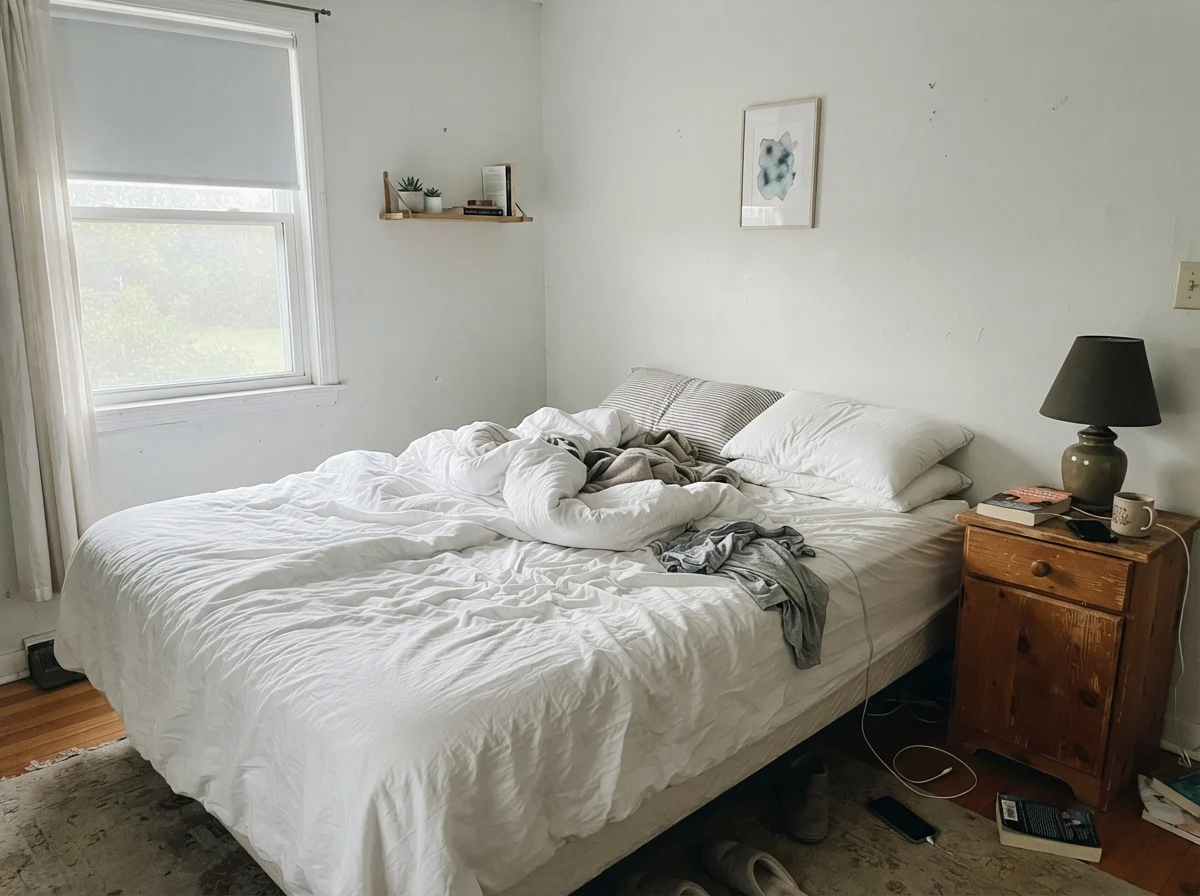
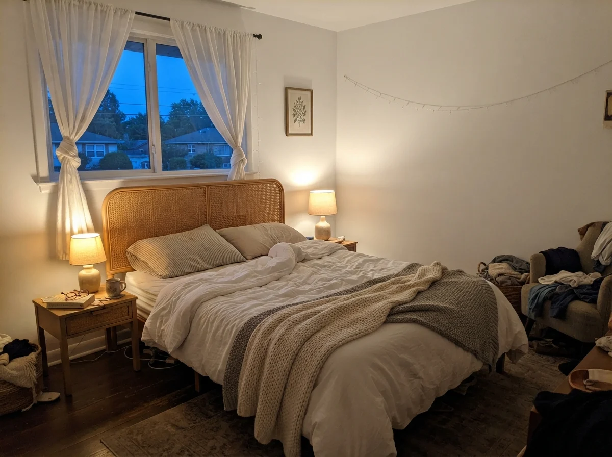
We saw this firsthand in a bedroom that faced due north. In the early morning hours, before lamps were turned on, the walls felt washed out, almost chilly to look at. Yet that very same paint, in a room that catches southern or late-afternoon sun, transforms entirely. When hit with direct, intense sun, the color flares into a brilliant white that borders on glare at midday. And in the evening, when you click on standard 2700K table lamps, the artificial golden light counterbalances the cool pigment, softening the room into something restful and composed. But if you make the mistake of installing 4000K commercial bulbs overhead, Extra White will lock into a clinical, sterile demeanor that never lets your shoulders drop.
Where Extra White Shines: Trim, Doors, and Millwork
The single greatest reason Sherwin-Williams Extra White is ranked among the most popular colors in the country is millwork. When you apply it in a durable semi-gloss finish across baseboards, interior door frames, and casings, it draws a definitive, sharp line. It doesn't soften edges; it frames them. If your walls are coated in a balanced greige like Agreeable Gray (SW 7029) or Repose Gray (SW 7015), or a bold statement like Naval (SW 6244), Extra White snaps against them with clean, graphic clarity.
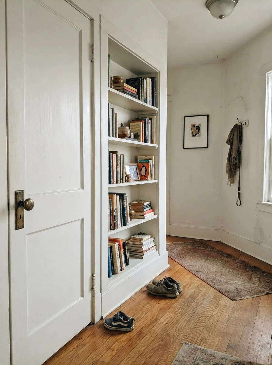
In our last house, our front hallway featured a substantial two-panel interior door and a wall of built-in shelving. Over the years, that hallway saw boots kicked off, backpacks dragged across the floor, and endless handprints near the brass doorknob. Because Extra White in semi-gloss is hard-wearing and dense, I scrubbed clean every smudge with a warm rag and mild soap, and the color held up without dulling or burnishing. Furthermore, because nearly every Sherwin-Williams counter in the country mixes Extra White as a base standard, doing touch-ups five years in was completely effortless. There was no hunting down discontinued formula codes; it is the universal language of professional painters.
Kitchen Cabinetry and the Reality of Cool Counters
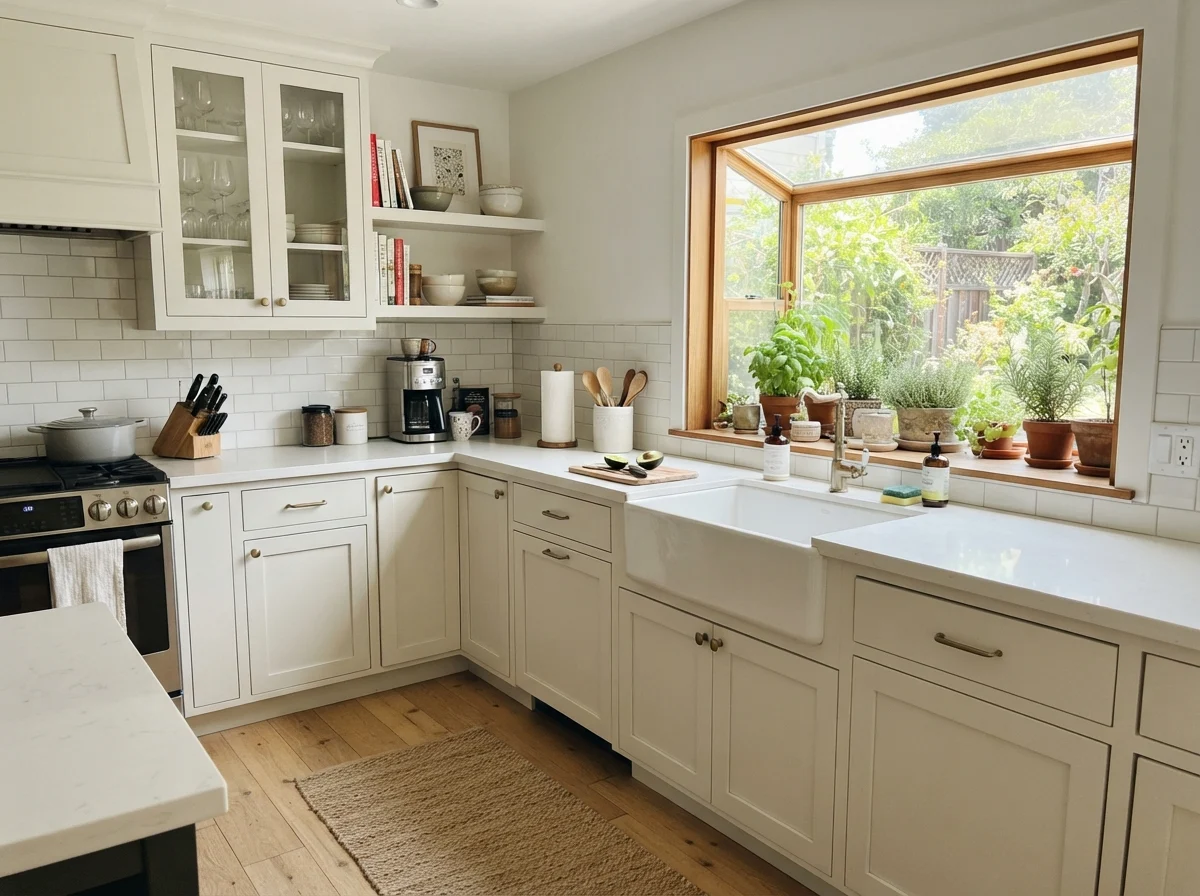
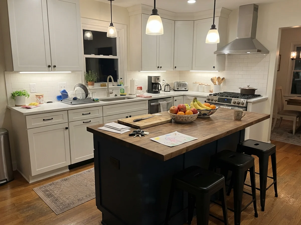
Cabinetry is another area where SW 7006 proves whether it is worth the money. If you have chosen modern finishes—such as cool engineered quartz, stainless steel appliances, and matte black hardware—Extra White on shaker cabinets in a satin sheen looks crisp, deliberate, and undeniably fresh. It gives cabinets a clean, tailored finish that doesn't compete with stone veining or chrome fixtures.
However, you must be disciplined about what sits alongside it. If your kitchen features warm golden honey oak floors, creamy marble, or heavy antique brass, Extra White can make those warm surfaces look surprisingly orange by comparison, while the cabinets themselves may read stark and cold. In that scenario, a more forgiving shade like Pure White (SW 7005) is the kinder pick. But if your goal is an island paired with cool quartz and deep contrasting walls—or accented by a dark, grounded tone like Urbane Bronze (SW 7048)—Extra White provides an anchor that feels crisp without looking tired.
When you use Extra White on an island surrounded by softer perimeter cabinetry or cream walls, the visual contrast takes center stage. In an everyday kitchen filled with cutting boards, fruit bowls, and the general clutter of life, that crisp line maintains a sense of structure. Just remember that satin cabinetry requires thorough prep; because this white is so clean, any grease or scuff will show up promptly until wiped down.
Bathrooms and Laundry Rooms: Bouncing the Light
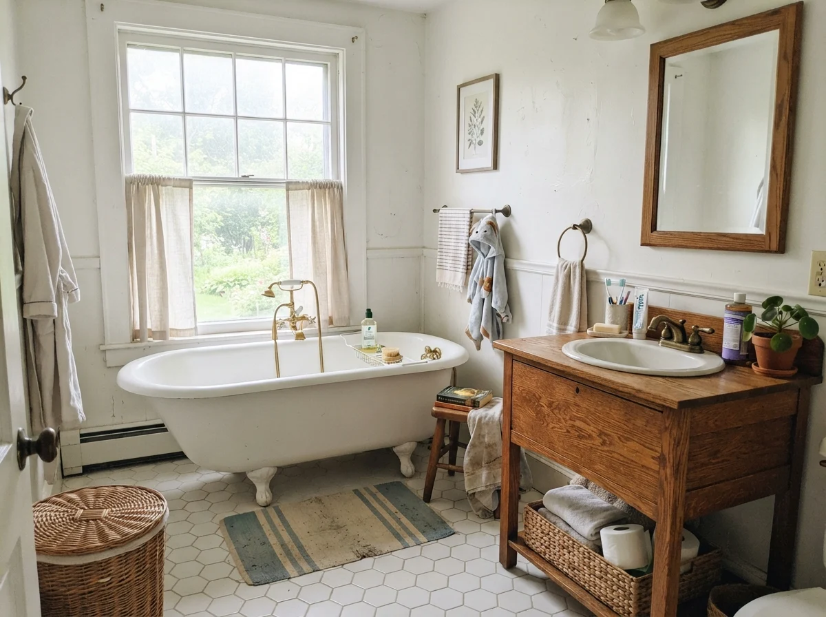
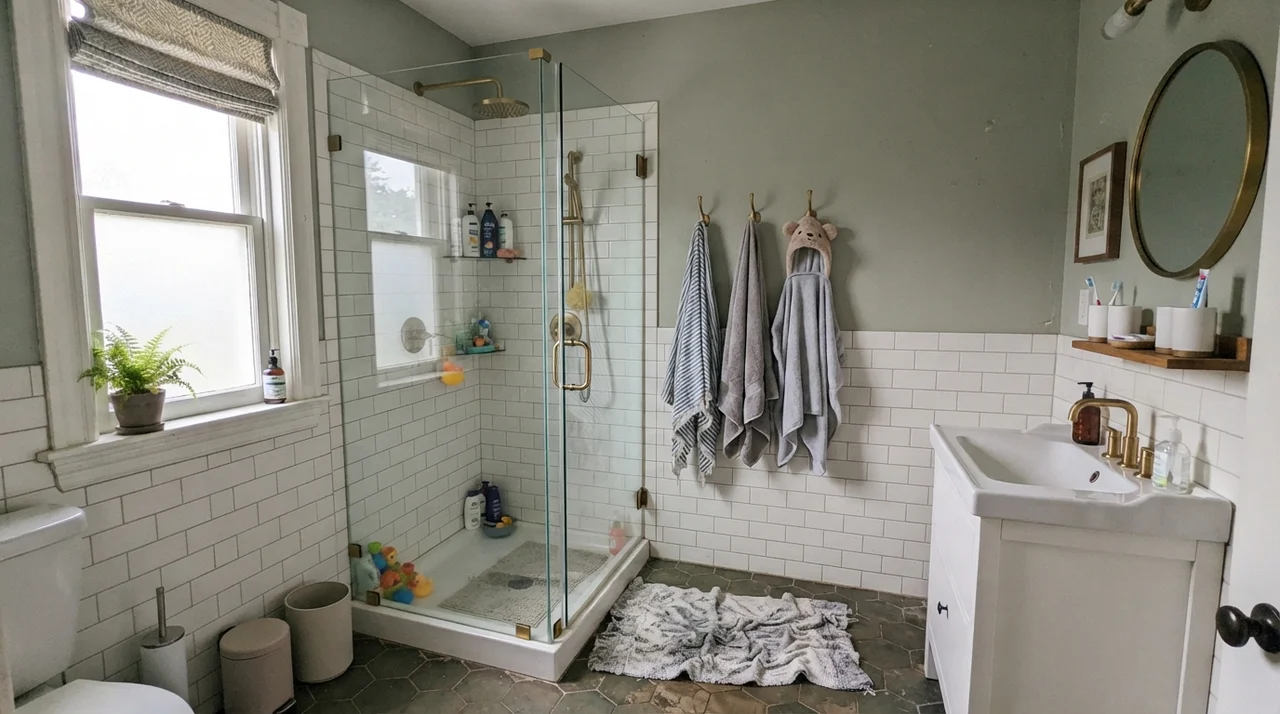
Where Extra White truly earns its keep on full walls is in utility spaces: family bathrooms, powder rooms, and laundry rooms. These are often compact, windowless rooms or spaces that rely on a single frosted window. An LRV of 86 does the work that a window simply cannot do, bouncing whatever light is available into every corner and preventing small rooms from feeling cramped or dingy.
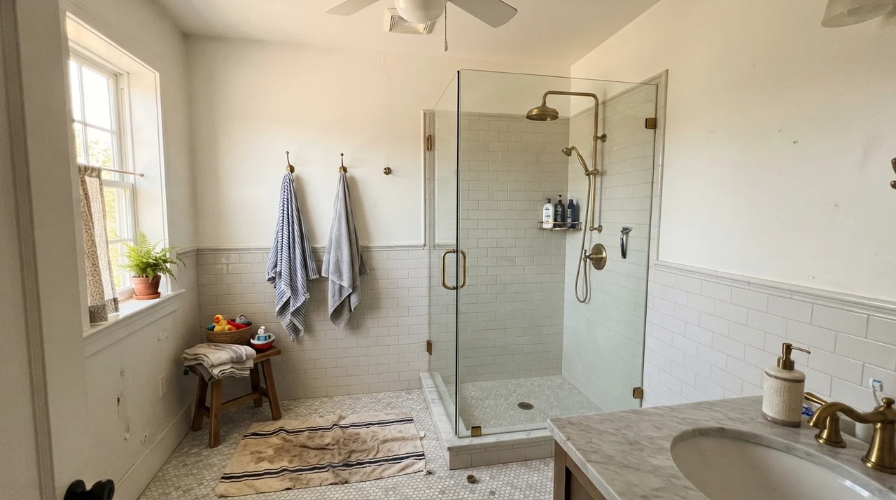
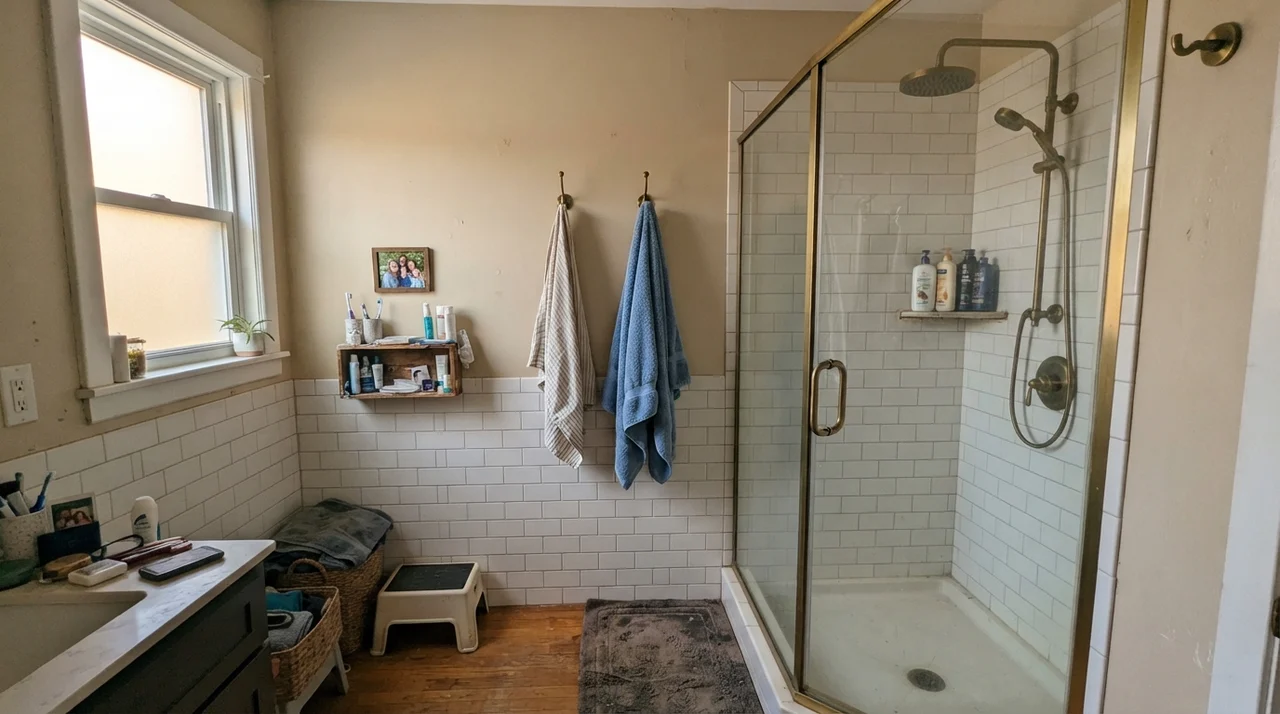
In our 1970s split-level, the family bathroom was heavily used by kids, damp towels, and constant steam. We painted the upper drywall in satin Extra White above white subway tile wainscoting. Paired with a glass door, clean tile, and brass shower fixtures, the walls looked perpetually fresh. When painted in eggshell or satin, the surface shed water droplets without water-spotting and scrubbed clean easily when toothpaste splattered against it.
In an active household, a small utility or laundry room benefits enormously from this level of reflection. In a laundry space with a butcher-block counter and stacked appliances, flat or eggshell Extra White keeps the workspace open and bright. If you have an accent vanity in an adjoining powder room painted in a calming blue-green like Sea Salt (SW 6204), Extra White on the surrounding trim and ceiling frames that color beautifully while keeping the compact footprint from feeling boxed in.
When Flat Light and North Windows Fight Back
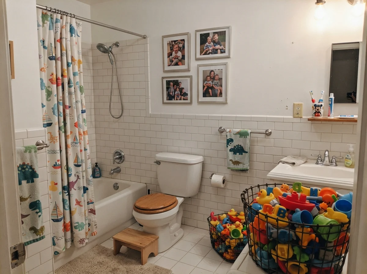
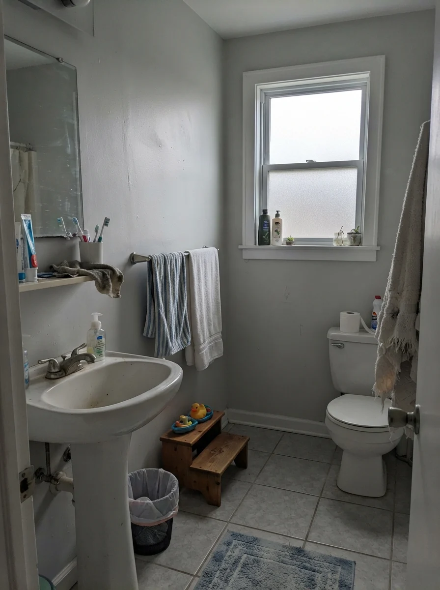
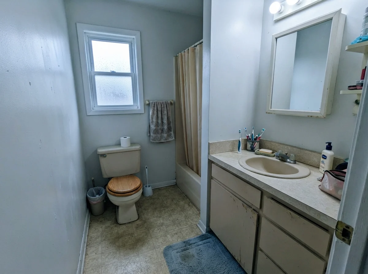
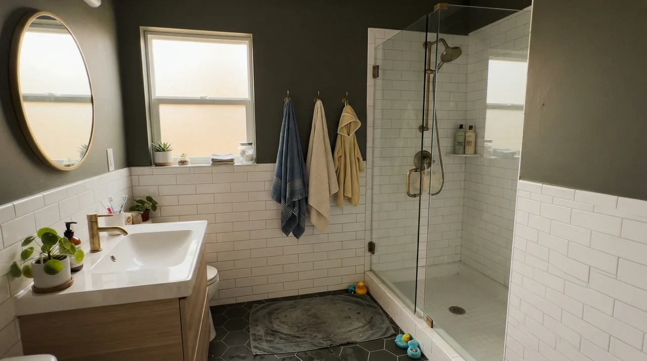
Here is the warning you must take to heart: Extra White does not look like a magazine spread in every bathroom or bedroom. When the daylight is flat or filtered through overcast skies and frosted glass, the color loses its bounce. It stops reading as a luminous architectural white and shifts into a muted, chilly gray. In a modest, older bathroom with an aging beige vanity and north-facing rain light, SW 7006 will not miraculously update the space; instead, it tends to make older beige fixtures look tired while the walls take on a cool, uninviting cast.
Bedrooms, Nurseries, and Generous Daylight
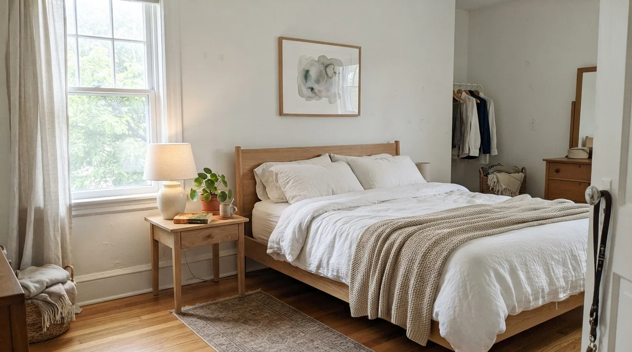
Can you use Extra White on bedroom walls? Yes, but only on the condition that the room receives genuine, generous natural light. In a serene main bedroom with large south- or west-facing windows, pale oak nightstands, and crisp white linen bedding, the walls feel airy, quiet, and expansive. The natural sunlight washes out the cool gray base, leaving behind an orderly, peaceful backdrop.
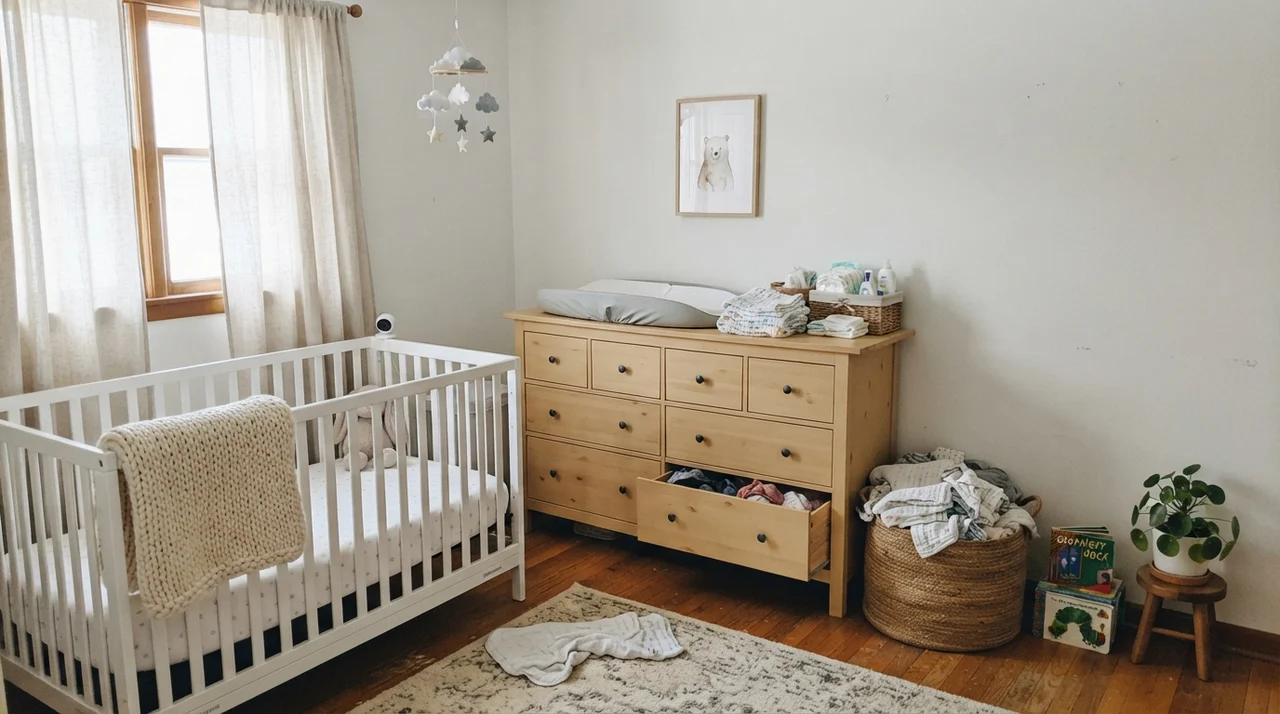
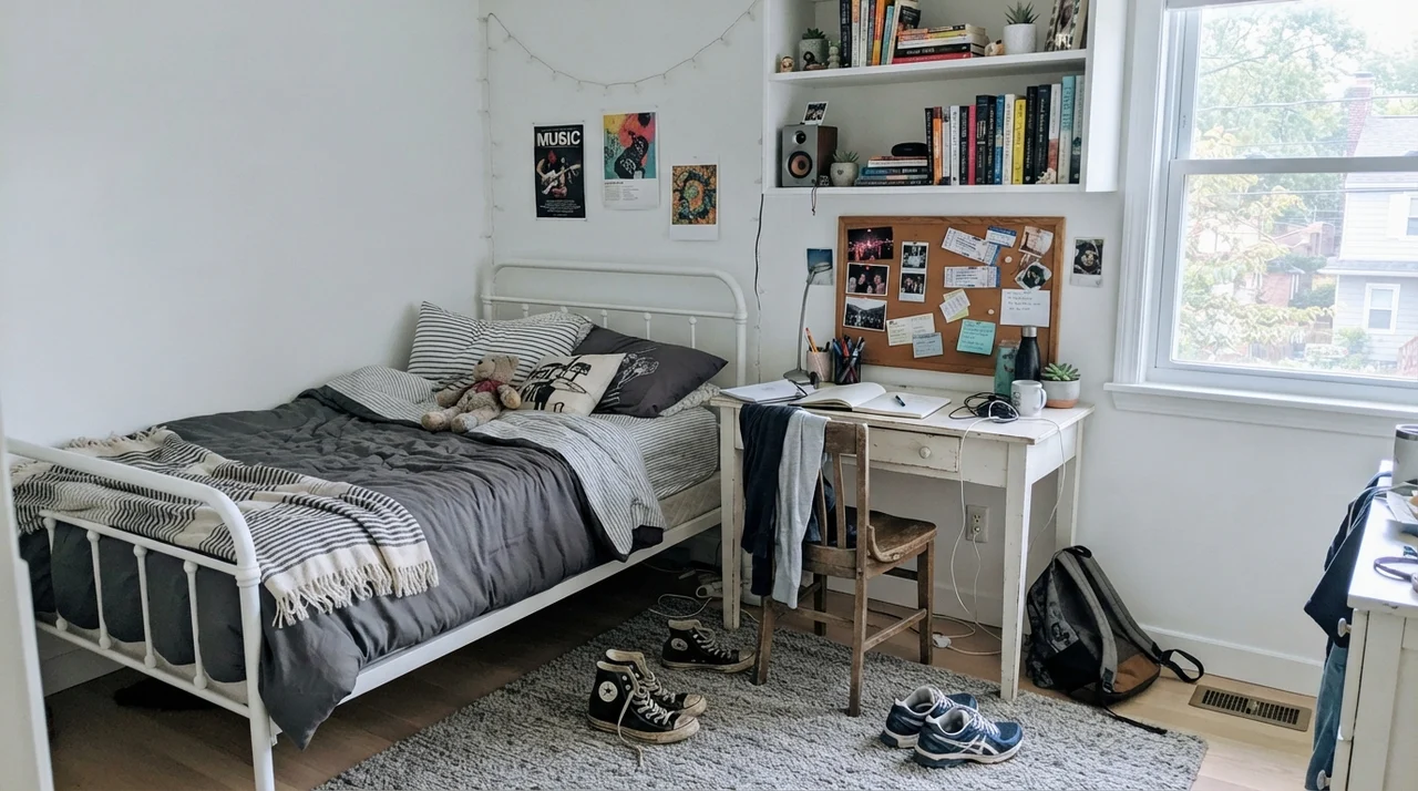
We see that same success in nurseries and teenagers' rooms when there is ample daylight filtering through curtains. With light-wood dressers, woven accents, or open shelving, Extra White creates a blank, tailored slate that lets furnishings provide the personality. But if the bedroom faces north or sits under the heavy shade of mature oak trees, do not force this color onto the walls. You will be far happier keeping Extra White strictly on the door casings and crown molding, while putting a softer, warmer white like Snowbound (SW 7004) on the wall surfaces.
Living Spaces, Sunrooms, and Full Sun
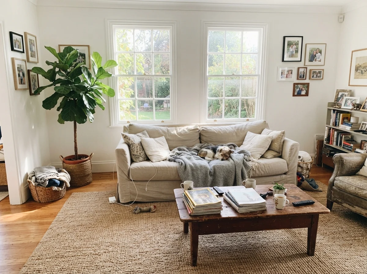
In main living areas, Extra White demands texture. If you put LRV 86 paint on large, continuous drywall surfaces and furnish the space with minimalist, slick pieces, the room quickly starts to feel hollow. In our current 1960s ranch, when we brought this white into spaces with generous midday sun, we balanced it with natural materials: a rumpled linen sofa, a woven jute rug, and warm wood coffee tables. The organic textures break up the glare and absorb the midday light, transforming what could be a harsh box into a comfortable family gathering space.
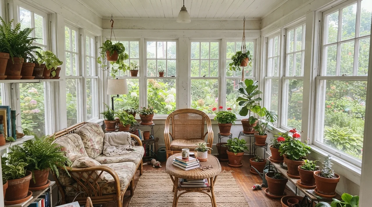
In a sunroom surrounded by glass on three sides, Extra White acts almost as an extension of the window frames themselves. Between terracotta pots, green foliage, and rattan furniture, the paint steps back and lets the garden view take center stage. Just be mindful of midday exposure: in full, unfiltered southern sunlight, this high-reflectance paint will cause slight glare. If you spend your afternoons reading in that room, make sure your window treatments can soften the peak glare hours.
The Honest Fail: The Dim Room Trap
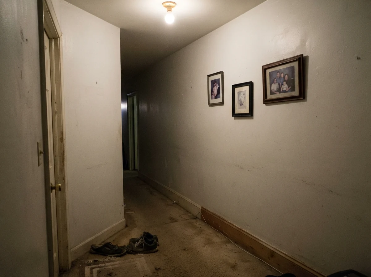
The bad stories you hear from homeowners about Extra White are remarkably consistent, and none of them stem from bad paint formulation. The failure happens when someone puts this cool, high-reflectance white where it has nothing to cut against, or in an area that lacks natural daylight entirely. When we sold our split-level, I watched a neighbor repaint their windowless, carpeted central hallway in flat Extra White, hoping it would make the narrow passage look grand and spacious. It was an absolute misstep.
Under a single incandescent ceiling fixture, without a single window in sight and paired with beige carpeting, the walls didn't look bright. They looked flat, muddy, and dingy—almost like wet putty. Because there was no contrasting trim or natural daylight to activate the white, the cool base simply sucked the life out of the corridor. If you have an interior hall or dark stairwell, do not try to force Extra White onto the walls. Use a warmer off-white on the drywall and reserve SW 7006 exclusively for the baseboards and doors so you get the crisp border without the sterile wash.
Exterior Applications: Trim Versus Full Siding
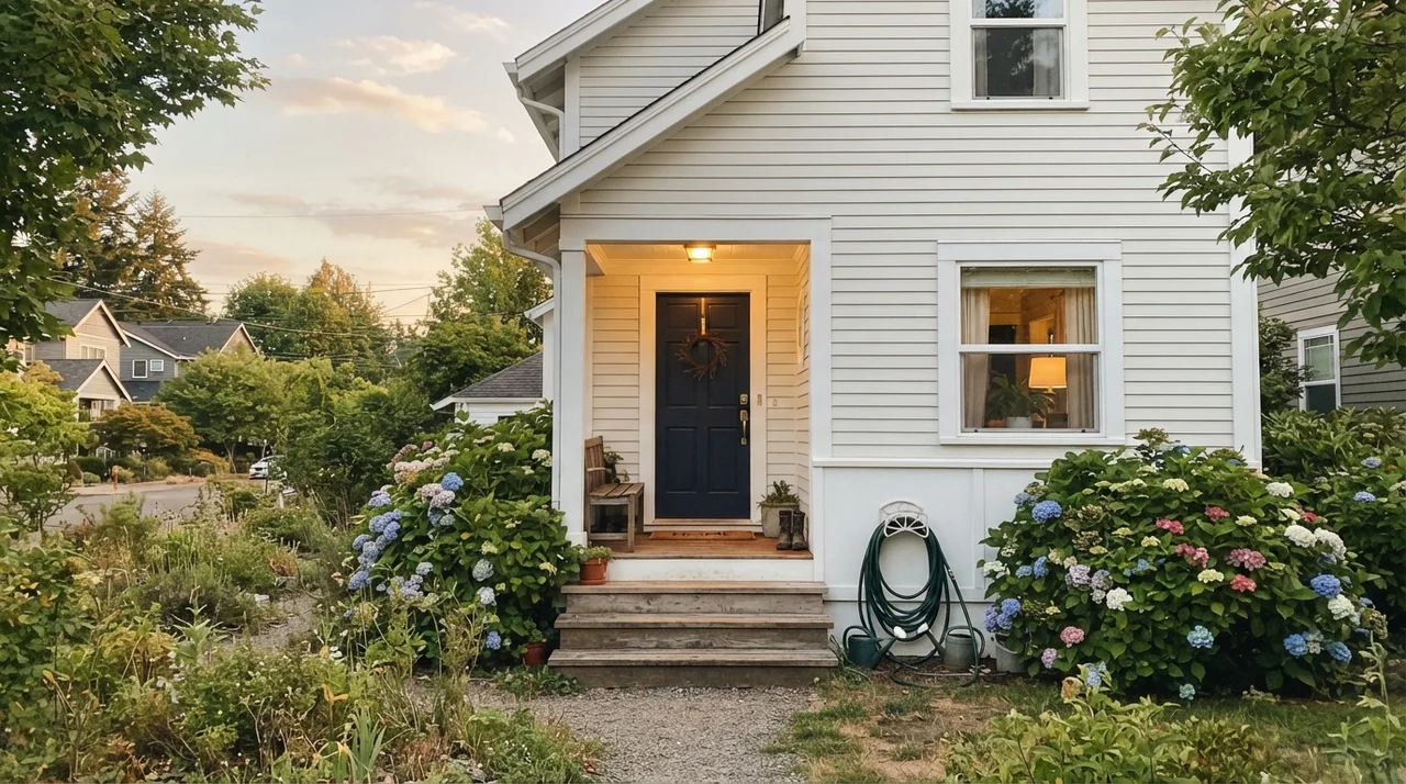
On home exteriors, Sherwin-Williams Extra White behaves exactly as it does indoors: brilliant on trim, tricky on broad surfaces. As exterior fascia, corner boards, soffits, and window casings set against darker siding or paired with a deep navy front door, it provides a tailored, crisp boundary that stays clean-looking for years. It resists fading and gives a house instant curb appeal from the street.
However, coating an entire house's horizontal siding in Extra White is a gamble that requires caution. In direct, unfiltered sunlight, an LRV of 86 siding color can be downright blinding to look at from the driveway. Furthermore, on north-facing siding that sits in damp shade, an ultra-crisp white will broadcast every speck of pollen, dust, and rain splash within six months. If you want a white house exterior that feels classic rather than glaring, stepping down to Snowbound (SW 7004) or Moderne White (SW 7071) for the siding body while keeping Extra White on the trim boards is the smarter architectural move.
Living with Extra White Over the Decades
I have lived with this paint across thirty years of family life, dog paws, renovation dust, and real-estate open houses. I know exactly how it behaves when the initial excitement wears off. If you are repainting with an eye toward resale, Extra White on trim and interior doors is practically an industry standard. Buyer's agents love it because it signals to potential buyers that the house has been freshly maintained and looks clean. It creates that crisp separation that makes wall colors pop in listing photographs.
In terms of cleaning and maintenance, the sheen you choose determines your happiness. In semi-gloss on trim, it is virtually bulletproof; crayon marks, shoe scuffs, and fingerprints scrub clean with a damp microfiber cloth and gentle dish soap without leaving dull burnish marks. On walls, keep it strictly in eggshell or satin. Flat Extra White on a high-traffic hallway wall will show every scuff, and scrubbing it will burnish the finish. On ceilings, however, flat Extra White overhead lifts the ceiling plane and keeps the overhead space uniform without requiring you to buy a separate ceiling paint product.
Sheens and Trim Strategy
When you commit to Extra White, you must follow one cardinal rule: whites in the same sightline must agree on temperature. The single most common regret I hear from neighbors is that they painted their trim in brand-new Extra White, only to realize that their existing creamy or warm walls—like Alabaster (SW 7008) or Creamy (SW 7012)—suddenly looked yellowed, dingy, and dirty next to it. The cool undertone in Extra White beats up warm creams every day of the week.
If you choose Extra White for your trim, use it everywhere: the baseboards, the door jambs, the window casings, and the ceiling. Changing trim whites from room to room makes a home feel disjointed. By sticking to Extra White throughout the millwork in semi-gloss, you create a continuous architectural thread that ties the entire house together, regardless of what colors you choose for individual rooms.
Long-Term Durability and Resale
Five years in, paint reveals whether it was worth the money. What makes Extra White such a workhorse is that it ages predictably. It does not contain unstable yellowing oils, nor does it have high tint concentrations that break down under sunlight. In our 1990s colonial, when we sold the home nearly a decade after repainting all the baseboards and doors in semi-gloss Extra White, the finish still looked remarkably tight. A quick pass with a damp sponge took care of scuffs near the back door, and the trim photographed beautifully for the real estate listing.
The only place where maintenance becomes a chore is if you put this paint in flat or matte finishes on high-traffic family walls. With an LRV of 86, every greasy thumbprint, kicked shoe, or spilled juice box will show like a beacon. If you use it on walls in hallways, mudrooms, or children's bedrooms, insist on an eggshell or satin finish so you can clean it without removing the paint film. Stick to flat sheen exclusively for ceilings, where it lifts the visual height of the room and hides drywall taping imperfections.
Extra White isn't chosen for a mood; it's chosen for an edge. On trim, it snaps clean; on dim walls, it feels like a clinic.
How Extra White Compares to Close Competitors
When you stand at the paint counter holding paint chips, it is easy to assume that all white paints look virtually identical. But once you coat an entire wall or a run of baseboards, the slight differences in light reflectance and undertone become glaringly apparent. Here is how Sherwin-Williams Extra White stacks up against the closest alternatives in the paint decks.
Frequently Asked Questions About Extra White
Before you commit five gallons to your project, take a moment to review the practical questions homeowners consistently ask about SW 7006.
Can I paint both my walls and trim in Extra White?
Only do this if your room receives abundant south or west daylight. If you use Extra White on both surfaces in a dim room, it will feel sterile and flat. If you do use it on both, vary the sheens: flat on ceilings, eggshell on walls, and semi-gloss on trim.
Why does Extra White make my existing white walls look yellow?
Extra White has an LRV of 86 and a cool, crisp undertone. When placed beside warmer off-whites like Alabaster or Creamy, the high reflectance and cool base make those warm pigments look instantly dingy and aged by comparison.
What sheens work best for Sherwin-Williams Extra White?
The proven formula is: flat for ceilings, eggshell for regular walls, satin for kitchen and bathroom cabinets, and semi-gloss for doors, baseboards, and window casings.
Is Extra White a good color for home exterior siding?
Use it carefully. On trim, eaves, and window casings, it is exceptional. On full siding in direct midday sun, its LRV of 86 can create blinding glare. For full siding, stepping down to Snowbound (SW 7004) or Moderne White (SW 7071) is safer.
Susan's Verdict · The Pro's Trim Standard
Sherwin-Williams Extra White is the color painters reach for when they want an edge, not a mood. As trim, casing, and cabinetry against cool quartz or darker walls, it is nearly flawless and holds up beautifully to years of family scrubbing. Just keep it off the walls of dim, sun-starved rooms unless you want your home to feel like an outpatient clinic.