Before You Roll Sherwin-Williams White Duck Everywhere
The warm off-white everyone calls foolproof, reviewed honestly: the green flash nobody warns you about, the rooms where it goes dingy, and what to paint instead.
Thirty years, three houses, every room repainted at least twice. This is my honest record of the famous colors — the Hale Navys and Sea Salts of the world — judged by year five, not day one.

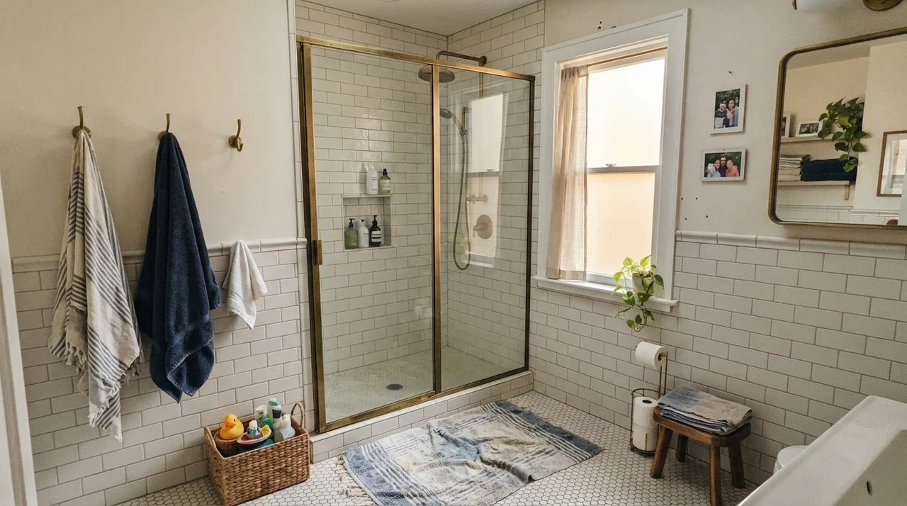 SW 7010 · White Duck
The warm off-white everyone calls foolproof, reviewed honestly: the green flash nobody warns you about, the rooms where it goes dingy, and what to paint instead.
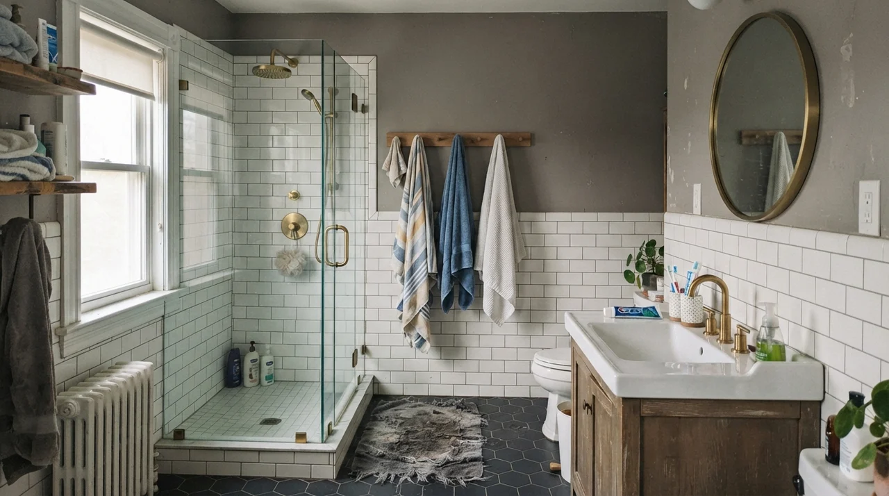 SW 7018 · Dovetail
The warm gray Sherwin-Williams sells more than it markets, reviewed honestly: where it reads rich, the light that turns it muddy, and what to pick instead.
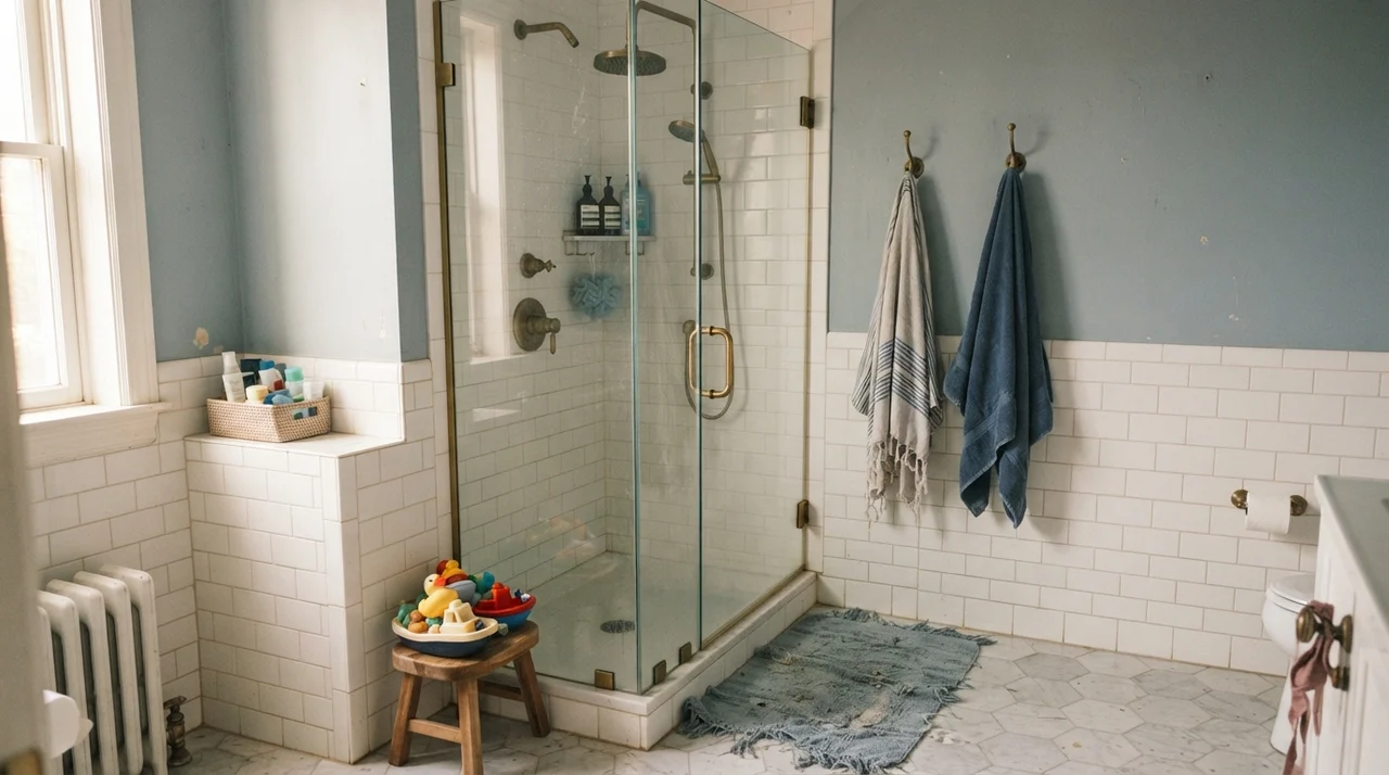 CSP-595 · French Toile
A cool blue-gray that's practically a twin of two site-favorite chameleons, reviewed honestly: what makes it glow, what makes it go flat, and why almost nobody has heard of it.
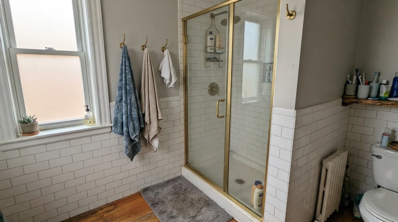 SW 55 · Light French Gray
The gray people buy to avoid beige, reviewed honestly: why it flashes baby blue on so many walls, and the rooms where it is close to perfect.
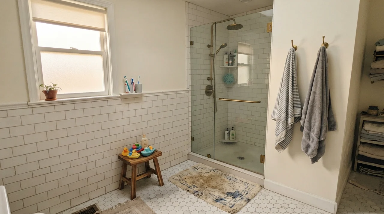 DC-001 · Whipped Cream
Behr's quietest true white, reviewed honestly: why almost nobody has heard of it, where it disappears in the best way, and where every white this pale runs into trouble.
 HC-187 · Black Forest Green
The blackened green everyone reaches for instead of black, reviewed honestly: the light it needs to prove it's green, and where it just goes flat.
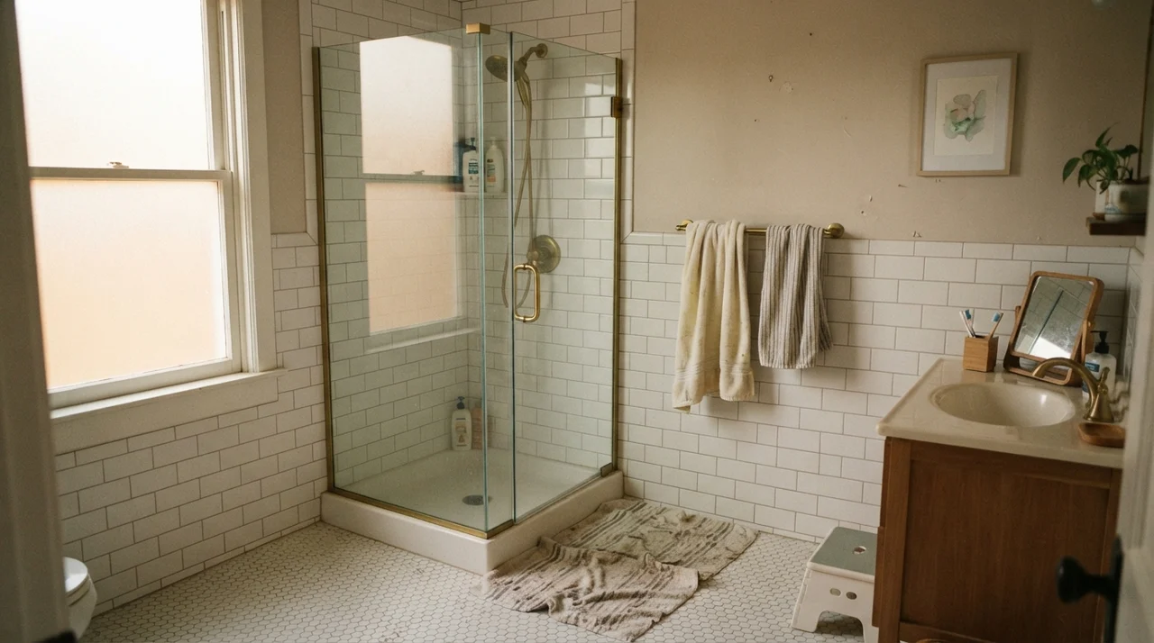 SW 7567 · Natural Tan
A grayed tan at LRV 65, reviewed honestly: the whole-house walls where it stays quiet, the north light that turns it pink or flat, and what to pick instead.
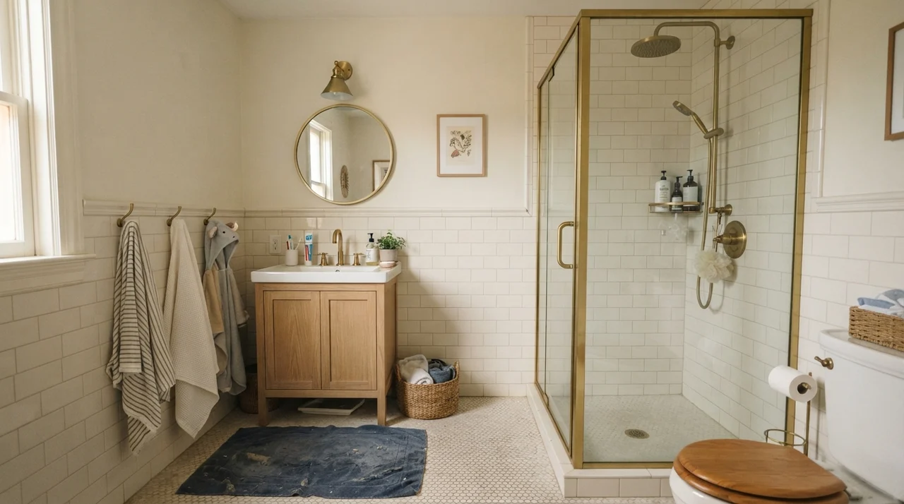 960 · Dove Wing
The warm white people pick when White Dove feels too plain, reviewed honestly: the rooms it saves, the trim that ruins it, and when it flashes peach.
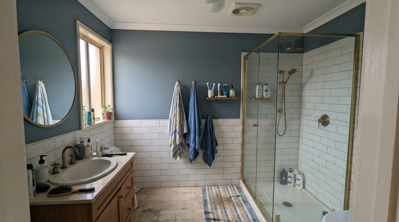 SW 7604 · Smoky Blue
A deep, grayed-down blue-gray that Sherwin-Williams quietly files under Neutral — reviewed honestly: the light where it turns unmistakably blue, the light where it disappears, and the jobs where it actually earns its keep.
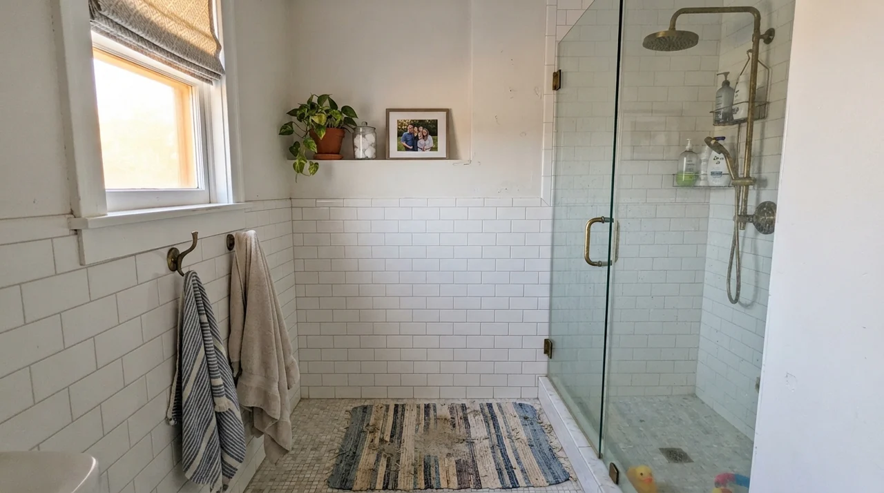 SW 7035 · Aesthetic White
The quiet warm off-white designers reach for when Alabaster feels too plain, reviewed honestly: what it does with wood, and the trim mistake that ruins it.
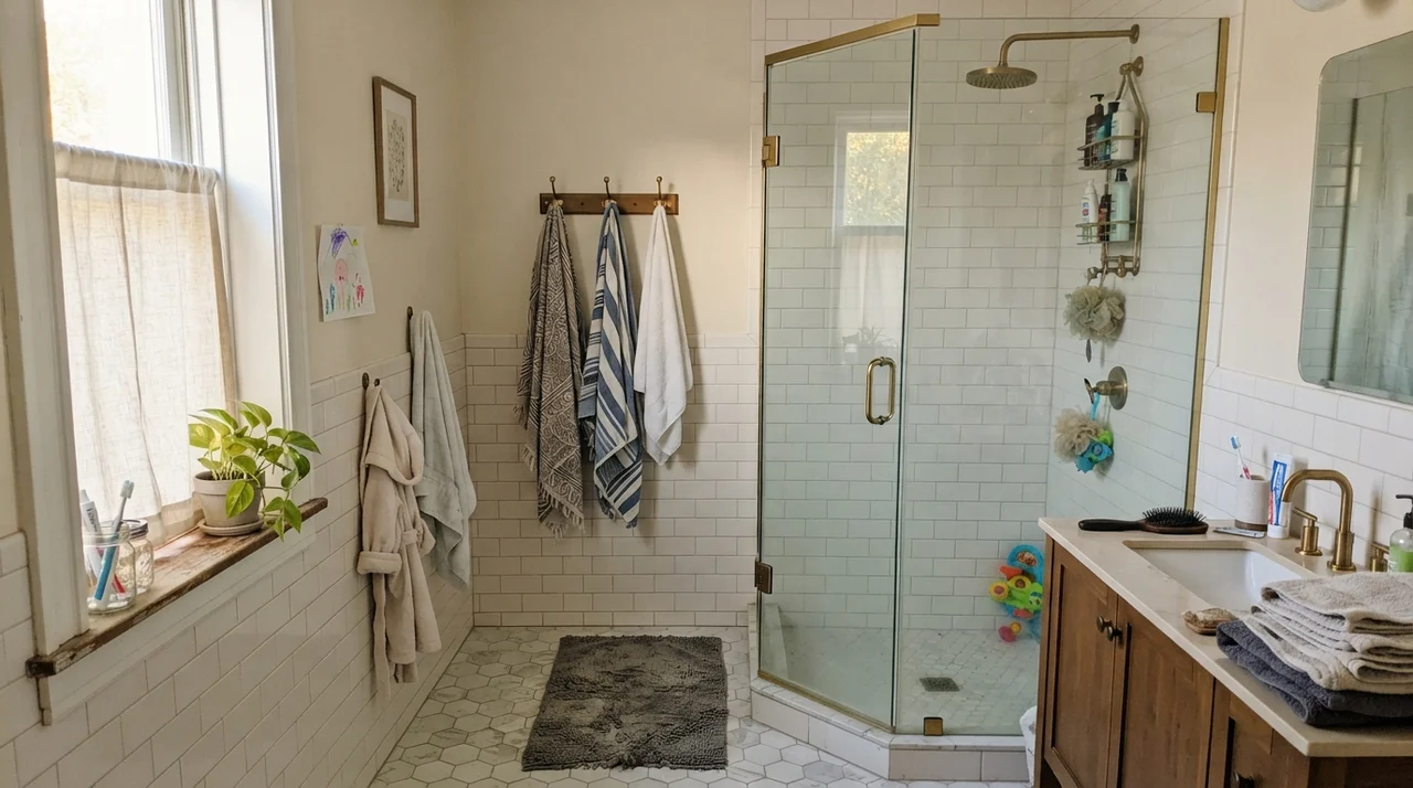 SW 7012 · Creamy
The cream-white that grounds half the farmhouse palettes in the Sherwin-Williams deck, reviewed honestly: the light that flatters it, the light that turns it butter, and what to pick instead.
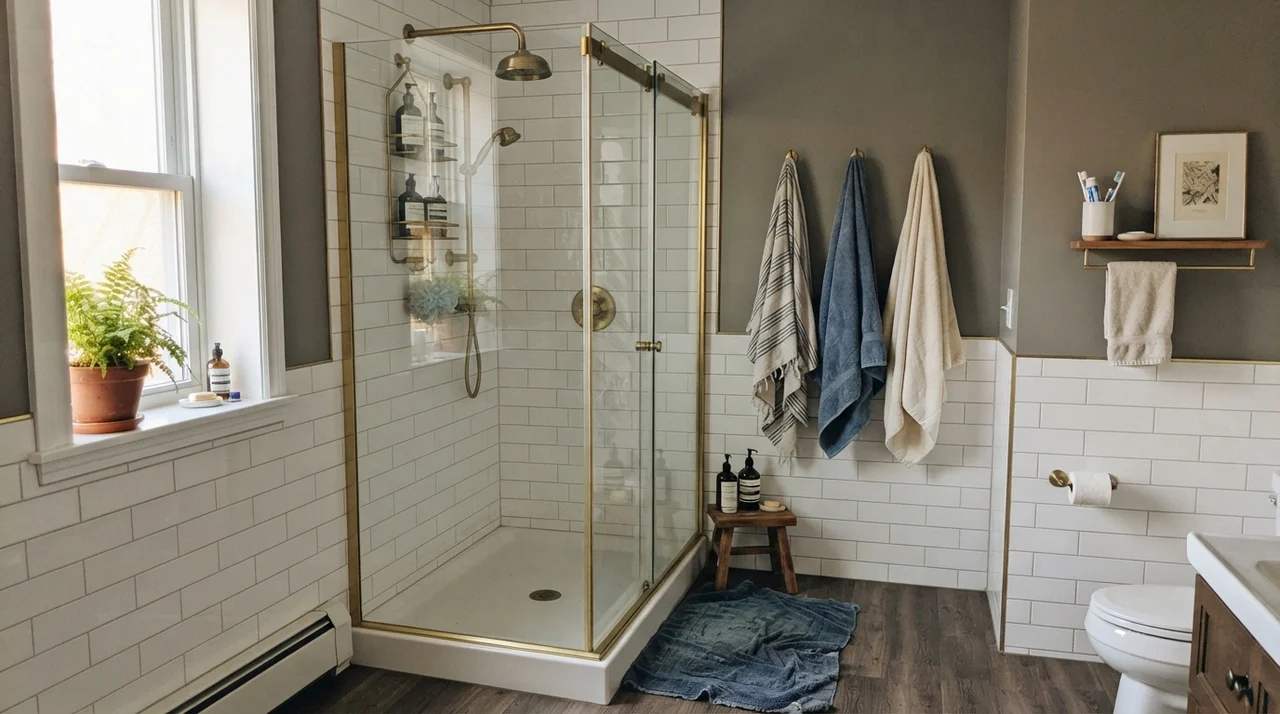 HC-168 · Chelsea Gray
The designer charcoal-greige on every island and every farmhouse exterior, reviewed honestly: the undertone that flashes green in the afternoon and purple next to the wrong neutral.

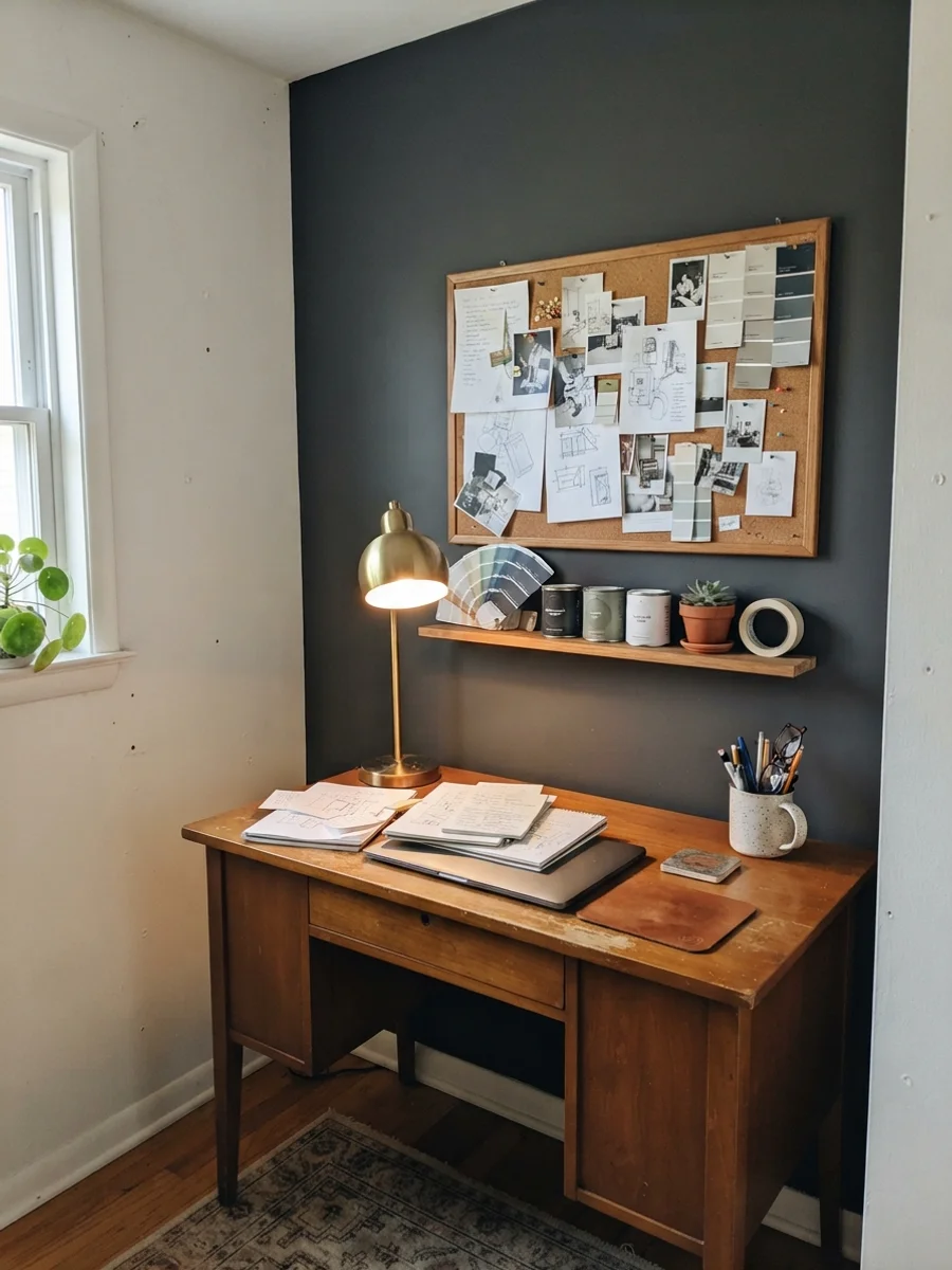
Same test, every diary, no exceptions. It's saved me from repainting more times than I'll admit in print.
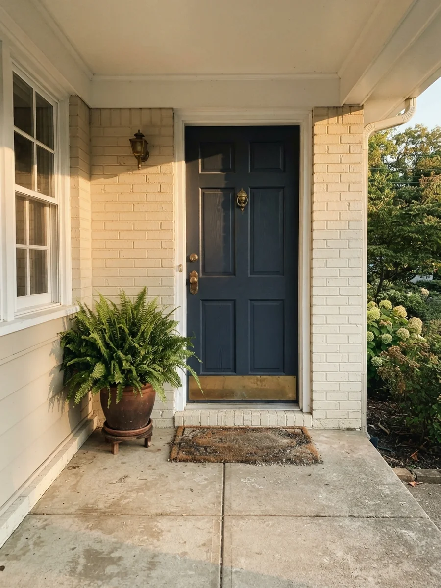
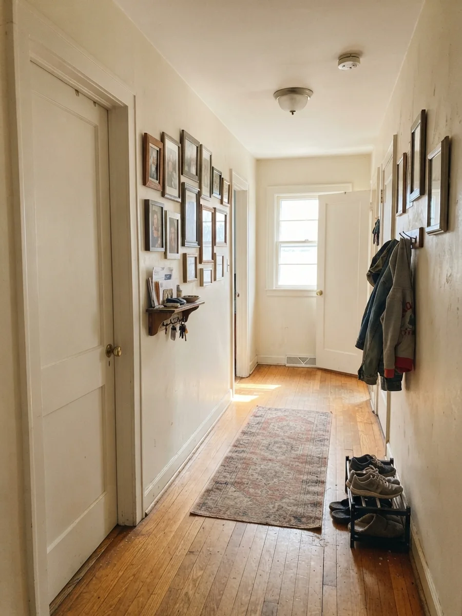
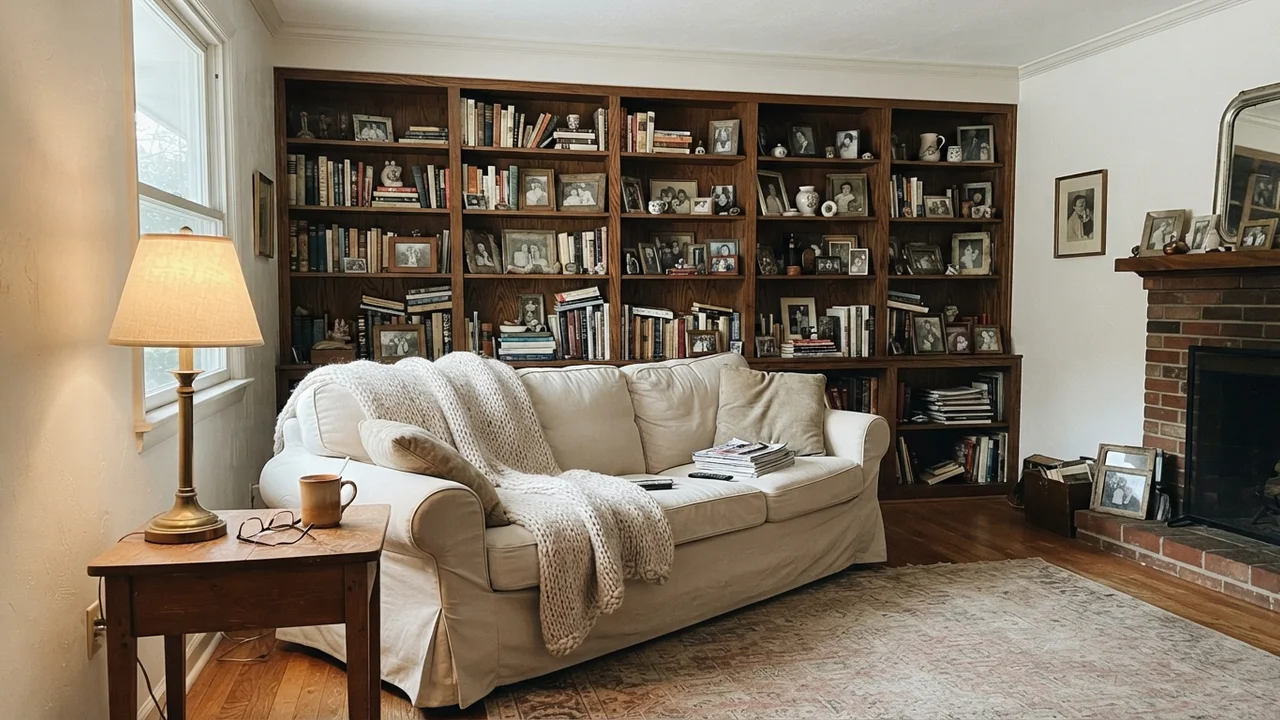
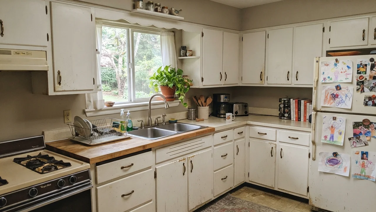
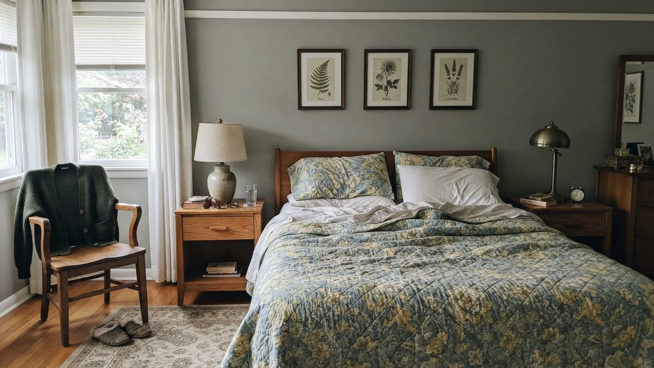
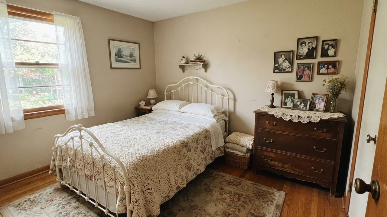
The 1960s ranch where every diary gets tested — ours, lived-in, imperfect on purpose.

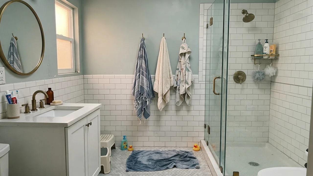
A short letter about one famous color and what it's really like to live with. No trends, no hauls, no "25 ideas." Just the one thing worth knowing this week.