Color Diary · No. 106
Why Behr Whipped Cream Is the Quietest Paint in the Home Depot Aisle
Behr's quietest true white, reviewed honestly: why almost nobody has heard of it, where it disappears in the best way, and where every white this pale runs into trouble.

Susan HartleyNovember 1, 2026 · 18 min read
Whipped Cream · Behr DC-001
Hex#F6F5EFLRV91Undertoneswarm sun (#f5f7ec) → overcast (#f4f2ef) → cool bulbs (#f1f4f5)
When we moved into our 1960s ranch eight years ago, the first room I tackled wasn't the kitchen or the primary bedroom. It was the center hallway bathroom. In our last house—a 1990s colonial where every single surface had been painted some variation of builder beige—I learned the hard way that picking a white paint is usually where people lose their minds. In that colonial, I had tested five separate swatches on the drywall, convinced myself that one had too much pink and another too much green, and finally settled on a stark builder white that made our vintage oak mirrors look like orange firewood. I lived with it for seven years before admitting it was a mistake.
So when it came time to paint the ranch bathroom, I walked past the giant numbered display rack at the home improvement store and went straight to the smaller Designer Collection cards tucked into the corner. That is where you find Behr Whipped Cream (DC-001). Almost nobody talks about it online. There aren't hundreds of forum threads or social media arguments dedicated to it, mostly because it doesn't live in Behr's main numbered deck. But on paper, it does something very few whites pull off: it delivers an LRV of 91 with just enough warmth to stop it from feeling like an operating room, without dumping a bucket of yellow into the can.
The name is frankly misleading. When someone tells you a paint is called Whipped Cream, you expect dessert. You picture a heavy, buttery off-white—something along the lines of a French vanilla or an old-fashioned linen that belongs in a country cottage. If that's what you are shopping for, Whipped Cream will disappoint you immediately. This is not a biscuit color. It is a true near-white, sitting right up at LRV 91. To put that in perspective, true laboratory white sits at 100, and Behr's benchmark Ultra Pure White sits at 92. Whipped Cream is barely a whisper softer than the purest base paint on the shelf.
What makes it interesting to live with—and why I have recommended it to more neighbors than any other pale neutral—is the undertone. Or rather, the near-total lack of one. When you examine the formula, the gap between the warm and cool color channels is roughly seven points. That tiny delta means you get just enough cushion to soften direct glare, but not enough pigment to read as yellow, peach, or green once the paint cures. It doesn't pick fights with hard finishes. Five years in, that quietness is worth its weight in gold.
Morning Light Versus Evening Lamps
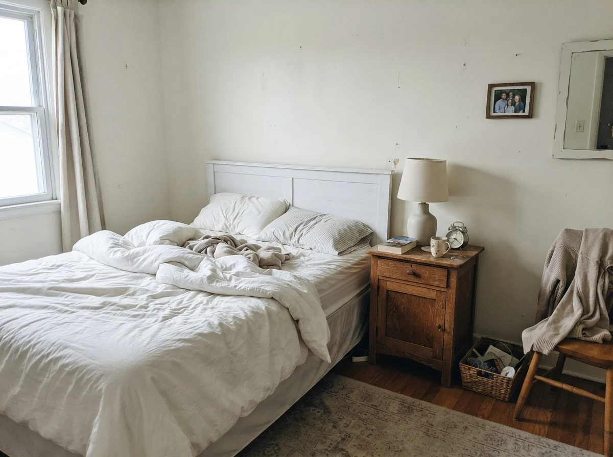
Every pale white tells two completely different stories depending on the time of day, and Whipped Cream is no exception. In the early morning, before the lamps are switched on, light from eastern or northern windows makes the pigment step back. If you are standing in a quiet bedroom at 6:30 AM with unmade white bedding, the walls will look clean, cool, and somewhat pale. There is no golden glow here until the sun climbs high enough to reach the sill.
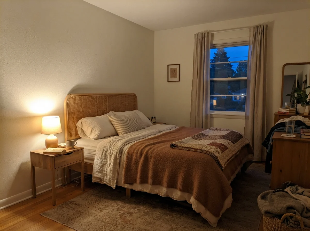
By evening, the entire personality hinges on what wattage and color temperature you have screwed into your fixtures. This is where so many homeowners blame their paint when they should be blaming the hardware store lightbulb aisle. Under standard 2700K incandescent-style bulbs, that faint drop of warmth in the formula wakes up, making a room feel sheltered and cozy. But put a 4000K daylight LED bulb overhead, and Whipped Cream will look like the intake hallway of an urgent care clinic. Before you put a roller back in the tray to change a paint you dislike at night, change the lightbulb first.
Where It Works Best: Bathrooms and Wet Rooms
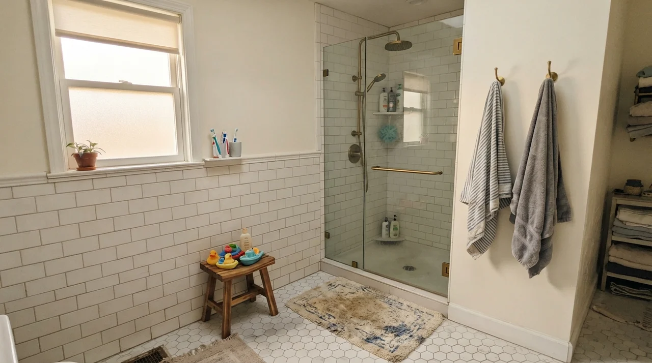
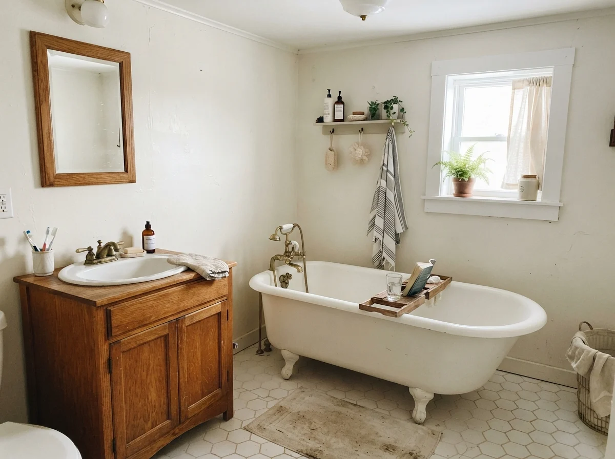
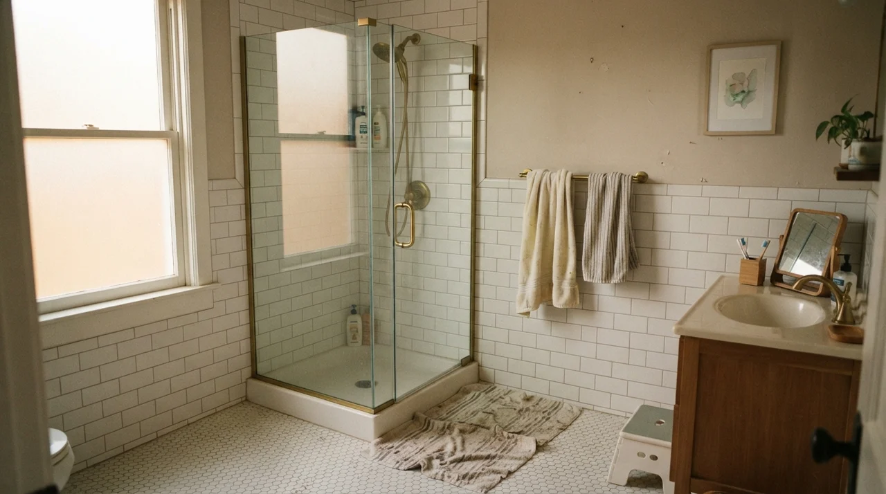
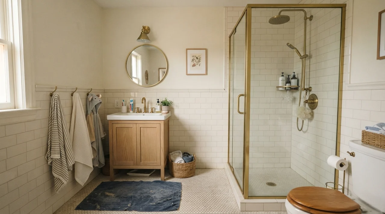
If you have ever tried to pick a white paint to go with tile, you know the particular misery of holding a fan deck against porcelain. Most standard white subway tiles are a bright, cool ceramic white. If you put an off-white like Swiss Coffee or Polar Bear right above them, the wall looks dingy, like somebody smoked in the room for twenty years. If you put a harsh base white above the tile, the whole room feels cold enough to freeze water.
Whipped Cream sits in that narrow sweet spot. In a family bathroom or a kids' bathroom with standard white subway wainscoting, it reads crisp and clean without fighting the tile. Because its undertone is so subdued, it also bridges the gap between different materials. In our last house, our guest bath had older travertine countertops that leaned warm, but the previous owner had put in a cool gray slate floor. A warm white turned gray slate purple; a cool white made the travertine look dirty. Whipped Cream doesn't pick sides. It sits beside warm oak vanities, brass fixtures, or gray stone and lets the materials be what they are.
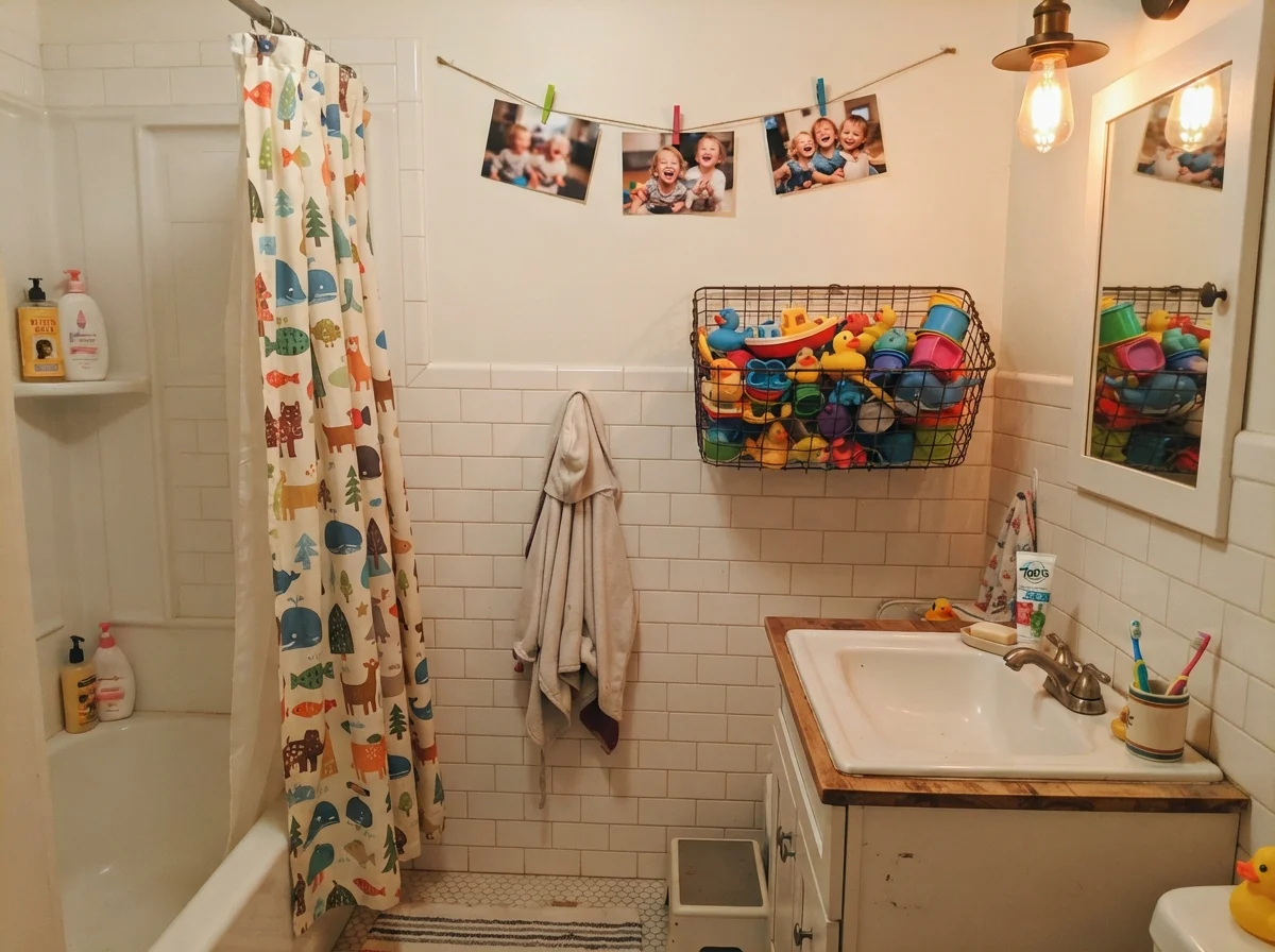
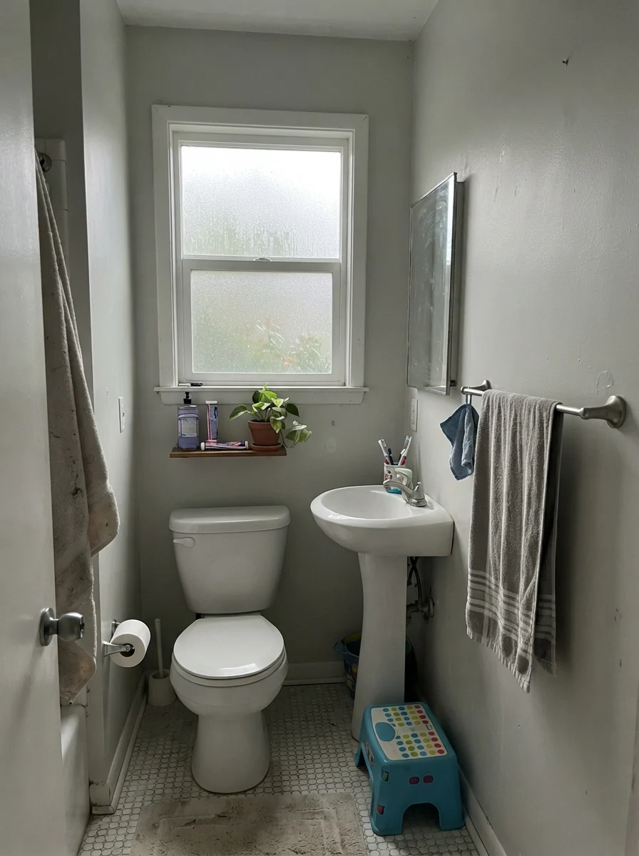
You do have to watch the exposure, however. When you take away direct daylight and look at a modest bathroom with north light on a rainy Tuesday, Whipped Cream drops back. It doesn't magically create warmth where no warmth exists. In cool, rainy light, it takes on a quiet, faint gray cast. It won't turn sour or yellow—which is the complaint you hear about Benjamin Moore Simply White in certain sun exposures—but it will look plain. For a family bath where towels, shampoo bottles, and bath toys bring plenty of their own chaos, that plainness is often exactly what keeps the space feeling orderly.
Bedrooms, Nurseries, and Living Spaces
When you put an LRV 91 white on all four walls of a main bedroom, you are making a commitment to your lighting and your textiles. In our 1970s split-level—the first home we bought thirty years ago—I painted our bedroom what I thought was an airy white. The room had two small windows shaded by an overgrown maple, and the walls ended up looking like wet cement for eight months of the year. I learned then that a high-LRV white requires real light coming through the glass, or else a deliberate layering of wood, linen, and warm ceramic fixtures to give the eye somewhere to rest.
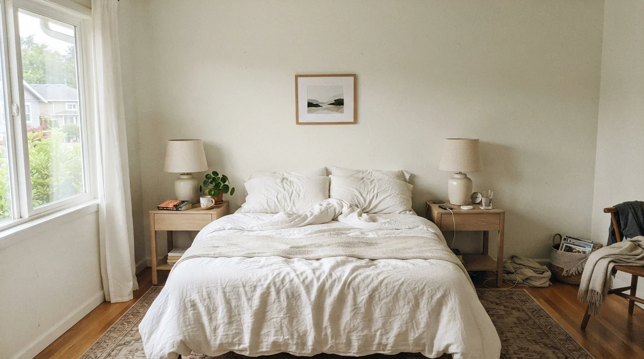
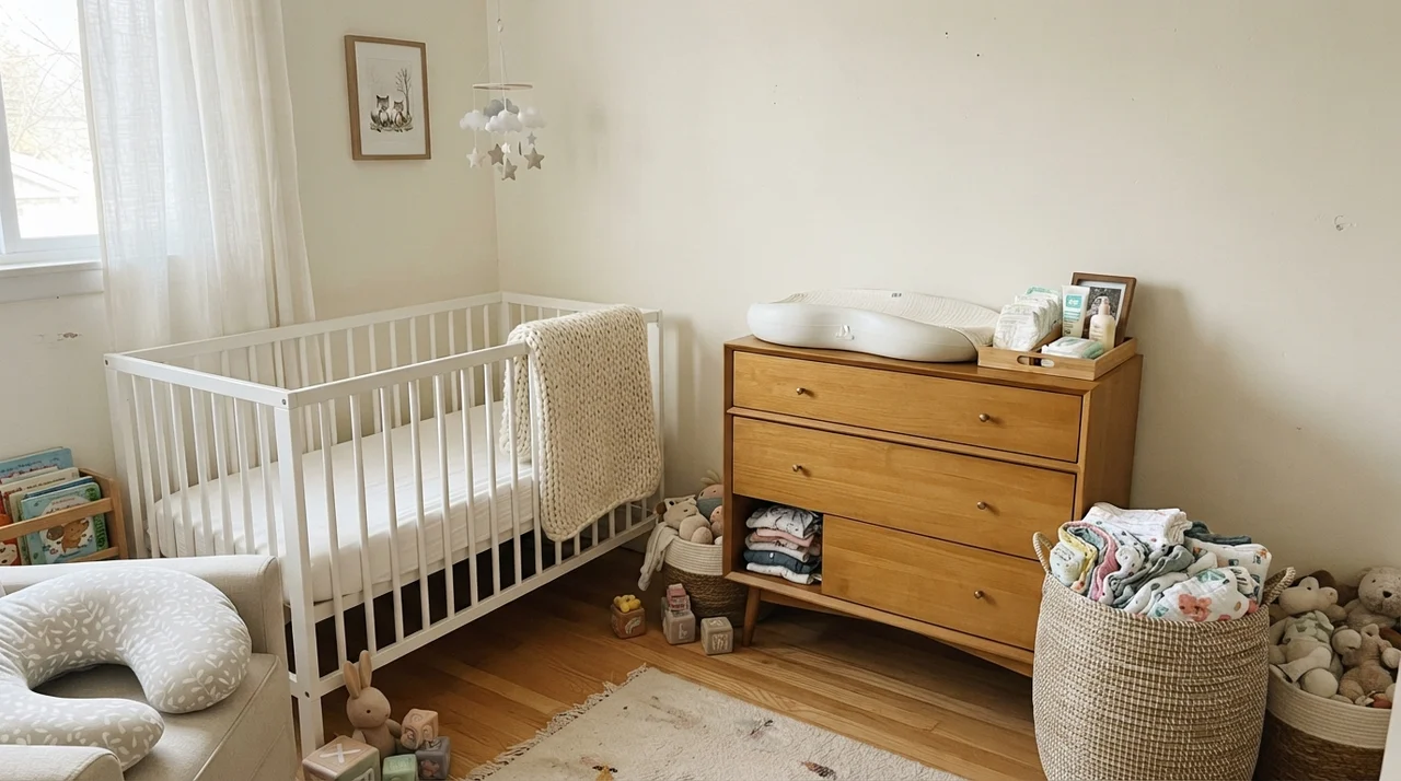
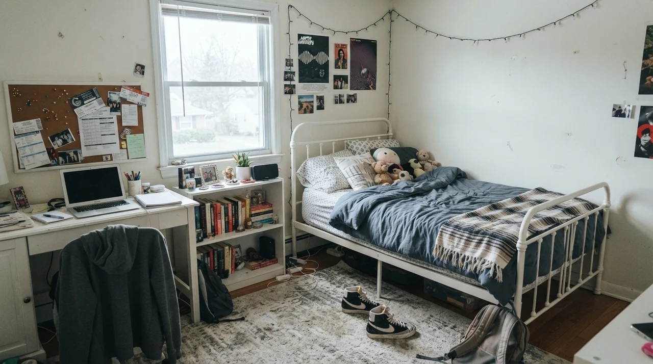
When you give Whipped Cream generous daylight, the results are effortless. In a sunny main bedroom with pale oak nightstands and white linen bedding, it creates an environment that feels open and quiet. In a nursery, paired with light-wood furniture, muslin cloths, and a simple white crib, it stays entirely neutral—it won't push yellow against natural pine or look blue against a white knit blanket. In a teenager's room with a white metal bed, open shelving, and corkboards, it acts as a resilient backdrop that lets posters, books, and sports gear take center stage without visual friction.
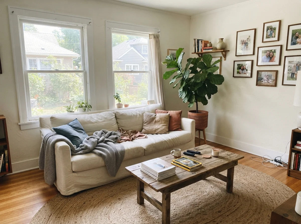
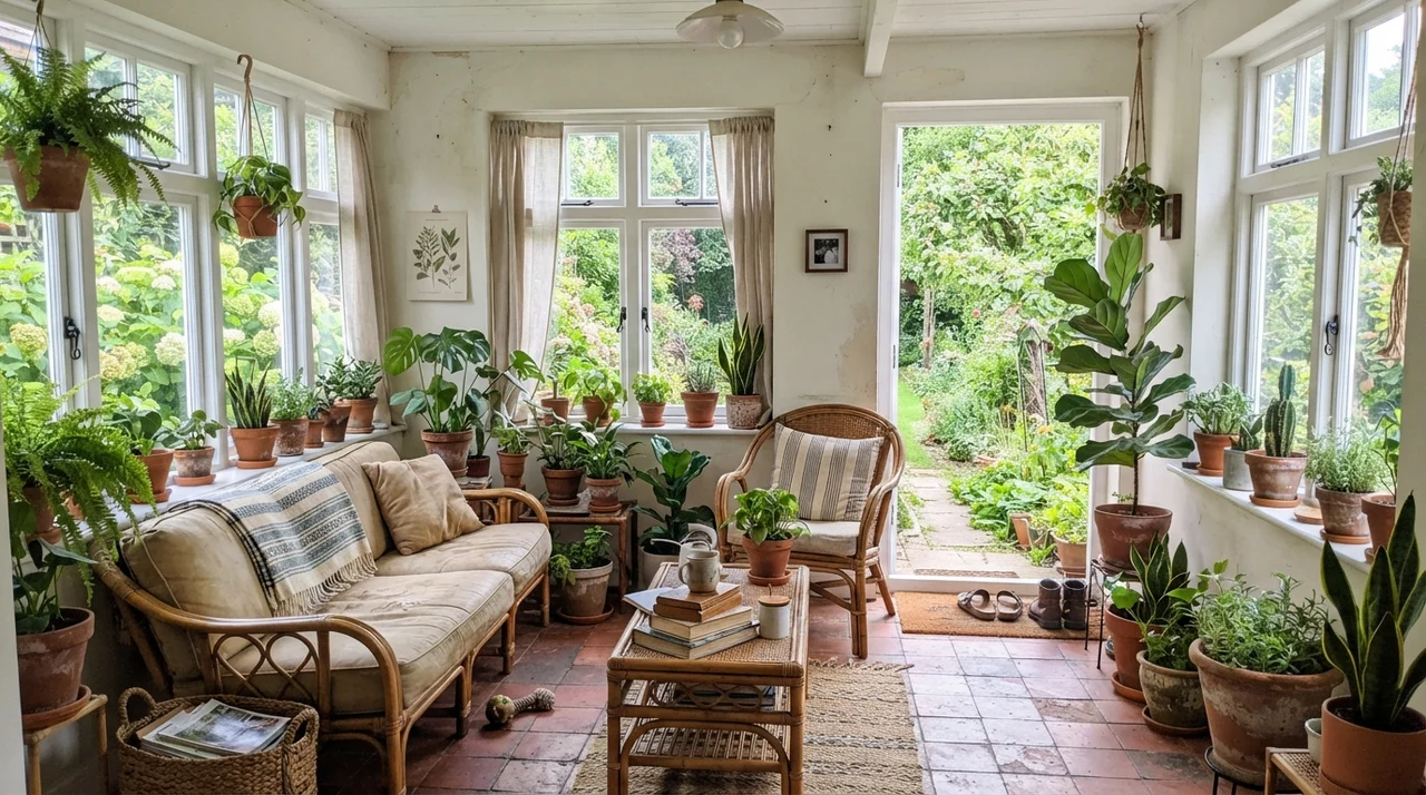
In living rooms and sunrooms where the windows run wide, Whipped Cream earns its keep. A lot of true whites in direct south sun become blinding; you find yourself squinting on a July afternoon because the light bounce off the drywall is so intense. Because Whipped Cream has that hair of softness, it tames the glare just enough to keep a large living room livable. It pairs naturally with textured jute rugs, rumpled linen upholstery, and house plants in terracotta pots. In a sunroom wrapped in glass on three sides, it holds its composure while green garden views reflect off every pane.
Kitchens, Cabinets, and Millwork
Cabinetry is where most homeowners spend the bulk of their renovation budget, and it is also where paint regrets hurt the most. Painting cabinets is not a weekend job you redo on a whim; when you prep, sand, prime, and spray a full kitchen of shaker doors, you need that color to hold up for ten years minimum. In our current ranch, the kitchen cabinets had been done in a yellow-cream in the late 1990s that looked dated within five years. Every time the morning sun hit the stove wall, the upper doors looked like old parchment.
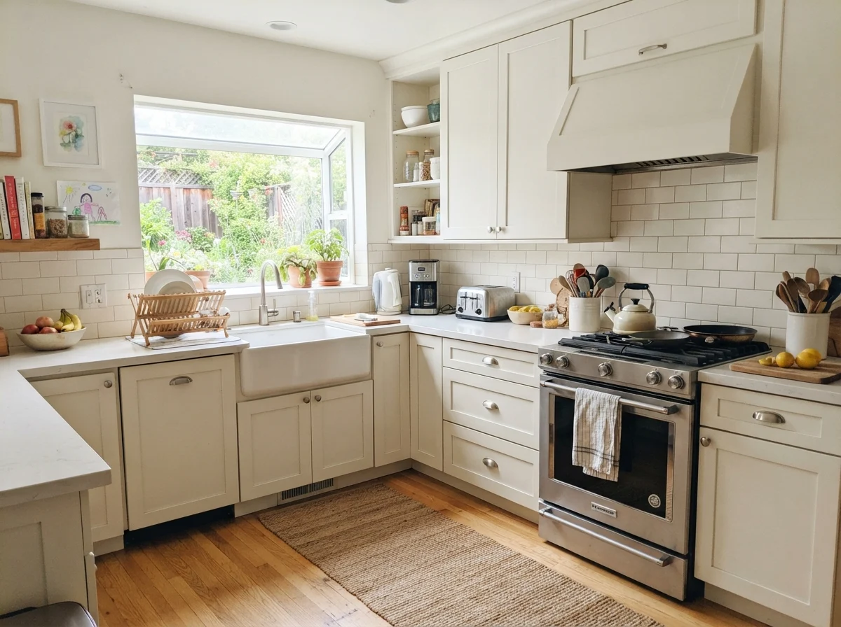
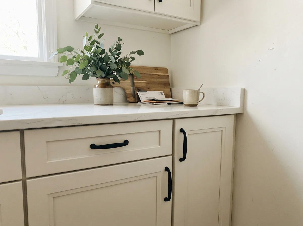
Whipped Cream on shaker cabinets is one of the cleanest looks you can achieve without switching brands to a specialty architectural paint line. Because the undertone doesn't lean distinctly cream or gray, it pairs equally well with white quartz counters, white subway tile backsplashes, and warm butcher block or light oak flooring. It gives you the look of a custom true-white kitchen without the jarring, icy punch of an un-tinted stock white.
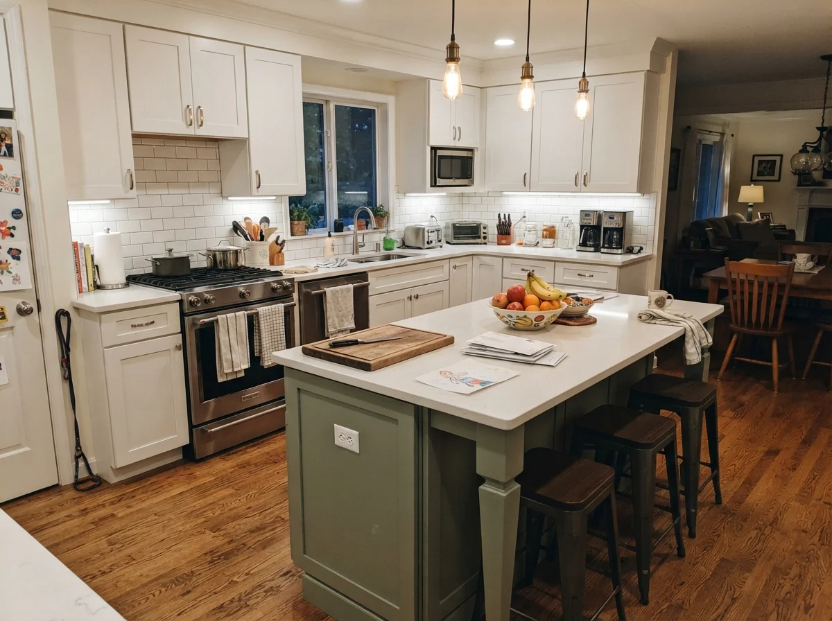
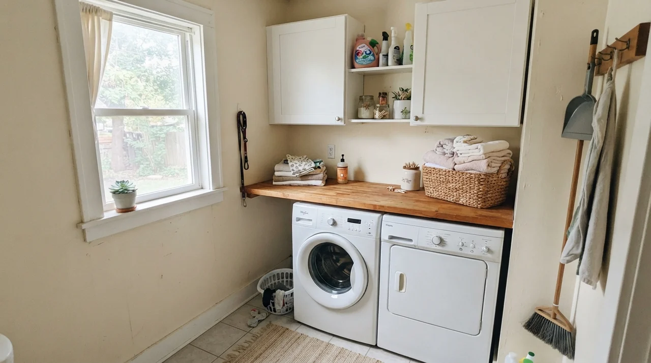
You can also use it selectively to bring focus to a single architectural element. In a family kitchen where the perimeter cabinetry is bright white and the walls lean warmer, rolling Whipped Cream onto a central island anchors the room quietly without shouting for attention. It also works beautifully in utility spaces like a bright laundry room, where upper painted walls provide a clean, fresh backdrop above a washer, dryer, and butcher-block counter.
The name promises dessert-level warmth; the can delivers an LRV 91 workhorse that quietly gets out of the way of your life.
Where Whipped Cream Runs into Trouble
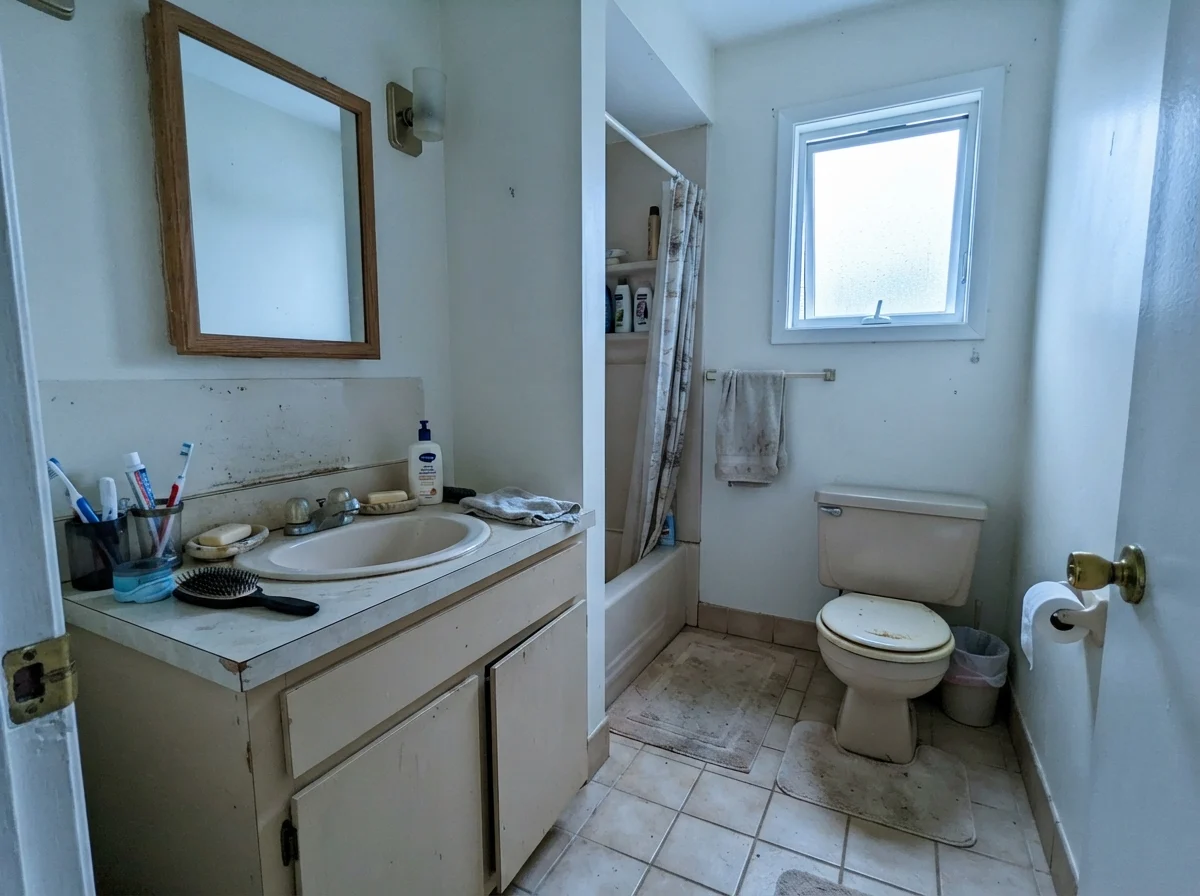
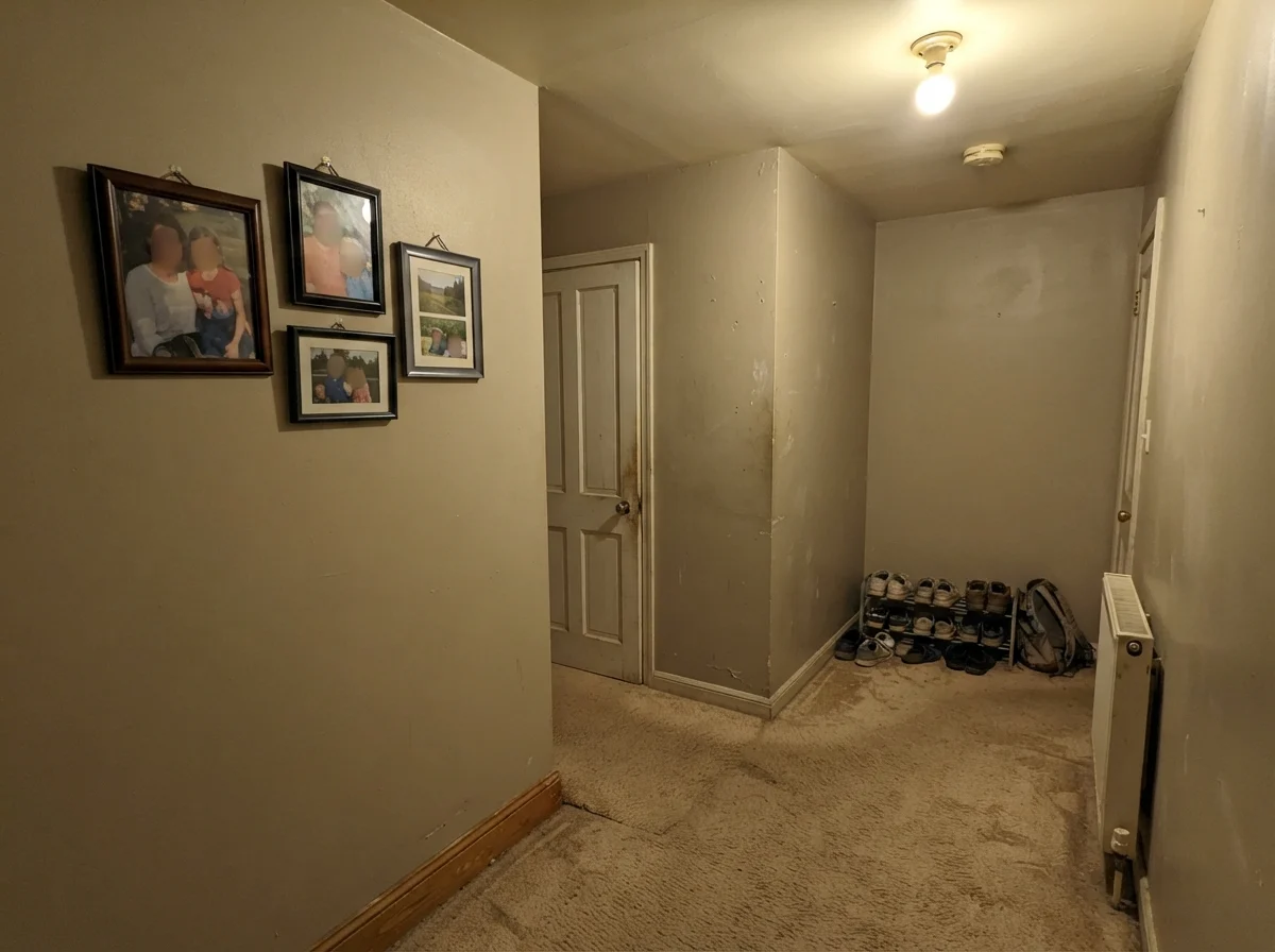
I promised you no lectures, but I will give you the plain truth: every white paint at LRV 91 has a failure mode, and Whipped Cream is not exempt. If you put this color on all four walls of a windowless hallway, a dark basement stairwell, or a north-facing room with tiny windows, it will disappoint you. With almost no tinting pigment to stand on, it requires ambient light to function. Without light, it flattens out into an unflattering, putty-like murk that feels unloved and chilly.
The second trap is the label on the lid. If you buy a gallon thinking you are getting the rich, buttery tone of whipped heavy cream, you will feel cheated the second it rolls onto the drywall. It reads as a crisp white. And third: watch what it sits next to. If you put Whipped Cream trim right next to walls painted in a deeper off-white like Behr Swiss Coffee or Polar Bear, Whipped Cream will look gray and chilly by comparison. You either have to commit to it across the trim and millwork, or pick an off-white that matches the undertone depth of your existing woodwork.
Trim, Doors, and Millwork
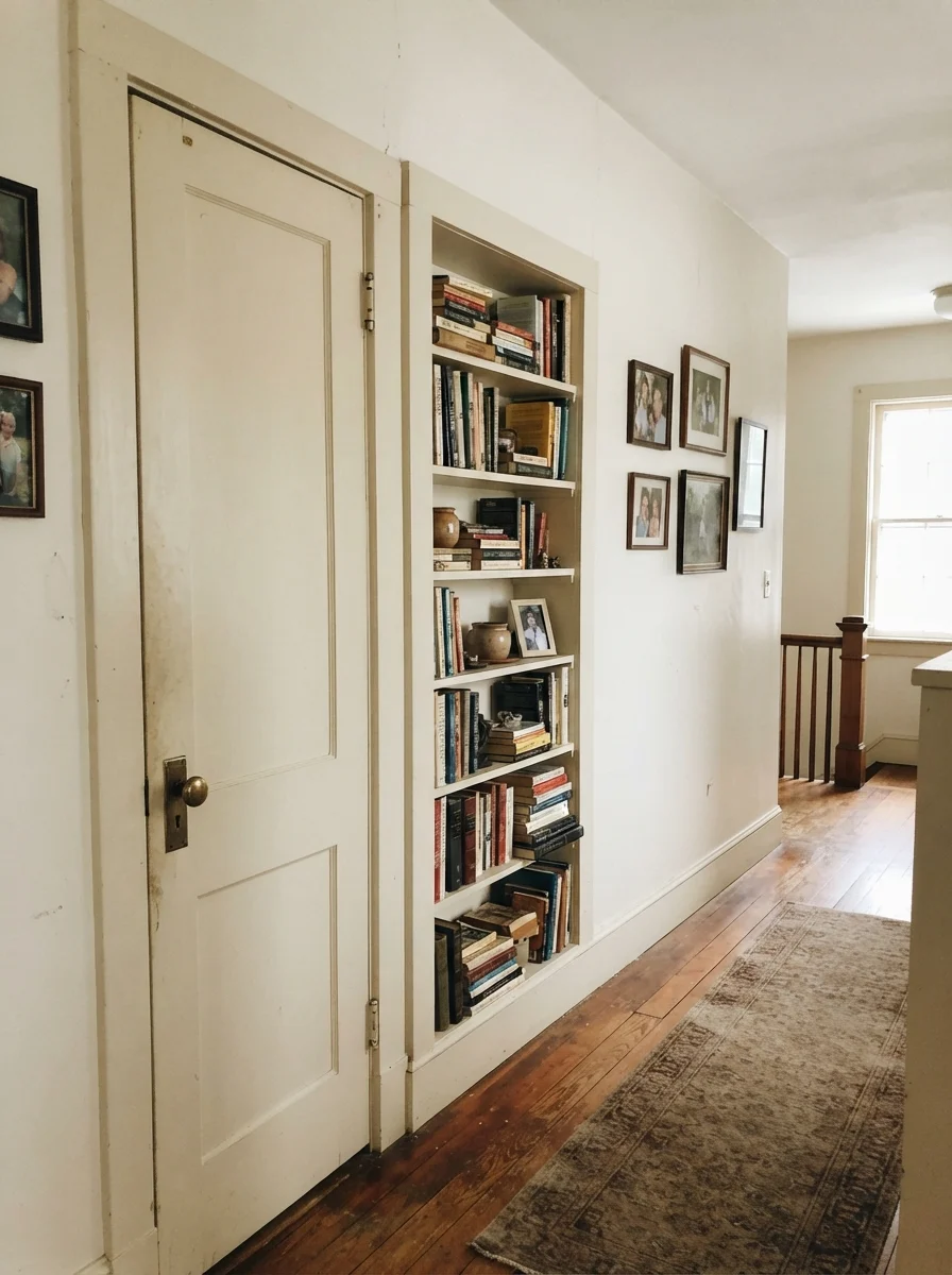
In our 1990s colonial, every interior door had been slapped with high-gloss untinted base white straight from the paint counter. It was harsh, cold, and chipped if you looked at it sideways. When we sold that house, I repainted the two-panel hallway doors and the built-in bookshelves in a quiet, tailored near-white. It softened the transitions between rooms immediately, and the buyer's agent specifically commented on how calm the hallway felt.
This is where Whipped Cream does its finest work. When you use it in semi-gloss on doors, casing, and built-ins, and pair it with a warm cream wall or a saturated neutral, it provides a crisp break without the eye-straining edge of pure titanium white. The brass doorknobs look richer, the hardwood floors look deeper, and the woodwork feels like real carpentry rather than plastic trim.
Exterior siding: A word of caution
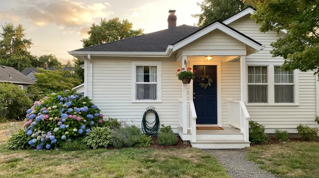
A lot of readers ask me whether a white they love inside will translate to the exterior of their home. On horizontal siding, trim, or porch columns, outdoor sun does dramatic things to high-LRV paint. In full sun, a white with an LRV of 91 will reflect almost all the light that hits it, looking significantly brighter and crisper than it does on an interior hallway swatch.
In the soft sky of late afternoon or early golden hour, Whipped Cream on horizontal siding reads clean, classic, and understated, especially paired with crisp white trim and a deep navy front door. However, there is very little documented track record for Whipped Cream used across whole house exteriors. It doesn't have the decades-long exterior pedigree of something like Behr Ultra Pure White or Sherwin-Williams Extra White. If you plan to use it outside, my advice is simple: buy a quart, paint a three-foot board, and carry it around all four sides of your house at 9 AM, 1 PM, and 6 PM before ordering ten gallons.
Living with It: Durability and Touch-Ups
Here is what happens five years in. When you have kids, dogs, groceries coming through the door, and vacuum cleaners bumping the baseboards, an LRV 91 white will show every single point of contact. That isn't a defect of Behr paint; it is simply the physics of pale walls. Dark scuffs on a pale wall stand out immediately. In our last house, our back entryway had to be scrubbed clean every three weeks with a damp microfiber cloth.
If you use Whipped Cream in high-traffic zones, your finish choice matters far more than the color swatch. Keep flat paint strictly on the ceiling. Put eggshell on the walls so you can wipe fingerprints without burnishing the sheen into an ugly shiny patch. And on cabinets, trim, and doors, spend the extra money on a high-grade satin or semi-gloss enamel that cures rock-hard. Touching up this color two years after the fact is relatively painless because the formula has so little tint in it; there aren't complex colorants that separate or fade dramatically under standard indoor lighting.
How Whipped Cream Compares to Other Whites
Before you commit to a purchase at the paint counter, it helps to know how Whipped Cream sits against the heavy hitters you have probably seen recommended on every design website. It is closest in spirit to Benjamin Moore Simply White (OC-117), which shares its exact LRV of 91. The primary difference is that Simply White has a well-known habit of flashing distinct yellow in intense southern afternoon sun. Whipped Cream holds its ground with less color drama throughout the day. If you prefer to stay in the Home Depot aisle, Whipped Cream gives you that same high-end architectural clarity without paying Benjamin Moore prices.
Compared to Behr's own Ultra Pure White (1850), Whipped Cream is one point lower in reflectivity and carries just a drop more warmth. Ultra Pure White is extraordinary on exterior trim and window sills, but on four walls in a bedroom, it can feel unforgiving and sharp. Whipped Cream gives you that tiny cushion of comfort. On the other hand, if you want a true off-white with real body that can survive a dim room, look at Behr Polar Bear (75) at LRV 86. Polar Bear has enough substance to stay cheerful in low light, whereas Whipped Cream will flatten out. And against Sherwin-Williams Extra White (SW 7006), Extra White is strictly a cool trim paint; trying to live with Extra White on living room walls is like living inside an unbaked meringue.
What sheen should I choose for Whipped Cream?
Stick to the classic homeowner rule: flat on the ceilings to hide drywall joints, eggshell on the living and bedroom walls for gentle wipeability, and semi-gloss on baseboards, door casings, and cabinetry to resist scuffing.
Why haven't I seen Whipped Cream on standard Behr fan decks?
Whipped Cream belongs to Behr's Designer Collection rather than their main numbered display deck. You will find it in the specialty brochures and kiosks at Home Depot, which is why it gets overlooked despite its exceptional balance.
Will Whipped Cream make my kitchen look yellow?
No. Despite the culinary name, it carries only a fraction of warmth. It reads as a soft, clean white. If your kitchen looks yellow with this paint, check your lightbulbs; warm incandescent lighting can tint any high-LRV white.
Can I use Whipped Cream throughout an entire open-concept floor plan?
Yes, provided the home has adequate natural daylight. It excels as a cohesive whole-house neutral because its faint undertone doesn't clash with varying furniture fabrics, flooring wood tones, or stone countertops.
Susan's Verdict · The Workhorse You Overlooked
Whipped Cream is the paint you choose when you want the clean, bright look of a modern true white without the harsh hospital glare of untinted base paint. Ignore the dessert name—it isn't custard, and it won't make your walls look yellow. In bright daylight, on kitchen shaker cabinets, or as unified trim and ceiling paint across an entire house, it does its job flawlessly and gets out of the way. Just don't ask it to rescue a dark, windowless hallway; at LRV 91, it needs real daylight to shine.