Color Diary · No. 105
Black Forest Green HC-187: When a Near-Black Refuses to Speak Up Indoors
The blackened green everyone reaches for instead of black, reviewed honestly: the light it needs to prove it's green, and where it just goes flat.

Susan HartleyOctober 31, 2026 · 21 min read
Black Forest Green · Benjamin Moore HC-187
Hex#242E2CLRV5Undertonesteal-black → charcoal → inky green
In our last house, a 1990s colonial that had more drywall than personality, I spent an entire autumn trying to convince myself that our dining room had the bone structure for a deep, theatrical dark wall. Dark colors were having a moment, though back then nobody used the word drama quite as casually as they do today. I picked up a swatch of Benjamin Moore Black Forest Green HC-187, tapped the paper square against our baseboard on a clear Saturday morning, and thought I had found the holy grail: a pitch-dark shade with an unmistakable, shadowy teal-green tail. It looked refined, old-money, and deliberately different from the stark blacks that were starting to crop up in every home magazine.
Then the sun moved past two o'clock.
By four in the afternoon, the sample square had surrendered every drop of visible green and collapsed into an impenetrable, charcoal-tinged black. By six, under our warm dining fixture, it looked like coal dust. I lived with that sample pinned to the wall for three weeks before I finally understood the fundamental truth about this paint: Black Forest Green is not a green that happens to be dark. It is a near-black that carries a green secret, and it will only tell that secret when the sun hits it right in the face. If you buy it hoping for a visible, lush everyday evergreen inside a dim house, you will spend your evenings wondering why you paid specialty paint prices for what looks like soot.
Over thirty years and three houses—from our first 1970s split-level to our current 1960s ranch—I have watched plenty of homeowners fall into this exact trap. You fall in love with the swatch in the paint aisle where fluorescent tubes blast three thousand lumens directly down onto the card, or you see a sun-drenched exterior shutter in a magazine and assume the shade will behave the exact same way across the four drywall corners of your north-facing powder room. It simply will not. At a Light Reflectance Value of 5, Black Forest Green sits at the very bottom edge of the scale. It absorbs ninety-five percent of the visible light that strikes it. If your room does not supply an avalanche of natural daylight to bounce off that surface, the green undertone stays locked inside the pigment, completely invisible to the human eye.
Understanding the Undercurrent: Where the Teal Hides
When you look closely at the color deck, Benjamin Moore files Black Forest Green under its teal family rather than its traditional forest or olive greens. That single classification explains almost everything about how this shade acts under natural and artificial bulbs. Many historic dark greens lean toward yellow or brown—think of traditional carriage house greens or old library felt, which carry a heavy olive undertone that warms up when the sun goes down. Black Forest Green does the polar opposite. Its undertone leans crisp, cool, and distinctly blue-teal.
What does that mean when you put it on a wall? In direct morning or midday sun, that teal undertone steps forward with breathtaking clarity. It gives the surface an aristocratic, tailored richness that a pure carbon black like Tricorn Black could never duplicate. But the moment the direct sun departs, that cool blue-teal base ceases to read as warmth. Instead of shifting toward cozy pine, it cools down rapidly, sliding straight into inky blue-black or flat charcoal.
The 24-Hour Cycle: How Daylight and Lamps Change the Tone
Before you ever dip a roller into a can of Black Forest Green, you need to understand that this color does not keep a static identity throughout the day. It is an active chameleon that trades entirely on your home's orientation. In our current 1960s ranch, I have learned to respect the clock above all else when evaluating dark paints. A color that greets you with crisp personality over your morning coffee can easily turn into an ominous black monolith before you finish clearing dinner dishes.
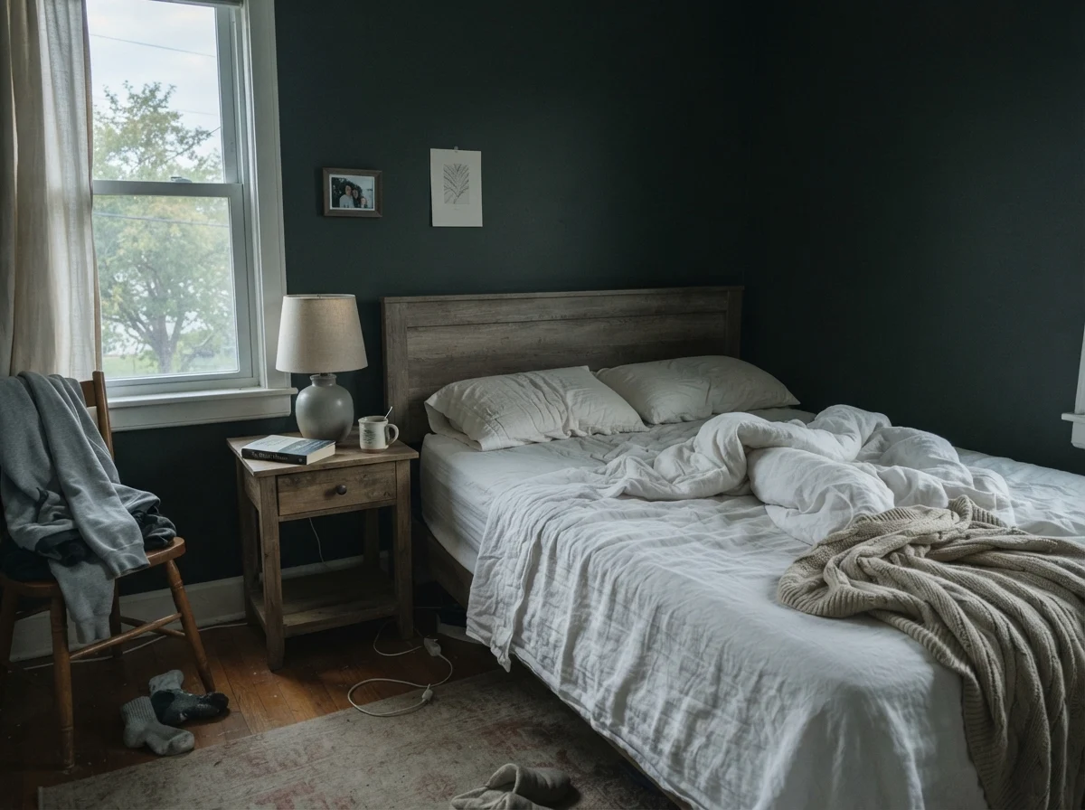
In cool, early morning light—especially in east-facing or north-facing spaces—Black Forest Green appears quiet, muted, and occasionally somewhat washed out. Without the high-noon sun hitting the pigments head-on, the teal undertone retreats into the background, leaving behind a sleepy, deep slate cast. It does not glow, nor does it shout. It waits.
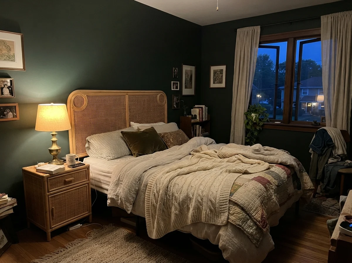
When evening arrives, the bulbs you screw into your bedside lamps and sconces will make or break your relationship with this color. If you run warm 2700K incandescent or warm-white LED bulbs, the yellow-amber warmth in the artificial light fights gently against the cool teal undertone, keeping a sliver of organic green alive after dark. It produces an intimate, cocoon-like atmosphere that makes leather headboards, wool blankets, and aged brass fittings look remarkably handsome.
However, if you make the mistake of using cool-white bulbs—anything from 3500K to 5000K daylight LEDs—the result is an absolute disaster for anyone expecting green. Those blue-heavy wavelengths instantly neutralize the yellow-green components of the paint, exaggerating the blue base until the wall resembles a harsh navy-black chalkboard. If you paint a room with this shade and find yourself grumbling that it looks like black asphalt at night, check the Kelvin rating stamped on your bulbs before you blame Benjamin Moore.
Black Forest Green does not compromise with bad lighting. Give it real sun and it rewards you with deep, tailored green; starve it of light and it simply shuts down into ordinary black.
The High-Stakes Exterior: Front Doors and Siding
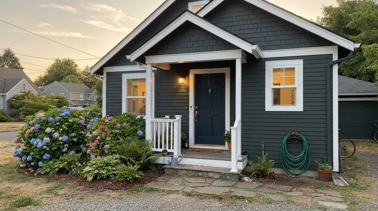
If you ask me where Black Forest Green performs with absolute, unshakeable perfection, the answer is always out on the porch. Outdoors, the sheer volume of daylight solves the color's biggest vulnerability. An exterior front door painted in Black Forest Green semi-gloss is, quite frankly, a masterclass in classic curb appeal. Against red brick, crisp white siding, or warm fieldstone, it presents as an expensive, customized near-black that softens into rich deep forest whenever the sun hits the threshold.
Because the sun outdoors delivers tens of thousands of lumens, the green pigment never gets smothered the way it can in a dim hallway. Even when applied across broader horizontal siding on a classic home, it stays legible. The only detail you must anticipate is that the north side of the house will look substantially blacker than the south-facing facade. That is not a failure of the paint; it is simply physics doing what physics does to an LRV 5 coating.
Hallways and Architectural Trim: The Power of Contrast
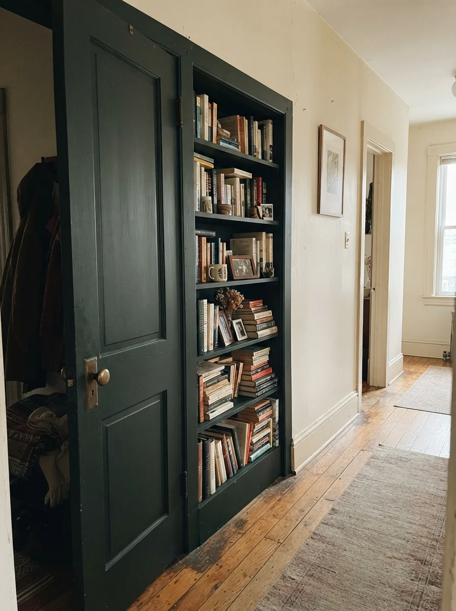
In interior applications where you want the dramatic punch of near-black without swallowing an entire living space, using Black Forest Green on millwork, interior doors, and built-ins is one of the smartest design maneuvers available. When we sold our colonial, the buyer specifically mentioned how grounding the dark doors felt against the pale hallway walls. Painting a passage door or a sturdy set of hallway bookshelves in this shade gives an older home immediate architectural gravitas.
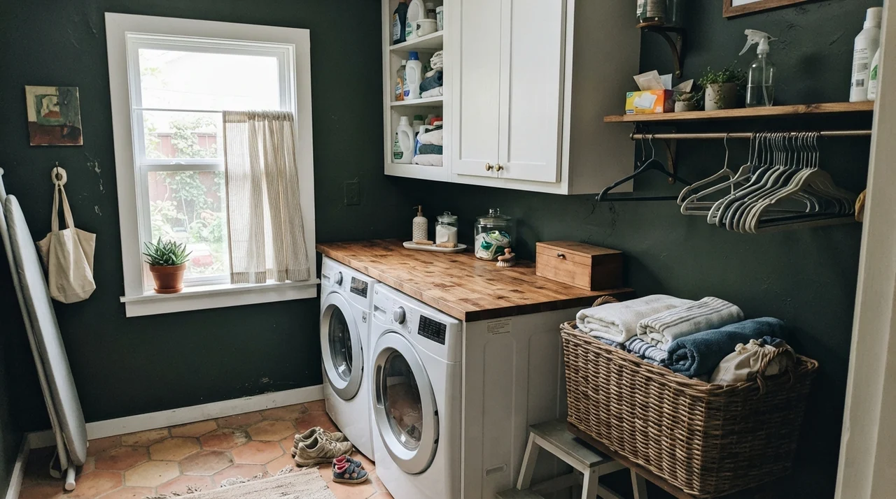
The secret is surrounding it with pale, creamy surfaces. When paired with off-white or soft cream walls, Black Forest Green creates a crisp graphic boundary that highlights brass doorknobs and polished hardware without feeling oppressive. Even in a laundry room with a single decent window, carrying the dark shade onto the walls above white appliances and warm butcher block turns what could be a sterile chore closet into an intentional, tailored utility space.
Cabinets and Islands: Kitchens Done Right
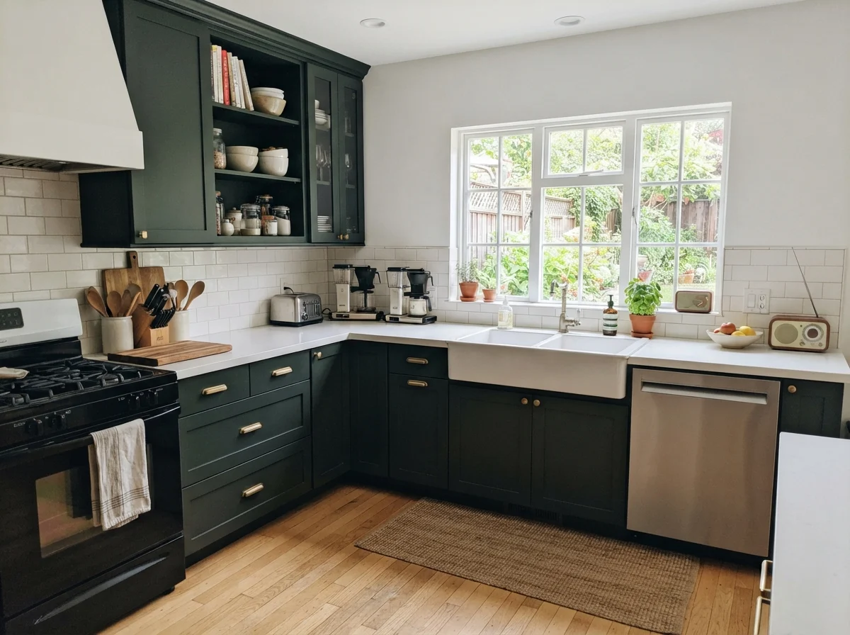
Over thirty years of renovating kitchens, I have seen cabinet trends swing wildly—from the honey oak of our first 1970s split-level to the all-white shaker craze of the 2010s. Right now, everyone wants a dark statement island or a moodier kitchen, but true black can feel unforgivingly cold in a room built around food and morning conversation. This is where Black Forest Green excels, provided your kitchen has genuine window light.
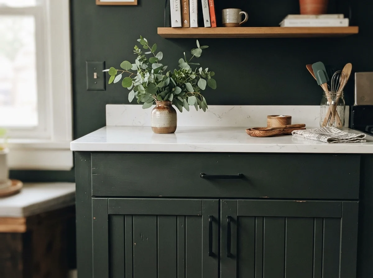
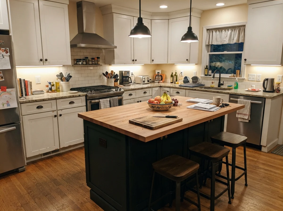
On a kitchen island surrounded by clean white perimeter cabinetry and pale marble or quartz counters, this shade acts like a tailored wool suit. In bright morning daylight pouring across the island from a garden window, the dark cabinetry reveals its teal undertone, echoing herbs on the counter or greenery outside the window. At night, it anchors the center of the room with quiet, steady presence. On a full run of upper and lower cabinetry, it demands satin urethane enamel to resist finger grease and scrub marks, and it requires crisp, warm white stone to prevent the workspace from turning into a dark tunnel.
Bathrooms: Wainscoting, Subway Tile, and Diffuse Daybreak
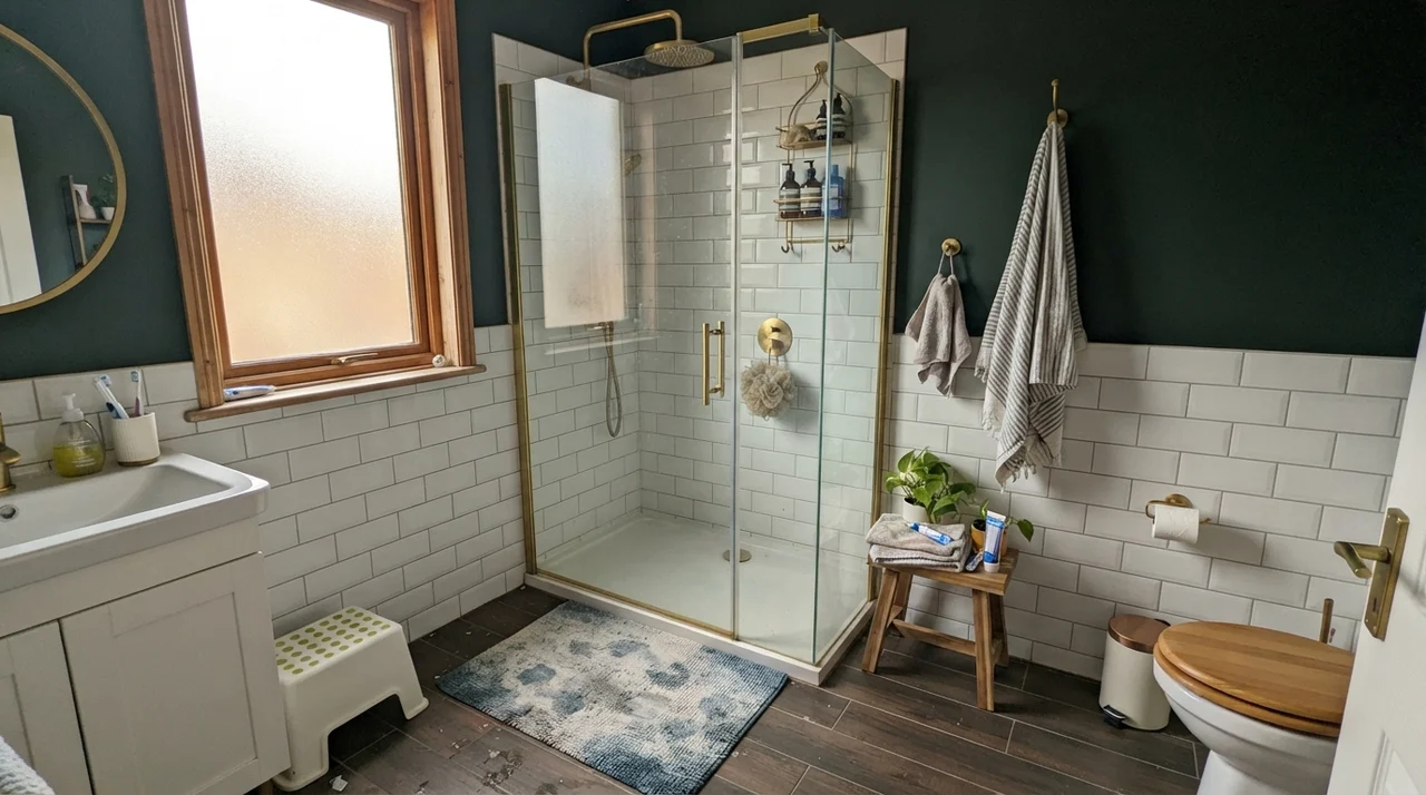
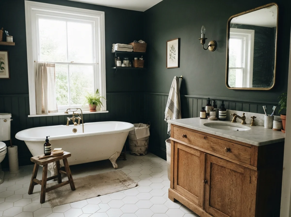
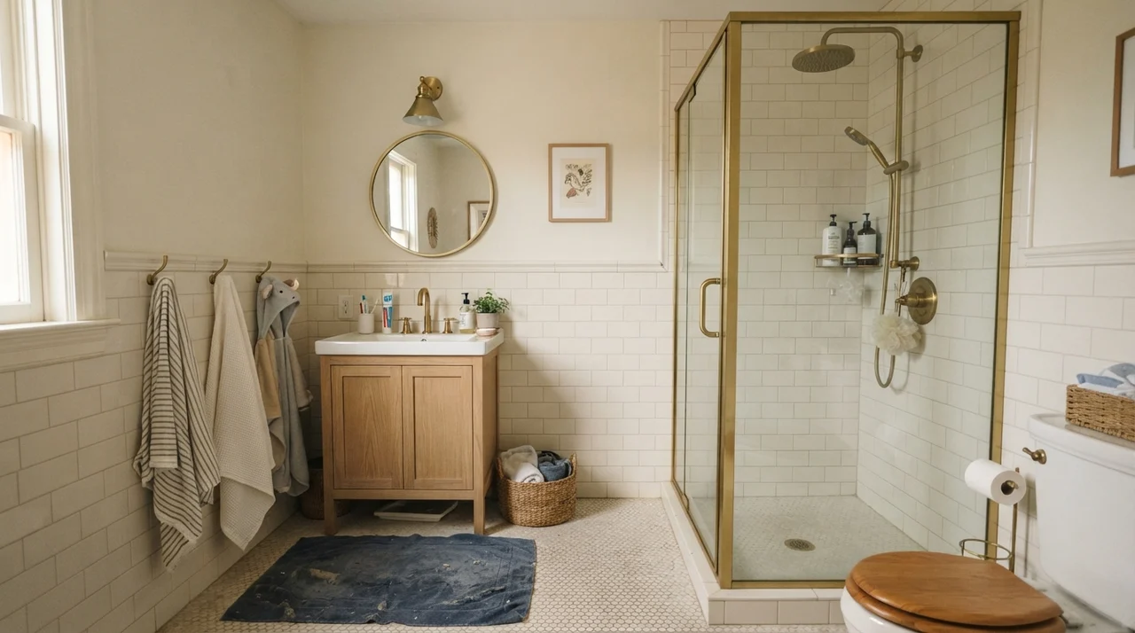
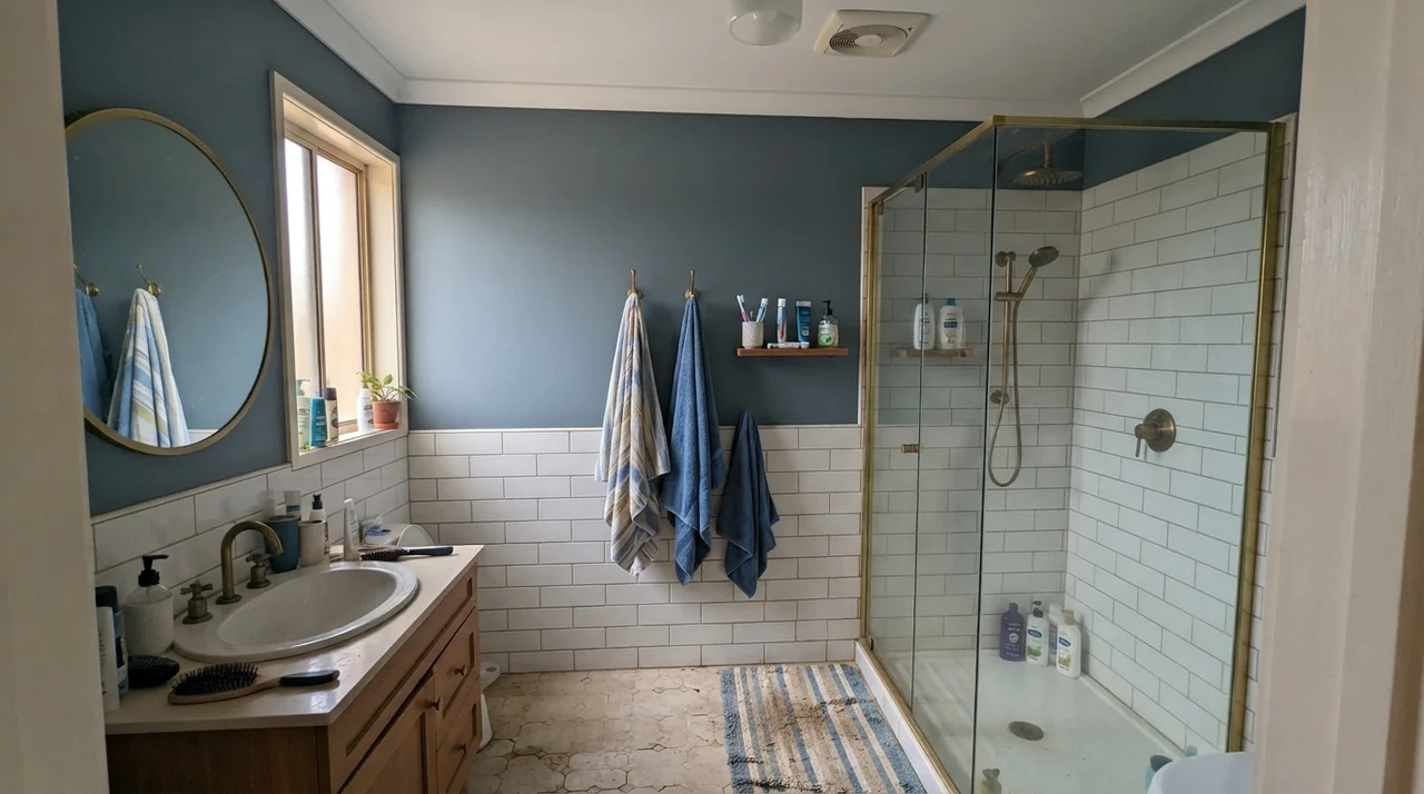
Bathrooms are inherently tricky spaces for dark paint because they are small, utilitarian, and frequently short on daylight. If you paint a five-by-eight powder room from baseboard to ceiling in Black Forest Green, it will feel like entering an elevator shaft. But if you break up the vertical plane with white subway tile wainscoting or a bright white hex tile floor, the balance shifts completely.
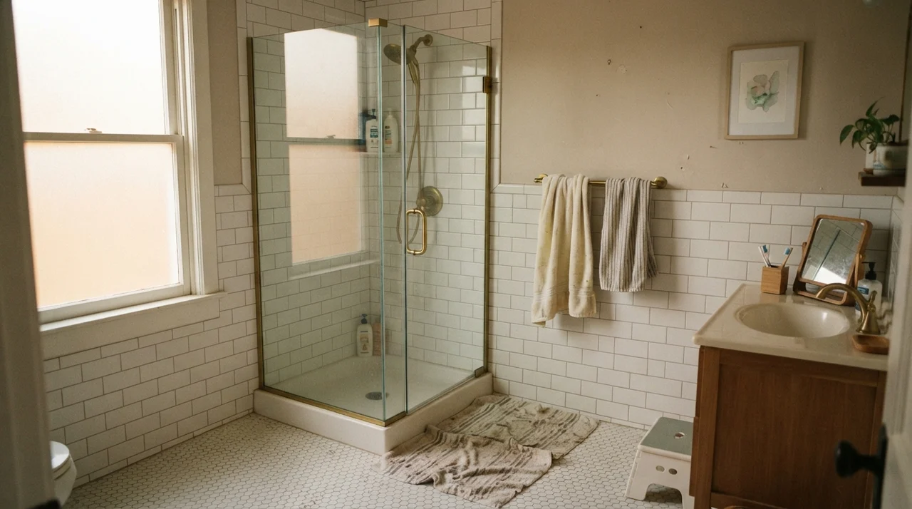
In a family bathroom where daylight streams in from a side window, running this deep shade on the drywall above a crisp white tile chair rail gives the space structure and polish. The white porcelain and reflective glass shower doors bounce daylight back onto the painted drywall, allowing the teal undercurrent to surface without dragging down the room's energy. Add an oak vanity or a clawfoot tub, and you create an environment that feels rooted, historic, and thoroughly timeless.
When Bathroom Windows Betray the Pigment
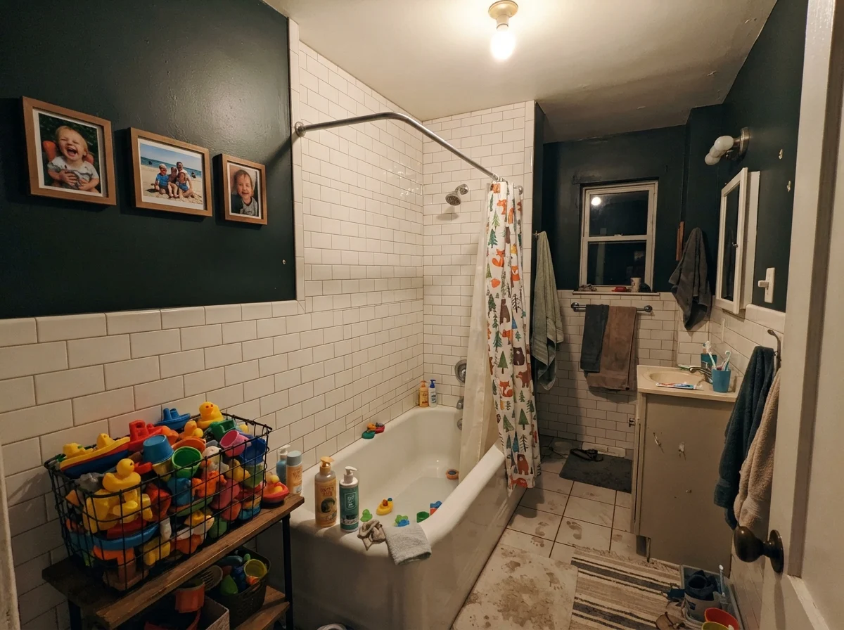
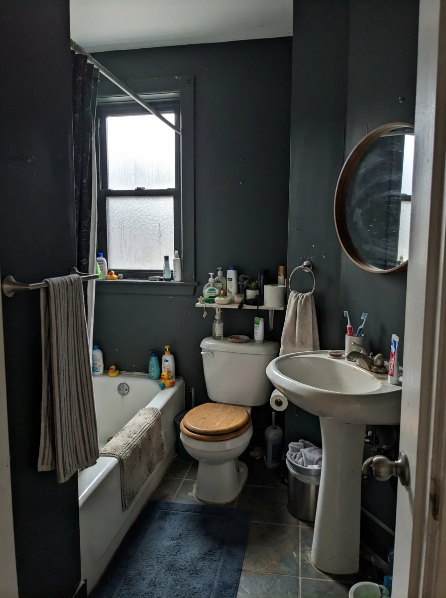
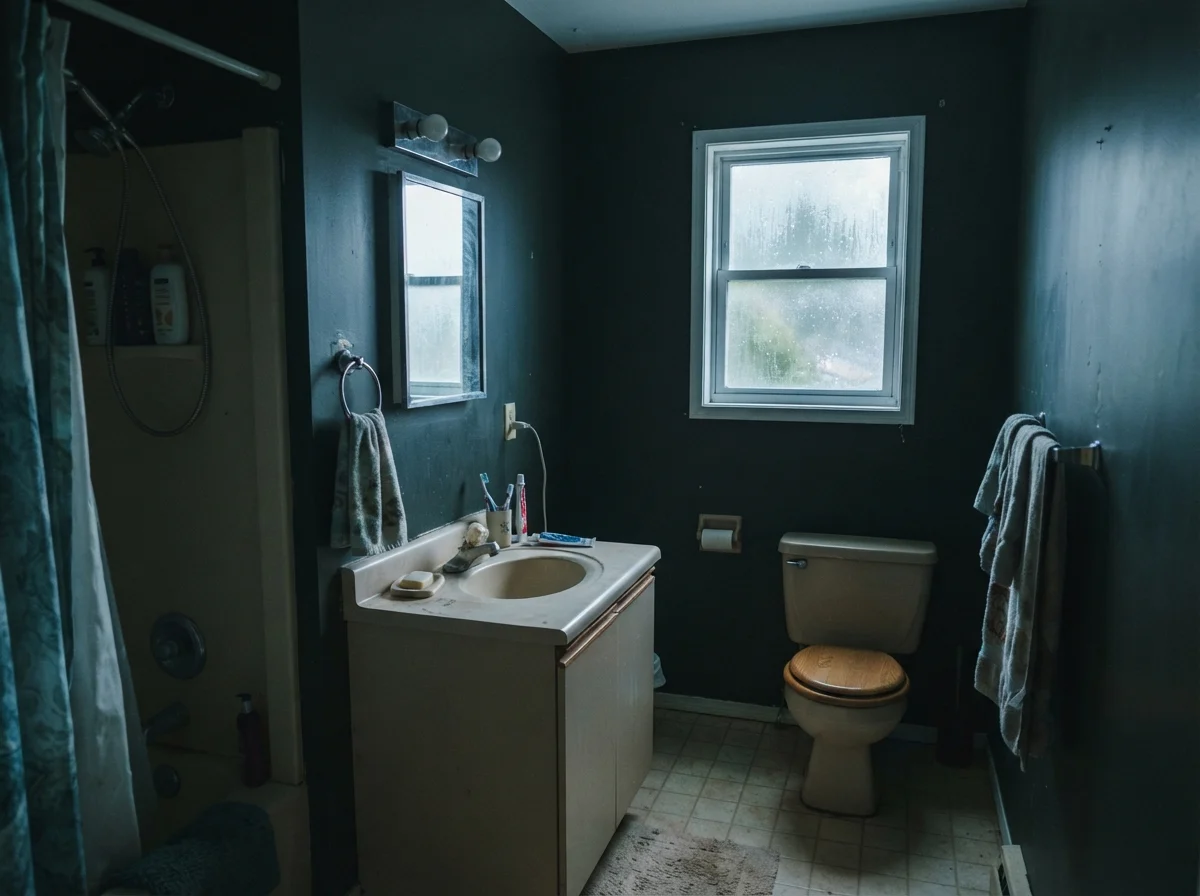
While bright side windows bring out the charm of this near-black, bathrooms with poor lighting will show you its harshest edges. You must be prepared for what happens when the sky clouds over or when your only window faces north into the damp woods. Under flat, overcast daylight through frosted privacy glass, Black Forest Green loses its crisp distinction and reads as a muted, heavy gray-slate. The green disappears entirely, leaving behind a brooding backdrop that makes ordinary white fixtures look stark and uninviting.
Even worse is a modest, dated bath with a north-facing window on a rainy day. Without direct sunlight to excite the pigments, the paint picks up a frigid, clinical blue-gray cast that can clash uncomfortably with older beige fixtures or standard laminate vanities. In our first house, we had an uninsulated half-bath with a tiny north window; trying to force a dark, light-hungry color into that room was one of the earliest paint lessons I learned. When natural light is weak and cold, dark colors do not make a room cozy—they simply make it gloomy.
Bedrooms and Enclosed Spaces: Cozy Retreat or Enclosed Cave?
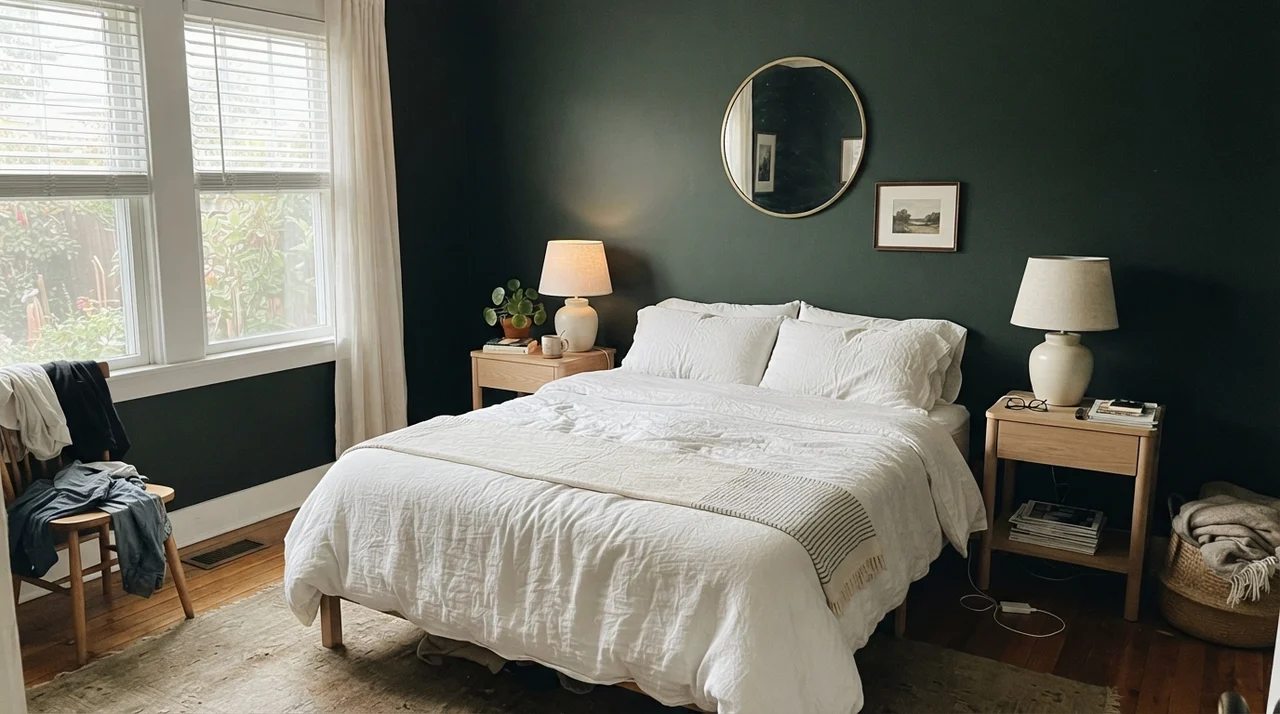
The impulse to paint a bedroom in an ink-dark shade is understandable. We want our sleeping quarters to feel quiet, protected, and restorative. In a serene primary bedroom that enjoys generous daylight through tall side windows, Black Forest Green creates a stunning envelope when balanced against pale oak nightstands, crisp linen bedding, and soft ceramic lamps. The dark walls recede, making the bed feel like a calm island of comfort.
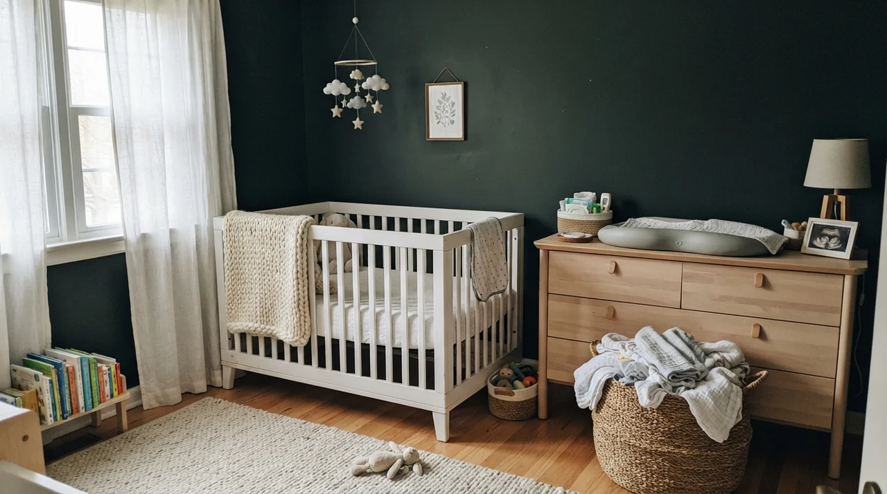
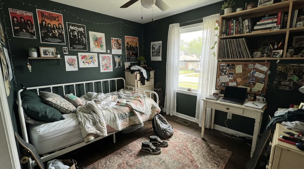
Even in a nursery or a teenager's room, the color can succeed, provided you intentionally counterbalance the visual weight. In a nursery with generous sheer curtains, a pale crib, and natural wood, the dark backdrop makes white textiles and framed prints pop with striking clarity. In a teen's bedroom with an open white metal bed frame, open shelving, and bright natural light, the walls offer a mature, tailored background that won't look dated within two years. But the non-negotiable rule remains unchanged: the room must have ample natural daylight to support an LRV 5 foundation.
Living Rooms and Sunrooms: Where Real Sunlight Pours In
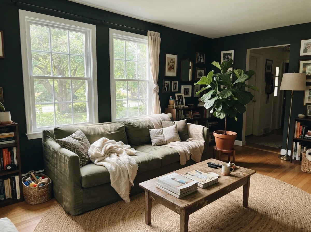
In our current home, our main living room has two large south-facing windows that dump bright light onto the hardwood floors from eleven until four. That is the kind of room Black Forest Green was made for. Against a natural linen sofa, a textured jute rug, and warm wood coffee tables, the shade provides unmatched depth. Because the daylight is generous and sustained, the paint reads as a sophisticated deep moss-teal rather than an anonymous dark void.
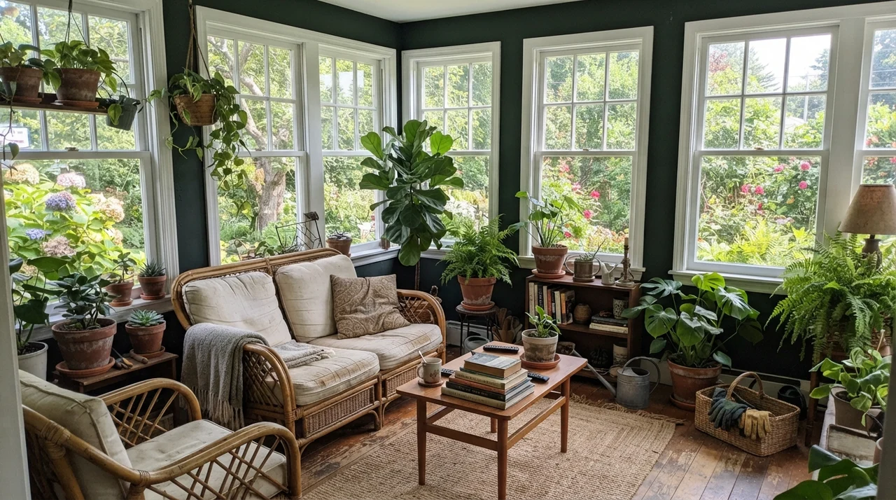
The ultimate test of Black Forest Green is a sunroom lined with white-framed windows. Surrounded by bright garden light from all directions, the color does something truly magical. The high light exposure forces every bit of green pigment to the surface, creating an organic link between indoor potted plants, terracotta pots, and the greenery visible right outside the panes. When sunlight wraps around this paint, you finally witness the color that Benjamin Moore's color lab intended to formulate.
The Honest Failure: Where This Color Absolutely Falls Apart
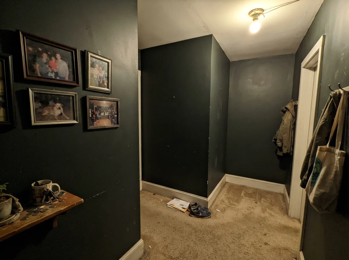
Now let's talk about the mistake that generates ninety percent of the buyer's remorse with this paint. Every single week, someone buys a gallon of Black Forest Green, paints a windowless interior hallway, a cramped powder room, or a basement staircase, and then emails me asking why their walls look like a muddy, depressing asphalt pit. The answer is painfully simple: LRV 5 cannot manufacture light out of thin air.
When you put this shade into an enclosed, windowless hallway lit by a lone builder-grade ceiling fixture, the physics of light work ruthlessly against you. Without daylight to activate the teal pigments, the coating does not read as green, does not read as charcoal, and does not read as custom. It collapses into a flat, muddy, putty-like near-black that makes walls feel like they are pressing inward on your shoulders. If your hallway lacks a generous window, save your money and paint it a bright neutral, or commit to a true black on purpose and skip the guessing entirely.
Trim Pairings: Choosing the Right Framing
With an LRV 5 shade on the walls, your trim choice is not a decorative afterthought—it is the structural frame that dictates whether the room looks intentional or sloppily assembled. If the trim is too yellow or dingy, the crisp teal undertone in Black Forest Green will make your trim look like it has thirty years of nicotine buildup. If the trim is too stark, the room can end up feeling like an optical illusion.
Over my thirty years of painting rooms, I have found that balancing near-black requires thoughtful contrast. You want whites that provide clean definition without shouting, or soft warm neutrals that acknowledge the organic root of the green.
Furnishings, Finishes, and Architectural Compatibility
A color this assertive will not play nicely with every piece of furniture in your garage. Because Black Forest Green sits on a cool, blackened teal foundation, it desperately craves warmth from surrounding materials. Unlacquered brass, aged bronze, cognac leather, and warm woods like oak, walnut, and cherry bring out its best qualities by supplying the visual warmth that the paint itself holds back.
Conversely, cool chrome finishes, gray carpeting, and synthetic ash furniture will compound the shade's chilly undertone, turning your space cold and unwelcoming. Architecturally, it thrives on traditional brick colonials, historic Tudors, cottages, and mid-century ranches with generous glass. It is far less successful in enclosed, drywall-heavy split-levels where natural light is rationed through small basement-level casement windows.
Durability, Sheens, and Living with It Long-Term
Here is what the slick interior design photos will never show you: dark paints are notoriously demanding to live with day in and day out. In thirty years of raising kids, hosting holiday gatherings, and wiping down baseboards, I have scrubbed clean every variety of wall surface known to humanity. At LRV 5, every speck of airborne dust, dry-skin transfer, pet fur, and scuff mark shows up like powdered sugar on a cast-iron skillet.
If you paint your walls in a standard flat or matte finish, the surface will feel luxurious and velvet-soft on day one. But the moment you grab a damp cloth to scrub a smudge near the light switch, you will burnish the paint, leaving a shiny, permanent buff mark that catches the afternoon glare. For living spaces, bedrooms, and home offices, stick firmly to eggshell or an ultra-durable scrubbable matte. For interior doors, trim, and exterior front doors, use semi-gloss; the higher sheen deflects scuffs, wipes clean without hazing, and gives the dark pigment an extra layer of dimensional depth that catches directional light.
For kitchen cabinets or bath vanities, never use standard wall paint. You need a dedicated satin enamel fortified with urethane. Cabinets endure greasy fingertips, dropped silverware, and daily dish splashes; satin cabinet enamels dry into a hard, non-porous shell that can be scrubbed clean without wearing down the color to the primer. Yes, professional cabinet enamel is not cheap, but repainting chipping cabinetry two years in is far more expensive—both for your wallet and your sanity.
Is Black Forest Green actually green, or is it just black?
It is a near-black with an LRV of 5 that contains cool teal-green pigments. Under direct sunlight or strong daylight, the green is clearly visible. In dim rooms, north-facing light, or at night under cool bulbs, it reads as ordinary charcoal or black.
What light bulbs should I use in a room painted Black Forest Green?
Stick strictly to warm 2700K incandescent or warm-white LED bulbs. The amber-yellow warmth helps keep the green pigment alive after dark. Cool-white or 5000K daylight LEDs will strip the green out completely, turning the paint into a cold inky blue-black.
Can I paint all four walls of a small room in Black Forest Green?
Generally, no. Starved of light in a small, enclosed space, LRV 5 creates a cave-like box where light cannot bounce. It is far better used as an accent wall, on an interior door, on a kitchen island, or above white wainscoting in spaces with generous windows.
What sheen works best for Black Forest Green on interior walls?
Matte or eggshell. Flat paint looks beautiful initially but burnishes into shiny marks if you scrub clean a smudge. Semi-gloss is ideal for doors, shutters, and exterior trim, while satin urethane enamel is necessary for cabinetry.
Will Black Forest Green hurt our home resale value?
When we sold our homes, strategic dark accents like front doors, shutters, and kitchen islands helped buyers perceive the house as custom and high-end. However, four dark walls in a small, windowless bedroom can turn off buyers by making the space feel cramped.
Susan's Verdict · Worth the Money with Direct Sun
Benjamin Moore Black Forest Green HC-187 is an outstanding, tailored near-black that delivers unmatched elegance—provided you give it the direct sunlight it demands. On a sunlit front door, exterior shutters, kitchen cabinetry by a bright window, or balanced above crisp white tile wainscoting, it outshines ordinary black every single day of the week. But if you try to put it on four walls of an unlit hallway or a dim powder room, do not expect it to perform miracles: it will collapse into plain black soot. Buy it for the direct sun, swap your lamps to warm 2700K bulbs, and let the green show itself on its own terms.