Color Diary · No. 102
Smoky Blue SW 7604: The Misfiled Gray That Thinks It's Navy
A deep, grayed-down blue-gray that Sherwin-Williams quietly files under Neutral — reviewed honestly: the light where it turns unmistakably blue, the light where it disappears, and the jobs where it actually earns its keep.

Susan HartleyOctober 29, 2026 · 17 min read
Smoky Blue · Sherwin-Williams SW 7604
Hex#596E79LRV15Undertonesgrayed neutral → slate blue → deep charcoal-blue
When we bought our second house—a 1990s colonial with enough honey oak trim to frame a football field—I made a promise to myself. I promised I would never fall for paint chips that lie on the display rack. Yet the first time I pulled the card for Sherwin-Williams Smoky Blue (SW 7604), I almost laughed out loud in the aisle. Sherwin-Williams had tucked it right into their "Neutral" family. Not blue. Not navy. Neutral.
On that tiny little two-inch chip under fluorescent store tubes, you can almost forgive them for the categorization. It looks like a polite, soot-softened slate gray that took a brief vacation near the ocean. But the moment you roll that first stroke across drywall in real daylight, the disguise vanishes completely. This is not an agreeable charcoal. It is a genuine, moody, deep blue-gray that refuses to pretend to be an off-white or a mild shadow.
We have lived with it in two rooms across our last two homes, and I have watched friends put it on everything from front doors to kitchen islands. Over thirty years and three houses, you learn that colors with an identity crisis can either be your smartest design move or an absolute maintenance headache. Smoky Blue sits right in that tension: an LRV 15 heavyweight that behaves like an anchor when treated properly, and turns into a muddy charcoal cave when starved for sun.
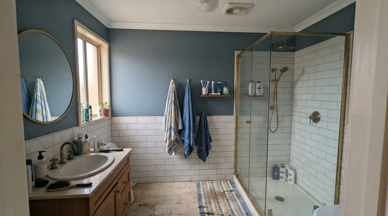
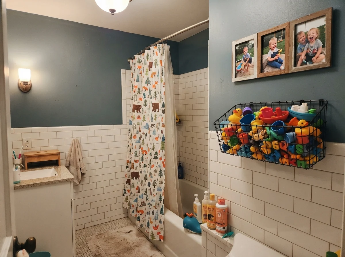
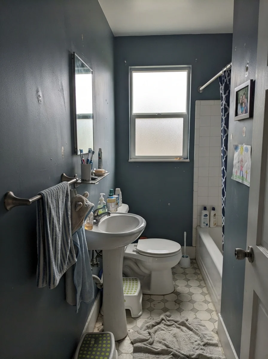
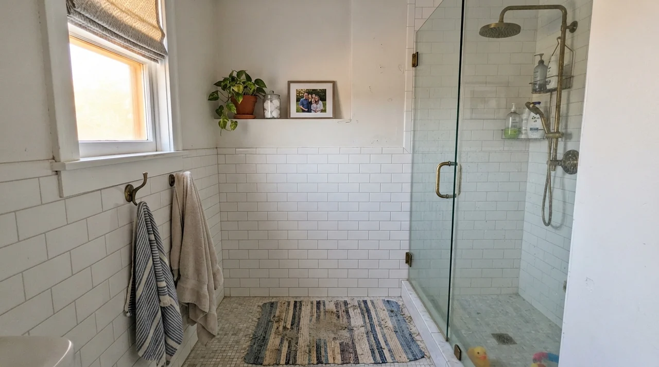
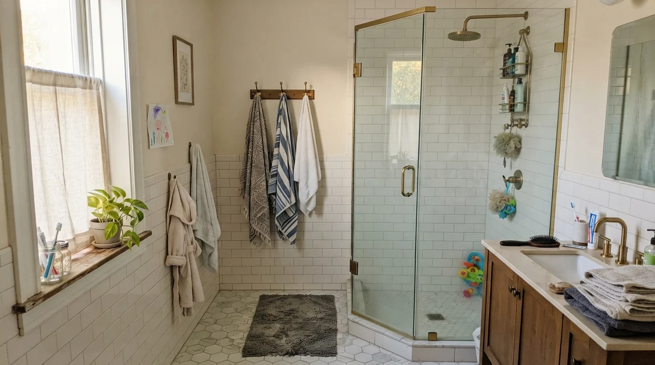
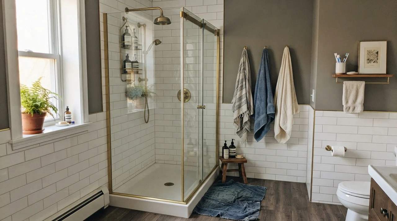
In our last house, I tested Smoky Blue on the upper half of a family bath that had white subway tile running four feet up the wall. That bathroom had one generous side window facing southwest. In that space, Smoky Blue earned its keep from the very first afternoon. The contrast against the white ceramic and brushed brass hardware kept the dark wall from feeling heavy. It felt intentional, classic, and grounded.
The trouble starts when homeowners expect it to perform like the word printed on the fan deck: "neutral." When you buy a true neutral gray, you expect it to step backward and let your rugs, sofa, and art do the talking. Smoky Blue does not step backward. At an LRV of 15, it absorbs eighty-five percent of the daylight falling on it. If you surround it with cool, shadowed corners, it grays down until it looks like weathered slate. But the moment warm southern light cuts across it, the blue wakes up with full throat.
Watching the Daylight Move: Morning Washout to Evening Glow
Before you commit five gallons to a bedroom or living area, you need to understand how drastically this color alters its character over a twelve-hour cycle. In cool morning light—especially if your windows face east or north—Smoky Blue can feel surprisingly washed out. Without the direct warmth of the sun, that LRV 15 depth doesn't look cozy; it looks almost pale and chalky, like an old denim jacket left outside on a chilly morning.
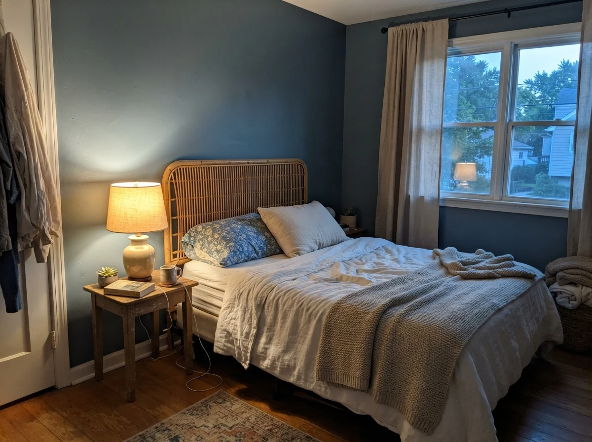
Then the sun swings around. By two o'clock in a south- or west-facing room, the blue warms up and feels velvety. Come twilight, when you switch off the overhead fixtures and flick on a single low table lamp, the color settles into its best self. It stops shouting and turns cocoon-like, muting the blue in favor of a quiet, restful charcoal-slate.
Where Smoky Blue Shines: Kitchens and Cabinetry
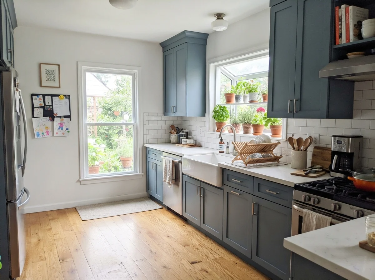
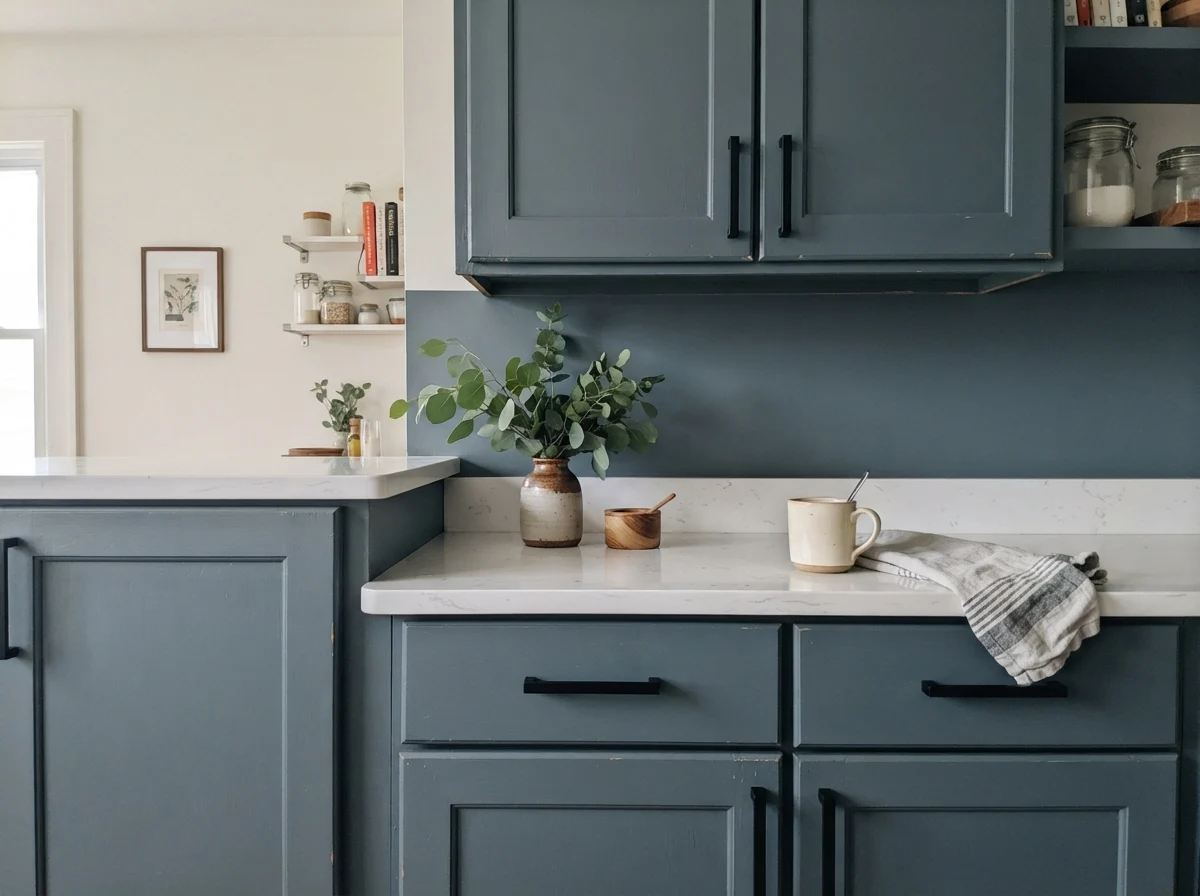
If you ask me where this paint is unconditionally worth the money, my answer is immediate: kitchen woodwork. In our 1960s ranch, I have watched friends spend a small fortune tearing out sound wood cabinets when a quart of good primer and a couple of quarts of deep color would have bought them ten more years of happy cooking.
Smoky Blue is arguably one of the most reliable cabinet shades in the entire Sherwin-Williams collection. Pure navies can often feel severe or nautical, demanding brass nautical pulls and perfectly stark white counters to keep from feeling like a captain's quarters. Smoky Blue, because of that generous dose of gray, settles down beautifully. It looks like bespoke architectural joinery.
When painting cabinets, sheen is everything. On drywall, I am an eggshell devotee—anything flatter marks the second a shoulder brushes past, and anything glossier highlights every taped drywall seam your builder left behind. But on woodwork, you want semi-gloss. A quality semi-gloss finish gives Smoky Blue enough sheen to bounce task lighting across the counter, preventing the color from turning into a visual black hole beneath upper cabinet shadows.
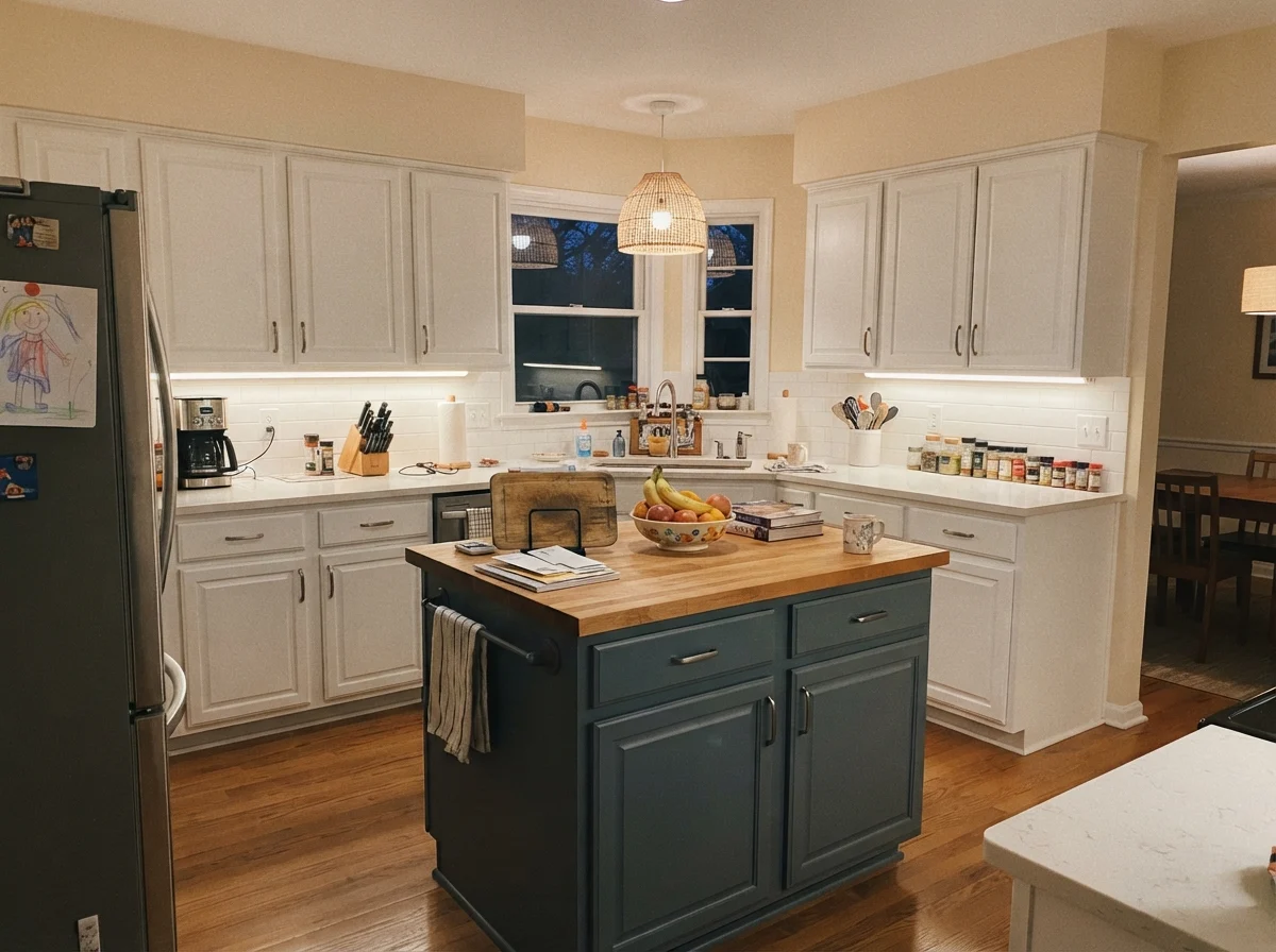
If painting every door and drawer front feels like too much of a leap, using it strictly on an island is a proven compromise. It anchors the center of an open kitchen without plunging the whole cooking zone into darkness.
Bathrooms and Water: Pairing with Tile and Metal
Bathrooms are high-humidity, high-traffic spaces that push dark paints to their limits. In our last house, our kids managed to test every wall surface with wet towels, toothpaste splatters, and errant bath toys. Dark colors can be unforgiving with dried water spots unless you prep properly and choose the right partner materials.
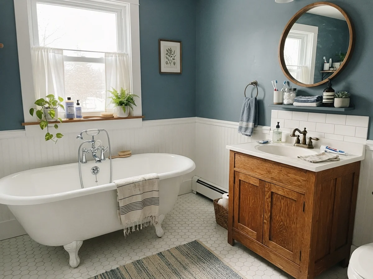
Smoky Blue needs warmth in a bathroom. If you pair it exclusively with ice-cold white square tile, chrome fixtures, and fluorescent vanity strips, the room will feel clinical and frosty. But bring in warm oak, unlacquered or brushed brass, and soft linen, and the deep blue-gray suddenly feels like an old-world hotel. It embraces you without overwhelming the modest square footage.
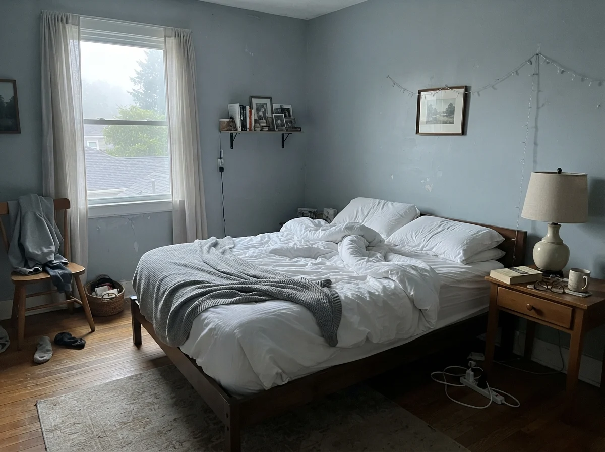
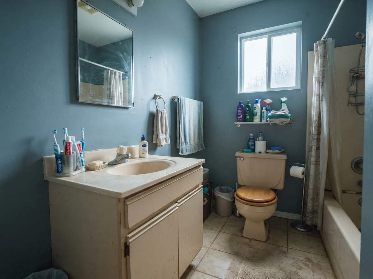
Notice how flat overcast weather strips the personality straight out of this pigment. In that small frosted-window bath above, the walls quietly trade their coastal slate charm for a plain, stony gray. If your climate involves eight months of drizzle and grey skies, you must account for that shift. Without warm incandescent bulbs or warm wood counters, Smoky Blue will sit on your walls looking like a moody storm cloud.
And if you have an older vanity with slightly yellowed or dated beige laminate? Be careful. Cool paint tones love to draw out the dingy qualities of older beige and cream plastics, as seen below when daylight turns cool and wet outside.
Bedrooms, Living Rooms, and Sunlit Corners
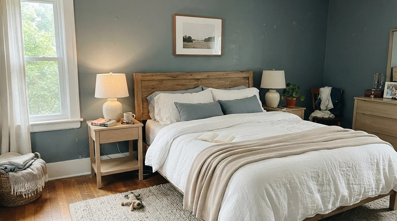
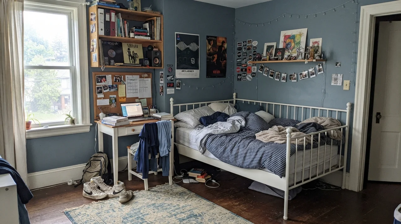
Can you put an LRV 15 paint on all four walls of a bedroom? Yes, provided you have real daylight to feed it. A south- or west-facing bedroom turns Smoky Blue into pure tranquility. It creates an enveloping perimeter that makes white bed linens and pale oak nightstands look crisp and deliberate.
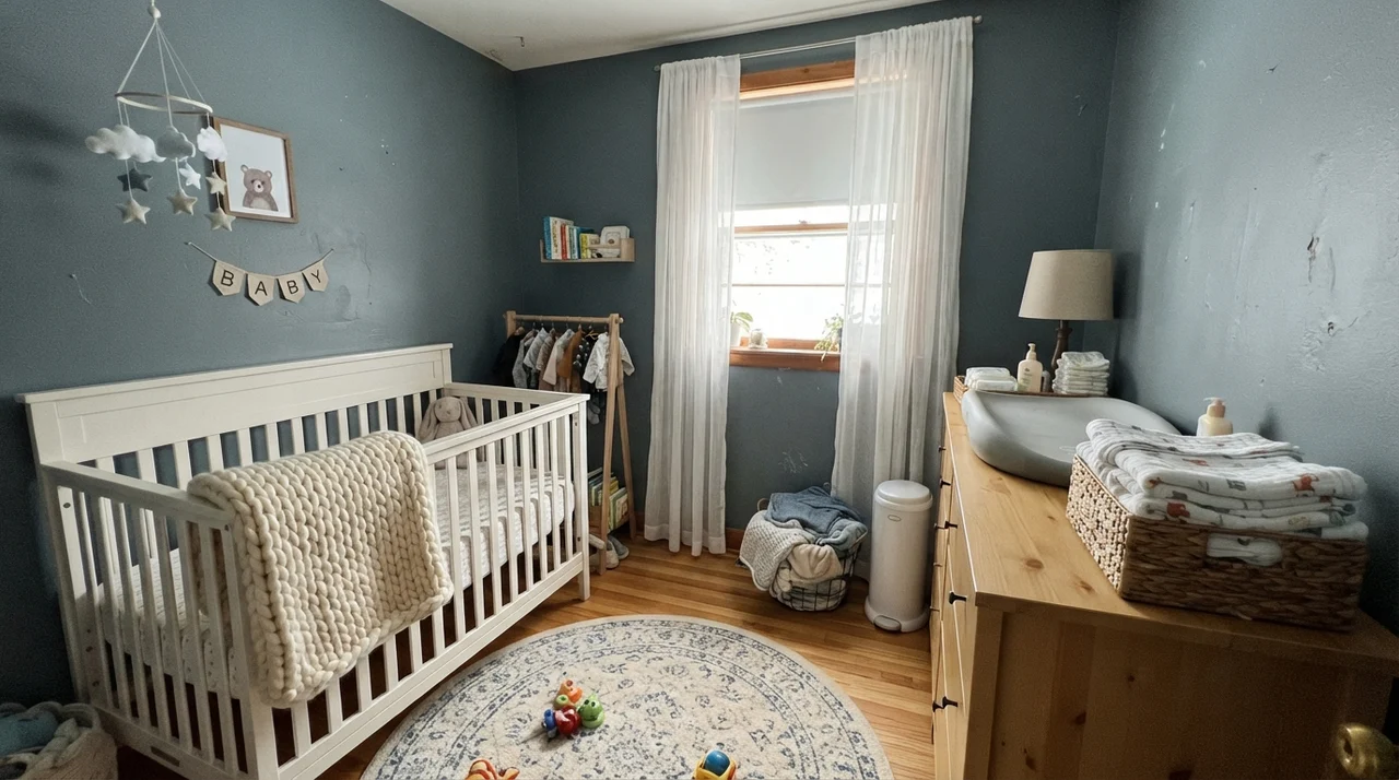
In a nursery or a teenager's room, it functions as a remarkably durable, timeless backdrop that doesn't feel infant-like or trendy. In our first split-level, we painted our son's room a bright, trendy royal blue that looked dated within three seasons. Had we used a grounded slate like Smoky Blue, we wouldn't have spent a Saturday repainting it before he even finished middle school.
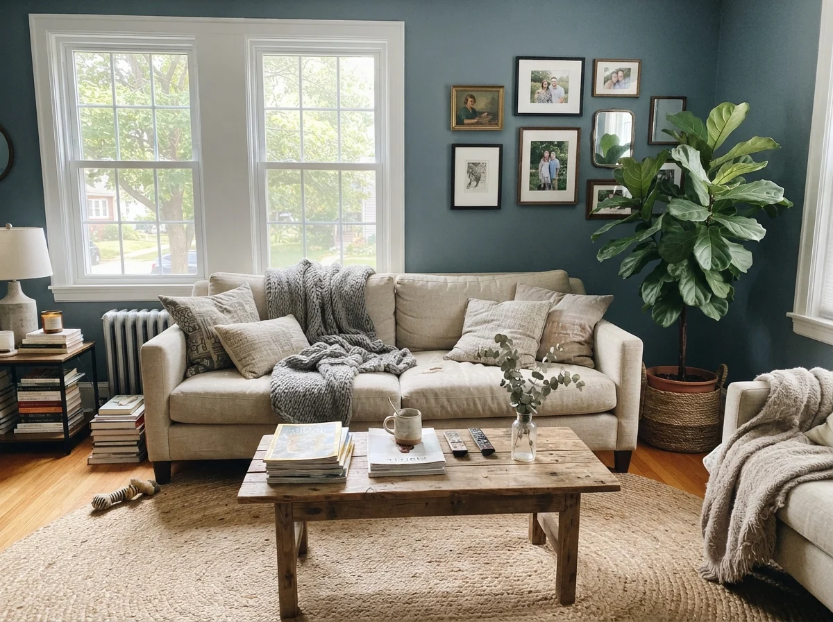
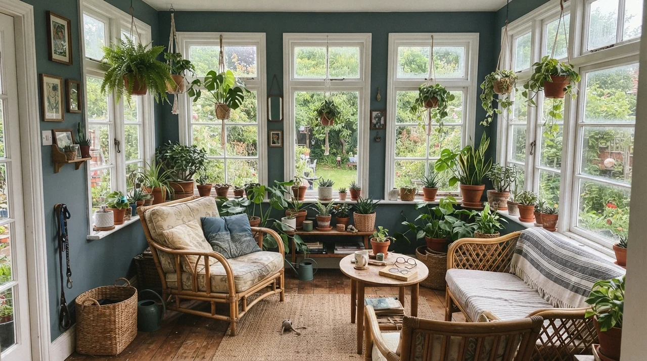
When you take Smoky Blue into larger social rooms—a main living room or an enclosed sunroom—light exposure becomes your make-or-break factor. A living room with two generous windows flooding sunlight over a jute rug can easily carry the weight of this color. The sun warms the gray base and highlights the subtle teal-slate undertone.
Surrounded by greenery, white window mullions, and terracotta planters, it almost acts as a garden wall, drawing the outdoor foliage inward. But if your living area relies on a single modest window, wrapping all four walls in Smoky Blue will feel oppressive by November.
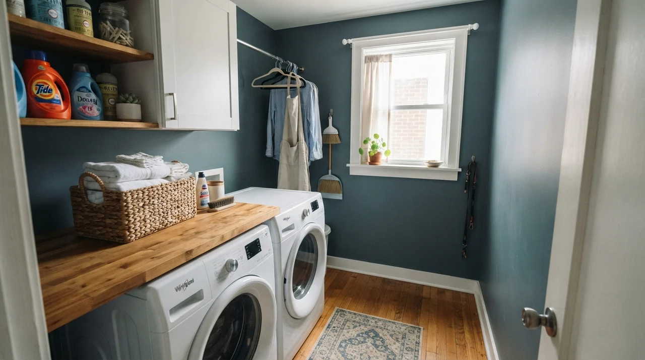
Even utility spaces can benefit from that deliberate contrast. A laundry room with one good exterior window can take Smoky Blue on the walls quite happily, especially when flanked by white storage cabinets and warm butcher-block counters. It hides the inevitable scuffs from laundry baskets far better than any pale greige ever could.
Architectural Accents and the Front Door
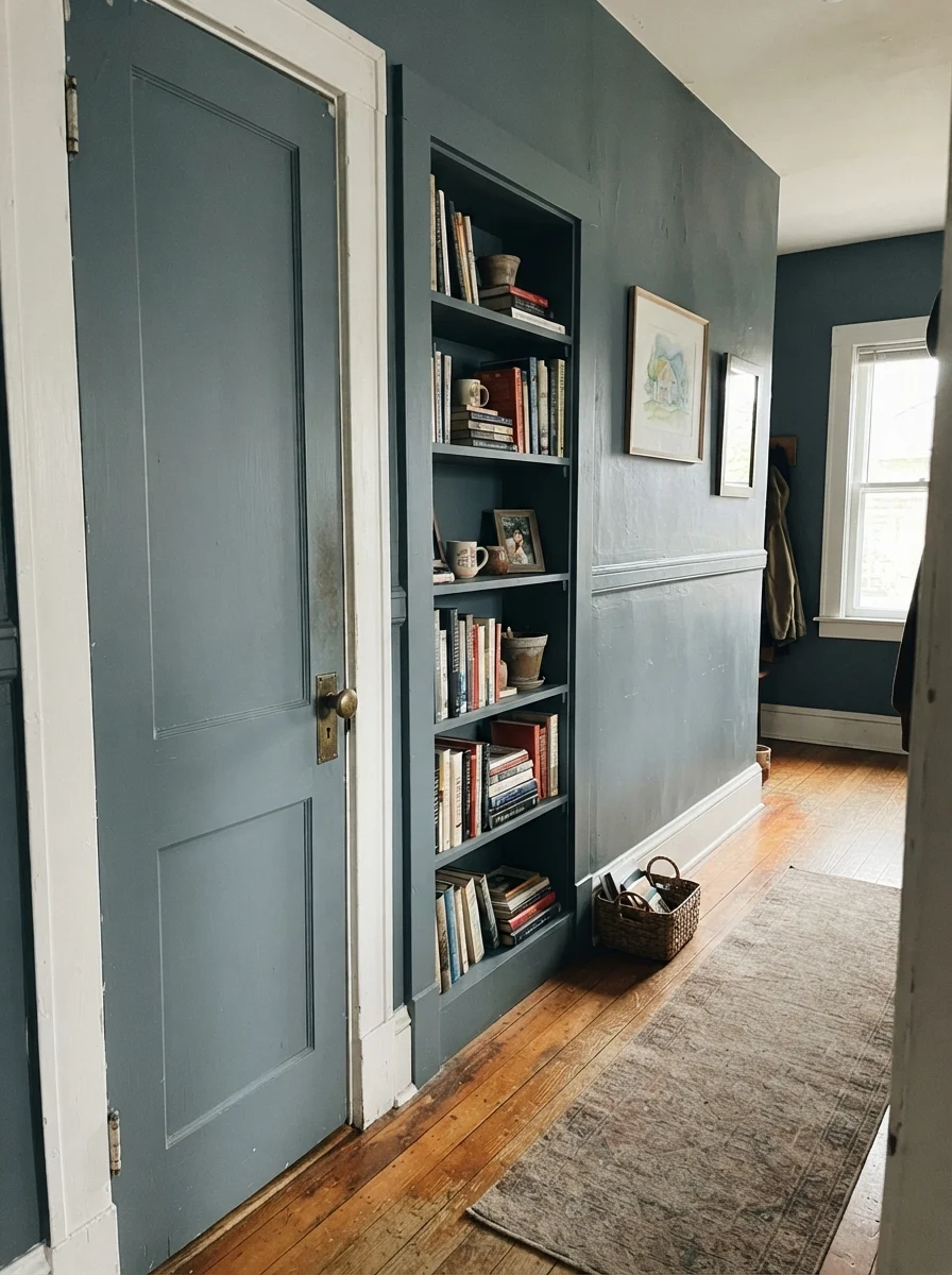
If you love the depth of Smoky Blue but don't want to live inside a dark envelope, treat it as an architectural punctuation mark. In hallways, painting just a two-panel door and an integrated bookshelf in this shade against pale cream walls creates instant vintage charm. It makes builder-grade trim look custom.
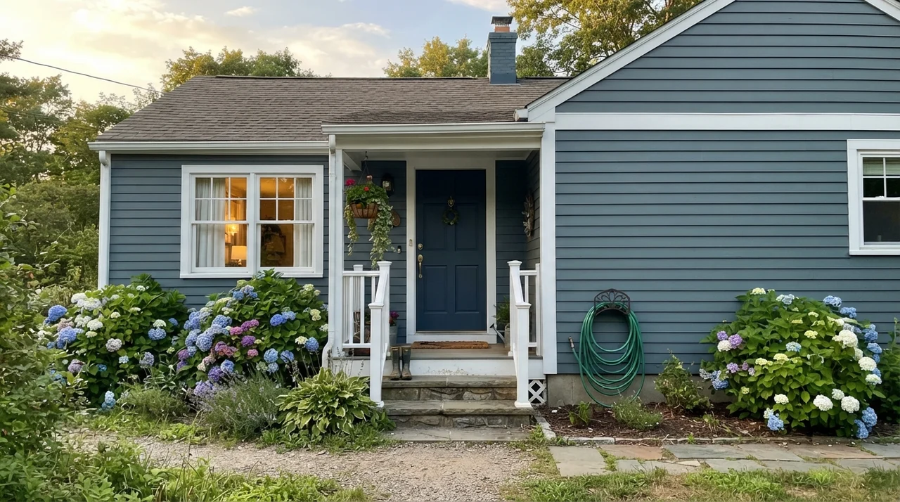
On the exterior of a home, Smoky Blue makes an exceptional siding color when paired with clean white fascia and trim. In the late-afternoon golden hour, horizontal siding finished in this gray-blue looks refined, coastal, and deeply anchored to the landscape without leaning nautical or pastel.
Here is my favorite spot in our house to sit and listen to music. When you look at how Smoky Blue cradles teak and warm mid-century wood, you see why it has remained quietly on the fan decks while flashier colors came and went. It gives the room gravitas without taking over.
The Honest Fail: Where Smoky Blue Falls Flat
Now, let's talk about where this paint goes horribly wrong. Almost every complaint I have ever heard about Smoky Blue traces back to a dark, windowless interior space or an unlucky collision with warm builder-grade finishes.
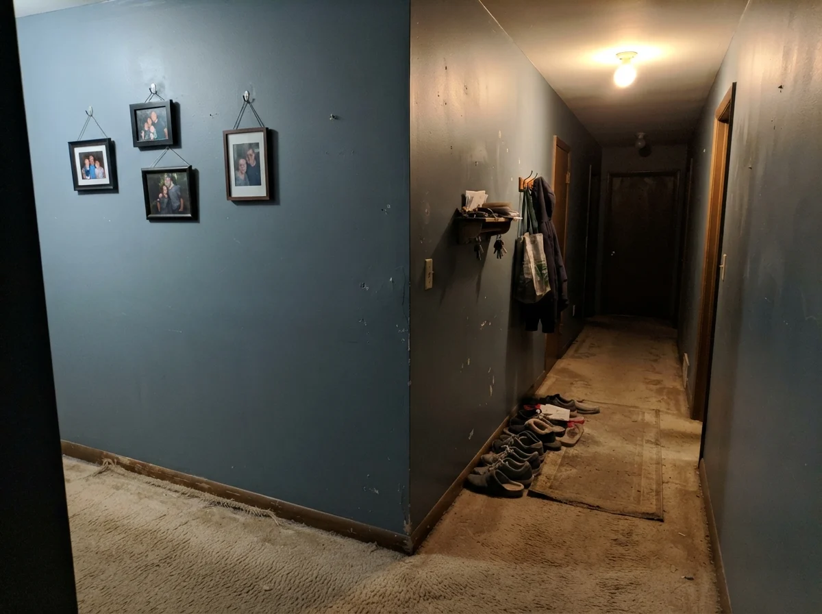
If you put this color in a windowless hallway or a dim powder room lit only by a cheap overhead builder fixture, it will disappoint you. Cool, weak light drains every ounce of blue pigment out of the paint, leaving behind a flat, muddy, putty-like slab of drywall. Readers who painted their windowless interior corridors expecting an intimate moody blue have written to me describing a space that looks like an unfinished commercial basement. That is not the paint's fault; an LRV 15 paint requires daylight to wake up its undertones.
The second hazard is orange wood. If your home is filled with 1990s honey oak floors or builder-grade orange-stained trim that you aren't planning to sand down, Smoky Blue will pick a fight with every square foot of it. Cool slate-blue and warm orange-gold sit on opposite sides of the color wheel. Place them side-by-side, and your floors will scream orange, while your walls will look gray and sullen.
Styling and Finishes: What Works and What Fights
Because Smoky Blue carries such a strong gray spine, it plays exceptionally well with materials that have natural weight and texture. In our homes, I have paired it with everything from vintage walnut to raw stone, and the rule has always held: give it texture, not gloss.
Polished chrome fixtures can sometimes look icy and dated against this color, whereas brushed nickel, warm unlacquered brass, and oil-rubbed bronze add instant sophistication. Natural linen, rattan, jute, and white oak all provide the warm counterbalance that a dark slate hue begs for.
Durability, Cleaning, and the Five-Year Reality
Here is what nobody tells you in the glossy design magazines: living with a dark wall is fundamentally different from living with an off-white. Five years in, every door casing, light switch surround, and baseboard corner tells a story about how your household moves through space.
Smoky Blue is heavily pigmented. If you buy a flat or matte finish to make your walls look velvety, prepare yourself for burnishing. Every time someone brushes against the hallway carrying groceries, or a child drags a backpack along the wall, flat dark paint leaves a faint shiny line. And when you try to scrub it clean with a wet microfiber cloth, flat dark finishes can leave a pale water mark that never quite goes away.
We learned this the hard way in our split-level. For whole-wall applications, buy eggshell. It has just enough sheen to allow fingerprints to be scrubbed clean without rubbing off the pigment. For cabinetry or interior doors, spend the extra money on a high-grade semi-gloss or satin enamel. Quality paint is worth the money on woodwork; cheap contractor-grade enamels chip along the drawer edges within eighteen months, and touching up deep blue-gray is notoriously difficult without repainting the entire cabinet face.
You don't choose a color for the weekend you paint it. You choose it for year four, when the light has tested it and you've scrubbed the door casing a hundred times.
How Smoky Blue Compares to Similar Shades
Before you make a final run to the paint counter, you should look closely at how Smoky Blue stacks up against its closest peers in the color decks. Small shifts in LRV and gray saturation can change the entire mood of a finished room.
Living with It Long-Term: Resale and Buyer Reactions
When we sold our colonial, the listing agent took one look at our white kitchen with the deep gray-blue island and said, "Don't touch a thing." Ten years earlier, people would have demanded a bland beige kitchen before listing. Today, buyers appreciate a strong, deliberate anchor—provided it is contained.
That is the secret to Smoky Blue and resale: keep it where it makes architectural sense. If you paint an entire open-concept living, dining, and foyer area in Smoky Blue, prospective buyers will mentally calculate the cost of three coats of primer. But put it on a front door, a bathroom vanity, an office, or a kitchen island, and it reads as custom, high-end woodwork that sets your home apart from the flip houses down the block.
What sheen should I choose for Smoky Blue on walls versus trim?
For walls, stick strictly with eggshell. A flat finish burnishes and marks if you look at it sideways, while satin on drywall can look plastic and show roller laps. For cabinets, doors, and islands, use semi-gloss to ensure you can wipe away fingerprints and food splatters without lifting the pigment.
Will Smoky Blue make my small room look tiny?
It depends entirely on your window light. In a small bedroom with generous southern or western daylight, Smoky Blue creates an enveloping, cozy jewel-box effect. In a small, windowless powder room or north-facing room with only dim ceiling fixtures, it will feel heavy, dark, and flat.
Does Smoky Blue work well with white subway tile?
It is an ideal match. The clean, crisp contrast of white tile breaks up the LRV 15 depth, preventing the dark paint from overwhelming the room while letting the rich blue-gray pop.
Why does my sample look like charcoal gray instead of blue?
You are likely sampling it in cool north light or under low-kelvin evening light. Smoky Blue needs natural daylight to awaken its blue undertones; without sufficient light, its heavy gray foundation takes over completely.
Susan's Verdict · Grounded Workhorse with Clear Boundaries
Sherwin-Williams Smoky Blue is not the neutral the fan deck claims it to be, but it is one of the most reliable blue-grays in existence if you give it daylight and clean edges. Keep it away from honey oak trim and windowless hallways. Put it on kitchen cabinetry, an island, a well-lit study, or an exterior front door with crisp white trim and warm brass hardware, and you will have a color that still looks dignified and intentional five years down the road.