Color Diary · No. 100
What Five Years with Sherwin-Williams Creamy Taught Me About Warmth
The cream-white that grounds half the farmhouse palettes in the Sherwin-Williams deck, reviewed honestly: the light that flatters it, the light that turns it butter, and what to pick instead.

Susan HartleyOctober 28, 2026 · 18 min read
Creamy · Sherwin-Williams SW 7012
Hex#EFE8DBLRV81Undertonesyellow-cream → mellow linen → warm butter
In our last house, a 1990s colonial with honey oak casings around every doorway, I spent three solid weeks agonizing over swatches because I refused to admit that true whites simply looked like primer next to all that golden timber. The previous owners had slapped a sterile, hospital-grade white over the center hall and the living room right before putting the place on the market. When we bought it, the whole house felt chilly and disjointed, like someone had tried to turn an honest Midwestern colonial into an art gallery by brute force.
I finally gave in and bought five gallons of Sherwin-Williams Creamy (SW 7012). It wasn’t a timid, whisper-soft off-white that pretended to be colorless; it was unapologetically cream. Lived with it for eight years in that house, and by year two, I realized what the color was really doing. It was an anchor. It didn't fight the amber tones in the floorboards or the aged brass sconces in the hallway; it settled in and let the woodwork breathe. That colonial wasn't the last time I opened a can of SW 7012, either. Five years in our current 1960s ranch, I reached for it again to rescue a north-facing guest bath that felt like a limestone cave in the winter months.
Here is the unvarnished reality about Sherwin-Williams Creamy: it does exactly what the name printed on the lid promises. It is not an off-white that might pass for clean parchment under certain bulbs. It has an LRV of 81, which means it reflects plenty of daylight to keep smaller spaces feeling open and bright, but on a large wall in full daylight, you are going to see warmth, and in certain rooms, you are going to see yellow. If you have cool north daylight, honey pine, and brass fixtures, that yellow undertone is the exact reason to buy it. If you have crisp white quartz countertops, cool gray floors, or hard southern afternoon exposure, that same warmth is the reason people repaint within six months.
Light Shifts from Sunrise to Bedtime
The single biggest mistake homeowners make with warm neutrals is sampling them on a Saturday afternoon and assuming the color will look that way around the clock. In our current home, I made a point of watching how Creamy behaved across twelve hours before rolling an entire bedroom. In the early hours, when the sun is low and the morning sky has a cool blue edge, the color lays quiet. It reads pale, almost understated, behaving like an antique parchment that has had the glare taken off.
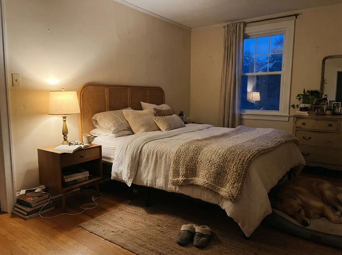
By the time dusk settles and you flip on your evening lamps, the whole equation changes. If your fixtures are fitted with standard 2700K warm incandescent or LED bulbs, the yellow pigment in Creamy wakes right up. It deepens into a rich, cozy biscuit that feels wonderfully restful when you are turning down the bed, but if you want the walls to look lighter and more tailored after dark, you will want to swap those bulbs out for 3000K or 3500K lamps. That small bulb switch cleans up the color immediately without robbing the room of its natural warmth.
Living with Creamy in the Bathroom: Tile, Moisture, and Light
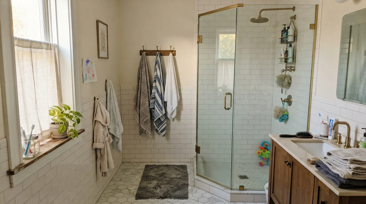
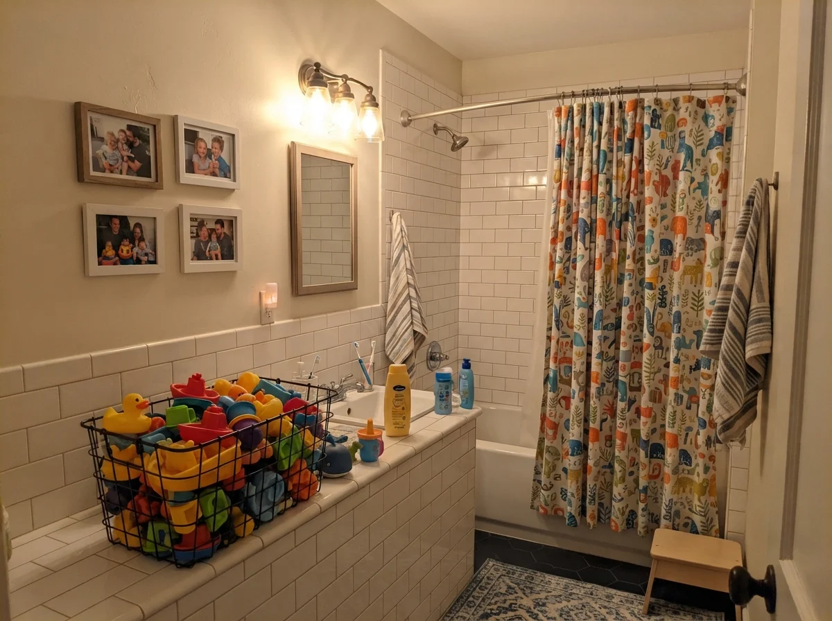
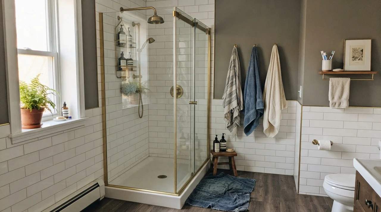
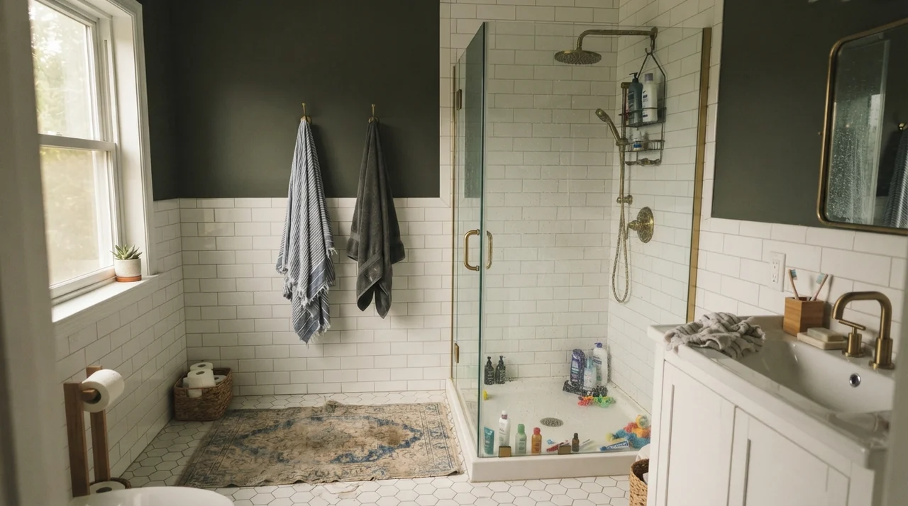
Bathrooms are where paint colors either earn their keep or show their flaws in a hurry. In our last house, our upstairs family bathroom had white subway tile running four feet up the wall. I painted the upper half in Creamy, and the contrast taught me a crucial lesson: when you put a yellow-tinged cream right against crisp, clean white tile, the tile doesn't get warmer. Instead, the wall color shows its yellow cards immediately. In soft side daylight, that combination works nicely if you balance it with unlacquered brass or warm wood. But if your bathroom has harsh fluorescent bulbs or cheap cool-toned vanity lights, the paint can read dingy, almost like an old wall that needed to be scrubbed clean.
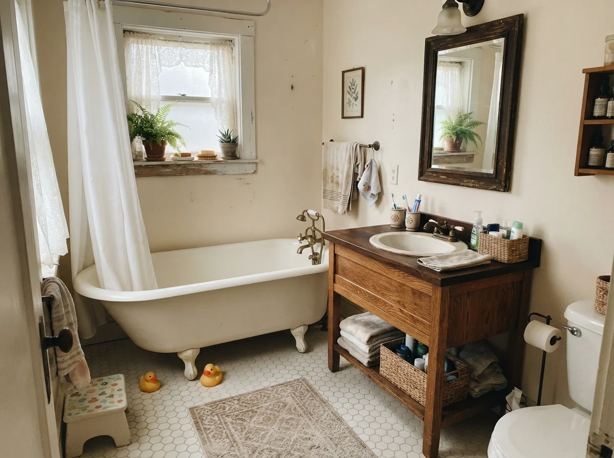
We lived with it through two toddlers, countless splash sessions, and damp towels flung over wall hooks. In eggshell, SW 7012 held up remarkably well to everyday moisture. Water spots dried down without leaving ring stains, and toothpaste splatters scrubbed clean with a warm microfiber rag without pulling away the pigment. But you must pay close attention to your tile selection. With white hex floor tiles and a warm oak vanity, the room feels like an authentic country cottage. Under flat, overcast daylight through frosted privacy glass, however, the paint drops its sunshine and looks muted and dusty.
Kitchen Cabinets, Islands, and Countertop Realities
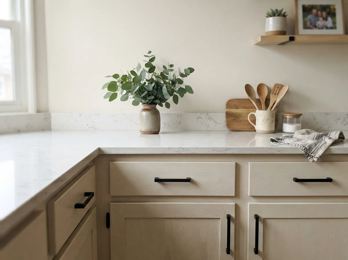
Every time I see someone recommend a whole-kitchen cabinet repaint in Creamy without asking about the countertops first, my blood pressure ticks up. In a kitchen, paint does not live in isolation. It sits flush against horizontal slabs of stone, tile backsplashes, and cabinet hardware. If you are putting SW 7012 on your kitchen cabinets, your countertop choice dictates whether the project is worth the money or an outright disaster.
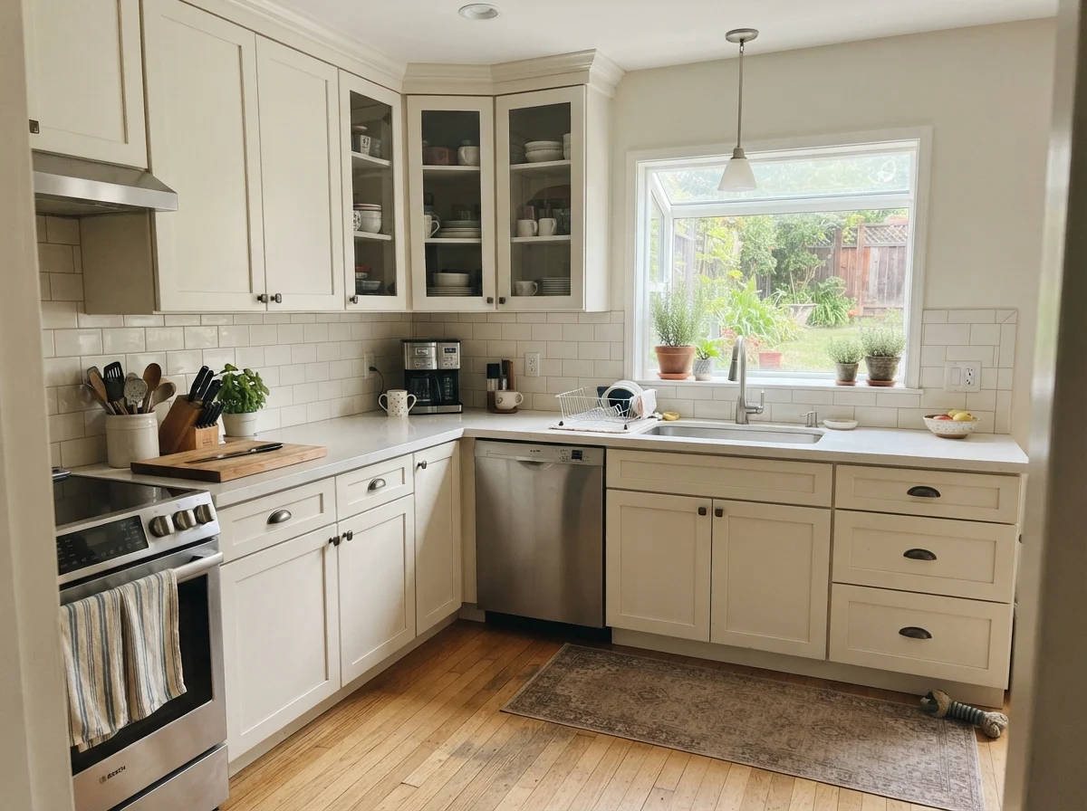
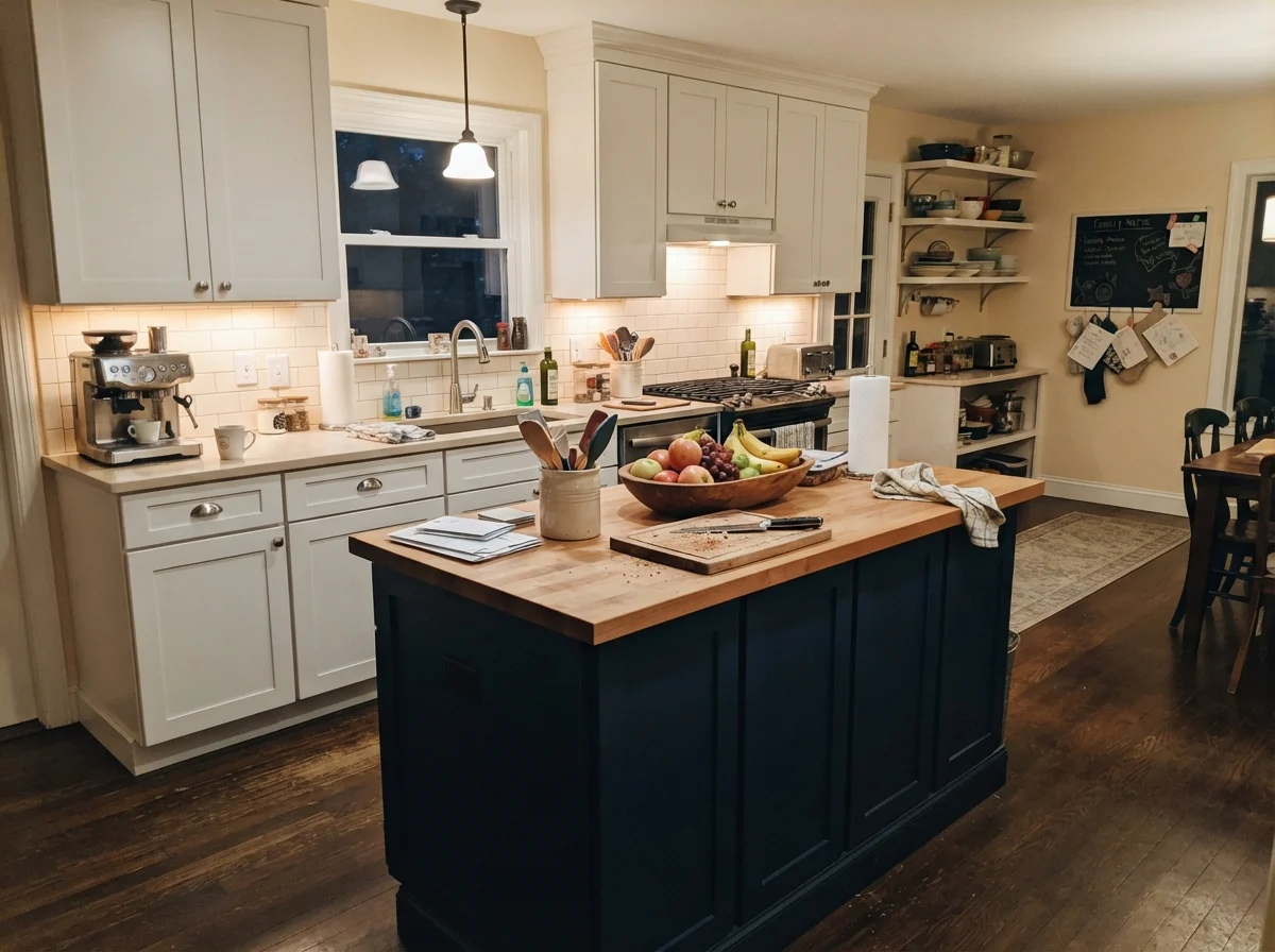
With butcher block, soapstone, or warm-flecked granite, Creamy on shaker cabinets is timeless. It flatters aged bronze and oil-rubbed hardware better than any cool white ever could. In our colonial kitchen refresh, we painted the base cabinets and uppers in a durable satin enamel. It held up against five years of sticky fingers around the cabinet pulls, grease splatters near the range hood, and the weekly wipe-down routine. But here is the hard rule: if your kitchen features cool Carrara marble, crisp gray quartz, or gray-washed flooring, skip this color. Those cool, blue-gray surfaces will push the undertone of Creamy toward a murky, faint yellow-green that looks like a mistake. If you want to keep the main cabinetry white and just warm up the room, brushing Creamy onto a central kitchen island while leaving the perimeter cabinets a cleaner white works well, provided your flooring has natural golden or honey undertones to tie it together.
Creamy does exactly what the name says: it is a true cream, and on a big wall in afternoon sun, you are going to see the yellow.
Living Rooms and Sunrooms: Managing the Glare
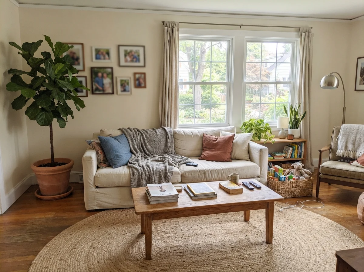
In a living room that faces north or east, Creamy performs like a champion. North light has a stubborn gray-blue cast that sucks the life right out of pure whites, leaving living rooms feeling cold and hollow. Creamy compensates for that missing warmth. Its yellow foundation absorbs the cool gray light and softens it into a calm, lived-in linen tone. When paired with a jute rug, an oak coffee table, and a comfortable rumpled linen sofa, it gives the entire space an easy, collected feel that doesn't look like it came out of a showroom catalog.
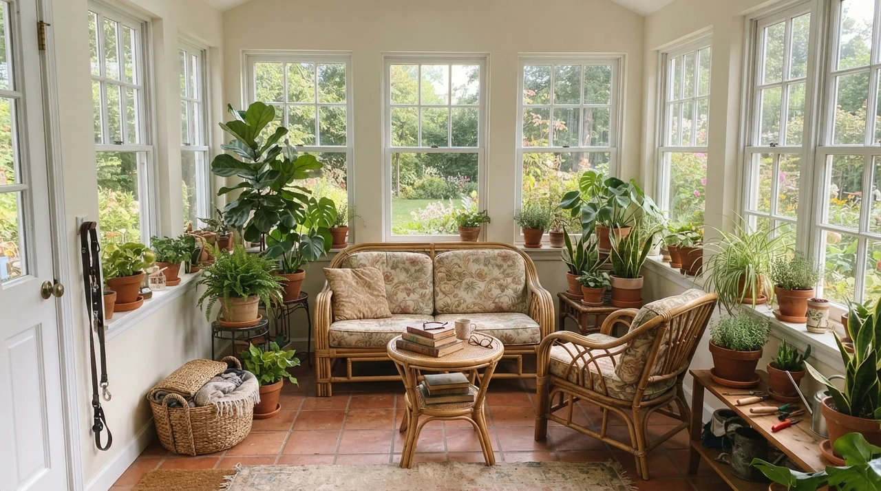
However, you have to be cautious with southern and western exposures. In a sunroom with windows wrapping around two or three sides, midday sun will flood the walls and supercharge the pigment. Under hard direct sunlight, Creamy can look less like linen and more like melted butter. If you have terracotta planters, rattan chairs, and lots of leafy greenery, that heavy warmth can feel cheerful and tropical. But if you were hoping for an airy, restrained, minimalist room, the heat coming off the walls at 3:00 PM might drive you crazy. I always tell friends who ask: don't look at the paint swatch when it's cloudy; look at it when the afternoon sun is blazing directly onto the plaster.
Bedrooms and Nurseries: The Soft Background
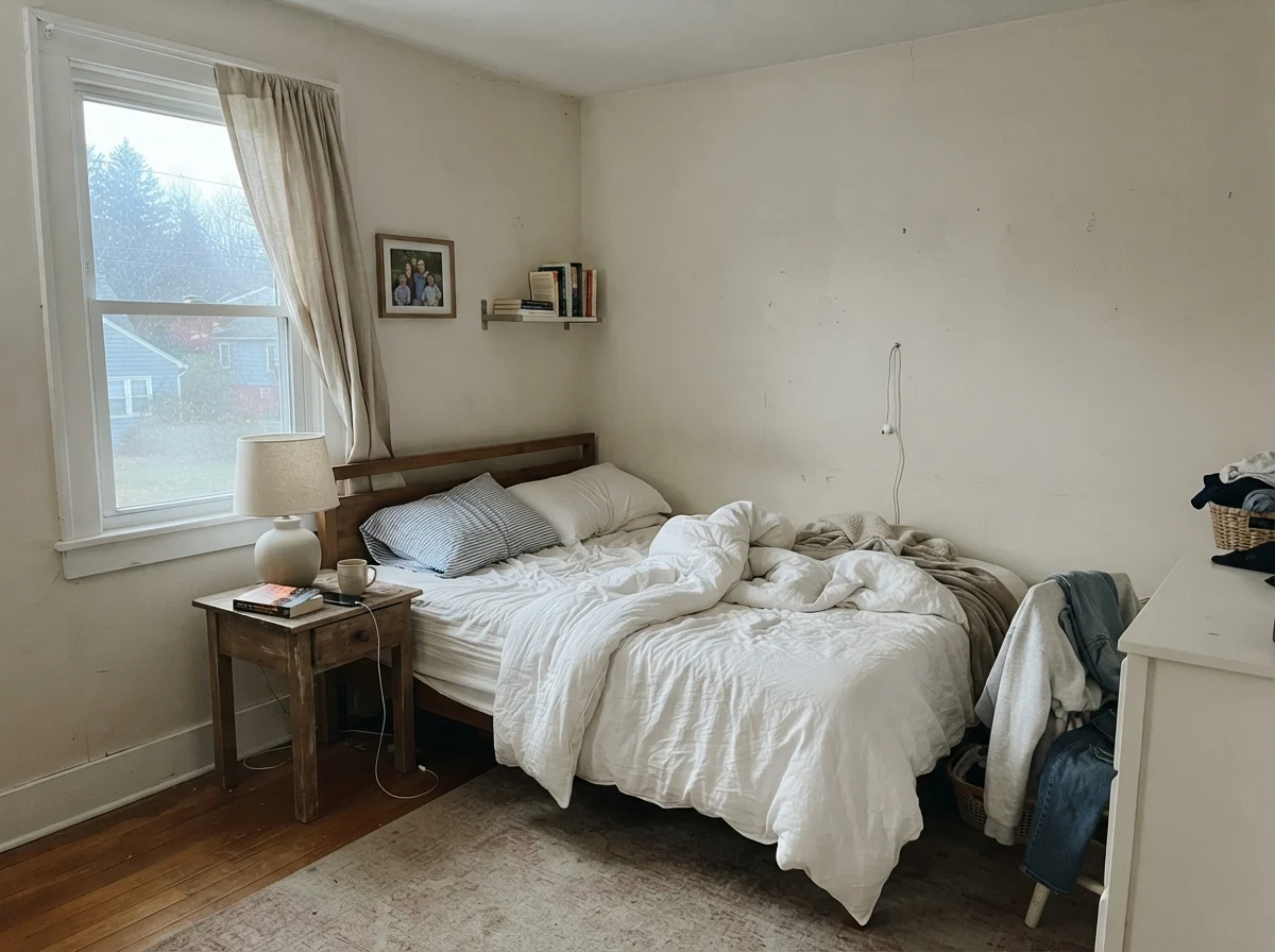
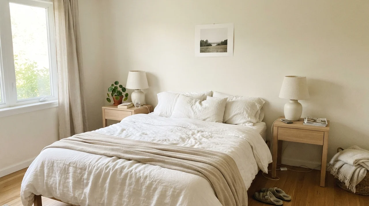
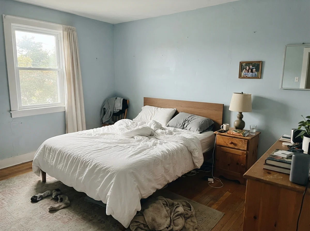
Where Creamy shines with very little effort is in private spaces: primary bedrooms, guest suites, and nurseries. In a bedroom with soft side-window daylight, the color functions like a warm embrace. It doesn't demand your attention. It creates a quiet, restful backdrop that flatters pale oak nightstands, white linen sheets, and ceramic bedside lamps. Five years in, you don't get tired of waking up to it because it never feels harsh or sterile on your eyes in the early morning.
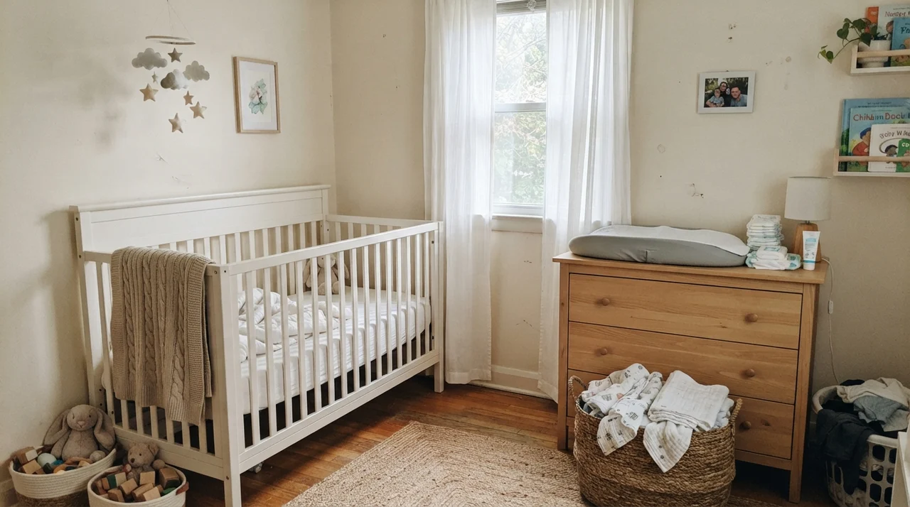
In a nursery, it is one of my favorite recommendations for young parents who want to steer clear of pastel stereotypes. Paired with a simple white crib, a knit blanket, and a light-wood changing dresser, Creamy creates an atmosphere that feels gentle and timeless. And practically speaking, as the child grows into their teenage years, the walls don't scream baby room. In a teenager's bedroom with cool window light, white metal furniture, and open bookshelves, Creamy maintains just enough warmth to keep the room from looking like a dorm hall, even with sneakers tossed on the rug and desk clutter in full view.
Hallways, Built-Ins, and the Laundry Room
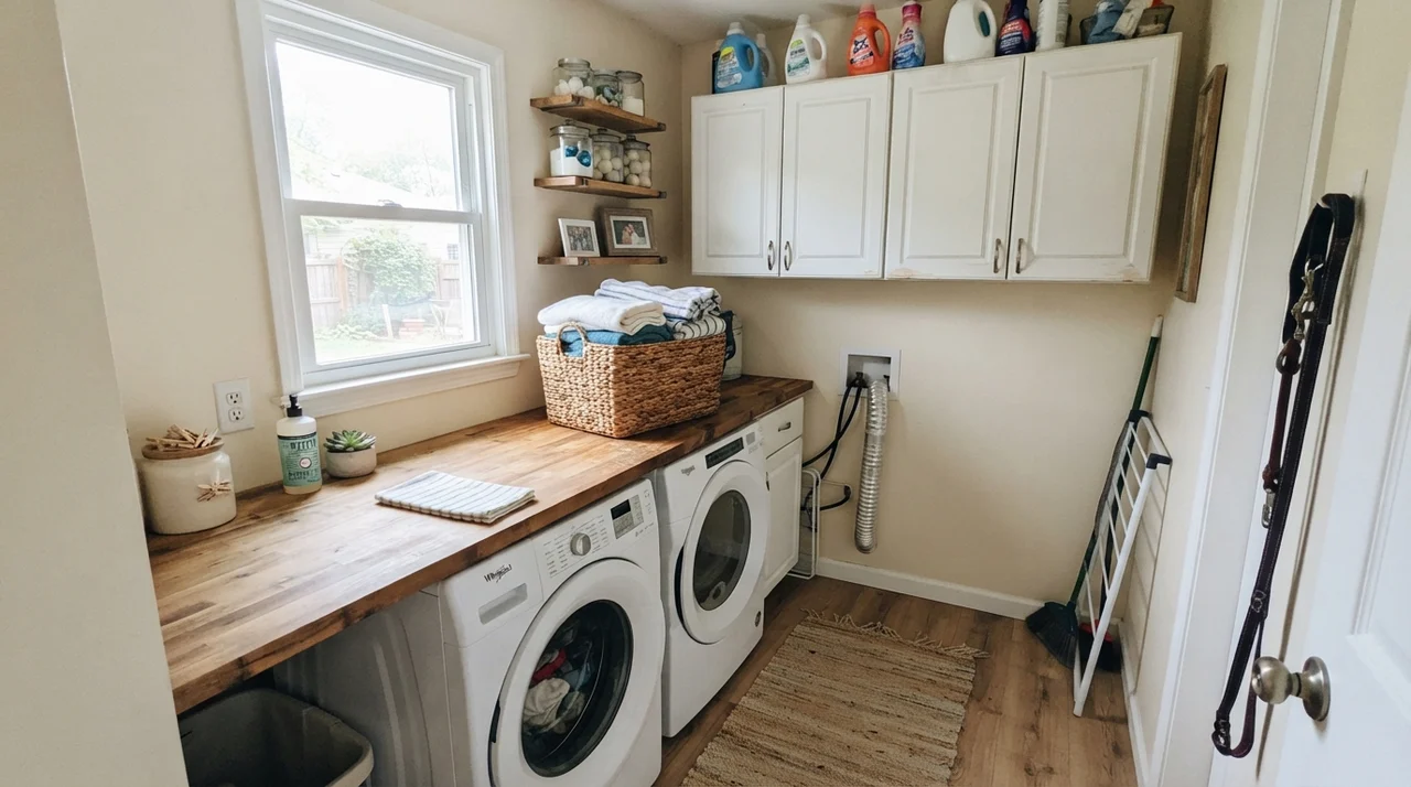
Utility spaces and interior corridors present another challenge entirely. In our current ranch home, the laundry room has just one modest window. Laundry spaces need to feel clean and fresh, but bright stark whites can make a small utility room feel like an operating suite. Painting the walls in Creamy above a butcher-block counter and alongside a white washer and dryer adds an unexpected touch of comfort. Doing laundry is tedious enough; having walls that feel warm and pleasant makes the chore slightly less punishing.
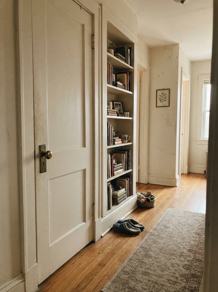
Hallways in older homes, particularly those with wood flooring, brass knobs, and classic two-panel interior doors, also handle Creamy with grace. If you have built-in bookshelves along a corridor, painting the door and the shelving to match the wall tone creates an intentional, continuous feel that makes a narrow hallway feel wider and more architectural. The soft afternoon light coming through a nearby room catches the profiles of the door casing without creating the harsh shadows that a stark white would throw.
The Honest Fail: Where Creamy Falls Apart
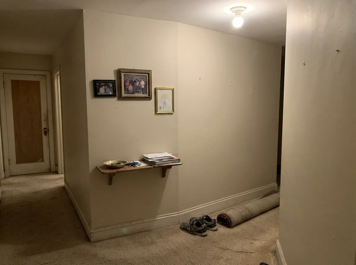
Now for the uncomfortable truth that paint swatches won't show you. Look closely at the image above: a windowless hallway corner under a single builder-grade ceiling bulb with dated beige carpet below it. In this exact environment, Creamy falls completely flat. Without real daylight to activate its LRV of 81, and with low-quality artificial lighting bouncing off beige carpet, the color loses all its charm. It stops reading as warm cream and turns into a muddy, dull putty.
This is where homeowners feel cheated. They see a lovely cottage living room online and assume SW 7012 will bring that same cozy light into an unlit basement hallway or an enclosed powder bath. It won't. Paint cannot create light that doesn't exist; it can only reflect and soften what is already there. If your space has zero natural light and dated beige carpeting, putting Creamy on the walls will just amplify the dinginess. In those enclosed, dim corners, you either need to commit to significant lighting improvements or choose a color with a completely different tonal base.
Exterior Siding: Shady Elevations vs. Full Afternoon Sun
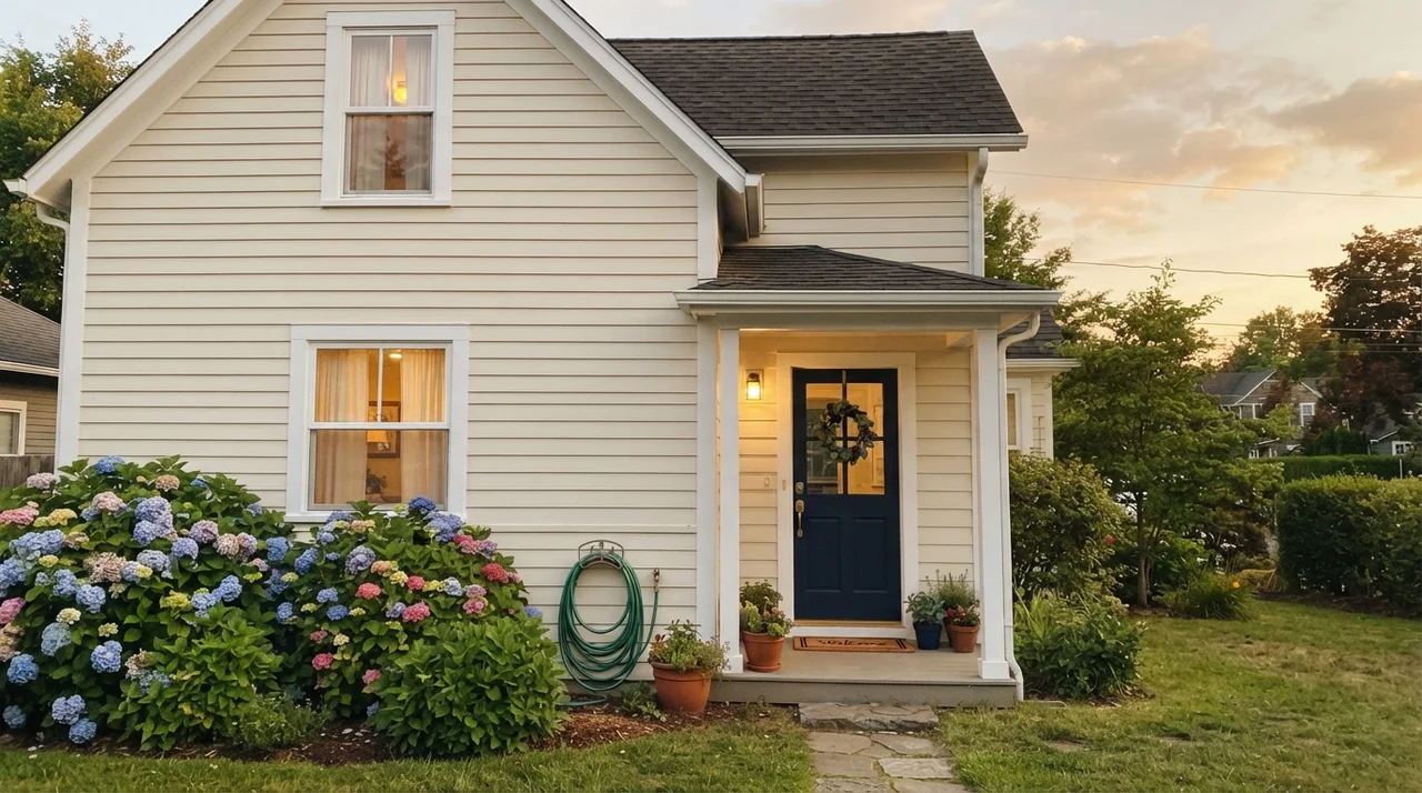
Taking Creamy outside onto exterior siding is a classic choice for traditional homes, farmhouses, and cottages. Against dark navy front doors, white trim, and leafy green hydrangeas, it looks stately, established, and grounded. Because outdoor light is vastly more intense than interior light, colors often wash out by two full shades once applied to exterior siding. In northern shade or under tree cover, Creamy looks like an inviting, soft ivory that never glares in your eyes when you pull into the driveway.
The catch on exteriors is identical to what happens inside: the southern and western elevations. On an unshaded west-facing wall at 5:00 PM, direct sun will bake Creamy into a noticeable butter-yellow. Before you hire a painting crew or order twenty gallons of exterior acrylic, do what I always do: buy a sample quart, paint two large boards, and literally carry them around your foundation at 9:00 AM, 1:00 PM, and 6:00 PM. Check the north wall under the eaves, and check the south-facing porch. If you hate seeing yellow on your siding in the late afternoon, that five-minute walk will save you thousands of dollars.
Trim, Millwork, and the Wood Finish Dilemma
Here is my firmest rule regarding Creamy: it is almost never worth the money to use it as your trim paint alongside white walls. Millwork needs definition. Because SW 7012 has an LRV of 81 and noticeable warmth, using it on baseboards under a crisp white wall just makes your baseboards look old and dusty, like someone smoked in the house twenty years ago and nobody wiped down the woodwork. If you use it on trim, commit to a monochromatic cream-on-cream look where the walls and trim are the exact same color in different sheens (eggshell on walls, semi-gloss on trim).
Where Creamy does perform magic is around natural wood trim. In our split-level and later in the colonial, having walls that didn't fight honey oak, pine, or aged cedar casings made repainting worth every penny. Clean modern whites create an aggressive visual stripe between the wall and the wood baseboard; Creamy acts like a diplomatic bridge between the two.
Matching Finishes and Architectural Styles
After thirty years and three houses, you realize that paint colors belong to architectural families. Creamy is right at home in spaces with history, texture, and character. If your home has golden oak flooring from the 1980s or 1990s, aged brass door plates, unlacquered fixtures, or rough-hewn stone fireplaces, Creamy settles in like it was specified in the original blueprints. It looks like the way older homes were meant to feel.
Conversely, if you live in a sleek contemporary build with polished concrete floors, flat-panel gray slab cabinets, and cool marble, Creamy looks completely out of place. It looked dated within weeks when a former neighbor of ours tried rolling it into her open-concept loft with gray quartz surfaces; the stone looked icy and modern, while the walls looked like yellowing parchment from an attic. Paint has to respect the materials already bolted to your subfloor and your studs.
Durability, Touch-Ups, and Resale Prep
Here is one major operational benefit of Creamy that high-contrast white paints can never match: touch-ups and scrubbability. In our colonial center hall, the area right around the coat hooks took a beating every winter. Muddy boot kicks, wet raincoats, and stray umbrella tips left regular scuffs. Because Creamy has genuine pigment in the formula, it hides minor drywall imperfections, drywall tape seams, and everyday dings infinitely better than an ultra-white paint.
When you scrub an eggshell finish of Creamy with mild soap and water, you don’t burnish a gleaming halo onto the wall the way you do with stark whites. When five years in rolled around and I needed to do touch-ups before listing our colonial for resale, I pulled out a leftover quart from the basement, feathered it in with a small foam brush over old picture nail holes, and it blended seamlessly. When we sold, the buyer’s home inspector didn’t spot a single patch job. For budget-conscious homeowners who don't want to repaint an entire hallway every three years, that durability matters.
Sheens and Application Advice
Choosing your sheen with SW 7012 is straightforward, but do not deviate from the fundamentals. On walls, stick to eggshell. Flat paint in a cream color absorbs dirt and fingerprints too quickly in high-traffic zones, while satin on broad drywall walls produces an oily glare that highlights drywall bumps. Eggshell gives you scrubbability without shiny reflections.
For ceilings, keep it flat. Trying to use Creamy on ceilings is risky unless you are doing a full envelope wrap in a cottage bedroom; otherwise, a true ceiling white keeps the ceiling feeling high. For trim and millwork, if you are doing a monochrome scheme, use semi-gloss to give the wood durability. For kitchen or bathroom cabinets, satin in a dedicated cabinet enamel is the only finish worth the money—it provides a silky, wipeable surface that resists grease without showing every single brushstroke.
Does Sherwin-Williams Creamy look yellow on the wall?
Yes. Creamy is an authentic cream, not a sterile white. In north-facing rooms it reads as a mellow linen, but in south-facing rooms with warm afternoon sun, the yellow undertone is prominent.
What is the LRV of Sherwin-Williams Creamy?
Creamy has a Light Reflectance Value (LRV) of 81. It reflects 81 percent of available light, keeping spaces open while providing obvious color.
Can I use Creamy on kitchen cabinets?
Yes, but only if your countertops have warm flecks, soapstone, butcher block, or creamy tones. Avoid pairing it with cool gray quartz or Carrara marble, which will make the cabinets appear dingy or slightly yellow-green.
What trim color goes best with Creamy walls?
A soft, slightly bright white works well to give the cream a clean boundary. If you have natural oak or honey pine trim, Creamy works exceptionally well right alongside the natural wood.
Is Creamy a good paint color for selling a house?
It depends on the home. For older traditional homes with warm wood floors and earthy finishes, it looks inviting and clean. For contemporary homes with cool gray finishes, it will look dated and should be skipped.
Susan's Verdict · The Honest Cream
Sherwin-Williams Creamy (SW 7012) does not lie about what it is. If you have cold north light, golden oak flooring, and brass fixtures, it turns a chilly room into a warm, lived-in sanctuary. But if you have south-facing afternoon sun or cool gray stone, buy Alabaster instead and save yourself a weekend of repainting.