Color Diary · No. 98
Sherwin-Williams Shade-Grown: The Deep Green That Disappears at Night
Sitting at an LRV of 8 at the bottom of Sherwin-Williams' best earthy strip, Shade-Grown is a moody, bronzed green in full sun that collapses into straight charcoal the moment the light leaves the room.

Susan HartleyOctober 27, 2026 · 18 min read
Shade-Grown · Sherwin-Williams SW 6188
Hex#4E5147LRV8Undertonesbronzed olive green → dark charcoal → flat black
In our last house, a center-hall colonial with eight-foot ceilings and a kitchen that got decent southern sun until about two in the afternoon, I spent three weeks obsessing over dark paint for the lower cabinetry. I had convinced myself that standard charcoal was too cold, navy felt too predictable, and true black would look like an iron safe dropped into the middle of our cooking space. I wanted a color with a pulse—something that felt grounded and historical, but had enough quiet life in it to catch the afternoon sun. That was my first introduction to Sherwin-Williams Shade-Grown (SW 6188).
On the paper strip at the paint store, Shade-Grown sits at the very bottom, anchored beneath Dried Thyme and Rosemary. It looks like the darkest corner of an old hemlock grove: rich, grounded, and unmistakably green. But the first lesson anyone learns when dealing with a paint that carries a Light Reflectance Value of just 8 is that paper swatches lie through omission. What they omit is light. When you bring an LRV 8 paint inside an actual home, it does not act like a darker version of the chip above it. It behaves like a near-black that only remembers it is green when the sun is directly hitting it.
We lived with it on those lower cabinets for six years. During that stretch, I watched it shift from a rich, roasted olive in the heat of a July midday to a stony near-black on November mornings, and finally to an uncompromising flat charcoal after the dinner dishes were washed and the recessed cans took over. It taught me a great deal about what very dark colors demand of a room, where spending extra on premium cabinet enamel was worth the money, and why choosing a paint solely from an afternoon swatch test is the quickest route to buyer's remorse.
The Undertone Shift: Olive Bronze, Charcoal, or Plain Black
Shade-Grown belongs to the Sherwin-Williams green deck family, but at LRV 8, the green pigment is hanging on by its fingernails. Depending on the hour and the light fixture overhead, the wall will read as three entirely distinct colors.
warm sun
overcast, north light
dusk, rain, cool bulbs
Under high-noon sun or warm incandescent lamps (2700K), Shade-Grown pulls a rich, bronzed olive tone forward. Under cloudy skies, north exposures, or cool LED bulbs, the green disappears completely, leaving behind an unyielding deep charcoal-black.
Roycroft Bronze GreenSherwin-Williams · see diary
Ashwood MossBenjamin Moore · see diary
Shade-GrownSW 6188
North WoodsBehr · see diary
Deep RiverBenjamin Moore · see diary
When people ask me why their neighbor's dark green island looks like an expensive custom build while their own powder room ended up looking like a coal mine, I point straight to the undertone behavior. Shade-Grown is fundamentally an earthy near-black with an olive-green soul. It doesn't carry blue, and it doesn't carry gray-slate coolness. In fact, if you place it next to a cool slate gray or an icy quartz countertop, it will fight them tooth and nail. The green curdles into an unflattering mud, and the gray stone ends up looking sterile.
What it genuinely wants is warmth. It needs warm wood tones—white oak, walnut, or aged pine—and warm metals like unlacquered brass or antique bronze to give that faint green something to talk to. Five years in our colonial taught me that Shade-Grown is essentially a background neutral with a secret: if you give it sun, it gives you foliage; if you starve it of daylight, it acts like any standard off-black on the shelf.
How Daylight and Light Bulbs Dictate This Color
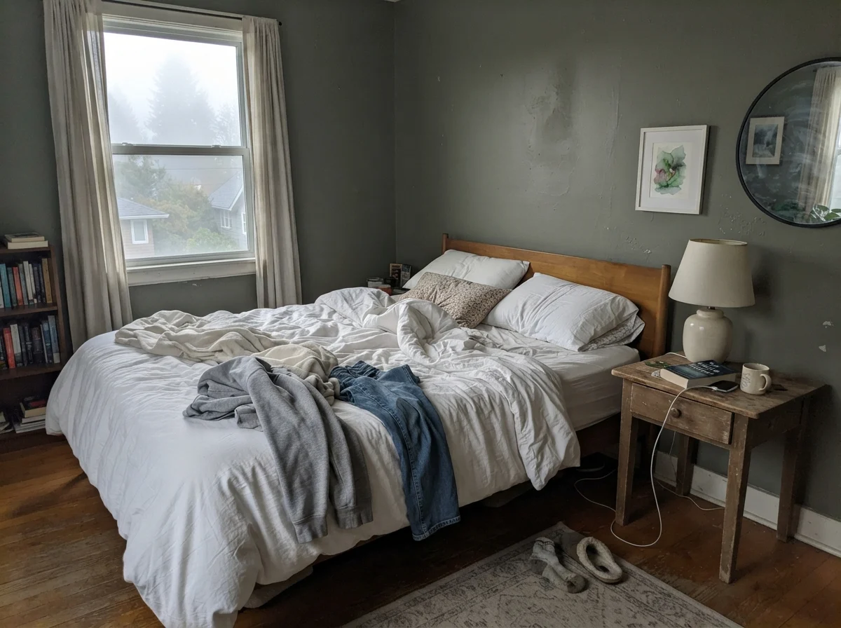
The difference between dawn and dusk in a room painted with Shade-Grown is startling. In the photo on the left, you can see how cool, early morning light washes right over the paint. Without direct sun, the pigment doesn't have the energy to bounce its green wavelength back to your eye. It flattens out, registering as a muted, chalky charcoal. Many homeowners panic at seven o'clock in the morning right after their painters finish the second coat, convinced they were handed the wrong formula. They weren't; the sun simply hasn't punched through the glass yet.
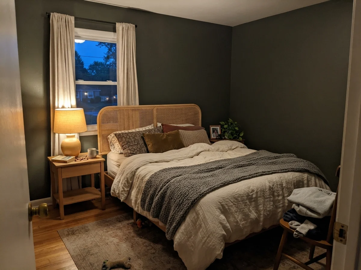
Flip a 2700K bedside lamp on as dusk rolls in, however, and the paint changes its tune. The warm filaments bring out the golden-brown base beneath the green, restoring that rich, cozy woodland character. This is why bulb temperature is not an afterthought here—it is the whole ballgame. If you illuminate Shade-Grown with 4000K or 5000K daylight LED bulbs, you will strip every drop of green out of the surface. You might as well have bought a can of black paint and saved yourself the color consultation.
The Kitchen Island: Where Shade-Grown Does Its Best Work
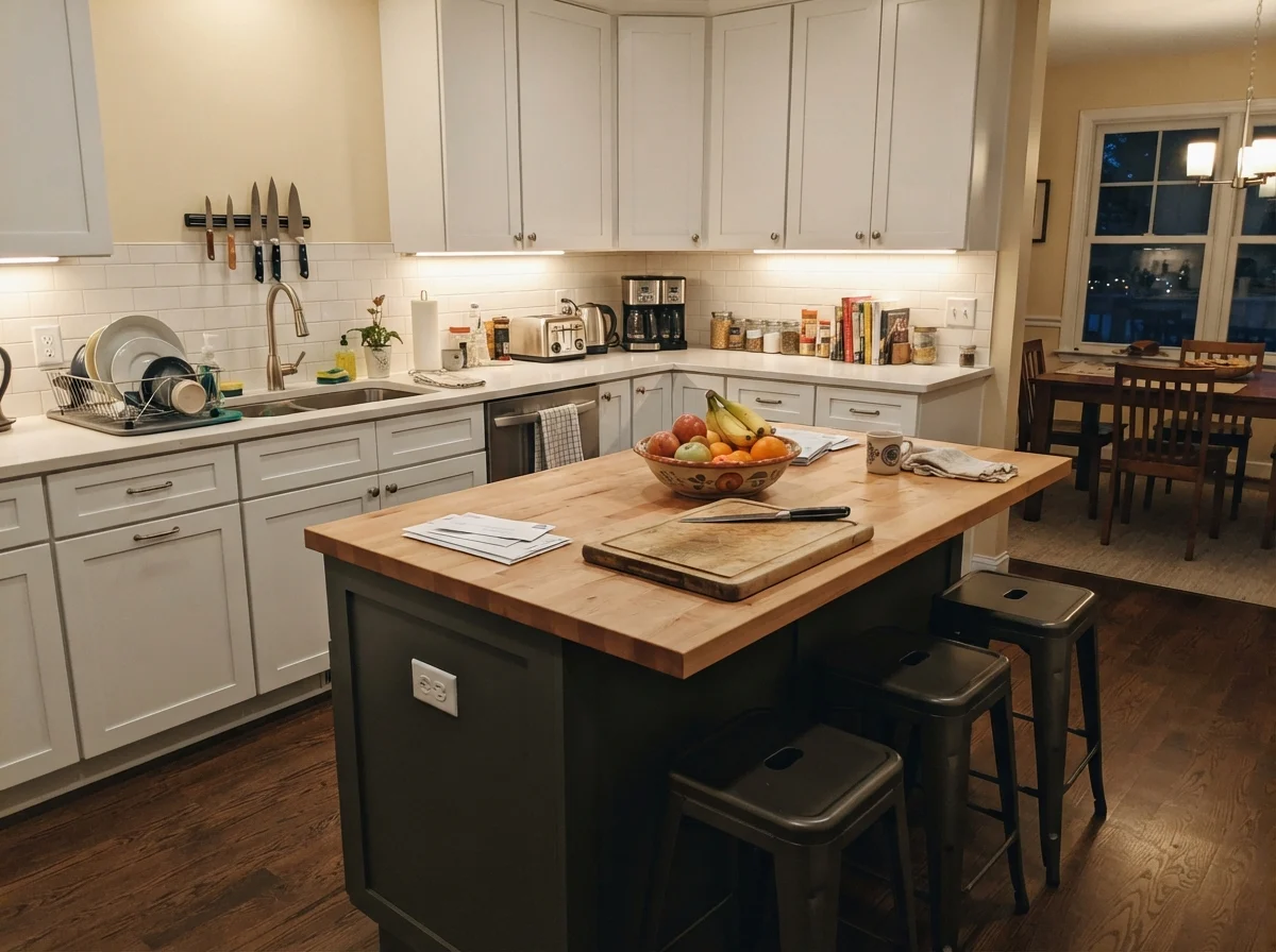
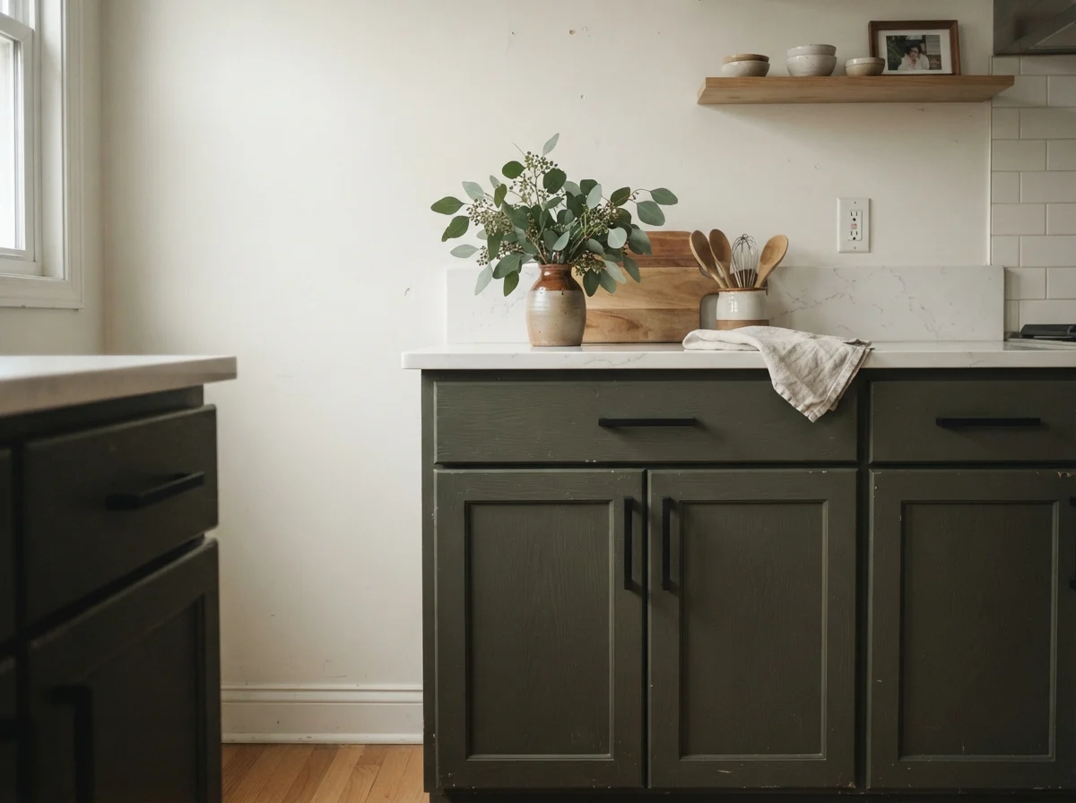
If you ask three seasoned cabinet painters about Shade-Grown, at least two of them will tell you they keep the swatch tucked behind their ear for kitchen islands. And they're right. In a room that is otherwise bright—creamy perimeter walls, light oak flooring, and white upper cabinetry—a Shade-Grown island provides visual ballast without feeling like a harsh black void.
In our colonial, painting just the lower cabinetry and island this shade meant that the dirt, grease splatters from the stove, and scuffs from my kids' sneakers kicking the island stools were completely swallowed up. It scrubbed clean with a warm microfiber cloth and mild soap weekend after weekend. Because the island caught direct lateral light from our breakfast nook windows, guests constantly commented on that 'lovely forest tone.' Had I painted every cabinet in the room—uppers included—the space would have felt like a cave by three in the afternoon.
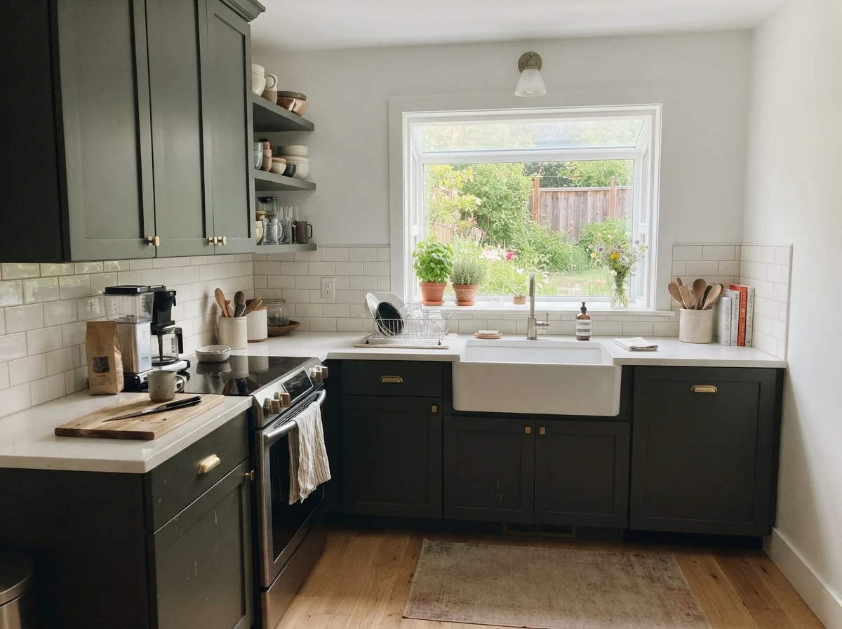
When you do commit to painting both upper and lower cabinets in Shade-Grown, you need two non-negotiables: immense daylight and a satin urethane enamel. Notice how the bright garden windows in the kitchen above flood the cabinet boxes with daylight, allowing the green undertone to step forward. Without that generous wash of sun, upper cabinets at LRV 8 will loom overhead like heavy iron shelving.
Let me talk about finish for a moment, because this is where many DIYers make an expensive mistake. Do not try to paint cabinetry with standard wall eggshell, and do not use high-gloss in a color this dark unless you want every brush stroke, roller stipple, and dust spec magnified under your pendant lights. A satin urethane-fortified enamel provides enough surface tension to withstand daily wiping while maintaining a velvety, low-sheen body. It was worth the money every single day we owned that kitchen.
Bathrooms and Powder Rooms: The Half-Wall Strategy
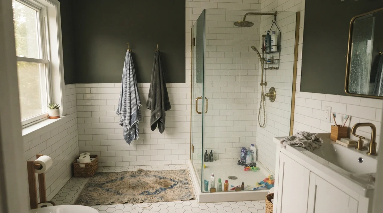
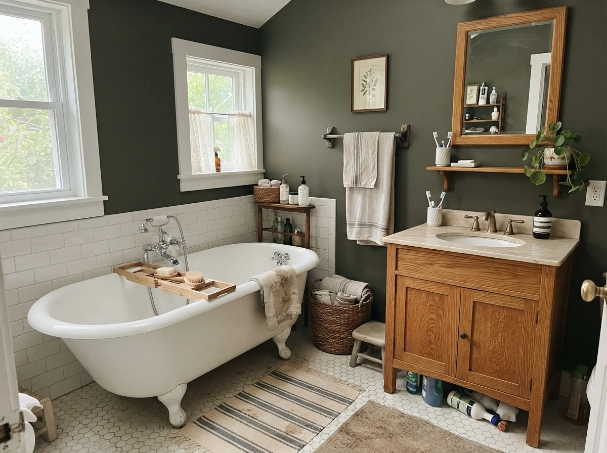
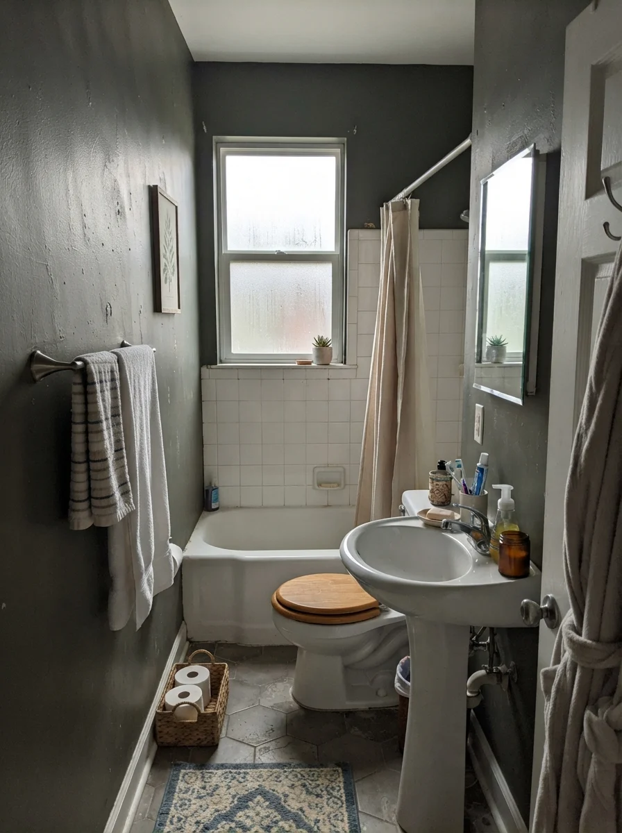
Bathrooms are tricky territory for Shade-Grown. In the three spaces shown above, you can see how wildly the color behaves based on surrounding finishes and lighting conditions. In the clawfoot tub cottage setting, paired with warm oak and white hex tile, the color feels tailored, timeless, and serene. It frames the white porcelain beautifully.
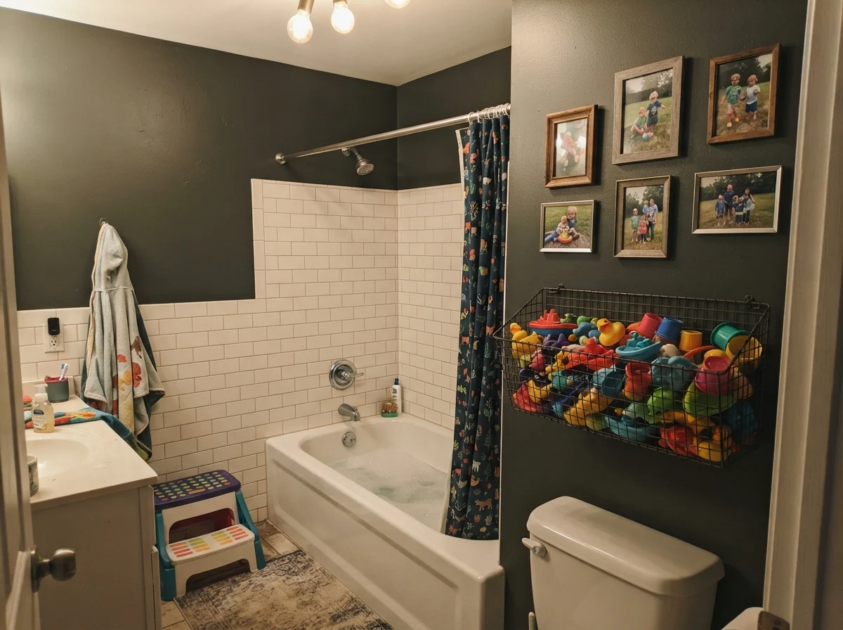
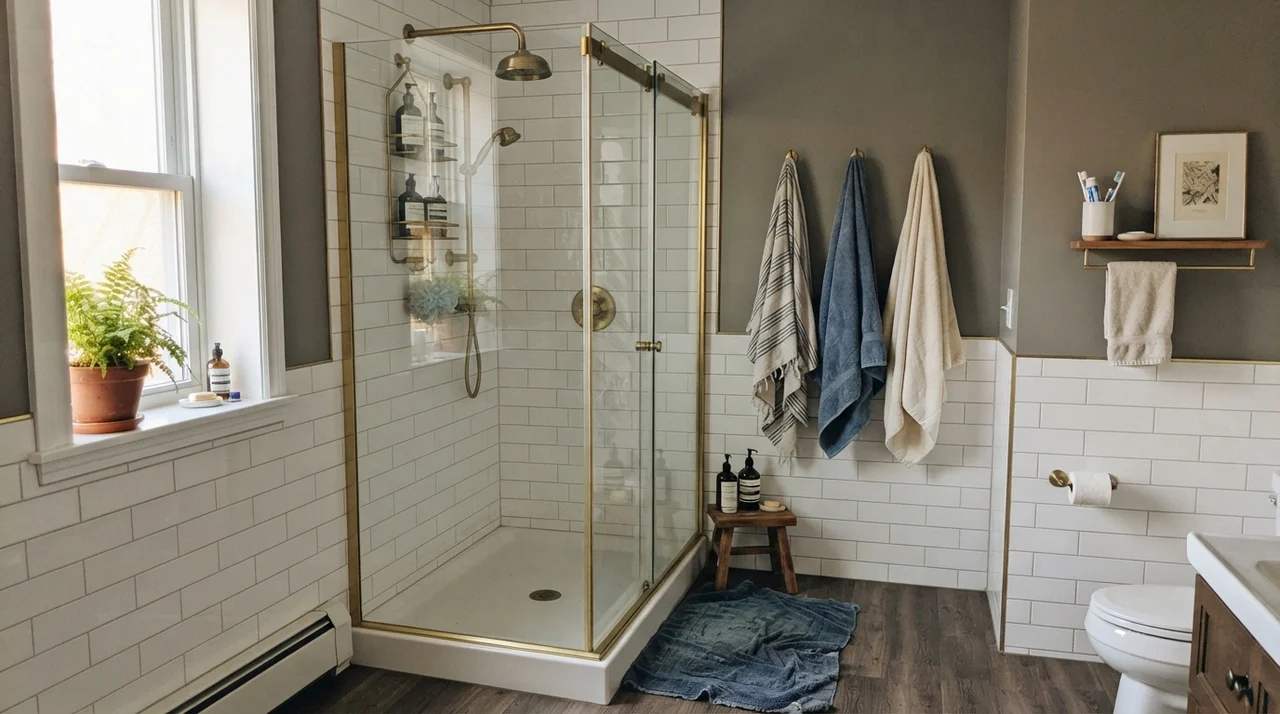
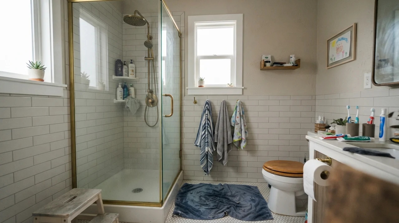
In the kids' bath, running crisp white subway tile two-thirds of the way up the wall is the only reason the room works. The white tile bounces illumination from the vanity bulbs, while the Shade-Grown upper wall creates a grounded picture rail effect. Contrast that with the third photo: on a drizzly, overcast day through frosted glass, the color loses its spark completely. It turns stony, quiet, and slightly flat. If your guest bath or powder room has zero windows, painting all four walls top-to-bottom in Shade-Grown will turn it into a dark box unless you introduce very intentional, warm sconce lighting at eye level.
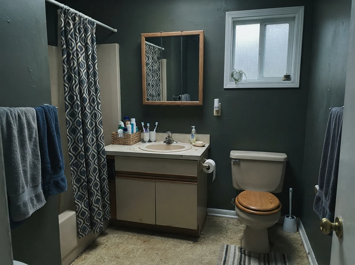
Here is an honest view of what happens when Shade-Grown meets poor lighting and dated fixtures. In this modest bathroom with a north-facing window on a wet afternoon, the green is virtually undetectable. More importantly, notice how it sits against the older beige laminate vanity: they do not help each other. The beige feels tired and yellowed, while the wall paint looks like an uninviting charcoal slate. If you have an older bathroom that you are trying to refresh on a budget without replacing the vanity or tile, Shade-Grown is not your magic bullet. It requires clean whites, fresh creams, or warm, rich woods to look intentional.
Sleeping Spaces: Bedrooms and Nurseries
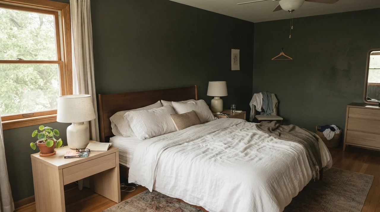
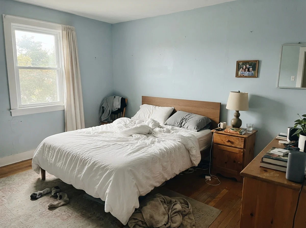
Can you paint all four bedroom walls in an LRV 8 near-black green? Yes, but only if you dress the rest of the room in light-reflecting materials. In the main bedroom shown above, the room succeeds because seventy percent of what your eye sees is white linen bedding, pale blonde oak nightstands, and soft ceramic accents. The dark wall acts as a dramatic backdrop rather than an overbearing blanket.
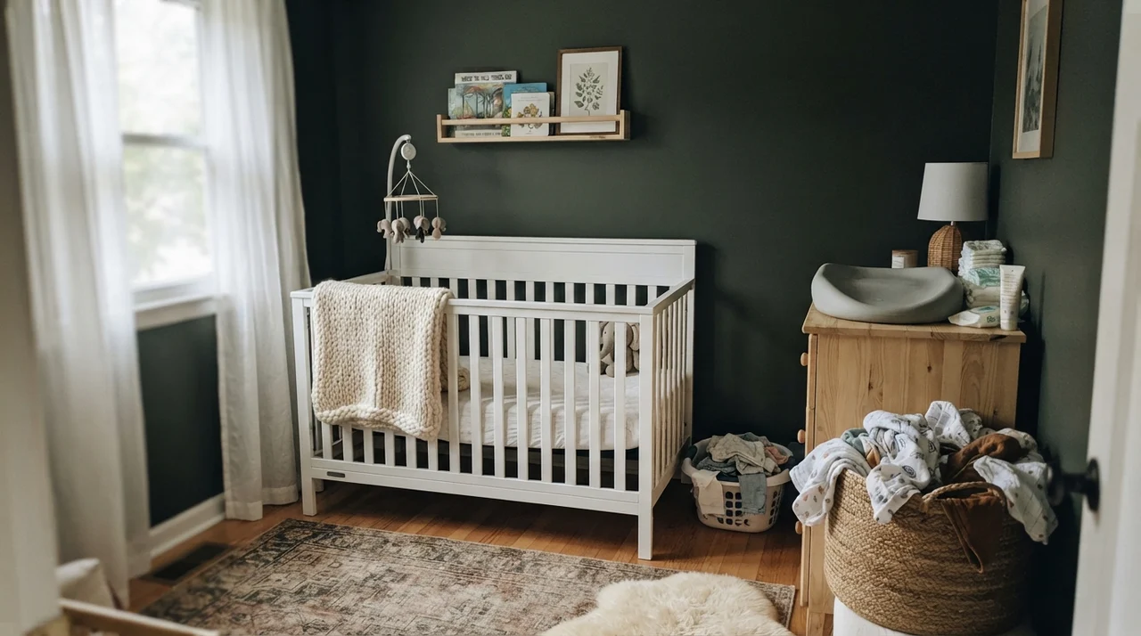
We see the same principle in the nursery. With sheer curtains filtering bright daylight, the walls read as a calming, cocooning forest green. It feels grounded, natural, and timeless—not something that will look dated within three years when nursery trends inevitably turn over. When you pair it with natural woven baskets and unfinished wood, Shade-Grown settles right into the background, providing a resting place for the eyes.
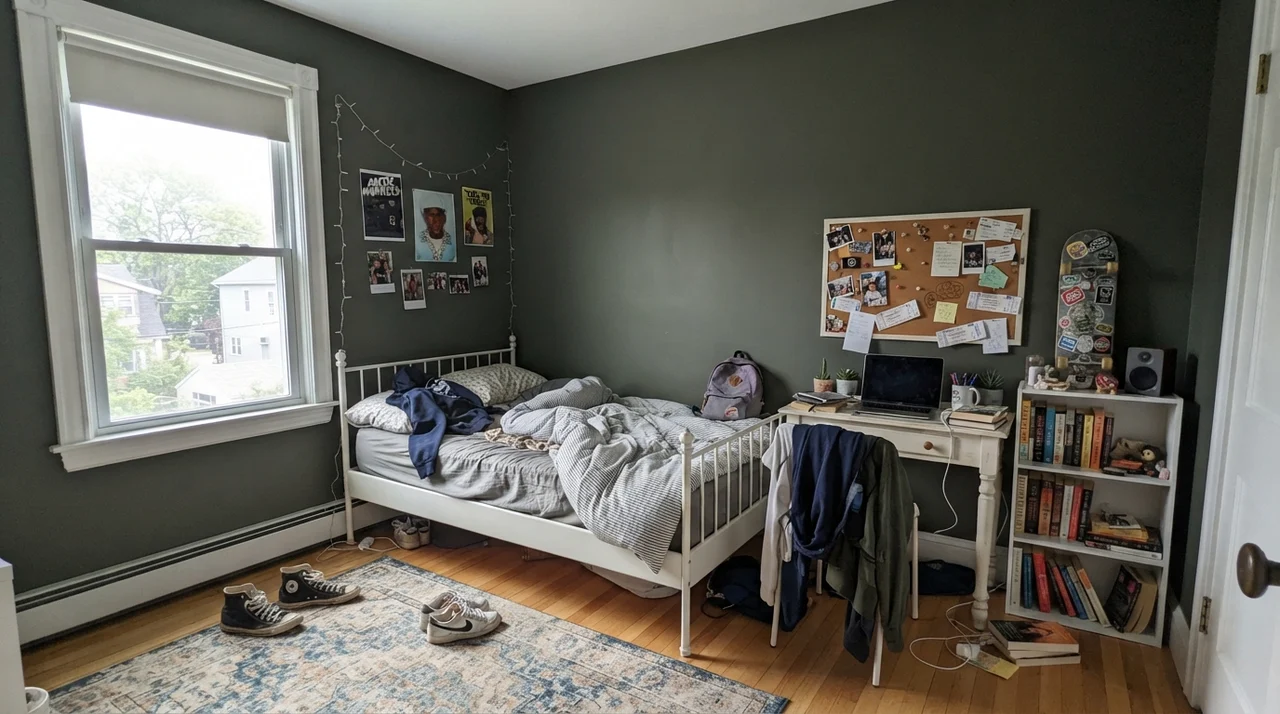
In this teenager's bedroom, you can see how Shade-Grown handles everyday practical life. It provides an excellent, high-contrast canvas for white metal furniture, posters, corkboards, and bookshelves. More importantly for parents of busy teens, it handles scuff marks from backpacks and leaning chairs far better than a pale greige ever could. A quick wipe down with a damp rag removes dust without burnishing the surface—provided you chose an eggshell or washable matte finish designed for real scrub resistance.
Living Rooms and Sunrooms: Embracing the Natural World
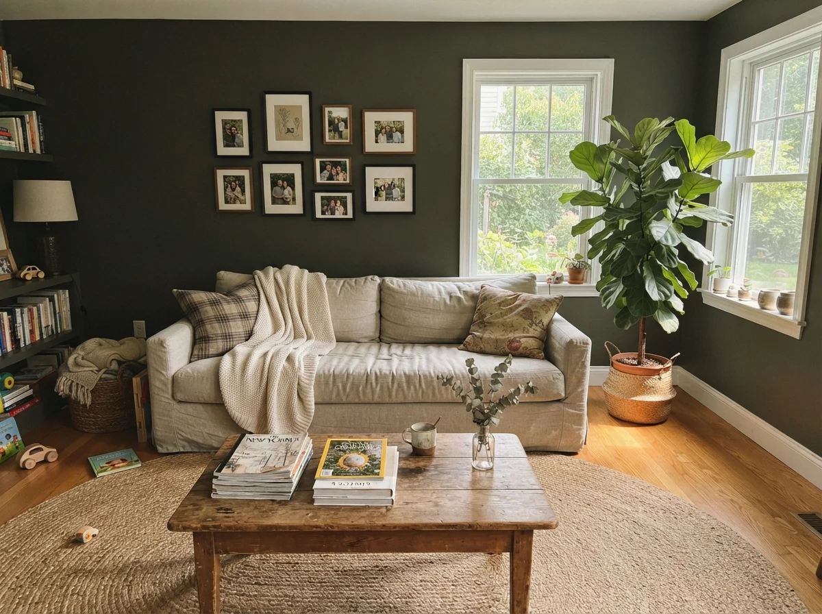
Look at the living room above when the noon sun streams in through double windows: suddenly, the olive tones step directly forward. The jute rug, warm timber coffee table, and rumpled linen upholstery work in complete harmony with the wall color. This is the exact scene that makes people fall in love with Shade-Grown in design magazines. It feels collected, deeply layered, and grounded in nature.
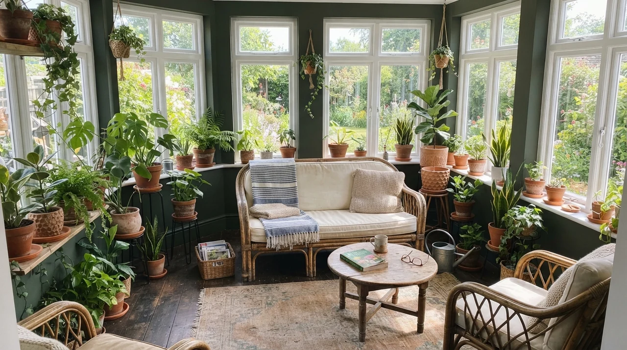
The sunroom takes that concept a step further. Because the painted surface area is broken up by dozens of white window mullions and frames, the dark green acts like the dark soil of an outdoor garden bed. It makes the vibrant green foliage of indoor plants pop with extraordinary vitality. It bridges the gap between indoors and outside better than almost any true black or stark navy I've ever lived with.
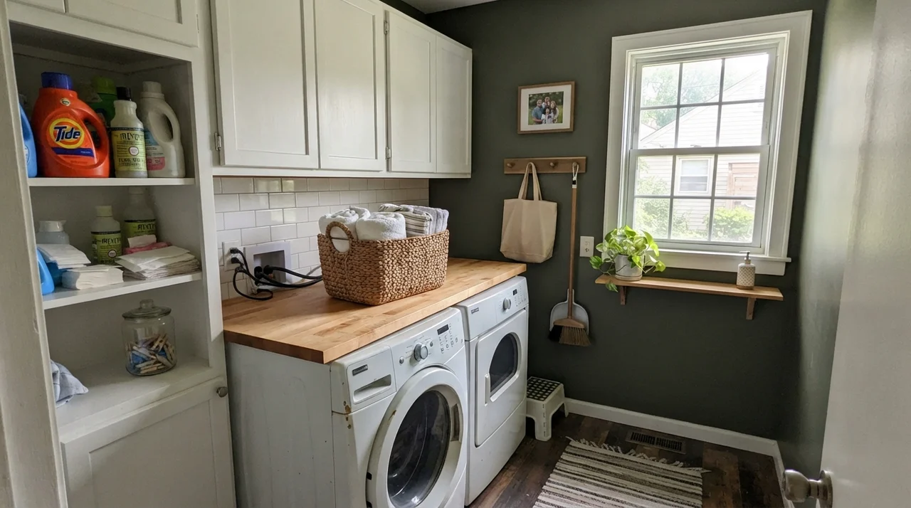
In this laundry room, the combination of a single good window, a honey-toned butcher-block folding counter, and clean white appliances proves why Shade-Grown is such an effective utility color. Laundry rooms and mudrooms take a beating from laundry baskets, damp coats, and muddy boots. An LRV 8 dark green conceals minor scuffs effortlessly while elevating what could otherwise be a sterile, utilitarian chore space into something rich and customized.
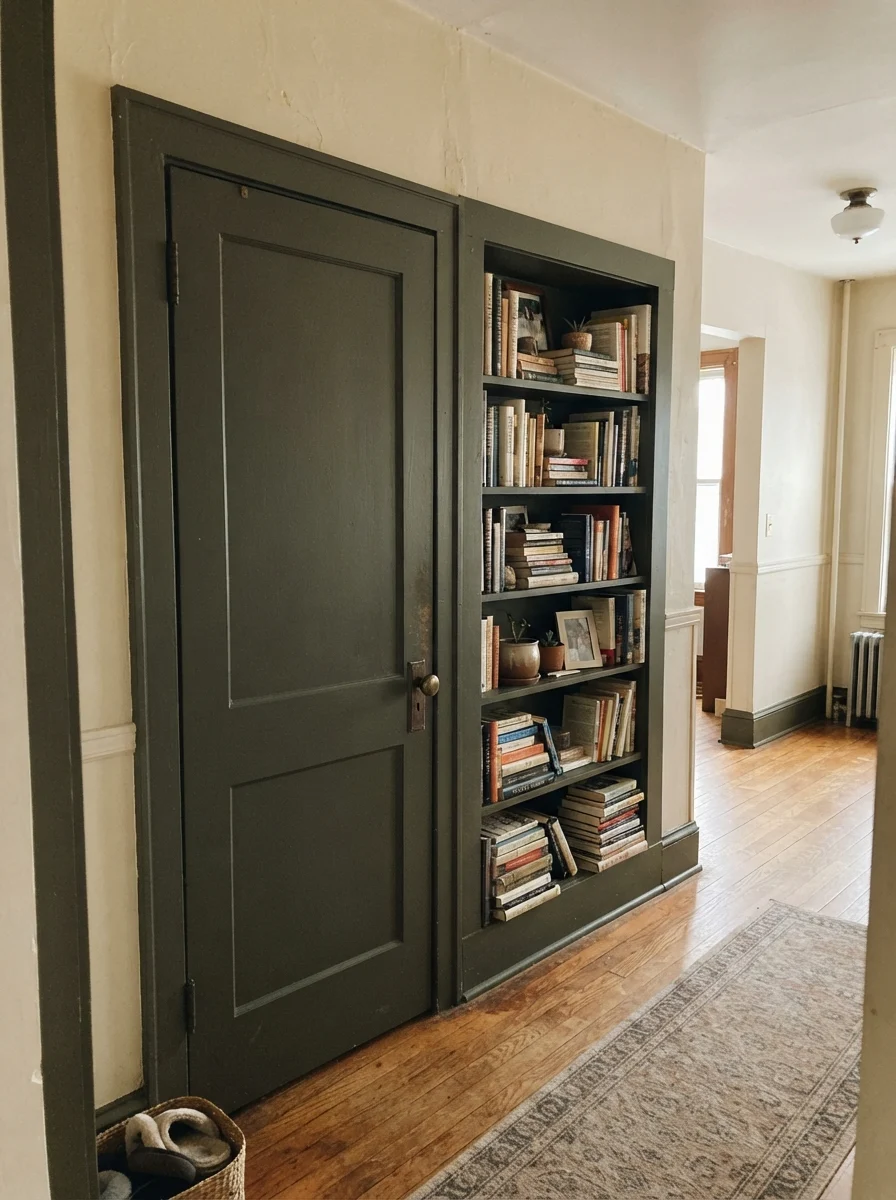
If you are nervous about committing all four walls of a major room to a paint this dark, treating an interior door and millwork to a coat of Shade-Grown is an exceptional compromise. In our current 1960s ranch, I painted the interior side of our back hall doors in a deep satin dark green. It hides dirty handprints near the brass knobs and gives standard flat millwork instant architectural weight. Against warm cream walls, it provides crisp definition without feeling jarring.
Exterior Application: Siding vs. Shutters and Doors
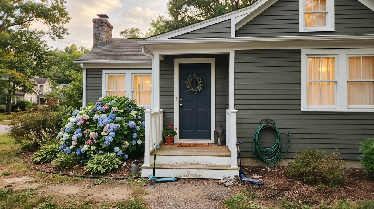
On an exterior facade, natural sunlight is at its absolute peak. As you can see in the photo above, horizontal siding painted in Shade-Grown does not look like an ominous black haunted house. The direct sky light pulls out an earthy, deep bronze-green character that nests comfortably behind landscaping, shrubs, and hydrangeas. Paired with white trim, it feels dignified and historic.
However, a word of caution from thirty years of home maintenance: dark exterior siding absorbs massive amounts of heat. In southern climates or unshaded west-facing exposures, an LRV 8 paint will put extra thermal stress on your substrate and will require more diligent maintenance over the years. For most homeowners, using Shade-Grown on exterior shutters, the front door, or garage trim—while keeping the main body a warm, lighter neutral—is the smarter long-term investment.
The Honest Fail: Why Dim Rooms Defeat This Color
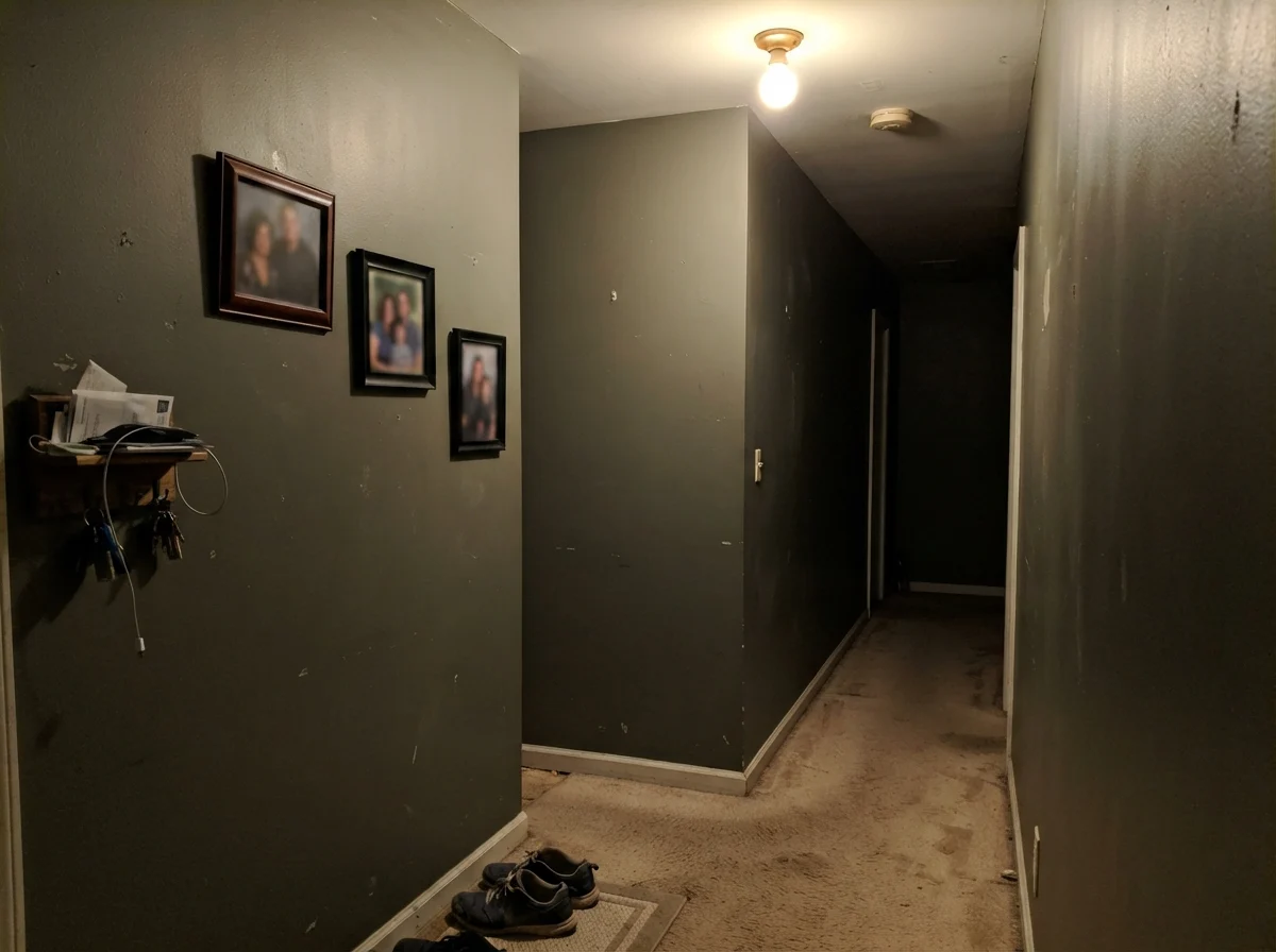
Here is the cold, unvarnished truth captured in the photograph above: if you paint a windowless hallway or a dim interior foyer in Shade-Grown under a builder-grade overhead bulb, you will hate it. Without daylight to activate the green pigment, the paint collapses into a flat, lifeless, muddy charcoal that resembles dirty putty. The warm, woodland magic you saw in the sunny living room evaporates completely.
I receive emails from readers every month lamenting that their new dark green paint job 'just looks like depressing black.' In every single instance, the culprit is identical: a windowless room, cool or weak lighting, and no high-contrast trim to break up the mass. If your space cannot supply regular natural sun or thoughtful 2700K lamp lighting, stop looking at Shade-Grown and choose a true charcoal like Iron Ore, or step up four shades lighter to a dependable sage like Dried Thyme.
Long-Term Living: Durability, Touch-Ups, and Resale Realities
Whenever you choose a wall color with an LRV in the single digits, you must prepare for how it behaves five years in. In our colonial, we lived with it through two dogs, teenage homework sessions, and countless dinner parties. Here is what they never tell you on paint fan decks:
First, dusting is real. Dark surfaces show airborne household dust, pet hair, and lint significantly faster than a soft beige. You will find yourself running a microfiber duster along baseboards and cabinet stiles twice as often. Second, finish quality matters immensely. Because dark tints require a heavy load of pigment dispersion, lower-tier contractor paints will burnish—leaving shiny rub marks—the second someone brushes against them with a shoulder or a vacuum cleaner handle. Spending thirty dollars more per gallon for a premium, scuff-resistant paint line was worth the money tenfold.
Third, let's talk about resale. When we sold our colonial, our listing agent walked through and specifically noted the dark island and hall built-ins as major selling assets because they grounded the open floor plan. But she also noted that had we painted the primary bedroom or formal dining room top-to-bottom in Shade-Grown, we would have had to prime and repaint it in an off-white before hosting the first open house. Dark rooms photograph small online to buyers scanning listings on their phones. Keep your deep colors on islands, cabinetry, doors, or sunny dens, and you will protect both your sanity and your equity.
What is the Light Reflectance Value (LRV) of Sherwin-Williams Shade-Grown?
Shade-Grown has an LRV of 8. On a scale where 0 is absolute black and 100 is pure white, an LRV of 8 places it firmly in the near-black category. It absorbs ninety-two percent of visible light.
Is Shade-Grown black or green?
It is an earthy near-black with a strong olive-green base. In south- or west-facing daylight, the olive character shows clearly. In dim hallways, north-facing exposures, or rooms lit by cool 4000K LEDs, it reads as a solid, flat black.
What paint sheen should I use for Shade-Grown?
Use a washable matte or eggshell on walls to minimize glare and keep the dark tone rich. For kitchen cabinets, bathroom vanities, and interior doors, choose a satin urethane-fortified enamel for durability and easy cleaning.
Does Shade-Grown work with cool gray countertops or tile?
No. Shade-Grown carries an earthy olive-bronze undertone that clashes with cool, blue-gray carrara marble, gray quartz, or cold slate. It pairs best with warm whites, creamy alabaster, brass fixtures, and natural wood tones.
Susan's Verdict · A Selective Powerhouse
Sherwin-Williams Shade-Grown is not a whole-house wall color, and it is certainly not a paint to toss casually into a windowless hallway. But if you give it the job it was built for—a kitchen island anchoring a sea of white cabinets, an exterior front door framed by warm stone, or millwork bathed in afternoon sunlight—it is magnificent. It delivers all the architectural gravity of a classic black, but keeps just enough green heart to feel alive. Test it in your home at noon and at nine at night before you buy the gallon, and pair it only with warm companions.