Color Diary · No. 99
Chelsea Gray HC-168 and the Three-Way Undertone That Surprises Everybody
The designer charcoal-greige on every island and every farmhouse exterior, reviewed honestly: the undertone that flashes green in the afternoon and purple next to the wrong neutral.

Susan HartleyOctober 27, 2026 · 21 min read
Chelsea Gray · Benjamin Moore HC-168
Hex#86847CLRV23Undertonesbrown → green → violet
In our last house, a 1990s center-hall colonial with builder-grade oak everywhere you looked, I spent three solid months trying to figure out what to do with the kitchen island. The perimeter cabinets were painted an off-white that had held up well enough, but the island was an expanse of scuffed golden oak that caught every kick from every pair of sneakers at the breakfast bar. I didn't want black. Black in a family kitchen shows every flour smudge, every water drop, and every greasy thumbprint before the morning rush is even over. What I wanted was weight. I wanted a shade that had enough backbone to anchor the middle of the room, look intentional next to warm wood floors, and take a beating from the vacuum cleaner without looking chipped to pieces five years in.
A designer friend handed me a swatch of Benjamin Moore Chelsea Gray (HC-168). She told me it was the one dark neutral that never went dead. I brought the chip home, taped it to the oak paneling, and lived with it through four seasons before I touched a brush to cabinet wood. That was twelve years ago. Since then, I have seen this specific charcoal-greige go onto front porches, bathroom vanities, board-and-batten accent walls, and whole exteriors across three different neighborhoods. It is one of the most capable, hard-working colors in the Historical Collection, but it is also one of the most misunderstood. People buy the chip thinking they are purchasing a polite, straightforward charcoal gray. What they actually get is a complex, moody middleweight that carries brown, flashes olive green in hard afternoon light, and will turn distinctly violet if you park it next to the wrong trim.
If you are looking at Chelsea Gray because you want a dependable dark accent that feels grounded and rich, you are looking in the right place. But before you buy three gallons of cabinet enamel or hire a crew to spray your exterior siding, you need to understand how those three undertones behave once the paint cures. A color with an LRV of 23 does not sit quietly in the background; it announces itself, and you have to know what it is going to say when the sun goes down.
The Undertone Story: Three Colors Living in One Can
Chelsea Gray sits in Benjamin Moore's yellow deck family, but calling it yellow will only confuse you. What that yellow base really means is that this paint is loaded with warm pigment. Instead of being an icy, mineral charcoal built on pure black and blue tint, Chelsea Gray is a three-way balancing act between warm earth brown, muted moss green, and a fugitive violet that only steps out when provoked by cool lighting.
warm sun
overcast, north light
dusk, rain, cool bulbs
Under bright sun, the warm brown and green pigments expand, lifting the color into a soft, velvety greige-charcoal. In dim north daylight or under cool 4000K LED lighting, the warmth drains away and the hidden violet undertone comes forward.
Mole's BreathFarrow & Ball · see diary
Metal FringeDunn-Edwards · see diary
Chelsea GrayHC-168
Mountain RoadSherwin-Williams · see diary
Dirty ChaiClare · see diary
Understanding Light Reflectance Value is crucial when dealing with a shade like this. Chelsea Gray has an LRV of 23. To put that in perspective, pure black sits at zero and bright ceiling white sits around 85 or 90. An LRV of 23 means this paint absorbs 77 percent of the light hitting its surface. It is well below the halfway mark of the scale, which places it firmly in the middleweight dark category. It is not quite a deep, near-black charcoal, but it has plenty of pigment to darken an under-lit room in a hurry.
Because it retains that 23 percent reflectance, Chelsea Gray does not flatten out into an opaque void the way near-black paint can. When natural daylight washes across a wall painted in this shade, you can see the velvety depth of the pigment. That is precisely why designers reach for it when an island needs to anchor an open-concept kitchen. A pitch-black island can look like a gaping hole from across the living room, but Chelsea Gray retains its texture, catching just enough reflection to read as tailored and soft.
How Daylight Governs the Shifts
The cardinal rule of living with Chelsea Gray is that the orientation of your windows will dictate which of its three personalities you see most of the day. In our 1960s ranch, I tried a sample board in the east-facing front bedroom and another in the west-facing family room at the back of the house. The difference was startling enough that two visiting neighbors thought I was testing two entirely separate color chips.
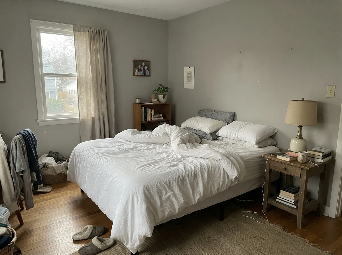
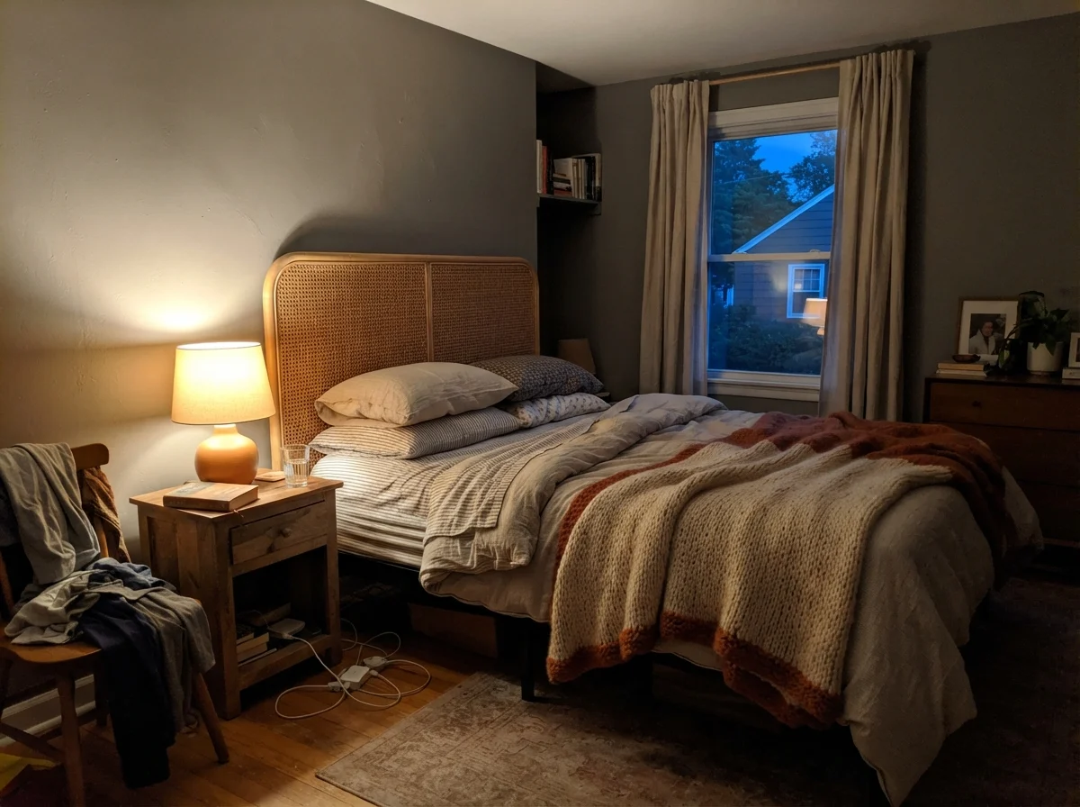
In cool morning light or rooms with north-facing exposures, the yellow-brown warmth stays dormant. The paint leans cooler, reading as an honest, slightly moody slate gray. On a rainy day, that cooler cast can push the subtle violet undertone to the front, particularly if you have cool-toned flooring or stark trim in the room. But when the afternoon arrives and low-angled western sunlight floods the space, those warm pigments wake right up. Between four and six in the evening, a west-facing wall painted in Chelsea Gray will flash a distinct, unmistakable olive-green note. I happen to love that earthy, organic shift, but if you purchased the paint expecting pure, clinical gray flannel, that two-hour green window will feel like an unwelcome surprise.
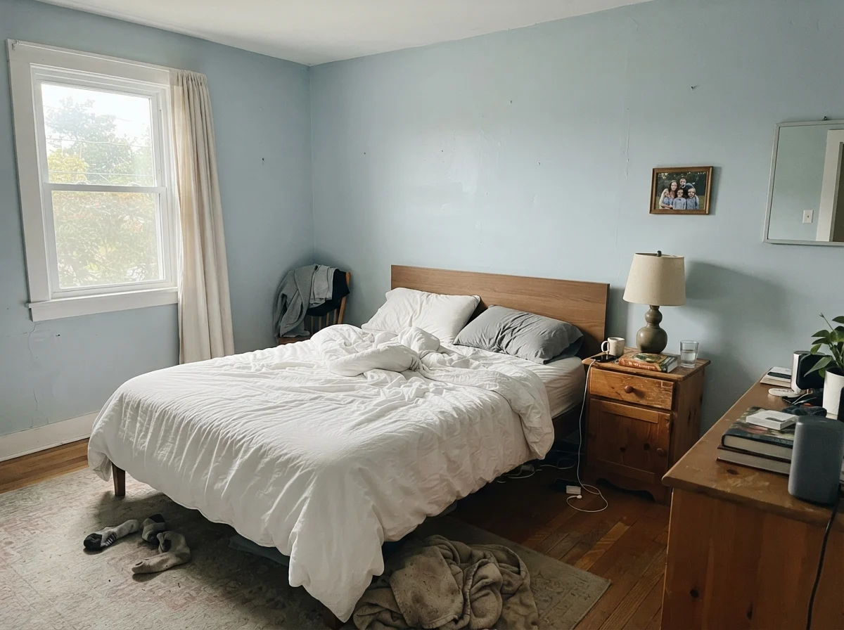
Those two bedroom photos show the daylight shift clearer than any technical description I could write. In the morning shot, the cool light through the east window drains the body from the paint, leaving it looking cooler and somewhat muted. By evening, once the incandescent bedside lamp is clicked on and dusk settles outside, the brown-charcoal base comes roaring back, wrapping the room in a rich, enveloping warmth. That responsiveness is the whole charm of living with a Historical Collection color. It does not stay static; it breathes with the daylight cycles of your home.
The Kitchen: Where This Color Earns Its Keep
If there is an undisputed natural habitat for Chelsea Gray, it is on kitchen cabinetry. For the last fifteen years, homeowners have faced a familiar dilemma: all-white kitchens can feel sterile and clinical, while all-navy or all-black kitchens can feel heavy, trend-bound, and unforgiving of dust and cooking grease. Chelsea Gray provides the ideal middle path.
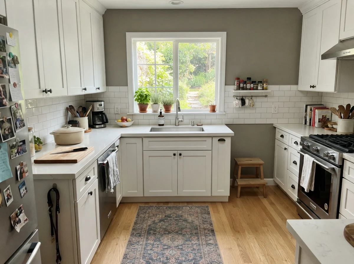
On perimeter cabinetry, it delivers enough contrast against white subway tile or pale quartz countertops to give the kitchen genuine architectural depth. When used exclusively on a central kitchen island, it grounds the room without fighting adjacent finishes. It pairs effortlessly with warm natural wood, whether that is a butcher-block prep counter, white oak plank flooring, or honey-toned open shelving. Because it has yellow and brown in its genetic makeup, it harmonizes with warm wood rather than making the wood appear yellowed or cheap—which is the classic failure mode of cool, blue-based grays.
When painting kitchen cabinets in Chelsea Gray, sheen selection is everything. Do not paint cabinets in an eggshell or matte finish. In our colonial, I used a proper satin cabinet enamel on the island base, and it proved to be worth every single dime. Kitchen cabinets take relentless physical abuse: scuffs from shoes, splatters from pasta sauce, and constant contact from wet hands. A quality satin enamel provides the tight, washable surface film you need while maintaining a soft, furniture-quality appearance. A semi-gloss can work as well, but because Chelsea Gray is dark, a high gloss level will bounce specular highlights across the panel faces, which emphasizes every tiny ding and grain line in the wood.
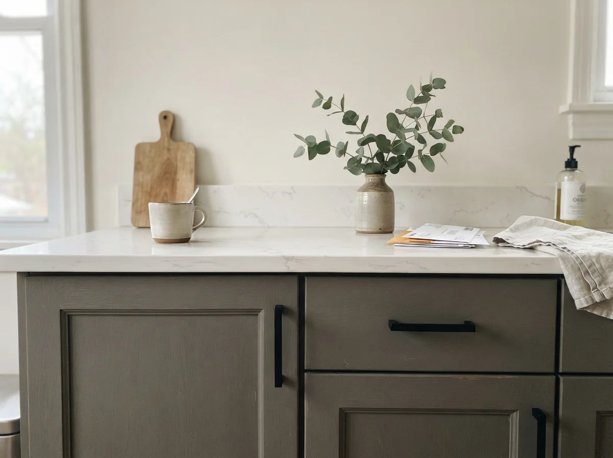
Hardware pairing is another area where Chelsea Gray shines. As seen in the close-up above, matte black hardware provides a crisp, tailored look that feels grounded and modern. But if you want to lean into the color's inherent warmth, unlacquered brass, aged bronze, or warm brushed gold hardware is where the magic happens. The yellow-brown base of the paint picks up the golden highlights of the brass, turning what could be a cold utility room into an inviting space that feels established and collected over time.
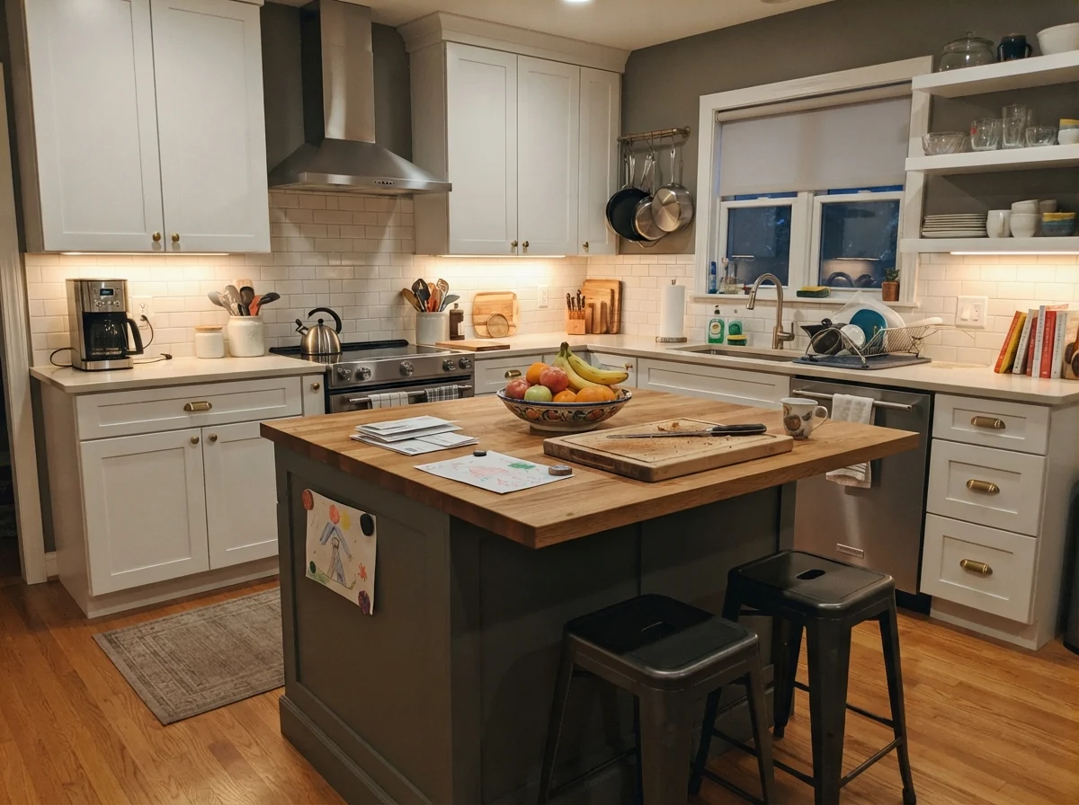
Look at that island shot above. That is real life in a real house. When the surrounding cabinetry is painted white and the walls are kept in a soft cream, painting just the island in Chelsea Gray gives the eye a comfortable place to rest. It conceals the inevitable shoe scuffs along the seating overhang, disguises everyday dust that would drive you crazy on black paint, and balances the presence of stainless steel appliances without duplicating their cold metallic tone.
Living Spaces, Sunrooms, and Utility Rooms
Moving out of the kitchen and into the broader living areas of the house requires more restraint. Because Chelsea Gray absorbs 77 percent of visible light, rolling it across four walls in a main living space is a high-stakes decision. If your living room has eight-foot ceilings and modest windows, painting the entire room in this color will swallow the light and make the space feel cramped and gloomy.
However, when a living room enjoys generous daylight from large windows, Chelsea Gray transforms the room into a calm, enveloping retreat. It provides a striking backdrop for linen sofas, natural jute rugs, and warm wood coffee tables. The key is balance: you need pale textiles and warm wood tones to offset the visual weight of the walls. If you furnish a Chelsea Gray room with dark charcoal sofas and dark walnut furniture, the room will quickly begin to resemble a basement cave.
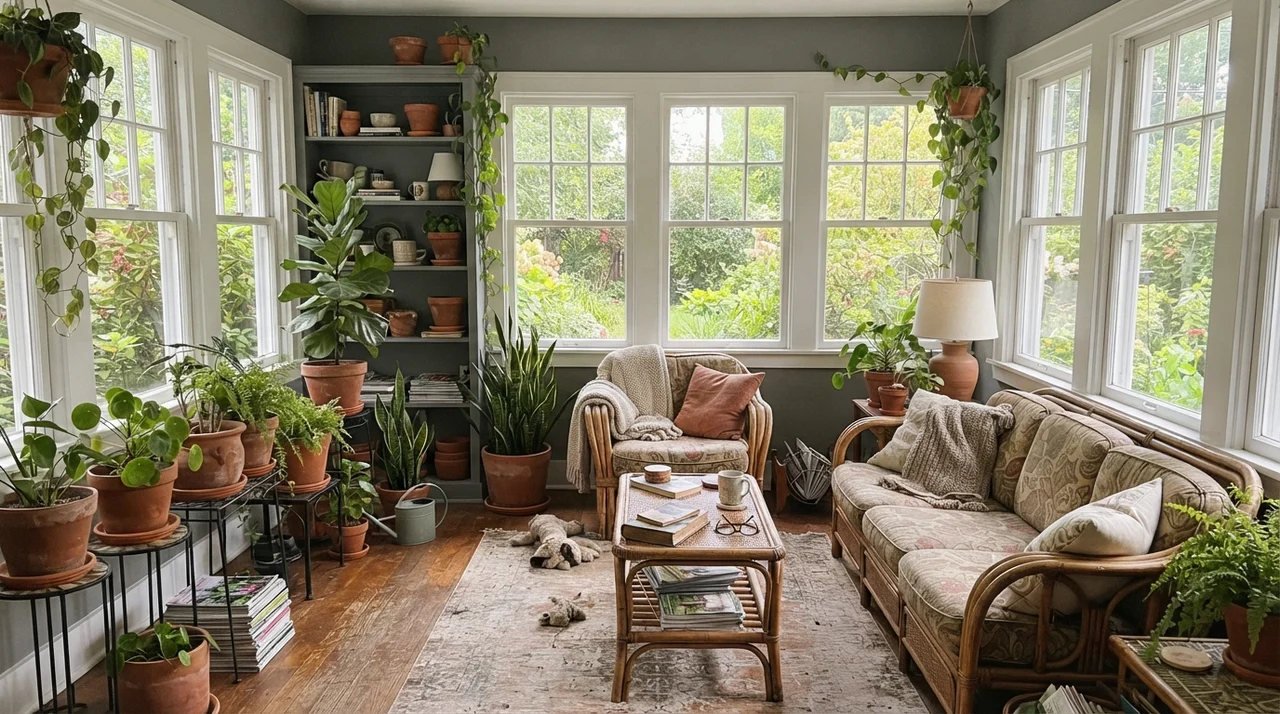
Where Chelsea Gray truly surprises people indoors is in rooms with uninterrupted perimeter daylight, such as a sunroom or an enclosed porch. In a room framed by numerous white window casings, the painted wall space is reduced to narrow vertical pillars. In that setting, Chelsea Gray acts as an elegant picture frame for the outdoor greenery. Because of the subtle green undertone buried in the paint, the walls connect naturally to garden foliage and terracotta planters rather than contrasting harshly against them.
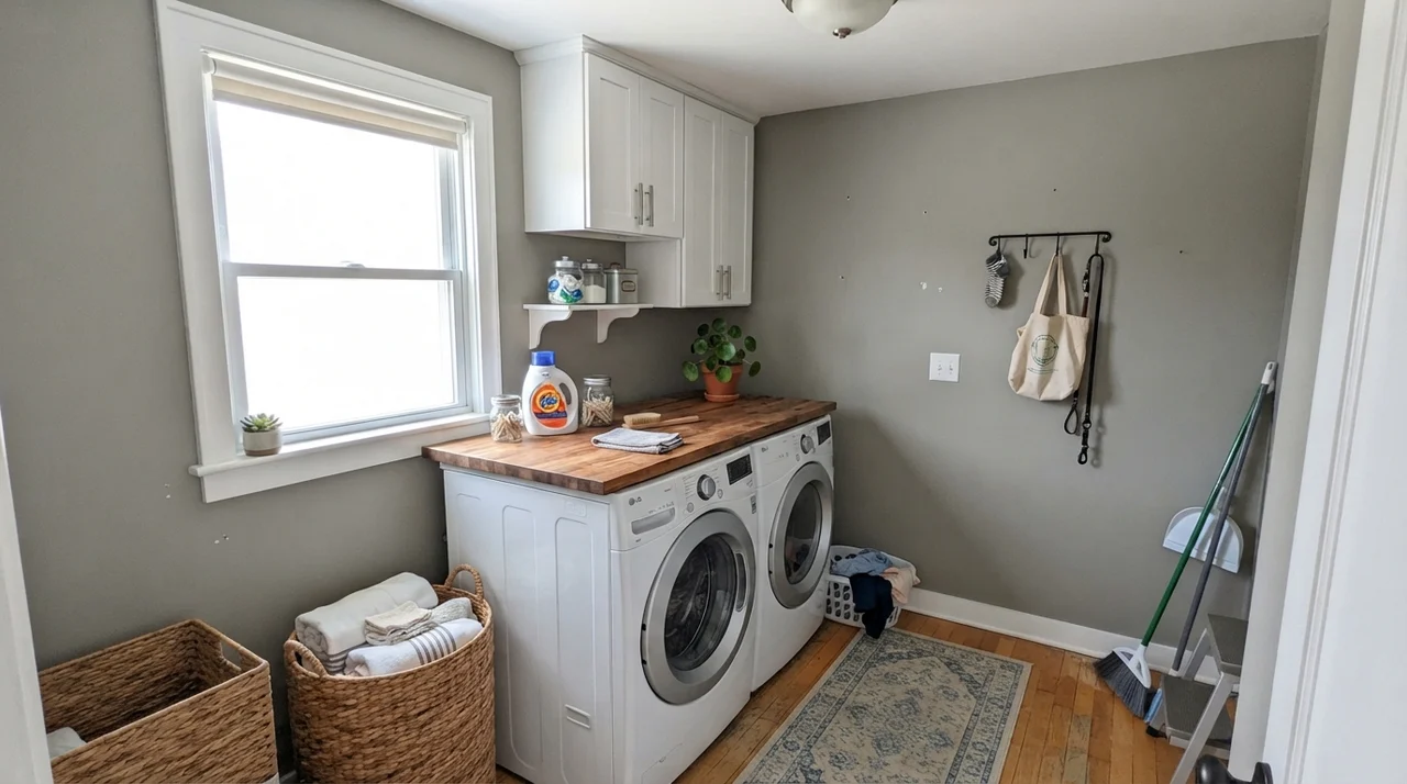
The laundry room is another workhorse application. Laundry rooms are functional spaces that endure high humidity, lint, and constant basket bumping. Painting the walls in Chelsea Gray behind white front-loading machines and butcher-block folding counters gives the utility space an intentional, customized feel. A scuff from a laundry basket on a pale white wall leaves an immediate gray mark; on Chelsea Gray, minor scuffs blend in until you have time to wipe them down with a damp microfiber cloth.
In secondary bedrooms, a single accent wall behind a headboard is often the safest and most effective interior application for Chelsea Gray. It creates an anchor for the bed, gives depth to white linen bedding, and allows the remaining three walls to stay in a lighter, light-bouncing warm neutral. In a nursery or a teenager's room, it functions as a sophisticated neutral that grows with the child. It doesn't look like baby paint, and it easily accommodates evolving furniture choices, from a light-wood crib to white metal bed frames and corkboards.
Architectural Millwork and the House Exterior
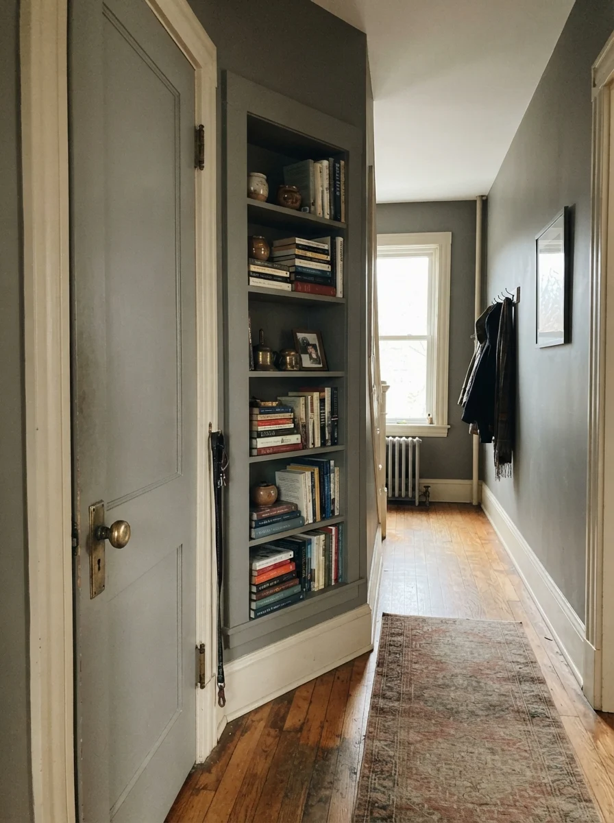
One of my favorite ways to deploy Chelsea Gray is on architectural trim, interior doors, and built-in cabinetry inside an older home. When you paint a two-panel interior passage door and adjacent built-in bookcases in this shade against soft cream walls, the millwork instantly takes on historical gravity. It feels architectural and solid, especially when paired with original brass hardware and warm hardwood floors. It gives character to spaces that might otherwise feel flat or ordinary.
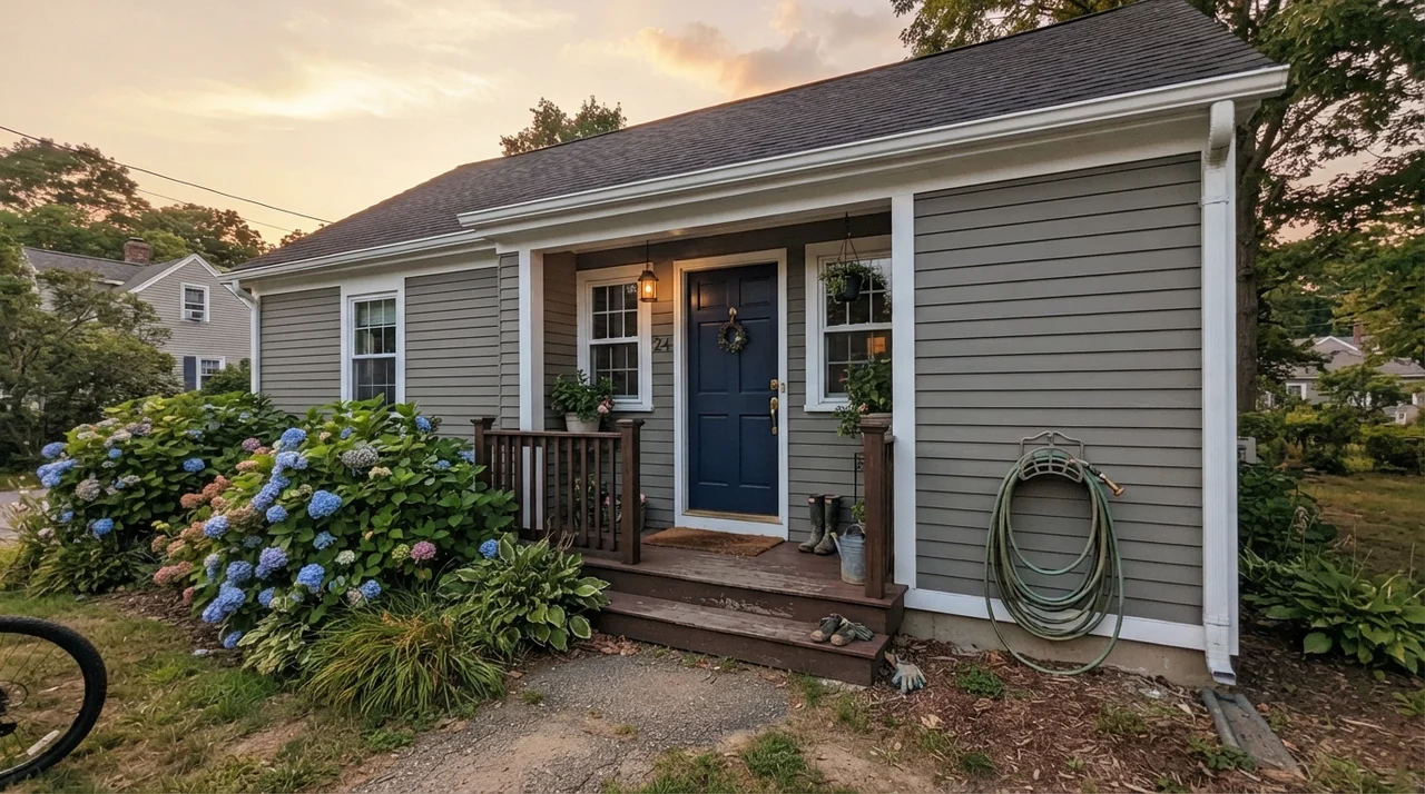
Then there is the exterior siding. If you drive through any established suburban neighborhood or modern farmhouse development, you will see charcoal-painted exteriors everywhere. Most of them look flat, dusty, or uncomfortably stark. Chelsea Gray is one of the very few mid-to-dark grays that actually excels on full exterior siding. Why? Because outdoor sunlight washes out paint colors by roughly one to two shades. Under the full intensity of the open sky, an LRV 23 color reads more like an LRV 30. The warm yellow-brown undertone prevents the siding from turning chalky or baby-blue under midday sun. When paired with crisp white trim, black window sashes, red brick foundations, or natural fieldstone, it creates a rich, stately curb appeal that looks timeless rather than trendy.
Where Chelsea Gray Fails: The Honest Assessment
Almost every disappointed homeowner review of Chelsea Gray traces back to one of three predictable mismatches. None of these failures are defects in the paint itself; they are simply the result of asking a three-way undertone to do a job it was never engineered to handle.
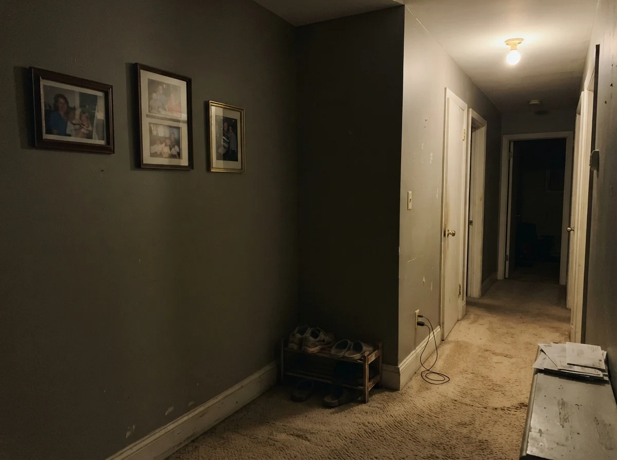
The first mistake is using Chelsea Gray as a whole-house interior wall color. I have walked through open houses where the owners painted every hallway, foyer, and stairwell in this shade, likely inspired by a dramatic photo on the internet. At an LRV of 23, painting wall-to-wall without break makes the home feel heavy, claustrophobic, and dim. Unless you live in an expansive loft with twelve-foot ceilings and industrial steel-framed industrial windows pouring daylight from dawn to dusk, this color is a supporting actor. It wants to be the island, the accent wall, the powder room, or the front door—not the default backdrop for every square foot of your life.
Look closely at that dim hallway corner above. When you place Chelsea Gray in an interior space with no natural light and illuminate it with a single, weak ceiling fixture over beige builder carpet, all the richness evaporates. The paint collapses into a flat, muddy putty tone. It doesn't look moody; it just looks dirty. If a room doesn't have good natural daylight or carefully layered lamps, keep this color far away from the walls.
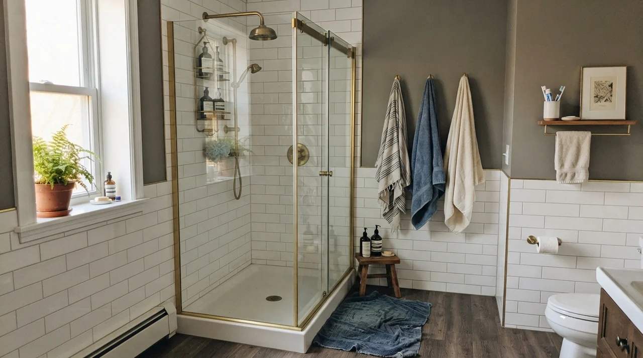
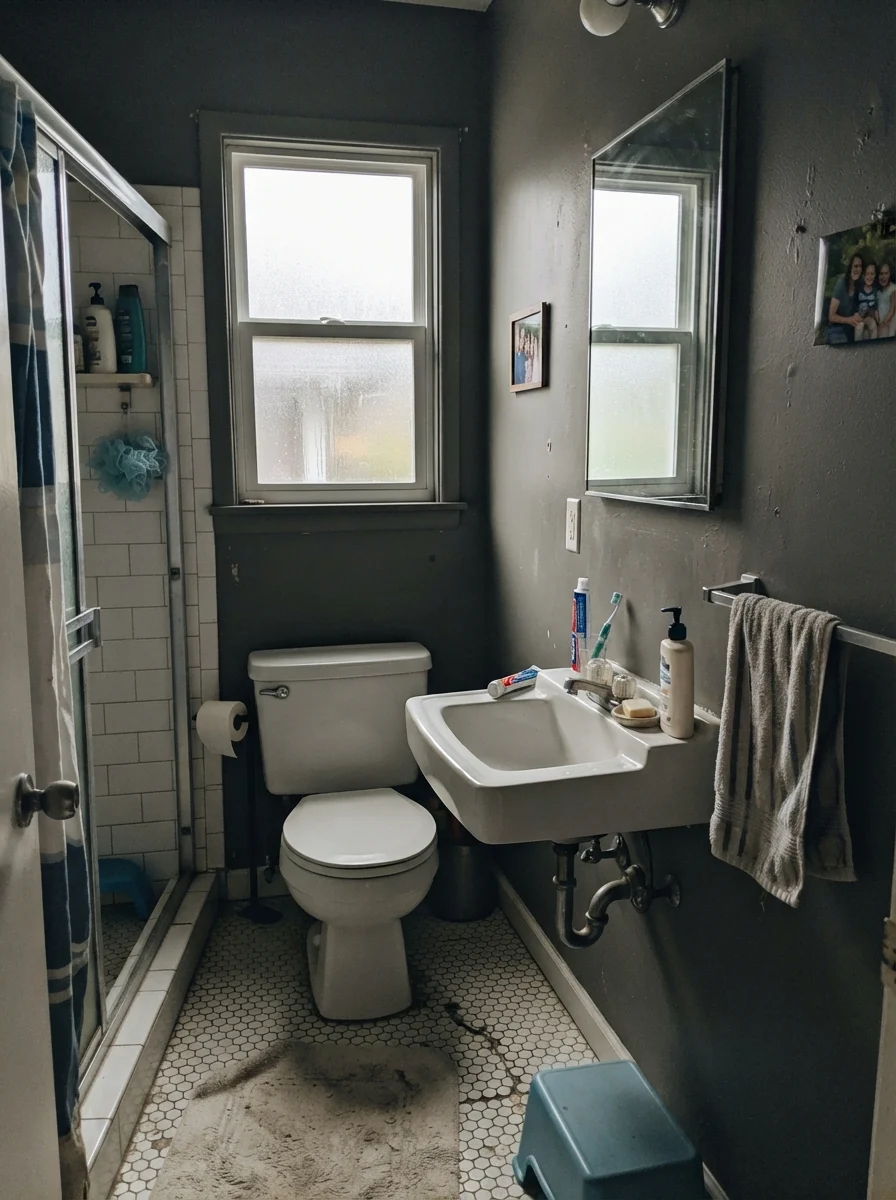
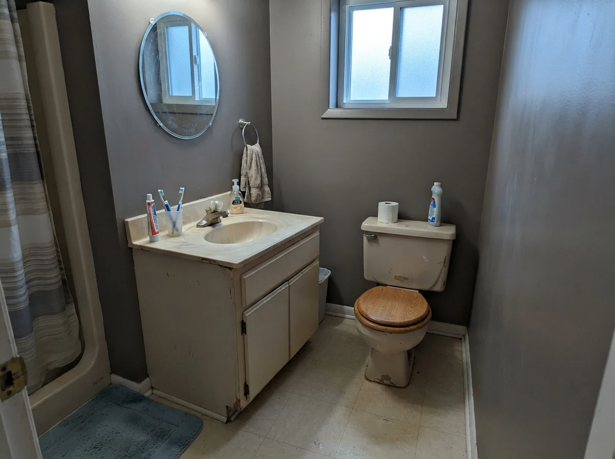
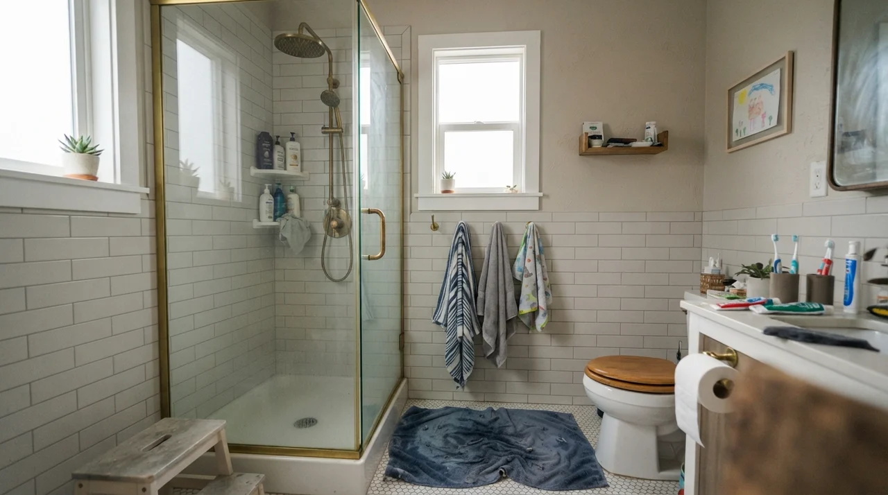
The second failure happens in small, dated bathrooms with competing cool or beige undertones. Below, you can see how flat overcast light and cool north daylight affect small bath spaces. Under flat overcast skies through frosted glass, the color loses its warmth and turns into an indifferent, stony gray. Worse, when paired with an older beige fiberglass vanity and cool rainy north light, the paint catches a stubborn cool cast that fights the yellow-beige fixtures. The two neutrals sit next to each other and bicker.
The third predictable failure is late-afternoon western sunlight. If you paint an exterior wall or kitchen island that faces directly into the low, hot 5:00 PM sun, that yellow-brown base will tip distinctly olive green for about an hour and a half every clear day. For homeowners who bought the paint wanting pure charcoal slate, that temporary flash of army green can be deeply frustrating. Always paint a generous sample board and watch it at five o'clock before you commit to painting an entire west-facing exterior.
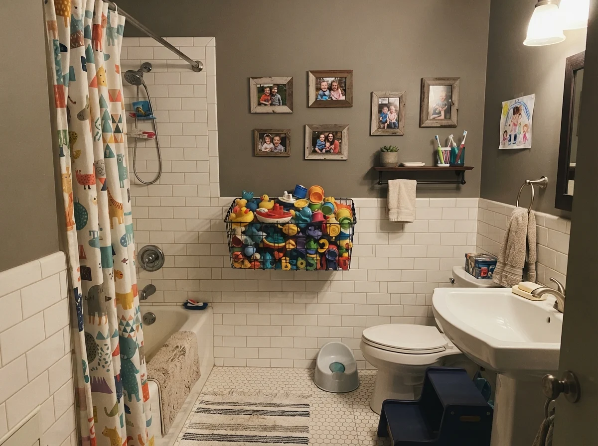
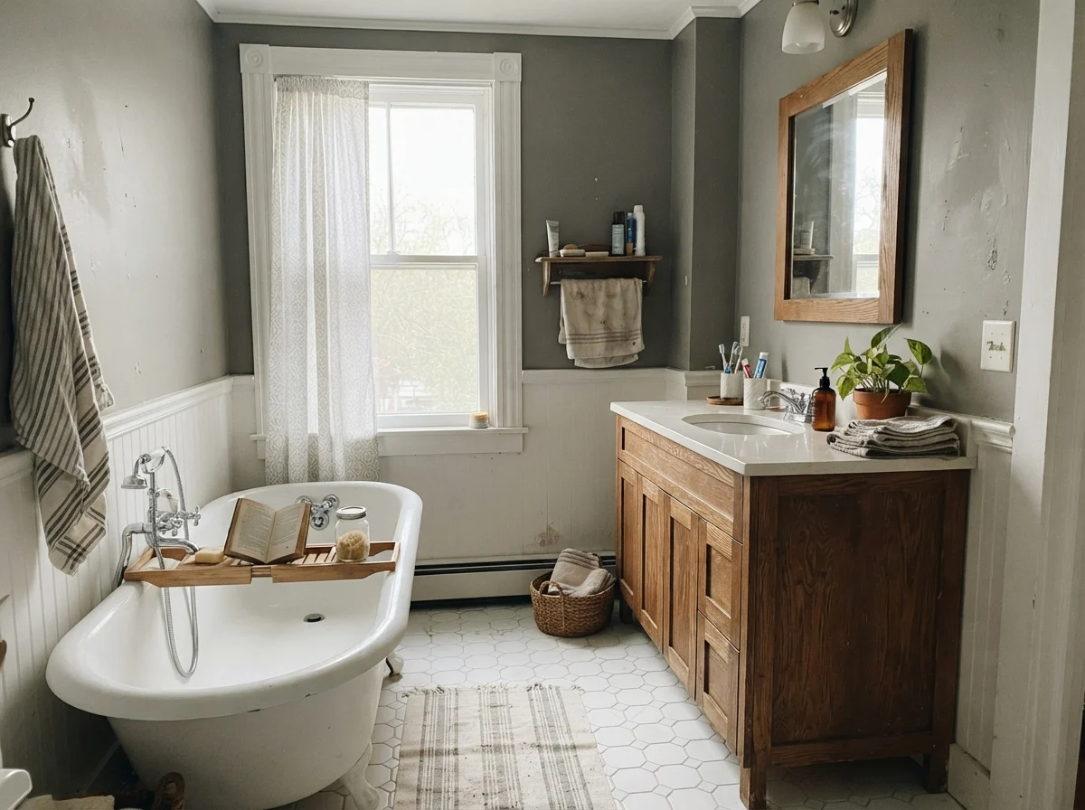
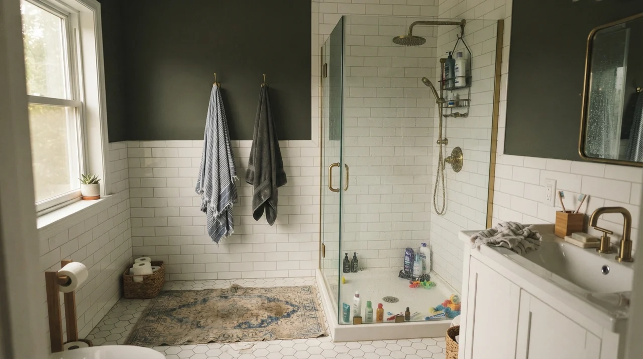
However, when the room's elements are balanced—such as pairing it with bright white subway tile wainscoting, white hex tile floors, or warm oak cabinetry—Chelsea Gray settles in beautifully. In a kids' bath or a vintage cottage bathroom, keeping the color on the upper walls above crisp white wainscot prevents the room from feeling dark while providing a clean, durable contrast that masks splashes and everyday family wear.
Durability, Scrubbing, and Long-Term Wear
Over thirty years and three houses, I have learned the hard way that dark paints are notorious for showing their age early if you pick the wrong finish. A pale greige can survive in a cheap flat finish for years because scuffs and burnishing blend into the chalky surface. An LRV 23 charcoal-greige gives you no such leeway.
When you scrub a dark wall painted in matte or cheap builder flat, the friction of your sponge smooths the microscopic roughness of the paint film. That burnished spot turns slightly shiny, and from that day forward, whenever the light hits the wall from a side window, you will see a glossy, greasy-looking halo right where you cleaned. That is not a defect in the color; it is basic paint physics.
For interior accent walls in bedrooms, living rooms, and dens, buy a high-grade eggshell. A quality eggshell provides just enough sheen to allow light washing with warm soapy water without burnishing the finish. If you must use matte for a moody bedroom accent wall, make sure it is in an ultra-premium resin line engineered for scrub resistance—and even then, scrub with a light hand.
For kitchen islands, bathroom vanities, and interior doors, insist on satin. Satin cabinet enamel cures to a hard, washable shell that resists finger oils, food splatters, and kicking feet. On our kitchen island in the colonial, that satin finish lasted seven years without requiring a single touch-up, surviving two teenagers and a golden retriever who liked to lean against the end panel while we prepped dinner. On whole exteriors, an exterior satin finish sheds rainwater, resists dirt accumulation, and holds up to garden hose spray without dulling.
Dark paint doesn't forgive a cheap finish. If you put flat on an island, you will be repainting it by year three; put a proper satin enamel on it, and it will still look tailored when you list the house.
What sheen should I use for Chelsea Gray on a kitchen island?
Always choose a high-quality satin cabinet enamel. A satin finish provides the washable surface needed to handle shoe kicks, spills, and grease while preserving a soft furniture feel. Avoid eggshell (which scuffs under foot kicks) and high-gloss (which reflects harsh glare off dark paint).
Why does my Chelsea Gray sample look green in the afternoon?
Chelsea Gray belongs to Benjamin Moore's yellow deck family and contains earth-brown and green pigments. When low-angled western afternoon sunlight hits the surface, those warm pigments expand, causing the paint to read noticeably olive green for an hour or two. This is normal behavior for this formula.
Can I use Chelsea Gray on all four walls of an interior room?
Generally no, unless it is a small powder room designed to be intentionally moody, or a room with expansive daylight. At LRV 23, painting all four walls in an average bedroom or living room absorbs 77% of available light and can make the room feel heavy and dim.
What trim white pairs best with Chelsea Gray?
Always choose a warm off-white trim. Warm whites harmonize with the yellow-brown base of the paint. Pairing Chelsea Gray with a stark, blue-leaning cool white will cause its subtle violet undertone to step forward, making the two colors argue.
How does Chelsea Gray behave on an exterior?
It is an exceptional exterior color. Because outdoor daylight washes out paint colors by roughly one to two shades, Chelsea Gray reads brighter and richer in full sun (closer to LRV 30). Its warm undertone keeps it from turning chalky or baby blue outdoors.
Susan's Verdict · A Proven Heavyweight for the Right Jobs
If you are looking for a sterile, undertone-free gray to paint an entire open-concept home, walk away right now. Chelsea Gray HC-168 is not a polite background gray. It is a rich, three-way hybrid of brown, green, and charcoal with an LRV of 23 that demands respect. Use it on a kitchen island against warm white perimeter cabinets, spray it on your exterior siding with crisp white trim, or roll it across a single accent wall behind a white linen bed. Keep its neighbors warm, give it decent light, and buy a quality satin finish for high-touch surfaces. Do that, and this color will still look tailored, expensive, and grounded ten years from the day you put down the roller.