Color Diary · No. 97
Benjamin Moore Santorini Blue: How Much Sun This Blue-Gray Actually Asks For
The blue-gray everyone puts on a kitchen island, reviewed honestly: the light that keeps it blue, the light that turns it flat gray, and what to pick instead.

Susan HartleyOctober 27, 2026 · 16 min read
Santorini Blue · Benjamin Moore 1634
Hex#A2B4BALRV45Undertonesgreen → gray → blue
When we bought our second house—the 1990s colonial with the drafty laundry room and too many hollow-core doors—the downstairs bath had been painted what the listing sheet called "coastal mist." In reality, it was a cold, watery pale blue that made everyone who looked in the mirror look like they were recovering from the flu. I lived with it for about six weeks before I dragged home four sample pots, determined to find a blue that didn't feel like a hospital corridor.
That was my introduction to Benjamin Moore Santorini Blue (1634). It sat on the paint chip looking like the calmest, handsomest blue-gray in the fan deck. It had enough gray to keep it polite, enough depth to stand up to bright morning sun, and just the faintest whisper of slate and sea salt. But over the thirty years and three houses my husband and I have painted, patched, and scrubbed, I have learned that mid-tone blue-grays are some of the biggest tricksters at the paint counter. When you choose them under commercial fluorescent bulbs, you are buying a dream. When you put them on four walls in a room that faces north, you get reality.
Santorini Blue has an LRV of 45. In plain English, that Light Reflectance Value means it sits almost dead center between pure black and clean white. It doesn't bounce light around the way an off-white will, but it won't drink the room down into darkness like a navy either. Yet that middle-of-the-road placement is precisely why its personality swings so hard depending on the window in front of it. Five years in, when the novelty has worn off and you are wiping down baseboards on a rainy Tuesday, this paint will show you exactly what it is made of.
The Undertone Shift: Blue, Slate, and the Green Whisper
Every blue-gray has a backbone of gray pigment to keep it from looking like a nursery pastel. But what sits underneath Santorini Blue is a soft green tint that surfaces the second direct sunlight hits the plaster. Take the sun away, and the blue recedes, leaving a quiet, shadowy slate that some people love and others find uncomfortably cold.
warm sun
overcast, north light
dusk, rain, cool bulbs
South or east light wakes up the faint green undertone, turning it into a dusty ocean blue. North light or cool LEDs strip the color down to bare concrete gray.
Shadow BlueBehr · see diary
French ToileBenjamin Moore · see diary
Santorini Blue1634
Half Sea FogBehr · see diary
StardewSherwin-Williams · see diary
I always tell our neighbors that buying paint by the swatch name is a fast way to waste eighty dollars. The name Santorini Blue evokes pictures of sun-baked white stucco churches overlooking the Aegean Sea—deep, rich cobalt or bright Mediterranean azure. That is not this can. Not even close. This is a dusty, restrained, weathered blue-gray. If you expect a punchy coastal vacation, you will be sorely disappointed the moment the roller dries.
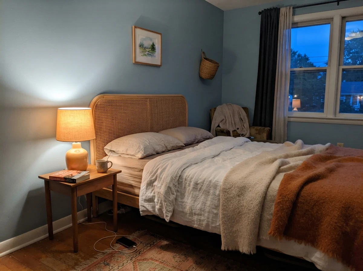
To understand whether this color will behave in your home, you have to watch how it responds as daylight drains out of the sky. The morning sun gives you one paint; the dusk gives you another entirely.
See what happened there? In that cool dawn light, the walls flattened out. The blue backed down, and the gray base came forward until the room felt almost chilly. But flip on a 2700K warm lamp at night, and Santorini Blue snuggles right back into its cozy, blue-gray identity. That duality is why you must test it on a poster board across multiple walls before you commit a weekend to cutting in.
In the Bathrooms: Tile, Steam, and Window Exposure
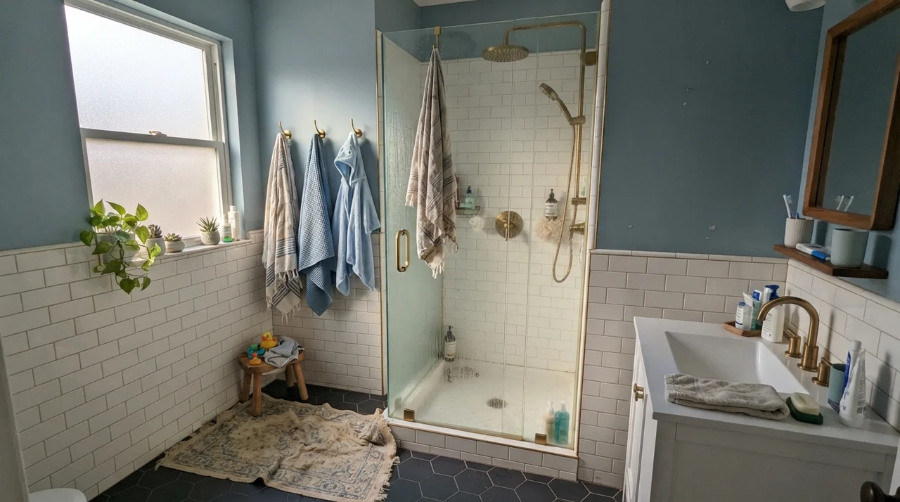
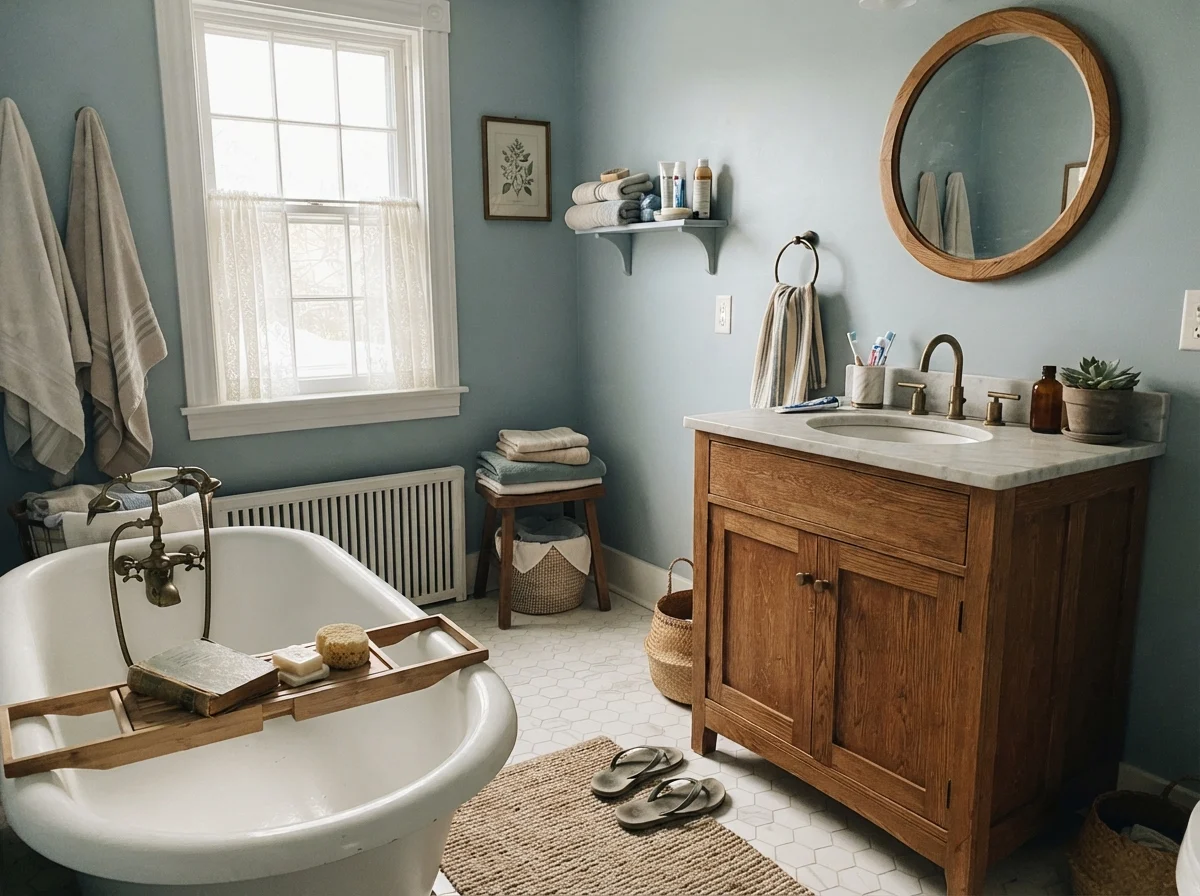
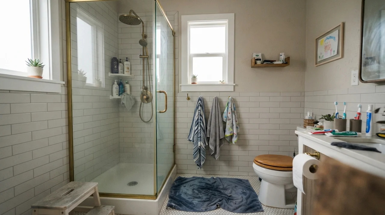
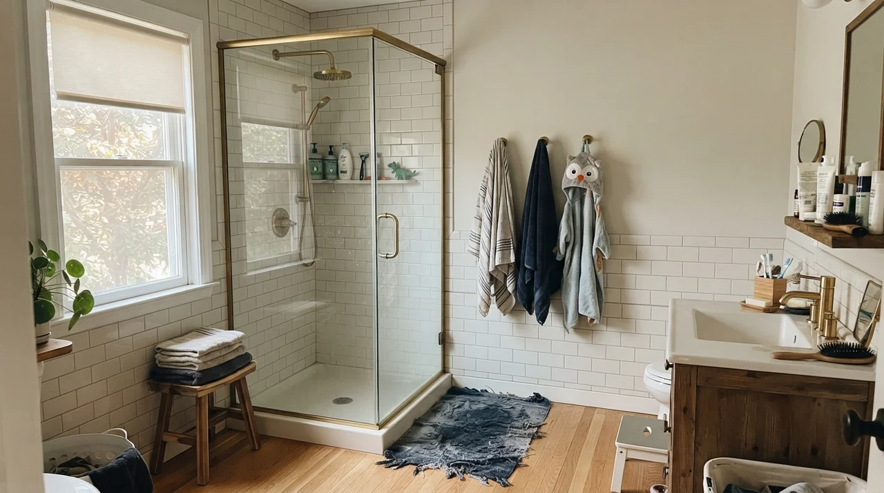
Bathrooms are where people try to force this color most frequently, and they are also where it either shines brilliantly or falls flat on its face. In our 1960s ranch, the family bath has one generous window facing south. That southern exposure carries just enough natural warmth to keep Santorini Blue looking like an intentional, historic blue.
Notice the balance in that space: the crisp white subway wainscoting takes up the lower half of the wall. That split is crucial. Because Santorini Blue has an LRV of 45, wrapping an entire small room floor-to-ceiling without substantial white woodwork can feel heavy. But paired with white tile and the warmth of brass hardware, it reads tailored and serene.
It also takes the chaos of family life surprisingly well. In a busy children's bath, walls take a daily beating from rogue splashes, soapy damp hands, and whatever else gets flicked out of the tub.
I have scrubbed clean more water marks and dried toothpaste spots than I care to admit. In our last house, I made the mistake of putting a flat paint in a full bath because I liked the chalky, powdery texture. That was not worth the money; two scrubbings with a damp sponge left shiny burnish marks around the towel rings. For Santorini Blue on bathroom drywall, eggshell is the absolute minimum sheen you should consider. It sheds moisture without turning the wall into a mirror.
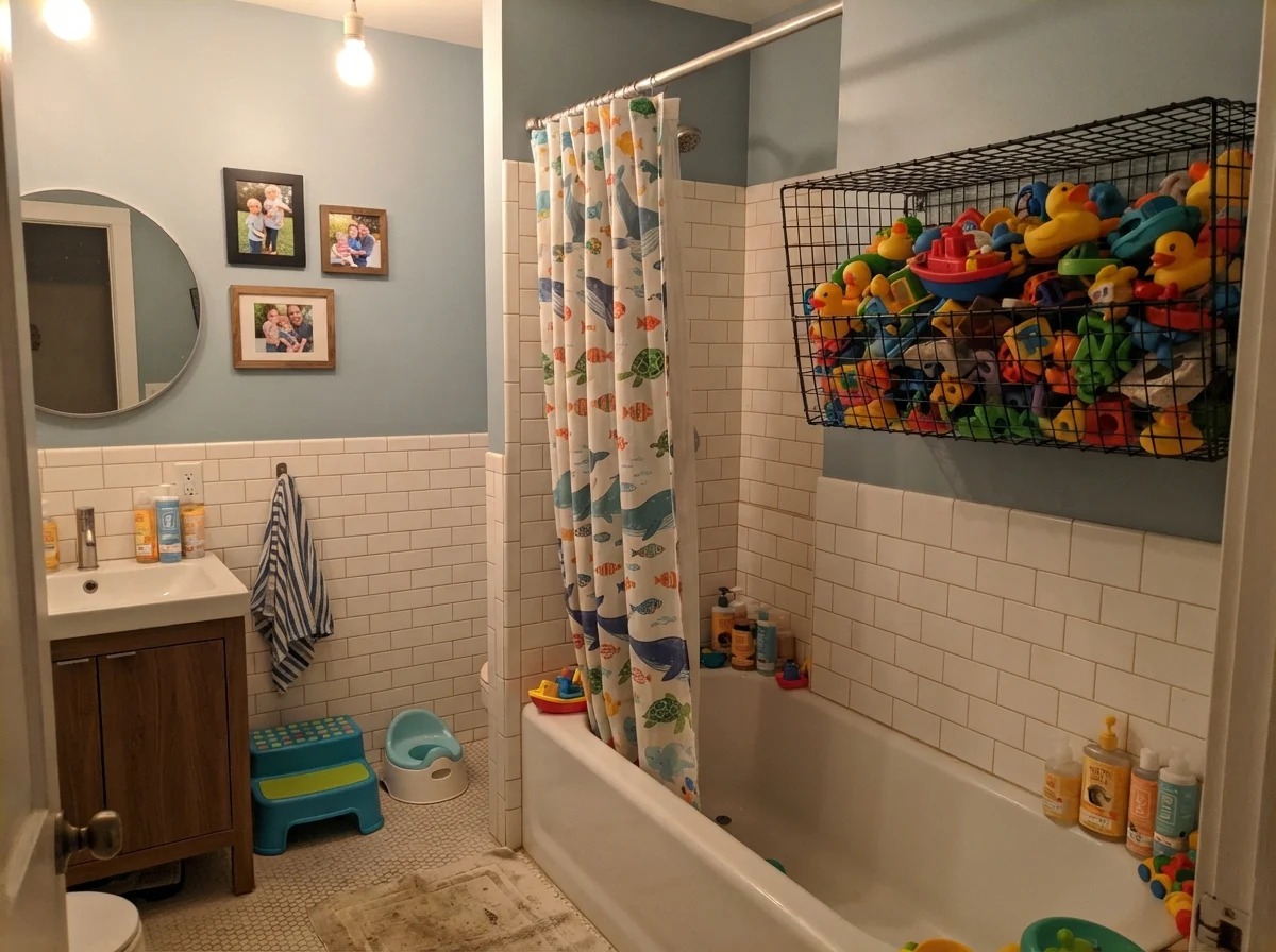
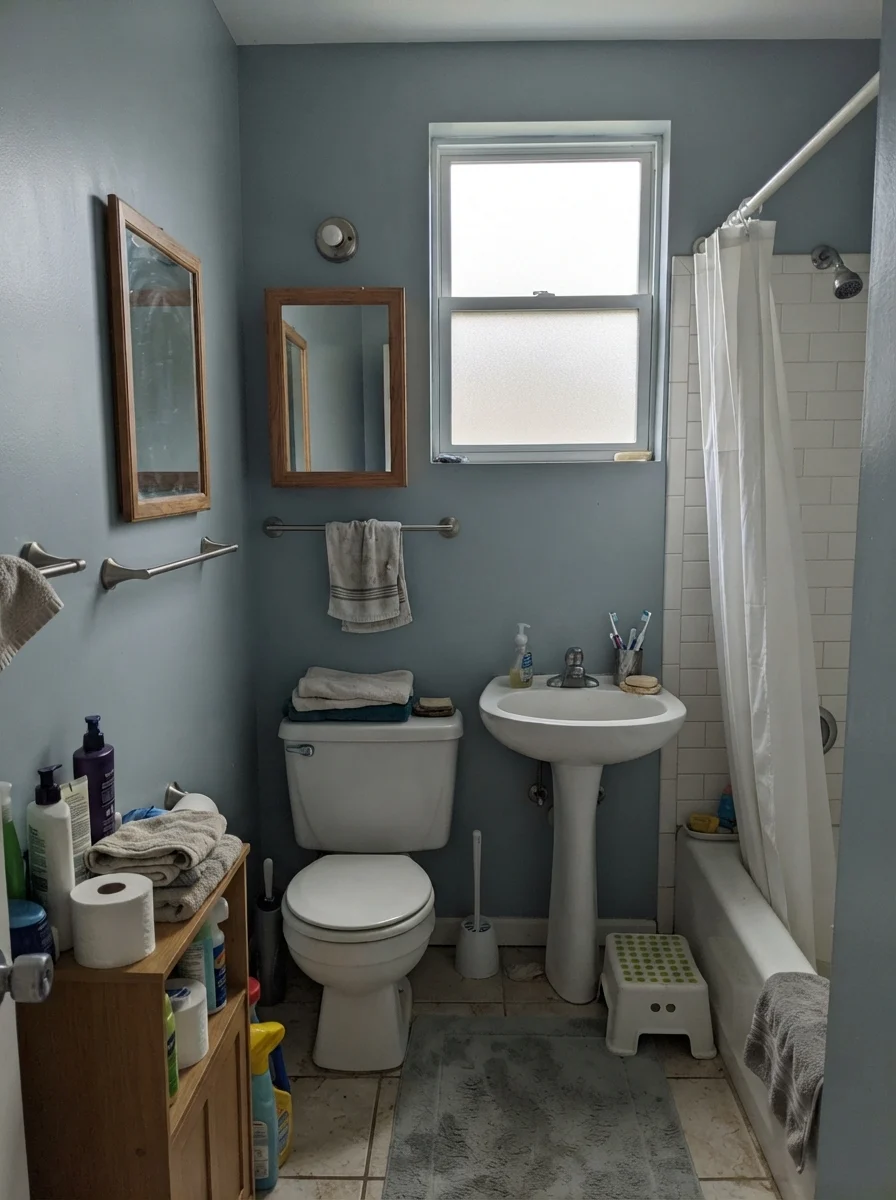
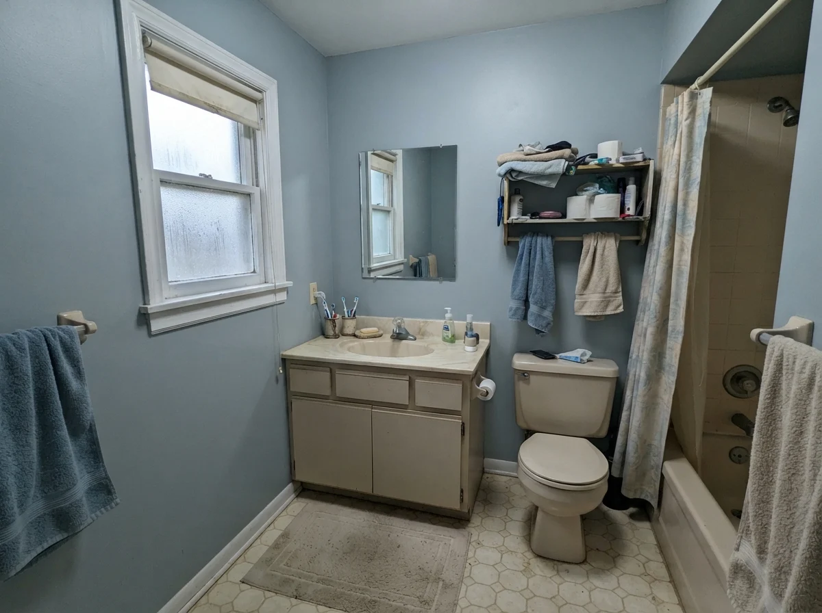
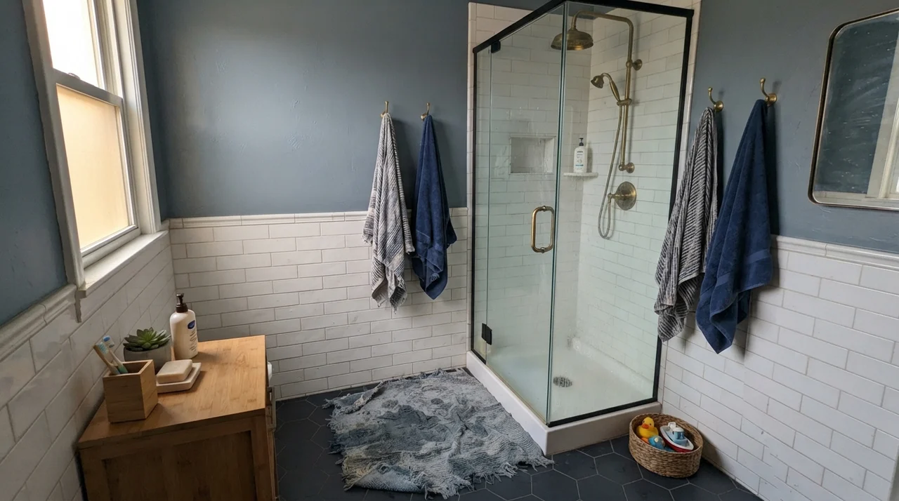
Now look at what happens when the lighting isn't cooperating. This is where homeowners start regretting their choices.
Under flat or northern light, that "serene blue" simply turns into damp cement. And notice that older beige vanity in the second shot—it does not play nicely with Santorini Blue. Mid-tone blues love crisp white, soft cream, or rich walnut. The moment you butt them up against yellowed laminate or peachy beige counters, both surfaces look tired and dingy.
The Kitchen: Why Islands and Shaker Cabinets Love It
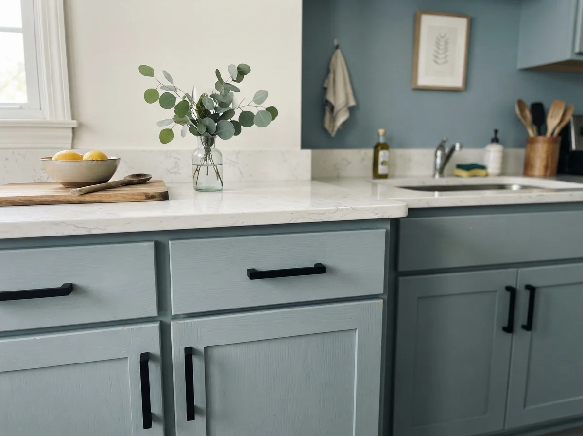
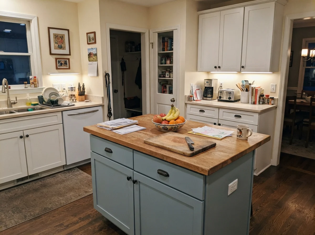
If Pinterest has made Santorini Blue famous for anything, it is kitchen cabinetry. Walk through any home store or open house right now, and you will see white perimeter cabinets paired with a blue-gray island. It has become the standard uniform for people who are tired of plain white but terrified of making a costly mistake with navy.
When we sold our 1990s colonial, our listing agent told me straight out: "If your cabinets are dated oak, buyers see a ten-thousand-dollar subtraction. If you paint them right, they see move-in ready." She was right. In that house, we painted the base cabinets in a durable satin enamel, and it held up through three years of teenage boys kicking the kickboards and dog noses bumping the trash pullout.
If you are painting kitchen cabinets Santorini Blue, do not skimp on prep or finish. A cabinet-grade enamel in satin gives you the exact right sheen: tough enough to wipe greasy fingerprints off the drawer fronts, but without that plastic shine that makes millwork look cheap.
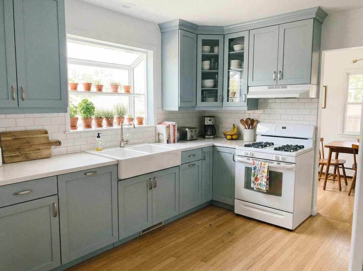
The color you pick for your island has to survive cereal splatters, damp dish towels, and soccer cleats kicking the paneling every morning. Santorini Blue hides the daily grind without shouting.
That kitchen island setup is where Santorini Blue really earns its keep. White countertops keep it grounded, and light oak flooring provides the warmth that balances its cool gray side. A quick warning, though: notice I said light oak or white oak. If your kitchen has the heavily orange honey-oak floors from thirty years ago, Santorini Blue is going to pick a fight with them. Because blue and orange sit dead opposite each other on the color wheel, putting this cool blue-gray against golden-orange polyurethaned oak makes the floor look orange-peel loud, and the paint look chilly and gray.
Bedrooms and Nursery: Finding Restful Light
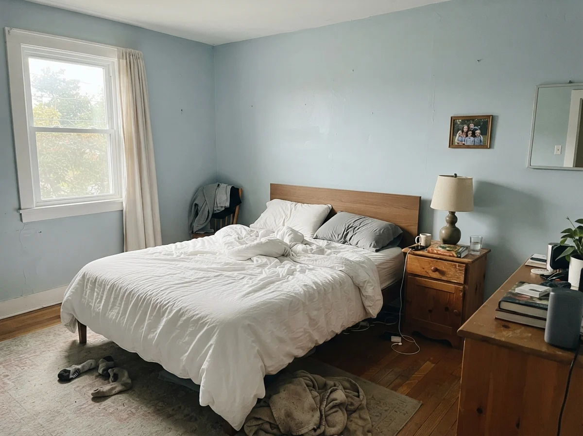
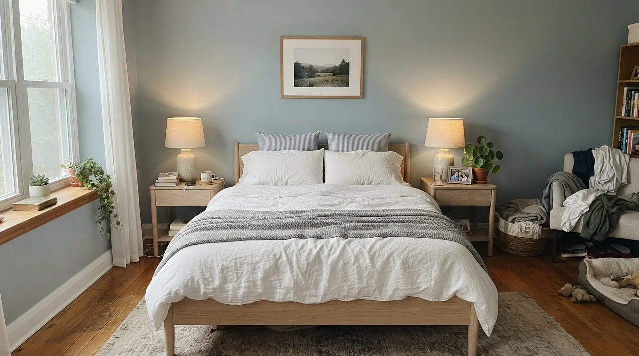
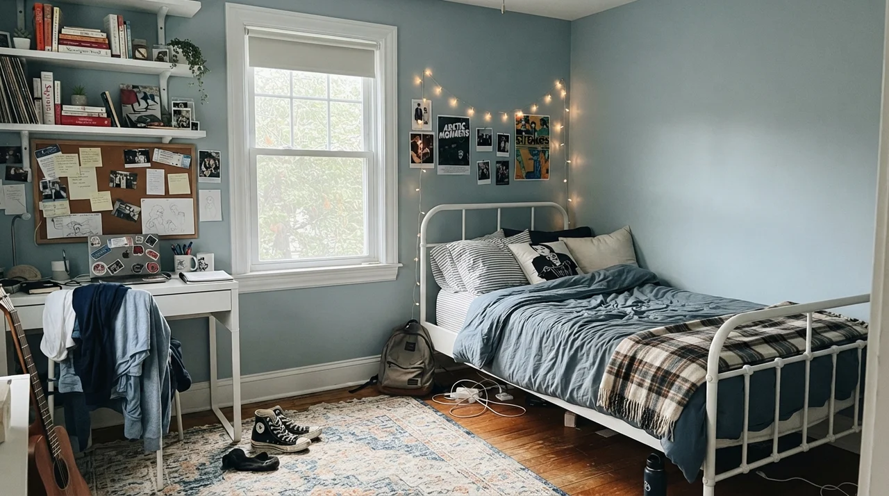
In our current 1960s ranch, the main bedroom gets lovely filtered side light from an eastern window. It is the room where Santorini Blue behaves most consistently like the swatch in the store.
When you use it on all four bedroom walls, you must bring in natural textures to keep the room from feeling sterile. Linen bedding, unpainted wood furniture, and woven rugs break up the paint and give the eye a resting place. Without those organic elements, an LRV 45 blue-gray can feel a bit like an accountant's waiting room.
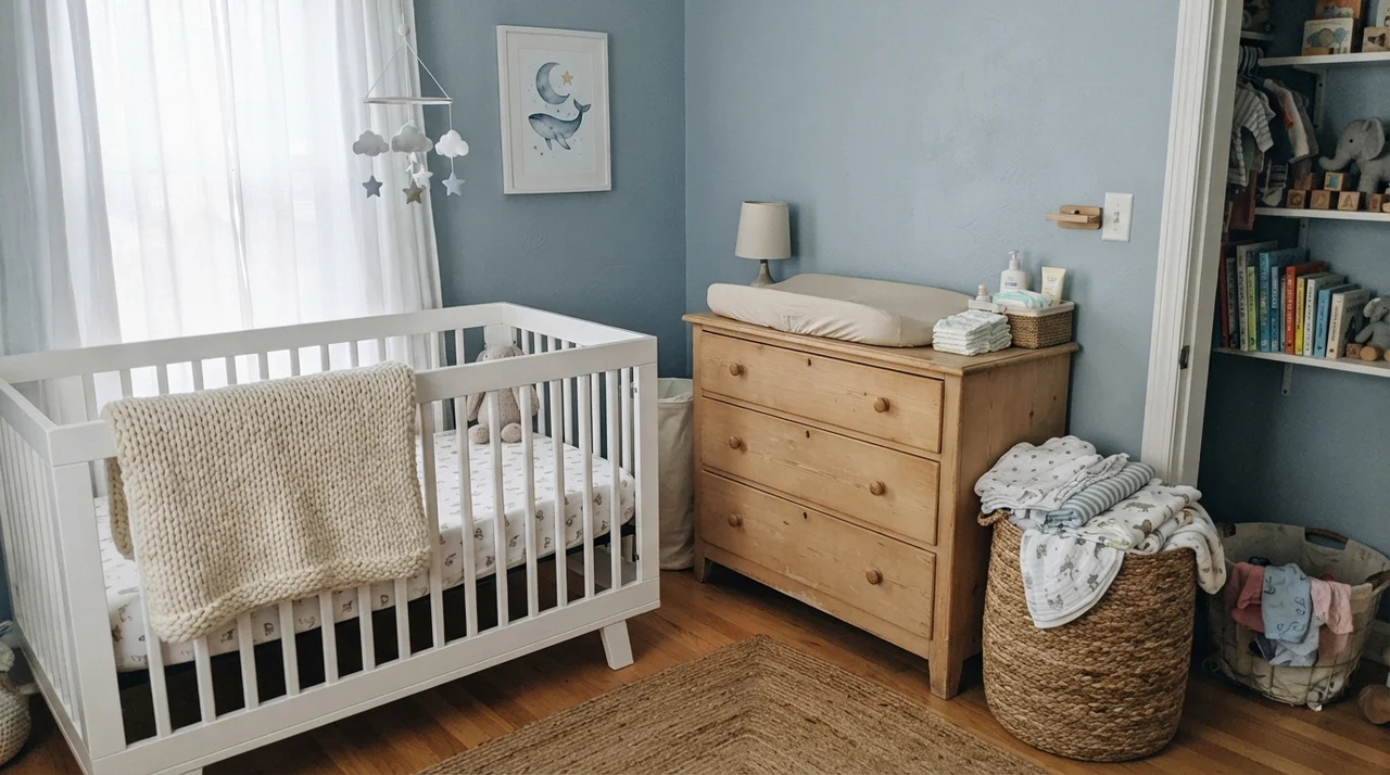
In a nursery or a teenager's room, it works equally well because it isn't childish. It doesn't look dated within two years the way bubblegum pink or baby blue does. It grows up with the child.
Five years in a kid's room will tell you everything you need to know about paint durability. Santorini Blue hides the occasional scuff mark much better than an off-white, but because it has depth, you cannot just touch it up with a foam brush three years down the road. If your wall takes a gouge, feather your touch-up out with an actual roller, or you will see an obvious flashing spot every time the sun shines across that drywall.
Living Spaces, Sunrooms, and Work Rooms
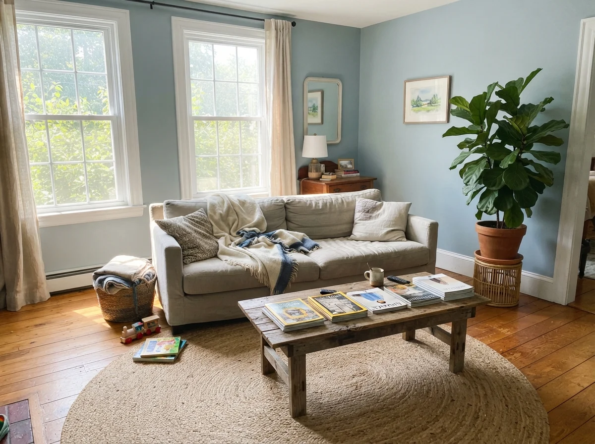
In larger, open gathering spaces, Santorini Blue needs lots of natural light to avoid feeling heavy. If your living room has tall ceilings and wide windows, it creates an atmosphere that feels classic and grounded.
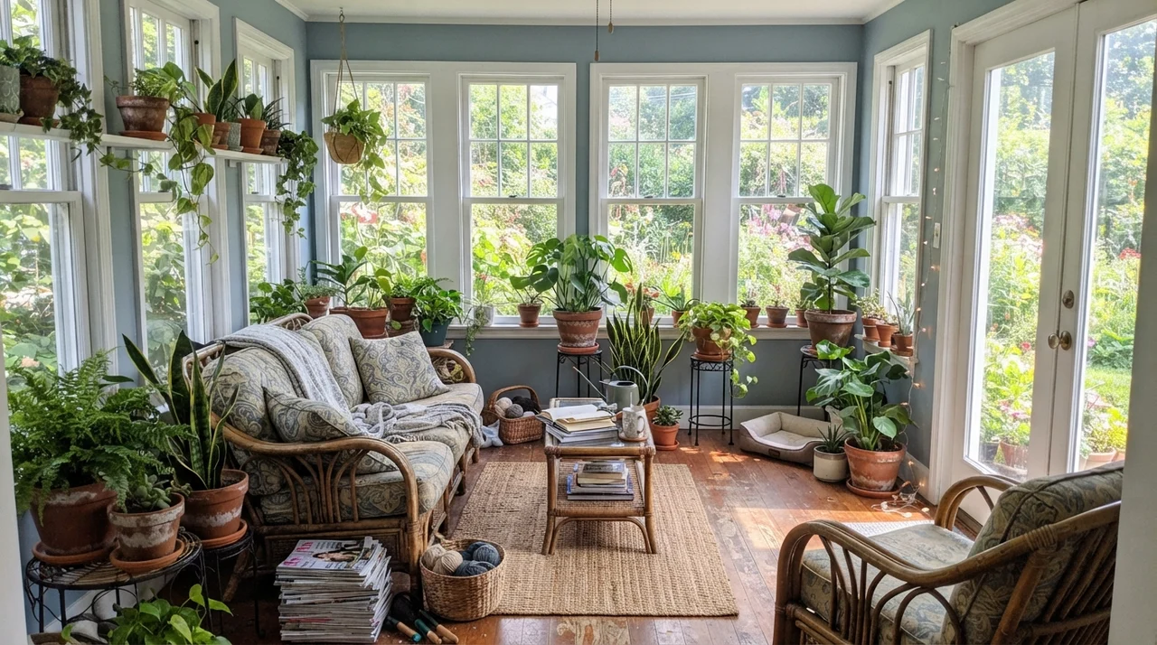
Notice that sunroom in particular. That is where the soft green whisper underneath Santorini Blue really comes alive. When you wrap a room in glass and surround it with outdoor foliage and terracotta pots, the blue warms up and feels almost botanical. It is one of the few places where you get that coastal, organic feel that people hope for when they pick the swatch.
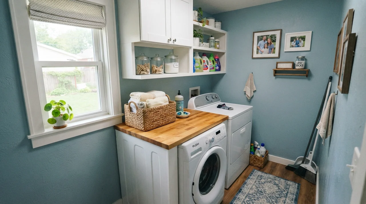
And in the laundry room, pairing it with a warm butcher-block counter gives practical chore space a clean, elevated feel without spending thousands on specialty tile. It is a workhorse paint choice when given a decent window.
Where Santorini Blue Fails: The Windowless Corner
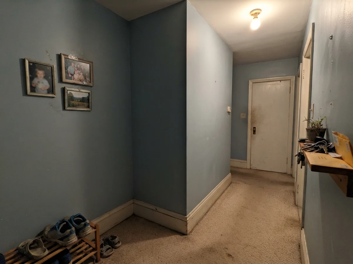
Every paint has an environment that ruins it. For Santorini Blue, that environment is the windowless interior hall or the dim basement powder room. Take away direct sunlight, starve it of warm incandescent lamps, and you will see why people write frustrated reviews online.
This is the picture nobody pins on their dream board, but it is the reality of putting a mid-tone blue-gray in the dark. The color didn't break; the physics of light did. Without daylight to bounce off the blue pigment, you are left staring at the raw gray base. It looks muddy, dreary, and completely lifeless. If this is what your hallway looks like, do not buy this paint. Pick a warm off-white or commit to a real, rich navy instead.
Exterior Siding and Interior Doors
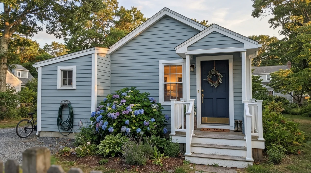
Take Santorini Blue outside, however, and the story changes completely. Full, unfiltered outdoor daylight is the very best light for this formula. It burns off any trace of gloom and turns the siding into an elegant, timeless blue-gray that looks right at home next to cedar trees or coastal hydrangeas.
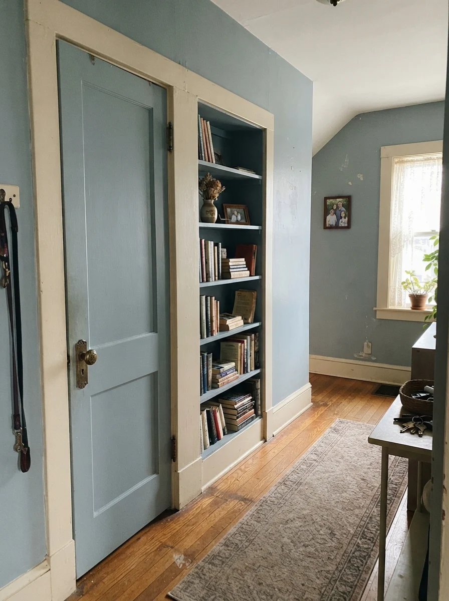
Using it on an interior door and built-in bookshelf is one of my favorite tricks for an older house. In our 1970s split-level, the hallway doors were completely flat and forgettable. Giving a solid, panel door a coat of satin paint against neutral walls makes the whole corridor feel custom-built. It took two coats, cost half a gallon, and added more charm than any new piece of furniture I bought that year.
Living with It: Cleaning, Touch-ups, and the Five-Year Test
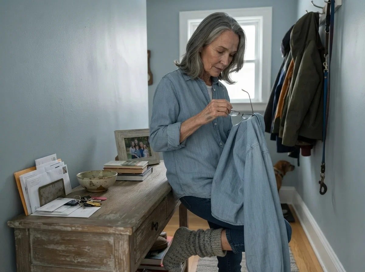
When you have owned homes for thirty years, you stop judging paint on day two and start judging it on year five. That is when you find out if the extra twenty dollars a can was worth the money. In our last house, we used Santorini Blue on the mudroom built-in where backpacks were dropped and wet coats were hung. That unit got kicked, bumped, and scrubbed clean with warm water and dish soap every spring.
Because it sits at LRV 45, it hides ordinary scuffs better than white, but it shows chalky drywall scrapes if someone drags a vacuum cleaner along the baseboard. If you put it on walls, use an eggshell finish. On trim, doors, or cabinetry, never use anything softer than a satin enamel. Semi-gloss is even better on exterior doors where rain, morning sun, and garden hoses take their toll.
Touch-ups are where mid-tones get tricky. The blue and black colorants in this formula dry down slightly differently depending on humidity and how the paint is laid down. If you touch up a middle-of-the-wall roller patch with a standard nylon bristle brush, you will see a dull halo every time the afternoon sun cuts across that room. Keep an extra quart tightly sealed in the basement, and when touch-up time comes, use a small mini-roller to feather it into the existing texture.
What sheen should I choose for Santorini Blue?
For walls, eggshell gives you the best balance between scrubbability and a soft finish. For kitchen islands, shaker cabinets, and interior doors, choose satin enamel so food splatters and fingerprints wipe off easily. For exterior doors and exterior trim, go with semi-gloss for weather resistance.
Does Santorini Blue look gray at night?
Yes, especially if you use cool white or daylight LED light bulbs. Under 4000K or 5000K LEDs, it pulls toward cold concrete. To keep the blue cozy and rich after sunset, swap your fixtures to warm 2700K incandescent-style bulbs.
Can I use Santorini Blue with honey-oak cabinets or trim?
I strongly advise against it. Blue and orange sit opposite each other on the color wheel. The contrast forces the honey oak to look intensely orange and yellow, while stripping the blue right out of the wall paint and leaving it flat and cold.
Is Santorini Blue too dark for a small powder room?
Only if that powder room has no window. At LRV 45, it needs daylight to keep its blue identity. In an interior windowless half-bath, it will read like a dingy gray box unless you pair it with bright white subway wainscoting and warm brass lighting.
Susan's Verdict · Buy with Daylight, Pass in the Dark
Santorini Blue is not the deep Mediterranean coastal blue its name suggests, but when you give it real south or east daylight, it is one of the handsomest, most dependable blue-grays Benjamin Moore makes. On a kitchen island, a front door, or a bathroom wainscot paired with crisp white trim, it earns every penny. But if your room faces north or lacks windows entirely, leave this can on the shelf and pick a true warm gray instead.