Color Diary · No. 95
Silver Satin 856: Living with Benjamin Moore's Most Fragile Near-White
Benjamin Moore's quietest almost-white, reviewed honestly: the violet flash people argue about, the rooms where it goes dingy, and what to pick instead.

Susan HartleyOctober 25, 2026 · 13 min read
Silver Satin · Benjamin Moore 856
Hex#E3E2DALRV75Undertoneswarm gray → dingy flat gray → faint violet
When we moved into the 1960s ranch we live in now, the center hall had no exterior windows, three mismatched hollow-core doors, and walls coated in a yellowed builder-white that looked exhausted. I wanted to paint it once and never climb that ladder again. The swatch on the kitchen table looked like the easiest decision in the world: Benjamin Moore Silver Satin (856). It looked soft, gentle, and utterly polite—a whisper of warm gray with an LRV of 75 that promised to take the dark edges off the corridor without turning it into a blinding institutional tunnel.
We put two coats on the hallway walls on a Saturday morning. By Sunday afternoon, I realized what anyone who has actually lived with it learns the hard way: Silver Satin is the near-white you pick when you want the walls to stop talking, but it is also one of the most fragile shades on the deck. Because it carries so little pigment, it borrows the temperature of whatever is around it. When the room supports it, the color looks tailored and calm. When the room neglects it, Silver Satin simply collapses.
The Triple Shift
Silver Satin behaves like water in a glass: clear enough on its own, but entirely colored by what surrounds it. In direct southern sun, faint warmth comes to the surface. Under north light or heavy cloud cover, that warmth evaporates into a flat, shadowy gray. And under cool artificial lighting or alongside pinkish flooring, you get the notorious violet drift.
warm sun
overcast, north light
dusk, rain, cool bulbs
Silver Satin sits at LRV 75, right on the threshold between an off-white and a pale greige. Because its undertone is so faint, lighting temperature decides everything.
Origami WhiteSherwin-Williams · see diary
ShiplapMagnolia Home · see diary
Silver Satin856
Spare WhiteSherwin-Williams · see diary
Winds BreathBehr · see diary
The bad reviews of Silver Satin are strikingly consistent, and none of them are about coverage or durability. All three come down to the same thing: a color with this little pigment needs help from the room, and when the room does not help, it collapses. If you give it warm daylight and wood underfoot, it gives you a soft, linen-like backdrop that never fights your furniture. But strip away natural light or introduce cool bulbs, and the undertones take over.
The Light Test: Morning Cool vs. Evening Lamp
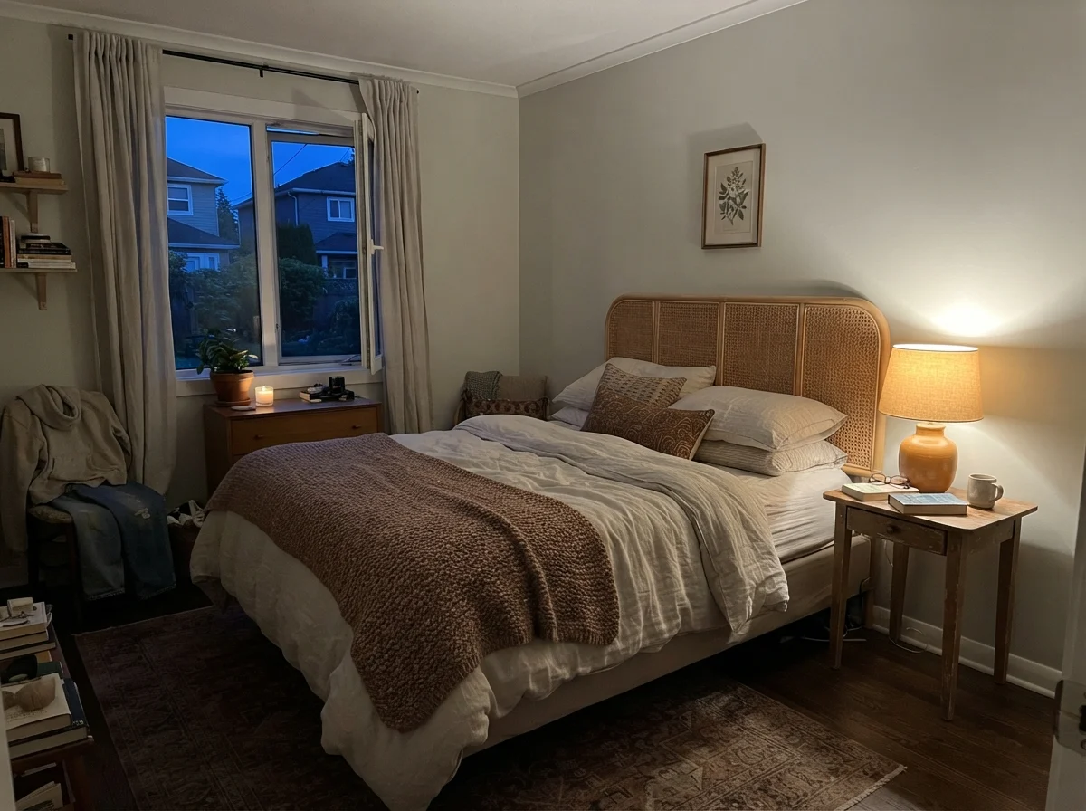
In our last house, our main bedroom faced northeast. If you have ever put a pale neutral in a room that catches early dawn and nothing else, you know how merciless morning light can be. Early in the day, before anyone clicks on a lamp, Silver Satin reads bone-pale and slightly chilly. But come sunset, when you switch on warm household bulbs, that identical wall softens completely.
That split personality is why people argue about this color online. Someone will swear it's a cozy, gentle cream-gray, while their neighbor insists it turned purple-gray in their guest room. They are both telling the truth; they just own different lamps and face different directions. Under 2700K bulbs, Silver Satin relaxes. Under 4000K commercial-grade LEDs, that warm gray washes out and leaves behind a cold, purplish tint that nobody ordered.
How Silver Satin Behaves from Room to Room
Give it daylight and something warm underfoot and it does exactly what it promises. This is a whole-house color: hallways, stairwells, open main floors, bedrooms with modest windows. It is light enough to lift a dim corridor and quiet enough that it never argues with the art, the rug, or the wood. But you must pay attention to what else is in the space.
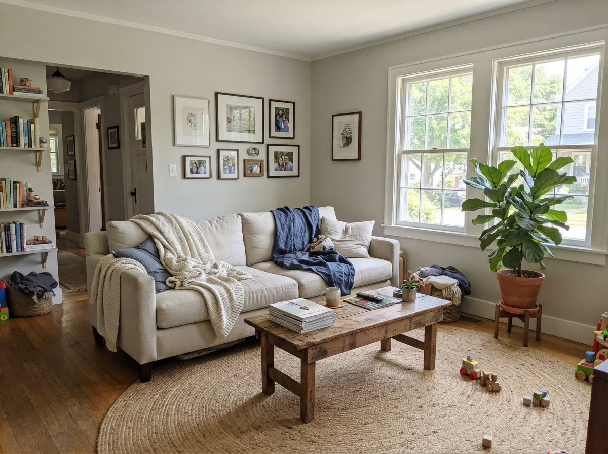
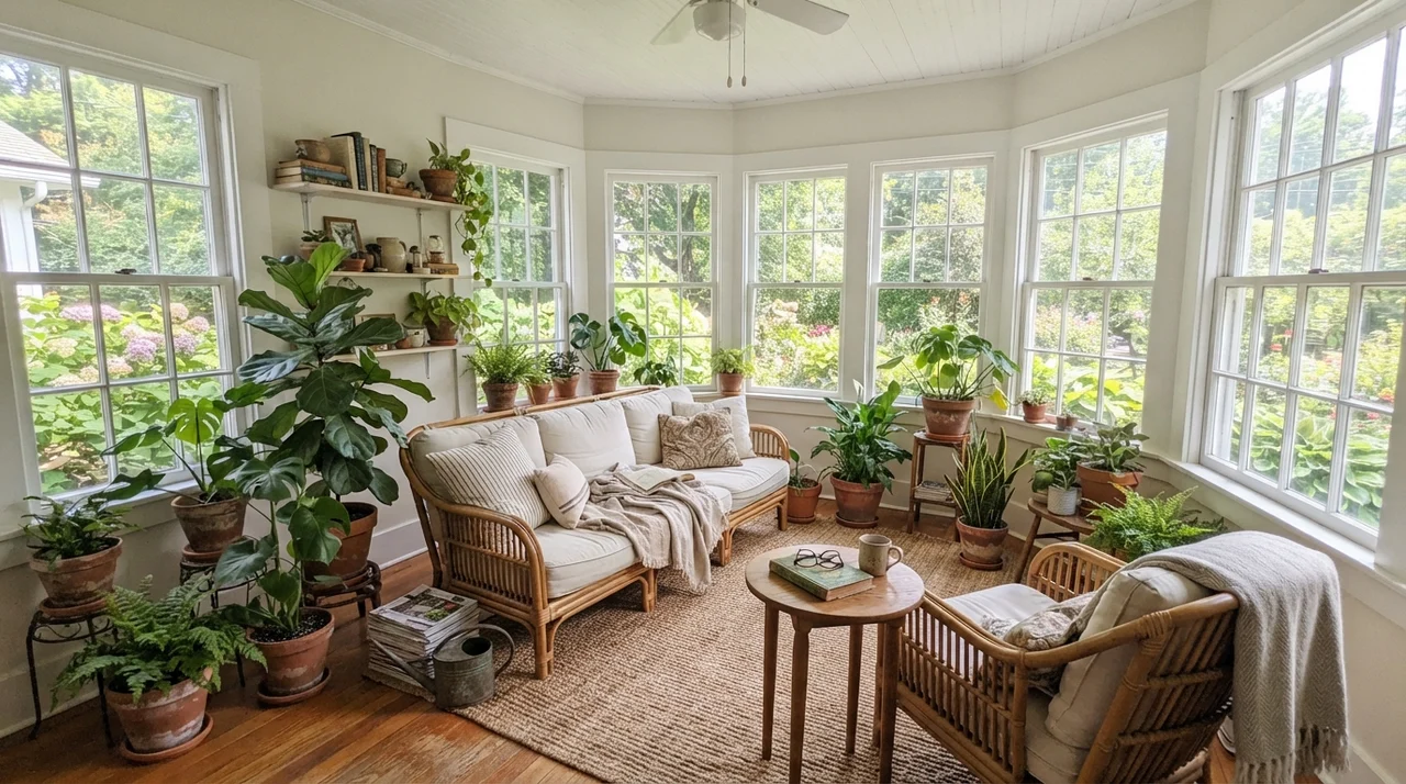
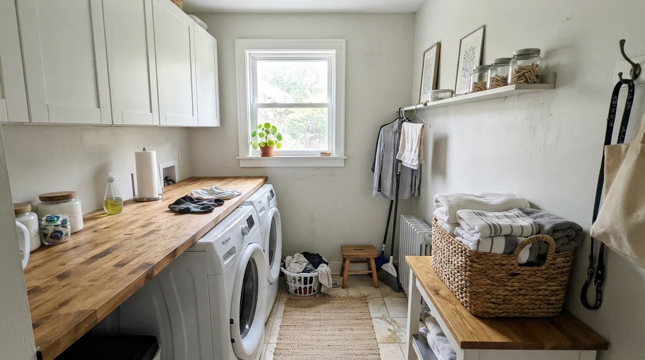
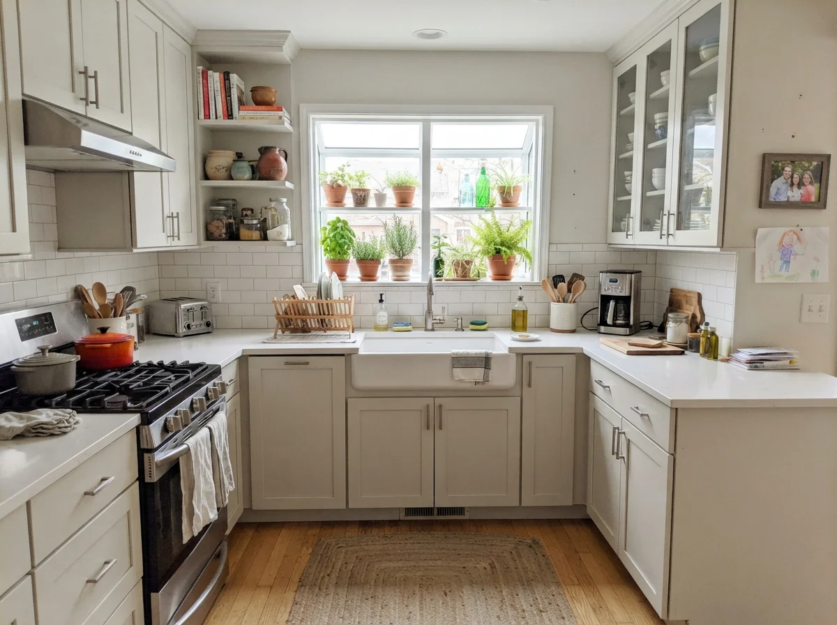
In a sunny living room with generous south or west windows, Silver Satin is hard to fault. The yellow in warm daylight balances the cool gray, settling it down so it flatters linen upholstery and natural jute without glaring like a bright white. The same holds true for a sunroom or a bright laundry room with a good exterior window. Where a stark high-LRV white will bounce blinding glare across the room, Silver Satin absorbs just enough daylight to stay soft on the eyes.
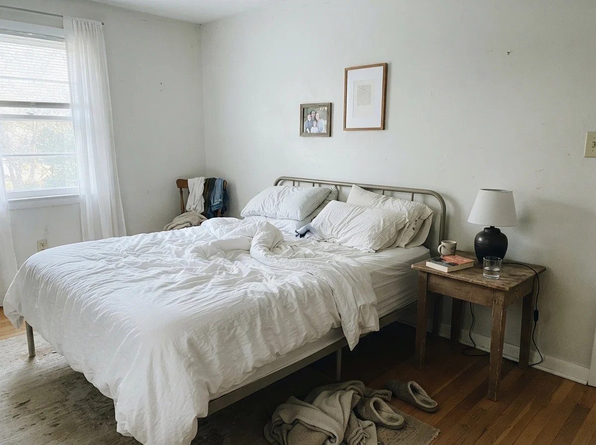
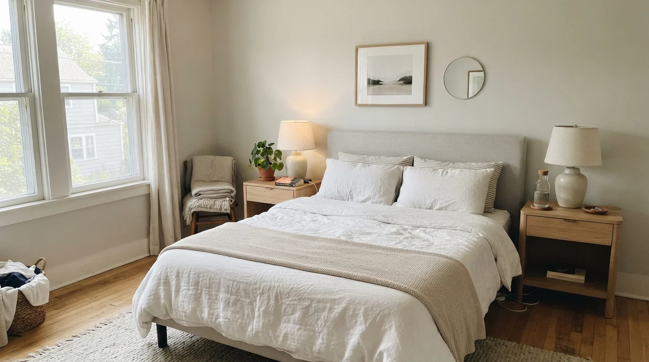
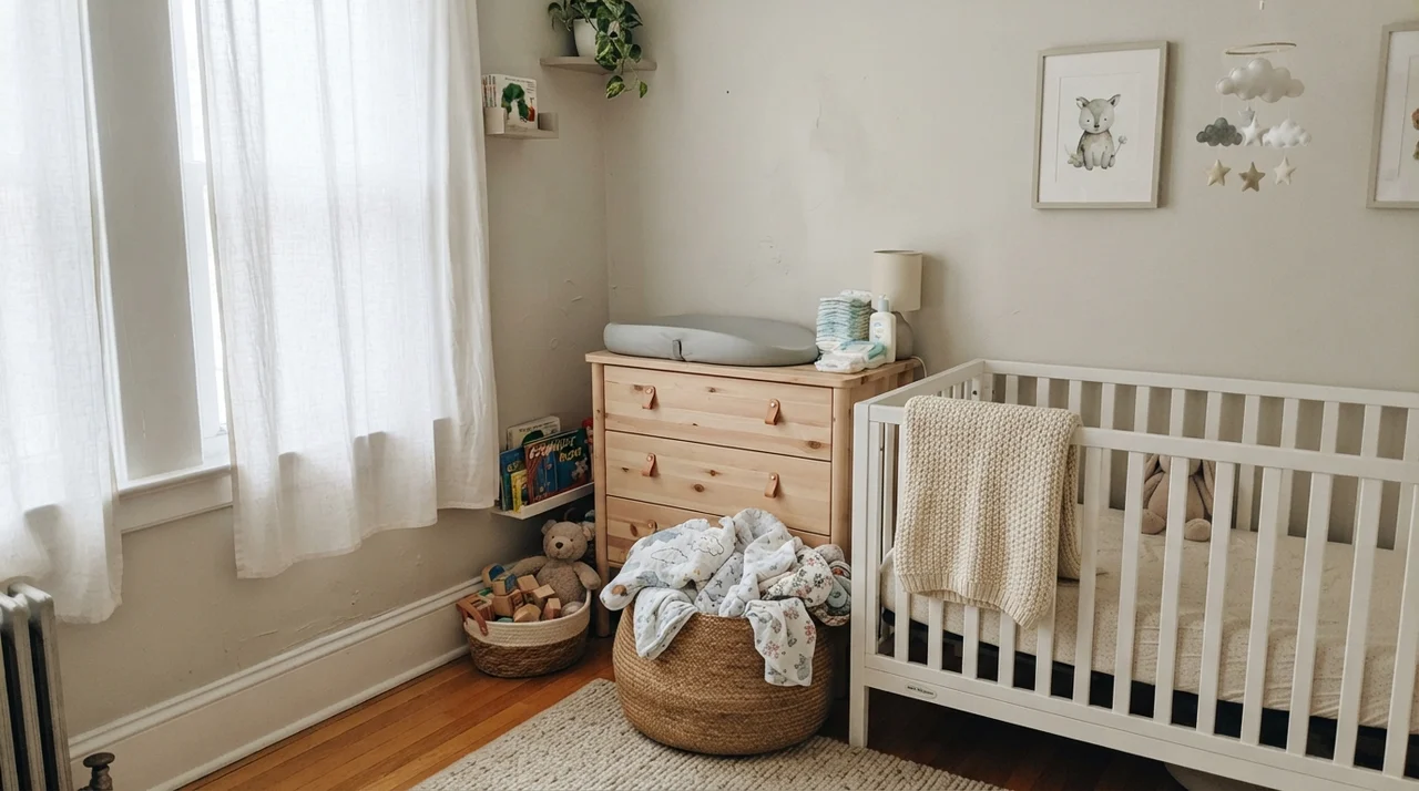
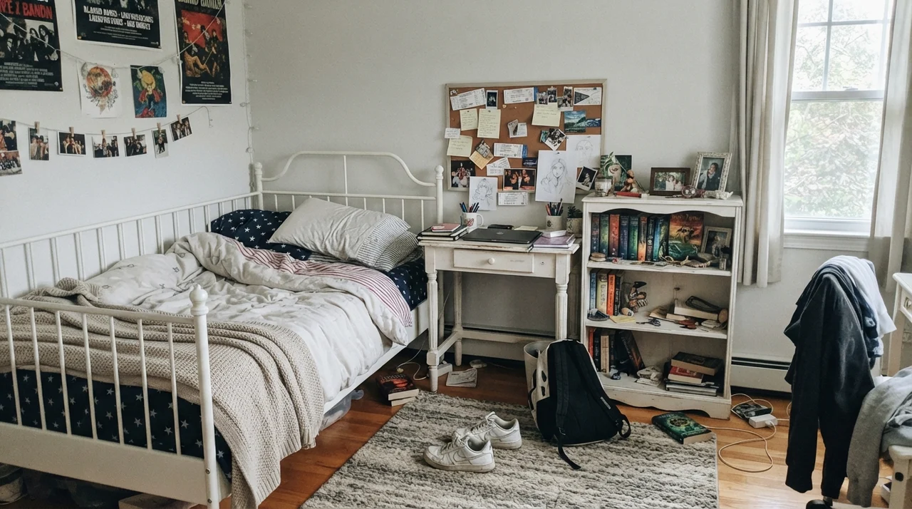
Where people run into trouble is in bedrooms and family spaces that get treated with mixed lighting. In a primary bedroom or a nursery with sheer curtains, the softness works well. But in a teenager’s room or a room that sits on the north side of the house, you need to watch how the flat daylight drains the warmth out of the pigment.
Silver Satin is the near-white you pick when you want the walls to stop talking, but a color with this little pigment needs help from the room to stay upright.
The Cabinet Dilemma: Decided or Undecided?
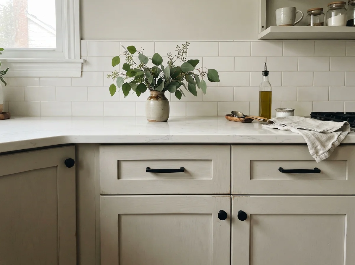
I get asked all the time whether Silver Satin works on kitchen cabinets. My answer after watching decades of kitchen trends come and go: it is usable, but non-committal. On shaker cabinets, it sits quietly between light oak floors and cool quartz countertops. That neutrality can be an asset if your kitchen has a lot going on elsewhere. But because it has an LRV of 75, it reads as neither a true white nor a definite gray.
In photographs and under certain lights, Silver Satin cabinets can look undecided. If you want cabinetry that looks deliberate and crisp, picking a shade that knows what it is usually serves you better in the long run. When we sold our second house, the listing agent pointed out that buyers react best to kitchens where the paint makes a clear statement rather than hovering in between.
Bathrooms and the Problem with Tile
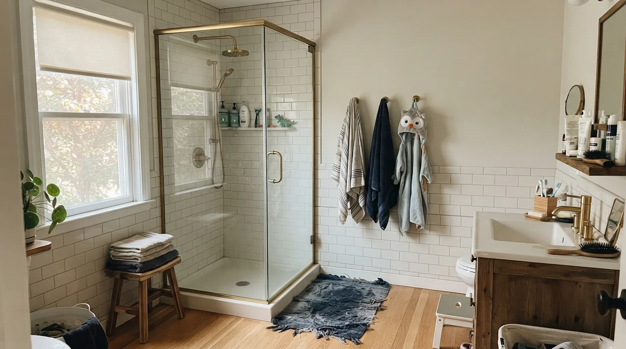
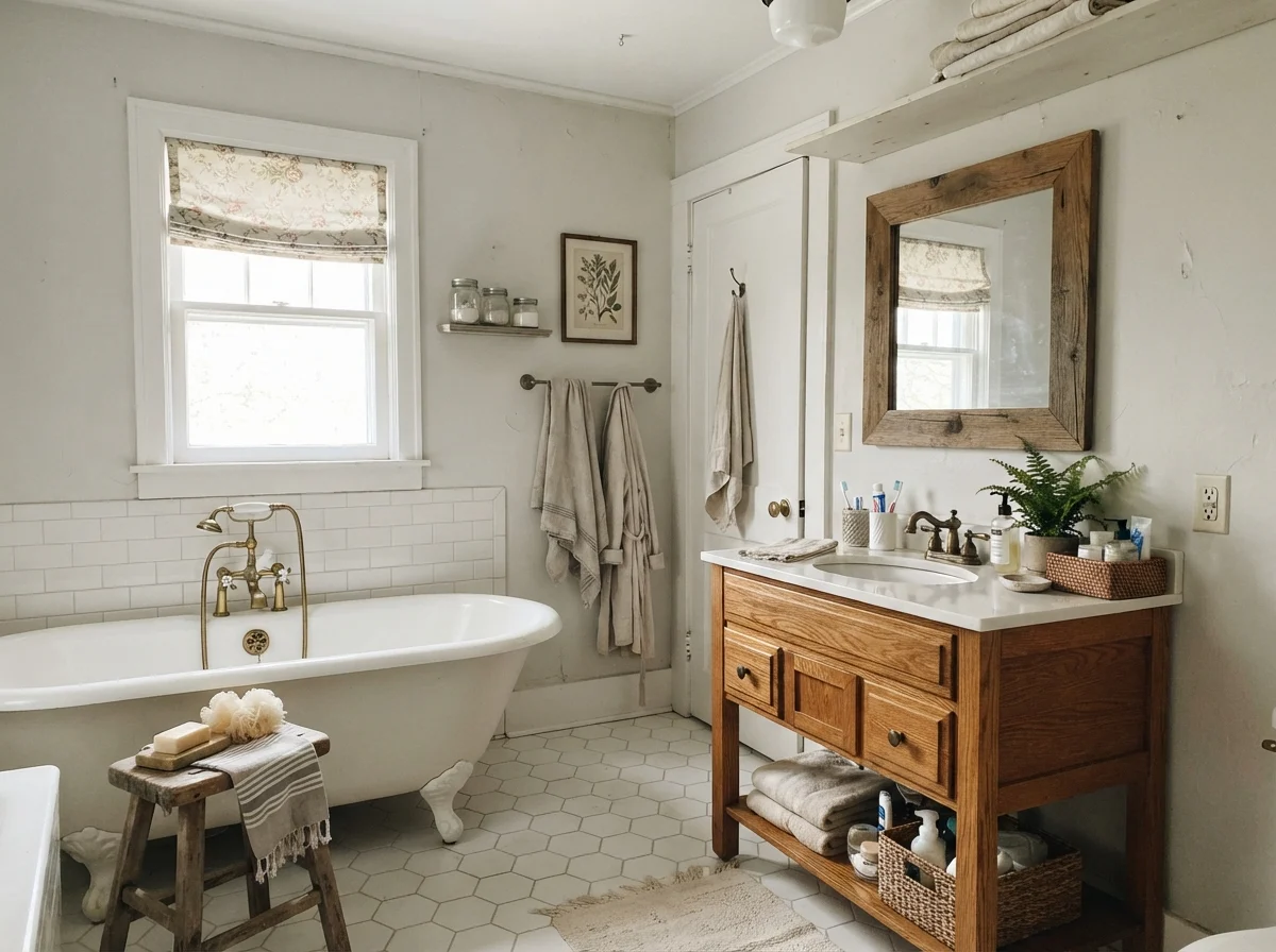
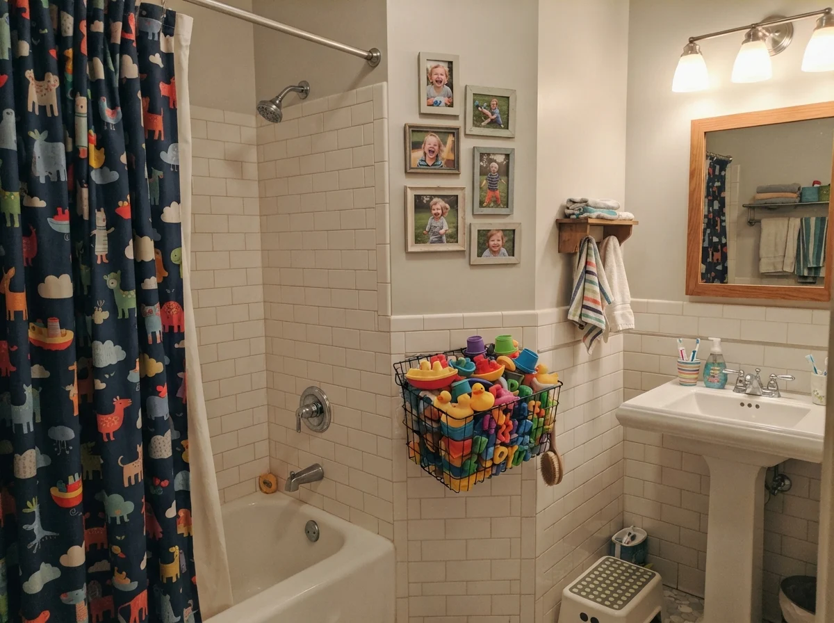
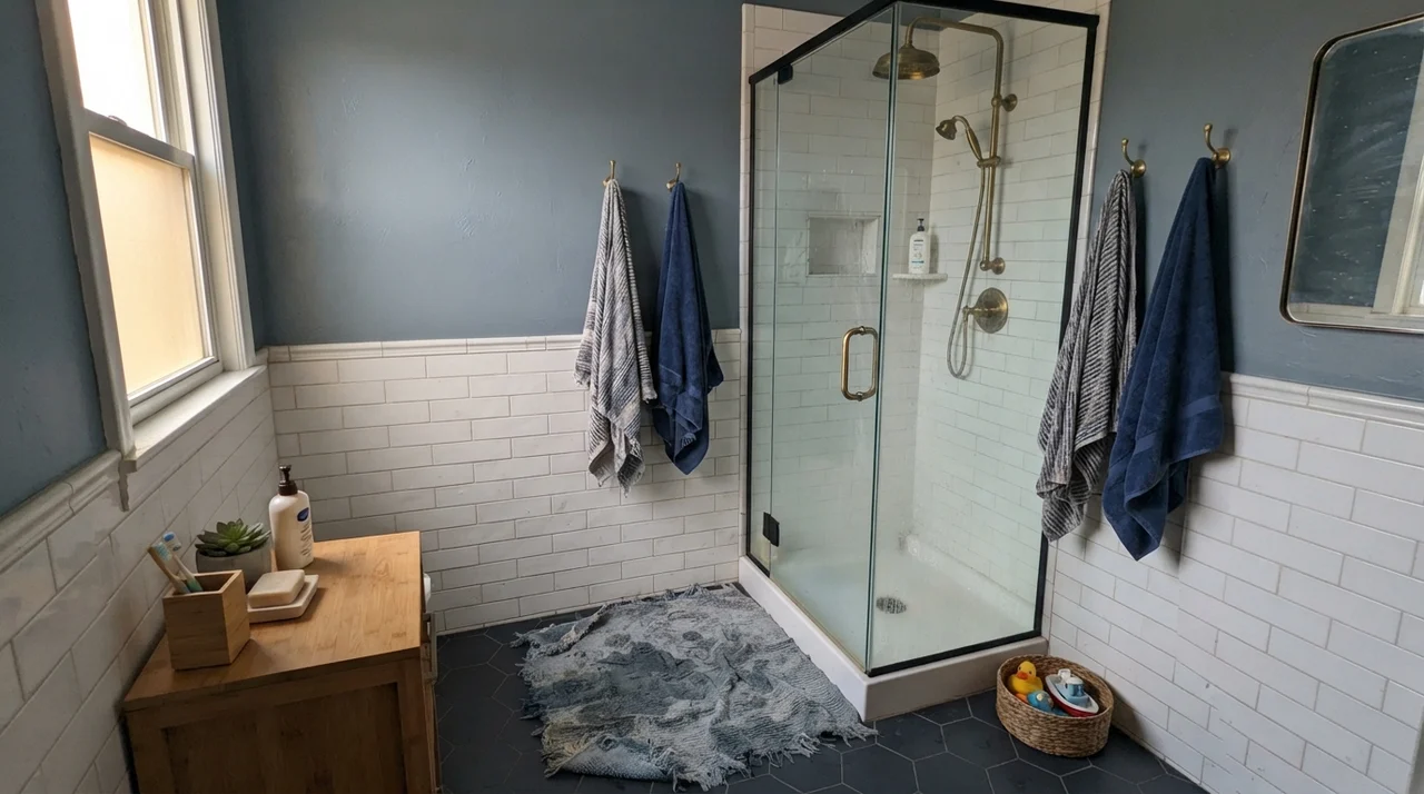
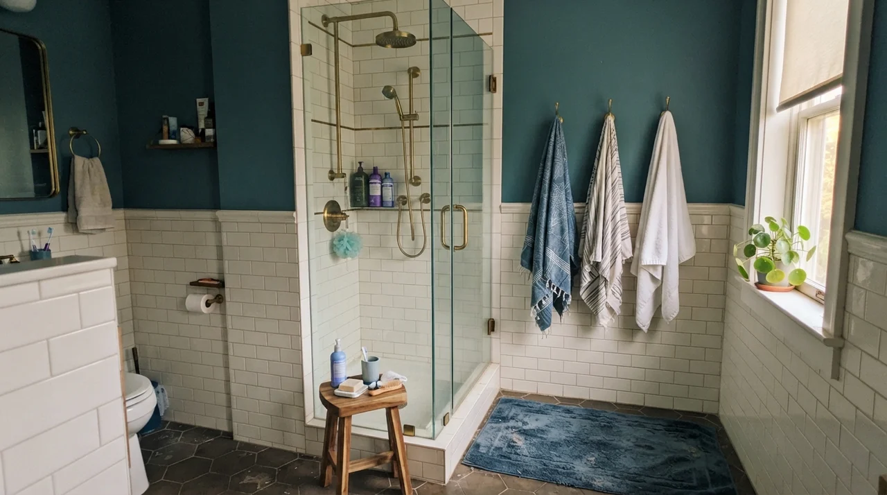
Bathrooms are where Silver Satin either looks like an upscale hotel or an unfortunate mistake. In a cottage bath with clean white fixtures, a clawfoot tub, and warm oak accents, it reads calm and clean. Against bright white subway tile wainscoting, the slight gray body creates a very soft, tailored shadow line.
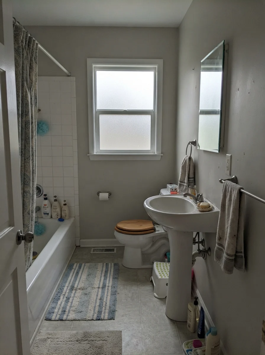
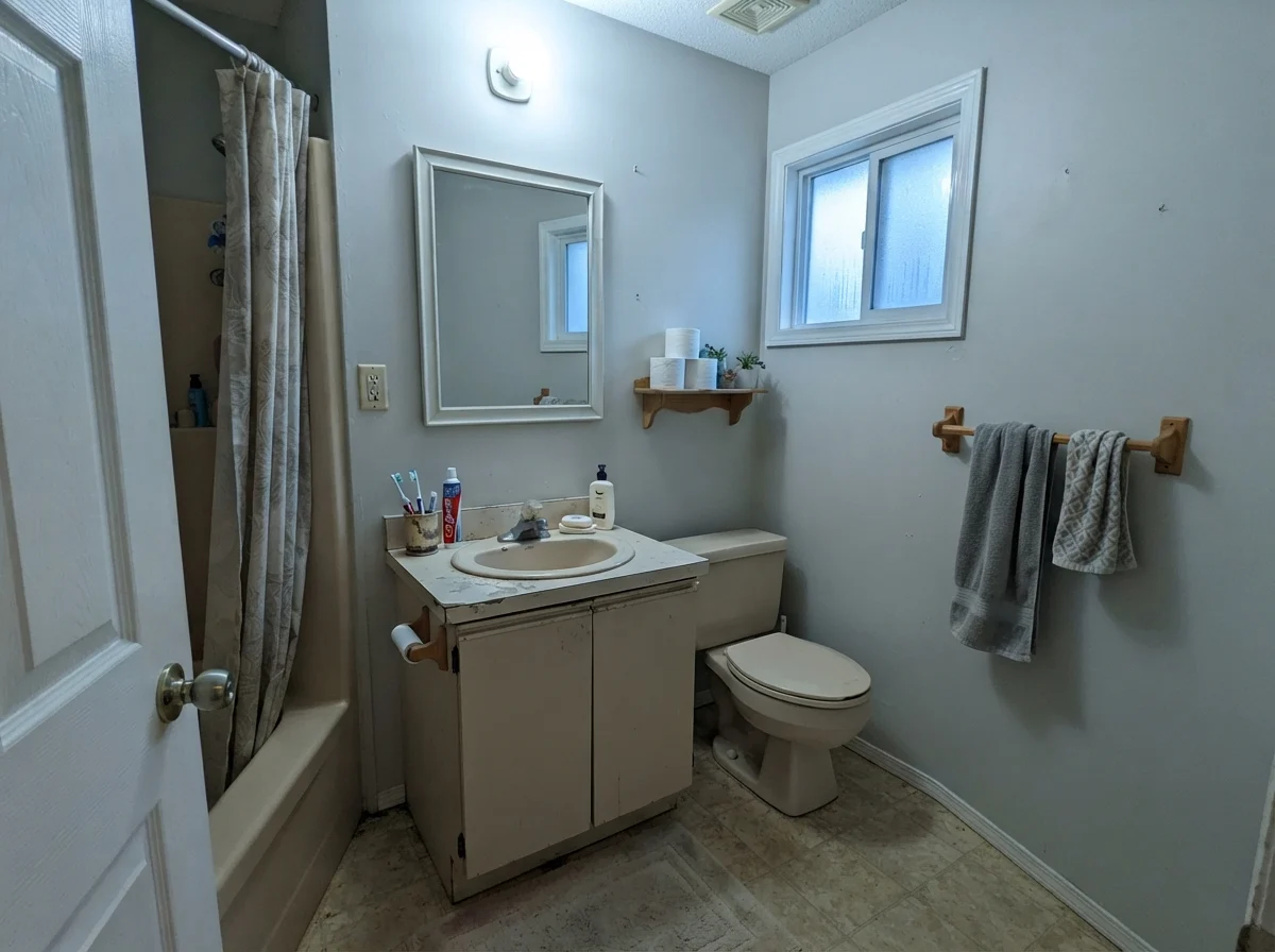
The trouble happens when you bring Silver Satin into a modest, dated bath with existing surfaces you aren't replacing. If your bathroom has pink-beige travertine, yellowed 1990s floor tile, or an older beige vanity, Silver Satin fights it immediately. The warm pink in the tile pushes the cool side of the paint forward, and suddenly your walls flash lavender. Add cool overcast light from a small frosted window, and it goes drab in an afternoon.
When Silver Satin Collapses: The Dim Hallway Trap
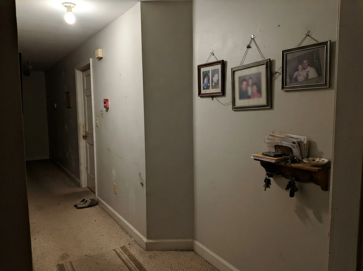
Here is the honest fail that nobody puts in the catalog. Take a windowless interior hallway, carpet it in generic builder beige, illuminate it with a single overhead fixture, and paint the walls Silver Satin. You will not get an airy designer gallery. You will get a muddy, flat, putty-colored box.
North light is cool and flat, and there is simply not enough warmth in Silver Satin to push back against it. Instead of a soft, dimensional gray, you get a dull, slightly dirty look that people describe as dingy—especially on an overcast Tuesday afternoon with no lamps turned on. That was the exact trap we had to navigate in our ranch hallway.
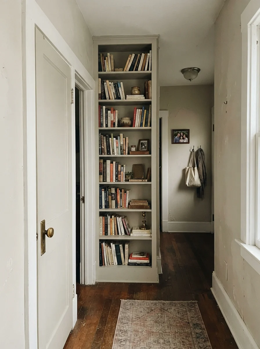
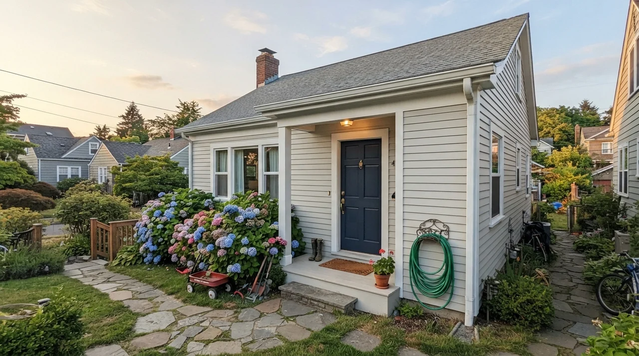
Where Silver Satin does hold up beautifully is on interior trim and doors when the surrounding wall is a deeper shade. In an older house with cream walls, painting an interior door and a built-in bookshelf in Silver Satin gives an understated, quiet frame that feels intentional. And on horizontal siding outside in soft evening light, that subtle warmth steps forward, keeping the house from looking like a sheet of stark primer.
Trim Advice: Beware the Tiny Gap
Next to a slightly brighter white trim is the single most common disappointment with Silver Satin, and it is a pairing mistake rather than a paint problem. Standard builder-white trim sits only a few points above Silver Satin—close enough that the human eye reads the wall as grubby rather than deliberate. You see a wall that looks like it needs to be scrubbed clean against the woodwork.
You have two honest choices: either paint the trim Silver Satin as well in semi-gloss and let the sheen difference handle the contrast, or pick a whole-house neutral with enough color depth that the boundary line looks intentional. What does not work is a near-white that misses the mark by half a step.
Durability and the Long View: Five Years In
Here is what thirty years of repainting rooms teaches you: high-traffic areas don't care about subtle undertones; they care about mud, dogs, and elbows. In our ranch hallway, we painted Silver Satin in eggshell on the drywall and semi-gloss on the woodwork. Five years in, it has held up reasonably well to daily living, but with one major caveat.
Because Silver Satin is an LRV 75 pale gray, scuffs from grocery bags and boot marks along the baseboards show up fast. When you wipe it down with a damp microfiber cloth, the surface cleans up without taking off the finish—provided you bought quality paint. But don't expect a color this light to hide handprints by the garage door. It won't. If you have kids or active dogs, you will find yourself doing annual touch-ups around door casings.
What sheen should I choose for Benjamin Moore Silver Satin?
Walls do best in eggshell; trim and doors should be finished in semi-gloss; ceilings require flat to avoid glare; and kitchen cabinets need satin for cleanability and smooth coverage.
Why does Silver Satin look purple on my walls?
Silver Satin carries very little pigment, so cool 4000K LED lighting or pink-beige carpet pulls out its subtle violet lean. Switching to 2700K warm bulbs usually solves it immediately.
Is Silver Satin considered a white or a gray?
It sits right on the edge at LRV 75. In south-facing daylight with wood floors it reads as a soft off-white, but in dim rooms or next to brighter white trim, its gray body becomes obvious.
Can I use Silver Satin for the entire house?
Yes, provided the home gets decent natural light. It lifts windowless hallways and stairwells without glaring, and its quiet nature means it will never fight your furnishings.
Susan's Verdict · A Quiet Performer That Demands Warm Light
Silver Satin 856 is not the paint you buy to make a bold decorating splash. It is the color you buy when you want your walls to step back and let your life, your art, and your furniture do the talking. If your rooms have south light, warm wood floors, and 2700K lamps, it looks tailored and expensive. But if your space faces north, relies on cool commercial bulbs, or sits next to pink-toned tile, pass on it. A shade with this little pigment won't rescue a difficult room; it needs a good room to begin with.