Color Diary · No. 92
Sherwin-Williams Waterloo SW 9141 on Cabinets, Walls, and Doors: The Long View
A deep slate-blue that photographs like navy and lives like gray, reviewed honestly: the light it needs, the room it goes near-black in, and what to pick instead.

Susan HartleyOctober 24, 2026 · 16 min read
Waterloo · Sherwin-Williams SW 9141
Hex#536872LRV13Undertonesteal-slate → charcoal-blue → deep steel
In our last house—a center-hall colonial from the mid-nineties with drafty double-hung windows and eight-foot ceilings—I spent four months convinced I wanted a navy dining room. Everyone was doing navy. It was supposed to feel intimate, grounding, and timeless. So I bought two sample quarts of a very famous dark navy, rolled big swatches onto the wall opposite the sideboard, and walked in the next morning at eight o’clock to find two patches of pitch-black staring back at me. It felt cold, flat, and aggressive. What looked stately in a magazine looked like a cave in our northeastern morning light.
That was the week I hauled myself back to the paint counter and stumbled onto Sherwin-Williams Waterloo (SW 9141). It sat quietly in the teal-slate family with a light reflectance value of 13—meaning it only reflects about thirteen percent of the light entering a room. That is undeniably dark, but unlike true navies that rely on deep violet-blue pigments, Waterloo is anchored in slate gray. It is essentially what happens when a deep blue gets talked out of being a navy. It grays down so substantially that it reads more like weathered harbor stone than sailor uniform. I painted that dining room in Waterloo, and we lived with it for seven years until the day we packed the moving van.
Over thirty years of owning three different homes—from our first 1970s split-level to that nineties colonial and now our 1960s ranch—I have learned that the paint colors that look most striking on a tiny swatch chip are often the ones you tire of fastest. The colors that actually survive real family life are the chameleons: the shades with enough gray in their backbone to settle down, step back, and let your furniture and family breathe. Waterloo is one of those rare colors, but it comes with real stipulations. If you do not give it the light it asks for, it will punish you.
How Daylight Dictates the Shift
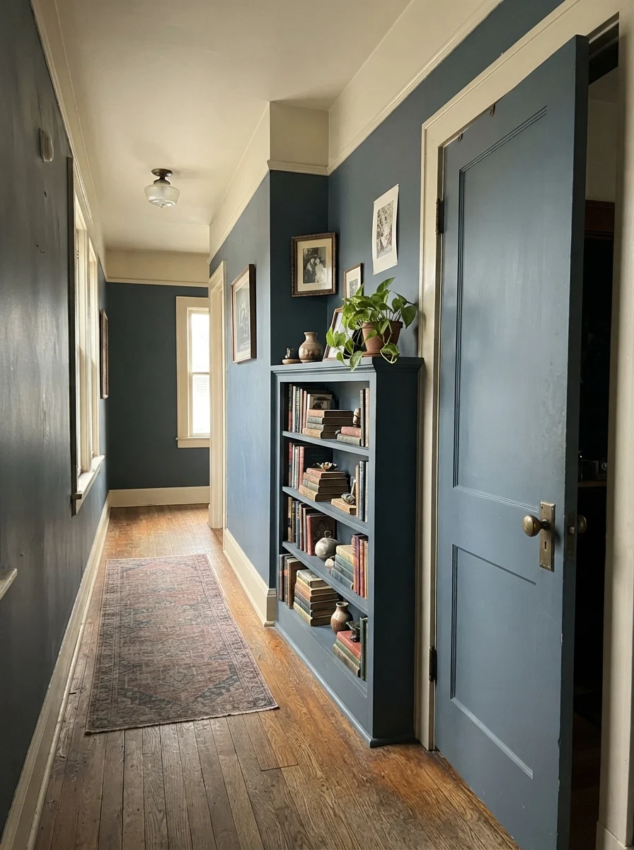
Here is what you must understand about an LRV 13 paint: it cannot create its own bounce. White paint throws light back into a room; dark paint swallows it. When Waterloo is hit with clear, indirect morning light, the blue pigment steps forward. You get a calm, misty ocean tone that feels crisp, tailored, and sophisticated. But as soon as the sky clouds over or the sun dips behind the treeline, the gray base takes command.
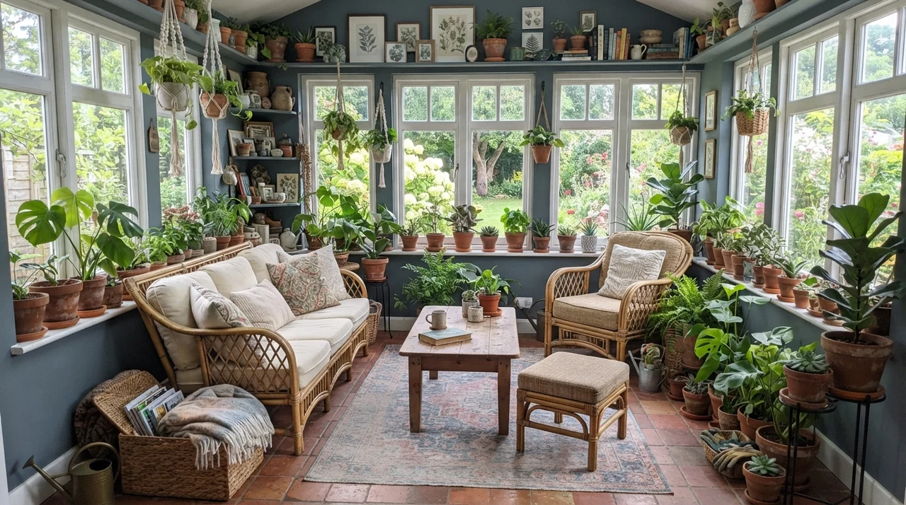
In a room with generous east or north exposure, Waterloo looks like its truest self—a balanced slate-blue that never reads gaudy or childish. However, direct south- or west-facing afternoon sun does something peculiar to cool dark paints. Instead of enriching them the way it enriches warm terracottas or creams, harsh blazing sunlight can wash Waterloo out around two in the afternoon, flattening its depth until the shadows return around five o’clock. If you paint a sun-drenched room with it, make sure you evaluate your swatch boards at noon, four o’clock, and eight o’clock under your real lamps before you order five gallons.
Kitchen Cabinets and Islands: Where It Truly Earns Its Keep
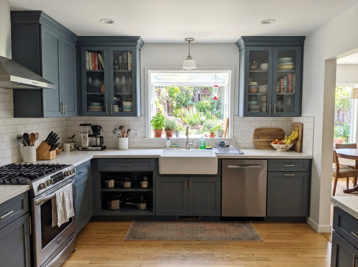
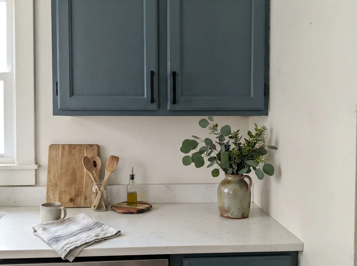
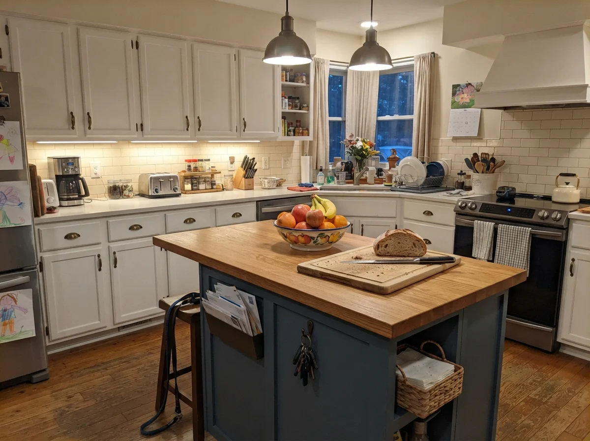
If you ask me where Waterloo belongs most naturally, I will tell you without hesitation: cabinetry and architectural woodwork. When we remodeled the kitchen in our colonial fifteen years ago, all-white kitchens were everywhere. I knew myself well enough to know that an all-white kitchen with two growing teenagers and a golden retriever meant I would spend the rest of my days on my knees with a bottle of cleaner. I wanted something dark on the lower cabinets that could hide shoe scuffs, but I was terrified of true black looking too stark against our oak floors.
Waterloo was the answer. On lower cabinets or a single center island, anchored underneath crisp white countertops and white subway tile, it acts like a grounding anchor. Can lights and under-cabinet puck lights bounce downward onto the horizontal rails of shaker doors, preventing the color from sliding into that lifeless near-black hole. It gives you the moody, architectural gravitas of navy without making the room feel like an officer's mess deck.
For cabinetry, satin enamel is worth the money every single time. Flat paint on cabinets is an absolute disaster—it absorbs grease and fingerprints like a sponge. Semi-gloss is durable, yes, but it catches every single roller lap mark and wood imperfection. A high-grade satin enamel provides just enough slip so that dried pasta sauce and butter drips can be scrubbed clean with a warm microfiber cloth without buffing away the paint's sheen.
The colors that survive real family life are the chameleons: the shades with enough gray in their backbone to step back and let your life happen in front of them.
Bathrooms: The Dividing Line Between Cozy and Cave
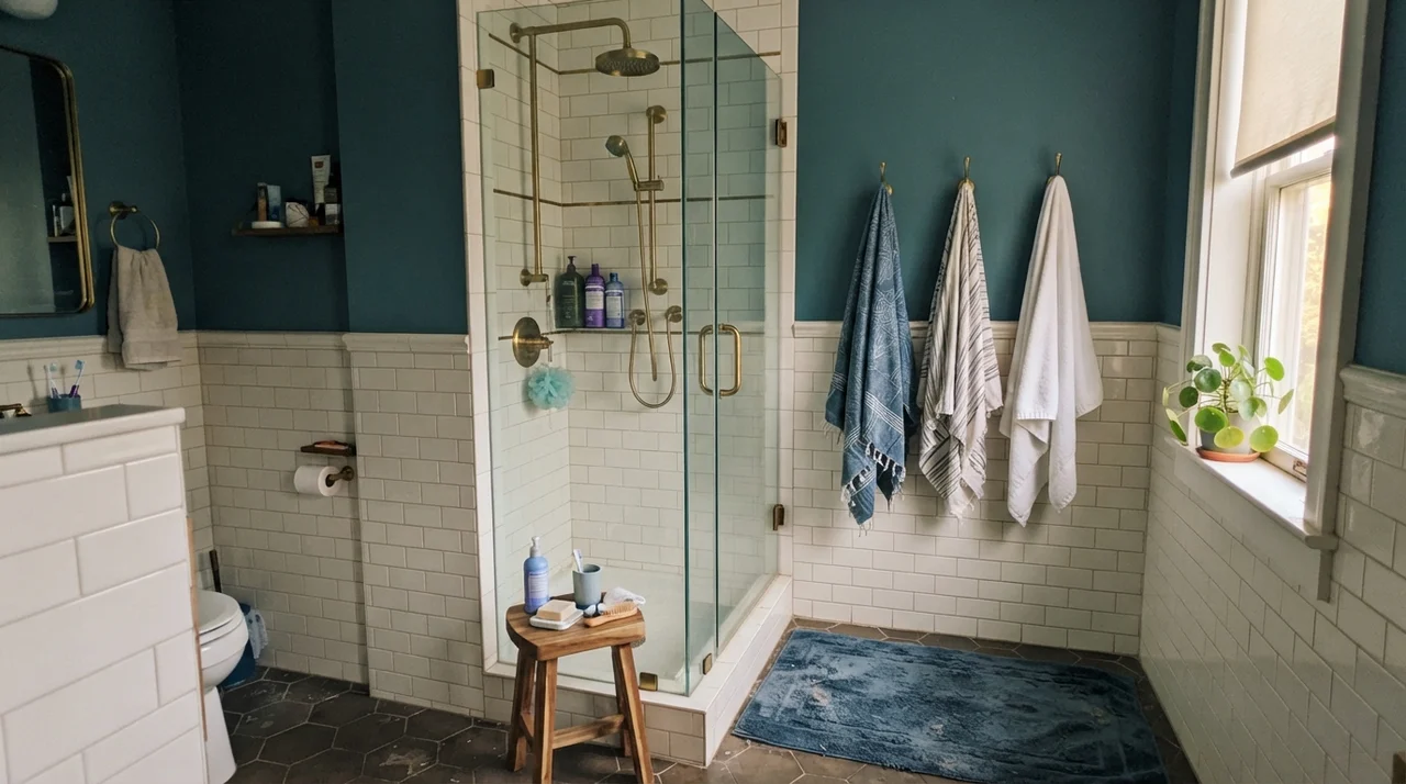
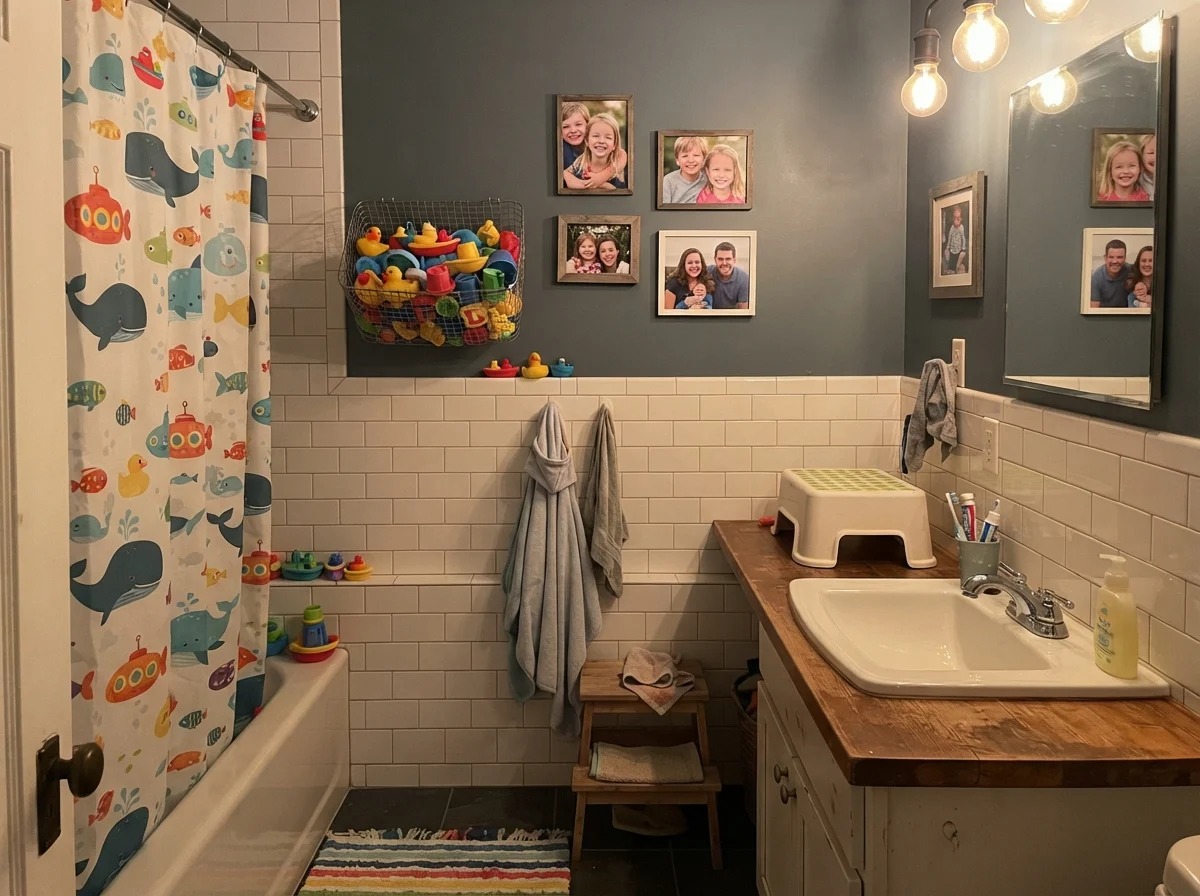
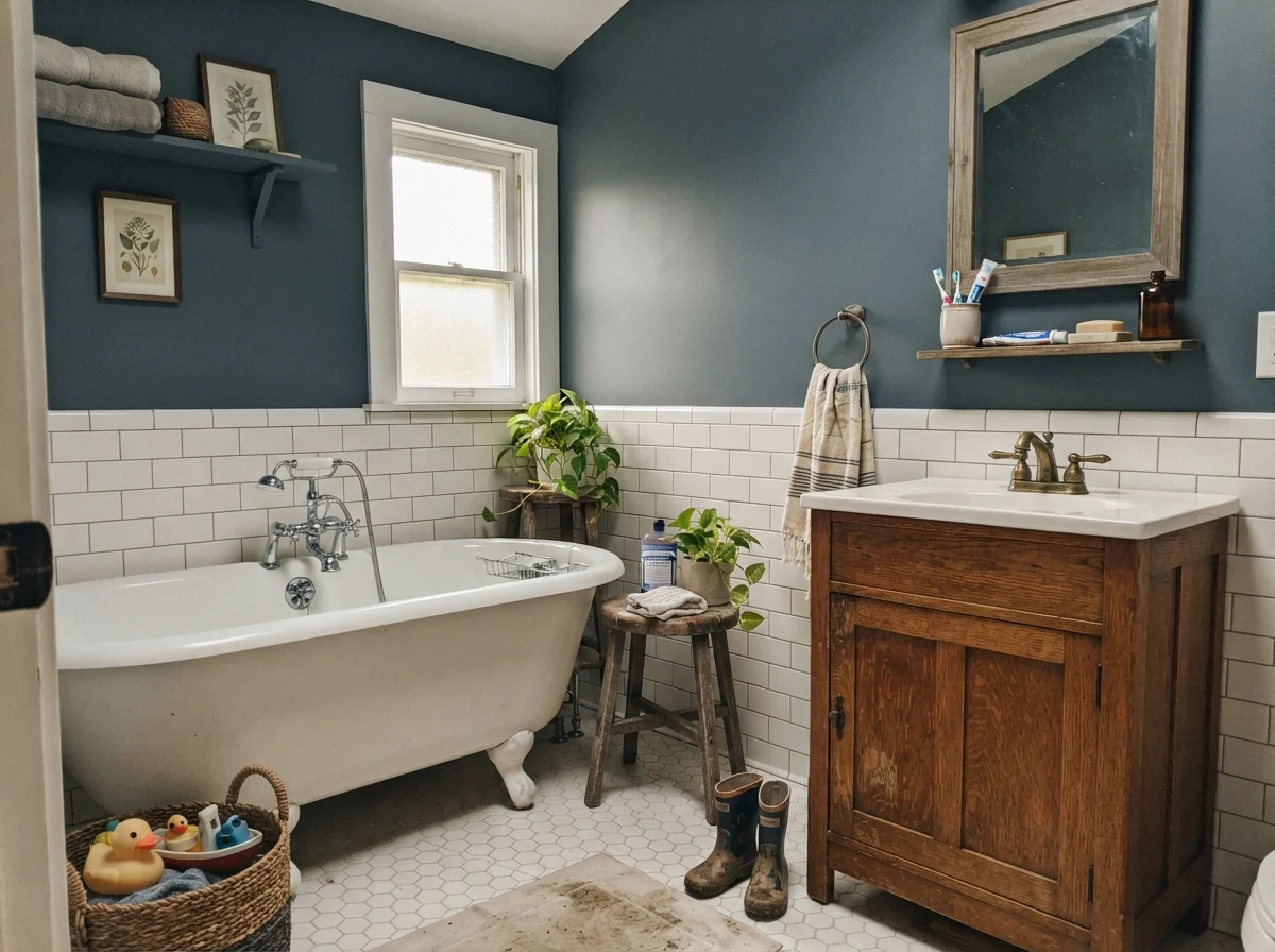
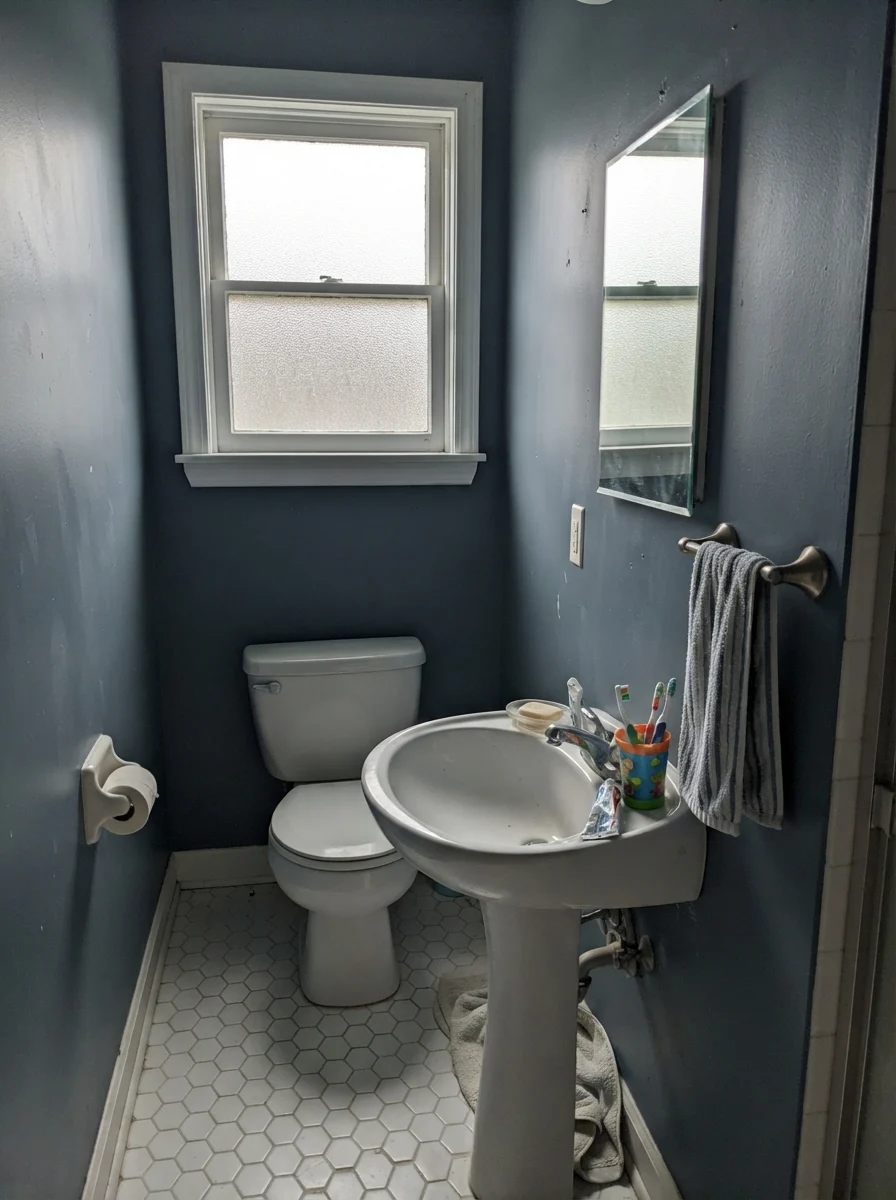
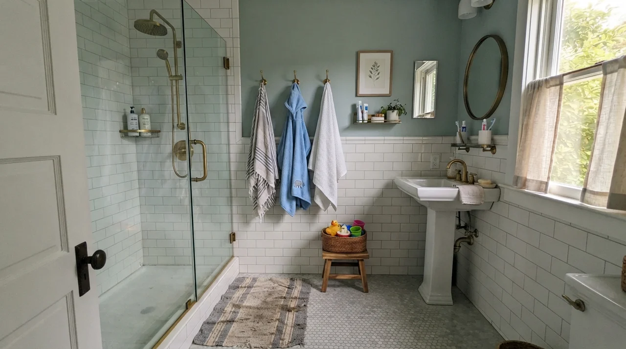
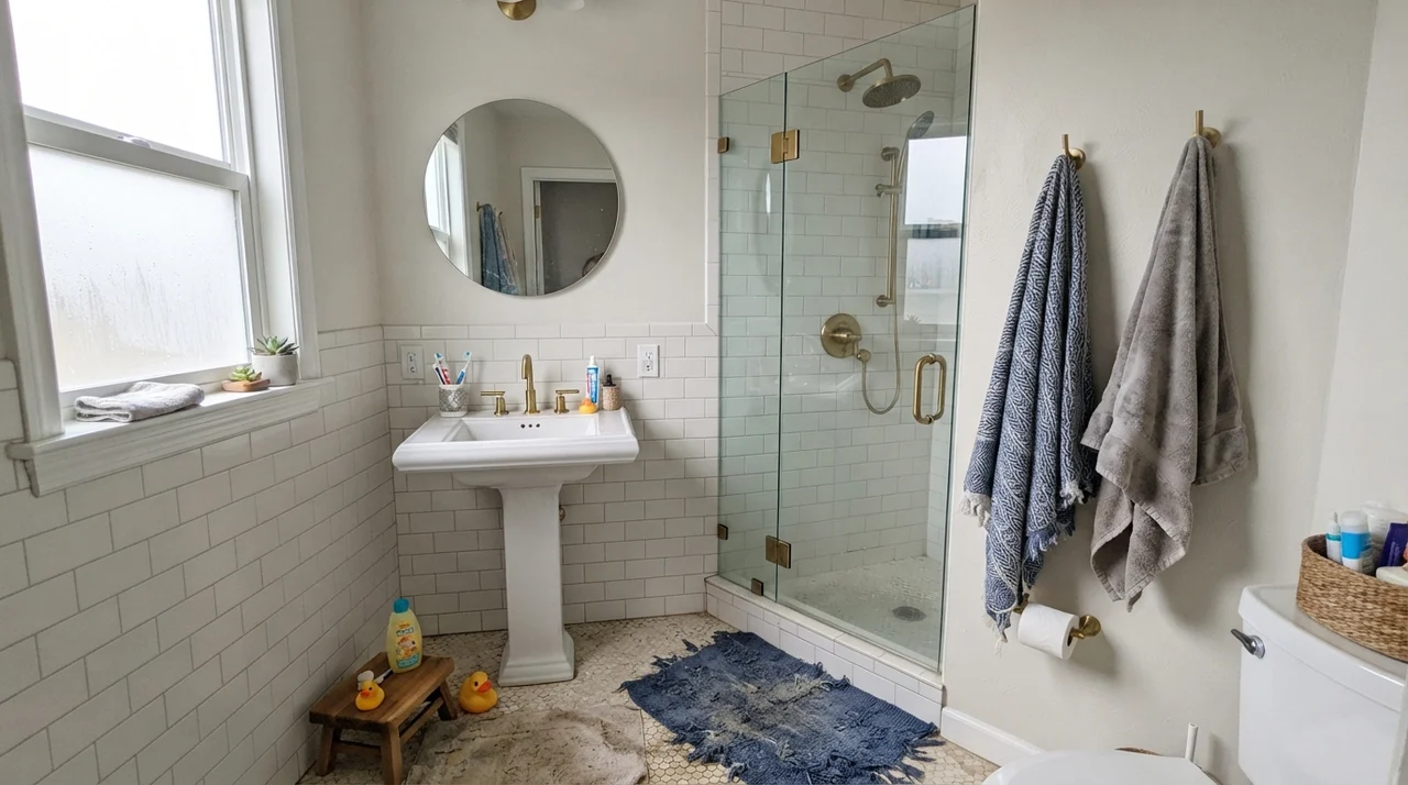
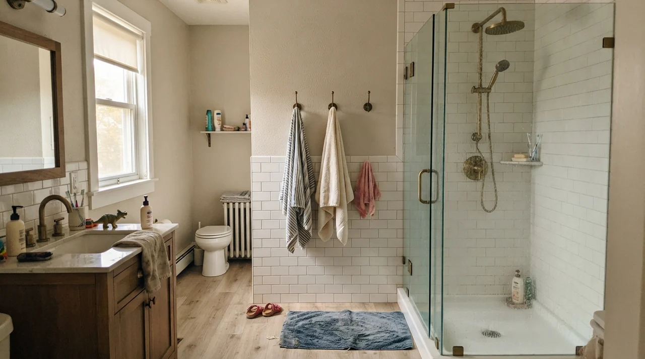
In bathrooms, Waterloo requires a disciplined hand. The most successful bathrooms I have ever seen painted in this color share one crucial element: white tile wainscoting covering the bottom four feet of the wall. When you keep Waterloo on the upper third of the room, above white subway or hex tile, it provides a gorgeous, jewel-box contrast without overwhelming the plumbing fixtures. Brass faucets and warm oak vanities glow against it, turning what could be a sterile utilitarian space into a proper room.
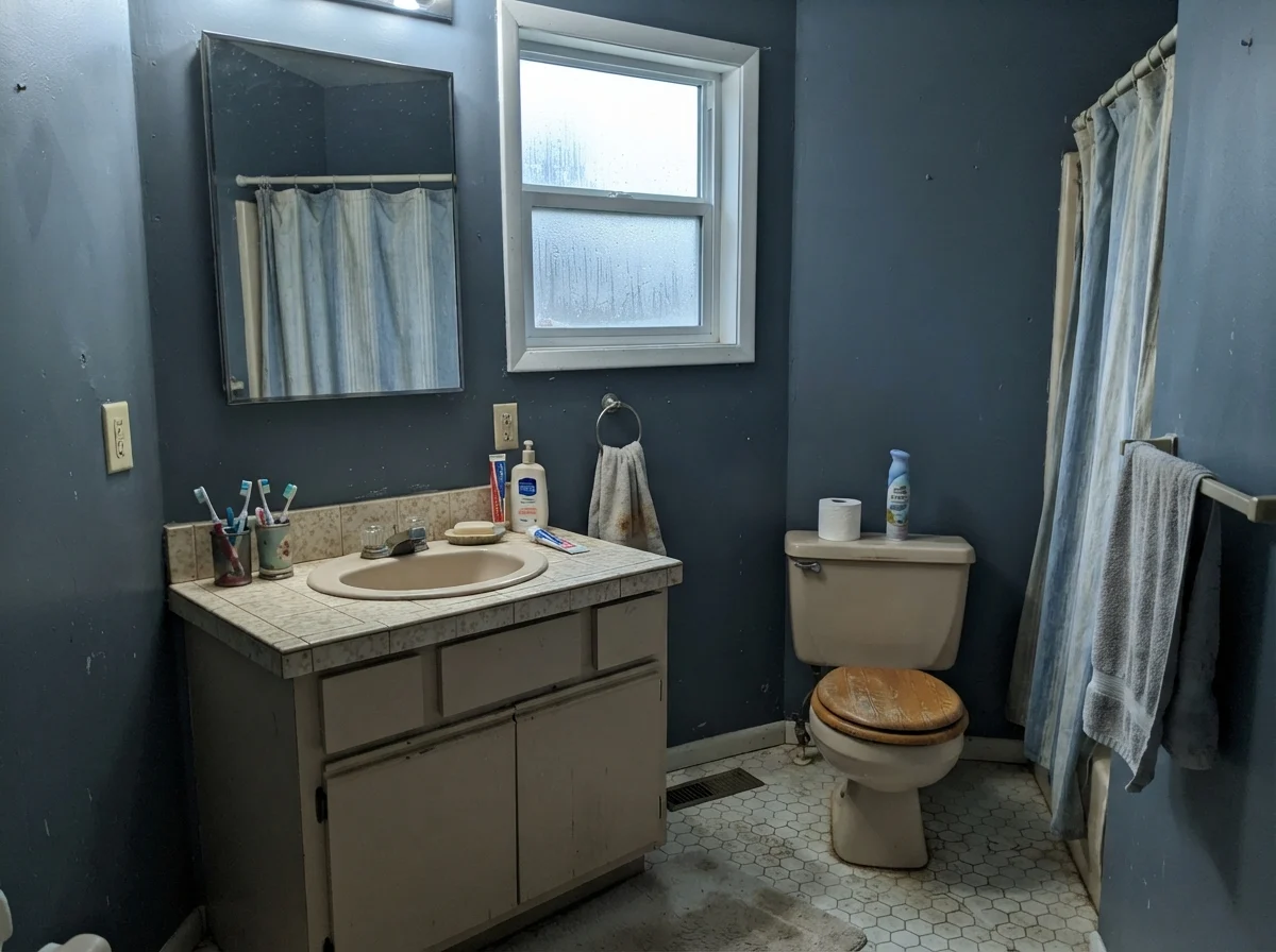
Where people get into trouble—and I hear this regret from neighbors at least twice a year—is painting all four walls of a windowless powder room in Waterloo. You see a picture in an editorial shoot with studio umbrella lights hidden out of frame, you fall in love with the drama, and three days later you are brushing your teeth in what feels like an unlit elevator shaft. In a tiny bath with no natural window light, an LRV 13 paint turns flat, murky, and suffocating. Unless you have planned a robust three-point lighting scheme with warm vanity sconces, keep it above wainscoting or reserve it for the vanity cabinet itself.
Bedrooms: Space, Scale, and Rest
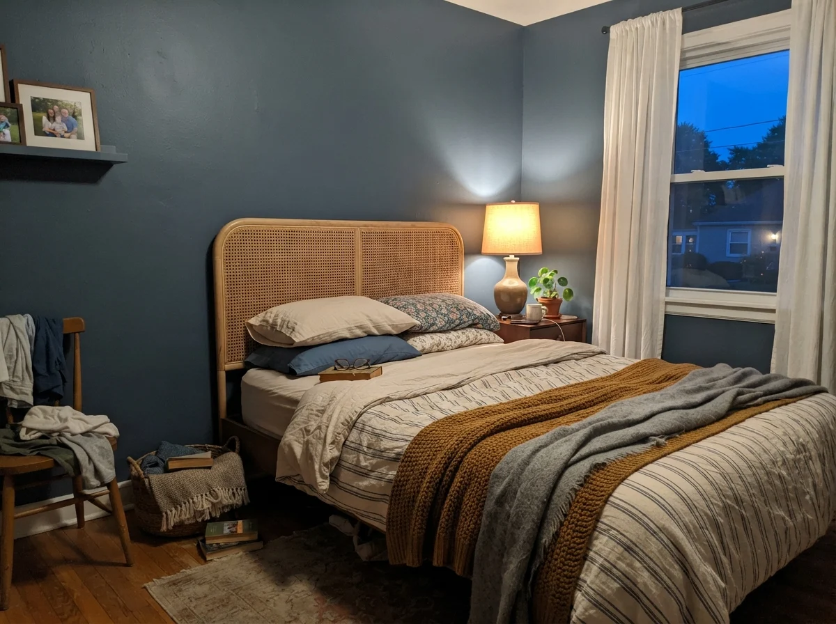
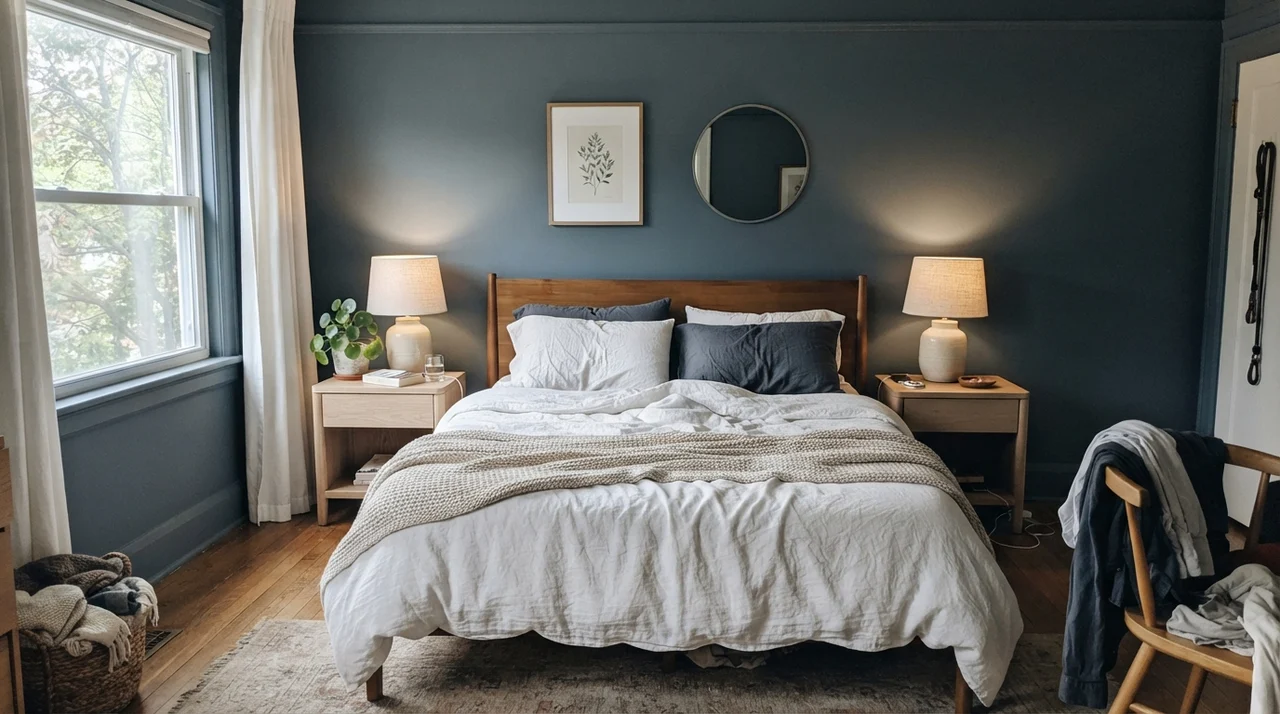
Can you put Waterloo on all four walls of a bedroom? Yes, provided the bedroom has the square footage and window count to justify it. In a spacious primary bedroom with white linen bedding, pale oak dressers, and generous morning sun, Waterloo creates a deeply restorative cocoon. The eye stops straining against glare; the room instantly feels settled. Five years in, you will not tire of it because its gray undertone prevents it from buzzing like an electric navy or a royal blue.
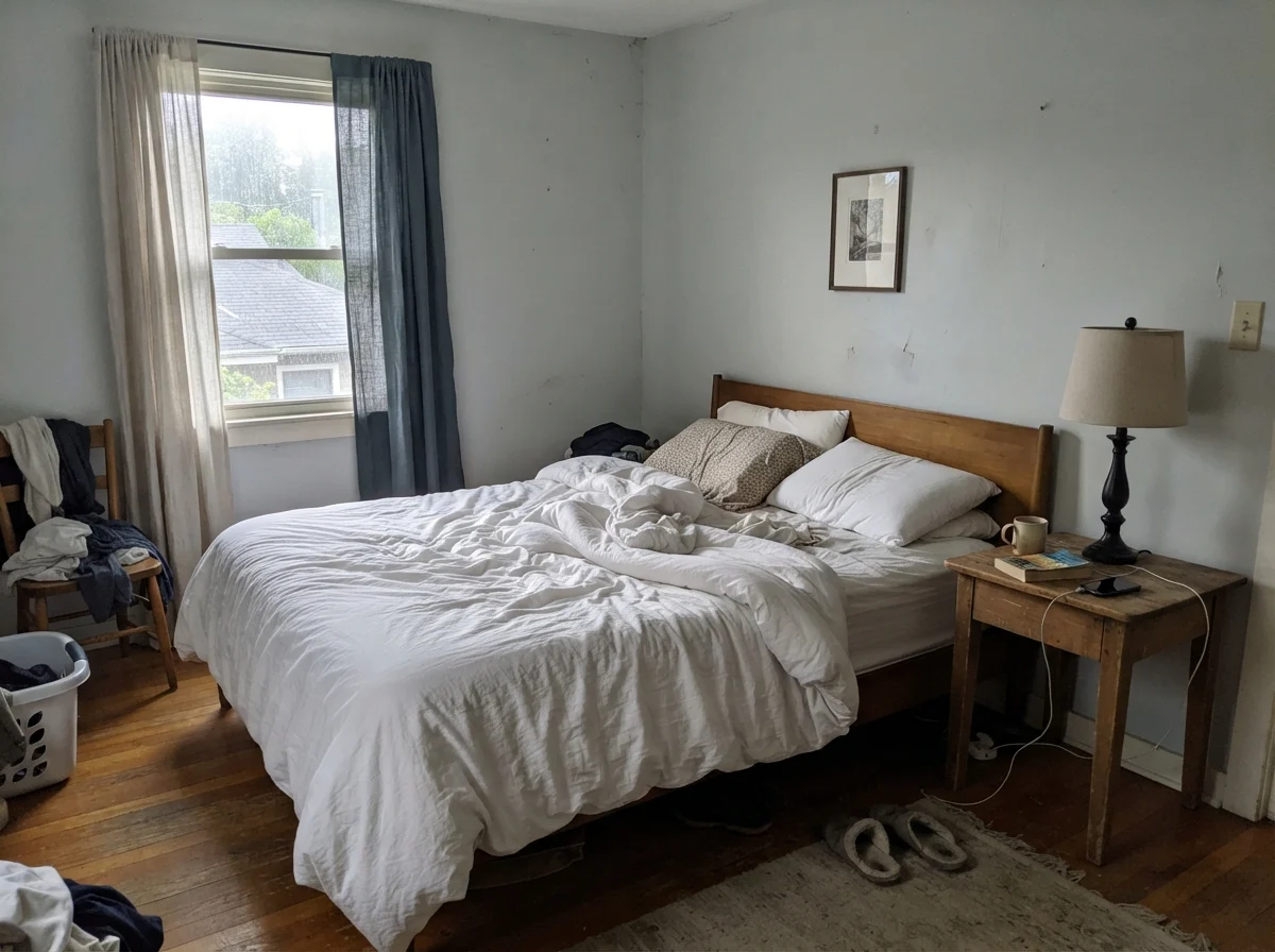
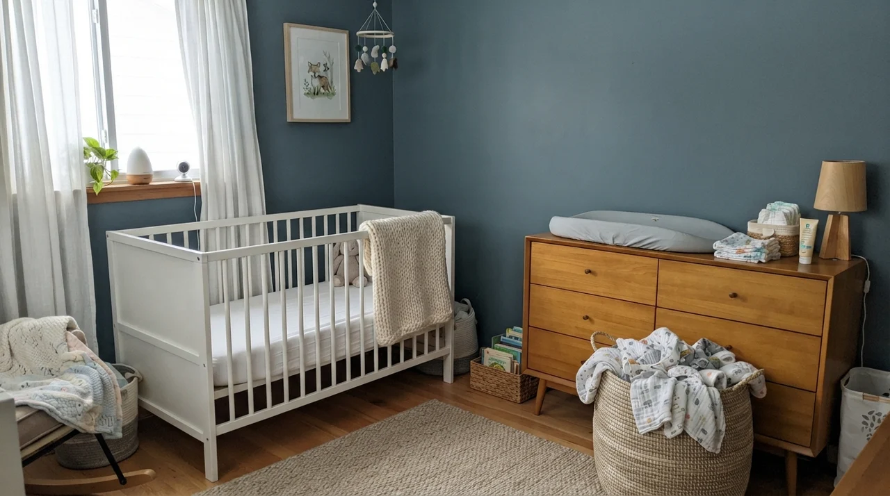
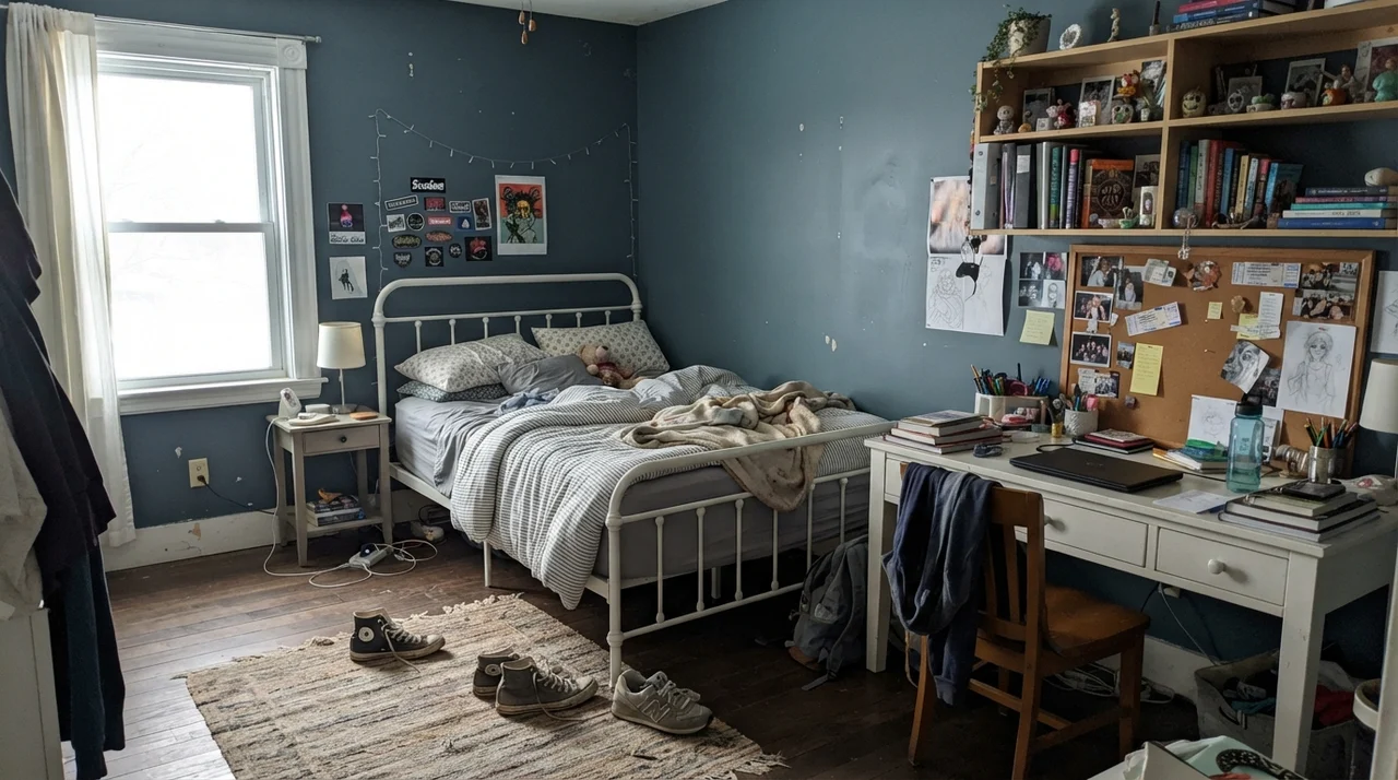
However, in a small secondary bedroom or a north-facing guest room with a single small slider window, painting every wall in Waterloo is the fastest way to make the room shrink by four feet in every direction. If you have a teenager who begs for dark walls, or if you want to ground a nursery, balance it deliberately: use light natural woods, keep the trim and ceilings a clean contrasting off-white, and incorporate bedside lamps with warm 2700K bulbs. A single warm bulb against a Waterloo wall turns the paint velvety and rich at bedtime, whereas harsh 4000K overhead daylight bulbs will make it look institutional and cold.
Living Rooms, Exteriors, and Millwork
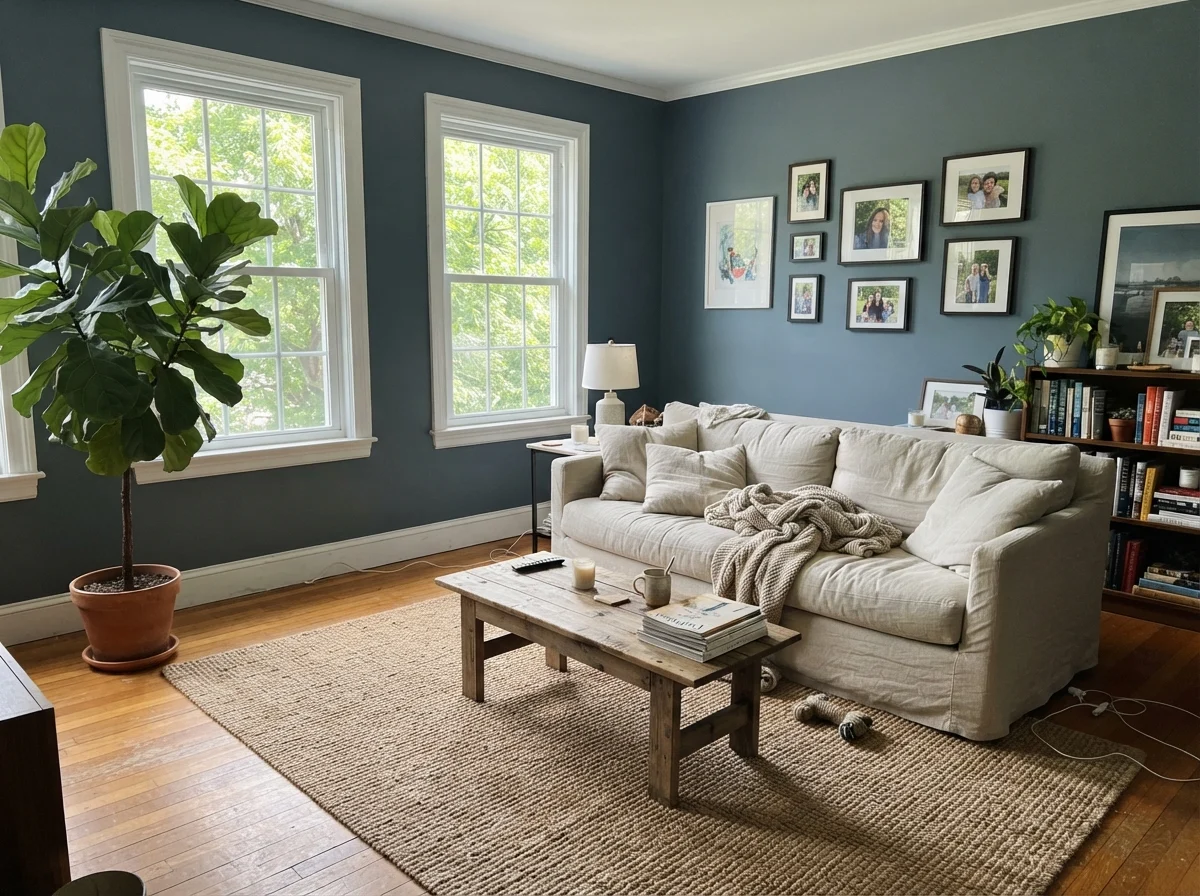
In our current 1960s ranch, the living room is open and wide, flooded with light from two large southern windows. Here, Waterloo functions as a deliberate focal point rather than a whole-room envelope. We used it across a single wall of built-in bookshelves flanking the fireplace. That single deep wall grounds the whole room, making our rumpled linen sofa, jute rug, and collection of secondhand books look deliberate and cohesive without plunging the entire living area into darkness.
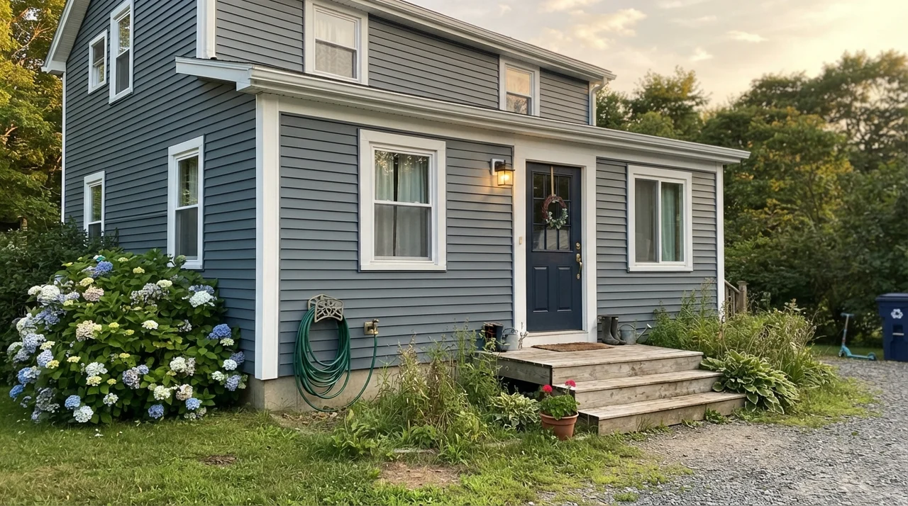
Outdoors, Waterloo is an absolute workhorse. On horizontal siding paired with crisp white trim, it reads as a timeless maritime gray-blue that looks expensive and composed. It does not suffer from that chalky, electric look that cheap exterior blues get after three summers of UV exposure. Furthermore, painting an exterior front door in Waterloo is one of the easiest resale prep moves you can make: it looks welcoming, pairs beautifully with brass or black iron hardware, and conceals the inevitable smudges from kids, dogs, and grocery bags far better than any white or pale greige ever could.
The Honest Failure: Where Waterloo Betrays You
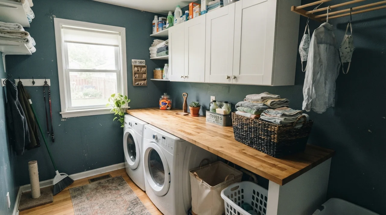
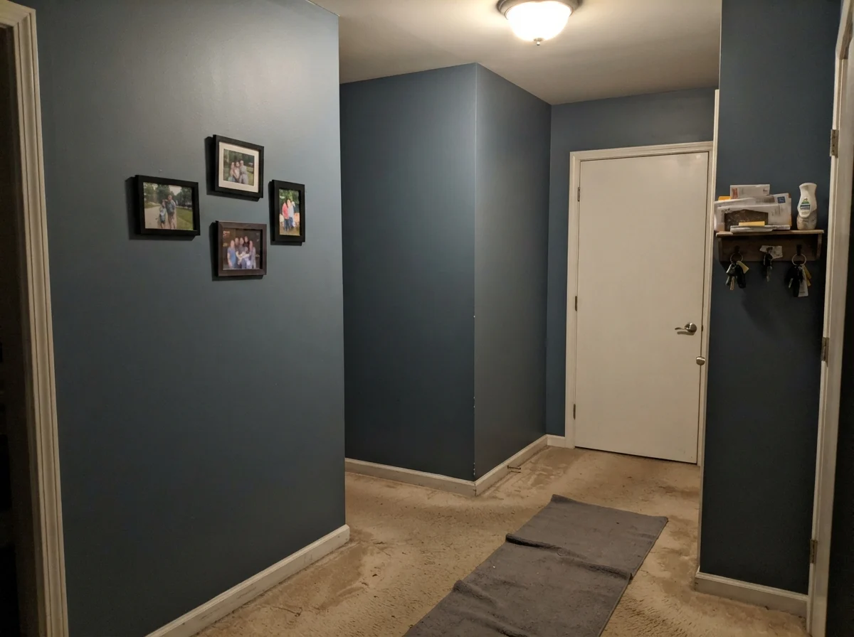
I promised you no lectures, but I will give you the unvarnished truth. Almost every homeowner I know who has ended up hating Waterloo made the exact same mistake: they put it in an unlit hallway or an interior laundry room with no window, expecting it to perform like a rich designer backdrop. (And believe me, my husband questioned my sanity when I brought home three different nearly identical swatches of dark slate-blue to paint our windowless back passage).
Look at what happens in a windowless hallway corner under a single builder-grade ceiling fixture: LRV 13 cannot survive. Without natural daylight to pick up the blue pigment, Waterloo collapses into a muddy, lifeless charcoal that makes beige carpet look dingy and white trim look cheap. It reads like dirty putty in bad light. If your room has no natural window, or only one tiny north-facing slit, do not paint all four walls in Waterloo. It is not the paint's fault; you simply asked a shade that requires bouncing photons to thrive in the dark.
Living with It Long-Term: Scrubbing, Wear, and Resale
Here is the reality of living with an LRV 13 paint five years in. With dark walls, sheen selection is everything. On drywall, eggshell is the absolute sweet spot. Flat paint in a dark color is impossible to maintain; the moment a handbag rubs along the hall or a kitchen chair bumps the wall, it leaves a permanent burnished mark that cannot be washed away. Satin on walls can look unpleasantly plastic and highlights every drywall taping seam your builder left behind. Eggshell gives you cleanability without unwanted glare.
When our youngest dog was a puppy, he routinely shook mud against the dining room wall after rainstorms. Waterloo in eggshell held up through repeated washings. The spots scrubbed clean with mild dish soap and warm water without leaving faded water halos, which is where cheap paints always fail. If you buy a budget brand in a dark formula, you will often find the color lifts right onto your sponge during cleaning. Sherwin-Williams' higher-tier bases lock that pigment in.
What about touch-ups? Two years in, you will ding a corner moving a laundry hamper. Here is my rule: keep a pint jar of the original mix sealed tightly in the basement. Shake it thoroughly, take a small foam brush, and lightly feather it over the scuff. Because Waterloo has that heavy slate base, it touches up far more invisibly than high-chroma true navies, which tend to show a shiny patch wherever fresh paint meets old.
When we sold that colonial, our real estate agent walked straight into the dining room, looked at the Waterloo walls paired with our white wainscoting and brass chandelier, and told us to leave it exactly as it was. That is the highest compliment a paint can get. Had it been trendy hunter green or purple-navy, it would have looked dated within four seasons. But because Waterloo leans slate-gray, it felt architectural, established, and grounded.
Comparing Waterloo Against Its Closest Rivals
When you stand at the paint counter, Waterloo is rarely sitting alone. You will find yourself cross-referencing it against three or four other chips that seem to promise the same moody slate-blue mood. Having tested these in our own homes over thirty years, here is how Waterloo measures up against the candidates you are likely considering.
What sheen should I choose for Waterloo on kitchen cabinets?
Use a satin enamel. A satin finish provides the durability needed to be scrubbed clean of kitchen grease and food splatters without showing the glaring roller texture or lap marks that semi-gloss often exposes.
Is Waterloo considered a true navy?
No. Waterloo is a deep slate-blue. Sherwin-Williams grayed down the blue pigment significantly, placing it in the teal-slate family at LRV 13. If you want a punchy, unmistakable navy, look at a color like Naval instead.
Does Waterloo make small rooms feel smaller?
In small rooms lacking natural daylight, yes—it drops toward a flat near-black that can feel shrinking. However, in small rooms with bright natural light or white wainscoting, it creates a cozy, intentional envelope.
What hardware finish pairs best with Waterloo cabinets?
Both warm brushed brass and matte black hardware work beautifully. Brass brings out the warmth and counters Waterloo's cool undertones, while matte black gives it a sharp, modern architectural feel.
Susan's Verdict · Worth the money with light
Waterloo SW 9141 is worth the money if you treat it with respect. It is not an all-purpose paint you can throw onto all four walls of an unlit hallway and expect magic. Put it on kitchen cabinetry, front doors, or a dining room with white tile or wainscoting and real window light, and it will reward you for ten years without ever looking dated.