Color Diary · No. 91
Woodlawn Blue HC-147: The Porch Ceiling That Followed Me Indoors
A Historical Colors blue-green built for porch ceilings and spa bathrooms, reviewed honestly: the light where it turns gray, the light where it sings, and what to pick instead.

Susan HartleyOctober 24, 2026 · 15 min read
Woodlawn Blue · Benjamin Moore HC-147
Hex#C1D0CALRV61Undertonesgreen → gray → blue
In our last house—the 1990s colonial with the wraparound front porch—I spent three weekends agonizing over what to put on the porch ceiling. Down South, folks swear by haint blue, a pale, watery blue-green meant to echo the open sky. I didn't want anything too electric or sugary, so I bought a quart of Benjamin Moore Woodlawn Blue HC-147. Out there under the rafters, framed by crisp white columns, it was absolute magic. It held just enough green to feel grounded and just enough soft gray to keep from looking like a baby nursery.
Naturally, I got cocky. Two years later, during a dated-home refresh on the upstairs hallway bath, I decided that if it looked that serene outdoors, it belonged on the drywall over the tub. That was my first real lesson in what this specific shade does once you trap it between four walls. I lived with it for seven years in that house, and when we sold, the buyers specifically asked if the bathroom paint can was still in the basement. But getting it to behave indoors takes an understanding of how light, bulbs, and flooring either make it sing or drag it into looking like wet cement.
Woodlawn Blue sits in Benjamin Moore's Historical Colors collection at an LRV of 61. In plain English, that Light Reflectance Value means it bounces back sixty-one percent of the light that hits it. It has enough backbone and body that it will never be mistaken for an off-white, but it is light enough that it won't plunge a modest room into cave-like shadows. Yet the deck family classifies it under green, not blue—and that distinction matters more than anything on the swatch card.
Watching the Clock: Daylight Shifts
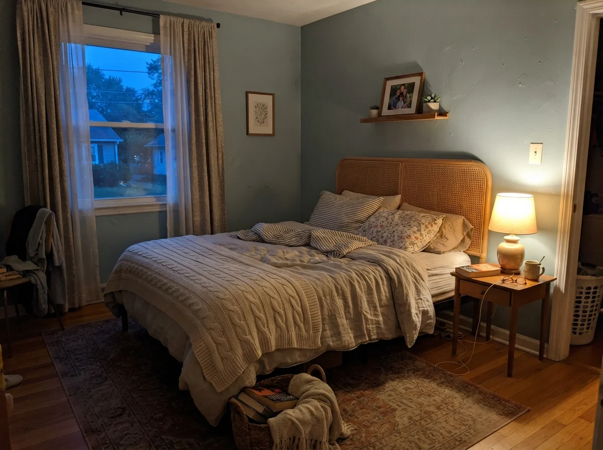
Here is what happens across a standard twelve-hour day. In early morning light, especially from an eastern window, the color starts out crisp, clean, and quite pale. If there are no lamps switched on, you might look at it and wonder if it has washed out entirely into a soft coastal mist. But wait until dusk rolls around. Turn on a bedside lamp with a standard warm bulb, let the outside light turn to navy, and the paint settles into something entirely different—warmer, cozier, and noticeably greener.
That chameleon behavior is the entire point of the formula. If you want a wall that announces itself as sky blue thirty seconds after you open your eyes and stays that exact same shade until you go to bed, do not buy this paint. Woodlawn Blue refuses to stay frozen. It keeps you company by changing clothes as the sun moves across your roofline.
Where It Earns Its Keep: Bathrooms
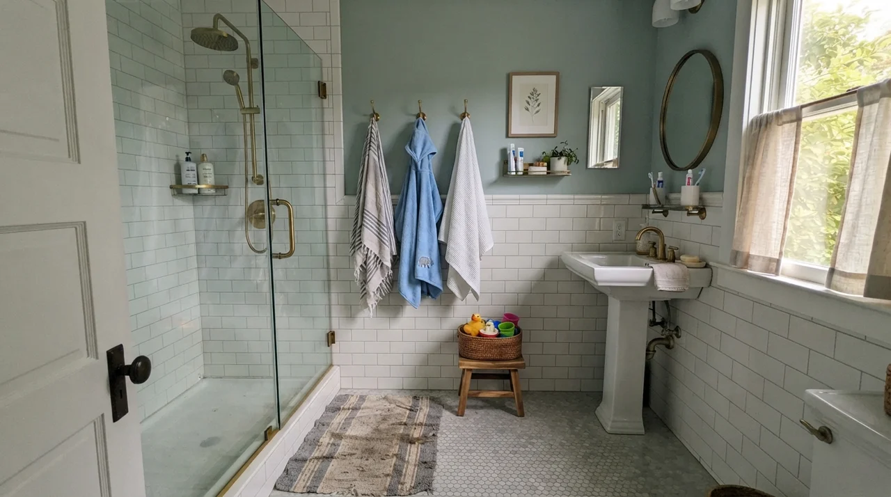
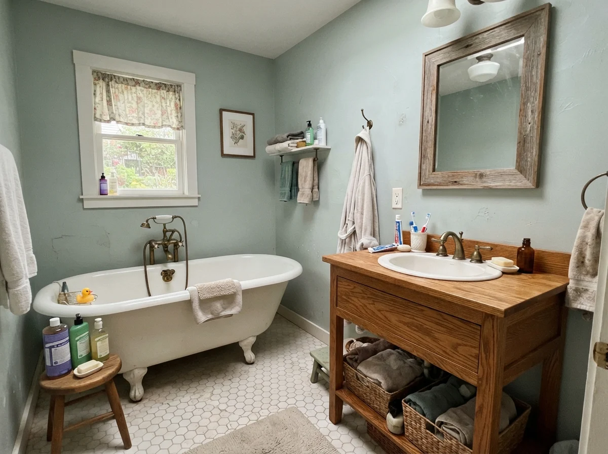
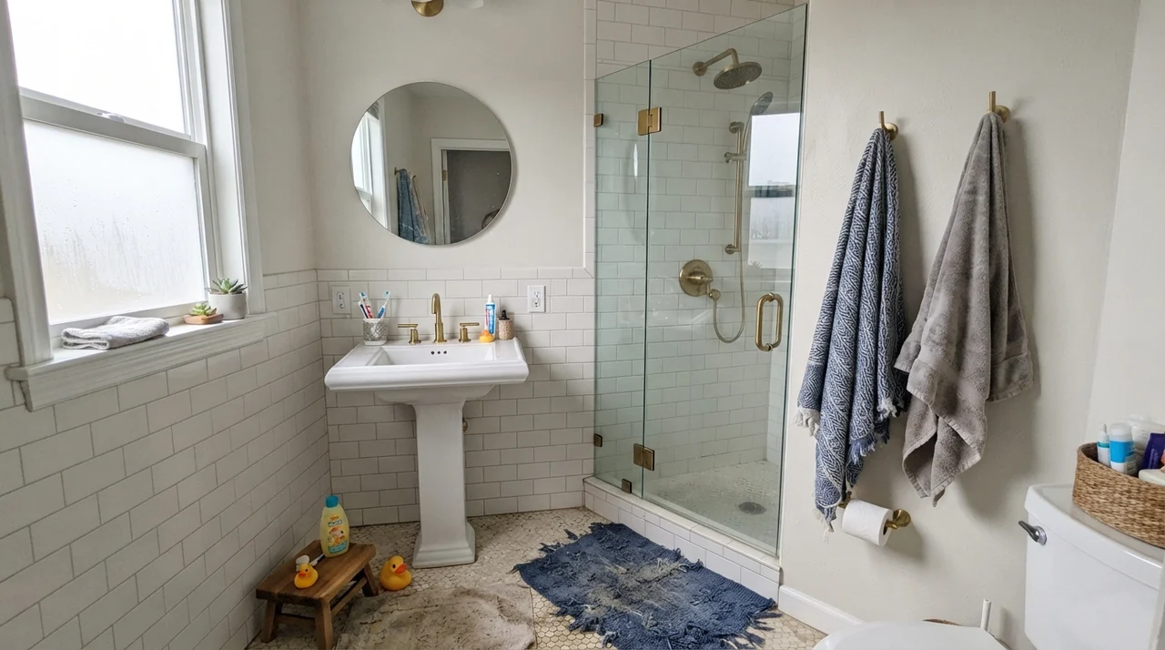
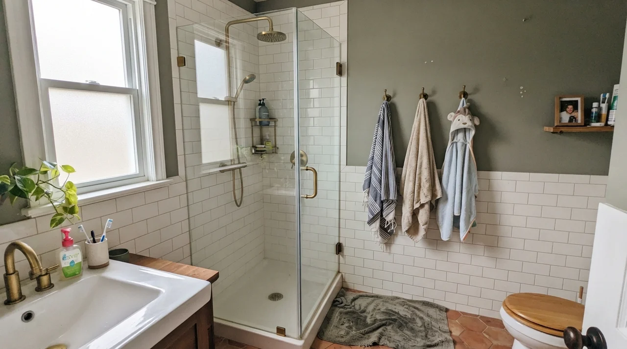
If you ask me where this color belongs, my answer will always be bathrooms and powder rooms. There is something about the pairing of clean white porcelain, white tile, and polished warm metals that unlocks the best version of Woodlawn Blue. In our second house, we had white subway wainscoting halfway up the wall and Woodlawn Blue on the drywall above it. Paired with brass plumbing fixtures and a clear glass shower door, it felt like an upscale boutique inn, but without any high-maintenance fuss.
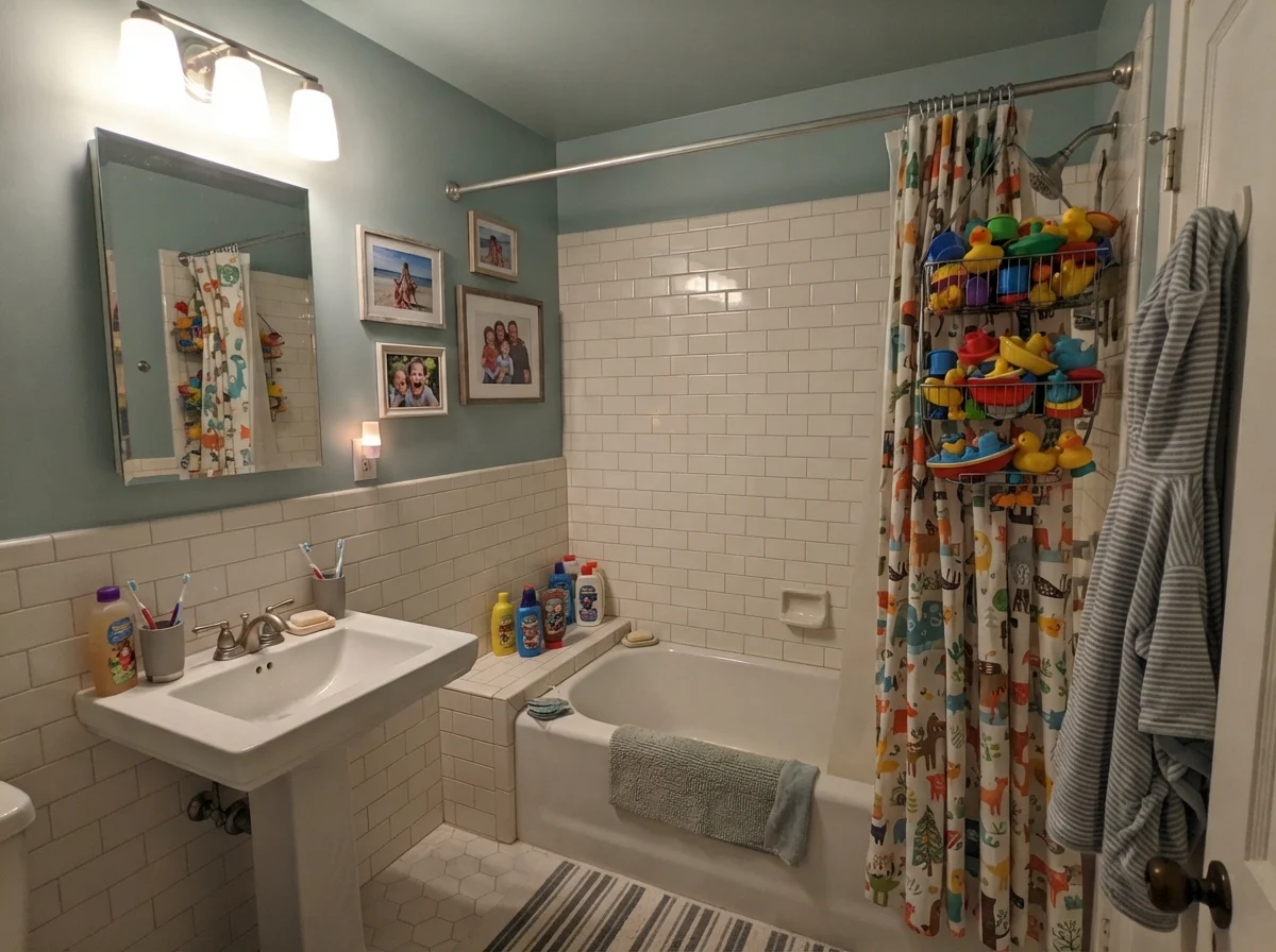
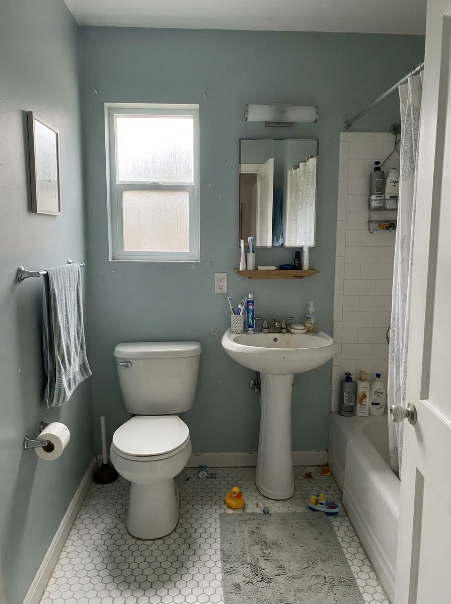
Notice what happens on an overcast morning through frosted glass, as shown above. The crisp seafoam airiness retreats, and the gray undertone steps right to the front. To my eye, that isn't a flaw—it's a relief. Too many pastel blues turn chalky or nursery-sweet when the sun hides behind gray clouds. This one simply turns quiet and dignified. Even in our busy kids' bathroom, where water splashes were an hourly hazard, the eggshell finish wiped clean easily and masked the steam streaks that plague glossier paints.
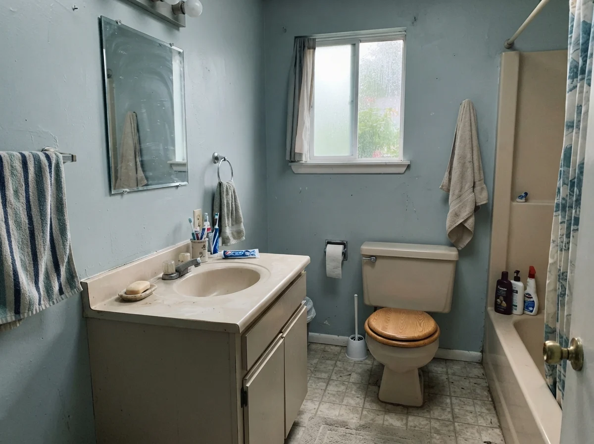
Be careful, however, if your bathroom has a north-facing window and dated beige fixtures. When cold north rain meets vintage almond or tan laminate, Woodlawn Blue cools off fast and can look slightly aloof. It really wants the honest contrast of true white or rich natural wood to anchor its soft personality.
The Calming Bedroom
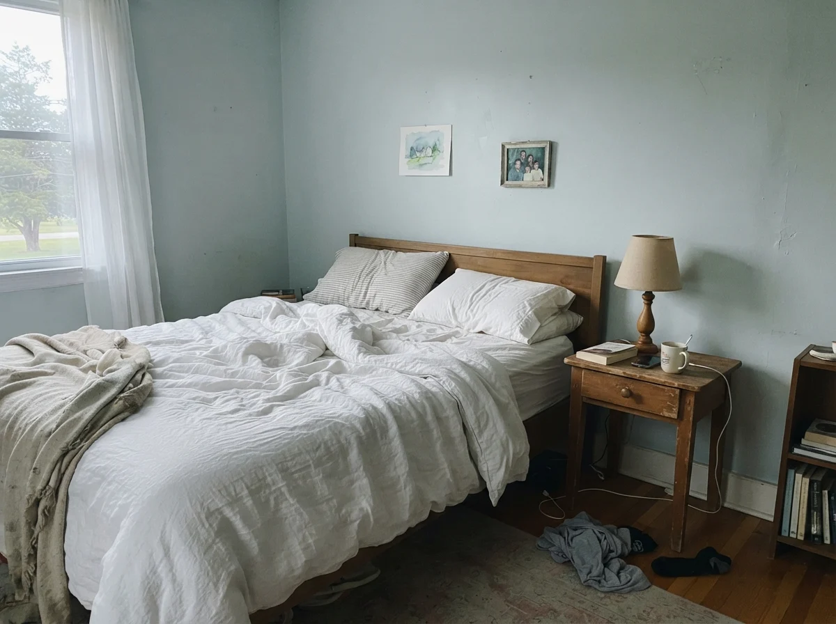
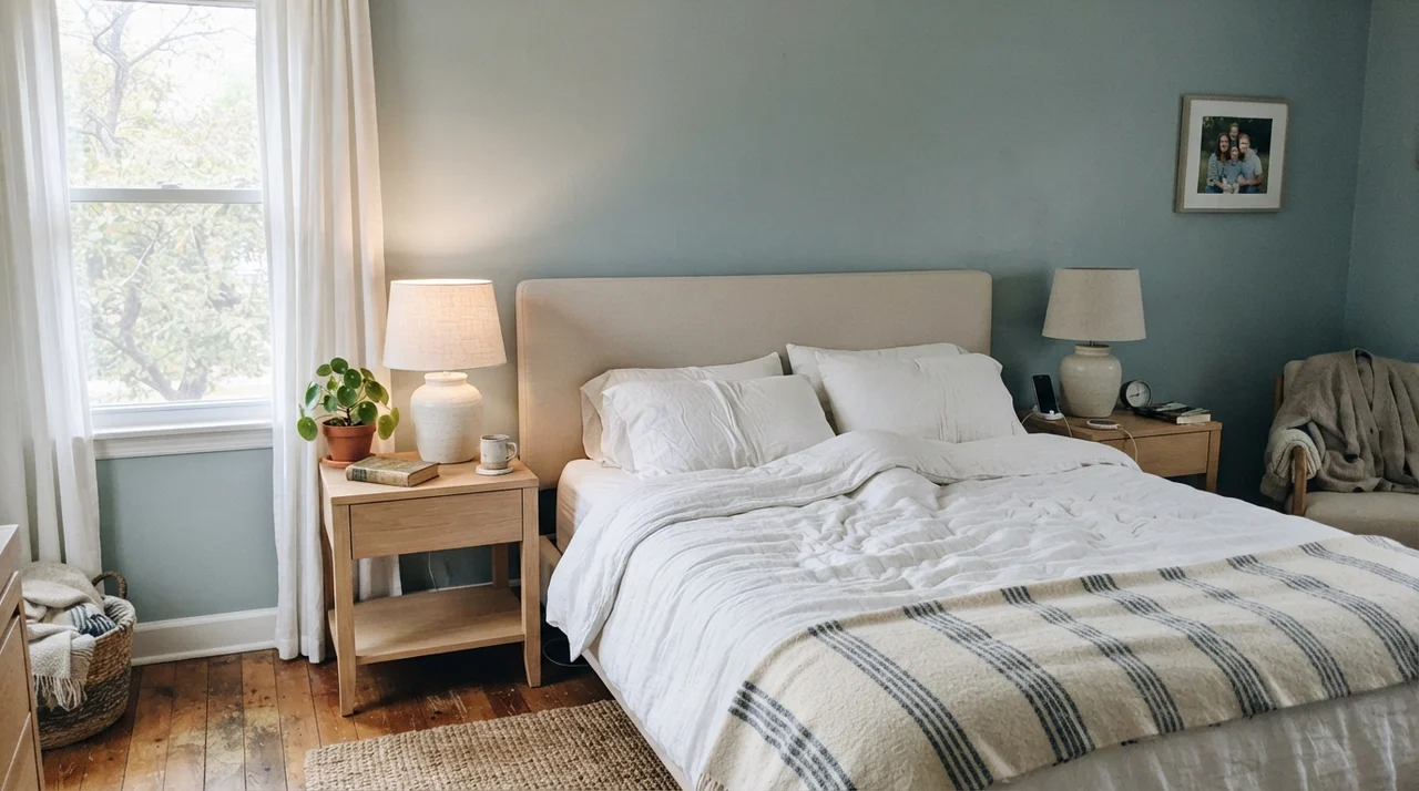
In our current 1960s ranch, the main bedroom gets clean, indirect southern exposure from two sizable windows. We painted it in an eggshell finish five years in after dealing with an overly sterile builder white that gave me a headache every morning. Pairing Woodlawn Blue with pale oak nightstands, neutral ceramic table lamps, and white linen bedding took the room from harsh to tranquil in a single Saturday.
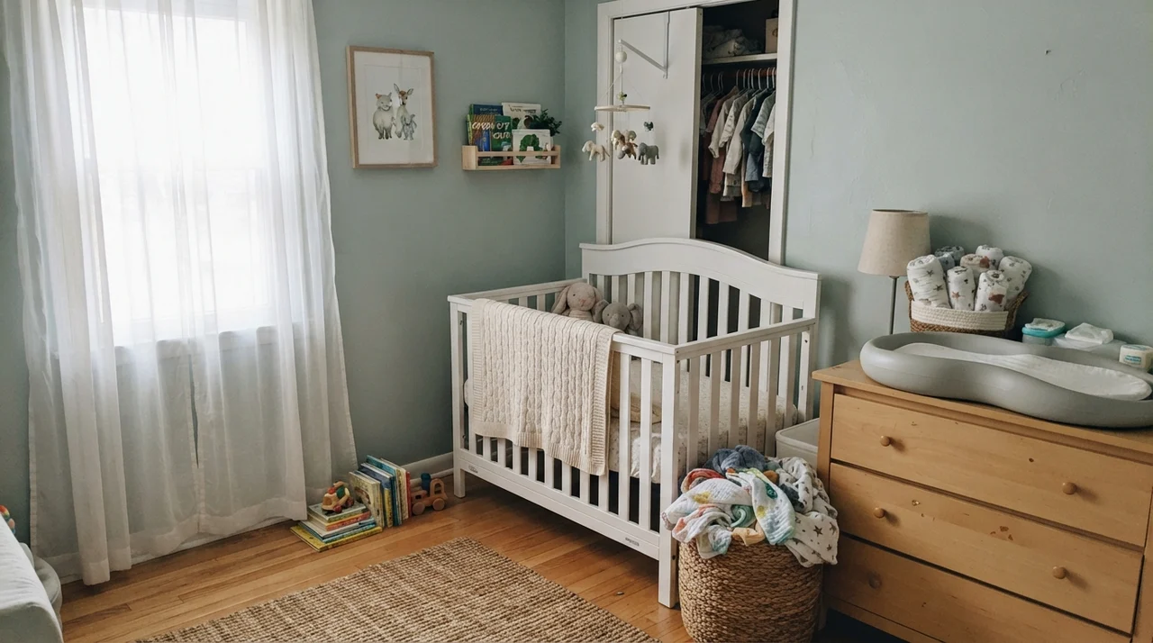
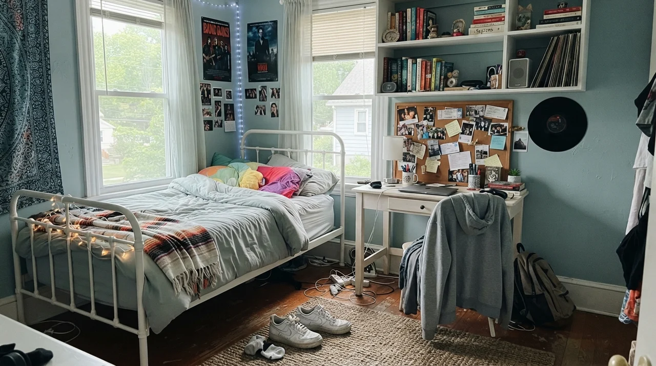
It also bridges age groups unusually well. When my daughter was transitioning out of her younger years into high school, we used this color alongside simple white metal furnishings, open shelving, and natural cork. In a nursery, it feels gentle and nostalgic; in a teen's room, it reads tailored and mature without feeling stiff. It is one of those rare colors a child won't grow out of in twenty-four months.
Cabinets, Islands, and Millwork
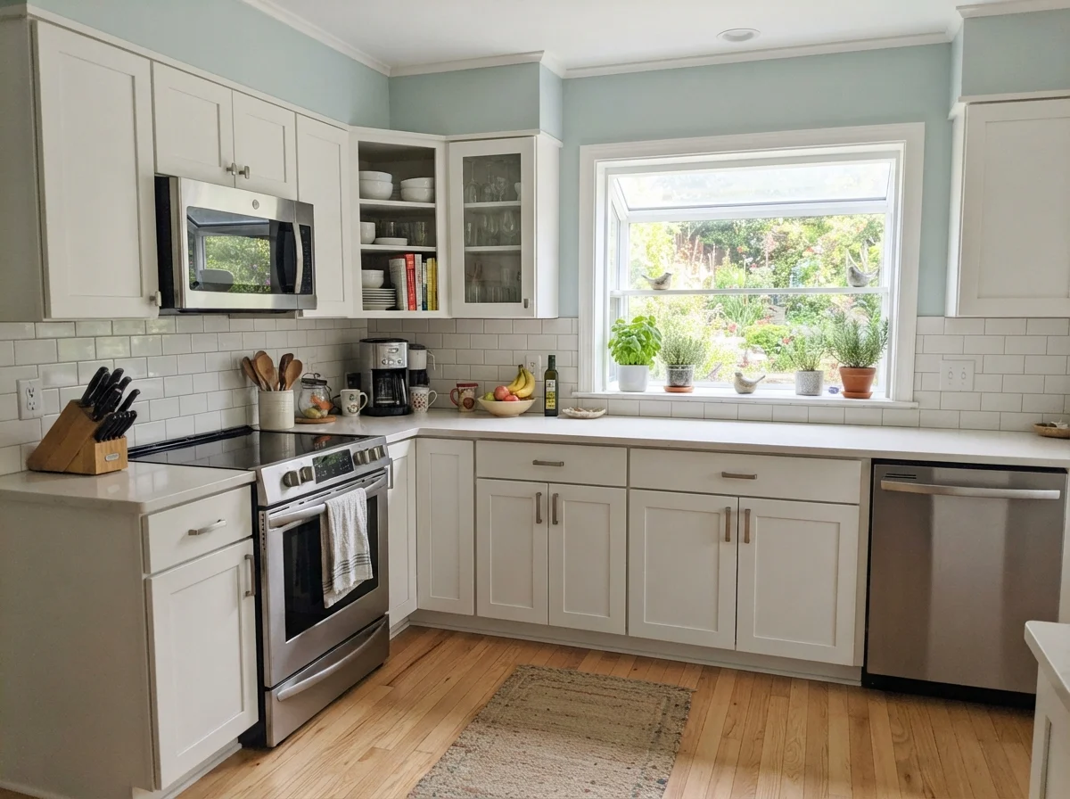
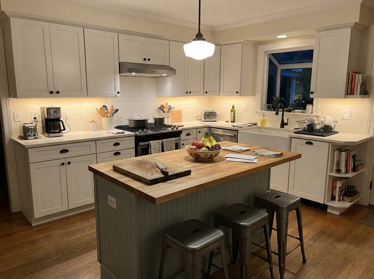
A lot of homeowners think Woodlawn Blue is solely meant for drywall. That is a missed opportunity. If you have an all-white kitchen that feels a little sterile, putting this color on the island while leaving the perimeter cabinets white is worth the money every single time. It provides just enough visual weight to ground the room without darkening the workspace.
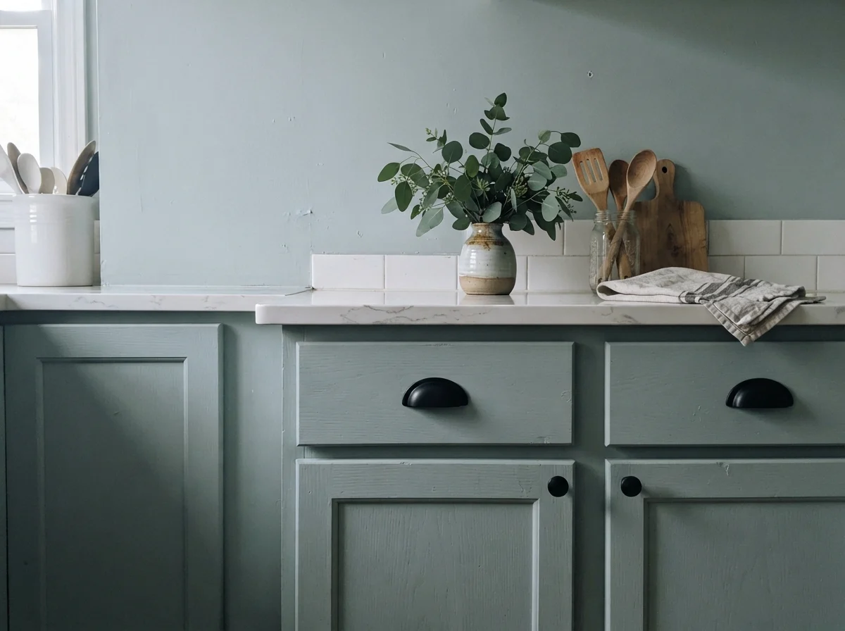
On cabinetry, you want a satin urethane-fortified cabinet enamel. Matte or eggshell finishes on cabinet doors will look beat up within six months around the drawer pulls and trash bin. Satin provides just enough sheen to shed grease and sticky fingerprints while keeping that muted, historical softness intact. Notice how sharp it looks against matte black pulls or warm aged brass. Against light oak floorboards and quartz counters, it gives a kitchen that custom, built-by-an-architect presence.
You don't choose a chameleon paint for the sunny Saturday you roll it on. You choose it for how it handles an overcast Tuesday evening with the lamps turned low.
Sunrooms, Living Spaces, and Halls
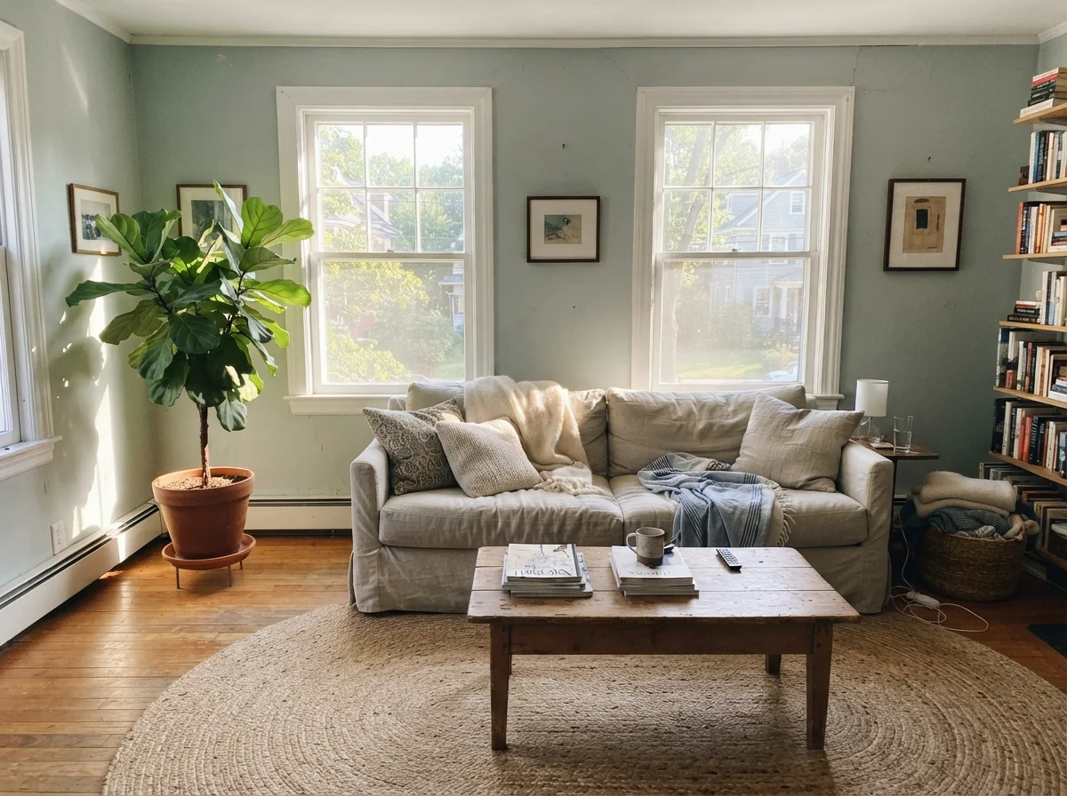
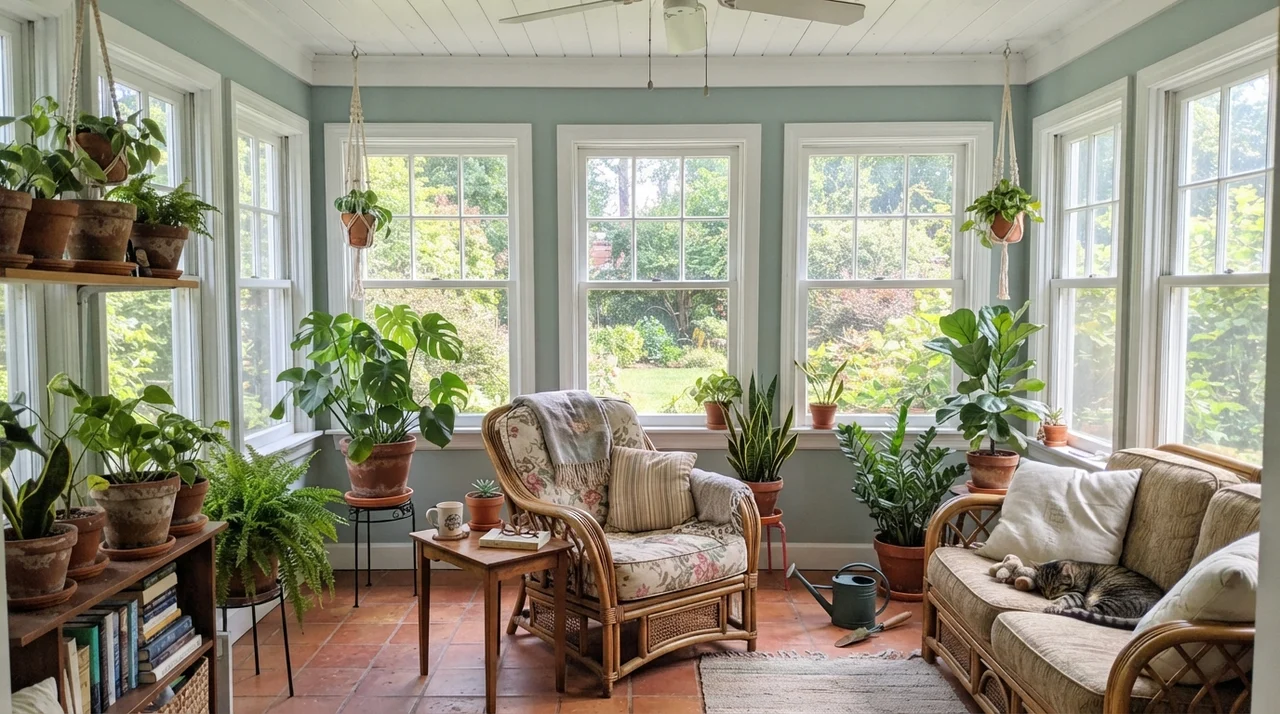
In living rooms and bright sun porches, Woodlawn Blue thrives whenever you give it abundant natural daylight. Surrounded by white window casings, natural rattan chairs, and terracotta pots, the green undertone blooms. It feels alive and directly tied to the foliage outside your window panes.
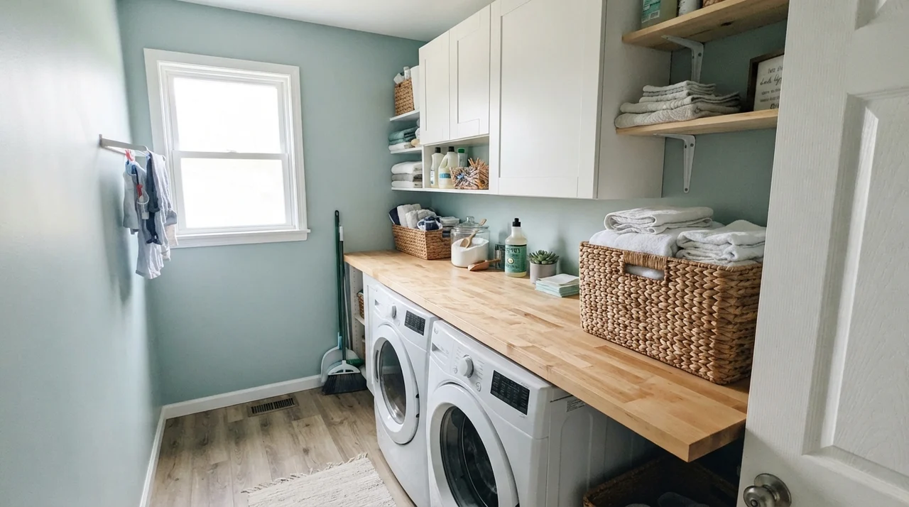
Even in a small utility laundry room, provided there is one decent window throwing natural light across the appliances, it turns a chore space into something pleasant. It plays exceptionally well with warm wood, whether that is a butcher-block folding counter or an antique interior door.
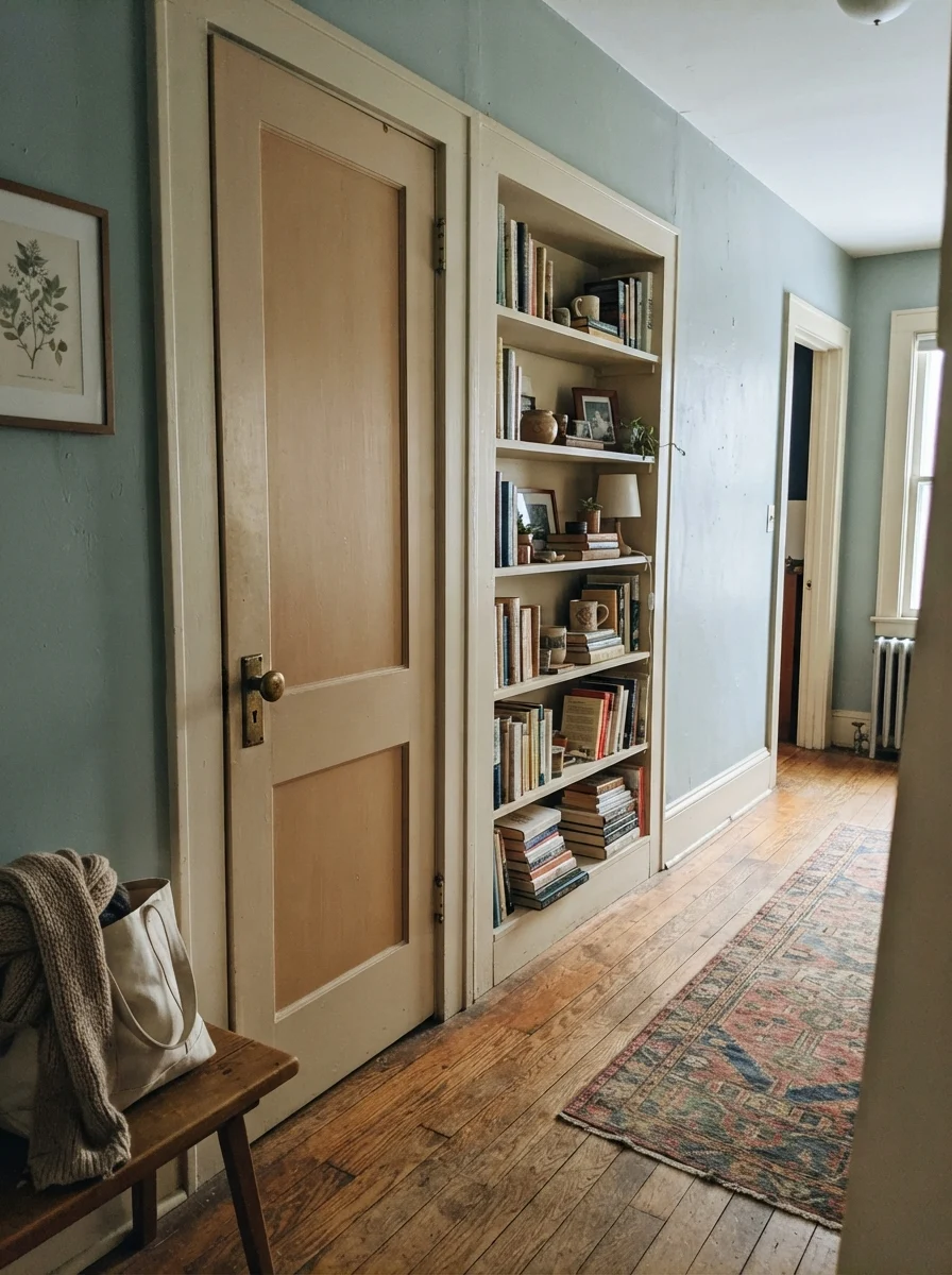
Here is an old trick I used in our split-level: paint an interior door and an adjacent built-in bookcase in Woodlawn Blue, while leaving the surrounding walls a soft, creamy neutral. It delivers that coveted custom-millwork feeling on a shoestring budget. You only need a single quart of satin paint and an afternoon with an angled sash brush.
The Honest Failure: Where This Color Falls Apart
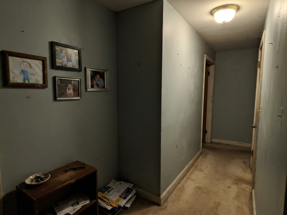
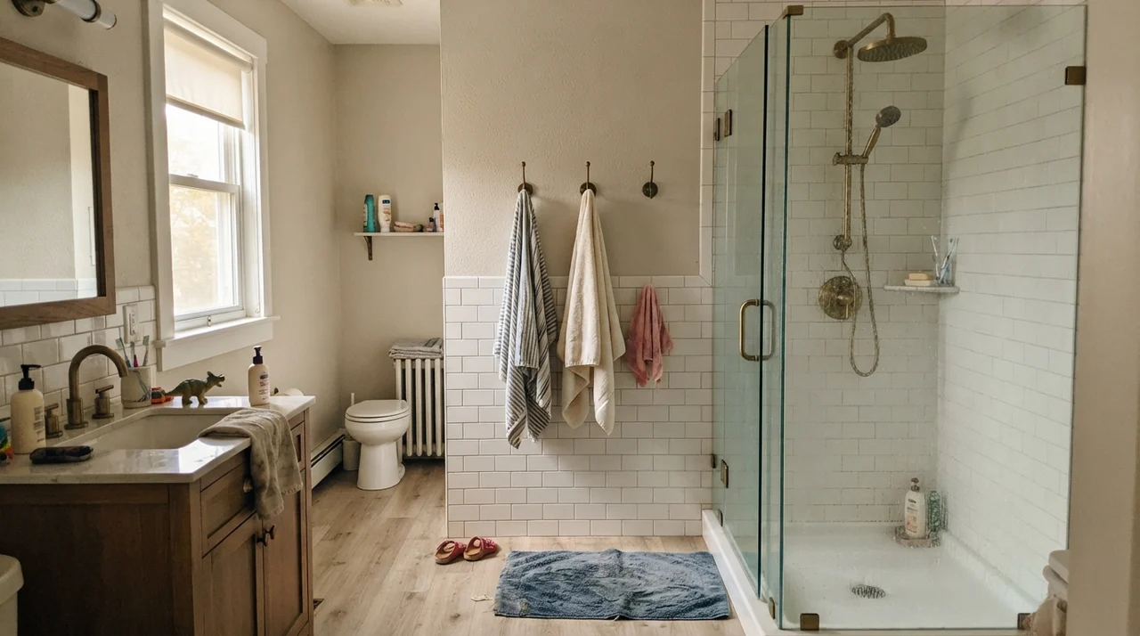
Now, let's talk about the mistake that will make you hate this can of paint. Look at the hallway below. This is what happens when you roll Woodlawn Blue into an interior space with zero exterior windows, beige carpet, and a single dingy overhead light fixture.
Almost every disappointed review of Woodlawn Blue traces back to one of three predictable mismatches. None of them are the paint's fault, but if your room fits these descriptions, step away from the counter:
- A dim, north-facing room: Cool, indirect north light drains both the blue and the green right out of the mix, leaving behind a flat, muddy gray. Homeowners who painted a north bedroom on the strength of a sunny showroom brochure end up deeply disappointed. Test a sample board on your actual wall at four in the afternoon before you buy five gallons.
- Cool gray flooring or slate tile: Woodlawn Blue carries its own gray undertone. If you pair it against a cold gray tile floor, you erase the subtle contrast that makes it register as a color at all. Both the floor and the wall end up looking dull and lifeless. Warm oak, white hex tile, or warm stone fixes this immediately.
- You wanted a true navy or sky blue: The green is always present. Under standard warm 2700K incandescent or LED bulbs, that green pulls forward into soft sage. If you want a crisp, unambiguous blue that never flirts with green, look elsewhere.
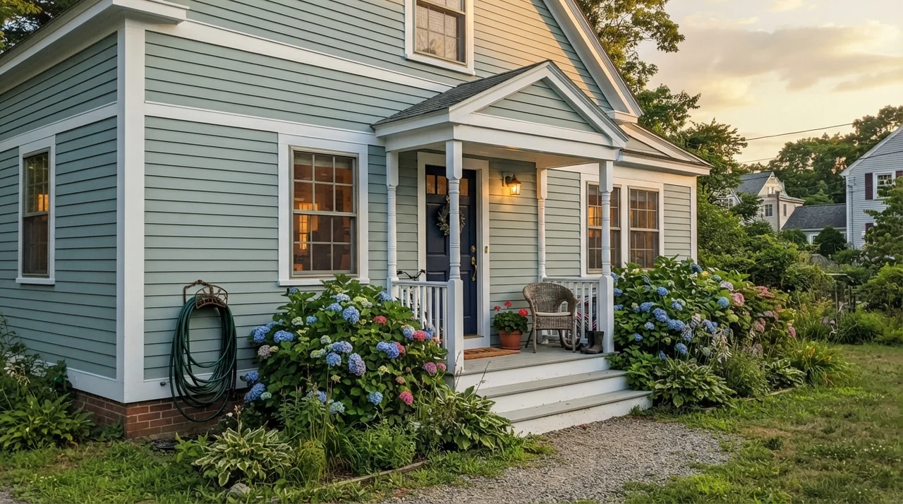
When taken outdoors as siding, it looks thoroughly classic on traditional architecture, particularly when balanced by white corner boards, bright white window trim, and a dark navy front door. Just remember your exterior reality: south- and west-facing elevations take a beating from the summer sun and will fade half a shade over the years. That is simply the nature of exterior finishes—budget for a standard refresh cycle every seven to ten years.
Wood, Metal, and Architectural Pairings
Over thirty years of repainting rooms, I have learned that a chameleon color is only as good as the materials sitting against it. Put Woodlawn Blue next to polished chrome and cold quartz, and it feels clinical. Pair it with natural elements, and it instantly feels like a high-end heritage home.
Durability and Five Years of Living
Let's talk about maintenance, because nobody lives in a pristine catalog photo. In our colonial's family bathroom, Woodlawn Blue was applied in an eggshell sheen right over standard drywall primer. Over five years in, that wall saw toothpaste splatters, soapy splashes from toddler bath time, and daily humidity. When scrubbed clean with a warm, damp microfiber cloth and mild soap, the surface held up without burnishing or leaving dull, chalky rings. That is where spending more on quality paint pays off; cheaper builder-grade paints would have flashed after the third scrub.
For touch-ups, however, keep your expectations realistic. Because Woodlawn Blue relies heavily on fine pigment balancing to achieve that nuanced blue-green-gray shift, touch-ups done two or three years down the road with an old brush will often show a faint boundary line. If you get a deep gouge or water mark, feather it carefully, but accept that rolling corner-to-corner on that single wall face is the only way to get a seamless repair.
How It Measures Against Close Cousins
Standing in the paint aisle staring at paper chips under fluorescent tubes is the easiest way to make a hundred-dollar mistake. Here is how Woodlawn Blue stacks up against its closest competitors in real life:
What sheen should I buy for a porch ceiling?
Always use a flat or matte exterior finish on a porch ceiling. You want the light to wash across the boards like open sky; any sheen or gloss overhead reflects porch clutter and lawn equipment like a mirror.
Does Woodlawn Blue make a small bathroom look larger?
Yes, provided the room has white subway tile or bright fixtures for contrast. Its LRV of 61 reflects substantial daylight, and the slight cool-gray tone causes walls to recede visually rather than closing in on you.
Which interior light bulbs work best with this paint?
Warm 2700K bulbs pull forward the soft sage-green notes in the evening. If you prefer the crisp, watery blue-gray side of its personality, opt for 3000K neutral LEDs. Avoid harsh 4000K daylight bulbs, which make it look chalky and sterile.
Will this color hurt my home's resale value?
Not at all in bathrooms, laundry rooms, or on porch ceilings—buyers consistently react to it as custom and calming. However, I would avoid rolling it through entire open-concept living rooms right before listing, as whole-house buyers still favor warm, neutral whites.
Susan's Verdict · Buy it for the porch ceiling, keep it for the bath
Woodlawn Blue HC-147 is one of those timeless heritage colors that earns its reputation when used with intention. If you put it on a north-facing wall over cool gray flooring, you will end up with dreary putty and wonder why anyone recommended it. But pair it with southern daylight, white tile, warm wood furniture, and brass hardware, and it delivers a restful, quiet dignity that never goes out of style. I've lived with it across multiple houses, and in the right room, it remains worth every single penny.