Color Diary · No. 88
Valspar Warm Eucalyptus: The Green That Asks for Brass
Valspar's 2026 Color of the Year, reviewed honestly: the light that turns it green, the light that turns it gray, and the deck twin that's almost the exact same color.

Susan HartleyOctober 18, 2026 · 15 min read
Warm Eucalyptus · Valspar 8004-28F
Hex#7C7F70LRV21Undertonesmuted green → gray-green → muddy taupe
In our last house—a 1990s colonial that had more builder-grade oak than any one family should ever have to negotiate—I spent three weeks convinced that what the half-bath needed was a true, fresh sage green. I bought a can of something cheerful, rolled two coats between the mirror and the baseboards, and immediately felt like I had trapped myself inside a spearmint gum wrapper. I lived with it for about four months before I dragged my ladder back out on a Tuesday night. It took me thirty years across three houses to figure out that the colors that actually hold up on a wall are almost never the bright, leafy shades you admire on a sample card. The ones you can stand five years in are the ones that have been dragged through some dirt and softened with gray.
That brings us to Valspar Warm Eucalyptus (8004-28F). When Valspar announced it as their 2026 Color of the Year, the marketing rolled out with the usual fanfare about grounding, earthy calm and versatile modern neutrals. I'll admit I was skeptical. "Eucalyptus" usually signals a cool, minty pastel or a crisp botanical green that makes a residential drywall room look like a florist shop. But Warm Eucalyptus is not that. It has an LRV of 21 and a hex value of #7C7F70, which immediately tells you you're dealing with a muted, gray-grounded shade that leans heavily into a warm brown undertone. It sits right in that moody pocket between an olive and a weathered slate.
I've seen dozens of green trends come and go since our first split-level in the 1970s. Most people pick a green because they imagine morning sunlight filtering through greenhouse glass. But when the painters pack up and you live with the color through dark November afternoons and rainy Tuesdays, you find out what the paint is really made of. Here is how Warm Eucalyptus actually behaves when the styling crew goes home.
The Undertone Shift
Warm Eucalyptus is a muted gray-green grounded by a warm brown undertone, with just enough of a cool leafy edge to prevent it from dissolving into ordinary beige. Because of that dual temperature, its appearance pivots dramatically depending on the quality of light hitting the surface.
warm sun
overcast, north light
dusk, rain, cool bulbs
South light brings out the warm olive-green; cool daylight or north exposure strips out the brown and pushes the color into a quiet slate-gray.
Dried ThymeSherwin-Williams · see diary
HartfordBackdrop · see diary
Warm Eucalyptus8004-28F
RetreatSherwin-Williams · see diary
Conifer GreenBehr · see diary
Light and the Morning-to-Evening Shift
The single biggest mistake homeowners make with mid-tone greens is assuming the color stays put across the day. At an LRV of 21, Warm Eucalyptus absorbs nearly eighty percent of the light that touches it. That means whatever light enters your room will dictate the undertone you see on the drywall.
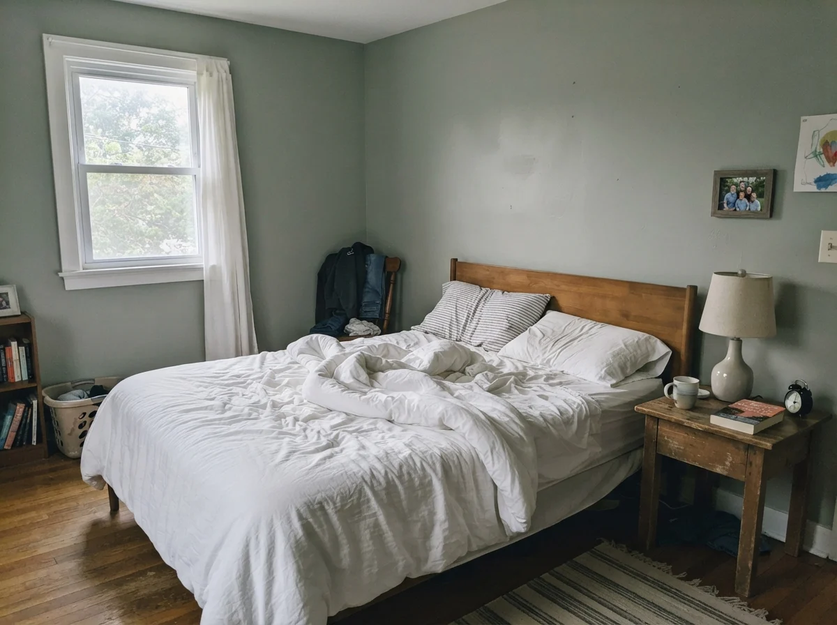
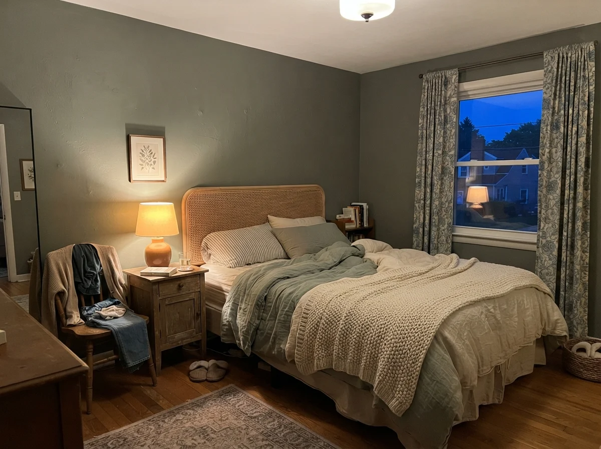
In strong south-facing daylight, the brown undertone wakes up and gives the walls a lovely, velvety warmth that reads distinctly green—almost like sun-warmed dried herbs. But walk into a north-facing bedroom at dawn before any lamps are switched on, and you might wonder why you painted your walls a cool, pale cement. Watch what happens between sunrise and evening lamplight in the exact same kind of room:
That shift between cool morning light and evening bulb warmth isn't a defect in the formula; it's simply how complex gray-greens work. Under standard 2700K warm incandescent or warm LED bulbs, the brown base steps forward, giving you that cozy, enveloping feel people want when they paint a room a deeper shade. If you run harsh, cool-white bulbs—the kind that feel like an operating theater—the paint will look lifeless, flat, and decidedly dull. Before you curse a can of paint, check your lightbulbs.
Living with It in the Bedroom and Nursery
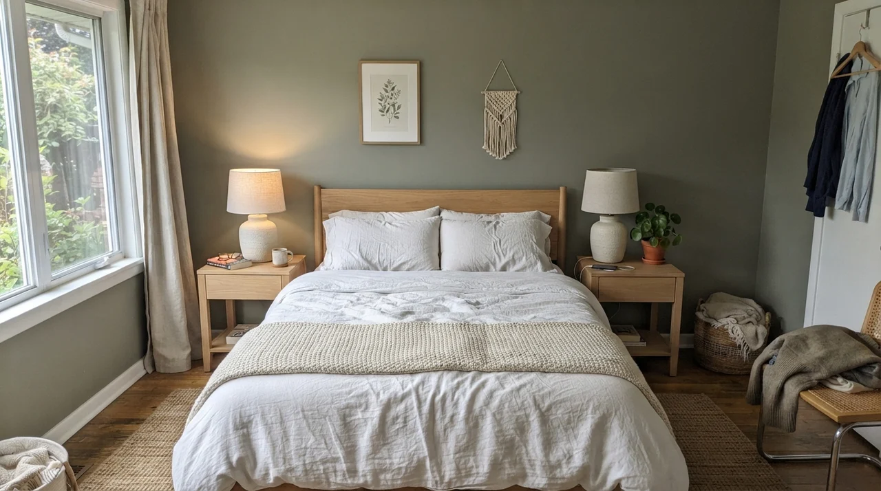
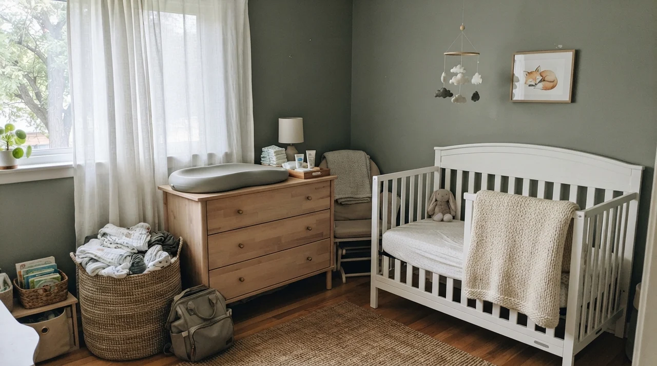
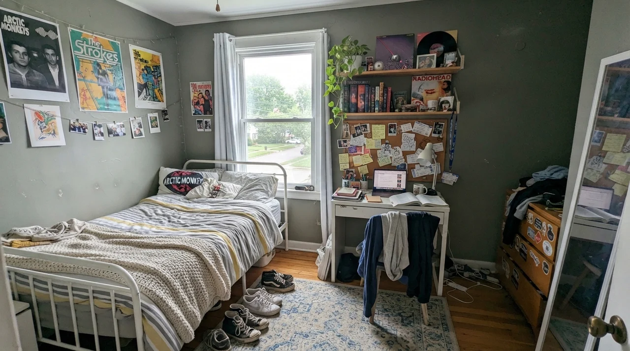
Bedrooms and quiet corners are where Warm Eucalyptus earns its keep. Because it has enough gray to calm down the green pigments, it doesn't shout at you when you open your eyes in the morning. In our current 1960s ranch, I’ve found that mid-tone earthen colors create an instant sense of boundary and rest that stark whites or timid beiges simply cannot manage.
It pairs effortlessly with simple materials: pale oak, white linens, unlacquered wood, and basic ceramics. In rooms where daylight filters in gently from a side window, the color softens without disappearing into the background.
Notice how well it plays against crisp white furniture. A white metal bed frame or a simple white crib keeps an LRV 21 wall from feeling heavy. You don't need fussy architectural moldings to make it work; honest wood and clean lines are enough.
The Kitchen: Cabinets, Islands, and Hardware
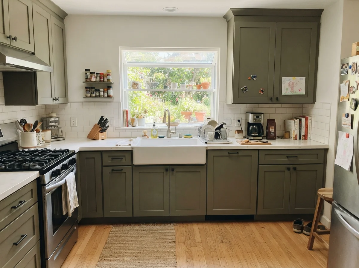
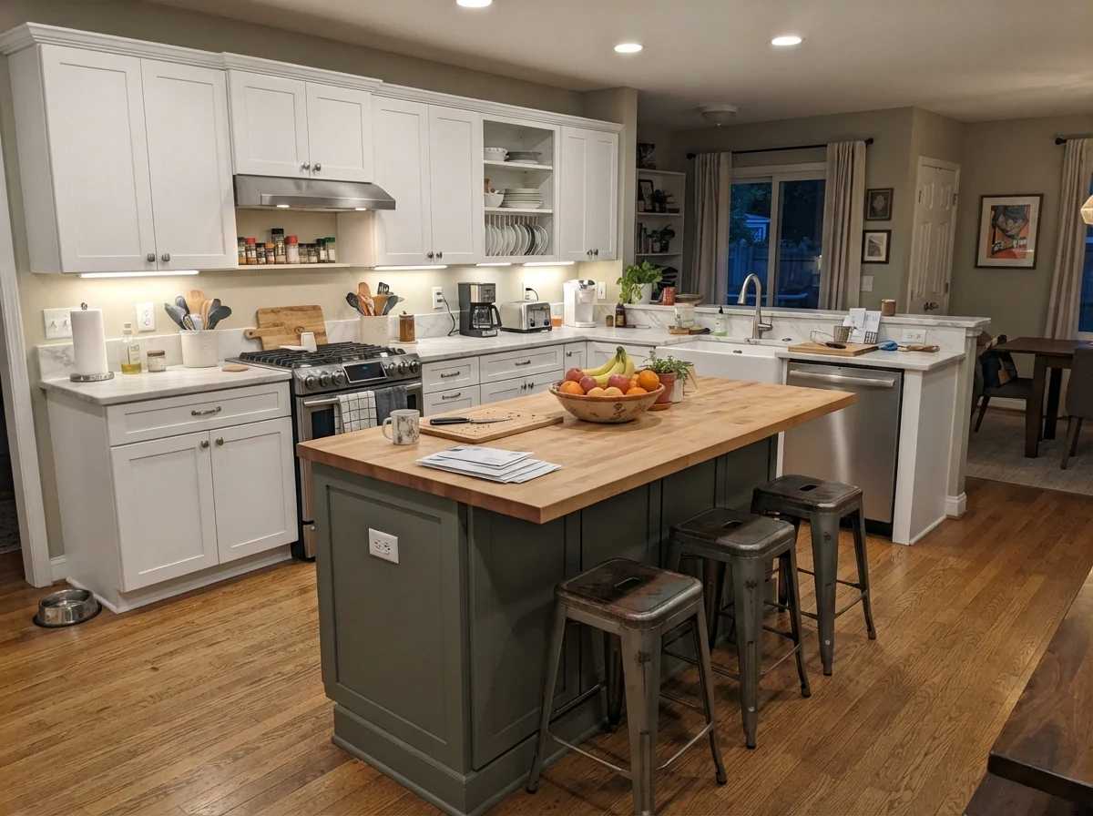
If you ask me where Warm Eucalyptus does its absolute best work, the answer is kitchen cabinetry. For the last ten years, we have seen an endless parade of stark white shaker kitchens and navy islands. While a classic white kitchen will always have resale appeal, people are tired of living in what feels like an icebox. They want warmth, but they don't want to revisit the heavy Tuscan golds of twenty years ago.
Warm Eucalyptus sits right in that sweet spot. It anchors a run of cabinets or an island without dropping into the gloomy, near-black territory of a true dark forest green. But here is the non-negotiable rule I have learned after living with three kitchen renovations: your hardware will make or break this color.
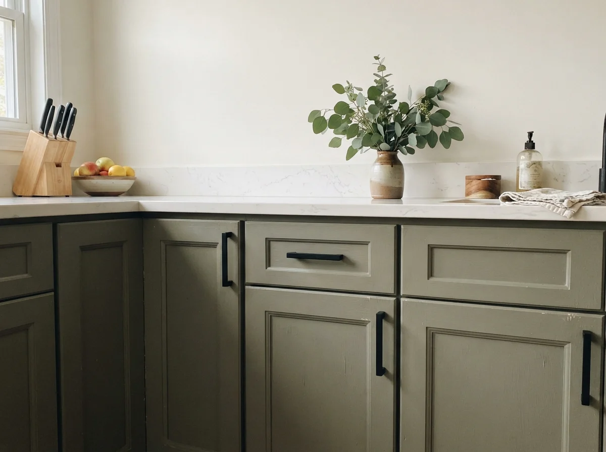
Warm Eucalyptus wants warmth in return. Give it brass or warm wood and it glows; give it cool chrome and cold light, and it will look like wet cardboard.
When you put warm brass, antique gold, or even simple matte black against this green, the undertones lock together. But if your kitchen currently has brushed nickel or polished chrome faucets and pulls, think twice. Cool silver metals fight the warm brown spine of this paint, making the cabinets read flatter and grayed-out. If you aren't prepared to budget for new pulls or a faucet, you might not get the look you fell in love with on the swatch.
For sheen on cabinetry, stay far away from high-gloss unless you enjoy seeing every stray brushstroke and finger smudge. A durable satin enamel provides enough wipeability without creating distracting glare across the doors.
The Faces in the Bath: From Spa to Overcast
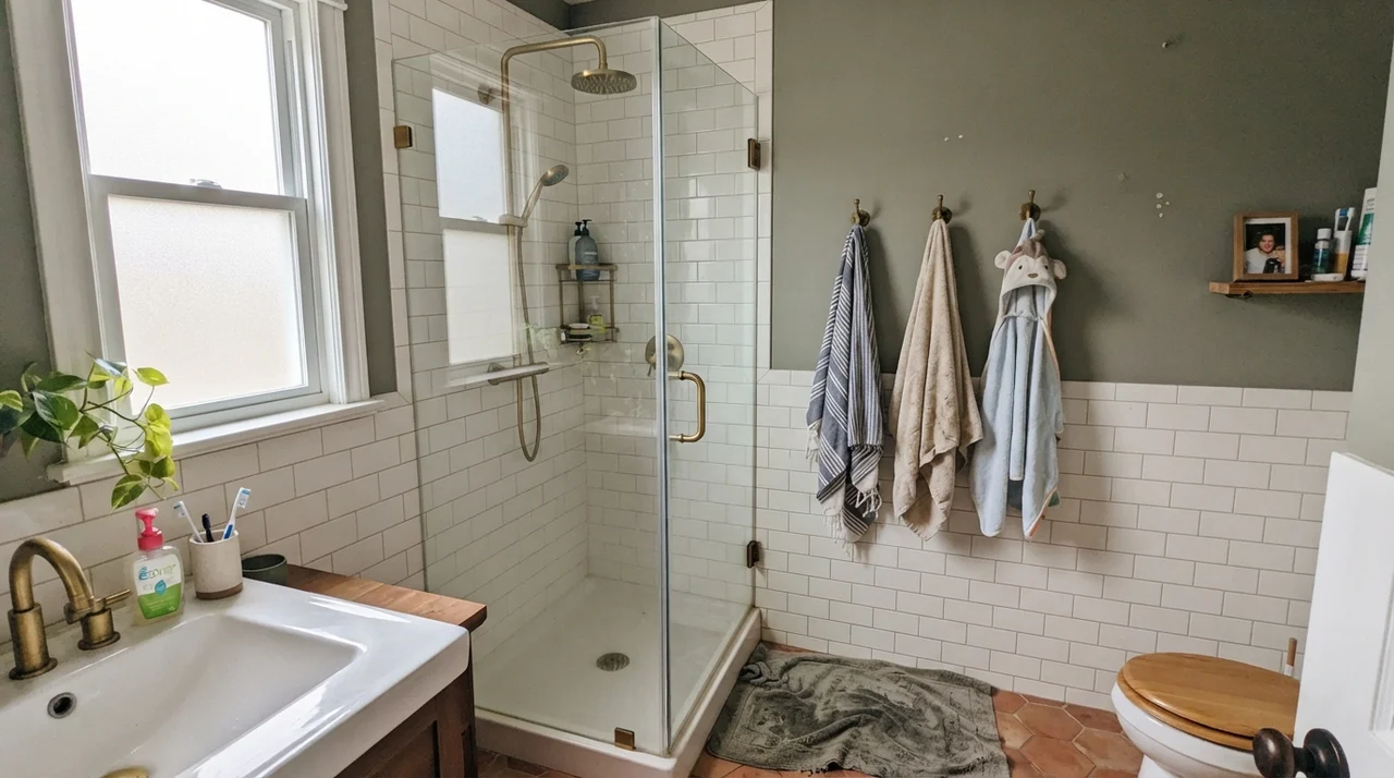
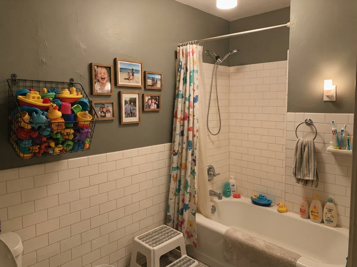
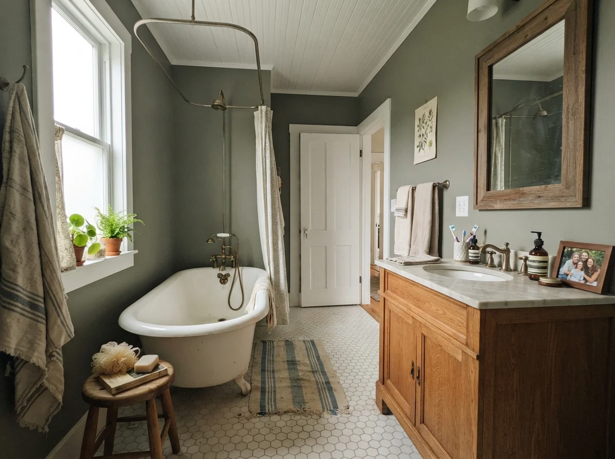
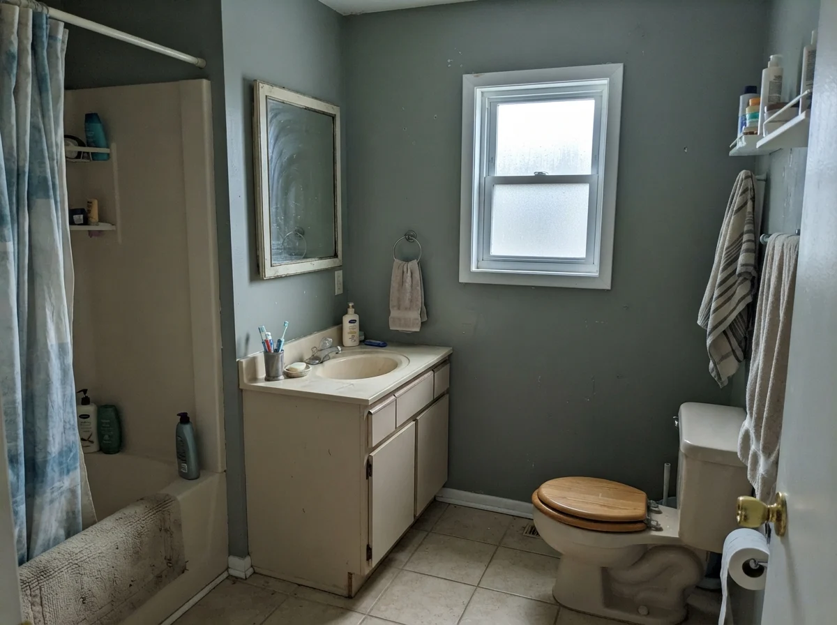
Bathrooms are tricky beasts. They are usually small, often lack decent windows, and contain lots of cold, reflective porcelain and tile. That combination can make a moody paint either sing like a luxury retreat or look like an unpainted basement. Warm Eucalyptus is frequently pushed for powder rooms and baths, and it can be spectacular when balanced with white subway tile or a warm oak vanity.
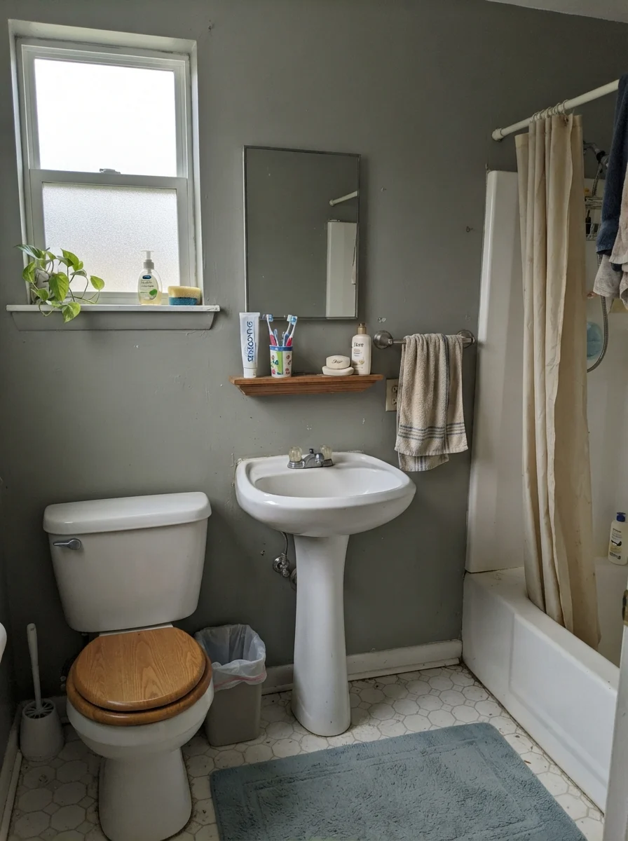
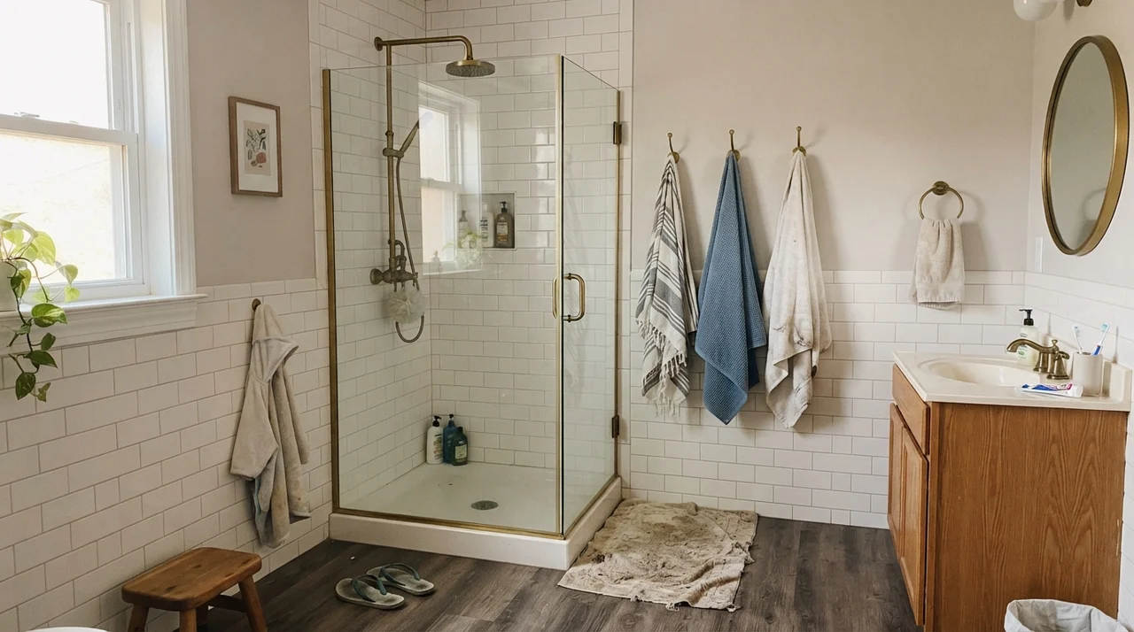
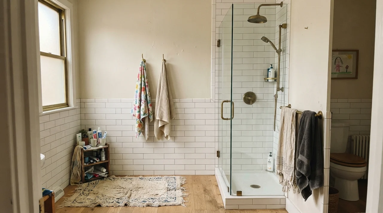
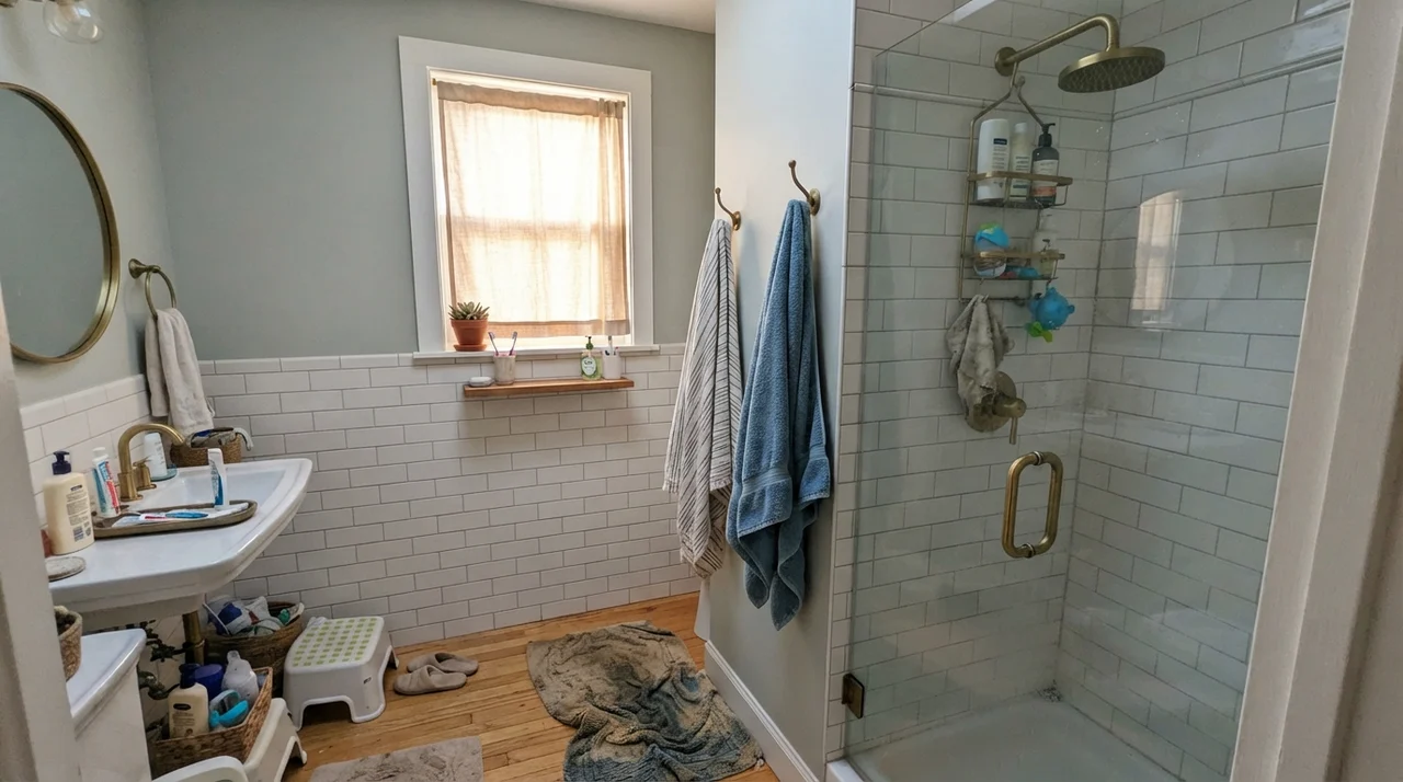
Look closely at how the light changes the story in those spaces. In bright, diffuse morning light next to a warm oak vanity and a clawfoot tub, Warm Eucalyptus looks timeless and fresh. But when the skies turn gray and you're looking at it through frosted glass without lamps turned on, the green recedes and you get a quiet, stony neutral. And if you put it into an older bath with a cool north exposure and an aging vanity, it can lean downright chilly:
Sunrooms, Living Spaces, and Everyday Clutter
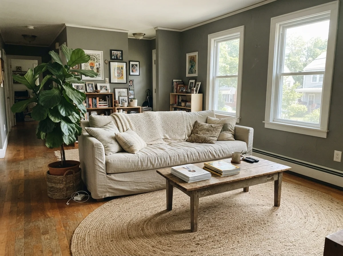
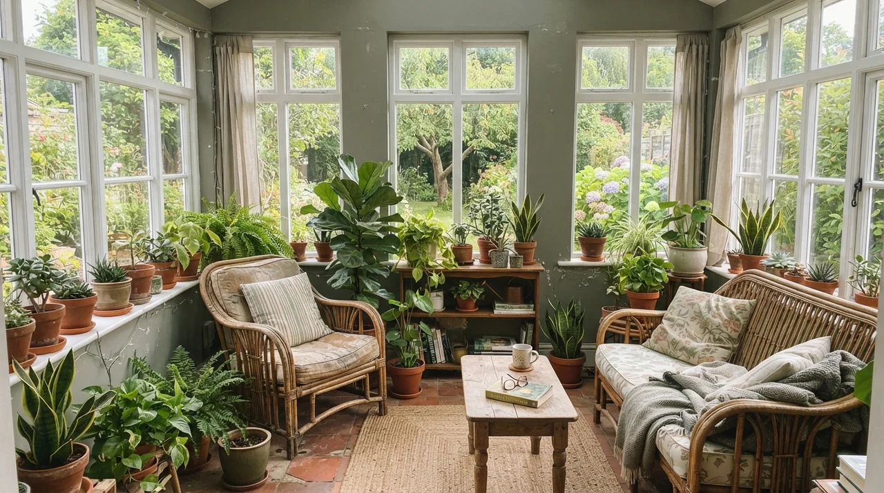
In full midday sunlight, Warm Eucalyptus shows off why it was picked as a standout color. The intense natural light washes out the heavy gray base and lets the green take center stage. If you have a sunroom with windows on three sides, or a living room with generous south-facing glazing, the walls look vibrant without ever feeling neon.
It also provides an incredible backdrop for organic textures: rattan chairs, terracotta planters, jute rugs, and rumpled linen. It is one of those forgiving colors that actually looks better when a room is lived in, rather than staged for a magazine shoot.
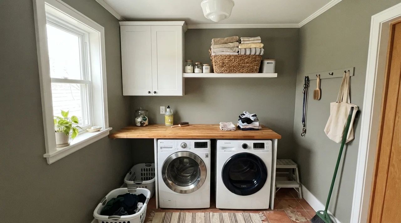
In our current house, our laundry area is small, but having a warm wood surface next to this green gives the utility space a clean, grounded feeling. Even folding towels feels a little more dignified when the walls don't look like an uninspired rental white.
Doors, Built-ins, and Exterior Siding
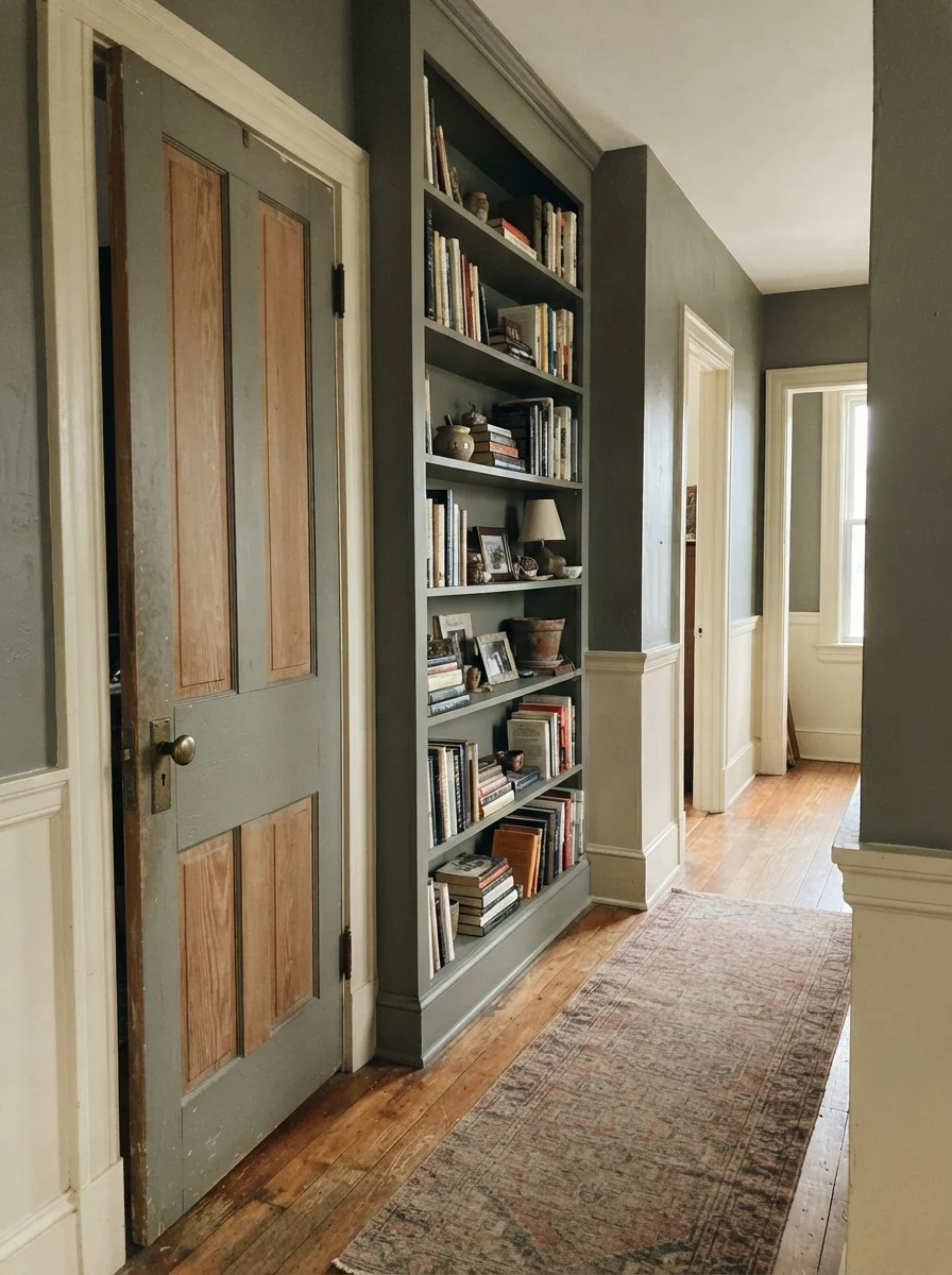
You do not have to commit to painting every square inch of drywall to make this color work. In our second house, a center-hall colonial, painting interior doors in an accent color was my favorite trick for breaking up long corridors of off-white. Warm Eucalyptus applied in a satin finish on a two-panel interior door or a built-in bookshelf brings architectural character to spaces that feel a little generic.
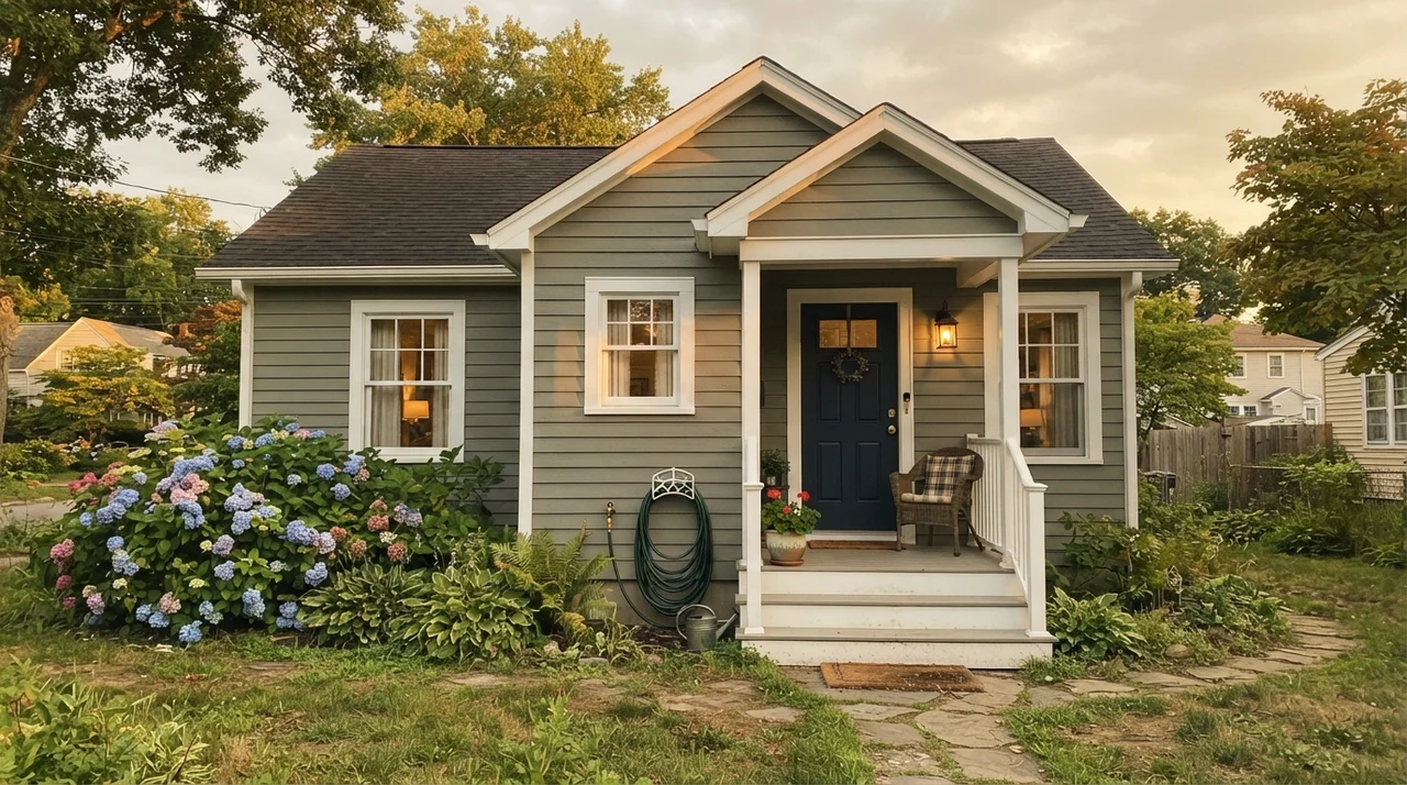
Outside the house, Valspar promotes Warm Eucalyptus for exterior siding—and on Craftsman bungalows or mid-century homes surrounded by established trees and foundation plantings, it looks entirely at home. In exterior daylight, the sky reflects off the paint, making it read distinctly lighter and greener than it does indoors on a bedroom ceiling.
Where Warm Eucalyptus Fails
Almost every disappointed review of Warm Eucalyptus comes down to one of three predictable mismatches: a wrong expectation, a wrong light, or a wrong metal. None of them are a flaw in the paint itself, but they will certainly ruin your weekend if you don't anticipate them.
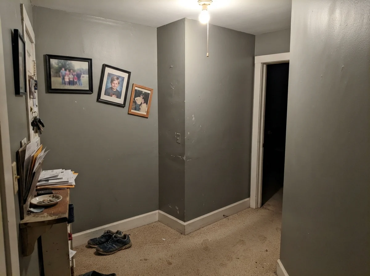
First, if you bought this can expecting the bright, leafy green of fresh eucalyptus sprigs, you will feel let down. This is a muted, grayed-down olive. Second, cool chrome or nickel hardware fights the warm undertone, leaving the overall space looking tired. And third, if you put this paint in a windowless hallway or a dim north-facing space under a single cool ceiling bulb, the warmth evaporates entirely. What you are left with is a muddy, drab shade that looks uncomfortably close to wet cement.
That hallway is the cautionary tale. If a room gets no natural daylight and you rely on an old overhead fixture, do not put an LRV 21 muted green on the walls unless you are prepared to install intentional, warm accent lighting to support it.
Durability, Scrubbing, and Long-Term Wear
Here is my home-editor perspective on living with a color like this five years in: darker, saturated neutrals show dings, scuffs, and water spots much faster than pale whites. If you paint this in an eggshell or matte on kitchen base cabinets, you are going to see dried drip marks below the sink within six months. That is simply the reality of darker pigment.
For walls in bedrooms and dens, a matte or eggshell finish is gorgeous because it absorbs glare and smooths out drywall imperfections. But on trim, doors, and cabinets, stick strictly to satin enamel. It can be scrubbed clean with a warm microfiber cloth without buffing up shiny spots or stripping the color. When we sold our colonial, the rooms that looked fresh were the ones where I had respected the finish guidelines, rather than trying to use flat wall paint on heavy-use touchpoints.
How It Compares to Its Deck Neighbors
If you're staring at the paint chips and trying to decide whether Warm Eucalyptus is the exact right shade, looking at its closest neighbors on the shelf will tell you everything you need to know about where its undertones lean.
Is Valspar Warm Eucalyptus a true green or a gray?
It is a gray-green with a warm brown undertone. In southern daylight or under warm 2700K bulbs, the green shows clearly; in dim rooms or overcast light, it leans heavily neutral gray.
What finish should I use for Warm Eucalyptus on cabinets?
Use a satin cabinet enamel. It provides the durability needed to be scrubbed clean without creating the harsh shine of semi-gloss that highlights cabinet surface flaws.
Why does Warm Eucalyptus look muddy in my hallway?
At LRV 21, it requires sufficient daylight or warm lamplight to balance its brown base. Cool overhead bulbs in windowless spaces strip out the color's warmth, leaving it looking flat and drab.
What metal finishes look best with Warm Eucalyptus?
Warm metals like unlacquered brass, antique gold, and matte black complement the paint's undertone. Cool finishes like chrome and brushed nickel tend to clash and make the paint look dull.
Susan's Verdict · Worth the Can
If you want a grounded, earthy cabinet or bedroom color that behaves like a quiet neutral rather than an over-eager garden shade, Valspar Warm Eucalyptus is worth the money. Just keep your lightbulbs warm, pair it with brass hardware and honest wood, and avoid using it in windowless, dim hallways.