Color Diary · No. 87
Eider White SW 7014: The Neutral That Refuses to Be What It Is Called
The light greige with a white name, reviewed honestly: where it looks expensive, the rooms where it turns mauve, and what to paint instead.

Susan HartleyOctober 17, 2026 · 14 min read
Eider White · Sherwin-Williams SW 7014
Hex#E2DED8LRV73Undertonestaupe-greige → mauve-gray → cool lilac
In our last house—a 1990s colonial with decent windows on the south side and a pair of stubborn, shadowed rooms facing north—I made the mistake that about ten thousand other homeowners make every spring. I went looking for a soft, quiet white that would feel calm through the main floor. The paint chip said Sherwin-Williams Eider White (SW 7014). It sat under the white section of the deck, tucked right beside clean off-whites, looking like a tailored linen shirt.
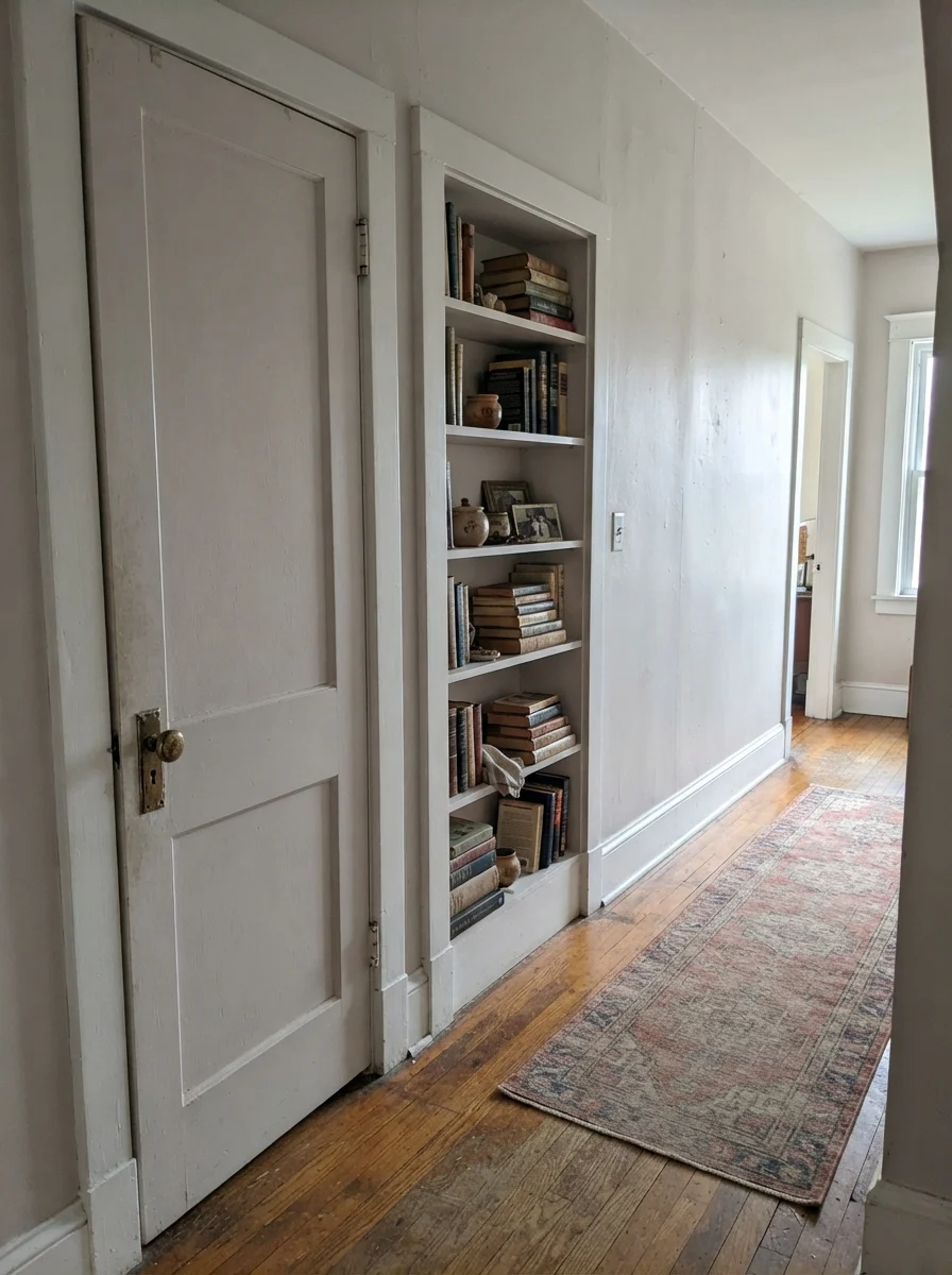
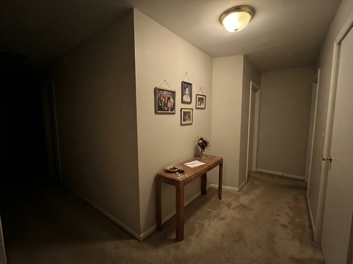
I rolled four gallons across the main hallway and up the stairwell before I stepped back and realized what had happened. In the bright family room, it looked like an expensive, tailored greige. Up at the top of the stairs, where the north-facing hallway only ever saw cool blue sky, my walls were distinctly, undeniably lilac. Not a whisper of gray. Not a soft off-white. Straight-up dusty purple.
That was ten years ago, and I lived with it long enough to learn its rules. Here is the first thing nobody tells you at the counter: Eider White is not a white. At a light reflectance value (LRV) of 73, with a warm, red-based body, it is a pale greige masquerading as something else entirely. If you treat it like an off-white, you will end up startled. If you treat it like a moody, nuanced light neutral that needs warmth to survive, it can be one of the prettiest things you ever put on drywall.
The Red Base Underneath the Gray
Every paint color carries a backbone you only see when the light turns against it. Eider White is built on a red-violet base. In southern sun, that base simply reads as warm stone. In dim or cool light, that red turns stubborn, pulling the whole wall toward mauve, lilac, or muddy putty.
warm sun
overcast, north light
dusk, rain, cool bulbs
taupe-greige → mauve-gray → cool lilac
Incredible WhiteSherwin-Williams · see diary
Strong WhiteFarrow & Ball · see diary
Eider WhiteSW 7014
Origami WhiteSherwin-Williams · see diary
Classic GrayBenjamin Moore · see diary
How the Light Moves It Around the Clock
Color is never fixed drywall; it is a moving target. Eider White is more sensitive to orientation and bulb temperature than almost any other neutral in the Sherwin-Williams deck. When you understand the daylight coming into your room, you can predict whether it will look like a luxury hotel or an Easter egg.
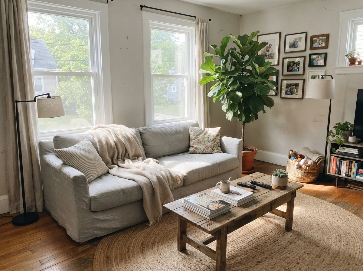
In a south-facing room, generous sun pours warmth across the wall, holding the red undertone down into a cozy, soft taupe-greige. This is where the color was made to live. West light does something similar in the late afternoon, firing up the warmth and making the walls feel rich and grounding.
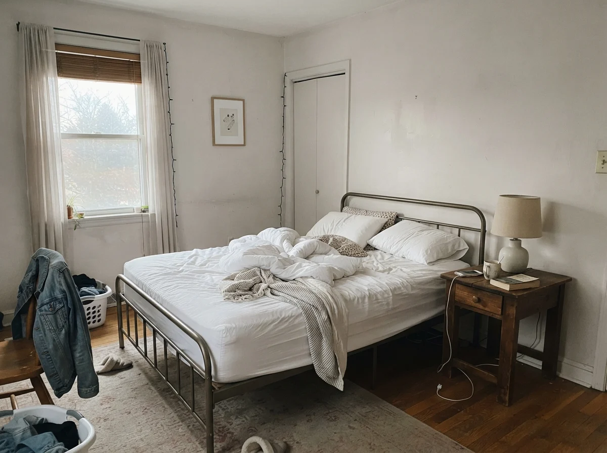
East light is trickier: morning sun can flash a fast blush of pink before cooling down into a flat neutral by noon. But the real danger zone is north light. Cool blue-gray daylight lands on that red-tinted formulation, and the science of color does what it always does: blue plus red equals purple. If your main window points north, do not buy five gallons based on a chip you looked at under store fluorescents.
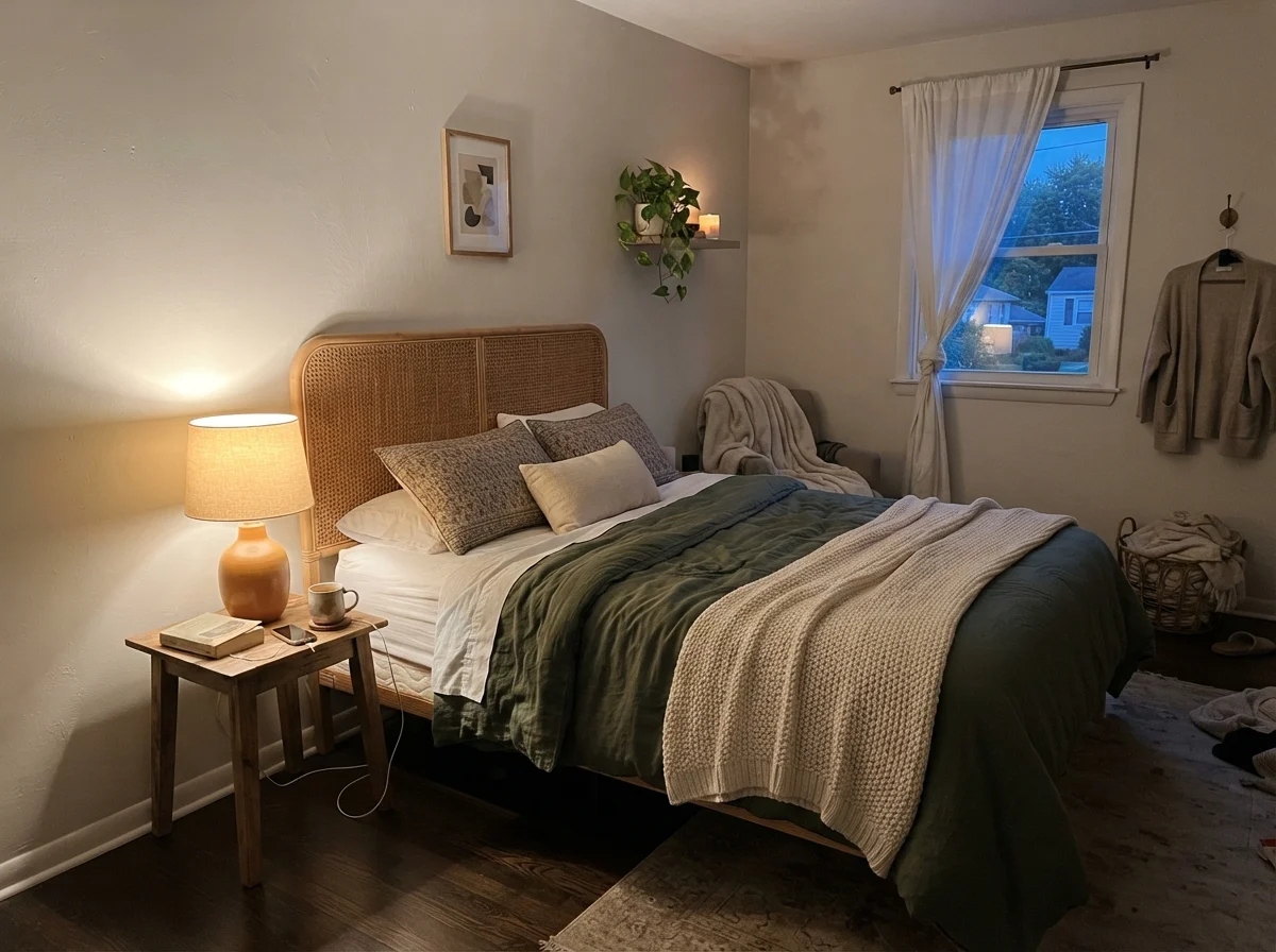
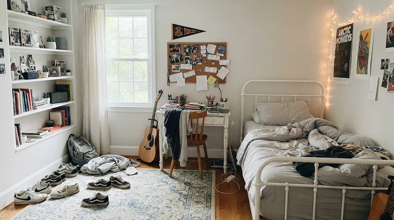
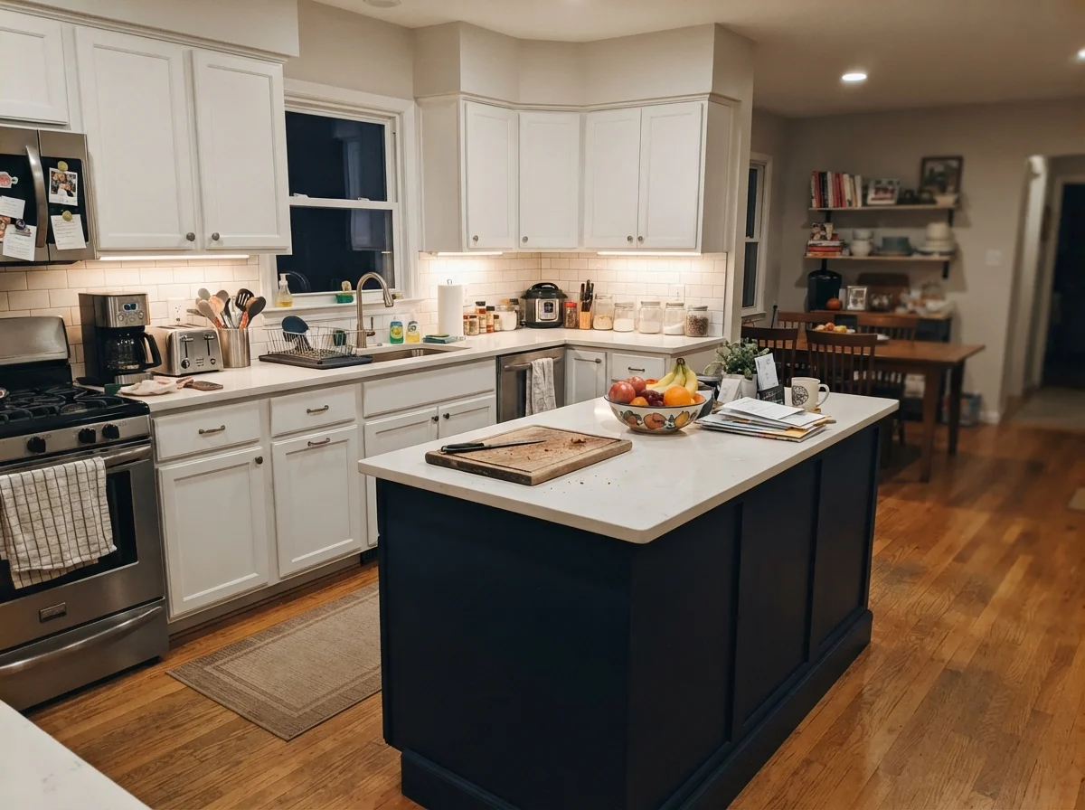
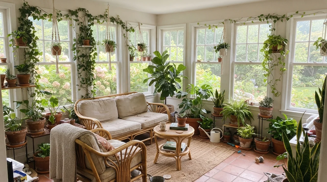
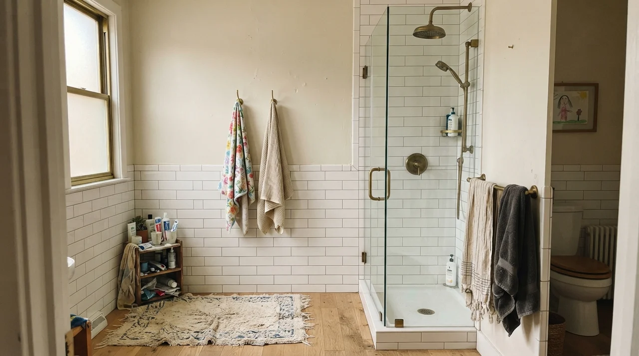
Notice the two rooms above. That is the exact same paint code on the wall. At dawn, stripped of warm rays, the wall flattens out and pulls cool. At night, lit by a simple 2700K lamp, it wraps around you like a wool blanket. That brings me to artificial lighting: if you have 4000K or 5000K daylight LED bulbs screwed into your fixtures, Eider White will look like a gray-lilac waiting room. Change the bulbs to 2700K or 3000K before you go to the trouble of repainting.
Living with It in the Bedroom and Nursery
Because Eider White sits at LRV 73, it does not glare. In a bedroom with decent exposure, it gives you that calm, grounded feeling people spend years chasing with off-whites that end up feeling either too stark or too yellow. It provides just enough pigment to create contrast against white linen bedding and trim without demanding attention.
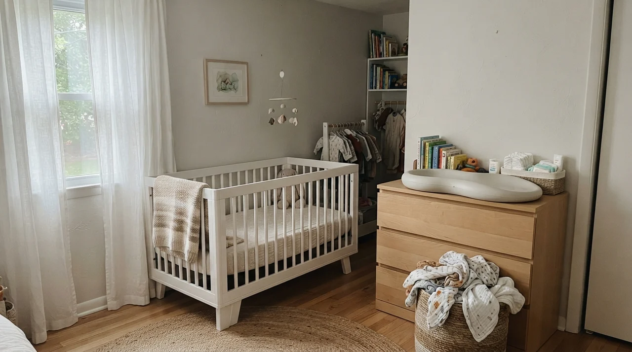
In nurseries and kids' spaces, it acts as a peaceful backdrop that lets natural wood, woven baskets, and colorful books carry the room. It doesn't scream 'gray,' and it doesn't shout 'white.' But again, you have to watch the flooring and the fabric. If you load up the room with cool blue-gray carpets or ash-gray furniture, you force that red undertone right to the surface.
Kitchens: Cabinets, Islands, and Countertops
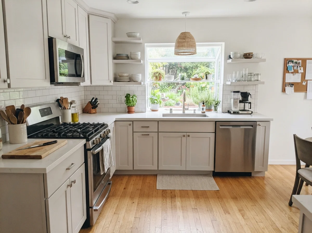
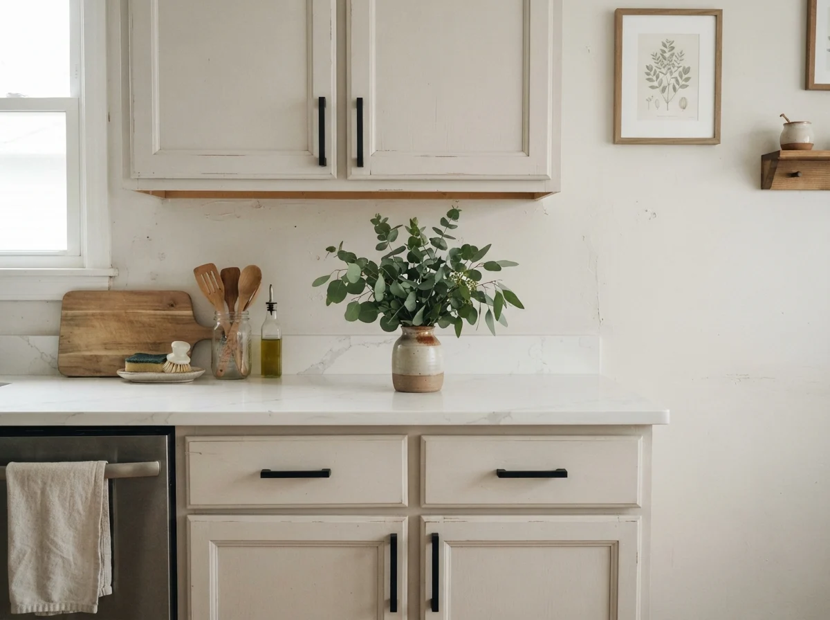
Here is where Eider White surprised me the most: painted cabinetry. If you are tired of sterile, blinding white kitchen cabinets that show every crumb and fingerprint, taking a step down to LRV 73 in a satin finish is a revelation. It hides scuffs, cleans up better, and gives the kitchen an older, settled presence that brand-new paint rarely delivers.
A word of caution about your stone counters and hardware: Eider White adores warm wood floors, butcher block, unlacquered brass, and matte black. But if your kitchen features stark white quartz heavy with cool blue-gray veining, or cool gray subway tiles, the cabinets will look faintly pink against them. In our 1990s colonial kitchen refresh, I learned the hard way that you must always hold your painted board directly against your countertop slab in natural light before the painter sprays the doors.
The Main Living Spaces: Warmth vs. Mud
When you have generous southern or western exposure, Eider White on living room walls is pure elegance. It carries an entire open floor plan without feeling cold or sterile, and it lets warm oak floors, jute rugs, and linen slipcovers sing. You get the breathing room of a light wall without the stark bounce of hospital white.
In our current 1960s ranch, I've used soft neutrals through the main living run because I love how they unify broken-up floor plans. But you have to know when a color is earning its keep and when it's giving you trouble. In a sunny room with garden greenery outside, Eider White holds its own gracefully.
Bathrooms and Hallways: Where Things Get Tricky
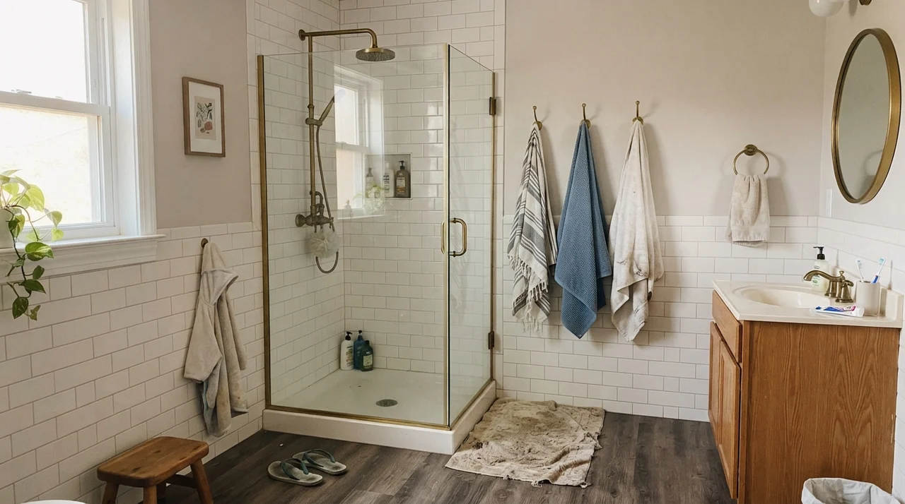
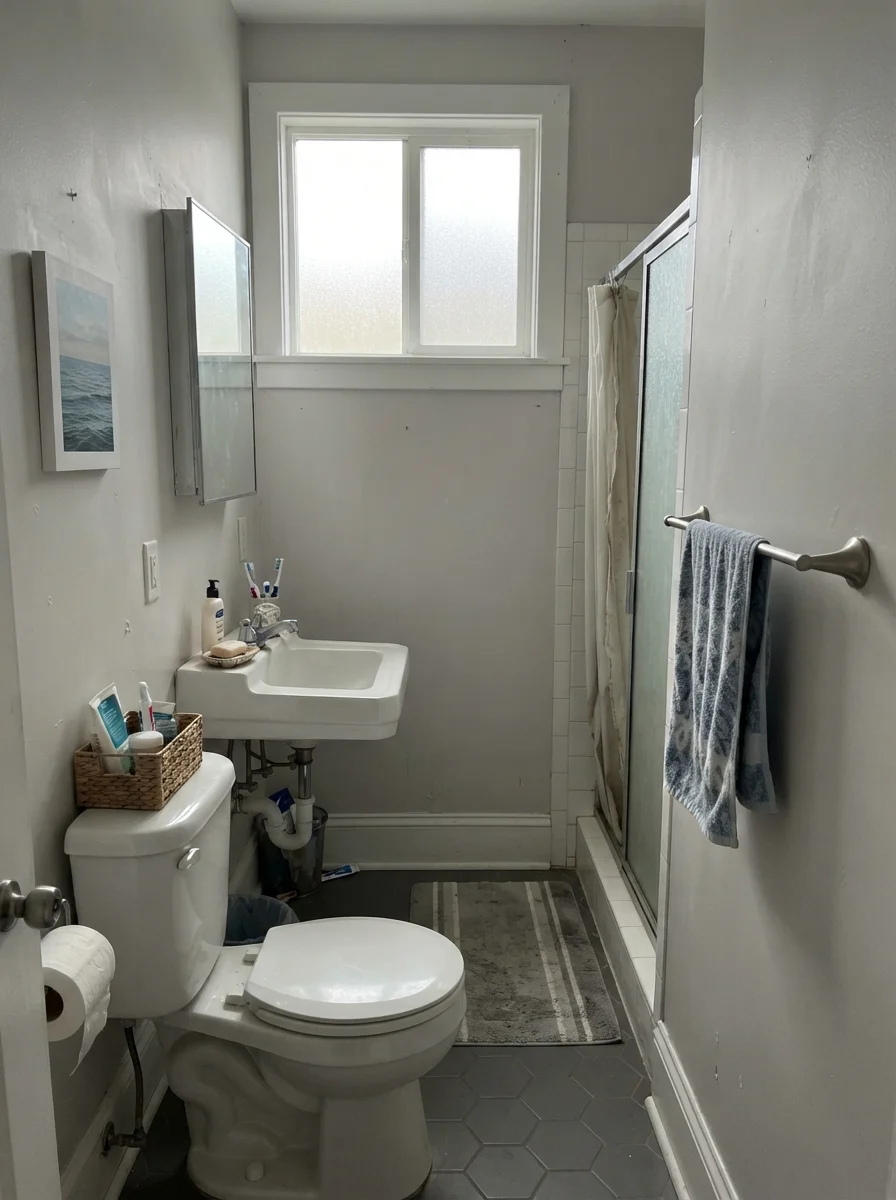
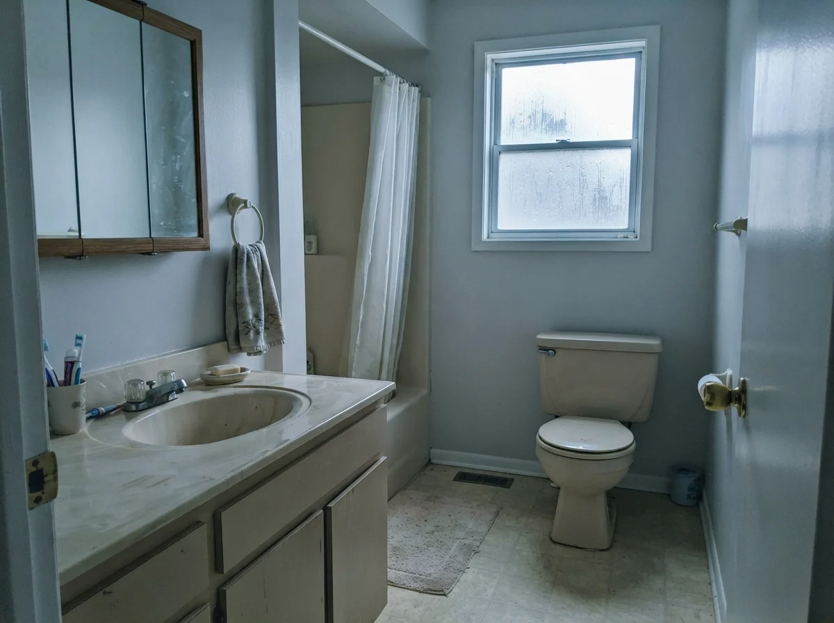
Bathrooms are small, high-moisture boxes that rarely get generous south-facing daylight. They often have frosted glass, small north-facing windows, or no daylight at all. And that is where Eider White starts showing its split personality.
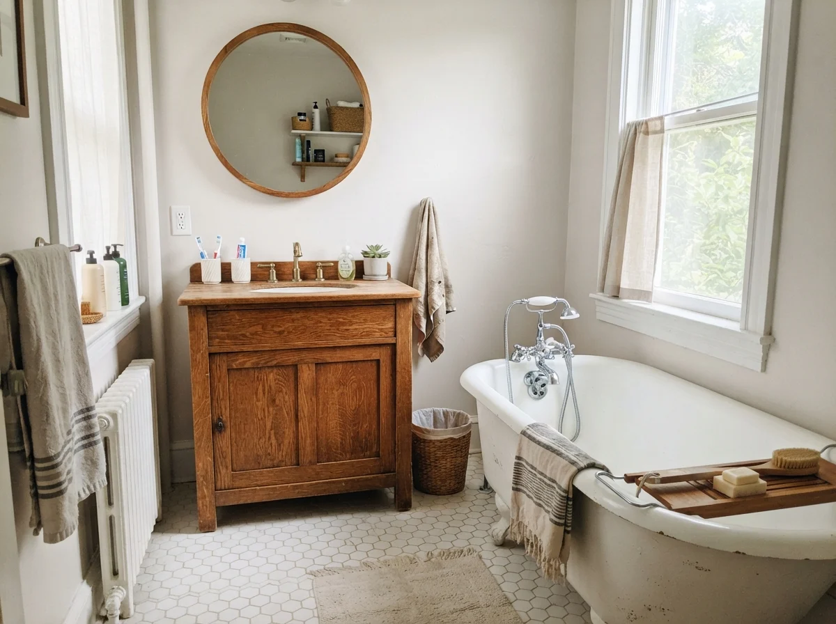
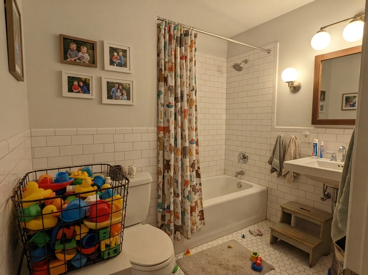
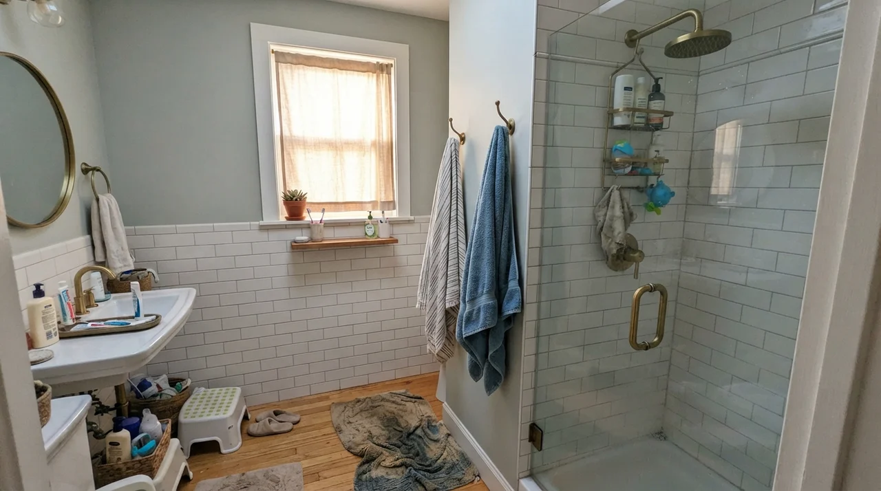
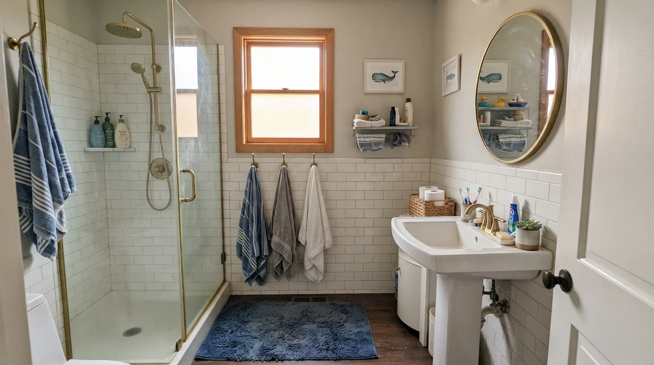
Look at how differently the color behaves when the quality of light drops. When paired with natural oak, warm incandescent bulbs, or clean white subway tile wainscot, it stays composed. But strip away that warmth, and the red and gray fight back.
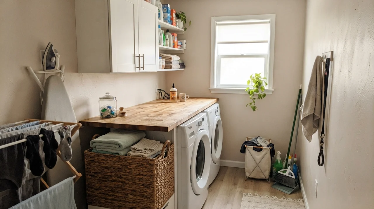
Notice that rainy-day bathroom. When the light goes flat and cold, Eider White can turn into a chilly, dreary shadow. In a utility space like a laundry room, you can counteract that shift as long as you have one good window bringing in real daylight and warm surfaces like natural wood to balance the walls.
The Honest Failure: Where Eider White Collapses
The bad reviews on Eider White are unusually consistent, and they cluster into three situations. If your room matches one of them, no primer, sheen, or second coat is going to save it—the light and the materials are doing the damage, not the paint.
First: a north- or east-facing room with limited sun. Cool blue-gray daylight lands on that red-tinted base and walls read pink, mauve, or straight purple. People describe buying seven gallons and standing in a lavender living room wondering what went wrong.
Second: cool gray flooring or cool gray quartz. Gray luxury vinyl plank (LVP) with blue undertones pushes Eider White hard. Because cool gray sits opposite the red-violet spectrum, putting them next to each other forces the floor to look bluer and the wall to look pinker. It is an immediate clash.
Third: windowless spaces and basements. At LRV 73, this paint does not carry its own light. Without daylight, the gray base takes over, and the wall goes flat, muddy, and dingy.
Taking It Outside
Can you use a paint with this much undertone risk on the exterior of a home? Yes, but with strict ground rules. In direct outdoor sunlight, intense UV light burns off much of the perceived pink undertone, turning Eider White into a gorgeous, stately, creamy greige body color.
Outside, pair it with dark, grounding accents like Sherwin-Williams Iron Ore (SW 7069) or Urbane Bronze (SW 7048) on your shutters or front door. Keep your trim clean. The only outdoor hazard is pairing it with a cool blue-gray roof, which will pull that purple undertone right back out on the shaded, northern side of the house.
Durability, Sheens, and Touch-Ups
Here is where spending more paid off in our house: I always buy Sherwin-Williams in the higher-tier lines when using a color like this. In the cheap contractor-grade cans, light greiges can dry chalky, and when you scrub a scuff mark in the hallway, you burnish the paint immediately. A quality can holds its color pigment through five years of hard family use.
For sheens, keep walls in an eggshell finish. Flat looks velvety on day one, but the moment you try to clean fingerprints off a red-based greige, you leave a noticeable shiny patch. Trim belongs in semi-gloss, kitchen cabinets in a smooth satin, and ceilings strictly in flat.
And here is the good news: five years in, Eider White on cabinetry and doors hides dirty knuckle marks and dog nose prints far better than true whites. Bright white trim looks grubby the week your grandchildren visit; Eider White absorbs life gracefully and scrubs clean without losing its depth.
Why does Eider White look purple or pink in my room?
Eider White has a red-violet base. When cool daylight from north-facing windows or 4000K LED bulbs hits that red base, the blue light combines with the red pigment, making your eyes see mauve, lavender, or pink.
Is Eider White a gray, a greige, or a true white?
It is a light greige. At LRV 73, it is far too deep to be considered a true white. Put it against bright white trim and you will clearly see a pale taupe-gray wall.
What ceiling paint should I use with Eider White?
Use a clean, crisp flat white like Sherwin-Williams Pure White or standard ceiling white. Do not paint the ceiling in Eider White unless you want a dim, shadowy cave effect.
Will Eider White help with resale prep?
Yes, but only in houses with warm wood floors and generous light. It creates a high-end, tailored neutral backdrop. If your house has gray LVP or cool gray tile, it will hurt resale because the clash will look like a painting mistake.
Susan's Verdict · Buy it for sun, skip it for shadows
Eider White is a lovely, sophisticated light greige that got cursed with the wrong label. If you give it warm southern sun, oak floors, and Pure White trim, it looks like a million bucks and holds up beautifully over years of living. But if your room faces north, sits in a basement, or looks out on gray vinyl plank, put the can down. Walk over to Shoji White or Repose Gray and save yourself the repainting headache.