Color Diary · No. 84
Crushed Ice SW 7647: When You Want the Walls to Stop Talking
A near-white warm gray reviewed honestly: the rooms where its quietness is the point, and the rooms where it disappears into nothing.

Susan HartleyOctober 16, 2026 · 16 min read
Crushed Ice · Sherwin-Williams SW 7647
Hex#D6D3CCLRV66Undertoneswarm greige → clean gray → faint taupe-lilac
In our last house, a 1990s colonial with oversized hallways and far too many doorways competing for attention, I spent four months trying to find a color that would simply keep its mouth shut. Every sample I rolled onto the plaster demanded an audience. One turned lavender by three in the afternoon; another went sharp and minty whenever the sun hit the lawn; a third looked like cold wet cement before I had even finished cleaning my roller. When someone handed me a chip of Sherwin-Williams Crushed Ice SW 7647, I nearly tossed it aside because it looked like almost nothing at all. But after thirty years and three houses, you learn that 'almost nothing' is sometimes the hardest thing in the world to get right on drywall.
We painted that rambling center hall in Crushed Ice, lived with it for seven years, and scrubbed clean every stray fingerprint near the garage door without a single regret. At an LRV of 66, it sits squarely in the greige family—a pale, hushed neutral that reflects plenty of daylight without giving you the clinical glare of an untinted primer. The warm lean is so subtle that most visitors just register it as a clean, soft gray. It doesn't perform magic tricks or reinvent your architecture. Instead, it offers pure retreat. When you have beautiful oak treads, framed prints, or textured textiles, this paint simply steps out of the spotlight and lets the rest of your home do the talking.
The Undertone Drift: Warm Greige to Chilly Slate
Crushed Ice is at global rank 47 for good reason: it rarely offends. But with only about 11 percent saturation, it has very little pigment armor to defend itself against whatever is happening outside your windows or under your light fixtures. In strong southern exposure, that gentle warmth blooms and reads as an effortless pale greige. Move it to a north-facing window or let an overcast sky take over, and the warmth evaporates completely, leaving behind a plain, cool gray that can occasionally take on a faint taupe-lilac edge if your flooring bounces gray tones back into the space.
warm sun
overcast, north light
dusk, rain, cool bulbs
South light coaxes out the warm greige lean; northern exposures and cloudy skies strip out the warmth and leave a flat, muted gray.
Goose FeathersValspar · see diary
AmmoniteFarrow & Ball · see diary
Crushed IceSW 7647
DoveBehr · see diary
AbaloneBenjamin Moore · see diary
How Daylight and Lamps Change the Wall
Here is the truth about pale neutrals that paint chips can never show you: the light bulb you buy at the hardware store will make a bigger difference to Crushed Ice than two extra coats of paint ever could. Because this formula carries so little color weight of its own, it acts like a mirror to whatever illumination strikes it. Early morning daylight can leave it looking washed out, almost fragile, while a low-wattage evening lamp pulls every scrap of cream and beige to the surface.
If you screw in 4000K daylight LED bulbs, expect Crushed Ice to behave like a crisp, cool gray with zero sentimentality. Switch those out for 2700K warm incandescent or warm LED bulbs, and suddenly the walls feel cozy, wrapping the room in a gentle, cloudy warmth that never tilts yellow. You must decide what you want the color to do before you pick your fixtures, not after the painters pack up their drop cloths.
Living with Crushed Ice Room by Room
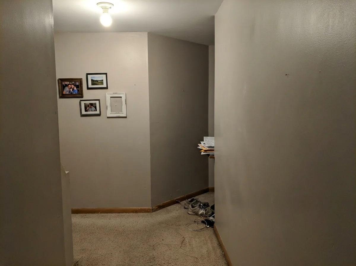
Over thirty years of repainting, I have discovered that some shades belong strictly in small powder rooms, while others only make sense when spread across an entire ground floor. Crushed Ice is a true connector. It thrives in long hallways and soaring stairwells where light levels shift every six paces. In a dim corner, its 66 LRV gathers whatever borrowed light is drifting down the stairs and bounces it back into the walkway without the chalky glare of flat builder white.
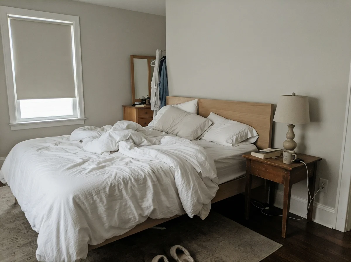
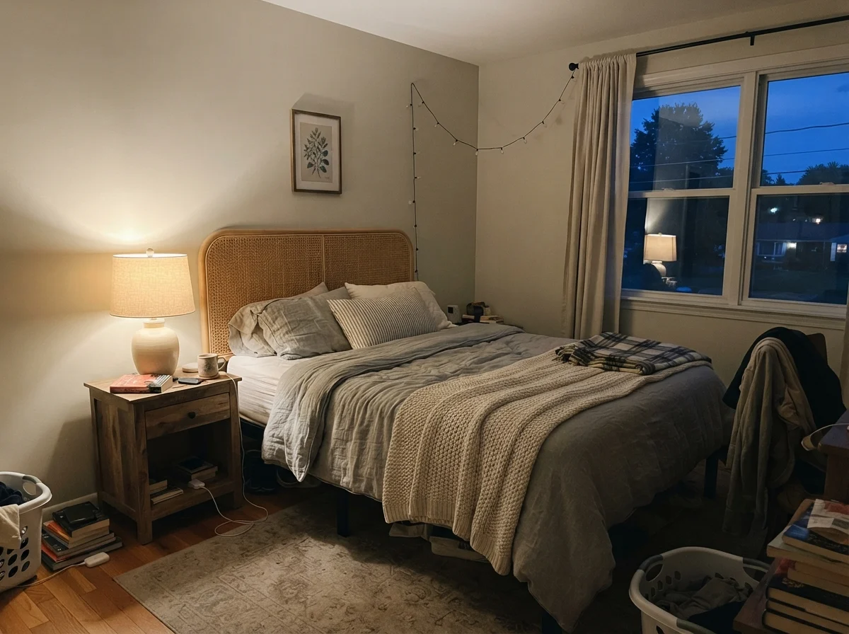
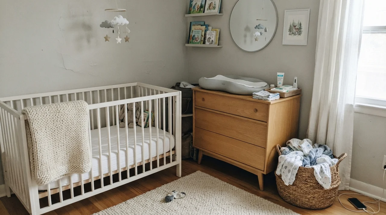
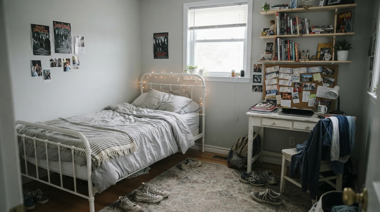
In main bedrooms and nurseries, it creates an immediate sense of stillness. You do not walk into the space and register 'a gray room' or 'a beige room'; you simply notice the texture of your woven blankets, the grain of a dresser, and the softness of the light coming through the curtains. That restraint is a blessing if you are someone whose nervous system needs quiet at the end of a long day.
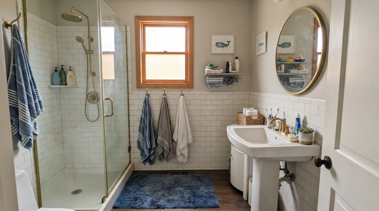
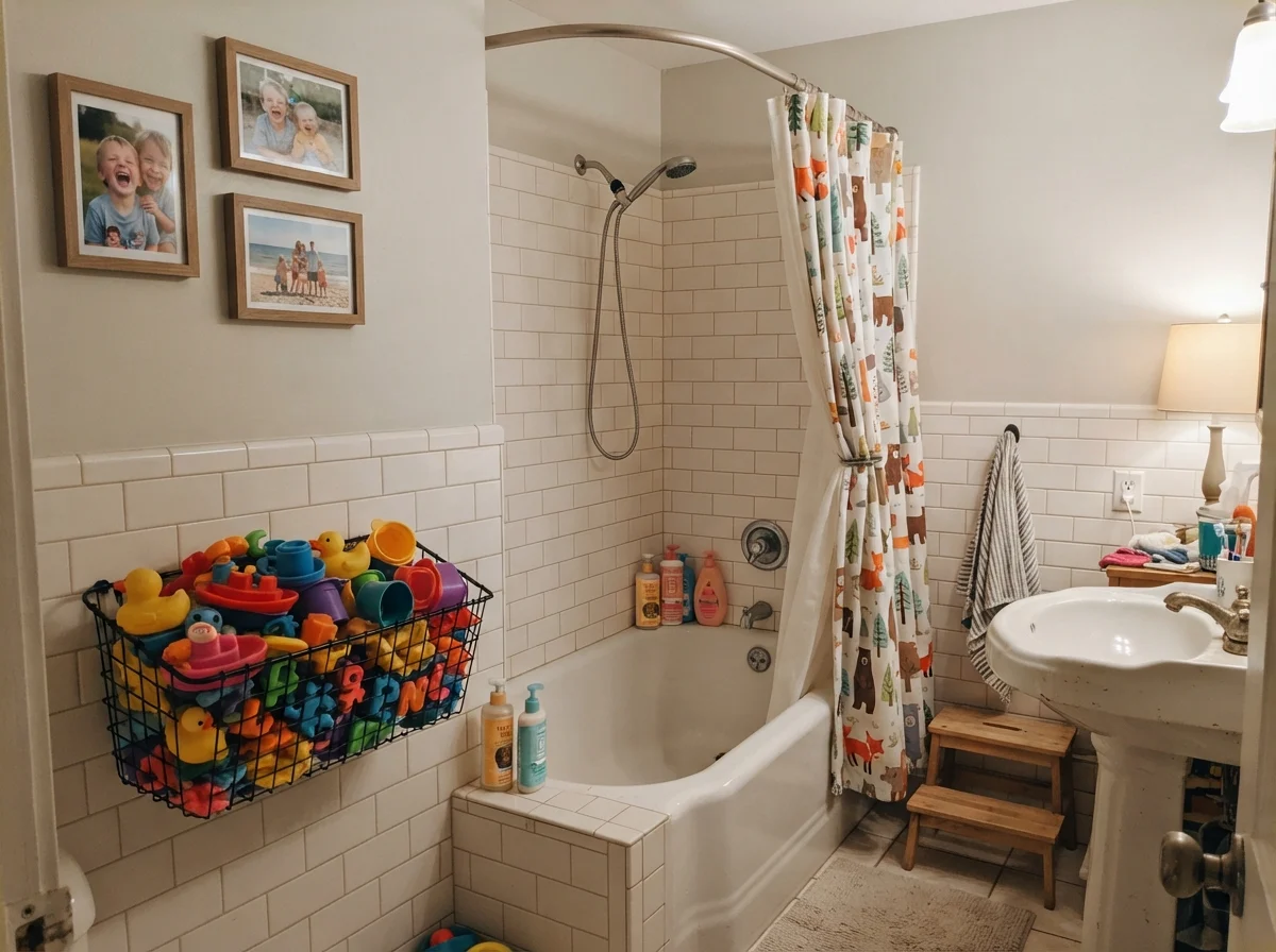
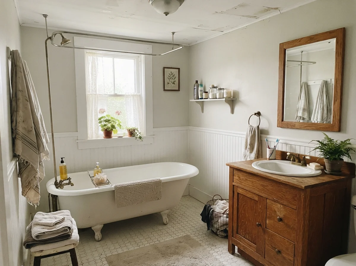
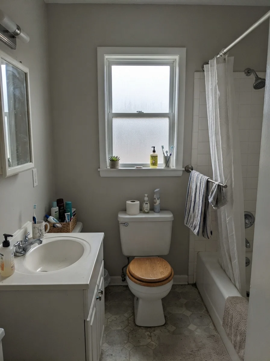
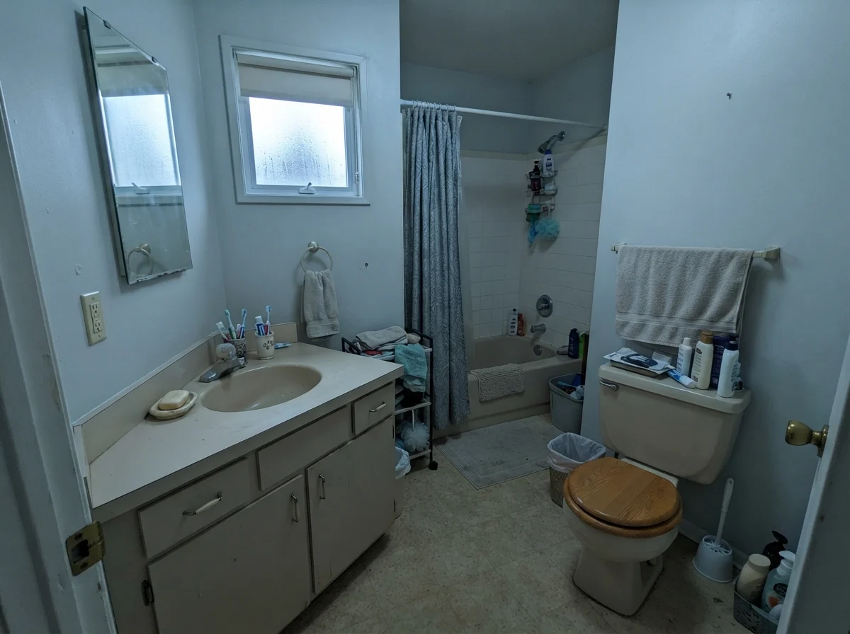
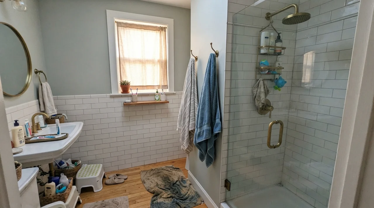
Bathrooms are another place where Crushed Ice proves its worth, provided your materials cooperate. When paired with classic white subway tile and warm wood vanities, the subtle gray tint gives crisp porcelain something gentle to lean against. In our second home, I learned the hard way that painting a small bath in true white makes every speck of water spotting and rogue hair look like an emergency. A quiet shade like this softens the clinical glare, especially in a cottage-style layout with white hex tile and a freestanding tub.
When the Sky Turns Gray: Watching the Cold Faces
No review of mine would be honest if I didn't warn you about how this paint behaves when the weather refuses to cooperate. On a dreary November afternoon under flat, overcast skies, or inside a north-facing window on a rainy Tuesday, Crushed Ice drops its greige disguise entirely. It turns decidedly gray—sometimes a lovely stone, but occasionally a flat, slightly chilly slate that offers very little comfort.
If your room already has older beige fixtures or cool gray floors, that north-facing rain can push the wall toward a dull, taupe-lilac cast. It isn't ugly, but it is certainly not the warm linen shade you fell in love with on a sunny Saturday afternoon at the paint counter. Seeing those mood swings in advance is the only way to avoid feeling swindled by your own walls.
At eleven percent saturation, there is simply not enough color in this can to fight your room. It will either flatter what you have, or mirror its flaws.
On Kitchens, Cabinets, and Millwork
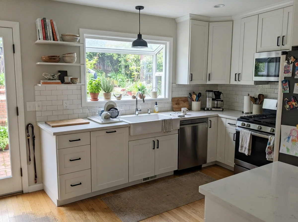
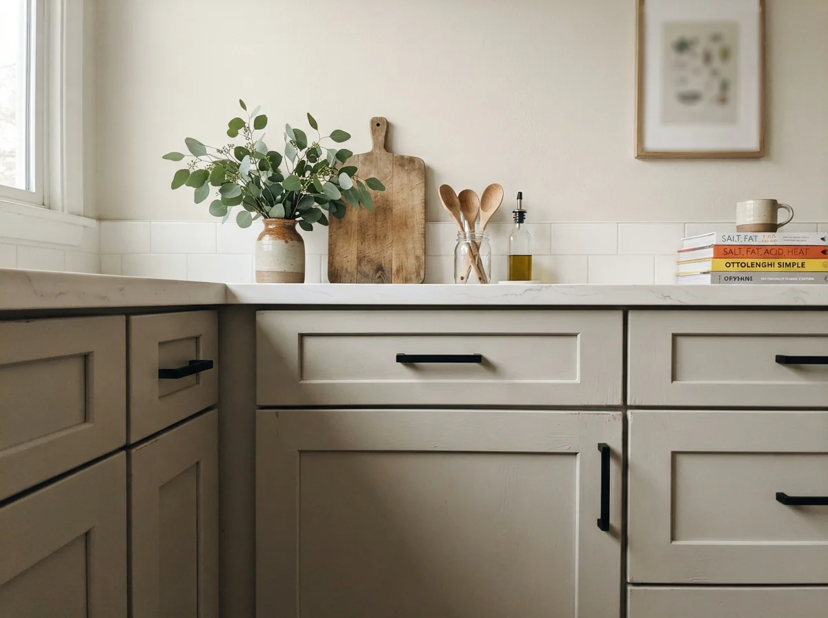
Because Crushed Ice is so light, people constantly ask whether it can handle cabinet duty. The answer is yes, but only if you understand the contrast equation. On shaker doors, satin Crushed Ice acts as a softer, less abrasive alternative to pure white. It cuts down on visible water spots and scuffs, which is worth the money if you have a busy household running through the kitchen three times an hour.
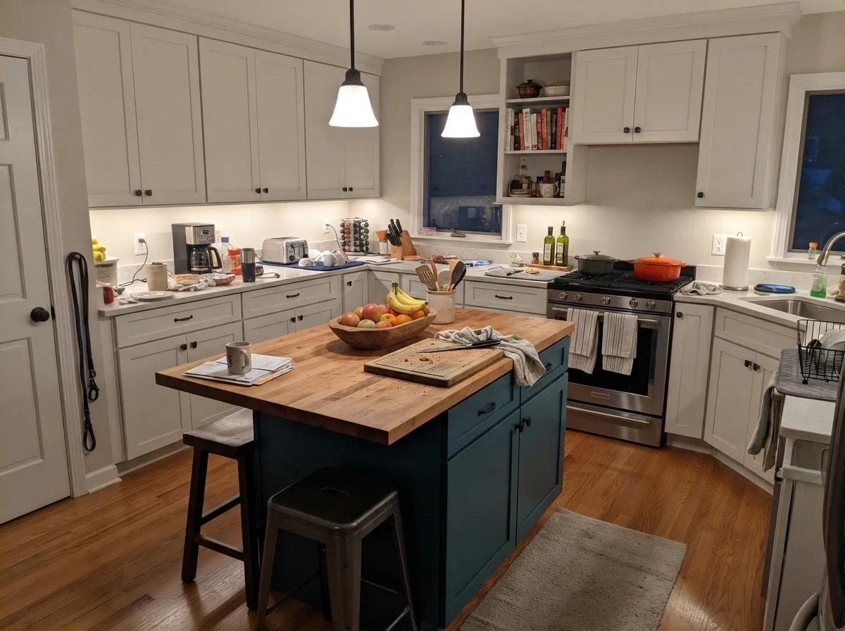
If you spray all the cabinetry in Crushed Ice, keep the backsplash crisp subway tile and let natural oak flooring anchor the ground. Or flip the script: use it solely on an island anchored by cream walls and white perimeter cupboards. The color gives the island just enough weight to define the work zone without chopping the room into disjointed blocks.
Living Rooms, Sunrooms, and Interior Architecture
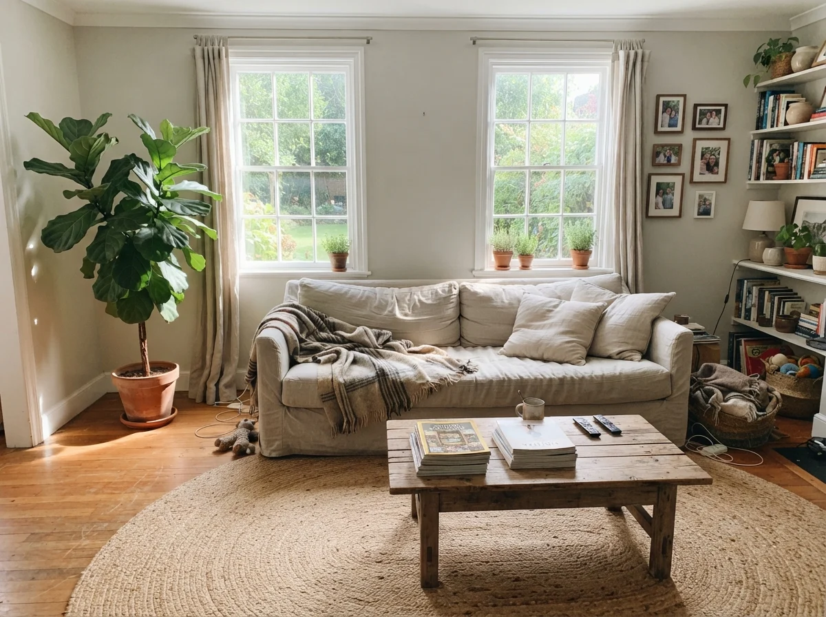
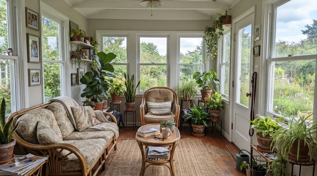
In a large, south-facing living room or a breezy sunroom wrapped in glass, Crushed Ice spreads out and sings. Sunlight washes out heavy undertones, turning the wall into a clean, breathable canvas. But here is the catch: because the paint itself offers almost no saturation, a room painted in Crushed Ice without contrast will look half-finished. You need a textured jute rug, a rumpled throw, rich wood tables, or dark iron accents to give the eye somewhere to land.
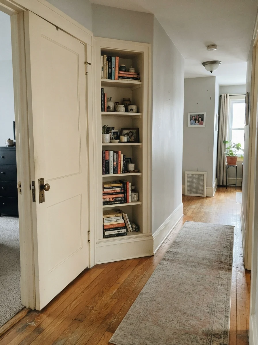
You can also use it selectively on millwork. In an older hallway with cream walls, coating a solid two-panel interior door and a built-in bookshelf in Crushed Ice adds subtle architectural definition. It separates the millwork from the field color without demanding the jarring shock of stark white or deep navy.
Laundries and Exteriors
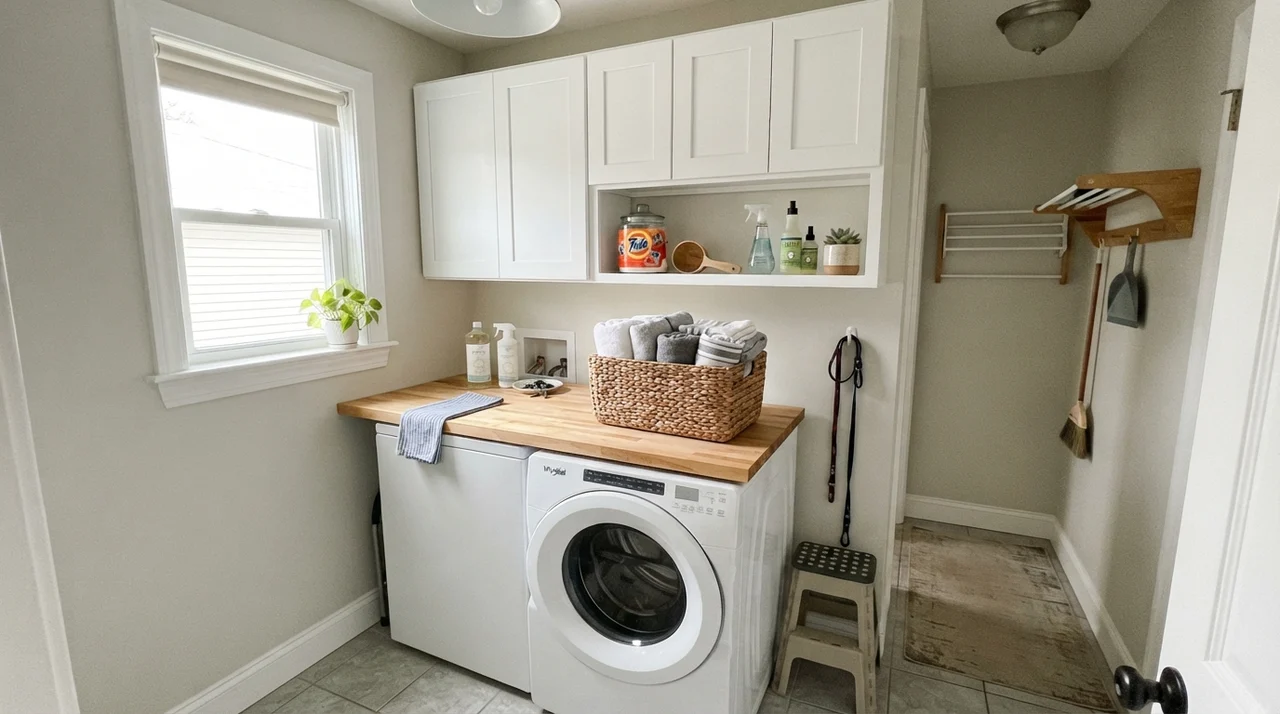
Practical workspaces benefit enormously from this kind of understated clean. In a compact laundry room with butcher block over the appliances, Crushed Ice catches natural window light and makes the whole utility zone feel intentional rather than forgotten. It scrubs clean easily when mixed in an eggshell finish, which matters when laundry hampers and detergent bottles regularly brush against the walls.
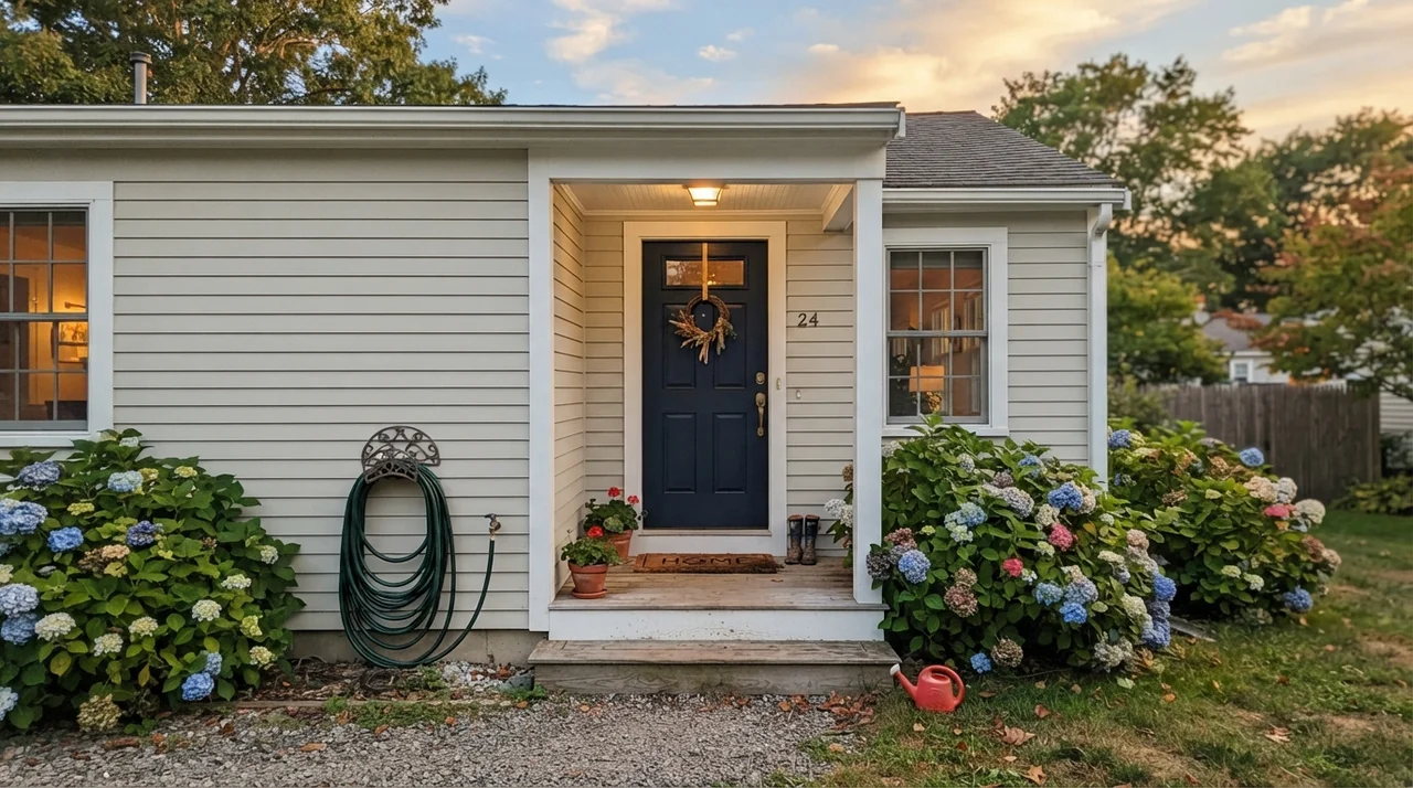
On an exterior, remember that full direct sun bleaches paint by several shades. Outside, Crushed Ice reads almost like a soft, chalky white. That makes it a handsome siding choice if you pair it with deep contrast—like a dark navy front door or charcoal shutters—against crisp white window trim. If your siding has to compete with white trim and nothing else, it will wash out into a pale blur that lacks confidence.
Where Crushed Ice Fails: The Honest Traps
The unhappy stories about Crushed Ice are almost never about the paint being defective. They happen because someone asked a near-neutral to do heavy lifting that it simply cannot manage. At 11 percent saturation, there is virtually no backbone in the mix to push back against poor surroundings. Over the years, I have seen three specific scenarios ruin this color entirely.
First, do not pair it with stark, brilliant builder white on the baseboards and door frames. When crisp white sits directly against Crushed Ice, your eye instantly uses the white as its benchmark. The gray wall no longer looks like an intentional color choice; it looks like dingy white that needs to be scrubbed down with warm soapy water. Second, watch out for cool north daylight over gray-washed laminate floors. The cool sky kills the warmth, the gray flooring reflects upward, and the wall collapses into a lifeless taupe-lilac.
Third, beware of expansive green lawns, dense tree cover outside large picture windows, or green-veined granite counters. Because the paint is so pale, it acts like a sponge for reflected greenery. The wall facing the window will drink up that grass reflection and take on a sickly tint that will drive you mad by late afternoon.
Keeping It Clean and Living With It
Five years in, what matters most isn't how the swatch looked when the painter pressed it against your crown molding; it's how the surface handles real life. We put eggshell Crushed Ice in our high-traffic back hallway, and I can tell you that the formula held up through dogs, muddy coats, and garden tools being hauled through the rear entry. It scrubbed clean with a warm, damp microfiber cloth and left no burnished shiny spots behind.
Because the pigment load is light, minor scuffs from vacuum cleaners or luggage don't expose jarring undercoats. Touch-ups are relatively forgiving compared to deep charcoals or dark sages, provided you feather the roller edges properly. For daily peace of mind, that low-maintenance profile is worth every penny of the paint can's price tag.
How It Holds Up Against the Competition
When you are staring at a display rack of paint chips, everything between LRV 58 and 67 begins to look identical. But when we sold our split-level and moved into the 1960s ranch we live in now, I tested several of these close neighbors side by side. Small shifts in light reflectance and undertone completely change how a room feels once all four walls are coated.
Repose Gray SW 7015 sits lower on the scale at LRV 58. It is clearly, unmistakably a gray wall. If you want everyone who walks into the room to say, 'Oh, what a lovely gray,' choose Repose. If you want them to notice your antique sideboard and never think about the paint at all, stay with Crushed Ice. Agreeable Gray SW 7029 has more warmth and beige backbone, making it much safer in dim rooms with cold northern light. Silverpointe SW 7653 lives on the cooler side of the street, sitting crisp beside modern chrome, while Benjamin Moore Pale Oak OC-20 leans slightly creamier for those who want a touch more sunshine in low-light rooms.
What sheen should I choose for Crushed Ice across different surfaces?
For walls, eggshell gives the ideal balance between low glare and scrubbability. For trim and baseboards, use semi-gloss to provide a durable, wipeable edge. Use satin on cabinetry and bathroom vanities to resist water spots, and stick to flat on ceilings to hide drywall imperfections.
Why does Crushed Ice look slightly dirty or dingy next to my trim?
This happens when your trim is painted in a stark, bright builder white. Because Crushed Ice is a soft greige with low saturation, the eye uses the bright white trim as its reference point and reads the wall as unwashed white rather than an intentional gray. Pair it with an off-white like Pure White SW 7005 or Snowbound SW 7004 instead.
Will Crushed Ice look cold in a room that faces north?
Yes, it can. Cool northern daylight cancels out the faint warm greige undertone, leaving behind a plain, cool gray that can drift toward a flat taupe-lilac if your flooring is gray. If you need warmth in a north-facing space, look toward warmer options like Agreeable Gray SW 7029 or Accessible Beige SW 7036.
Can I use Crushed Ice on the exterior siding of my home?
Yes, but remember that full direct sunlight washes out pale paint by several shades, making Crushed Ice read almost white outside. It looks wonderful when anchored by high-contrast accents like an Iron Ore SW 7069 or Naval SW 6244 front door, but it looks weak on facades paired only with white trim.
Susan's Verdict · The Restful Background Player
Crushed Ice is not the paint to buy if you want people to walk into your home and compliment your color bravery. It is the color you buy when you want your walls to stop talking. At LRV 66, it keeps large spaces bright, bridges warm oak and cool tile without fuss, and allows your furniture, books, and art to lead. Just keep it away from stark builder-white trim, pair it with warm 2700K bulbs at night, and give it real contrast to lean on. In a busy house that already has enough noise, this quiet can of paint is worth every penny.