Color Diary · No. 83
Benjamin Moore Iron Mountain: Living with the Brown-Black Near-Black
A warm, brown-black near-black nobody has crowned Color of the Year — reviewed honestly: the doors and islands where it shines, the dim rooms where it goes flat black, and what to pick instead.

Susan HartleyOctober 15, 2026 · 12 min read
Iron Mountain · Benjamin Moore 2134-30
Hex#575553LRV9Undertonesbronze charcoal → flat black → cool blue-black
In our last house—the 1990s colonial where we raised the kids and repainted practically every baseboard twice—I decided on a whim to paint an interior door in an uncompromising near-black. The front door had already taught me that dark colors demand respect, but an interior passage door was another beast entirely. I didn’t want an industrial slate gray, and I certainly didn’t want a cold ink that looked like chalkboard paint. I wanted something with enough dirt and warmth to feel settled next to old brass hardware and warm wood floors.
That was how Benjamin Moore Iron Mountain (2134-30) found its way into my garage. At the time, nobody on television was screaming its praises. It has never been crowned a Color of the Year, and no decorator built an empire staging glossy magazine spreads around it. Benjamin Moore quietly lists it in their charcoal deck, and contractors mostly reach for it when someone asks for a dark trim or exterior accent that won't fight warm stonework. I lived with it on that door for seven years before we moved, and when we sold the house, the woman who bought it specifically asked whether I still had the leftover half-can sitting in the basement workshop.
That is Iron Mountain in a nutshell: quiet, grounding, and thoroughly handsome—provided you understand exactly how much light it demands to keep from turning into an empty black void.
The Anatomy of a Brown-Black
Let’s talk numbers for a moment, because dark colors behave according to physics whether we like it or not. Iron Mountain sits at an LRV of 9. Light Reflectance Value runs on a scale from 0 to 100, where zero is absolute black that absorbs all light and 100 is pure white reflecting everything back at you. At an LRV of 9, you are firmly in near-black territory. This is not a soft medium gray; it is an absorbing, heavy pigment.
What separates Iron Mountain from a dozen other darks in the fan deck is its undertone. This is a warm, brown-black near-black. It is not a green-black, and it is not a cool blue-black. In strong, direct daylight, the bronze undertone comes forward and it reads as a rich charcoal-brown. Step away from that direct sunlight, however, or drop it into a hallway with no windows, and that subtle bronze compresses right out. In flat or dim light, it collapses into plain black and the personality disappears.
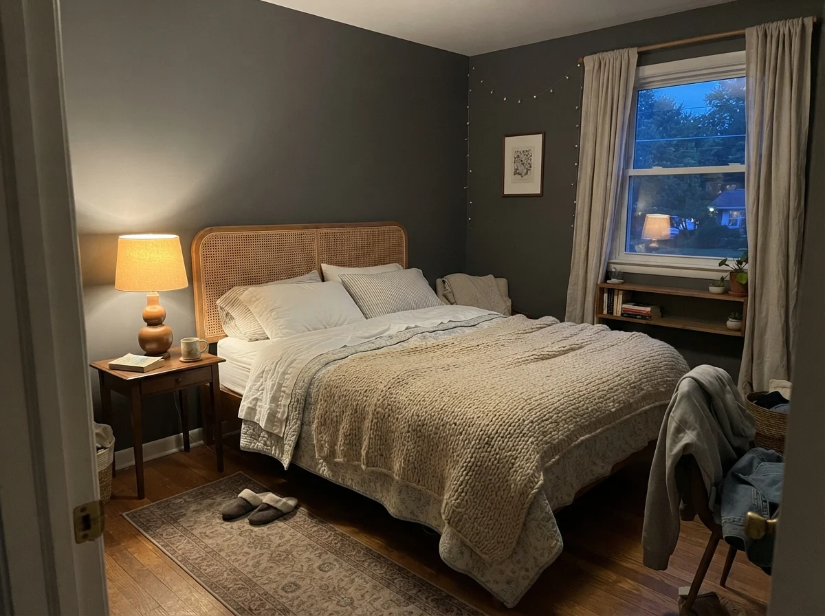
When people tell me they painted a room dark and ended up hating it, nine times out of ten it’s because they chose their color from a tiny paper chip held under fluorescent hardware store lights. That chip doesn't warn you about the twilight shift. In the morning, when cool north light comes through the glass, a dark shade can feel distant and cold. Come evening, switch on a table lamp with a warm 2700K bulb, and the very same wall suddenly radiates coziness.
Where Iron Mountain Shines in Everyday Life
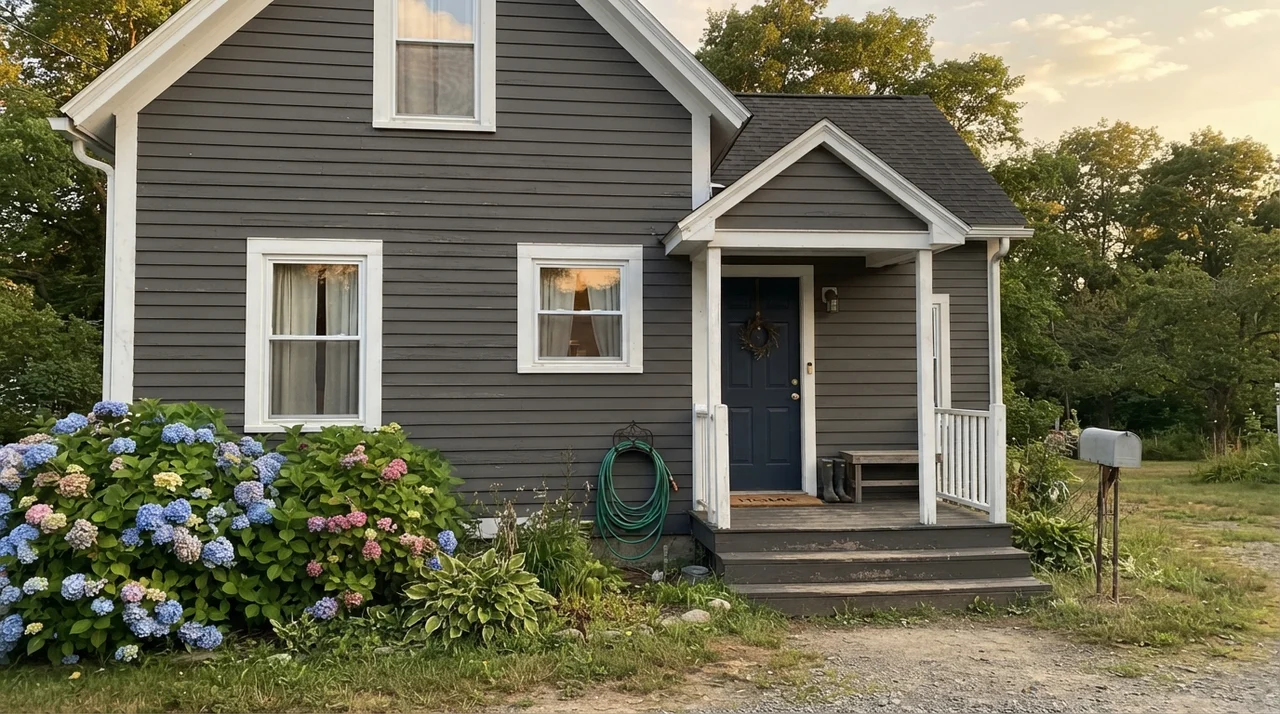
Iron Mountain earns its keep in small, well-lit doses. Benjamin Moore’s own marketing quietly hints at this, pointing toward front doors, shutters, garage doors, and kitchen islands. And they’re right. In full daylight or under crisp entry fixtures, that bronze warmth keeps it from feeling like cold steel or commercial ironwork. It looks expensive, tailored, and intentional.
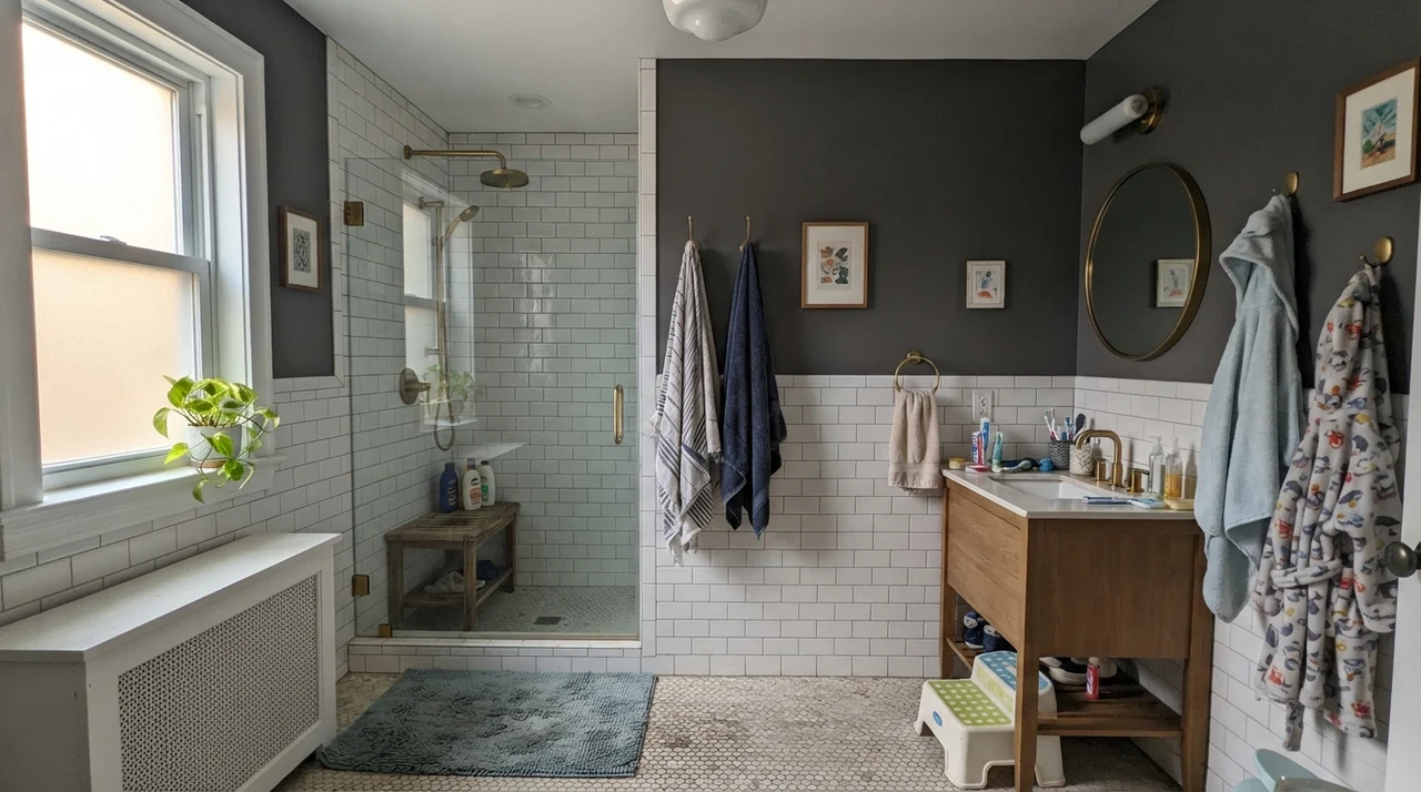
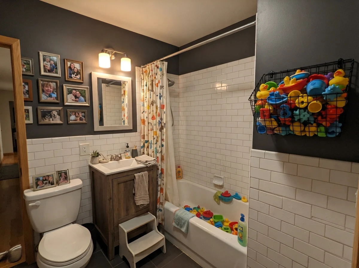
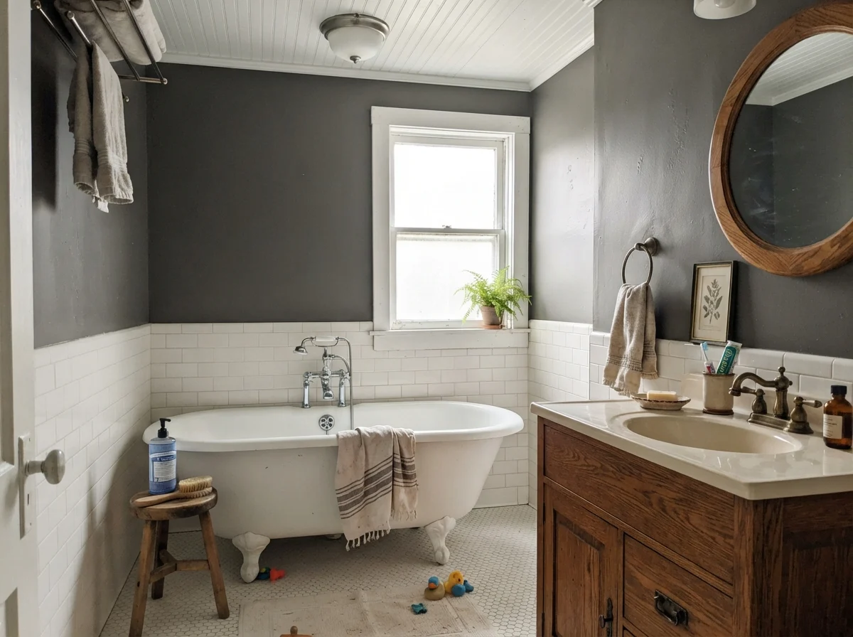
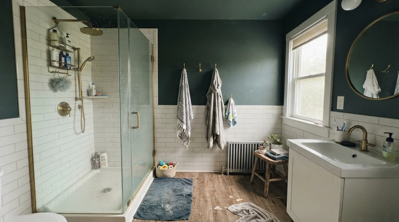
Consider bathrooms with generous tilework. If you run crisp white subway tile up four feet as a wainscot and finish the upper walls in Iron Mountain, the contrast does something wonderful. The white tile bounces natural light up toward the ceiling, giving the dark paint the illumination it needs to show off its charcoal-brown undertone without overwhelming the square footage.
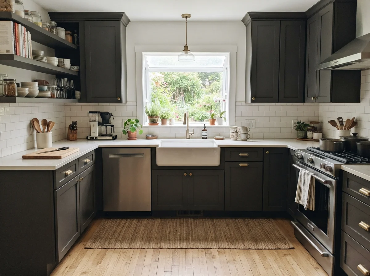
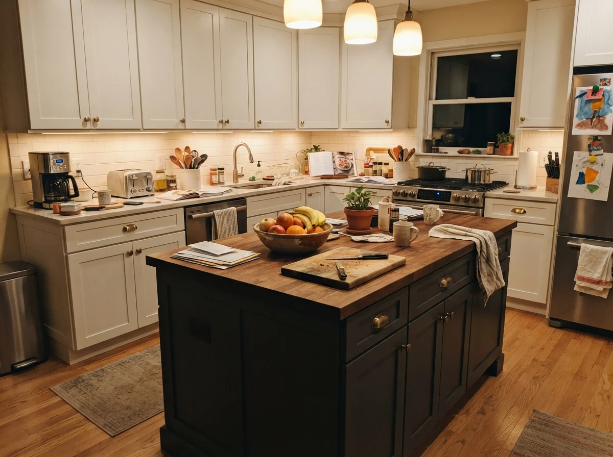
When you have natural light flooding in from garden windows, Iron Mountain behaves beautifully on millwork and cabinetry. A kitchen island painted in Iron Mountain set against light countertops and pale surrounding cabinetry anchors the entire workspace. It grounds the room without feeling heavy-handed.
In our 1960s ranch, the kitchen island takes all the abuse: dropped forks, grocery bags slid across the counter, and muddy dog noses nudging the base. Darker satin paints on an island hide an astonishing amount of everyday life while staying scrubbed clean with a simple damp cloth. It is worth every penny of the extra prep work.
Rooms with Generous Windows
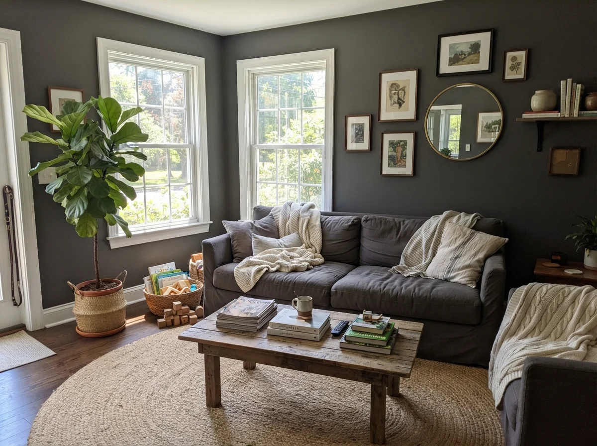
If you're bold enough to paint four full walls in an LRV 9 shade, you had better have the windows to support it. A living room with generous midday exposure can handle Iron Mountain with grace; the sunlight keeps the bronze alive, and warm textures like jute, oak, and linen soften the edges so the room feels grounded rather than austere.
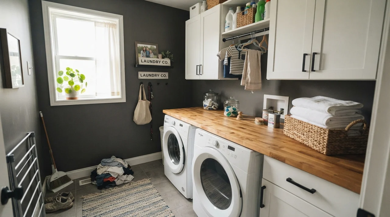
Even small utility rooms can tolerate this depth if they possess one solid source of daylight. In a laundry room with a clear window, white appliances and pale folded linens pop against the dark walls, creating an organized, deliberate utility corner instead of an overlooked afterthought.
Bedrooms and Quiet Corners
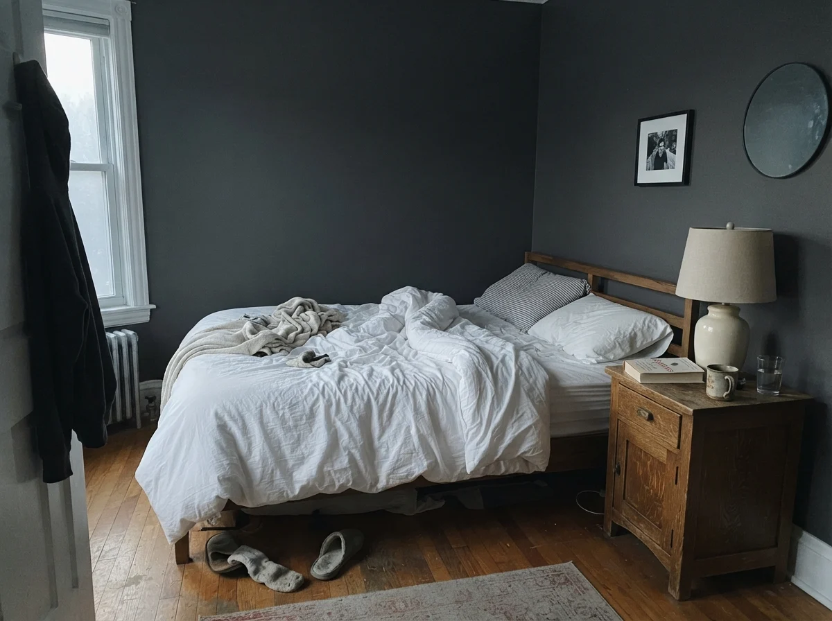
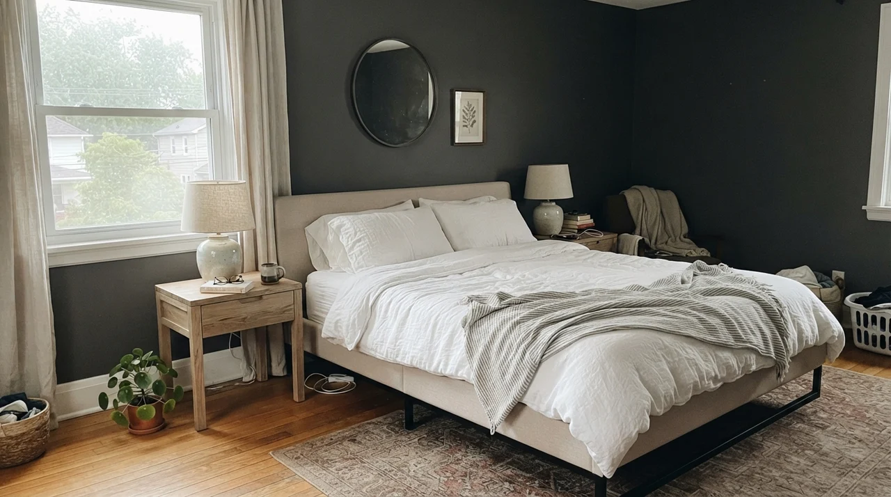
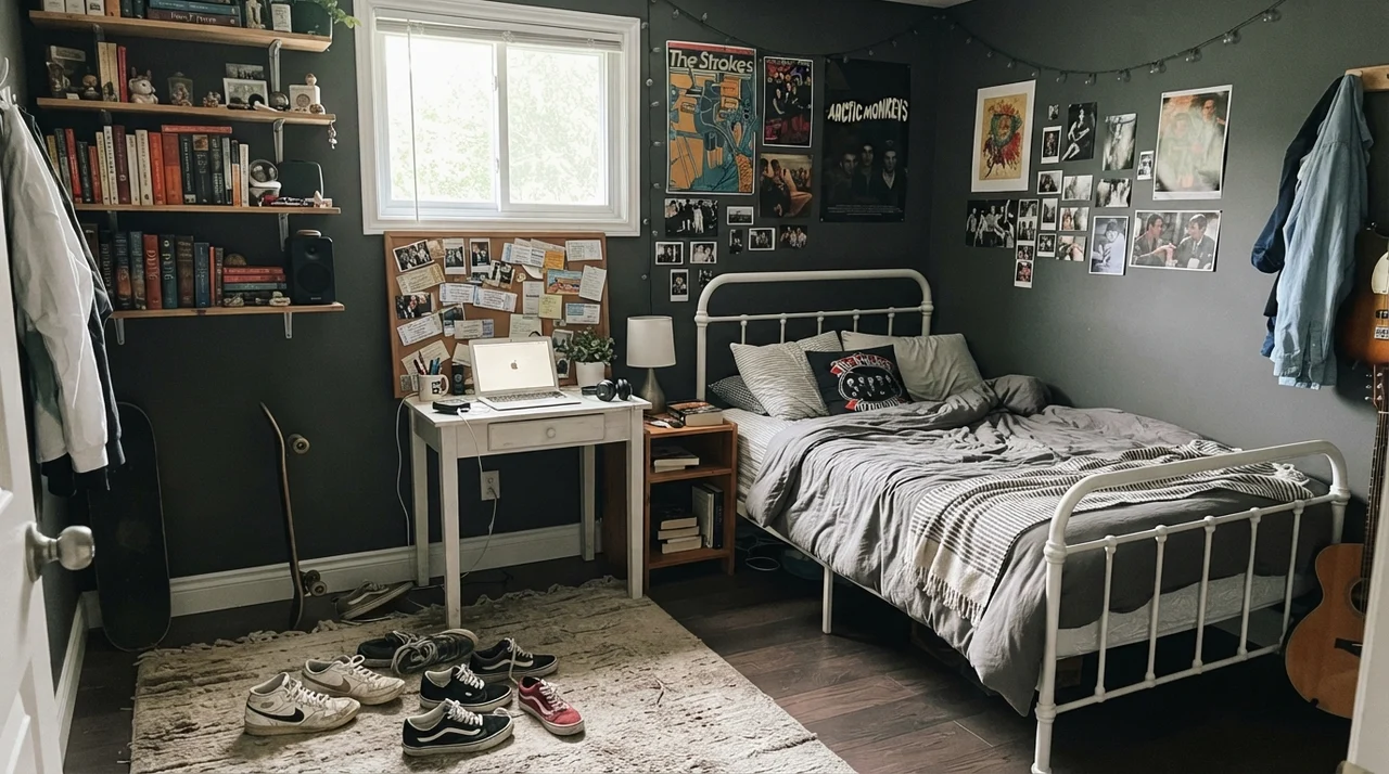
Bedrooms are naturally suited to darker tones if you lean into the mood rather than fighting it. In a serene master bedroom, Iron Mountain provides a striking backdrop for pale oak nightstands and light linen bedding. In a teenager’s room, it feels grown-up without looking dreary, acting as a neutral slate for framed posters and white desks.
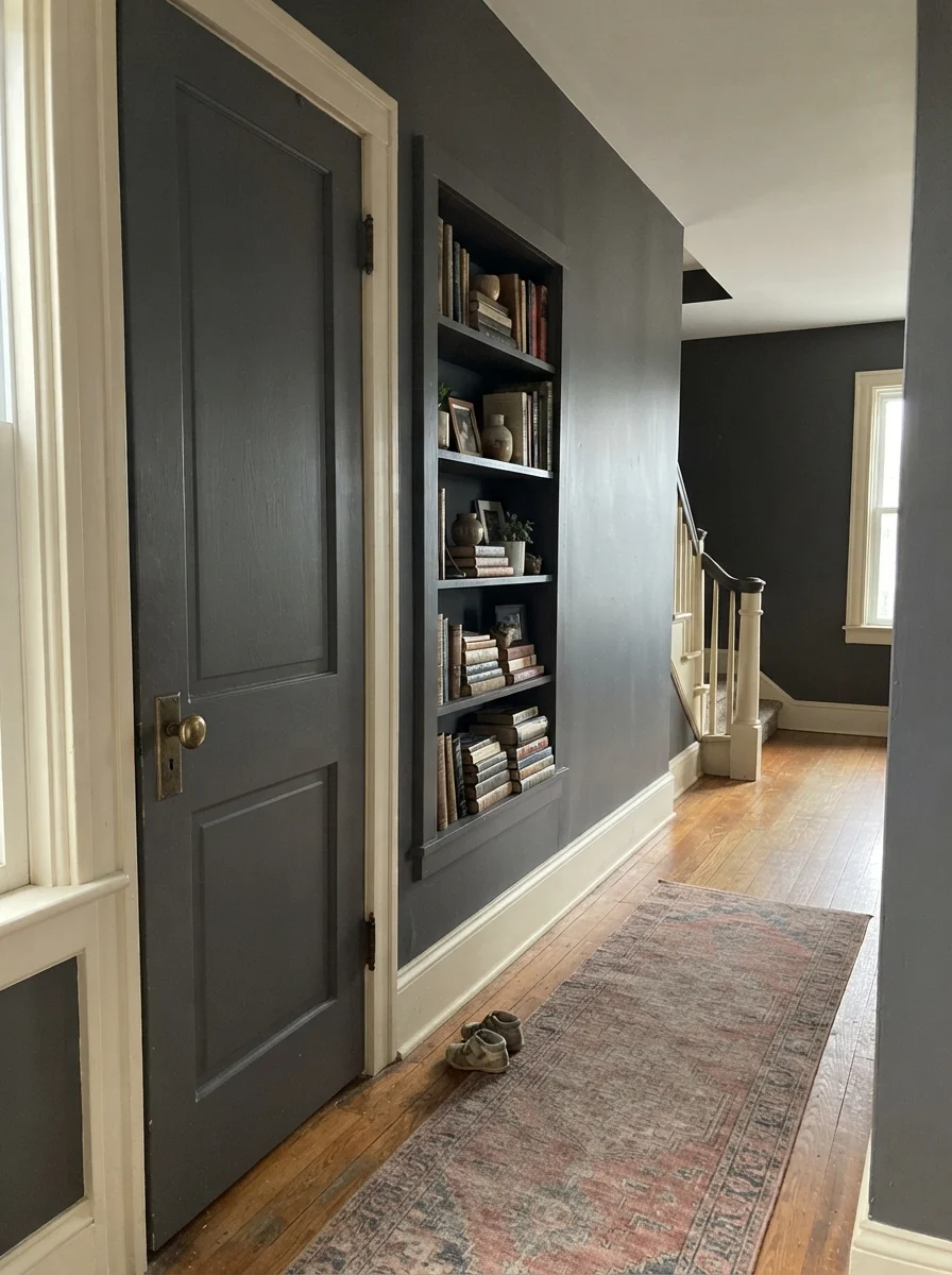
If you aren't ready to coat an entire bedroom in near-black, try restricting it to an architectural feature. An interior door or a built-in shelving unit painted in Iron Mountain against pale walls gives you all the weight and character of a dark pigment without swallowing the daylight.
The Honest Fail: When the Light Disappears
Almost every way this color disappoints traces back to one single cause: not enough light reaching the surface. That failure is entirely predictable before you even open the can. Iron Mountain was built as an accent dark, not a room-filling cavern paint. Ask it to do the work of four walls in a windowless room, and it stops being a warm brown-black and turns into a flat, lifeless hole in the wall.
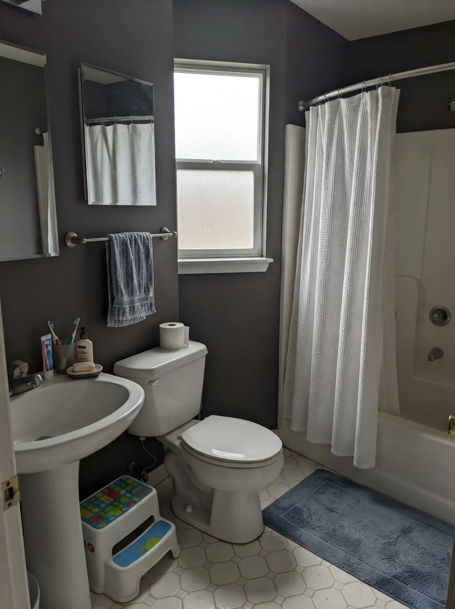
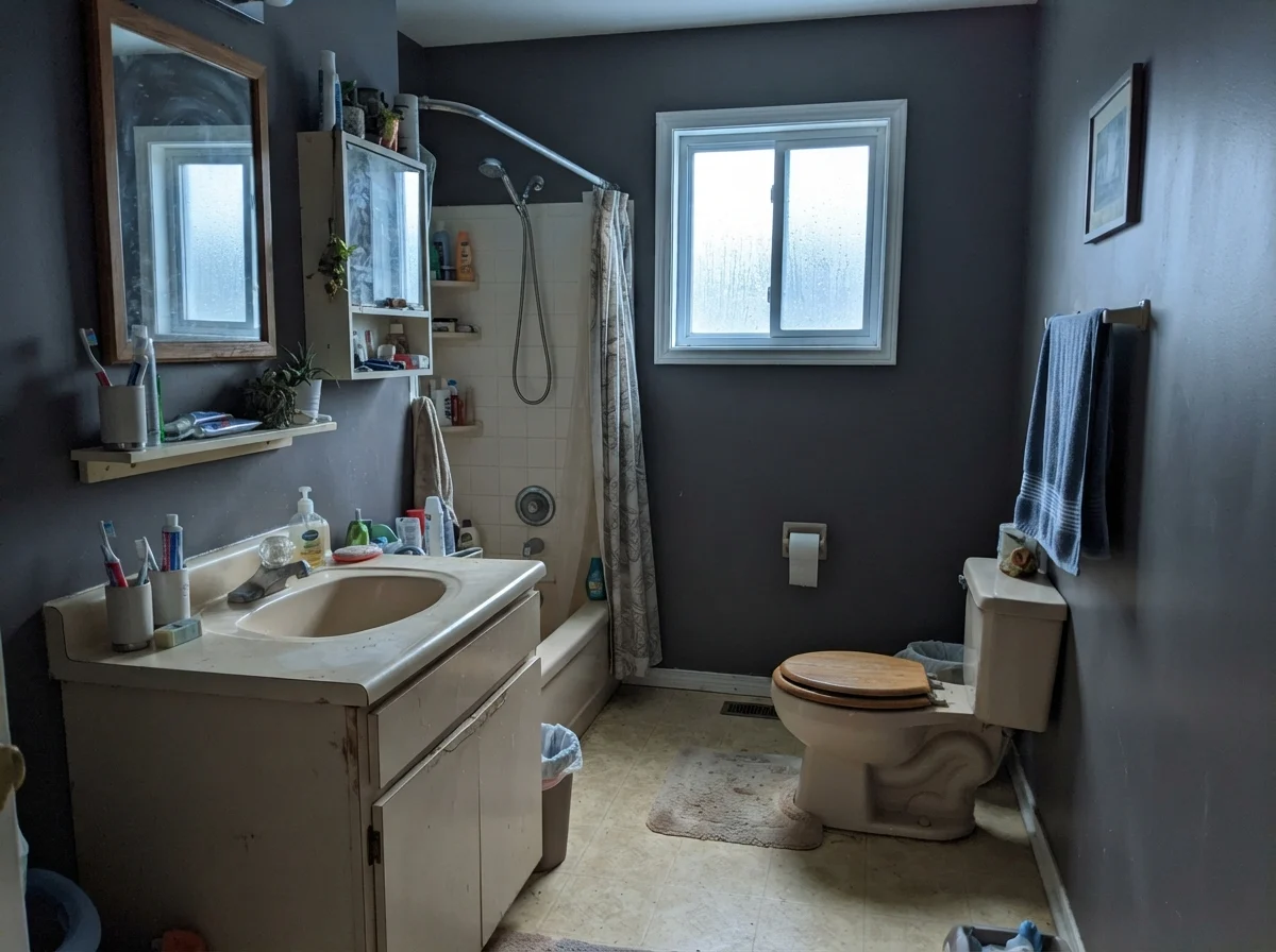
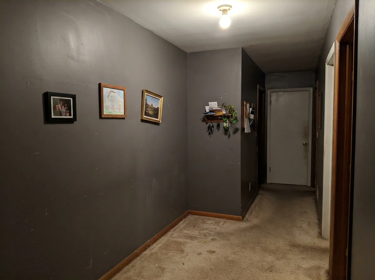
Look at what happens in a north-facing bath or a dark hallway corner. Without direct sun or warm 2700K lighting, the bronze warmth compresses out completely. The paint looks muddy, cold, and putty-like. It robs the space of energy.
At LRV 9, dim rooms flatten Iron Mountain to plain black fast. Keep it to a door, an island, or a sun-drenched accent—not a dark bedroom's four walls.
Trim Pairings and Room Finishes
Getting the trim right next to an LRV 9 color is the difference between a high-end architectural finish and something that looks like an unfinished theater backdrop. Because Iron Mountain carries a warm bronze undertone, high-contrast cool whites can make it look muddy rather than rich. You want dark or warm neutrals that respect its undertone without picking a fight.
Durability, Sheens, and Long-Term Wear
Here is the practical homeowner truth: dark paint requires careful sheen management. In a flat or dead-matte finish, an LRV 9 wall will show every single brush of an elbow or rub of a vacuum handle. Those marks leave faint, shiny burnish streaks that you cannot simply scrub away with warm soapy water without leaving a dull spot.
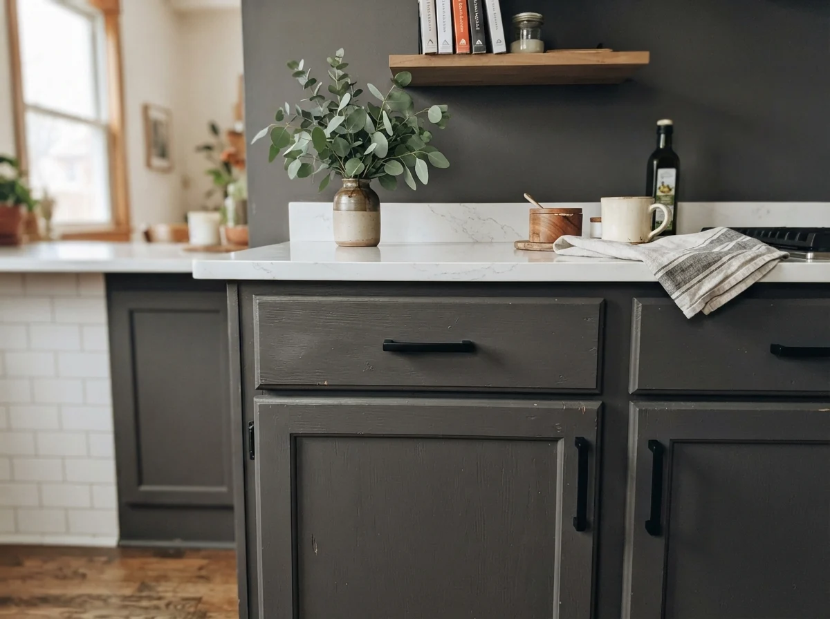
On front doors, shutters, and garage doors, use semi-gloss. It sheds rain, resists hand oils around the deadbolt, and wipes clean easily. On kitchen islands and built-in bookshelves, satin is your absolute best friend; it provides enough surface tension to withstand scuffs from shoes and barstools while maintaining a soft, furniture-grade glow. For interior walls in a study or dining room, stick to eggshell. Eggshell gives you just enough resin to wipe away fingerprints without turning your walls into glaring mirrors under ceiling fixtures.
How Iron Mountain Compares to Other Darks
When you're standing in front of the fan decks, dark swatches start blurring together. Here is how Iron Mountain stacks up against its closest neighbors on the shelf:
What is the exact LRV of Benjamin Moore Iron Mountain?
Iron Mountain has a Light Reflectance Value (LRV) of 9. This places it firmly in the near-black category, meaning it reflects only 9 percent of available light.
Does Iron Mountain look black or brown in real rooms?
It looks like both depending on the light. In direct natural sunlight, the bronze undertone comes forward, making it read as a rich, warm charcoal-brown. In dim or overcast rooms, it collapses into a plain, flat near-black.
What light bulbs should I use with Iron Mountain?
Warm 2700K bulbs are essential. Cool 4000K or 5000K LED lighting cancels out the bronze undertone, leaving the walls looking muddy and flat.
What sheen should I choose for Iron Mountain?
Use semi-gloss for front doors, shutters, and garage doors. Use satin for kitchen islands and cabinets to resist scuffs. For walls in a den or bedroom, eggshell provides wipeability without unwanted surface glare.
Susan's Verdict · Small Doses, Generous Daylight
Benjamin Moore Iron Mountain (2134-30) is a warm, brown-black near-black that earns its keep through quiet dignity rather than passing design trends. It has never won Color of the Year, and that is precisely why it won't look dated in five years. If you want a rich, bronze-tinted dark for an exterior door, shutters, or a kitchen island paired with white perimeter cabinets, it looks expensive and deliberate. Just keep it out of windowless hallways and dim bedrooms, where its warmth disappears and leaves you with an empty black box.