Color Diary · No. 82
Pearly White SW 7009: The Cream That Refused to Turn Yellow
America's quiet builder white, reviewed honestly: the rooms where it glows, the one pairing that ruins it, and what to use instead.

Susan HartleyOctober 14, 2026 · 14 min read
Pearly White · Sherwin-Williams SW 7009
Hex#E8E3D9LRV77Undertoneswarm cream → soft neutral white → buttery yellow
In our last house—a 1990s colonial that seemed to have an endless supply of golden oak baseboards and honeyed cabinets—I spent an entire spring trying to find an off-white that didn't fight the woodwork. Every crisp white I tested made our doors look like dirty margarine, while the popular creams tipped right back into the butter-yellow traps of the decade we were trying to soften. That was when our painter slid a chip of Sherwin-Williams Pearly White across the laminate counter.
I lived with it for seven years in that house, and when we moved into our 1960s ranch, it was one of the first cans I brought over to test on the old plaster. Pearly White (SW 7009) is an off-white with an LRV of 77. In plain terms, that means it reflects seventy-seven percent of the light back into your room—plenty bright enough to lift a dim corner, but grounded with just enough body to hide drywall patches that aren't quite square. It carries real yellow in its makeup, but it stops short of becoming an overt cream because it lacks the heavy tinting that turns paint cloyingly sweet.
Yet it is easily one of the most misunderstood cans on the shelf. Treat it like a pure white under a stark ceiling, and it will let you down instantly. Treat it as a full-room envelope, and it delivers a quiet warmth that feels like late-afternoon sun caught in a jar.
The Undertone Mechanics: Yellow Without Gray
Pearly White is a cream that stopped short of being a cream. It has real yellow in it and no gray to hold that yellow down. That gives it an uncanny ability to flatter natural oak, unlacquered brass, and warm stone. But because there is no gray anchor, it responds immediately to the light outside your window and the fixtures overhead.
warm sun
overcast, north light
dusk, rain, cool bulbs
Pearly White shifts noticeably across the day: warming to a soft yellow under southern daylight, flattening out into a quiet neutral in north exposure, and sinking toward a subdued putty under dim rain.
SanctuarySherwin-Williams · see diary
ShoelaceBehr · see diary
Pearly WhiteSW 7009
Whisper GrayDunn-Edwards · see diary
SeapearlBenjamin Moore · see diary
Light Across the Day: Morning Calm to Evening Lamp Glow
Before you commit five gallons to a bedroom or hallway, you have to watch how Pearly White behaves as the sun turns around the house. In cool, early-morning daylight or dim northern exposures, cool light naturally cancels out much of the paint's yellow base. The result is a soft, chalky neutral white—clean, restrained, and completely free of glare. It sits quietly on the wall without demanding attention.
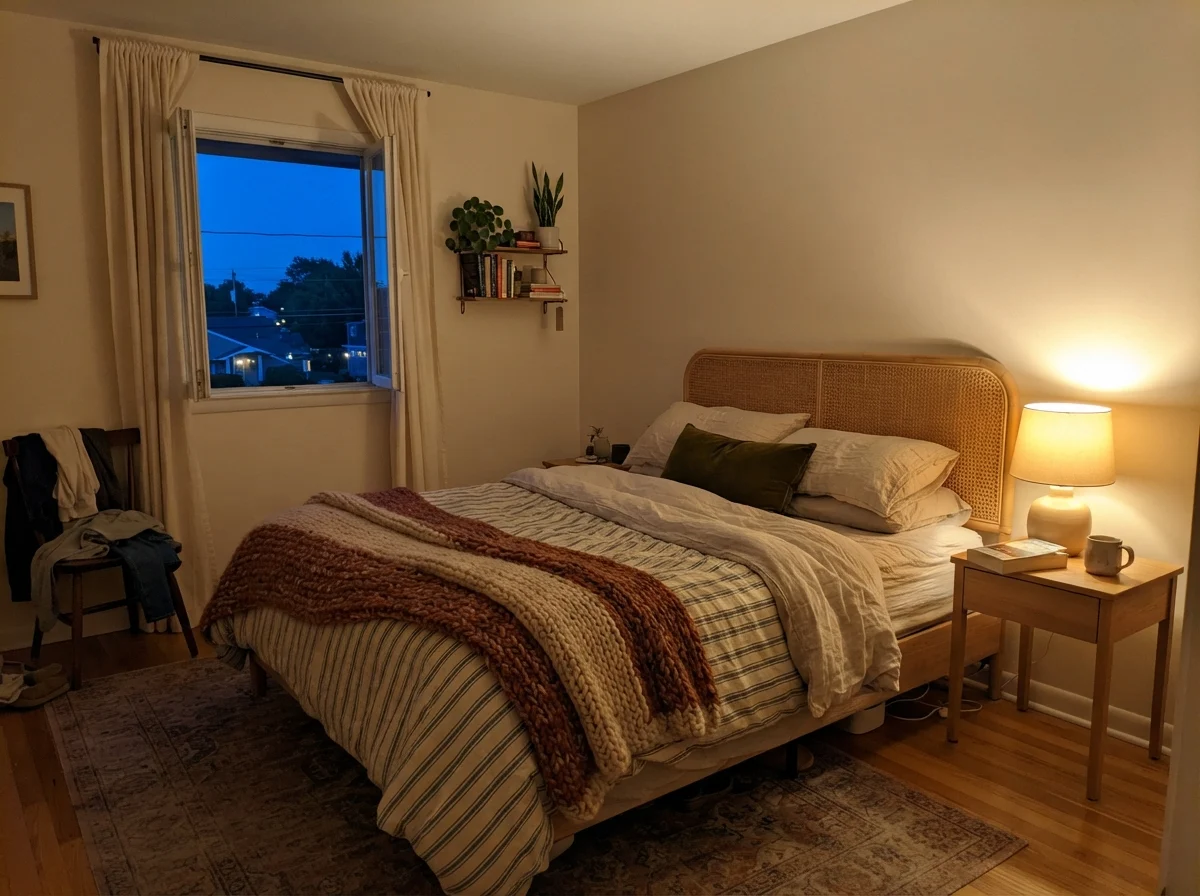
Come evening, however, the yellow steps forward. Switch on a 2700K bedside lamp as the blue twilight gathers outside, and Pearly White deepens into an intimate, cozy cream. It makes a room feel wrapped and settled. The only real risk is hard western sun around four in the afternoon: unfiltered late-day rays can turn it buttery, and if you have green shrubs or lawn right outside, it can flash a faint yellow-green that catches people off guard.
Bathrooms and Tile: Finding the Balance
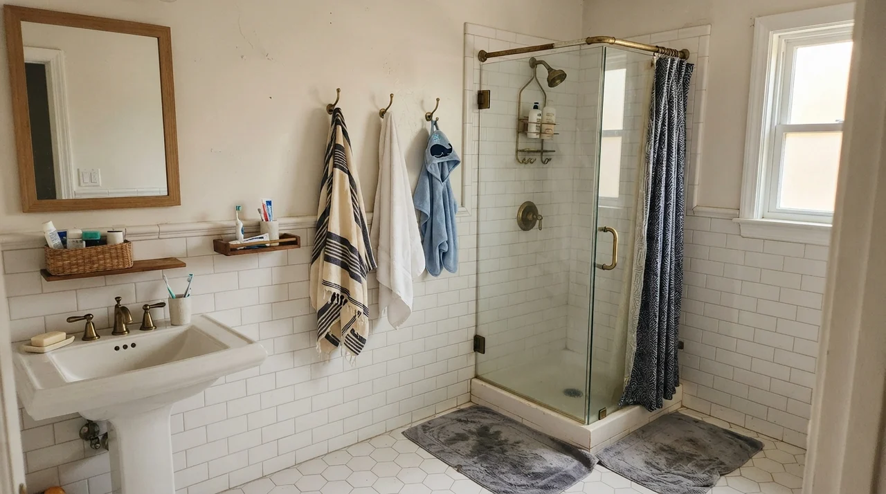
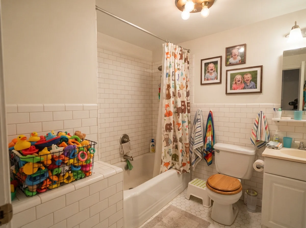
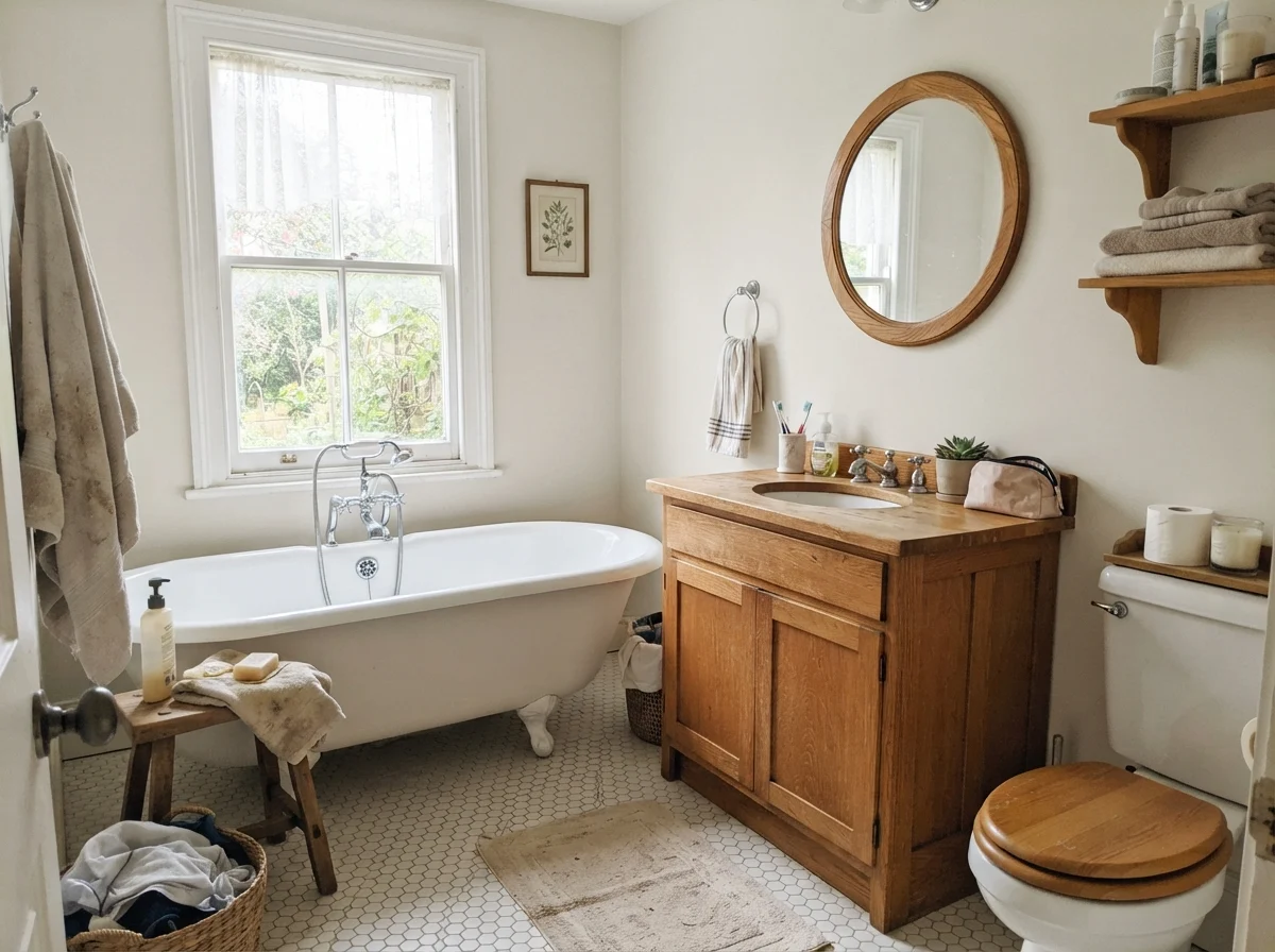
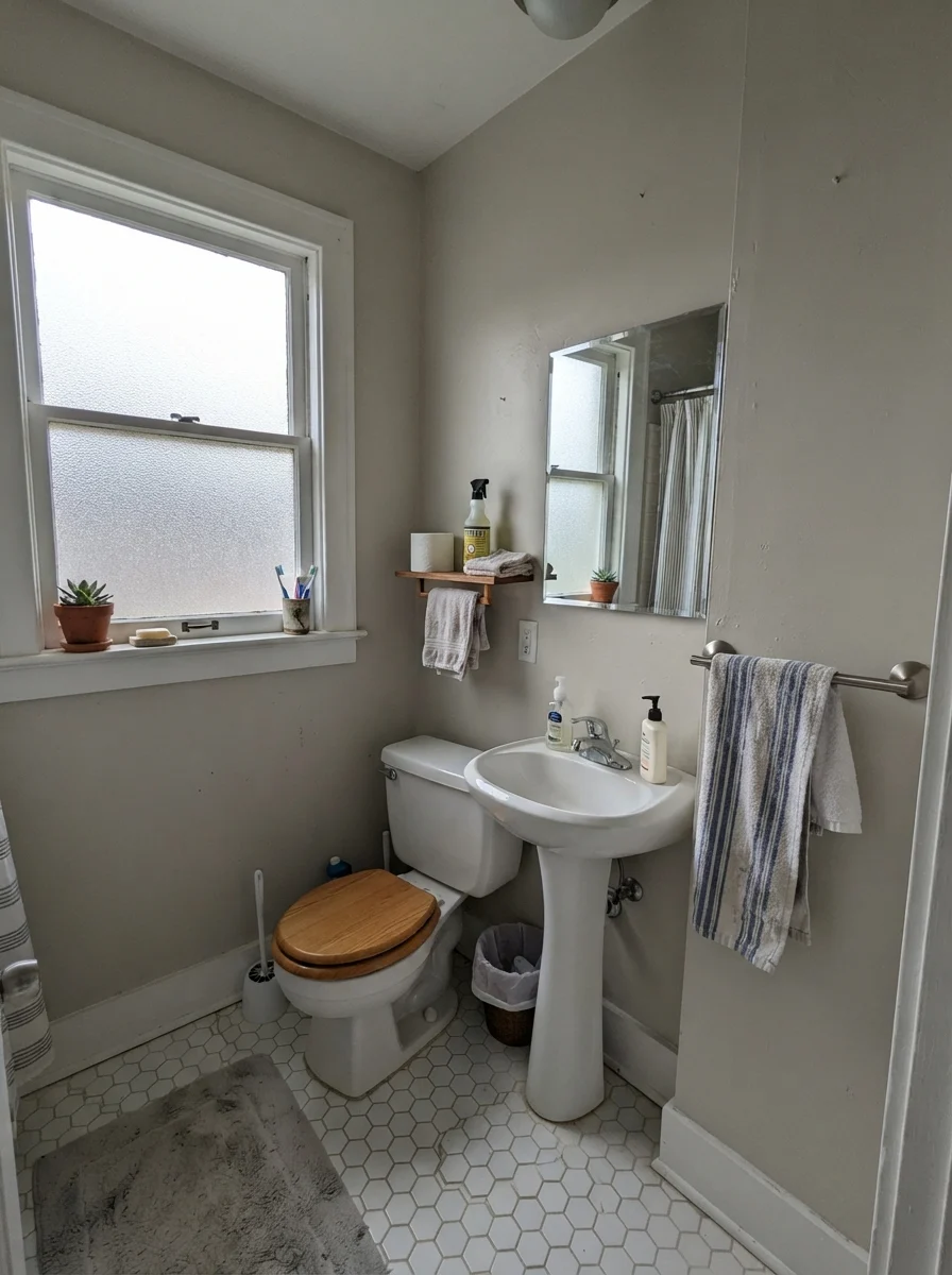
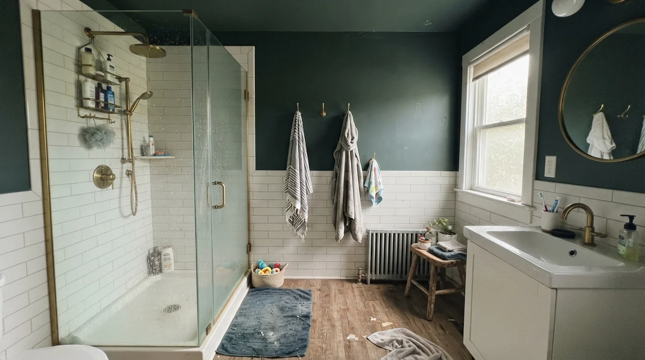
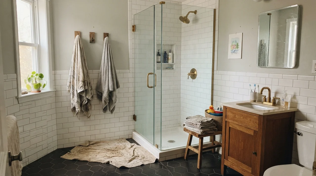
In bathrooms, Pearly White does some of its finest work—provided your stone and fixtures speak the same language. When paired with warm oak vanities, brass shower plumbing, or classic white subway wainscoting, it brings a soft, vintage depth that modern ultra-whites simply cannot match. It feels grounded, lived in, and gentle under morning vanity lights.
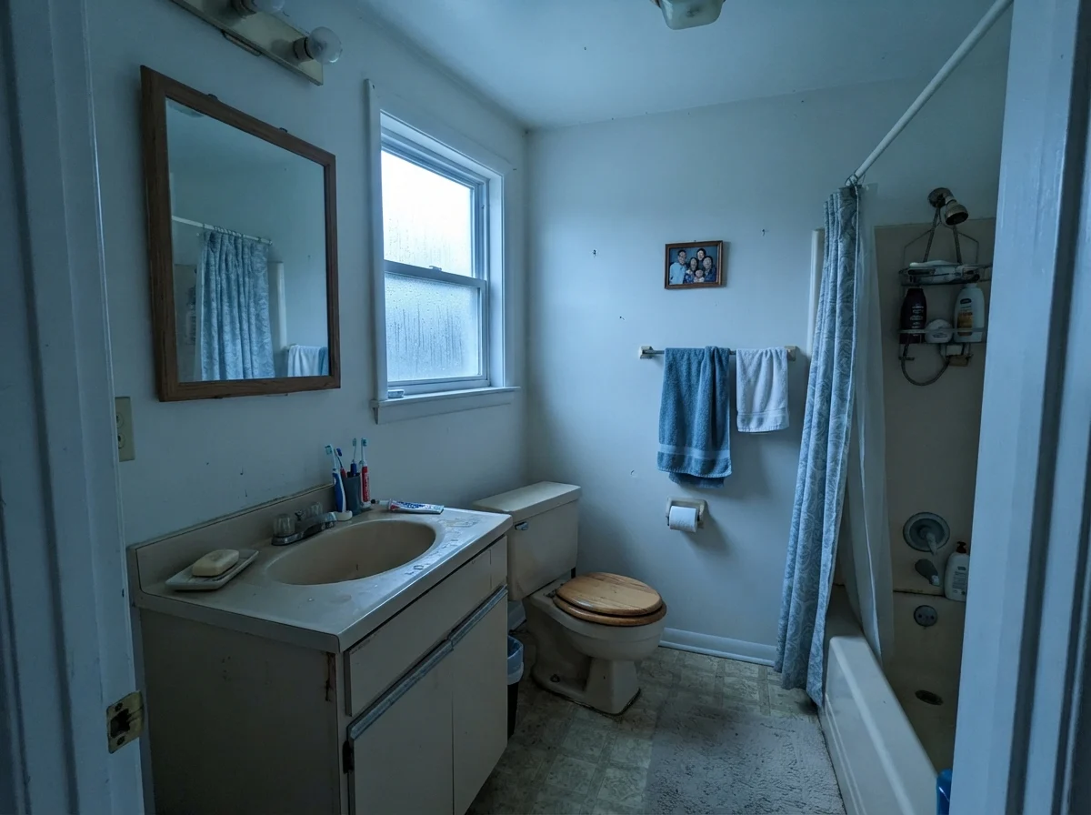
That said, daylight still plays an enormous part in how it presents against white fixtures. Under flat, overcast skies, or in rooms taking cool north rain, it dials back its creaminess and leans into a quiet, muted stone tone. It never turns icy, but you will notice the subtle shift from cozy to reserved depending on what the weather is doing outside.
Bedrooms and Living Spaces: Embracing the Envelope
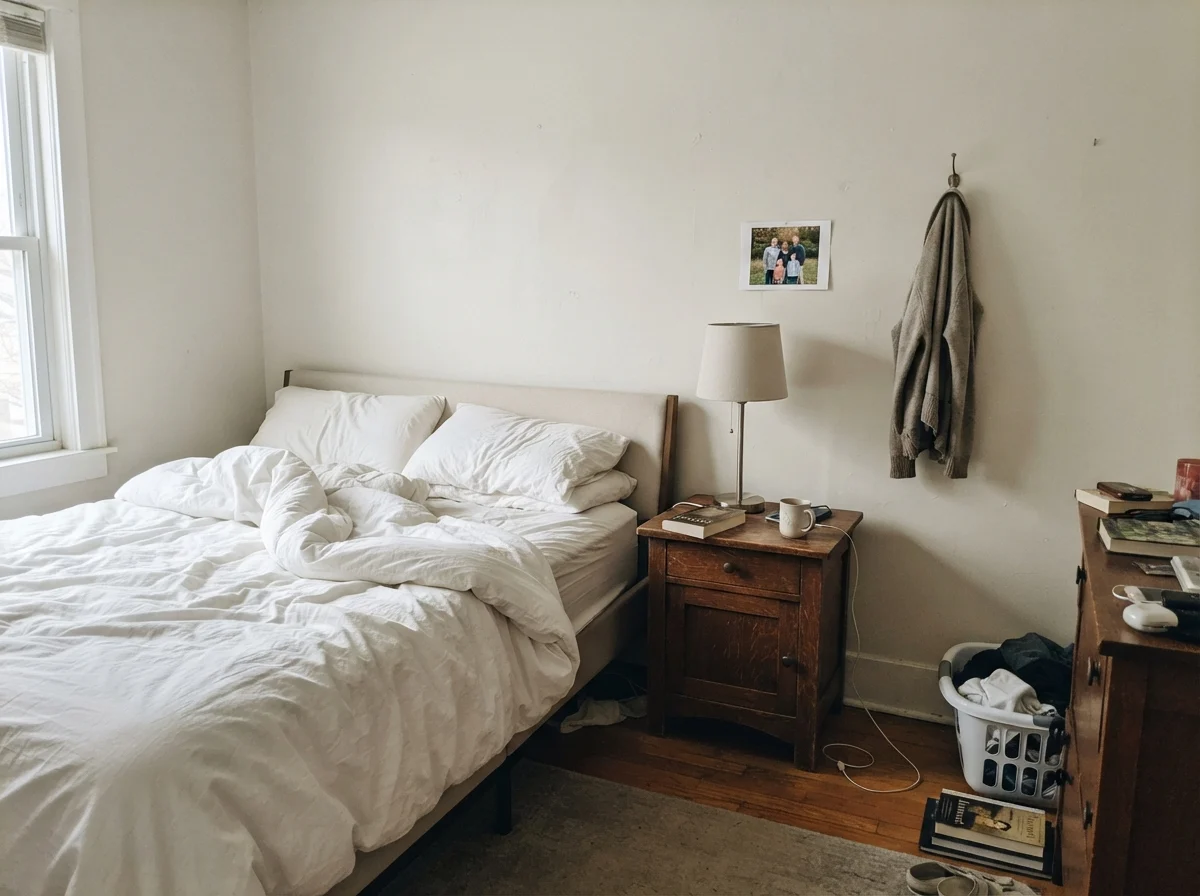
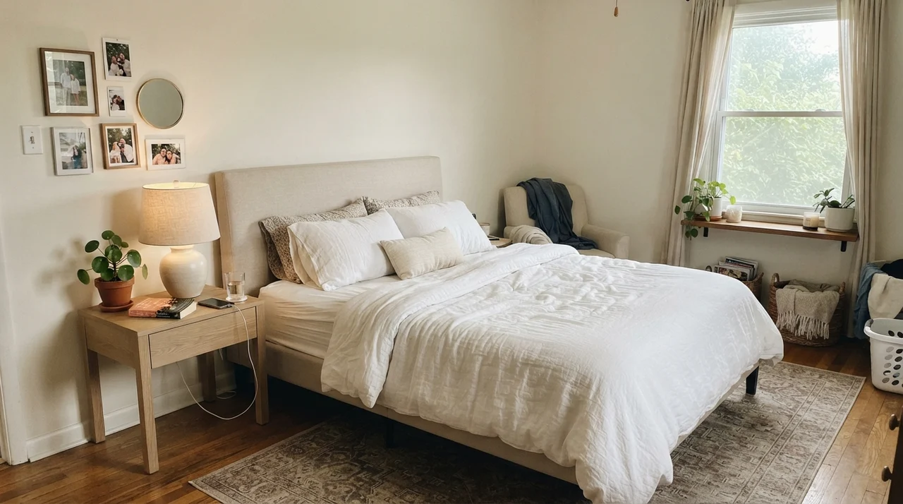
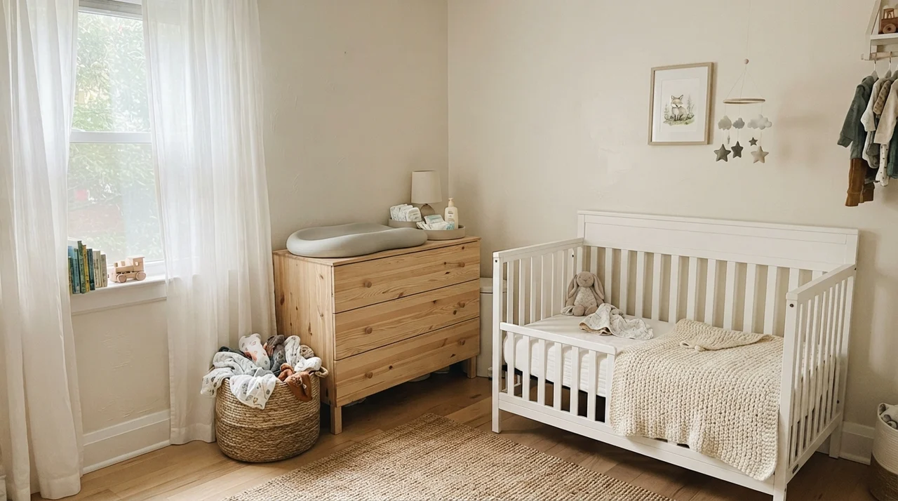
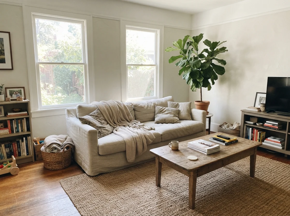
Where people fall in love with Pearly White is in bedrooms and living areas that lean toward natural materials. If you have pale oak nightstands, ceramic lamps, jute rugs, or linen upholstery, this paint functions like an effortless connective tissue. At LRV 77, it reflects ample ambient daylight to keep a room bright at midday, yet it doesn't give off the stark, sterile bounce of modern gallery whites.
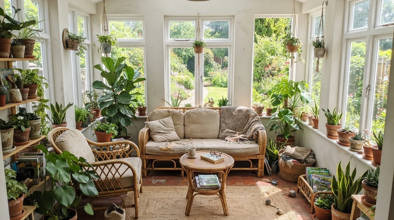
In a sunroom or living room wrapped in windows, Pearly White absorbs intense sunshine without glaring back at you. It also has a lovely habit of forgiving the house itself: wavy plaster, minor drywall patches from long-gone picture hooks, and slightly uneven corners disappear far better against Pearly White in eggshell than they ever would under a high-contrast bright white.
Kitchens and Built-Ins: The Traditional Fit
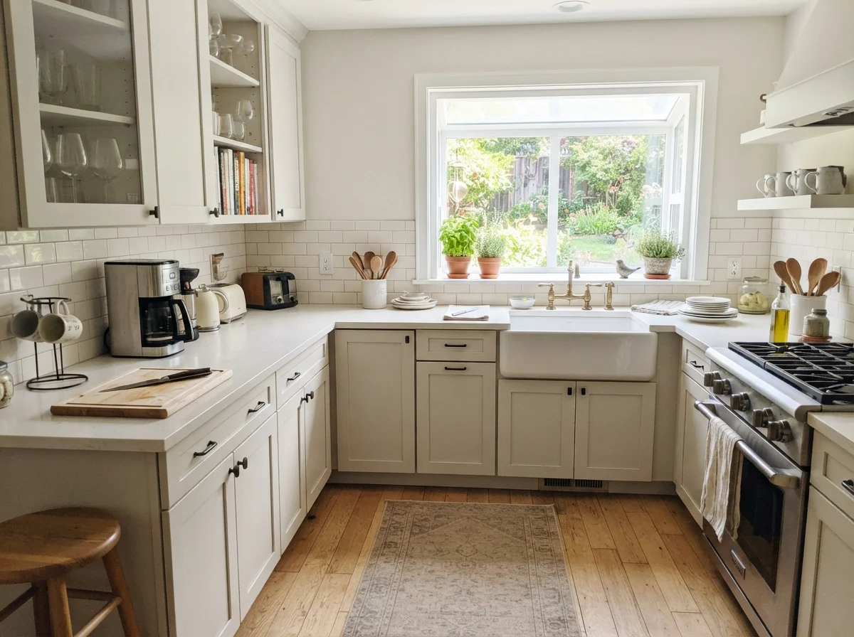
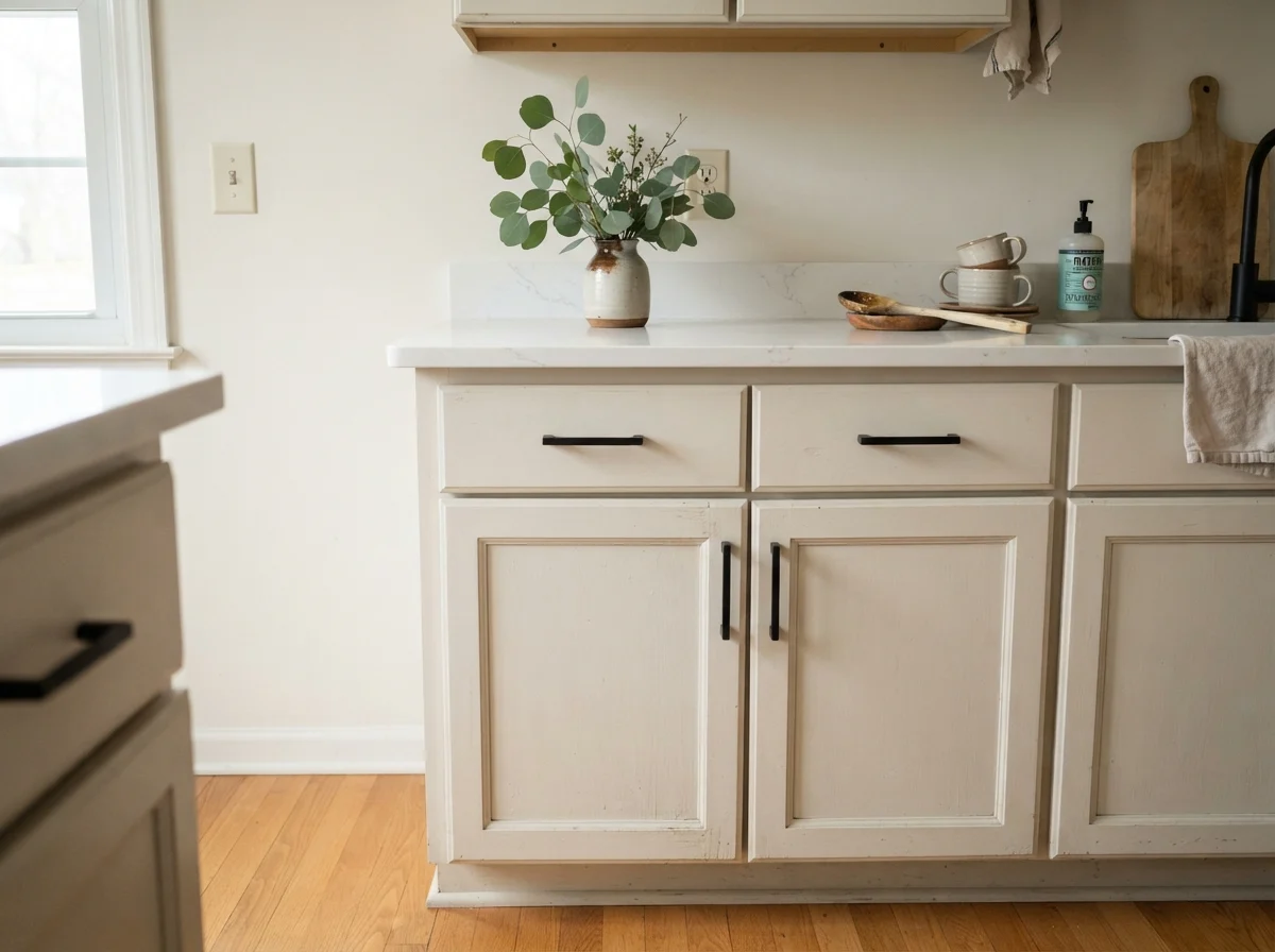
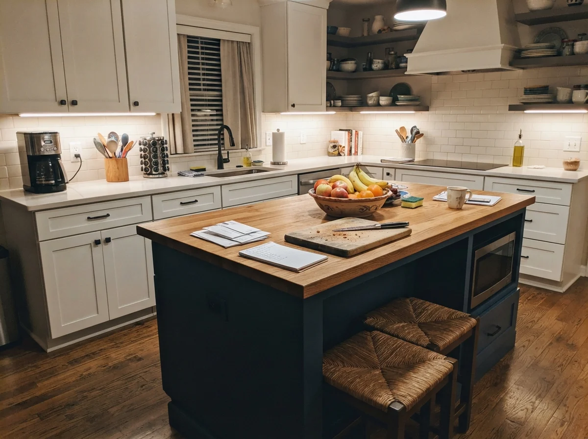
When it comes to cabinetry, Pearly White belongs on traditional profiles—specifically shaker cabinetry paired with warm wood accents, butcher block counters, or honed granite. Done in satin, the finish cleans easily around handles and looks rich and intentional. It softens the entire room, especially under warm under-cabinet lights in the evening.
However, you have to be cautious with contrast. If you install crisp, modern flat-panel cabinets or waterfall cool-gray quartz counters, Pearly White will suddenly look tired, like an ivory that aged poorly. It needs the company of wood floors, classic subway tile, and aged bronze or brass hardware to carry off its vintage charm.
Doors, Hallways, and Utility Spaces
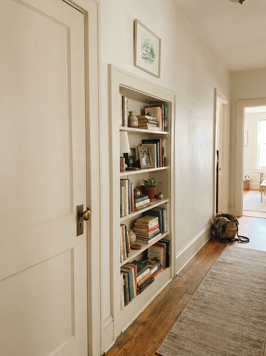
In our last house, I used Pearly White on interior doors and built-ins to soften long corridors. Done in semi-gloss on a two-panel door, it creates a gentle transition into rooms without the jarring chop that a bright optic white causes against cream walls. It feels architectural and historic, especially alongside unlacquered brass knobs and vintage hardwood floors.
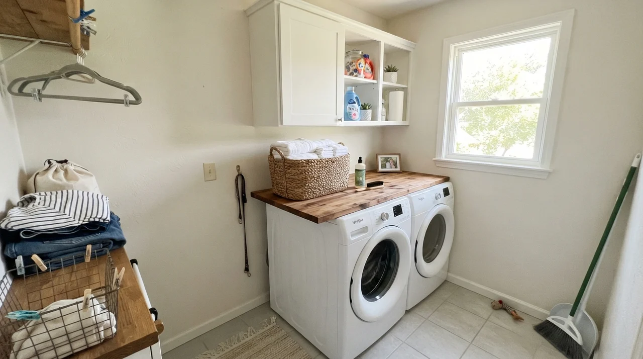
In working areas like the laundry room, where a single window provides good daylight, it keeps the space warm and functional against white appliances and butcher-block counters. It turns a chore space into something pleasant without blinding you under noon sun.
Where Pearly White Completely Falls Apart
The complaints about Pearly White are remarkably consistent, and almost none of them are about the paint by itself. They are about what is sitting next to it. Match one of these three situations and no number of coats will save you.
The absolute number one regret is placing Pearly White on the walls while leaving the ceiling or trim in a bright, optic builder white (like Pure White SW 7005). The brighter white immediately steals the comparison. Against that crisp baseline, Pearly White's yellow undertone is dragged into the open, and the wall reads dingy—like a surface someone smoked near or forgot to wash. If bright trim is staying in your home, walk away from this can.
The second trap is pairing it with cool grays. If your home has cool gray luxury vinyl plank, gray-veined quartz, chrome hardware, or blue-gray bathroom tile, Pearly White will rebel. Those cool tones force the warmth out, making the walls look uncomfortably yellowed rather than soft white.
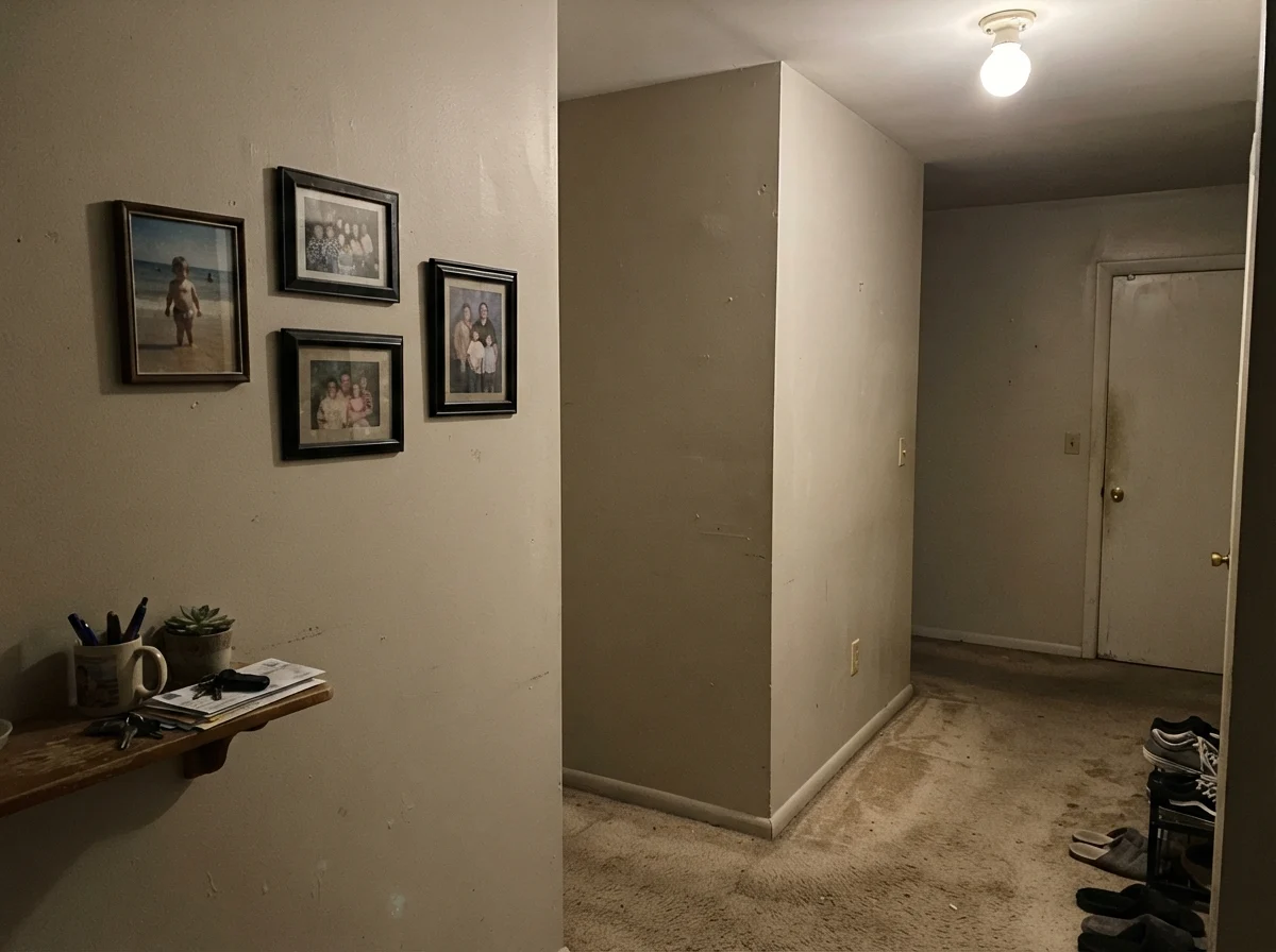
Finally, there are dim, windowless interior corners. In dead light under a single bare ceiling bulb, Pearly White loses its luminosity entirely. Without daylight to bounce, the LRV of 77 cannot save it; it flattens into a muddy, putty-like cast that feels lifeless.
Taking Pearly White Outside
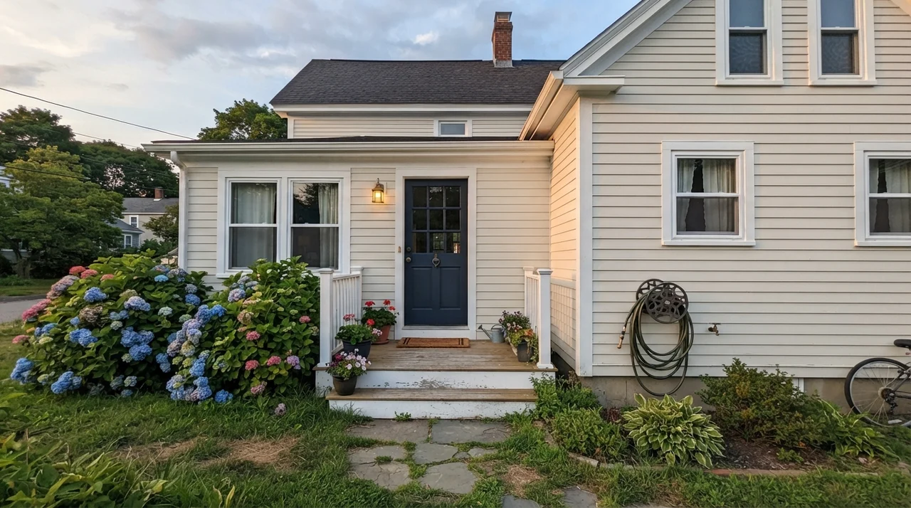
Full outdoor sunshine washes out paint by several degrees, which makes Pearly White a very dependable body siding color on a home exterior. In direct daylight, it reads substantially lighter and cleaner than it ever looks inside a bedroom, shedding much of its overt yellow cast. It settles into an elegant, creamy off-white that pairs handsomely with dark navy front doors or charcoal trim colors like Urbane Bronze SW 7048 or Iron Ore SW 7069. Just remember that it is purely the light body of the house—it cannot serve as a crisp accent white on shutters or trim against another pale color.
Durability: Five Years In
Here is what the swatches won't tell you about living with Pearly White: it is remarkably forgiving of actual household life. Stark whites show every greasy thumbprint near a doorway, every scuff from a dropped laundry basket, and every patch job where someone moved a picture frame. Because Pearly White sits down at LRV 77 and carries real pigment, it hides surface imperfections beautifully.
In eggshell on living room and hallway walls, it has scrubbed clean without leaving obvious shiny burnish spots when cleaned gently. On shaker kitchen cabinets, satin has held up against daily use around the pull handles. That said, I will give you my standard budget view: spending more on top-grade scrubbable enamel for the trim and cabinets is always worth the money. Cheaper paint on doors chips, yellows unevenly, and looked dated within three years in our first home. Buy the better can for high-touch woodwork; the eggshell on your bedroom drywall will survive just fine either way.
What sheens work best for Sherwin-Williams Pearly White?
For walls, stick to eggshell for a soft finish that wipes down cleanly. Use semi-gloss on trim, baseboards, and interior doors. Keep ceilings in flat to avoid light reflection, and use satin on kitchen or bathroom shaker cabinets.
Does Pearly White look yellow on the wall?
In south-facing rooms and warm 2700K lamplight, its yellow undertone comes forward comfortably as a cozy cream. However, it will look distinctly and unpleasantly yellow if you place it next to cool gray flooring, gray quartz, or bright optic-white trim.
Can I use Pearly White with bright white trim?
No. That is the most common mistake with this color. Placing Pearly White against a crisp builder white or Pure White trim makes Pearly White look dingy, like dirty drywall. If your trim is bright white, choose Alabaster or White Dove instead.
Is Pearly White a good choice for whole-house painting?
Yes, but only if you use it everywhere—walls, trim, and ceilings—or pair it with warm natural wood trim and floors. Used as a monochromatic envelope with sheen doing the separating, it creates a serene, seamless flow throughout older or traditional homes.
Susan's Verdict · The Whole-Room Envelope
Pearly White is not a shortcut white you slap on walls while keeping stark builder-white trim and modern gray floors. If you ask it to fight cooler finishes, you will regret it before the second coat dries. But if you wrap an entire room in it—walls in eggshell, trim in semi-gloss, ceiling in flat—over warm oak floors and brass accents, it stops feeling like paint and simply feels like beautiful, comfortable daylight.