Color Diary · No. 79
Benjamin Moore Quiet Moments: Surviving the Shift from Gray to Spa Aqua
The Pinterest spa color, reviewed honestly: where its calm blue-green works, the exact rooms where it flips to turquoise, and what to paint instead.

Susan HartleyOctober 13, 2026 · 13 min read
Quiet Moments · Benjamin Moore 1563
Hex#C7CFC8LRV61Undertonesgreen → gray → blue
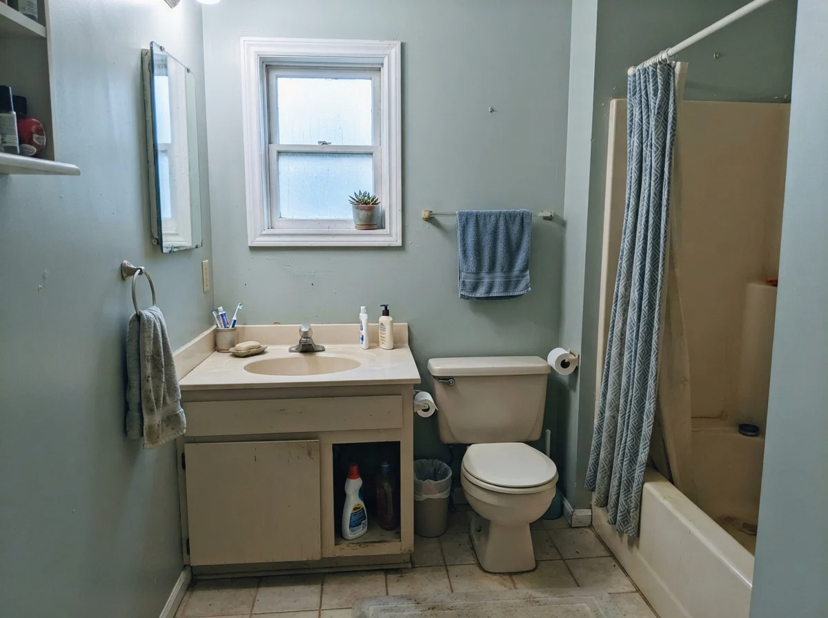
In our last house—a 1990s colonial that seemed to have sixty-four separate beige surfaces—I decided the guest bath needed to feel like a retreat. I bought a can of Benjamin Moore Quiet Moments 1563 because every shelter magazine in the country claimed it was the ultimate whisper of sea smoke and calm. I rolled it on, stepped back, and felt genuinely pleased with myself. It looked like an expensive weekend on the coast.
Then eight o'clock came. I flipped on the ceiling fixture—four cool, bright modern bulbs my husband had picked up on sale—and that soothing, muted gray-green vanished into thin air. In its place stood four walls of electric pool turquoise. I stood there in my socks, staring at what looked like a Miami hotel lobby, wondering how three hours of dried paint had completely traded personalities.
That is the thing nobody tells you on the sample swatch: Quiet Moments does not sit still. At an LRV of 61, it holds enough pigment to give a room real substance without turning dark, but it is an absolute chameleon. Most hours of the day, it carries a soft gray foundation with a cool blue-green breath. But when you alter the light source, the color moves faster than almost any other shade in the Benjamin Moore green deck. Five years in, I learned to love where it works, but you have to understand the rules before you pour the can.
The Shifting Underbelly of Quiet Moments
Quiet Moments sits in Benjamin Moore's green family, but it behaves as an elusive three-part mix: part soft neutral gray, part pale green, part watery blue. How it appears on your walls depends entirely on what your windows face and what bulbs you screw into your sockets.
warm sun
overcast, north light
dusk, rain, cool bulbs
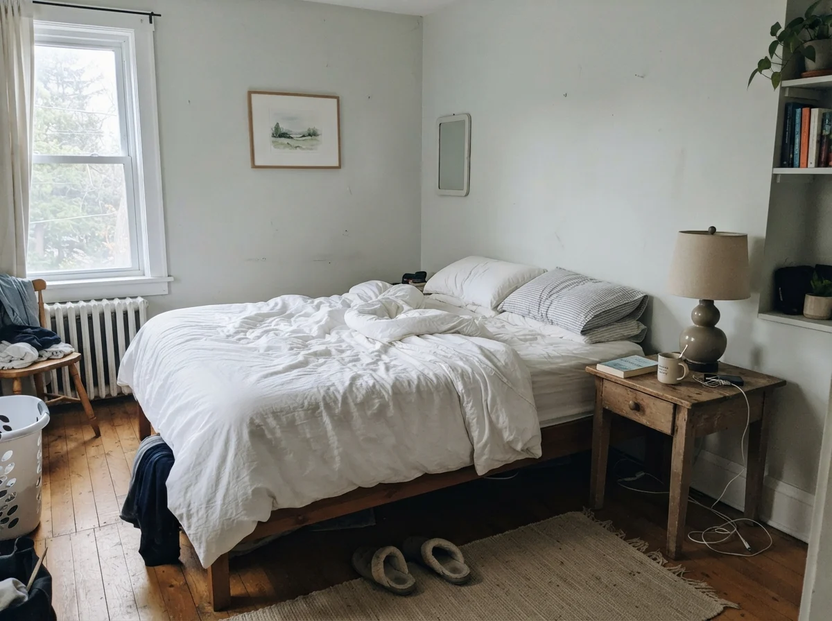
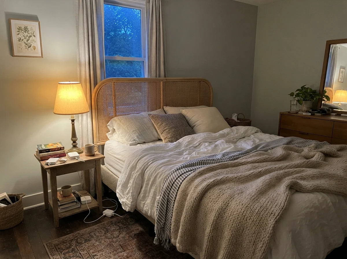
Warm southern exposure brings out the soft green side; overcast skies or northern exposures peel the green away to leave a quiet, flat blue-gray; while evening dusk and cool 4000K LEDs shove it directly into aqua.
RainwashedSherwin-Williams · see diary
Sea SaltSherwin-Williams · see diary
Quiet Moments1563
Silver StrandSherwin-Williams · see diary
Gray CashmereBenjamin Moore · see diary
How the Light Rewrites the Formula
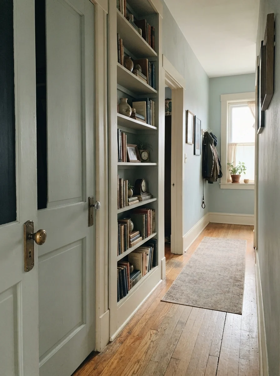
Before you commit to painting a full room, you have to watch this color over a full twelve hours. South-facing daylight softens Quiet Moments beautifully; the warmth of the sun draws out the gentle sage-green notes, making it feel grounded, gentle, and peaceful. It flatters wood finishes, makes linen bedding look effortless, and acts like a genuine neutral.
North light, however, does something entirely different. Indirect, cool northern daylight pulls the green right out of the formula, leaving the bare blue-gray exposed. On a dreary November day, a north-facing room painted in this shade will feel chilly and flat rather than calm. If you have cool recessed LEDs overhead—especially those stark 4000K bulbs builders love—the wall skips gray altogether and jumps straight to bright spa-blue. You have to decide which personality your room gets.
Bedrooms and Bathrooms: Where It Earns Its Keep
If you ask me where Quiet Moments is worth the money, my answer is always the bedroom or the family bath. It has an LRV of 61, which provides enough color weight that your trim pops, but keeps enough light bouncing around that an eight-foot ceiling won't feel like it is descending on your head.
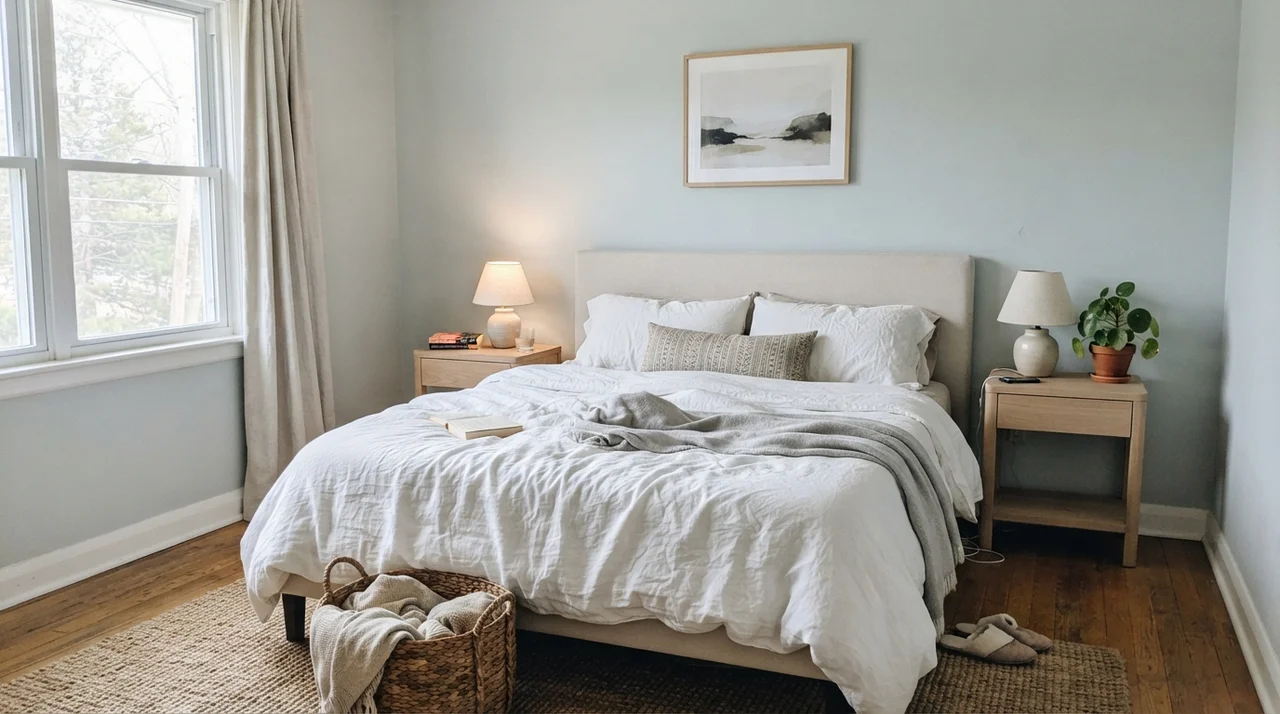
In our current 1960s ranch, I used it in our primary bedroom with white trim and natural oak accents. In soft morning light, it feels restful without announcing itself. That is the highest compliment I can pay a bedroom color: it does not demand attention, and it never looks like you tried too hard to create a decorative theme. It simply lets you sleep.
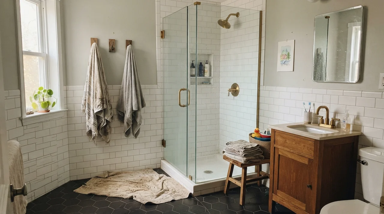
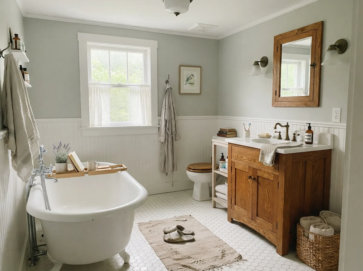
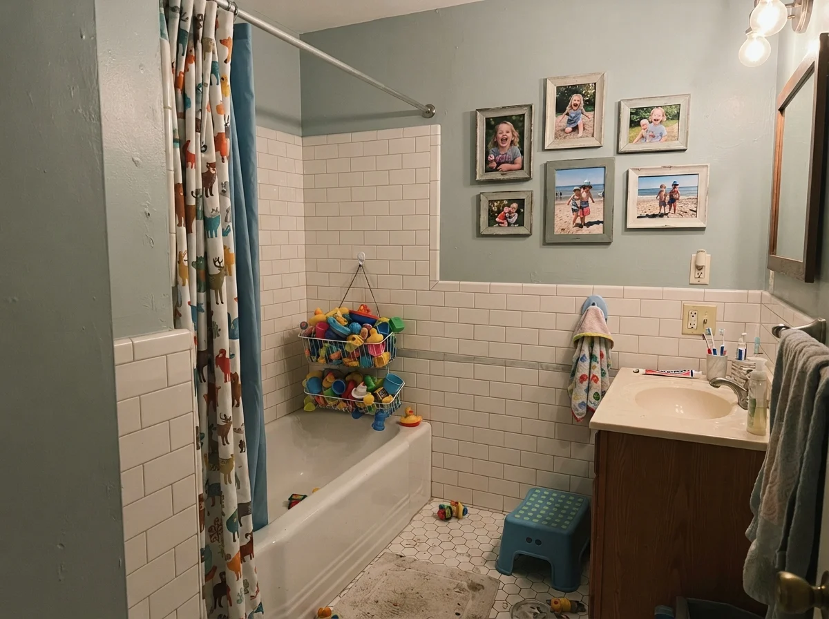
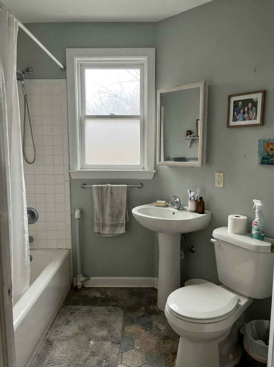
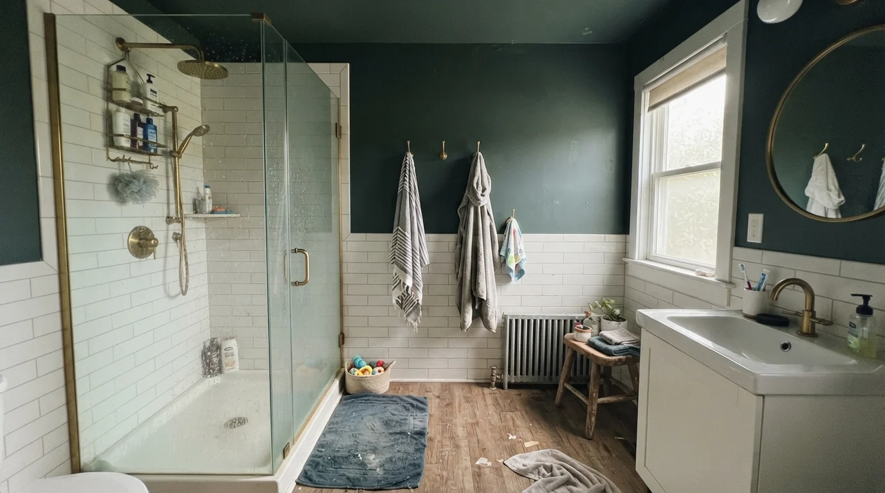
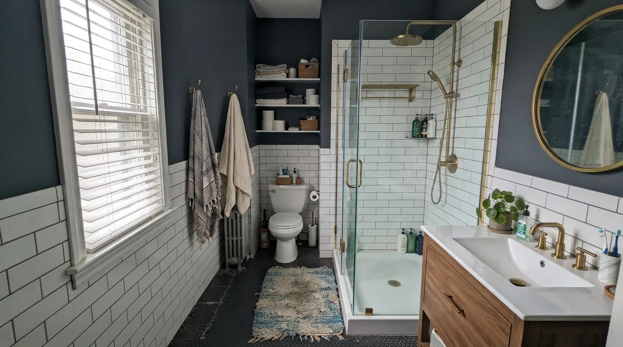
Bathrooms are its other natural home, provided you keep your tile clean and simple. When you run Quiet Moments over classic white wainscoting or subway tile, the contrast anchors the blue-green tint. The caveat here is your vanity lighting. If you put cold, daylight-balanced LED globes beside your mirror, your skin will look pale and the walls will look minty. Put warm 2700K bulbs in your sconces, and the room settles into that exact resort-style calm you were aiming for.
Rooms for Growing Up and Settling In
Because Quiet Moments has low saturation, it plays wonderfully in spaces that need to stay calm despite regular clutter. In nurseries and children's rooms, parents often default to pastel blues or sugary greens that they end up repainting before third grade. Quiet Moments dodges that trap because the gray backbone keeps it adult enough to endure.
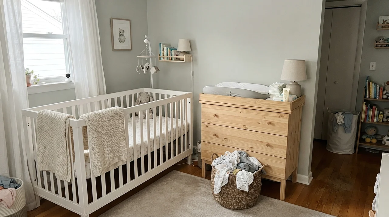
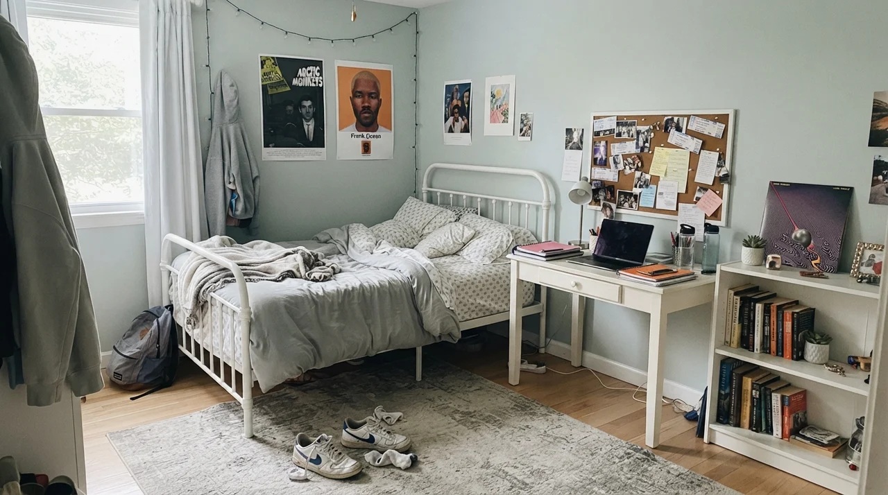
In a nursery with sheer curtains, a natural wood dresser, and a white crib, it reads airy and restful. Take that same paint into a teenager's space with books, corkboards, and metal bedframes, and it simply acts like a quiet, collected gray with a bit of life. It does not feel babyish, and it does not feel dated within five minutes of putting the brushes away.
Cabinets and Woodwork: What Happens on Enamel
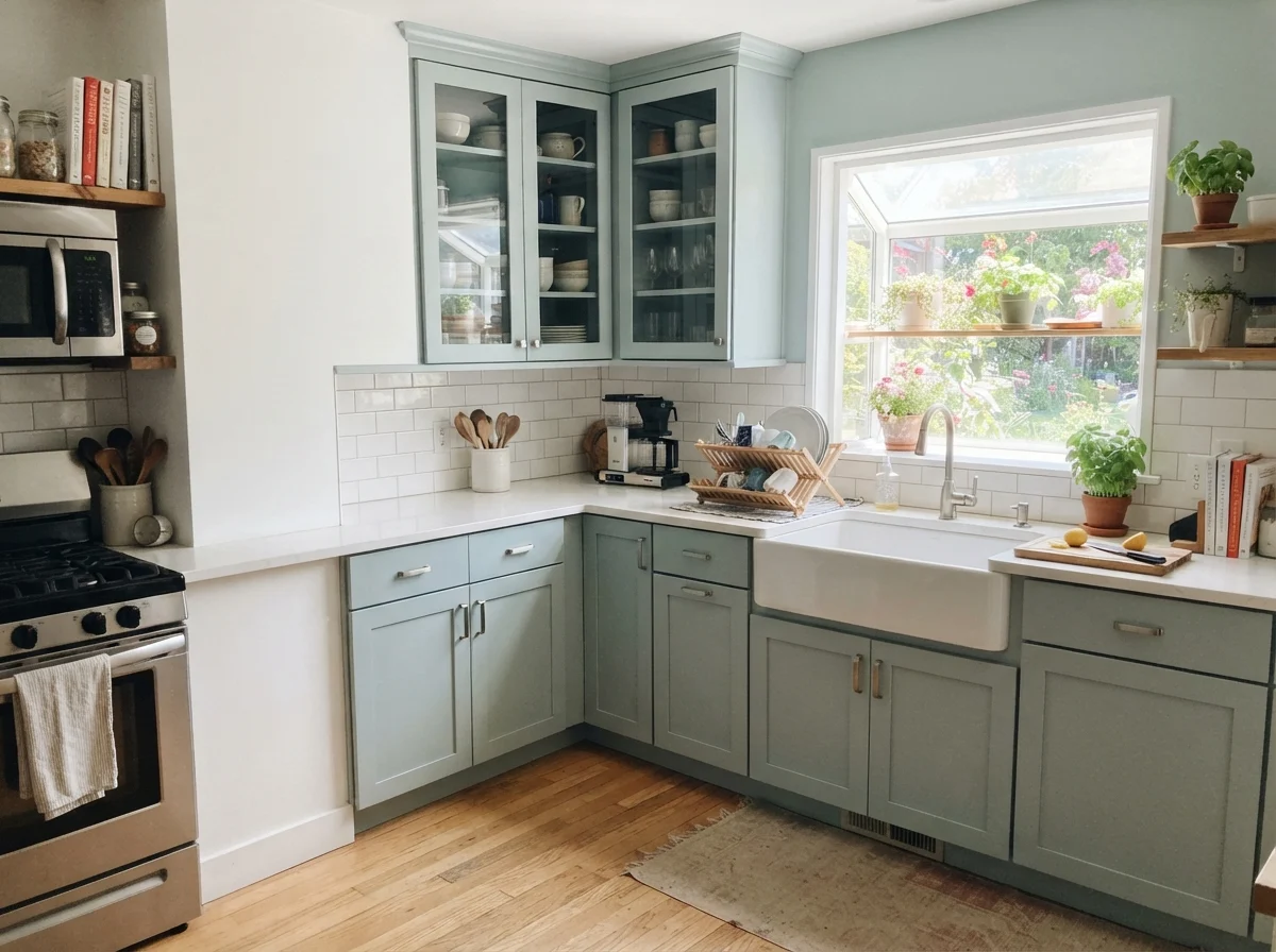
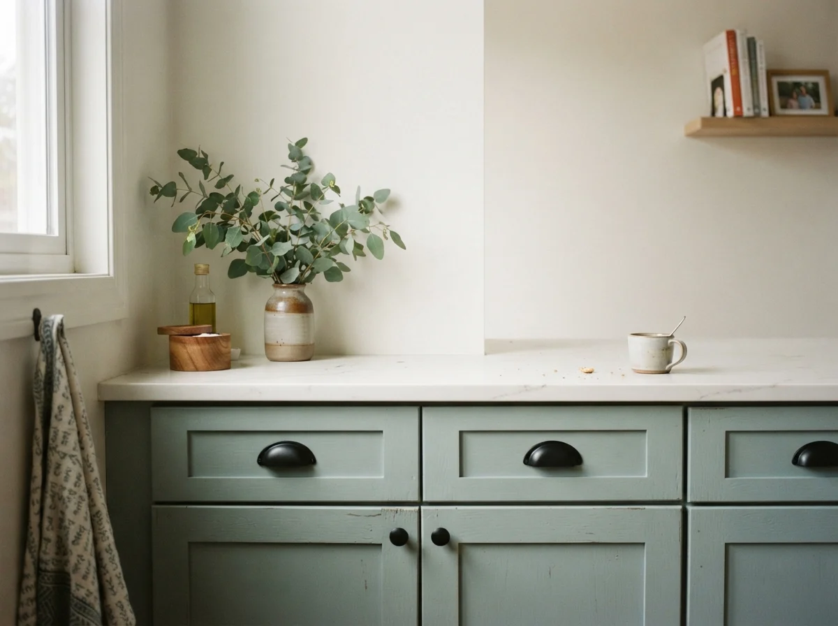
Here is something you discover only when you put paint on millwork: finishes matter just as much as light. On drywall in an eggshell sheen, Quiet Moments looks velvety and dimensional. When you step up to a satin urethane cabinet enamel on kitchen doors, the extra sheen reflects more direct overhead light, which washes some of the color out and makes it read significantly quieter and grayer than it does on an adjoining wall.
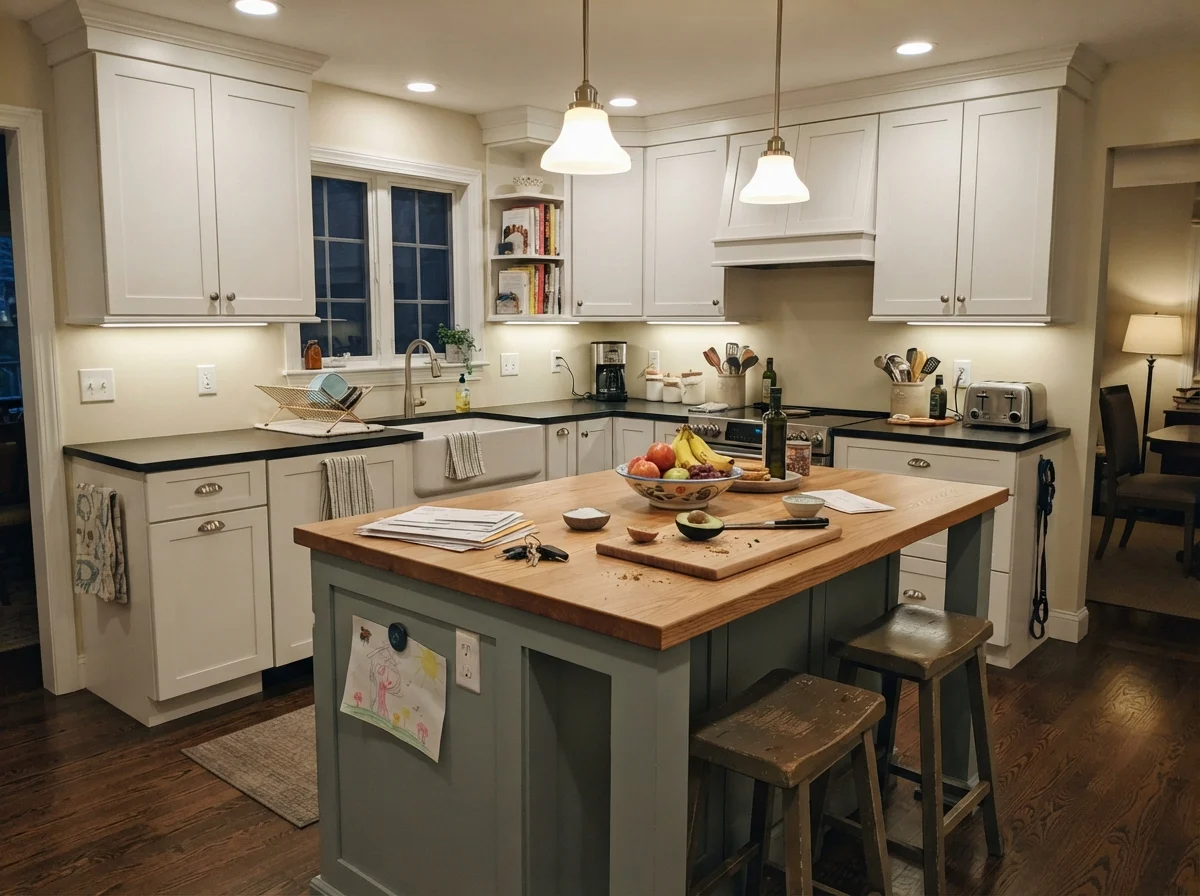
We used this on the lower cabinets in a kitchen refresh years ago, and I loved how it held up to everyday wear. It flatters warm wood accents—butcher block, natural oak floorboards, and brass cabinet pulls make it sing. If you have cool gray quartz and chrome hardware, however, it can feel a little clinical. Give it warm materials to play against, and the gray-green balance stays intact.
Living Rooms, Sunrooms, and Connected Spaces
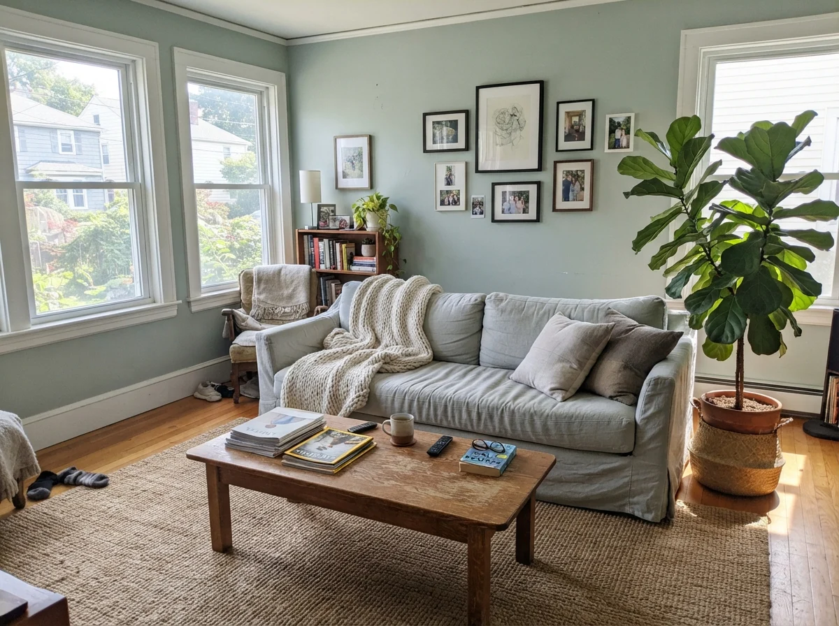
When you take Quiet Moments into large, open living spaces, you need to be realistic about your window layout. In a room that receives generous midday sun through multiple windows, the warmth softens the color and spreads an easy, linen-and-jute simplicity across the space. It looks sophisticated beside large house plants and natural textures.
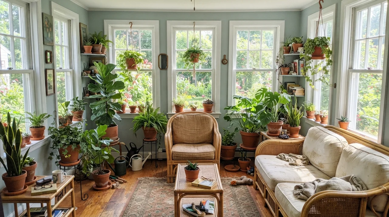
Sunrooms wrapped in glass are another strong match. With light pouring in from three or four sides, the green undertone pushes forward, echoing the lawn and trees outside. But if you have a wide living room lit primarily by a grid of cool recessed ceiling cans, beware: painting an uninterrupted twenty-foot wall in Quiet Moments can quickly turn into twenty feet of unmistakable aqua.
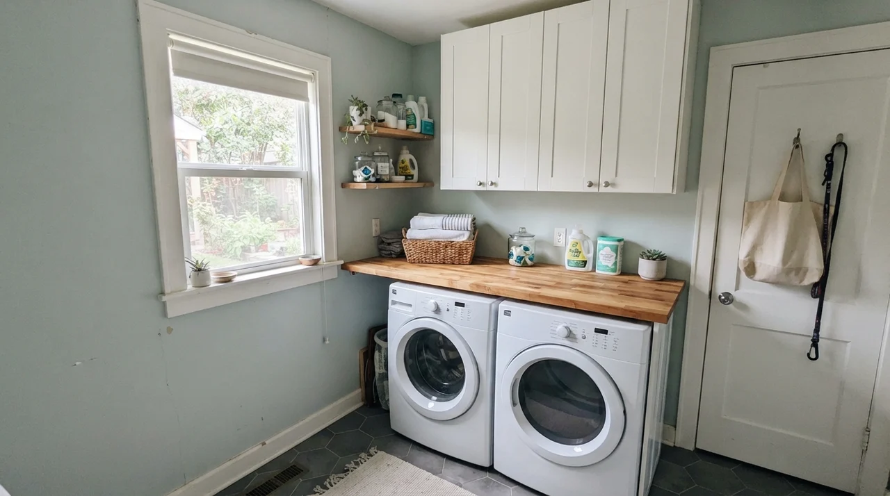
In secondary spaces—like laundry rooms or connecting hallways—Quiet Moments performs well when there is at least one natural light source. It brings life to utilitarian tasks without feeling dark. But when you carry it into a dark passage with no daylight, you meet its limits.
The Honest Fail: Where It Disappoints
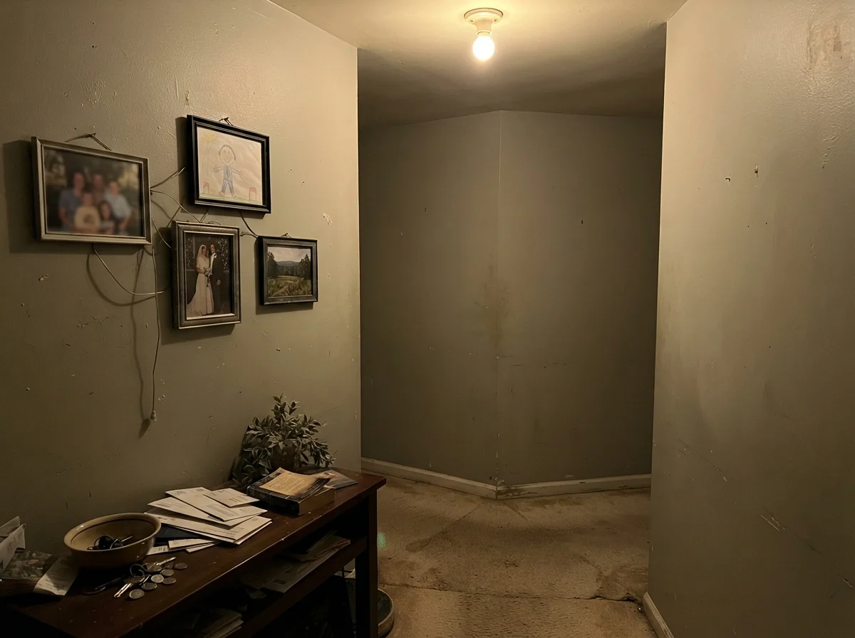
Nearly every reader complaint I have received about Quiet Moments boils down to one situation: someone put it in a dark, windowless interior hallway or a low-light room with a single weak bulb, expecting a breezy coastal oasis. Here is what happens instead: without natural light to pick up the green or blue notes, the color dies. It turns into a flat, muddy putty that looks unwashed and dreary.
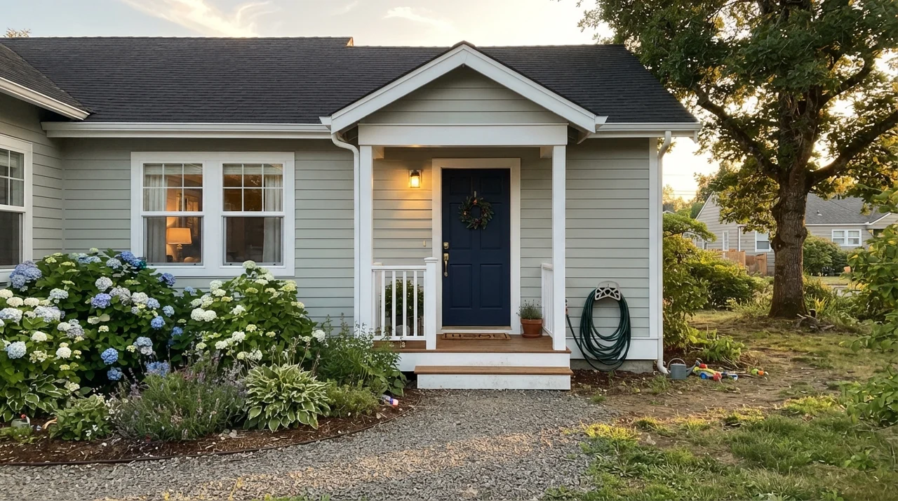
Outdoors, you face the opposite danger. Full, direct sun bleaches the subtle saturation right out of the paint. Put it on whole-house exterior siding, and from the street it simply reads as a dull, washed-out off-gray that lost its color in the wash. If you do use it on horizontal siding, it demands crisp white trim and a contrasting dark door to help the human eye register that there is color on the wall at all.
The paint did not change; your lighting did. When Quiet Moments turns into swimming-pool aqua, swap your bulbs before you blame the can.
Durability, Sheens, and Five Years of Family Life
When you live with a color for years across multiple houses, you stop caring about how it looked the hour the painter rolled his drop cloths. You care about how it cleans up when muddy golden retriever tails slap the wall, or when little hands rub toothpaste across the bathroom door frame.
For walls in bedrooms and living rooms, eggshell is the sweet spot. It gives you enough washability that you can take a damp rag to everyday scuffs without rubbing off the finish. In bathrooms, do not try to sneak by with flat paint—use satin. Between hot showers and steamy mirrors, a satin sheen repels moisture and can be scrubbed clean without leaving water streaks. On kitchen cabinets, invest in a dedicated urethane enamel in satin. It flows out smoothly, resists fingernail scratches near the pulls, and keeps grease from soaking into the wood.
As for resale prep, Quiet Moments is a safe bet for bedrooms and baths because buyers read it as tranquil rather than personal. It does not feel loud, and when we sold our second house, the listing agent pointed out our master bedroom paint as a highlight. Just make sure you change out cold lightbulbs before your open house; nobody writes an offer because they fell in love with fluorescent aqua.
Why does Quiet Moments look bright aqua in my house?
The color is reacting to cool lighting. Recessed LED bulbs in the 4000K to 5000K daylight range immediately push its blue-green undertones toward electric turquoise. Swap your bulbs to warm 2700K or 3000K lights before repainting.
What trim white works best with Quiet Moments?
Benjamin Moore White Dove (OC-17) is the ideal trim match. Its soft creaminess prevents Quiet Moments from feeling chilly. If you want a crisper exterior look, Chantilly Lace works well.
Is Quiet Moments too dark for a small bathroom?
Not at all. With an LRV of 61, it bounces plenty of light to keep small bathrooms feeling open, especially when balanced with white subway tile or light vanity countertops.
Can I use Quiet Moments on exterior siding?
You can, but direct sun washes out its delicate blue-green tint, making siding read like a flat, dusty pale gray. If you use it outside, pair it with crisp white trim and a strong dark door like Wrought Iron.
Susan's Verdict · Buy the Paint, but Check the Bulbs First
Quiet Moments remains one of the best bedroom and bathroom colors in the Benjamin Moore deck, provided you understand its light sensitivity. In gentle daylight with warm 2700K lamps, it gives you that restorative, exhale-at-the-end-of-the-day calm that few paints achieve. Just don't put it in a dark windowless hallway, and keep cold recessed LEDs far away from it. Do that, and you will still be happy looking at it five years down the road.