Color Diary · No. 78
Dover White SW 6385 and the Thirty-Year Trim Defense
The old-house cream that half of America has on its trim, reviewed honestly: where it still looks right, and the exact rooms where people end up calling it yellow.

Susan HartleyOctober 13, 2026 · 11 min read
Dover White · Sherwin-Williams SW 6385
Hex#F0EADCLRV83Undertonescream → warm gold → light tan
In our last house, an honest 1990s colonial with wide baseboards and honey oak floors, the trim in the front center hall was painted Sherwin-Williams Dover White SW 6385 before we bought it. We lived with it through two graduations, three dog adoptions, and a whole sequence of repaints in the adjoining rooms. I never touched those baseboards. They were scrubbed clean more times than I care to tally, and when we sold, the buyers made a specific note of how cozy and established the woodwork felt.
That is the thing about Dover White. It sits at an LRV of 83 with a soft hex of #F0EADC, ranking at global rank 33 for very practical reasons. It is not an airy, crisp off-white that pretends to be neutral. Dover White is a real cream, not a warm-ish white, and that is the whole story. In an older house with stained wood, oak floors, and cool north light, it looks settled and correct in a way no crisp white manages. But put it next to a bright white bathtub, white appliances, or cool gray flooring, and that very same paint reads yellow. That contrast is where almost every single regret post comes from. You either buy it on purpose, or you do not buy it at all.
The Undertone Story: Cream That Leans Yellow When Provoked
Dover White carries an undeniable golden cream underbelly that shifts distinctly depending on the light hitting the surface. Cool, flat daylight pulls it back toward a soft, traditional off-white, while harsh late afternoon sun or warm household incandescent lighting coaxes out saturated gold and light tan tones.
warm sun
overcast, north light
dusk, rain, cool bulbs
cream → warm gold → light tan
CreamySherwin-Williams · see diary
Mourning DoveBehr · see diary
Dover WhiteSW 6385
Coastal BeigeBehr · see diary
Ball of StringDunn-Edwards · see diary
Light Shifts Across the Day
Before putting Dover White on your walls, you have to watch what your room's light does from breakfast to evening tea. Cool, flat daylight cancels the gold and leaves a soft, comfortable off-white. That makes north-facing rooms its absolute best environment. But in south- or west-facing spaces, strong warm sun brings the saturation forward; by late afternoon it can read light tan. Come dusk, your interior bulbs decide everything: 2700K lamps push it right into rich cream and cozy territory, while 3500K bulbs hold it nicely neutral. If you ever feel it is turning too yellow at night, swap bulbs, not paint.
Living Rooms and Sunlit Corners
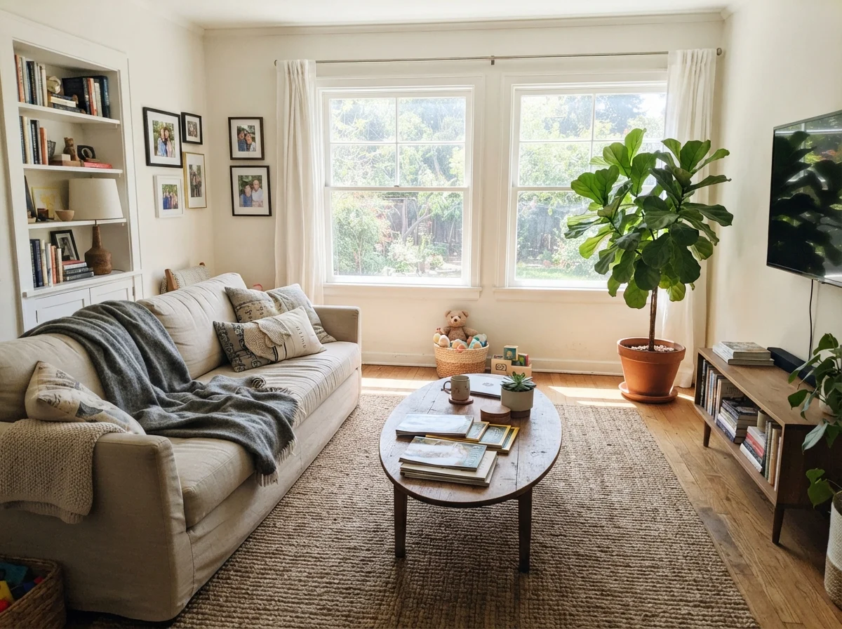
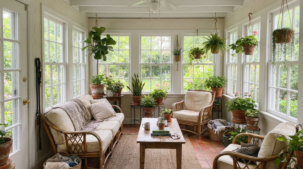
Five years in a living room will reveal every strength and weakness a paint can hold. Because Dover White sits at an 83 LRV, it bounces generous amounts of light around traditional living areas, pairing seamlessly with natural textures like jute rugs, rumpled linen upholstery, wood tables, and aged brass fixtures. In a sunroom loaded with rattan furniture and potted plants, garden daylight allows the creaminess to ground the space without feeling stark or sterile.
The Kitchen Equation: Cabinets and Trim
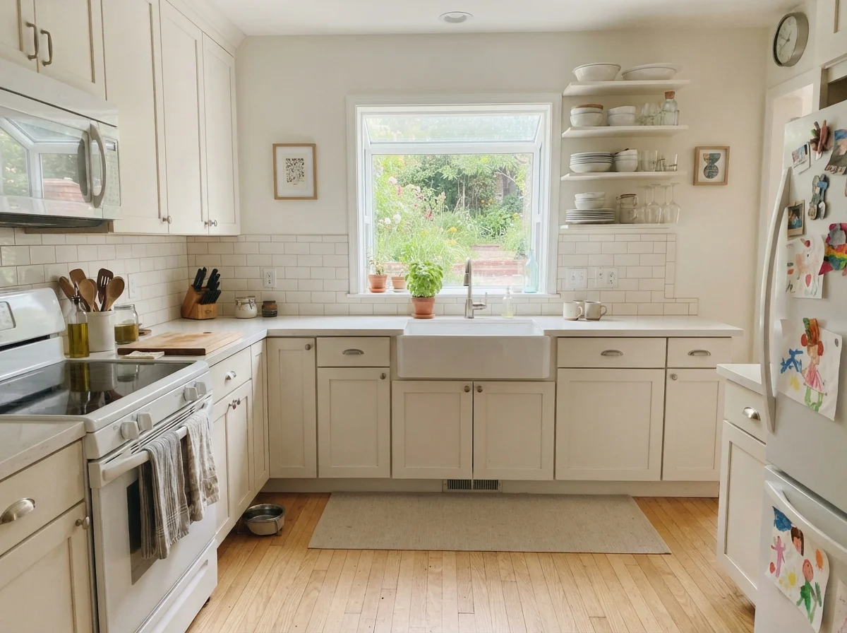
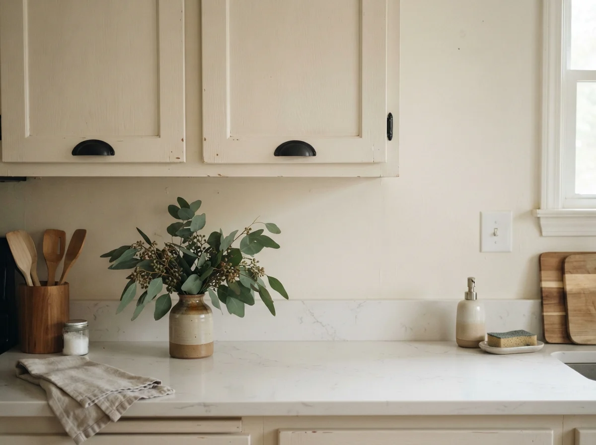
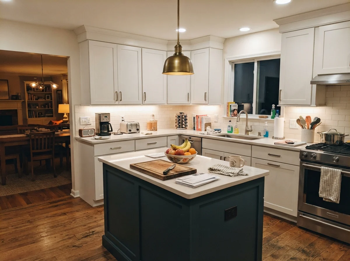
On kitchen cabinets, Dover White is either an absolute triumph or an expensive regret—there is no middle ground. On inset and shaker doors in an older kitchen, it reads settled and charming rather than freshly installed from a big-box showroom. Moreover, it forgives daily scuffs, stray sauce splashes, and greasy fingerprints far better than stark factory whites ever will. Yet kitchen downlights remain the primary trap: warm cans firing straight down onto cabinet doors over honey oak flooring will instantly magnify the gold undertones.
Dover White is a real cream, not a warm-ish white, and that is the whole story. Buy it on purpose, or do not buy it.
Bedrooms, Nurseries, and Growing Kids
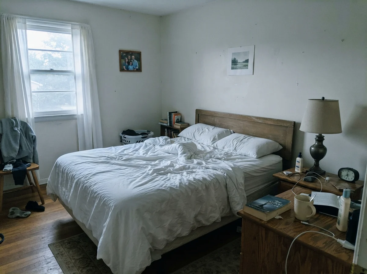
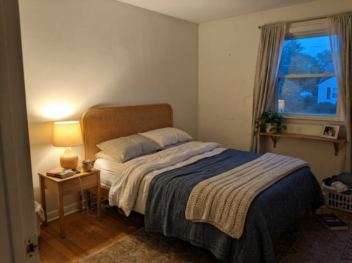
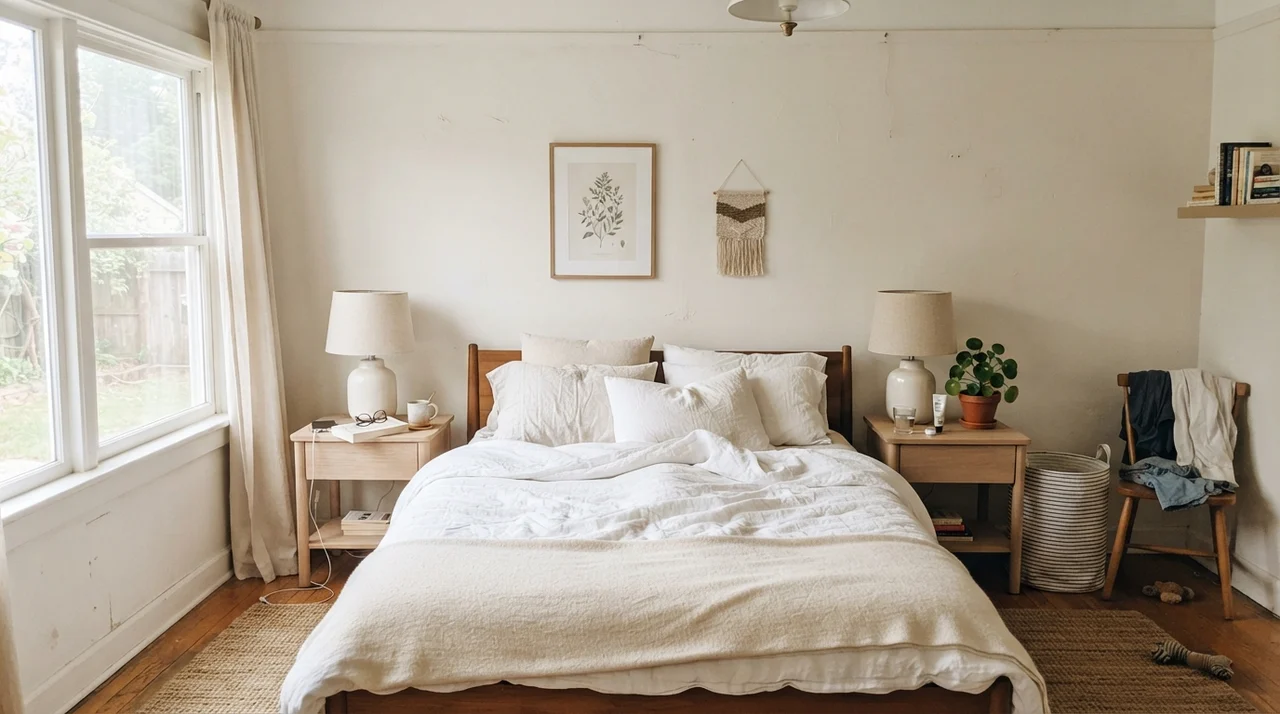
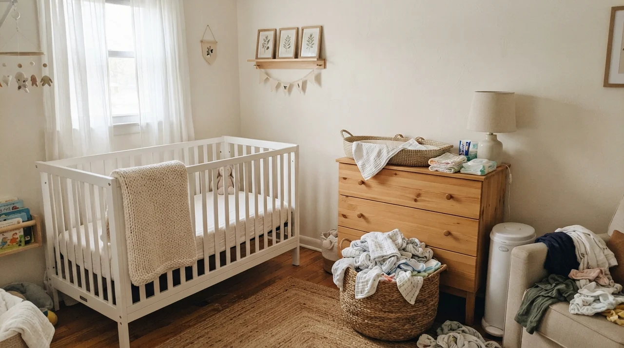
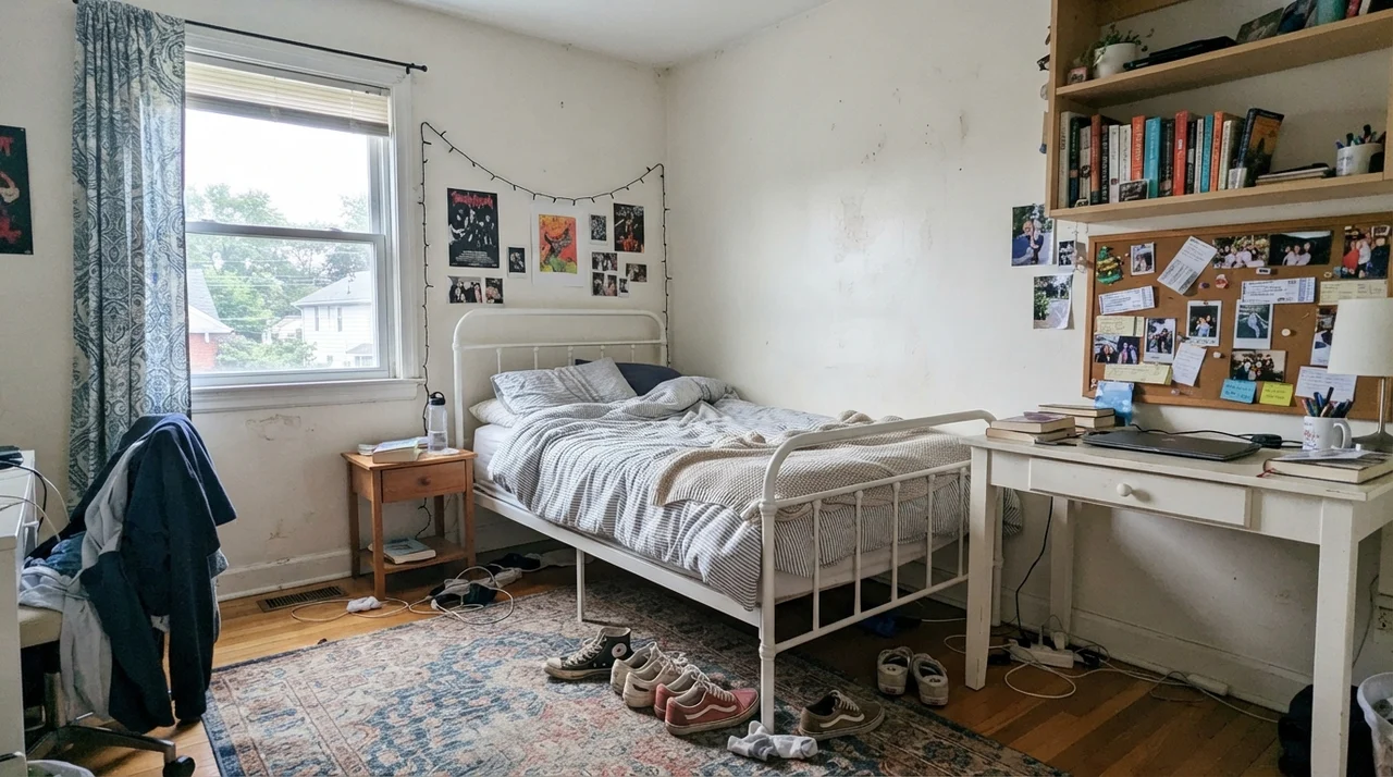
In bedrooms, Dover White behaves generously when paired with soft linens, pale oak nightstands, and ceramic table lamps. For a nursery, its warmth offers an inherently gentle backdrop beside a white crib and light-wood changing dressers. Even in a teenager's room, framed by simple white metal beds and open book shelving, Dover White gives a quiet, collected backdrop that handles everyday life without complaining.
Bathrooms: Where Dover White Usually Fails
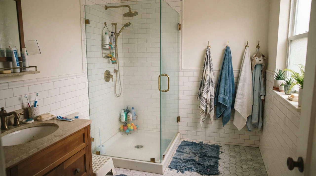
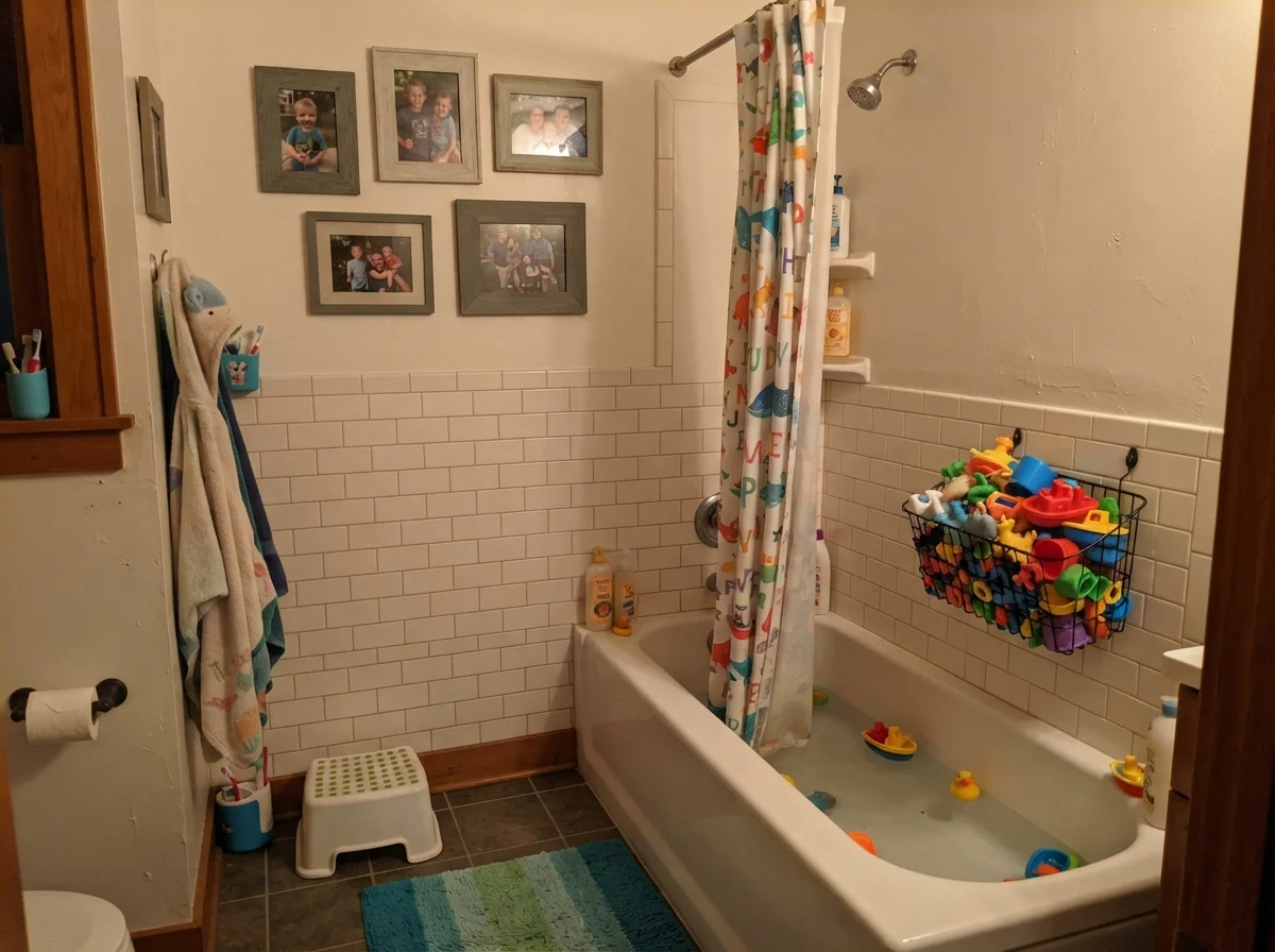
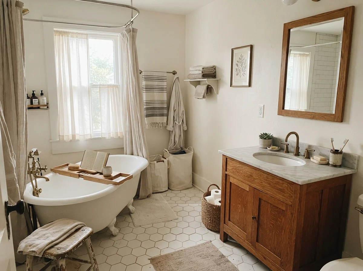
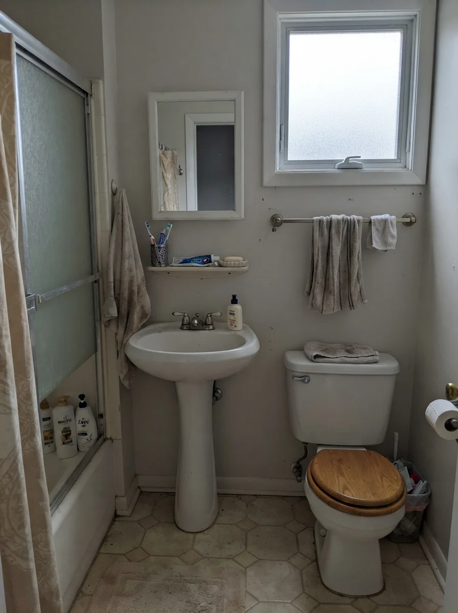
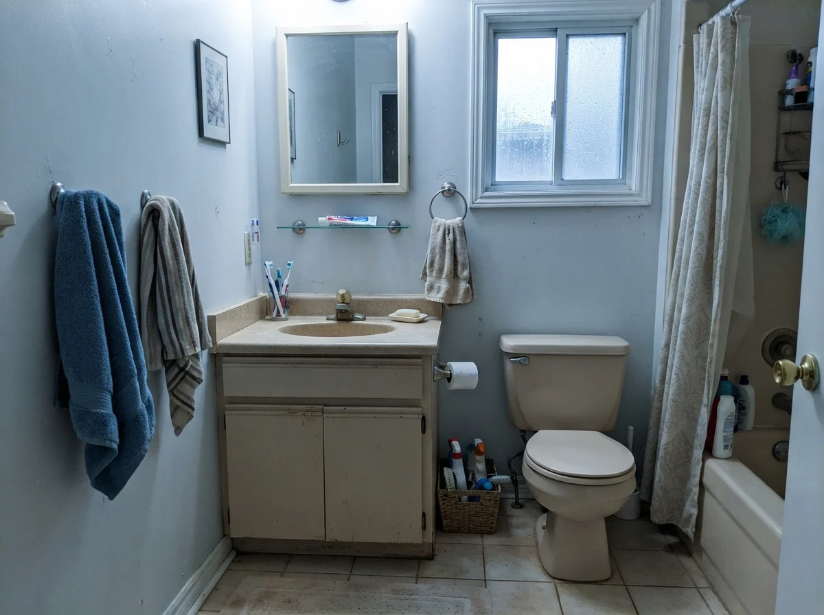
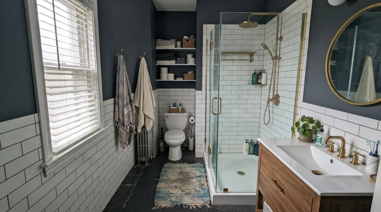
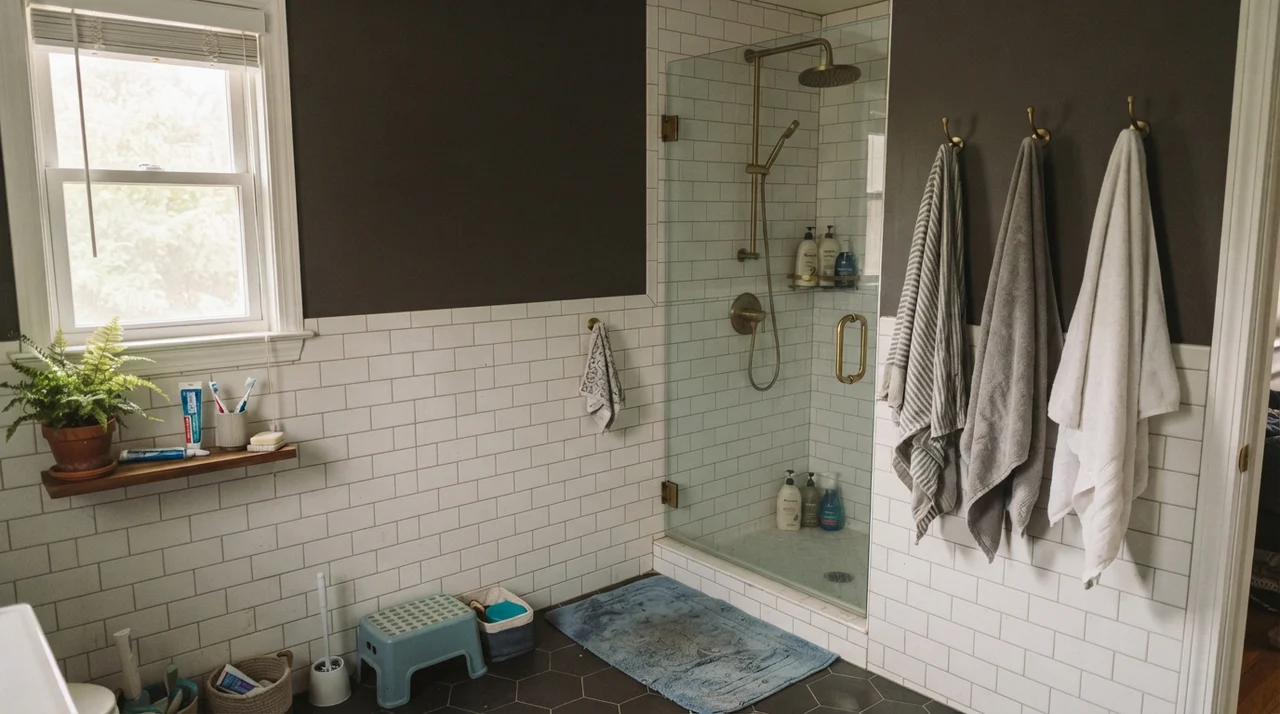
Almost every bathroom houses a bright white porcelain tub, a white toilet, or crisp white subway tile. Because those fixtures carry near-neutral, cool factory whites, placing Dover White on the walls or surrounding trim immediately makes the paint look dingy or yellow by comparison. It only holds its ground when there is warm wood, like an oak vanity, or vintage elements like aged brass to bridge the contrast gap.
Utility Spaces, Millwork, and the Windowless Trap
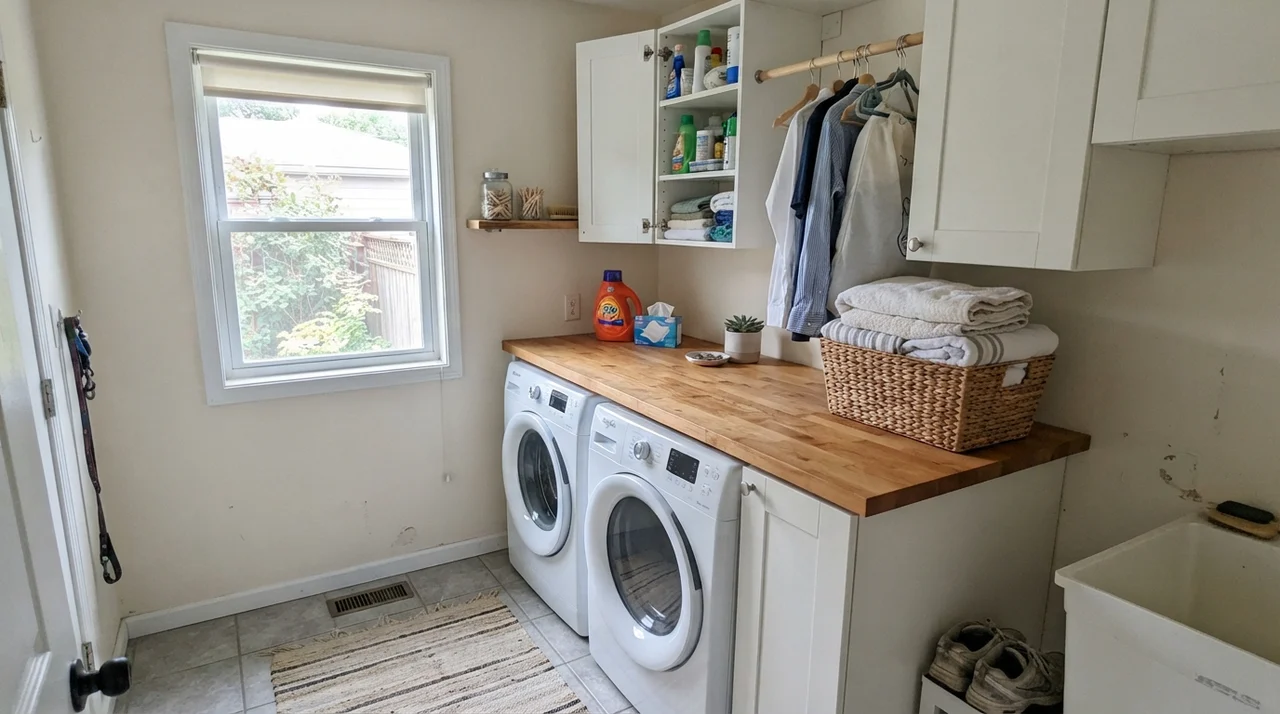
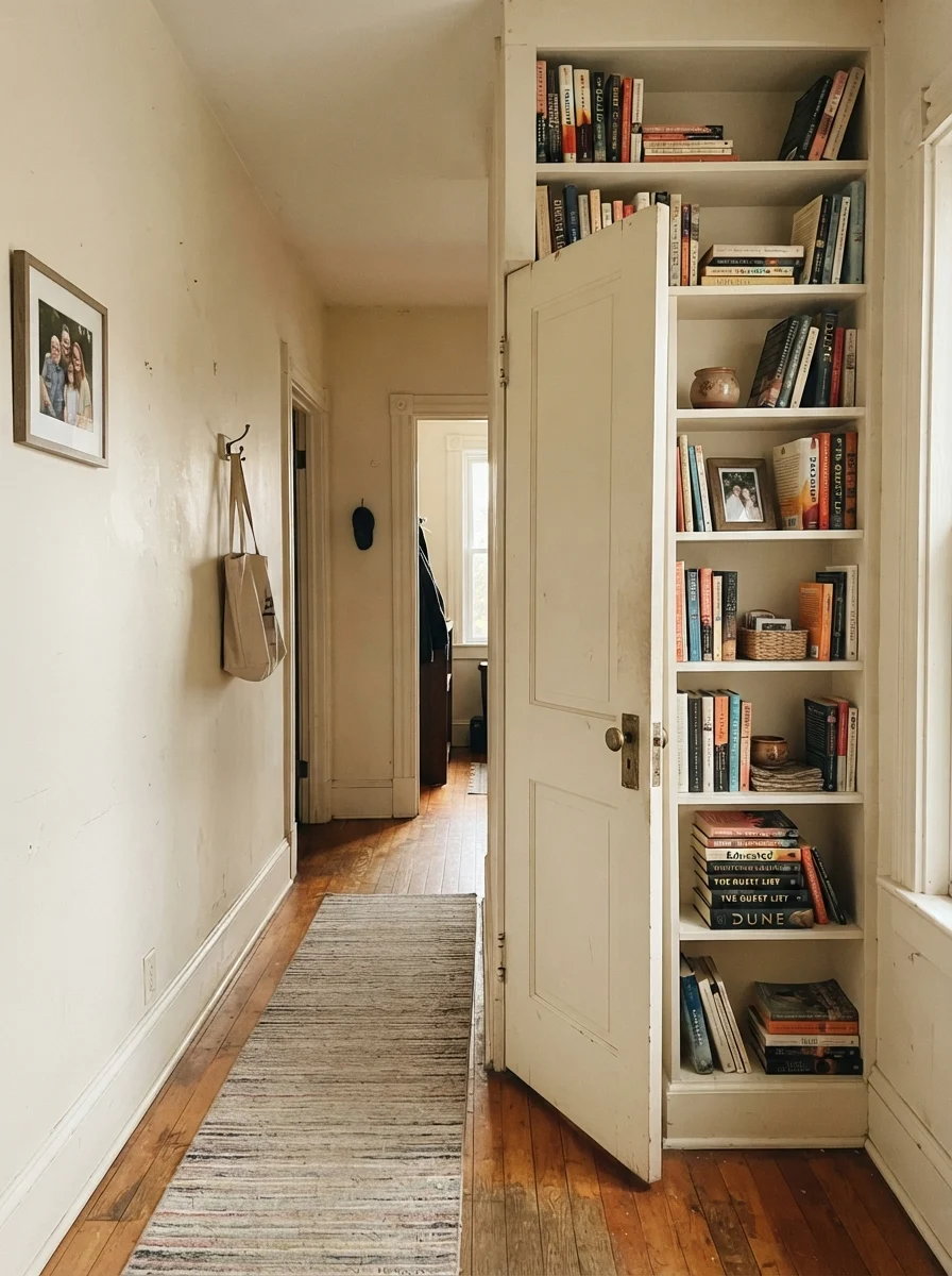
In functional utility rooms and hardworking hallways, Dover White shines beside rich stained doors, traditional millwork, and warm butcher block. But take away windows entirely, drop in a lone generic bulb, and that cozy warmth instantly degrades into something flat and putty-colored.
Exterior Siding and Natural Materials
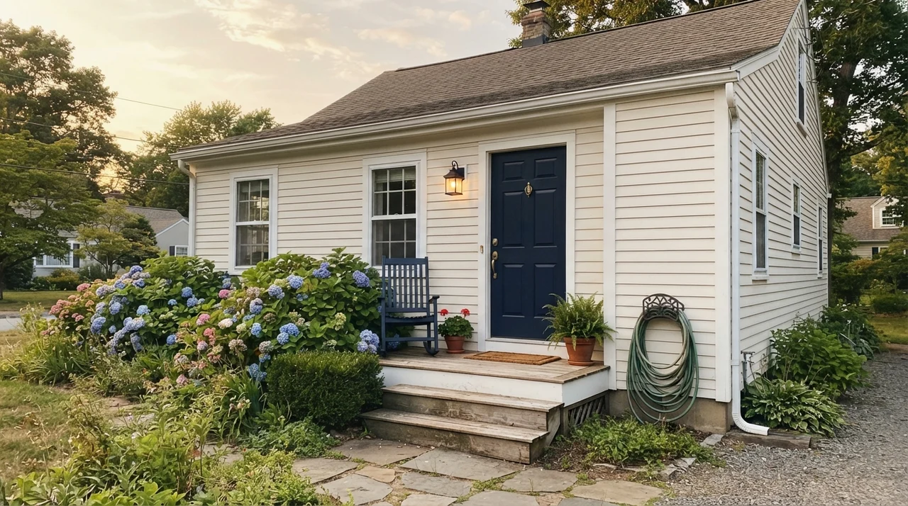
Exterior application is an area where Dover White consistently proves its worth. In full outdoor sunlight, the color reads noticeably brighter, shedding the heavy yellow cast while harmonizing naturally with stone, brick, and cedar shingles. A house painted in Dover White will not look dated within a few seasons because it delivers a timeless, established warmth that sharp contemporary whites completely lack.
Durability, Scrubbing, and Living With It Five Years In
Here is the practical side that no showroom display mentions: Dover White held up better to real-life family wear than almost any bright white I have owned. Crisp whites reveal every stray scuff, gray pencil mark, and dog smudge within twenty minutes of the painter packing up their van. Dover White’s warm base hides minor day-to-day contact beautifully. When you do have to take a damp microfiber rag to the door jambs, it scrubs clean without leaving noticeable dull burnish patches. For the finishes, keep walls in eggshell, trim in semi-gloss, cabinets in satin, and ceilings flat. That separation makes the investment well worth the money over five or ten years of active living.
Why does Dover White look yellow in my room?
Dover White is a true cream containing yellow-gold undertones. If you pair it with bright white bathtubs, pure white tile, or cool gray floors, that contrast immediately drags the yellow forward.
What light bulbs work best with Dover White?
Bulbs rated at 3500K keep Dover White balanced and relatively neutral. Warm 2700K bulbs push it toward a cozy, rich cream, but warm overhead kitchen cans combined with oak floors can make it read overly gold.
Can I use Dover White on both walls and trim?
Yes. Using eggshell on the walls and semi-gloss on the trim is one of the smartest ways to use Dover White, as it prevents harsh contrasting whites from making your trim look dirty.
Is Dover White worth the money for older homes?
Absolutely. It is worth the money because it looks settled and historically appropriate alongside stained oak doors, antique brass, and traditional woodwork that make colder whites look out of place.
Susan's Verdict · Keep It Traditional and Keep It Intentional
If I were repainting the trim in an older home with oak hardwoods, stained interior doors, and rooms that get cool north light, I would buy Dover White SW 6385 in semi-gloss without hesitation. It delivers warmth and character that crisp modern whites cannot replicate, and it hides family wear for years. But if your home is filled with bright white subway tile, modern white bathroom fixtures, or cool gray flooring, step away from the can. Dover White is an unapologetic cream—use it where that history belongs, and it will never let you down.