Color Diary · No. 77
Before You Paint the Island Cyberspace, Look at the Light
The dark blue-gray everyone puts on islands and office walls, reviewed honestly: where it holds its blue, where it just turns black, and what to pick instead.

Susan HartleyOctober 11, 2026 · 17 min read
Cyberspace · Sherwin-Williams SW 7076
Hex#44484DLRV6Undertonescharcoal → navy → near-black
In our last house, a 1990s center-hall colonial with drywall that had settled into uneven ridges, I spent three weeks staring at sample boards propped against our study baseboards. My husband thought I had lost my mind. I wanted a dark room—a cocoon where you could close the French doors, turn on a brass desk lamp, and pretend the laundry pile downstairs did not exist. But true black felt like a commercial sound booth, and the standard department-store navies were shouting at the top of their lungs. A friend recommended Sherwin-Williams Cyberspace (SW 7076), calling it the grown-up dark everyone was turning to.
We bought two gallons in eggshell for the walls and a quart of satin for the built-ins. We rolled the first wall on a Saturday morning, and by three in the afternoon, I realized what Cyberspace actually is: it is a deep charcoal holding a quiet blue by the collar. If you give it direct sunlight, that blue slips out and looks remarkably sophisticated. But if you starve it of daylight, the charcoal tightens its grip, and you are left sitting in near-black. That dual personality is either the exact reason you buy it or the very reason you will regret the purchase before the second coat dries.
When people look at an LRV 6 swatch under the fluorescent strips of a paint counter, they assume a dark paint simply behaves like a shadow. Light Reflectance Value measures how much visible light a color bounces back into the room, on a scale where zero is absolute black and one hundred is pure white. At an LRV of 6, Cyberspace absorbs ninety-four percent of the light hitting its surface. That means the wall has almost no horsepower to project its own pigment back across the room. If the daylight coming through your window does not actively tease out the blue, your eye simply registers an inky charcoal.
We lived with it in that colonial study for six full years, and I watched it cycle through every season of northern light, summer heat, and winter gloom. It never looked cheap, and it certainly never looked childish. But it also never pretended to be an easy, forgiving neutral. You have to understand its undertones before you commit to rolling four walls of it.
Light Shifts Across the Day
The single biggest mistake homeowners make with this color is judging it at 11:00 AM on a sunny Saturday and forgetting about 8:00 PM on a Tuesday in November. In direct, warm morning daylight or high southern sun, Cyberspace leans comfortably into a softened slate-charcoal. The yellow in warm sunshine cancels out just enough of the cool undertone to prevent the wall from turning icy. Cool north light, on the other hand, pulls the blue straight to the surface. On an overcast morning, an office painted in Cyberspace feels crisp, tailored, and unmistakably navy-cast.
Once the sun sets, artificial lighting takes full control of the room. Under 2700K incandescent or warm LED bulbs, the blue settles down entirely, leaving you with a velvety, cozy near-black that wraps around the furniture. But screw in a 4000K bulb—the kind contractors love because they illuminate drywall defects—and Cyberspace instantly turns clinical, cold, and jarringly industrial. If you are going to use this shade, your lighting scheme needs to be sorted before the tape comes off the baseboards.
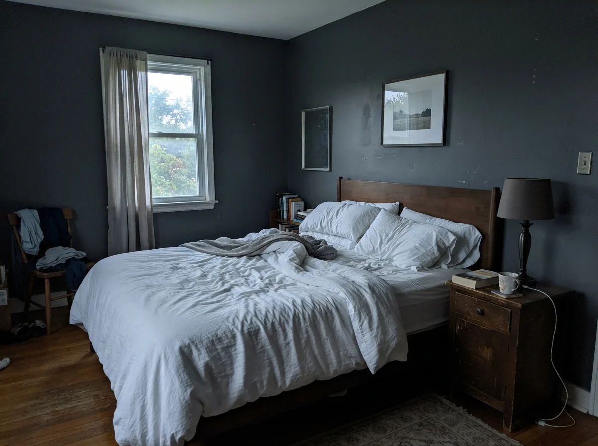
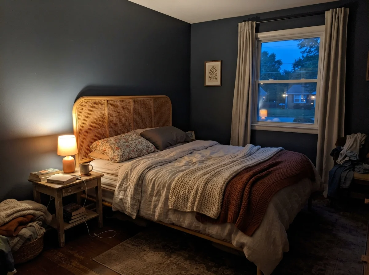
In the pair above, you see exactly what happens when natural morning cool meets artificial evening warmth. At daybreak with no lamps switched on, the wall can look subdued and slate-toned, losing its richness until the daylight gathers strength. Flip on a single warm bedside lamp at dusk, and that same wall suddenly has weight, intimacy, and enclosure. Five years in to living with colors this deep, I can tell you that the lamp on your nightstand matters just as much as the formula on the can.
Bathrooms and Powder Rooms: The Enclosure Strategy
People are terrified of dark bathrooms. For thirty years, the prevailing real estate wisdom has told homeowners to paint small bathrooms off-white to make them feel larger. That advice works if you have an eight-foot window overlooking an orchard; in an ordinary center-hall powder room or a dated family bath, white paint simply makes the drywall feel institutional and highlights every ding in the baseboard.
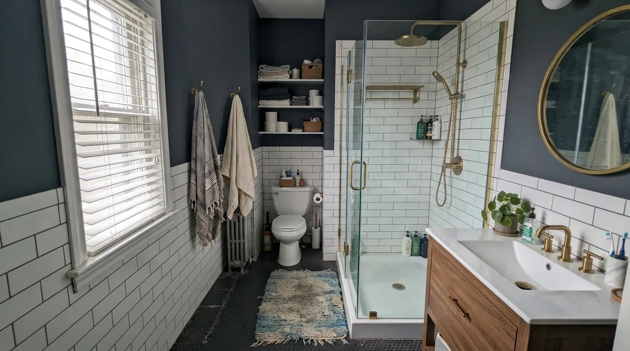
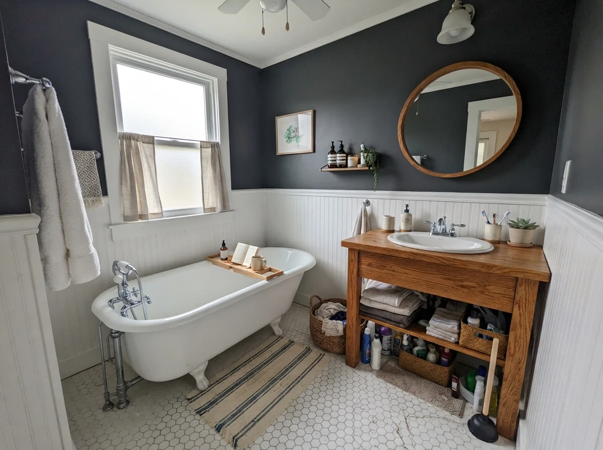
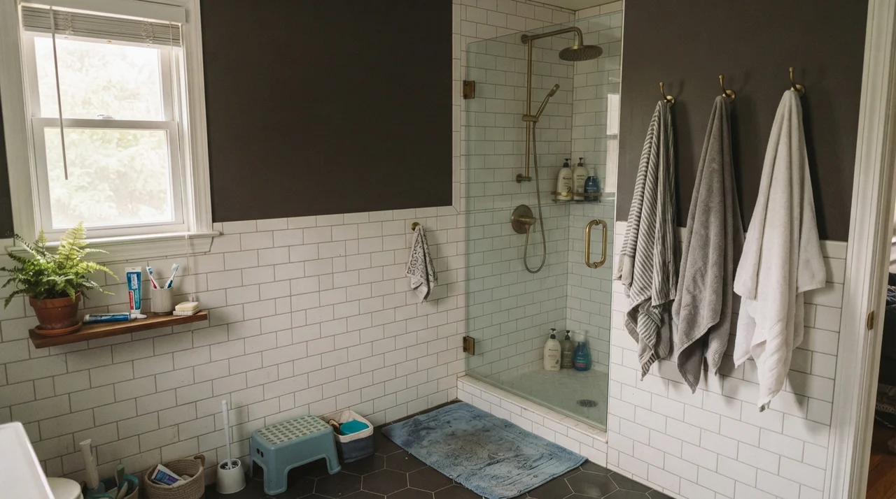
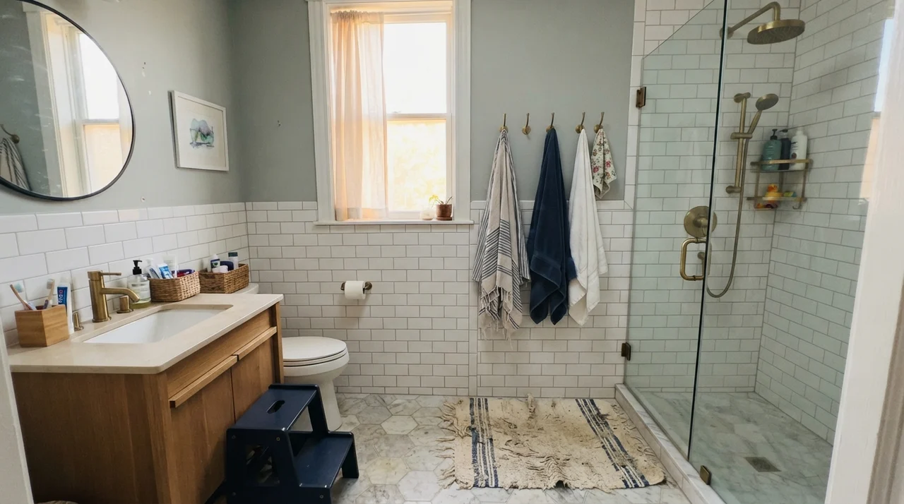
Where Cyberspace excels is in treating a small bathroom as a deliberate jewel box. By running it up the walls above clean white subway tile wainscot, you create a grounding contrast that makes porcelain fixtures look brilliant and brass hardware look intentional. The white tile bounces the ambient light up toward your face, while the dark paint above holds the ceiling down, giving the room an immediate sense of architecture.
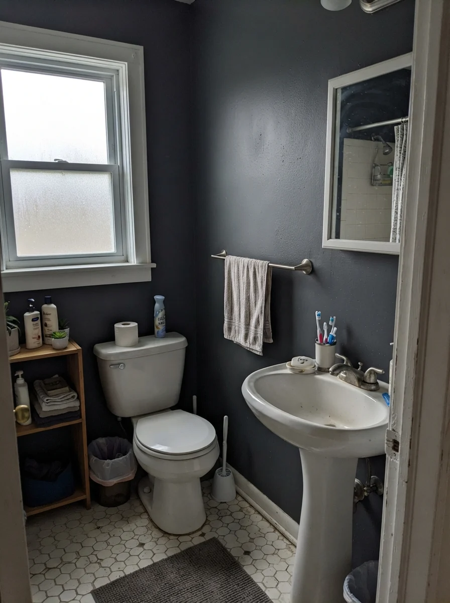
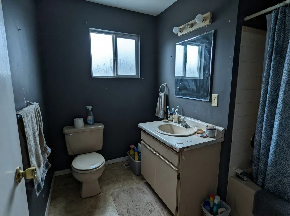
Notice the middle photograph in that trio. When you set Cyberspace against an older beige countertop or cream fixtures, the blue in the paint wakes up and starts picking a fight with the yellow in the beige. It makes the vanity look dingy and tired, not antique. If your bathroom has clean white subway tile or white hex tile, Cyberspace is sharp. But if you are working with almond fiberglass or 1980s biscuit porcelain, do not use this paint. You will end up blaming the paint for a conflict that started at the plumbing supply counter.
In a high-traffic family bathroom, you also need to think about moisture marks and condensation trails. On dark walls, water drips leave faint mineral sheen lines if you use a flat finish. For any bathroom, eggshell on the drywall is the minimum sheen you should consider, and if you have teenagers who take twenty-minute steam baths, make sure the exhaust fan actually moves air before you open the paint can.
Kitchen Islands and Cabinets: The Low-Risk Anchor
If you walk through any neighborhood open house built or remodeled in the last five years, you will spot Cyberspace on a kitchen island. There is a reason it took over that specific surface: navy islands were everywhere in 2016, and many of them looked dated within forty-eight months because the blues were too bright and too royal. They looked like sports jerseys. Cyberspace fixed that problem by drowning the navy in twenty percent more graphite gray.
On lower cabinets or a central island, satin is the sheen to buy. It gives you the necessary scrubbability without turning the cabinet fronts into shiny mirrors. When we painted the perimeter of our kitchen in our last house, we kept the uppers white and anchored the base with a deep tone. It held up through years of dropped wooden spoons, dog tails, and grocery bags brushing the drawer edges.
A word of caution about cabinet doors: dark satin shows finger oil along the top pulls. In our kitchen, I scrubbed clean the drawer fronts under the sink once a week with a warm microfiber cloth. If your household includes small children with buttered toast in their hands, you will see every print. It wipes off easily enough, but if you expect a dark cabinet to magically conceal daily kitchen grime, you have the wrong color. Dark hides stains, but it highlights dust and grease smudges.
Living Spaces and Sunrooms: Managing the Glare
Can you paint an entire main living room in Cyberspace? Yes, but only under two very specific conditions: either you have massive windows flooding the space with balanced light, or you genuinely want the room to feel like an evening cocktail lounge where daylight reading is beside the point.
When strong midday sun hits a Cyberspace wall, the light warms the pigment and lets the gray-navy breathe. You see the subtle complexity that Sherwin-Williams mixed into the formula. The room feels expansive and architectural, especially when paired with natural materials like jute, pale oak, and linen. But in a sunroom with continuous glass on three sides, you have to be careful with glare. Paint the narrow wall dividers in satin, and you will get reflective hot spots; keep it to flat or eggshell so the color recedes between the glass panes.
Bedrooms and Quiet Quarters
In bedrooms, Cyberspace is unapologetically cozy. It works best behind a bed where your head rests against crisp white linens or warm wood headboards. When we sold our colonial, the buyer told our listing agent that the dark master bedroom felt like a high-end boutique hotel. That was flattering, of course, but the practical side of me remembered the two coats of primer it took to prep the room after the previous owners had left it beige.
If you use Cyberspace in a bedroom where you also get dressed, be warned: getting your navy socks matched to your black pants against a Cyberspace wall at 6:30 in the morning requires very good closet lighting. The wall swallows light, making color discrimination tricky in corner wardrobes.
Utility Rooms and Hallway Details
Every house has those hard-working utilitarian spaces that get neglected because nobody hosts dinner parties in them. Laundry rooms, mudrooms, and interior doorways are wonderful testing grounds for Cyberspace. In a small laundry room with a decent window, painting the walls behind white utility cabinets turns what could have been a dreary chore space into a crisp, purposeful room.
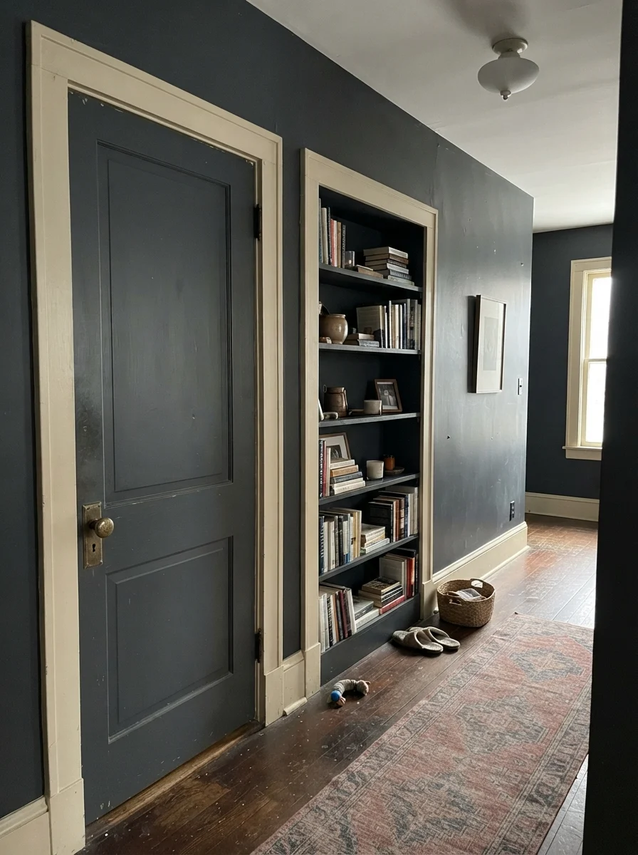
Another place where Cyberspace shines without overwhelming a floor plan is on interior doors and built-in shelving. If you have an older home with standard hollow-core or two-panel doors, rolling them in satin Cyberspace gives them instant visual weight. Set against a warm wood floor and paired with brass hardware, a painted door acts like a frame, establishing separation between rooms without closing off the sightlines.
Where Cyberspace Fails: The Honest Misses
The bad stories about this color are remarkably consistent, and all three are predictable before you buy a gallon. None of them are a paint defect—but if your room matches one, no second coat will save it.
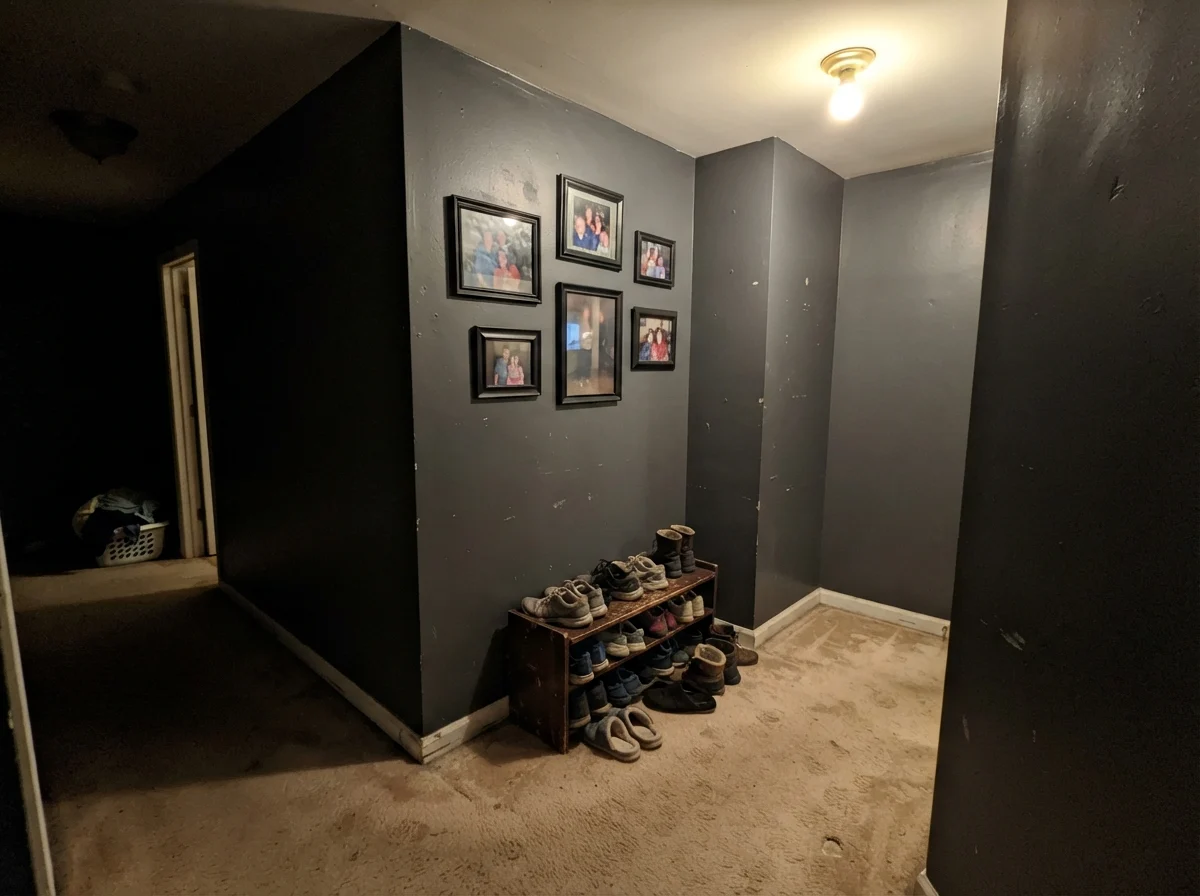
The first failure is the windowless interior space: an interior powder room, a basement hallway, or an enclosed stairwell lit by a lone 60-watt builder-grade ceiling globe. People paint these spots hoping for rich, moody navy, and they end up with a room that feels like a coal chute. With an LRV of 6, Cyberspace needs photons to activate the blue pigment. Without daylight, the gray turns heavy, flat, and muddy. You are simply living with black, and not an interesting black either.
The second failure happens when Cyberspace meets yellow-toned trim or honey oak baseboards. In our 1970s split-level, the first house we owned, every door casing was stained that golden-orange honey oak that ruled the late twentieth century. If you put Cyberspace next to that wood, the cool blue in the paint leaps forward, exaggerates the yellow in the wood, and makes the woodwork look greasy and tired. The same thing happens with cream trim: the wall makes the woodwork look like aged nicotine rather than soft white.
The third failure happens on full exterior facades facing south or west. Exterior siding in full afternoon sun absorbs massive heat when painted in an LRV 6 shade. That thermal stress causes dark paints to fade significantly faster than mid-tones on the exact same house. If you love Cyberspace outside, put it on shutters or front doors, or use it on homes sheltered by mature tree canopy.
Pairing Materials and Finishes
Because Cyberspace sits between charcoal and navy, your choice of accompanying materials dictates which personality it adopts. Pair it with unlacquered brass, oiled walnut, or warm butcher block, and the wood draws out the cozy navy tones, preventing the space from feeling sterile. Pair it with polished chrome, white quartz, and gray flooring, and it behaves strictly like architectural slate.
Living With It Long-Term: Durability and Touch-Ups
Here is the truth about dark walls that paint brochures leave out: touching them up two years later is nearly impossible. When you touch up an off-white wall with leftover paint from the original can, the patch blends eighty percent of the time. When you dab leftover eggshell Cyberspace onto the middle of a wall after moving a picture frame, the fresh spot will flash like a beacon. The sheen difference and the natural settling of deep pigment mean that any touch-up will show unless you cut and roll the entire wall corner-to-corner.
In terms of wear, Cyberspace holds up well if you buy a quality formulation. In our study, the paint took light bumping from office chair casters without burnishing into shiny scuffs, provided nobody attacked it with abrasive kitchen powders. For cleaning, plain warm water and a soft rag are all you should ever touch it with. Anything harsher will strip the sheen and leave a dull greyish halo right at eye level.
Is spending the extra ten or fifteen dollars a can on top-tier paint worth the money here? Absolutely. Cheaper builder-grade dark paints have less binder and lower pigment density; you will find yourself rolling four coats just to cover an old pastel, and the moment a shoulder rubs the wall, it will leave a chalky trail. A premium base is worth every cent on an LRV 6 color, whereas on a standard ceiling white, you can get away with the budget can all day long.
Cyberspace is what people choose when black feels harsh and navy feels loud. But if you starve it of daylight, the color only shows you its charcoal teeth.
How Cyberspace Compares to Similar Darks
When you stand at the paint counter with five charcoal swatches in your fist, they all start to bleed together. Here is how Cyberspace stacks up against the closest alternatives in the fan decks:
What sheen should I choose for walls, trim, and cabinets?
Use eggshell on standard drywall to reduce glare while allowing gentle cleaning. Trim looks sharp in semi-gloss, while cabinet doors and kitchen islands perform best in satin to handle daily finger contact. On exterior body siding, stick to satin.
Why does Cyberspace look like straight black in my hallway?
At an LRV of 6, Cyberspace reflects almost no natural light. Without sunlight to bring its blue-gray pigments forward, your eyes simply register a deep black. Dim interior bulbs cannot carry the blue hue.
Will Cyberspace make my small room look smaller?
Not necessarily. When applied across walls, baseboards, and built-ins in a room with warm lighting, it erases corners and gives a seamless, enveloping feeling. Contrast is what shrinks a room—painting dark walls against bright white trim creates an outline effect that chops the space up.
Can I use Cyberspace on an exterior facade?
Yes, provided the facade does not face relentless south or west afternoon sun. Very dark paints absorb heavy heat and fade faster on sun-drenched elevations. It looks magnificent paired with wide white trim and sheltered porches.
Susan's Verdict · The Restrained Dark
Cyberspace SW 7076 is a wonderful, grown-up paint that solves the dilemma of wanting drama without theatrical loudness. It is not worth the money in a windowless powder room or over honey oak trim, where it will simply look like muddy coal. But on a kitchen island, lower cabinetry, or a home library that catches natural daylight, it delivers a tailored, quiet depth that will hold its ground long after brighter navies look dated.