Color Diary · No. 74
Quietude SW 6212: How Sherwin-Williams' Spa Shade Behaves Behind Closed Doors
Sherwin-Williams' bestselling spa color, reviewed honestly: when it reads sage, when it turns blue, and the rooms where it is simply too much color.

Susan HartleyOctober 10, 2026 · 15 min read
Quietude · Sherwin-Williams SW 6212
Hex#ADBBB2LRV48Undertonesgreen → gray → blue
In our last house, a 1990s colonial with oversized baseboards and far too many hollow-core doors, I fell into the exact trap everyone falls into when looking at Sherwin-Williams Quietude. It was late autumn, the light was running low, and I brought home a paint chip convinced I had finally located the world's most civilized sage green. I painted our upstairs family bathroom that very Saturday. On Sunday morning, with the sun pouring past the frosted pane, the room felt like a quiet exhale. But by four in the afternoon on a Tuesday, under a contractor-grade fluorescent tube and a flat grey sky, the green vanished into thin air. In its place sat a chilly, unblinking hospital blue.
That was my first real lesson in how a low-saturation mid-tone behaves. Quietude sits right at an LRV of 48—though depending on which index sheet you study, its depth feels solidly around 41 on a dim corner—meaning it carries honest weight on drywall. It is not an airy off-white whisper like Sea Salt, nor is it a polite greige. It is a genuine color, yet because it lacks a loud, punchy pigment, it has very little stubborn opinion of its own. The room you put it in will tell Quietude what to be, not the other way around. Over thirty years and three houses, I have learned to respect paint that shifts like this, but you have to know what you are signing up for before you roll out the drop cloths.
When the Daylight Shifts
People look at tiny cards in the paint aisle and imagine color sits still. It never does. Morning light, especially the crisp, cool sun coming in from an eastern or northern window, pulls the dusty, washed-out blue straight to the surface of Quietude. If you walk into your bedroom before the kettle has boiled, you will wonder if you accidentally bought slate. Come late afternoon, when a warm southern or western sun cuts across the floor, the yellow in that daylight wakes up the green pigments, softening the entire space into that tranquil, spa-like sage you thought you were paying for.
Artificial light does something even more dramatic. If you leave 3500K or 4000K daylight-balanced LED bulbs in your fixtures, Quietude drops its warmth entirely and goes cold and medicinal. Before you spend a Saturday repainting a room you think you hate, swap your lightbulbs to 2700K warm white. It will cost you twelve dollars at the hardware store and will rescue the green quicker than another gallon of paint ever could.
Bathrooms: Its True Home Turf
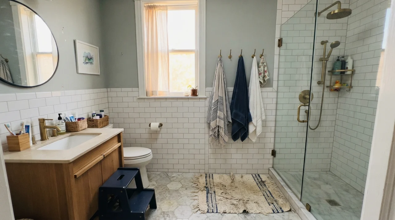
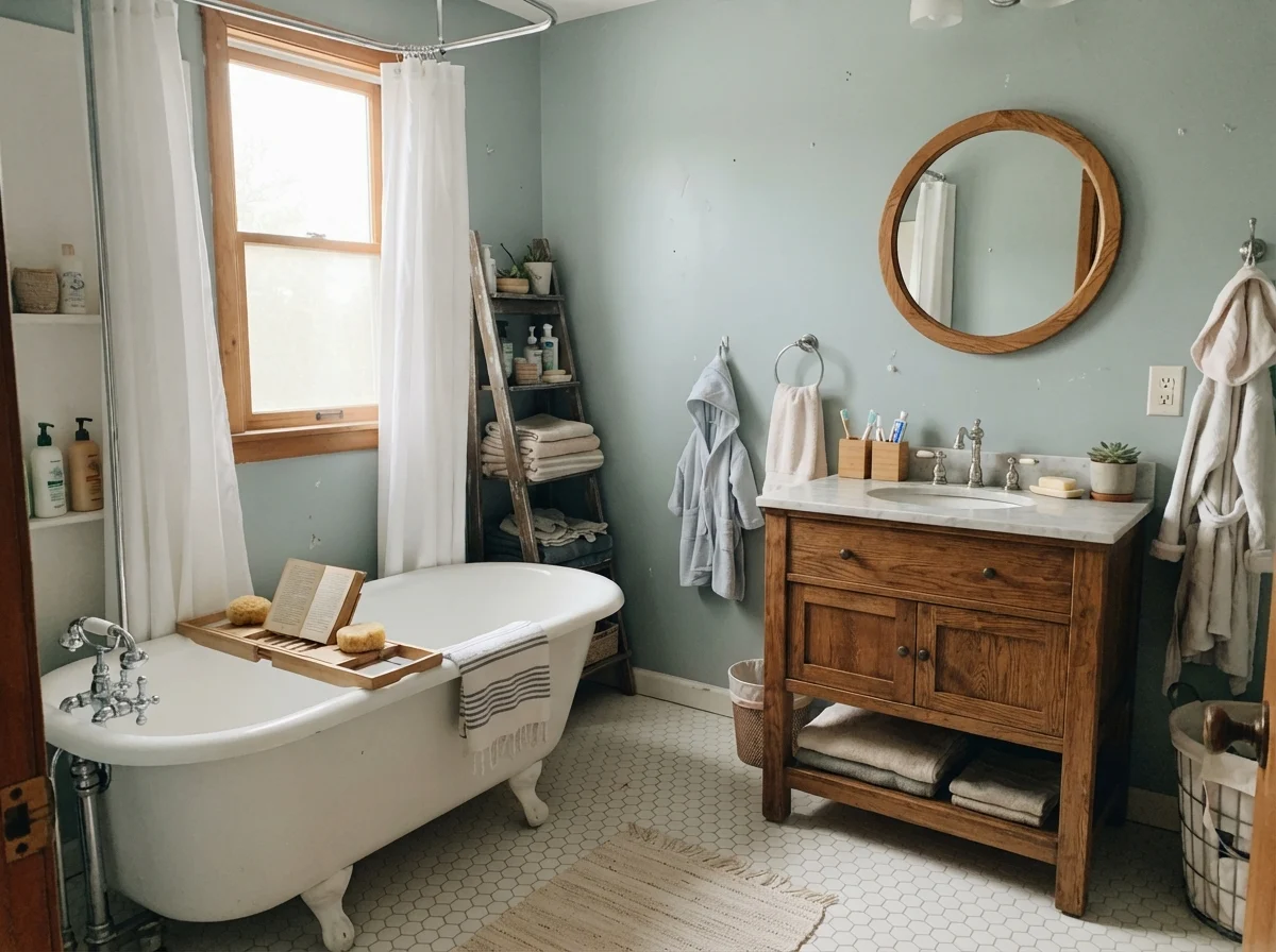
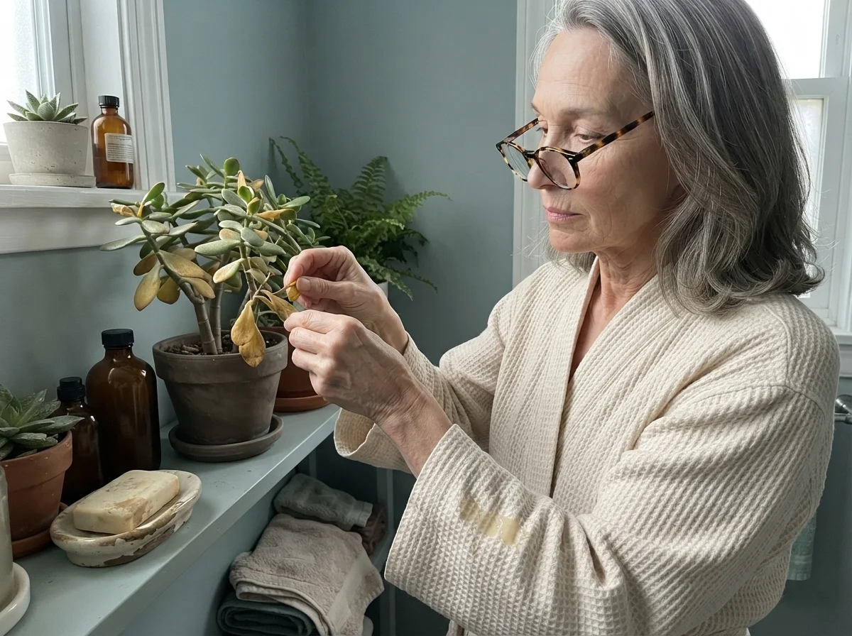
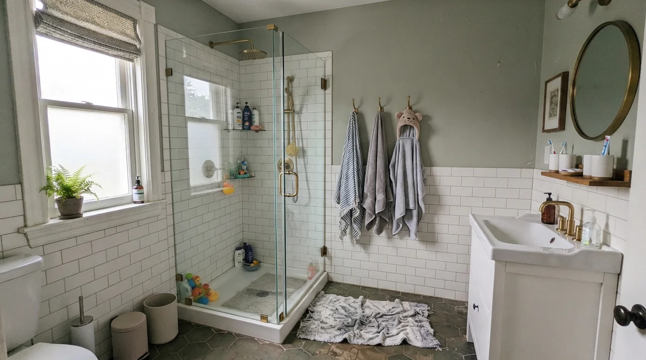
If Quietude has an ideal address, it is a bathroom with white fixtures and real daylight. There is something about the balance of white ceramic, chrome or brass hardware, and painted drywall that makes this color snap into focus. In small rooms, colors with strong saturation can feel aggressive—they shout from three feet away when you're brushing your teeth. But Quietude, with its muted gray spine, settles back against white subway tile and lets the room feel finished rather than decorated.
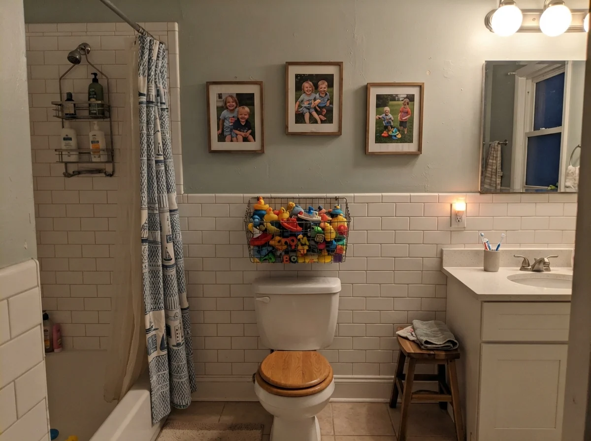
We lived with it in our upstairs family bathroom for seven years. Between splashes from bath toys, humid showers, and endless morning routines, it held up remarkably well because we took the time to pick the right sheen: satin. Walls in a high-humidity room need that gentle wipe-down resilience. Flat finish in a bathroom is an invitation to water marks, while semi-gloss turns the color harsh and plastic. Satin hits that sweet middle ground where water beads up and wipes away clean without giving you a blinding glare every time you turn on the vanity lights.
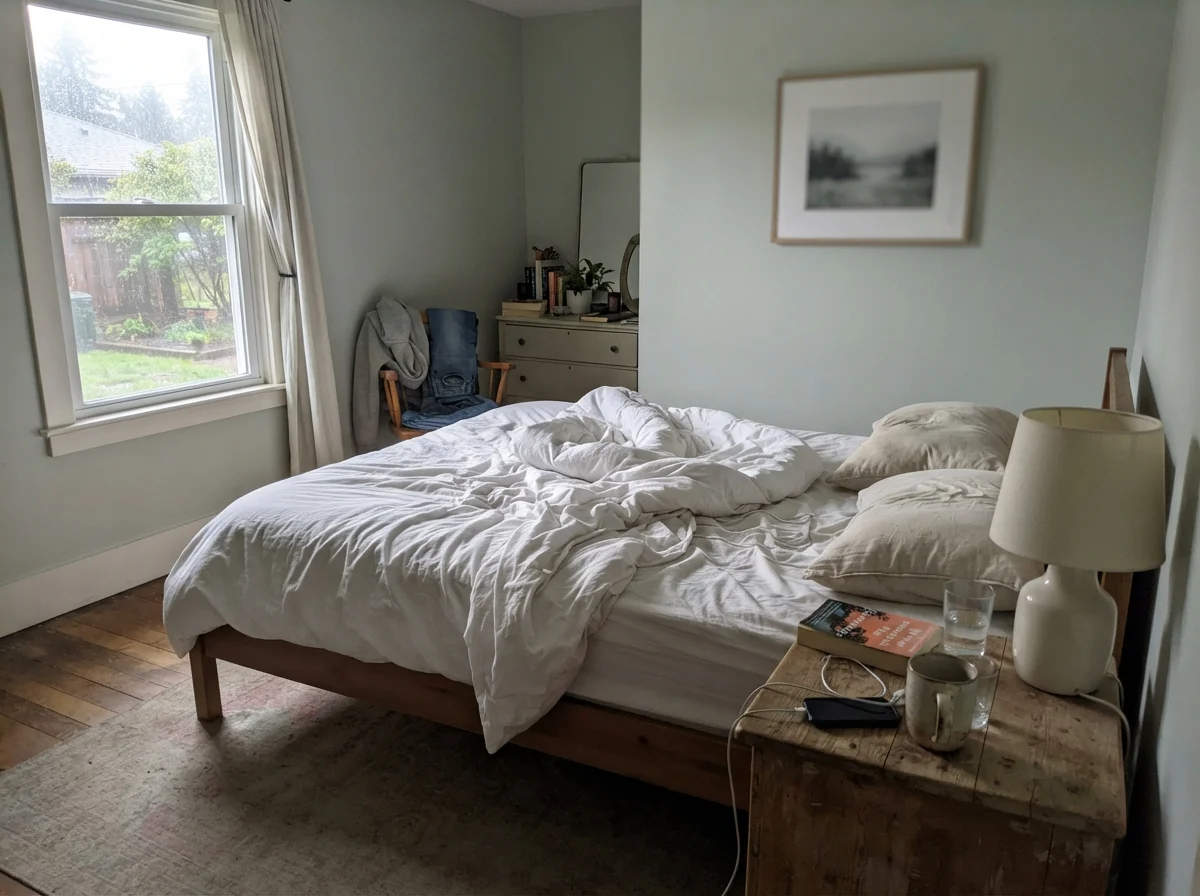
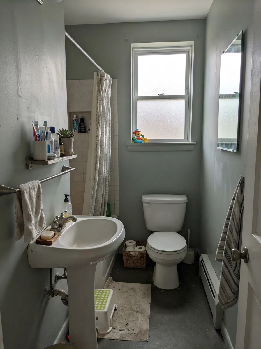
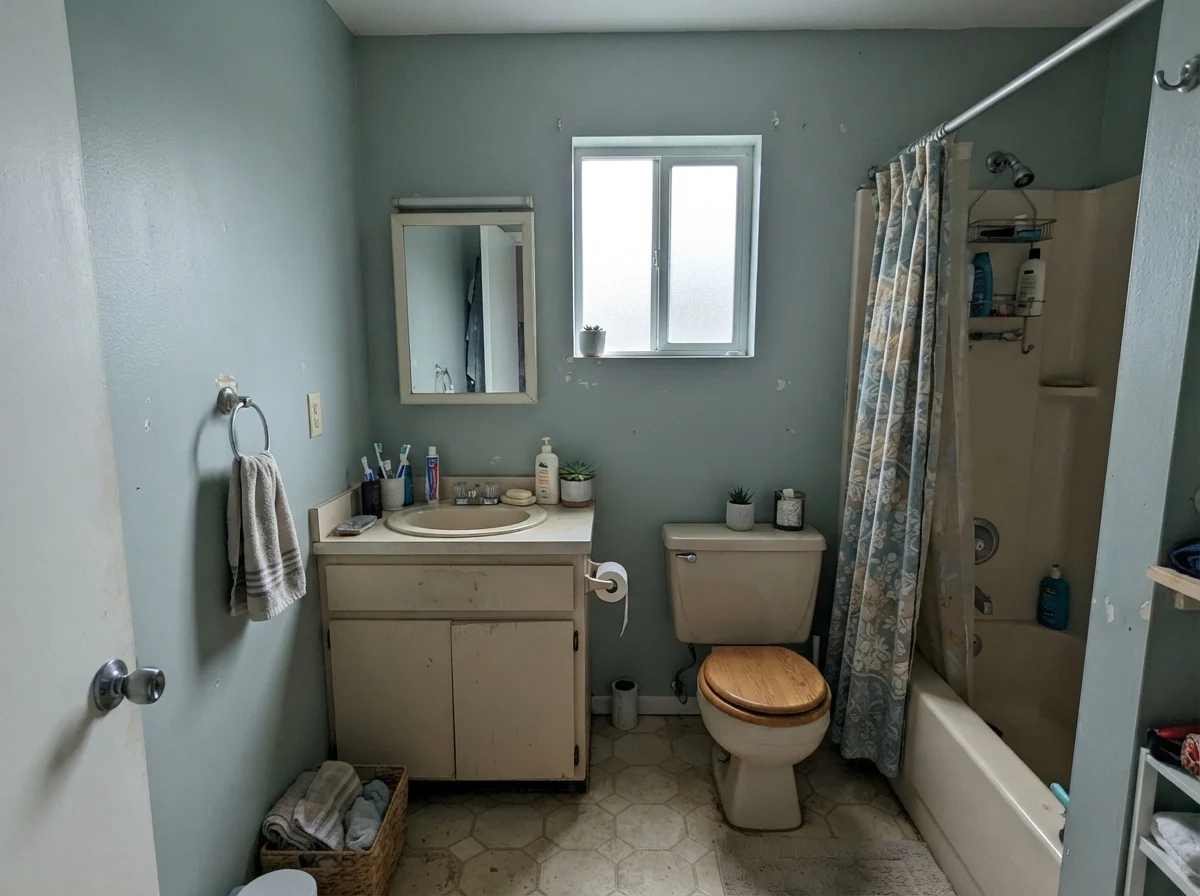
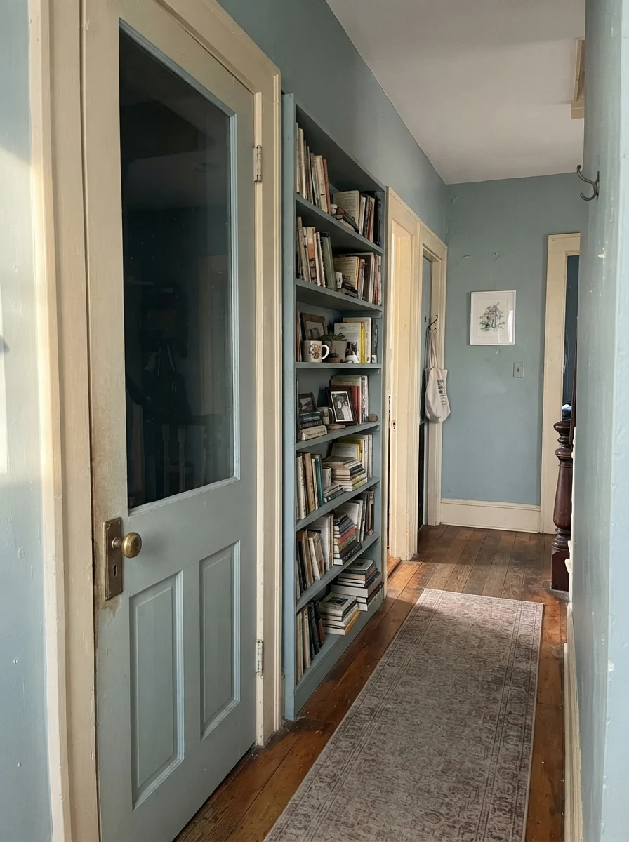
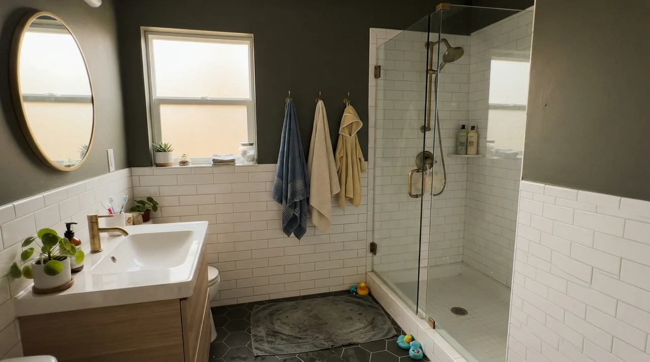
Notice what happened above in that flat overcast daylight: Quietude gave up its herbal charm and went quiet, slate gray. It didn't look terrible, but it certainly stopped pretending to be a garden retreat. Now compare that to what happens when you combine weak north light with older cream-leaning fixtures. Below is what you see in a rainy, north-facing bath with an older beige vanity: the paint turns blue-gray and casts a chilly pall over everything. When we bought our current 1960s ranch, the half-bath off the breezeway had this exact problem. I had to learn the hard way that when you pair Quietude with dingy beige counters, the two spend all day picking fights with one another.
Quietude is the calm blue-green everyone wants until they see how much color it really has. Treat it as a color, not as a safe neutral, and it is one of the best mid-tones Sherwin-Williams makes.
Quiet Bedrooms and Growing Spaces
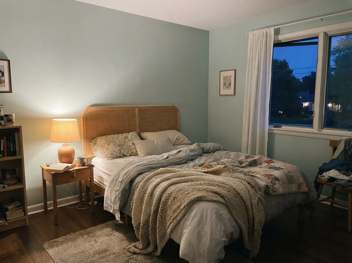
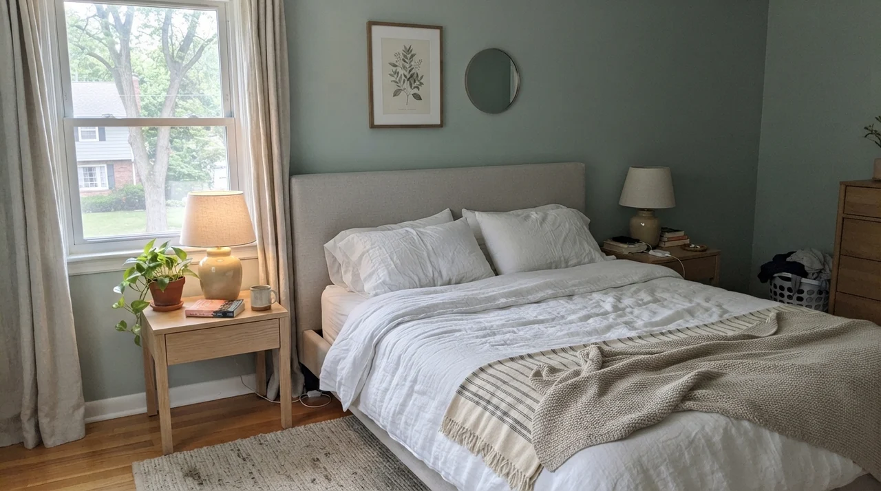
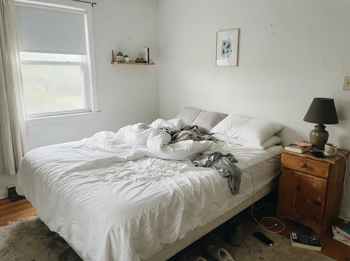
Bedrooms are where people crave stillness, and Quietude delivers that stillness provided you have decent natural light. At LRV 48, it is dark enough to give a bedroom visual enclosure, but pale enough that you don't feel like you've moved into a cavern. It wraps around white linen, pale oak dressers, and simple nightstands with effortless grace. Five years into living with a bedroom painted this shade, you don't wake up feeling exhausted by trend fatigue. It simply recedes into the background.
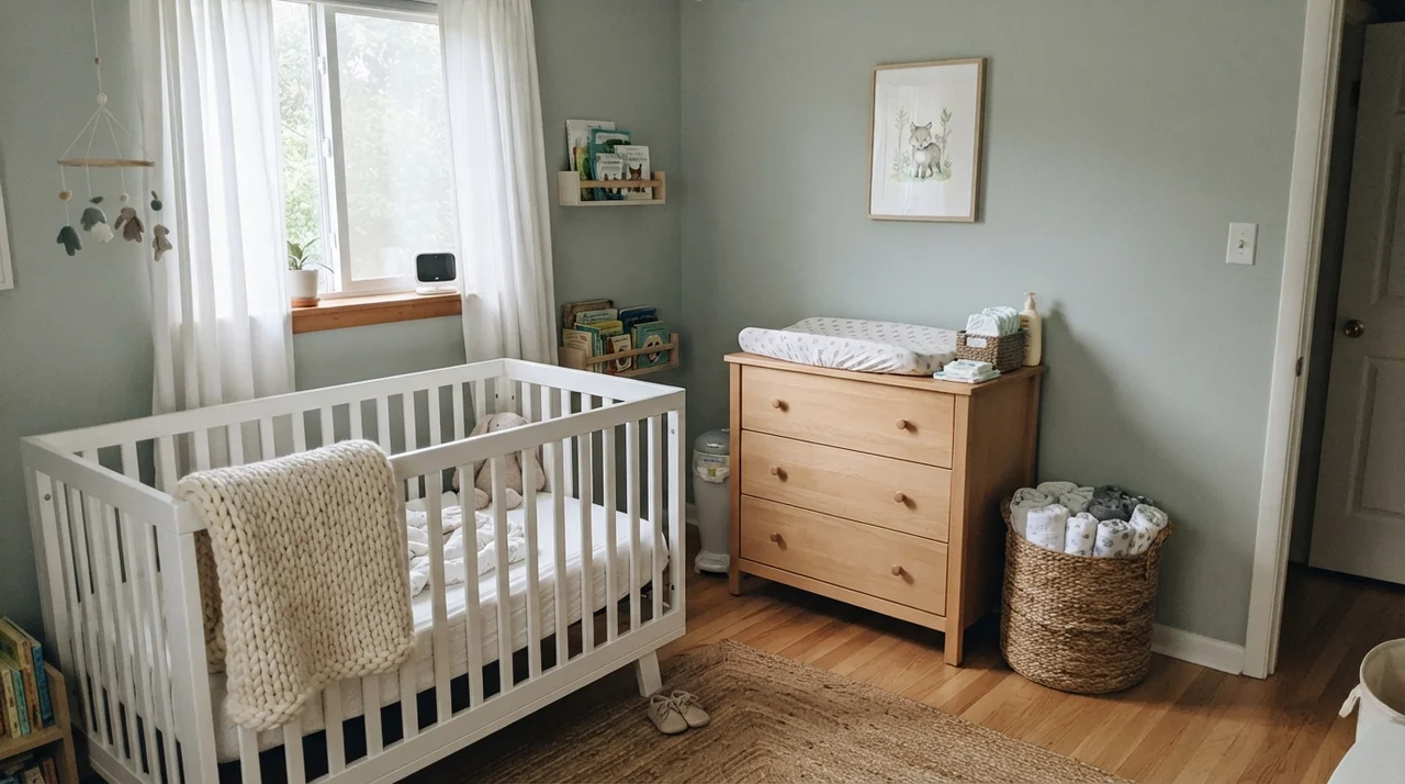
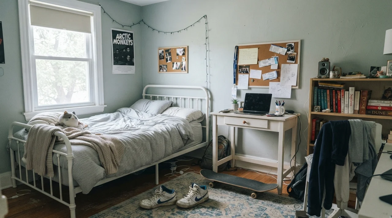
It also makes a remarkably sensible choice for nurseries and teenagers' rooms. So many nursery colors are cloyingly sweet—pale pastel mints or nursery blues that child outgrows by age four. Quietude has enough gray bone structure to transition from baby cribs and muslin baskets right up to homework desks, white metal bedframes, and laundry piles without needing a repaint. If you can paint a bedroom once and have it last from infancy through middle school, that can of paint was worth the money twice over.
Cabinets and Islands: The Sleeper Application
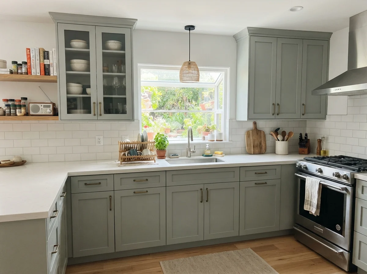
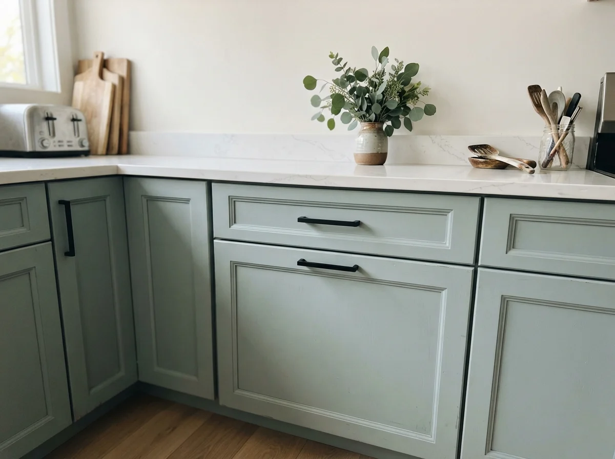
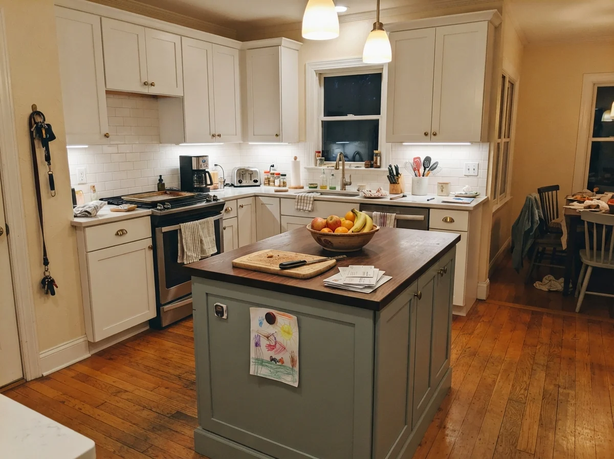
Here is where Quietude surprised me most. Most folks look at the chip and think strictly about walls. But on cabinetry—specifically painted shaker doors finished in satin—Quietude looks like something out of a bespoke English kitchen catalog. Because satin reflects more light across curved stiles and rails than a flat wall finish does, the color reads half a shade lighter on cabinet fronts, showing off its sage complexity against crisp white subway tile and quartz counters.
It pairs beautifully with warm butcher block and matte black or brass hardware. In our 1970s split-level, our kitchen cabinets were tired laminate that we couldn't afford to tear out during our first five years of ownership. When we finally replaced them with simple wood fronts in our colonial, we left the perimeter white and rolled Quietude onto the kitchen island. That island became the visual anchor of the whole ground floor. It hid scuff marks from kids kicking the lower panel, scrubbed clean every Sunday with a damp cloth, and never showed grease splatters the way pure white cabinets do.
Living Spaces and Sunrooms: Keep Doors on the Room
I will give you my sternest piece of neighborly advice right now: do not paint Quietude across an open-concept main floor. It is simply too much color. On a continuous forty-foot wall that runs from your entry through your living room and into the dining area, Quietude stops behaving like a restful background and starts feeling like an unrelenting thematic commitment. You will feel trapped inside an all-inclusive health club.
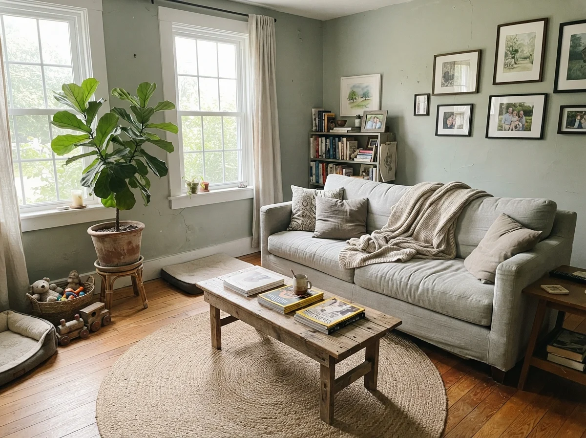
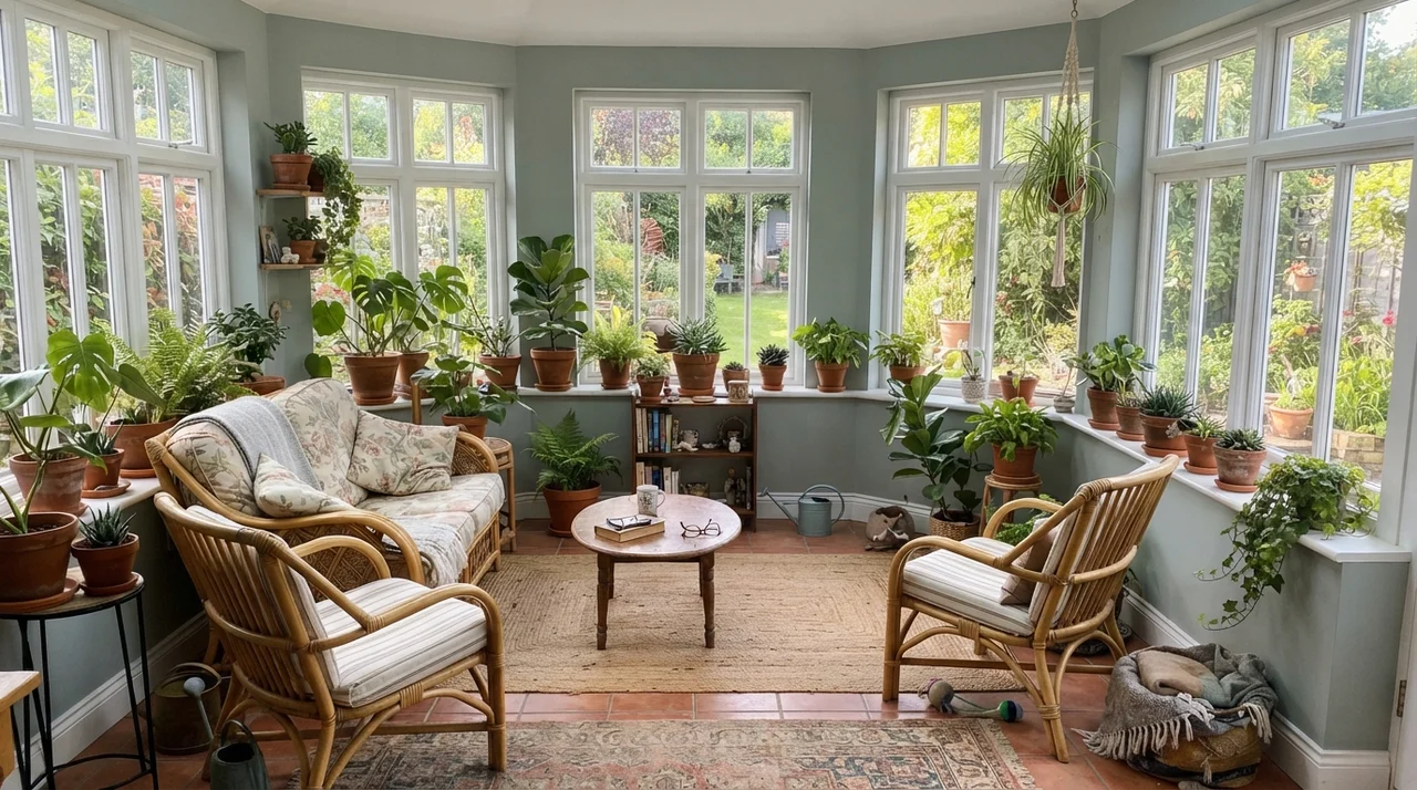
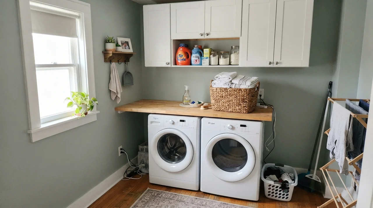
Keep Quietude in rooms with four walls and a door frame. In a distinct living room with two generous windows and plenty of warm elements—jute rugs, leather, natural wood furniture—it creates an elegant, restful mood. It loves sunrooms, too, where expansive windows and natural greenery outdoors pull the green undertone right through the glass. In our current ranch, the laundry room gets bright natural light from a side window; we put Quietude on the drywall above the butcher-block counter, and it turned what used to be a chore bunker into a bright, pleasant corner of the house.
Where Quietude Falls Flat
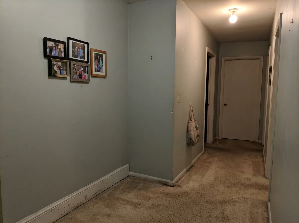
Now for the uncomfortable truth. Every paint has a spot where it looks dreadful, and with Quietude, that spot is an unlit interior hallway or a windowless powder room running standard cool bulbs. Take a look at this dark hallway corner below. With beige carpet beneath it, zero natural daylight, and a lone ceiling bulb, Quietude loses every ounce of its charm. It turns muddy, putty-like, and dead. If your hallway has no windows, do not put this paint on the wall expecting it to bring light into the darkness. At an LRV of 48, it will drink what little illumination you have and leave you feeling drab.
Exterior Siding: When Sunlight Takes the Wheel
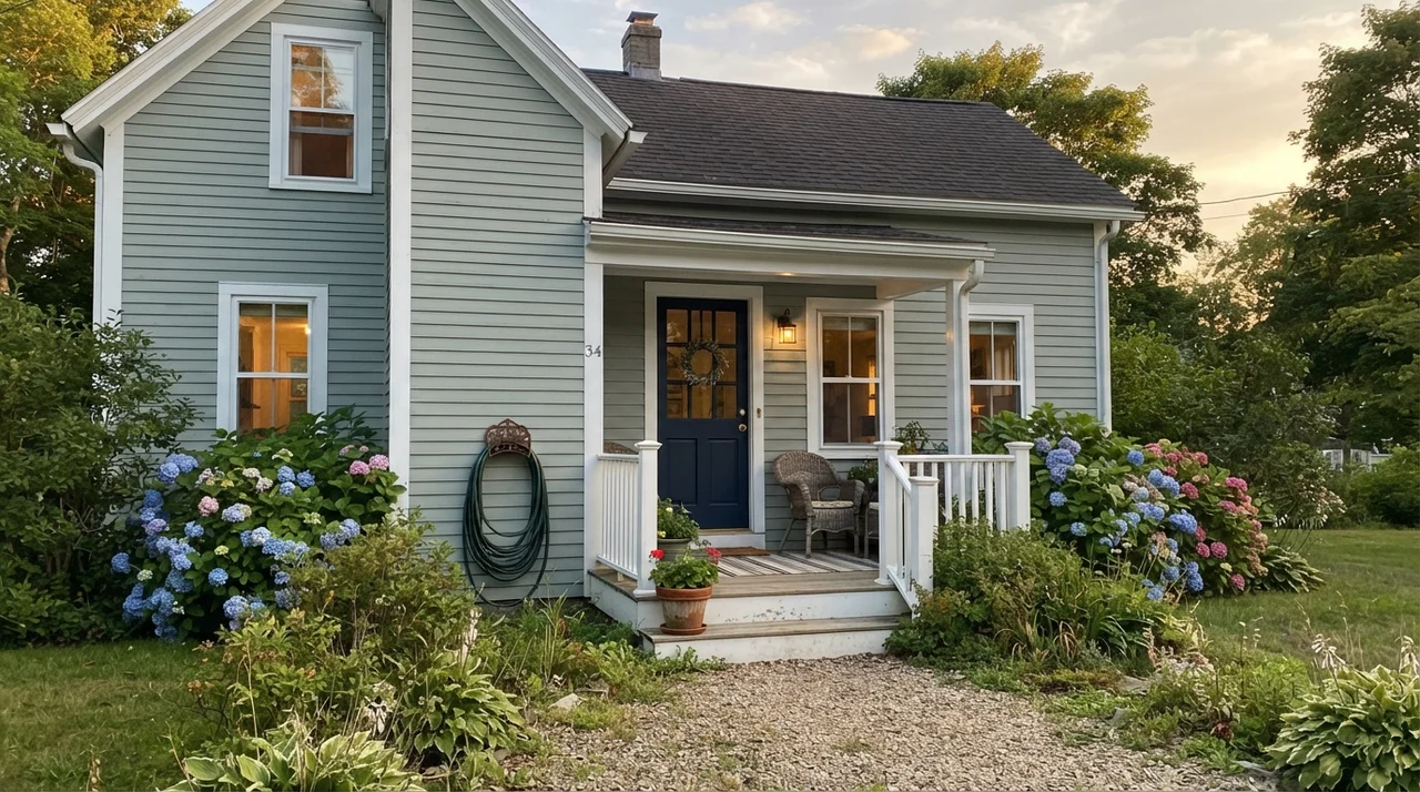
Exterior light changes everything. Under full summer sun, paint colors lighten by about three steps on the LRV scale, meaning Quietude on horizontal siding looks like an airy, timeless coastal sage. It looks breathtaking on craftsman cottages, especially framed by crisp white trim and anchored by a dark navy front door. But heed this warning: keep it away from red or orange clay brick and terracotta roof tiles. That fiery warm red creates a harsh clash with Quietude's cool blue-green undertone that will make your siding look sickly.
Durability and Cleaning: Living with It Five Years In
Here is what the paint store sample pot will never show you: how a color holds up when you live with it day after day. In our last house, our family bathroom walls saw their share of condensation, bath time splashes, and scrubbing around towel bars. We painted those walls in Sherwin-Williams Duration Home satin. That extra fifteen dollars per can paid for itself three times over. Five years in, the walls held up through weekly cleanings, scrubbed clean with a sponge, and showed zero burnishing or paint wear around the light switches.
Eggshell is your friend for bedrooms and defined living rooms. It offers enough washability for vacuum dings and fingerprints without bouncing too much harsh surface sheen across the wall. If you touch up Quietude three years down the road, make sure you feather the brush edges; because this mid-tone has both blue, gray, and green colorants, fresh paint can flash against a wall that has seen years of daylight unless you blend it gently.
What is the LRV of Sherwin-Williams Quietude?
Quietude has a Light Reflectance Value (LRV) of 48. In practical application on dimmer walls and inside shadowy room corners, it behaves like a deeper mid-tone, absorbing noticeable light compared to pale off-whites.
Does Quietude look more blue or more green?
It depends entirely on your light source. South and west daylight alongside 2700K warm bulbs pulls the herbal sage green forward. North light, overcast skies, and cool 3500K+ LED bulbs will cause the green to recede into a flat, dusty blue.
Can I paint an entire open-concept main floor in Quietude?
It is not recommended. At LRV 48 with real chromatic weight, running it across continuous thirty- or forty-foot walls feels heavy and commits your entire home to an overwhelming spa aesthetic. Save it for rooms with doors.
What trim white pairs best with Quietude?
Sherwin-Williams Pure White (SW 7005) is the ideal partner. It is clean and neutral without sharp yellow tones. Avoid creamy or ivory whites, which fight the cool tones in Quietude and make each other look muddy.
Susan's Verdict · Buy with Purpose
Quietude is not a generic neutral you can slap across an entire house and ignore. It is a true mid-tone color that needs natural daylight, white trim, and a closed door to work its magic. Put it in a bathroom with white subway tile, roll it across satin kitchen cabinets over oak counters, or use it in a bright bedroom, and it is worth every penny you pay at the counter. But keep it out of windowless north hallways, swap out cold lightbulbs, and leave your open great room to lighter neutrals. Treat it like a color, and it will reward you for years.