Color Diary · No. 76
Benjamin Moore Silhouette: An Honest Reading of the Dark Brown Gamble
Benjamin Moore's 2026 Color of the Year, reviewed honestly: the rooms where it looks expensive, the bulbs that turn it purple, and who should pick something else.

Susan HartleyOctober 11, 2026 · 15 min read
Silhouette · Benjamin Moore AF-655
Hex#57504CLRV10Undertoneschalky brown → charcoal → plum-gray
In our last house, a 1990s center-hall colonial with eight-foot ceilings and too much hollow-core pine, I decided during our sixth winter that the powder room off the garage had to go dark. Not navy, and certainly not the hunter green I had already survived and painted over in the nineties, but a dense, quiet charcoal that would hide the fact that the room had no window and very little architectural ambition. I bought two gallons of an off-black on sale, painted the entire room on a Sunday afternoon, and lived with it for about three weeks before realizing that under our cheap frosted fixture, the room felt less like a jewel box and more like the inside of a coat closet that someone forgot to wire.
That is the gamble with very dark paint. We see marketing photographs of drenched libraries and rich cabinet runs, and we imagine that rolling that depth onto drywall will magically summon crown moulding and four-hundred-dollar brass lamps. It does not. But when Benjamin Moore named Silhouette AF-655 their Color of the Year, I looked at the numbers before I looked at the styling. It sits at a light reflectance value of 10, which puts it firmly in the dark category, yet it belongs to the orange family in the color deck. That makes it a dark, chalky brown that behaves in real rooms like a charcoal—softened, grayed, and fundamentally grounded. It is deep enough to change a room completely, but it is not a flat black. And after thirty years of living with dark walls, I can tell you that the difference between an unforgiving black and a chalky espresso-charcoal is the difference between a room you retreat into and a room you want to run out of.
The Violet Streak in Silhouette
Silhouette sits at LRV 10 as a dark, grayed brown, but it does not stay static across different exposures. Because its base leans toward a chalky, complex charcoal rather than a raw earthy mud, cool illumination pulls out an unmistakable violet-gray tone. Here is how that pigment shifts across varying exposures and bulb temperatures in an ordinary house.
warm sun
overcast, north light
dusk, rain, cool bulbs
chalky brown → charcoal → plum-gray
Weathered BrownDunn-Edwards · see diary
Urbane BronzeSherwin-Williams · see diary
SilhouetteAF-655
Iron MountainBenjamin Moore · see diary
Dark TruffleBehr · see diary
When you put a swatch on your drywall at noon, it reads as a handsome, deep espresso with enough gray to stop it from looking like milk chocolate. But that is only half the story. The complaints about Silhouette are remarkably consistent, and none of them are about the paint being bad. They are about three specific situations where this color stops being a warm brown and starts being something you did not order. The primary culprit is lighting. Cool daylight or modern blue-toned bulbs strip away the warm orange-brown undercurrent and drag a dusky plum tone right to the top.
Light Shifts: The Bulb Decides, Not the Can
In our current 1960s ranch, I learned the hard way that you cannot fight your light exposure with sheer willpower. Silhouette proves that rule instantly. South light is where this shade looks like the marketing swatch: warm daylight brings the brown forward, giving it that rich, enveloping character that feels custom and deliberate. Outside in full sun, it lightens considerably, opening up to a warm mushroom-brown that softens exterior lines without disappearing into gray. But turn toward a north-facing window, and cool gray daylight immediately strips the warmth away. On that exposure, the violet shows up plainly. If you love muted plum and dusty slate, that might please you; if you expected warm timber and saddle leather, you will be disappointed. Sample that wall first before committing to four gallons.
Even more critical than windows is what you screw into your ceiling fixtures. Silhouette is heavily bulb-dependent. Under warm 2700K incandescent or LED bulbs, the paint reads like rich espresso. Switch those out for 4000K or 5000K bulbs—the cold, bright white that contractors love to put in modern recessed pots—and the color flips into a purple-gray. The bulb decides, not the paint. If you cannot or will not change your cool lightbulbs, you have no business painting a room in Silhouette.
Bathrooms and Enclosed Spaces
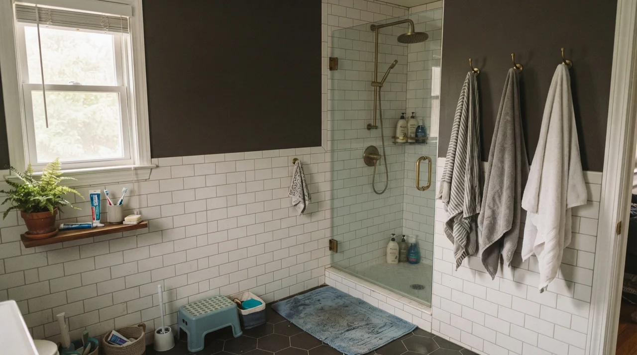
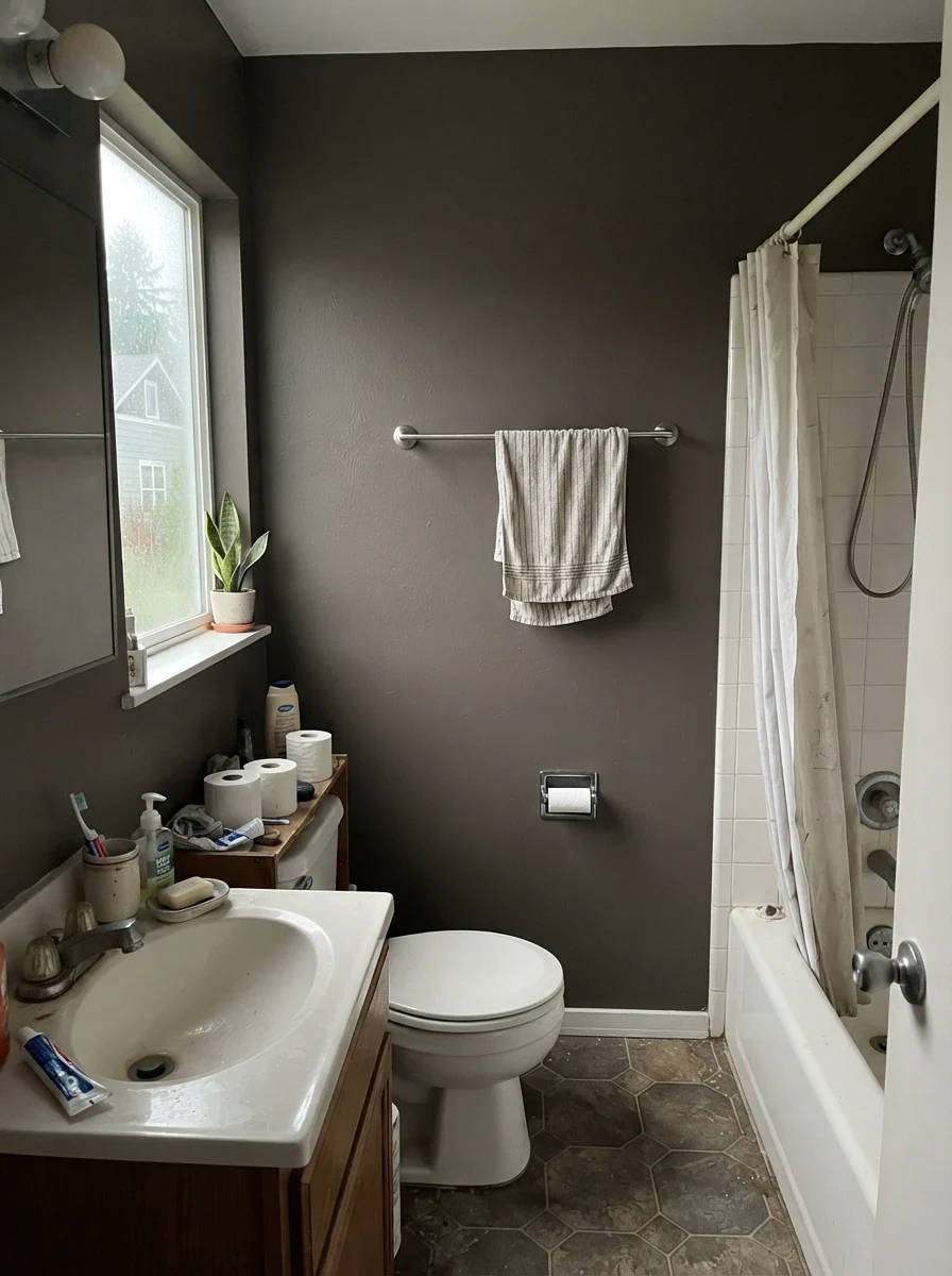
Small, closed rooms are where Silhouette actually earns its keep. Give it a small room, warm bulbs, and permission to be dark, and it looks like money. A powder room is easily its best room: drench the space completely—walls, ceiling, and trim, all Silhouette, with matte on the walls and semi-gloss on the woodwork. Small windowless rooms have nothing to lose by going dark, and warm brass fixtures throw back just enough light to keep it from feeling claustrophobic. Just keep your vanity sconces warm so you do not spend every morning looking into a purple haze.
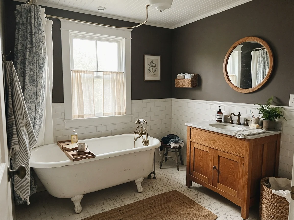
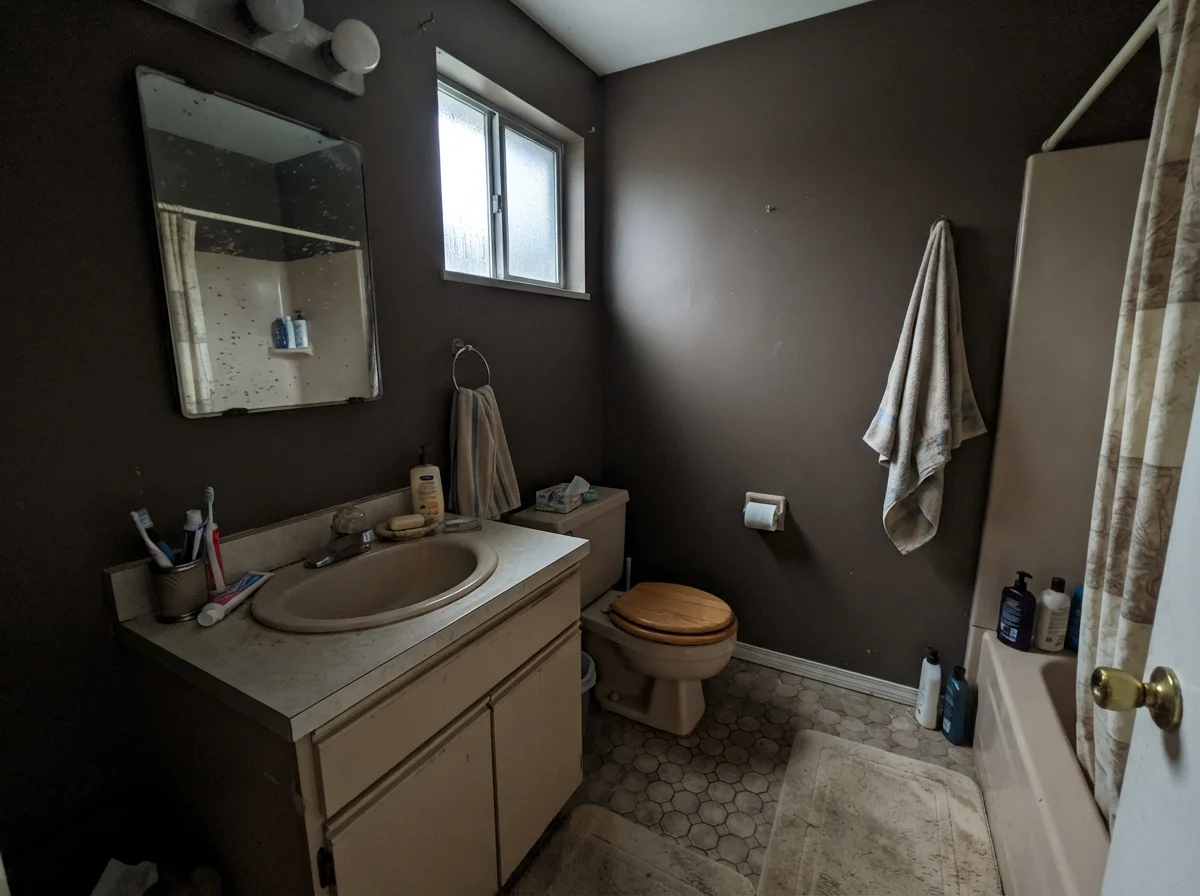
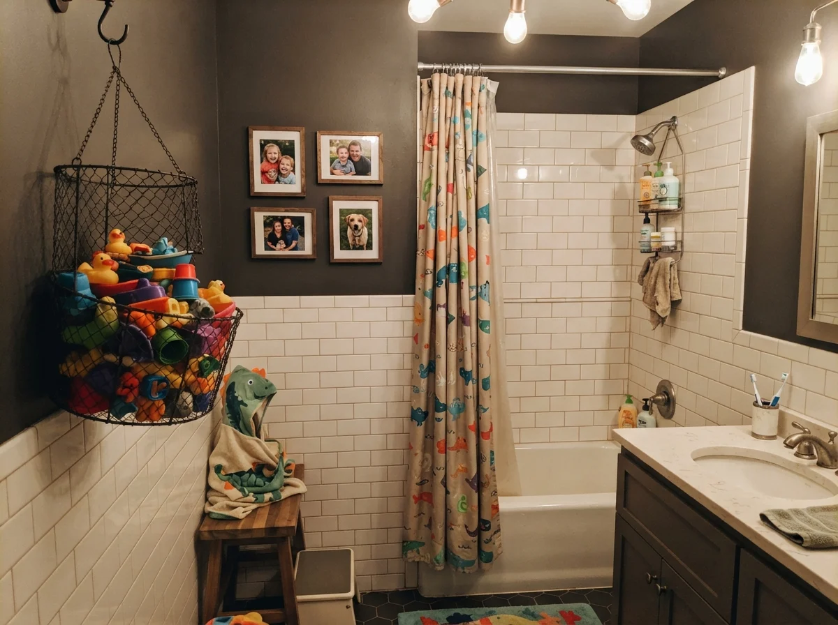
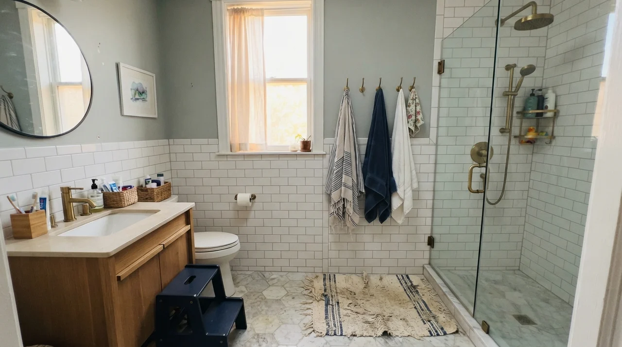
In family baths where you have white subway wainscoting or clawfoot tubs, using this shade on the upper walls anchors all that bright porcelain. It creates contrast without the harsh, clinical shock that ordinary black can produce. But watch the trim and fixtures: if you have older beige laminate or heavily yellowed oak, take a careful look before rolling the second coat.
Bedrooms and Quiet Corners
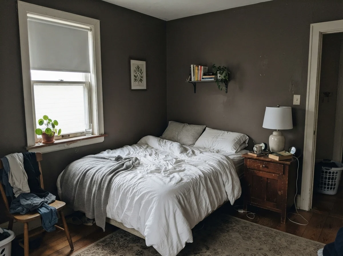
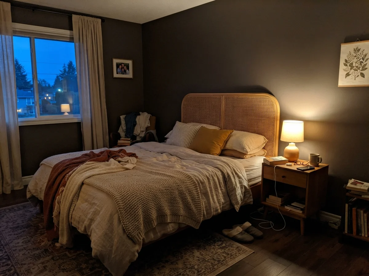
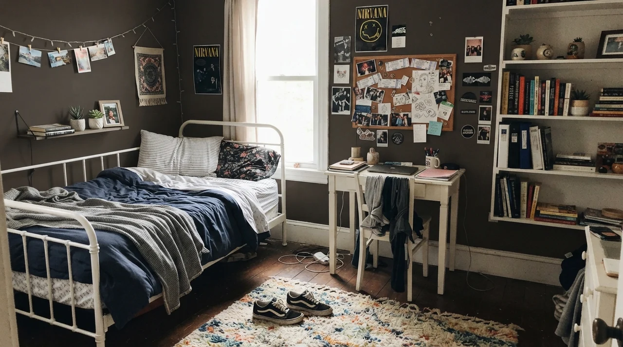
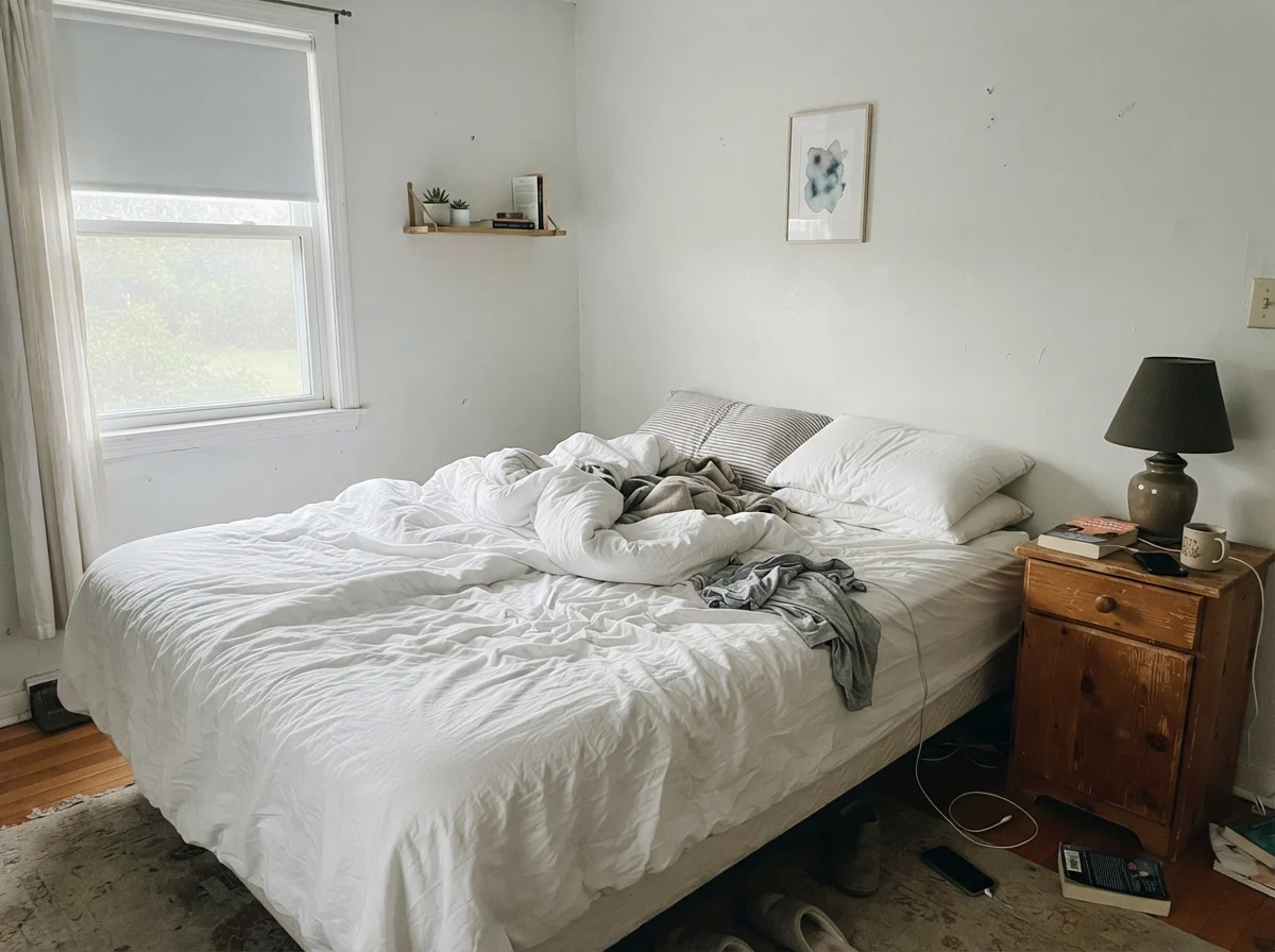
In our second house, a sprawling suburban place that felt perpetually drafty, we painted a guest bedroom a deep, muddy charcoal to make it feel snug. Silhouette accomplishes that same cocooning effect, but with a softer, chalkier edge. A bedroom drenched in Silhouette sleeps beautifully. It feels grounded at night when the bedside lamps are turned low.
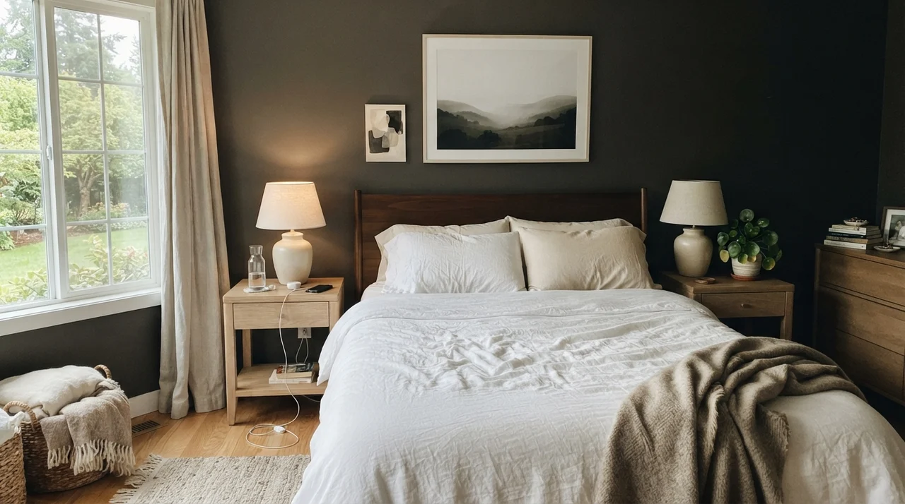
The honest catch, however, is your morning routine. A north-facing bedroom finished in an LRV 10 brown-charcoal stays dim and shadowy until you switch on a lamp. If you rely on morning sunlight to wake you up, this wall will absorb that early brightness rather than bouncing it around. For teen rooms or peaceful main suites with pale oak nightstands and white linen, it creates a striking backdrop, but you must plan for secondary light sources on both sides of the bed.
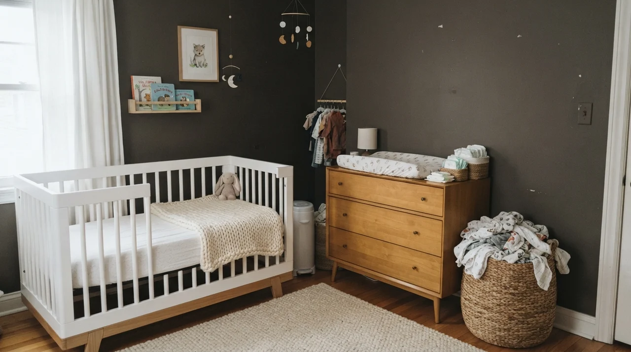
Even in a nursery, pairing Silhouette with pale natural wood and white crib railings creates an unexpectedly quiet, calm nursery atmosphere. Because it carries that orange-deck heritage, it reads gentle against unvarnished timber rather than cold or stark. But again, you have to be comfortable with a room that feels like dusk even in the middle of the afternoon.
Kitchens and Built-In Millwork
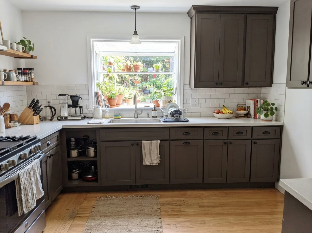
Here is my firm rule on this paint: kitchen cabinets are a strong yes; kitchen walls are a definite no. A busy kitchen needs every lumen of reflected light it can muster for chopping vegetables, reading recipes, and finding spices. Painting drywall in an LRV 10 shade in a busy family kitchen is not worth the money or the frustration.
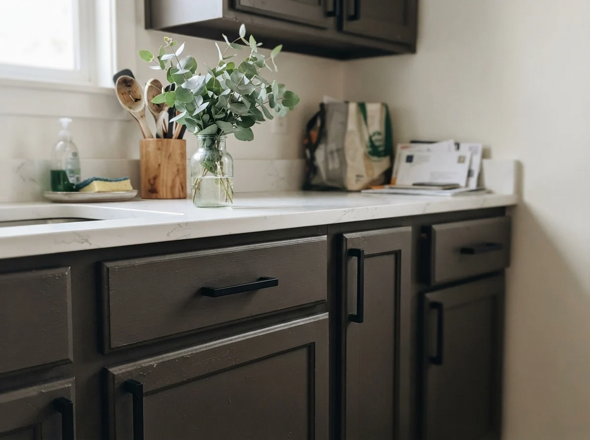
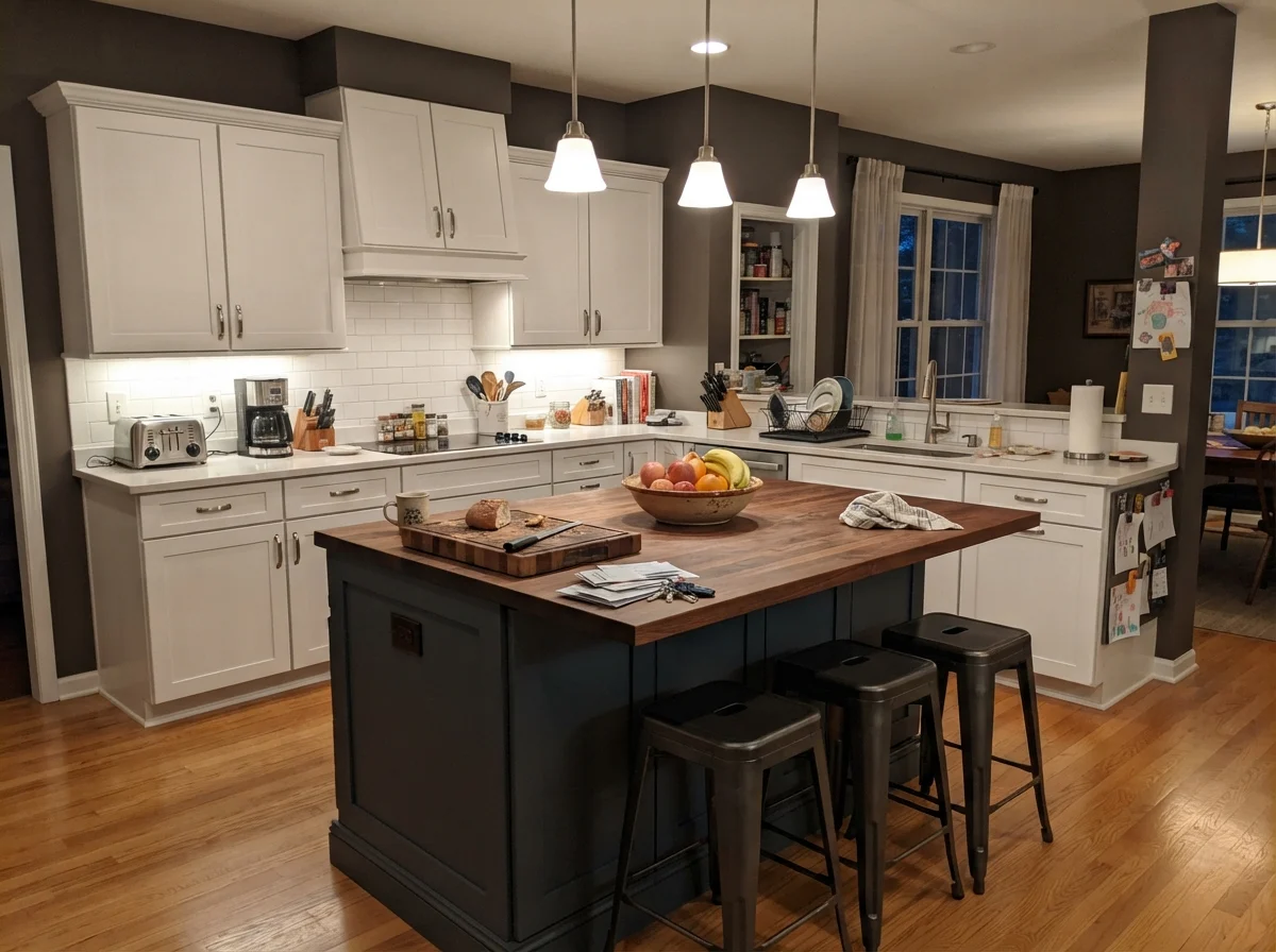
On cabinetry, however, it is one of the best dark colors in the fan deck. On an island or a lower bank of shaker cabinets, finished in satin, it looks custom and expensive. It does what true black cannot: it holds soft shadow without turning severe or aggressive. When you flank it with crisp white counters and plain white upper cabinets, it anchors the center of the house with undeniable substance.
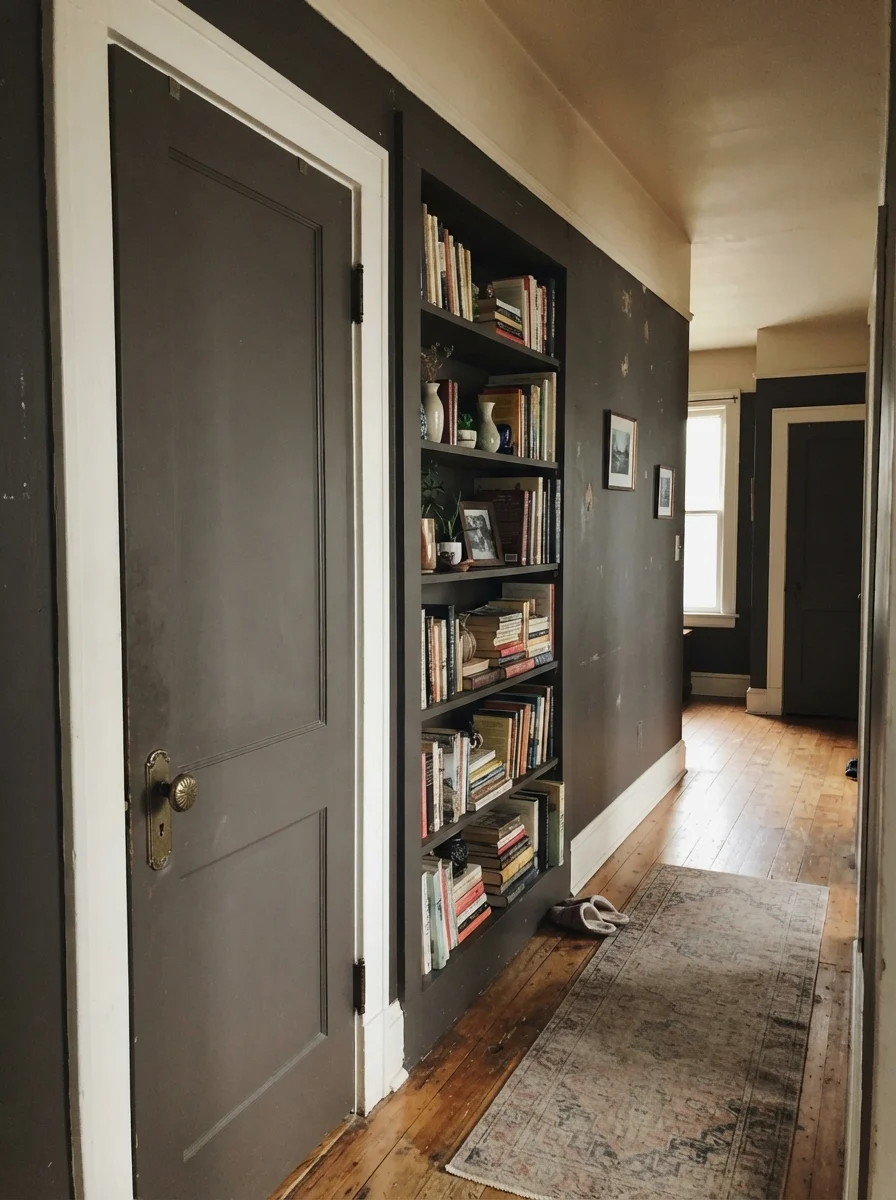
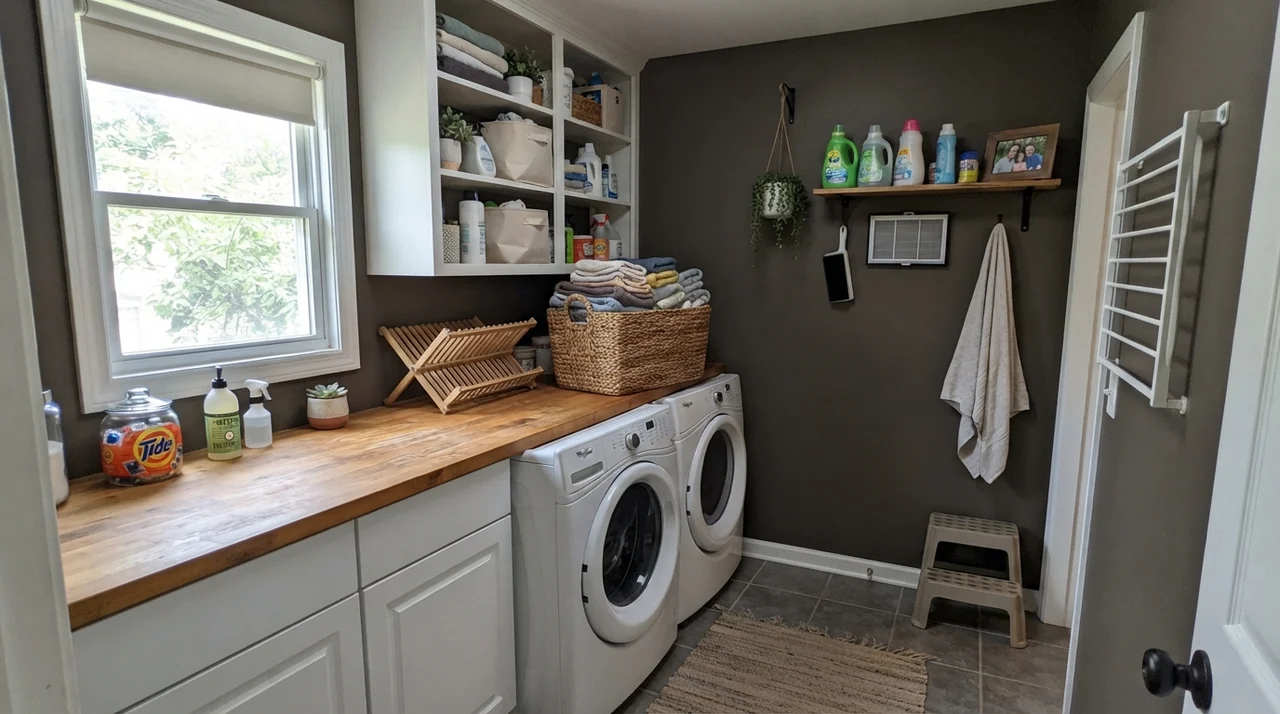
Beyond the kitchen, built-in bookcases, interior passage doors, and laundry room millwork benefit from this depth. A two-panel door coated in semi-gloss Silhouette against an off-white hallway wall looks tailored, hiding the inevitable smudges around the latch while adding weight to ordinary builder architecture.
Sunrooms, Living Spaces, and the Open Floor Trap
People see Color of the Year editorial spreads and immediately want to coat their entire open-concept first floor in it. Please do not do that. An open floor plan offers no natural architectural breaks, no clear door jambs where a dark color can stop gracefully. Wrapping three interconnected living areas in an LRV 10 dark brown turns a home into a cave before the furniture is even pushed back into place. For large shared living zones, a mid-tone like Pashmina AF-100 makes far more sense.
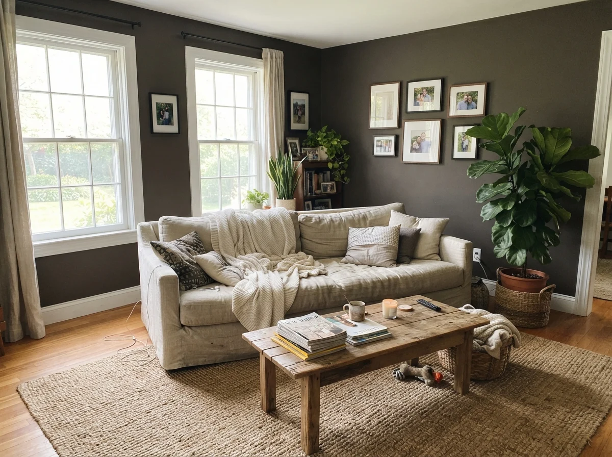
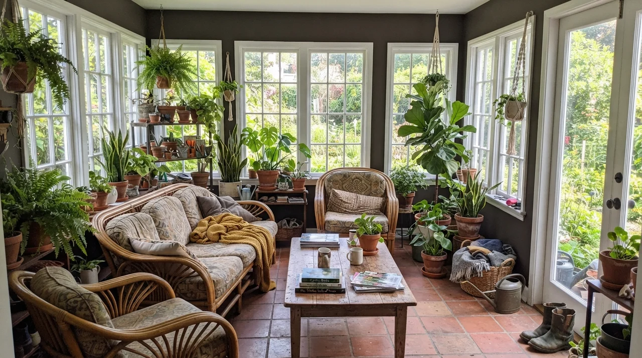
Where it does shine in living spaces is when the room is bounded and enjoys steady light, or when it functions as an enclosed sunroom flanked by heavy window trim. Surrounded by glass, rattan furniture, and leafy houseplants, Silhouette recedes into the background, letting the outdoor green take center stage.
Exterior Siding and Rooflines
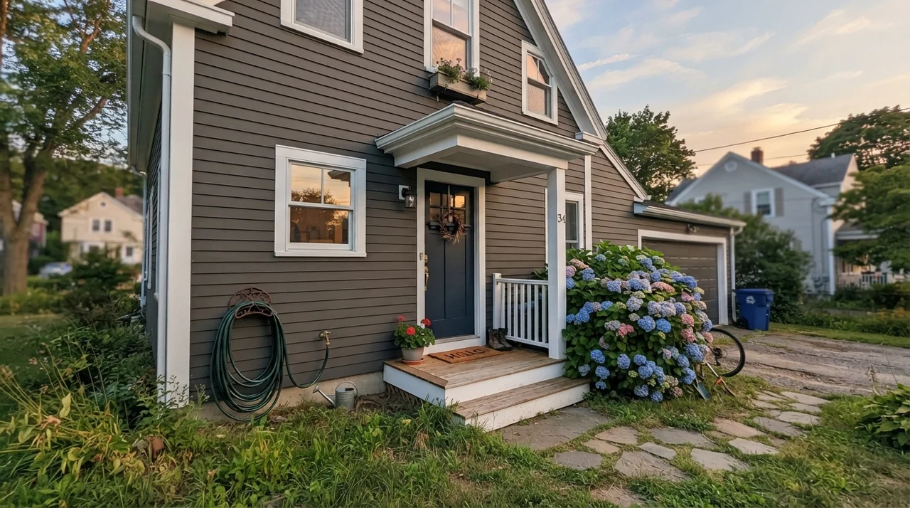
Long before marketing teams crowned Silhouette as a headline shade, exterior designers were specifying it for trim, gutters, fascia boards, garage doors, and siding on warm-toned homes. Out in the natural daylight, the depth softens noticeably. Where a pure black can look harsh and industrial against stone or brick, Silhouette reads as a warm, grounded shadow. If you live under heavy tree cover or want horizontal siding that blends into natural landscaping without disappearing into generic slate, it performs remarkably well. Ask your local paint counter which specific exterior line handles a base this deep, because rich pigment requires a formula that will not fade prematurely under full weather exposure.
Where Silhouette Fails: Hallways and Oak Clashes
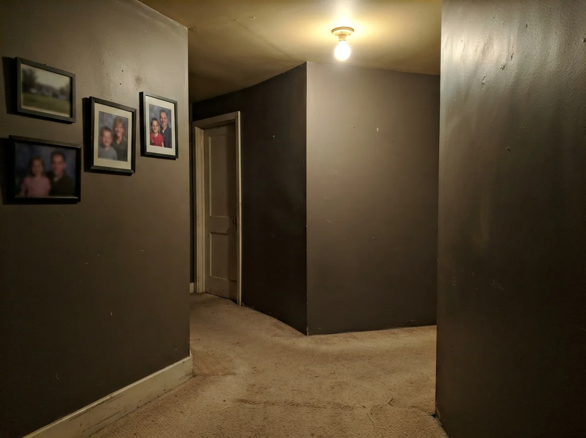
Now for the honest failure. If you try to run Silhouette down a windowless interior hallway lit by a lone builders-grade overhead fixture, you will hate it. Without natural light to draw out the brown or warm lamps to give it richness, the color goes flat, muddy, and heavy. It loses its refinement and looks like wet putty. Worse still, if you pair it with heavily orange builder-grade oak cabinetry or strong yellow creams like Windswept OC-94, the color science works against you. Warm yellow sits opposite violet on the wheel; instead of warming the wall up, the yellow trim exaggerates the mauve undercurrent in Silhouette. If you cannot change orange trim, look toward Willow CC-542 instead, which stays firmly in the clean, earthy brown camp.
Durability, Touch-Ups, and Family Life
Here is the reality of living with an LRV 10 wall five years in: dark paint is high maintenance if you choose the wrong sheen. Because deep shades require a heavy saturation of colorant in a dark base, they have less natural resin binder to resist scuffing. If you roll Silhouette in a dead-flat finish down a narrow hallway where kids carry backpacks, every shoulder brush leaves a light, burnished streak that cannot simply be scrubbed clean. When we sold our second house, I had to completely repaint two dark walls rather than touch them up, because dark bases show brush lap marks the second you dab a small spot.
For walls in a dining room, study, or bedroom, stick to a durable matte. Matte absorbs surface glare, which hides drywall flaws, and modern quality formulations can actually be wiped down without leaving bright burnish spots. On trim and interior doors, step up to semi-gloss. On kitchen cabinets, satin is mandatory—it resists grease, cleans smoothly, and provides just enough sheen to keep the dark brown from looking flat and chalky. On exterior siding, choose a low-lustre exterior finish that sheds water while standing up to summer sun.
Is Benjamin Moore Silhouette black or brown?
It is a dark, chalky brown that behaves like a charcoal. In warm south light or under incandescent bulbs it reads as a rich espresso; under cool north light or blue LED bulbs, its violet undertones come forward and it looks like a plum-gray.
What is the LRV of Silhouette AF-655?
The Light Reflectance Value is 10. That means it absorbs 90% of visible light, placing it firmly in the deep, moody category. It requires thoughtful lighting to prevent rooms from feeling closed-in.
Why does Silhouette look purple on my wall?
Silhouette sits in the orange color family with a complex dusky gray base. Cool 4000K or 5000K LED bulbs, cool north window light, or high contrast next to yellow trim or orange oak will draw the purple streak directly to the surface.
Can I use Silhouette in an open floor plan?
No. At LRV 10, running it across continuous open living areas creates a heavy, cave-like effect with no natural stopping point. Keep it for closed rooms, accent cabinetry, or exterior trim.
Susan's Verdict · Worth It for Millwork, Risky on Open Drywall
Silhouette is the rare Color of the Year that normal homeowners can actually put to work, provided you keep it off large open-plan walls. If you want custom-looking lower kitchen cabinets, a drenched powder room, rich library built-ins, or smart exterior trim, it is worth the money. Just change your bulbs to warm 2700K first, keep it away from yellow-orange oak, and sample it on your darkest wall before you commit.