Color Diary · No. 80
Benjamin Moore Salamander: When You Paint for Green and Get Midnight
Benjamin Moore's near-black green-blue chameleon, reviewed honestly: the light that finally lets it read green, and the light that just makes it black.

Susan HartleyOctober 13, 2026 · 14 min read
Salamander · Benjamin Moore 2050-10
Hex#2F3E3ELRV6Undertonesblack → teal-blue → mossy green
In our last house, a 1990s colonial with oversized windows and endless golden oak trim, I convinced myself I wanted a moody library corner. I bought a quart of what the chip promised was an opulent, forest-drenched teal, brushed it proudly onto the wall behind an armchair on a cloudy Tuesday, and stared at what looked like three coats of chimney soot. My husband walked past, paused with his mug of coffee, and asked if we were priming for a chalkboard wall. That was my introduction to colors sitting below light reflectance value ten—and Benjamin Moore Salamander sits all the way down at an LRV of 6.
That is the thing nobody tells you about near-black paints: on the tiny paper chip in the store, your thumb covers half the surface and your eyes strain to catch the undertone under fluorescent lighting. You see rich moss, a whisper of lake water, and dramatic European cabinetry. But once you roll it over twenty square feet of drywall in an ordinary American room, gravity sets in. At LRV 6, Benjamin Moore Salamander (2050-10) is practically kissing true black. Benjamin Moore describes it as a deep, dark mix of black, blue, and green, and that is entirely literal. Most of the hours you live with it, the black base simply swallows the room. But when strong, direct sun cuts through a south pane or glances across a kitchen island, the mix suddenly separates, letting you see the cold blue edge and the mossy green heart that made you fall in love with it in the first place.
I have lived through enough decorating cycles across thirty years to know when a color is being asked to do something it wasn't engineered for. People grab Salamander because deep green kitchens and moody painted dining rooms are having a massive moment on glossy magazine spreads. But if you expect this color to announce itself as unmistakable emerald or spruce the minute you flip on an overhead switch, you are heading straight for disappointment. Salamander demands that you negotiate with your daylight. It is a chameleon that needs coaxing, which makes understanding its pigment shifts your very first job.
The Undertone Breakdown: How Salamander Shifts Across Daylight
At an LRV of 6, Salamander lives right on the borderline where pigments turn into silhouettes. Depending on the hour and your light source, here is how its three internal faces reveal themselves.
warm sun
overcast, north light
dusk, rain, cool bulbs
A heavy black base with competing cold-blue and moss-green undertones that separate only under direct, potent illumination.
Regent GreenBenjamin Moore · see diary
CascadesSherwin-Williams · see diary
Salamander2050-10
JasperSherwin-Williams · see diary
Night WatchSherwin-Williams · see diary
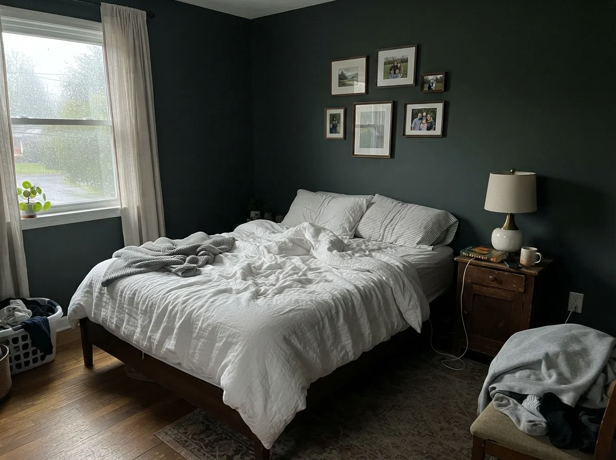
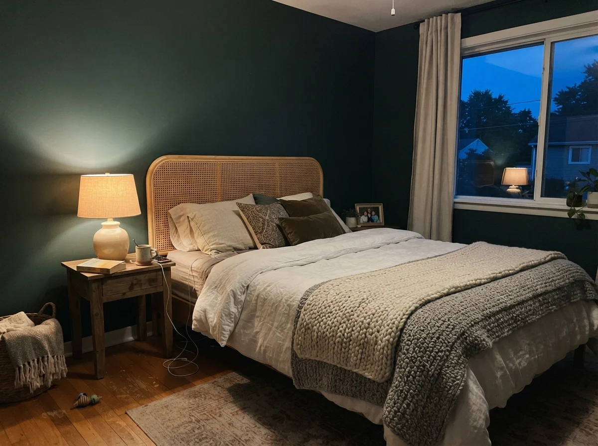
To see how wildly a color with an LRV of 6 changes across twelve hours, you only have to watch it in a bedroom from dawn to dusk. In the early morning, before any lamps are switched on and the sky is just pale silver, Salamander looks lean, cold, and almost drained—resembling a faded slate or an unwashed blackboard. But come evening, when you flip on a single reading lamp cast with a warm 2700K bulb, the black softens into an intimate, velvet cocoon with a faint whisper of forest floor.
Where Salamander Shines: The Power of Small Doses
In our current 1960s ranch, I've learned that saturated, near-black paints are like chili pepper flakes: a pinch lifts the entire dish, but dumping in a cup makes it inedible. Benjamin Moore Salamander is fundamentally a doses color. It was never intended to wrap the drywall, baseboards, and ceiling of a windowless family den. Where it earns every single penny of its price tag is when it is given a defined border to anchor.
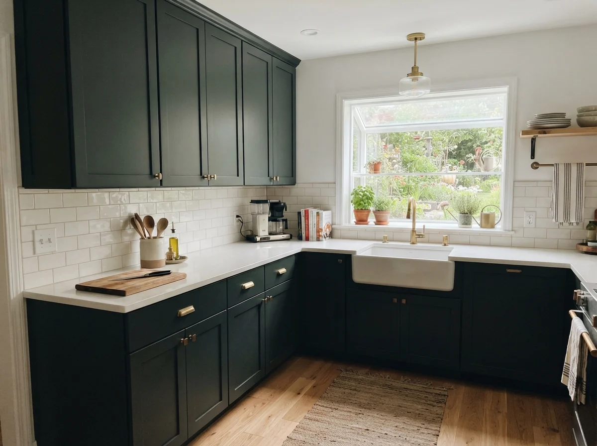
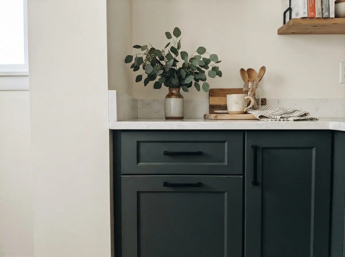
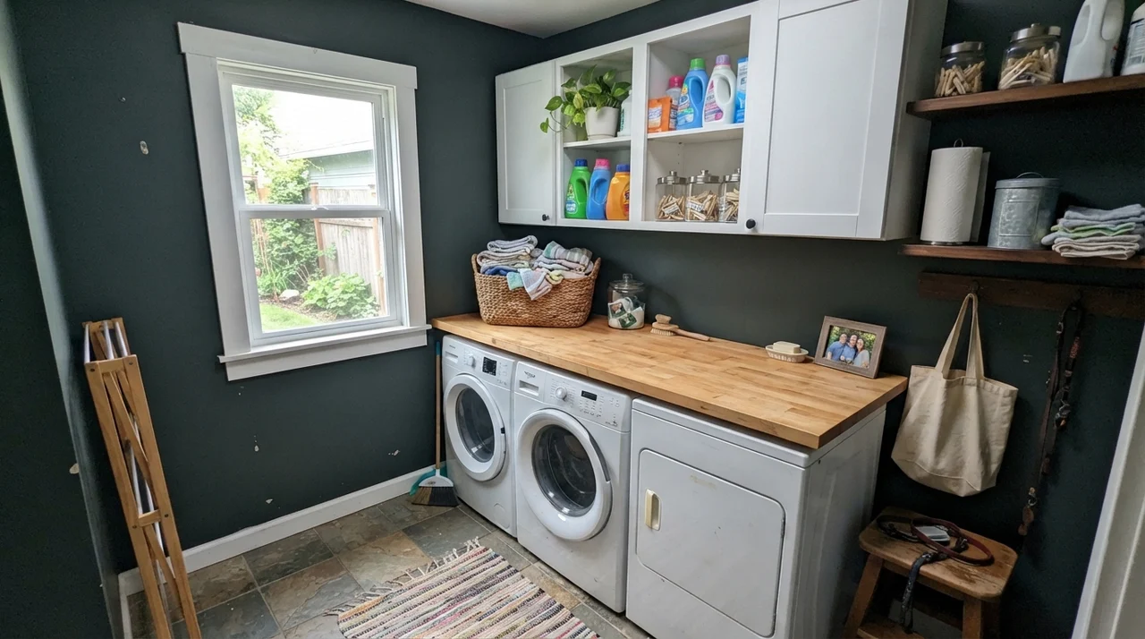
Think about a kitchen island, a set of lower cabinets, a laundry room work counter, or a modest bathroom vanity. Paired with bright white surfaces or honest wood tones, that inky depth reads tailored and expensive rather than heavy. And because Benjamin Moore sells Salamander not just as interior wall paint and cabinet enamel but also as an exterior solid wood stain through their Woodluxe line, you get an unusual bridge between inside and outside living.
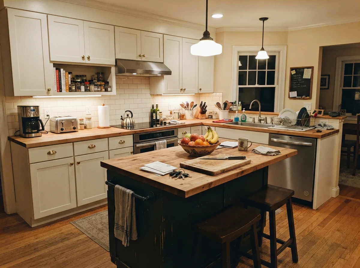
When we sold our split-level years ago, the appraiser walked through and noted that accent points grounded the open concept without chopping up the sightlines. An island in Salamander does exactly that. Under strong midday task lighting, the subtle blue and green undertones prevent it from looking like a flat black box dropped into the middle of the kitchen. Instead, it catches the sun and hints at deep coastal water or pine boughs.
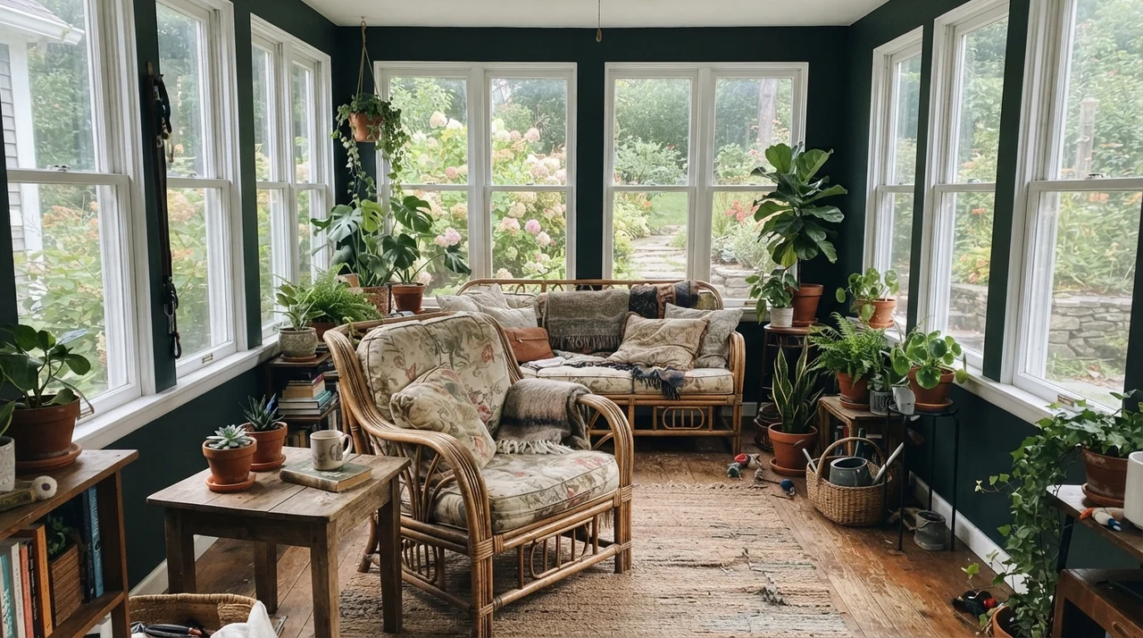
You can carry that same disciplined contrast right into service spaces like the laundry room or a sun-drenched breakfast area, where clean white millwork keeps the dark pigment from encroaching on your good mood.
At LRV 6, you are not buying a friendly green wall that happens to be dark. You are buying a black wall that gives up its green only when the sun demands it.
Bathrooms and Bedrooms: Managing the Mood
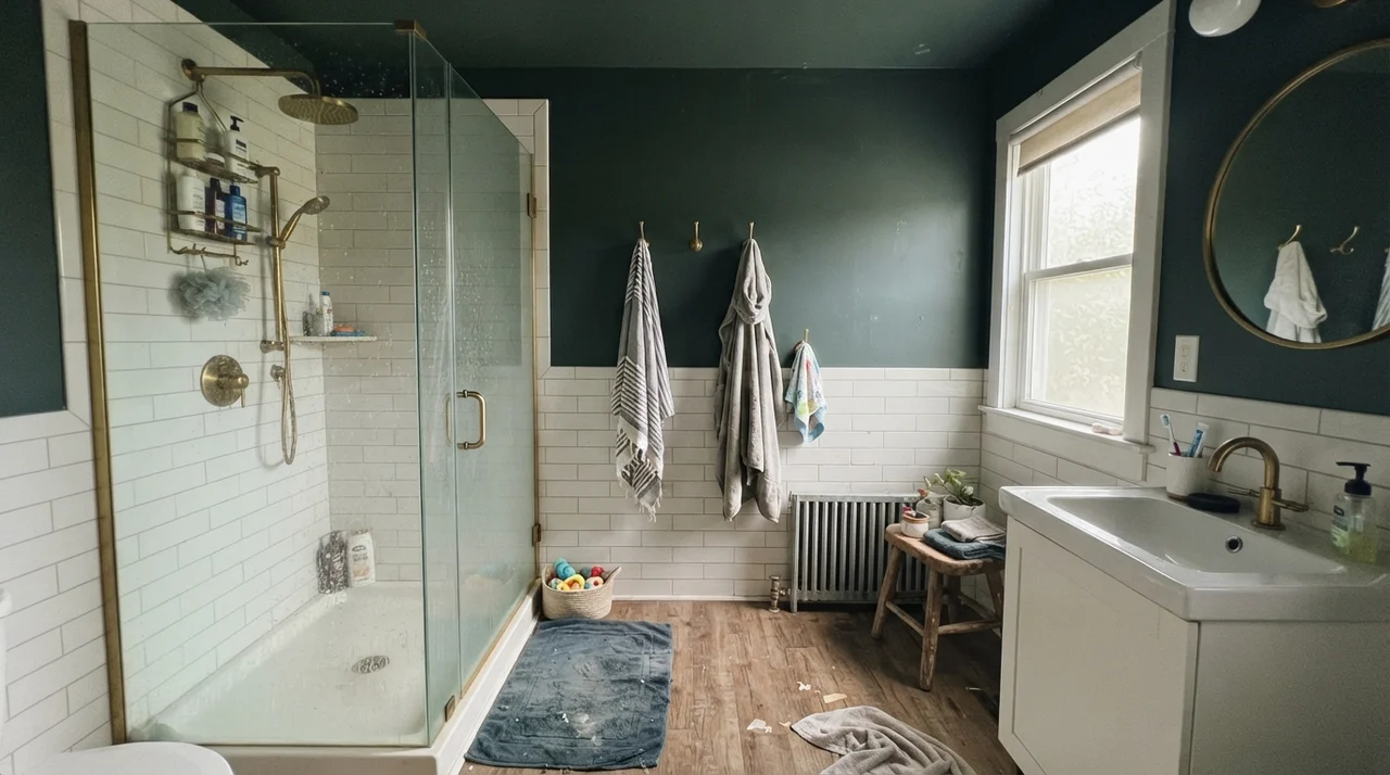
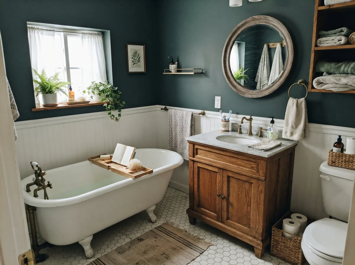
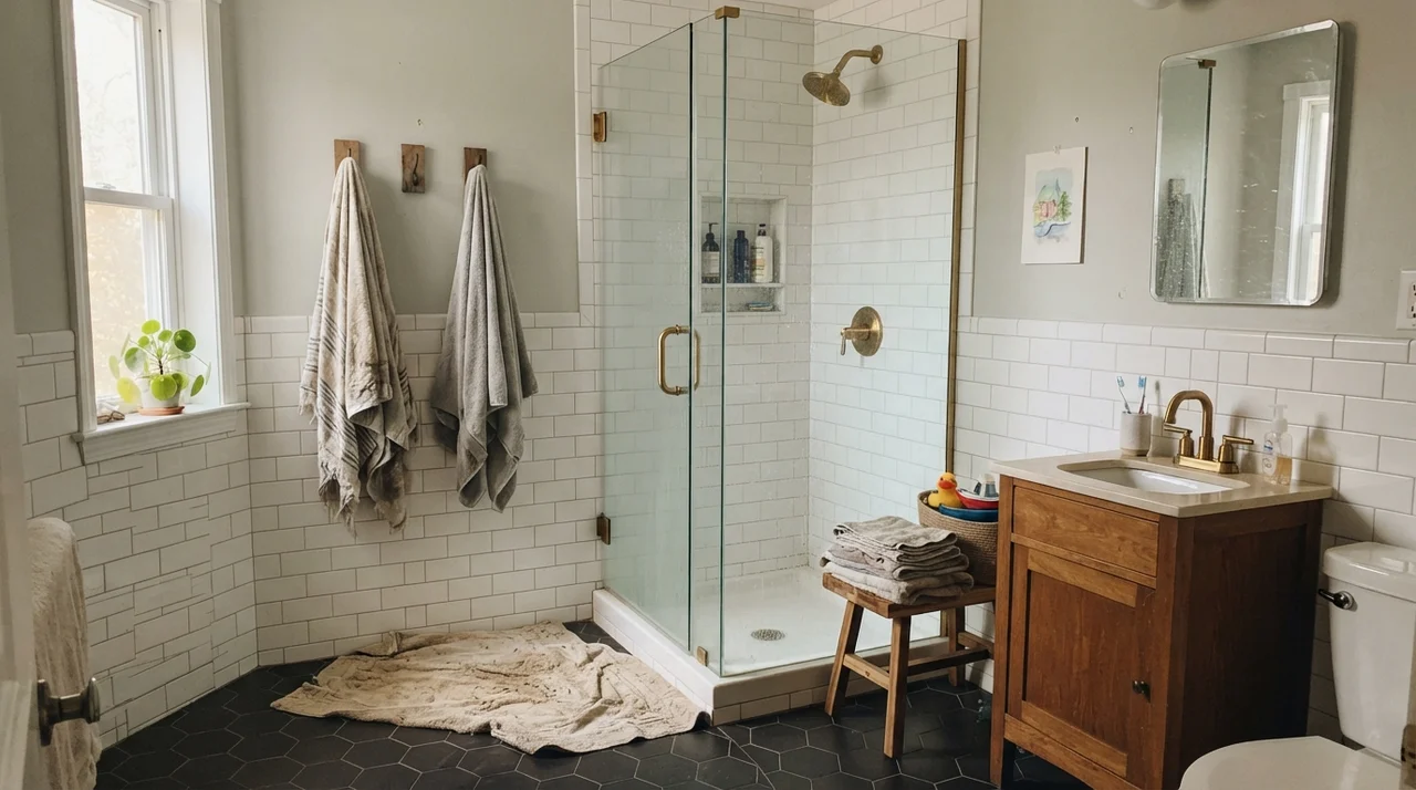
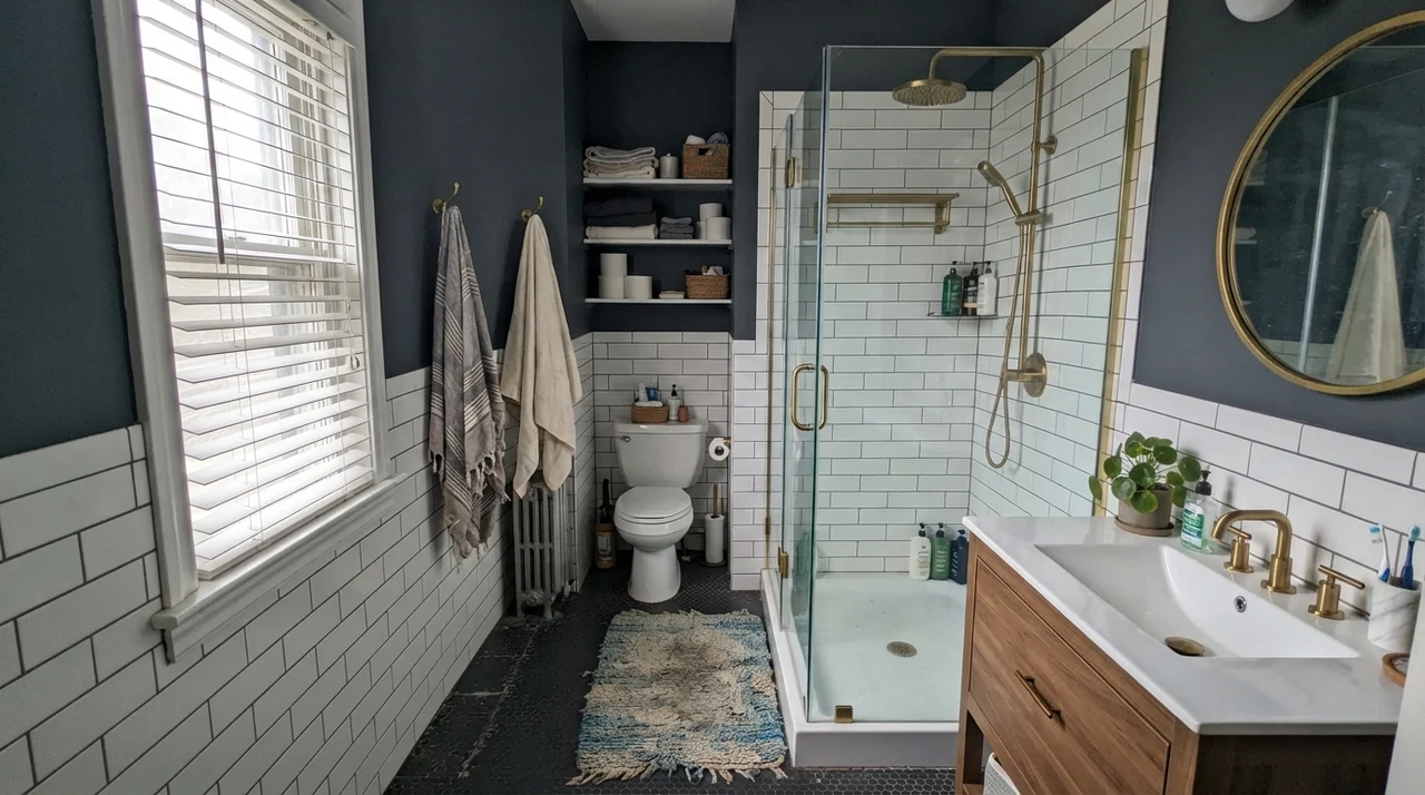
People love putting moody dark tones in powder rooms, calling them 'jewel boxes.' I have lived with enough powder rooms to know that if there is no natural window and you screw in standard cool white LED bulbs, you haven't built a jewel box; you've built a mine shaft. Salamander can look remarkably handsome in a bathroom, but only when balanced by gleaming white fixtures, mirrors that bounce daylight, or extensive white tile wainscoting.
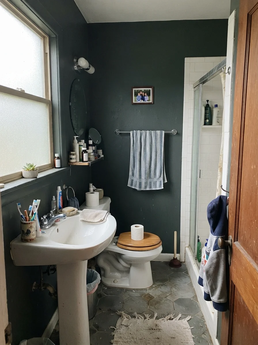
Consider how different light exposures handle it. In soft, diffuse morning light, a cottage clawfoot setup feels tranquil. Put that same paint in a dim space with frosted glass or cool northern drizzle, and the color will retreat instantly into a somber, slate-tinged charcoal.
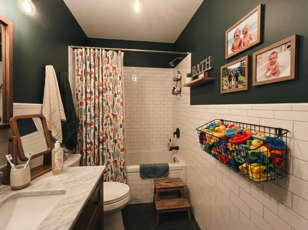
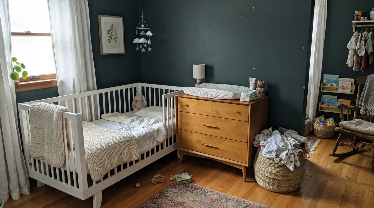
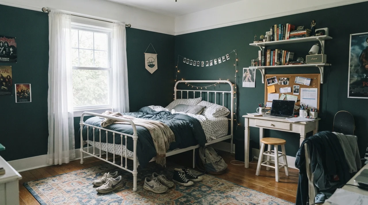
In family spaces where clutter naturally accumulates—like the children's bath with bath toys spilling out of wire bins, or a teenager's desk area strewn with sneakers and notebooks—a near-black paint can easily feel oppressive unless there is sharp, intentional relief. White trim, crisp subway wainscot, or blonde wood desks break up the shadow and let the dark pigment frame the room rather than overwhelm it.
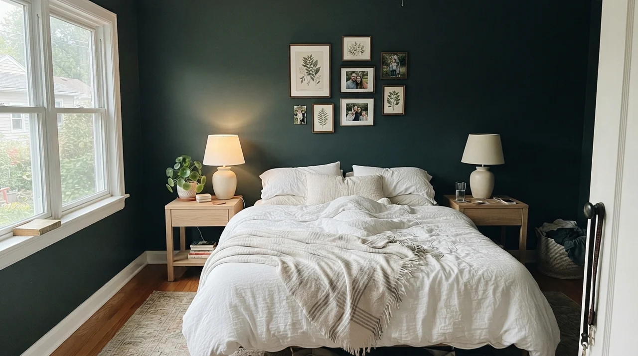
When you take Salamander into a main adult bedroom, treat it with respect. If the space enjoys generous side-window daylight, the combination of crisp white linen bedding and pale oak furniture creates a restful, tailored retreat. It gives you the intimacy of a dark bedroom without feeling like a cave, provided the sun actually visits during the day.
Living Spaces, Built-Ins, and the Great Outdoors
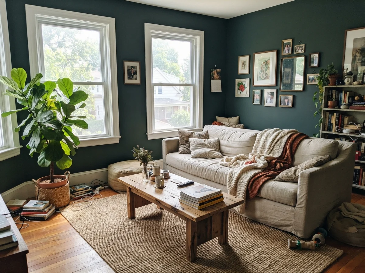
I am generally skeptical of painting all four walls of a family living room in an LRV 6 shade. Living rooms have awkward corners, alcoves, and varying light conditions throughout a twelve-hour span. Unless you have massive windows pouring midday sun across the entire floor plan, four full walls of Salamander will simply read as flat black for seventy percent of your waking hours. If you want it in the living room, place it on the wall opposite your largest southern or western window where the sun directly hits the pigment.
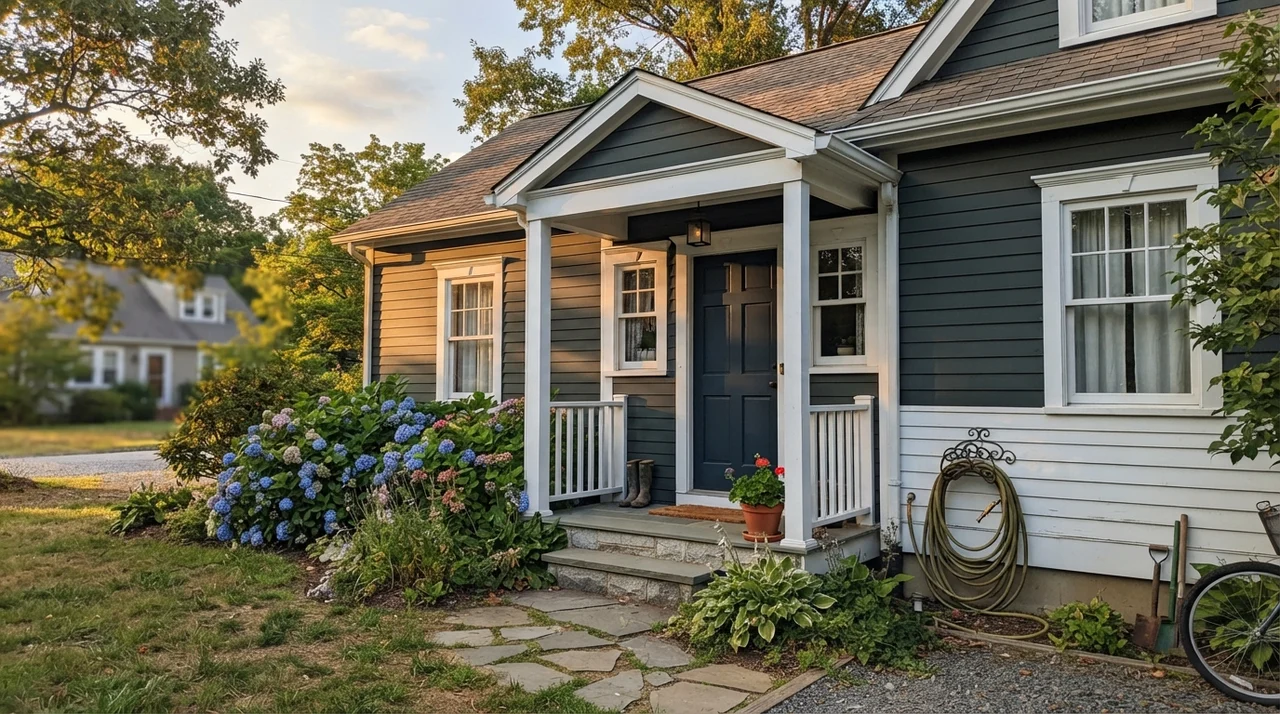
Where Salamander absolutely triumphs without reservation is out in the open air. Daylight outdoors is ten to twenty times stronger than even the brightest interior sunroom. On exterior horizontal siding, shutters, or front doors, the black baseline recedes just enough to let the deep forest and coastal teal shine through proudly. And because it is available through Benjamin Moore's Woodluxe line for siding, decks, fences, and outdoor furniture, matching an exterior gate or outbuilding to your front trim is completely straightforward.
I spent an afternoon sitting in my reading chair, testing a fresh board of Salamander while unraveling some heather-gray wool. Looking at it across several hours, you realize that colors like this require patience. You cannot judge them by a 2-by-3-inch paint chip taped to the drywall under a sixty-watt ceiling bulb.
The Honest Fail: When LRV 6 Betrays You
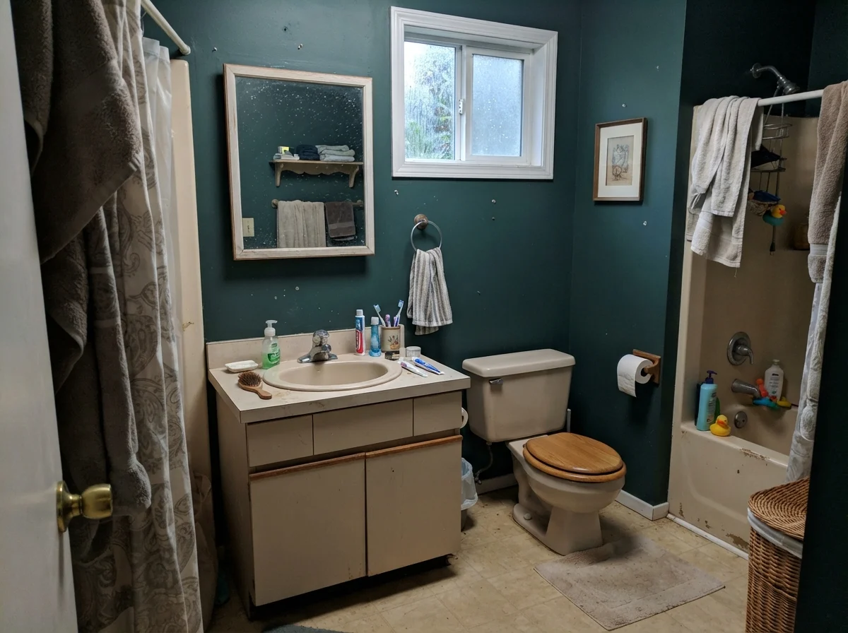
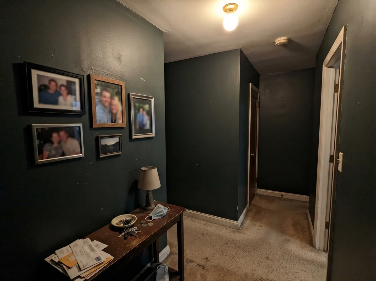
Almost every angry homeowner review I have ever read regarding Salamander stems from one predictable error: treating it like an ordinary forest green and rolling it in a space without natural daylight. If you put this color in a windowless hallway, a basement rec room, or a powder room illuminated solely by a cold ceiling dome, you didn't buy a green room. You bought an expensive shadow.
The black pigments in Salamander are heavy. Without real daylight driving into the surface, the blue and moss-green undertones never wake up. The wall simply sits there—muddy, heavy, and absorbing every lumen your light fixtures try to provide.
If this describes the room you want to paint, put the can back. Choose a lighter olive or green with a higher LRV that can carry its own weight without relying on direct sunshine. Don't ask a midnight color to act like an afternoon shade.
Furnishings, Metalwork, and Architectural Fit
Because Salamander carries that cool teal-black foundation, the metals and woods you set against it will make or break the installation. Warm metals—unlacquered brass, brushed antique gold, and aged copper—sing alongside this shade. The yellow warmth in the metal brings out the mossy undertone of the paint, whereas cool chrome or brushed nickel can make the entire wall look chilly and institutional.
For millwork and furniture, light oak, butcher block, and raw pine provide the organic balance that keeps a near-black wall feeling grounded in a home rather than looking like an upscale boutique.
The Budget View: Sheen, Primers, and the Five-Year Test
Here is where thirty years of house ownership makes me practical: dark paint is unforgiving when it comes to labor and durability. If you pick up a can of Salamander, walk straight up to the paint counter and insist on a deep-base gray-tinted primer. If you roll an LRV 6 near-black directly over standard white drywall or old pale cabinets, you will be on your fourth coat at 11:00 PM on a Sunday, weeping into your roller tray. A properly tinted dark primer cuts that nightmare down to two clean coats, saving you cans and weekend sanity.
When it comes to sheen, wall sheens should stay in eggshell or matte. High sheens on large drywall surfaces magnify every drywall tape bump and roller stipple you ever had. But on trim and cabinets, a durable satin, semi-gloss, or high-gloss finish gives you the washability you need. Dark paints show hand oils and dried soap scum like nobody's business. Five years in, you will be grateful you selected a finish that can be scrubbed clean by the sink without leaving burnished, shiny rub spots behind.
Will Benjamin Moore Salamander look green on my walls?
Only if that wall receives strong, direct daylight or focused warm artificial lighting. In dim lighting, north-facing rooms, or windowless spaces, it will simply read as soft black.
What sheen should I use for Salamander on kitchen cabinets?
Use a satin or high-gloss cabinet finish. These sheens hold up against regular kitchen grease and can be scrubbed clean without leaving worn, burnished patches.
Do I really need a tinted primer for Salamander?
Yes. Painting an LRV 6 color directly over white drywall will require three to four coats for opaque coverage. A dark gray tinted primer saves time and paint.
Can I use Salamander on exterior siding and decks?
Yes, Benjamin Moore sells Salamander through their Woodluxe exterior wood stain line, making it excellent for siding, fences, decks, and doors.
Susan's Verdict · Use in Doses Under Good Daylight
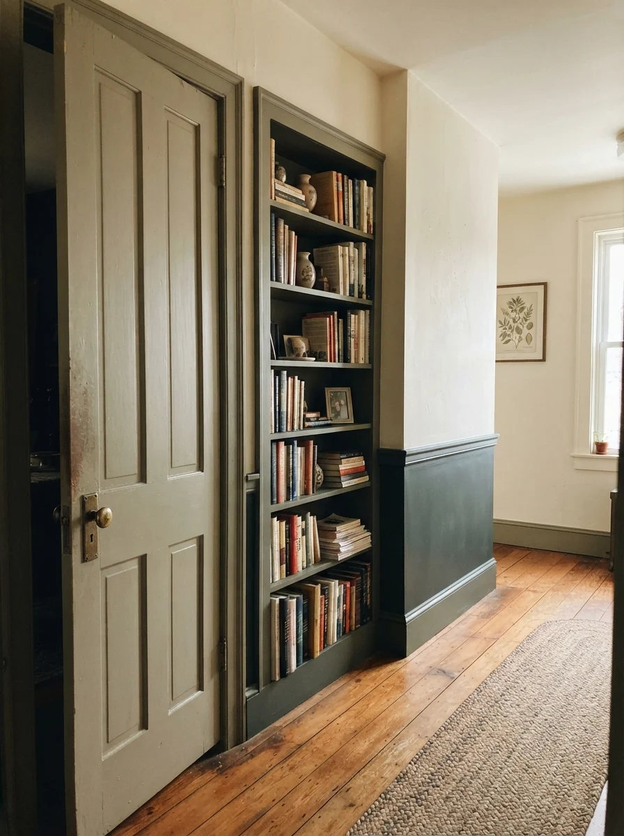
Salamander is an exceptional architectural accent when applied with restraint. Use it on kitchen islands, built-in bookcases, vanities, or exterior siding bathed in real sun. Just don't roll it across four walls in a dark room expecting a friendly green—at LRV 6, respect the black base and you'll love it five years in.