Color Diary · No. 81
Oyster White SW 7637: When Ten Points of Light Change the Entire Room
A white in name only: Oyster White reviewed honestly — the rooms where its soft greige glows, the light that turns it drab, and what to pick instead.

Susan HartleyOctober 14, 2026 · 13 min read
Oyster White · Sherwin-Williams SW 7637
Hex#E2DDD0LRV72Undertonesgreige → soft beige → olive shadow
In our last house, I spent three weeks staring at a strip of cardboard taped next to the refrigerator, convinced I had found the holy grail of off-whites. It had an elegant, coastal-sounding name, and on the paper swatch under fluorescent hardware store lighting, it looked like linen. We bought four gallons of Sherwin-Williams Oyster White, hired a crew to roll the tall central living space, and by four o'clock on the first day, I had to walk outside and stand in the driveway to catch my breath. It was not white. It was never white. It was a soft, chalky greige that had quietly settled onto my walls like an overcast November afternoon.
That was my initiation into LRV 72. Most homeowners who get into trouble with Oyster White get into trouble because they took the name at face value. If you buy a paint called Oyster White expecting it to perform like crisp millwork paint or a bouncy, light-reflective gallery wall, you are going to be profoundly disappointed. But once you accept what it actually is—a grounded, low-saturation greige that sits about ten points lower than a standard off-white—you begin to see where it truly belongs.
That gap of ten light reflectance points is the whole story. A true off-white sits up around an LRV of 82 or higher, reflecting ample daylight back into the room and behaving like a clean canvas. At 72, Oyster White absorbs just enough light to introduce real mass and depth to a surface. In a space flooded with natural daylight, that low saturation flatters natural materials—warm white oak, unlacquered brass, limestone, and linen—without ever tipping over into the cloying buttery creaminess that made so many 1990s interiors feel stuffy. But take that same pigment into a dim corner, and the greige loses its warmth entirely.
How Daylight Dictates the Shift
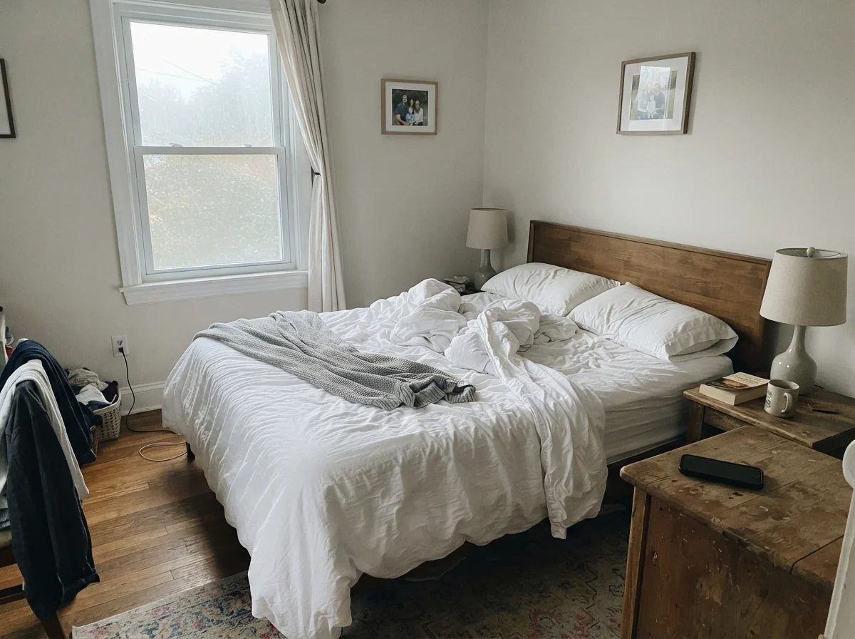
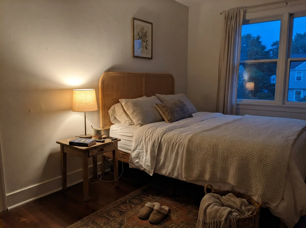
Color shifts happen in every paint, but with Oyster White, the change between morning and evening feels like two completely separate paint chips. In cool morning light or overcast weather, the subtle green and gray undertones come forward. If the room doesn't have south-facing exposure to pump warm photons into the drywall, the color reads quiet, muted, and occasionally pale. But when you light a warm incandescent lamp at dusk, the beige foundation wakes up, creating an enveloping, comfortable warmth that modern cold grays simply cannot replicate.
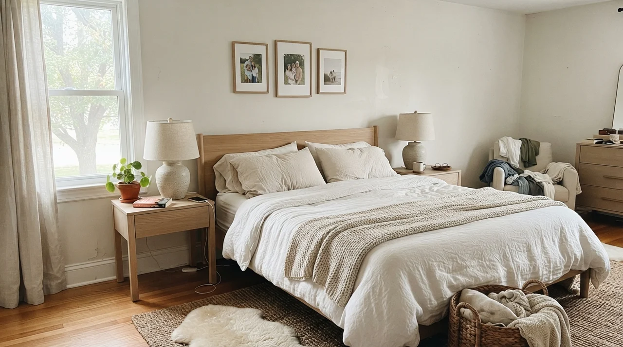
I saw this daily in our 1990s colonial. In the east-facing master bedroom, the walls woke up feeling brisk and slightly reserved, but by eight in the evening under bedside lamps running 2700K bulbs, the walls settled into a quiet, comforting cocoon. That dual personality is why sampling on a small two-inch card never works. You have to paint a poster board, move it around, and watch how it looks when you're actually sitting in bed reading.
The Bathroom Test: Tile, Vanity, and Morning Light
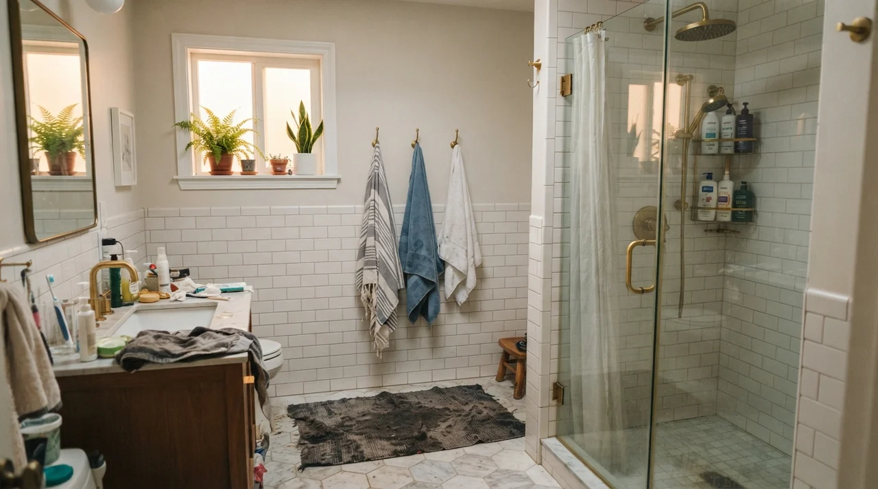
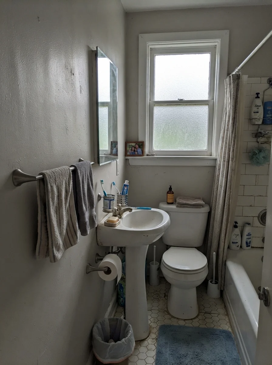
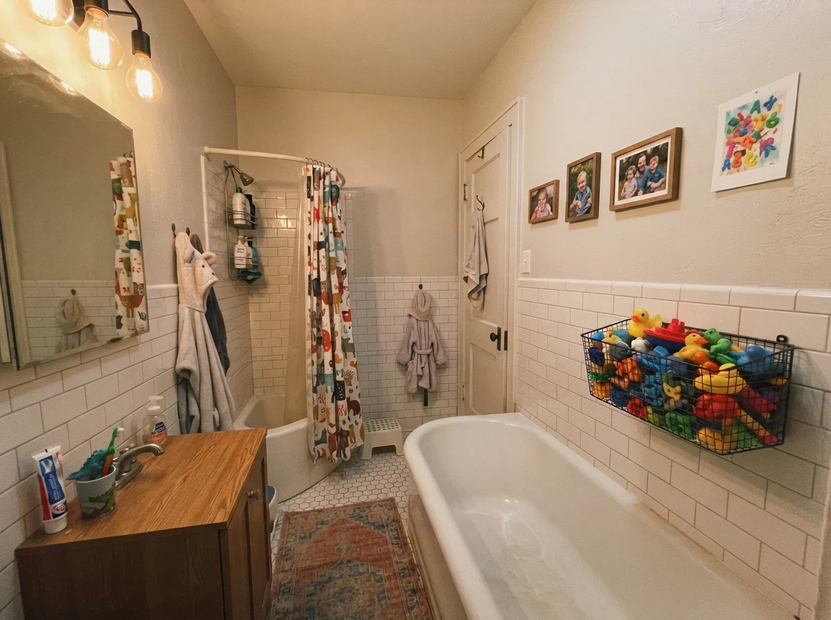
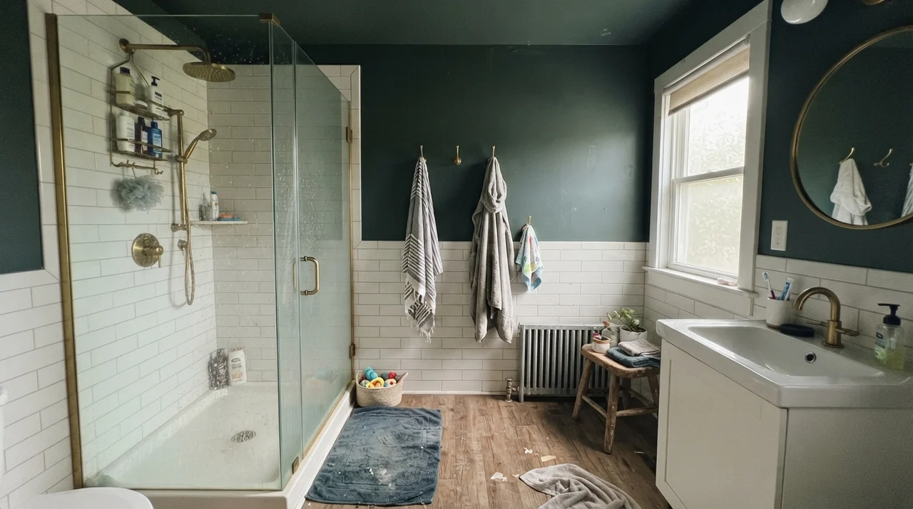
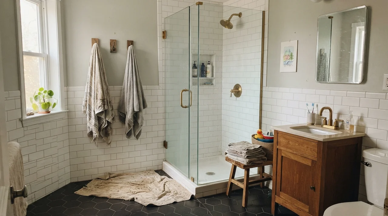
Bathrooms are an unforgiving testing ground for Oyster White. Because bathrooms typically feature dense fields of pure white ceramic tile, cool mirrors, and high-output lighting, the greige pigment has to fight hard to hold its ground. When paired with warm unlacquered brass and clean white subway tile wainscoting, Oyster White provides just enough contrast to make the white tile pop without creating a jarring stripe around the room.
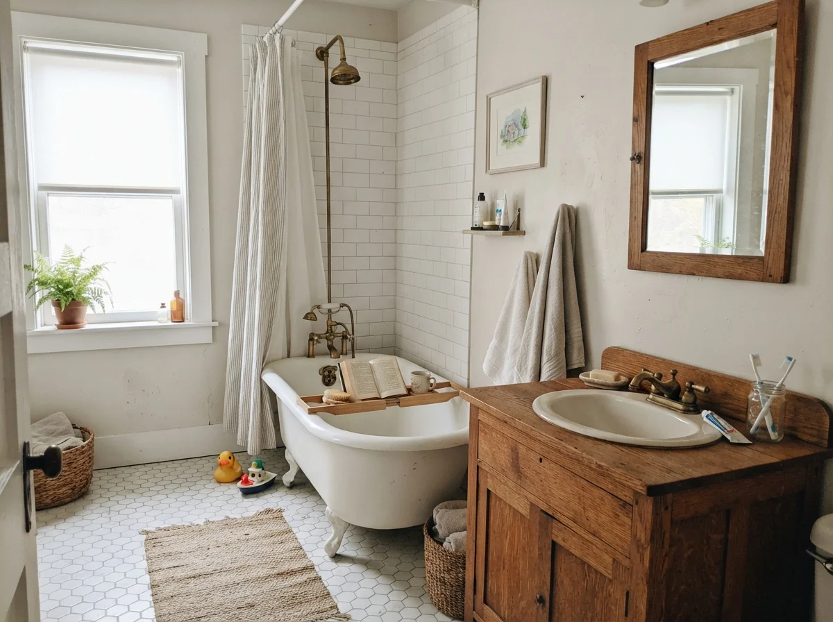
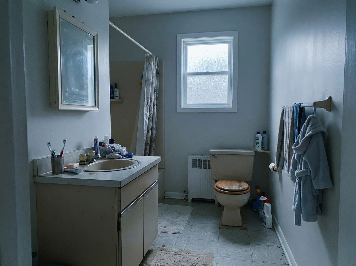
However, the moment you introduce cooler natural light or older fixtures, the story shifts. In a cottage setup with white hex floor tile, a clawfoot tub, and a warm oak vanity, the daylight brings out the soft, organic qualities of the paint. But put it under flat overcast daylight or cold north-facing exposure, and you will see the gray take over, flattening the mood of the room.
In our family bathroom, with kids leaving bath toys everywhere and damp towels draped over hooks, I lived with it on the upper drywall for seven years. It held up wonderfully against everyday scrubbing. Water droplets and minor soap splashes didn't leave the visible dark halos that darker grays show, nor did it broadcast every single stray scuff mark like bright white trims always do.
Bedrooms and Quiet Corners
When you move into private spaces like bedrooms and nurseries, Oyster White delivers an anchor that bright off-whites can't quite manage. Because it has that lower LRV, it absorbs light rather than bouncing it around, which makes a room feel settled. In a serene main bedroom paired with pale oak nightstands and white linen bedding, it creates an understated calm that allows textures to do the heavy lifting.
At LRV 72, you are not painting with white; you are painting with quiet mass that hides five years of living.
Kitchens: Cabinets, Islands, and Real Work surfaces
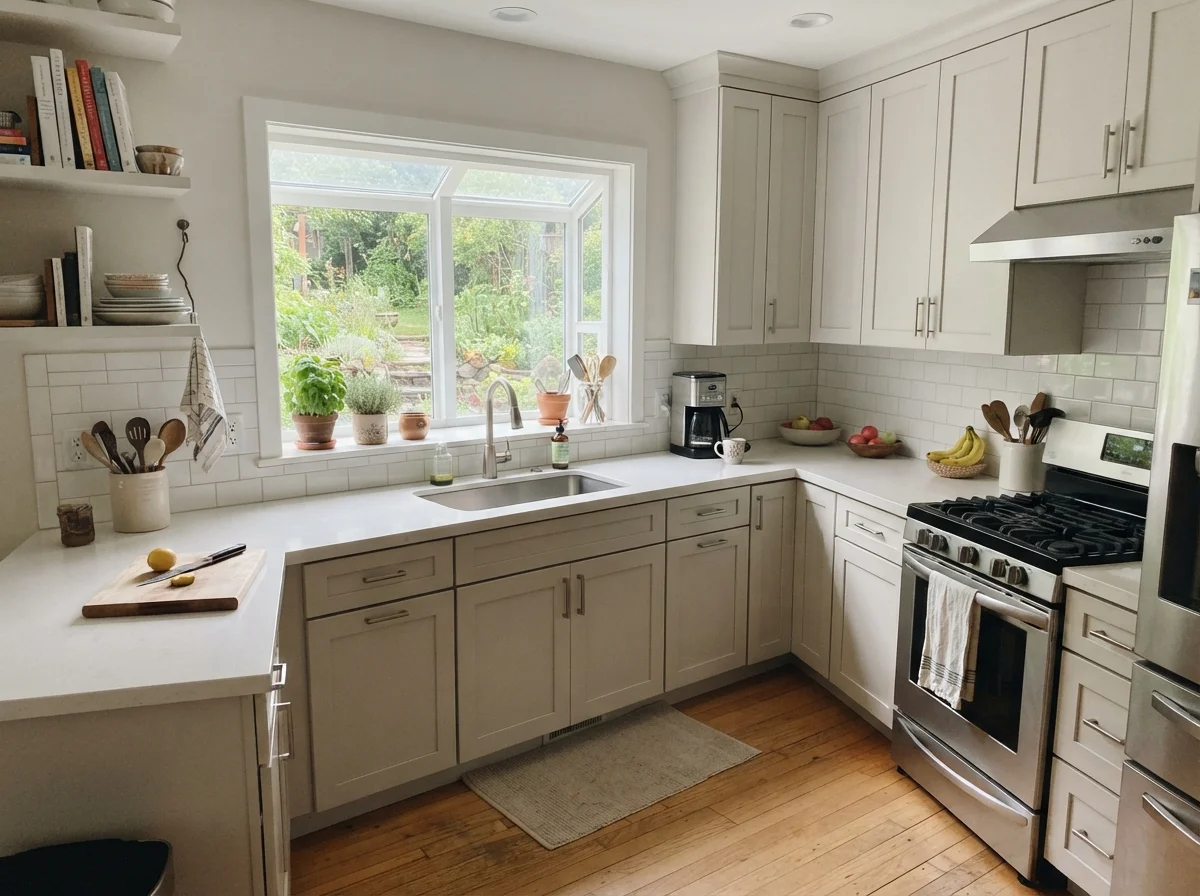
If you ask me where Oyster White does its finest work, I will tell you without hesitation: cabinetry. In 2018, when everyone was painting cabinets stark, clinic-grade white, I watched a neighbor scrub her white shaker doors every Sunday morning just to remove the faint yellow grease line above her range hood. Bright whites broadcast cooking haze, sticky toddler fingerprints, and shoe scuffs on base cabinets with agonizing clarity.
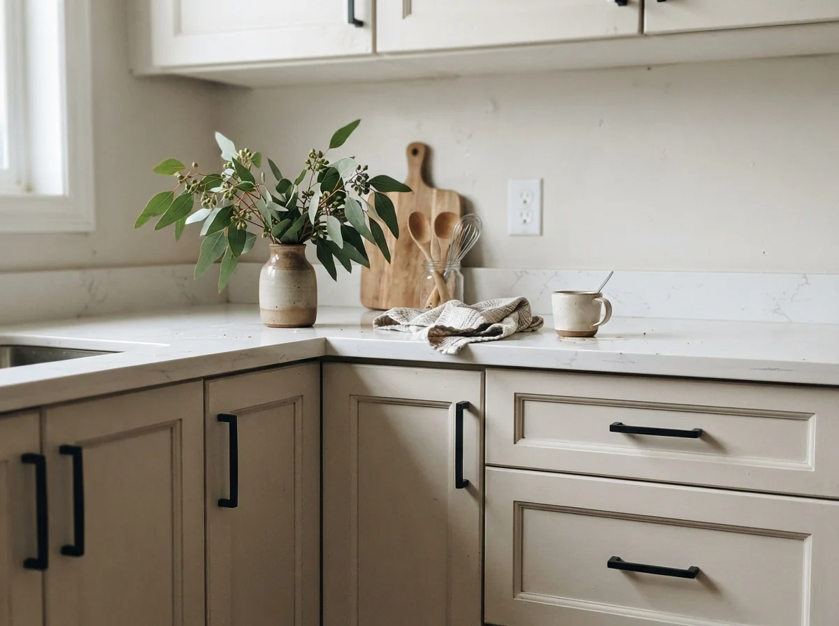
Oyster White in a satin cabinet enamel solves that problem entirely. It has just enough greige pigment to hide the realities of a working kitchen, while still appearing bright, airy, and intentional when placed next to white counters and white subway tile backsplashes.
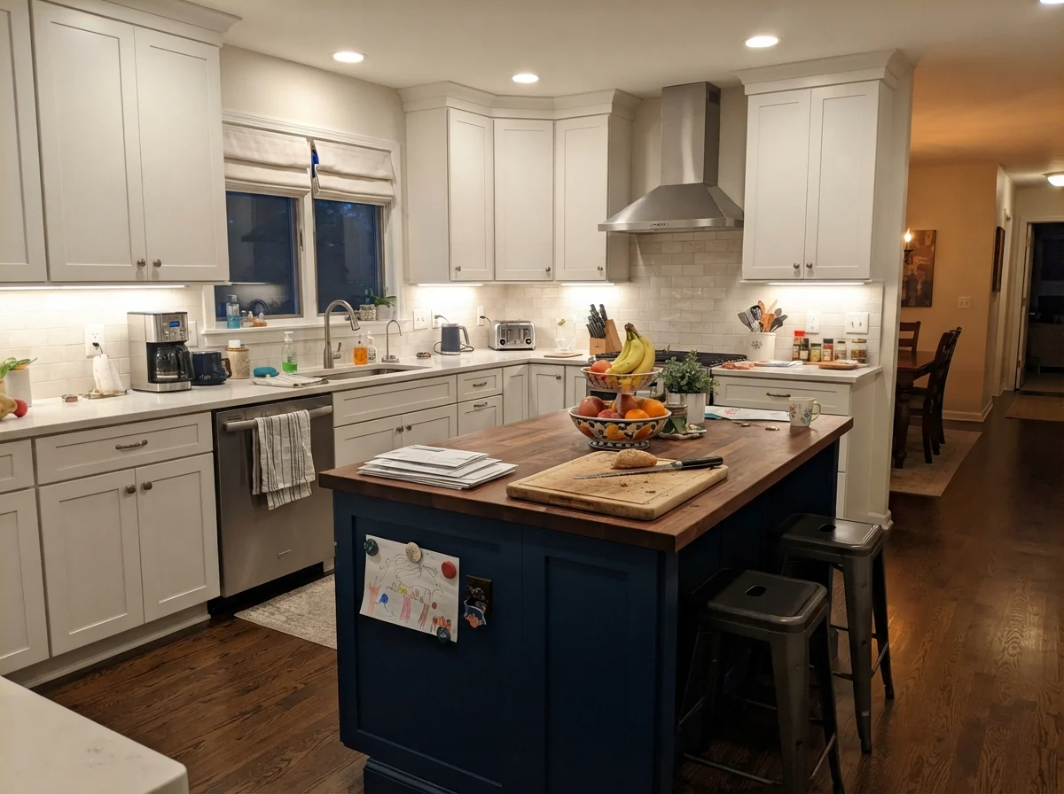
Using it solely on an island is another smart play. In a kitchen with creamy walls and white cabinets, painting the island Oyster White grounds the center of the room without the stark visual break that navy or charcoal creates. It was worth the money to use premium satin enamel here; five years in, that island takes kicking feet from barstools and scrubs clean with a warm microfiber cloth without flashing or burnishing.
Living Spaces, Sunrooms, and Utility Rooms
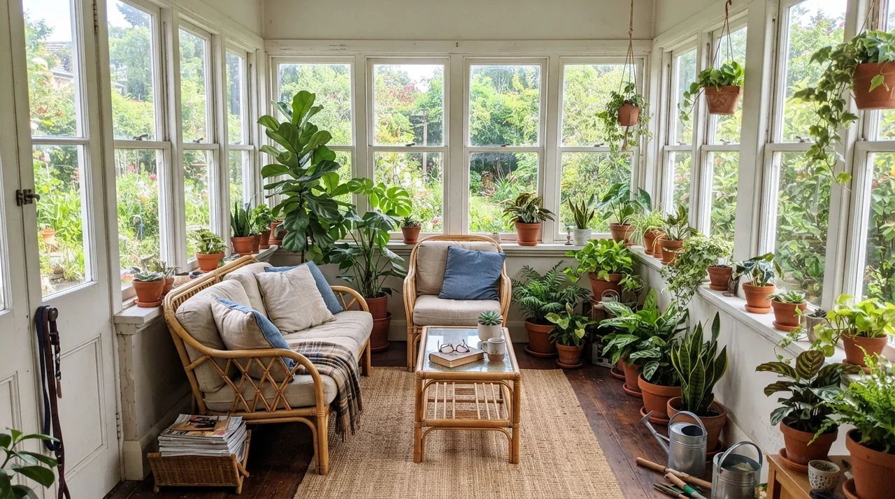
In living rooms and open-concept floor plans, Oyster White behaves like a chameleon. When bathed in midday sun from two large windows, it holds its ground without washing out or glaring, acting as a polite background for a linen sofa, jute rugs, and leafy house plants. In a sunroom wrapped in white window trim, the walls offer a gentle respite from intense outdoor glare, complementing rattan furniture and terracotta pots effortlessly.
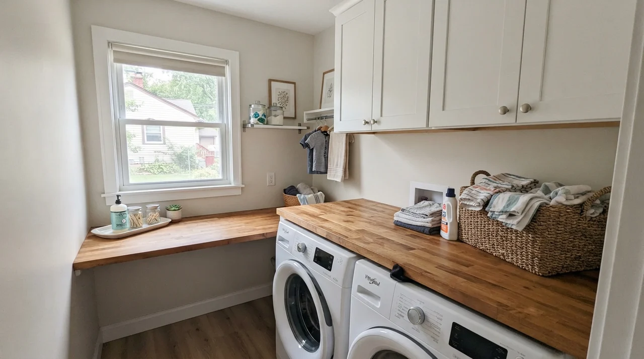
Even in a small laundry room, provided you have daylight from a single window, the greige creates a tailored, finished look against butcher-block tops and simple white cabinetry. It bridges the gap between utilitarian white appliances and warm natural wood countertops smoothly.
The Honest Failure: Where Oyster White Falls Apart
The unhappy stories about Oyster White are remarkably consistent, and every one of them comes down to expectation. Three situations produce almost all of them—and if your room is one of these, another coat will not save it.
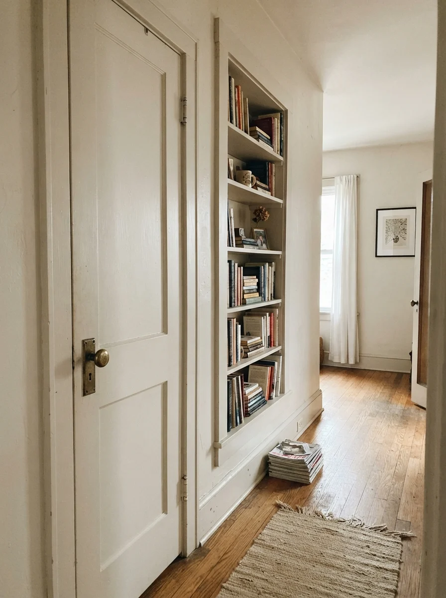
The first is the windowless interior space. If you take a low-saturation greige with a subtle green-beige base and trap it in a dim hallway with a single overhead bulb, the light is simply not there to bounce the tan pigment back to your eye. The paint loses its warm foundation and turns into an unflattering, muddy putty that readers have described as looking like dirty dishwater. You cannot fix that with paint; you fix it with lighting, or by choosing a much lighter, creamier white.
The second trap is trim contrast. Using Oyster White walls next to crisp trim is wonderful. But using Oyster White on the woodwork or interior doors when your walls are a brighter white ceiling or door casing is an unmitigated disaster. When a darker, low-LRV color is placed where your eye expects crisp trim, it simply looks unwashed. The only way it works on woodwork is when the entire envelope is carried through intentionally.
And the third mistake is fighting red-orange flooring. In our first 1970s split-level, we had heavy red oak flooring with strong honey-amber poly coats. Red and green sit opposite each other on the color wheel; put Oyster White next to fiery red oak or orange brick, and those opposing undertones amplify each other. The wall suddenly pulls a distinct, uninvited olive cast that no lamp bulb can cure.
The Exterior Strength
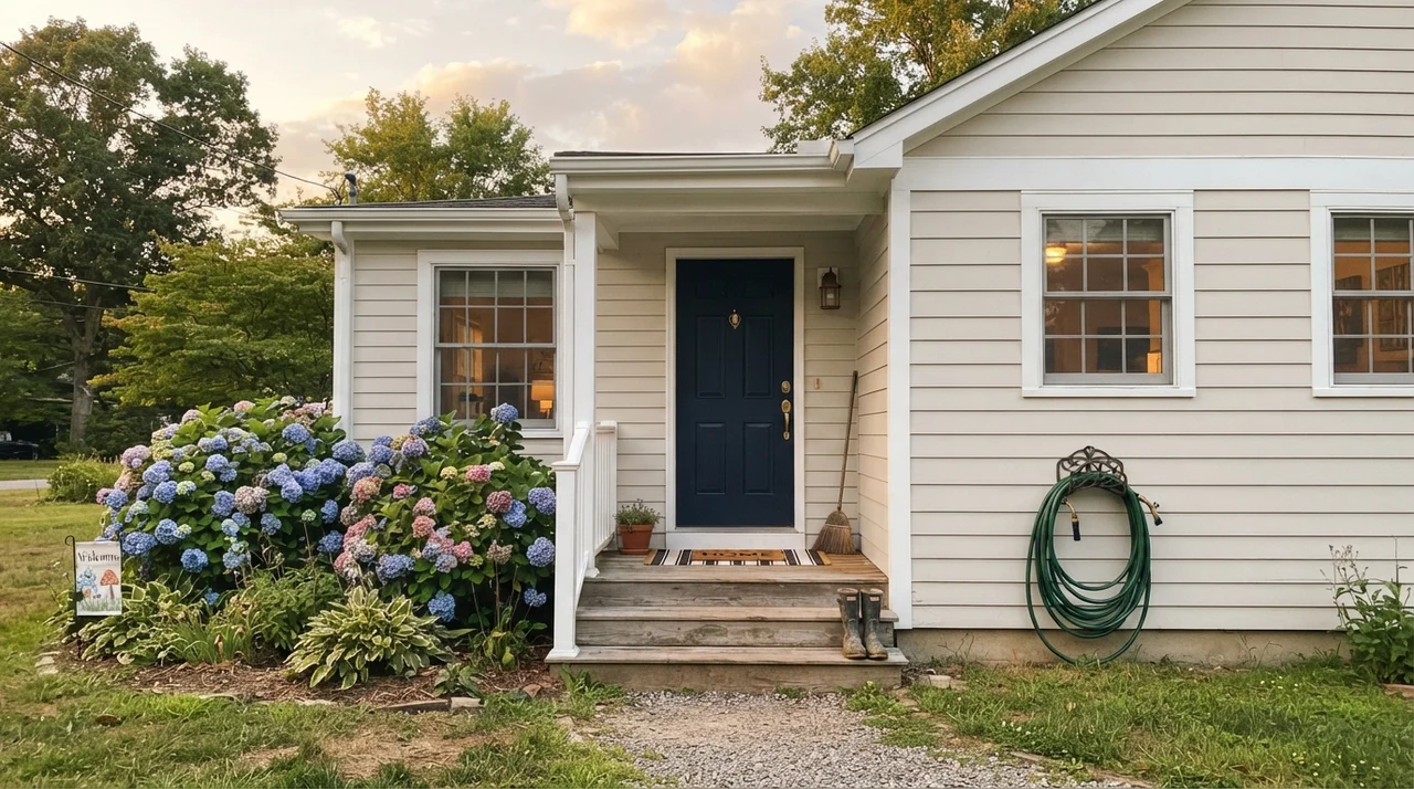
While dim rooms can betray it, the exterior of a home is where Oyster White shines with exceptional reliability. Direct sunlight bleaches soft whites into blinding, reflective sheets. Because Oyster White starts at LRV 72, full afternoon sun knocks it up into a clean, sophisticated off-white that never glares. It pairs beautifully with dark navy or charcoal accents and softens modern horizontal siding without washing out.
Styling Oyster White: Wood Tones and Hardware
Because Oyster White has that muted, low-chroma greige core, it requires warm, grounding materials in the room to look its best. When paired with cold polished chrome and cool gray engineered countertops, the walls will appear tired and flat. But place it alongside warm white oak, textured linen, rattan, and limestone, and the room feels collected and grounded.
Durability and Finish Recommendations
Over thirty years of repainting, I have learned the hard way that paint performance depends entirely on where you apply what sheen. For Oyster White, walls belong in eggshell. Flat paint in a greige color scuffs easily and burnishes when scrubbed; eggshell provides just enough wipeability without bouncing harsh reflections.
For millwork, doors, and trim, stick to semi-gloss. If you are coating cabinets, use a dedicated satin cabinet enamel. The satin finish diffuses kitchen lights across the shaker profiles, resisting hand oils and cooking residue far better than flat or eggshell could ever hope to do. Keep ceilings flat, and if you are spraying the exterior siding, an exterior satin or low-lustre protects against weathering while mitigating sun glare.
Is Oyster White considered a true white or a greige?
It is a greige. At LRV 72, it has too much pigment and depth to function as a true white, sitting about ten points below standard off-white shades.
Will Oyster White look green in my room?
It will show an olive or green-beige cast if placed in a cool north-facing room, or if paired directly against red oak floors and orange brick.
What trim color goes best with Oyster White walls?
Sherwin-Williams Pure White SW 7005 semi-gloss offers crisp, clean contrast. If you want a softer, creamy trim, Sherwin-Williams Alabaster SW 7008 works beautifully.
Can I use Oyster White on kitchen cabinets?
Yes, cabinets are its best application. In a satin enamel finish, it pairs wonderfully with white counters, brass pulls, and hides kitchen smudges far better than bright whites.
Susan's Verdict · SW 7637 Oyster White
Do not buy Oyster White if you want a clean white room, or if you are trying to brighten a windowless north hallway. But if you have good natural daylight, warm wood furnishings, and you want an understated greige that hides fingerprints, stays calm across open floor plans, and gives kitchen cabinets an enduring, lived-in warmth, it is worth every penny of the gallon.