Color Diary · No. 86
Creamy White OC-7: Benjamin Moore's Forgotten Biscuit
Benjamin Moore's quietest cream, reviewed honestly: the trim-and-ceiling workhorse almost nobody photographs, where it glows warm and where it turns tired.

Susan HartleyOctober 16, 2026 · 12 min read
Creamy White · Benjamin Moore OC-7
Hex#E3DCC8LRV72Undertonesbisque → cream → muted putty
In our last house—the 1990s colonial that had more builder-grade oak casing than any human being could reasonably sand down in one lifetime—I spent three months paralyzed over off-whites. It was 2004, and every magazine insisted you had to paint every board stark decorator white. I bought the sample pot, rolled it onto twelve inches of baseboard in the family room, and stepped back. It looked like someone had run masking tape across the floorboards. The oak screamed, the walls cringed, and the trim glared like a halogen bulb in a church basement.
My painter at the time, an old fellow named Frank who had been working in our county since the bicentennial, looked at my swatch board, chuckled into his coffee, and pulled out an old Benjamin Moore fan deck. He didn't flip to White Dove. He flipped straight to OC-7: Creamy White. 'Stop reading the glossy pages, Susan,' he said. 'Put this on the woodwork and let the house breathe.'
We put it on every foot of trim downstairs. We lived with it for eleven years until we sold the house, and when we sold, the home inspector actually paused in the hallway to write down the color because his wife had been searching for an off-white that didn't snap your eyes in half. That is Creamy White OC-7. It is sitting at number 118 in the brand's lineup, entirely ignored by the internet, while a hundred newer swatches get all the fuss.
Creamy White has a Light Reflectance Value of 72. In plain English, that means it is not a white trying to pass as bright; it is a warm bisque that knows exactly what it is. With its orange-family base, it carries actual body. If you hold it up against a snowy index card, it doesn't look white at all—it looks like heavy cream poured into an earthenware mug.
Because it isn't chasing trends, it never looked dated within two seasons like the cool grays did a decade ago. But that 72 LRV cuts both ways. In a room flooded with warm daylight, it warms up into a quiet, grounded glow. In a dim, forgotten box, it can turn into wet cardboard before you've even washed your roller.
How the Light Moves: Morning Frost to Evening Glow
Here is what happens across twelve hours in a room with standard double-hung windows. In the early morning, before the sun clears the roofline, Creamy White reads pale, modest, and slightly sleepy. It doesn't sparkle. If you wake up expecting your walls to jump out and greet you like a polished gallery wall, you will be sorely disappointed.
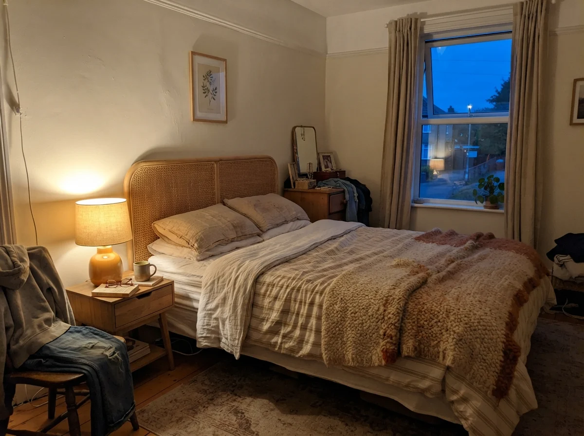
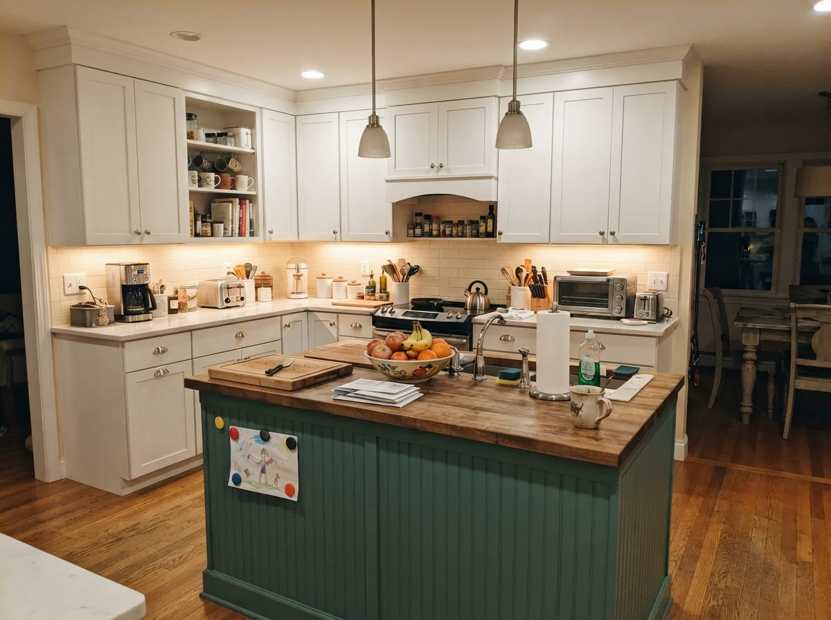
By dinner, once the lamps click on, it turns into something entirely different. Under ordinary 2700K incandescent or warm LED bulbs, that bisque foundation gathers depth. It settles down into the room like a heavy woolen blanket.
Two Overcast Bathrooms: The North Light Warning
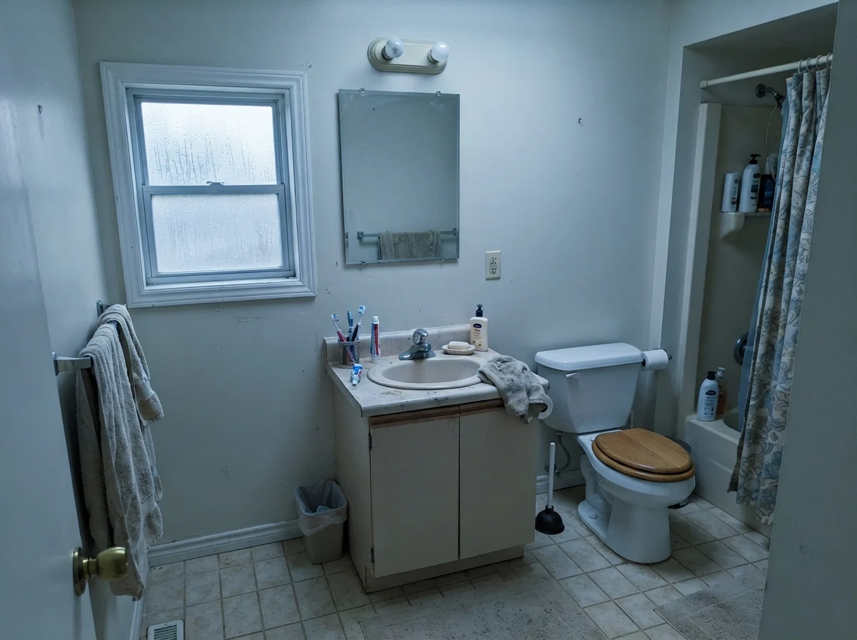
I have repainted every room in three houses across thirty years, and if there is one rule written in stone, it is this: do not put a heavy cream into a windowless north-facing utility room and expect it to look like a French country estate. It will not.
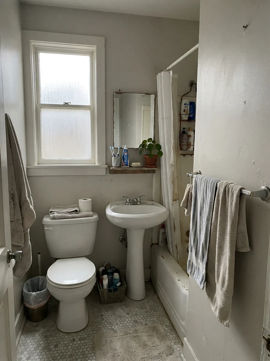
Look at what happens when the sky goes flat. When the light goes cold and gray, Creamy White loses its biscuit warmth. It doesn't turn sky blue; it turns drab. If your bathroom looks out at a blank fence under an overcast sky, this color sits there looking tired, like an undershirt that has been washed one too many times with dark socks.
Where It Shines: The Kitchen Workhorse
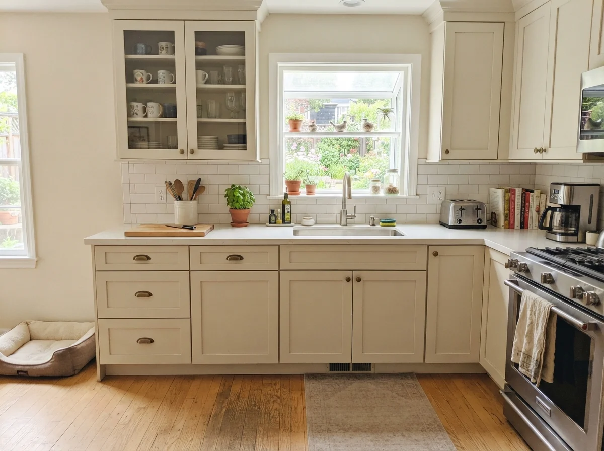
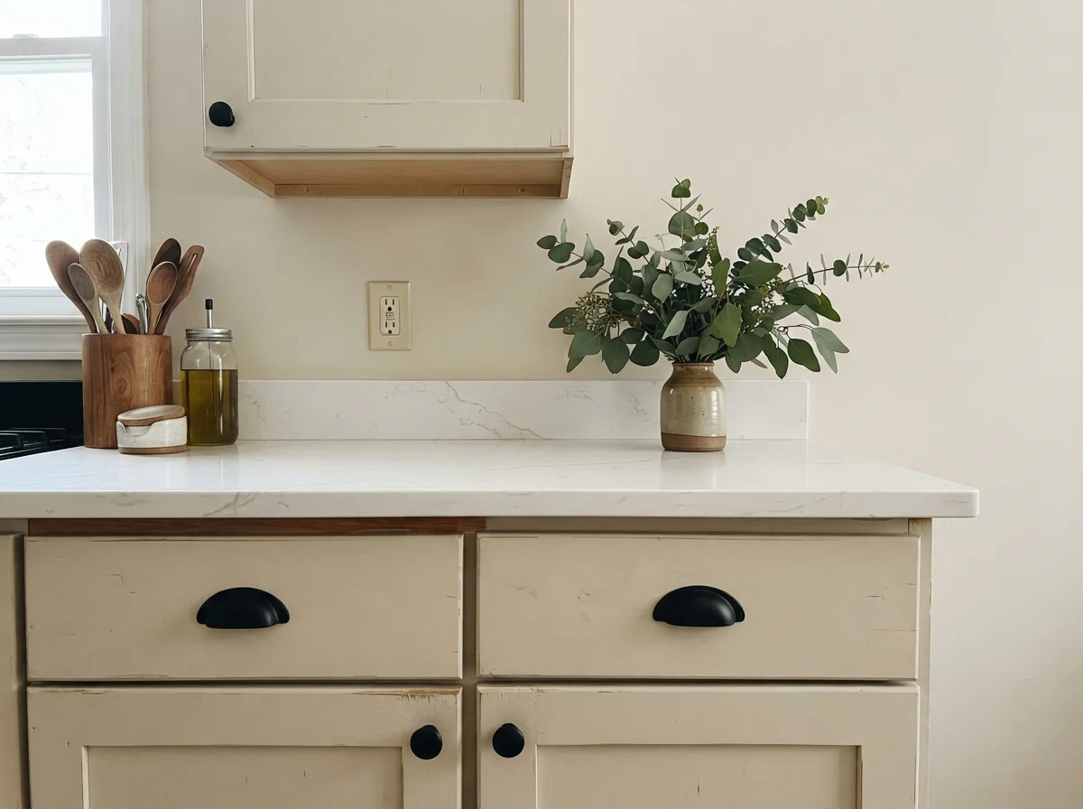
Where Creamy White earns its keep without an argument is on cabinetry and trim. In the kitchen, people spend small fortunes trying to find a white that doesn't make their honey oak or butcher block look like an orange peel. Because Creamy White shares that underlying warmth, it sits down alongside natural wood like an old friend.
On kitchen cabinets, satin finish is worth the money every single time. It has just enough slip that splatters wipe off with a damp rag, and that tiny bit of sheen stops the color from absorbing the room's shadows.
Everyday Family Bathrooms and Cottages
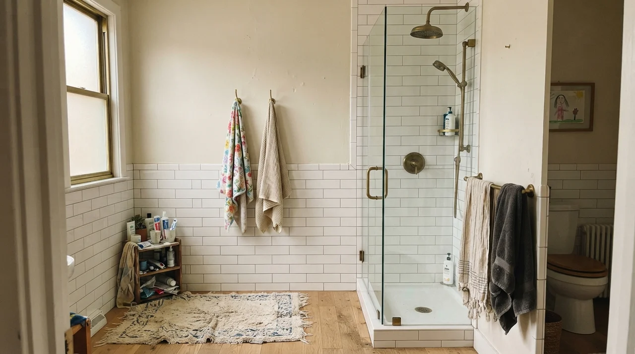
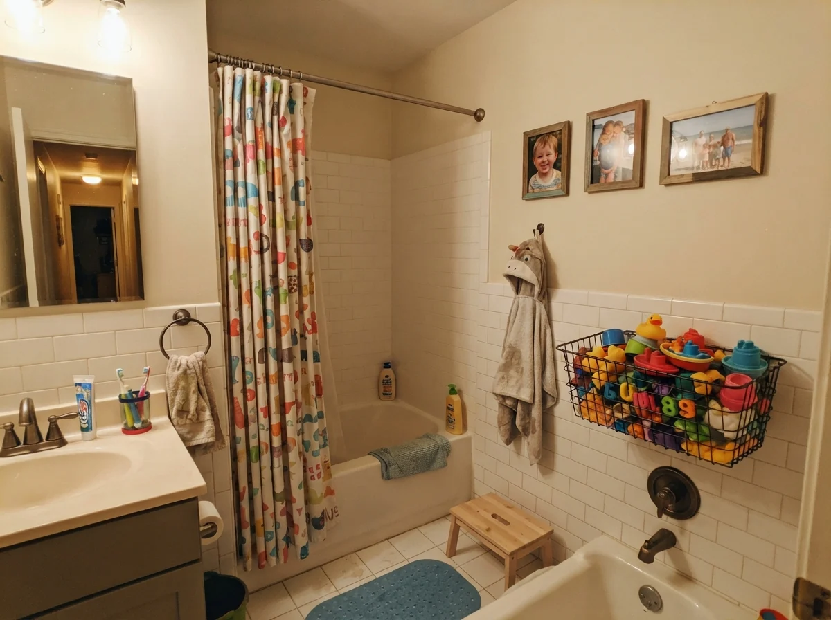
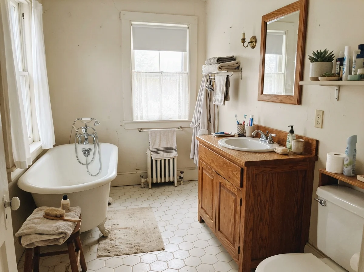
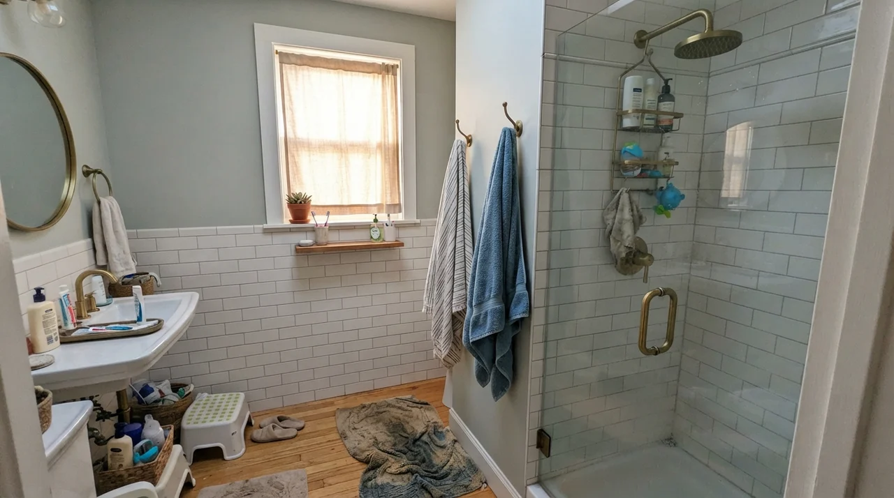
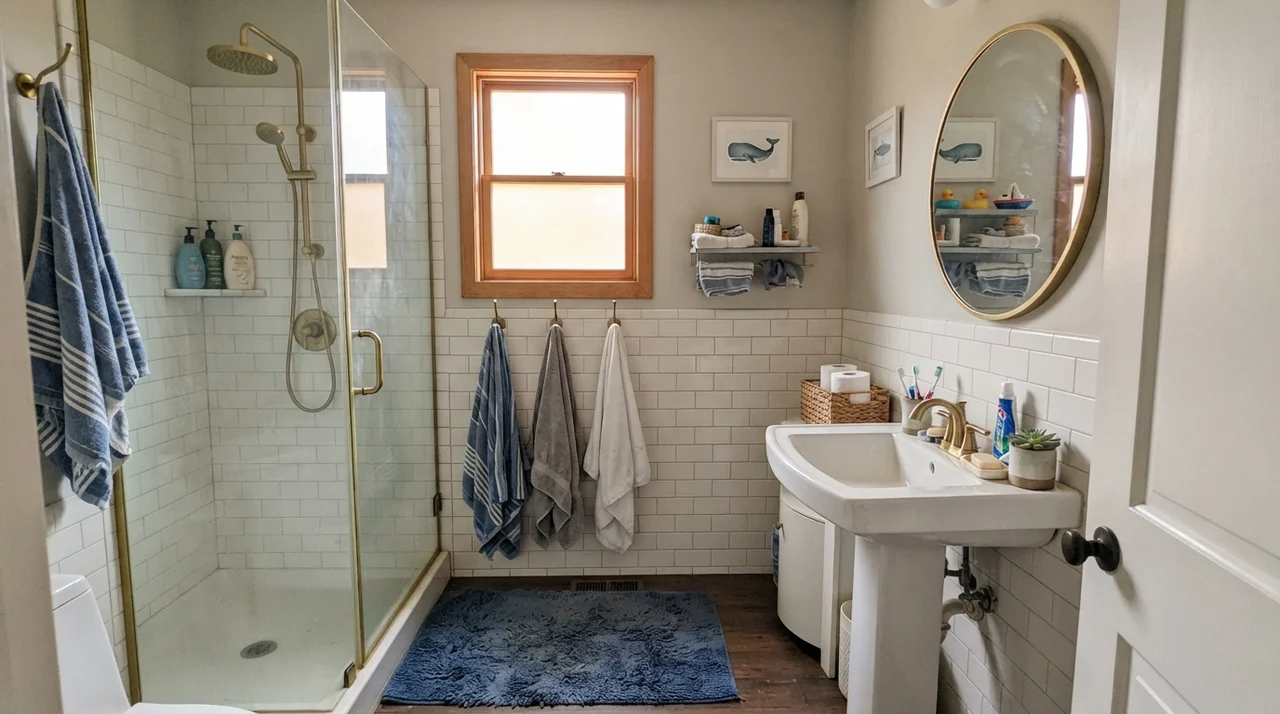
In our current 1960s ranch, the family bath gets blasted with side-window sun for about three hours every afternoon. When you pair this color with white fixtures, you get a gentle, quiet contrast. You do have to be mindful of your tile: Creamy White loves classic white subway tile and traditional hex, but if you put it next to cold blue-gray slate, it will look like you bought the wrong can of paint by accident.
Bedrooms and the Light Gamble
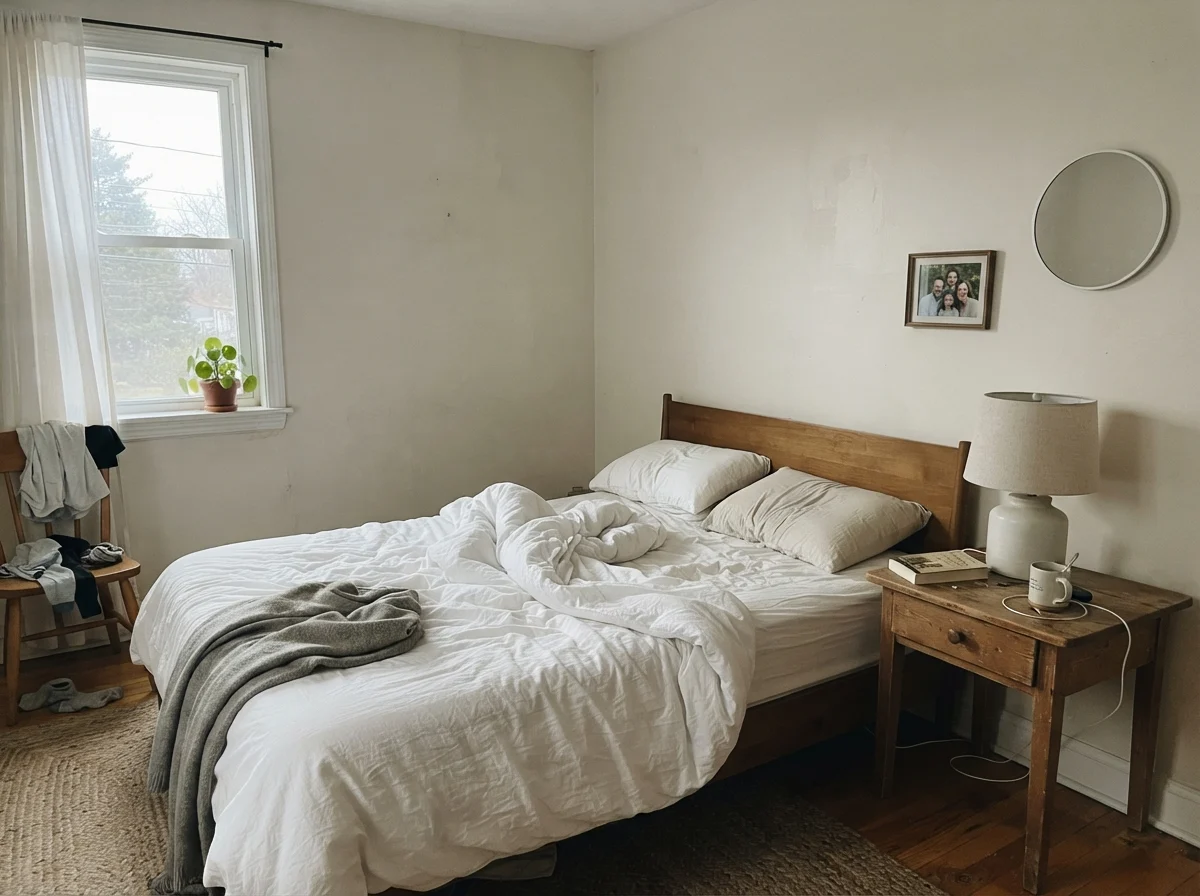
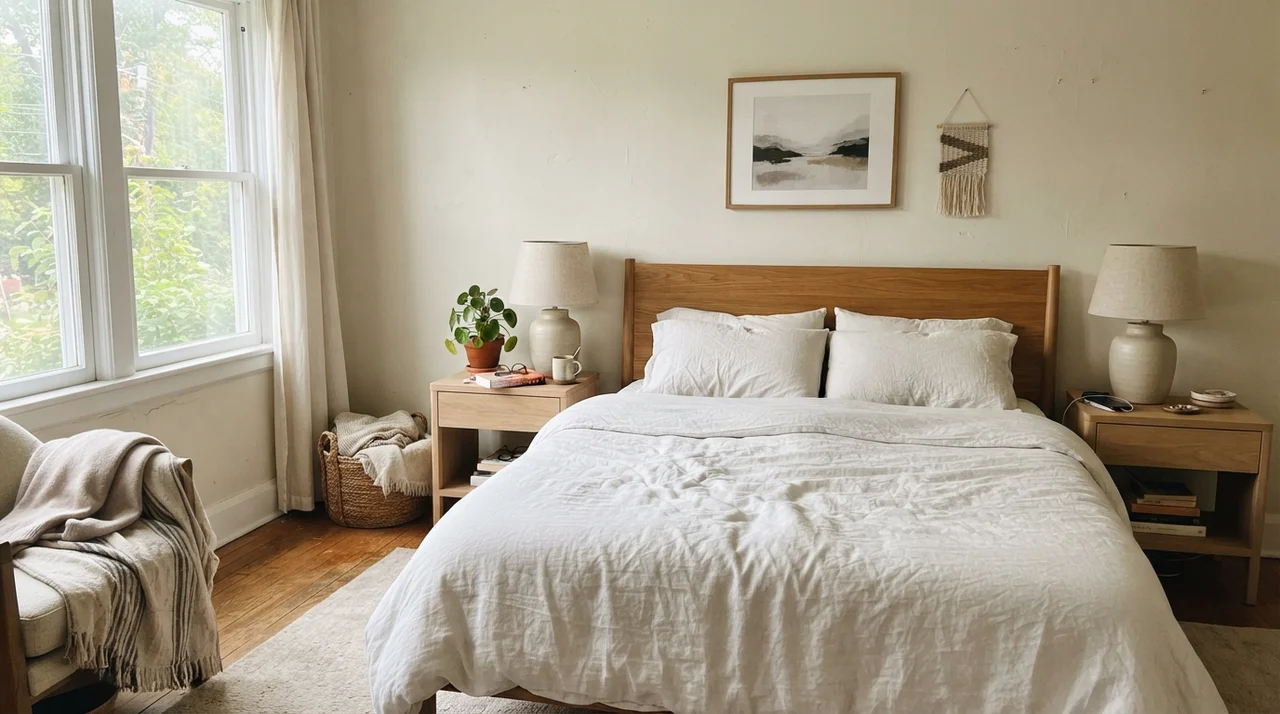
When you take Creamy White into bedrooms, the furniture determines everything. If your room is packed with bleached woods, white metal beds, or sheer curtains, the paint acts like a soft, comforting backdrop. In the nursery or a teenager's study space, it doesn't shout. It doesn't demand that you buy matching designer quilts. It just sits there, warm and polite, holding the room together.
Living Spaces, Sunrooms, and the Exterior
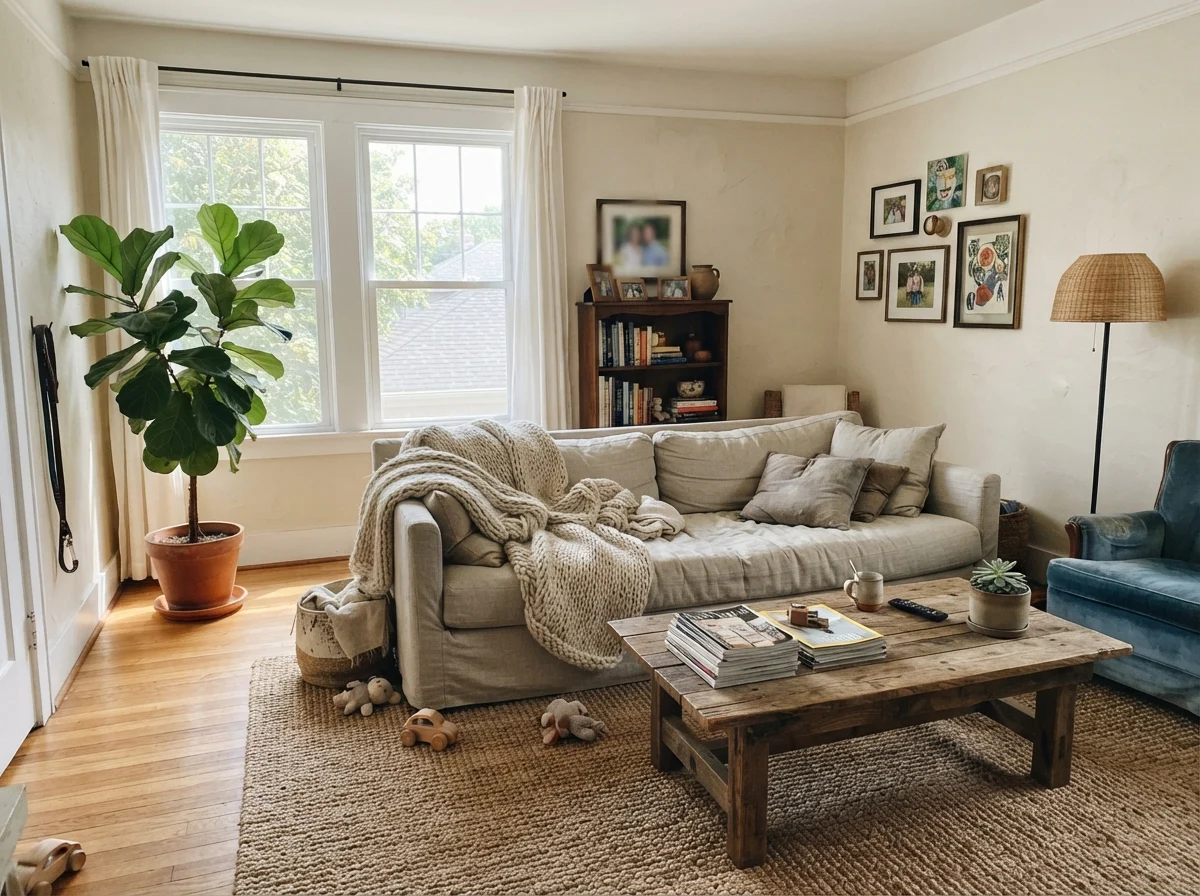
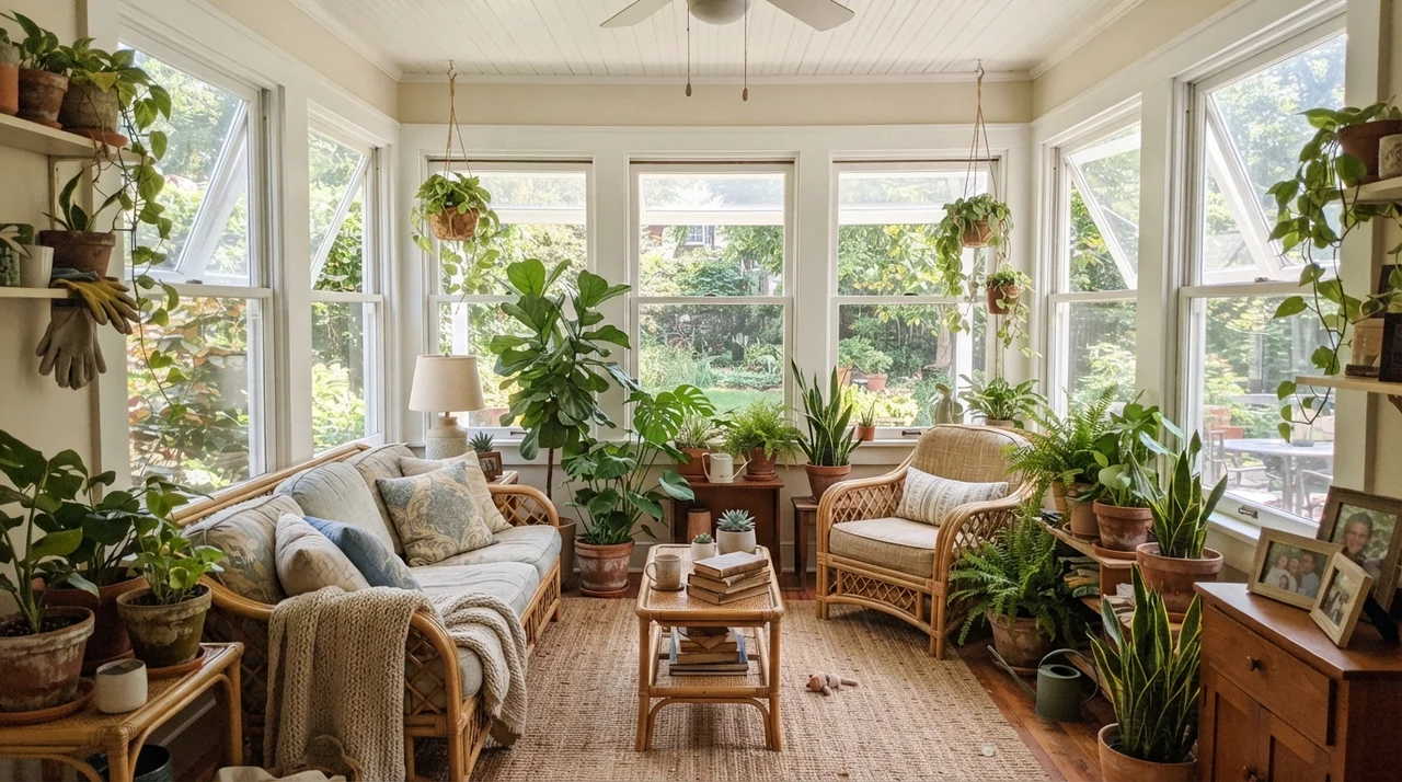
If you have south or west light pouring into a family living room, Creamy White is an absolute dream. It handles direct sunshine without that blinding glare you get from higher-LRV whites. In our 1970s split-level, the sunroom was an absolute furnace of light in July; a sterile white would have forced us to wear sunglasses indoors. A shade like this absorbs the excess brightness and turns it into pure warmth.
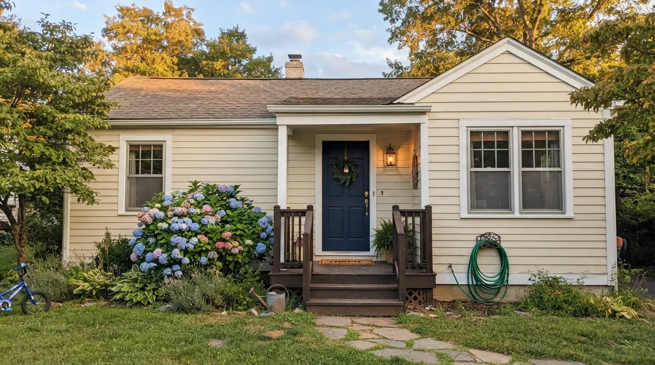
And outside? On horizontal lap siding, under the early evening sun, it reads like a rich, historical white from an old coastal town. It is soft enough that your dark navy door pops without looking like a plastic toy.
Utility Spaces and Built-Ins
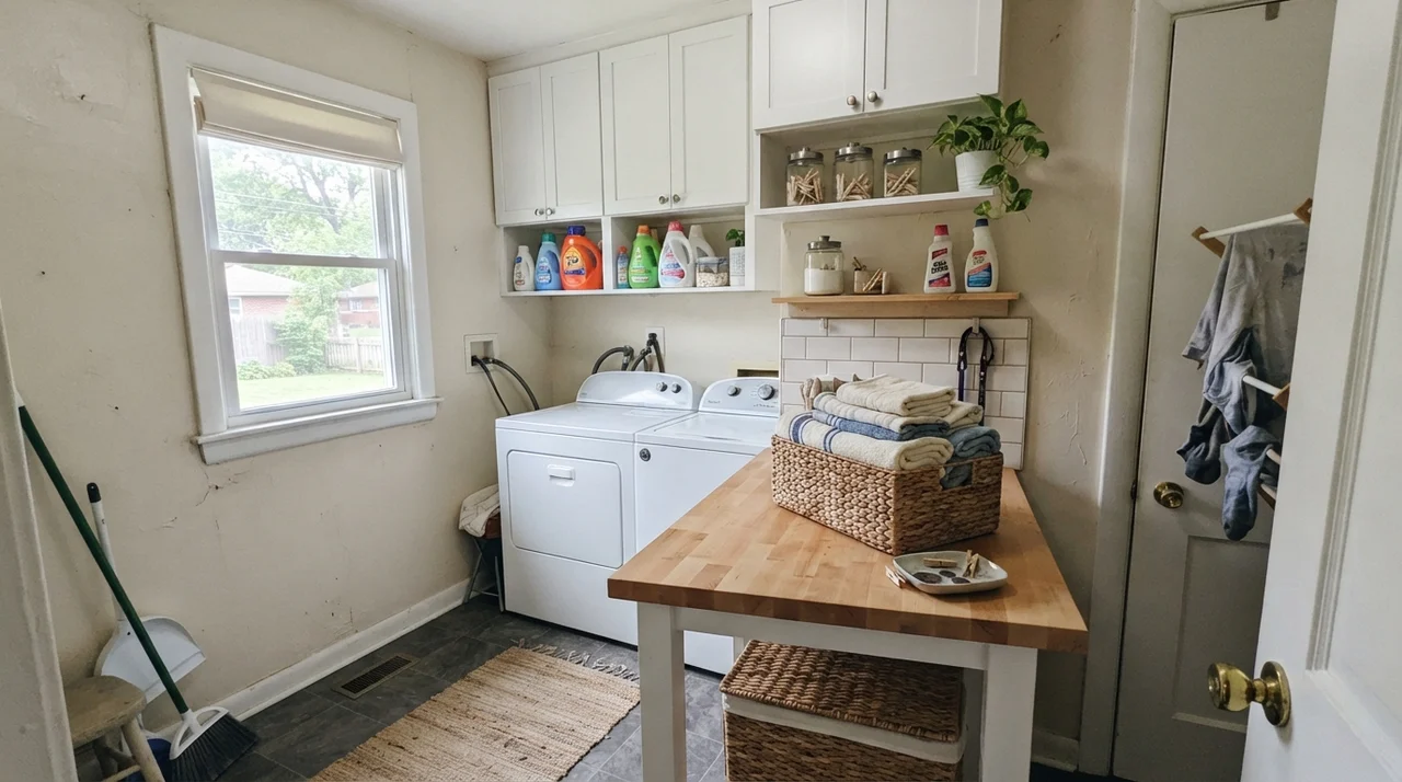
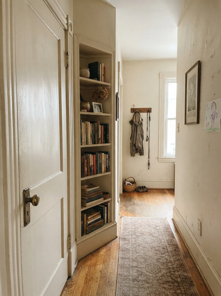
In a laundry room with a good window, eggshell Creamy White over butcher-block counters gives you that clean, farmhouse feel without feeling sterile. In older hallways, using it on a two-panel door and built-in bookshelves makes the woodwork look like it was installed by craftsmen eighty years ago, rather than tacked on by a builder on a Friday afternoon.
The Honest Fail: The Windowless Box
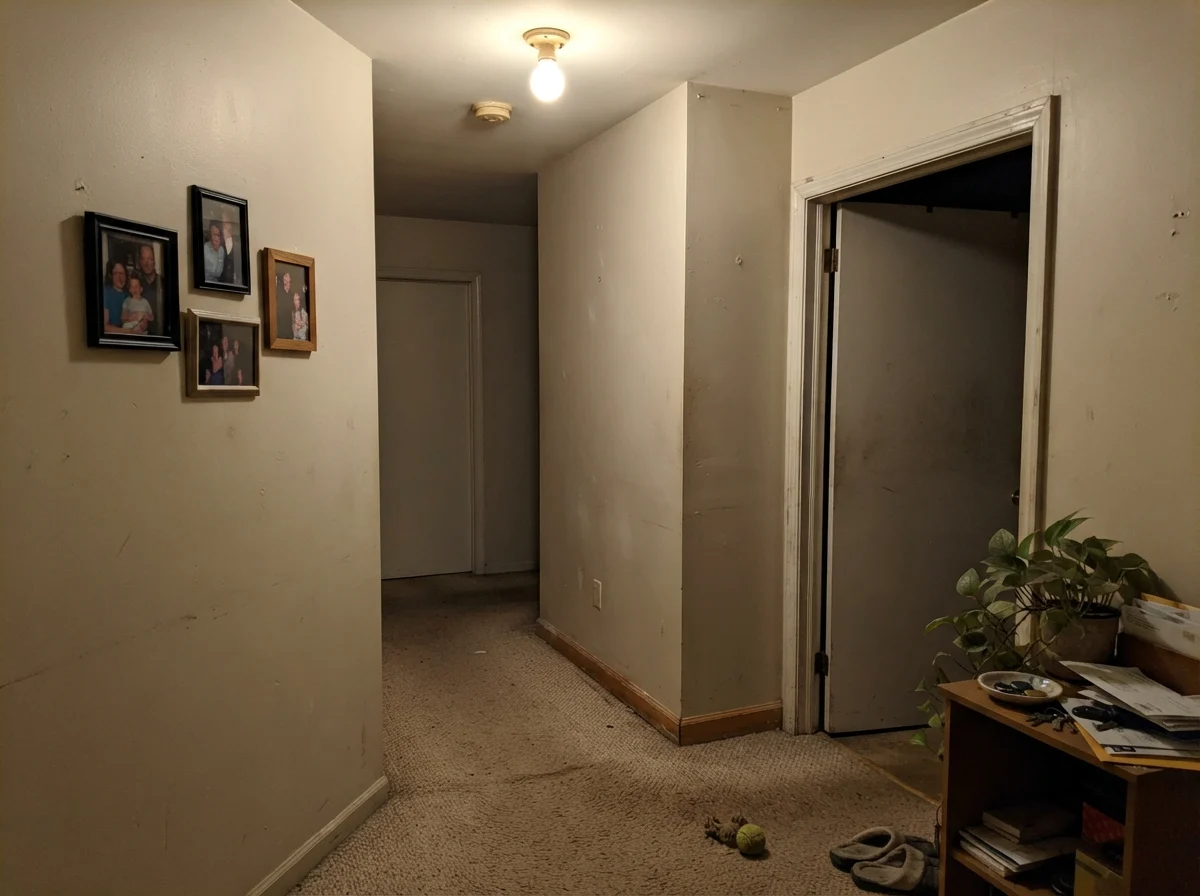
Now, let's talk about where Creamy White falls flat on its face. I took this can into a windowless interior hallway corner lit by nothing more than a lone 60-watt overhead fixture. It was an absolute disaster.
Because there is no natural sunlight to bring out the bisque tones, the color loses its pulse. It turns into a muddy, flat putty that makes the hallway look dusty, even when the baseboards have just been scrubbed clean. If your hallway has no windows, buying this color is not worth the money—you'll end up repainting it within six months.
Creamy White is not a tint of white trying to be modern. It is a genuine warm bisque that needs real daylight to earn its keep.
How It Holds Up Five Years In
Here is the truth about living with Creamy White five years in: on walls, eggshell is your best friend. A flat finish in an off-white with this much pigment shows water marks and scuffs from vacuum cleaners like you wouldn't believe. In our colonial's mudroom, the eggshell finish held up through winters of wet boots, dog paws, and grocery bags dragged along the wall.
It scrubbed clean with a sponge and warm dish soap without burnishing or leaving those shiny bald patches that cheaper formulas leave behind. On cabinets and trim, satin or semi-gloss gives you that hard shell. You can wipe fingerprints off the cabinet doors for years without wearing down the paint film.
What sheen should I use for Creamy White?
Walls should be done in eggshell for easy cleaning without excessive glare. Use semi-gloss on trim, doors, and ceilings if you want a subtle, durable contrast. For kitchen cabinets, satin offers the best durability against grease and frequent wiping.
Why does Creamy White look yellow in my room?
Creamy White sits in the orange deck family and has an LRV of 72. If you have warm 2700K bulbs or heavy afternoon sunlight bouncing off warm wood floors, that underlying biscuit tone will warm up quickly. If it feels too yellow, switch your lighting to neutral 3000K bulbs.
Can I use Creamy White on my ceiling?
Yes, but with care. In a room with walls painted a deeper warm beige or tan, Creamy White on the ceiling creates an intentional, cozy canopy. Just avoid it on ceilings in dim, north-facing rooms, where it can make the ceiling feel lower and dingy.
Susan's Verdict · The Honest Biscotti
If you are repainting a house with honey oak trim, warm maple floors, or good southern light, Creamy White OC-7 is worth every penny of the can. It is a quiet, durable workhorse that doesn't follow design fads. But if you're trying to brighten a windowless hallway or pair it with cold gray marble, put the brush down—this color will break your heart in the dark.