Color Diary · No. 90
Origami White SW 7636: The Living Truth About the Trim Trap
Sherwin-Williams calls it a cool violet white. On a real wall it is not. Here is what Origami White actually does, and the rooms where it goes wrong.

Susan HartleyOctober 21, 2026 · 13 min read
Origami White · Sherwin-Williams SW 7636
Hex#E5E2DALRV76Undertonescreamy off-white → pale butter → soft quiet white
In our last house, a 1990s colonial that had more crown molding than common sense, I spent three weeks convinced I could outsmart a paint swatch. The front hallway was dark, narrow, and had a northern exposure that turned every respectable white into dirty dishwater. I wanted something soft, something that felt like linen instead of hospital gauze. I brought home a can of Sherwin-Williams Origami White SW 7636, put two coats on the foyer walls, and stepped back to admire my handiwork.
By noon the next day, I realized I had made the classic blunder: the walls looked lovely, but the trim—which the previous owners had sprayed in a glaring, ultra-crisp builder white—suddenly looked blinding, while my brand-new Origami White walls looked unwashed. Like someone had smoked cigarettes in the hall for a decade and wiped down only the baseboards. I ended up repainting every linear foot of that trim just to save the room.
That is the thing nobody tells you about Origami White: it is a gorgeous, settled color with real body, but it demands that you understand what is sitting next to it. At an LRV of 76 (though it often behaves closer to an 80 in terms of bouncing illumination), it lifts dim spaces beautifully. But it carries a quiet creaminess that turns into outright butter in the late afternoon sun, and it flatly refuses to play nice with sharp, cool whites.
The Violet Myth and the Real Undertone
If you look at the Sherwin-Williams fan deck, they classify Origami White under their cool collection, claiming a cool violet undertone. I have lived with it, painted it across three decades of houses, and I can tell you plainly: that classification is misleading. In the real world, under real lamps and daylight, this is a soft, creamy off-white. It shifts not toward purple, but between quiet stone-cream and pale butter.
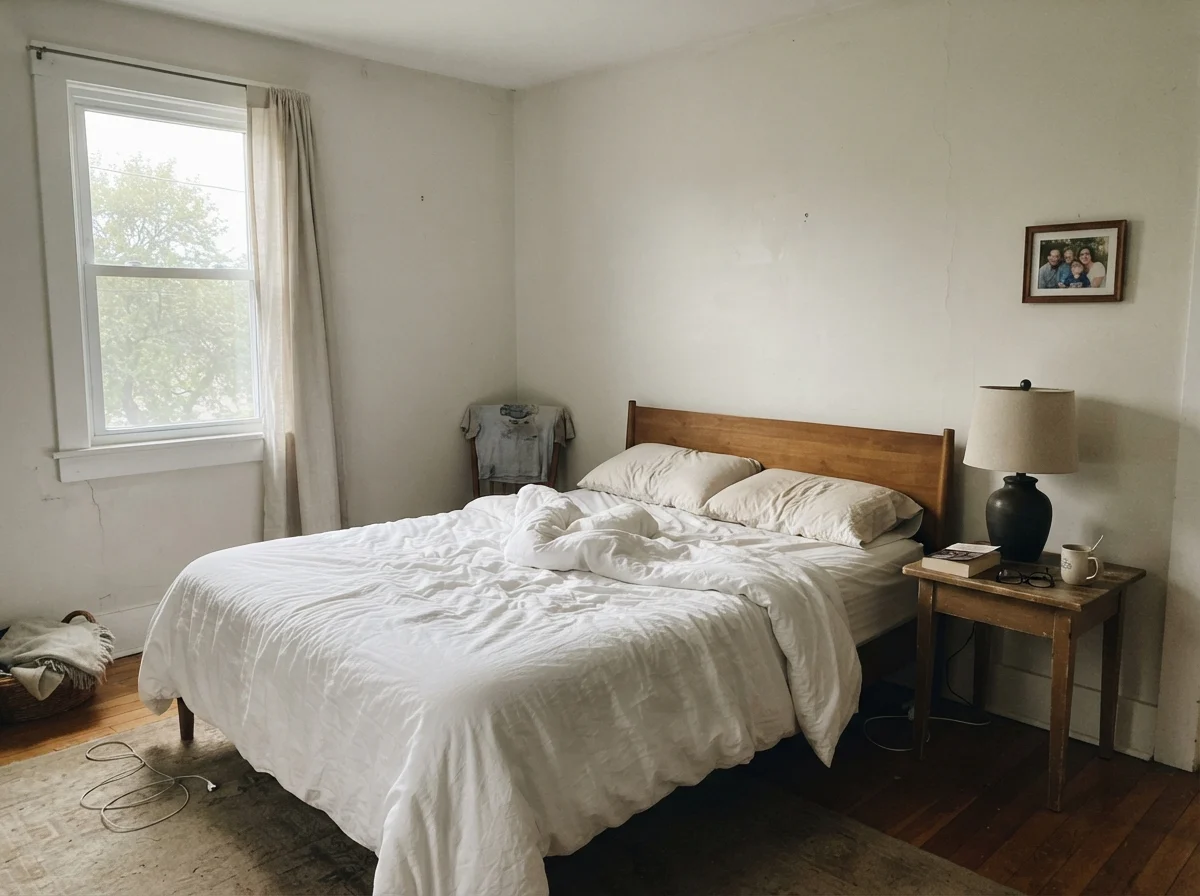
warm sun
overcast, north light
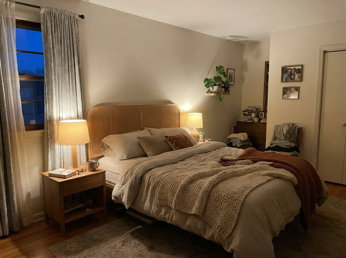
dusk, rain, cool bulbs
Under cool daylight, the cream cancels out and gives you a soft, quiet white. In south or west sun, the yellow pushes forward hard.
Foggy DayDunn-Edwards · see diary
SanctuarySherwin-Williams · see diary
Origami WhiteSW 7636
Weathered WhiteBehr · see diary
Heron PlumeSherwin-Williams · see diary
How Daylight Commands This Color
The personality of Origami White depends entirely on the compass. In north-facing rooms, where the sky is cool and blue-gray, it does its finest work. Cool daylight cancels out the gentle cream in the mix, leaving behind a peaceful, quiet white that has zero chill. It rescues cold bedrooms that would otherwise feel uninviting.
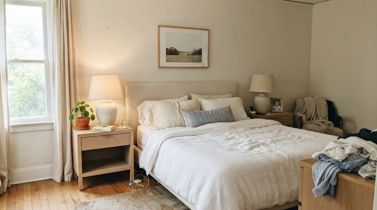
South and west light, however, tells a different story. When direct late-afternoon sun pours through the glass, that yellow undertone wakes up and pushes forward across large expanses of wall. It doesn't turn neon, but it definitely reads like pale butter for an hour or two before sunset. If you aren't expecting it, you might panic. If you know it's coming, it just feels cozy.
Living with It in the Bedroom and Nursery
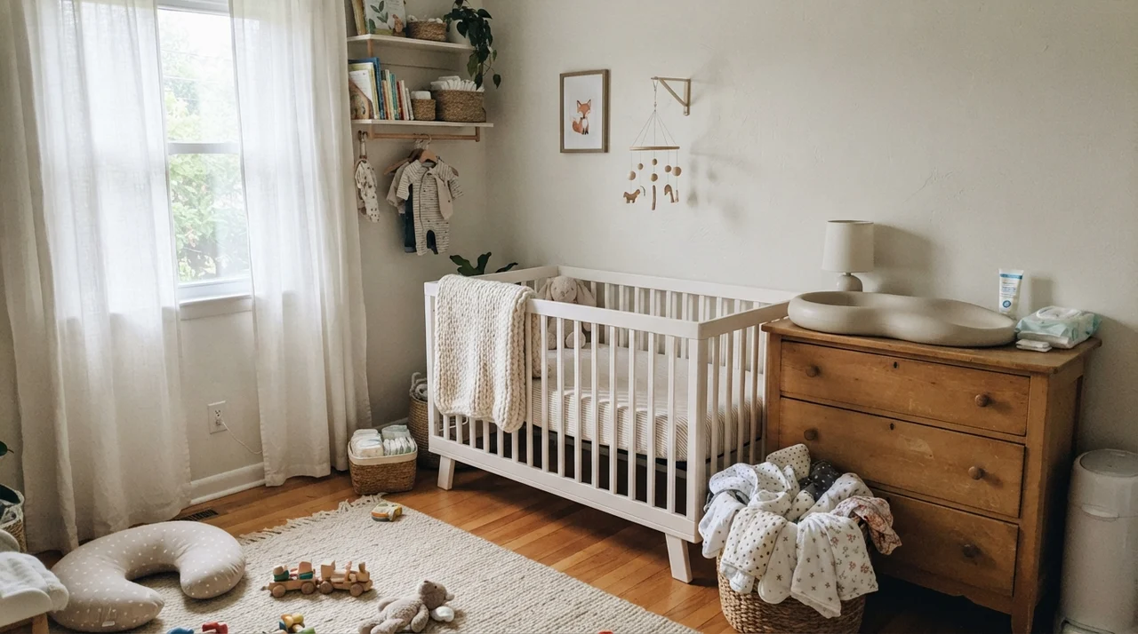
We used this shade in our daughter's bedroom when she was a toddler, and it held up through three different furniture rearrangements, two sets of curtains, and the transition from a crib to a big-girl bed. It has enough depth that white painted furniture still registers as white, while the walls wrap the room in a gentle, warm envelope.
Because it isn't an aggressive, stark white, it forgives the everyday chaos of family life. It hides dust, minor smudges, and the inevitable scuff marks near baseboards far better than crisp gallery whites ever could.
Bathrooms: A Tale of Fixed Finishes
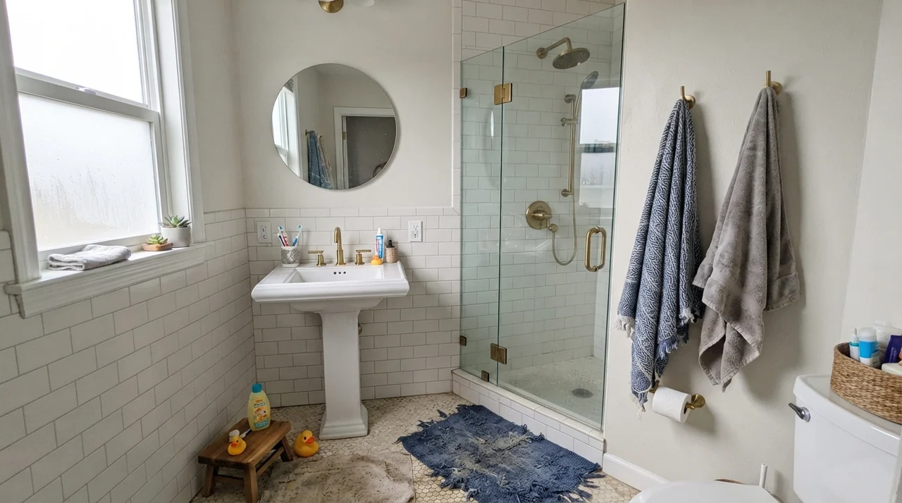
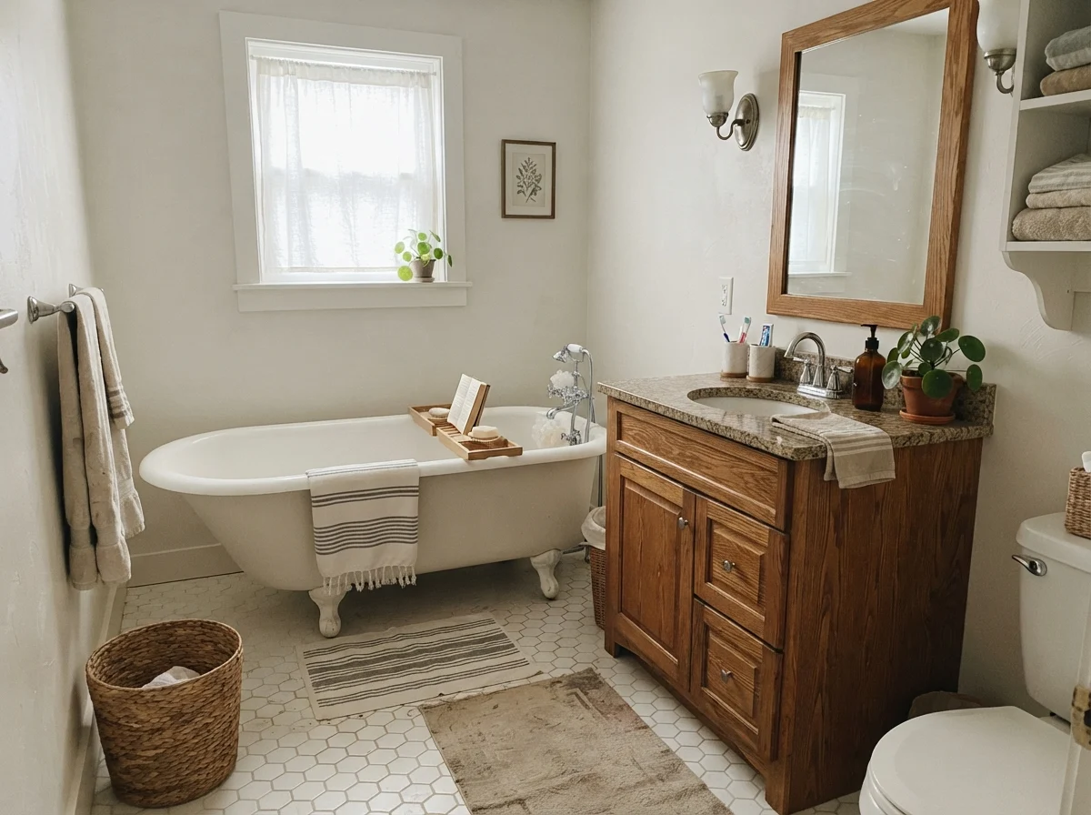
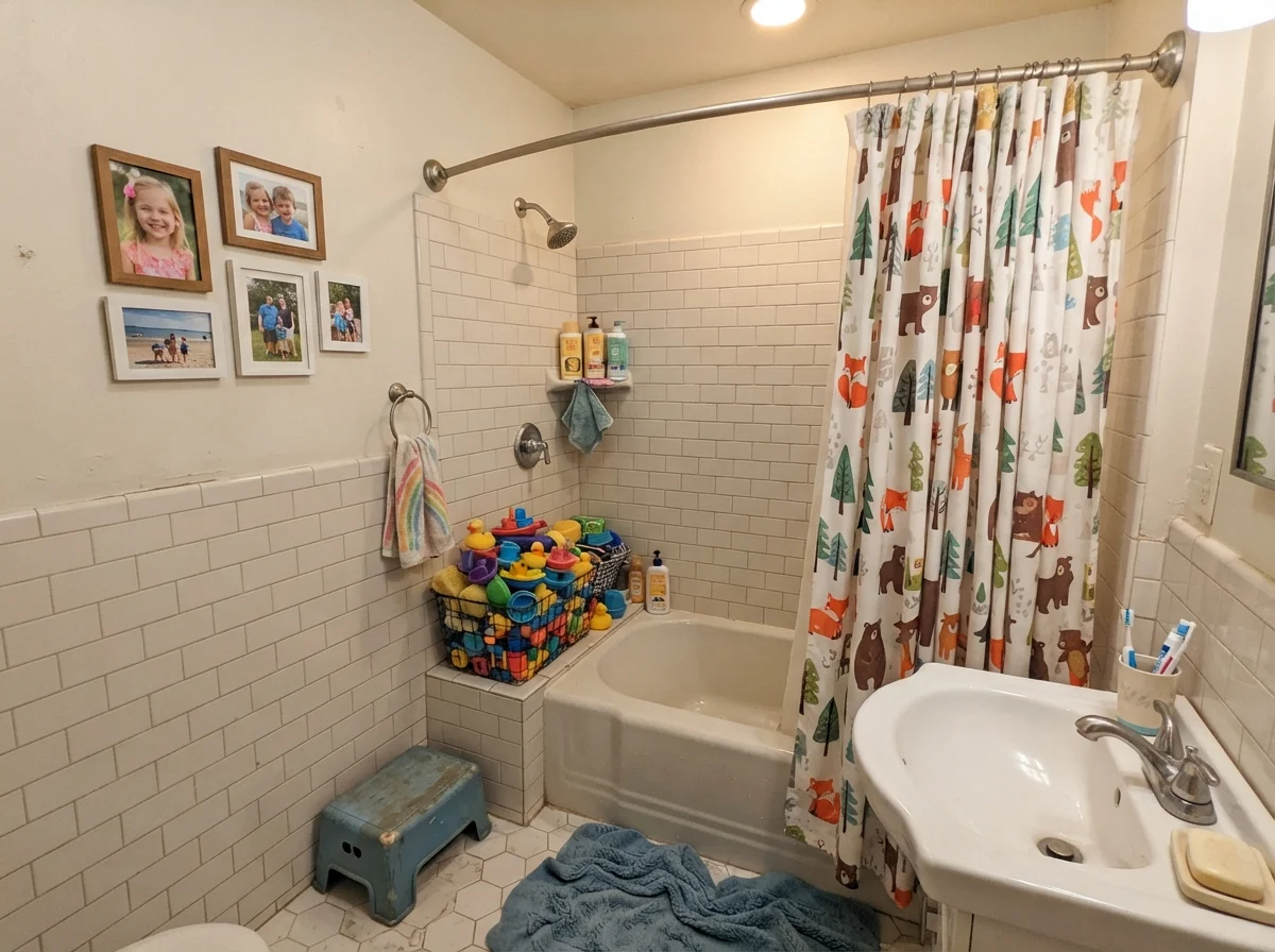
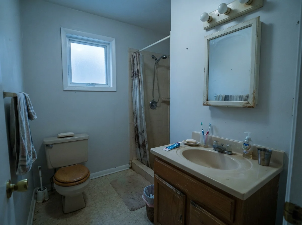
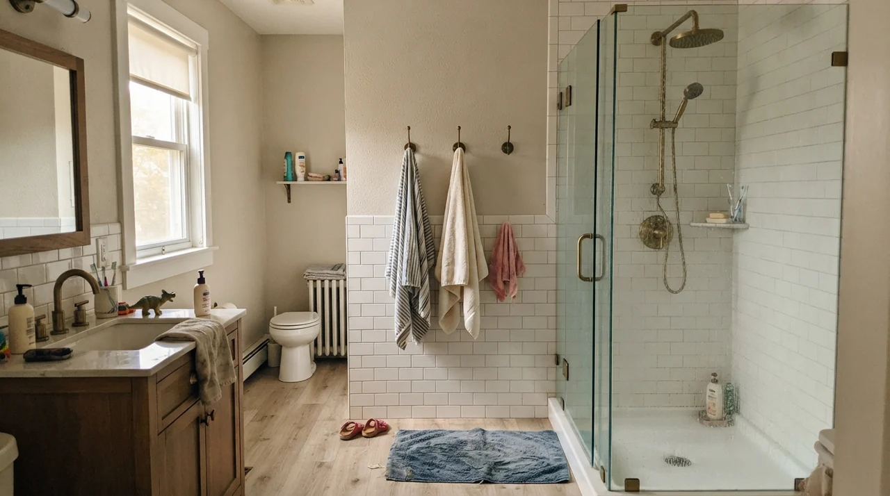
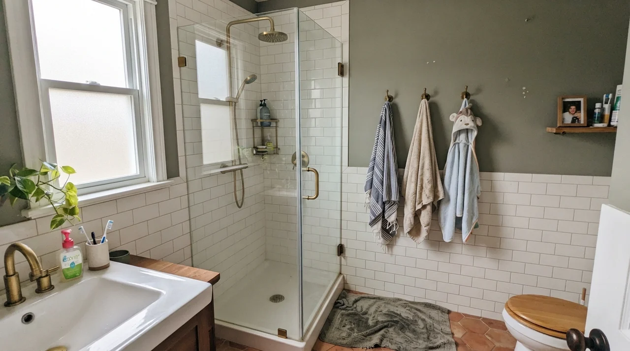
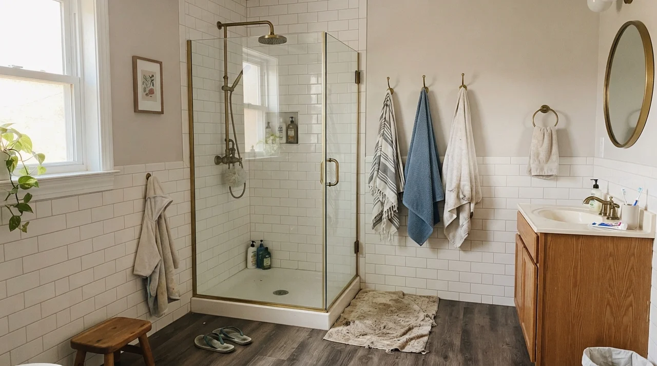
In bathrooms, Origami White is either an effortless success or an immediate regret, and the outcome has nothing to do with your painting technique. It comes down to your tile and stone. If you pair it with warm subway tile, vintage hex tile, wood vanities, and unlacquered brass, it looks like it was mixed specifically for the house. It feels timeless, grounded, and clean.
However, if you put it next to cold, blue-gray Carrara marble or stark gray quartz counters, the contrast is harsh. Origami White will look distinctly yellowed and tired, while the stone will look icy. Before you paint a single inch in a bathroom, tape your sample right up against your countertop and backsplash.
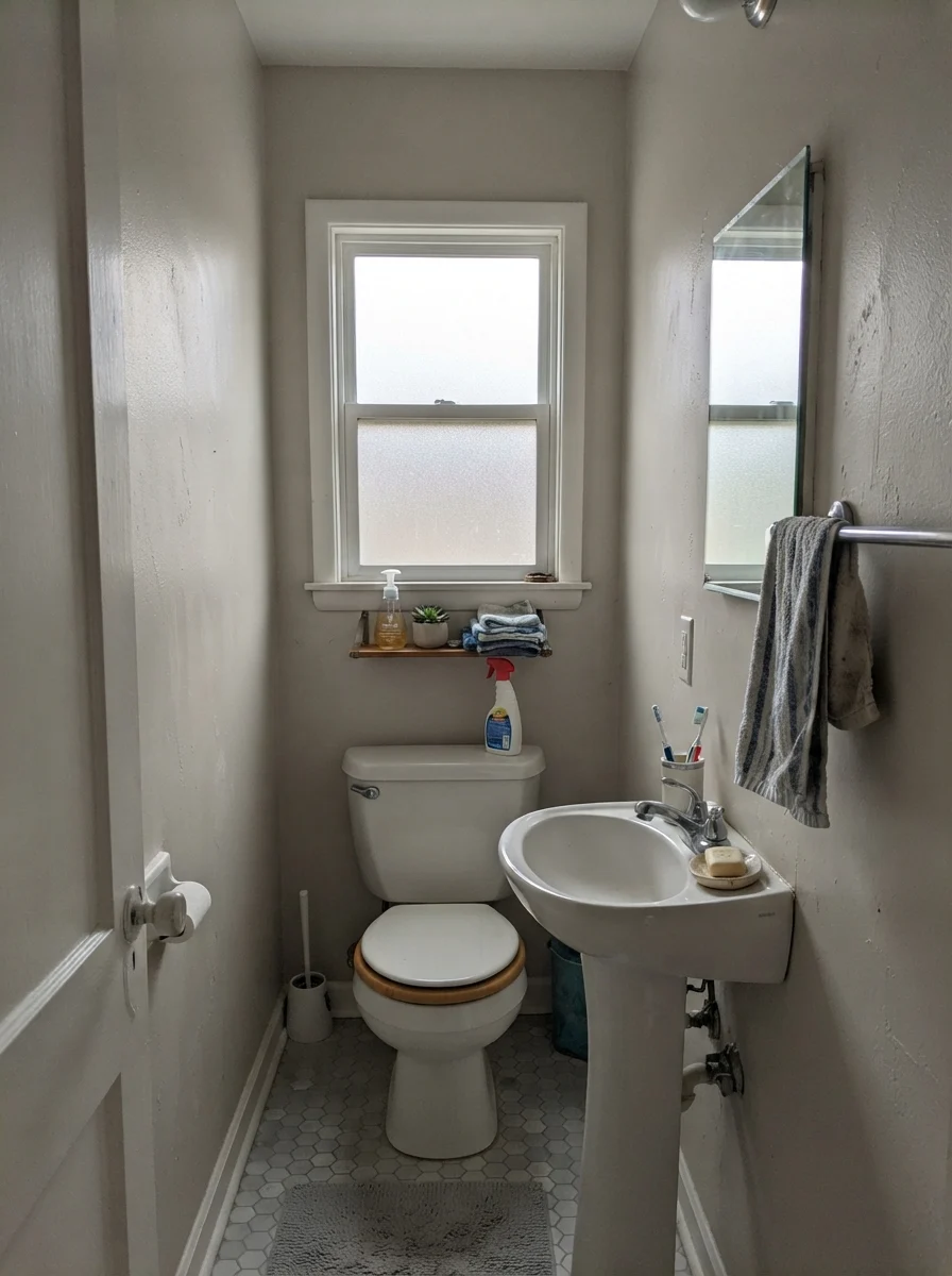
When the light turns completely gray on a rainy afternoon, or when you are dealing with an older bathroom that doesn't get prime southern sun, you will notice the color settling back. It doesn't vanish into pure gray, but it loses that active creaminess. That flexibility is why people keep buying it, even when the undertone behaves differently than the swatch booklet suggested.
The Kitchen Equation: Cabinets and Islands
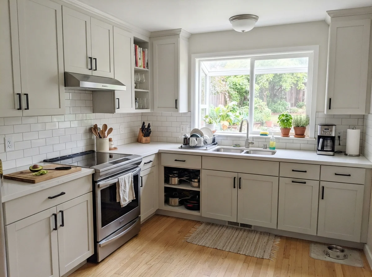
I get asked constantly about using Origami White on cabinetry. My answer is always: only if you commit to the whole picture. If you spray your shaker doors in this shade and leave a bright builder-white crown molding above them, your cabinets will look dingy from day one. You will spend five years explaining to guests that the cabinets are clean, they just look that way because of the ceiling.
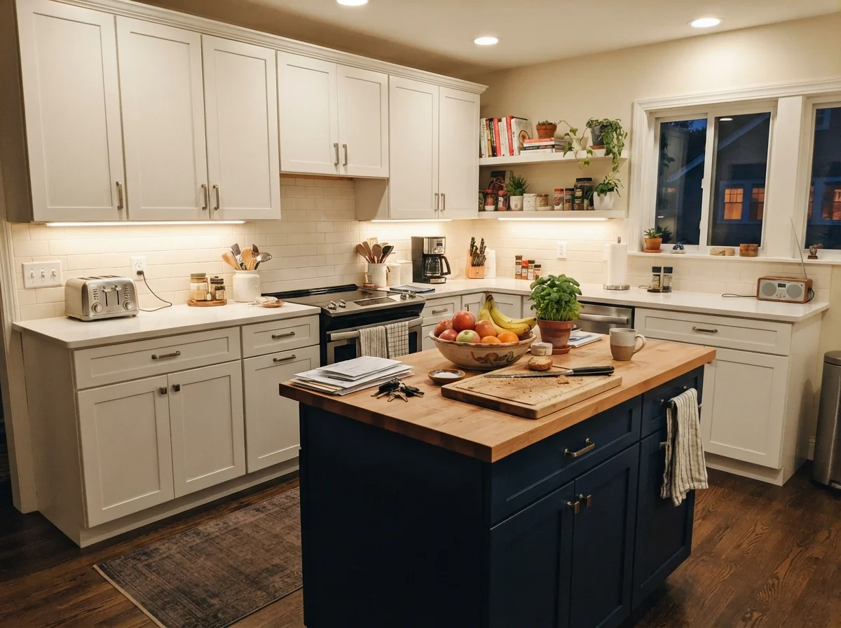
When you do it right—running the color on the cabinets, matching or softening the trim, and pairing it with natural wood or a grounding island tone—the result is rich and architectural. Satin is the finish here; it gives the doors a soft sheen that cleans easily without turning reflective.
The bad stories about Origami White are almost never about the paint film. They are about what is sitting right next to it.
Where It Shines: Living Rooms and Sunlit Spaces
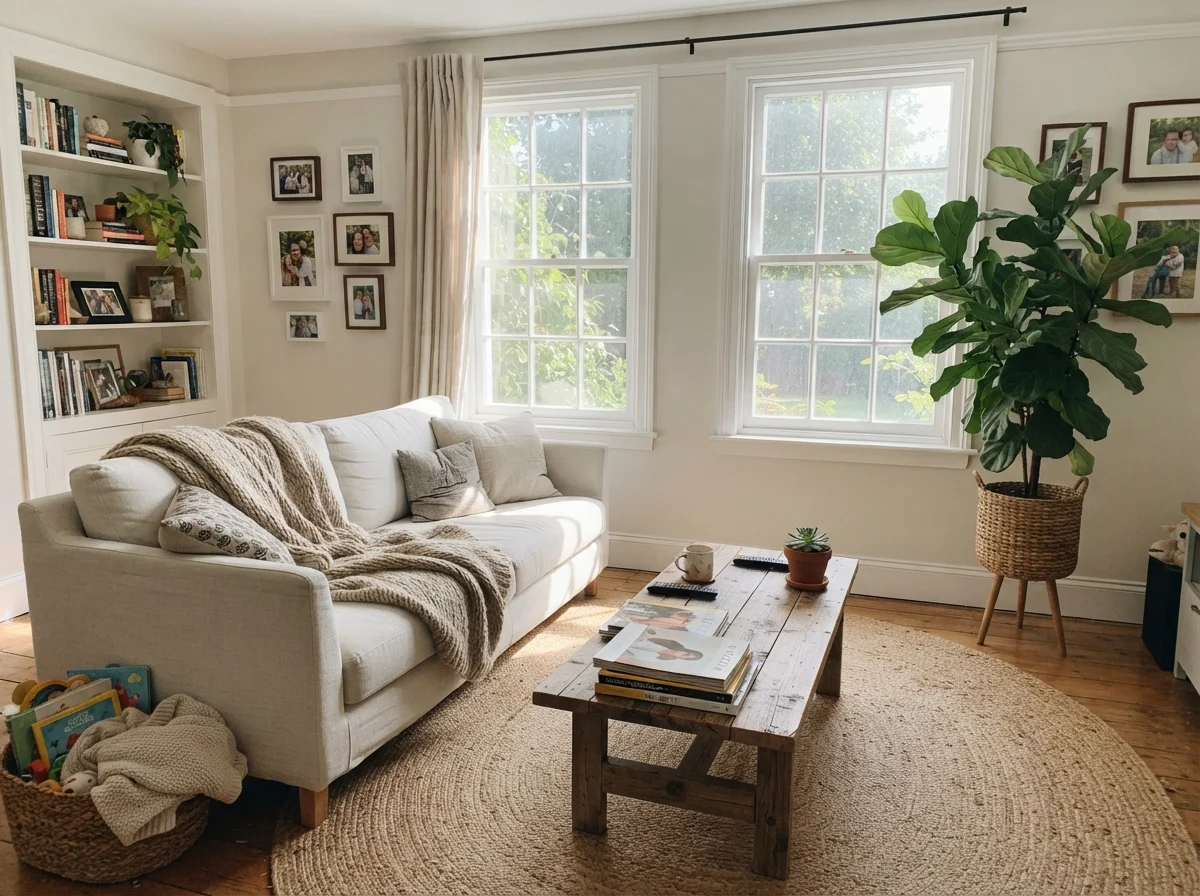
In our 1960s ranch, our main living space faces east and gets flooded with generous daylight through mid-afternoon. This is where Origami White feels like an old friend. Paired with white oak flooring, a rumpled linen sofa, and brass floor lamps, it stops calling attention to itself and simply lets the room breathe.
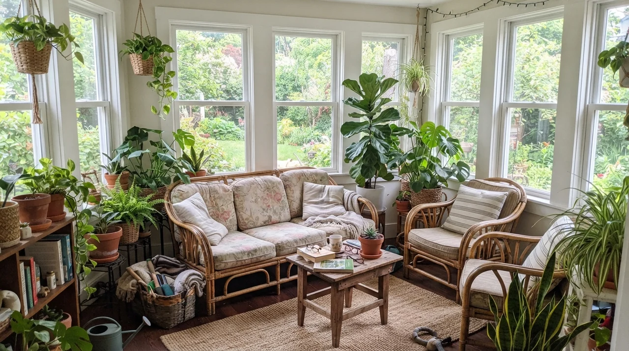
It also handles transitional garden spaces like sunrooms beautifully. Because it isn't an icy modern white, it frames leafy green houseplants, terracotta pots, and wicker furniture with a natural, earthy ease. In eggshell on the walls, it resists the scuffs of everyday family traffic and wipes down without leaving shiny burnish marks.
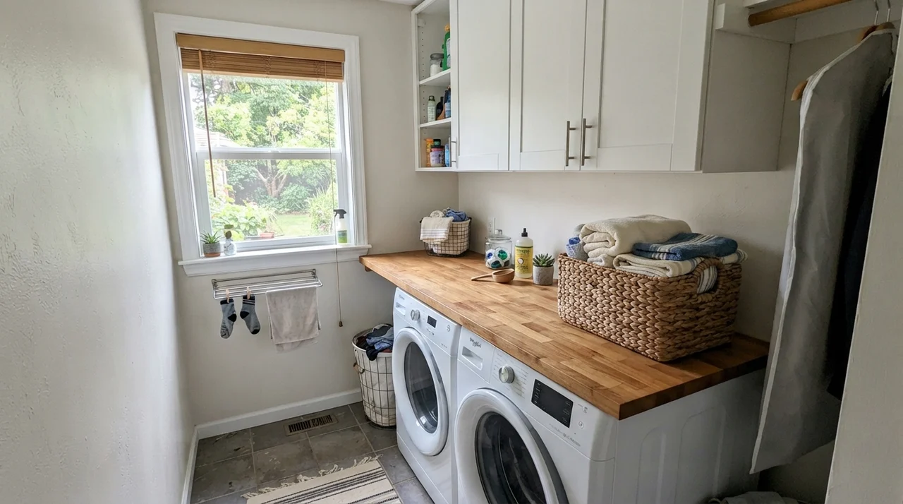
In hardworking utility spaces like laundry rooms, where you might have one good window and a stack of clean linens, it gives you that fresh, spotless feeling without making the room feel like an operating theater. butcher block counters and white washer-dryer units sit comfortably against it.
The Honest Fail: Where Origami White Goes Wrong
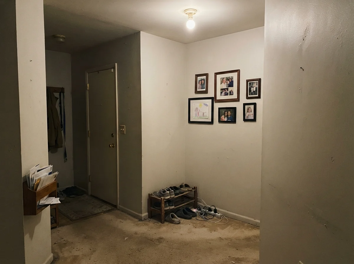
I promised you no fluff, so let us talk about where this color falls flat on its face. The classic mistake happens in dark, windowless interior hallways with low ceilings and dated carpet. If you have an enclosed hallway lit only by a single dim ceiling bulb, and beige carpet underneath, Origami White will not perform a miracle.
Without enough clean light to activate its lightness, and without crisp trim to separate it, it turns into a muddy, putty-colored beige smear. It loses its white identity entirely. You end up with a room that feels stagnant rather than serene—a dingy look that makes you feel like you wasted your weekend with the roller.
Architectural Trim, Doors, and Siding
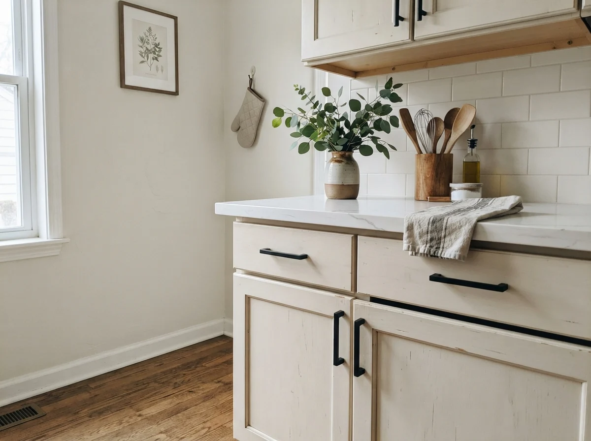
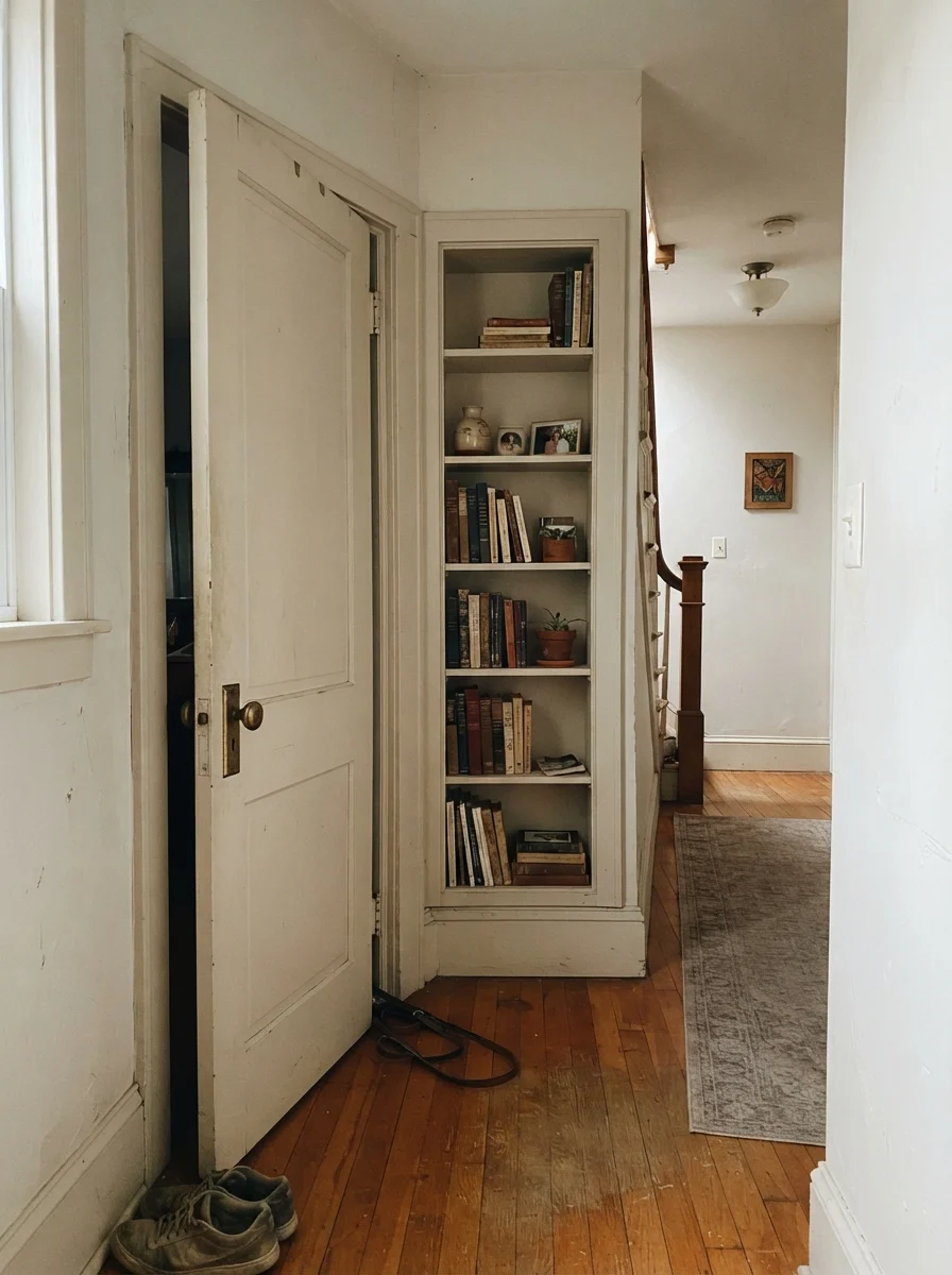
Where people often overlook Origami White is as a specialty millwork color. In older houses with character, painting a two-panel interior door and a built-in bookshelf in Origami White against slightly creamier walls creates a soft, layered historic look. It feels collected and deliberate, especially when anchored by an aged brass doorknob.
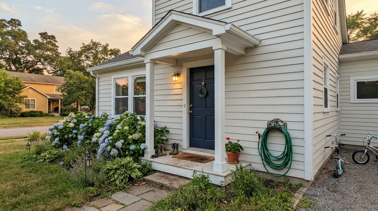
It also makes an exceptionally handsome exterior body color. On horizontal siding, full outdoor sun cleans it up, washing out excess cream and leaving a solid, stately off-white. The trick outdoors is framing: you need deep, grounded accents like dark navy, Iron Ore, or Urbane Bronze on the shutters and entry door so the house doesn't look washed out.
Durability, Scrubbing, and the Five-Year Test
A good paint color isn't worth the money if you have to baby the surface every six months. In our current home, I've had Origami White on the hallway walls for five years in Sherwin-Williams' eggshell finish. It has seen muddy retriever tails, heavy grocery bags bumping down the hall, and the occasional spilled cup of coffee.
It has held up remarkably well. Because it sits at LRV 76 with that creamy foundation, high-traffic grime doesn't jump out at you like it does on pure white walls. When marks do show up, a soft damp microfiber cloth scrubbed clean around the light switches without stripping the sheen or leaving a chalky halo. That alone made it worth the can price.
Why does my Origami White look yellow in my living room?
Origami White has an inherent warm cream base. In south- or west-facing rooms, late-afternoon sun amplifies that yellow pigment, pushing it toward pale butter for a couple of hours. Testing a large swatch on your sunniest wall will tell you if your space triggers this shift.
What finish should I use for different surfaces?
Stick to flat for ceilings, eggshell for main walls to handle wiping, satin on kitchen cabinets and built-ins for smooth cleaning, and semi-gloss on trim and interior doors for proper contrast and durability.
Will Origami White work with bright white kitchen appliances?
It can be risky. If placed directly against stark, glossy white appliances, Origami White can read a bit dirty by comparison. It looks much better paired with stainless steel, matte black, or paneled cabinetry.
Is Origami White good for resale?
When we sold our colonial, soft off-whites like this received high praise because they feel move-in ready and warm rather than sterile. Just ensure your trim paint coordinates properly before open houses begin.
Susan's Verdict · Worth the Money with One Condition
If you are willing to handle your trim intentionally—either doing a monochrome wall-and-trim scheme or stepping down to Pure White—Origami White SW 7636 is one of the easiest, most forgiving warm whites you can put on a wall. It lifts cold north rooms, forgives five years of family scuffs, and pairs gorgeously with oak and brass. Just keep it far away from bright builder white and icy gray tile, and it will serve your home beautifully.