Color Diary · No. 94
Storm Cloud SW 6249: What Happens When You Give Gray Real Color
A genuine blue-gray reviewed honestly: the door and island jobs it was built for, the dim room that flattens it, and what to pick instead.

Susan HartleyOctober 24, 2026 · 11 min read
Storm Cloud · Sherwin-Williams SW 6249
Hex#7A848DLRV23Undertonescool slate → deep blue-gray → muted charcoal
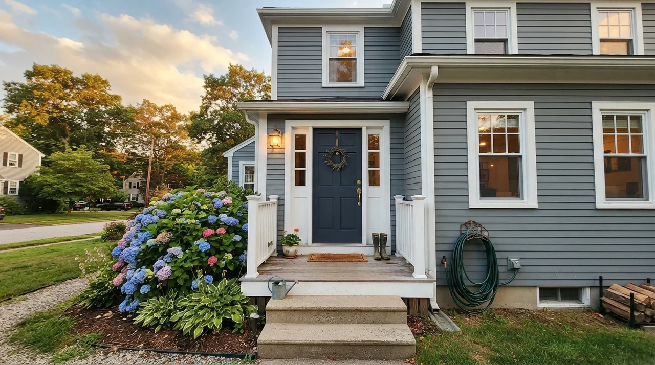
In our last house—the 1990s colonial with the drafty foyer—I spent three weeks trying to pick a color for the front door. We had painted the exterior a clean, quiet off-white, and every standard black swatch looked harsh, while navy felt like something straight out of a suburban subdivision catalog. I wanted something that felt anchored, grown-up, and slightly moody without turning into ink at five in the afternoon.
A painter friend handed me the swatch for Sherwin-Williams Storm Cloud (SW 6249). On the paper chip under fluorescent hardware store bulbs, it looked like a nondescript, wet slate gray. But the moment we put a sample brushout on that exterior door, the daylight pulled out something entirely different: a steady, composed blue-gray with real spine. We lived with it on that front door for seven years, and when we sold, three separate open-house visitors asked the listing agent for the paint formula. That tells you something about how it lands in the real world.
Storm Cloud is sitting at an LRV of 23 (with some measurements reading right around 24). In practical homeowner terms, that Light Reflectance Value means it absorbs over three-quarters of the light hitting it. It is not an airy accent gray, nor is it a polite off-white trying to be subtle. It is a genuine, mid-to-deep blue-gray that needs light to breathe. If you feed it good daylight, it rewards you with an elegant, tailored look that makes crisp white trim pop instantly. If you starve it of light, however, it will show its teeth.
The Faces of Storm Cloud Across the Day
Storm Cloud doesn't pretend to be a greige or a warm putty. Its core identity is blue and gray, but the balance between the two swings dramatically depending on your light sources and the weather outside.
warm sun
overcast, north light
dusk, rain, cool bulbs
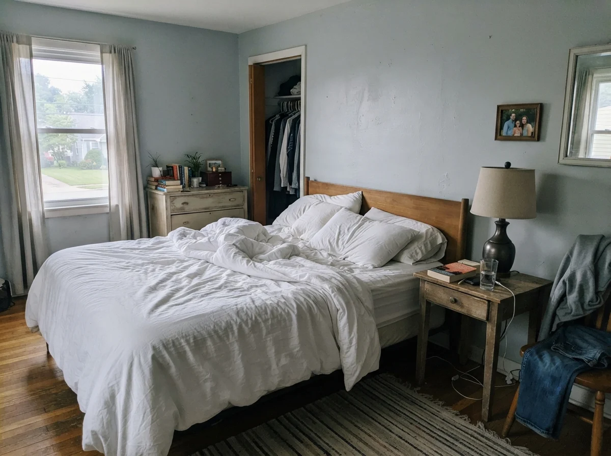
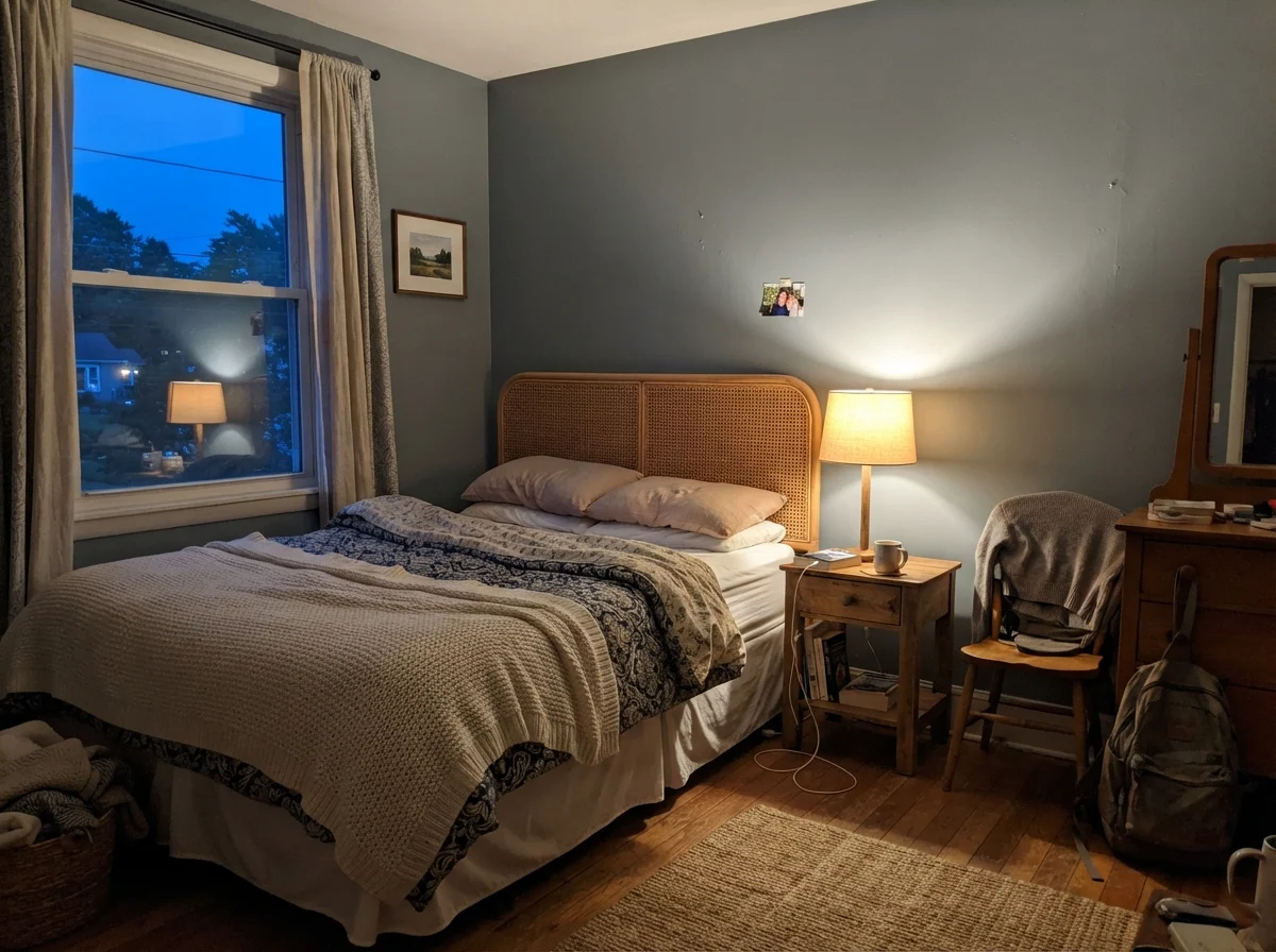
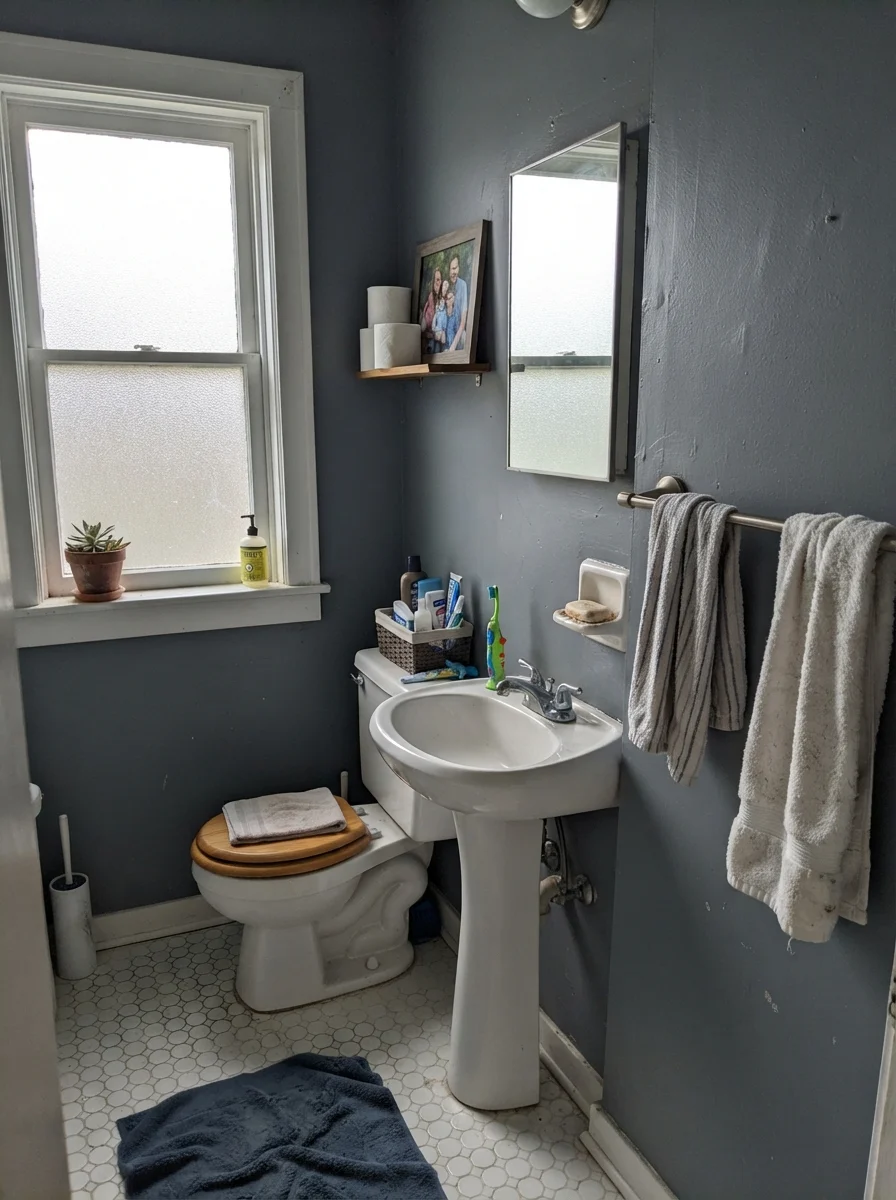
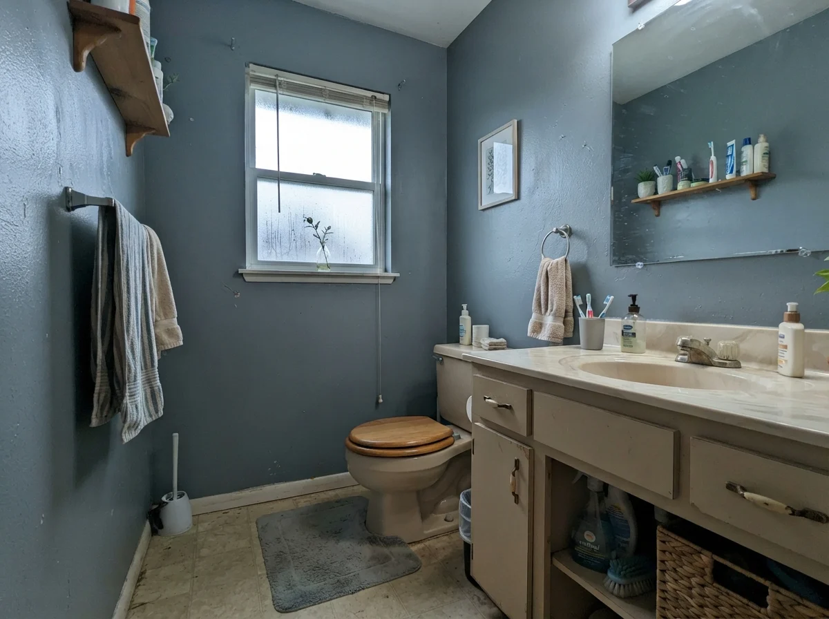
Under bright direct sun, the blue relaxes and lets a faint mineral warmth show through. Overcast days push the slate gray forward, while cool rainy light or cold LED bulbs bring out its deep cool blue backbone.
Adirondack BlueBehr · see diary
Norwegian BlueBehr · see diary
Storm CloudSW 6249
Wolf GrayBenjamin Moore · see diary
Charcoal BlueBehr · see diary
Watching the Light Shift: Morning to Night
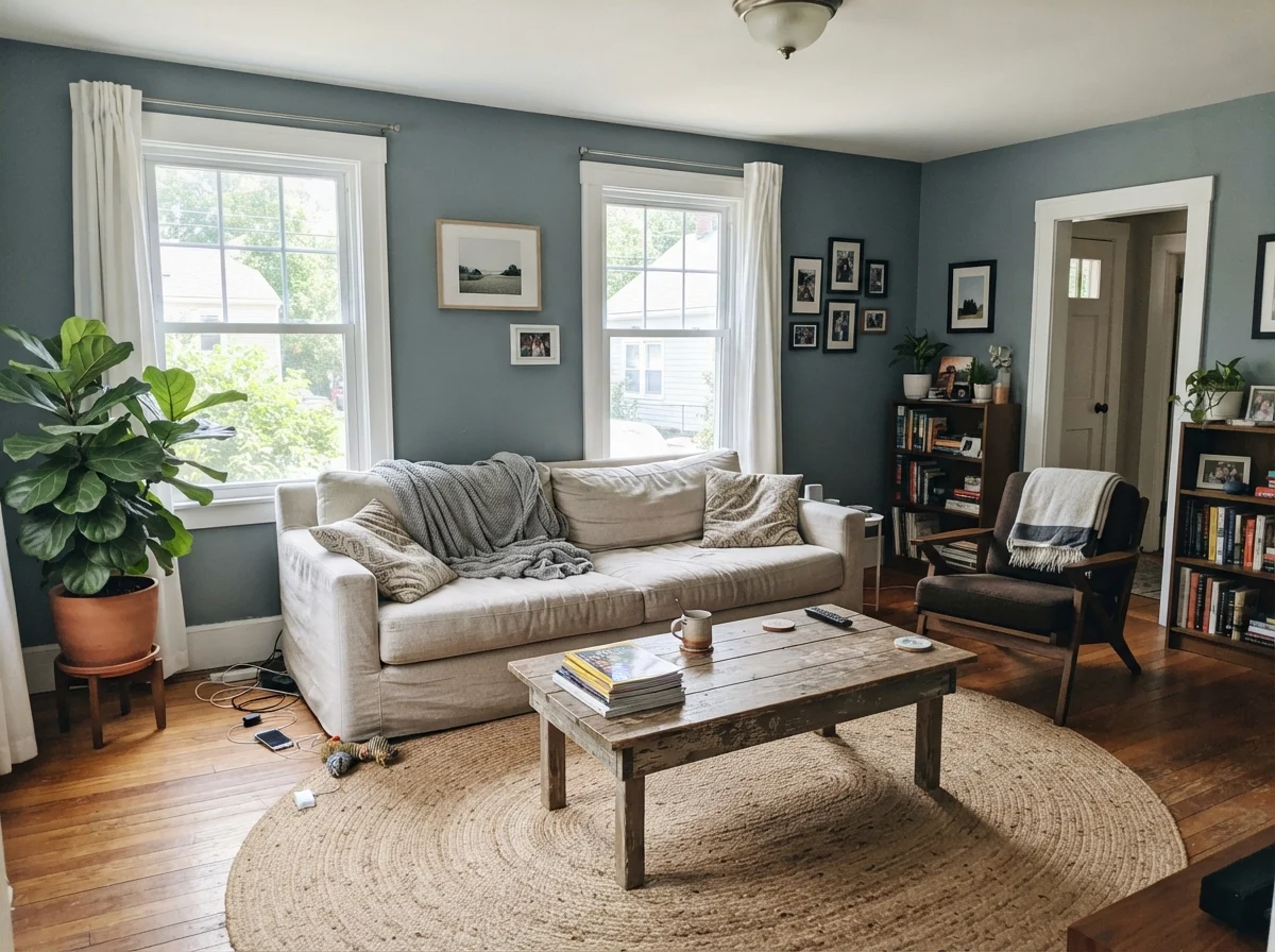
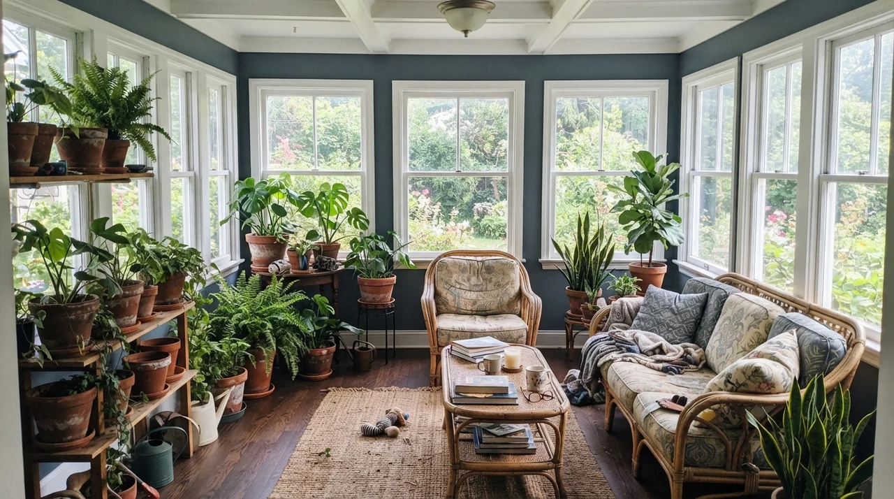
Before you commit five gallons of paint to a room, you need to understand how an LRV 23 color behaves as the sun moves across your roofline. In the early morning, before any lamps are switched on, Storm Cloud can look noticeably subdued and cool. It waits for the sun. By evening, under warm 2700K lamp lighting, the color wraps around the room in a much cozier, softer way.
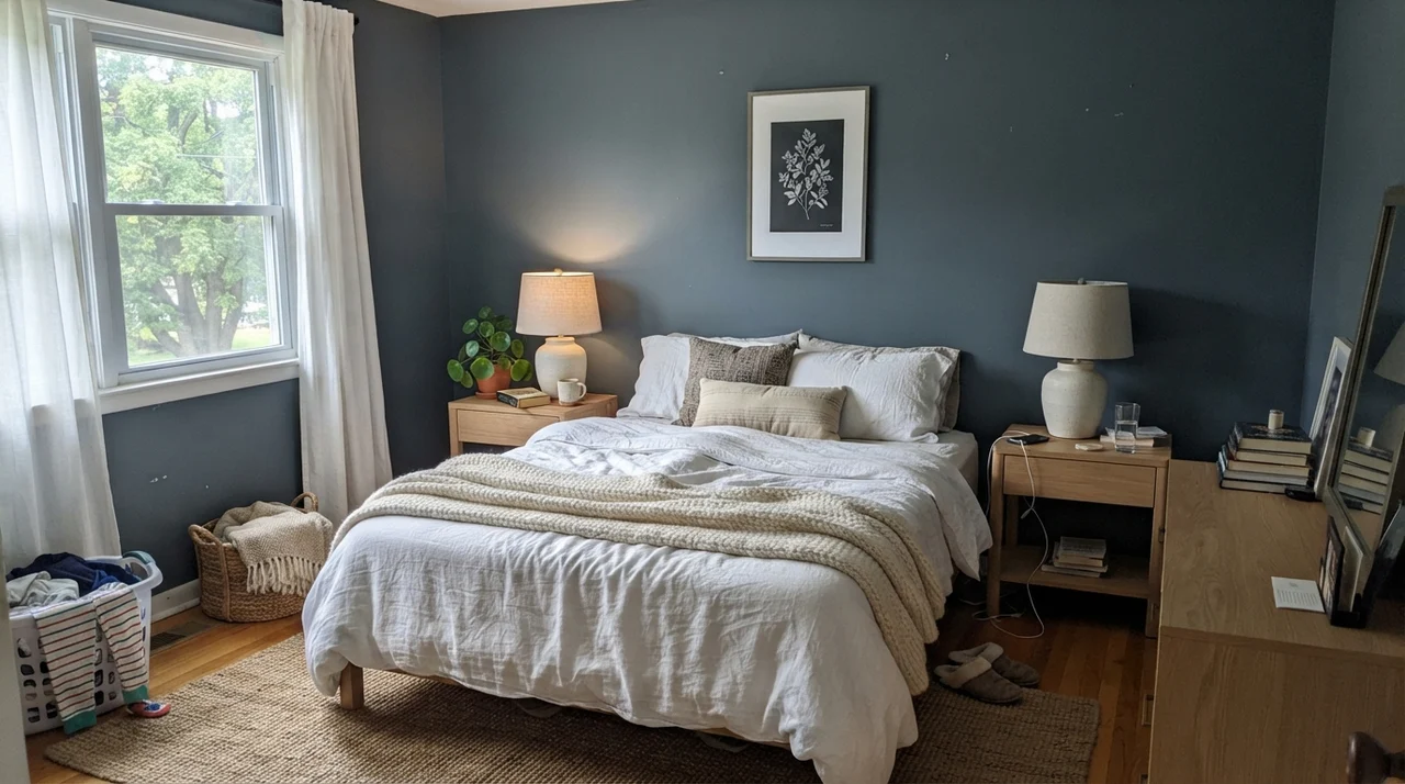
When you look at those two lighting conditions side by side, you see the central truth of this paint: it needs thoughtful lighting. If you rely on overhead cool white bulbs, Storm Cloud can feel chilly and stern, leaning toward a harsh storm-gray. Give it a classic shaded bedside lamp with a warm 2700K bulb, and the blue softens into something peaceful and enveloping.
Where Storm Cloud Belongs: Rooms That Do the Work
Over thirty years of renovating, I've learned that deep colors have specific jobs they love and places where they feel forced. Storm Cloud is an absolute workhorse when treated as an architectural anchor. Let's look at how it lives across different spaces in a busy house.
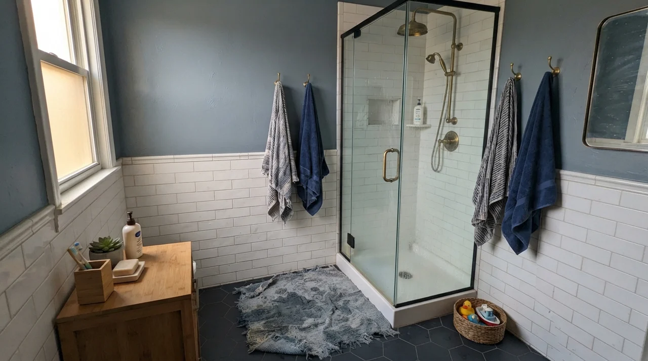
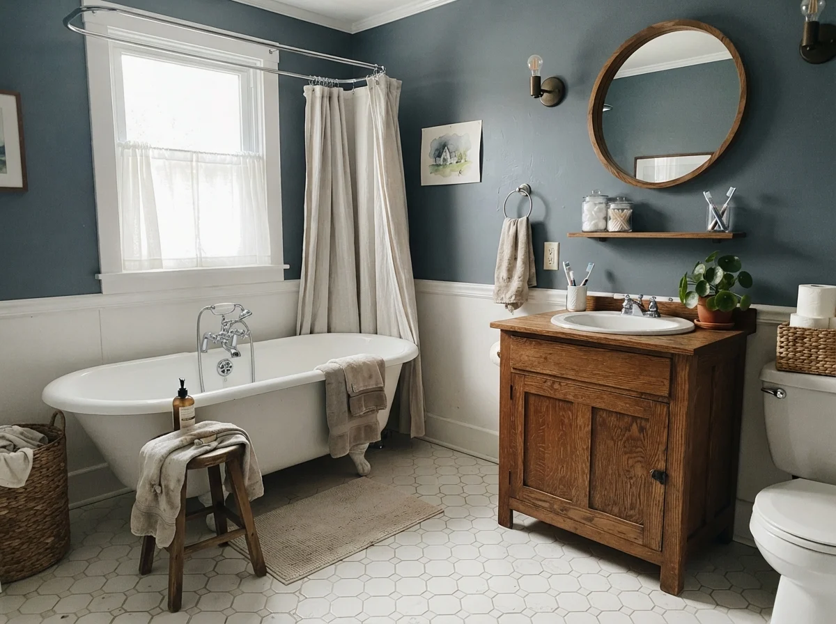
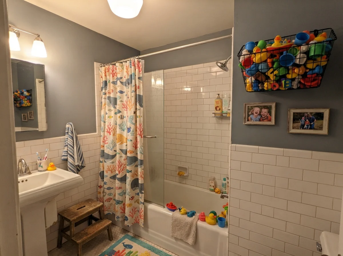
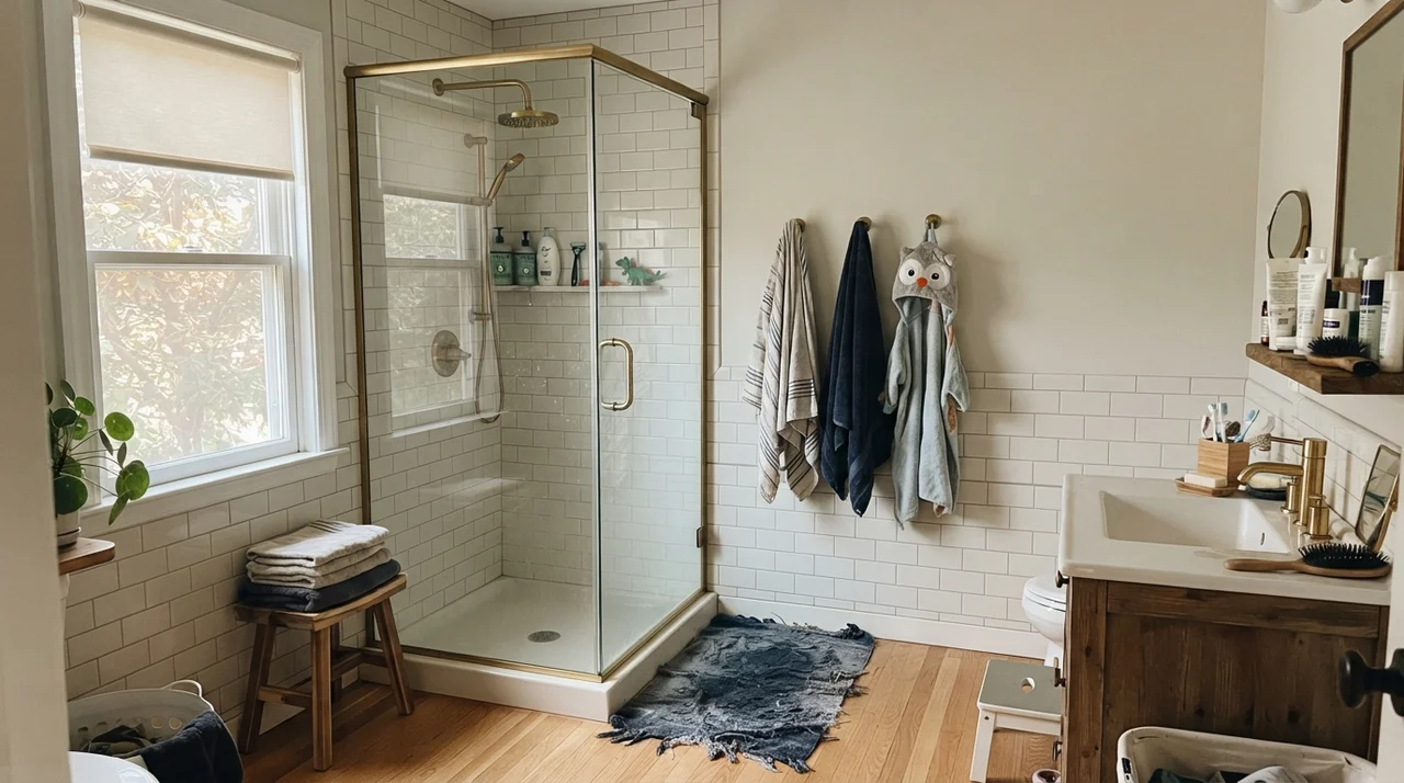
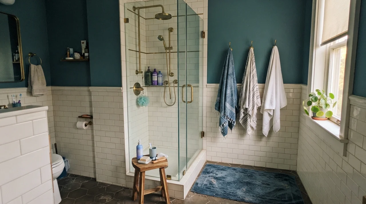
In bathrooms, paired with high-wainscot white subway tile or a classic white clawfoot tub, Storm Cloud gives you contrast without the severe black-and-white shock of a cold charcoal. It gives steam-filled rooms a sense of grounded permanence. In a bedroom with decent southern or western exposure, it settles the eyes after a loud day.
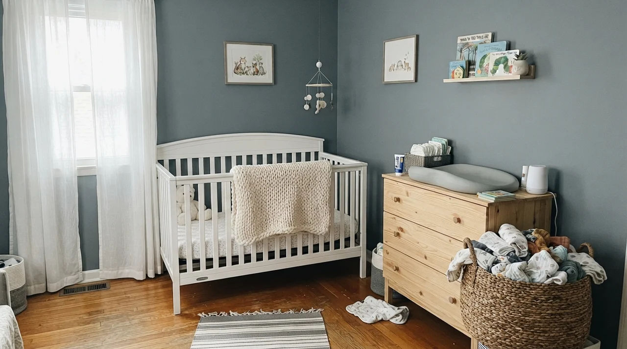
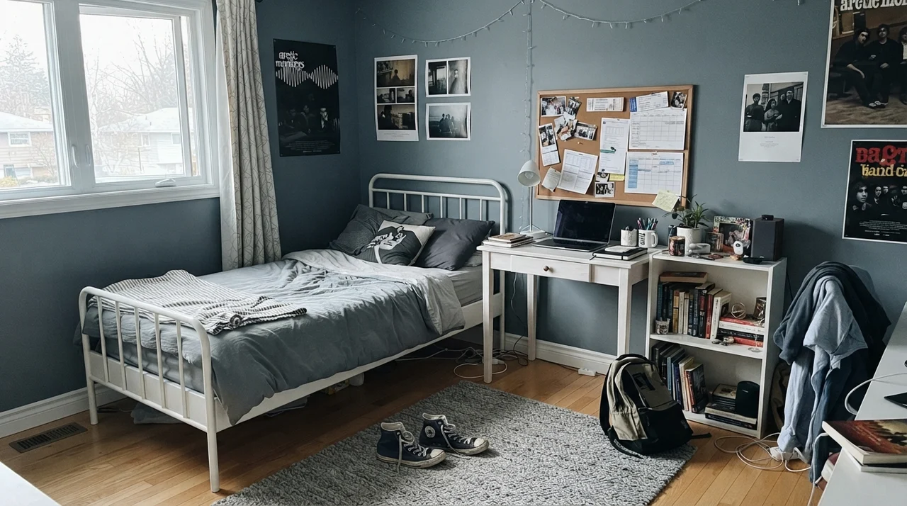
It also handles transitions remarkably well. As kids grow out of baby pastels, Storm Cloud is one of those rare colors that works in a serene nursery with pale woods and continues to hold up straight through the high school years without ever feeling childish or trendy.
Cabinets, Islands, and Architectural Woodwork
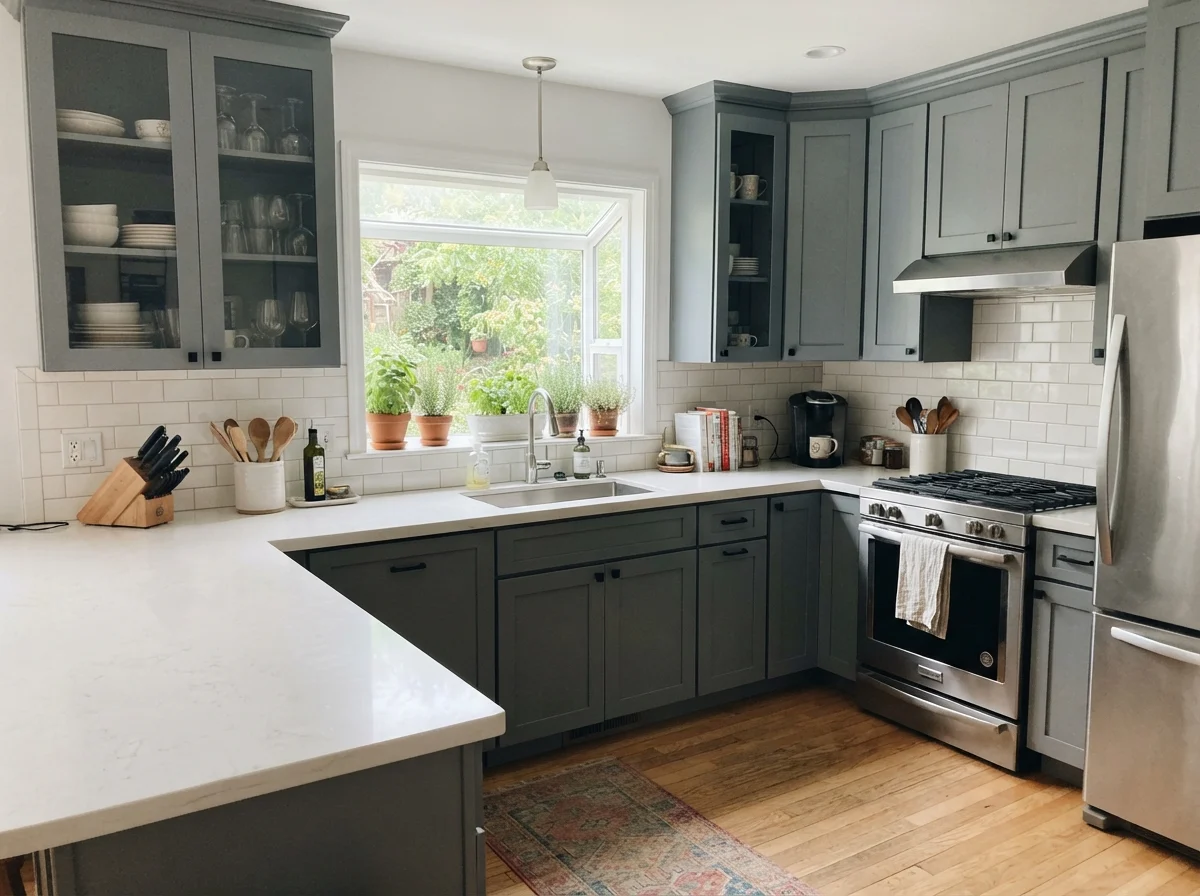
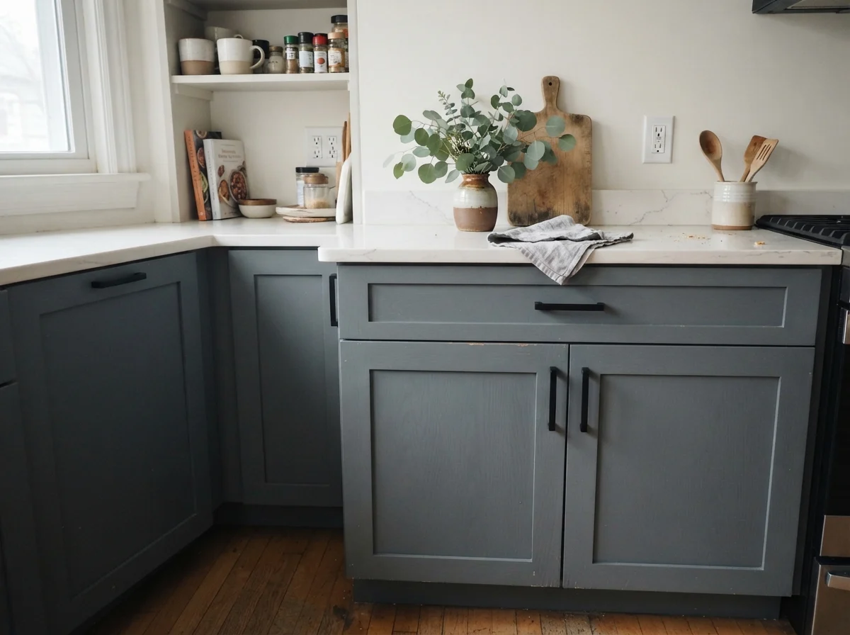
If you ask me where this color shines brightest indoors, it's on woodwork. Kitchen cabinets and built-ins demand colors that can hide fingerprints, ground lighter countertops, and withstand everyday kitchen life.
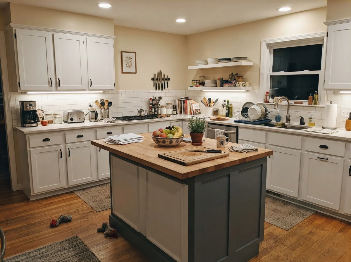
Painting only the kitchen island in Storm Cloud—while keeping perimeter cabinets in a gentle white—is one of the most reliable design decisions you can make. It breaks up a sea of white cabinetry without turning your kitchen into a dark cave. And from a pure maintenance standpoint, an LRV 23 satin finish on an island base is worth every penny when kids are kicking the panel with their sneakers every morning at breakfast.
Storm Cloud is what a true blue-gray looks like when it isn't trying to be a headline. It's a professional's pick more than a trend pick.
When Flat Light Takes Over: The Honest Failures
Now, let's talk about where things go wrong. Almost every disappointing Storm Cloud story comes from one of three predictable situations, and none of them are the paint's fault—they're a mismatch between a cool, LRV 23 blue-gray and a room that simply cannot support it.
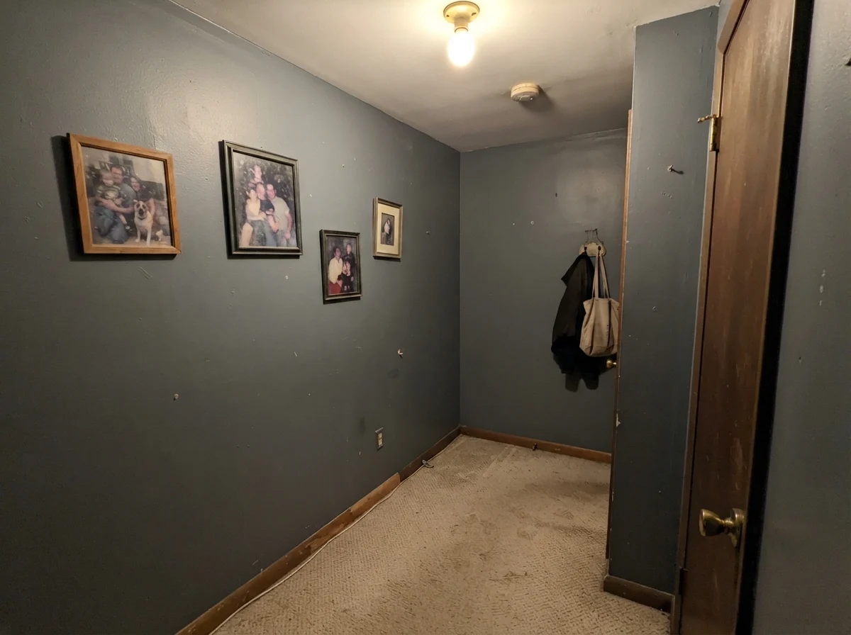
First: a dim, windowless space. Without natural light to draw the blue forward, Storm Cloud flattens out into an uninspired, murky putty. It loses all of its nuance and can feel oppressive fast. Second: a room choked with honey oak. Yellow-orange sits directly opposite blue on the color wheel; put Storm Cloud against dated golden oak trim, and the wood looks aggressively orange while the paint looks icy and sour. Neither surface wins.
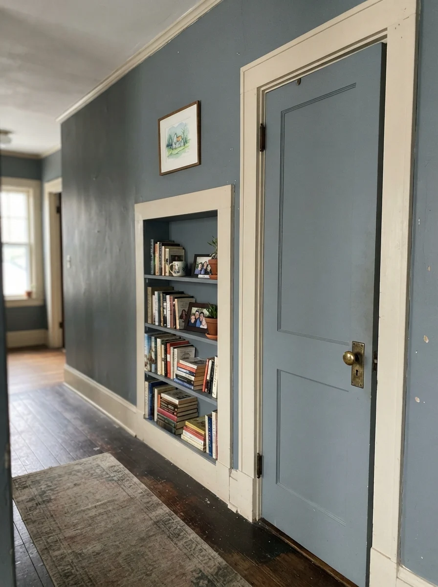
Look at that windowless hallway in the photo above. That is the reality of putting a deep blue-gray under a cheap overhead bulb without a single window in sight. If that describes your hallway, save yourself the weekend of painting and pick a warm neutral instead.
Durability, Sheens, and Living with It Long-Term
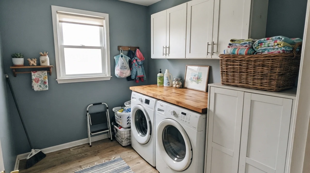
Five years in, what does Storm Cloud actually look like on your walls? That depends entirely on your sheen decision. Darker, cool-toned paints show burnishing—those shiny rub marks you get when someone brushes against the hallway wall with a shoulder or a laundry basket—far faster than pale neutrals.
Here is my strict sheen breakdown for this specific color:
- Walls: Eggshell. A flat finish looks gorgeous for two months, but the moment you wipe away a scuff mark by the light switch, you will leave a permanent burnished halo. Eggshell gives you just enough resin to wipe down without turning the wall into a reflective mirror.
- Trim & Front Doors: Semi-gloss. Exterior doors take rain, salt, keys, and grocery bags. Semi-gloss gives Storm Cloud the hard shell it needs to be scrubbed clean every spring without peeling or fading.
- Cabinets & Islands: Satin. Specifically a urethane-fortified cabinet enamel. It resists hand oils around drawer pulls and wipes down easily without the plastic glare of high-gloss.
Is Storm Cloud too dark for a small bathroom?
Not if you pair it with good lighting or white wainscoting. Over white subway tile with a bright mirror sconce, it looks deliberate and grounded. In a windowless powder room with a single weak bulb, it will feel like a closet.
Does Storm Cloud look blue or gray on the wall?
Both. In soft indirect daylight, the blue steps forward clearly. In overcast conditions or dim corners, the slate gray takes over. It never looks like baby blue or royal blue—it is always anchored by gray.
What finish should I use for a Storm Cloud kitchen island?
Use a satin finish in a dedicated cabinet enamel. A satin sheen resists scuffs and dirty shoes while cleaning up easily with a damp microfiber cloth.
Will Storm Cloud work with golden oak cabinets or trim?
No, and this is where many homeowners get frustrated. Blue and orange sit opposite each other on the color wheel, so Storm Cloud will make your oak look excessively orange while the paint looks harsh and icy.
Susan's Verdict · Built for Doors, Islands, and Daylight
If you want a dependable, grown-up blue-gray that refuses to chase trends, Sherwin-Williams Storm Cloud is worth the money. Use it on a front door, a kitchen island, or a well-lit home office where daylight can draw its blue out. Keep it far away from honey oak and windowless hallways, and it will reward you with five, ten, or twenty years of quiet architectural dignity.