Color Diary · No. 93
Porpoise SW 7047: Why This Sherwin-Williams Gray Needs Real Sun
The warm brown-gray dark neutral that quietly runs front doors, islands, and exteriors, reviewed honestly: the light it needs, the rooms where it goes muddy, and what to pick instead.

Susan HartleyOctober 24, 2026 · 15 min read
Porpoise · Sherwin-Williams SW 7047
Hex#6B645BLRV13Undertonesbronze → taupe-brown → flat muddy near-black
In our last house, the 1990s colonial with the drafty foyer, I decided our back mudroom door needed to feel grounded. It had spent twelve years wearing builder-grade gloss white, which mostly meant it spent twelve years wearing black thumbprints around the deadbolt. I wanted something dark, substantial, and forgiving. I bought a quart of Sherwin-Williams Porpoise SW 7047 on a bright Saturday morning in May, painted two coats before lunch, and stepped back thrilled. In the south-facing glare streaming through our screened porch, it looked like old bespoke ironwork softened by decades of wax—a rich, earthy bronze-gray with genuine depth.
Then November arrived. The daylight angled down, the porch roof cast a long cold shadow, and suddenly my handsome door looked like wet Portland cement. Not dramatic. Not cozy. Just a heavy slab of flat, muddy near-black that seemed to swallow whatever weak light crept into that entryway. That was my first lesson in living with Porpoise: it is not a paint you choose in the sunshine and expect to behave the same way once the clouds settle in.
Porpoise is not a famous color. There is no Color of the Year press release, no viral pinboard attached to it—it is the quiet, dependable member of Sherwin-Williams' dark-neutral lineup, sitting right between softer greiges and the deep near-blacks like Urbane Bronze and Black Fox. Sitting at global rank 124, it belongs to the orange deck family, which surprises people until they see that warm undertone wake up. What it actually is: a deep gray built on a warm brown-bronze base, named for the animal's own brown-and-gray coloring. With a light reflectance value of 13, it absorbs eighty-seven percent of the light hitting it. Give it real daylight—a covered porch, a sunlit island, a well-lit exterior—and it reads sophisticated and warm. Starve it of light and it collapses into a flat, muddy near-black with no personality left.
The Three Faces of Porpoise
Because Porpoise carries a warm orange-brown foundation underneath an LRV 13 charcoal blanket, its character swings wildly depending on the quality and volume of light in the room.
warm sun
overcast, north light
dusk, rain, cool bulbs
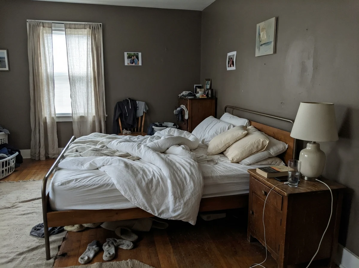
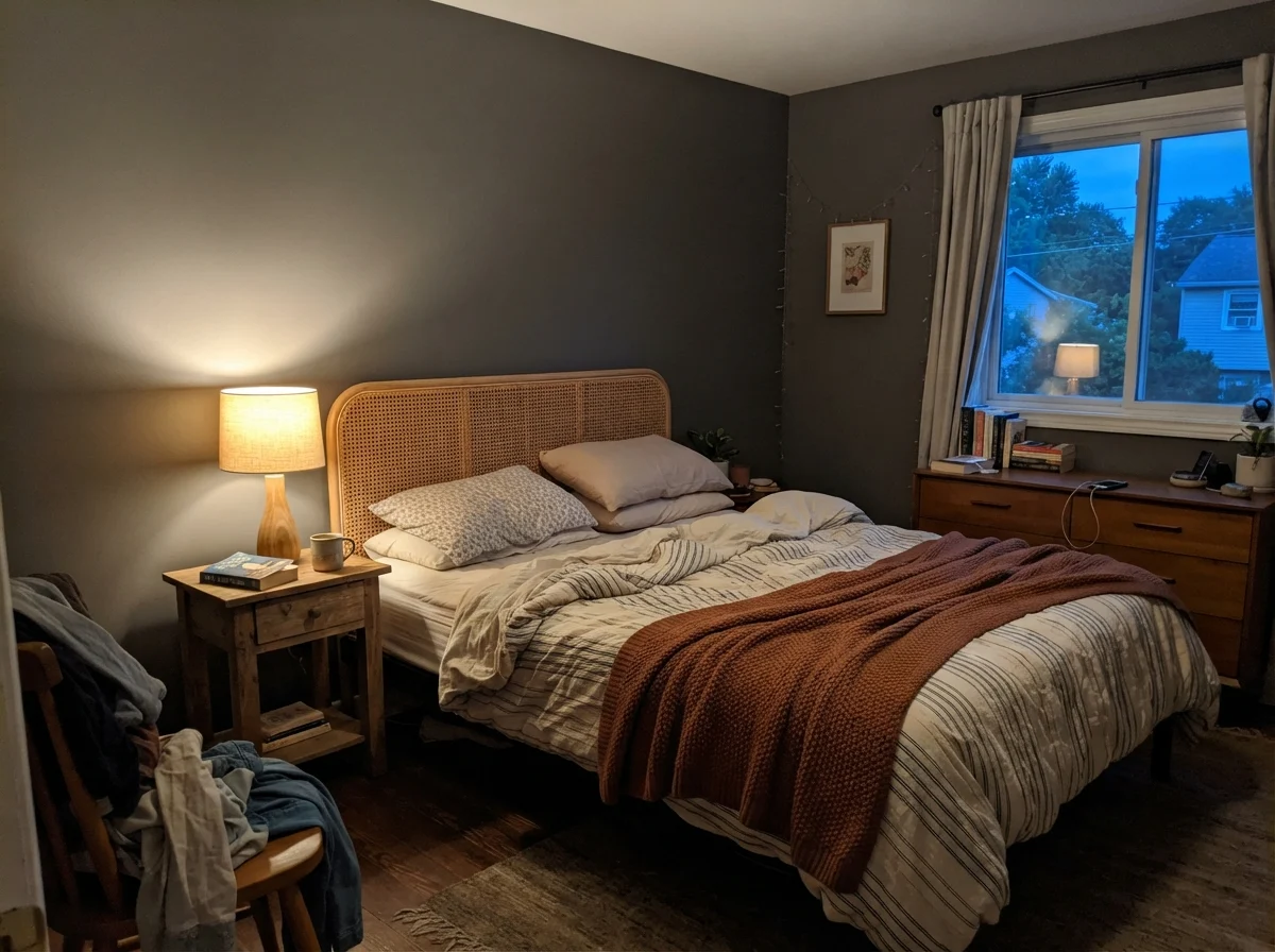
Under bright direct light, Porpoise shows its softened taupe-bronze soul. In cool or overcast daylight, it pulls an olive-green cast. Under poor artificial lighting or dim hallways, it collapses into a flat, chalky dark.
Cast IronSherwin-Williams · see diary
ThunderousSherwin-Williams · see diary
PorpoiseSW 7047
Kendall CharcoalBenjamin Moore · see diary
Pewter GreenSherwin-Williams · see diary
Watching the Shifts: Morning Frost to Evening Glow
Whenever someone asks me why their dark paint turned sullen, I ask them what time of day they’re looking at it. Dark neutrals with warm undertones are chameleons, and Porpoise is particularly impressionable. When cool daylight hits it early in the morning without any lamps to help, the bronze foundation hides completely. The wall looks faded, almost washed out and dusty. But bring in a warm lamp at twilight, and that sleeping brown base comes right back to life.
I've lived with paints that hold a stubborn, unyielding line no matter what bulb you screw into the socket. Porpoise isn't one of them. In direct morning sun, you get that lovely taupe-bronze. On a rainy Tuesday afternoon under north-facing windows, you might swear you caught a distinct flash of army green or olive drab. It isn't misbehaving; that's simply what happens when cool ambient sky light washes over an earthy brown-gray mix.
Where Porpoise Shines: Rooms with Strong Bones and Real Light
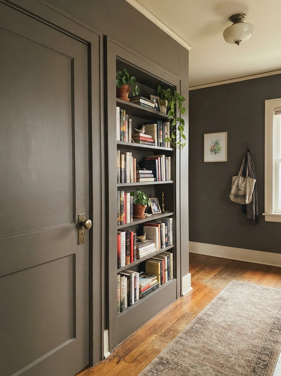
This color earns its keep in small, well-lit doses rather than as an indiscriminate whole-house blanket. A front door under a porch light, an exterior painted in real daylight, a kitchen island with task lighting overhead, or a bathroom vanity under a window—all of these give Porpoise enough light to show the bronze-brown warmth that makes it worth choosing over a flatter charcoal. It also works as the deeper, more approachable stand-in for Urbane Bronze: it sits in that same warm-dark family, but it is lighter and easier to live with on cabinetry and trim where a full black-brown can feel oppressive.
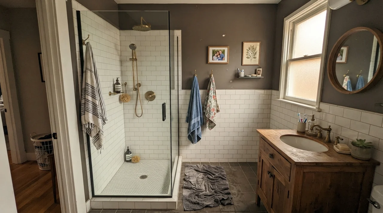
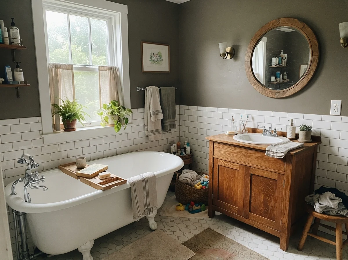
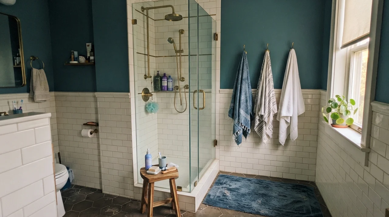
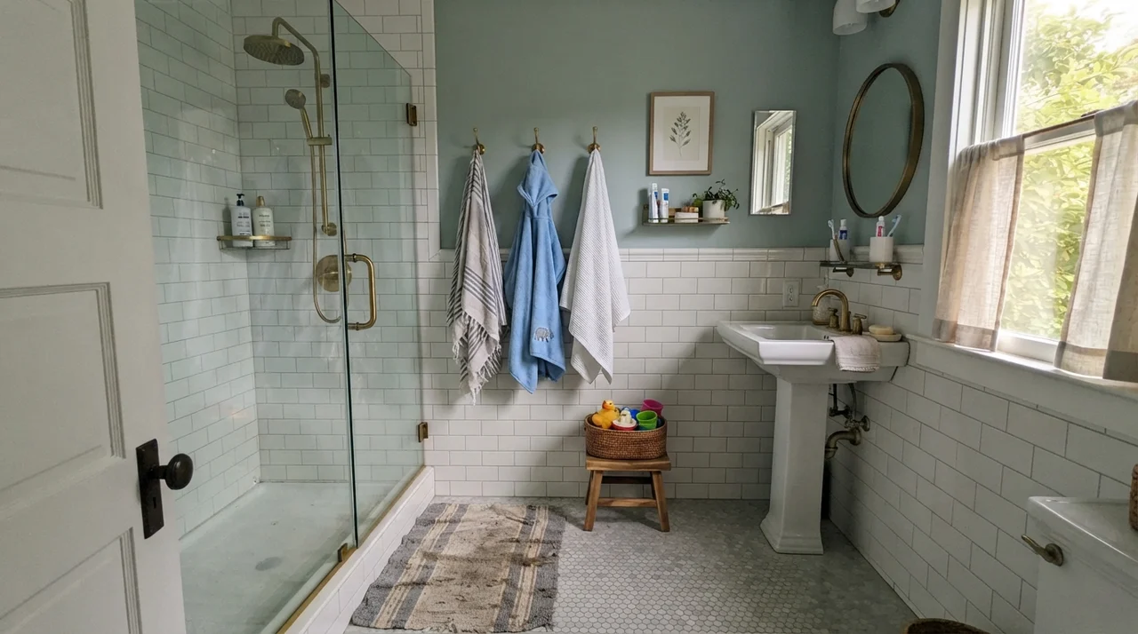
Notice why that bathroom works: the white subway tile wainscot takes up half the vertical height. That tile acts like a giant reflector, bouncing the soft warm daylight from the side window straight up into the paint. When you pair an LRV 13 wall with that much clean ceramic white, the room feels tailored rather than cramped. It gives the eye a crisp benchmark. Five years in, that subway tile and dark wall combo remains one of the most durable choices you can make for a family bath.
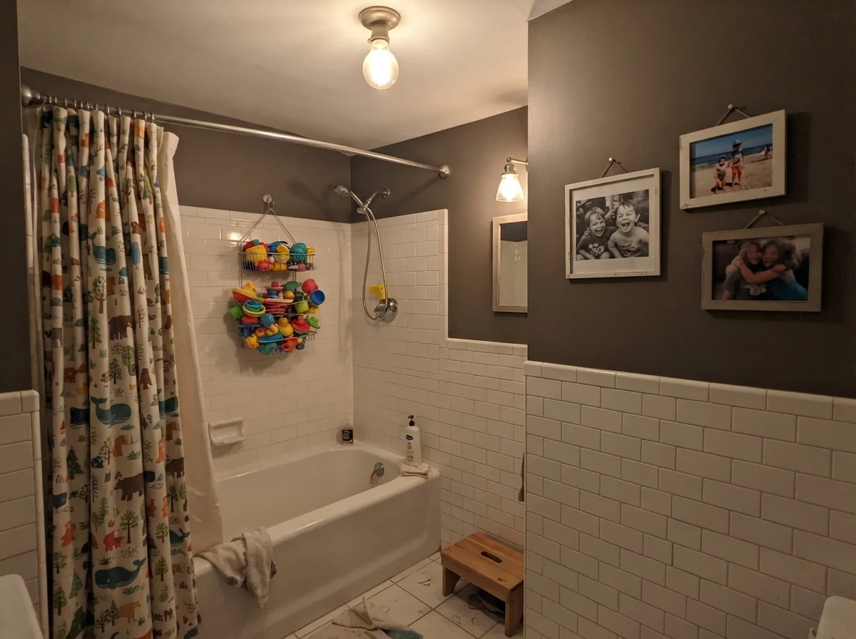
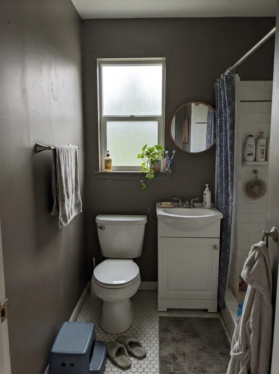
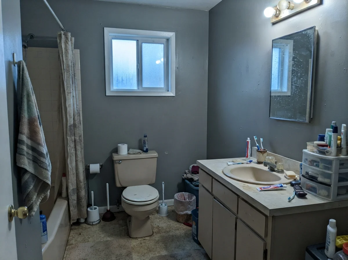
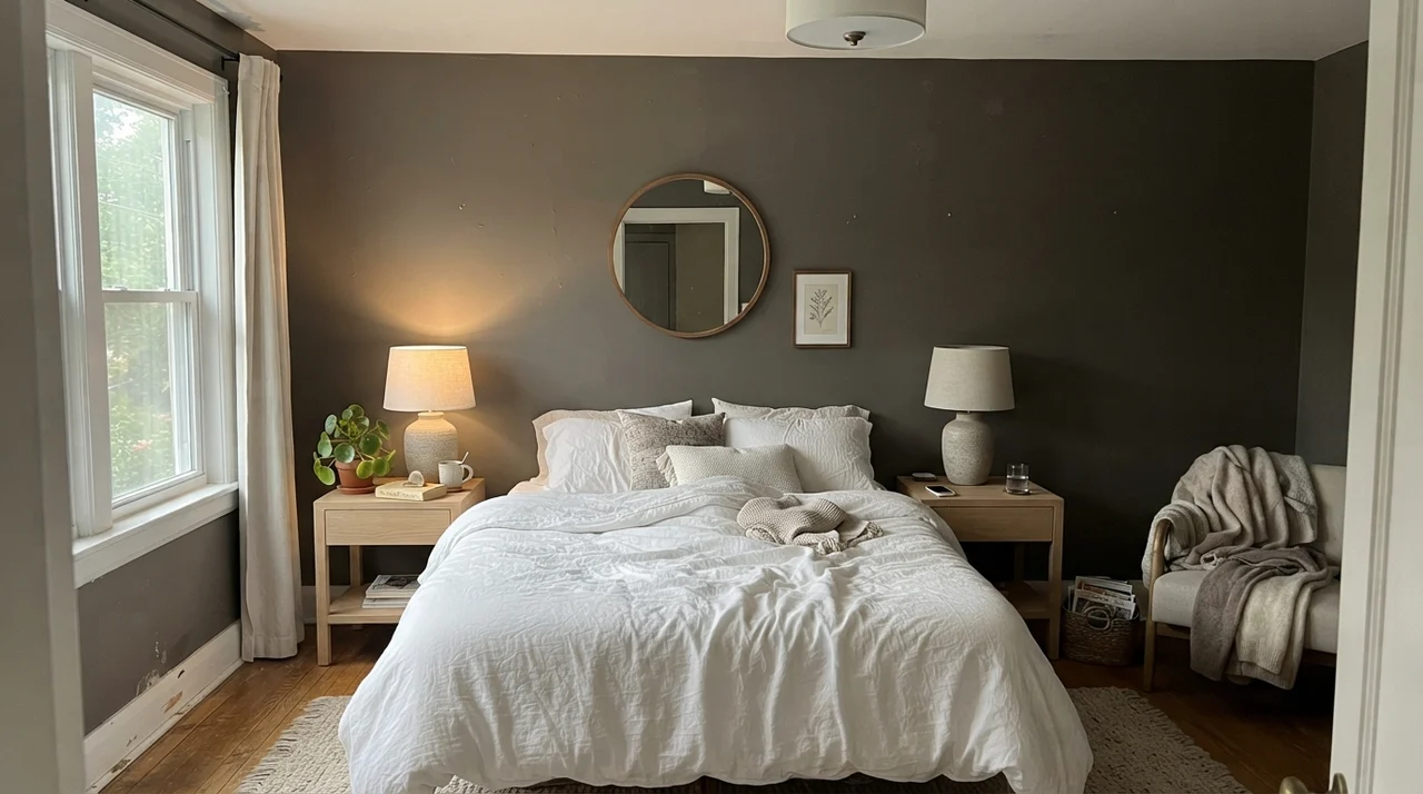
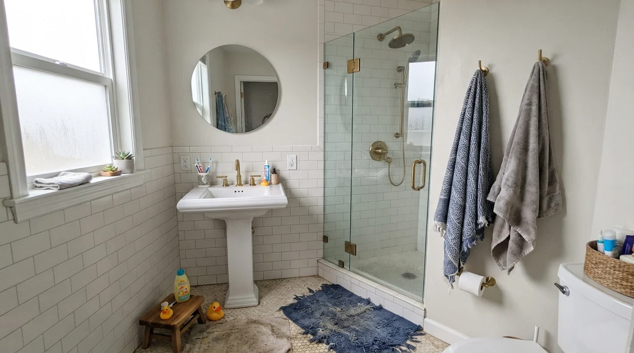
In both of those spaces, there is plenty of bright white ceramic and warm wood to balance the walls. If you tried that same wall color in a bath with dingy beige floor tile and a yellowed acrylic tub surround, you would hate it within forty-eight hours. Porpoise demands clean partners. It loves natural oak, aged brass hardware, and bright porcelain.
Now look at what happens when the lighting isn't doing any favors. Below, you can see how radically this paint shifts when an overcast day rolls in or when it's exposed to cool northern exposure.
That cool, almost greenish cast in the right-hand image is exactly what catches people off guard. When paint stores hand you a tiny paper chip under fluorescent tubes, nobody tells you that an overcast sky will pull out every drop of green-gray in the formula. If your home sits under heavy tree cover or faces north, you must paint a large test board and look at it at 2:00 PM on a cloudy day before ordering three gallons.
Bedrooms, Living Rooms, and Daylight Requirements
Can you put Porpoise in a bedroom? Yes, provided you have real daylight or an intentional lighting plan. Under rough conditions—say, under forty lumens per square foot—the bronze undertone simply drops out of sight. But when generous daylight pours in, Porpoise behaves like a velvety cocoon.
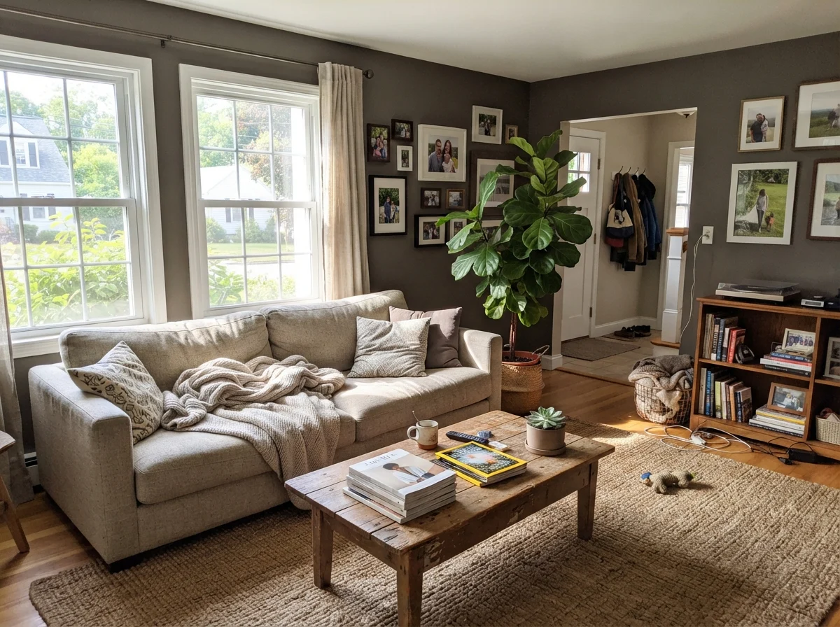
In our 1970s split-level, we had a living room with two giant picture windows that flooded the room from noon until dusk. That is the exact scenario where a dark bronze-gray earns its keep. Flooding daylight cuts through the low LRV and keeps the room from feeling like a cave.
Cabinets, Islands, and Woodwork
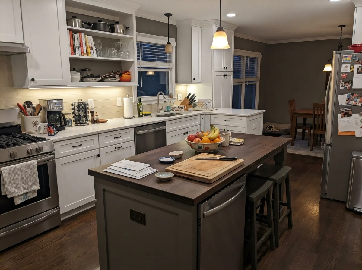
If you ask me where Porpoise does its finest work indoors, I will tell you without hesitation: cabinetry. Under white or light upper cabinets, with dedicated task lighting overhead, Porpoise gives an island real architectural weight without the severe finality of a true pitch black. It feels grounded, timeless, and forgiving of kicked shins and scuff marks.
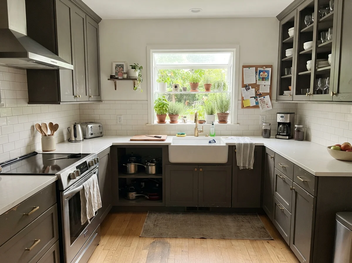
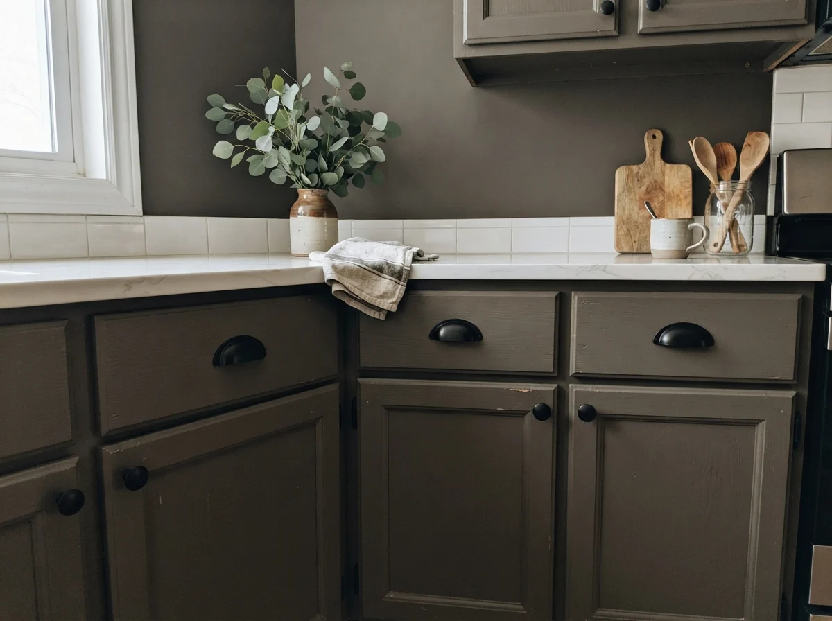
If you're bold enough to run Porpoise across all your kitchen cabinets—uppers and lowers—you must commit to light countertops, a pale backsplash, and ample natural light. When you do, the result is tailored and calm. But make sure you spend the money on the right cabinet coating. Never use standard wall latex on kitchen millwork; pick a satin urethane-fortified product designed to resist hand oils and repeated scrubbings.
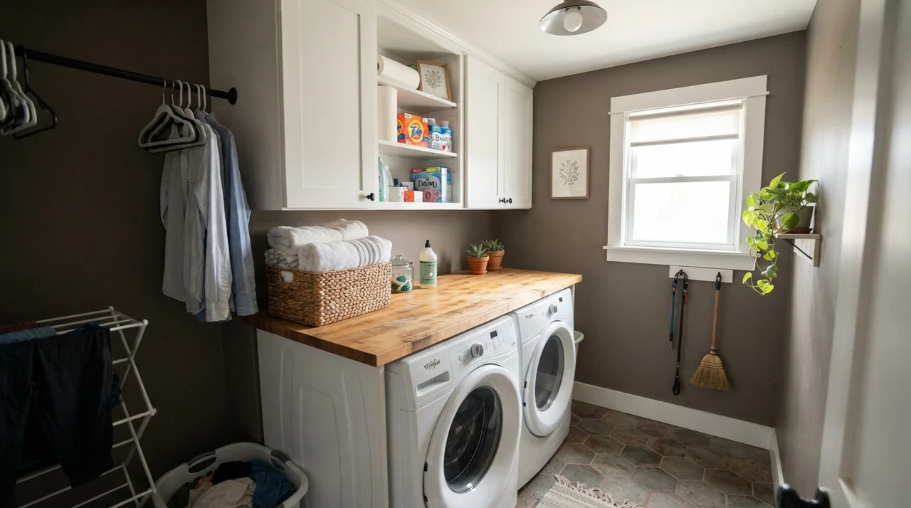
Beyond the kitchen, small utility spaces benefit hugely from this shade when daylight is present. A bright laundry room with white appliances and pale shelving gives Porpoise a structured, functional backdrop that hides laundry detergent splashes far better than an off-white ever could.
The complaints that show up around Porpoise all trace back to one predictable mismatch: asking a low-LRV bronze paint to do heavy lifting in a room with zero daylight.
The Honest Fail: When Porpoise Goes Flat and Muddy
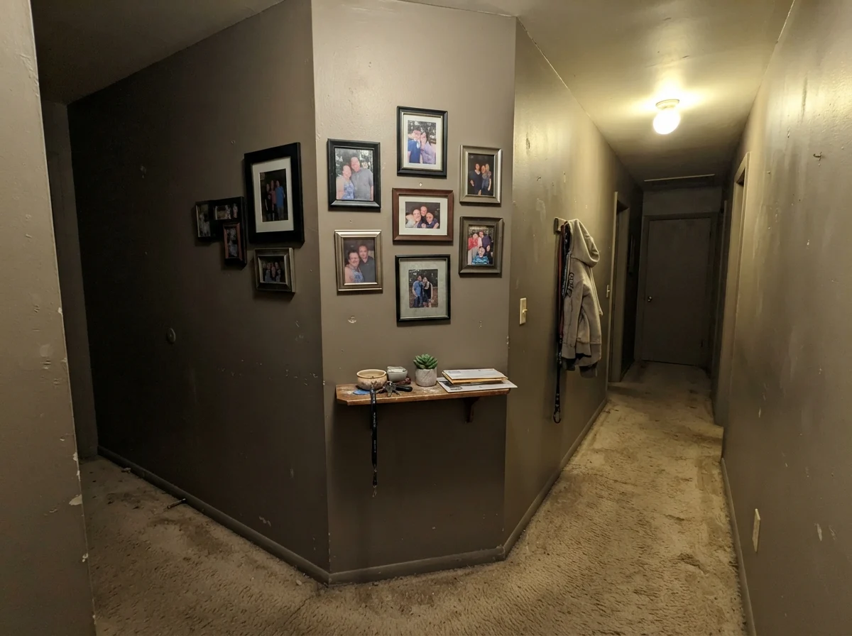
I promised you the unvarnished truth, and here it is: Porpoise can look utterly depressing. When you roll this paint into an enclosed space starved of natural light—a windowless interior hallway, a tiny powder room lit by a single builder-grade flush-mount ceiling fixture—the warmth evaporates. The brown-bronze base collapses into a lifeless, muddy dark gray that looks like dried sludge. It isn't moody or intentional; it just looks like you ran out of primer and gave up.
If your room lacks windows, do not put Porpoise on all four walls unless you are prepared to install serious lighting—aim high, well over forty lumens per square foot, with warm 2700K bulbs. Otherwise, save this shade for rooms where the sun can actually do its job.
Exterior Siding, Trim, and the Front Door
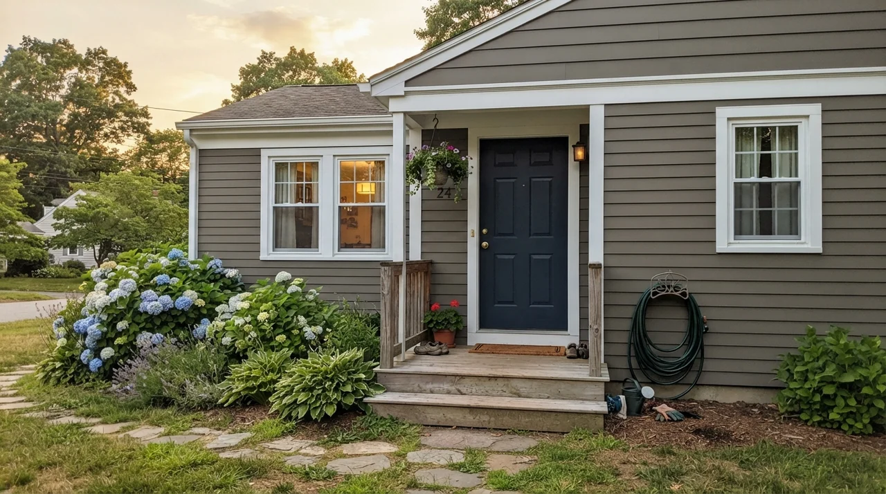
Full outdoor daylight is the great equalizer for Porpoise. Outdoors, under the open sky, that low LRV of 13 stops being a liability and becomes an asset. Direct sun washes out lighter grays, turning them into pale, glaring whites. But Porpoise holds its own. On horizontal siding, exterior trim, or a front door, the warm bronze undertone blooms beautifully without ever looking stark.
When we sold our second house, a front door repaint in a warm bronze-charcoal was the single best fifty dollars I spent. It gave the entry presence, paired seamlessly with the brick walk, and didn't show scuffs from grocery bags. If you want a front door that says someone sensible lives here, Porpoise is hard to beat.
Durability, Sheens, and Touch-Ups
Here is where thirty years of wiping walls catches up with you: dark paints are notoriously unforgiving of the wrong sheen. If you buy Porpoise in a flat or dead-matte finish for a high-traffic hallway, you will regret it the first time a shoulder brushes past and leaves a chalky burnish mark. Dark pigments show burnishing instantly. On the flip side, do not put semi-gloss on your living room walls unless you want to highlight every drywall seam your builder taped in 1994.
Stick to matte or eggshell on standard drywall, but insist on a high-grade washable formula. For front doors and exterior trim, semi-gloss provides the necessary wipe-down durability. For cabinetry and islands, insist on a satin finish in an enamel or urethane-fortified product. In our current ranch house, our dark doors get scrubbed clean twice a year around the knobs, and a quality satin formula has held up without losing its luster or flashing.
What is the LRV of Sherwin-Williams Porpoise?
Porpoise has a Light Reflectance Value (LRV) of 13. This places it firmly in the dark category, meaning it absorbs roughly 87 percent of visible light and requires generous daylight or dedicated fixtures to prevent it from looking muddy.
Is Porpoise considered a warm or cool gray?
It is definitely a warm gray. Formulated from Sherwin-Williams' orange deck family, it features a pronounced brown-bronze base. However, under cool northern daylight or flat overcast skies, that warmth can shift and show an olive-green cast.
Can I paint an entire small room in Porpoise?
Generally, no. Floor-to-ceiling Porpoise in a small room with no white trim or large windows tends to read like a dark closet rather than a cozy retreat. It needs adjacent light surfaces—like Alabaster trim or white subway tile—to bounce illumination back into the room.
What trim white looks best with Porpoise SW 7047?
Warm whites like Sherwin-Williams Alabaster SW 7008 and Greek Villa SW 7551 are ideal partners. Crisp, cool whites like Extra White create too harsh a contrast and make Porpoise look unwashed.
Susan's Verdict · A Handsome Accent That Asks for Real Light
If you have a sunny exterior, a front door ready for a dignified lift, or a kitchen island sitting under good task lighting, Porpoise SW 7047 is worth the money. Its warm bronze-brown foundation gives it a quiet sophistication that flat charcoals just can't match. But if you are planning to roll it across four walls in a dimly lit hallway or a north-facing bedroom with one small window, stop what you are doing and choose a lighter greige. Porpoise will not create warmth out of thin air; it only reflects the light you give it.