Color Diary · No. 96
Behr Wheat Bread: The Unsung Greige That Earned Its Keep in Our Hallways
Behr's quiet warm neutral, reviewed honestly: the light that flatters it, the Behr sibling it gets mistaken for, and what to buy instead.

Susan HartleyOctober 27, 2026 · 15 min read
Wheat Bread · Behr 720C-3
Hex#CDC4B7LRV56Undertonesbeige → taupe → greige
When we moved into our current 1960s ranch, nearly every square foot of drywall was coated in a builder-flat cream that had turned the color of damp cardboard after a decade of neglect. I knew we needed a whole-house reset, and after thirty years and three houses, I also knew that spending seventy dollars a gallon for designer labels across an entire floor plan is usually not worth the money. What you actually need for hallways, family bathrooms, and high-traffic corners is a workhorse: a shade that softens the drywall, bounces enough natural light to keep you from flipping on overheads at two in the afternoon, and forgives the occasional scuff mark.
That is how I ended up standing in front of the Behr rack at the local home center, looking at Behr Wheat Bread (720C-3). Nobody was writing breathless magazine features about it. It has never been named a Color of the Year, and you will not find thousands of polished lifestyle photos documenting its every angle. But on paper, it had the exact profile I have learned to look for: an LRV of 56, which sits right in that sweet spot where a room feels illuminated without washing out, and a balanced greige composition that avoids the yellowish sludge of the late 1990s tans while refusing to go icy cold like the stark grays that looked dated within five years of the 2015 remodeling craze.
We bought the paint, rolled it on, and lived with it. Five years in, I can tell you precisely where this paint earns its keep, where it quietly fails, and the one mistake people make at the mixing counter that ruins the entire room before the roller even gets wet.
Light Shifts: From Dawn to Twilight
In our last house, a 1990s colonial with oversized windows on one side and heavy shade trees on the other, I learned that a paint swatch tells you almost nothing about how a wall behaves over twelve hours. A genuine greige is a chameleon by design. Because Wheat Bread sits at LRV 56, it absorbs just enough light to show distinct personalities depending on the time of day and the bulbs you screw into your bedside lamps.
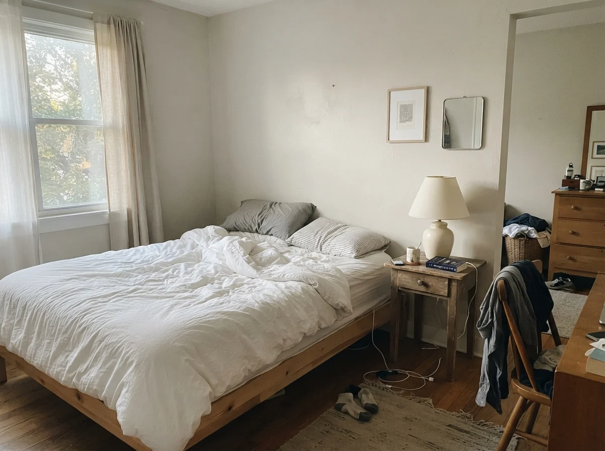
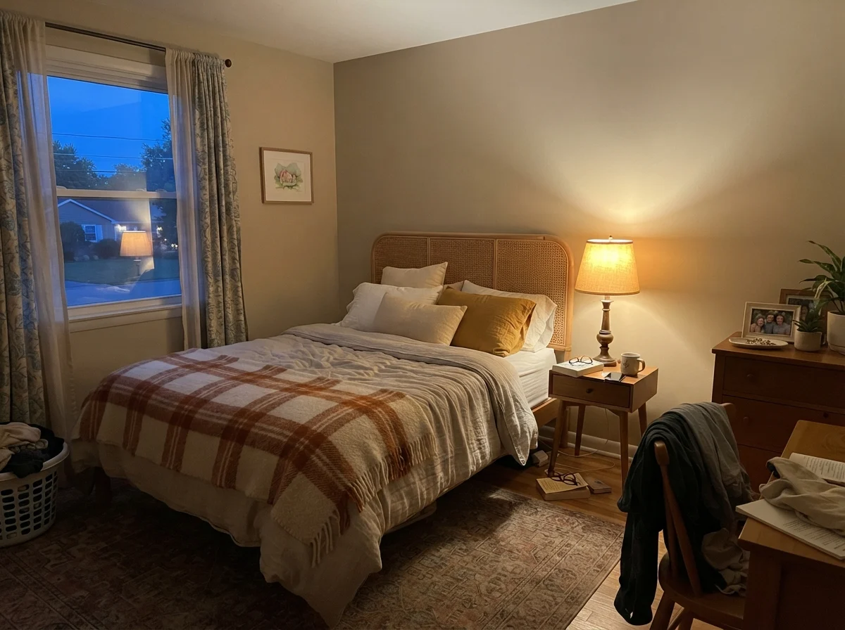
In early morning light, before the household wakes up, Wheat Bread can feel quiet, pale, and slightly washed out if there is no direct sun. It looks like a simple, soft taupe that steps backward and lets the trim stand out. But flip on a 2700K bedside lamp at dusk, and that same wall warms up immediately. The underlying beige comes forward, creating the cozy, cocooning atmosphere you actually want when winding down for the night. If you put cold, 4000K commercial LEDs in your fixtures, however, you will strip every drop of warmth out of the pigment, leaving behind a dull, concrete-like slab. Swap your light bulbs before you ever think about repainting.
Where Daylight Does the Heavy Lifting
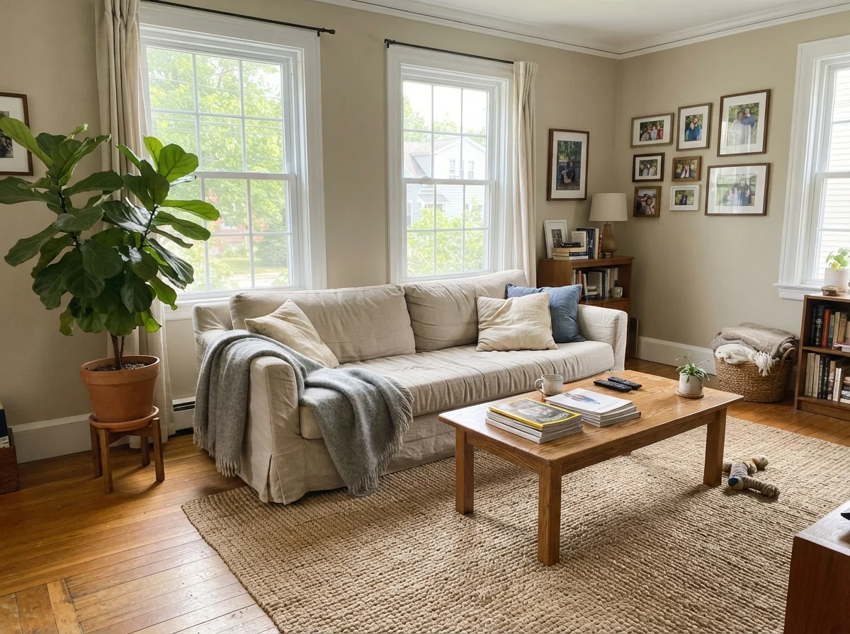
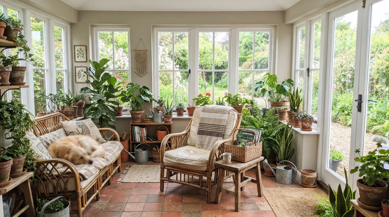
Warm neutrals thrive on generous natural light. When Wheat Bread receives direct or strong indirect daylight, the gray pigments settle down, acting purely as an anchor while the soft beige tone carries the room. In our sunroom and front living room, where daylight pours in from mid-morning through late afternoon, the color behaves like the ideal background. It lets natural oak flooring, textured jute rugs, and warm greenery take center stage without competing for visual dominance.
What surprises many homeowners about an LRV 56 paint is that it does not close in an open space. Pure whites can often feel blinding or stark in full sun, bouncing harsh glares into your eyes when you are trying to read on the sofa. Wheat Bread absorbs that harshness. It provides a soft, matte depth on the drywall that feels settled and restful, making modern open spaces feel like real homes rather than sterile showrooms.
The North-Facing Hazard and Flat Light
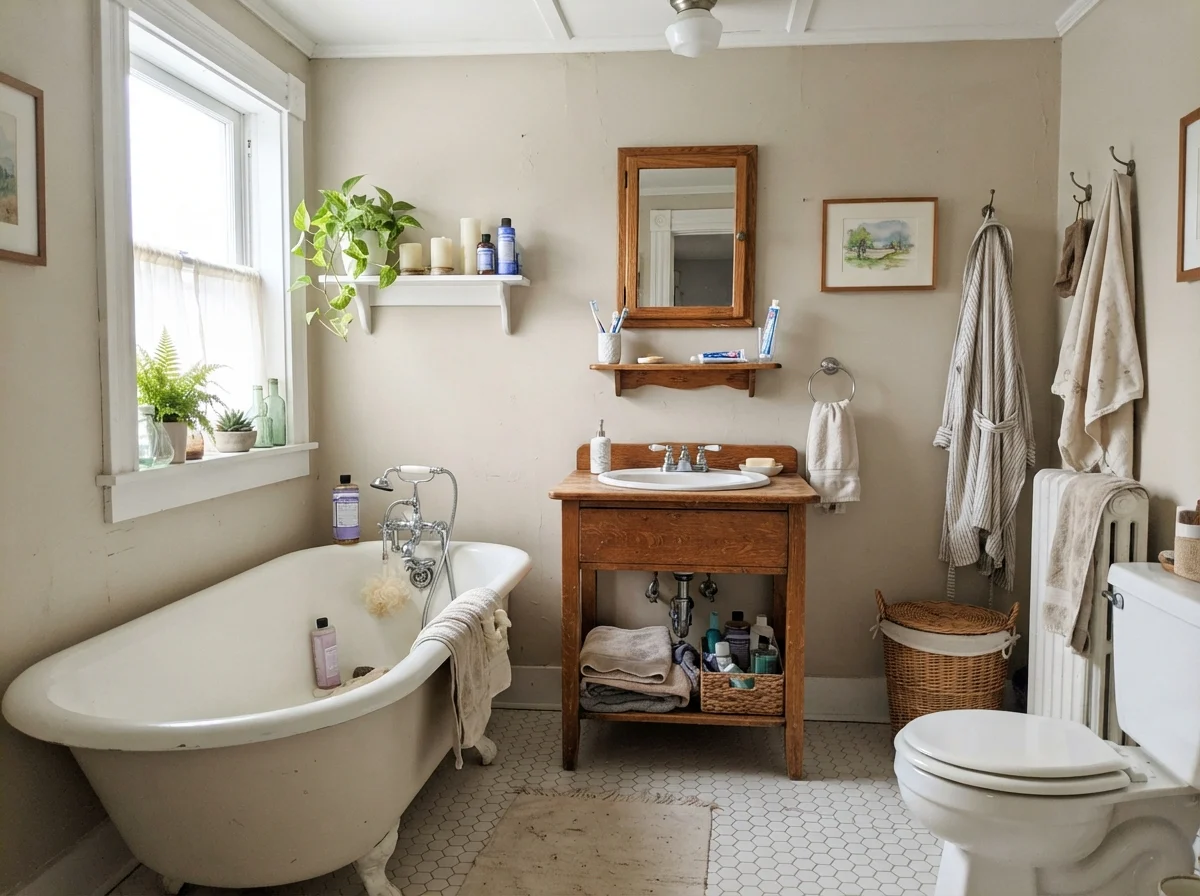
Now for the uncomfortable truth that paint swatches hide: Wheat Bread is not an all-weather miracle. Put this color into a small, dim, north-facing room on a rainy Tuesday, and the transformation is immediate—and not particularly pretty. Without natural warmth in the incoming light, the beige elements disappear, and the gray undertones lose their balance. The result is a flat, slightly muddy taupe-gray that can feel heavy and uninspired.
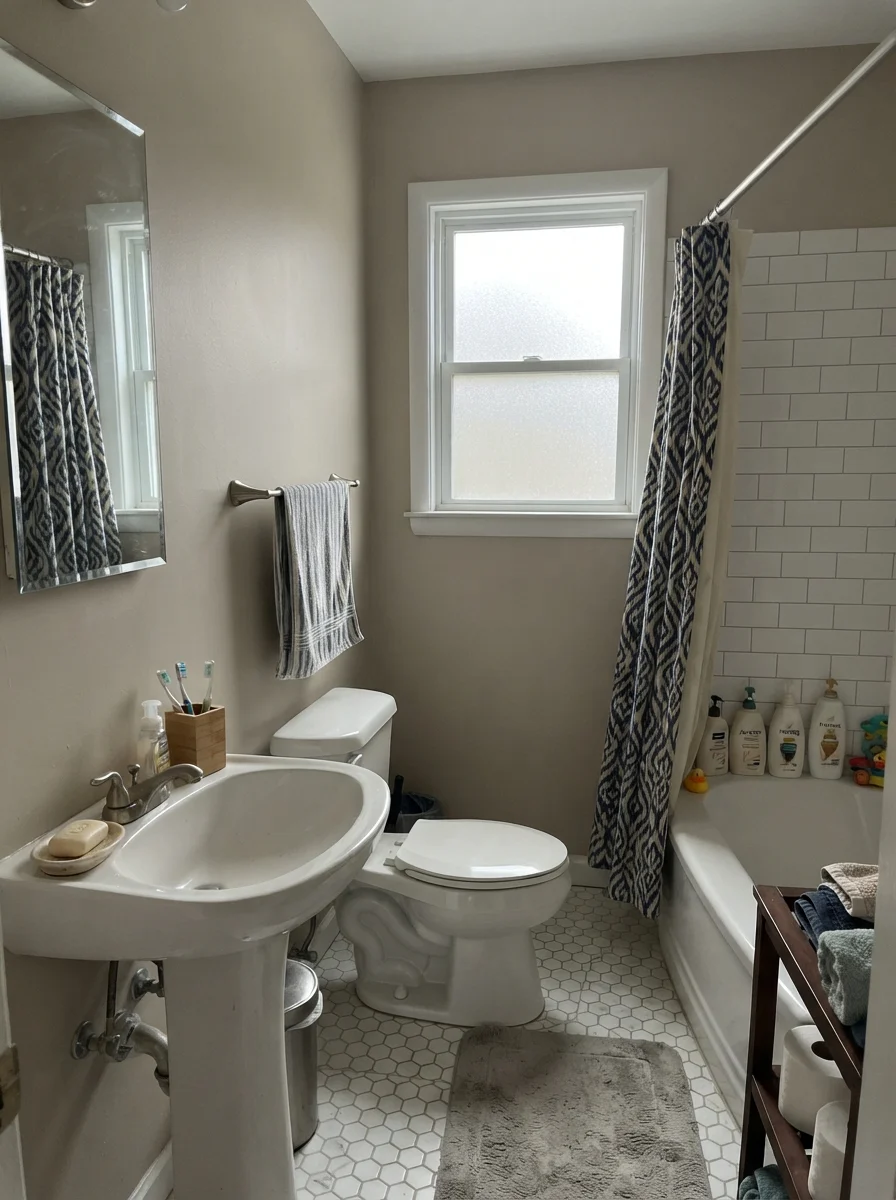
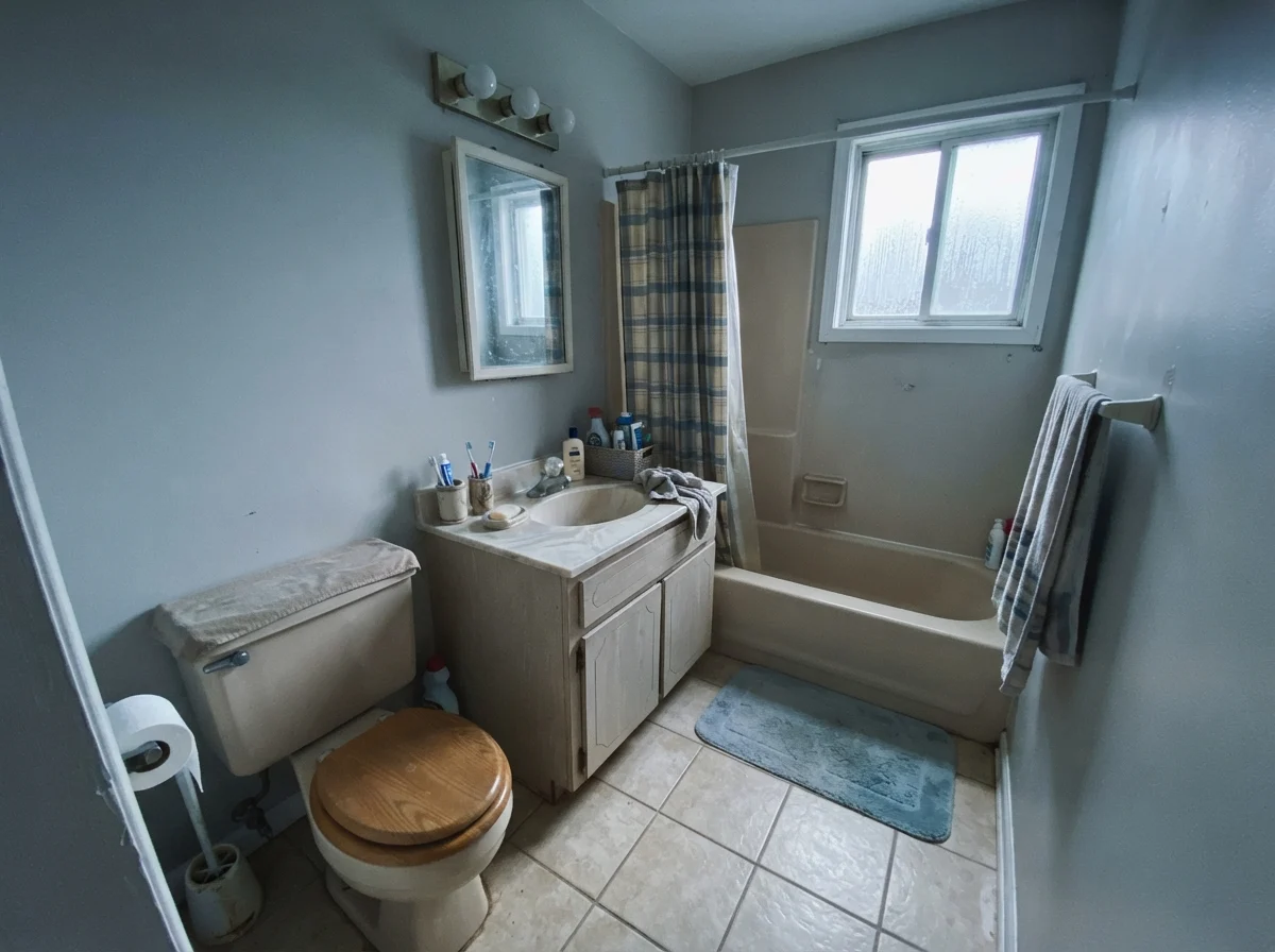
We ran into this exact issue in a modest half-bath in our second home. The window faced straight north into an overgrown hemlock, and on overcast winter days, the walls took on a drab, putty-like cast that made our older fixtures look even older than they were. If your space lacks good daylight and you rely on weak, cool fluorescent or utility lighting, Wheat Bread will not rescue the room. In those conditions, you either need a paint with significantly more LRV to reflect what little light exists, or a cleaner, clearer cream that generates its own sunshine.
Bedrooms, Nurseries, and the Chaos of Family Life
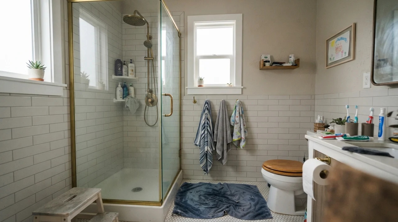
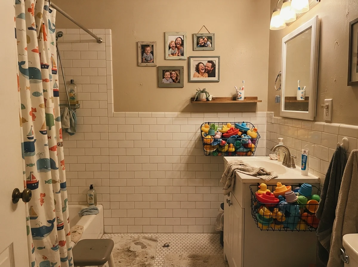
Where Wheat Bread truly proves its worth over the years is in family bedrooms and shared spaces. White walls in a children's bedroom or a hallway are an invitation to constant maintenance. After raising two kids through the tricycle and sports-gear years, I have scrubbed clean more drywall patches than I care to count. A paint with an LRV of 56 and a grounded greige hue hides the everyday smudges, scuffs, and stray handprints that turn pure whites into an endless chore.
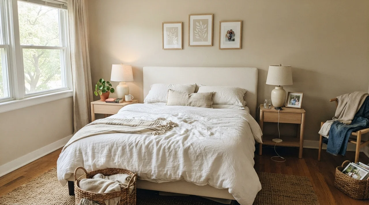
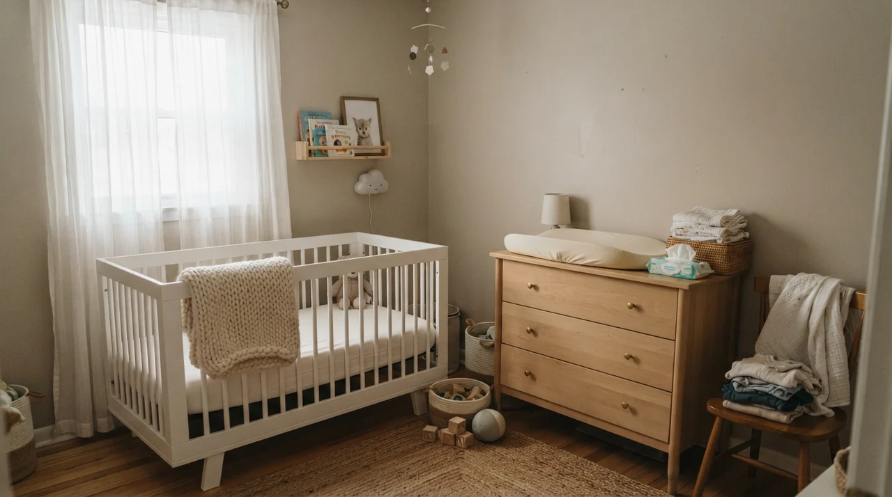
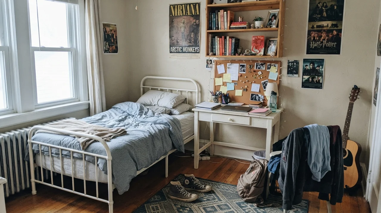
In a serene main bedroom, Wheat Bread creates a tranquil, steady backdrop that allows pale oak nightstands, white linen sheets, and ceramic lamps to feel curated rather than cold. In a nursery or teenager's room, it adapts smoothly as furniture turns over. It looks charming next to a light-wood changing dresser and woven baskets when the baby is small, and still looks age-appropriate ten years later next to open book ledges, corkboards, and sneakers dropped by the door.
Cabinets, Islands, and Woodwork
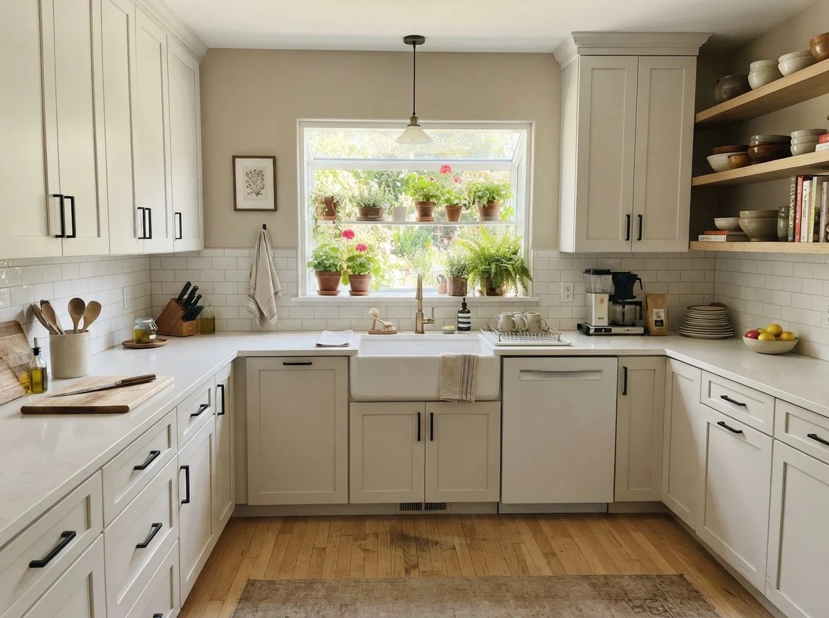
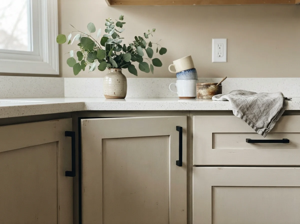
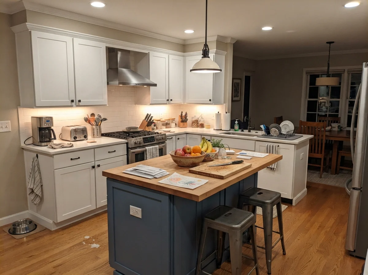
Most people instinctively restrict greige paints to drywall, but Behr formulates Wheat Bread across multiple finishes, and it turns out to be an exceptional cabinet color if you know how to pair it. In kitchens where standard bright white cabinetry feels too sterile or harsh against warm wood floors, painting shaker cabinets in Wheat Bread satin enamel introduces depth without making the room feel dark.
The secret is your hardware and fixed surfaces. Wheat Bread sings when paired with natural oak or butcher block, aged brass knobs, and clean white quartz or subway tile. However, you must pay attention to your counters: if your kitchen features speckled cool-gray granite or gray-veined quartz that pulls blue, Wheat Bread will fight those surfaces every single day. A warm neutral needs warm company. When set beside cool stone, the paint looks slightly soiled, and the stone looks icy. If you have gray countertops, pick a true gray; do not try to force Wheat Bread into a room that cannot support its warmth.
Practical Utility: Laundry, Millwork, and the Exterior
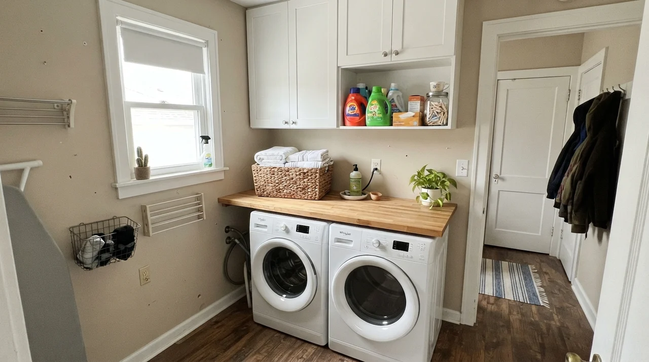
In our 1970s split-level, the laundry room was a tight, windowless box that always felt like an afterthought. When we remodeled our current ranch's utility space, I insisted on a window and painted the walls in Wheat Bread to tie into the butcher-block folding counter. It turns what could be a sterile utility corner into an inviting workspace that feels like a natural extension of the rest of the home.
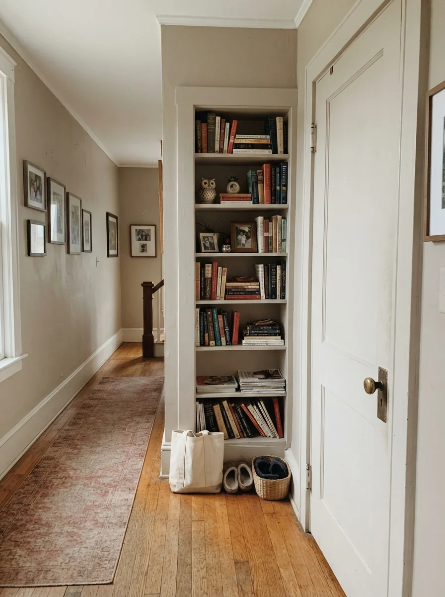
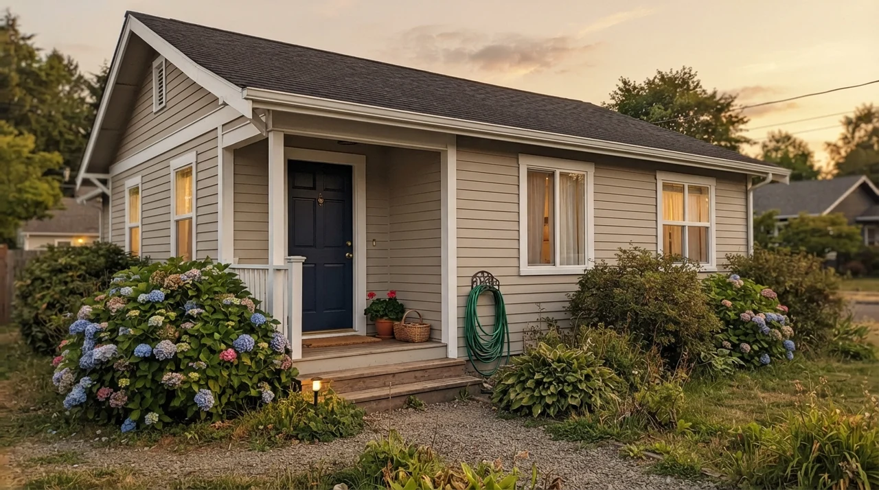
You can also use this shade to give architectural weight to interior millwork. Painting an interior passage door and adjacent built-in bookcases in Wheat Bread against creamy walls provides architectural definition without the stark, graphic jolt of charcoal or black. And outdoors, horizontal siding coated in Wheat Bread reads cleaner, crisper, and half a shade lighter under open sky than it does inside. Paired with bright white exterior casing and a dark navy front door, it gives an older facade a classic, grounded presence that will not look outdated when neighborhood trends shift again.
The Trap You Must Avoid: The Behr Strip Confusion
Here is the single biggest trap with Wheat Bread, and it happens right at the paint counter. Behr makes another wildly popular neutral called Even Better Beige (DC-010). They sit right beside each other in the color display, both hovering near the LRV 56 to 60 mark, and under harsh home center fluorescent tubes, they look virtually indistinguishable on those two-inch paper chips.
I have heard from neighbors who intended to buy Wheat Bread, grabbed the Even Better Beige swatch by mistake, and had two gallons mixed. Even Better Beige is a truer, sand-toned beige with considerably less gray pigment. On a large wall in direct afternoon sun, Even Better Beige can flash an unexpected peachy-pink tone. Wheat Bread, because of its heavier gray footing, stays grounded and never pulls pink. Do not eyeball these chips in the aisle. Buy the small sample pots, paint a two-foot square on your own wall, and watch it across twenty-four hours before you spend your weekend on a ladder.
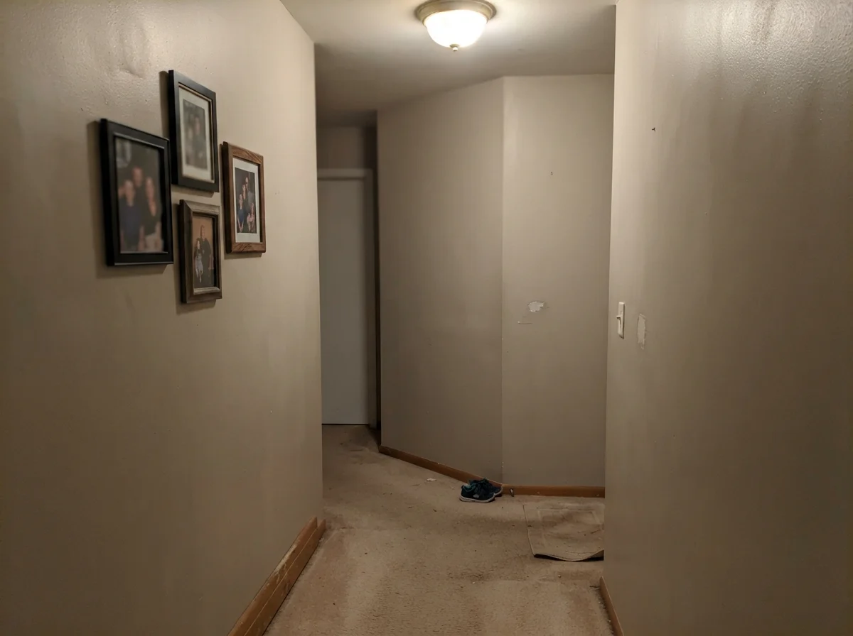
The paint didn't change between the swatch and the wall. The light did—and in an unlit hallway, greige turns to mud faster than any color in the deck.
Durability, Scrubbing, and the Five-Year Test
When you are choosing paint for a living room or back hallway, sheen is just as critical as pigment. In our home, we put Wheat Bread on the walls in Behr's eggshell finish, with satin on the utility cabinets and semi-gloss on the baseboards. Five years in, that eggshell finish has held up remarkably well against real-life messes. In the hallway right by the garage entrance—where coats swing against the wall and grocery bags scrape past twice a week—I have scrubbed clean scuffs using warm water and a microfiber cloth without burnishing the finish or lifting the paint film.
That is where paying attention to formulation pays off. Some ultra-matte boutique designer paints look gorgeous on day three, but the moment you wipe away a fingerprint, you leave a shiny polished spot that forces you to repaint the entire wall. Wheat Bread in standard eggshell takes daily cleaning gracefully. It does not flash, it does not chalk, and when we sold our previous colonial, a quick round of touch-ups with a leftover quart blended seamlessly into walls that had been painted four years prior. That alone saved us hundreds of dollars in professional repainting fees before listing.
What is the LRV of Behr Wheat Bread and what does it mean?
Wheat Bread has a Light Reflectance Value (LRV) of 56. On a scale where 0 is absolute black and 100 is pure white, 56 sits right in the mid-range sweet spot. It reflects enough daylight to brighten an average room without washing out into an anonymous off-white.
Does Wheat Bread look yellow or pink on the wall?
No. Unlike older 1990s contractor beiges or warmer sand shades like Even Better Beige, Wheat Bread has enough gray in its formula to prevent yellowing or flashing pink undertones in strong sun.
Can I use Wheat Bread for an entire house repaint?
Yes, provided your home has reasonable natural window light. It is an exceptional whole-house color that transitions smoothly from living areas to bedrooms, as long as you do not run it into windowless, cool-lit basements.
What sheen should I choose for walls and trim?
Stick with eggshell for walls, which balances cleanability with low glare. Use semi-gloss on pure white trim for sharp contrast, and satin enamel if you are painting kitchen cabinets or interior doors.
Susan's Verdict · The Practical Whole-House Buy
If you want a designer showpiece that wins awards on social media, Behr Wheat Bread is not your color. But if you are repainting a real house on a real budget—with oak floors, muddy boots by the door, and rooms that need to feel comfortable five years in—it is worth every penny. Keep it out of dim north corners, pair it with crisp white casing, and let it quietly do its job.