Color Diary · No. 101
Aesthetic White SW 7035: Don't Touch the Roller Until You Check the Trim
The quiet warm off-white designers reach for when Alabaster feels too plain, reviewed honestly: what it does with wood, and the trim mistake that ruins it.

Susan HartleyOctober 29, 2026 · 17 min read
Aesthetic White · Sherwin-Williams SW 7035
Hex#E3DDD3LRV73Undertonessand-cream → soft white → muted tan
In our last house—a 1990s colonial that had more builder-grade oak and beige wall-to-wall carpeting than anyone knew what to do with—I spent three weeks trying to find a paint color that didn’t make the hallway look like an unbaked biscuit. Everything either turned into a stark hospital corridor or collapsed into the very same dirty yellow-khaki we were trying to escape. A neighbor leaned over our shared fence one Saturday morning while I was staring at eight taped-up swatches and told me to just buy two gallons of Sherwin-Williams Aesthetic White SW 7035. She swore it was the only neutral that understood how to behave itself around honey oak.
She was three-quarters right. The quarter she left out cost me an entire weekend of repainting baseboards, but we will get to that blunder in a moment.
I have lived with Aesthetic White across two different houses now—first in that colonial hallway and later in the north-facing guest bath of our current 1960s ranch. Having lived with it through five years of winter twilights, muddy boots, and sticky fingerprints, I can tell you exactly what this paint does over the long haul. It is not an all-purpose white that you can throw onto any surface without looking at your trim. It is a specific, quiet, sand-and-cream off-white with a light reflectance value of 73. That means it sits squarely between a true white and a pale greige. If you treat it like an off-white, it rewards you with warmth and depth. If you treat it like trim paint, it will make you pay for your optimism.
When you stand in the paint aisle under those buzzing fluorescent tubes, Aesthetic White looks like a calm, slightly muted linen. But paint chips are liars. On a real wall in an actual house, this color has three distinct gears depending entirely on what the sun is doing through your glass.
First, it has a healthy dose of sand and warm cream in its formulation. In a north-facing room where the daylight is naturally chilly and blue-tinted, that sand is an absolute blessing. Cool light cancels out the cream, and the wall settles into a soft, restful white that never reads as sterile. It gives you the brightness of a white room without the icy glare that makes you feel like you are waiting for a dental cleaning. In our 1960s ranch, where the front rooms get nothing but stubborn northern sky, it is genuinely lovely.
However, that same sand base means it cannot be bullied into staying crisp if the light turns hot. When late afternoon sun hits it from the south or west, the color gathers heat quickly. For about two hours before sunset, you are not looking at an off-white at all; you are looking at a mellow, yellow-peach tint. If you have warm floors, that shift feels cozy. If you paired it with stark modern gray counters, you will suddenly find yourself wondering why your walls look faintly orange.
The biggest trap with this shade is what happens when daylight leaves entirely. In a dark room without lamps turned on, the gray in the formula floats straight to the surface. It stops being creamy and starts looking flat, muddy, and occasionally a little mauve. The fix is remarkably simple, though people constantly misdiagnose it: you don't need a second coat of paint; you need to turn on a lamp with a 2700K warm bulb. This is a color that runs on incandescent warmth. Starve it of light, and it goes sullen.
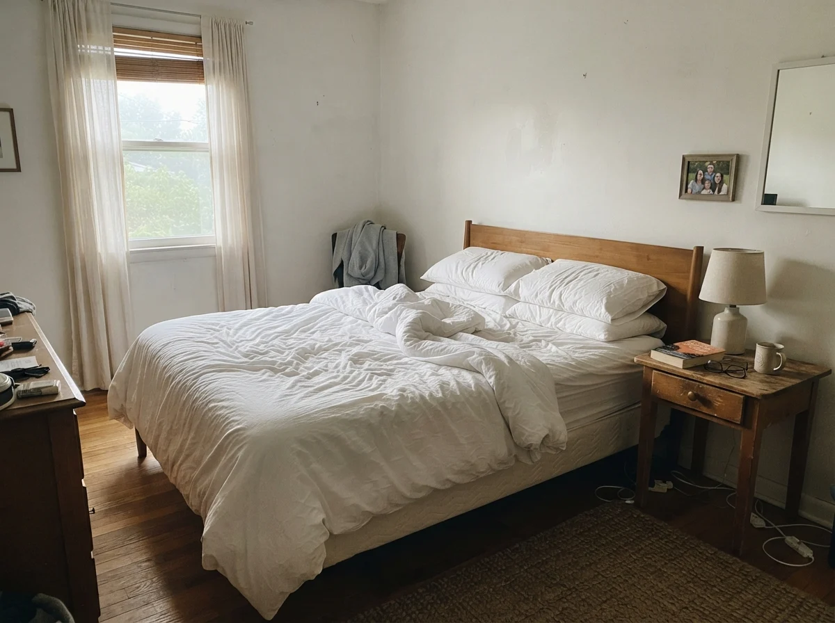
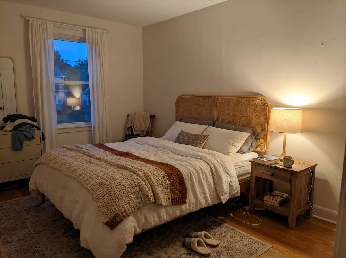
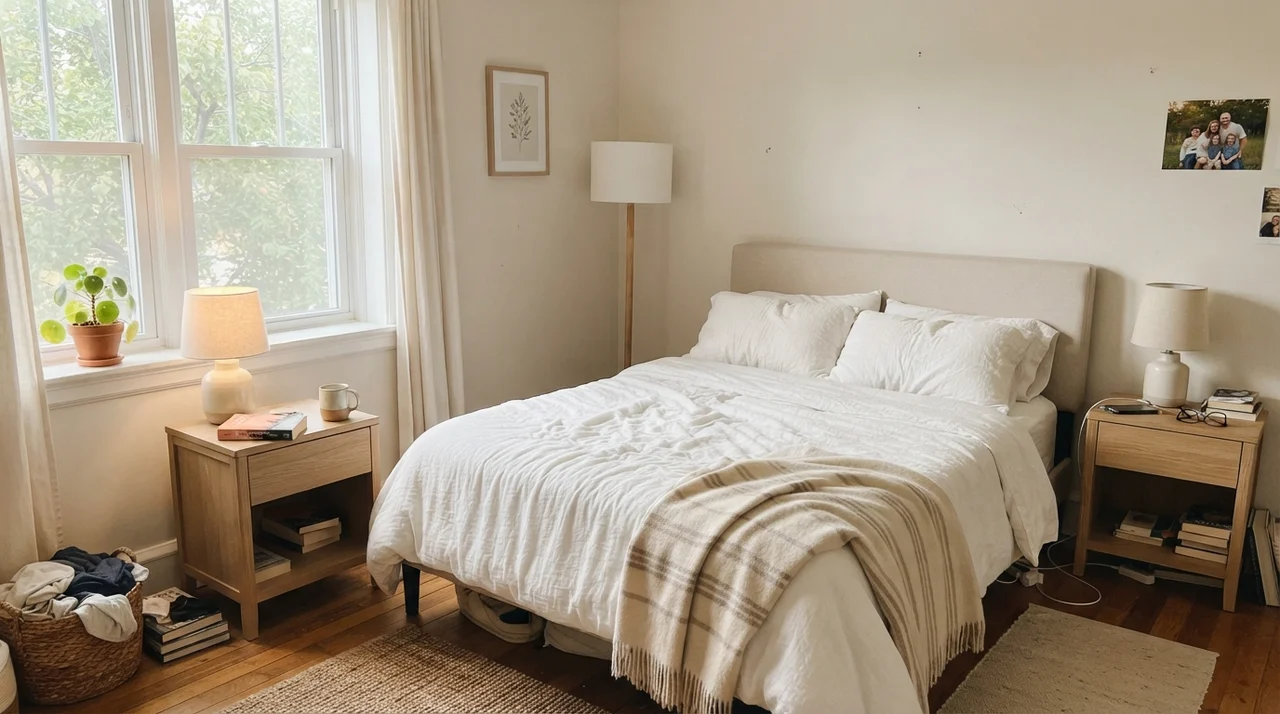
See that shift above? That is the exact difference between leaving a bedroom to the mercy of gray morning clouds versus turning on a bedside lamp at 8:00 PM. In the morning, with no lamps running, the wall recedes into a pale, slightly washed-out neutral. It doesn't offend, but it certainly isn't singing. Come dusk, under a warm table lamp, the cane headboard and the sand tones in the paint shake hands, and the entire bedroom feels ten degrees warmer.
How Natural Daylight Changes the Formula
Over thirty years of owning homes, I have watched friends repaint the exact same living room three times because they evaluated the swatch at 11:00 AM on a Tuesday and then hated how it looked on Friday evening. Natural light is not a static backdrop; it's a moving target.
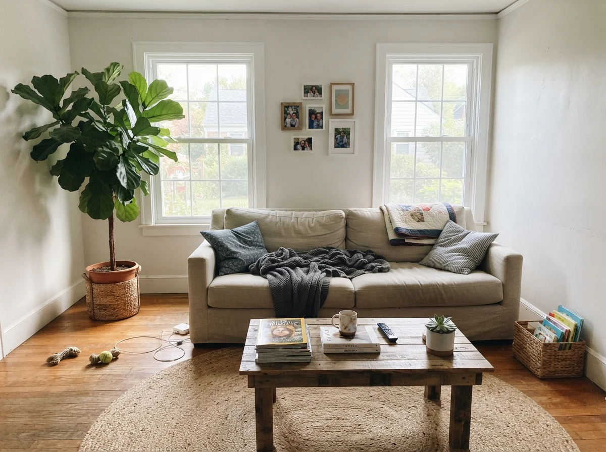
In strong midday sun, Aesthetic White washes out in the best possible way. The LRV of 73 lets it bounce sunlight all over the floorboards, making a living room feel expansive and relaxed. But on a rainy Tuesday through an overcast window, that warmth hides, and the gray backbone holds the room together so it doesn't look sickly yellow.
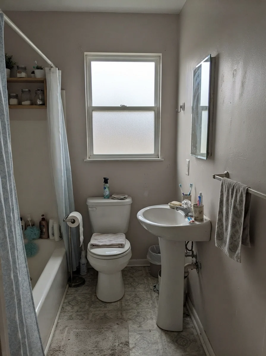
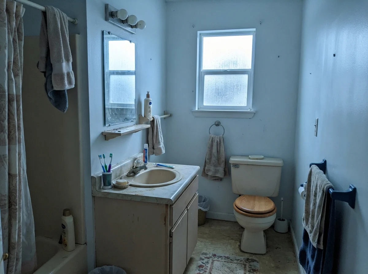
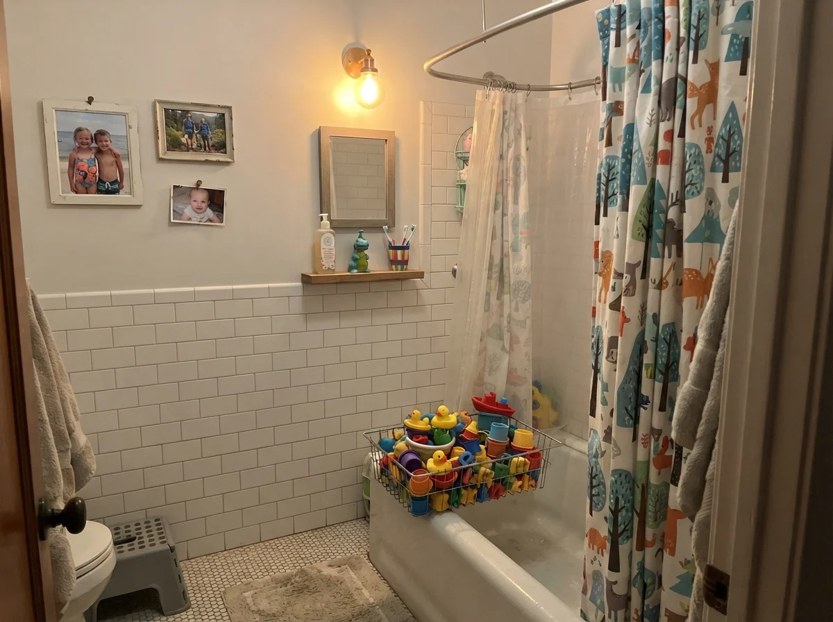
Look closely at that small dated bathroom above on a rainy day. Notice how the wall takes on a cooler, almost stone-colored edge next to an older beige vanity? That is the gray sneaking through. It is also why this color works so remarkably well in older homes that haven't had a five-figure renovation. It doesn't fight dated almond fixtures or beige tile the way an icy modern white does. It bridges the gap between what you have right now and what you eventually hope to afford.
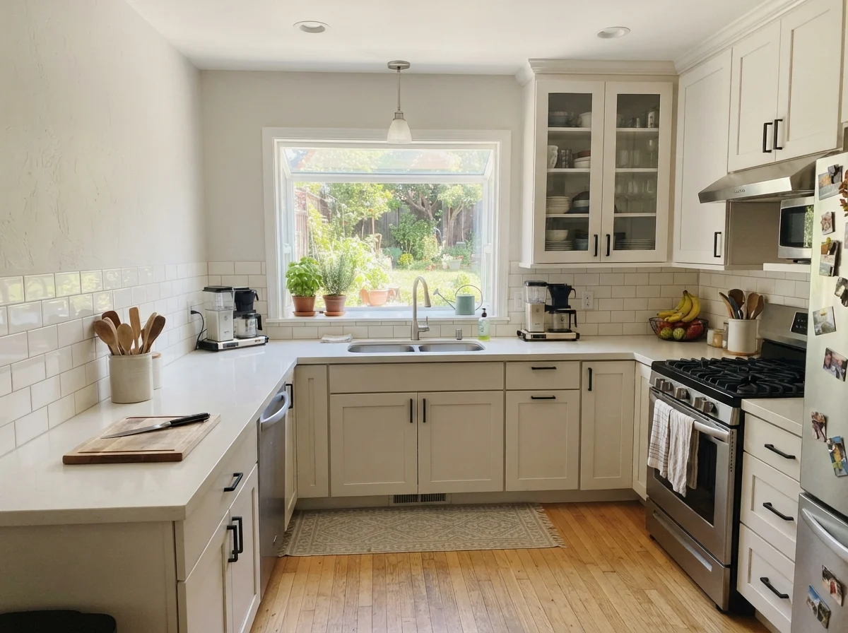
Whenever I brew chamomile in the late afternoon, that warm stone tint on the kitchen wall settles down into the quietest, calmest backdrop imaginable. (Please ignore my bunched-up wool house sock; thirty years of renovating drafty houses has taught me that warm ankles are far more important than domestic glamour.) That is the gift of this shade: it stays entirely out of your way while you live your life.
Aesthetic White on Kitchen Cabinets and Islands
Now, let's talk about kitchens, because this is where people either fall deeply in love with this color or make an expensive misstep that takes hours of sanding to undo.
If you spray Aesthetic White on shaker cabinets in a satin finish, you will get an authentic, traditional pantry look. It feels like an English scullery from forty years ago—soft, grounded, and slightly aged. It is gorgeous beside butcher-block counters, honed limestone, unlacquered brass latches, and warm oak floors. It was practically designed to flatter wood grain.
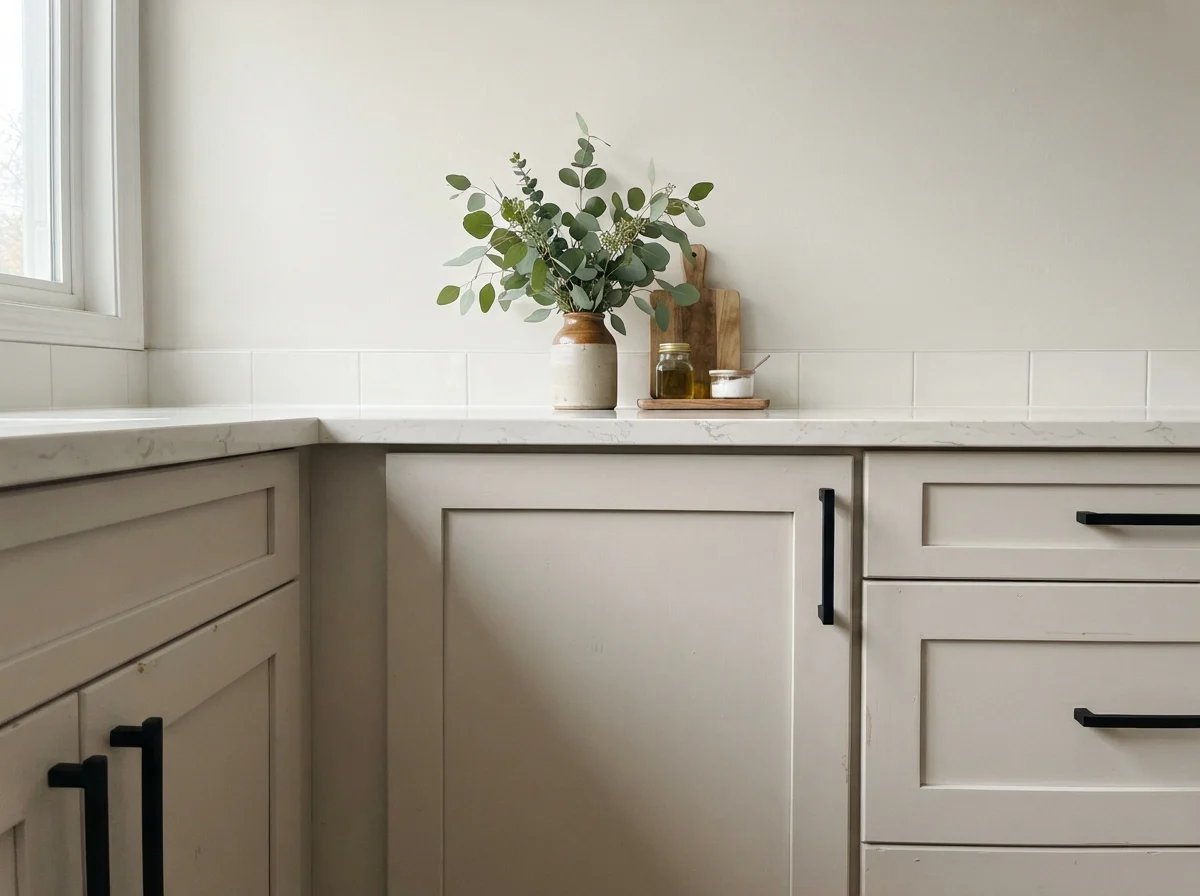
Where it fails miserably is next to crisp, pure white artificial quartz. If you have those bright, cool white quartz slabs with dramatic gray veining, Aesthetic White cabinets will look dingy and slightly yellow against them. It is the classic mistake: placing a warm LRV 73 greige directly against an LRV 90 engineered stone makes the paint look like someone smoked twenty cigarettes in the room before you moved in.
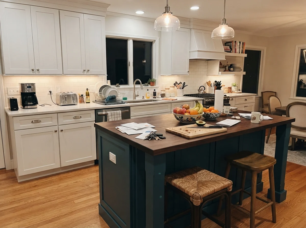
In our last house, we used it on a kitchen island while keeping the perimeter cabinets a cleaner white. Because the island sat on medium-toned wood flooring and caught overhead tungsten lighting from the pendant lamps, the sand tone grounded the entire kitchen without requiring a bold contrasting color. It held up against kicking feet and dog tails surprisingly well, provided you clean it with a gentle rag rather than scouring it with abrasive powders.
Bedrooms and Quiet Corners
If you want a bedroom that feels like a quiet hotel room where you actually get eight hours of sleep, this color deserves a hard look. In a primary bedroom or a guest room, stark white walls can feel loud and exposed when you wake up. Aesthetic White wraps the room without making it feel claustrophobic.
We paired it with crisp linen bedding and pale oak dressers in our guest room, and visitors constantly commented on how peaceful the room felt. For a layered look that doesn't feel complicated, Sherwin-Williams Accessible Beige SW 7036 on a feature wall or a headboard sits one step down the same tonal family and looks like you hired an interior designer who charged you by the hour.
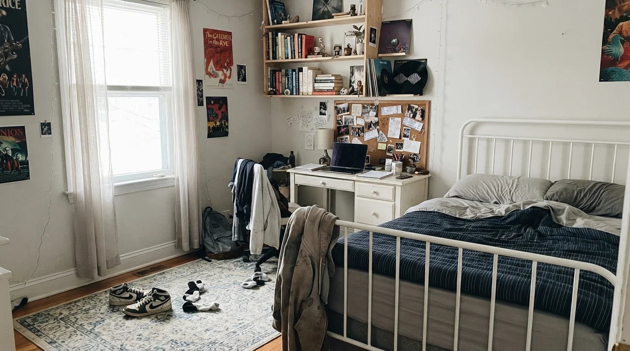
In the teenager’s room shown above, you can see how it handles natural cooler daylight from a plain window. It absorbs the slightly messy lived-in reality of books, corkboards, and sneakers without looking precious. A bright stark white shows every scuff mark made by a backpack dropped in a corner; this tone forgives ordinary life.
Bathrooms: Why Tile Dictates Everything
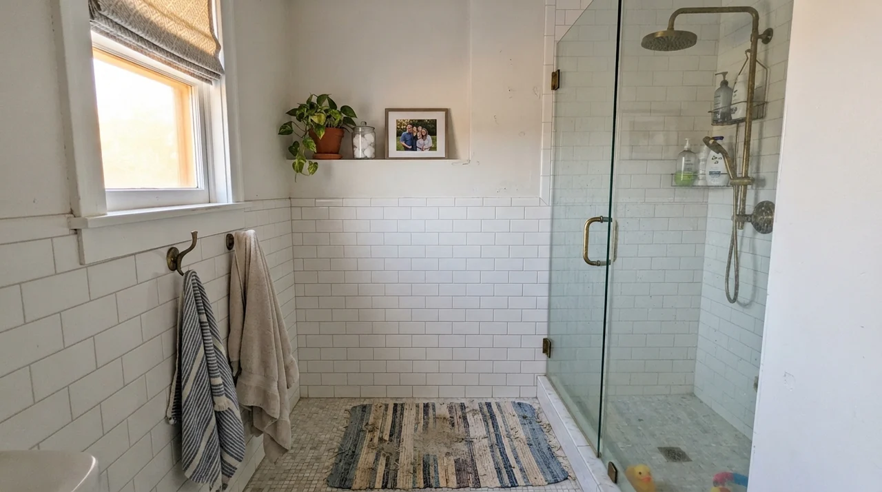
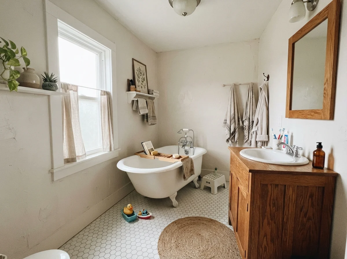
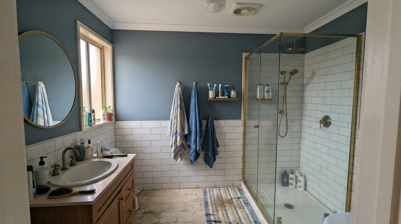
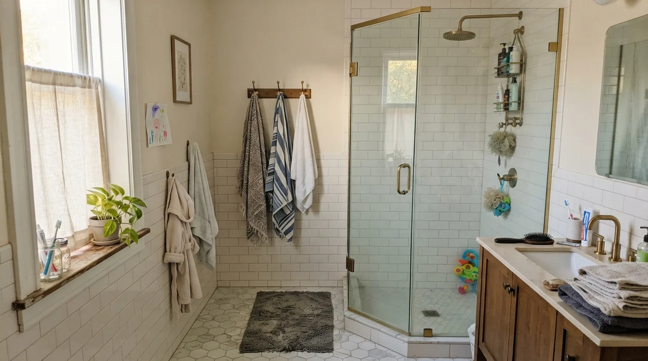
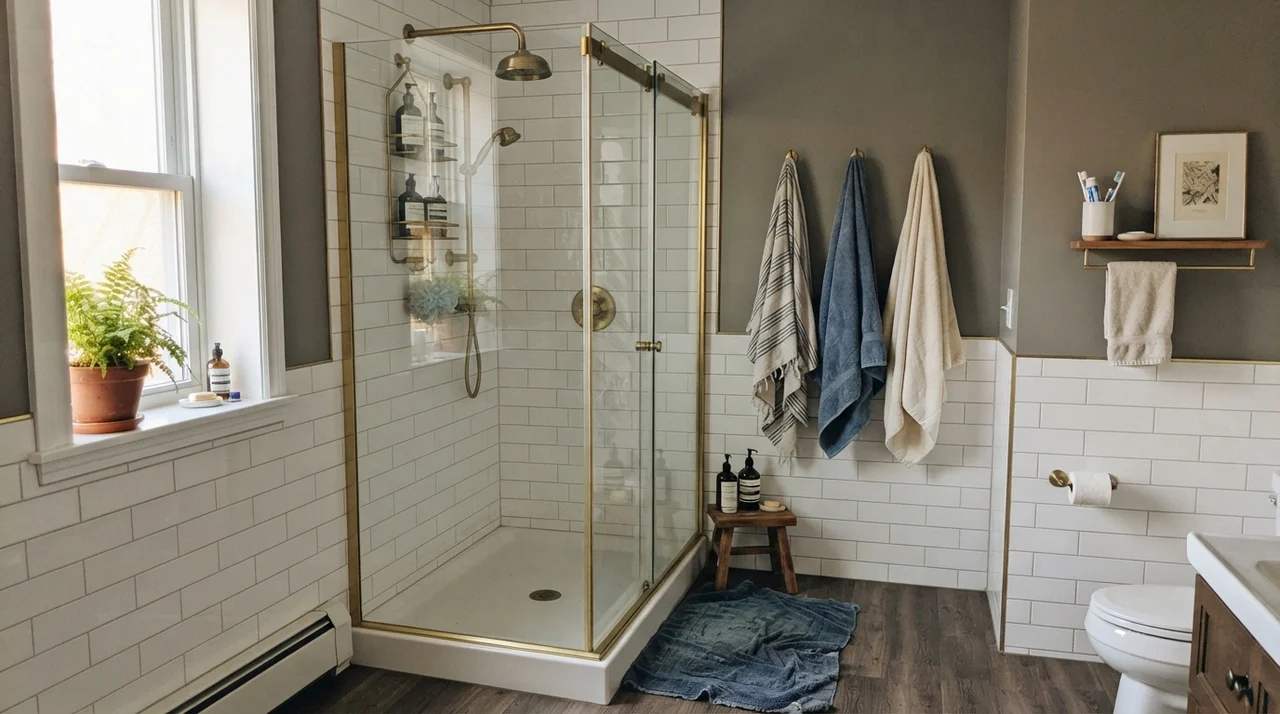
I have painted more bathrooms than I care to admit, and bathrooms are where good paint colors go to die if you don't check your plumbing fixtures and tile first. Aesthetic White is wonderful with classic white subway tile, warm unlacquered brass, unpolished chrome, and white hex tile. It provides just enough gentle contrast against the bright porcelain tub to define where the wainscot stops and the plaster begins.
Here is my firm rule for bathrooms: do not put this paint anywhere near blue-gray porcelain, cool gray slate, or faux-marble luxury vinyl tile that has a blue or purple undertone. When you place a sand-based cream against cool gray flooring, the floor makes the wall look yellow, and the wall makes the floor look dirty. It is an unhappy marriage that no amount of fancy bath towels can save.
Hallways, Sunrooms, and Trim Transitions
Hallways are the hardest test in any house. They rarely have their own windows, they borrow whatever light is spilling from adjoining rooms, and they take a beating from laundry baskets. An LRV of 73 means Aesthetic White reflects nearly three-quarters of the available light back into the corridor. It is light enough to keep a long ranch hallway from feeling like an underground mine shaft, yet deep enough to distinguish itself from standard white doors.
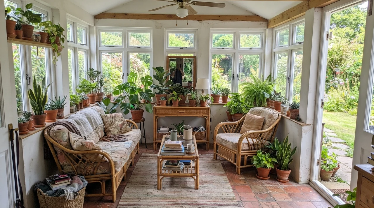
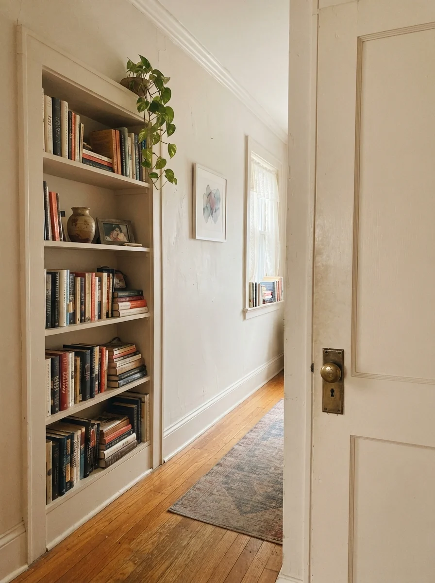
Notice that hallway image above where the door and the built-in bookshelf are painted Aesthetic White while the walls are cream? That is a lovely, traditional way to handle woodwork when you don't want harsh white lines breaking up the visual flow of an older home. It reads soft, intentional, and quiet.
The Honest Failure: Where This Color Falls Flat
I promised you the mistake, and here it is. If you paint a room that has zero exterior windows, no warm lamps, and a single fluorescent or cool-white builder-grade ceiling globe, Aesthetic White will look awful. It will look like wet cardboard.
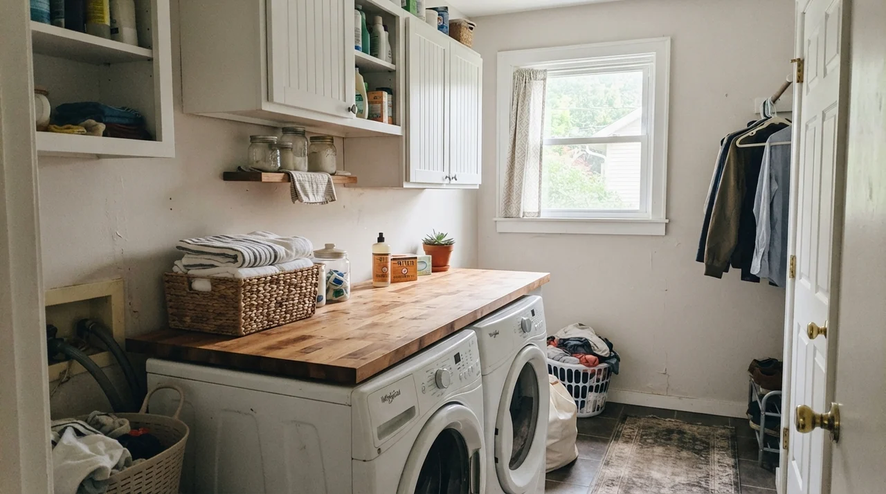
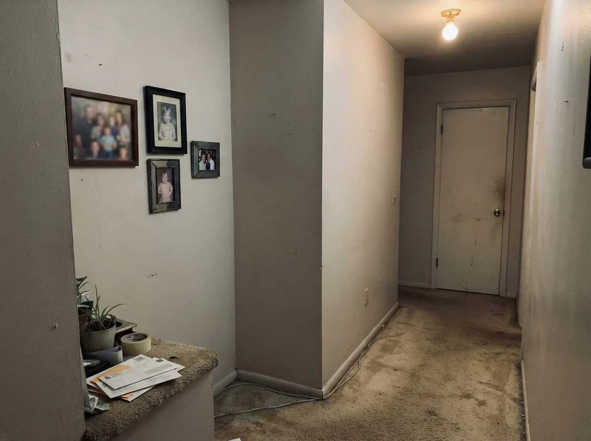
Take a good look at that unvarnished hallway corner above. That is the complaint people write to me about in panic. The gray base takes over completely when daylight is absent. If your room looks like this, putting on a third coat will do absolutely nothing. You need to either swap your light bulbs to a warmer 2700K or 3000K spectrum, or you need to jump up to a true high-reflectance white like Sherwin-Williams Alabaster SW 7008, which gives you eleven more points of light bounce.
The second trap is the ceiling. If your ceiling is sprayed in crisp, blue-toned builder flat white and you roll Aesthetic White on the walls right up to the drywall corner, your walls will immediately read as tan or dirty. People often think the store mixed the can incorrectly. It wasn't mixed wrong; your eyes are simply comparing an LRV 73 sand-greige against an icy ceiling.
Exterior Siding and Trim Choices
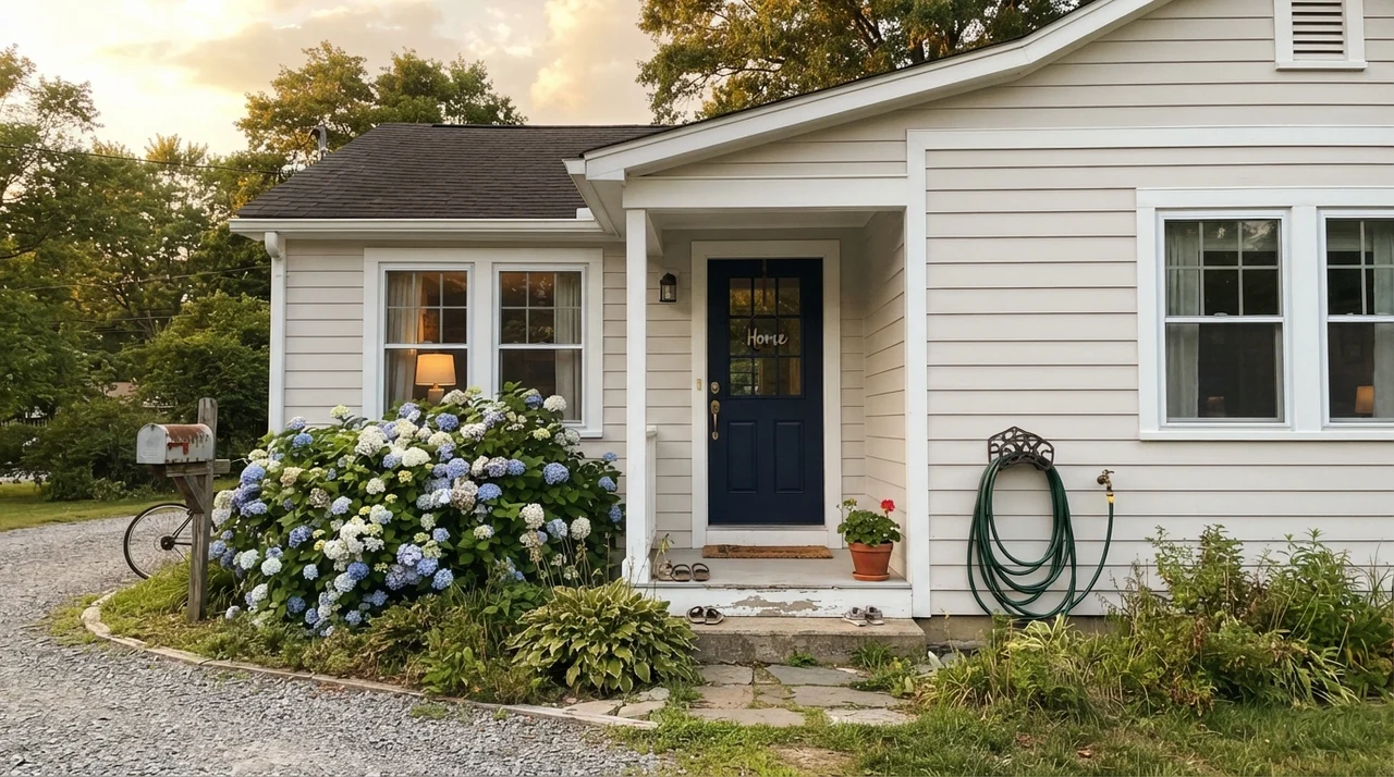
Outside in the open air, sunlight eats color for breakfast. On exterior siding, Aesthetic White reads almost as a crisp off-white rather than a greige. The blazing sun washes out the yellow undertone, leaving a clean, classic body color that looks remarkably handsome on 1960s ranches, stone cottages, and colonial homes.
When using it outside, you must frame it with intent. If you pair it with weak pastel trim, the house will look washed out. Ground it with dark architectural trim—Sherwin-Williams Urbane Bronze SW 7048 or Peppercorn SW 7674 are foolproof choices—and the siding will snap right into focus.
Put this paint beside a crisp blue-white ceiling and your walls will turn visibly tan by noon. Pick your trim first, then pick your wall color.
Durability, Scrubbing, and Living Five Years In
Anyone can tell you what a paint swatch looks like when the tape peels away on Sunday evening. What actually matters is what it looks like after your grandkid rubs a greasy grilled-cheese sandwich along the dining room baseboard three years later.
In our last house, our hallway walls were painted in eggshell. Five years in, that paint held up remarkably well to everyday scuffs. The beauty of an LRV 73 greige over an LRV 85 stark white is that everyday household dust and subtle finger smudges don't telegraph from across the room. I have scrubbed clean the same spot next to our back entry door dozens of times using warm water, a squirt of dish soap, and a microfiber cloth. High-quality acrylic latex in eggshell will survive that without burnishing or peeling.
Where you will lose your patience is if you choose flat paint in high-traffic zones. Flat looks lovely on a ceiling, but on a busy wall, Aesthetic White in flat finish will trap grease and turn dark when wiped. For walls, stick to eggshell; for trim, semi-gloss is non-negotiable; for kitchen cabinets, satin gives you cleanability without looking like plastic.
When we sold that colonial, our real estate agent explicitly noted that the hallway didn't need to be repainted for open houses. It didn't look dated within the decade we lived there, and it didn't look dingy. It simply looked like a well-kept, welcoming home. That alone made the extra effort worth the money.
What trim color goes best with Sherwin-Williams Aesthetic White?
Sherwin-Williams Pure White SW 7005 is the gold standard. It has enough softness that it provides clean architectural separation without forcing Aesthetic White to turn dingy or tan. Avoid cool, blue-tinted builder white ceiling paint.
Does Aesthetic White look gray or beige in person?
It sits right in the middle, but light dictates the balance. In north-facing rooms and cloudy weather, the gray base shows through as a soft, muted stone. In south-facing afternoon sun or under 2700K bulbs, the warm sand and cream notes take over.
Can I use Aesthetic White on kitchen cabinets?
Yes, provided you have warm countertops like butcher block, honed limestone, or warm marble. It gives a traditional, aged scullery feel in satin finish. Avoid it if you have cool gray-veined artificial quartz, as the contrast will make the paint look dirty.
Is Aesthetic White too dark for a whole-house paint color?
Not at all. With an LRV of 73, it reflects plenty of light down corridors and shared spaces. It works especially well as a whole-house backdrop in older homes with stained wood trim or oak floors because it doesn't fight existing woodwork.
Susan's Verdict · The Right Warmth, If You Mind Your Trim
Aesthetic White SW 7035 is one of the most reliable warm neutrals in the fan deck, provided you respect its boundaries. In north-facing living rooms, bedrooms with warm lamps, and hallways over honey oak floors, it softens the entire house without surrendering to beige. But it is not a trim white, and it will punish you if you park it next to an icy builder-grade ceiling or cool gray countertops. Check your baseboard paint first, ensure your light bulbs are 2700K, and it will earn its keep for years.