Color Diary · No. 108
French Toile and the Slate Blue Compromise Nobody Warns You About
A cool blue-gray that's practically a twin of two site-favorite chameleons, reviewed honestly: what makes it glow, what makes it go flat, and why almost nobody has heard of it.

Susan HartleyNovember 3, 2026 · 15 min read
French Toile · Benjamin Moore CSP-595
Hex#A2B0B7LRV43Undertonesblue-gray with a cool green lean
In our last house—the 1990s colonial with the drafty laundry room and ceilings that were just slightly lower than the builder promised—I spent three weeks testing blue paint swatches on poster boards. My goal wasn't revolutionary. I just wanted a bathroom color that looked like slate after rain instead of a nursery blanket or a filing cabinet. I had already made the mistake of putting a pale, powder blue in our guest bath back in the late nineties, and it looked dated within eighteen months. It was sweet, powdery, and completely incapable of standing up to real morning daylight without turning juvenile.
That was how I found Benjamin Moore French Toile (CSP-595). It sat quietly on the fan deck with an LRV of 43, carrying a hex of #A2B0B7, tucked away where almost nobody looks. Most homeowners hunting for a smoky mid-tone blue-gray end up gravitating toward names they have seen fifty times in design magazines. French Toile never received that kind of marketing push. There are no endless boards of finished room photos dedicated to it, which is precisely why it caught my eye. It looked like an adult color—measured, slate-leaning, and calm.
We lived with it in that colonial bathroom for six years, and when we sold the house, the couple who bought it asked for the leftover can in the basement before they even asked about the furnace inspection. But living with a color across several seasons teaches you things no card stock sample ever will. French Toile is a chameleon, but it is not an unconditional friend to every wall in your home.
The Undertone Drift: Blue, Gray, and a Whisper of Green
On the deck card, French Toile reads as a grounded, mid-depth blue. The moment you roll it across drywall, however, its gray backbone asserts itself immediately. It is a genuine blue-gray—not a gray pretending to be blue, and not an oversaturated nursery pastel. In clean daylight, you will notice a cool slate character with a subtle blue-leaning-green undertone that softens the edges. But shift the window orientation or swap out your lamps, and the personality changes quickly.
warm sun
overcast, north light
dusk, rain, cool bulbs
green → gray → blue
Shadow BlueBehr · see diary
Santorini BlueBenjamin Moore · see diary
French ToileCSP-595
StardewSherwin-Williams · see diary
Half Sea FogBehr · see diary
How Daylight and Nightfall Reshape the Mood
Here is what thirty years of repainting rooms has taught me about mid-tone blue-grays: their light reflectance value tells you the whole story if you know how to read it. At an LRV of 43, French Toile sits squarely in the middle of the spectrum. It does not produce its own bounce. It requires light to enter the room, bounce off the pigment, and carry the undertones back to your eye. Without adequate daylight, that LRV behaves like an anchor.
In strong, indirect daylight—such as an east-facing room in the morning or a south-facing room with filtered sun—French Toile settles into a quiet, architectural slate. You get the crispness of the blue without any juvenile perkiness. Late in the day, or under standard incandescent lighting, the warm bulbs coax out that slight green-gray undertone, turning the room remarkably cozy.
The trouble begins when daylight disappears entirely, or in rooms that face stubbornly north. When overcast skies take over, the cool light leaches out every bit of warmth the pigment possesses. Instead of reading like a custom coastal slate, it slides toward a flat, heavy gray that feels more like wet highway concrete. If you paint this in an under-lit room expecting a gentle spa blue, you will be sorely disappointed by four in the afternoon.
Where It Works Best: Bathrooms and Natural Tile
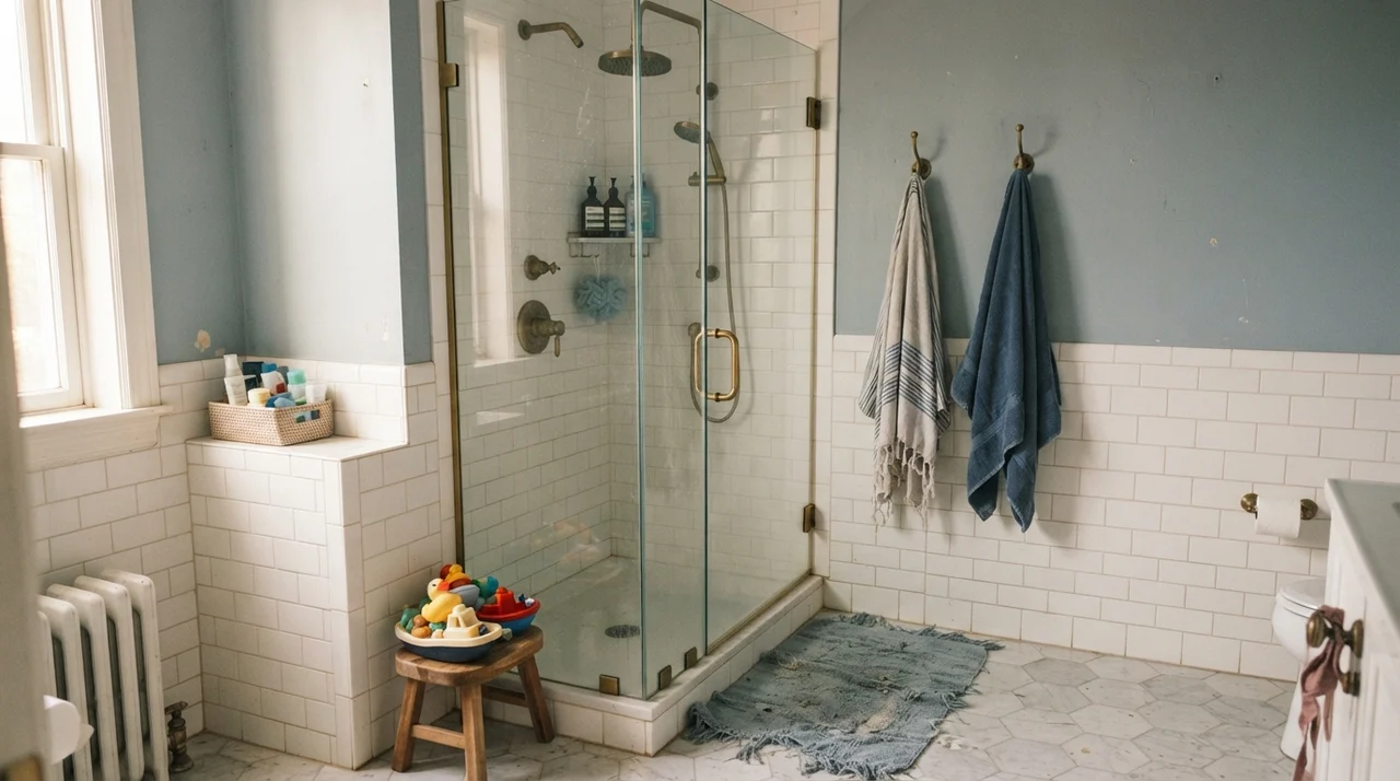
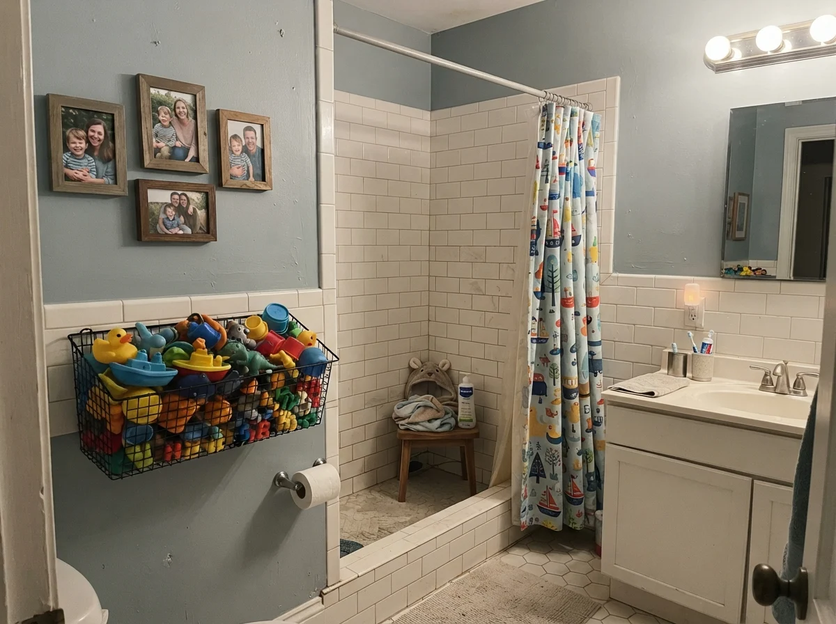
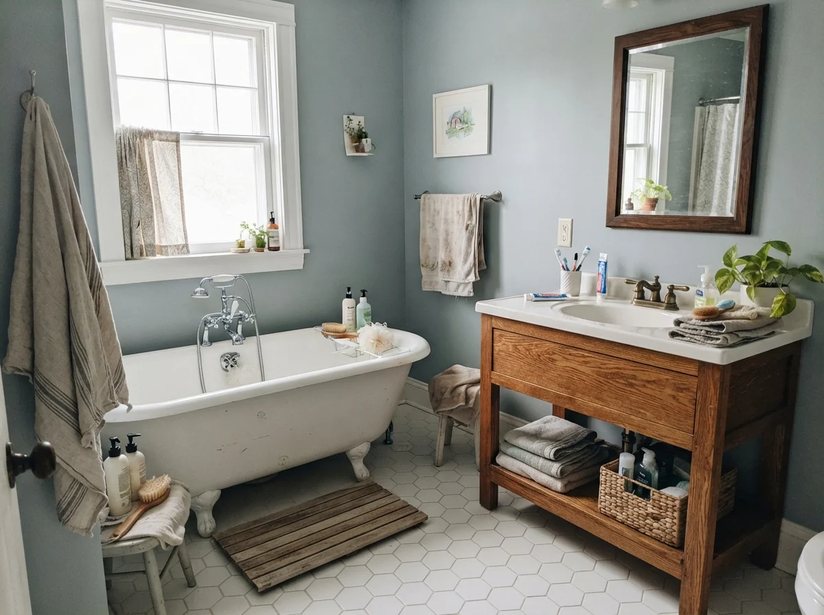
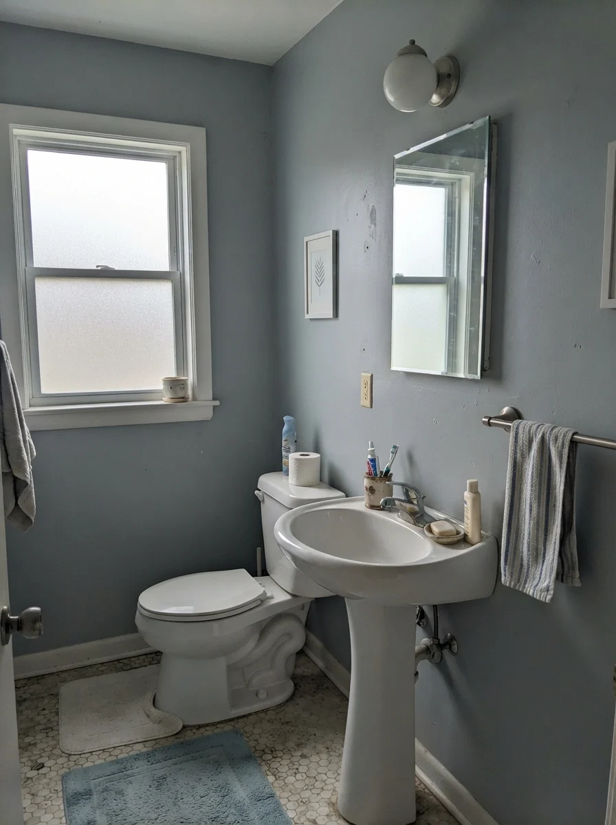
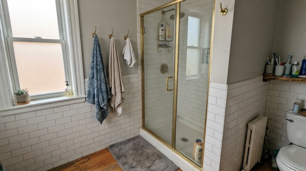
A daylit bathroom is where French Toile genuinely earns its keep. Moisture, steam, and mirrors bounce natural daylight into tight corners, and the color responds by staying fresh and composed. When paired with clean white subway tile wainscoting or pale quartz countertops, the mid-40s LRV provides enough contrast to make painted trim pop without cutting the room in half visually.
In our current 1960s ranch, I used a mid-tone blue-gray on the upper walls above white wainscoting in the hall bath. It hides toothpaste flecks, soap splatters, and water marks far better than any pale off-white ever could. Five years in, that wall has been scrubbed clean around the towel bars dozens of times, and the eggshell finish still looks intact. It looks intentional rather than clinical, which is a rare balance to strike in a wet space.
You don't choose a blue-gray for the sunny Saturday you paint it. You choose it for the gloomy Tuesday in November when the sky drops and the walls have to hold their own.
Kitchen Islands, Cabinets, and Millwork
Painting kitchen cabinets is a massive labor investment, whether you do it yourself over four weekends or hire professional painters. If you choose the wrong color, you cannot simply brush over it in an afternoon. That is why so many people default to safe whites or dark navies. French Toile offers a very sensible middle path for cabinetry, provided you keep it grounded.
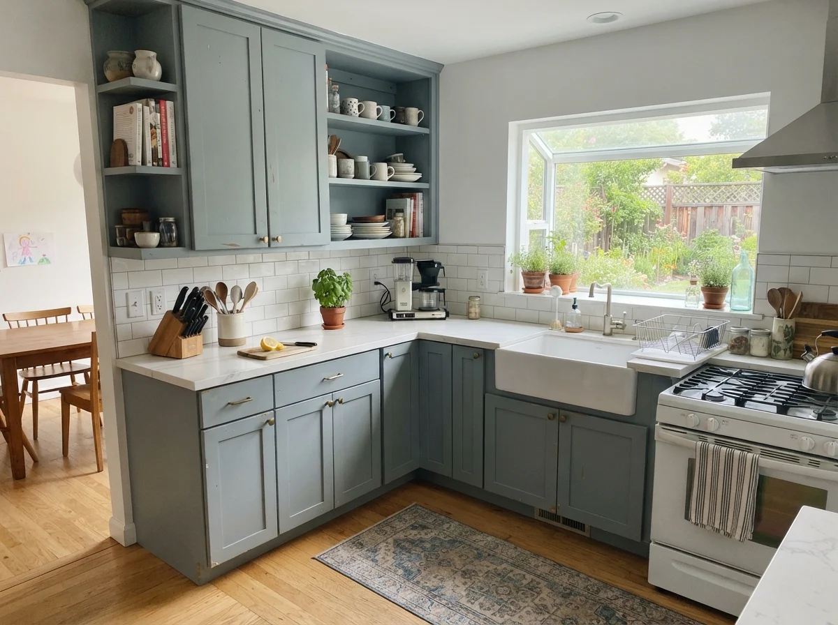
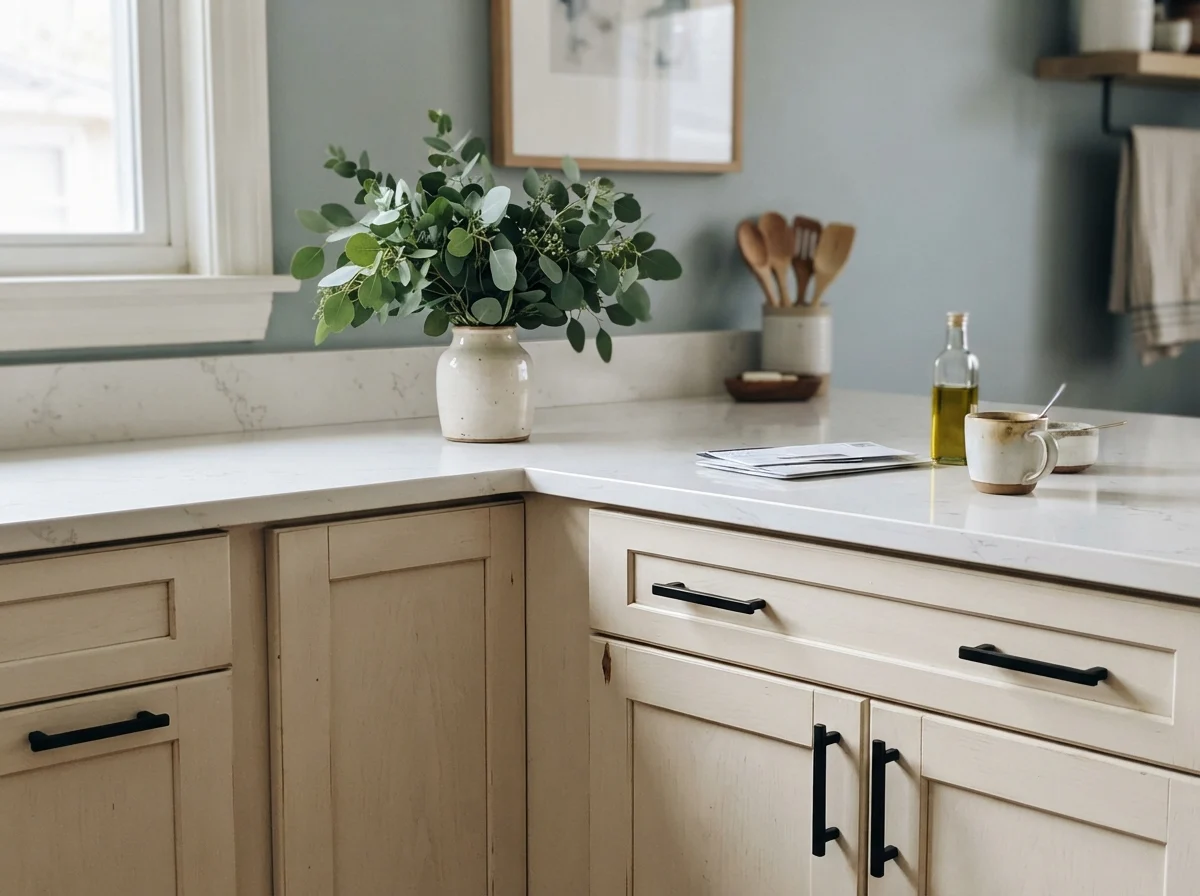
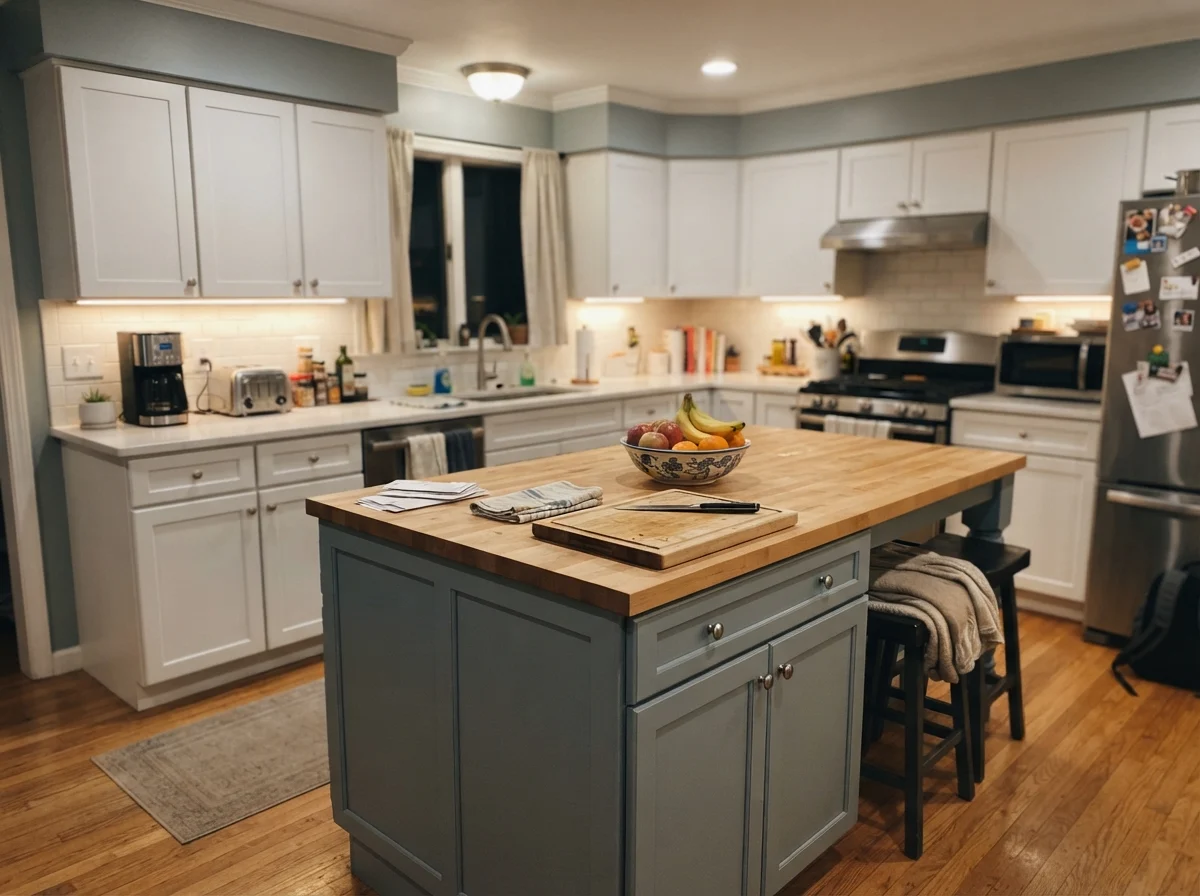
On an island surrounded by plain white perimeter cabinets and light oak floors, French Toile creates an immediate anchor. It has enough gray to prevent it from feeling like a pastel novelty, but enough blue to keep the kitchen from looking sterile. When used across both upper and lower cabinetry in a room with substantial garden windows, it behaves like a soft Scandinavian slate. Matte black pulls or unlacquered brass hardware both rest against it naturally.
I will offer one firm caution: do not paint every wall in your kitchen this color if your cabinets are already a cool gray. You need contrast. Let the island or the lower cabinetry wear the color in a satin finish, and keep your perimeter walls a clean, pale neutral.
Living Spaces, Bedrooms, and the Sunroom Test
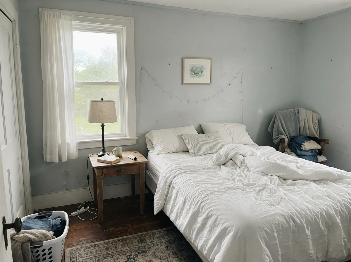
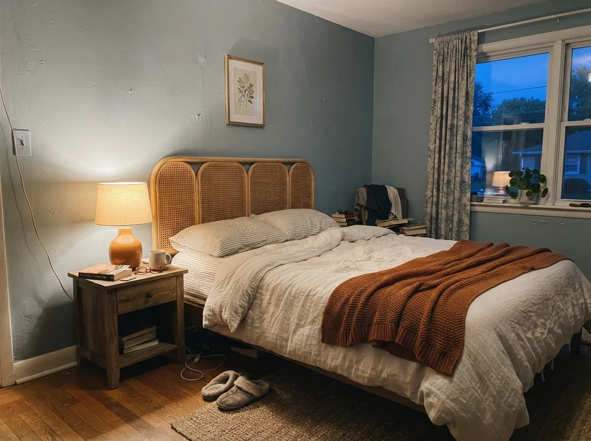
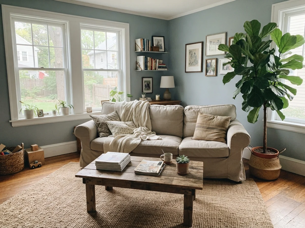
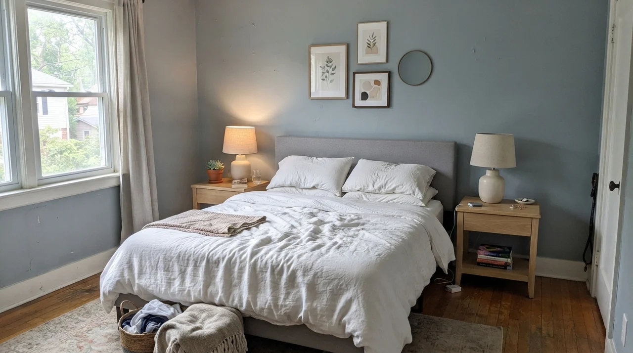
In living rooms and bedrooms, French Toile demands generous glazing. If your living room has two broad windows letting in midday light, the color sits behind linen upholstery and jute rugs with total poise. It looks collected, serene, and mature. You do not get tired of it after six months the way you do with saturated jewel tones.
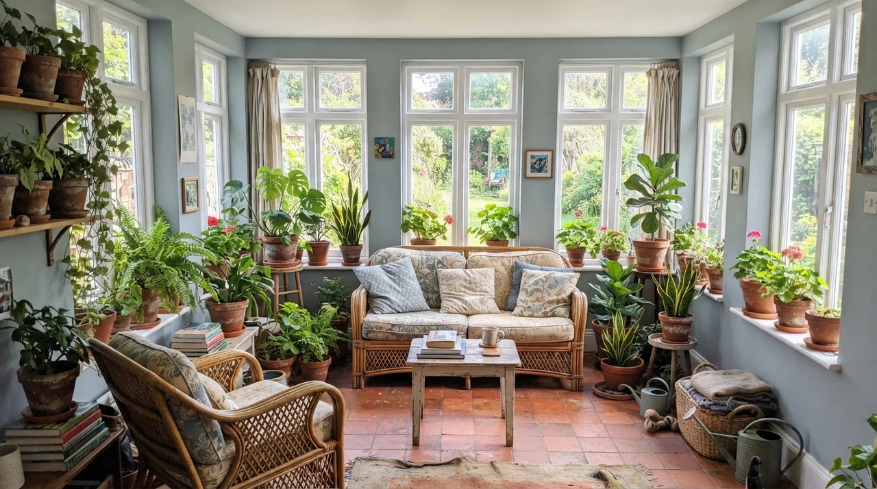
A sunroom surrounded by white window frames is perhaps the safest testing ground for this swatch. Because natural light pours in from multiple sides, the walls never drop into that muddy, shadowed trough. Surrounded by terracotta pots, rattan furniture, and leafy houseplants, the subtle green-leaning slate undertone sings. It mirrors the sky without competing with the garden greenery outside.
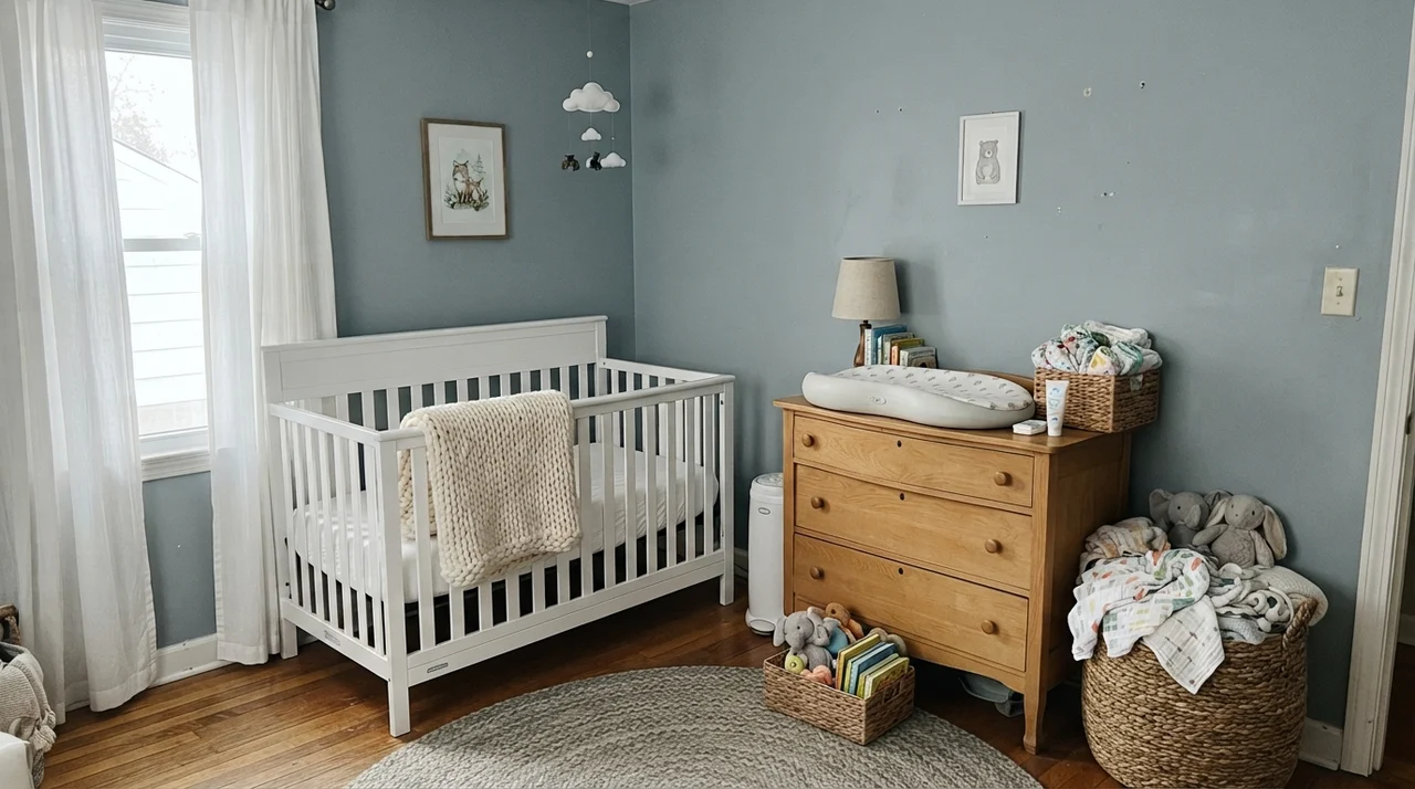
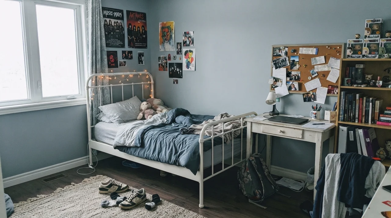
For main bedrooms, nurseries, or teenagers' rooms, it offers a grounded calm that grows with the occupant. In a nursery, it provides a peaceful background for a light-wood dresser and white crib. Ten years later, with a white metal bed frame, open book shelves, and sneakers on the floor, the exact same wall still looks appropriate. That longevity is worth the money every single time.
Laundry Rooms, Hallway Millwork, and the Exterior
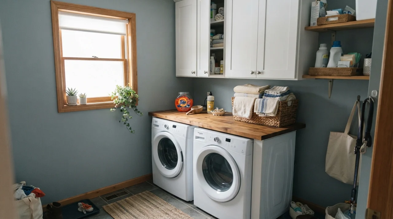
Utility spaces are frequently neglected during whole-house repaints. We tend to slap leftover primer or an uninspired beige on laundry room walls and call it a day. But a small laundry room with a single good window is an exceptional venue for French Toile. Over a white washer and dryer, next to butcher-block counters and white shelving, this mid-tone blue-gray elevates the entire chore area into something that feels intentional and clean.
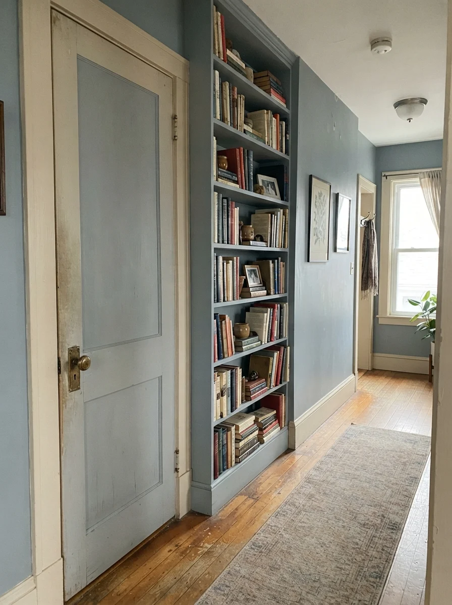
You can also use it strategically on architectural trim. In older homes with classic two-panel interior doors and built-in bookshelves, painting just the door and shelves in French Toile while leaving surrounding walls an off-white or pale cream creates instant character. It highlights the craftsmanship of the wood without the stark, jarring contrast of a true black.
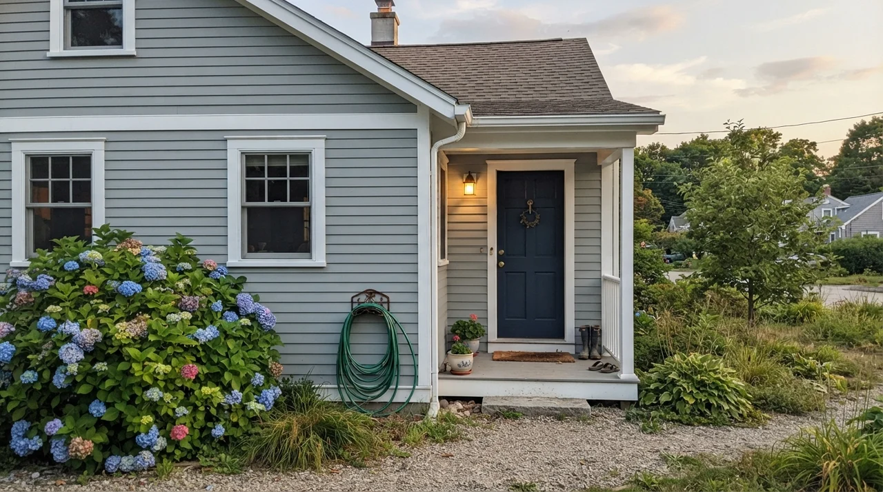
On an exterior, French Toile behaves surprisingly well on horizontal siding or front doors. Outdoors, under open sky, colors always look half a shade lighter and bluer than they do on an interior ceiling. On a home with white trim and dark navy accenting, French Toile siding reads as an elegant, historical slate blue that separates your home from the sea of builder-grade tan without looking eccentric.
Where French Toile Fails: The Honey Oak and Dim Hallway Trap
Now for the uncomfortable truth that swatch brochures leave out. French Toile will punish you severely if you ignore your room's fixed finishes or its light levels. The biggest failure mode I see with this color family involves 1980s and 1990s honey oak. In our second house, the builder had installed honey oak cabinets in every bathroom and golden-yellow trim around every baseboard.
Basic color theory tells you that blue and orange sit opposite one another on the color wheel. When you put a cool, slate blue like French Toile directly against golden oak flooring or warm brassy trim, they do not neutralize each other. They fight. The wood instantly screams bright orange, and the wall turns shockingly cold and chalky. If your floors or kitchen cabinets run distinctly honey or amber, choosing this color is not worth the money—you will spend the next five years resenting how brassy your woodwork looks.
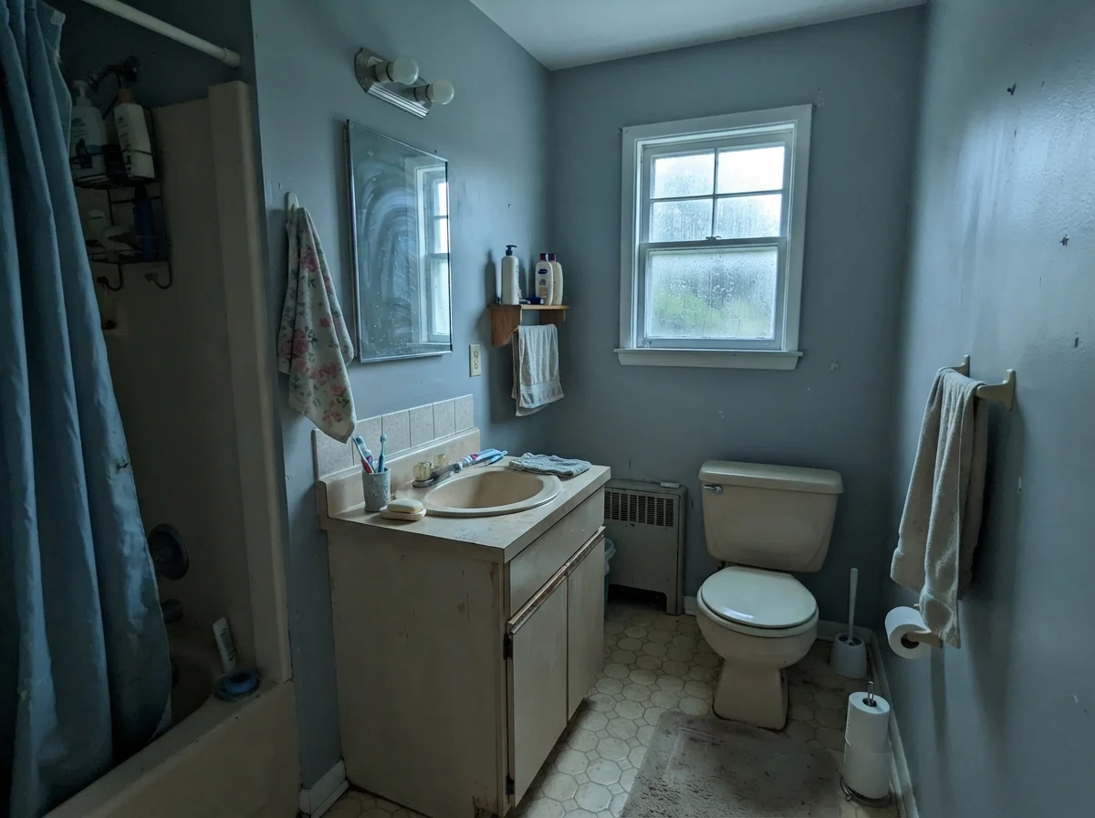
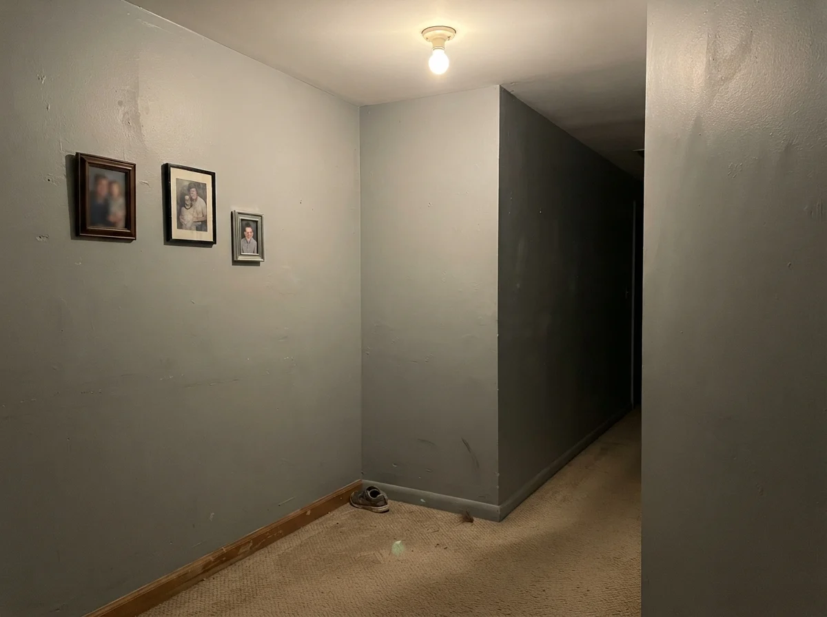
The second trap is the windowless interior corridor. Below is a photograph of an unlit interior hallway corner with beige carpet and an overhead ceiling bulb. In that kind of dead light, French Toile loses all its slate charm and turns into a muddy, industrial putty. It feels like an unfinished basement wall.
Durability, Scrubbing, and the Five-Year Test
A paint color is only as good as the finish you put it in. In our 30 years of maintaining three different houses, I have learned the hard way that saving twenty dollars on a budget bucket of wall paint is a terrible trade. A mid-tone like French Toile has enough pigment that scuffs, hand oils, and water rings will show up if your finish has no backbone.
On standard drywall, eggshell is the sweet spot. It offers enough sheen to wipe away scuffs without highlighting every taped seam in an older wall. For bathroom vanities, laundry cabinetry, and trim, satin or semi-gloss is essential. In our hall bath, that satin surface has been scrubbed clean around the light switches and baseboards hundreds of times, and the color has held up without burnishing into shiny bald spots.
Touch-ups are relatively forgiving because of the gray content. Unlike high-saturation navy paints, which flash terribly if you dab a brush on a wall two years later, French Toile blends decently well if you keep a labeled Mason jar of the original mix sealed in your utility cabinet. Just make sure to stir it thoroughly before touching up high-traffic corners.
What is the LRV of Benjamin Moore French Toile?
French Toile has a Light Reflectance Value (LRV) of 43. This puts it squarely in the mid-tone category, meaning it requires decent natural or artificial lighting to keep from looking flat or overly shadowed.
Will French Toile make my room look cold?
In a north-facing room or under cool 5000K LED light bulbs, yes. The blue-gray pigment strips out warmth when daylight is weak. Stick to 2700K warm household bulbs and south- or east-facing windows to preserve its balanced slate tone.
Can I use French Toile with oak cabinets?
It pairs beautifully with pale, weathered oak or bleached white oak. However, it clashes aggressively with orange or golden 1980s honey oak due to the direct blue-orange color wheel contrast.
What sheen should I choose for French Toile?
Use eggshell on regular living and bedroom walls, semi-gloss on trim and doors, and a durable satin on kitchen islands or bathroom vanities where hands and water are common.
Susan's Verdict · The Understated Slate
French Toile is a genuinely handsome blue-gray that behaves like an architectural slate when daylight treats it right. It gives you the tailored calm of popular designer mid-tones without being a color every guest has already seen in ten other houses. Just keep it out of windowless hallways, keep it far away from honey oak trim, and make sure your light bulbs lean warm.