Color Diary · No. 110
Before You Roll Sherwin-Williams White Duck Everywhere
The warm off-white everyone calls foolproof, reviewed honestly: the green flash nobody warns you about, the rooms where it goes dingy, and what to paint instead.

Susan HartleyNovember 4, 2026 · 19 min read
White Duck · Sherwin-Williams SW 7010
Hex#E5DFD2LRV74Undertonesbeige → green-gray → soft cream
When we bought our 1990s colonial—the second house my husband and I renovated—every single wall was coated in an aggressive, high-gloss white that felt less like a family home and more like an icebox. The previous owners thought they were making the place look fresh and modern for listing. Instead, they had turned a house with heavy golden oak trim and modest northern exposure into a harsh, glaring bunker. My first instinct back then was to reach for beige, because in the late nineties, beige was the universal cure for everything that felt clinical. But after living with heavy beige in our first house—a 1970s split-level where the hallways ended up looking like wet cardboard after five years—I wanted something far gentler. I wanted an off-white that had enough weight to soften the glare, but wouldn't turn into mud the moment a cloud passed overhead.
That was my introduction to Sherwin-Williams White Duck (SW 7010). Over the decades since, I have rolled it on family room walls, brushed it onto tired kitchen cabinets, put it on bathroom wainscoting, and tested it in every conceivable exposure across three different houses. People online love to call White Duck completely foolproof. They claim it is the one neutral you can spray across every square inch of drywall without a second thought. I am here to tell you that no paint color is foolproof, and White Duck has a very specific, stubborn secret tucked inside its formula: a dose of green-gray that can either make your rooms look effortlessly grounded, or leave you wondering why your hallway suddenly looks faintly like split-pea soup under the wrong lamp.
The Green-Gray Underneath the Cream
White Duck sits at a light reflectance value (LRV) of 74. That places it squarely in off-white territory—deep enough to show contrast against crisp white trim, but high enough to bounce ample light around a living space. Yet it is not a clean, sunny off-white like you get with butter-yellow undertones. It is built on a warm beige body with a distinct green-gray pigment stirred right into the base. In bright, balanced natural light, that green-gray behaves like an anchor, stopping the beige from going yellow or peachy. But drain the room of warm light, and that same anchor is all you can see.
warm sun
overcast, north light
dusk, rain, cool bulbs
beige → green-gray → soft cream
Crisp LinenBehr · see diary
Cotton KnitBehr · see diary
White DuckSW 7010
Slipper SatinFarrow & Ball · see diary
Shoji WhiteSherwin-Williams · see diary
When you look at White Duck on a tiny swatch inside the paint store, your eye registers a pleasant, quiet cream. What the fluorescent store fixtures won't reveal is how sensitive that LRV 74 neutral is to the light coming through your window. In a south-facing room flooded with noon sun, the warmth blooms. The beige takes center stage, the green-gray vanishes completely, and the wall reads as an inviting, cozy off-white. But turn around and put that exact same can of paint into a north-facing bedroom with one small window, and the daylight strips away all the warmth. The beige retreats, the cool northern sky pushes forward, and the underlying green-gray takes over. Suddenly, your serene sanctuary looks dull, cold, and a little bit dingy.
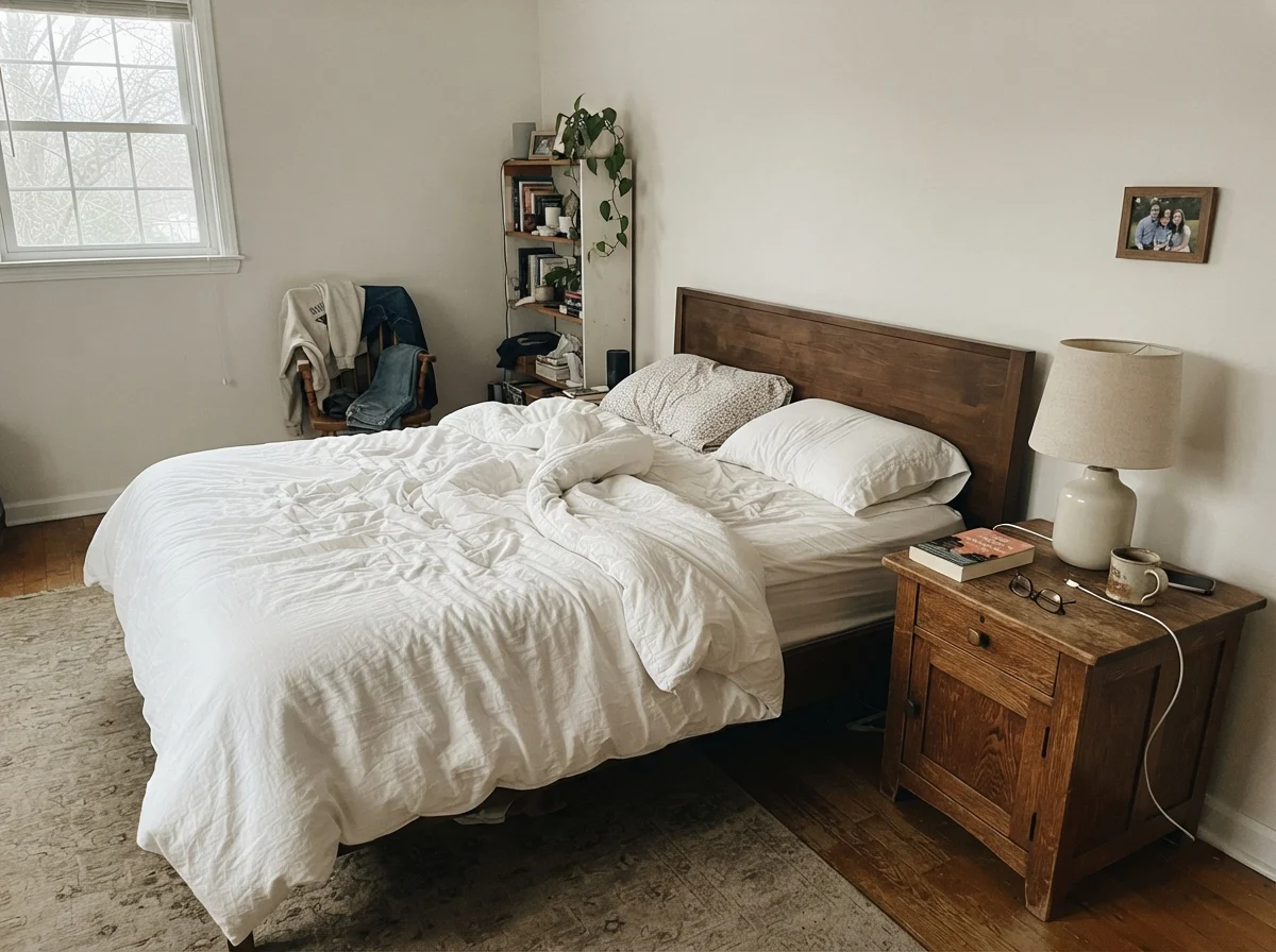
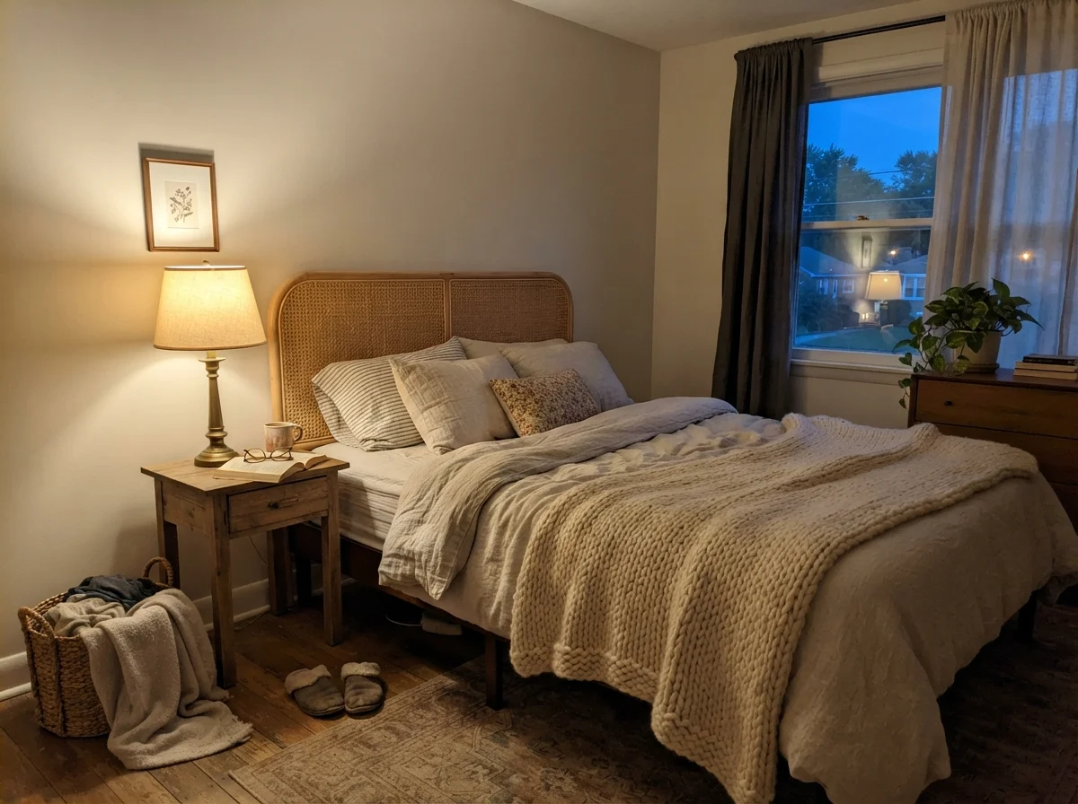
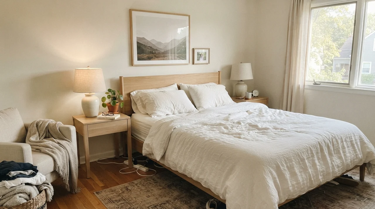
I watched this shift play out right across our second house. In the front foyer and dining room, which drank in southern daylight all afternoon, White Duck was stunning. Visitors constantly asked for the formula. But in the guest bedroom at the back of the house, which faced north toward a stand of mature pines, the color fell completely flat. It looked like wet putty before breakfast, and at dusk it felt downright gloomy. That is the duality of White Duck: it requires daylight and warm artificial lighting to keep its beige backbone awake. Here is how that morning-to-night light dance looks inside a bedroom space:
Living Rooms and Main Living Spaces
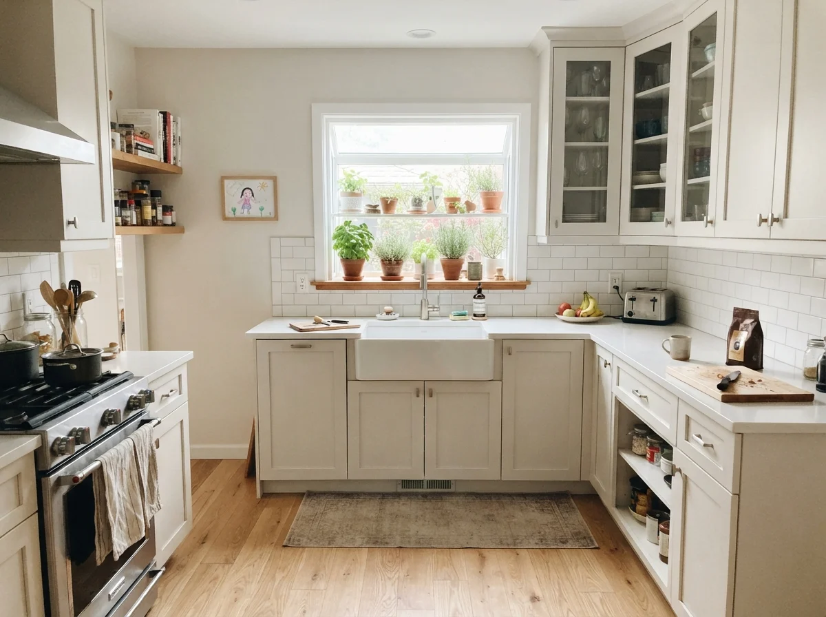
Where Sherwin-Williams White Duck truly earns its reputation is in large, open-concept living areas. If you have an open floor plan where the living room bleeds into the dining area and wraps around the entryway, choosing paint is usually a nightmare. A true white will create glaring hot spots near the picture windows and cast deep, cold shadows in the corners. A mid-tone greige or beige, on the other hand, can feel heavy and dated when it stretches across forty feet of drywall. White Duck operates right in the sweet spot between those extremes.
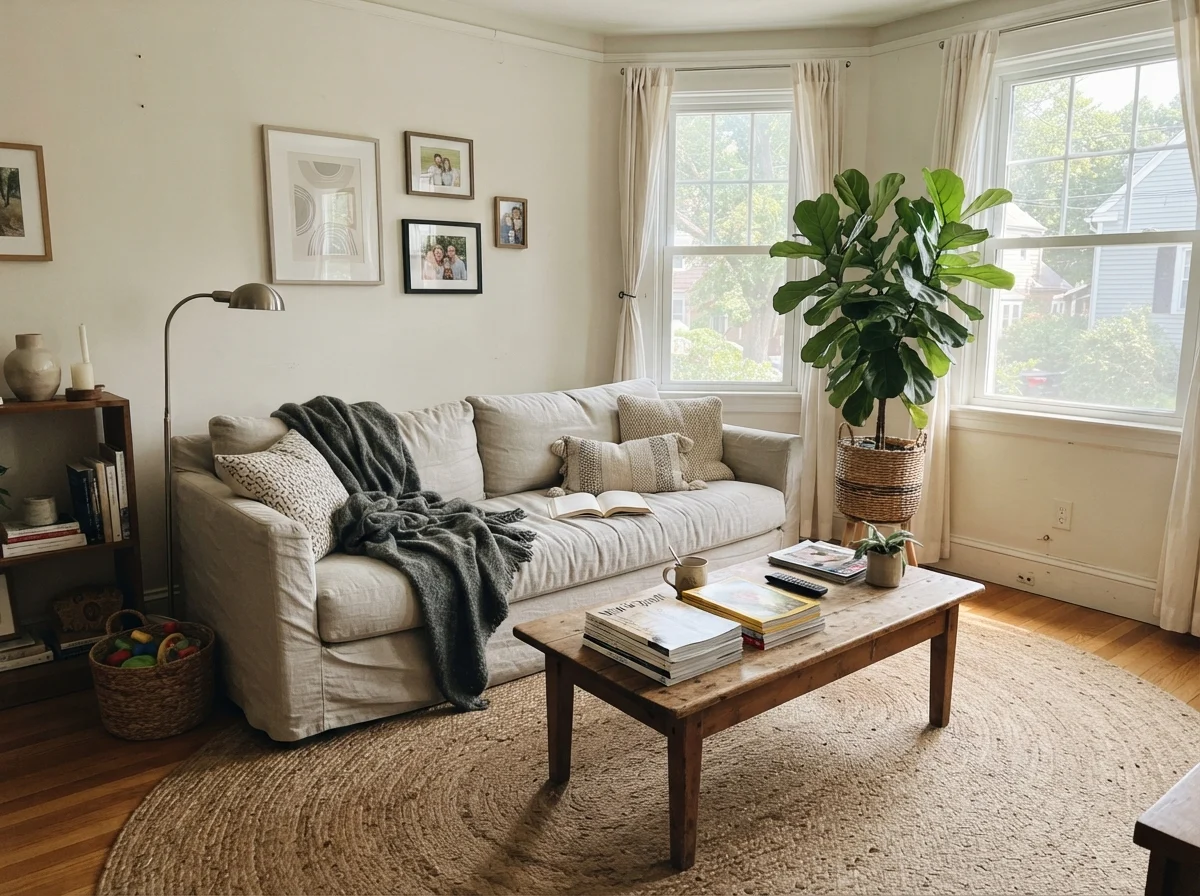
Because its LRV sits at 74, it carries across big drywall runs without bouncing obnoxious glare into your eyes. It lets your furniture do the talking. In our current 1960s ranch, we have a generous living area with big windows that catch generous midday sun. White Duck on those walls is a workhorse. It complements natural textures in a way stark whites simply cannot manage. If you have linen upholstery, jute rugs, oiled white oak, or walnut end tables, White Duck acts like a tailored backdrop. It doesn't scream for attention, and it never looks like you just bought five gallons of generic contractor white because you couldn't make up your mind.
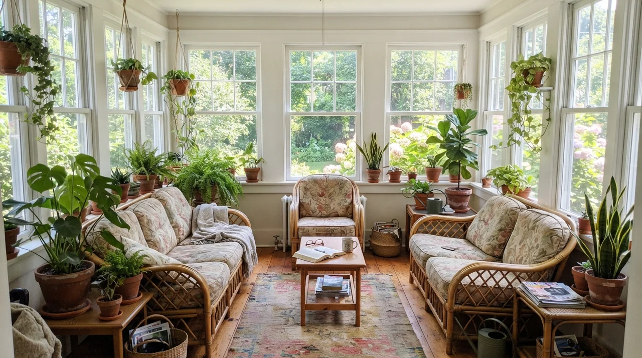
Notice how comfortably it sits against organic materials. That touch of green-gray in the formula, which causes trouble in dark corners, is the very ingredient that makes White Duck look magnificent next to greenery and house plants. In a bright sunroom surrounded by glass, where an off-white could easily wash out to blinding chalk, White Duck holds its body. It lets the outdoor greenery spill inside without creating a sharp, artificial divide at the window frames.
Bedrooms and Nurseries: Getting the Mood Right
When you take White Duck out of open gathering spaces and bring it into quiet, private rooms, you have to be far more deliberate about your light bulbs and textiles. A bedroom is where you want walls to recede and feel calm. If you have generous eastern or southern windows, White Duck will wake up with a soft, clean creaminess that makes white sheets and light oak furniture feel pulled together and serene.
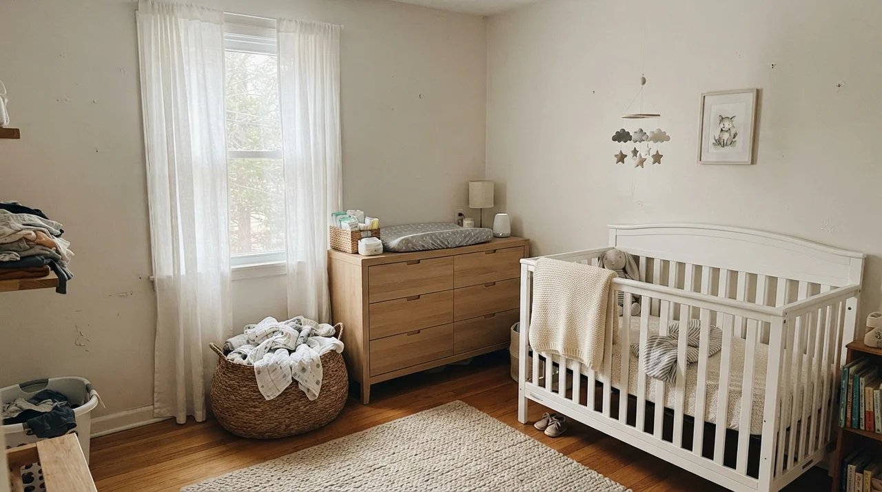
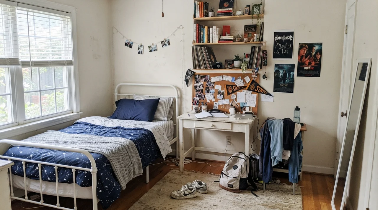
We used it in our youngest daughter's room back in our colonial home when she was growing up. Over the years, that room transitioned from a calm baby nursery with pale wood accents to a messy teenager's haven filled with school books and sports gear. What I appreciated most over those ten years was that the color never demanded to be repainted just because her tastes changed. It held up against changing bedspreads, corkboards, and posters without clashing or looking dated within a few seasons.
Here is my practical rule for bedrooms painted in White Duck: throw away your 4000K LED light bulbs immediately. If you screw high-kelvin, cool-white bulbs into your bedside lamps, White Duck will instantly turn a strange, sterile gray-green that makes everyone look slightly unwell in the mirror. Stick strictly to 2700K warm white bulbs. The warm filaments bring out the creamy beige and settle the green undertone right down into a soothing, restful envelope.
Kitchens, Cabinets, and Millwork
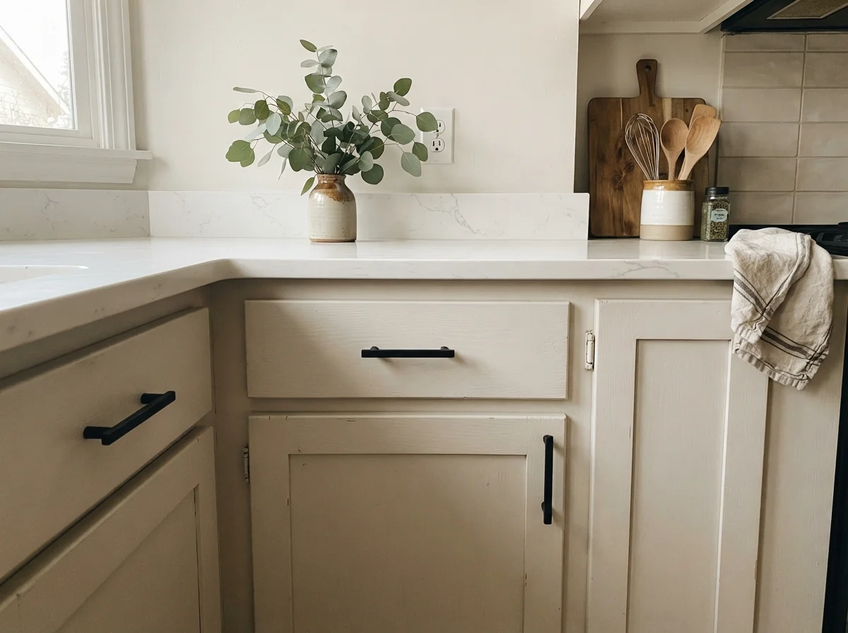
Kitchens are notoriously hard to paint because you are dealing with fixed, expensive surfaces: stone slabs, tile backsplashes, and rows of cabinet faces. When people ask me how to keep an all-white kitchen from looking like a dental office, my advice is almost always to pull back from stark whites on the cabinetry. White Duck on kitchen cabinets is one of the best tricks in home remodeling. In a satin sheen, it looks like custom hand-painted furniture rather than cold, factory-sprayed plastic.
It pairs remarkably well with unlacquered brass hardware, warm butcher block, and honed counters. But here is the warning: pay very close attention to your countertop slabs. If you have installed cool, blue-gray veined quartz or cold gray granite, White Duck will fight them tooth and nail. The coolness in the stone will pull the green undertone right out of the cabinet paint, making the millwork look dingy and slightly soiled. Pair it with warm soapstone, creamy quartzite, or butcher block instead, and let the warmth speak for itself.
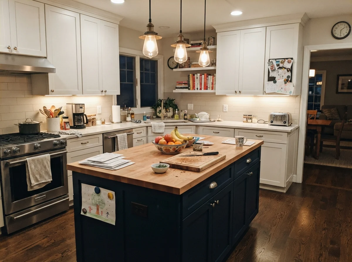
In our last house, when we refreshed the kitchen before selling, we left the perimeter cabinets in a clean off-white and painted only the central island in White Duck satin. That single weekend project did more to anchor the room than anything else we touched. Prospective buyers loved that the island felt like a substantial piece of freestanding furniture. When we sold, the feedback was unanimous: the kitchen felt high-end and welcoming, not sterile.
Bathrooms, Laundries, and Tile Realities
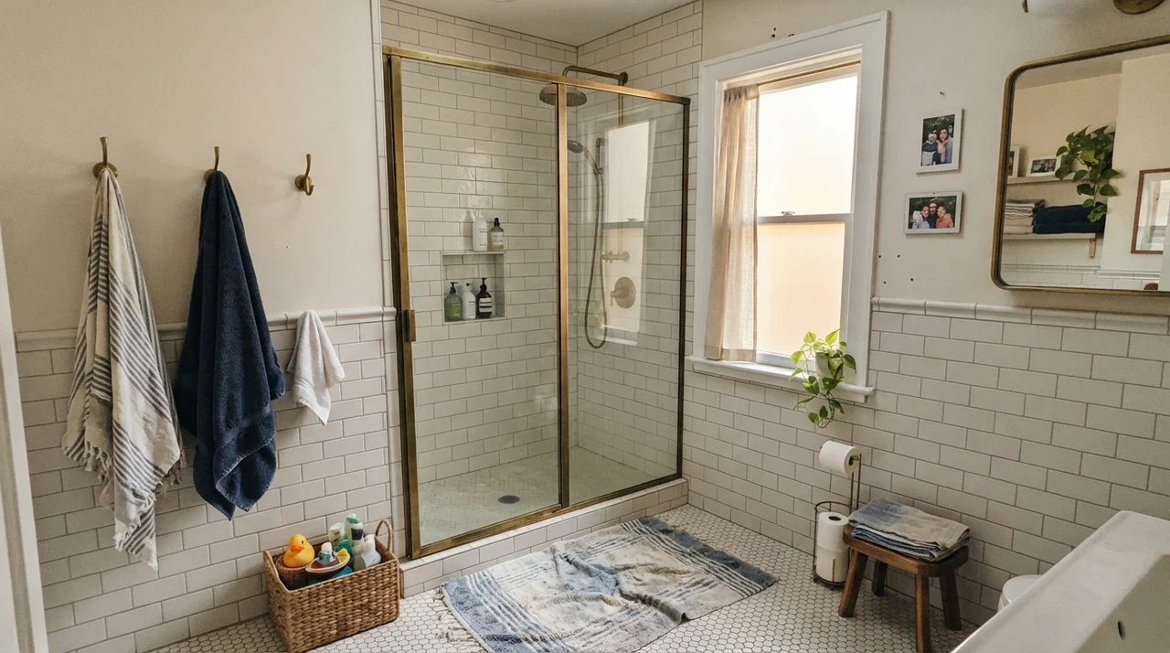
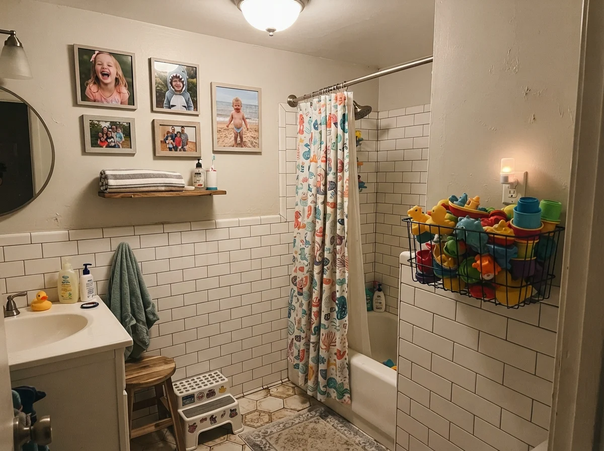
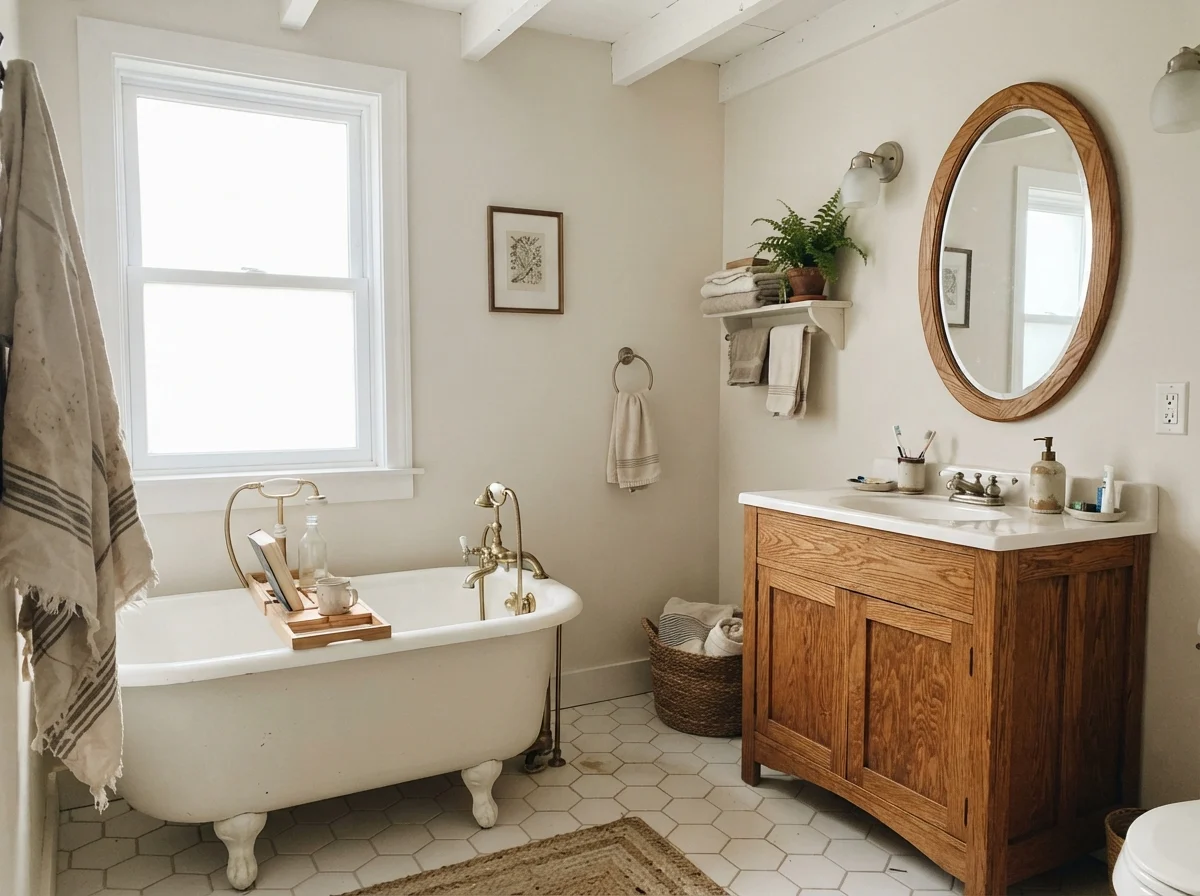
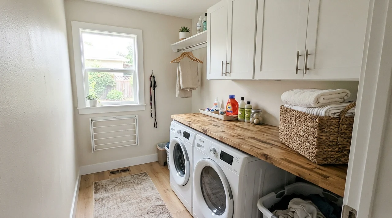
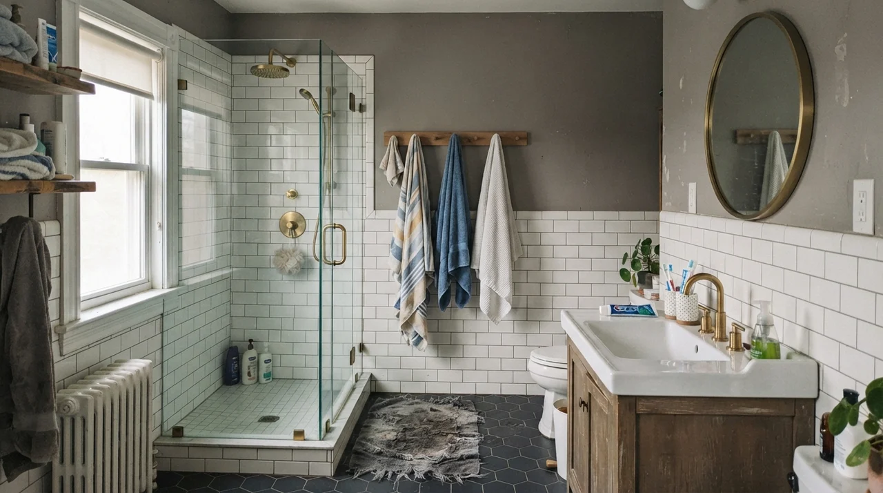
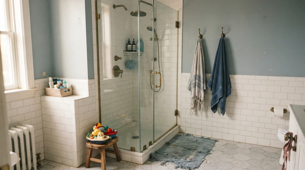
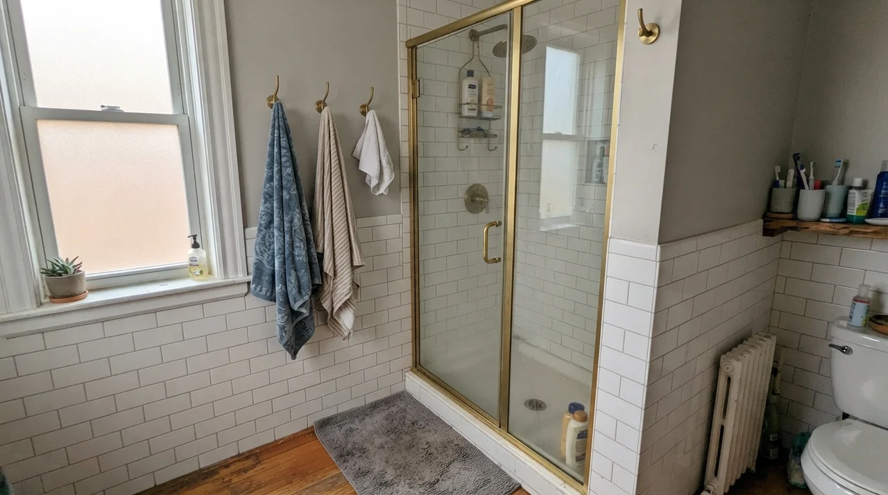
If you take White Duck into wet spaces like bathrooms and laundry rooms, you need to look hard at your tile before you buy a gallon. White Duck loves classic white subway tile, warm marble with honey veining, and warm wood vanities. Against subway wainscoting, it provides just enough gentle contrast so the trim doesn't disappear, while keeping the upper half of the room from feeling washed out. We lived with it in our family bath for over six years, and it was remarkably forgiving of the steam, wet towels, and daily splashes of family life.
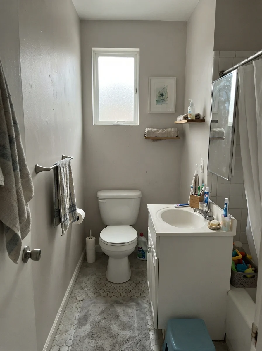
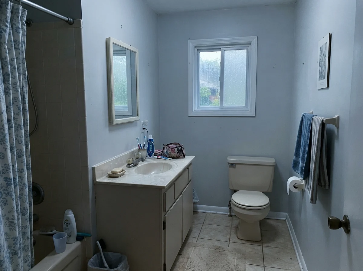
However, when the light turns gray or your tile pulls cool, White Duck will show its temperamental side. This is where most homeowners get burned. Put this paint in a small, windowless bath or under flat overcast skies through frosted glass, and the walls will lose every ounce of cream. They don't turn into a pretty slate gray; they turn into an ambiguous, muddy putty. If your bathroom has cold gray vinyl plank flooring or blue-gray ceramic shower tile, do not paint your walls White Duck. You will end up calling your painter back within three weeks to coat over it.
Doors, Built-ins, and Exterior Siding
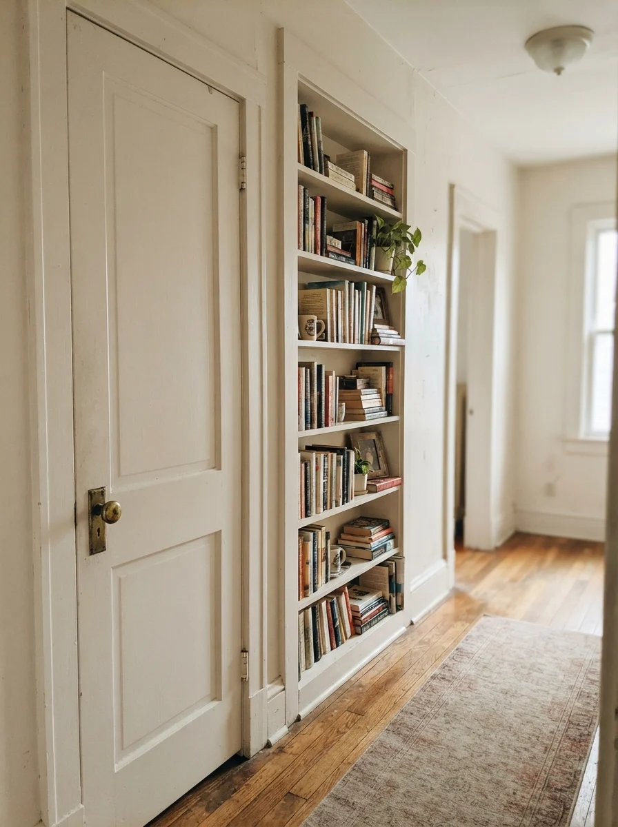
Because White Duck has enough pigment to stand apart from true white, it makes a wonderful accent color on interior doors, window trim, and built-in bookshelves when your walls are painted a lighter cream. In our 1960s ranch, the hallway doors take a beating from dogs, grandchildren, and moving vacuum cleaners around. Painting interior doors in semi-gloss White Duck hides fingerprints and daily scuffs far better than stark builder white ever could, while giving the hallway a custom, architectural feel.
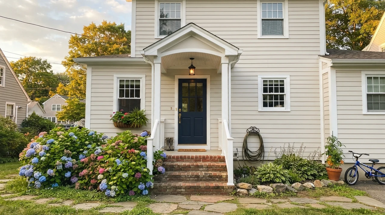
Outside, the sun does something fascinating to White Duck. If you use it as an exterior siding color, the sheer intensity of direct outdoor UV light washes out much of the beige, making it read as a crisp, soft, traditional white that doesn't blind the neighbors when they drive past. It sits gracefully alongside red brick, cedar shingles, and natural fieldstone. But remember the lesson of the interior: walk your exterior sample board around all four sides of the house. The south-facing facade will look like creamy perfection, but the north-facing shaded wall behind the garage will always read half a shade greener.
Where White Duck Fails: The Honest Truth
Nearly every bad review of White Duck comes from one of three situations, and all three are predictable before you ever open the can. None of them are defects in the paint itself. But if your room matches one of these profiles, White Duck is the wrong color for you, and brushing on a third coat will not save you.
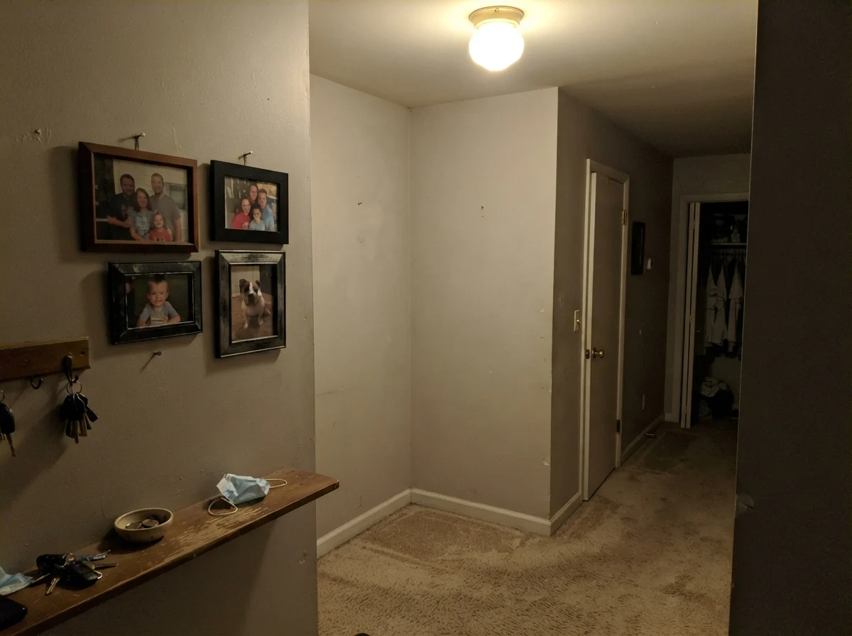
First, a windowless, dimly lit hallway or back room. North light or low artificial light is cool and flat. It drains the warm beige pigments first, leaving behind only the green-gray undertone. Homeowners call this effect 'sludgy' or 'dingy.' In an unlit hallway corner with old beige carpet, White Duck looks like dirty dishwater. If you have a dim space, either step up to Sherwin-Williams Alabaster (SW 7008) at LRV 82 to bounce real light, or cross over to Sherwin-Williams Natural Choice (SW 7011), which has significantly less green pigment to misbehave in the shadows.
Second, pairing it with bright builder white trim. If your baseboards, doors, and crown molding are coated in Sherwin-Williams Pure White (SW 7005) or High Reflective White (SW 7757), do not paint your walls White Duck. That stark, icy trim makes White Duck walls look like someone spent twenty years smoking inside the house. The contrast is too severe, and White Duck immediately reads as dirty rather than intentional.
Third, hard afternoon western sun in a hot climate. In rooms with massive west-facing floor-to-ceiling glass, strong 5:00 PM sunlight paired with 2700K incandescent lamps will push the beige forward with a vengeance. In that scenario, clients often complain that their off-white room suddenly turned into a deep, warm tan. If your room gets blasted with harsh desert or southern sun, test Shoji White (SW 7042), which carries a tiny touch more gray-pink and holds its composure without going yellow-tan.
That stark, icy trim makes White Duck walls look like someone spent twenty years smoking inside the house. The contrast is too severe, and White Duck immediately reads as dirty rather than intentional.
Cleaning, Scuffs, and Five Years In
Here is what thirty years of owning three houses teaches you: you do not pick a paint color for how it looks on Sunday evening when the blue tape comes off. You pick it for how it behaves five years in, when you've scrubbed dried spaghetti sauce off the kitchen wall for the fifth time and the dog has rubbed his wet coat against the hallway corner every day of his life.
In terms of day-to-day durability, White Duck is far superior to true whites like Extra White or High Reflective White. True white shows every fingerprint, every stray pencil mark, and every shoe scuff at eye level. Because White Duck sits at LRV 74 and carries that subtle beige-gray pigment, it hides routine household wear remarkably well. In our busy family hallway, we lived with it for over seven years before I ever felt the urge to drag out the touch-up roller.
When it comes to sheen, never put flat paint on your main walls unless it is on a smooth ceiling. For living rooms and bedrooms, buy White Duck in an eggshell finish. It gives you just enough resin to wipe clean with a damp microfiber cloth and a drop of dish soap without burnishing or leaving shiny bald spots on your wall. For trim, doors, and wainscoting, stick to semi-gloss. And on kitchen cabinets, satin is worth the money every single time—it wipes clean without feeling sticky, and it doesn't chip nearly as easily as high-gloss enamels can over years of door slamming.
Does Sherwin-Williams White Duck look yellow on the walls?
No, it does not look yellow. The formula balances its warm beige base with a small drop of green-gray, which specifically prevents the paint from turning into a buttery or golden yellow. However, in rooms with intense west-facing afternoon sun paired with warm 2700K lighting, it can deepen into a light, warm tan.
Why does White Duck look green in my bathroom?
The green cast appears when the room lacks natural warm light or uses cool LED light bulbs (3500K to 4000K). In dim north light or cool artificial light, the beige base recedes and exposes the green-gray undertone. Switching your fixtures to 2700K warm bulbs usually corrects the problem immediately.
What ceiling paint should I use with White Duck walls?
For a calm, unified look that feels intentional and elegant, paint your ceiling in flat White Duck. Keeping the ceiling the same color as the walls softens shadows and makes the room feel taller. If you prefer contrast, choose Sherwin-Williams Alabaster SW 7008 in flat finish; avoid bright, icy ceiling whites.
Is White Duck a good whole-house color for resale?
Yes, provided the house has reasonable daylight. Real estate agents appreciate White Duck because its LRV of 74 feels warm, settled, and welcoming without the stark chill of bright white. It hides scuffs well and flatters hardwood floors, brass hardware, and neutral furniture during open houses.
Susan's Verdict · A Masterclass Off-White, Provided You Have the Sun
If you have south- or west-facing windows, warm hardwood floors, and the good sense to use 2700K light bulbs, Sherwin-Williams White Duck is one of the most handsome, forgiving whole-house neutrals money can buy. It bridges the gap between cold white and dated beige with quiet grace, and after five years in, it will still look like a comfortable home rather than a spec-house flip. But do not roll it blindly in a windowless hallway or a dim northern room beside bright builder-white trim—that green-gray pigment will come knocking, and no amount of wishing will keep it quiet. Test a generous swatch on your darkest wall before you commit, and you'll never regret the can you buy.