Color Diary · No. 44
Kendall Charcoal in Real Daily Life: What Daylight Gives and Shadows Take
The charcoal designers reach for by default, reviewed honestly: where it looks expensive, the rooms where it turns into flat black, and the greener side nobody warns you about.

Susan HartleySeptember 22, 2026 · 15 min read
Kendall Charcoal · Benjamin Moore HC-166
Hex#676662LRV15Undertonesolive-charcoal → neutral deep gray → soft slate
In our last house—the 1990s colonial with the high ceilings and the perpetually drafty formal dining room—I decided in year eight that I was done with timid walls. We had lived with safe builder-grade tans and polite grays for long enough. I wanted drama, but I didn't want the room to feel like a coal cellar or a trendy basement bar. That was the first time I rolled Benjamin Moore Kendall Charcoal HC-166 onto drywall, and it taught me a lesson about dark paint that I have carried through every renovation since.
The color swatch in the hardware store looks like a straightforward, heavy wool gray. It feels grounded, tailored, and undeniably handsome. But dark paint is fundamentally different from pale paint. A pale cream or off-white bounces whatever light is in the room; an LRV 15 charcoal eats it. What you get back depends entirely on what the sun is handing that wall at two o'clock on a Tuesday. When you get the balance right, Kendall Charcoal looks like custom millwork and quiet confidence. When you get it wrong, it looks like a flat, muddy shadow that swallows your baseboards whole.
The Anatomy of LRV 15 and the Yellow Secret
To understand why Kendall Charcoal behaves the way it does, you have to look at its underlying structure. With a Light Reflectance Value of 15, it sits in the deep tier of paint colors—it reflects roughly fifteen percent of visible light. True blacks live down at an LRV of 4 or 5, while pale greiges hover up in the 50s and 60s. At 15, there is just enough reflectivity for your eye to register actual color rather than pure void.
More importantly, Benjamin Moore categorizes Kendall Charcoal under its yellow deck family. That does not mean your wall is going to look mustard or cream. What it means is that beneath that deep charcoal pigment lies an earthy, warm undertone. That yellow base is why this color sits so comfortably against natural oak, warm walnut, and polished brass. It completely lacks the icy, cold blue-steel edge that makes many commercial charcoals feel sterile in a family home. But that same yellow component is also why, under certain strong western sun exposures or when placed right against icy Carrara marble, you will suddenly see an olive-green drabness creep across the wall.
How Kendall Charcoal Shifts in Changing Light
Because Kendall Charcoal sits on a warm yellow-neutral base, it alters its personality across the day far more than a pure black or a flat graphite would. In southern sun it shows its rich greige ancestry, while north light and cool LED fixtures pull out its somber slate edge.
warm sun
overcast, north light
dusk, rain, cool bulbs
Kendall Charcoal HC-166 shifts between a warm, earthy graphite in southern sunlight and a cool slate-black under overcast skies.
Down PipeFarrow & Ball · see diary
Charcoal SmudgeDunn-Edwards · see diary
Kendall CharcoalHC-166
Cast IronSherwin-Williams · see diary
Homburg GraySherwin-Williams · see diary
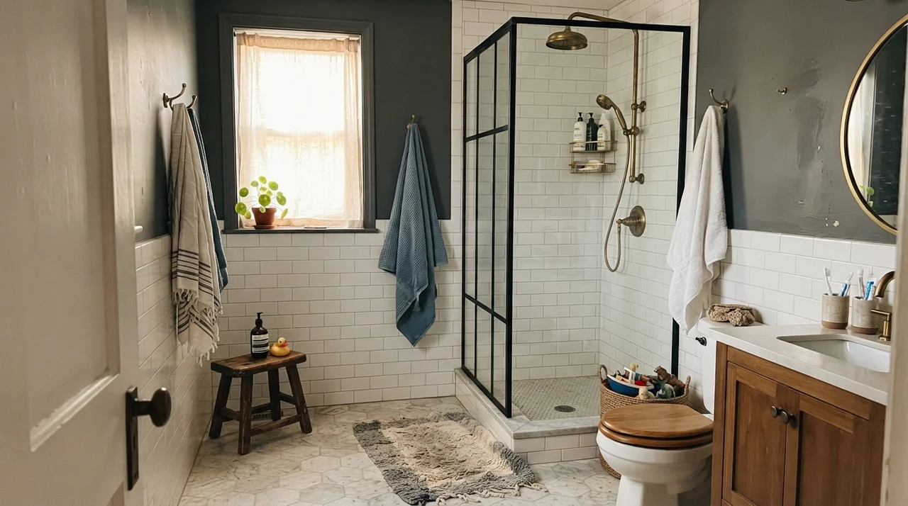
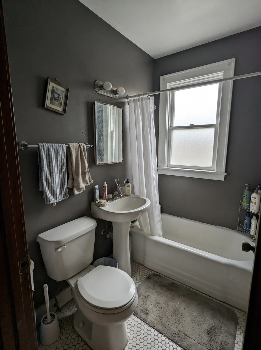
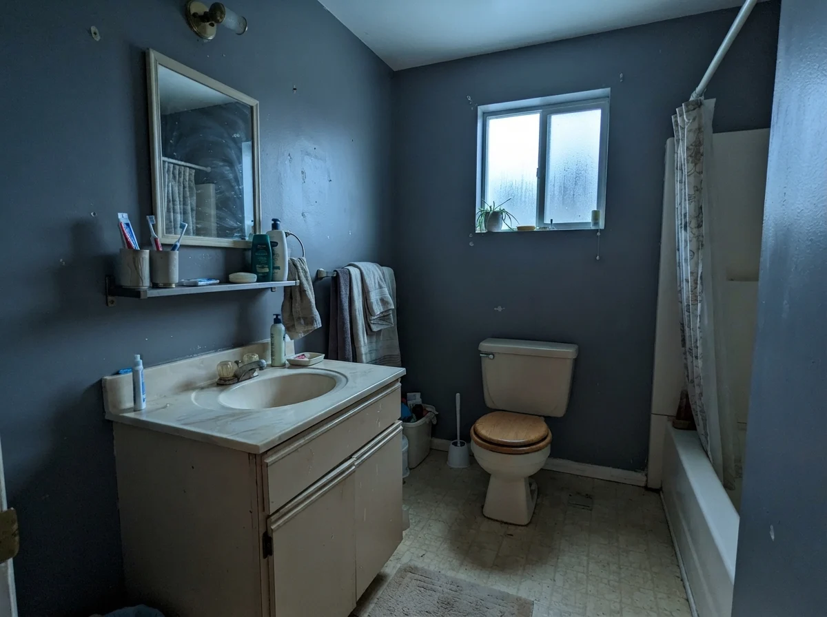
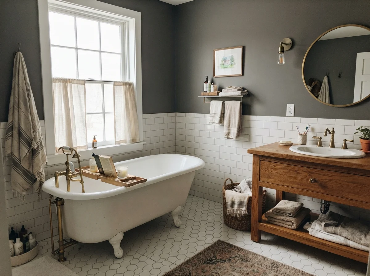
When the Sky Changes: Three Bathroom Views
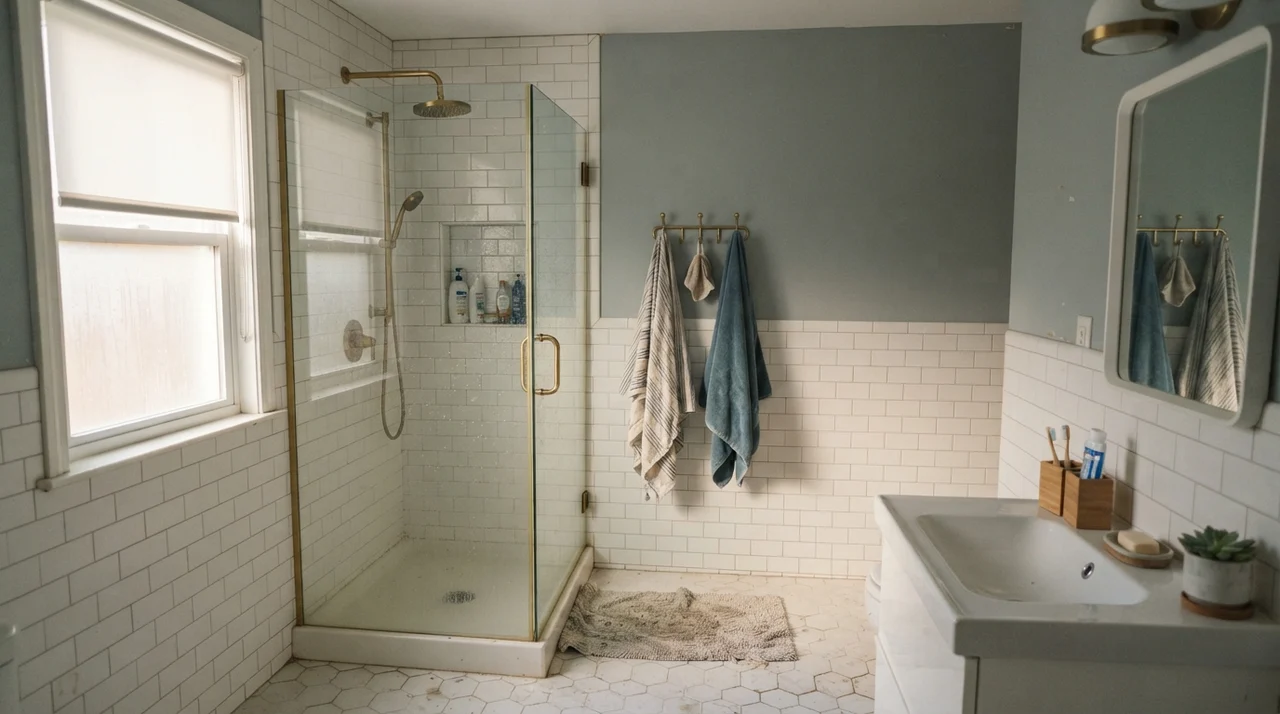
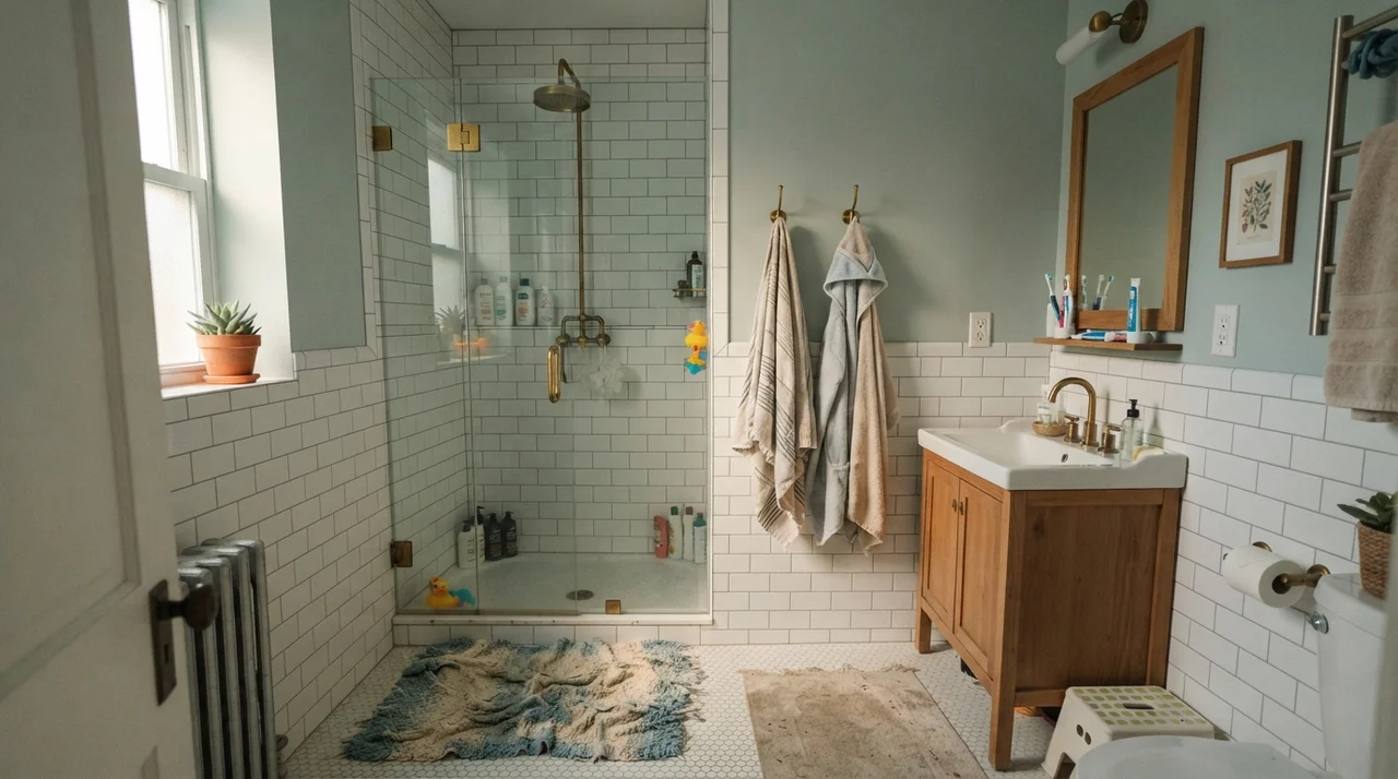
Bathrooms are the truest testing grounds for deep colors because they compress artificial lighting, natural light, and high-contrast white fixtures into twenty square feet. In our 1960s ranch, we had an upstairs half-bath with a tiny north-facing window, and trying to put a deep gray in there was an education in compromise.
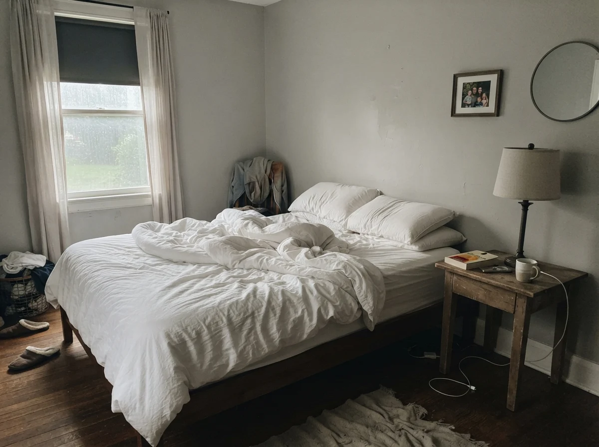
Look at how the color responds across different window orientations and weather. In a room with balanced morning light and warm wood, Kendall Charcoal remains grounded, crisp, and clearly gray. Put that exact same can into a room lit only by flat overcast skies or cool northern exposure, and the warmth evaporates completely. The walls collapse into an unreadable dark slate that makes older beige plumbing or dated almond fixtures look noticeably tired.
The Bedroom Test: From Morning Glare to Evening Glow
A lot of people ask me if painting a bedroom dark makes it impossible to wake up in the morning. My answer after thirty years of living with color is always the same: it depends on your lamps and your window glass. Dark walls in a bedroom don't feel depressing if there is crisp contrast to define the corners.
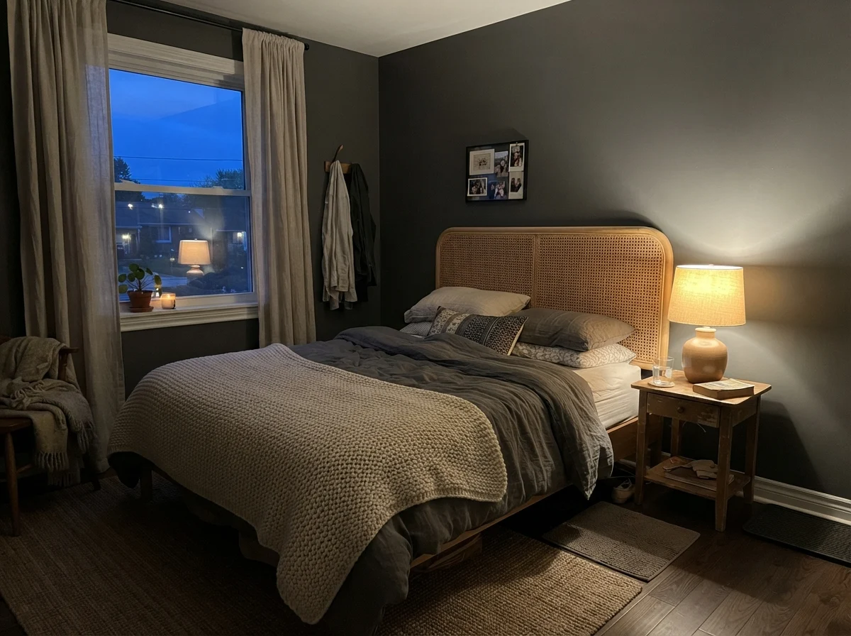
In cool, unassisted morning light, Kendall Charcoal can look somewhat austere and stripped of its depth. The walls pull back and read almost chalky before the sun clears the roofline. But come dusk, when you turn on warm 2700K bedside lamps, the color wraps around the room like a cashmere coat. The warm filament light picks up the yellow undertone in the paint, turning the room rich and deeply restful.
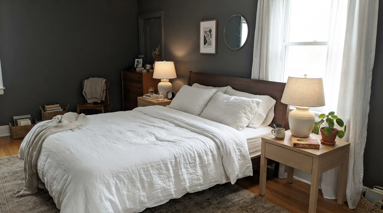
When you take Kendall Charcoal into larger private quarters, balance is everything. In our master suite in the colonial, we paired deep charcoal walls with simple oak furniture and crisp white bedding. It didn't feel dark; it felt quiet. That quietness comes from the lack of wall glare. When light hits an eggshell charcoal surface, it diffuses gently rather than bouncing off the way it does on pale enamel.
Bedrooms for All Ages: Nurseries and Teen Spaces
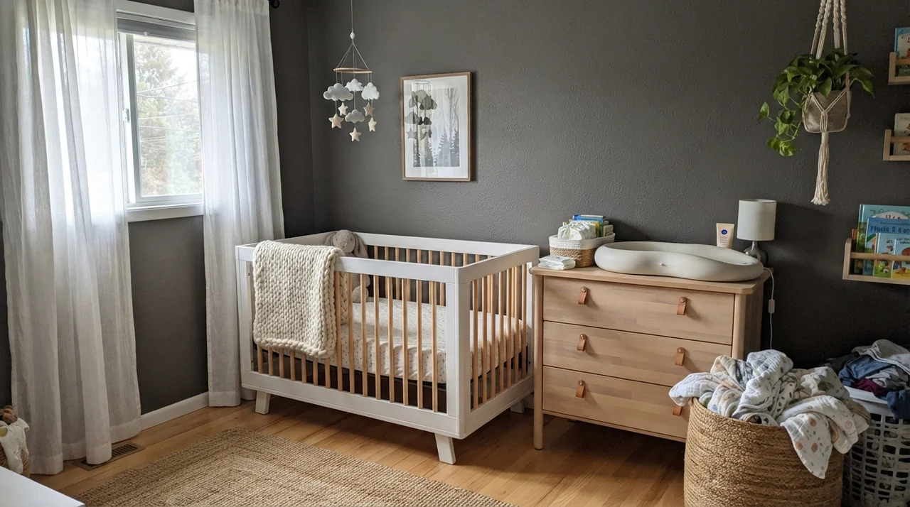
People are often hesitant to use heavy charcoals in children's rooms, but when paired with light natural woods, white cribs, and soft textures, Kendall Charcoal creates a remarkably calm environment. In a nursery bathed in gentle daylight through sheer linen curtains, it provides a soothing, low-glare backdrop that transitions beautifully as the child grows.
By the time kids reach high school, that same deep gray provides a tailored, mature background for desks, metal bed frames, and corkboards. Because it is neutral without being cold, it accommodates bright posters, athletic gear, and books without clashing. Five years in, while pastel rooms look dated within months, an honest charcoal wall still feels age-appropriate.
Kitchens and Millwork: Where the Paint Really Works
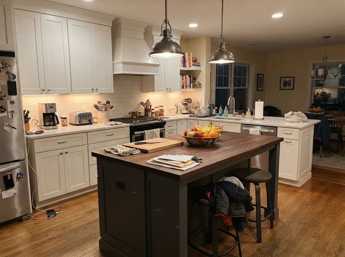
If you ask any seasoned kitchen designer where Kendall Charcoal belongs, they will tell you cabinets and islands. In our colonial, we renovated the kitchen on a strict budget: we kept the existing perimeter uppers in off-white, replaced the worn laminate counters with solid quartz, and sprayed the island base and lower cabinet boxes in Kendall Charcoal satin. It anchored the room completely without the harsh, formal finality of true jet black.
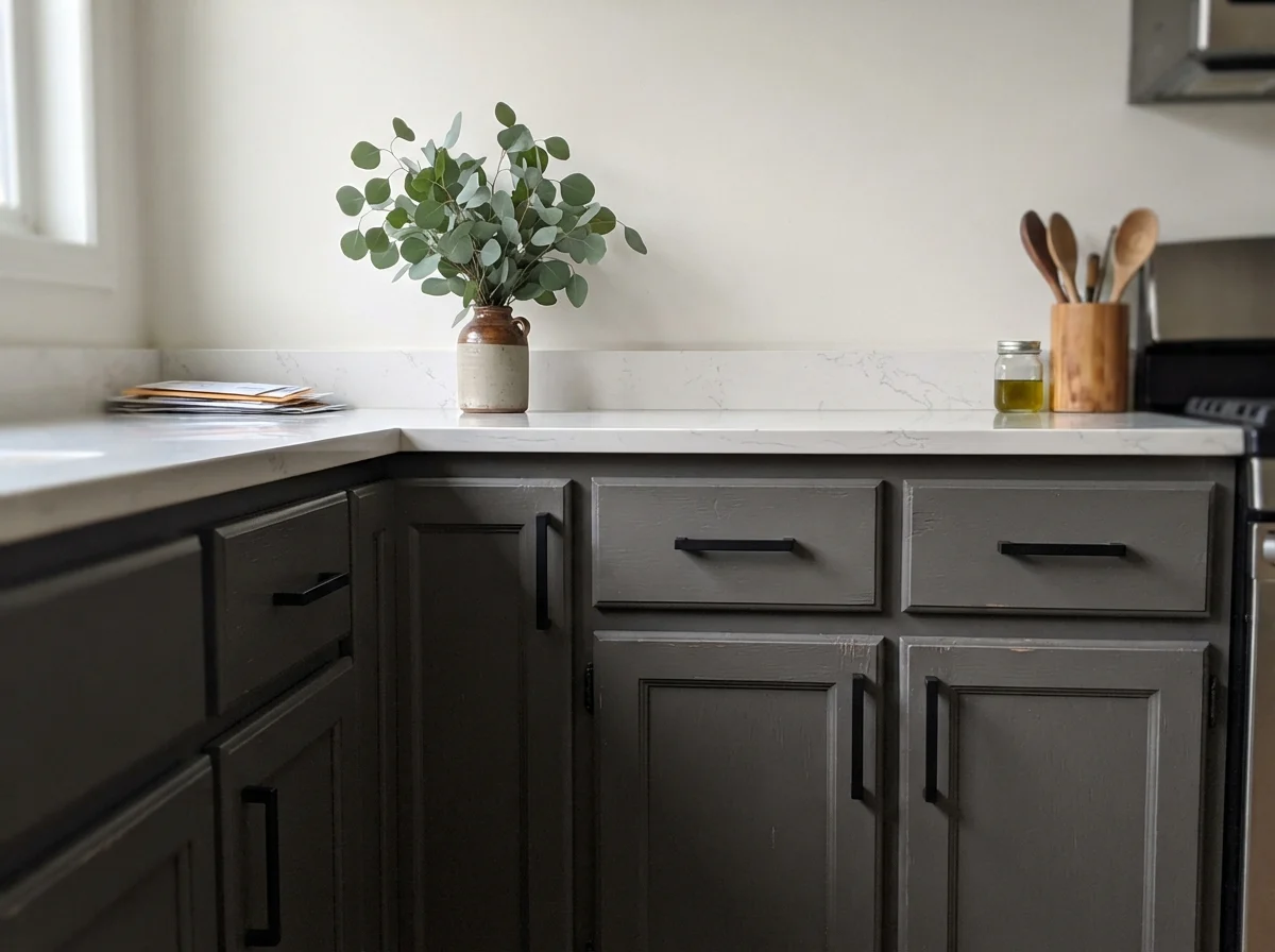
On kitchen cabinetry, Kendall Charcoal sits happily beside brass cups, unlacquered pulls, or matte black hardware. Because of that warm undertone, it flatters natural oak flooring in a way that slate-blue grays never do. But you must be honest with yourself about everyday living: dark satin cabinet doors show dust and dry hand lotion near the pulls faster than white doors do. It wipes down easily, but you will notice it.
If painting all your cabinets feels like too much commitment, keeping the dark tone strictly on the island is one of the smartest budget decisions you can make. The island takes the brunt of scuffs from barstools and family traffic, and a deep charcoal hides shoe kicks far better than any pale greige. Paired with cream walls and white perimeter cabinetry, it creates an intentional focal point that held up beautifully through years of cereal bowls and homework sessions.
Interior Millwork and Architectural Character
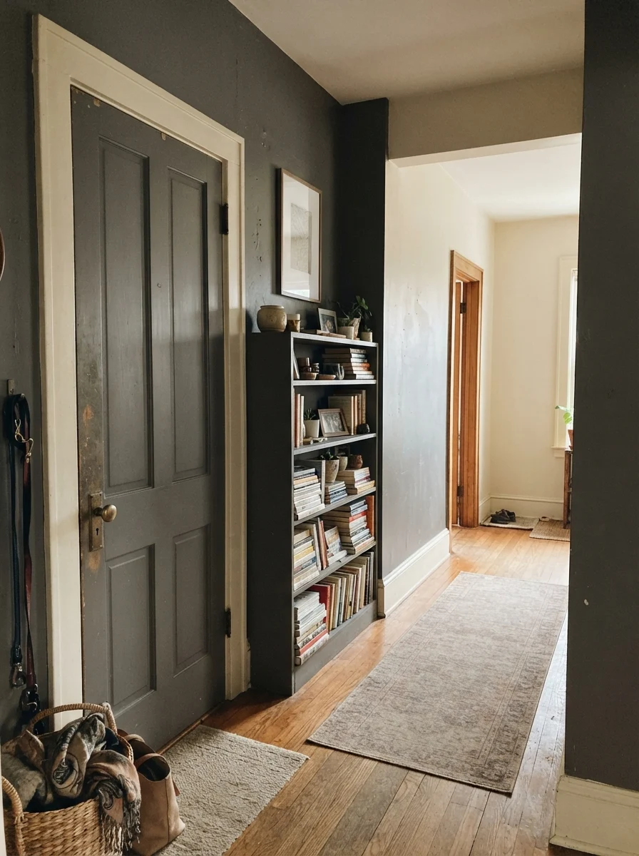
One trick we used in our 1970s split-level to add visual interest without gutting walls was painting the interior doors and built-in shelving a deep, contrasting color. When you apply Kendall Charcoal in semi-gloss to an interior two-panel door set against warm cream hallway walls, the door feels substantial and heavy, like solid vintage timber.
On built-in bookcases, Kendall Charcoal makes book spines and ceramic pieces pop off the shelves. Because it sits at LRV 15, the back of the bookshelf recedes, giving the room an immediate sense of architectural depth without demanding that you paint the entire surrounding living room dark.
Daylight Rooms: Living Rooms, Sunrooms, and Utility Spaces
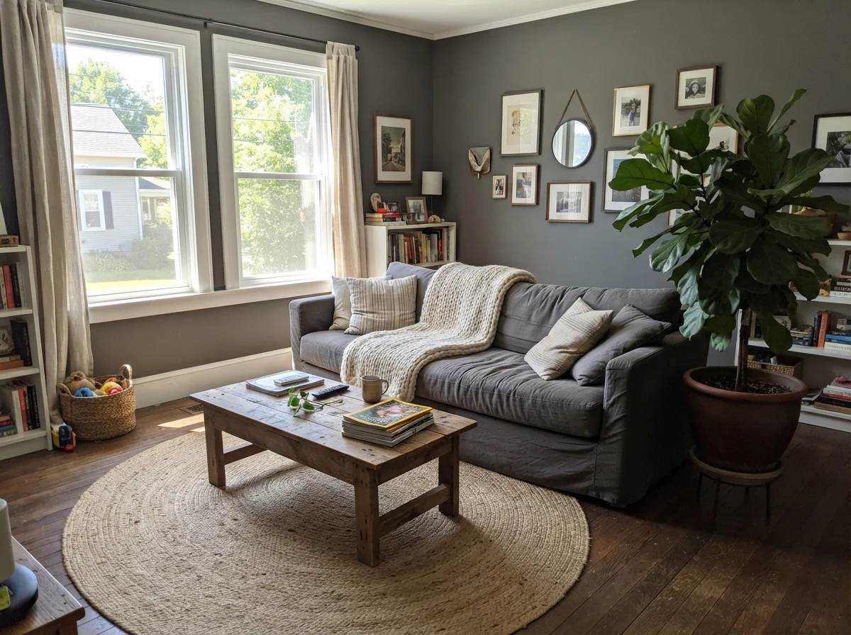
In bright living spaces with generous south-facing or west-facing windows, Kendall Charcoal sheds its moody reputation entirely. Bathed in full midday sun, the charcoal lifts into an earthy, sophisticated warm gray that flatters natural linen, jute rugs, and leafy indoor plants. It gives a large, sun-drenched room a cozy, grounded perimeter that prevents washed-out glare.
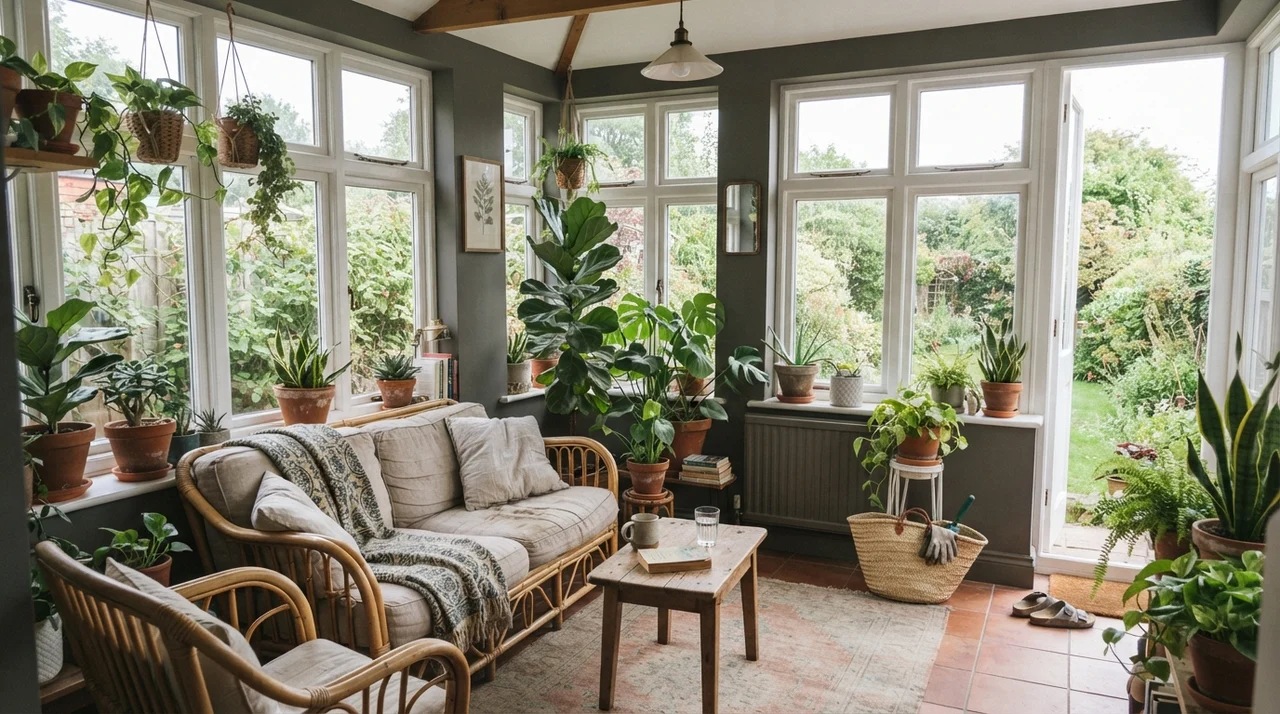
Even in a sunroom wrapped in white window frames, Kendall Charcoal on the narrow wall segments adds stunning garden contrast. Terracotta pots, green leaves, and rattan furniture sing against the deep charcoal background. The white window mullions provide a crisp border that keeps the dark tone from overwhelming the outdoor view.
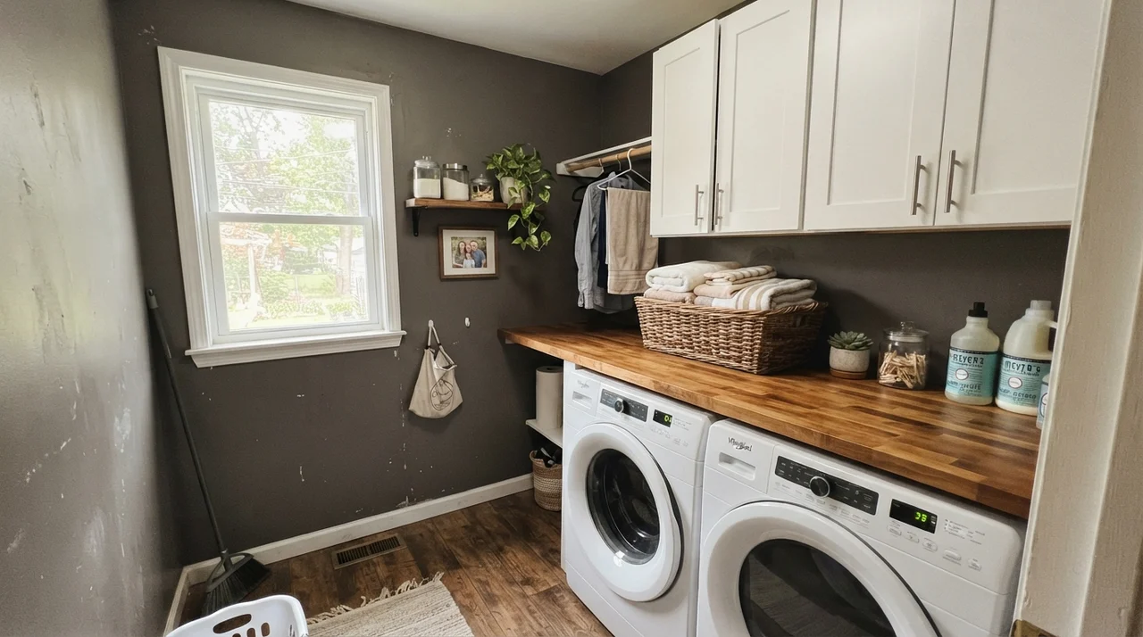
In hard-working utility areas like laundry rooms and family baths, this color is a practical workhorse. A laundry room with a decent window feels custom-designed when painted in Kendall Charcoal above clean white cabinetry and butcher-block folding tables. It hides detergent splashes and laundry basket rubs that would leave dingy gray scuffs on a pale wall.
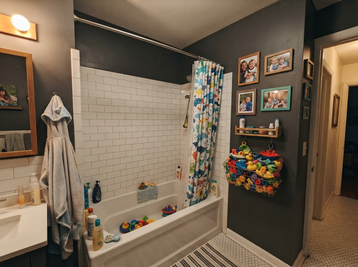
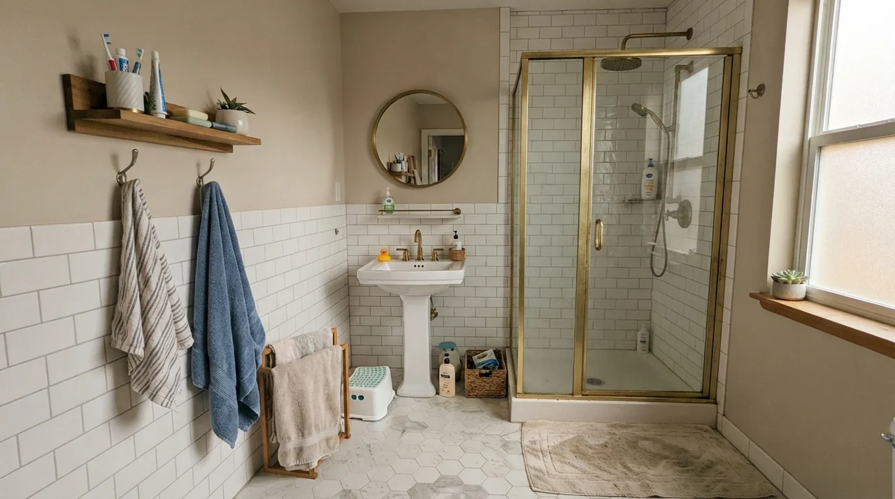
In the kids' bathroom, pairing Kendall Charcoal above bright white subway tile wainscoting keeps the room looking organized even when the wire basket is overflowing with colorful plastic bath toys and family photos crowd the wall. The dark upper wall absorbs visual clutter, letting the crisp white tile line keep the room feeling scrubbed clean.
Where Kendall Charcoal Betrays You: The Honest Failure
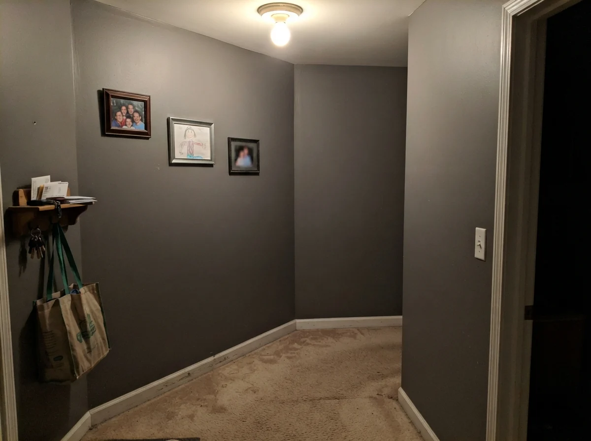
Nearly every disappointed homeowner story I hear about Kendall Charcoal lands in one specific condition: the windowless, poorly lit hallway or the dim north-facing den with a single overhead bulb. The paint is not defective in these rooms—it is simply following the laws of physics.
Without natural daylight to bounce off the wall, Kendall Charcoal loses all its nuanced greige warmth. It collapses into a flat, muddy shadow that sucks the ambient bulb light right out of the room. The corners turn murky, baseboards lose definition, and you end up feeling like you are standing inside an unpainted utility box. If your room does not get honest daylight, step up to a mid-tone gray like Chelsea Gray HC-168 (LRV 22) instead. It gives you the drama of gray without turning into dark putty.
Curb Appeal and the Exterior Reality
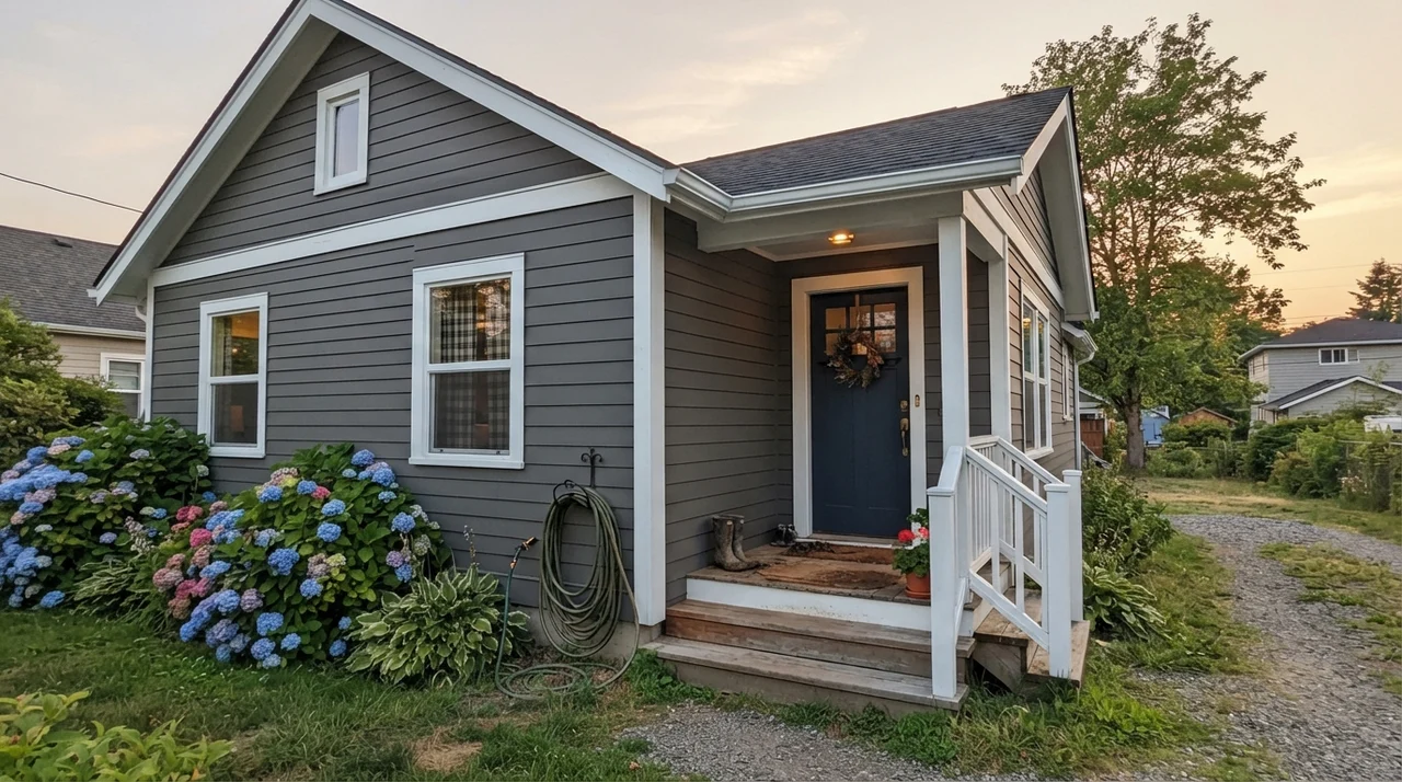
On exterior siding, Kendall Charcoal is one of the most reliable deep neutrals available, but it comes with a major warning: daylight exposure shifts it dramatically. In full direct sun on a south-facing exterior elevation, Kendall Charcoal looks like a sophisticated medium-deep warm gray. But on the shaded north side of the same house, it reads significantly darker.
When we evaluated this color for exterior siding, we painted a 4-foot by 4-foot board and walked it around the entire foundation at 9 AM, 1 PM, and dusk. Paired with crisp White Dove OC-17 trim and deep navy accents, it creates a tailored, timeless exterior that complements stone paths and green hydrangea bushes without looking harsh.
The Right Trim Pairings
Because Kendall Charcoal has a warm, yellow-neutral backbone, pairing it with the right white trim is critical. A cool, blue-white trim will fight the earthy undertone and pull out an unwanted olive-drab cast. Stick to warm, balanced whites that have enough body to hold their own against the heavy contrast.
Coordinating Finishes and Architecture
Over thirty years of house projects, I have learned that dark walls require thoughtful coordination with furniture and fixtures. Kendall Charcoal is remarkably versatile, but it heavily favors organic, warm materials over cool industrial chrome.
Durability, Cleaning, and Touch-Up Reality
Here is the unvarnished truth about dark paint finishes: they show roller marks, touch-ups, and grease far more than pale paint. When you roll Kendall Charcoal on a large living room wall, you must keep a wet edge and maintain consistent roller pressure. If you go back ten minutes later to touch up a thin spot with a dry roller tip, you will leave a permanent halo that will taunt you every time the afternoon sun cuts across that wall.
For wall surfaces, eggshell is the only finish I recommend. Flat finish absorbs light gorgeously, but five years in, when you scrub clean a dog rub or a sticky fingerprint near a switchplate, a flat dark wall will burnish into a shiny, ruined patch. In eggshell, you can wipe it down with a damp microfiber cloth without stripping the pigment. For baseboards and doors, stick to semi-gloss; on cabinets, use satin.
Dark paint doesn't hide sloppy work. Kendall Charcoal demands patience with the roller and honesty about how much daylight your room actually gets.
How It Compares to Other Popular Dark Neutrals
When standing at the paint counter, it is easy to get paralyzed by five nearly identical gray swatches. Here is how Kendall Charcoal stacks up against the competing darks you are likely considering.
What is the LRV of Benjamin Moore Kendall Charcoal?
Kendall Charcoal HC-166 has a Light Reflectance Value (LRV) of 15. This places it firmly in the deep neutral category, meaning it reflects only 15% of available light.
Does Kendall Charcoal have green undertones?
Yes. Because it belongs to Benjamin Moore's yellow deck family, it carries a warm, earthy base. In bright direct sun or when placed right next to icy cool marble, that yellow base can reveal a faint olive-green cast.
Is Kendall Charcoal too dark for kitchen cabinets?
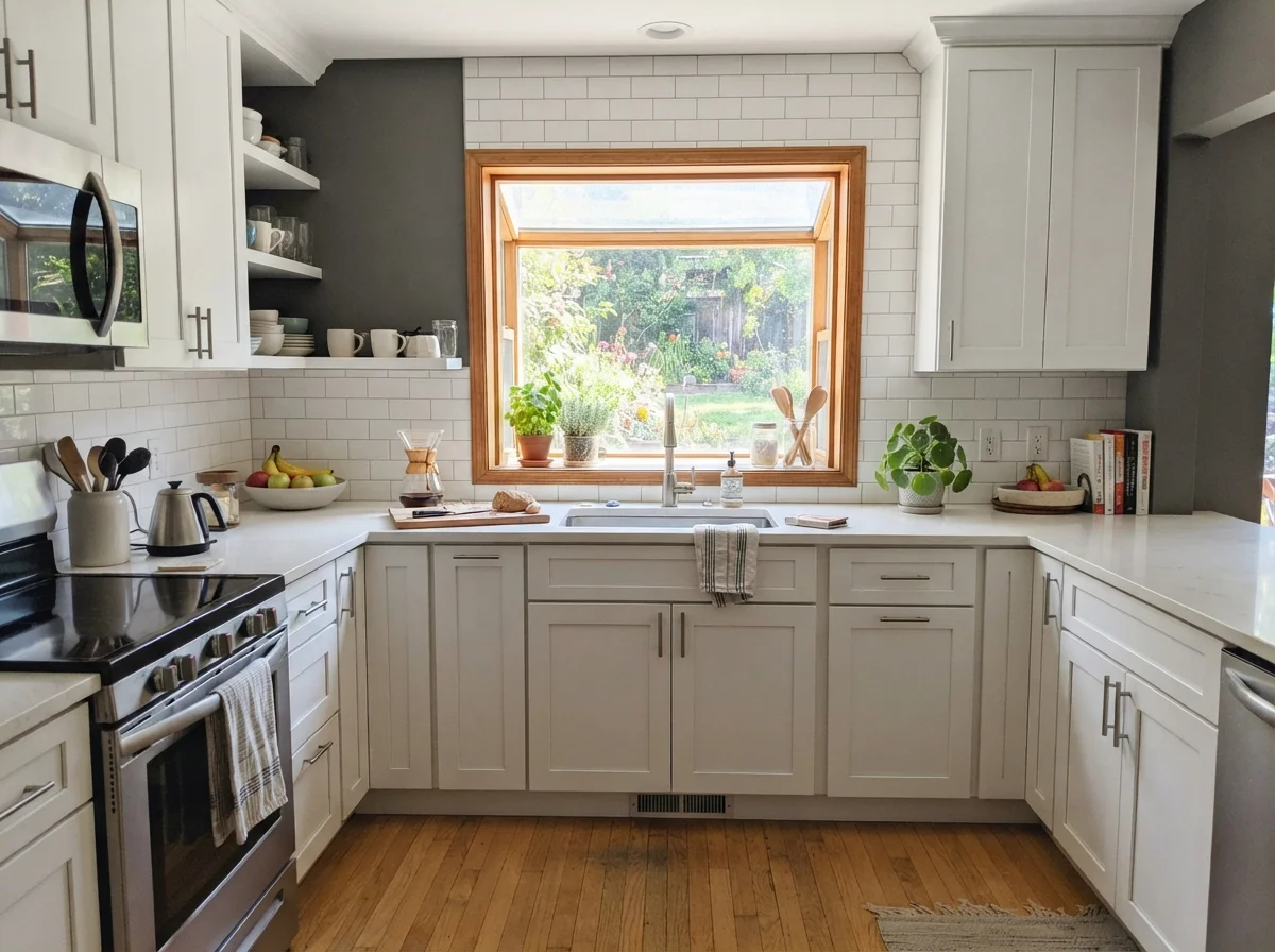
Not at all, especially on lower cabinets and kitchen islands. It provides grounding contrast against light quartz countertops and white upper cabinets without the starkness of pure black.
What paint sheen should I use for Kendall Charcoal on walls?
Use an eggshell finish for interior walls. Flat finish burnishes easily when cleaned, while semi-gloss on broad dark walls creates excessive glare and highlights drywall flaws.
Susan's Verdict · Worth the Money in Sunlit Rooms
Kendall Charcoal HC-166 is the deep neutral that earns its keep where natural light is plentiful. It gives you the drama of dark walls without the icy, cold hostility of slate or the funeral gravity of black. Put it on a study wall, a kitchen island, or your front door paired with warm brass and creamy trim, and it will look expensive for a decade. But keep it out of windowless, dim north-facing rooms where its warm soul gets lost in the shadows.