Color Diary · No. 114
Sherwin-Williams Sea Serpent and the Quiet Green Nobody Expects by Evening
The dark blue-green Sherwin-Williams quietly files as a neutral, reviewed honestly: the light that turns it teal, the light that turns it black, and what to pick instead.

Susan HartleyNovember 6, 2026 · 15 min read
Sea Serpent · Sherwin-Williams SW 7615
Hex#3E4B54LRV7Undertonesgreen → gray → blue
When we bought our 1990s colonial, the front study was painted an aggressive, bright cobalt blue. The previous owners had clearly bought into a weekend home makeover show and rolled on something loud that gave everyone an immediate headache. I tolerated it for about six weeks before I dragged my stepladder out. That room taught me an essential lesson about dark walls: if a deep color screams at you the minute you walk through the doorway, you will tire of it before the painter’s tape even cures. You want a dark color that sits back, lets your furniture do the talking, and only reveals its personality when the lamps come on.
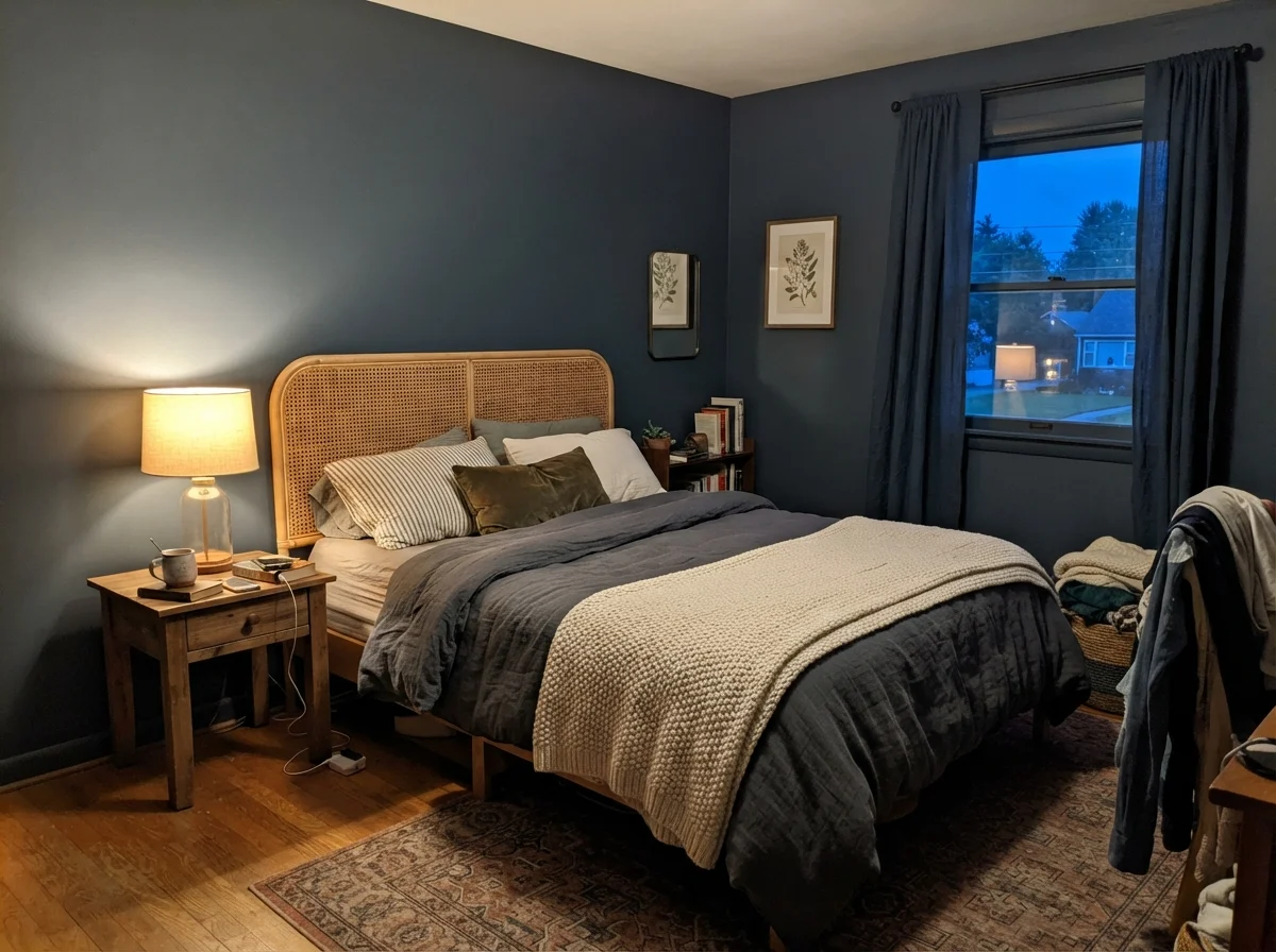
That search led me directly to Sherwin-Williams Sea Serpent (SW 7615). It has an LRV of 7, which puts it firmly in near-black territory on paper. Yet if you walk into the paint store and look up the deck, Sherwin-Williams does not shelve it under blues or greens. They catalog it as a neutral. That sounds absurd until you put it on four walls and live with it through an entire winter. It is built on a heavy slate-gray foundation with a strong green undercurrent running underneath the navy. In flat daylight it plays the quiet, understated anchor. In the evening under a warm table lamp, that green stirs up, and suddenly the walls look like polished, dark sea-glass.
Across thirty years and three houses—from our first 1970s split-level to our current 1960s ranch—I have repainted nearly every room at least twice. I have learned to judge paint by how it looks five years in, when the novelty has faded, the walls have been scrubbed clean around the light switches dozens of times, and the morning sun has done its worst. Sea Serpent is not a trend shade. It is a workhorse dark for people who want color without the theater.
Light Shifts: The Morning Awakening vs. Lamplight Warmth
The single biggest mistake people make with deep paints is judging the chip under the fluorescent strip lights of the retail counter. Sea Serpent reacts violently to lighting temperature. In early morning light or facing north, it can look surprisingly muted, pulling its gray spine forward until it reads almost like wet charcoal. If you were expecting a bright nautical navy, you might panic during that early breakfast coffee.
Wait until dusk before you make up your mind. When you turn on 2700K incandescent or warm LED bulbs, the yellow-red wavelength wakes up the green pigment. The room warms up by several degrees visually. It stops behaving like an imposing dark box and softens into an intimate, cocoon-like envelope. If you use harsh 4000K or 5000K daylight LED bulbs, do not blame the paint when your room feels like an interrogation cell—cool light flattens this shade right back into dead graphite.
In the Bedroom and Bath: Depth Without Claustrophobia
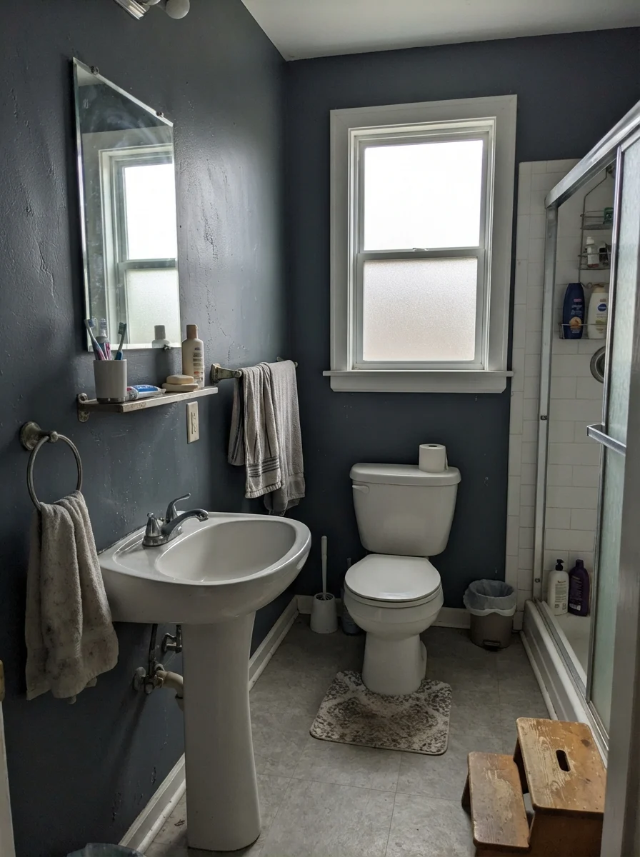
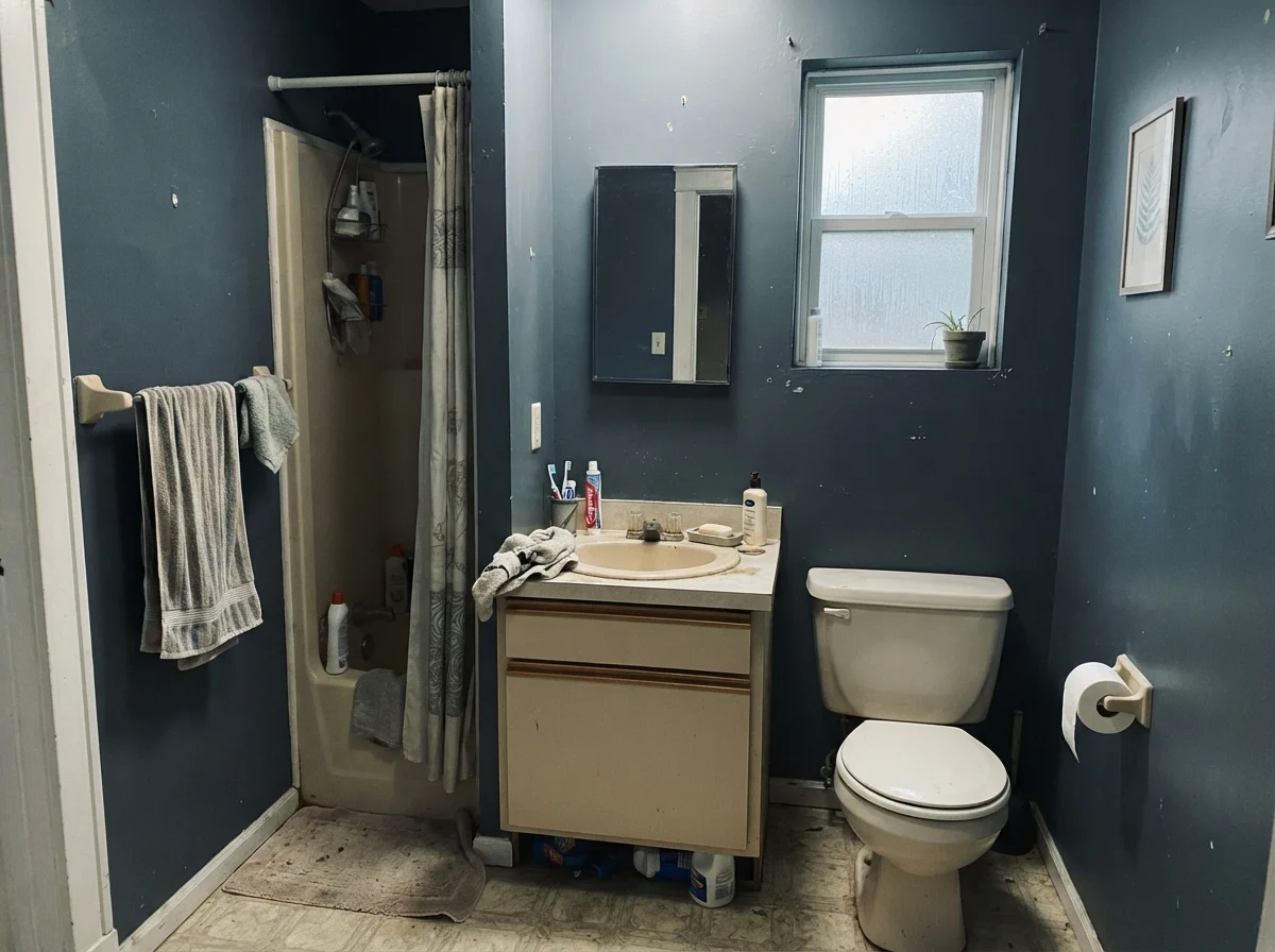
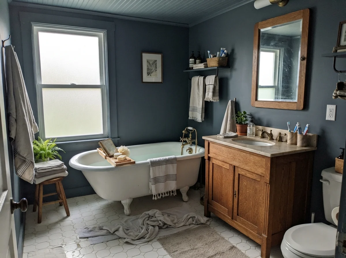
In our last house, our guest bathroom had no natural light whatsoever. Standard decorating advice insists that small, windowless rooms must be painted brilliant white to make them feel larger. I call that the hospital corridor effect. A tiny windowless powder room painted bright white just looks like a dingy closet with plumbing. When we rolled a deep slate-navy over the walls, the corners seemed to recede into soft shadow, making the small space feel deliberate, cozy, and high-end.
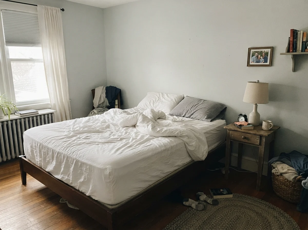
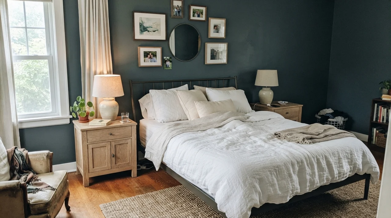
In a bedroom, Sea Serpent demands warm woodwork and clean, crisp bedding. If you throw beige or dingy taupe linens against this color, the room will look muddy. Stick to crisp white or natural unbleached cream linen, and bring in warm honey oak or walnut furniture. The contrast keeps the darkness feeling crisp and tailored rather than dreary.
Kitchens: Islands, Millwork, and the Cabinet Equation
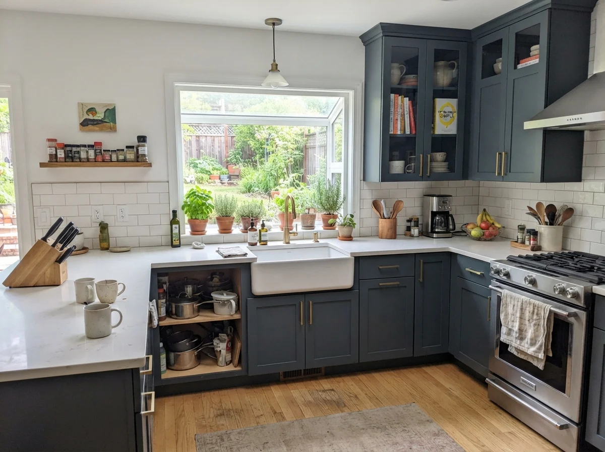
I am generally cautious about painting an entire kitchen in a color this deep unless you have floor-to-ceiling windows and ten-foot ceilings. In an ordinary family kitchen, wrapping every single upper and lower cabinet in Sea Serpent will swallow every lumen of ambient light you have. You will find yourself turning on task lighting at two in the afternoon just to slice an onion.
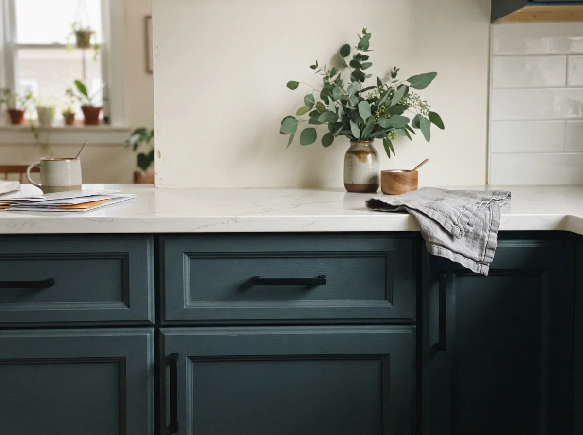
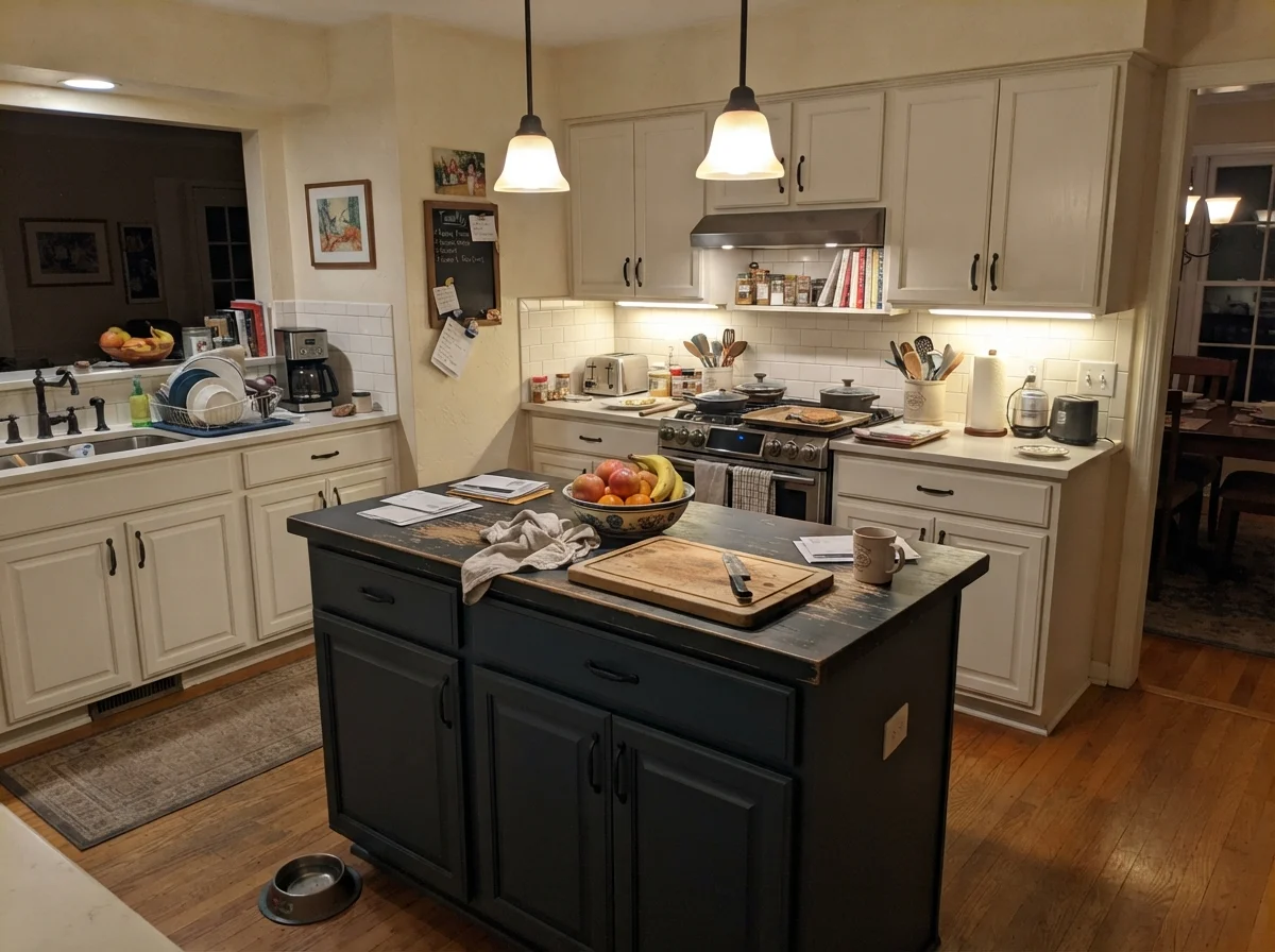
Where it is absolutely worth the money is on a kitchen island anchored beneath white perimeter cabinetry. It grounds the room without shrinking it. When grease splatters or grandchildren kick the back of the island seating with muddy sneakers, an LRV 7 surface forgives daily life in a way white paint never could. Just remember the sheen rule: use satin or semi-gloss for millwork and cabinetry. Eggshell on an island will burnish into an ugly patchwork of shiny spots the second you take a rag to it.
Living Rooms and Sunrooms: Handling Strong Sun
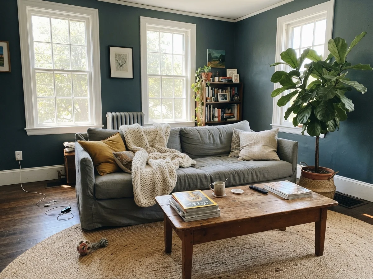
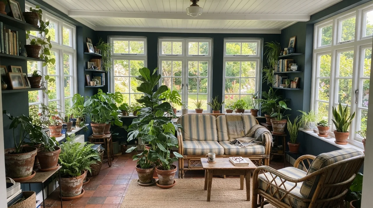
In bright midday sun, Sea Serpent reveals why designers reach for it over standard navies. Straight navy blue can look harsh and chalky under direct southern light, like an old wool blazer left out on a picnic table. Because Sea Serpent contains a dose of slate gray and green, direct sunlight doesn't wash it out—it just illuminates the teal undertone. In our 1960s ranch, southern windows make this color feel organic and architectural.
Pairing it with natural materials is the secret to keeping it approachable. Jute rugs, aged leather, rumpled linen upholstery, and terracotta planters prevent the room from looking like an uptight law firm conference room. The walls serve as a deep velvet backdrop that makes greenery and warm wood tones pop with surprising vibrance.
Kids’ Rooms, Nurseries, and Shared Family Zones
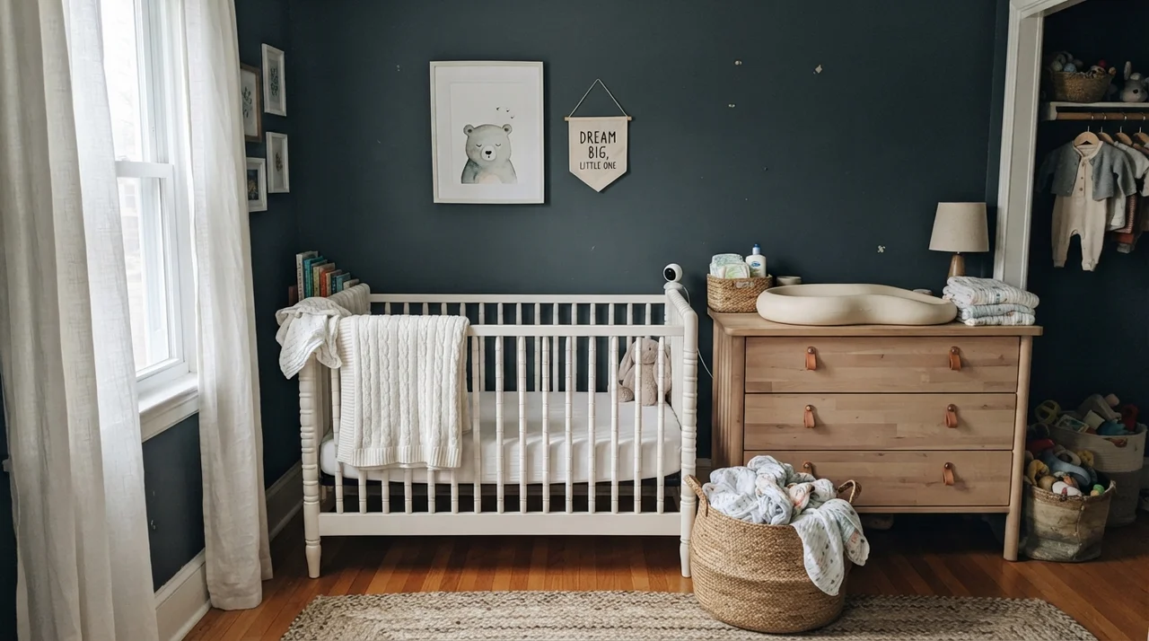
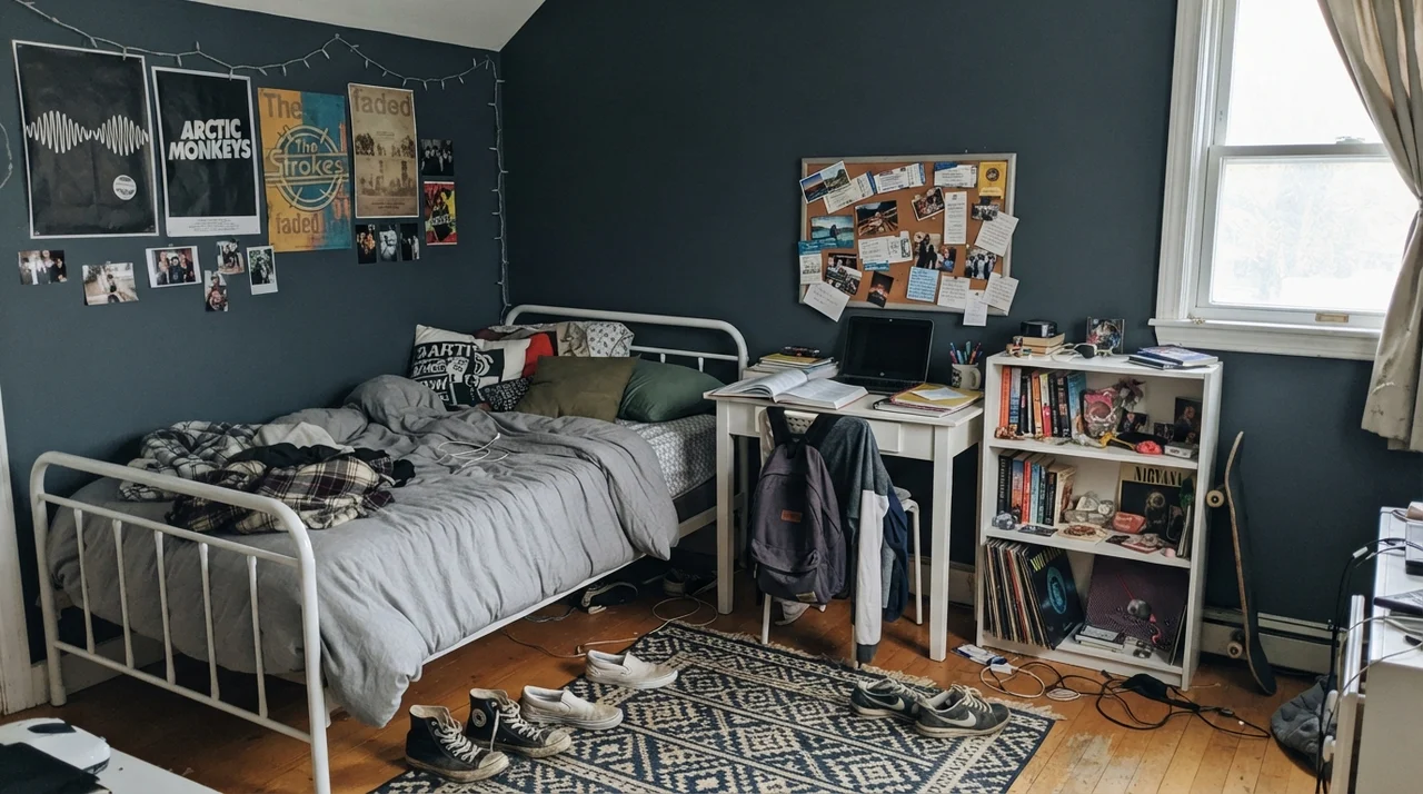
Most parents default to pastel blues or timid grays in children’s spaces, but those light pastel walls looked dated within two years of our kids growing out of toddlership. A deep, grounded slate-teal creates a restful, quiet nursery that transitions effortlessly into a teenager’s bedroom without requiring another weekend of rolling and taping when they turn thirteen.
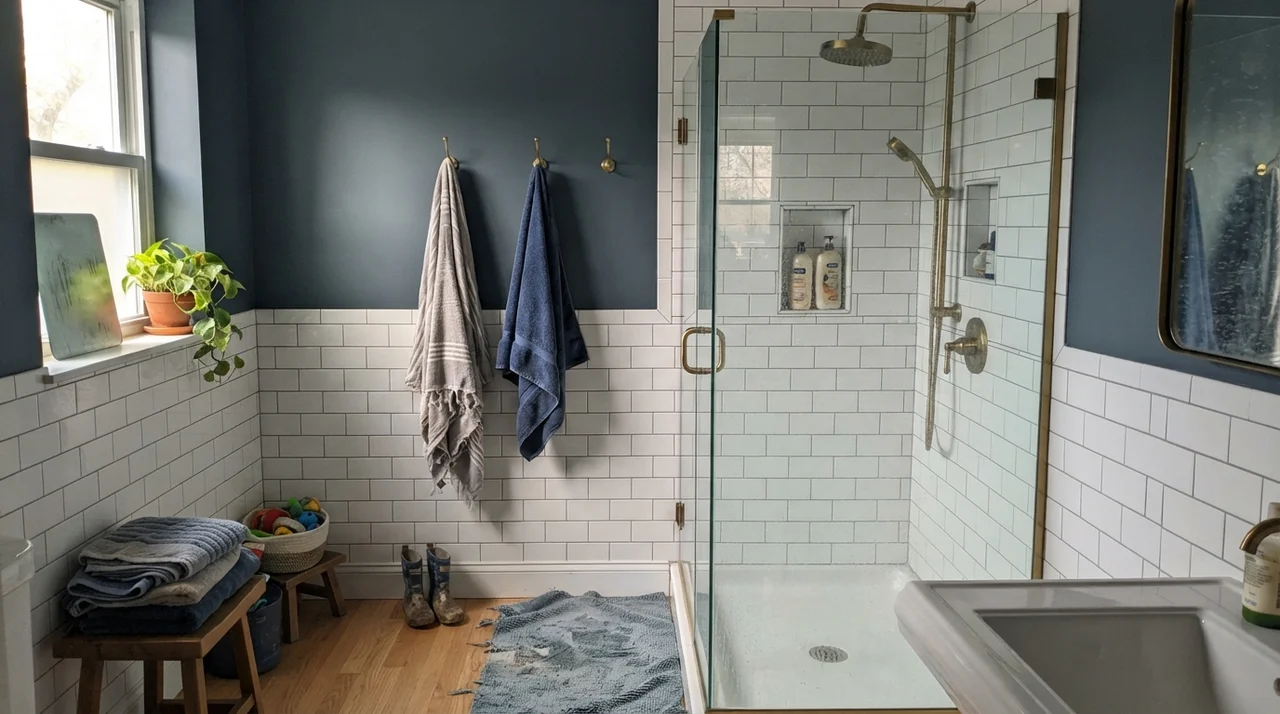
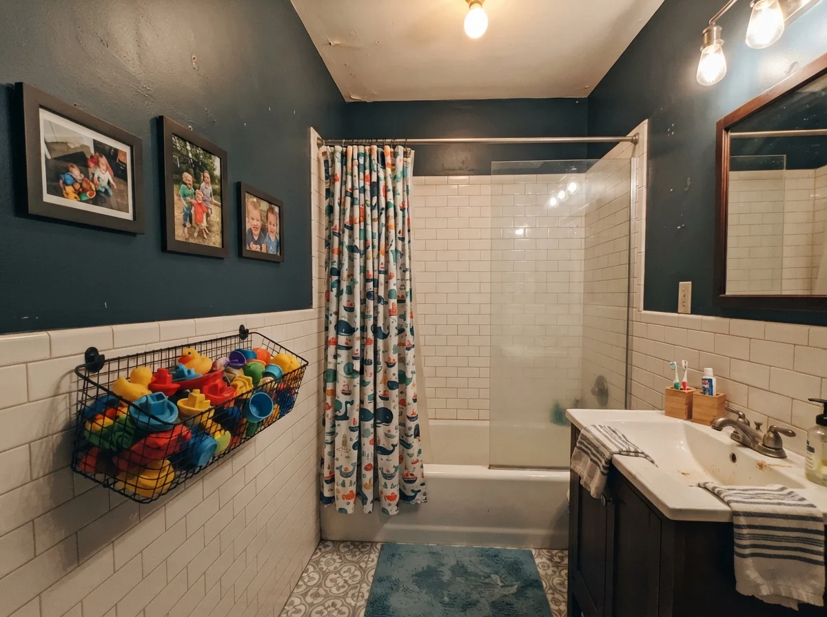
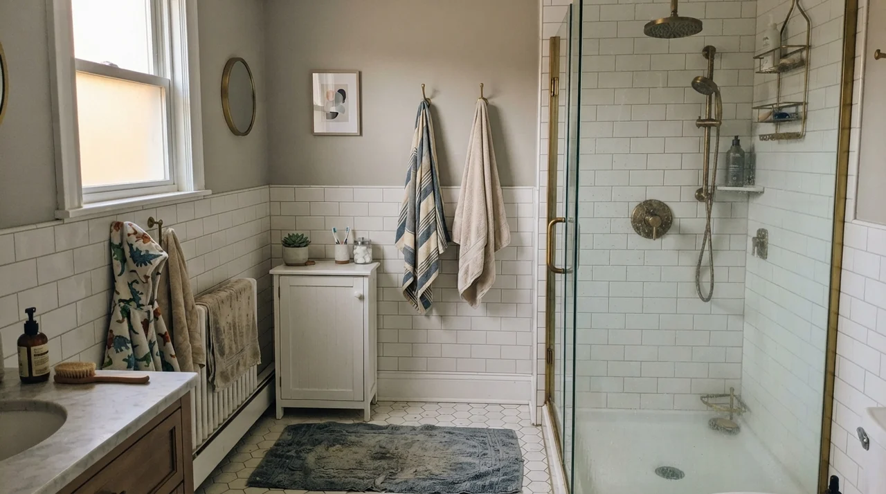
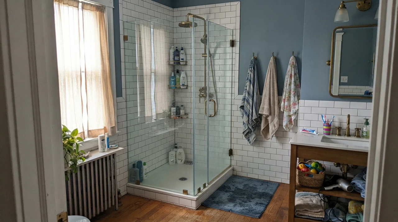
More importantly, dark colors in high-traffic family zones hide the scuffs, stray handprints, and backpack dings that leave pale walls looking battered within months. In our kids’ bathroom, pairing this shade with white tile wainscoting gave us the best of both worlds: washable porcelain down low where splashes occur, and rich, durable color up top that never felt childish.
Utility Spaces, Doors, and Exterior Siding
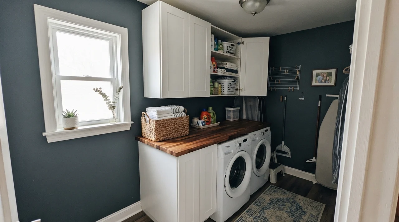
Utility rooms are where paint choices are truly tested. In a compact laundry room with decent natural light, Sea Serpent turns a purely functional chore room into a space that feels intentional and tailored. It frames clean white appliances and natural butcher block counters beautifully.
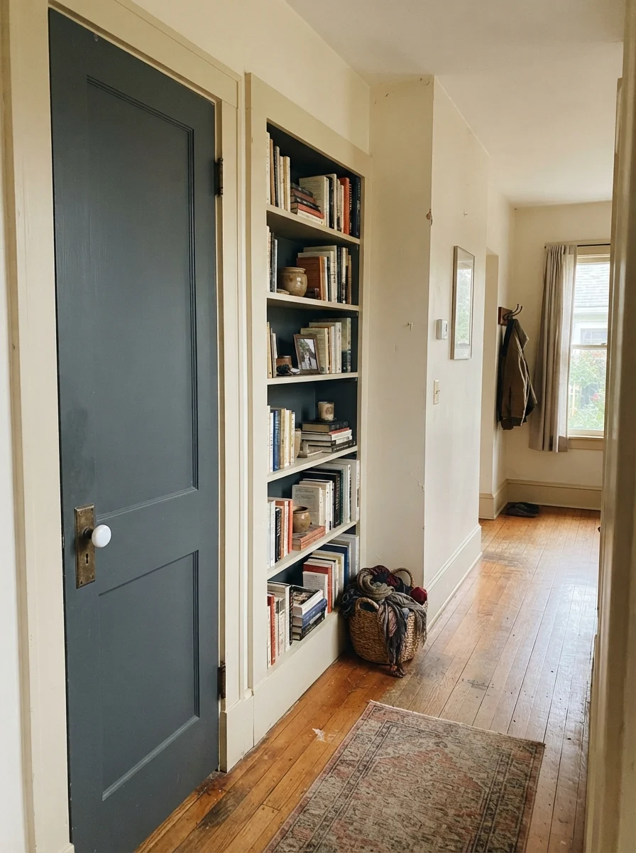
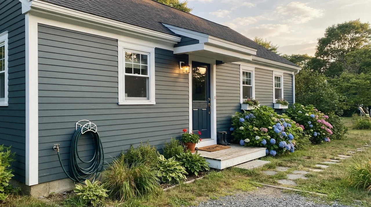
If you are nervous about painting an entire room, try using it on architectural details. A single interior door, a set of French doors, or built-in bookshelves painted in Sea Serpent against creamy off-white walls delivers high-impact architecture without overwhelming the hallway. On home exteriors, the color reads deeper and more substantial than standard exterior blues, though you must sample it against your siding on both the north and south exposures before committing to thirty gallons.
The Honest Fail: Where This Color Falls Flat
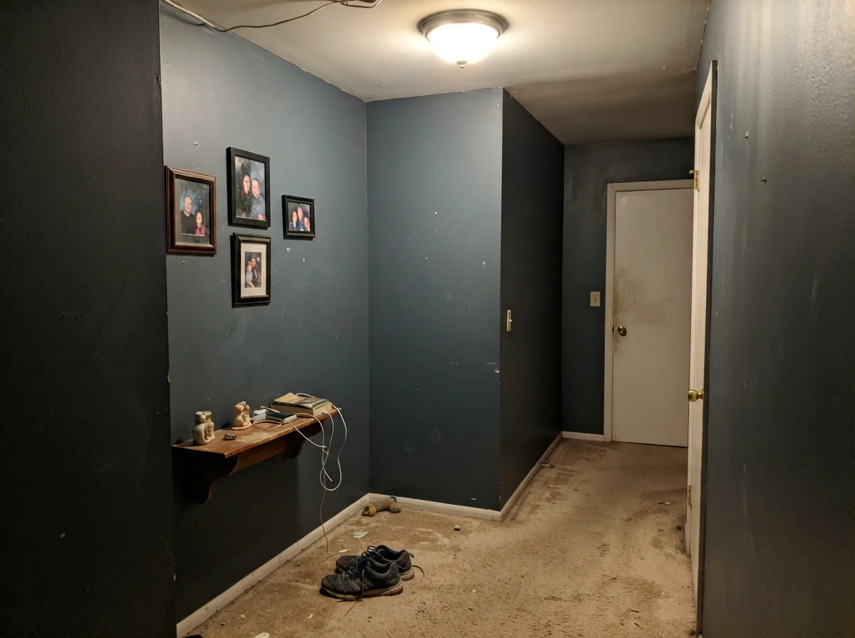
Almost every disappointed homeowner review of Sea Serpent comes down to one predictable mistake: painting it in a dim, north-facing space without adequate artificial lighting. When there is no sunlight to wake up the teal, and no 2700K lamp to bring warmth into the room, this paint collapses into a flat, dreary, featureless near-black. It stops reading as a rich blue-green neutral and begins to resemble dirty chalkboard slate.
The second trap is skimping on preparation. At LRV 7, you cannot slap this color over an existing builder-beige or white wall with standard white primer. If you skip a gray-tinted primer, you will get streaky, translucent patches that require three or four coats to cover, and you will blow your painting budget before you finish the first room. Buy the gray primer, apply two solid coats, and give the room real lighting.
Durability, Scrubbing, and Resale: The 5-Year Reality
Here is what happens five years in with a dark color like Sea Serpent. With an LRV of 7, ordinary dust, dog hair, and minor drywall scuffs can show up if you choose the wrong sheen. Flat finish on a dark wall is an absolute nightmare: touch it with a dry thumb and you leave an indelible mark, and trying to scrub it clean leaves a permanent burnished shiny patch. For walls, stick strictly to eggshell. It gives you enough washability to wipe away fingerprints without turning your wall into a plastic mirror.
When we sold our 1990s colonial, our dining room was painted in this exact shade of deep slate-teal. The listing agent originally warned me that dark walls turn off buyers. But because the room had crisp white painted molding, a warm chandelier, and gleaming oak floors, every single person who toured the house commented on how sophisticated the room felt. When we sold, the buyers actually wrote into their offer asking for the paint formula so they could touch up the baseboards. A deliberate dark color that behaves like a neutral is always worth the money—it held up through five years of family dinners and helped us command top dollar.
A dark wall should never yell the minute you enter the room. Sea Serpent sits back, anchors your space, and lets warm lamplight do the work.
Is Sherwin-Williams Sea Serpent considered a true navy?
No. Sherwin-Williams actually classifies it as a neutral because of its heavy gray base. While it functions as a navy in many rooms, it carries a pronounced green undercurrent that pulls it toward deep slate-teal under warm lighting.
What lightbulbs should I use with Sea Serpent?
Stick to 2700K warm white bulbs. The warm yellow-red light brings out the hidden green-teal undertone and makes the room feel cozy. Cool 4000K or 5000K daylight LEDs will wash out the color and leave it looking like cold, flat charcoal.
Do I really need a gray primer before rolling Sea Serpent?
Yes, absolutely. At LRV 7, rolling this saturated color directly over white primer or light builder-grade walls will result in streaky, translucent patches. A gray-tinted primer ensures rich, uniform coverage in two finish coats.
What paint sheen works best for walls in Sea Serpent?
Eggshell is the sweet spot for living rooms, bedrooms, and dining spaces. Flat or matte finishes on dark paints burnish easily when wiped, while satin on large drywall expanses can cause distracting light glare.
Will painting a small powder room in Sea Serpent make it look smaller?
No, it does the opposite. In a small, windowless space, deep colors blur the corners of the room and make the walls recede. Paired with warm lighting and a framed mirror, it turns an ordinary powder room into an intentional jewel box.
Susan's Verdict · A Working Dark Neutral
If you want a bold, electric jewel-tone teal, or an unmistakable nautical navy that never wavers, look elsewhere. But if you want a handsome, forgiving dark color that provides depth without shouting, Sherwin-Williams Sea Serpent SW 7615 is worth every penny. Give it warm 2700K lamps, pair it with natural oak or walnut, always roll it over a gray-tinted primer, and let its quiet green undercurrent anchor your home for the next ten years.