Color Diary · No. 112
Holding Out for Weathered Slate with Benjamin Moore Van Courtland Blue
The Historical Collection blue-gray builders quietly reach for on front doors and cabinets, reviewed honestly: the light where it turns true blue, the light where it goes green, and what to pick instead.

Susan HartleyNovember 6, 2026 · 19 min read
Van Courtland Blue · Benjamin Moore HC-145
Hex#86989ELRV31Undertonesslate gray → teal-green → smoky blue
In our last house—a center-hall colonial built in the mid-1990s that we spent twelve years gradually de-brassing and peeling wallpaper out of—I learned a blunt truth about blue paint. If you pick a blue that looks cheerful on a two-inch paper swatch under fluorescent hardware store lighting, it will almost certainly scream at you from the wall like a preschool nursery by noon on a Saturday. Real blue has a way of magnifying itself once you put two coats across twelve linear feet of drywall. What seemed like a polite country whisper on cardstock turns into a megaphone on the plaster.
That was how I originally met Benjamin Moore Van Courtland Blue (HC-145). It was the spring of 2004, and I was on my third sample pot trying to find a color for the mudroom door and the powder room wainscoting that didn’t make the room feel like an advertisement for nautical bath towels. The counterman at our local paint shop pushed the Historical Collection fan deck across the counter, tapped his finger against HC-145, and told me to stop looking at the standard blue racks altogether. He said builders and older painters had been using it for decades whenever an architect demanded a blue that didn’t behave like a nursery pastel.
I took that quart home, brushed two coats onto an old pine board, and leaned it against the wainscot. At first glance, I wasn't even sure it was blue. In the shade by our side porch door, it looked like a chunk of wet Atlantic slate with a handful of soot thrown in. But thirty minutes later, when the mid-morning sun bounced off the grass and through the window, the gray stepped back and this gorgeous, historic, restrained blue-green surfaced. We lived with it in that powder room for nearly a decade. When we sold that house, the buyer specifically asked for the paint code for that half-bath and the front exterior door before closing. That is the kind of staying power I pay attention to.
The Anatomy of an Ambiguous Blue
Van Courtland Blue sits at a Light Reflectance Value (LRV) of 31. To give you some context from someone who has repainted every room in three different houses across thirty years, an LRV of 31 places a paint squarely in the lower-middle territory. It is not a moody, near-black navy like Hale Navy or Van Deusen Blue, which drop down near the low teens and absorb light like a wool coat. But it is also nowhere near the airy, chalky territory of something like Woodlawn Blue up at 61. At 31, a pigment carries genuine weight. It doesn’t wash out when bright sunshine floods through a window, but it doesn't swallow a room whole either.
What makes Van Courtland Blue fascinating—and occasionally maddening to homeowners who don't sample properly—is that it belongs to Benjamin Moore's teal deck family. That does not mean it looks like a 1980s Florida sofa. Rather, it means that beneath the heavy veil of charcoal gray that keeps it calm, there is a stubborn drop of green fighting with a drop of blue. That tension is why so many people can't agree whether their walls are slate, smoky blue, or weathered sea glass. Most colors that people call 'timeless' have an identity crisis under different lamps, and this one is no exception.
Watching the Daylight Move: Morning to Evening
Here is the warning I give anyone who asks about this shade over the back fence: you cannot judge Van Courtland Blue at three in the afternoon and assume you know what it will do at breakfast. In warm east morning light, that green undertone wakes up with a vengeance. For about forty-five minutes after sunrise, the low, warm angle of the sun hits those gray pigments and pulls forward a unmistakable teal-green cast. If you were expecting baby blue or clean denim, that 8:00 AM window will make your heart skip a beat.
By noon, when direct overhead daylight washes into the room, the green steps back and the slate cleans up into a crisp, historic sky blue. Then, as the sun falls into the west and dusk sets in, the paint quietens down into an architectural, shadowy blue-gray. If you flip on a standard 2700K warm lamp, the warmth softens the slate and keeps the mood cozy. If you run harsh cool white bulbs, however, it pulls the paint right into flat battleship territory. (And believe me, after three houses and thirty years of repainting, my tolerance for mysterious undertones that misbehave before breakfast is exactly zero, so test this on your actual wall first.)
How It Behaves in Bathrooms and Water Closets
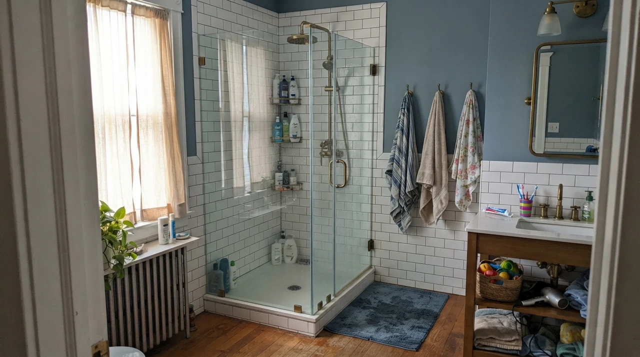
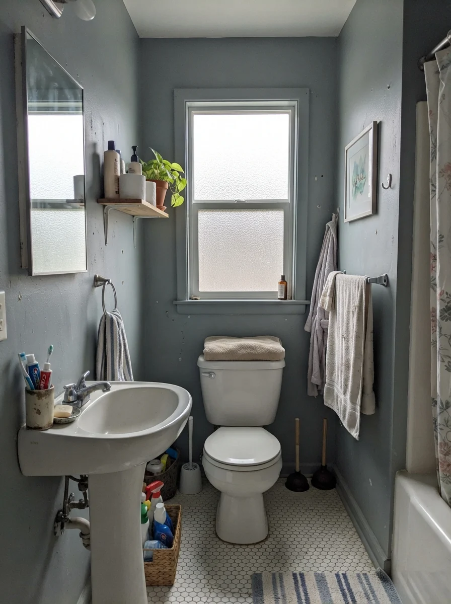
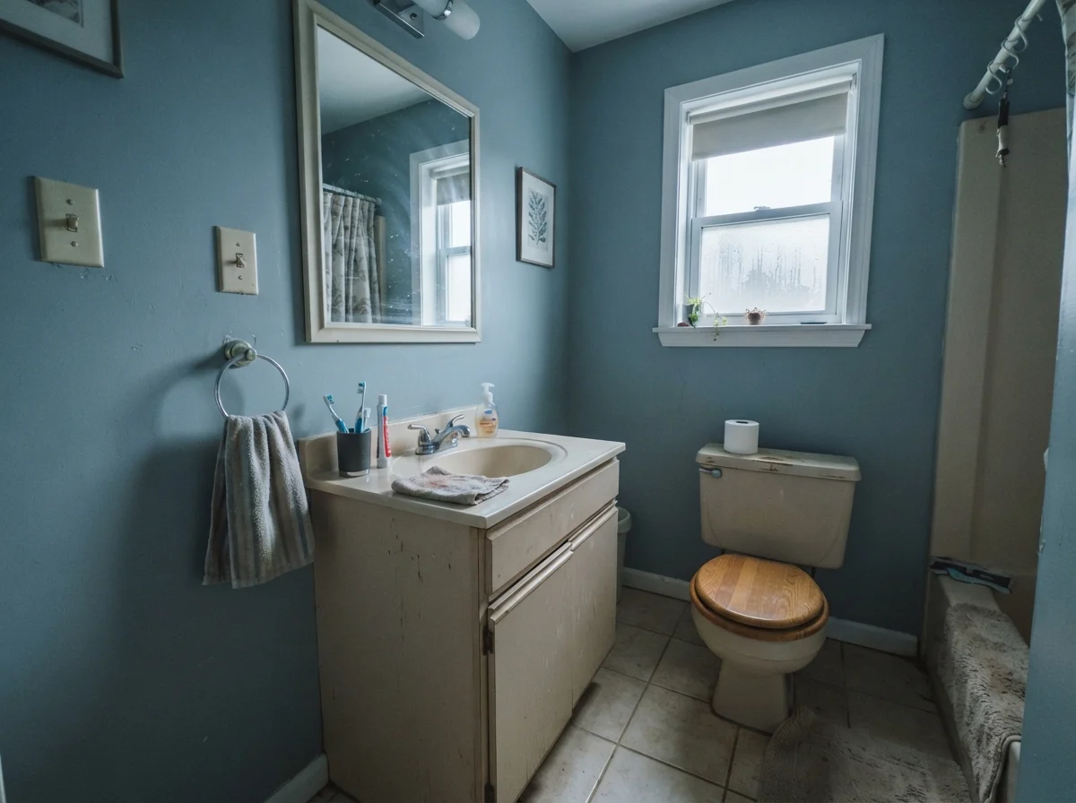
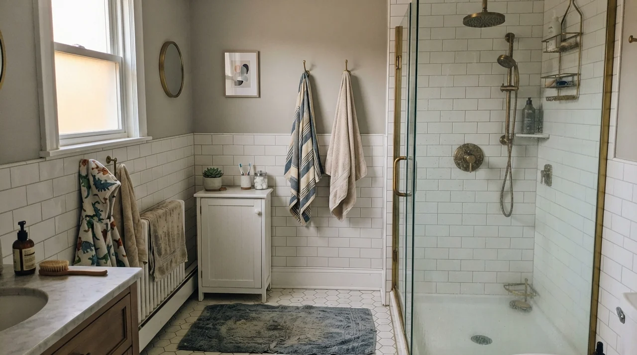
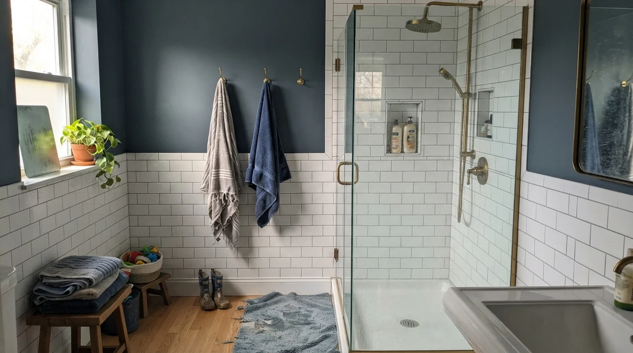
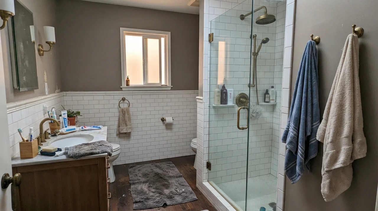
Bathrooms are where this color made its early reputation, and it remains one of the safest bets you can make in a half-bath or guest washroom. In a smaller room, an LRV 31 paint creates a jewel-box feeling without turning the space into a cave. Because bathrooms are almost always dominated by white porcelain, bright chrome or brass, and white ceramic tile, the walls don't have to carry the whole burden of bouncing illumination around. Instead, the paint acts as a deliberate, tailored frame for the fixtures.
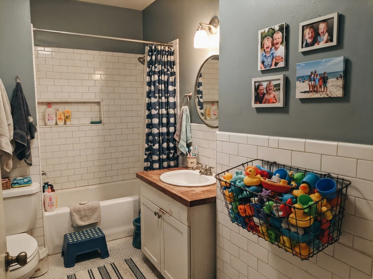
I especially like it above wainscoting or subway tile. When you pair Van Courtland Blue with bright white tile, the high contrast forces the paint to declare its color identity. The white makes the wall read decisively as a tailored colonial blue rather than a muddy neutral. However, how the bathroom is lit matters immensely. If you have flat, overcast skies through frosted glass, expect the paint to lean heavily into its gray backbone. On rainy days, it will feel quiet, cool, and subdued—never dreary, but certainly closer to stone than sky.
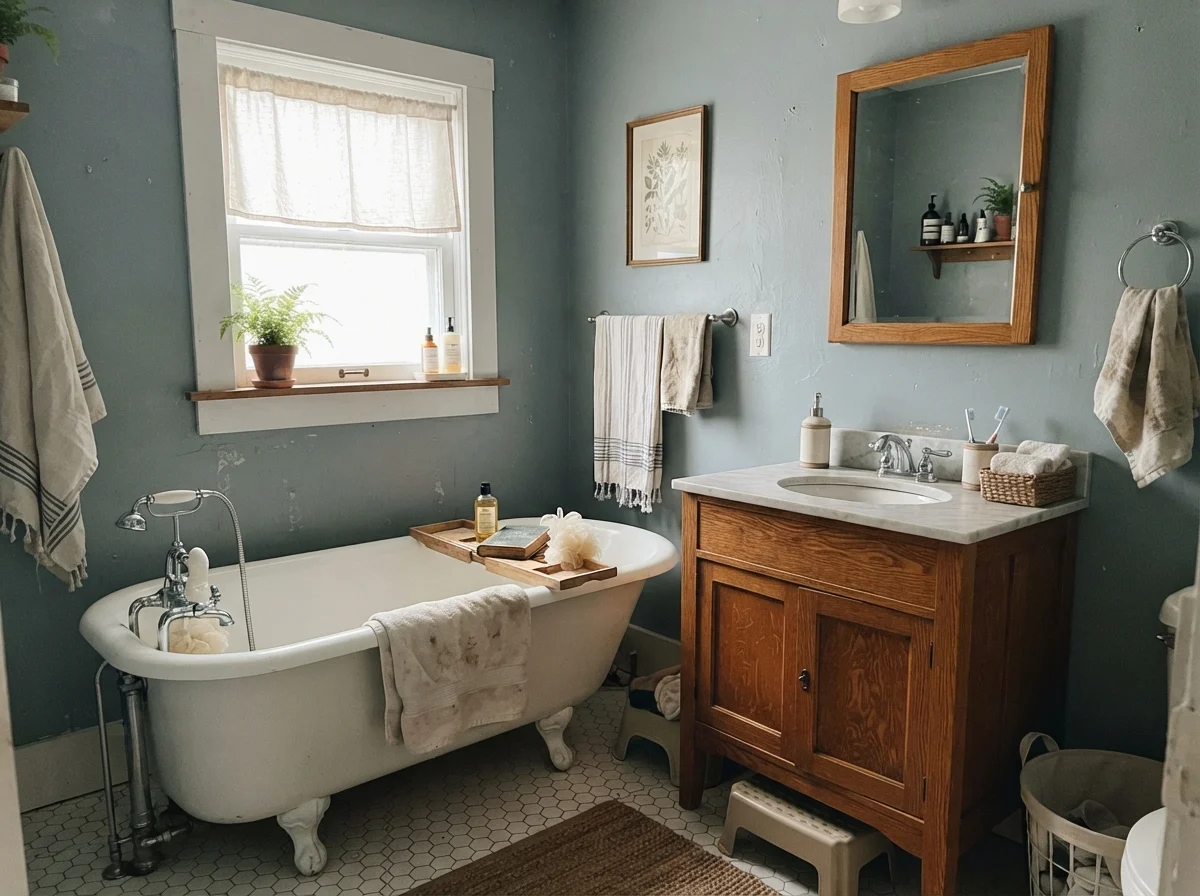
When you introduce warm wood tones into a bathroom—like a vintage oak washstand or vanity—you have to proceed with caution. Van Courtland Blue handles weathered, medium, or pale white oak beautifully because those woods lean neutral or slightly ash. But if the wood has an intense orange cast, the complementary color dynamic kicks in: the wood turns more glaringly orange, and the paint pushes harder toward its green-teal edge. In a cottage bath with white hex floors and balanced daylight, though, that interplay settles down into something relaxed and lived-in.
It also handles the chaos of everyday family life surprisingly well. In a kids' bath full of plastic bath toys and steamy splash sessions, an eggshell finish in this shade conceals small water streaks far better than a pale off-white ever could. Five years in, when you've scrubbed clean the area behind the towel bar forty times, the depth of pigment hides the wear instead of polishing to a shiny bald spot.
At an LRV of 31, Van Courtland Blue doesn't wash out when bright sunshine floods through a window, but it doesn't swallow the room whole either.
Bedrooms, Nurseries, and the Need for Daylight
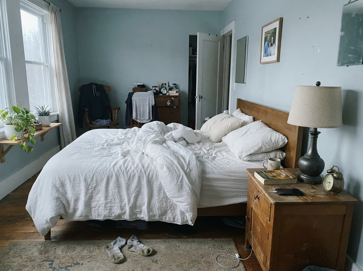
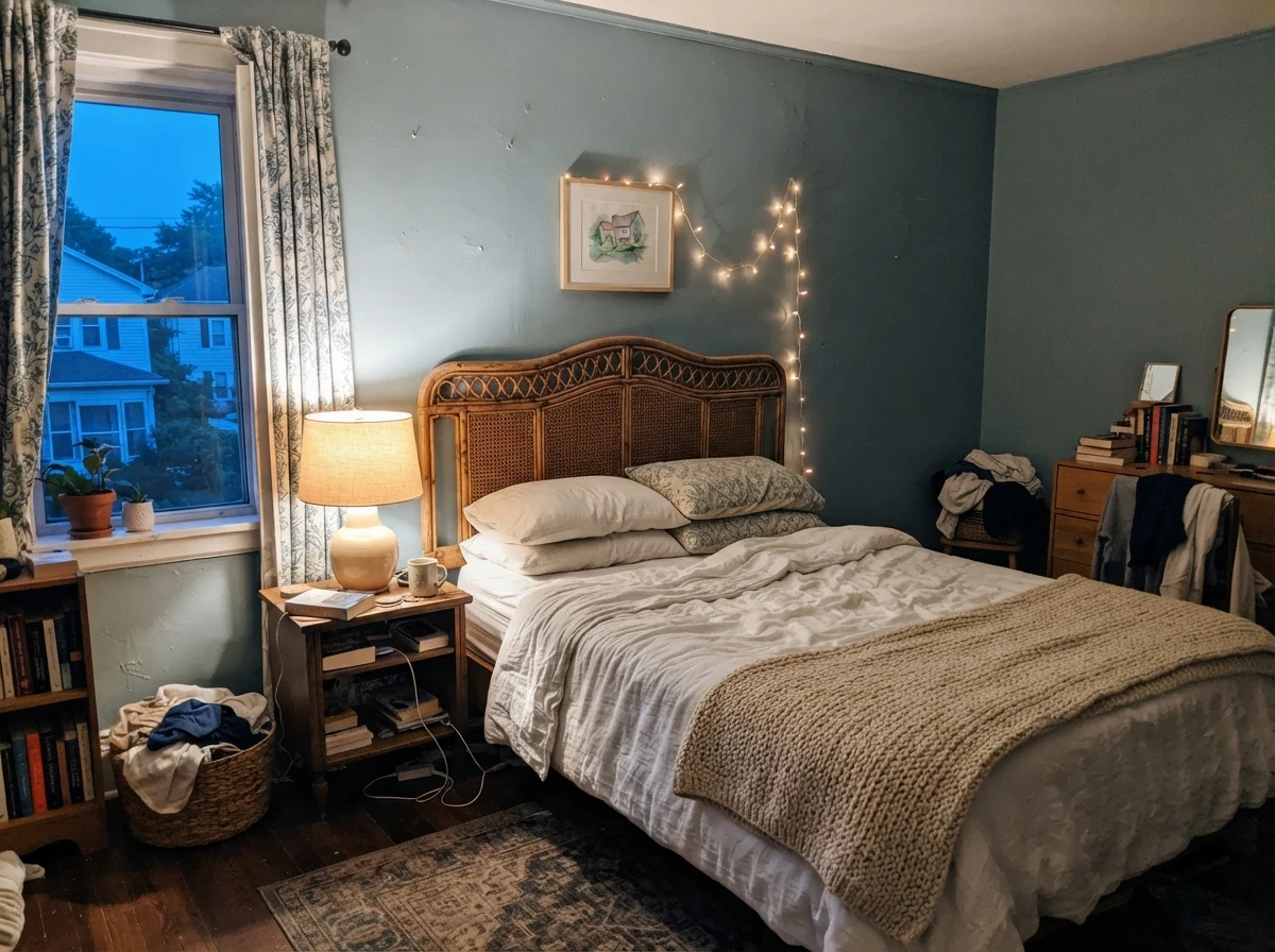
In a bedroom, your primary goal is usually rest, not stimulation. Many homeowners look at dark navy for bedrooms because it feels dramatic in magazine spreads, but living with near-black walls through a long winter in an older house can feel oppressive. Van Courtland Blue gives you the depth and quiet dignity of a historic blue without making you feel like you are sleeping inside an inkwell.
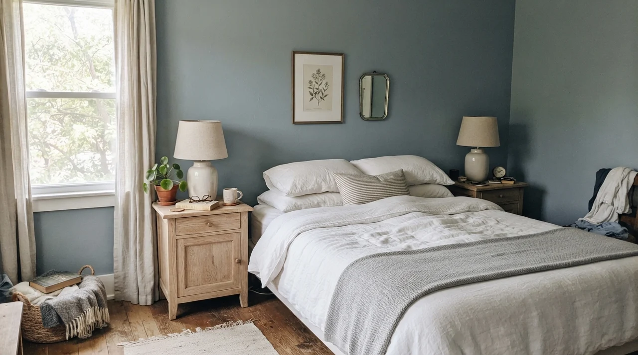
In our current 1960s ranch, I tested this color in our guest room. Paired with crisp white linen sheets, pale natural oak nightstands, and ceramic lamps, it creates a serene, grounded backdrop that never feels gimmicky. It doesn't look dated within a few seasons because it skips the trendy powdery pastels that come and go every four years. It simply looks like a color that has always belonged in the house.
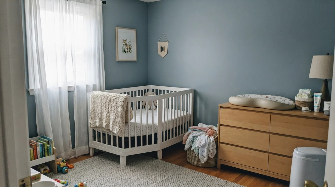
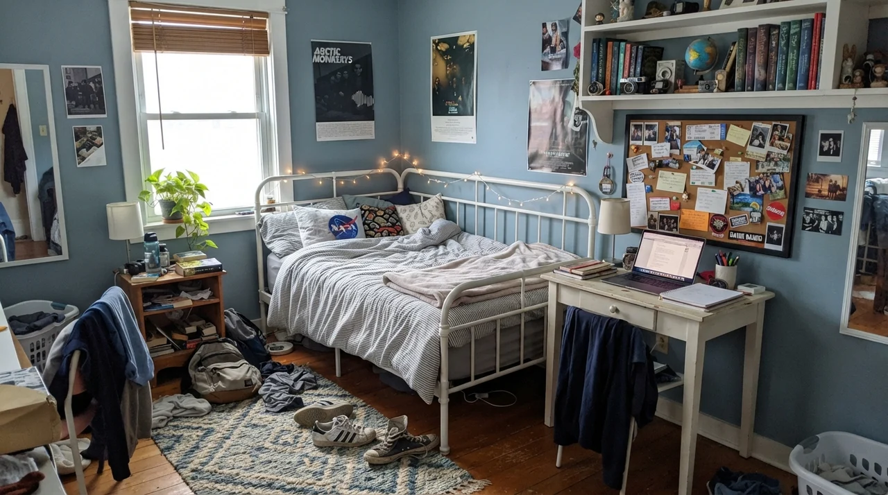
It also crosses over into nurseries and teenagers' rooms with surprising grace. Most parents pick baby blues that feel obsolete the minute their child turns seven. Because Van Courtland Blue is muted by so much charcoal slate, a room painted in this shade grows up seamlessly. It looks sweet behind a white crib with knit blankets, but it looks equally sharp a decade later behind a white metal bed frame, open bookshelves, and school clutter.
Cabinets, Islands, and Millwork: Where It Truly Earns Its Keep
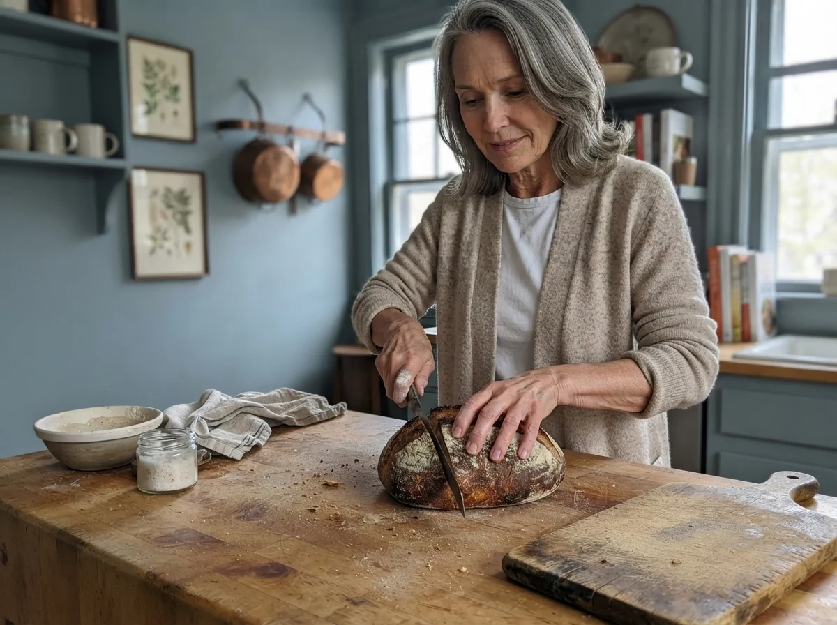
If you ask a custom cabinetmaker which mid-tone blues they spray most often, Van Courtland Blue will inevitably make the top three. Paint companies churn out hundreds of brilliant blues every season, but when someone is dropping fifteen thousand dollars on custom kitchen cabinetry, they almost always retreat to the Historical Collection. There is a good reason for that: cabinet paint is an expensive, permanent commitment. You cannot simply roll over cabinet enamel on a free Sunday afternoon.
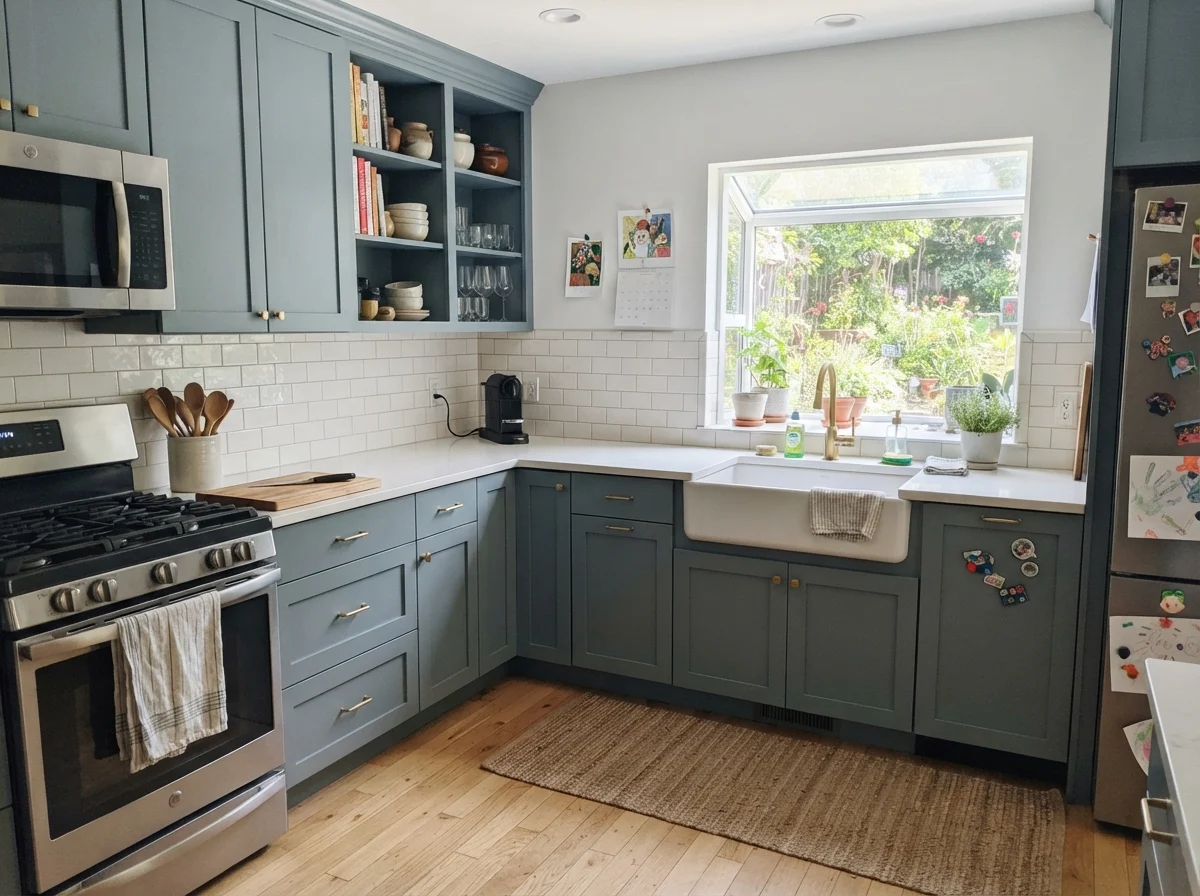
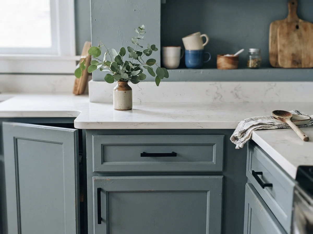
On a full run of shaker cabinetry, Van Courtland Blue reads tailored, substantial, and architectural. In satin finish, it reflects just enough ambient light to show off the door stiles and rail details without flashing glare. Against white quartz countertops, clean white subway tile backsplashes, and unlacquered brass hardware, it creates a kitchen that could belong to a 1920s pantry or a freshly built custom home. It avoids looking like an accent trend because it feels rooted in traditional millwork.
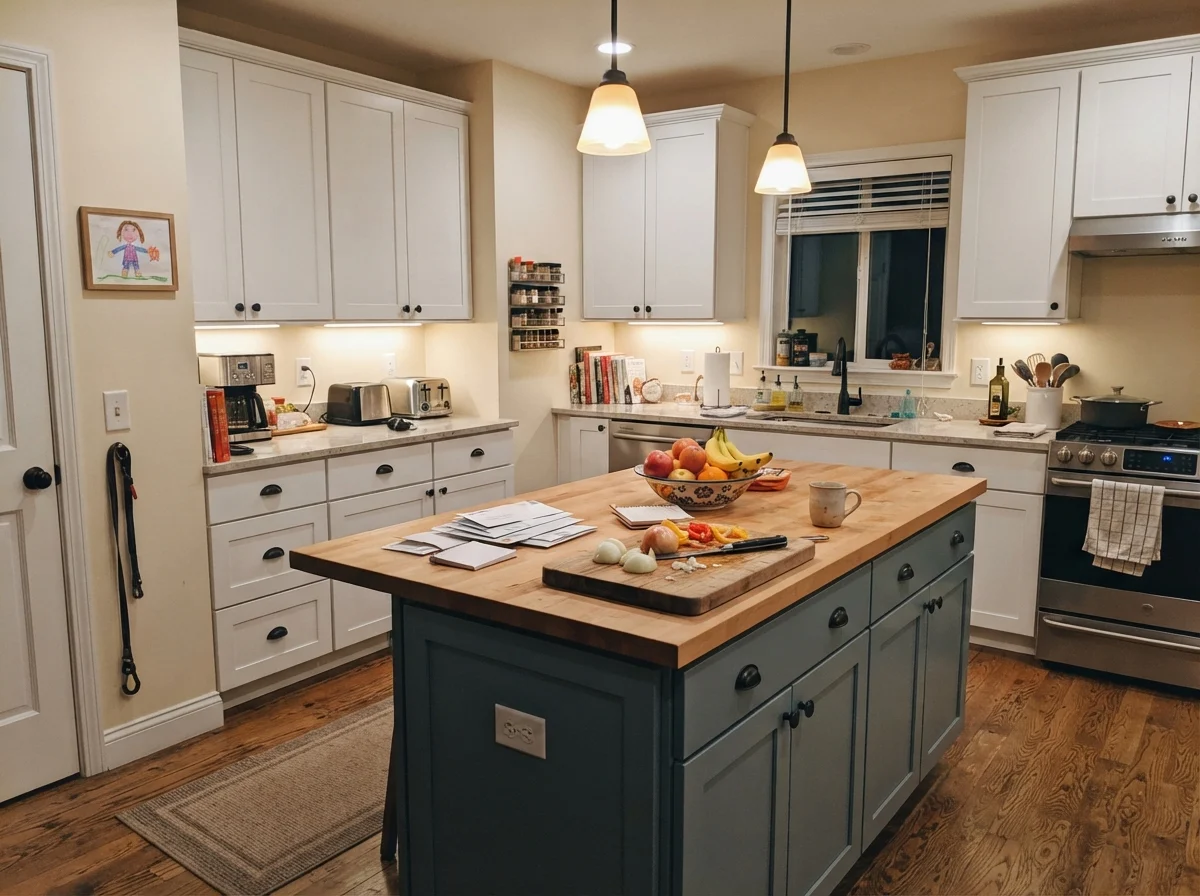
For homeowners who are hesitant about painting every cabinet box in the kitchen, anchoring just the island with this shade is one of the smartest budget decisions you can make. It breaks up an all-white kitchen without making the room feel choppy. Because the surrounding perimeter cabinets stay white or soft cream, the space remains light and open, while the island takes the daily scuffs, kicks, and backpack thumps without showing every speck of dust. In our 1970s split-level years ago, an island painted in a deep mid-tone like this saved me hundreds of hours of wiping down shoe scuffs.
Living Rooms, Sunrooms, and Open Expanses
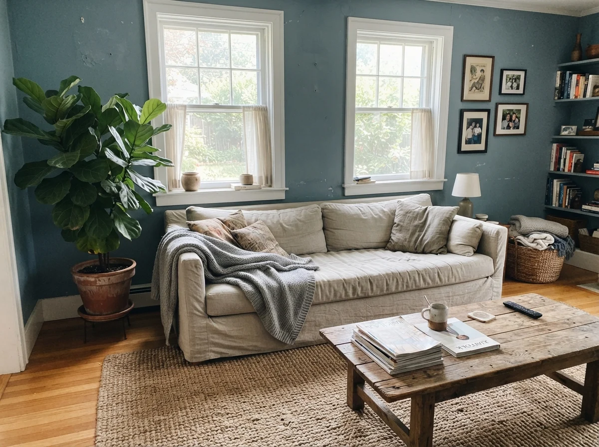
Rolling Van Courtland Blue across an entire open living room requires real conviction—and the right windows. In a room that receives generous midday sun from multiple large windows, the walls take on an easy, expansive confidence. The natural daylight keeps the charcoal undertone from settling too heavily, allowing the blue to breathe. When paired with natural textures—like a jute rug, a rumpled linen sofa, and warm wooden tables—the space feels collected rather than styled for an afternoon catalog shoot.
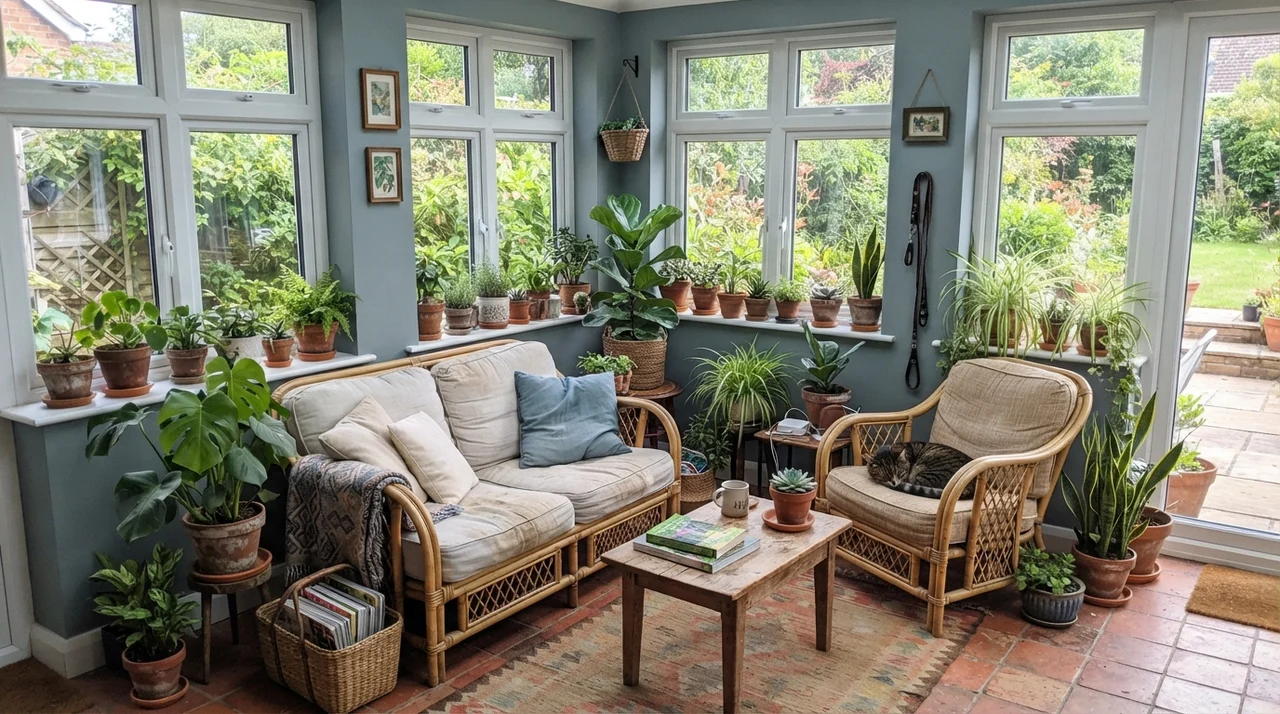
In a sunroom lined with white window frames and terracotta pots, the green lean in this paint actually works to your advantage. Surrounded by natural outdoor greenery and filtered garden light, the subtle teal-slate undertone bridges the gap between indoors and outdoors far more comfortably than a pure nautical navy ever could.
Doors, Built-ins, and Small Workhorses
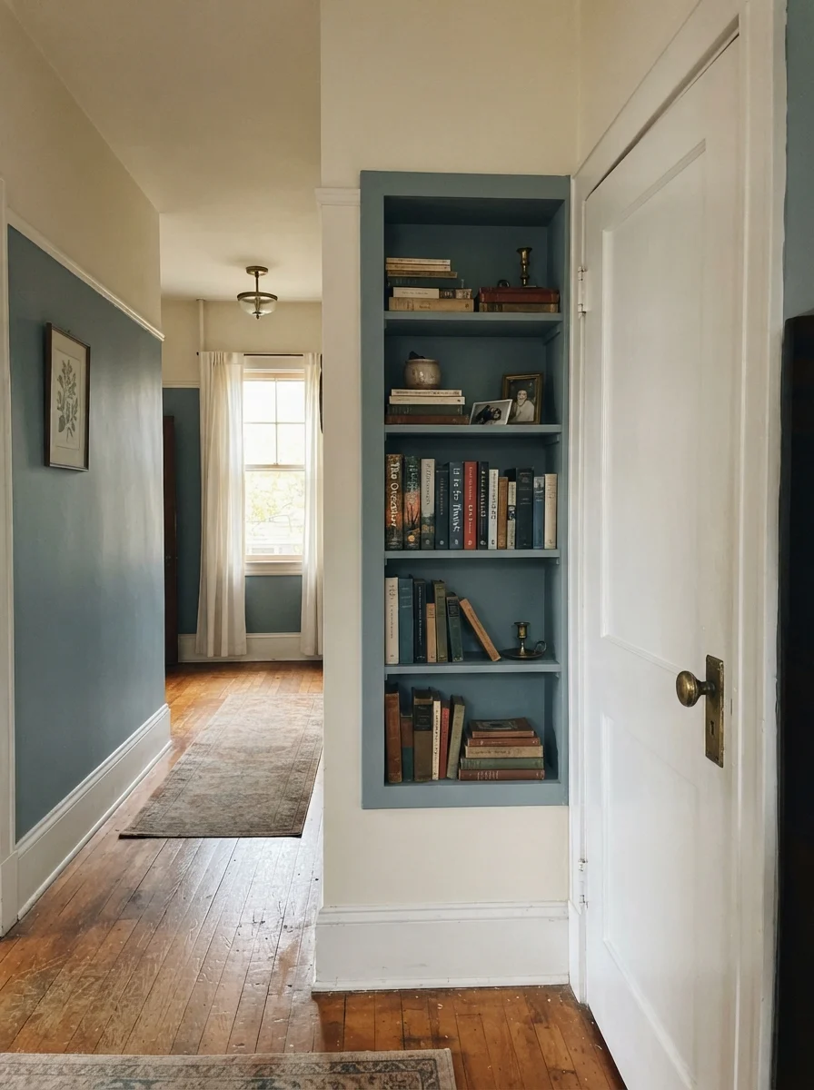
If you don't want to repaint four walls, interior millwork is where you should put your money with this paint. In our 1990s colonial, interior hallway doors were hollow-core builder specials that felt cheap no matter how clean they were. Replacing eight interior doors was simply not worth the money at that stage of our lives. Instead, I prepped them thoroughly, primed them, and rolled two coats of Van Courtland Blue in satin over the door slabs and nearby built-in shelves against creamy white hallway walls.
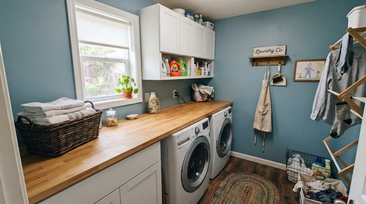
The transformation was immediate. An interior door painted in this tailored slate blue gives an otherwise plain hallway an architectural spine. It turns an afterthought passageway into something deliberate. The same holds true in a small, hardworking laundry room. When you pair this wall color with butcher-block counters, white overhead cabinets, and clean white appliances, the laundry room stops feeling like a chore closet and begins to feel like a proper scullery.
Where Van Courtland Blue Fails (and Why)
Now we need to talk honestly about the rooms where this paint will break your heart. Almost every disappointed email I receive about Van Courtland Blue comes down to one of two structural mismatches: light starvation, or a terrible fight with golden wood flooring. Neither is the fault of the paint can; it is the homeowner asking an LRV 31 green-slate to do a job it was never engineered to do.
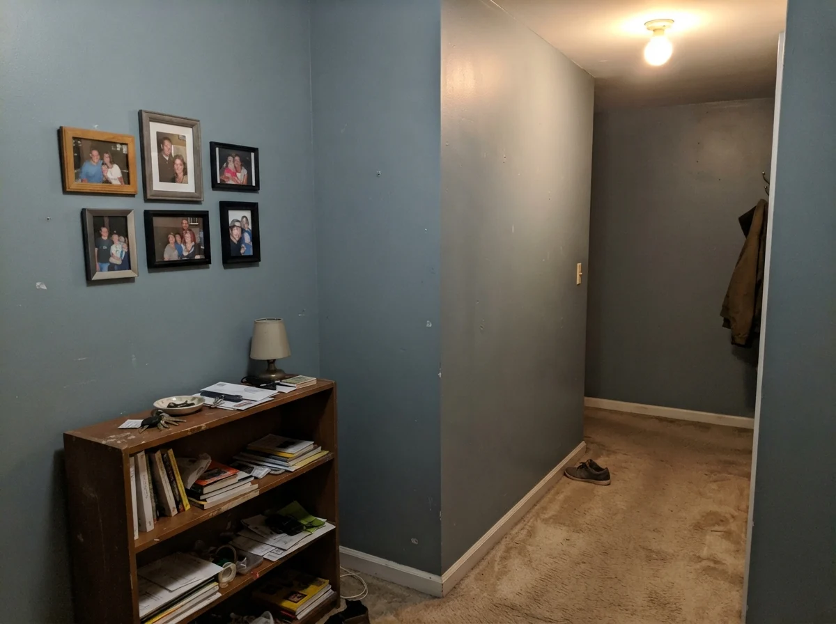
Take a long, windowless hallway or a dim interior entryway lit by a single overhead ceiling bulb. In that environment, there is no natural daylight to tease out the blue pigment. The paint suffocates. The green and charcoal undertones collapse together, and the wall reads as a flat, muddy, putty-like gray. If you put it over beige wall-to-wall carpet under poor light, it looks completely dead. If your space lacks a generous window, leave this swatch at the store and pick a much lighter neutral.
The other major failure point is the honey oak trap. If your kitchen or living room is surrounded by 1990s golden oak flooring or honey-stained oak builder cabinets, do not put Van Courtland Blue on the walls. Complementary colors push their opposites on the color wheel: orange pulls green-blue out of the paint, and the paint makes your floors look like an aggressive pumpkin. Unless you are planning to sand and refinish those floors in a natural white oak or cover them with large neutral rugs, the undertone friction will drive you crazy every single day.
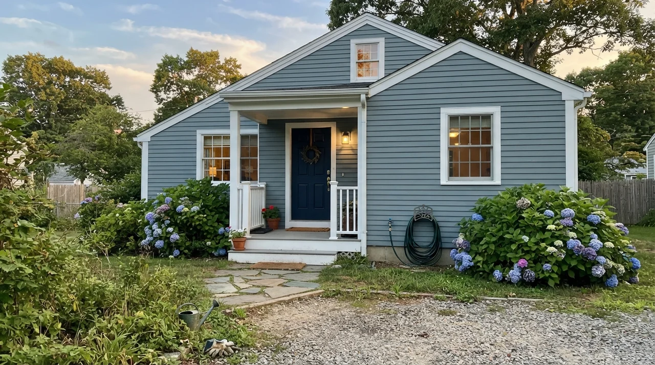
Finally, there is the exterior question. While this color is practically the gold standard for front doors and window shutters on traditional homes, rolling it across a full exterior facade of horizontal siding is a gamble. On full exterior siding, the sheer acreage of the house flattens the color. Without the sharp contrast of white trim framing it closely as an accent, a whole house painted in this shade can look surprisingly dark, overcast, and heavy, losing the crisp distinction that makes it shine on a front stoop.
Durability, Scrubbing, and the Realities of Resale
When you choose a paint in this value range, you have to consider how it handles life five years down the road. In our houses, I have scrubbed clean fingerprints around doorknobs, wiped soap scum off wainscot panels, and touched up baseboards more times than I care to count. In Benjamin Moore's Regal Select eggshell on interior walls, Van Courtland Blue held up exceptionally well. Because it carries substantial gray pigmentation, minor scuffs blend in rather than screaming across the room the way they do on pure pastels.
On kitchen cabinets or doors, spend the money on satin or semi-gloss in an enamel formulation. The extra sheen prevents hand oils from burnishing the surface around handles. When we prepared our colonial for resale, this was one of the few colored rooms we didn’t repaint back to white. The listing agent looked at the powder room, ran her hand along the painted door casing, and told me to leave it alone. It looked tailored and expensive, not personal or eccentric. That is the ultimate test of a color: when a buyer who doesn't even like blue walks in and finds themselves admiring the room anyway.
What sheen should I choose for Benjamin Moore Van Courtland Blue?
For interior drywall, use eggshell to keep the slate undertone rich without plastic glare. For kitchen cabinets and bathroom vanities, satin is the sweet spot for cleanability and architectural detail. For exterior front doors and shutters, use semi-gloss to resist weather and provide clean depth against your siding.
Why does Van Courtland Blue look green in my room?
The paint belongs to Benjamin Moore's teal deck family. In warm east-facing morning daylight or under warm incandescent lighting, the yellow rays activate the green undertone, pushing the paint toward a distinct teal-slate. It usually settles back into slate-blue once full overhead daylight arrives.
Does Van Courtland Blue work with honey oak cabinets or floors?
Generally, no. The strong amber-orange tones in honey oak fight directly with the green-blue pigments in this color. The friction makes the wood appear more glaringly orange and pulls an unflattering teal out of the paint. It pairs far better with white oak, walnut, or painted trim.
Is Van Courtland Blue too dark for a small powder room?
Not if you have white fixtures or white wainscoting. At LRV 31, it creates an elegant, jewel-box atmosphere in small spaces. Because you only spend short moments in a powder room, the depth reads as custom and tailored rather than overwhelming.
Susan's Verdict · Worth the Money with the Right Windows
Van Courtland Blue is a masterclass in how to do blue without looking juvenile, provided you respect its undertone. If you have warm morning east light and you hate green, leave it alone. If you have golden oak floors, look elsewhere. But if you have crisp white trim, unlacquered brass, decent natural daylight, or a front door that needs thirty years of weathered dignity, this is one of the finest cans of paint Benjamin Moore has ever poured.