Color Diary · No. 115
Sherwin-Williams Mindful Gray and the Depth Most Swatches Hide
The greige people order expecting Agreeable Gray and get something a full step deeper — reviewed honestly, including the two lights that turn it green.

Susan HartleyNovember 7, 2026 · 19 min read
Mindful Gray · Sherwin-Williams SW 7016
Hex#BCB7ADLRV48Undertoneswarm taupe-gray → sage-taupe under lawn light → flat gray in north exposure
In our last house, a 1990s center-hall colonial with eight-foot ceilings and builder-grade trim, I made the mistake nearly everyone makes when they decide to step away from white walls. I picked up a fan deck, thumbed past the pale greiges everyone was talking about online, stopped at Sherwin-Williams Mindful Gray (SW 7016), and told myself it looked like a nice, safe, gentle background neutral. On a two-inch paper card under fluorescent hardware-store tubes, it seemed like a polite gray with just enough warmth to keep from feeling like concrete.
Then the first gallon went on the wall.
Mindful Gray is not a pale, airy background whisper. With a Light Reflectance Value of 48, it sits squarely on the darker side of mid-tone. That single number—48—is the whole story of this paint. When you put a color with an LRV below 50 across an entire room, you are no longer tinting the walls; you are furnishing them. In a bright living room flooded with south sun, that depth gives a room immediate bones. In a dim hallway or a bedroom that only gets light bounced off wet grass, it can feel like sitting inside a cardboard carton. We lived with it through three seasons of second-guessing before I learned how to manage its quirks, and after thirty years of rolling paint across three houses, I have come to respect what it does—provided you know exactly what you are asking it to do.
The core reality of Mindful Gray is that it refuses to stay in one lane. It belongs to the Sherwin-Williams greige deck family, sitting right between the lighter and darker stops on the strip. It is gray enough that it never turns into beige, yet warm enough that it never reads cold or institutional. But that balanced recipe makes it a chameleon under natural daylight, and not always in ways you can predict from a tiny swatch held in your hand.
The Greige Shift: Taupe, Gray, and Lawn Light
Because Mindful Gray sits at LRV 48 with a complex taupe backbone, daylight changes its posture completely throughout the day. Here is how it reads as the sun moves across your house.
warm sun
overcast, north light
dusk, rain, cool bulbs
Mindful Gray shifts from a warm, grounded taupe-gray in strong daylight to a cool, quiet gray under overcast skies, while warm evening lamps pull its browner base forward.
ThunderBenjamin Moore · see diary
Reclaimed WoodDunn-Edwards · see diary
Mindful GraySW 7016
Graceful GrayBehr · see diary
GreigeBehr · see diary
How the Light Changes Everything
If you have never lived with a mid-tone greige, the shift between early morning and nightfall can give you whiplash. In cool dawn daylight, without a single lamp switched on, Mindful Gray sheds almost all its warmth. It sits quiet and pale on the drywall, looking almost washed out until the sun crests the roofline. Once direct midday sunshine enters the room, the taupe base wakes up, making the space feel settled and substantial.
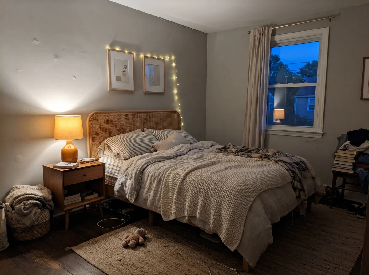
By evening, the color makes another drastic turn. Under standard warm household lamps, the brown notes step forward and the gray recedes, giving you a cozy, wrapped-in sensation. That warmth is exactly what people want in a bedroom or a den, but it catches homeowners off guard if they expected it to stay a crisp, silvery gray twenty-four hours a day.
Bathrooms: Wainscoting, Clawfoot Tubs, and the North Window Trap
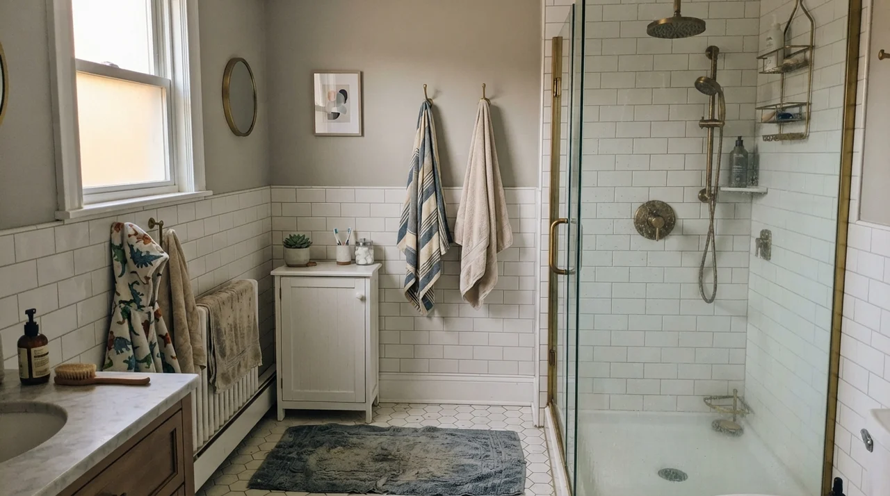
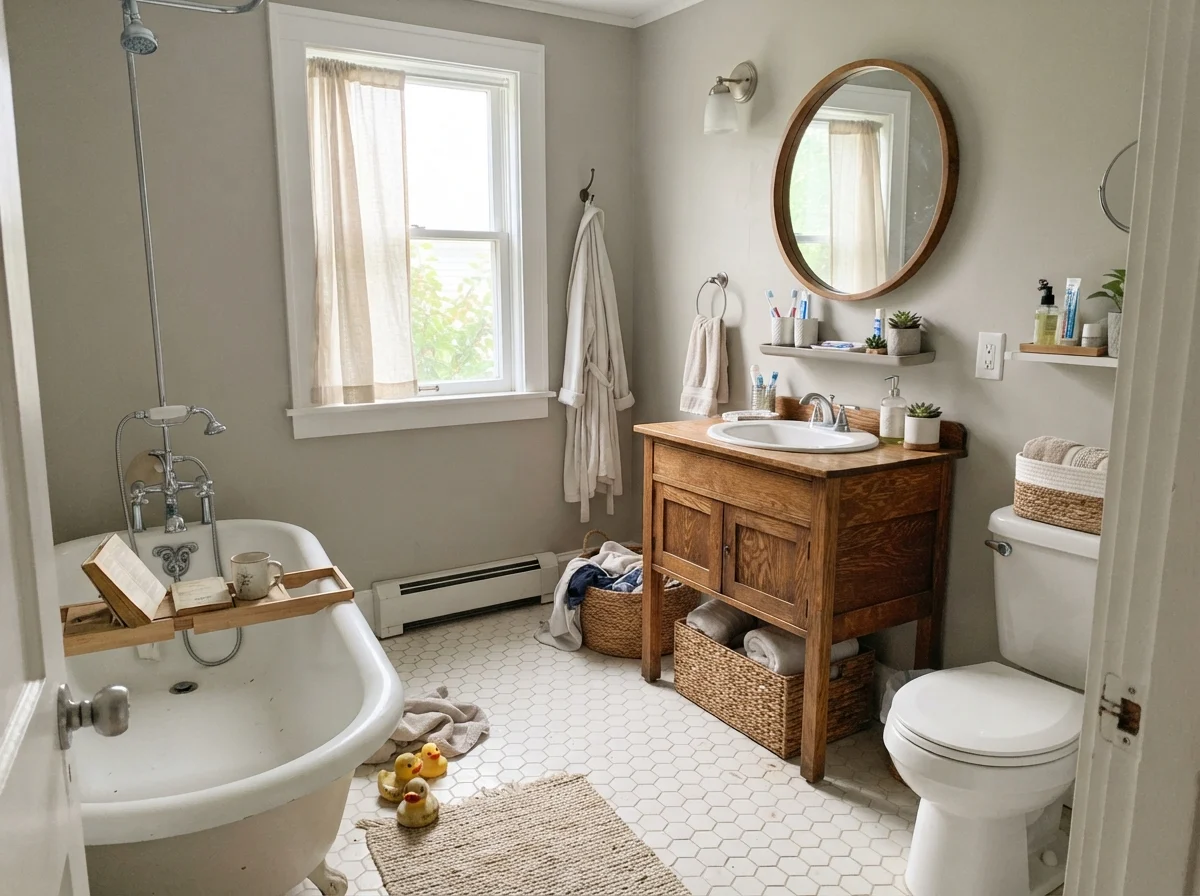
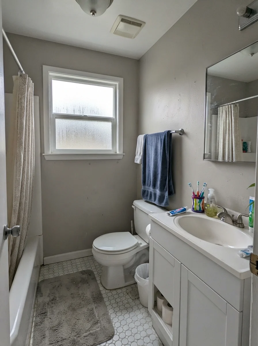
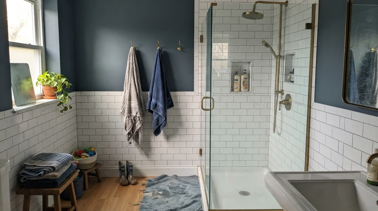
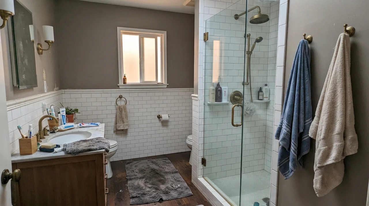
Bathrooms are where people either fall hard for Mindful Gray or regret buying the can before the primer has fully cured. Because the color holds an LRV of 48, using it floor-to-ceiling in a tight, windowless bath is asking for trouble. It absorbs too much bounce, leaving the room feeling smaller and dim. But when you anchor it above crisp white subway tile wainscoting or alongside a classic white clawfoot tub, that depth works entirely in your favor.
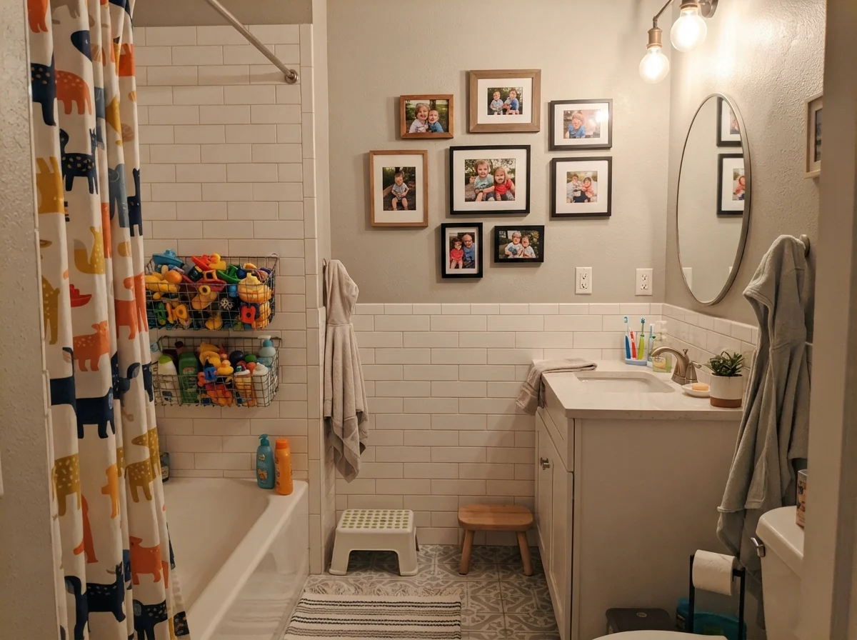
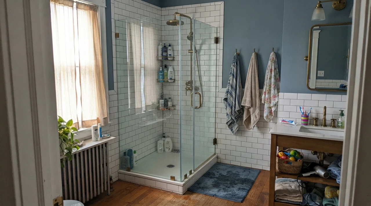
Five years in our second house, we had a family bath with white subway wainscot, brass shower fixtures, and a big side window. Mindful Gray on the upper third of the walls was exceptional. It gave the white porcelain and bright brass something sturdy to lean against, making the tilework look intentional rather than basic. It held up beautifully to steam and moisture, and water drops never left the faint outline marks that plague darker paints.
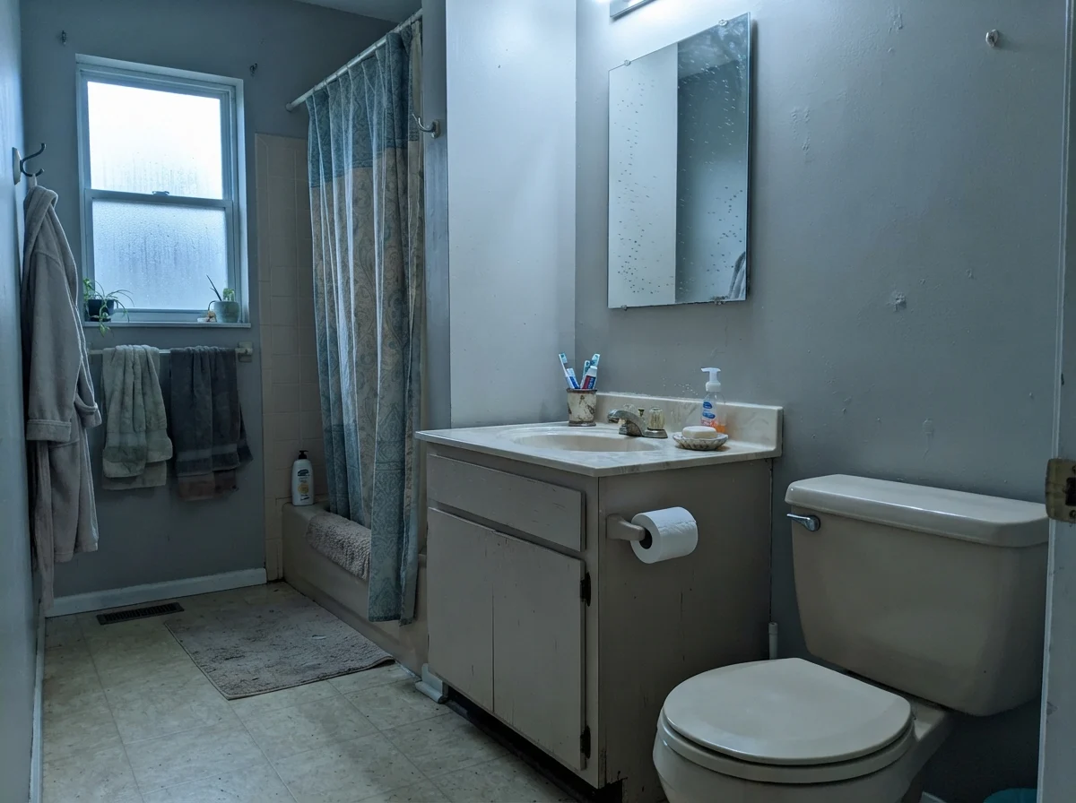
The warning here belongs to the window exposure. In bright, diffuse morning light or soft southern daylight, Mindful Gray stays balanced. But take a modest bath with a single north-facing frosted window on a rainy Tuesday, and the color will turn into a cool, flat gray that drains all life from older beige vanities. If your tile and countertops lean warm or you have vintage fixtures, that flat north light can make the walls look chilly and disconnected.
In our kids' bathroom, we painted the upper walls above white subway tile and lived with it through years of splashing, dripping rubber ducks, and bath toys heaped in wire baskets. Because Mindful Gray has enough pigment to stand up to heavy daily traffic, stray splashes never showed water rings, and muddy little fingerprints scrubbed clean with a warm rag without stripping the finish. It was worth the money in that high-use bath simply because it hid the wear that pale off-whites put on full display every single morning.
Bedrooms and Nurseries: The Cocooning Effect
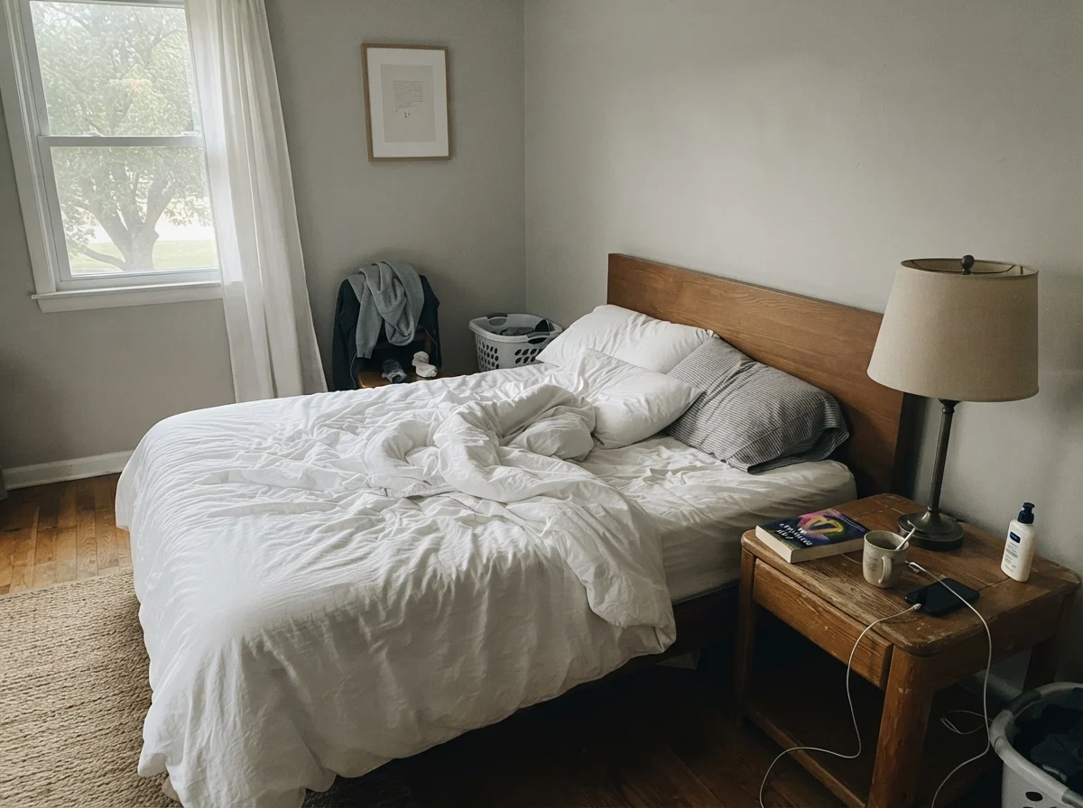
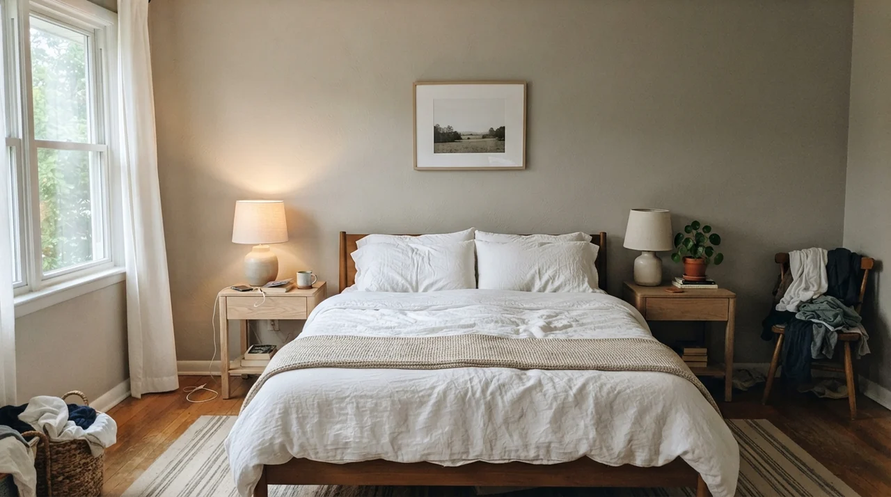
In a bedroom, Mindful Gray does something lovely if you have more than one source of daylight. It creates an envelope that feels calm, mature, and rested. In our main bedroom, pairing these walls with pale oak nightstands, white linen bedding, and soft ceramic lamps created the kind of calm that feels effortless. It is deep enough that white bedding pops cleanly, preventing the bed from melting into the background.
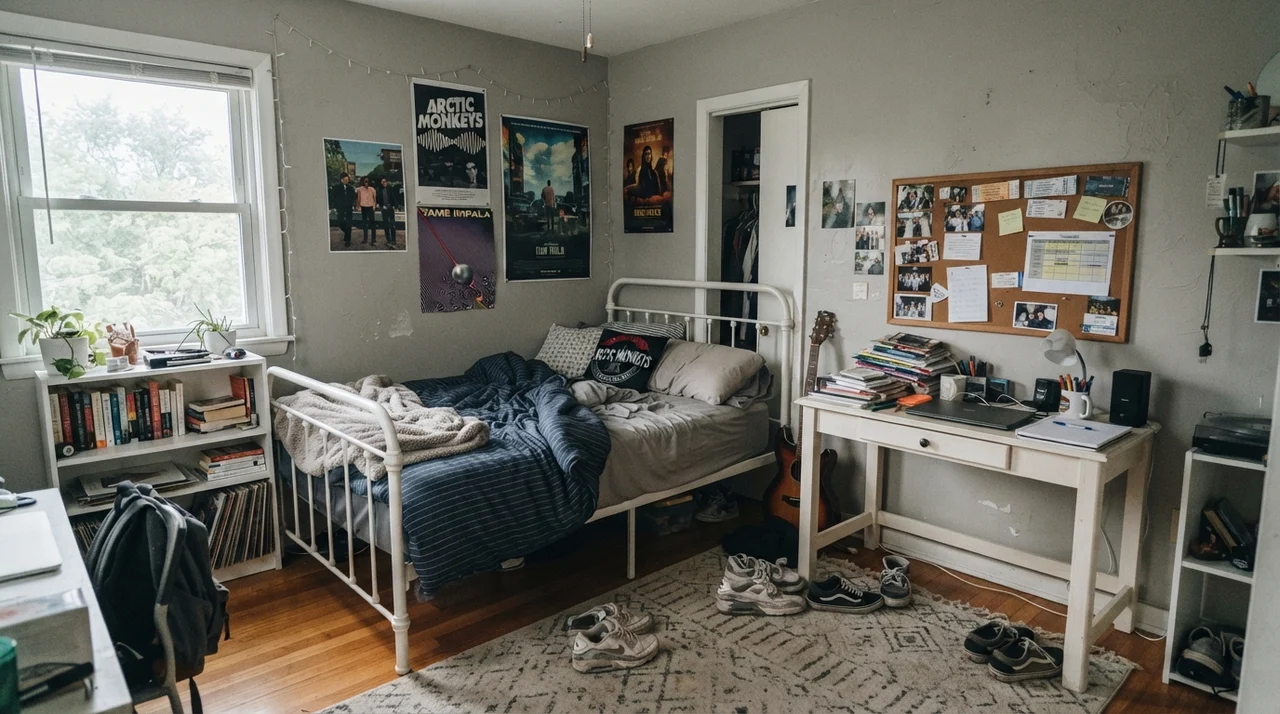
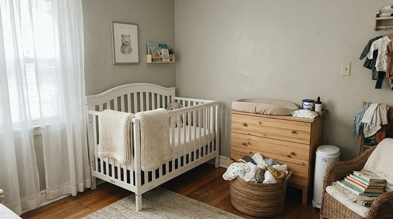
It works just as reliably in a nursery or a teenager's room, provided you have good window light. In a nursery with sheer curtains, a white crib, and a light-wood dresser, the color reads soft and grounded rather than sweet or pastel. When we sold our colonial, the buyer specifically asked about the teenager's bedroom paint—it had weathered four years of tacked-up corkboards, white metal bed frames, and sneaker scuffs on the floor without showing wear, looking just as composed as the day the roller dried.
In gentle, diffuse light, especially filtered through simple white curtains, Mindful Gray stays remarkably quiet. It softens the glare of direct sun while remaining sturdy enough to balance light-toned furniture, muslin baskets, and woven textures.
Kitchens and Cabinets: Its Quiet Second Career
While most homeowners start off looking at Mindful Gray for their living rooms, cabinetry is where this color genuinely earns its keep. At LRV 48, it hits the exact sweet spot for kitchen cabinets: light enough that the kitchen never feels dark or heavy, but saturated enough to look decided and deliberate.
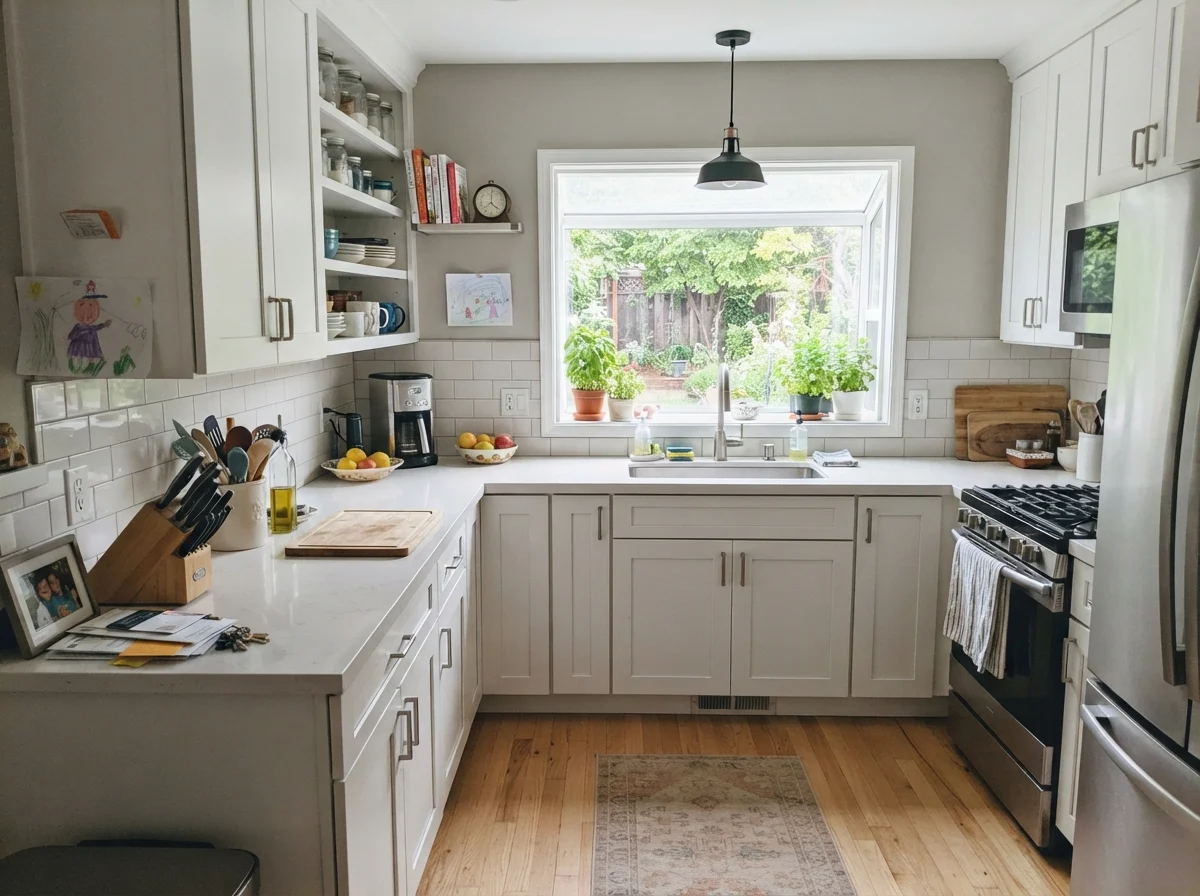
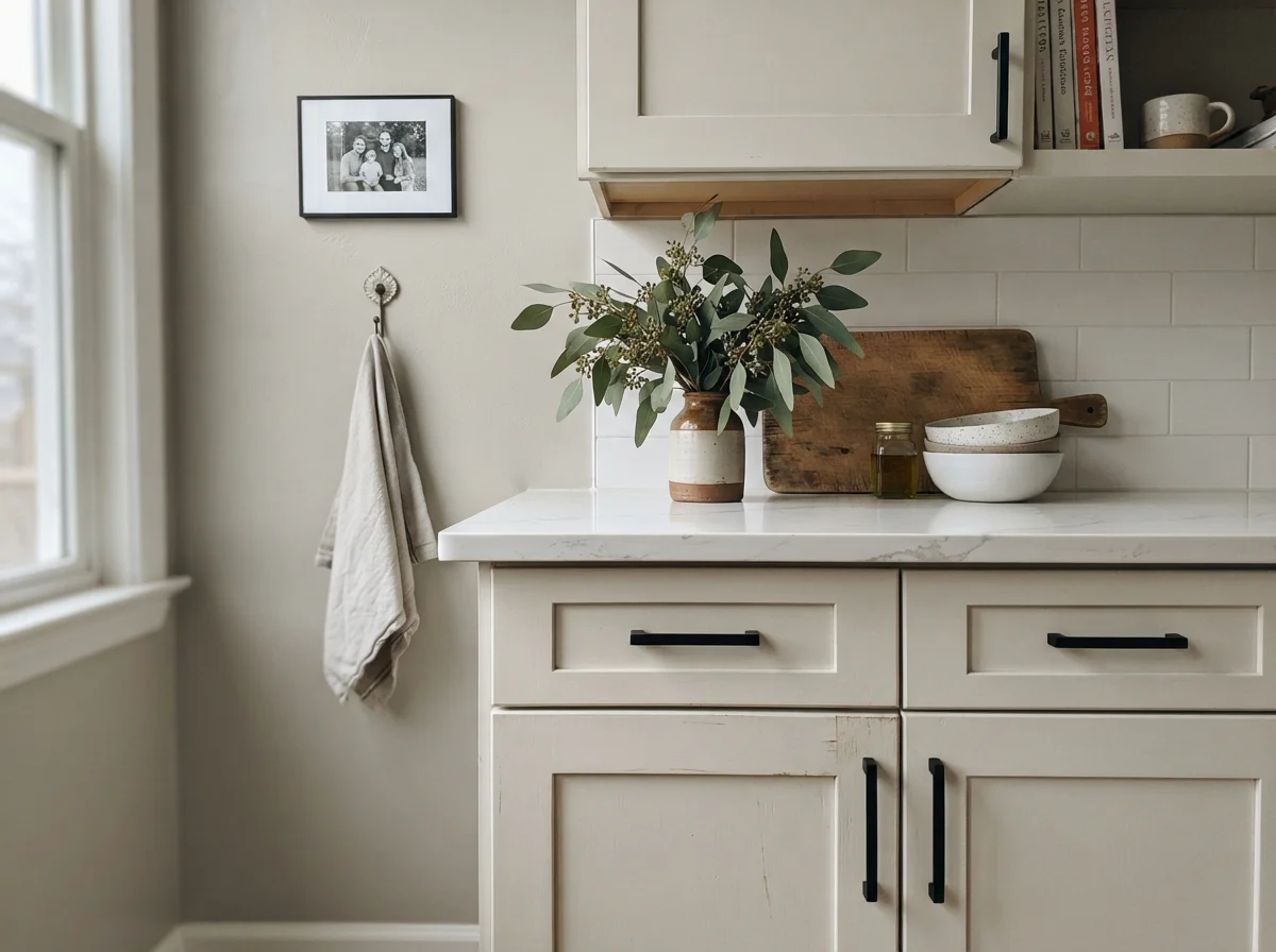
Pale greige cabinets can end up looking like unfinished primer under midday light. Mindful Gray never makes that mistake. When you roll it onto shaker cabinet fronts in a satin finish, it provides enough contrast against white subway tile and white countertops to give the kitchen structural presence. More importantly for anyone who actually cooks dinner every night, it hides handprints, dried water drips near the sink, and pan scuffs far better than any pale off-white ever could.
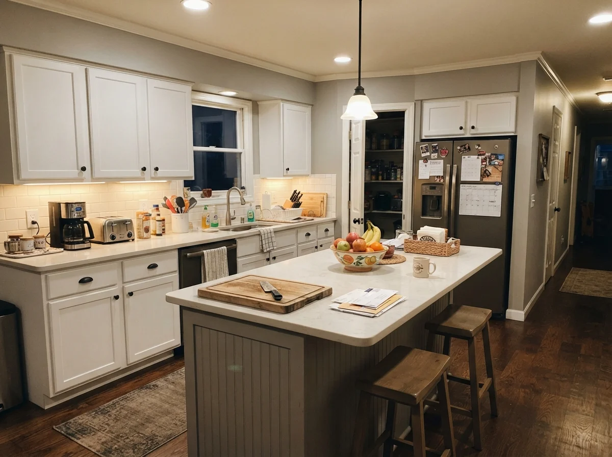
If painting every cabinet in the kitchen feels like too much commitment, running it exclusively on a kitchen island is an easy win. In our last house, our kitchen island took the brunt of every backpack drop, heel kick from counter stools, and stray grocery bag. Under warm evening recessed lights and under-cabinet glow, a Mindful Gray island grounded the surrounding white cabinets and cream walls without making the space feel closed in. A damp microfiber cloth scrubbed clean every stray tomato sauce smudge, and five years in, the island held up without requiring a single weekend touch-up.
Living Rooms and Sunrooms: Grounded Bones
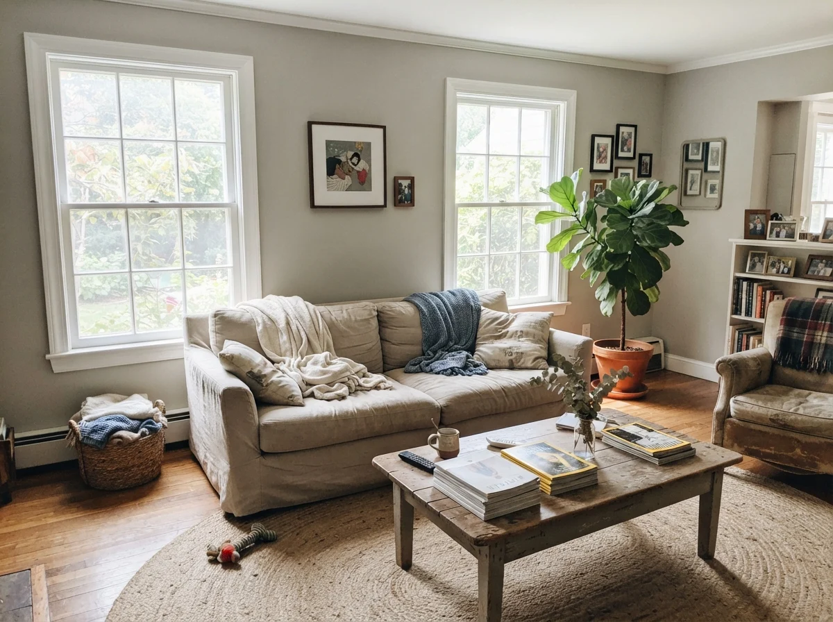
Living rooms with generous daylight are Mindful Gray's natural habitat. Give this color two large windows or a sliding glass door, and it does what expensive interior finishes do: it makes oak floors, linen sofas, and leather chairs look chosen rather than merely placed. It doesn't look like builder-grade drywall waiting for art; it looks like an architectural choice.
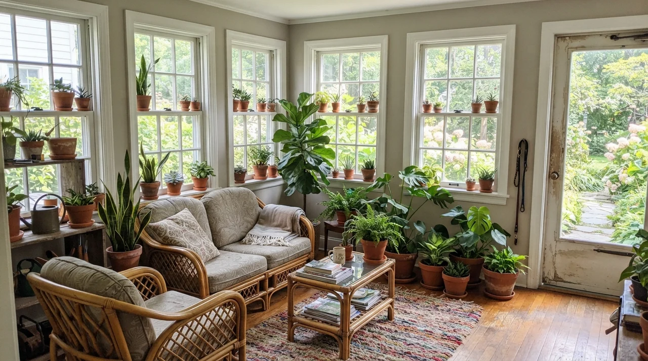
In a sunroom or enclosed porch wrapped in glass, the color performs another neat trick. Because the walls between window frames are narrow, strong exterior light lightens the paint by almost a full step. Paired with terracotta pots, lush indoor plants, and rattan seating, the gray base keeps the garden greenery from overwhelming the room, providing a steady, calm backdrop from April through October.
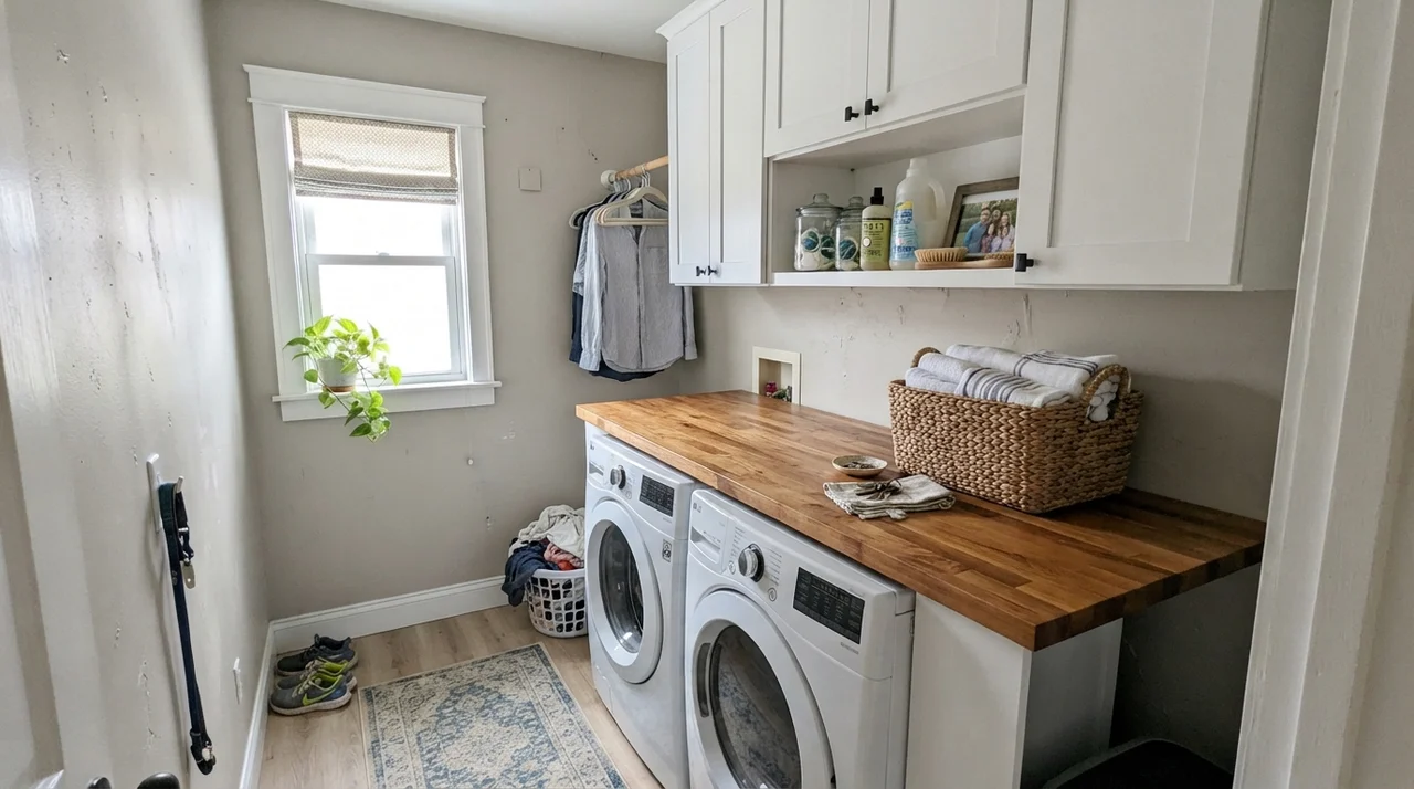
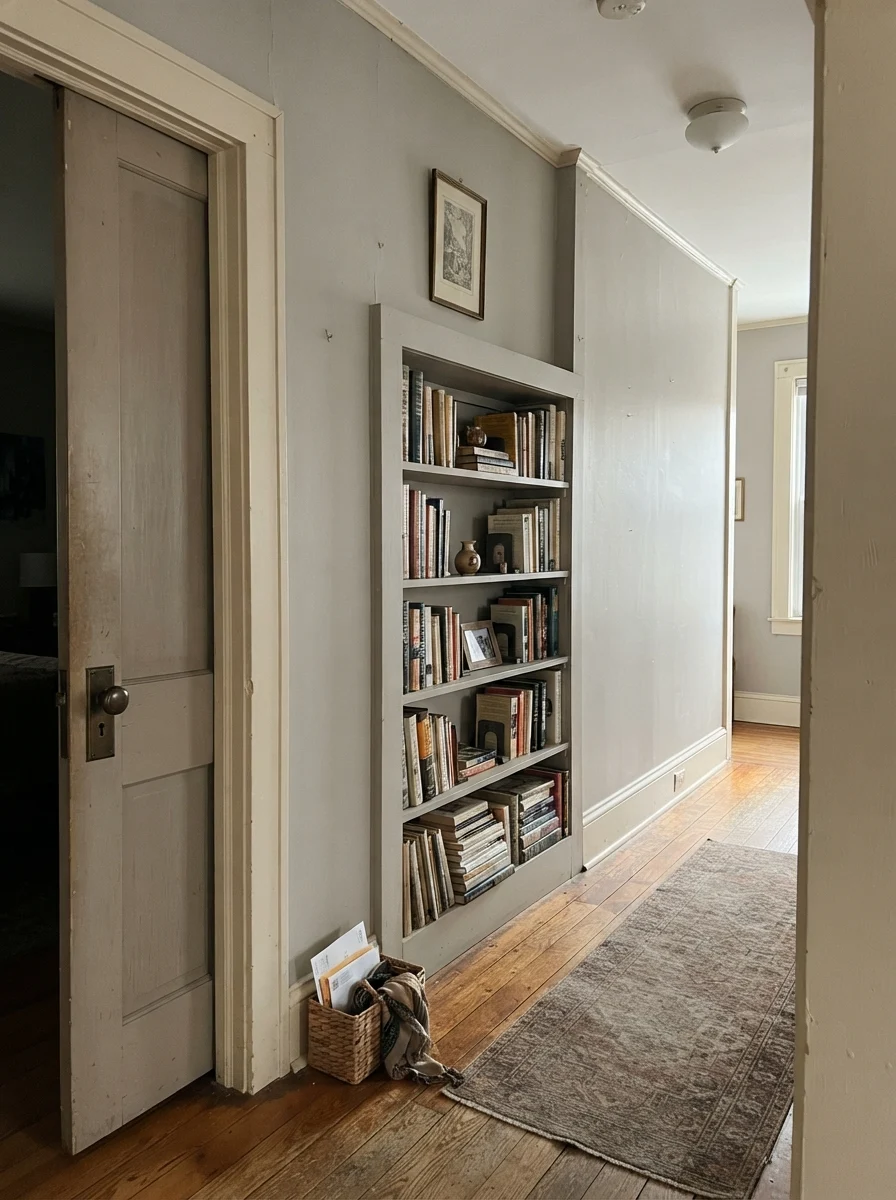
In utility spaces and architectural transitions, Mindful Gray behaves just as reliably. A bright laundry room with white cabinets, butcher-block counters, and one good window gets an instant upgrade when the drywall has depth. In hallways of older homes, using it on an interior door and adjacent built-in bookshelves against cream walls gives the passage character without darkening the whole floor.
Whenever I test a color in our 1960s ranch, I make sure to put the sample right where life actually happens—next to down pillows, daybeds, and well-worn trim. A paint swatch taped to an empty wall won't tell you how a color behaves when laundry needs folding and the afternoon light starts sloping across the floorboards.
Where Mindful Gray Fails: The Honest Mistakes
Nearly every bad Mindful Gray story traces back to three specific room situations, and all three are completely predictable before you buy a single can. If your room matches one of these descriptions, stop right here. A second coat will not fix it, and choosing a different sheen will not save it.
1. The Dim, North-Facing Room with One Small Window
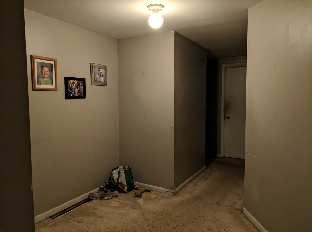
This is the single most common homeowner regret. North light is naturally cool, blue-tinted, and flat. It strips away the modest warmth in Mindful Gray's taupe base, leaving behind a heavy, drab, cement-colored wall that makes a small room feel like a concrete bunker. If your space lacks southern or western exposure and only has one modest window, step up ten reflectance points to Repose Gray (SW 7015). Repose sits at LRV 58 in the very same color family, giving you that tailored greige structure while leaving enough reflected light in the room so you can breathe.
2. The Room That Looks Directly Out onto a Green Lawn or Dense Trees
This one catches people off guard every single summer. Green daylight bounces off grass and tree canopies, travels through the window glass, and lands straight on your drywall. Because Mindful Gray carries a subtle green shoulder in its taupe undertone, that reflected light pushes the paint completely into a muddy sage-taupe. People tape up a sample card in March when the branches are bare, paint the room in April, and want to repaint by July. If you have a large yard or woods outside your window, try Amazing Gray (SW 7044) instead. At LRV 47, it has nearly the exact same depth, but its redder, purple-taupe base naturally cancels out the green lawn bounce.
3. Pairing It with Cool Gray Floors or Cool Gray-Veined Stone
Gray luxury vinyl plank, gray-washed wood floors, and cool quartz countertops sit firmly on the blue side of the neutral spectrum. Put Mindful Gray next to them, and its warm, earthy brown base gets dragged into the spotlight. Against cold gray flooring, Mindful Gray does not read warm—it reads muddy and dirty. If your hard finishes are truly cold gray, you need a gray without an earthy brown base.
Exterior Siding: Where It Behaves Best
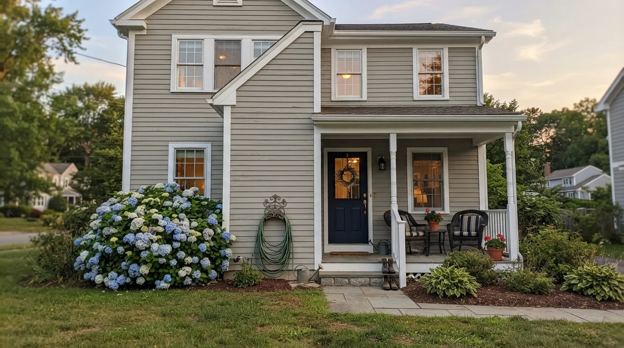
Here is something that surprises many homeowners: Mindful Gray actually behaves better on an exterior than it does in half the rooms inside a house. Under full, direct outdoor sunlight, an LRV 48 paint lightens up by nearly a full step. The heavy, cement-like risk vanishes completely, and the green undertone that troubles wooded interiors gets washed out by direct sky exposure.
On horizontal siding, it gives a house a dignified, tailored look that avoids both the blinding glare of off-white and the somber weight of charcoal. Paired with clean white trim, a dark navy front door, and simple porch details, it delivers an exterior that looks well-maintained and timeless five years down the road.
Trim and Finish Combinations That Actually Hold Up
When you put a mid-tone color on the wall, your trim choice is not a casual afterthought—it defines whether the room looks crisp or dusty. Because Mindful Gray has real depth, running an off-white trim with yellow undertones makes the trim look aged and makes the walls look dingy. You need a clean, balanced white on baseboards and casings to give the wall color a sharp boundary line.
Finishes and Sheens: Where to Put What
I have repainted enough rooms over thirty years to tell you that sheen can ruin a good color faster than bad lighting. Here is the formula that has held up through three houses:
- Walls: Eggshell. Mindful Gray needs a soft, low-sheen surface. Flat paint marks too easily if you have dogs or kids, while satin reflects too much overhead glare, turning that LRV 48 depth shiny and synthetic. Eggshell gives you cleanability without bouncing glare.
- Trim and Baseboards: Semi-gloss. A semi-gloss finish gives baseboards the scuff-resistance they need against vacuums and shoes, while providing a clear physical break from the eggshell walls.
- Cabinets: Satin. Semi-gloss on cabinets looks commercial and highlights every roller stipple. Satin provides enough enamel hardness to handle scrubbed clean grease spots around the stove while maintaining a smooth, furniture-grade feel.
- Ceilings: Flat. Never run eggshell on a ceiling over Mindful Gray walls. A dead-flat white ceiling keeps overhead light from flashing across the drywall joints.
Durability: Five Years In
One reason I often recommend mid-tones like Mindful Gray over pale off-whites comes down to daily wear and tear. When our kids were growing up, pale walls around light switches, door casings, and stairwells looked dated within eighteen months simply from accumulated hand oils and scuffs. Every six months, I was down on my knees with a sponge trying to keep things presentable.
Mindful Gray hides family life exceptionally well. Because it has enough pigment depth, grocery bag dings, dog tail swipes, and shoe scuffs do not stand out in high contrast. When you scrub it down with mild soapy water, an eggshell coat cleans up without leaving behind that shiny burnished patch that ruins cheap paints. In our colonial, we touched up two door frames right before we listed the house for sale, and the fresh brush marks blended into the five-year-old wall seamlessly. That alone made it worth the money.
You don't choose a paint for the afternoon the drop cloths come up. You choose it for year four, when the hallway has taken fifty grocery bags and still wipes down clean.
What is the LRV of Sherwin-Williams Mindful Gray?
Mindful Gray has a Light Reflectance Value (LRV) of 48. That places it just below the midpoint of the 0–100 scale, making it a true mid-tone neutral with noticeable depth on the wall.
Does Mindful Gray look green on the wall?
It can. While Mindful Gray is fundamentally a warm greige, its taupe base carries a faint green shoulder. If your room looks out onto a green lawn or heavy tree canopy, reflected outdoor light will bounce inside and push the wall color into a sage-taupe.
What light bulbs work best with Mindful Gray?
Standard 2700K warm-white bulbs pull Mindful Gray strongly toward taupe-brown at night. If you want the color to stay crisp and gray in the evening, swap to 3000K soft-white bulbs before deciding to repaint.
Is Mindful Gray a good whole-house paint color?
Only if your entire floor plan is consistently flooded with natural daylight. In windowless central hallways or interior stairwells, LRV 48 can make corridors feel narrow and tunnel-like. A common solution is running Mindful Gray in daylit living rooms and stepping up to Repose Gray (SW 7015) in connecting hallways.
Can I use Mindful Gray on kitchen cabinets?
Yes, cabinets are one of its absolute best uses. At LRV 48, it looks intentional, provides sharp contrast against white counters, and hides daily handprints and pan scuffs far better than pale off-whites.
Susan's Verdict · Grounded Mid-Tone With Real Weight
Mindful Gray is not a shy background off-white, and treating it like one is how homeowners end up repainting two weeks after the roller dries. At LRV 48, it is a deliberate, grounded mid-tone that requires real daylight from two directions or an anchor like white wainscoting to do its job. Give it south sun, oak floors, and a crisp white trim, and it delivers one of the most mature, enduring neutrals in the entire deck. Put it in a dim north-facing bedroom with trees out the window, and you will spend the summer staring at muddy sage drywall. Know your windows, test your lawn reflection in July, and don't be afraid of its depth.