Color Diary · No. 42
Palladian Blue HC-144: The Twenty-Year Truth About America's Favorite Spa Wall
America's default spa blue-green, reviewed honestly: the rooms where it glows, the day it decides to look green instead of blue, and what to pick instead.

Susan HartleySeptember 22, 2026 · 14 min read
Palladian Blue · Benjamin Moore HC-144
Hex#C1D1C9LRV60Undertonesaqua blue → soft sea glass → muted celadon green
In our last house—the 1990s colonial with the drafty upstairs hallway—the family bathroom had plain white four-inch ceramic tiles, chrome fixtures, and zero personality. In 2004, every shelter magazine on the rack was shouting about Benjamin Moore Palladian Blue (HC-144), calling it the ultimate spa shade. I bought two gallons, rolled it above the wainscot on a Saturday morning, and immediately understood the fuss. It was watery, serene, and soft without smelling like baby powder.
We lived with it in that bathroom for seven years. When we sold the house in 2011, the buyer's home inspector actually paused in the doorway to ask my husband what the paint color was because his wife had been hunting for it. That is the kind of immediate goodwill Palladian Blue generates. It has an LRV of 60, placing it right in that forgiving middle range where it reflects enough light to keep a small room feeling breezy, yet carries enough pigment that it never washes out into a tired white.
But thirty years of repainting rooms teaches you that no color is magic everywhere. Palladian Blue sits on an exact knife-edge between pale sky blue and soft sea glass green. It lives in the green deck family at Benjamin Moore, but the general public thinks of it as a watery blue. Depending entirely on the angle of your sun, your lightbulbs, and the color of your baseboards, this shade will flip personalities on you without warning.
The Blue-Green Balance Point
Palladian Blue (#C1D1C9) is technically indexed in Benjamin Moore's green collection, but its true behavior is a fluid conversation with ambient light. In cool exposure it holds a quiet aquatic blue, while warm light pulls its yellow undertones straight to the surface, transforming it into a delicate sage.
warm sun
overcast, north light
dusk, rain, cool bulbs
A true chameleon at LRV 60: cool north light exposes its blue backbone, midday sun warms it to sea glass, and incandescent 2700K lamps reveal its soft green heritage.
Woodlawn BlueBenjamin Moore · see diary
Frosted JadeBehr · see diary
Palladian BlueHC-144
RainwashedSherwin-Williams · see diary
BreezewayBehr · see diary
The 24-Hour Light Shift in Real Rooms
Before you commit five gallons to a primary suite or living area, you have to understand how daylight dictates this color's mood. Because it hovers right on the blue-green border, morning light and evening lamplight will make the same wall look like two entirely different paint formulas.
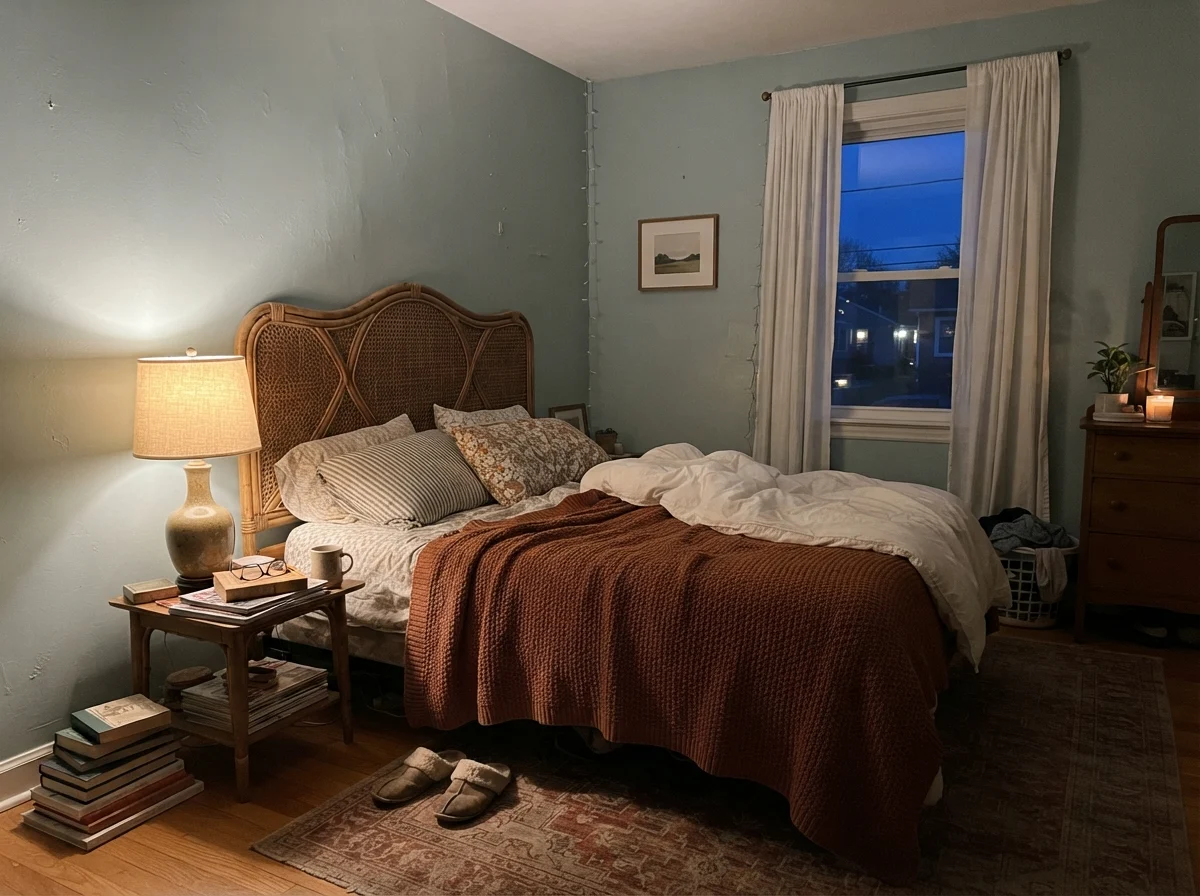
In cool early-morning daylight or northern exposures, the green undertone recedes. The wall reads as a pale, misty duck-egg blue. It is crisp, clean, and quiet. But come 4:00 PM in a south-facing room, or the moment you switch on warm 2700K bedside table lamps, that blue steps back and a soft celadon green takes over. If you painted the room hoping for a crisp sky blue, you might feel startled when it looks like pale sage at dinner time.
Where It Works Best: Bathrooms and Wet Rooms
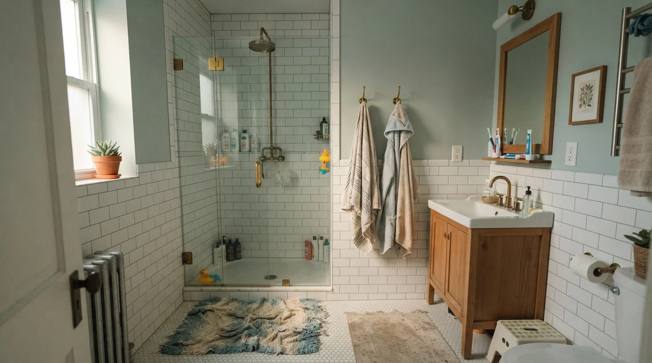
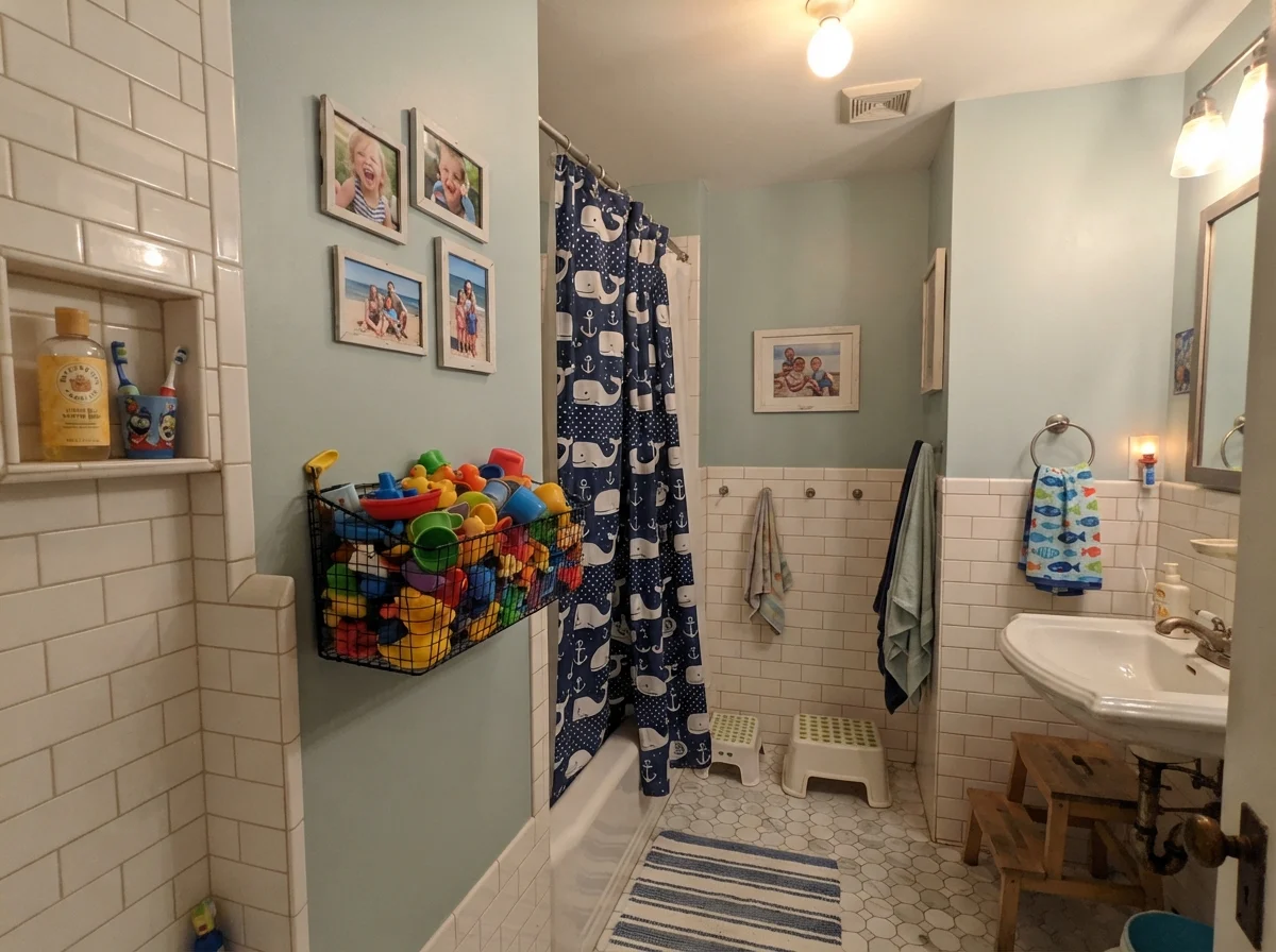
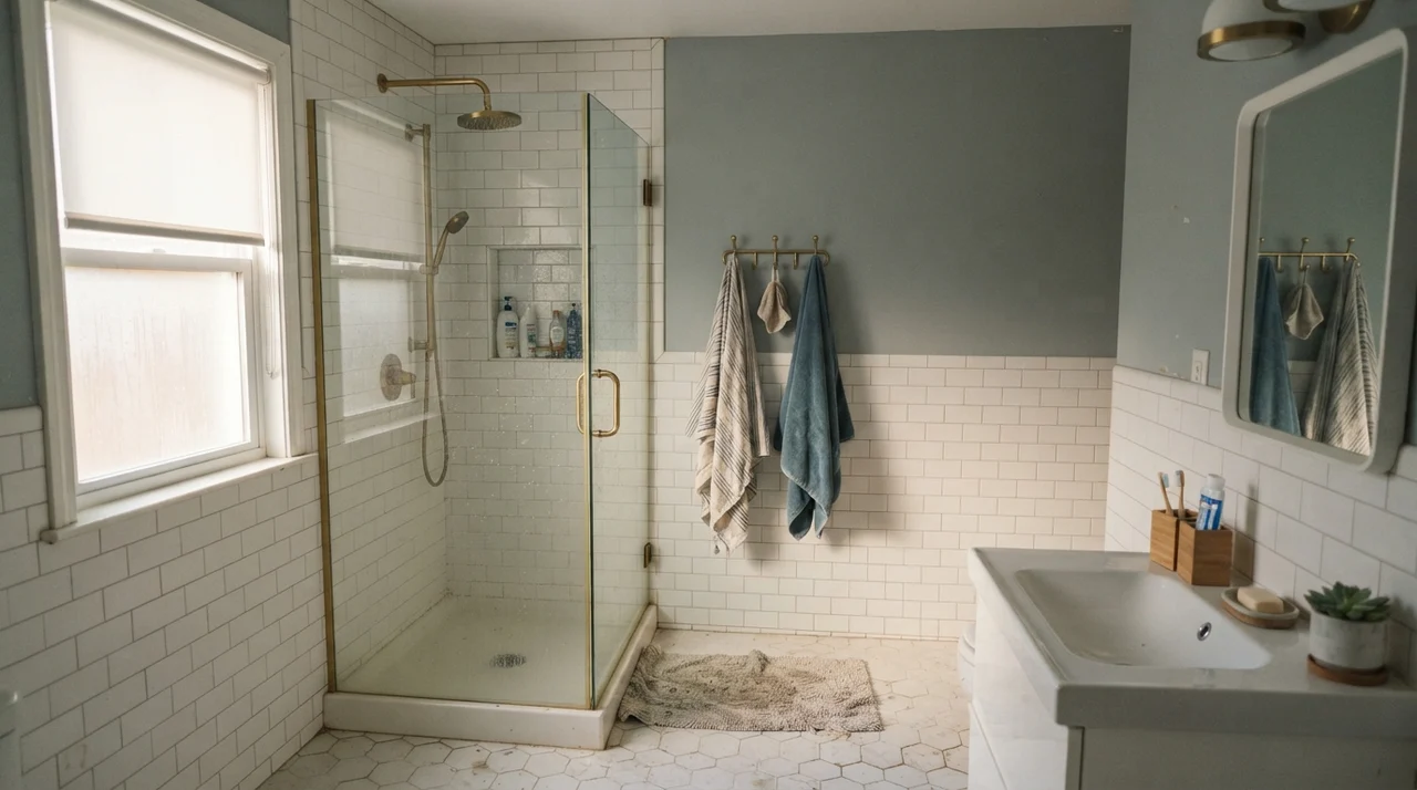
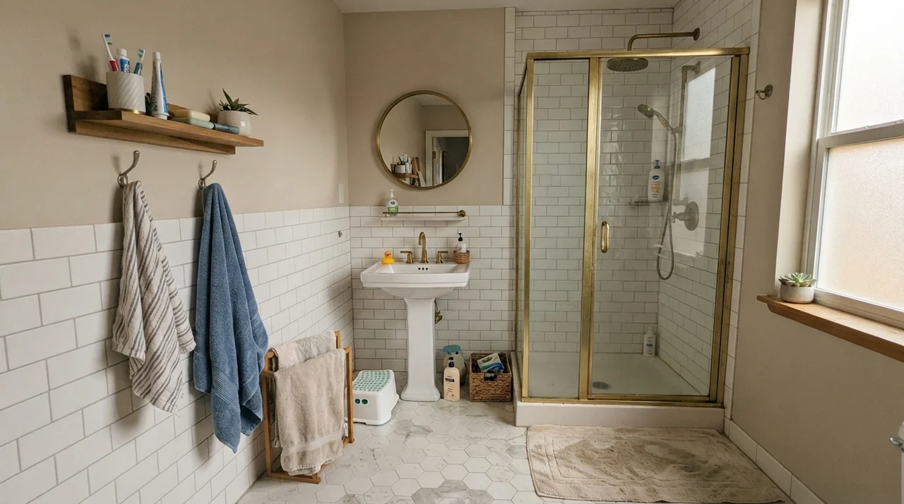
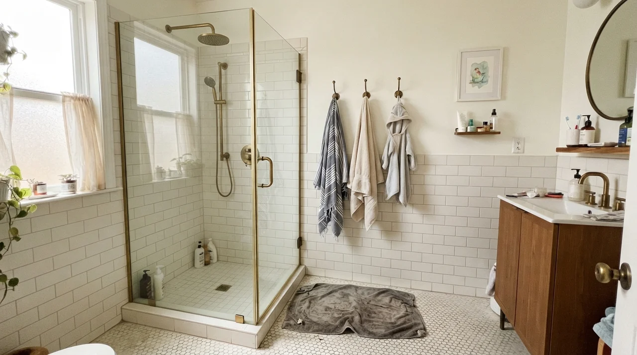
Bathrooms are where Palladian Blue made its reputation, and it remains one of the safest investments you can make in a bath refresh. In our current 1960s ranch, I rolled it in the hall bath over six years ago. Paired with clean white subway tile and simple plumbing fixtures, it turns a functional, utilitarian space into somewhere you actually want to linger on a Sunday morning.
The LRV of 60 is the secret engine here. Bathrooms are frequently cramped, sometimes entirely windowless, and often plagued by harsh overhead lighting. A dark paint turns them into caves; a stark white makes them feel sterile and institutional. Palladian Blue has enough depth to provide real color without sucking up the room's illumination.
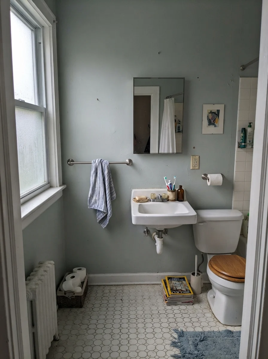
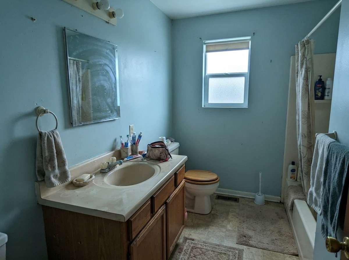
That said, light quality still matters. On gloomy, overcast days through frosted glass, or under chilly high-Kelvin vanity fixtures, Palladian Blue can take on a subdued, slate-gray cast. It doesn't look bad, but it loses that sun-warmed resort feeling.
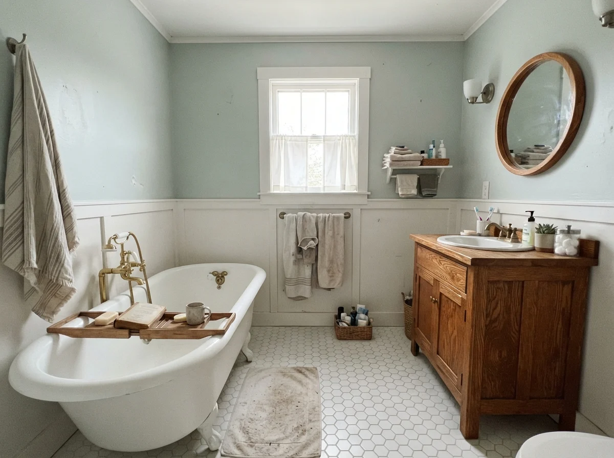
When you pair it with warm organic materials—like an oak vanity, vintage brass, or natural woven baskets—the warmth pulls the color back into balance. It loves white porcelain, clawfoot tubs, and classic hex floor tiles. It behaves like a soft watercolor backdrop that lets architectural details stand out rather than competing with them.
Bedrooms and Nurseries: The Restful Middle Ground
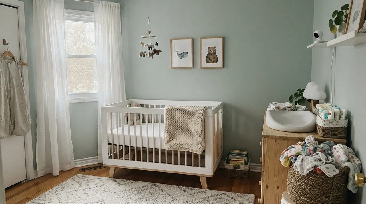
If you have ever tried to choose a blue for a bedroom, you already know the terror of the nursery trap: you pick what looks like a sophisticated slate-blue swatch, and once it is up on all four walls, your primary bedroom looks like a newborn boy's nursery. Palladian Blue bypasses that trap completely because of its green and gray backbone.
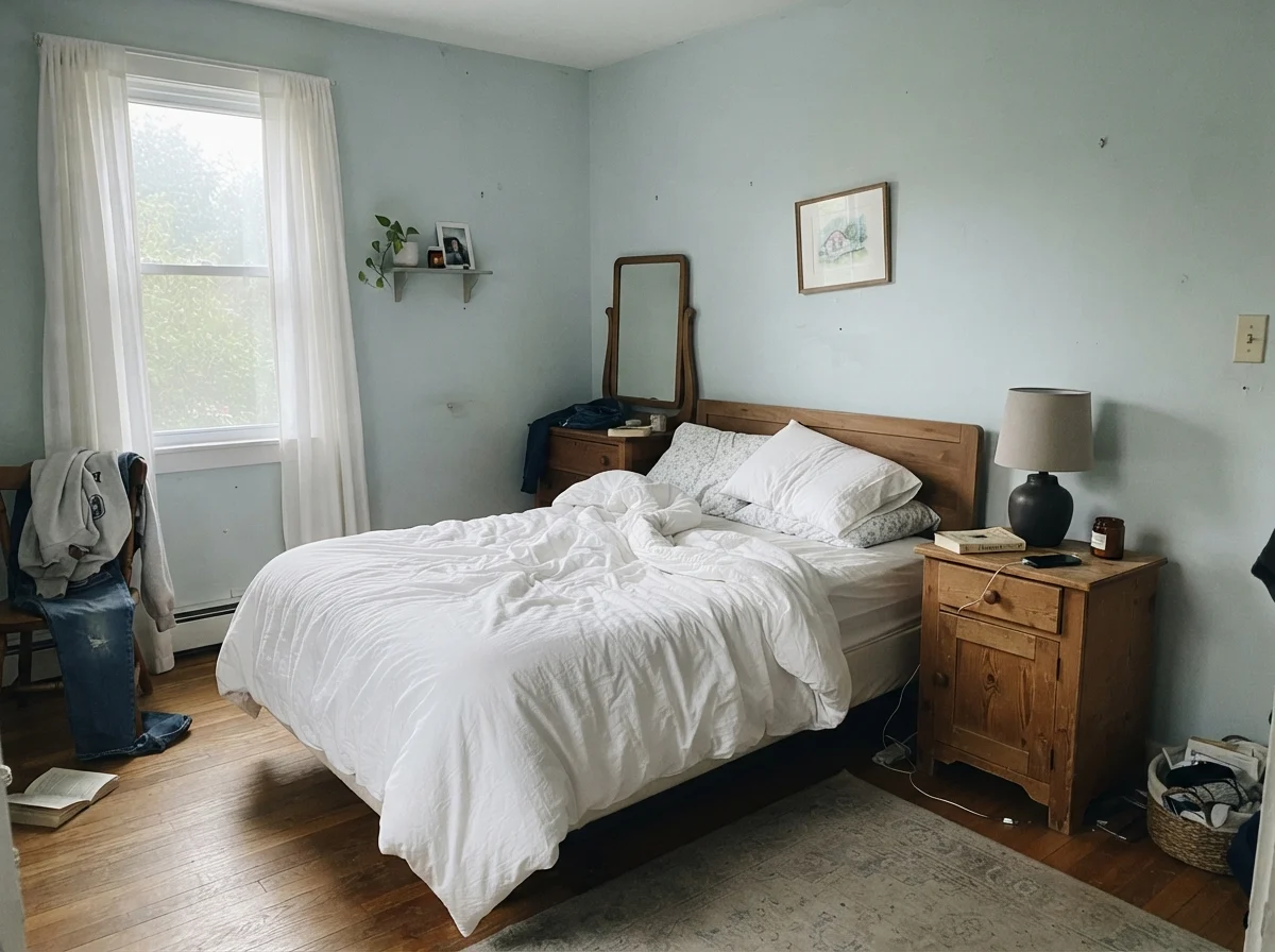
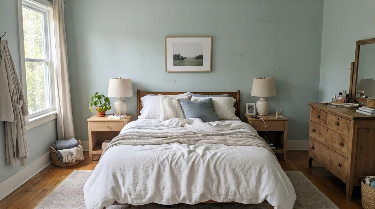
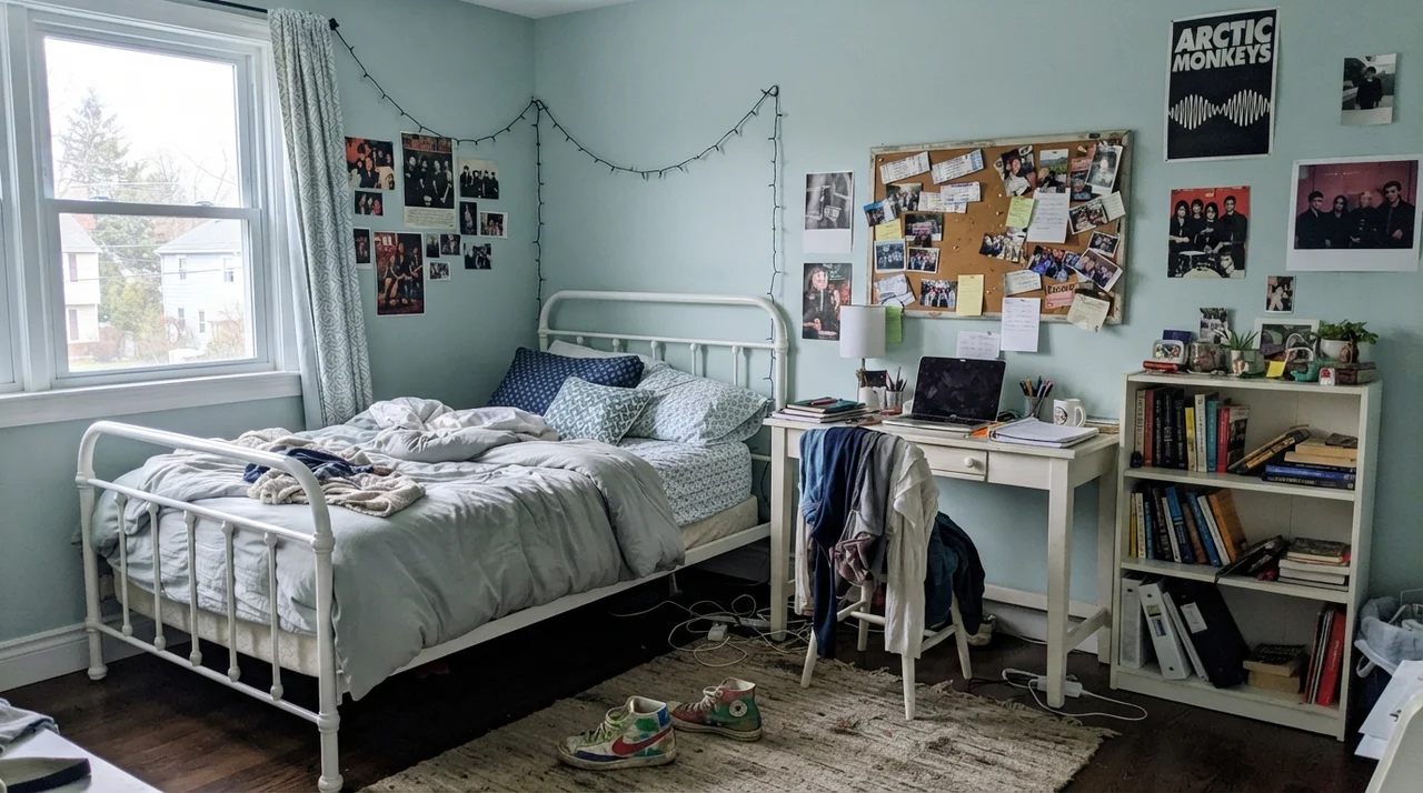
In a main bedroom with good window light, it feels calm, composed, and remarkably quiet. Five years in, you won't walk in and feel exhausted by the wall color. It works equally well across life stages—from a gentle, airy baby nursery to a teenager's study space—provided the room gets genuine natural daylight.
Kitchens and Cabinetry: The Fine Line Between Charm and Theme
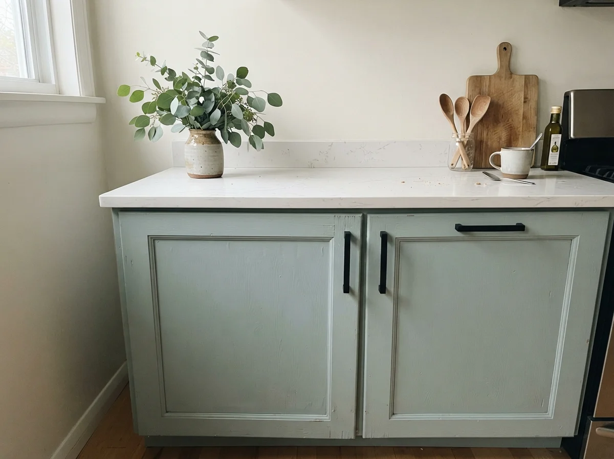
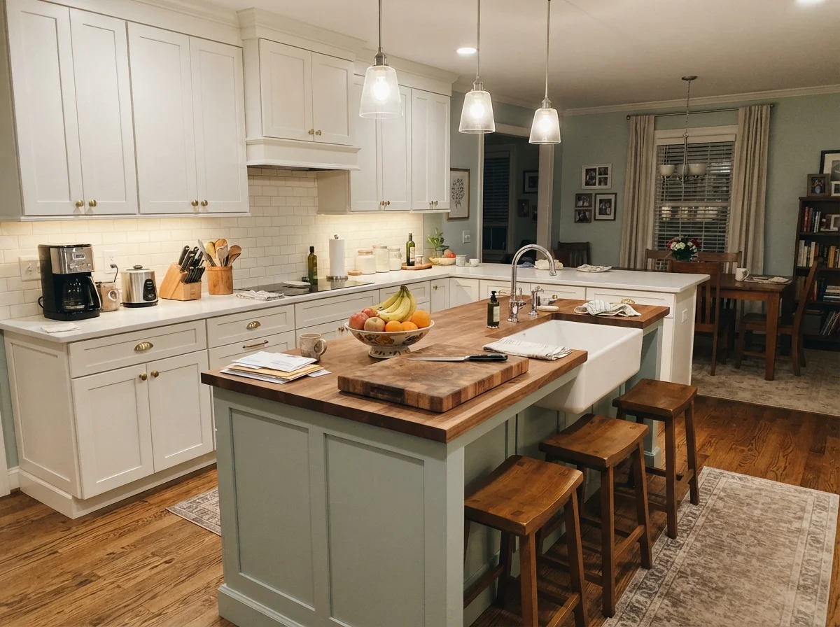
Here is my honest neighborly warning about Palladian Blue in the kitchen: treat it like fine spice, not the main broth. When used on a freestanding kitchen island, a laundry base cabinet, or a single bathroom vanity, it is utterly charming against crisp white quartz counters or warm butcher block.
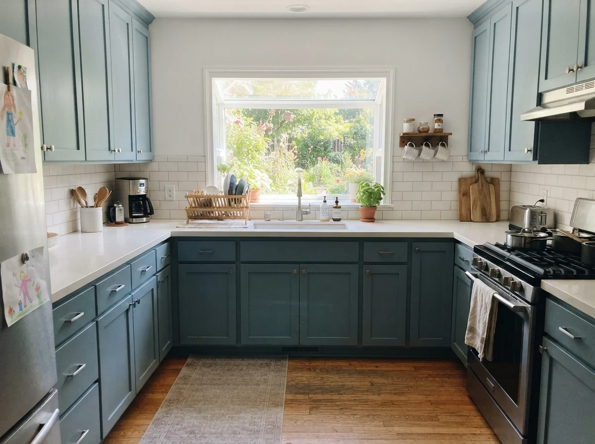
However, painting an entire kitchen's worth of upper and lower cabinets in Palladian Blue is a high-risk move. On thirty cabinet doors across a large room, that watery soft tone stops being subtle and turns the entire kitchen into a 1950s seaside theme diner. Unless you live in a literal cottage two blocks from the Atlantic surf, keep it to the island or lower cabinets and let clean white handle the upper wall territory.
Living Rooms, Sunrooms, and Trim Accents
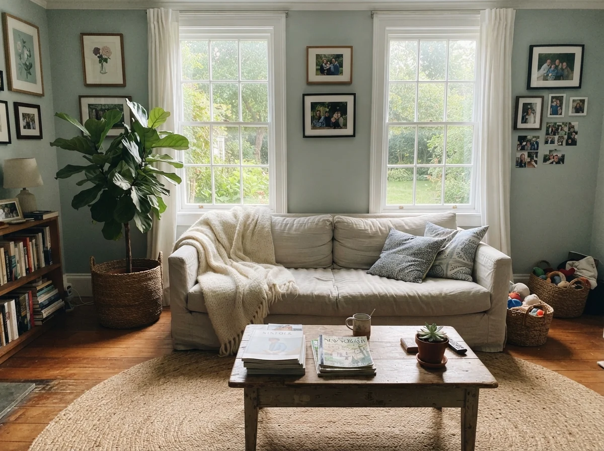
In living rooms, Palladian Blue requires a specific aesthetic context. If your home has white woodwork, linen slipcovers, and light oak or jute rugs, it sings. In a traditional suburban living room surrounded by heavy cherry furniture and beige wall-to-wall carpeting, it looked dated within two years when our neighbors tried it back in 2008. It clashes with muddy tans and makes traditional gold-toned carpeting look dingy.
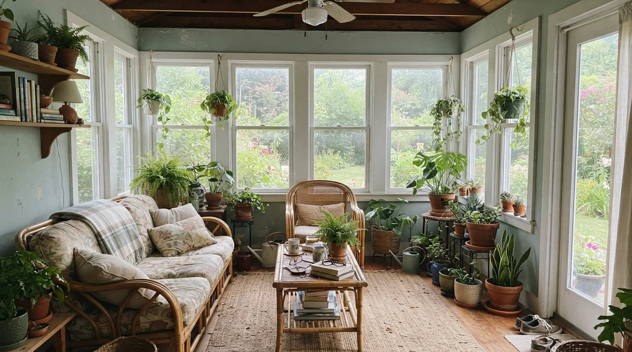
Sunrooms, enclosed porches, and garden rooms, on the other hand, are natural habitats for this shade. Surrounded by large windows and lively houseplants, the green in the paint responds directly to the greenery outside the glass, making the whole room feel like an extension of the garden.
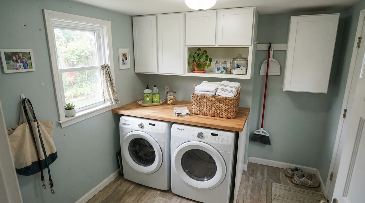
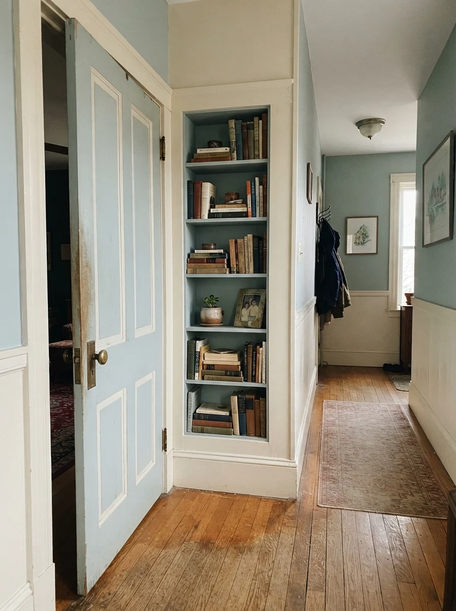
If you don't want to commit four full walls to color, using it on architectural millwork is an understated way to add character to an older home. Painting an interior door, a pantry entrance, or a built-in hallway bookshelf gives you that vintage charm without overwhelming the hallway. In bright laundry utility rooms, it brings a fresh, scrubbed-clean atmosphere to everyday chores.
Palladian Blue does not soften warm cream or yellowed woodwork — it exposes it. Put it next to pure white, or prepare to repaint all your trim.
The Honest Fail: Where Palladian Blue Falls Apart
The unhappy stories about Palladian Blue almost all come from three specific situations, and all three are completely predictable before you pry open the lid. If your room matches one of these, no amount of careful cutting-in will rescue it.
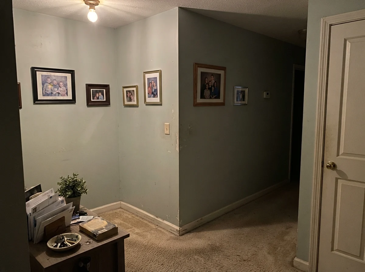
First, if your room has windowless dim lighting combined with dingy builder beige carpet or dark brown woodwork, Palladian Blue loses all its watery charm. Instead of looking like a luxury hotel bath, it turns flat, muddy, and putty-like. Without enough daylight or crisp contrast, the color dies on the drywall.
Second, the number-one homeowner regret: existing cream, almond, or oil-yellowed white trim. Because Palladian Blue is cool and genuinely saturated, it creates immediate contrast with warm trim. It doesn't blend with cream; it makes your trim look like it belongs in a heavy smoker's house from 1984, while the wall itself looks cold and detached.
Third, pairing it with warm travertine or beige tumbled stone tile. Warm tan stone drags out an aggressive greenish-gray cast from Palladian Blue that leaves homeowners saying, 'It looks pretty on the chip, but why does my bathroom look like pond water?'
Exterior Siding and Porch Ceilings
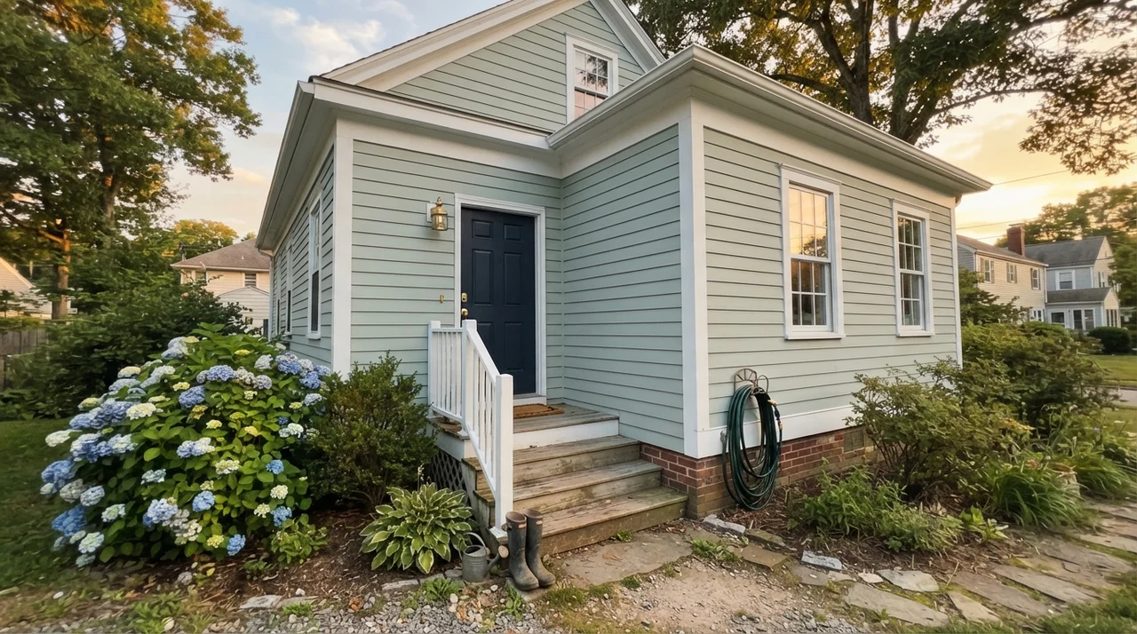
Outside the house, Palladian Blue takes on a whole new life. In full exterior sunshine, an LRV 60 paint will look significantly lighter than it does inside your living room. On horizontal cottage lap siding or cedar shingles, it washes out to a gentle, weathered coastal tone that feels historic rather than bright.
It is also a quintessential choice for covered front porch ceilings—channeling the classic southern haint-blue tradition. Under the shadow of a porch roof, it holds just enough color saturation to suggest an open summer sky without drawing undue attention to itself. Ground it with crisp white trim and a deep, confident front door shade like Kendall Charcoal or navy for proper exterior weight.
Durability, Scrubbing, and Sheen Choices
Over thirty years of maintaining family houses, I have learned that picking the right color is only half the battle; picking the wrong sheen will ruin even the prettiest shade. In high-humidity spaces like bathrooms, you need moisture resistance. For Palladian Blue in any bath with a functioning shower, satin is worth the money. A flat or standard matte finish will watermark the first time someone takes a hot twenty-minute shower, leaving dull vertical streaks down your wall.
For bedrooms and living spaces, stick with a dependable eggshell. Eggshell gives Palladian Blue a soft, velvety depth that absorbs daylight smoothly without creating blinding glare spots next to sunny windows. On cabinetry, bathroom vanities, and interior doors, step up to a dedicated cabinet satin or semi-gloss finish. In our last house, our laundry cabinets took daily abuse from laundry baskets and wet boots, but the satin enamel held up beautifully and scrubbed clean with a warm rag and mild soap year after year.
Is Palladian Blue blue or green?
It is officially cataloged in Benjamin Moore's green collection, but it sits directly on the boundary between blue and green. In north-facing rooms and cool morning light, it looks soft aqua blue. In south-facing rooms, warm afternoon sun, and under 2700K incandescent lamps, the green undertone comes forward and it reads like pale sea glass or soft sage.
What is the best trim color for Palladian Blue?
Crisp, clean whites are by far the best pairing. Benjamin Moore Chantilly Lace (OC-65) creates a sharp, clean contrast that highlights the color's aquatic clarity. White Dove (OC-17) works well for a softer, slightly warmer look. Avoid creamy, yellow, or almond trim, which will clash with the cool undertone and make the baseboards look yellowed.
What sheen should I choose for bathrooms painted in Palladian Blue?
Always use a satin finish in bathrooms with showers or tubs. Satin provides the necessary moisture and mildew resistance to prevent water streaking down your walls. In bedrooms, living areas, and hallways, eggshell is the ideal finish.
Can I paint all my kitchen cabinets in Palladian Blue?
It is generally not recommended for an entire kitchen of upper and lower cabinets because thirty painted doors can overwhelm a room and make it look themed. Instead, use Palladian Blue on a kitchen island, lower cabinets only, or a single bathroom vanity, pairing it with white perimeter cabinetry.
Susan's Verdict · Worth Every Penny Where It Fits
Palladian Blue has spent twenty years on Benjamin Moore's best-seller list for a very good reason: when you give it white trim, decent daylight, and clean tile, it creates the calmest, most restorative room in the house. It is worth the money in bathrooms, nurseries, bedrooms, and cottage sunrooms. Just remember its golden rule before buying your paint: it is an aqua chameleon that demands white woodwork and will show you its green side the second the afternoon sun hits.