Color Diary · No. 41
Accessible Beige SW 7036: What Happens When America's Default Color Meets Real Light
America's default warm greige, reviewed honestly: the rooms where it glows, the three rooms where people cry about it, and what to paint instead.

Susan HartleySeptember 22, 2026 · 17 min read
Accessible Beige · Sherwin-Williams SW 7036
Hex#D1C7B8LRV58Undertoneswarm tan → soft greige → dull taupe
In our last house—a 1990s colonial with enough golden oak trim to build a small boat—I spent six months paralyzed by paint swatches. We were getting ready to list the house, and our real estate agent had gently informed me that the buttery yellow walls I had loved for a decade now looked dated within thirty seconds of stepping through the front door. Everyone wanted gray, but every true gray I rolled onto our drywall felt like wet concrete next to our honey-toned floors. That was the year I finally caved and bought my first five-gallon bucket of Sherwin-Williams Accessible Beige (SW 7036).
Accessible Beige sits at number 15 on the global charts for a very specific reason: it is the peace treaty between two opposing eras of home design. It is the color you pick when plain gray feels clinical and cold, but traditional beige feels hopelessly stuck in 1995. Sherwin-Williams built it as a warm tan with just enough gray mixed in to keep it feeling tailored and modern. At a Light Reflectance Value (LRV) of 58, it reflects enough light to flow effortlessly across an entire main floor—entryway, living room, hallways, and kitchen—without plunging a hallway into gloom or blinding you under midday sun.
When we sold that colonial, the buyer’s agent told me three different couples asked for the paint code before they even submitted an offer. It gave the whole floor a clean, finished, cohesive look that didn't demand attention. But here is the hard truth nobody prints on the little paper swatch: Accessible Beige is not bulletproof. I have lived with it in two different houses across ten years, and while it can look breathtaking under the right conditions, it can turn into an absolute disaster if your lighting or your fixed surfaces fight it.
The Undertone Breakdown
Sherwin-Williams Accessible Beige is a greige that sits squarely between tan and gray. In strong southern light, the warm tan body comes forward. Under flat overcast skies or cool northern exposure, the gray takes over and can read as a muted, muddy taupe.
warm sun
overcast, north light
dusk, rain, cool bulbs
Accessible Beige shifts from a warm, creamy tan under direct southern daylight to a cool, quiet taupe under overcast northern skies.
MushroomSherwin-Williams · see diary
Even Better BeigeBehr · see diary
Accessible BeigeSW 7036
Smokey TaupeBenjamin Moore · see diary
Almond WispBehr · see diary
Light Shifts: The Morning-to-Midnight Transformation
Color is never a static thing on a wall; it is a live reflection of whatever sky you have outside your window and whatever lightbulbs you screwed into the ceiling. Accessible Beige is particularly sensitive to these shifts because its balance of gray and tan is so delicate.
In a south-facing room bathed in all-day sun, the warmth pushes forward. The paint reads as a soft, creamy tan that never tips into yellow or orange. It feels welcoming, grounding, and expensive. But walk into a north-facing room in the same house on a rainy Tuesday morning, and you will see an entirely different paint. Cool northern daylight strips the warmth out of the pigment, leaving behind a taupe-gray that can feel drab or flat. If you were expecting a cozy sandy beige, you will be deeply disappointed.
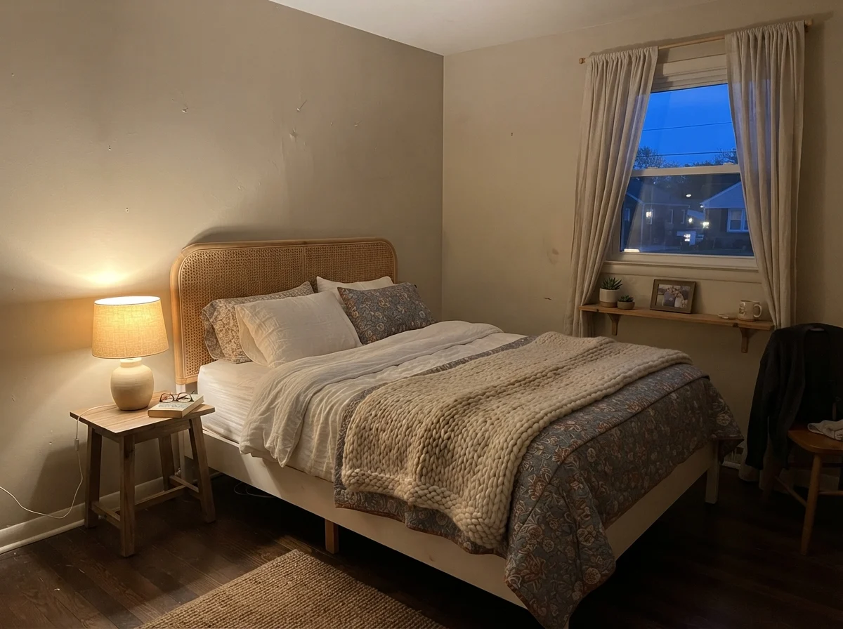
Your artificial lighting matters just as much. Under standard 2700K warm incandescent or LED bulbs, Accessible Beige comes alive in the evening, taking on a gentle, cozy warmth. But if you run cool 3500K or 5000K daylight LED bulbs, the color flattens out into an uninviting, sterile gray. If your walls look muddy at night, save yourself the cost of a repaint: change your lightbulbs before you blame the paint can.
Living with Accessible Beige in Bedrooms and Quiet Spaces
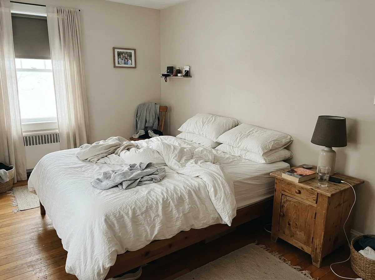
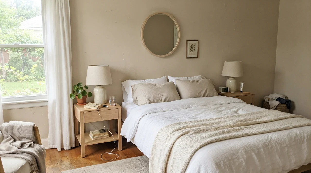
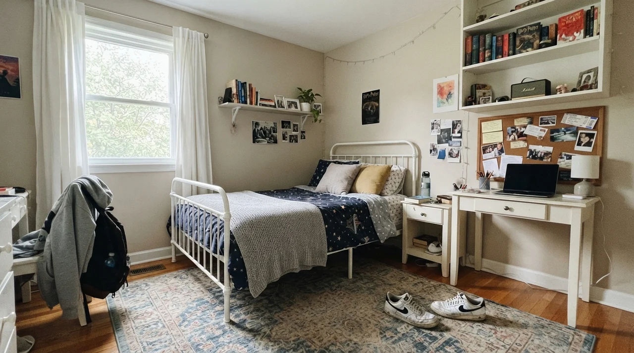
In bedrooms, Accessible Beige can be an exceptional backdrop because it provides enough contrast against white trim without making the room feel enclosed. At LRV 58, it is deep enough to feel restful during the day and enveloping when the lamps are turned on at night.
We used it in our guest bedroom for nearly seven years. Five years in, when guests would stay over, they always commented on how peaceful the room felt. Because it has that hint of gray, it allows you to bring in crisp white linen bedding, pale oak furniture, and woven natural rugs without the room looking washed out or monochromatic. It acts as an anchor.
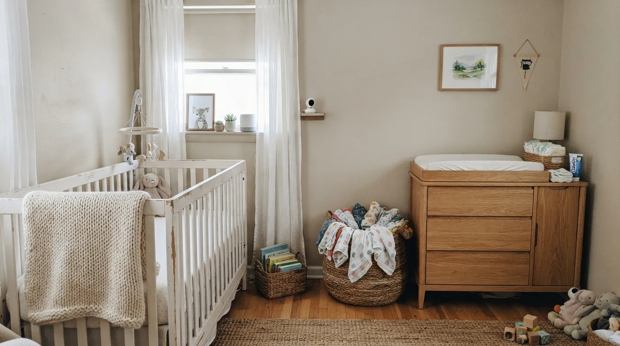
In kids' rooms or nurseries, it also serves a practical purpose that off-whites cannot match: it hides the minor scuffs and handprints of daily life. In our 1960s ranch, where hallway walls take a beating from laundry baskets and passing shoulders, Accessible Beige held up far better than the pale builder's whites we had in our first split-level.
Open Spaces, Sunlight, and Natural Materials
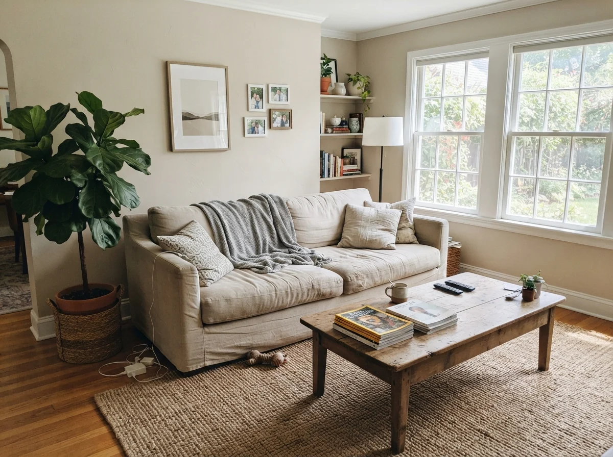
Where Accessible Beige truly shines is on large, open-concept main floors where you need a single wall color to tie together disparate zones. When you have south or west-facing windows pouring natural light across the room, the color softens and takes on a velvety, creamy quality that makes natural wood, leather, and warm metals look deliberate and curated.
If you have medium oak floors, walnut furniture, unlacquered brass hardware, or rich leather armchairs, this paint acts like a gentle spotlight for those textures. It doesn't fight them for attention the way a bold color would, nor does it make them look overly yellow the way a stark, cold gray tends to do.
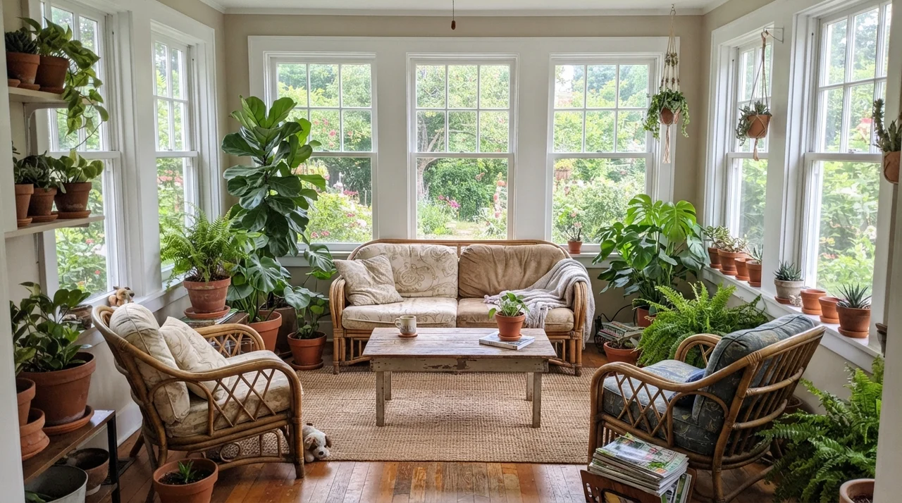
In a sunroom or great room wrapped in windows, the tan side of the formula comes forward immediately. Full natural light washes out pure whites, turning them blindingly bright, but Accessible Beige absorbs that glare and stays grounded. You get a relaxed, warm living space that feels connected to the garden outside.
Kitchens, Cabinetry, and the Trim Dilemma
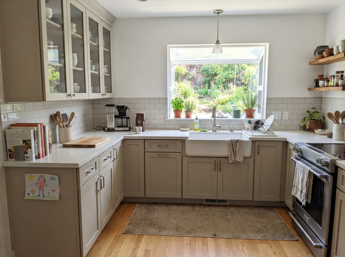
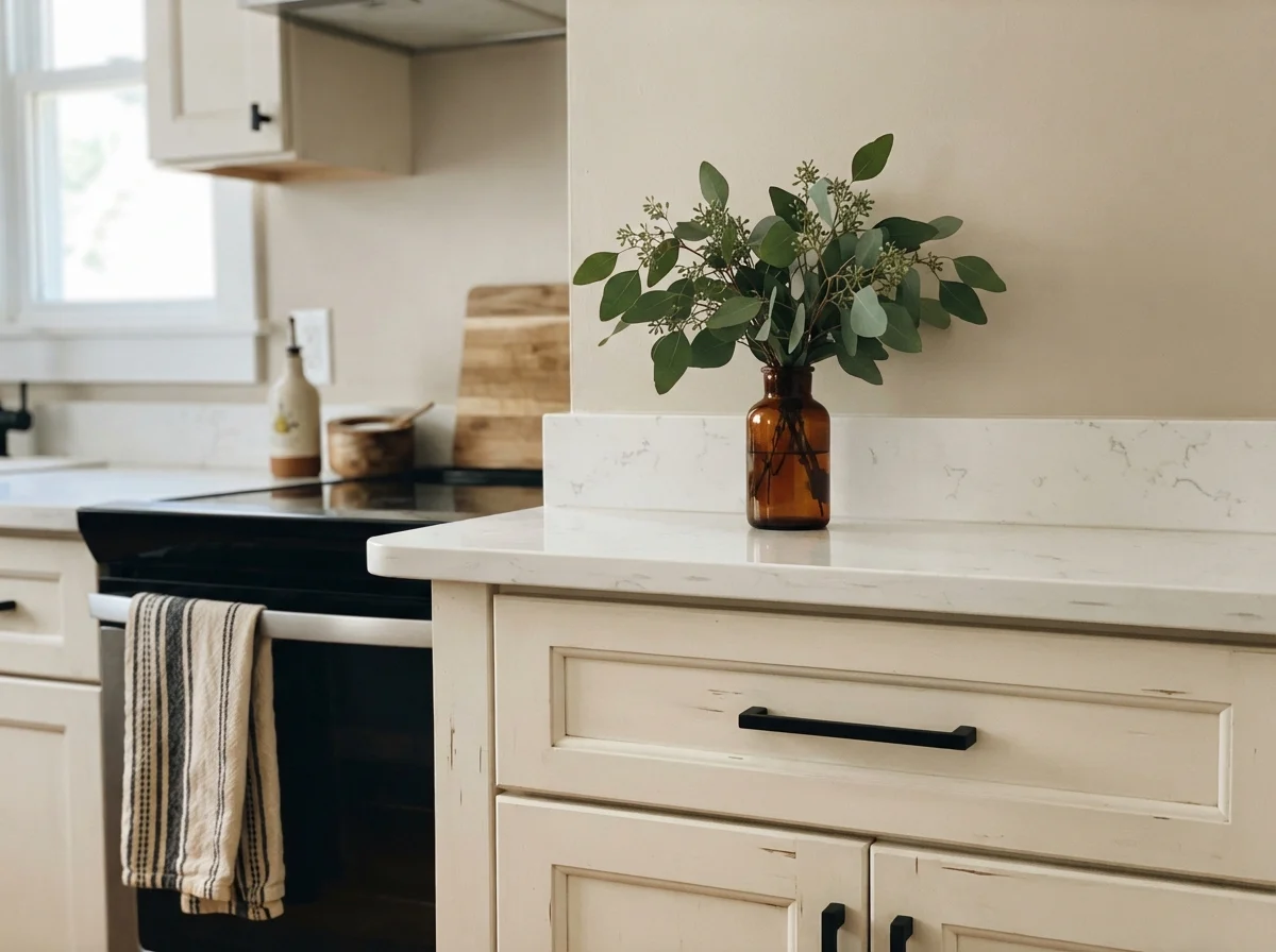
In a kitchen, Accessible Beige on the cabinetry—finished in a durable satin sheen—can look wonderfully sophisticated. It provides warmth without feeling sterile, and unlike white cabinets, it hides grease splatters and grubby fingerprints around cabinet pulls remarkably well. It is worth the money on cabinets if you want a warm, inviting kitchen that doesn't feel like a hospital laboratory.
However, kitchens are also where the most heartbreaking painting mistakes happen with this color. Accessible Beige is highly sensitive to the white you place right next to it. If you have Alabaster (SW 7008) trim, off-white subway tile, or cream countertops, Accessible Beige will suddenly read dingy, gray, and cold. Because Alabaster has a rich, yellow-cream undertone, it forces Accessible Beige's gray pigments into sharp focus.
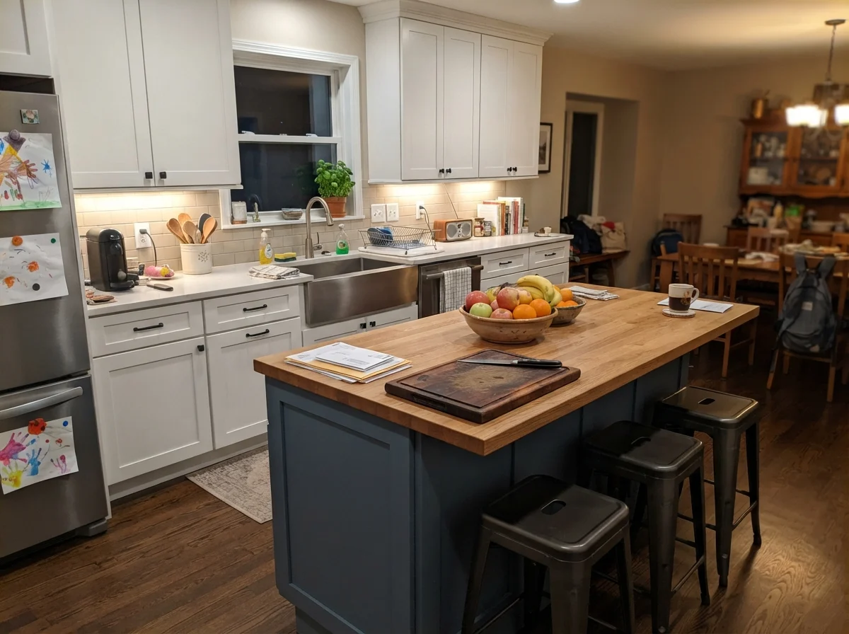
To keep Accessible Beige looking warm and clean, you must pair it with a crisp, neutral white like Pure White (SW 7005). Pure White provides just enough clean contrast to let the warm tan notes in the wall breathe. If you want contrast on a kitchen island, pairing Accessible Beige cabinets with a rich, dark grounding neutral like Urbane Bronze (SW 7048) on the island provides the depth the beige cannot deliver on its own.
Bathrooms, Laundry Rooms, and Utility Spaces
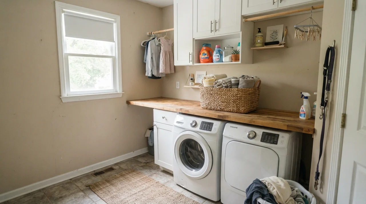
Utility spaces and bathrooms are working rooms, and your wall paint needs to hold up to moisture, steam, and frequent cleaning. We painted our main floor laundry room in Accessible Beige in eggshell, and it held up beautifully against laundry baskets banging into the drywall and detergent splashes scrubbed clean with a sponge.
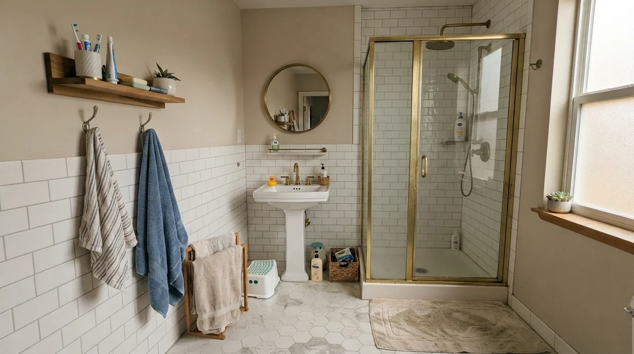
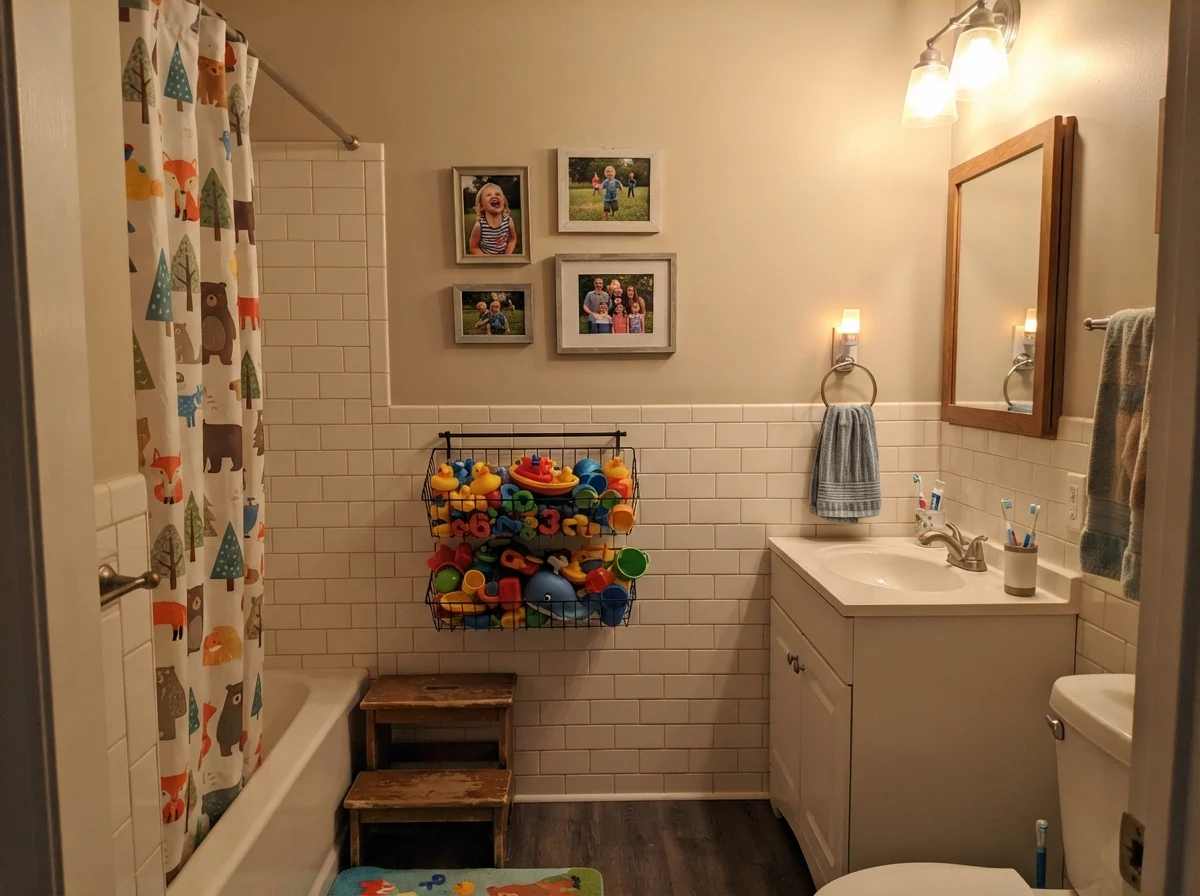
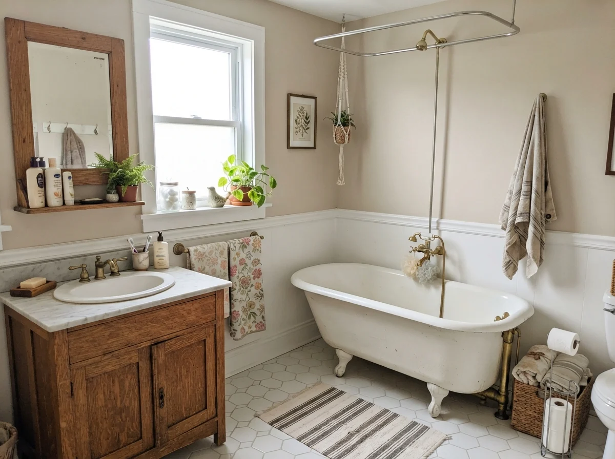
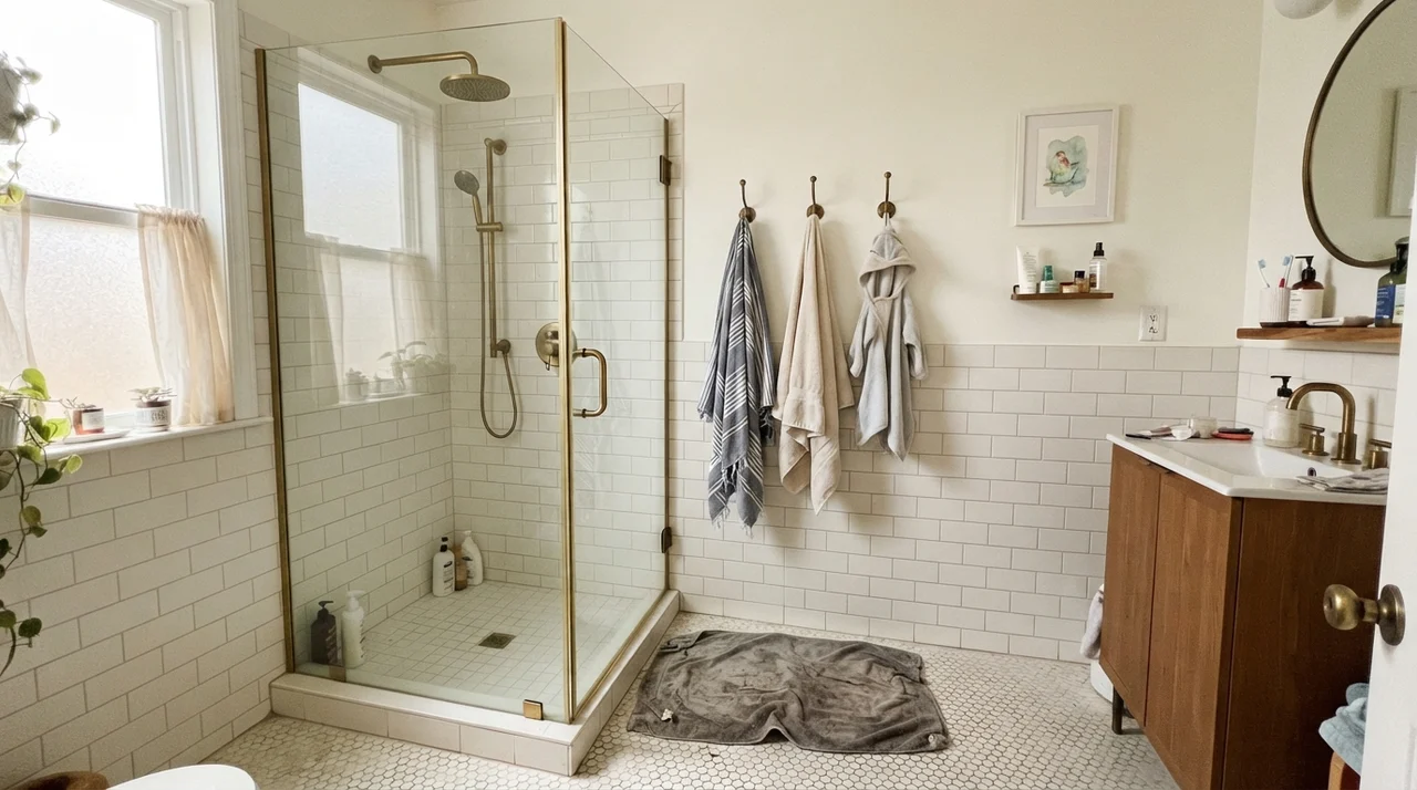
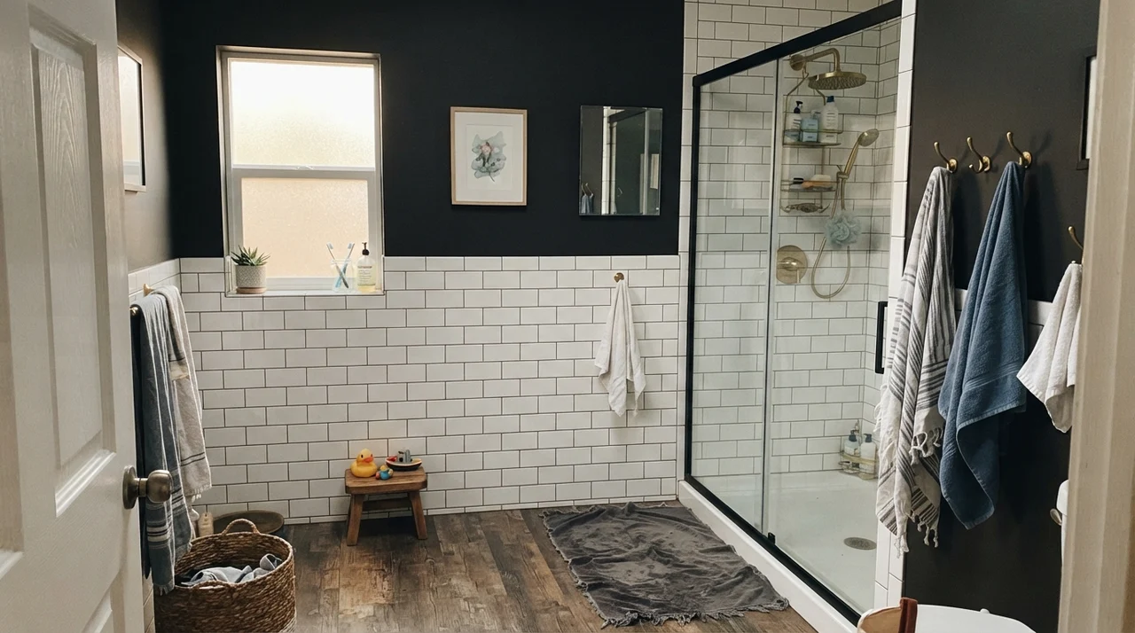
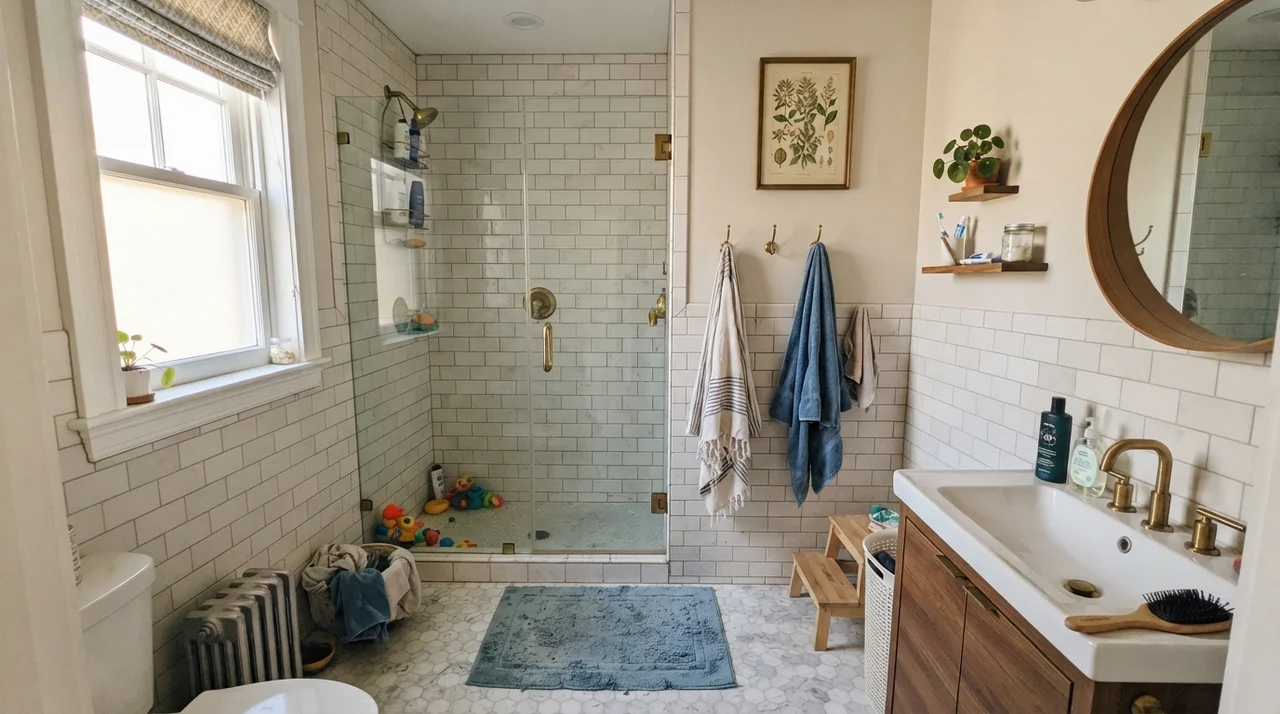
In a bright bathroom with a generous window, white wainscoting, and warm brass fixtures, Accessible Beige adds a spa-like, grounded feel. It frames white porcelain tubs and subway tile cleanly without the harsh contrast of a dark paint.
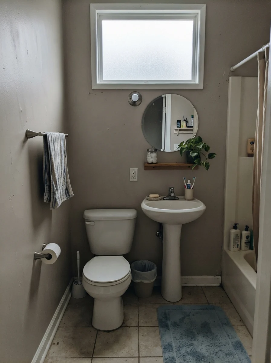
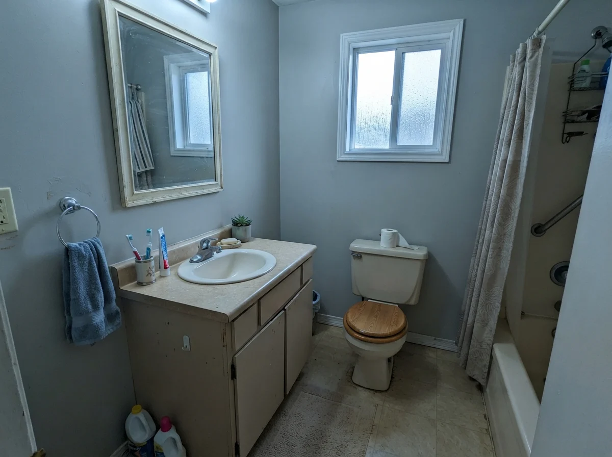
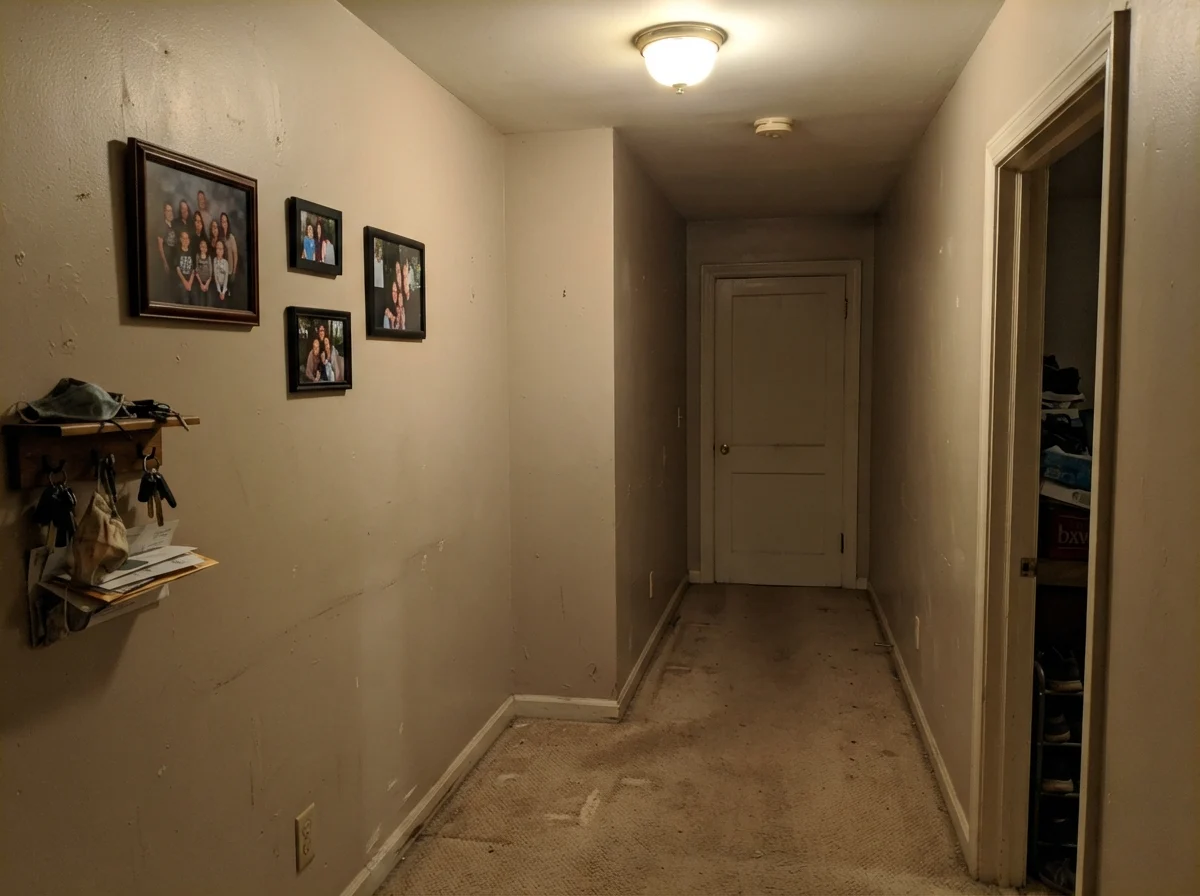
However, you need to exercise extreme caution in small, windowless powder rooms. Without natural daylight to energize the tan undertones, Accessible Beige can lose its lift and read like flat, muddy cardboard or a dingy taupe. If your bathroom relies entirely on an overhead builder-grade vanity bar, go with a lighter, creamier neutral instead.
The Three Rooms Where People Regret Painting Accessible Beige
The complaint threads about Accessible Beige on design forums and paint groups are remarkably consistent. In thirty years of painting houses, I have seen these exact three mistakes play out dozens of times. If your room matches one of these three profiles, a second coat will not fix it—you have the wrong paint for the space.
1. The Dim, North-Facing Room: North light is cool and blue. When blue-tinted daylight hits a paint made of yellow, brown, and gray pigments, it cancels the warmth immediately. The gray takes over, leaving behind a wall that looks drab, shadowy, and muddy. If your room stays dim all day, you need a beige with more cream, such as Natural Linen (SW 9109).
2. Paired Beside Warm Whites Like Alabaster: When people put Accessible Beige next to Alabaster trim or cream kitchen cabinets, they expect a seamless blend of soft neutrals. Instead, the yellow warmth in Alabaster pulls the gray straight out of Accessible Beige, making the walls look dull and cold by comparison. It looks like a painting mistake because the undertones fight.
3. Paired Over Red-Toned Wood Floors: This is the science of color theory at its most frustrating. If your home has Brazilian cherry, red oak, or mahogany floors, those reddish wood tones bounce red light back up at your walls. When your eyes see strong red tones reflected from the floor, your brain compensates by making the gray-tan on the wall read as olive green or pea soup. Sherwin-Williams did not put green in that paint can—your floor created it. If you have red wood floors, skip greige entirely and stick to a true warm beige like Kilim Beige (SW 6106).
Sherwin-Williams put no green in the can—your cherry floor did that. You don't choose a paint for the weekend you roll it; you choose it for how it handles your floor and your light five years down the road.
Hallways, Architectural Details, and Exterior Siding
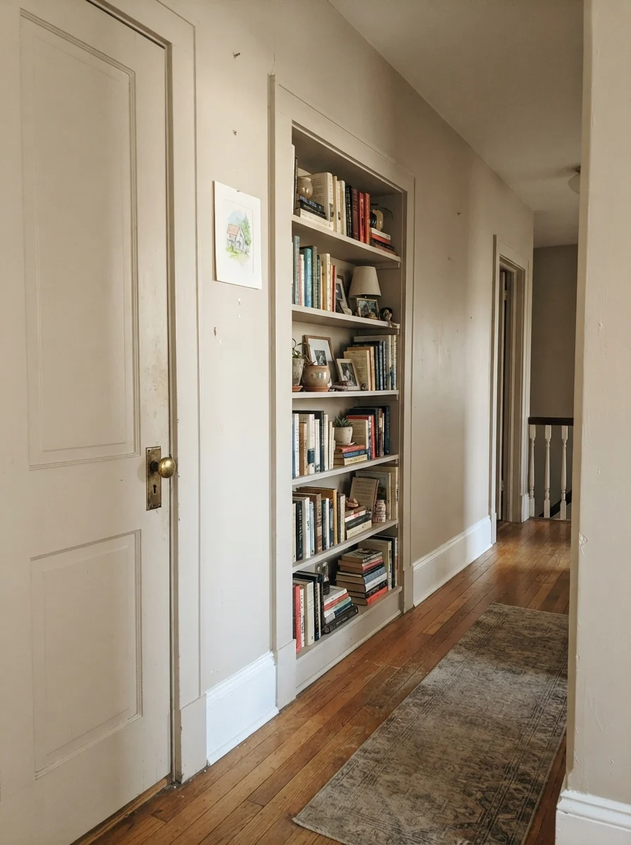
If you have an older home with architectural quirks—like hallway built-ins, detailed two-panel interior doors, or narrow passages—Accessible Beige is one of the most reliable tools in your kit. Painting an interior door or a hallway bookcase in Accessible Beige while keeping the surrounding trim in Pure White adds instant depth without visual clutter.
Running Accessible Beige down an entire hallway is one of the easiest ways to make a modest house feel larger. In our 1970s split-level, the central hallway was a chopped-up mess of four different wall colors. When we painted the entire hall and open living area in Accessible Beige, the choppy cut lines vanished. The eye traveled smoothly from room to room, and the house instantly felt more expansive.
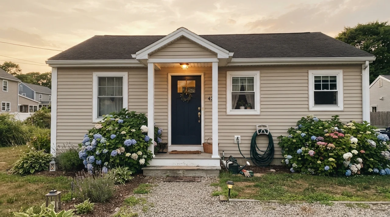
On home exteriors, Accessible Beige functions as an exceptionally durable, warm siding neutral. Direct outdoor sunlight washes out colors significantly; on exterior horizontal siding in a satin sheen, Accessible Beige reads as a bright, creamy, sun-warmed linen rather than tan. Pair it with crisp white trim, and use a dark, confident color like Urbane Bronze (SW 7048) or Tricorn Black (SW 6258) on the front door and shutters to give the exterior structure and presence.
Durability, Sheens, and Living with It Long-Term
When you've repainted every room in three different houses across thirty years, you stop judging paint by how pretty it looks on the roller tray. You judge it by how it looks on year four, after dogs have brushed against the hallway corners and dirty hands have touched the wall beside the back door fifty times.
For interior walls, eggshell is the only sheen I recommend for Accessible Beige. Flat paint absorbs too much light and makes this specific greige look chalky and dry; worse, you cannot scrub a flat wall without leaving a polished shiny mark behind. A good eggshell gives the paint a gentle luster that helps bounce light through the room and can be scrubbed clean with a warm microfiber cloth and a drop of dish soap without stripping the pigment.
For baseboards, door casings, and interior doors, step up to semi-gloss in Pure White (SW 7005). The sheen difference creates a crisp architectural boundary that makes the beige wall look intentional and tailored. On kitchen or laundry cabinets, satin is the sweet spot—durable enough to handle moisture and grease, but smooth enough to wipe down without high-gloss glare.
How Accessible Beige Compares to Similar Neutrals
Before you buy your paint, it helps to understand how Accessible Beige stacks up against its closest competitors in the paint aisle. Every brand has a version of this color, but small shifts in LRV and undertone completely change how they behave in your home.
What is the Light Reflectance Value (LRV) of Accessible Beige?
Accessible Beige has an LRV of 58. This puts it in the sweet spot for a whole-house neutral: light enough to reflect daylight and keep rooms open, but deep enough to contrast against white trim and hide minor scuffs.
Why does Accessible Beige look gray or drab in my room?
Accessible Beige contains both gray and tan pigments. If your room faces north, receives low daylight, or has cool 5000K LED bulbs, the cool light neutralizes the tan and forces the gray undertones forward. Switching to warm 2700K bulbs can instantly restore its warmth.
What trim color goes best with Accessible Beige?
Sherwin-Williams Pure White (SW 7005) is the best choice. Avoid creamy whites like Alabaster (SW 7008), as their heavy yellow undertones make Accessible Beige look muddy and gray by comparison.
Why does Accessible Beige look green on my walls?
Accessible Beige has no green pigment in the formula. However, if you have red oak, Brazilian cherry, or reddish-stained wood floors, your eyes see the reflected red light and compensate by making the gray-tan walls appear olive green.
Is Accessible Beige good for resale and home staging?
Yes. It ranks among the top neutral paint colors for real estate prep because home buyers read it as clean, warm, and move-in ready. It looks far more modern than 1990s yellow-beige without feeling as cold as early-2010s industrial gray.
Susan's Verdict · The Workhorse Neutral with Rules
Accessible Beige earned its spot as America's favorite greige because it solves the biggest decorating headache of the last twenty years: bridging warm wood trim with modern furniture. On an open main floor with generous southern or western daylight, oak floors, and Pure White trim, it is worth every penny of the gallon price. But do not treat it like an all-purpose cure. If your room faces north into the shadows, or your floors are red cherry, leave this can on the shelf and buy a warmer cream instead.