Color Diary · No. 43
Sherwin-Williams Stardew: The Color Chip That Lies Until the Morning Sun Hits It
The gray that quietly turns blue on the wall, reviewed honestly: the rooms where that is the whole point, the rooms where it backfires, and what to buy instead.

Susan HartleySeptember 22, 2026 · 15 min read
Stardew · Sherwin-Williams SW 9138
Hex#A6B2B5LRV43Undertonescool slate gray → muted coastal blue-green
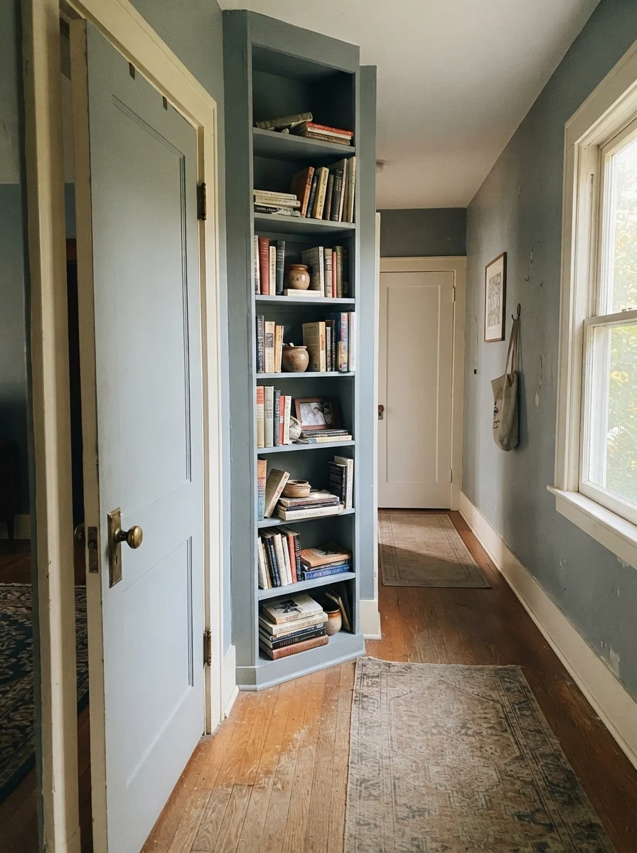
In our last house, a 1990s colonial with oversized windows and builder-grade drywall, I fell for a tiny cardboard chip that promised to be the perfect mid-tone gray. I painted our upstairs hallway with it on a Tuesday morning, went downstairs to make lunch, and walked back up to find that my neutral hallway had mysteriously turned into the color of a stormy Atlantic sky. It was not gray. It was an unmistakable, quiet blue with a drop of green tucked behind it.
That was my introduction to Sherwin-Williams Stardew (SW 9138). Over thirty years and three houses, I have learned that the paint fan deck is full of these polite deceptions. On the paper swatch under fluorescent hardware store tubes, Stardew looks like a sensible, well-behaved gray. But once you roll it across nine feet of plaster in natural daylight, its true character emerges immediately. It belongs to Sherwin-Williams's teal deck family, and it has no intention of pretending to be a pure gray once it hits your wall.
With a Light Reflectance Value (LRV) of 43, Stardew sits right in the meaty middle of the spectrum. It reflects less than half the light that touches it, which gives it genuine weight and substance. It never looks like tinted water, but it isn't heavy enough to swallow a room whole like a charcoal or a navy. The question with Stardew has never been whether it is a handsome color—it is. The question is whether you bought it on purpose or by accident.
The Undertones You Live With
Stardew is not a true gray, nor is it a pastel powder blue. It sits squarely in that slate territory where blue, green, and gray balance on an edge. The ambient daylight in your room will tip it heavily in one direction or the other.
warm sun
overcast, north light
dusk, rain, cool bulbs
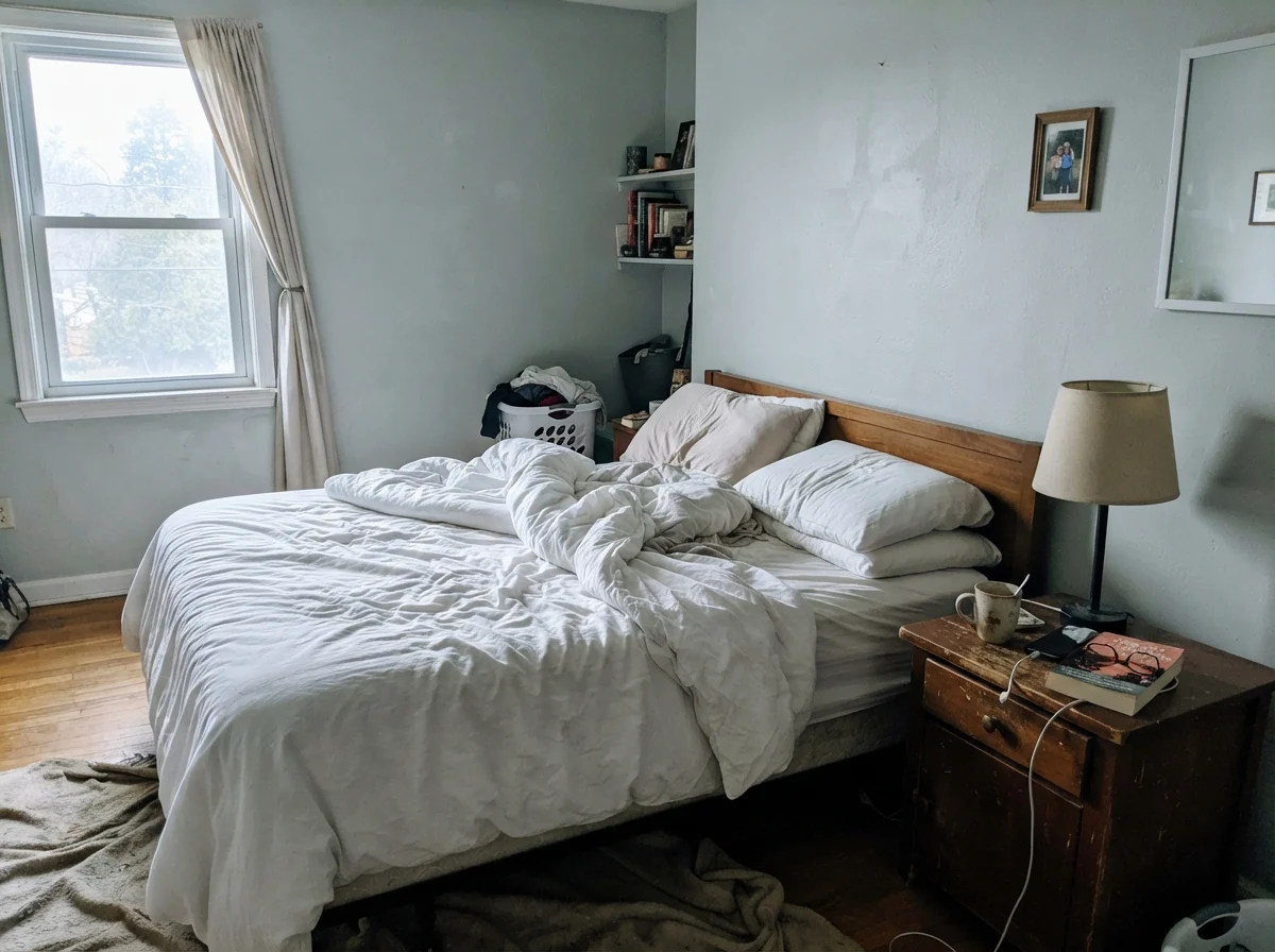
Under bright south sunlight, Stardew settles into a balanced, soft blue-gray. On rainy days or in north-facing rooms, the gray drops back and the cool blue steps forward.
Gull Wing GrayBenjamin Moore · see diary
Half Sea FogBehr · see diary
StardewSW 9138
French ToileBenjamin Moore · see diary
Santorini BlueBenjamin Moore · see diary
How Daylight Changes What You See
Before you commit five gallons to a room, you have to understand how this specific depth reacts to the sky outside your window. At LRV 43, Stardew is dark enough to absorb shadow and light enough to catch a direct beam. That means it shifts visibly across twelve hours in a way lighter grays never do.
In a south-facing room, generous natural sunlight washes out the cool undertones. The warmth of the sun cancels the blue chill, leaving behind a sophisticated slate gray that feels anchored and quiet. But turn the corner into a north-facing window or an overcast morning, and that blue-green pigment wakes right up. Indirect sky light is naturally cool, and when cool light hits a cool wall, it amplifies the undertone until the wall reads as a distinct, muted blue.
Where many homeowners run into trouble is in artificial lighting. When the sun goes down, your lightbulbs take complete control of this paint. If you run 2700K warm incandescent or LED bulbs, the golden glow wraps around the slate base, pushing it toward a soft, cozy gray. But if you have 4000K daylight LEDs in your ceiling fixtures, prepare yourself: Stardew will leap straight into an icy, clinical blue that feels like an examination room. We learned this the hard way in our colonial's upstairs bath, where changing out the bulb temperature made the difference between a restful retreat and an icebox.
Where Stardew Earns Its Keep
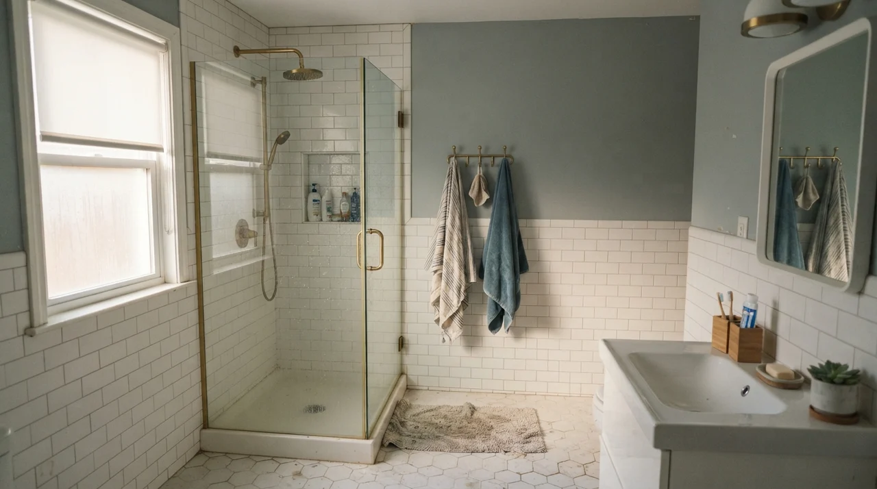
There are rooms where Stardew's subtle chameleon act is not just acceptable—it is the entire reason to buy the paint. When you pair this color with crisp white tile, white quartz counters, and solid natural daylight, it looks remarkably expensive. It has a tailored, architectural quality that keeps it from looking like a nursery pastel or a tired builder gray.
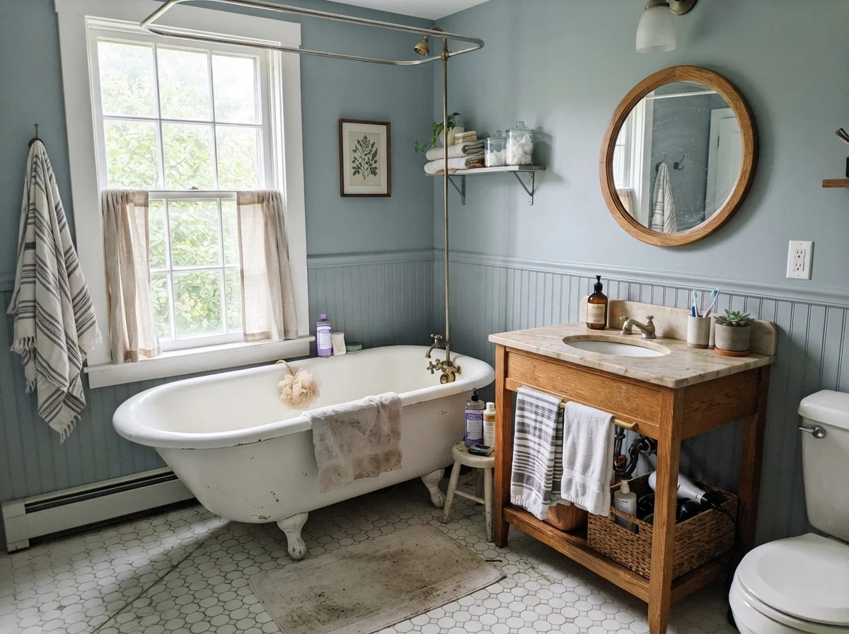
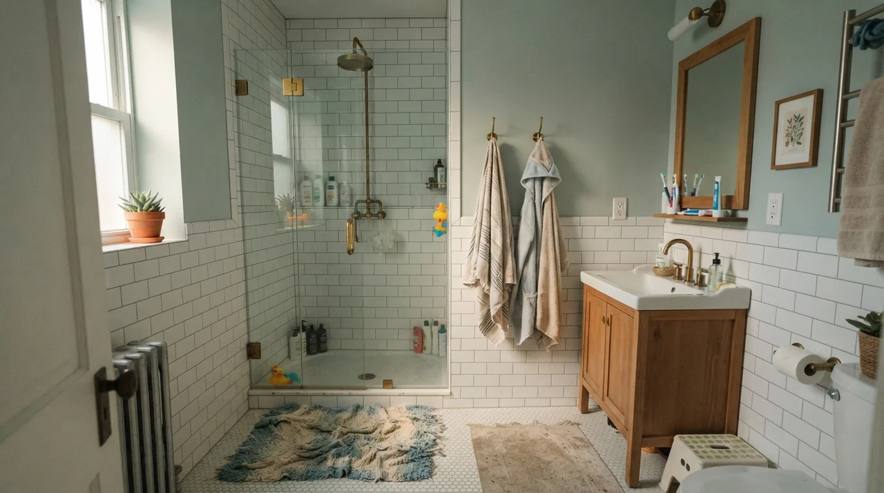
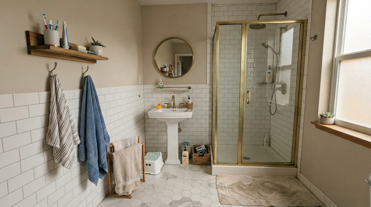
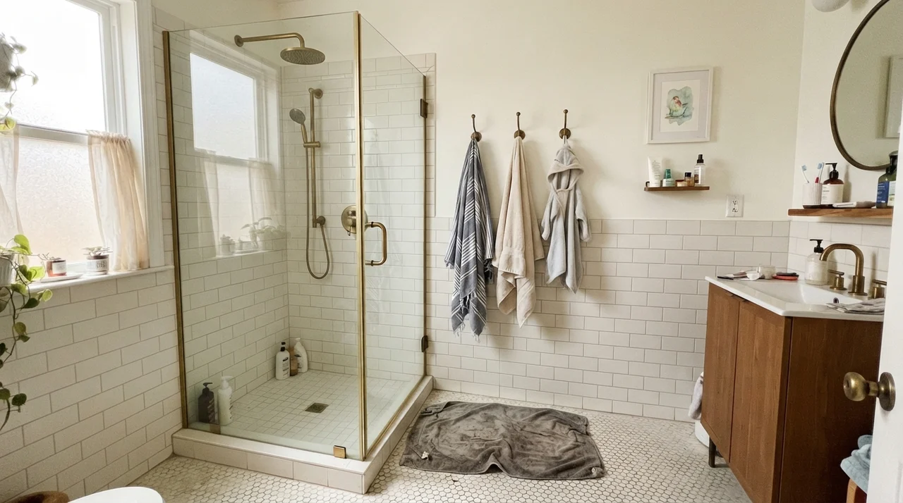
Bathrooms are Stardew's natural habitat. Because LRV 43 provides clean contrast against bright white ceramic plumbing fixtures and porcelain tile, it outlines the room with sharp, intentional definition. I have lived with it above subway tile wainscoting, and five years in, it never felt stale. The trick is making sure the bathroom has an actual window to supply natural white light.
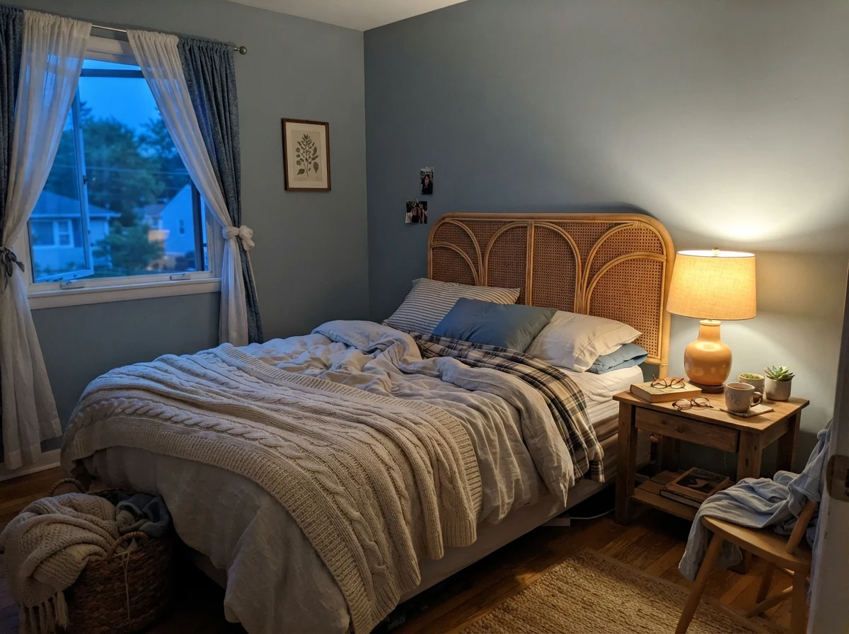
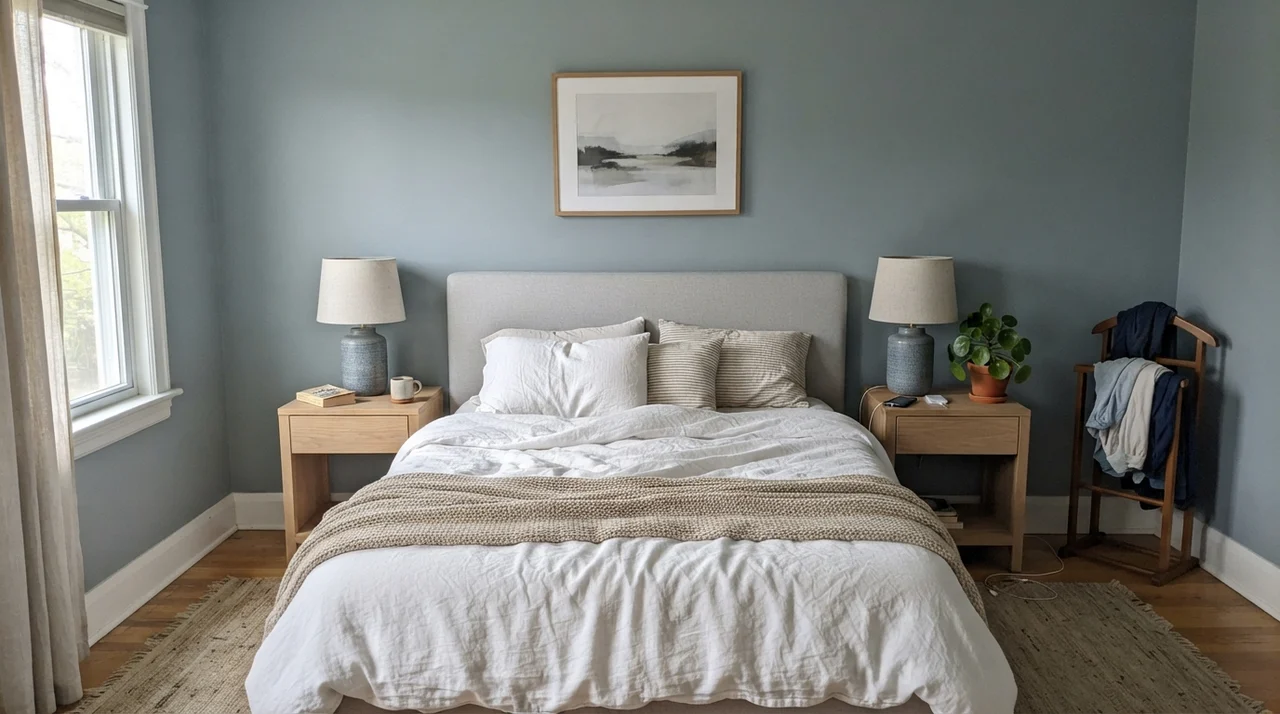
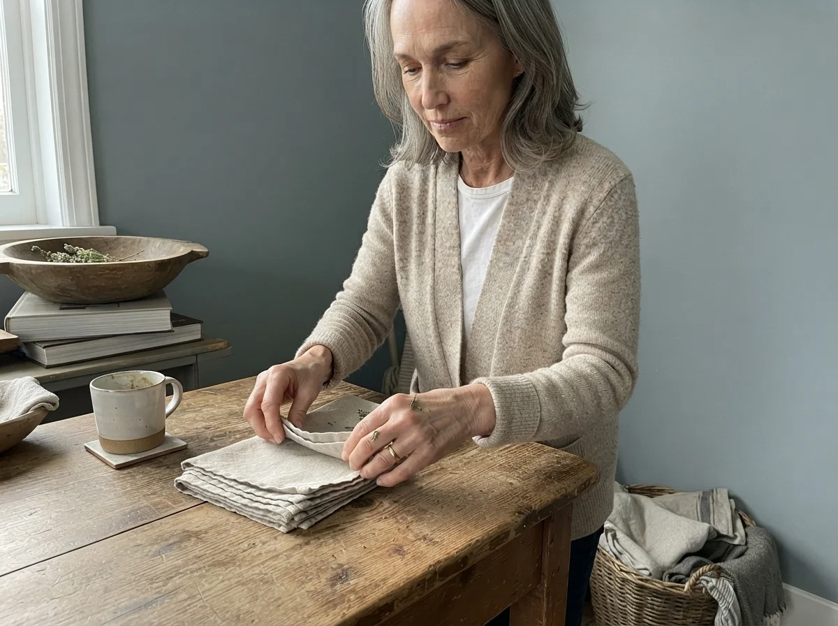
In bedrooms, Stardew creates a restful, quiet perimeter that encourages sleep. If you want a cool-toned sanctuary that looks effortless with white linen bedding, this is an exceptional pick. Unlike deep navy, which demands heavy lighting and deliberate staging, Stardew lets the room breathe while still giving the walls a clear identity.
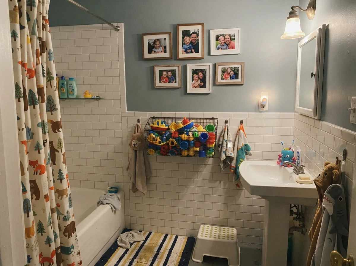
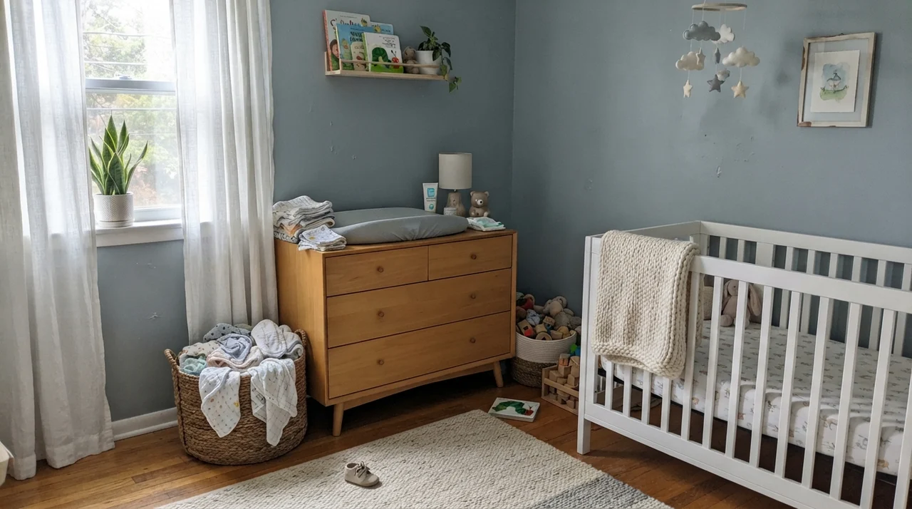
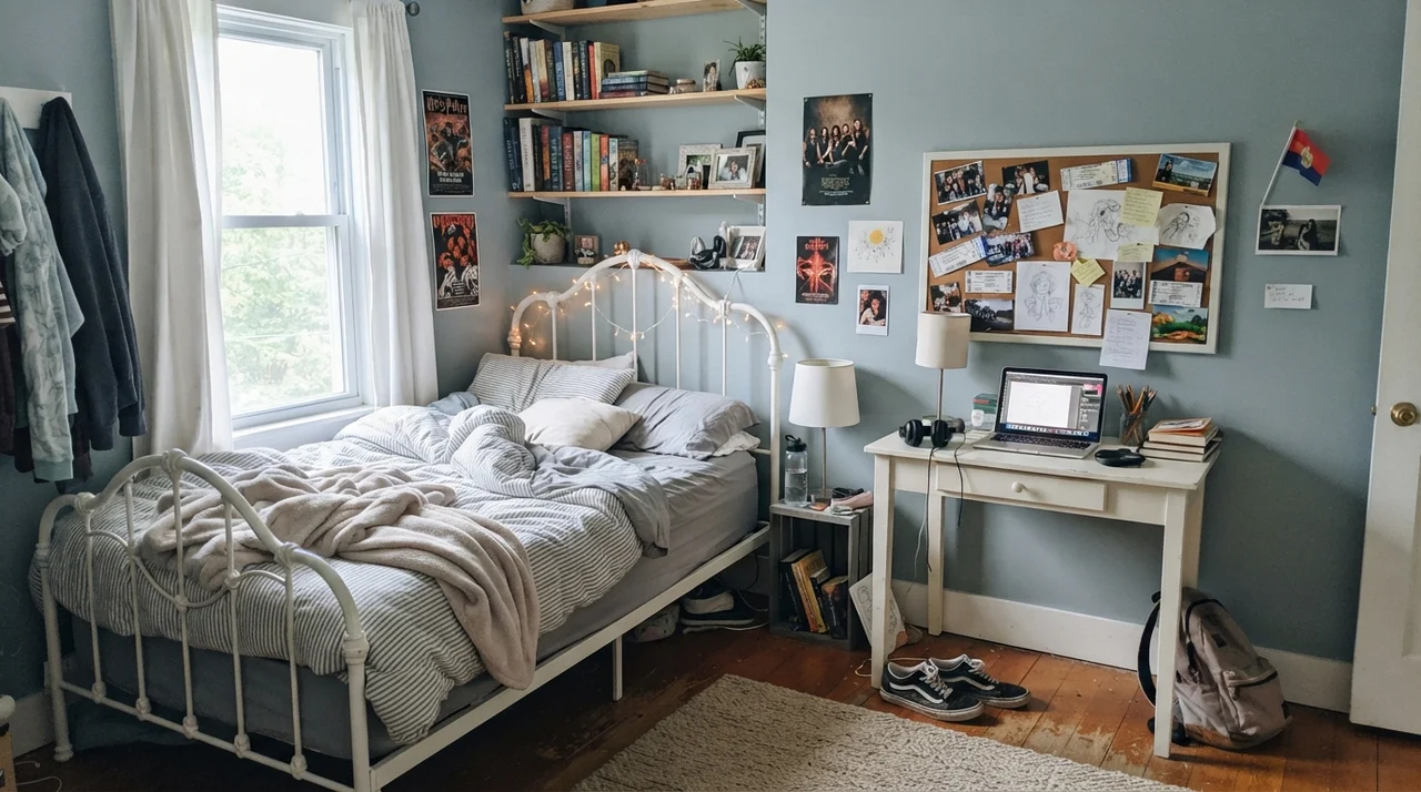
In nurseries and teenagers' bedrooms alike, it serves as a workhorse backdrop. It is subdued enough that bright toys, colorful textiles, and everyday clutter do not turn the space into a visual circus. Because its saturation is low, it avoids the sugar-sweet look of baby blues, meaning a child can easily grow through three stages of life without needing a weekend repaint.
Kitchen Islands, Built-Ins, and Cabinetry
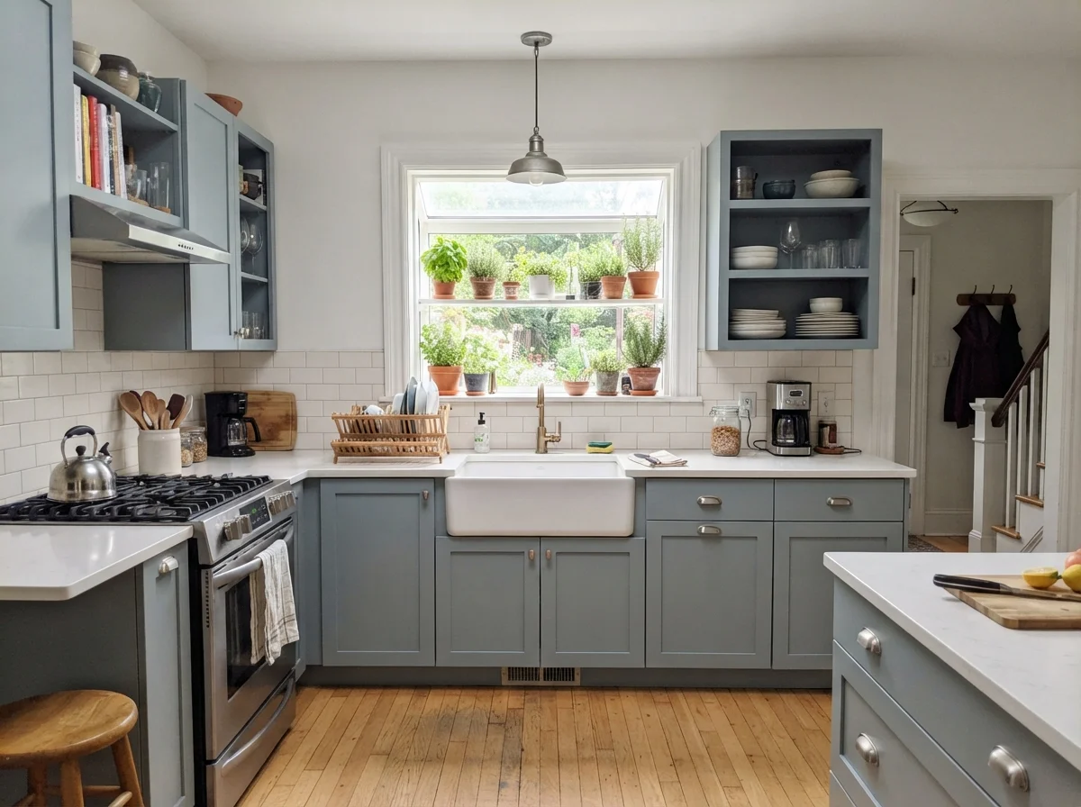
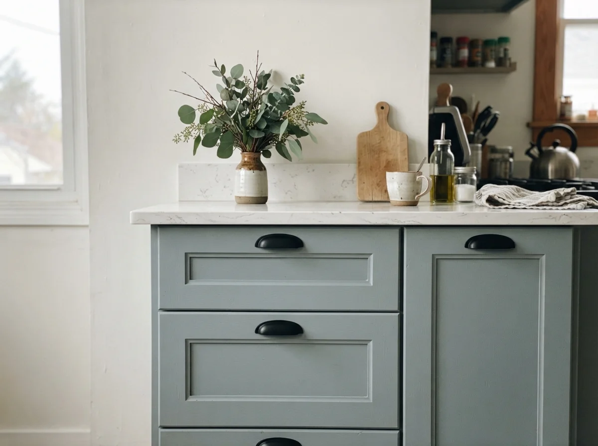
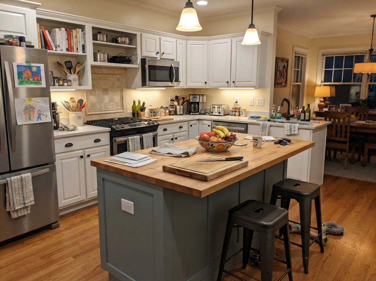
If you want color on your kitchen cabinets or an island but dread the high-maintenance upkeep and heavy visual weight of midnight navy or charcoal, Stardew is one of the smartest mid-tones on the market. It provides enough value contrast against white perimeter cabinetry to feel custom and grounded, but it won't show every speck of dust or flour the second someone bakes cookies.
In our current 1960s ranch, I've seen how a mid-tone slate handles daily kitchen traffic. When you spray or roll Stardew in a dedicated satin cabinet enamel, it wipes down easily and resists the greasy fingerprints that plague darker blues. It gives the island presence without making the kitchen feel chopped into pieces.
Notice how well Stardew pairs with clean quartz and simple hardware. It softens the starkness of a modern kitchen without feeling overly traditional. When used exclusively on a central island, it anchors the room while allowing the surrounding cream or soft white walls to keep the perimeter open and airy.
Sunrooms, Built-Ins, and Outdoor Trim
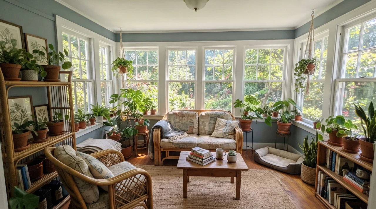
Because Stardew carries a hint of slate-green in its DNA, it responds remarkably well to organic textures and garden views. In a sunroom packed with leafy houseplants and terracotta pots, the green in the paint steps forward to connect the indoors with the lawn outside. It prevents a heavily windowed room from feeling washed out by direct mid-afternoon glare.
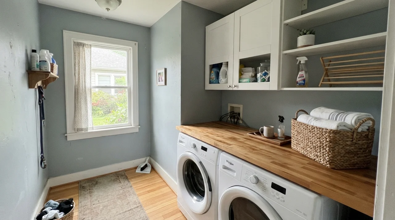
The same logic applies to transitional spaces like laundry rooms, painted interior doors, and built-in bookshelves. A door painted in Stardew semi-gloss breaks up a boring expanse of off-white wall and adds character that looks original to an older home rather than slapped on during a weekend rush.
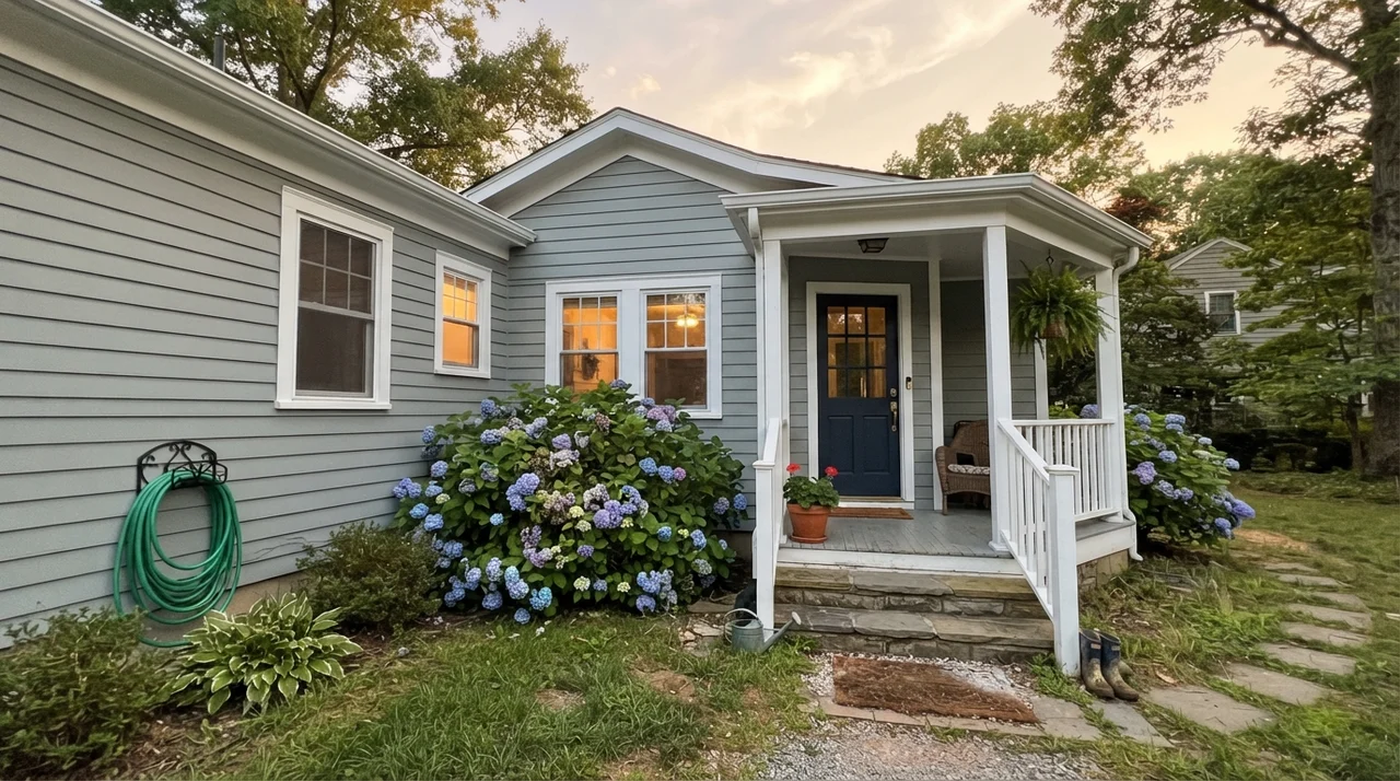
On home exteriors, Stardew behaves like an authentic coastal classic. Full outdoor sun lightens the color by nearly a full step, making it read as a weathered, dignified gray-blue rather than a heavy blue. Paired with cedar shingles, natural stone, crisp Pure White SW 7005 trim, and a dark navy or Tricorn Black SW 6258 front door, it looks like it has belonged on the house for fifty years.
Where Stardew Completely Backfires
The unhappy stories about Stardew are remarkably consistent, and every single one of them could have been avoided by looking closely at the numbers. It is not a finicky or poorly mixed paint formula. It is a cool mid-tone doing exactly what a cool mid-tone is engineered to do when placed in the wrong conditions.
Here are the three rooms where Stardew will let you down every single time:
1. The North-Facing Bathroom with White Tile and Chrome
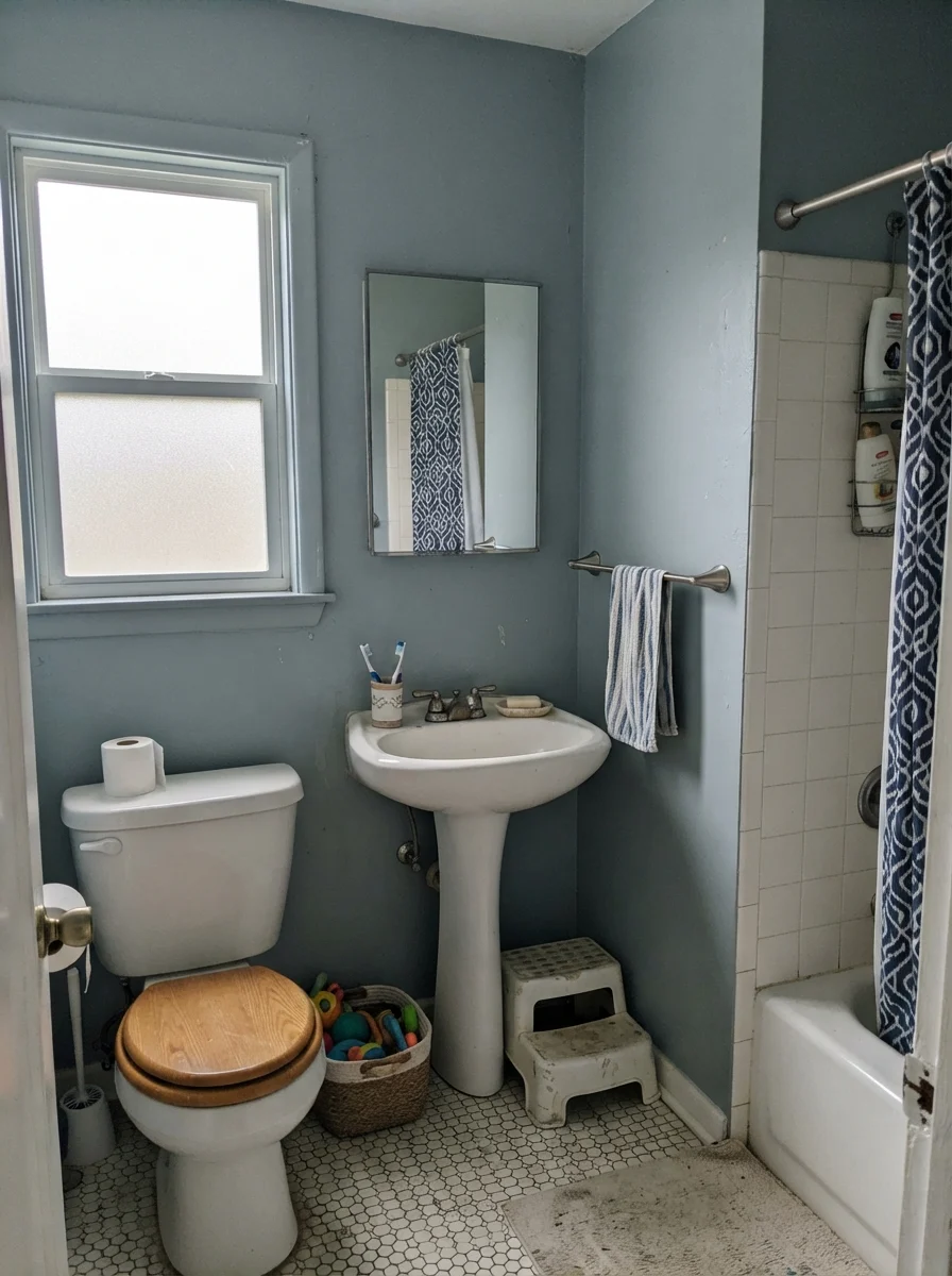
This is the number one regret I hear from homeowners. North light is naturally cold and blue-tinted. White tile bounces that cold light straight across the room, and polished chrome fixtures throw a sharp blue reflection. When all three elements stack together on top of Stardew's cool slate base, the room crosses the line from tranquil spa to hospital clinic. If your bathroom faces north and you want that soft, watery feeling without the chill, step down to a lighter, greener choice like Sea Salt SW 6204.
2. The Windowless Powder Room or Dark Basement
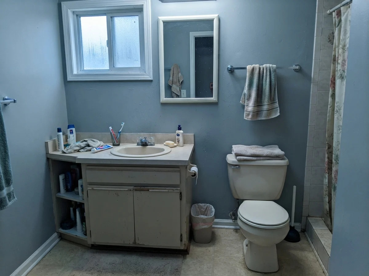
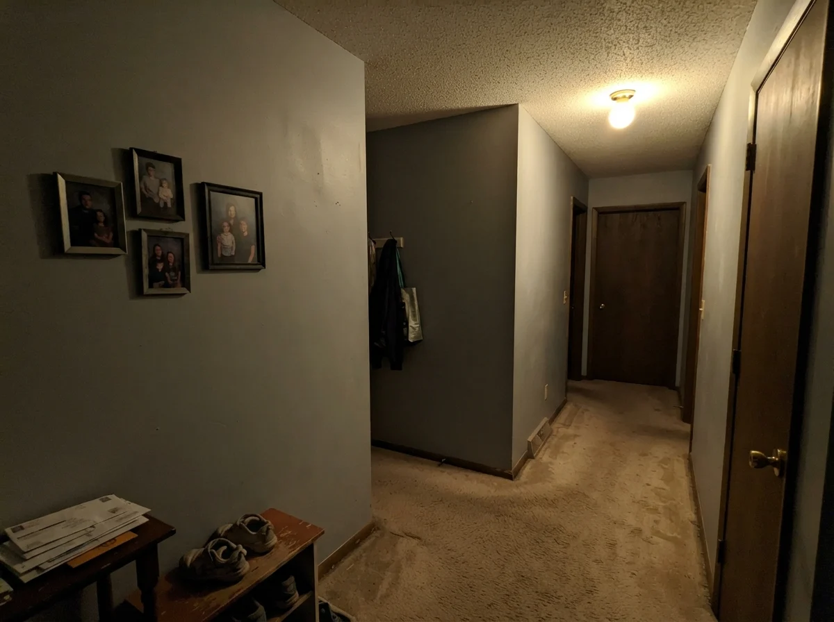
At LRV 43, Stardew needs natural light to reflect. When you put it in an enclosed powder room, an interior hallway, or a basement with only an overhead incandescent bulb, there is nothing for the pigment to work with. The blue drains right out of the wall, leaving behind a flat, muddy, putty-like gray that makes the room feel cramped and heavy. If you want quiet calm in a dark space, jump up to Silver Strand SW 7057 at LRV 59, which gives you the same mood with sixteen more points of light reflection to keep the room feeling lifted.
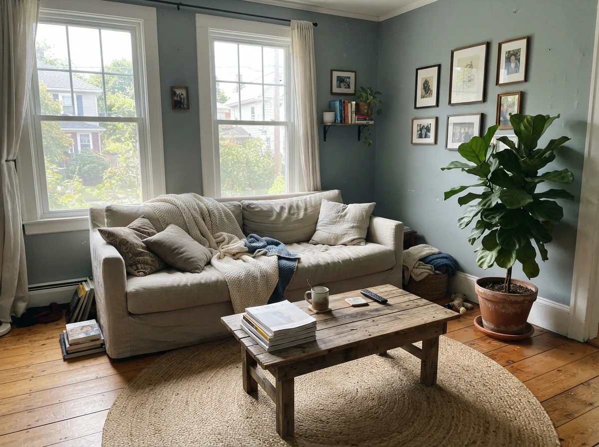
3. Rooms with Honey Oak Floors or Warm Builder LVP
Color theory is ruthless. Blue and orange sit directly opposite each other on the color wheel, which means they aggressively magnify each other. When you put Stardew against 1990s honey oak floors, golden red oak, or warm brown vinyl plank, the floor makes the wall scream bright baby blue, and the wall makes your floor look like an orange basketball court. They will fight all day long. If your warm wood floors are staying, paint the room in Uncertain Gray SW 6234 instead—it matches Stardew's exact LRV 43 depth without the blue undertone that causes the clash.
Durability, Sheens, and Long-Term Wear
When you live with a color for years instead of days, sheen selection matters just as much as pigment. At LRV 43, Stardew has enough depth that poor application or the wrong finish will show roller lap marks and flashing in bright side light.
For standard bedroom and living room walls, stick strictly to eggshell. It provides enough surface smoothness to be scrubbed clean of scuffs while remaining matte enough to hide drywall imperfections. In bathrooms and laundry spaces where steam and moisture gather, move up to satin. A satin finish gives the paint a water-repellent barrier that lets you wipe down condensation without leaving water streaks on the color.
If you are painting kitchen cabinetry or an island, do not buy standard wall paint. It is worth the money to invest in a dedicated cabinet-grade enamel in a satin finish. Cabinet enamel cures to a hard, furniture-like shell that resists chipping from shoe kicks at the island and won't soften when you clean grease off the lower drawers. For doors, baseboards, and window casings, a standard semi-gloss in Pure White SW 7005 delivers the durability you need to withstand thirty years of vacuum cleaner bumps.
Is Sherwin-Williams Stardew a blue or a gray?
It is officially categorized as a gray with a blue-green undertone in Sherwin-Williams's teal collection. On the wall, most people perceive it as a soft, muted slate blue rather than a neutral gray, especially in natural daylight.
What trim white looks best with Stardew?
Sherwin-Williams Pure White (SW 7005) is the best overall match. It provides a crisp, bright contrast that keeps Stardew feeling clean and intentional without looking stark or icy.
Why does Stardew look baby blue on my walls?
Stardew pulls blue when hit by cool north daylight, 4000K daylight LED bulbs, or when placed against orange-toned honey oak floors. To calm the blue, switch to 2700K warm bulbs and incorporate warm wood and brass accents.
Can I use Stardew on my kitchen cabinets?
Yes. At LRV 43, it is an exceptional choice for lower cabinets and kitchen islands. It provides depth and hides family wear much better than pure white, without the heavy visual commitment of navy blue.
Is Stardew too dark for a small bathroom?
It is not too dark if the bathroom has a window with natural daylight and plenty of white tile or quartz. However, in a windowless powder room, its LRV 43 depth will flatten out and feel muddy.
Susan's Verdict · A Handsome Slate That Demands the Right Light
Sherwin-Williams Stardew is one of the finest muted slate colors on the market, provided you buy it knowing that it is going to turn blue on your walls. If you want a calm, spa-like bathroom with white subway tile, a restful master bedroom with pale linens, or a tailored kitchen island that hides daily family life, it is worth every penny of the paint can. Just keep it out of windowless hallways, keep it far away from honey oak flooring, and never judge it by the little cardboard chip under store lighting.