Color Diary · No. 126
Treating Behr Adirondack Blue Like an Unfussy Workhorse
A dusty, slate-toned teal built for kitchen islands, cottage doors, and concrete slabs—provided you never paint it wall-to-wall under honey oak.

Susan HartleyNovember 16, 2026 · 16 min read
Adirondack Blue · Behr N480-5
Hex#74858FLRV22Undertonesblue → slate gray → soft teal
In our last house—the 1990s colonial with the high ceilings and the builder-grade oak that ruled my life for eleven years—I fell hard into the trap of looking for the paint that would stop people in their tracks. Every magazine back then showed deep, ink-dipped navy blues in gleaming butler's pantries and show-stopping powder rooms. So I dragged home three different sample pots of high-drama navy, painted large squares on the plaster, and convinced myself that if the room felt pitch-black by four in the afternoon on a November Tuesday, it was simply being moody.
It wasn't moody; it was suffocating. We lived with it for about three weeks before my husband pointed out that he couldn't tell his navy socks from his black socks unless he walked them over to the hallway window. That was the year I finally learned the difference between a magazine paint and a house paint. You don't live in a photo shoot. You live in a Tuesday morning when the sky is gray, the dog tracked mud onto the rug, and you need a color that holds its composure without demanding a battery of professional studio lights just to read as blue.
That brings me to Behr Adirondack Blue (N480-5). It sits at an LRV of 22, tucked right into that practical middle ground where so many homeowners actually need paint to live. It has never once been crowned Color of the Year, and you will not find design influencers waxing poetic about its poetic mystery on social feeds. What it does instead is something far more valuable to a thirty-year homeowner: it behaves itself. It is a dusty, slate-leaning blue teal that has enough gray iron in its backbone to keep it from looking sweet or juvenile, but enough light reflection that it doesn't collapse into a flat hole in the wall when the afternoon sun dips behind the treeline.
Behr sells this color in just about every can on the shelf at Home Depot—from interior cabinet enamels and porch paint to one-part concrete epoxies for garage slabs. When a paint manufacturer formulates a color to coat garage floors and trim enamel alike, they aren't marketing a delicate, high-strung wall color. They are giving you a workhorse. The trick is knowing where to turn that workhorse loose, and where to keep it firmly off the roller.
The Slate Core and How the Undertones Shift
Every blue paint is carrying a second identity in its hip pocket. Some lean into royal purple, some skew toward ice-water chill, and others tilt into muddy greenish lake water. Adirondack Blue carries a dusty teal heart anchored by a solid dose of slate gray. In direct warm daylight, that quiet teal whisper comes to the front, giving you a softened coastal feel. Under overcast skies or in flat northern exposure, the gray steps forward and keeps the blue looking sober, calm, and grounded.
warm sun
overcast, north light
dusk, rain, cool bulbs
blue → slate gray → soft teal
Blustery SkySherwin-Williams · see diary
Storm CloudSherwin-Williams · see diary
Adirondack BlueN480-5
Norwegian BlueBehr · see diary
Polly WantsBackdrop · see diary
Watching the Clock: How the Light Controls This Slate
If you have repainted even two rooms in your life, you already know that a two-inch chip in a hardware store aisle tells you almost nothing about how a wall will feel across twelve months of changing seasons. Adirondack Blue is particularly sensitive to the quality of the light hitting it because of that LRV of 22. In painting terms, 22 is right on the dividing line: it is not a deep black or navy (which sit down around 4 to 10), but it is nowhere near a pastel or light neutral (which live up in the 50s and 60s). It has real mass on the drywall.
In early morning light—especially if your windows face east or you get flat, gray morning sun—Adirondack Blue looks restrained and stony. You see the charcoal-gray pigment balancing out the blue. As the sun climbs and angles into the room, the color wakes up. That subtle teal warmth blooms without ever veering into poolside turquoise or candy-shop blue. It remains dignified. By evening, however, the bulbs you turn on will make or break your relationship with this paint.
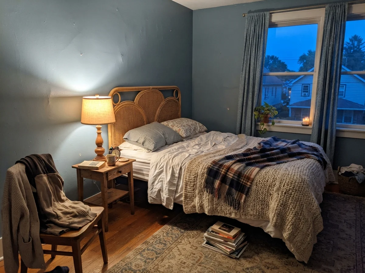
When we sold our split-level, one of the first things my real estate agent told me was to swap out every single mismatched lightbulb in the house so buyers wouldn't see cold spots. That advice stuck with me. With Adirondack Blue, if you illuminate your rooms with harsh 5000K daylight LEDs, the paint will look clinical, chilly, and industrial—like the breakroom in a municipal water department. But put standard 2700K warm-white bulbs near it, and the blue deepens into a cozy, comforting navy-slate that wraps around the furniture. Five years in to living with colors in this range, you realize that your lighting fixtures are just as much a part of your paint budget as your brushes and tape.
Where Adirondack Blue Belongs: The Accent and Utility Sweet Spots
Here is Susan's rule for mid-depth slate blues: they are brilliant partners, but they are demanding bosses. When you give Adirondack Blue a supporting role in a space that already has clean light and generous white surfaces, it is almost impossible to mess up.
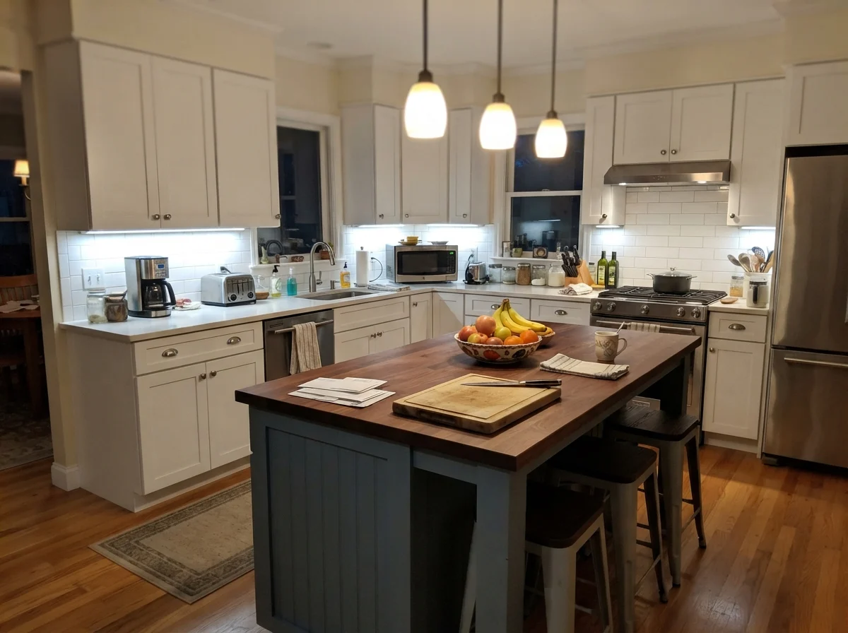
Its natural home is the kitchen island. In our current 1960s ranch, our kitchen cabinets along the perimeter are a soft off-white. If I had painted the perimeter cabinets navy or slate blue, the kitchen would have felt like a cave by three o'clock in the winter. But painting just the center island in a color like Adirondack Blue is the smartest design move you can make for everyday living. Why? Because kitchen islands take a relentless beating. Kids kick the back panel with their sneakers while sitting on barstools; grocery bags scrape against the corners; grease splatters off the skillet. White paint on an island means you are down on your hands and knees with a rag twice a week. A durable semi-gloss or satin enamel in Adirondack Blue hides the scuffs, masks the stray grease drops, and looks crisp against white quartz or butcher block counters.
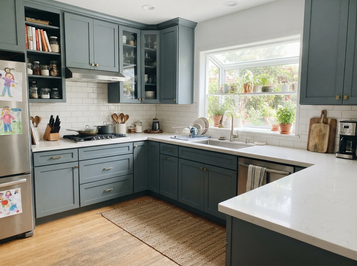
If you do decide to run it across full cabinetry—both uppers and lowers—you need large windows and pale counters to balance the scale. In a room flooded with sunlight from garden windows, full shaker fronts finished in this dusty blue give you that English scullery look that doesn't scream for attention. It feels like it was installed twenty years ago and will look just as good twenty years from now. That is the definition of a timeless surface.
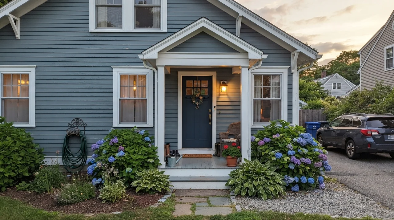
The second place where this color earns its keep is on cottage and coastal front doors. A pure jet-black or midnight-navy door can look harsh on a house with light siding, especially under direct summer sun where dark paints bake and peel. Adirondack Blue has just enough gray pigment to feel soft and welcoming against white or cream clapboards, and it pairs effortlessly with aged bronze or unlacquered brass hardware.
And then there is the garage floor. Behr formulates this exact shade in their one-part self-priming concrete and garage floor epoxy. If you have ever tried color-matching a concrete coating to an exterior trim paint from two different brands, you know the special kind of headache that creates. Being able to buy Adirondack Blue for your front shutters and pick up a gallon of matching floor coating for your screened back porch or workshop slab in the very same aisle is the kind of practical convenience I appreciate.
Living Spaces and Bedrooms: Knowing When to Scale Back
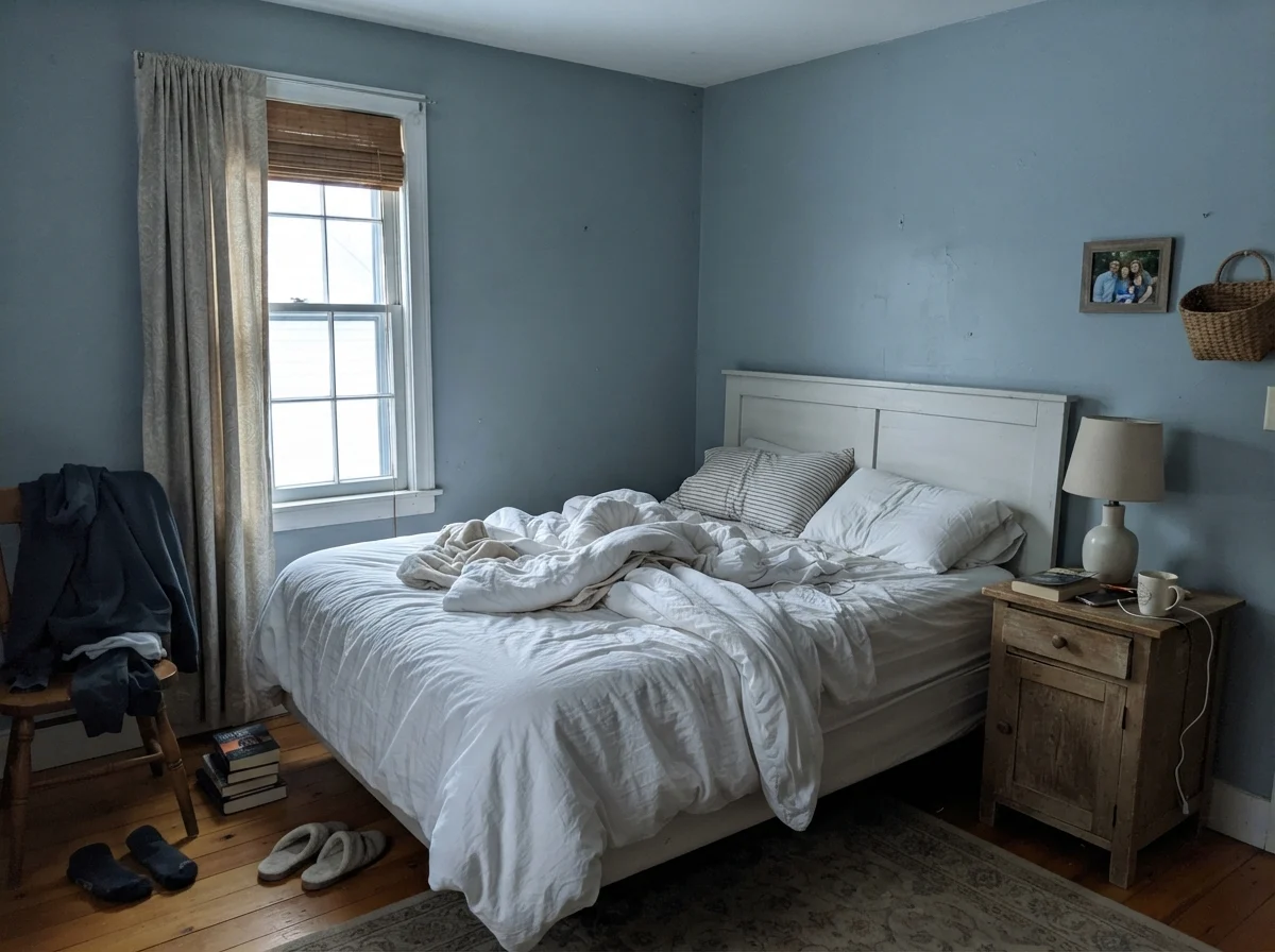
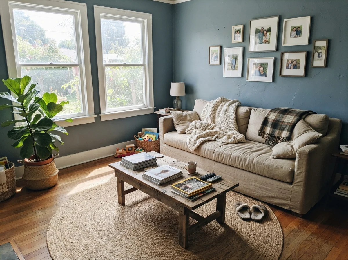
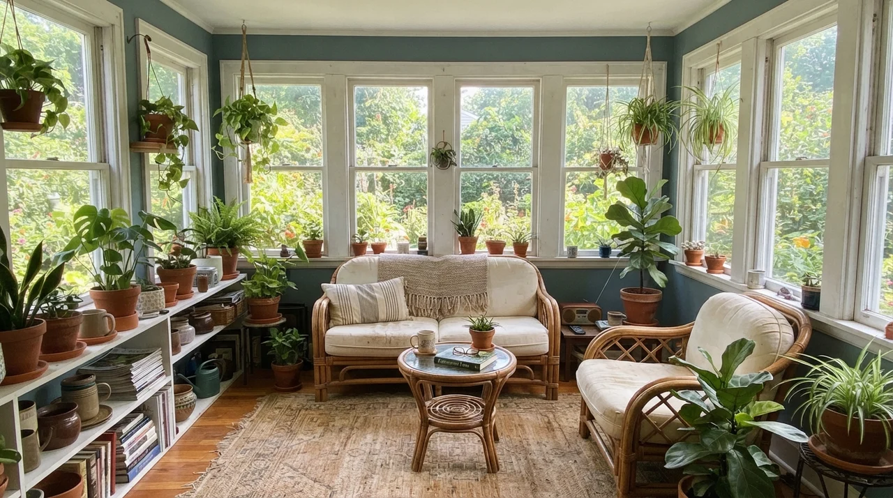
Can you use Adirondack Blue in living areas and bedrooms? Yes, but with strict ground rules. It works beautifully on an accent wall behind a sofa or behind a bed, especially when you have pale linen bedding, natural jute rugs, or white slipcovers in the room to bounce daylight around. In a sunroom wrapped in white-framed windows, the sunlight cuts right through the gray undertone and pulls out that breezy coastal slate character.
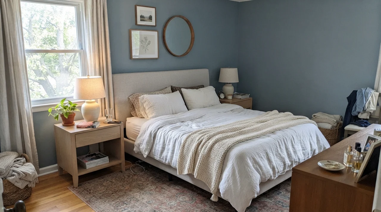
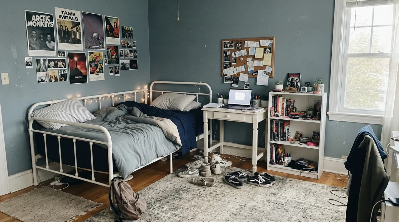
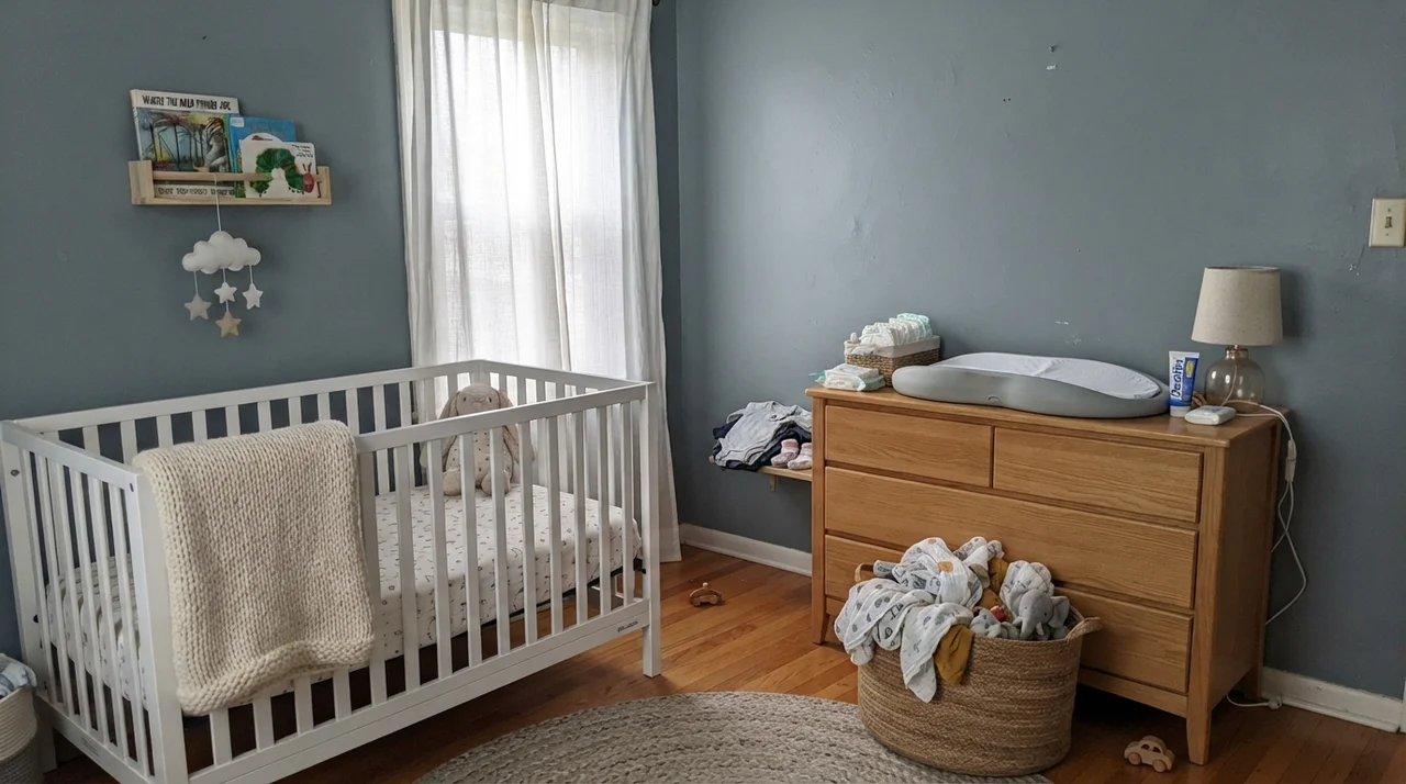
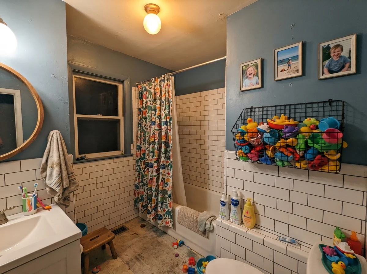
Where people get into trouble is rolling this color onto all four walls of a standard eight-foot-ceiling bedroom that only has a single north-facing window. At LRV 22, four solid walls of Adirondack Blue will shrink that room visually by twenty percent. If you want it in a primary bedroom, keep the woodwork crisp white and bring in light oak nightstands and pale ceramics. In a child's bedroom or nursery, it works surprisingly well because it isn't baby-blue; it is mature enough that you won't have to repaint it the minute they start middle school.
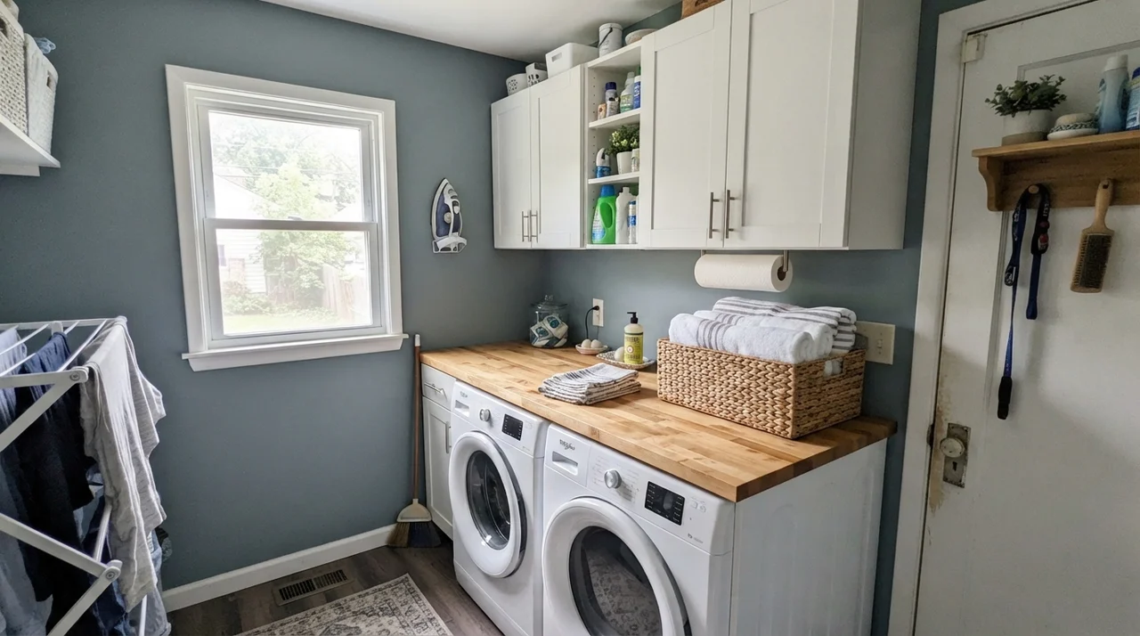
In utility spaces—like a hardworking laundry room or a half-bath—it delivers that organized, purposeful look. Above a butcher block folding counter or surrounding white appliances, it feels clean and steady. When you scrub a wall clean after detergent drips or damp laundry brushes against it, an eggshell finish in this shade holds up without leaving behind those shiny burnish spots that lighter grays always seem to show.
The Costly Mistakes: Where Adirondack Blue Fails
Almost every email I get from a reader who regrets rolling Adirondack Blue comes down to one of three predictable missteps. None of these are flaws in the paint formula; they are what happens when a medium-depth slate color is pushed into a job it was never meant to do.
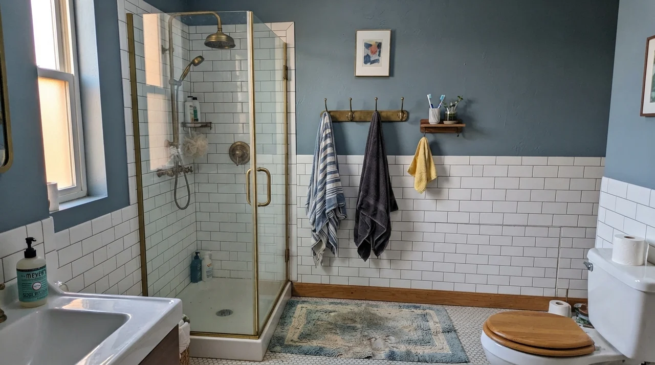
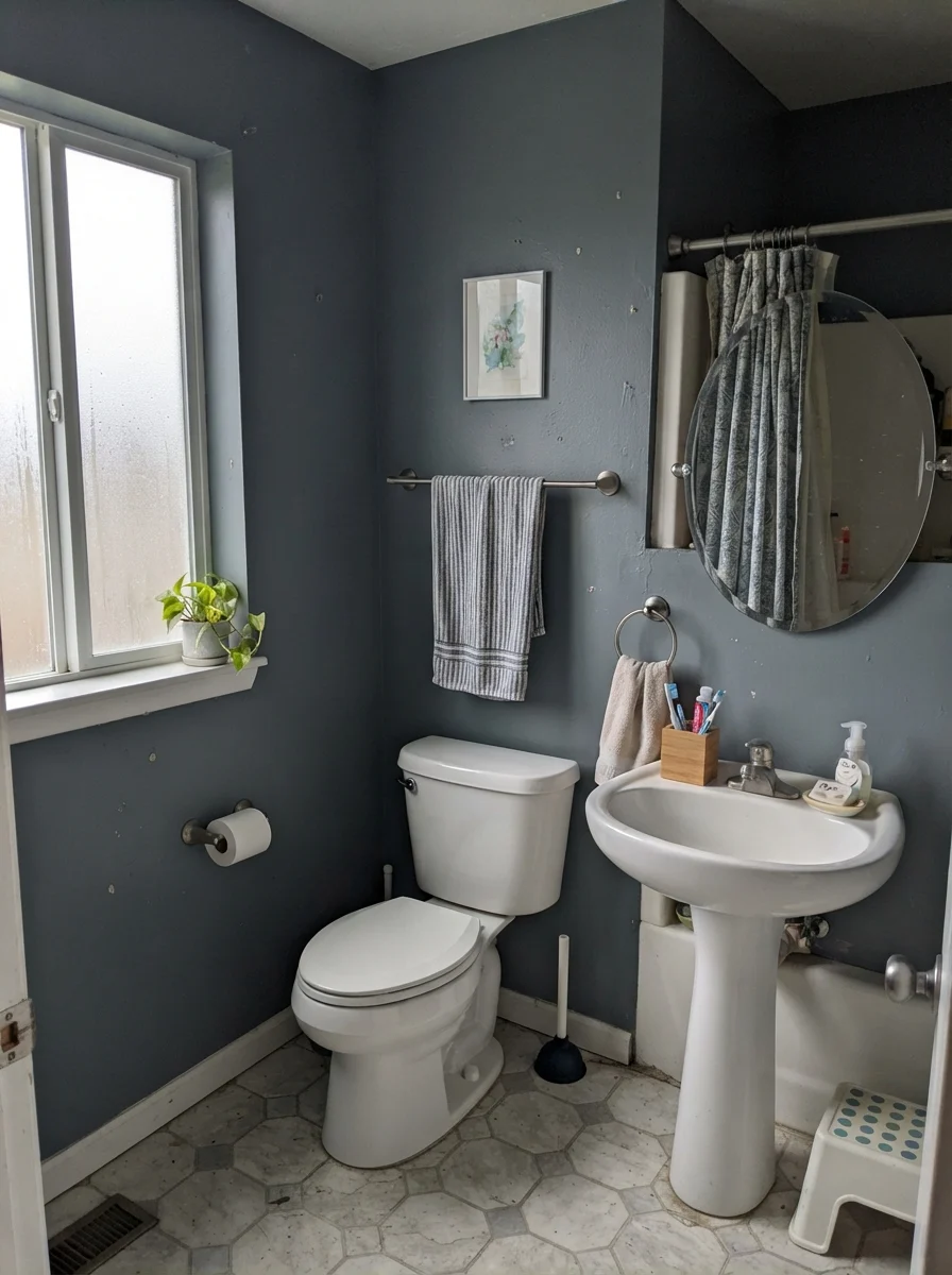
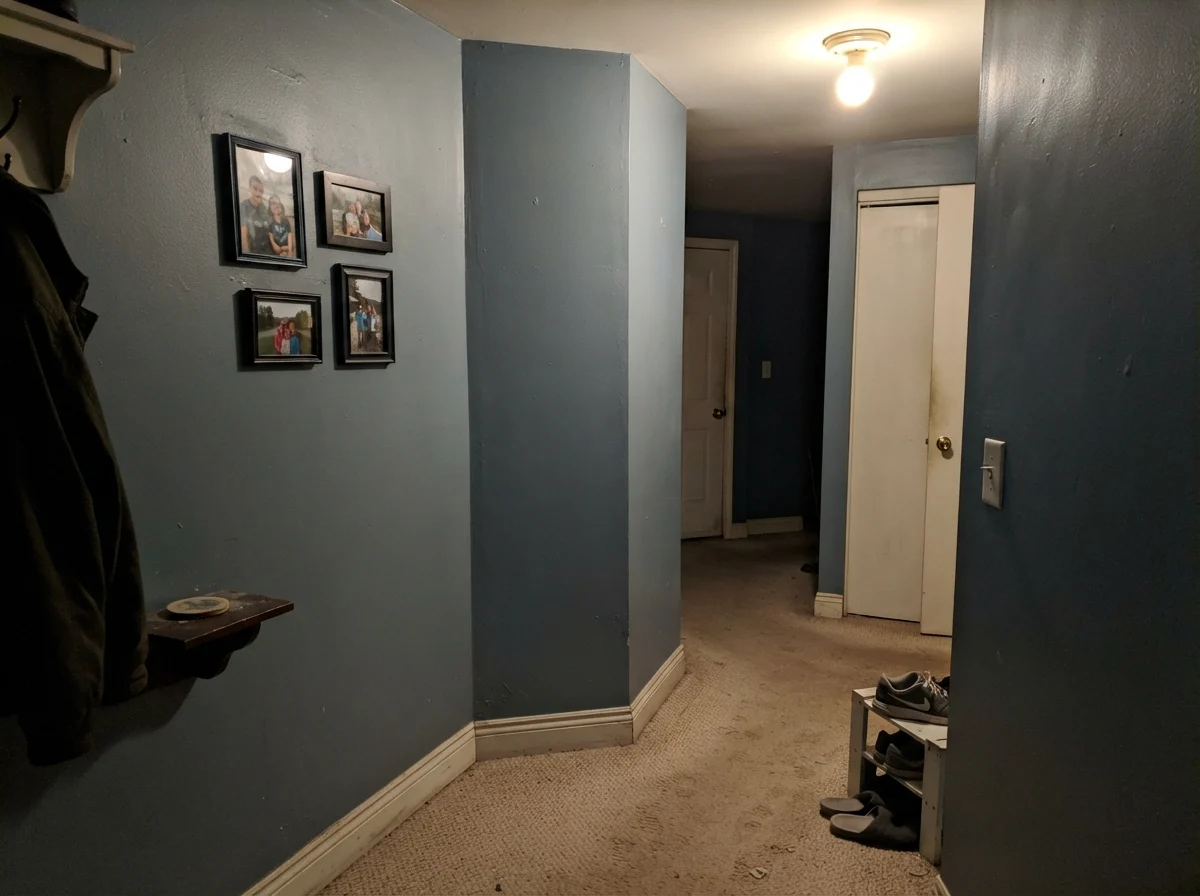
First, the windowless enclosed box. People see this color looking charming on a beadboard half-wall in a sunlit bathroom and decide to slather it over all four walls and the ceiling of a windowless first-floor powder room or an enclosed hallway. Without natural light to lift the teal undertone, the LRV 22 takes over. The paint flattens into a muddy, dingy gray that looks closer to wet sidewalk cement than coastal slate. If your room has no natural daylight, you do not commit all four walls to a 22 LRV blue unless you are prepared to install massive vanity lighting.
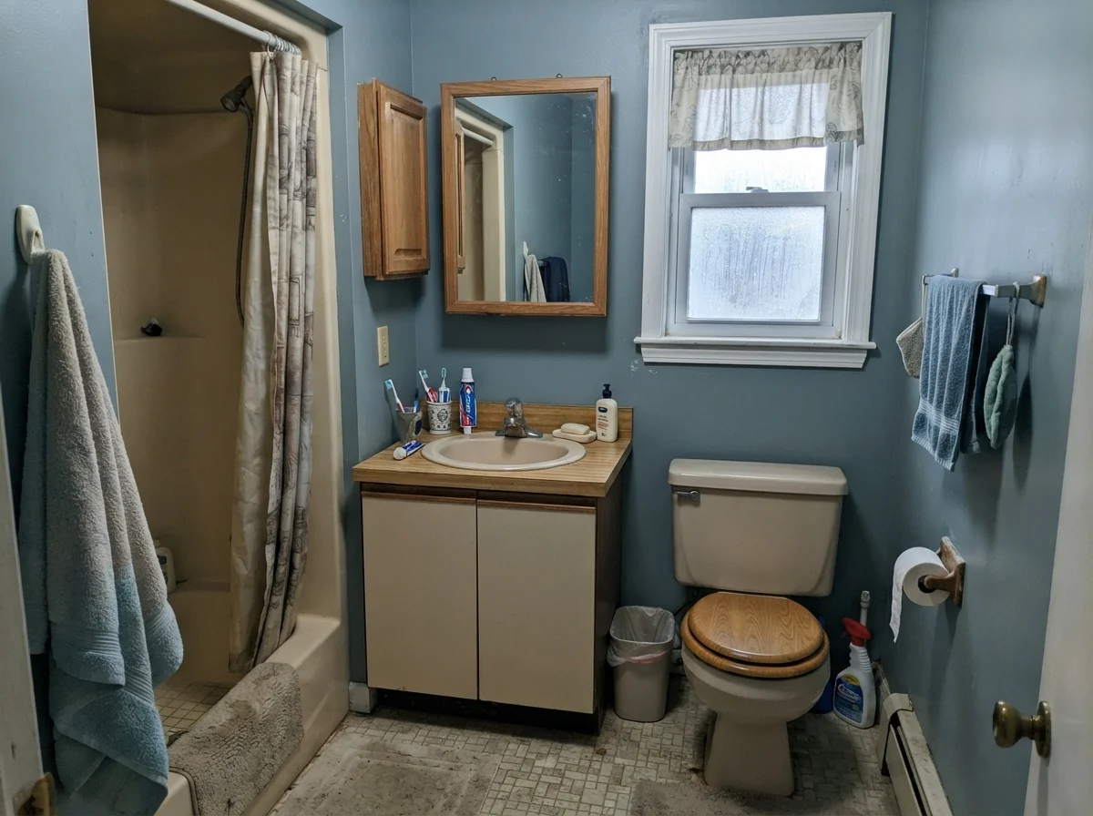
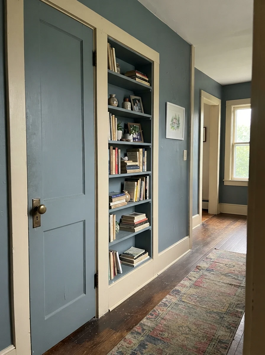
Second, the fight against honey oak and builder-beige tile. In our 1970s split-level, the hallway had an orange-tinted oak floor that I fought for a decade. Blue and orange sit straight across from each other on the color wheel. If you put Adirondack Blue on the walls right next to golden oak trim, honey oak baseboards, or 1990s peachy-beige bathroom floor tiles, neither surface wins. The blue-gray makes your wood look aggressively orange and dated, while the orange floor pulls the life out of the wall, leaving the paint looking cold and lifeless. This color needs to live next to clean whites, espresso stains, pale natural white oak, or gray-washed hardwoods.
Third, assuming that every can with 'Adirondack Blue' on the label is an identical liquid. Behr is fantastic about offering their color palette across interior acrylic enamels, exterior masonry paints, and concrete epoxies. But epoxy resin is chemically very different from acrylic latex. If you are coating your garage floor with the epoxy and painting your exterior service door with the exterior enamel, buy physical chips or sample pots first. On different substrates and under different chemical binders, the exact sheen and pigment dispersion will vary by a hair. Don't trust the label alone—verify it on the job.
Five Years In: How Adirondack Blue Actually Holds Up
When you have owned three houses across thirty years, you stop rating paint by how fun it was to roll on a Saturday morning. You judge it by year five. That is when you find out if the pigment holds its depth against UV sunlight coming through the blinds, whether the paint burnishes when you scrub off a scuff mark, and whether you are going to cringe at it when you decide to sell.
In terms of durability, Adirondack Blue is one of the most forgiving medium colors you can buy. In satin or semi-gloss cabinet enamel, it is dark enough that greasy finger marks around drawer pulls simply do not show. When my grandson dropped a plastic toy car down our painted hallway wall, leaving a dark rubber mark, a damp rag and mild soap scrubbed clean without pulling away the color or leaving a chalky gray halo. On lighter off-whites, that scrub mark would have required an entire can of touch-up paint.
When we sold our colonial, I had to repaint two rooms because the trendy sage green we had chosen looked dated within four years. But slate blues in this LRV 22 range do not trigger that immediate buyer fatigue. Because it reads as an architectural accent rather than a fashion-statement color, buyers look at an Adirondack Blue island or mudroom bench and see quality, not an immediate weekend chore.
What is the best sheen for Behr Adirondack Blue on kitchen cabinets?
Semi-gloss or satin cabinet enamel is best. Adirondack Blue has enough depth that a semi-gloss sheen won't look garish, and the slicker surface allows grease splatters and fingerprint oils to be wiped away easily without burnishing the finish.
Can I paint an entire small bathroom in Behr Adirondack Blue?
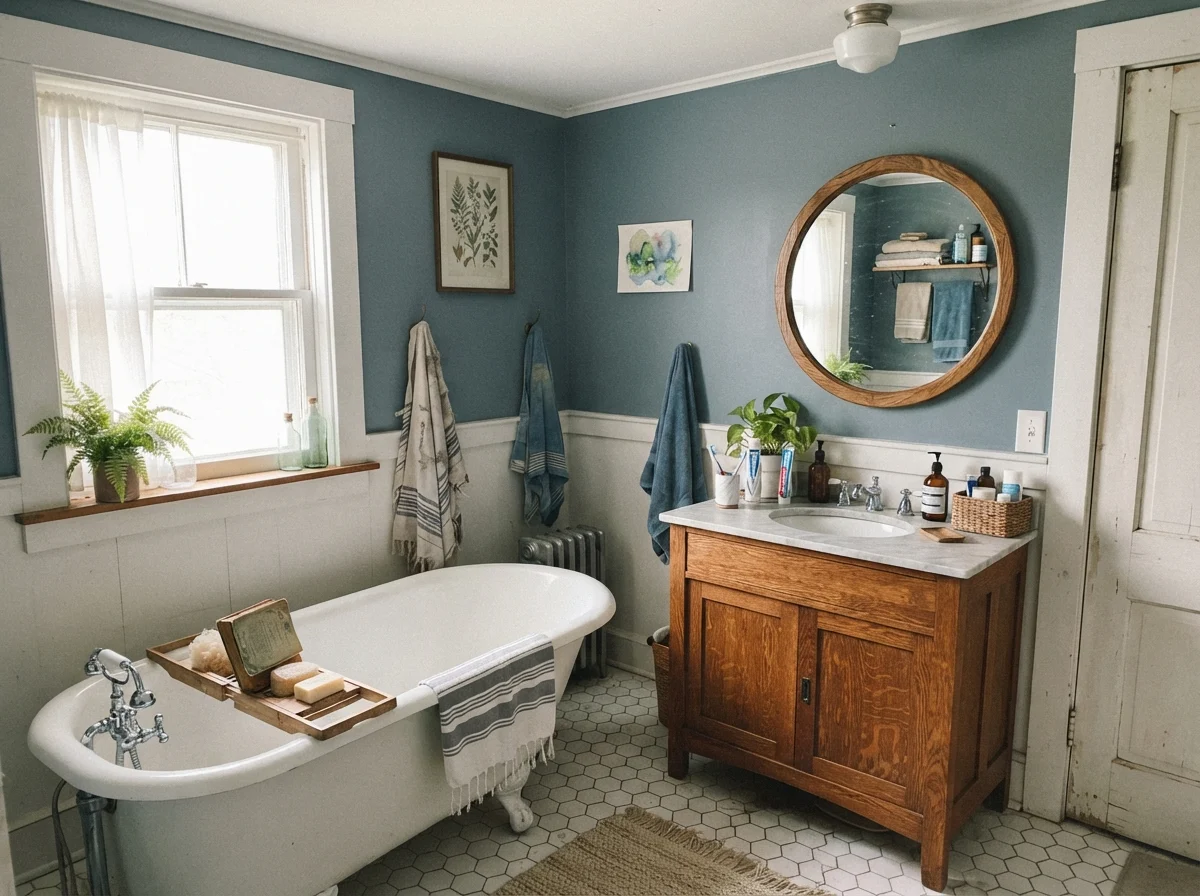
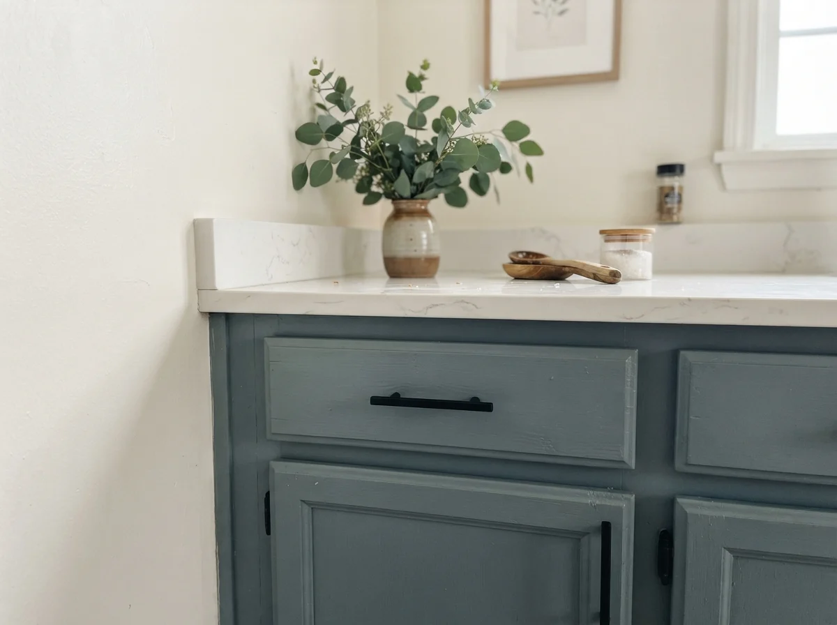
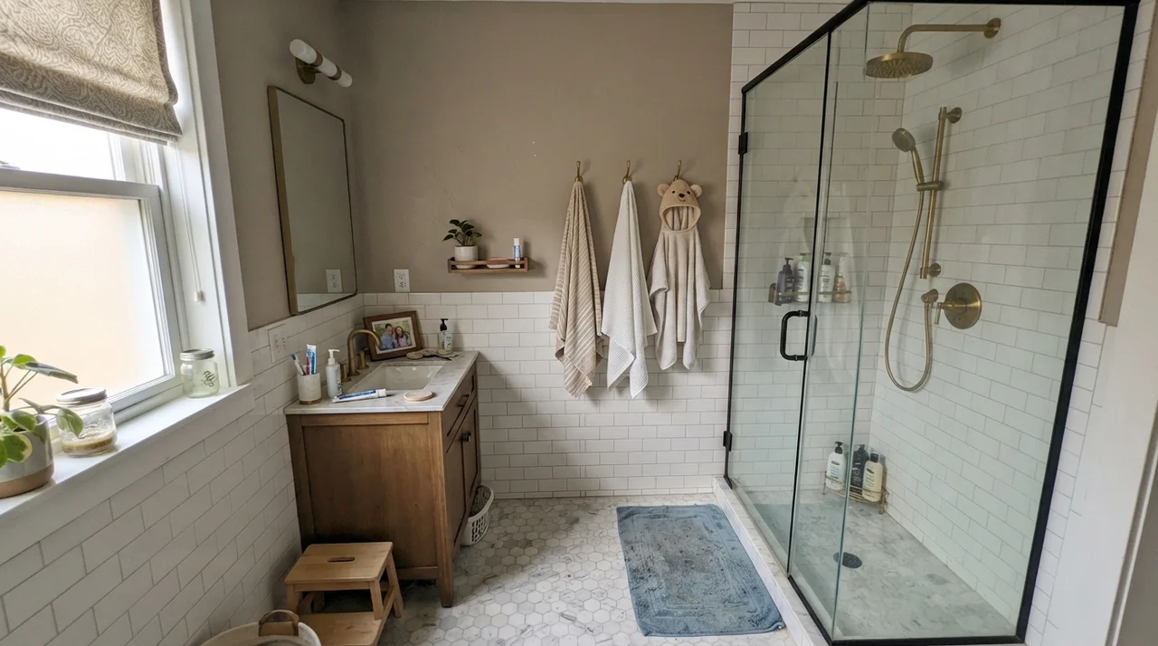
Only if the bathroom receives generous natural window light. In an enclosed, windowless powder room, an LRV 22 blue will swallow the light and look heavy, dull, and dark. In small baths, keep it restricted to the vanity cabinet or use it above bright white wainscoting.
Does Adirondack Blue look navy at night?
Under standard warm incandescent or 2700K LED light bulbs, it deepens noticeably and can read like a soft, dusty slate-navy. If you want it to retain its daytime gray-blue character after dark, you will need cooler 3000K to 3500K lighting.
Is Behr Adirondack Blue worth using on exterior shutters and doors?
Yes, absolutely. It is one of its strongest applications. Against white, cream, or light gray siding, it gives you deliberate color without the harsh, near-black contrast of traditional dark navy.
Susan's Verdict · Dependable Accent Workhorse
Adirondack Blue is not trying to win a design award, and that is why I respect it. If you are looking for a reliable, dirt-forgiving color for a kitchen island, an exterior cottage door, a laundry room counter accent, or a garage workshop slab, it is well worth the money. Keep it away from honey oak woodwork, avoid rolling it wall-to-wall in windowless basements, and it will reward you with steady, composed color that looks just as sensible five years in as it did on day one.