Color Diary · No. 130
Benjamin Moore Pashmina: The Heavy Greige That Refuses to Float
Benjamin Moore's heavyweight greige, reviewed honestly: the rooms where it grounds everything, the light and the floors that turn it drab, and what to pick instead.

Susan HartleyNovember 18, 2026 · 17 min read
Pashmina · Benjamin Moore AF-100
Hex#BBB2A1LRV44Undertonestaupe-gray with a quiet olive undertone
When we moved into our 1990s colonial in late 2004, every square foot of drywall was covered in a builder-grade beige that looked like wet sand under noon sun and gray cardboard by four o'clock. Like half the country at the time, I went looking for a neutral that felt substantial without turning into mud. Everyone at the paint counter was clamoring for light, featherweight greiges, but our main floor had nine-foot ceilings, an open run from the family room into the kitchen, and a set of heavy honey-oak floorboards that swallowed pale tints whole. If you put something wispy on those walls, it simply dissolved.
That was how Benjamin Moore Pashmina (AF-100) first came home in a sample pot. At a Light Reflectance Value of 44, it is not an off-white, and it certainly does not pretend to be an airy backdrop. It is a genuine mid-tone greige—a quiet, grounded blend of gray and taupe that carries real weight. I lived with it across three rooms in that house for nearly seven years, and when we sold, the couple who walked through on the first Sunday open house asked the listing agent for the exact formula on the hallway walls. But living with a paint for five years in gives you a very different perspective than looking at a paper chip under hardware-store fluorescents. Pashmina can be a magnificent workhorse that anchors wide spaces and conceals everyday family scuffs, but strip away its light or pair it with the wrong undertone on the floor, and it will turn on you faster than almost any neutral I know.
Understanding Pashmina begins with understanding what an LRV of 44 actually means inside an ordinary family house. Light Reflectance Value runs on a scale from 0 to 100, where zero is pure light-absorbing black and 100 is pure reflective white. Most whole-house neutrals that people roll across five connected rooms sit comfortably up in the 60s or 70s. At 44, Pashmina is reflecting less than half of the daylight that hits it. That single physical reality explains both why homeowners love it and why some people come to resent it deeply.
When you have ample natural daylight, that depth gives walls an architectural firmness. The room stops floating. White casings, pale linen fabrics, and honey or walnut floors suddenly have a dignified counterweight to push against. But because the color relies on an earthy foundation, there is a quiet green whisper sitting under the taupe. In south-facing sunlight, that green remains completely buried under a warm, dusty veil of stone. But shift that same paint to a dim exposure, or place it over cool gray floors, and the balance tips instantly. That undertone is not an accident or a manufacturing defect; it is simply the pigment structure that gives Pashmina its richness in full sun.
How the Compass Point Governs the Wall
Over thirty years of testing paint on old plaster and modern drywall, I have learned that the compass direction of a window matters far more than whatever color swatch you pinned to the wall at noon on a Saturday. Pashmina proves this rule with a vengeance.
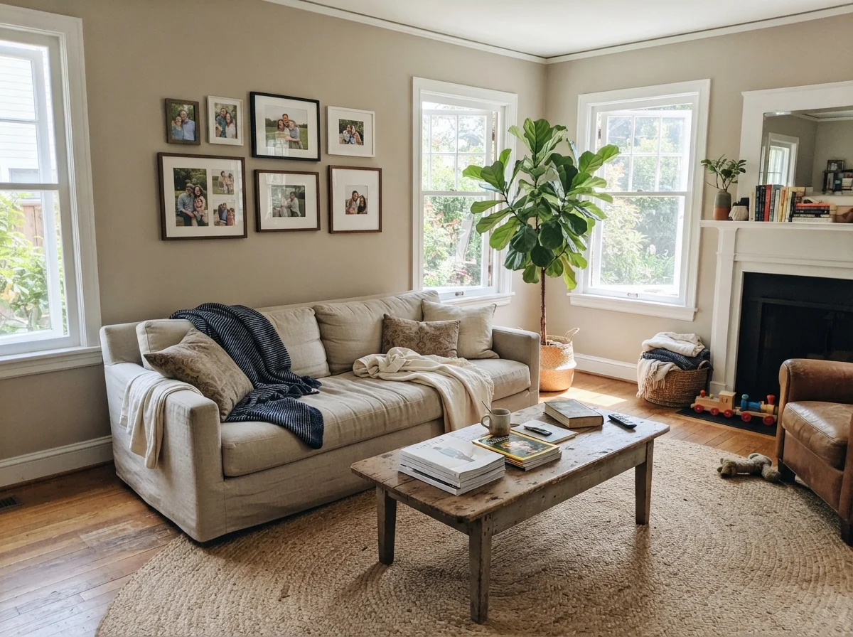
In a south-facing room, Pashmina is an absolute dream. The steady, warm, yellow-toned daylight that pours in through south exposures counteracts any lurking grayness. It lifts the taupe notes, softens the edges of the room, and reads as an expensive, sandy stone throughout the afternoon. If your main living room has two large south-facing windows, you will likely consider this one of the finest paints Benjamin Moore has ever formulated.
East and west rooms give you a split personality. An east-facing dining room will feel cozy and warm during breakfast, holding a gentle golden warmth on the walls. But by three in the afternoon, when the sun moves over the roof ridge, that warm glow vanishes, leaving behind a sober, quiet greige that can look noticeably cool. West-facing spaces reverse the story: they start the morning feeling somewhat flat and muted, then ignite into a rich, glowing tan as the late afternoon sun cuts through the glass.
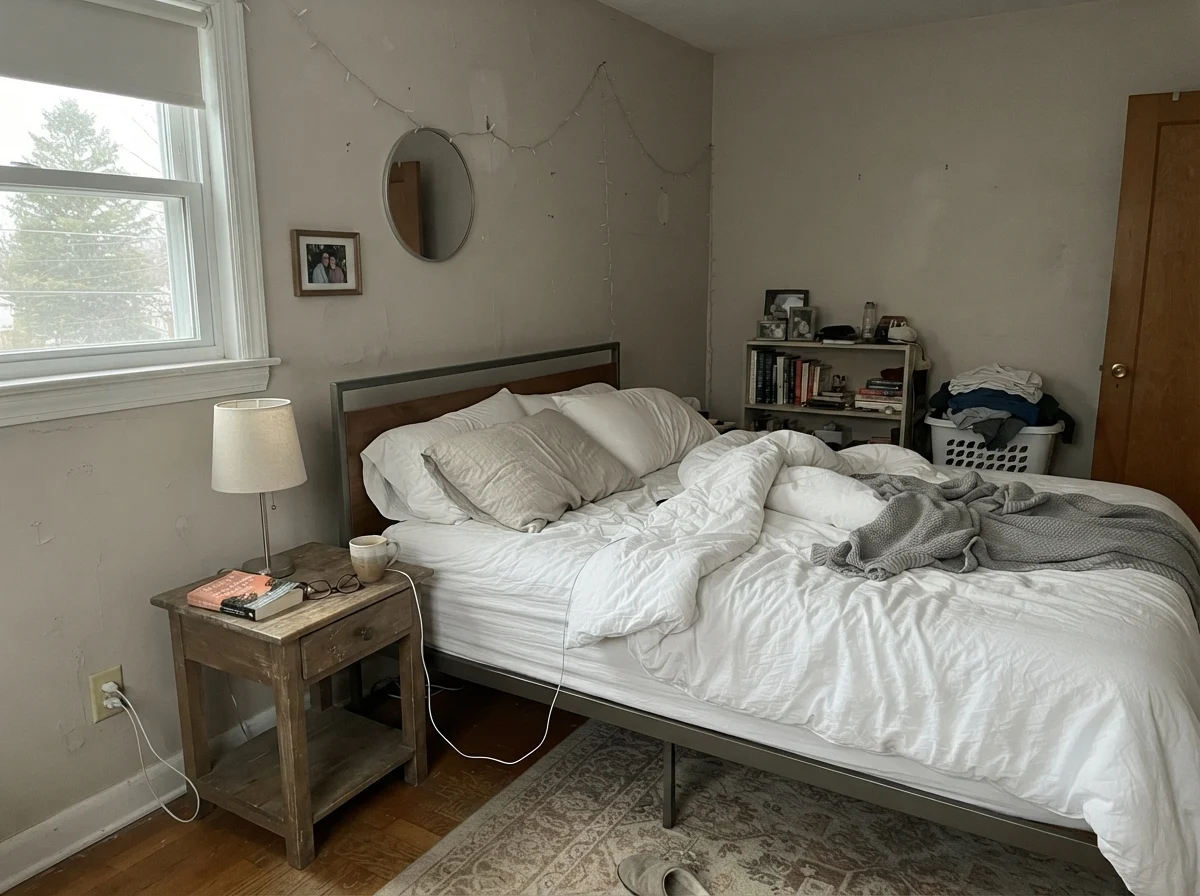
North light, however, is where Pashmina gets into serious trouble. A northern window brings in cool, blue-tinted, indirect light. It completely strips away the warm taupe base of the paint, bringing the underlying gray and olive pigments straight to the surface. In a north-facing living room or bedroom with modest windows, the paint quickly slumps into a tired, dingy shade that friends often describe as drab or muddy. No number of additional coats will change that outcome; the light simply isn't there to wake the warm pigments up.
Pashmina in the Common Rooms: Living, Sunroom, and Kitchen
In our last house, our main living room had two big double-hung windows looking directly out across the back lawn. That was where Pashmina earned every nickel we spent on it. Because the walls had real depth, our white linen sofa didn't look like it was marooned in a sea of sterile drywall, and our white oak flooring looked grounded and intentional. The room felt settled, permanent, and calm.
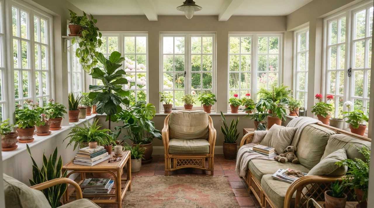
Sunrooms and spaces framed by generous glass are another natural environment for this shade. Because full exterior light floods the room from multiple directions, Pashmina never turns gloomy in these spaces. Instead, it provides a warm, earthy contrast to white window muntins, brick garden pavers, and leafy indoor plants. It prevents sun-drenched rooms from feeling uncomfortably blinding in the middle of summer.
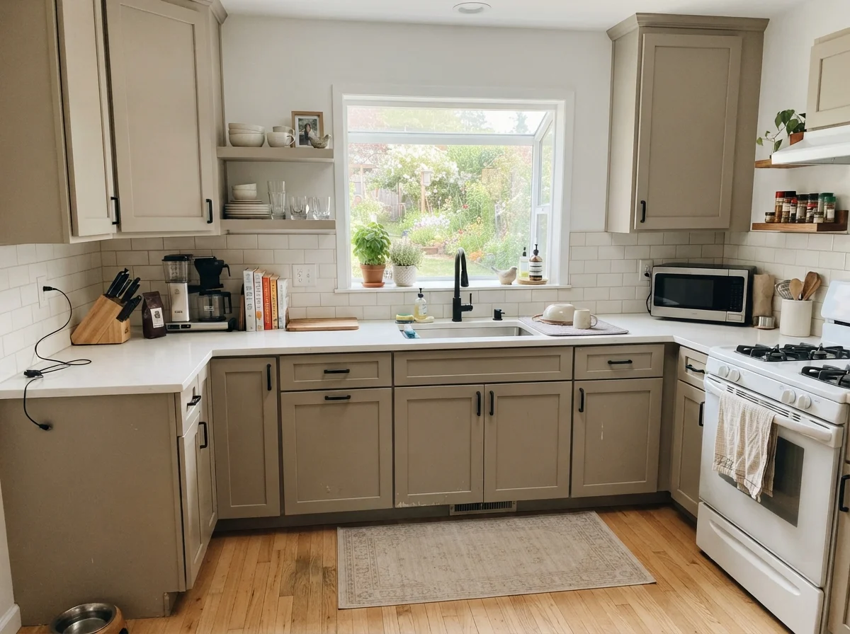
Where Pashmina has truly made a name for itself in recent years, though, is on kitchen cabinetry. For decades, homeowners treated cabinets as strictly white or natural wood. But if you have an all-white perimeter and want an island that grounds the center of the kitchen, an LRV 44 greige is near perfection. It reads as an intentional, tailored piece of furniture rather than an off-white that missed its cue.
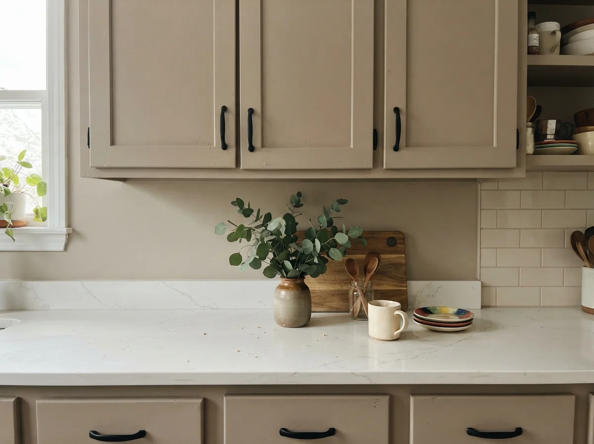
When painted on lower shaker cabinets or a large central island, Pashmina pairs effortlessly with white quartz or marble countertops and light oak floors. It hides the inevitable scuffs from barstools, shoes, and grocery bags far better than any pale shade ever could. Just remember the hardware: aged brass, antique bronze, and matte black bring out the rich warmth in the paint. Polished chrome or cool nickel, on the other hand, fight the taupe base and emphasize the cooler gray undertones.
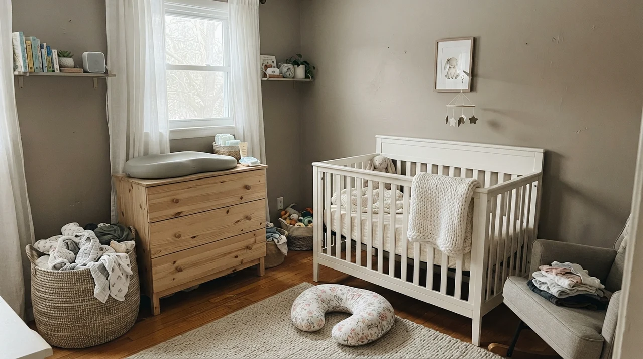
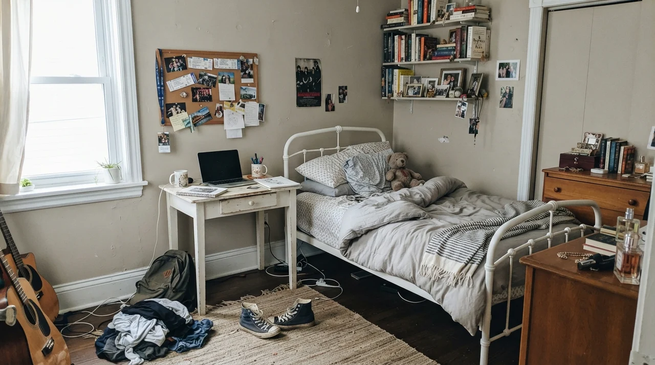
Bedrooms, Nurseries, and Teenage Quarters
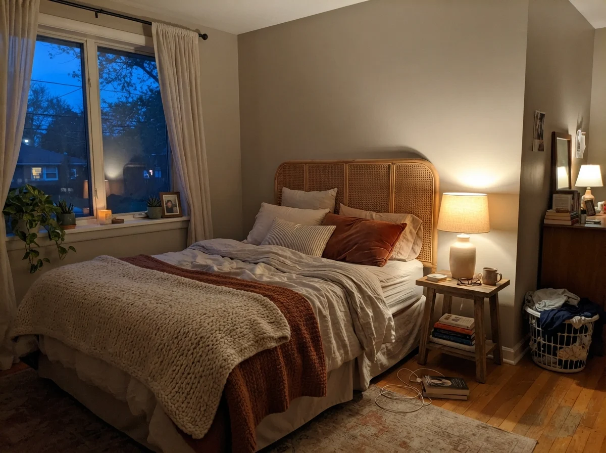
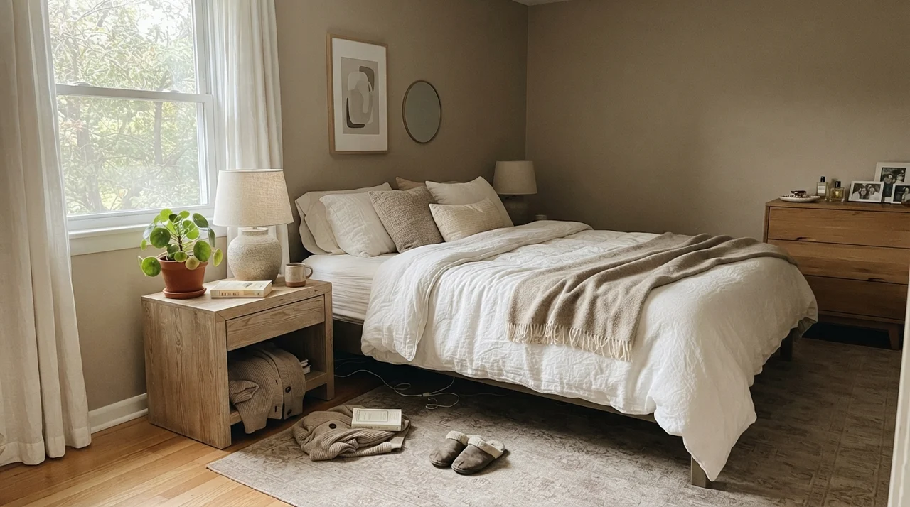
Using a paint this deep in private rooms requires careful attention to your artificial lighting. In a bedroom that catches good side-window daylight during the afternoon, Pashmina creates a calm, cocoon-like atmosphere that feels luxurious without being overwhelmingly dark. It provides just enough contrast to make crisp white cotton sheets and tailored headboards pop.
In our 1960s ranch, I tried a similar mid-tone in a guest room that had only a modest north-facing window, and I learned my lesson quickly: by five in the afternoon during November, the room felt like a vault. If you intend to use Pashmina in a bedroom, you must commit to warm lighting. Lamps outfitted with 2700K warm-white bulbs turn the paint into a cozy, comforting taupe after the sun goes down. Switch those bulbs to 4000K commercial LEDs, however, and you will drain every drop of warmth from the room, leaving behind a cold, cement-like finish.
Bathrooms and the Challenge of Tile Wainscoting
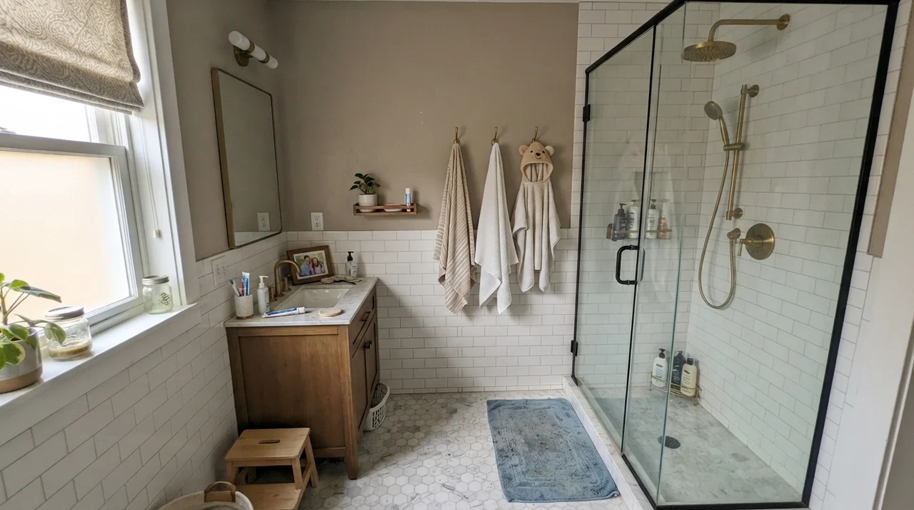
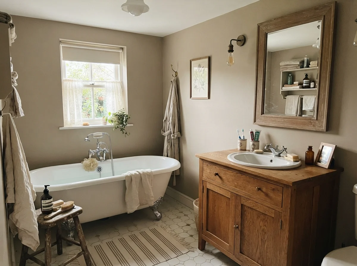
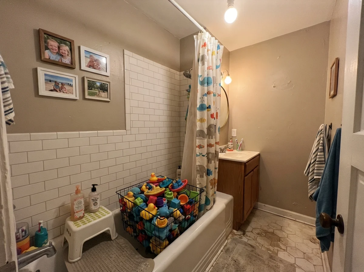
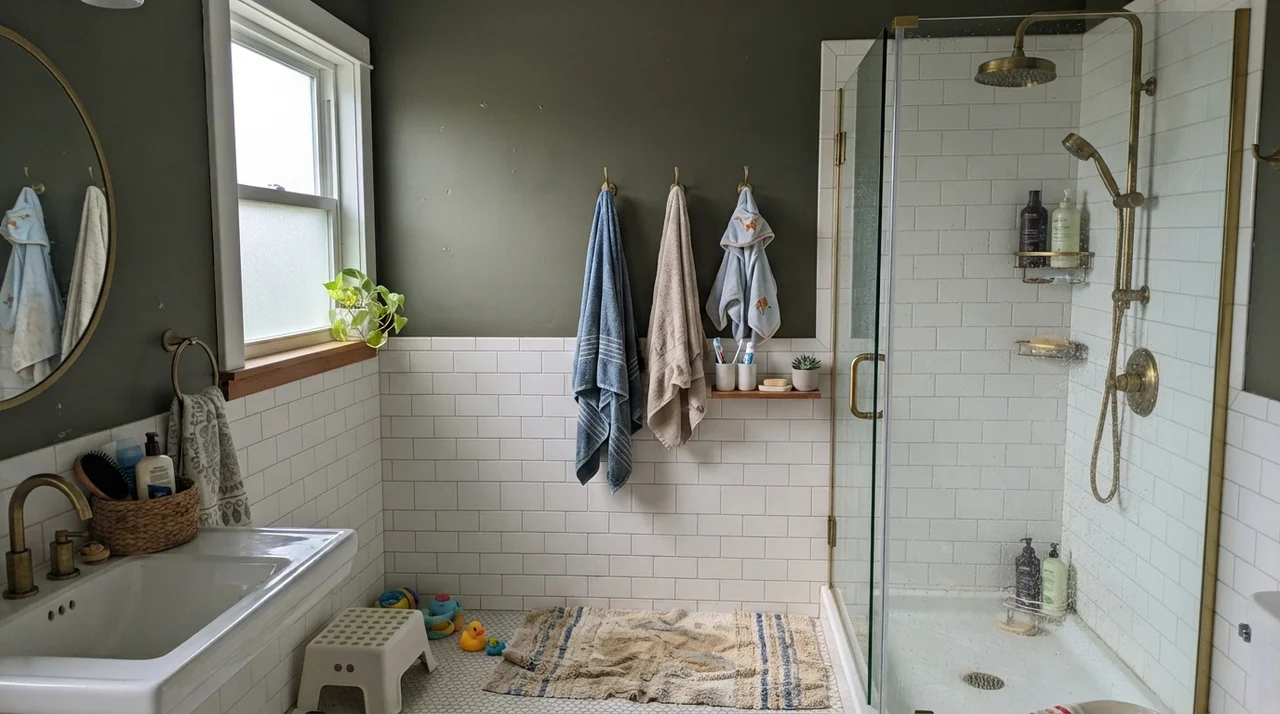
Bathrooms are another space where Pashmina often appears, particularly above traditional white tile wainscoting. Because white subway tile or porcelain hex flooring reflects so much light back up into the room, Pashmina sits above the chair rail as a crisp, tailoring contrast. It keeps small bathrooms from feeling like sterile commercial washrooms.
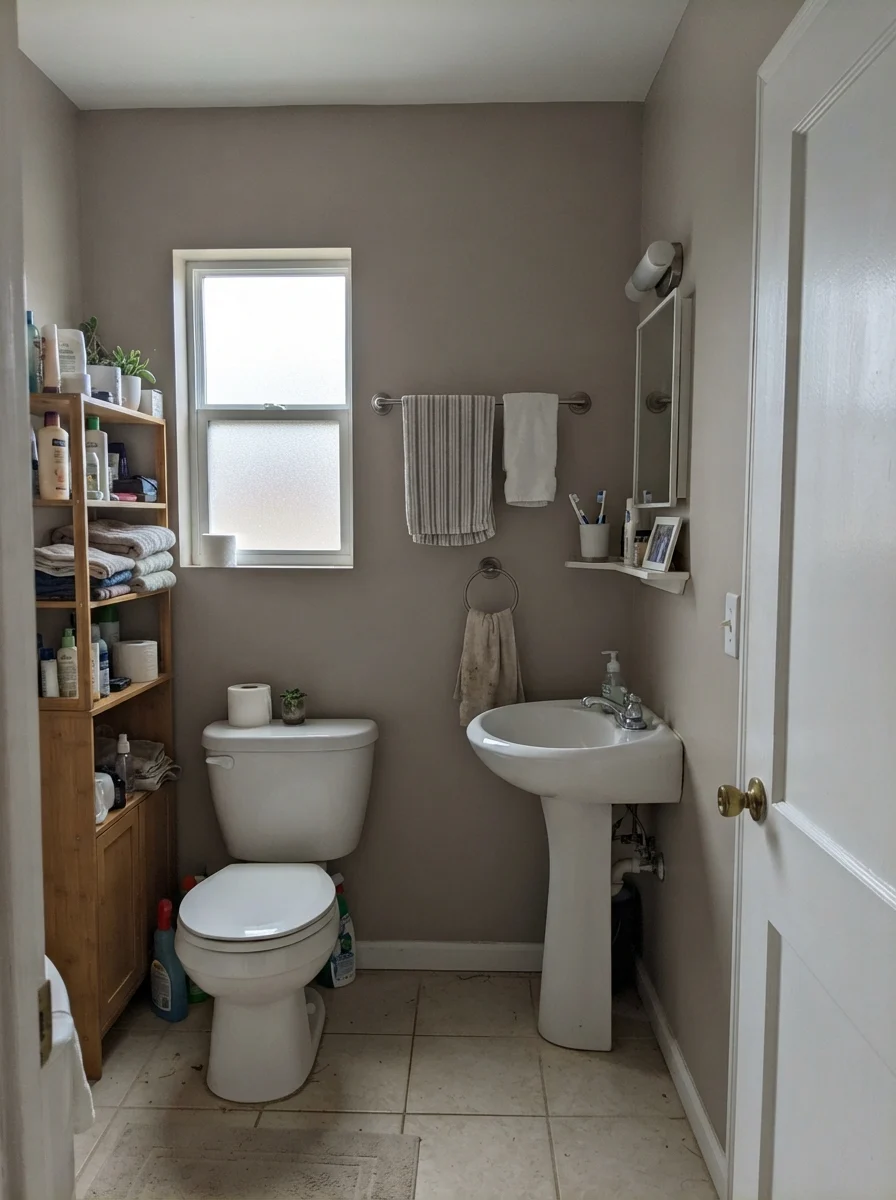
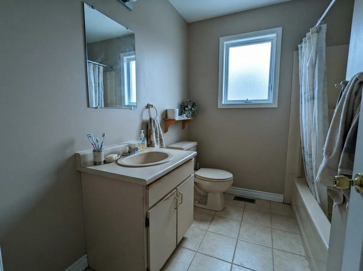
However, you have to watch your window exposure and your glass type very carefully in a bath. Frosted privacy glass or small, high windows cast a flat, overcast light that can mute the warm taupe pigments. When that happens, the paint drops its sandy warmth and turns noticeably gray and austere.
Hallways, Doors, and Exterior Siding
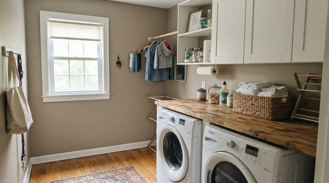
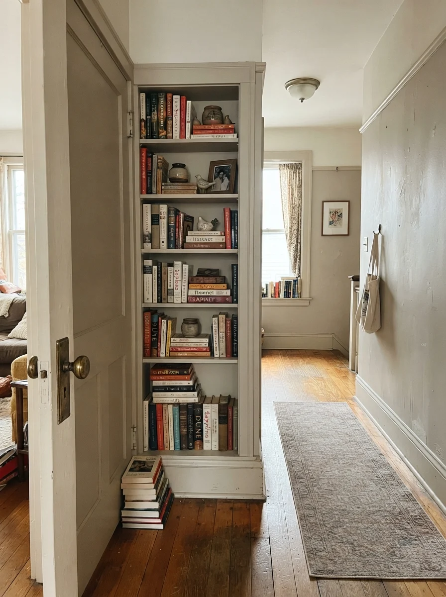
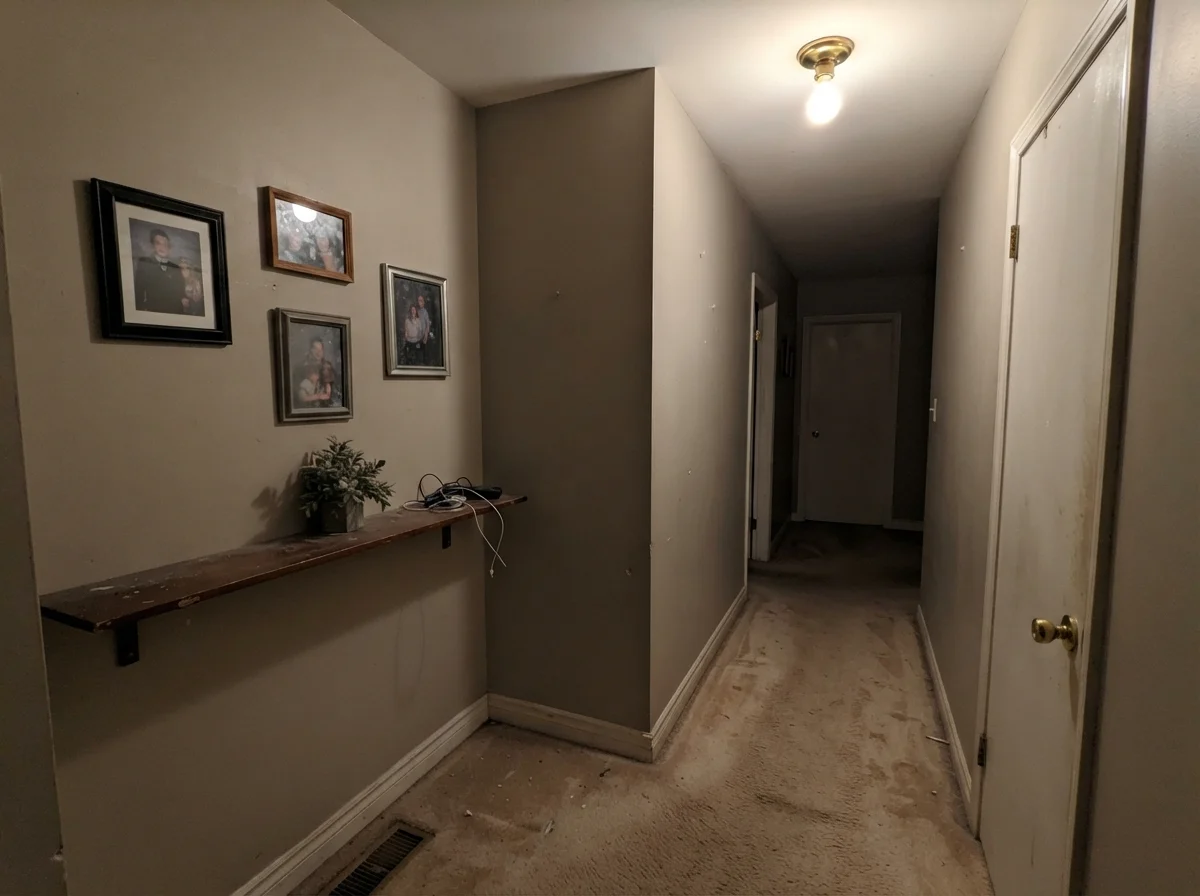
If there is one place inside an active family home where Pashmina proves it is worth the money, it is along a busy hallway or stairwell. Pale off-whites in high-traffic corridors are an endless headache—every backpack swipe, bicycle handlebar bump, and greasy handprint by the doorway shows up like a neon sign. Because Pashmina has genuine pigment density, everyday scuffs simply disappear into the wall.
In our colonial, we also used it as an accent color on interior two-panel doors and built-in shelving along our second-floor hall, while keeping the surrounding walls in a soft off-white. That small application gave the entire corridor an architectural backbone without making the hall feel narrow or dim.
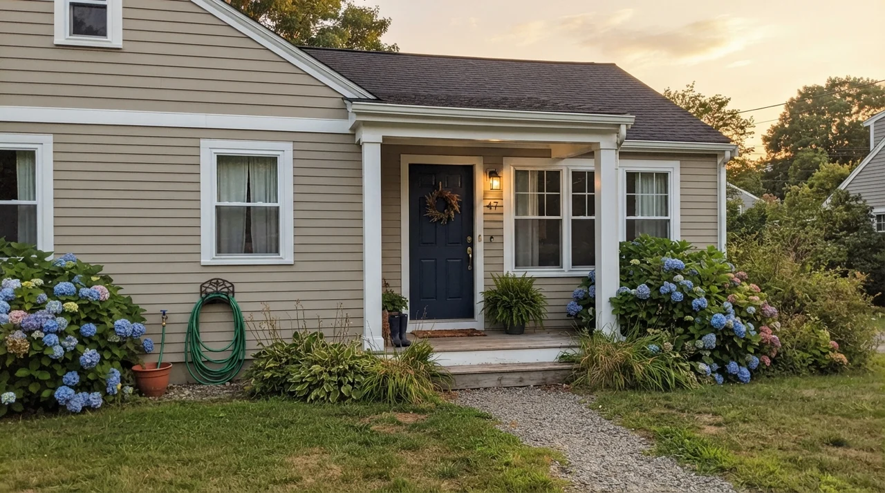
Outside on exterior siding, Pashmina performs an entirely different trick. Under direct, unfiltered sunshine, outdoor paints always wash out by about one full step lighter than they appear indoors. An LRV 44 paint outdoors doesn't look dark at all; it reads as an exceptionally handsome, warm sandy greige on horizontal siding, shingles, or stucco. Unlike bright white siding, which glares under direct sun and shows every splash of mud from the garden hose, Pashmina holds its composure year after year.
At LRV 44, Pashmina is not an off-white that forgives poor lighting. Take away its sun, and it slumps into mud before you can even unpack the roller.
When Pashmina Fails: The Honest Pitfalls
The complaints about Pashmina across thirty years of home forums are remarkably consistent, and none of them stem from the paint being badly made. All three come down to the exact same reality: an LRV of 44 leaves zero margin for error. If you force this paint into one of the following three environments, no amount of careful cutting-in will rescue the room.
1. A windowless hallway, basement, or dim north-facing room. Cool, indirect light or weak ceiling bulbs will completely kill the warm base. The gray and the underlying olive green rush forward, leaving the walls looking dingy, flat, and putty-like. In a basement with no natural daylight, it simply reads as an uninspired brown. If you need warmth in a dim room, step up to a lighter tint like Smokey Taupe 983 (LRV 55) or Edgecomb Gray HC-173 (LRV 63), which hand back real light to the space.
2. Against pink-beige tile, carpet, or flooring. This is the classic homeowner heartbreak. If you have 1990s ceramic floor tile, LVP, or carpeting that carries a pinkish, mauve, or red-tan undertone, Pashmina will look aggressively green. In color theory, pink sits directly across from green. When they are placed cheek-by-jowl, each intensifies the other. The floor looks pinker, and your walls look like army surplus canvas. If your floors lean pink-beige, switch to a cleaner gray with no green undertones, such as Silver Fox 2108-50, which shares the same LRV 44 depth without the olive cast.
3. Paired with creamy, yellow-based trim. If your baseboards and casings are coated in an older builder-cream or an antique white with heavy yellow undertones (like Navajo White), Pashmina will look visibly dirty next to them. The yellow in the woodwork brings out the dingiest gray notes in the wall. You need a trim that is genuinely white without being stark blue-cold.
Styling Pashmina: Wood, Metals, and Home Styles
Because Pashmina has weight, it demands furnishings that can hold their own. Delicate, spindly furniture painted in cool gray or stark chrome tends to look completely lost against it. It is built to partner with organic, substantial textures and genuine architectural character.
Durability, Sheens, and the Scrub Test
Here is something they don't print on the paint swatch: mid-tone greiges are infinitely easier to live with than pale off-whites. In our second house, we had two boys, a golden retriever, and a constant rotation of neighborhood kids tracking red dirt through the side entry. Our pale cream hallway looked dated within two years simply because the drywall around the baseboards was permanently smudged.
When we repainted the hall in Pashmina, the difference was immediate. Because LRV 44 sits right near the value of everyday dust and road dirt, accidental scuffs blend in rather than screaming for attention. But you have to choose your sheen wisely:
- Walls: Eggshell is the sweet spot. It provides enough wipeability to survive damp sponges without giving off a cheap, plasticky shine.
- Hallways and Stairwells: A scrubbable matte gives you the best of both worlds—zero glancing glare down long walls, but the ability to take a rag to dog rub marks.
- Trim and Casings: Semi-gloss provides the necessary hard shell to withstand vacuum cleaner strikes and highlights the crisp separation against White Dove OC-17.
- Cabinets and Islands: Satin is mandatory. Semi-gloss is too mirror-like over large flat cabinet doors, while eggshell won't survive greasy kitchen spills scrubbed clean over five years.
Pashmina Compared to Similar Mid-Tone Neutrals
When you stand in front of the color display, half a dozen cards will look nearly identical. Here is how Pashmina actually behaves next to its closest alternatives when you get them off the paper and onto eight feet of drywall.
Common Questions from the Workbench
Over the years, readers have written in with the same handful of dilemmas regarding Pashmina. Here are the practical realities.
Can I use Benjamin Moore Pashmina as a whole-house neutral?
For most homes, no. At LRV 44, it is simply too heavy to roll through every room, hallway, and powder bath. Unless your home has continuous, floor-to-ceiling southern glass across every elevation, it will turn dark and oppressive in north-facing bedrooms and windowless halls. Keep it for well-lit main living spaces, dining rooms, or kitchen cabinetry.
Why does Pashmina look green in my bathroom?
Look down at your floors. If your bathroom has pink-beige, travertine, or mauve tile, color contrast is pulling Pashmina's subtle olive undertone forward. In cool north or frosted window light, that green becomes even more pronounced. Nothing you put on the wall will fix that; you need a cleaner gray with no olive base, like Silver Fox.
What is the best trim white to pair with Pashmina?
Benjamin Moore White Dove OC-17 is the safest and most reliable pairing. It provides clean, soft contrast without looking cold. Cloud White OC-130 works nicely if you have older wood trim, and Chantilly Lace OC-65 delivers a sharp, modern pop. Avoid creamy, yellow whites like Navajo White, which make Pashmina look dingy.
How does Pashmina hold up against everyday wear and tear?
Exceptionally well. Because its LRV of 44 mimics the natural mid-tone value of dust and shoe scuffs, it hides hallway traffic marks that would ruin a light off-white within six months. In an eggshell or scrubbable matte finish, it can be scrubbed clean with a damp sponge without flashing.
Susan's Verdict · Buy with Purpose
Benjamin Moore Pashmina is the paint you reach for when featherweight greiges leave your room feeling hollow and untethered. At LRV 44, it grounds wide living spaces, flatters oak and walnut floors, and survives years of family traffic on walls and islands without showing every scrape. But do not treat it like a mindless whole-house neutral. It demands real southern or western daylight, warm 2700K bulbs at night, and a clean white trim like White Dove to sing. Keep it away from dim north rooms and pink-beige tile, and it will be one of the best decorating decisions you ever make.