Color Diary · No. 128
Putting Benjamin Moore Seapearl to Work Where Off-Whites Usually Faint
The most argued-over off-white in the Benjamin Moore deck, reviewed honestly: the rooms where it glows, the rooms where it goes drab, and what to pick instead.

Susan HartleyNovember 17, 2026 · 17 min read
Seapearl · Benjamin Moore 961
Hex#E7E4D9LRV76Undertonessoft cream → neutral gray-buff → flat putty
In our last house—the 1990s colonial with the drafty family room and eight-foot ceilings—I spent three weeks trying to find a white that didn't look like typing paper slapped against drywall. Every bright white felt aggressive, like someone turned an interrogation lamp on the baseboards, while the trendy greiges pulled so much cement out of the floorboards that my living room felt like a finished basement. That was my first real brush with Benjamin Moore Seapearl (sku 961), and thirty years of homeownership has taught me that colors with this specific kind of quiet stubbornness are both a godsend and a trap.
The swatch looks almost unremarkable. At an LRV of 76, it sits squarely in that narrow territory between a true off-white and a very pale stone. There is not a drop of bright drama in the can. But after you have lived with it across multiple seasons, repainted around it, and scrubbed clean your fair share of door casings, you realize Seapearl has real body. It isn’t an airy, floating white that politely disappears; it has enough pigment to root itself against plaster and oak. The catch—and it is a major catch that has caused plenty of homeowner tears—is that because there is very little color saturation in the formula, the room gets to decide what it becomes.
When people come to me complaining that their new paint job looks muddy, eight times out of ten they rolled a low-chroma shade into a space that couldn't feed it any light. Seapearl is identical to Benjamin Moore China White (OC-141), sharing the exact same #E7E4D9 formula and an LRV of 76. In an older home with heavy mouldings, substantial wood floors, and south-facing windows, it is an absolute dream—settled, calm, and expensive-looking without shouting about how much you spent on the gallon. But drop it into an unlit north-facing corridor under a bright contractor-grade ceiling, and the warmth drains right out of it, leaving behind a wall that looks like wet cardboard.
The Twelve-Hour Shift: Morning Light to Evening Bulbs
You cannot judge an off-white like this by checking a single dry swatch at noon. In our current 1960s ranch, I’ve watched paint colors run through three entirely different personalities before dinnertime. Seapearl is especially prone to this chameleon routine because it doesn't lean hard enough into yellow to stay warm on its own, nor hard enough into gray to remain steady.
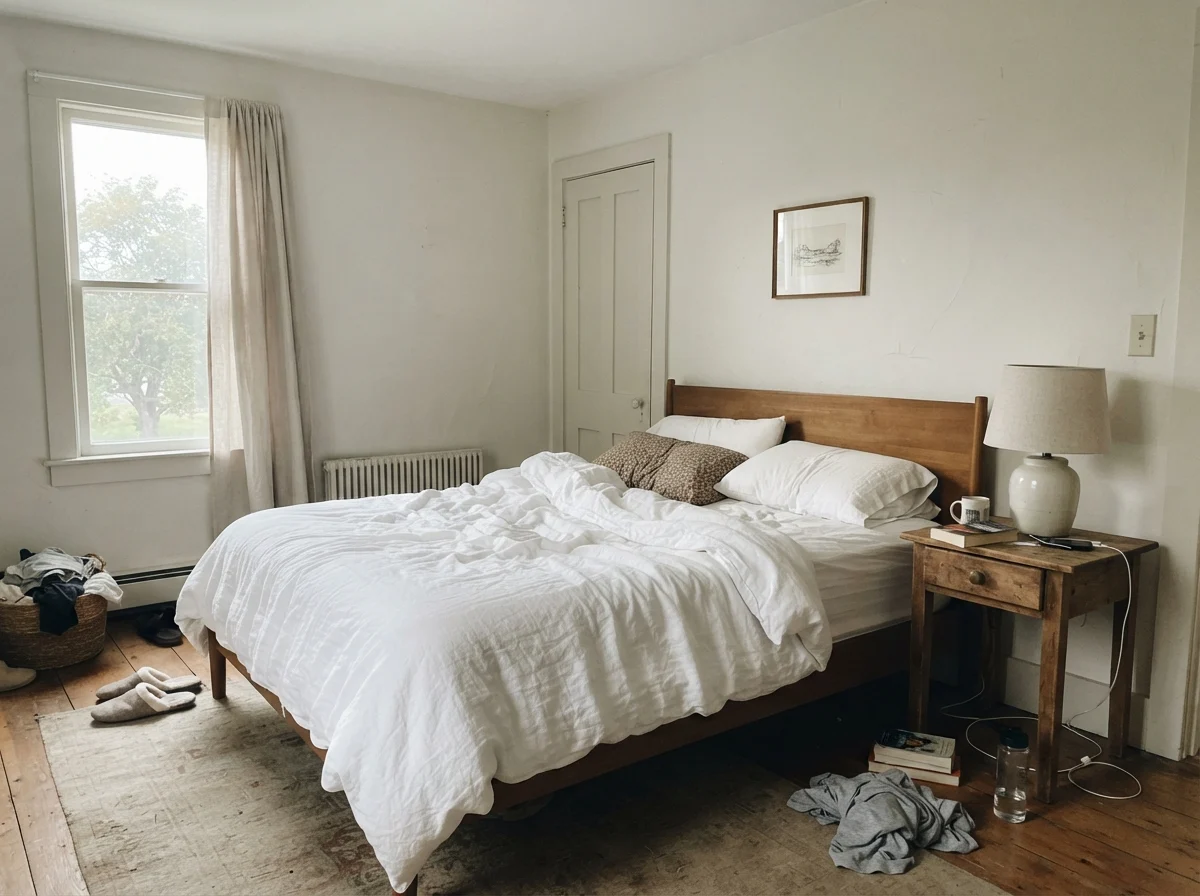
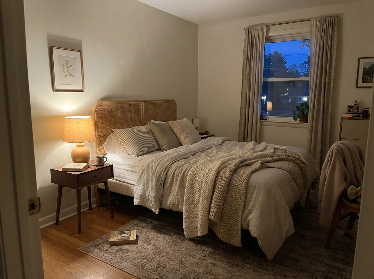
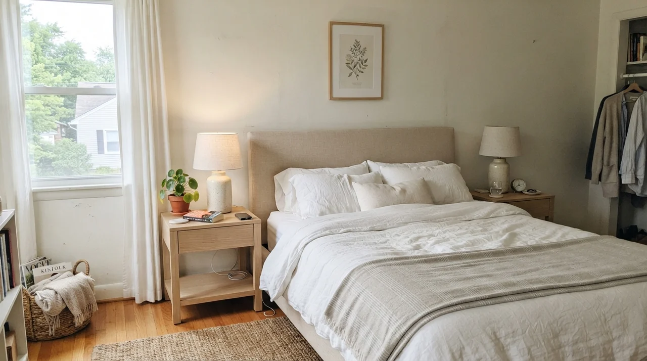
At dawn, when the morning light is cool and thin, a bedroom coated in Seapearl can feel sparse and slightly pale, almost washed clean of character. You look at it and wonder if you should have picked something with more punch. But wait until dusk arrives and you flip on a bedside lamp equipped with a 2700K bulb. The entire perimeter melts into a gentle, creamy sanctuary that makes linen and warm wood feel like they've been together for fifty years.
If your bedside tables are fitted with 3000K to 3500K bulbs, Seapearl stays much closer to its neutral baseline. But drop below 2700K, and you will see an unmistakable, slightly peachy warmth creep across the plaster. Some people adore that cozy glow; others feel betrayed because they thought they bought a cool, tailored stone. You have to know your lighting before you commit your weekends to the roller.
Seapearl doesn't choose its own mood; the room's exposure decides whether you get a rich heritage cream or a tired, unwashed gray.
Where Seapearl Shines: The Sunlit Living Spaces
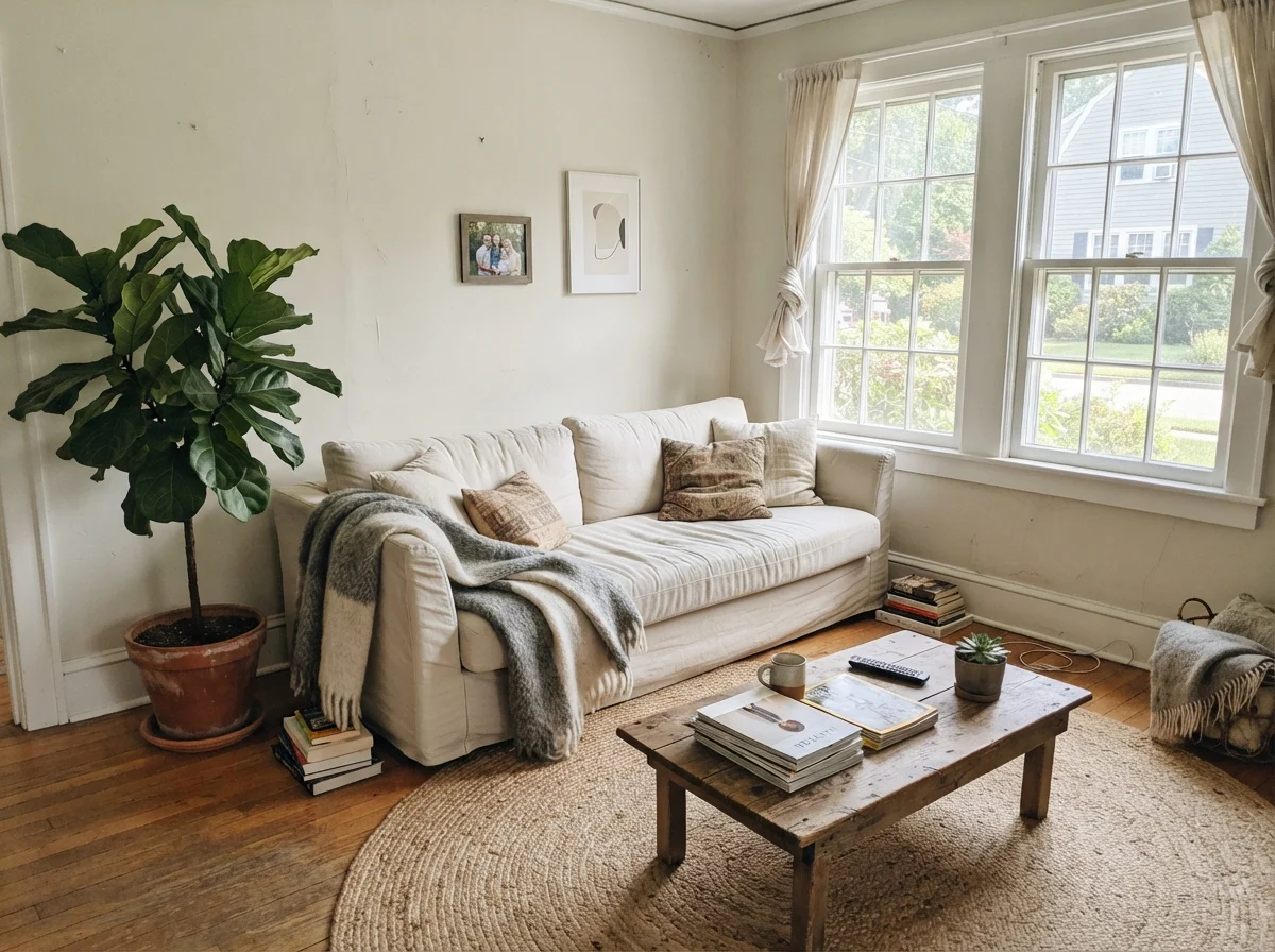
Give this shade two tall windows facing south or west, and it behaves like the most gracious guest you have ever hosted. It creates an atmosphere that isn't sterile, yet never competes with your furnishings. I have watched it flatter aged red oak, weathered walnut tables, and rumpled slipcovers in a way that modern bright whites simply cannot manage.
When we repainted the living room in our 1970s split-level decades ago, I made the amateur mistake of choosing a white that looked crisp on a two-inch chip. It turned out so sharp it showed every dent in the plaster and looked like a medical clinic by 2:00 PM. Seapearl does the exact opposite: its subtle gray-cream undertone absorbs glare, forgiving the minor wall imperfections that come with an older house while making leather and woven textiles look entirely purposeful.
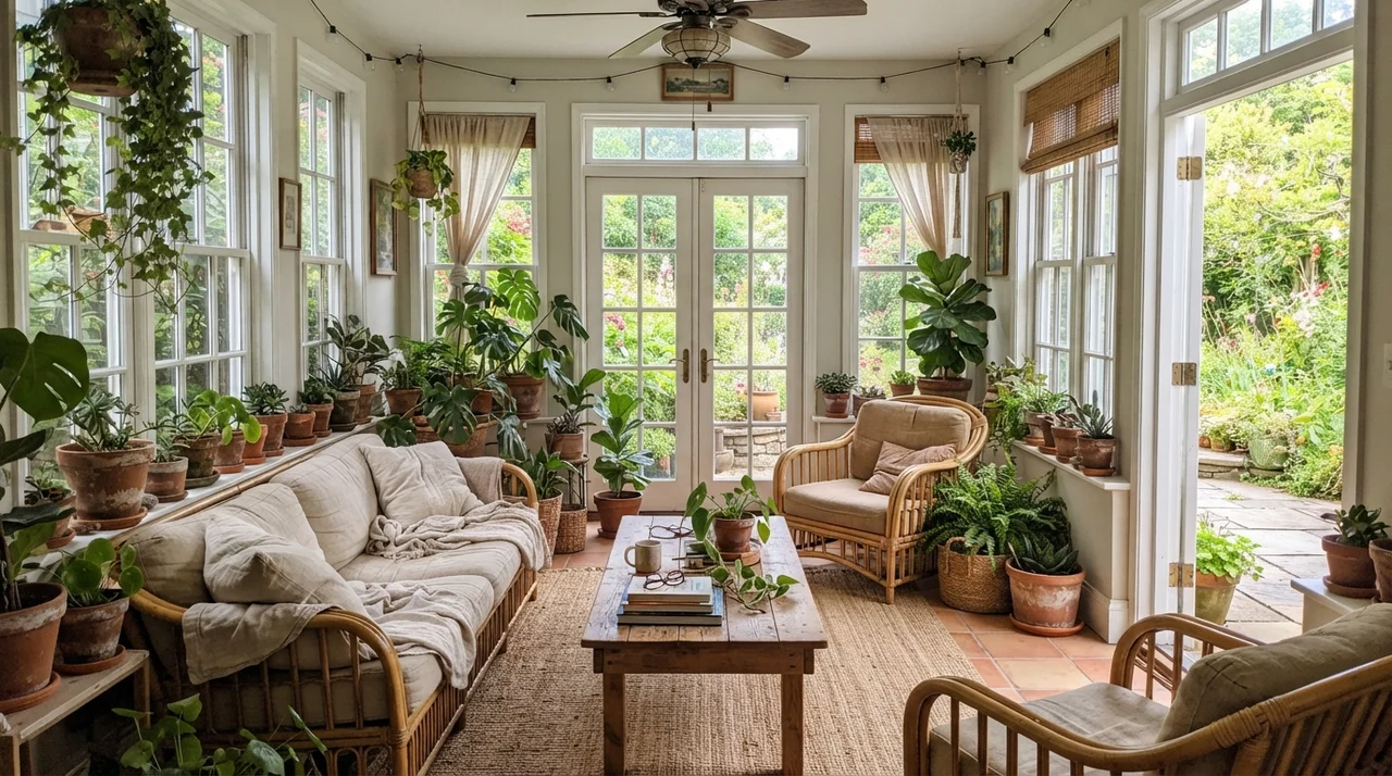
In a sunroom or any space lined with broad windows, Seapearl behaves itself remarkably well. Because it doesn't carry heavy yellow saturation, direct sunlight won't turn your walls into a stick of butter. It stays grounded, quiet, and cool-tempered even when the afternoon sun hits full tilt against terracotta pots and natural rattan.
Bedrooms and Nurseries: The Cozy Envelope
In a bedroom, your paint needs to work twice as hard: it has to look fresh enough to wake up to, but grounded enough that you aren't staring at glaring plaster when you're trying to wind down with a book. Seapearl manages that balance beautifully, provided the room gets some natural light during the daytime hours.
Five years in, a bedroom painted in this shade doesn't feel dated. It sidesteps the chilly, gallery-white look that dominated design magazines for a decade, without sliding backward into the heavy beige mud of the late 1990s. When paired with quiet oak accents and simple white linens, it feels steady and timeless.
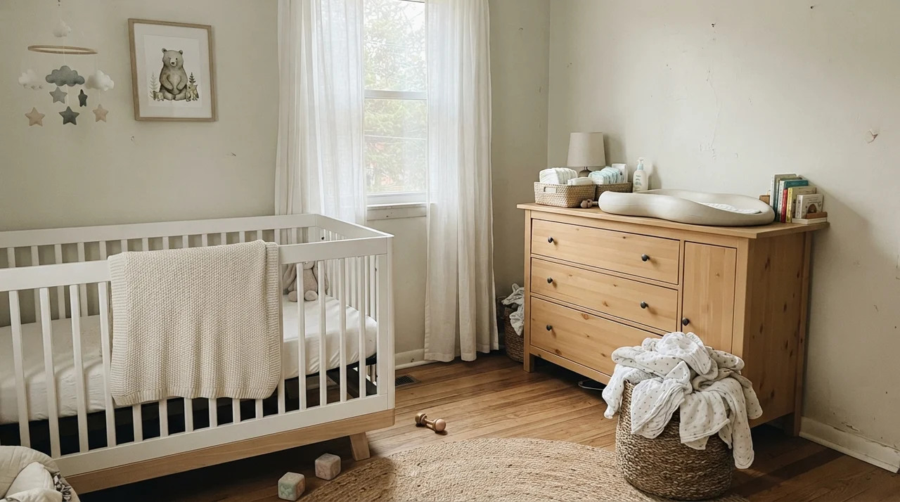
Notice how well it sits behind a white crib or a white metal frame. That slight difference in value—the fact that Seapearl has that LRV of 76 compared to a true white at 85 or higher—creates a gentle, deliberate separation. The white furniture steps forward, while the wall steps back, giving the room a sense of depth that you lose entirely when the walls and trim are the exact same bright builder-grade base.
Kitchens and Cabinetry: Where Details Make or Break It
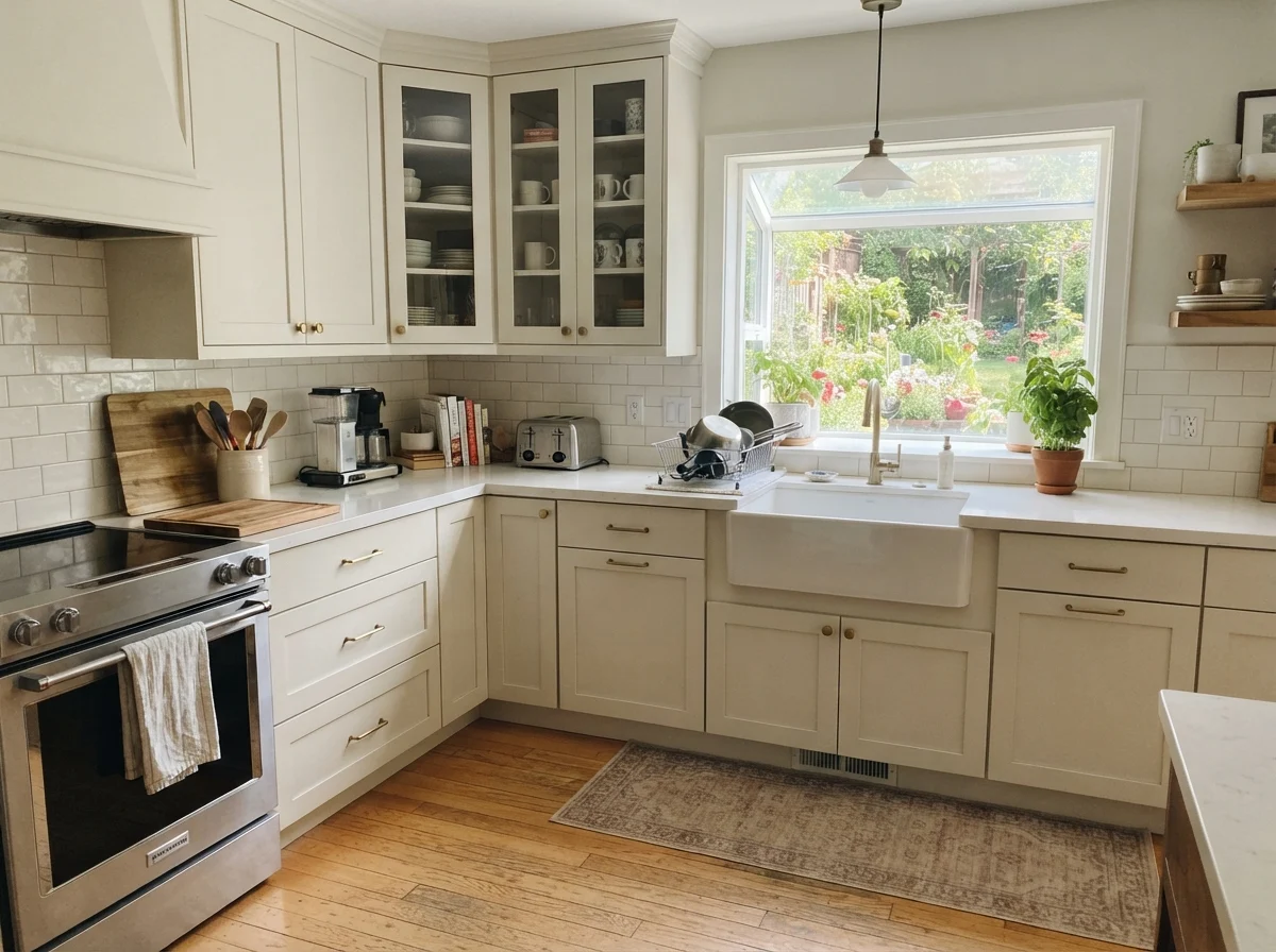
Here is where many well-meaning homeowners run into trouble. Seapearl is a phenomenal cabinet color if you are starting from a blank slate with fresh oak floors, brass hardware, and clean white quartz counters. On shaker doors, especially in a satin sheen, it reads like custom, architectural cabinetry from an old European estate rather than a stock order from a box store.
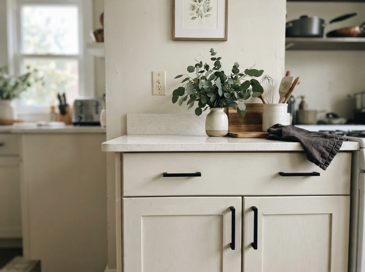
However, you must take an honest inventory of what is already installed in your kitchen. If you have tumbled travertine backsplash, cream-glazed perimeter cabinets, or yellow-toned granite, Seapearl will turn sullen and gray in protest. It cannot tolerate competing creamy finishes; against a true warm cream tile, Seapearl looks like dirty dishwater.
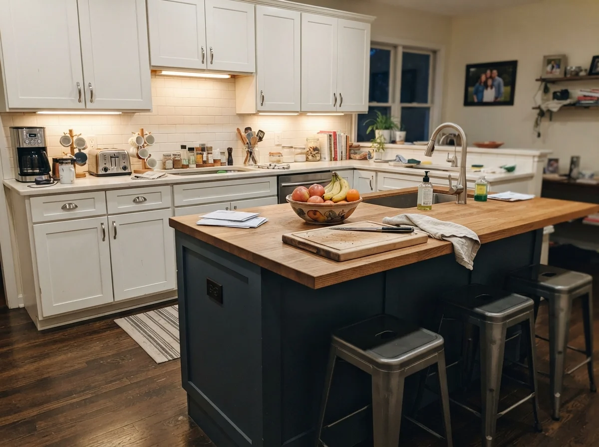
When you use it on an island alone, as shown above, you have to be careful with the wall color behind it. Notice how against warmer cream walls, the island pulls slightly cooler. If you want the kitchen to feel cohesive, my advice is to keep your subway tile or quartz crisp and white, letting Seapearl take the stage as the subtle, grounded element that warms up the space.
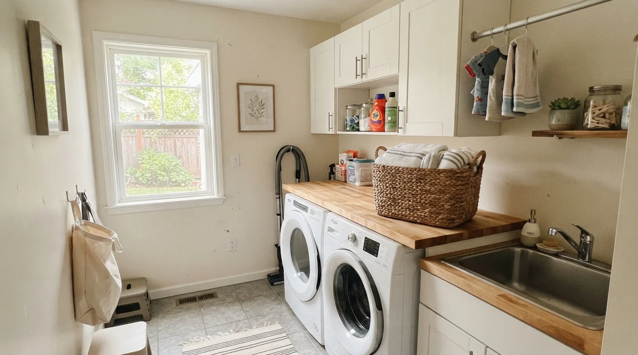
Bathrooms and Laundry Rooms: Tile and Moisture
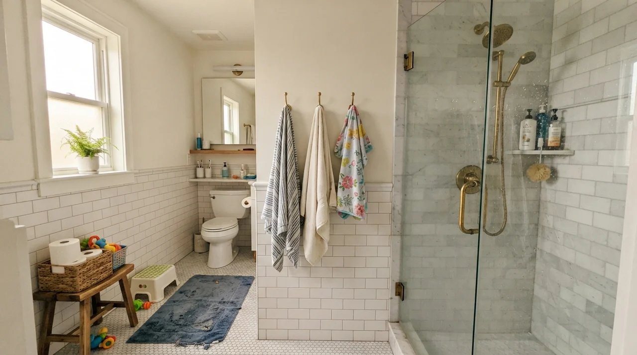
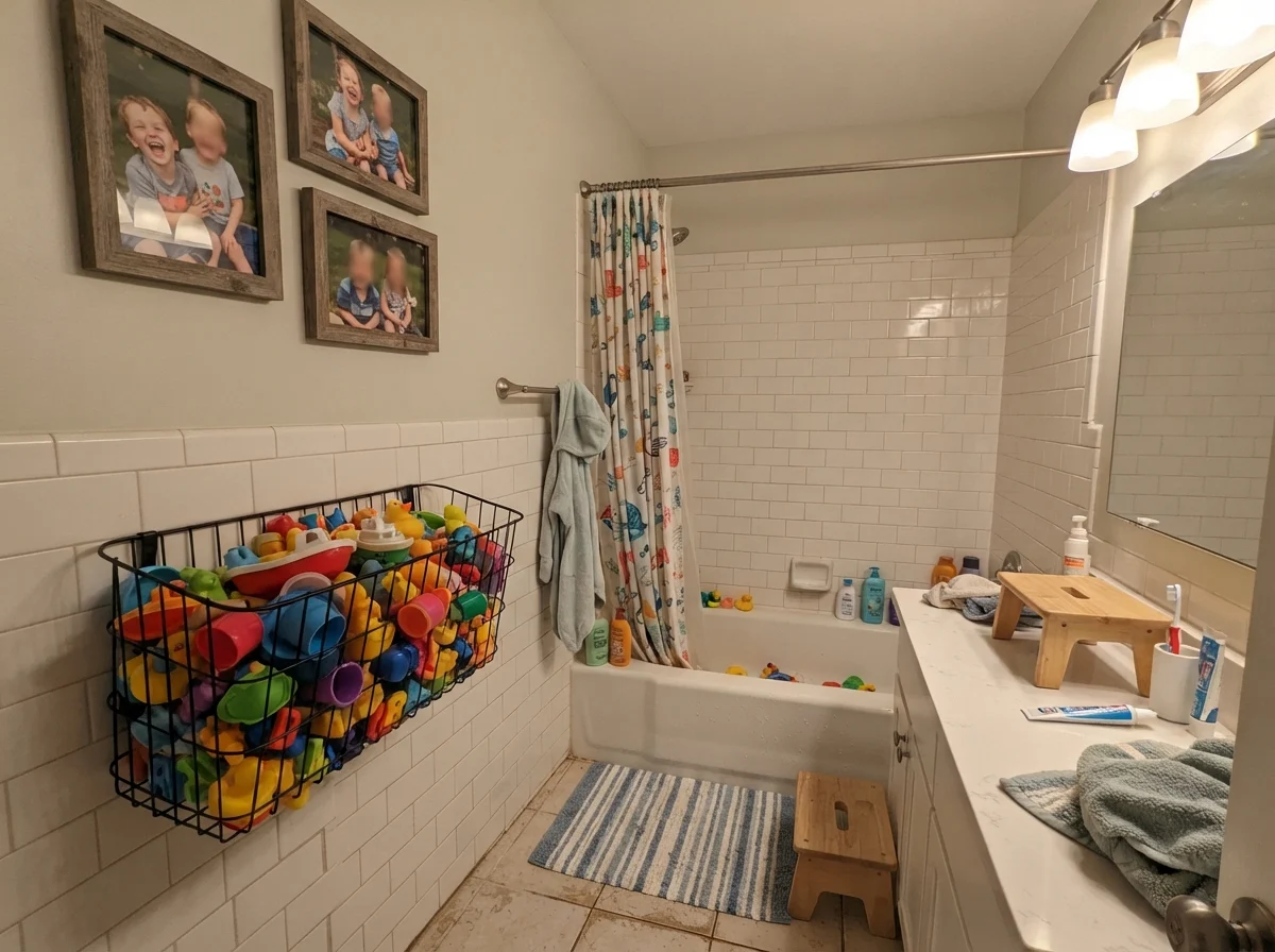
Bathrooms are an ideal testing ground for Seapearl because they usually contain hard white fixtures—porcelain sinks, cast-iron tubs, and glossy ceramic tile. That sharp white porcelain gives Seapearl something clean to lean against, which stops it from reading as dingy.
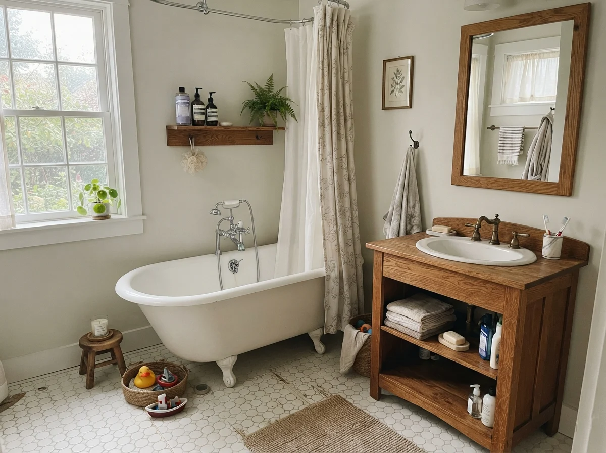
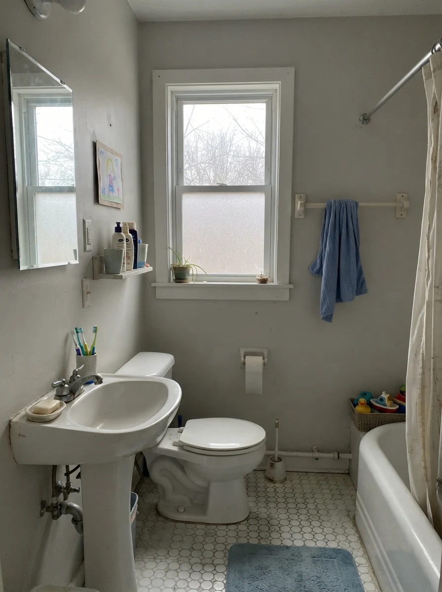
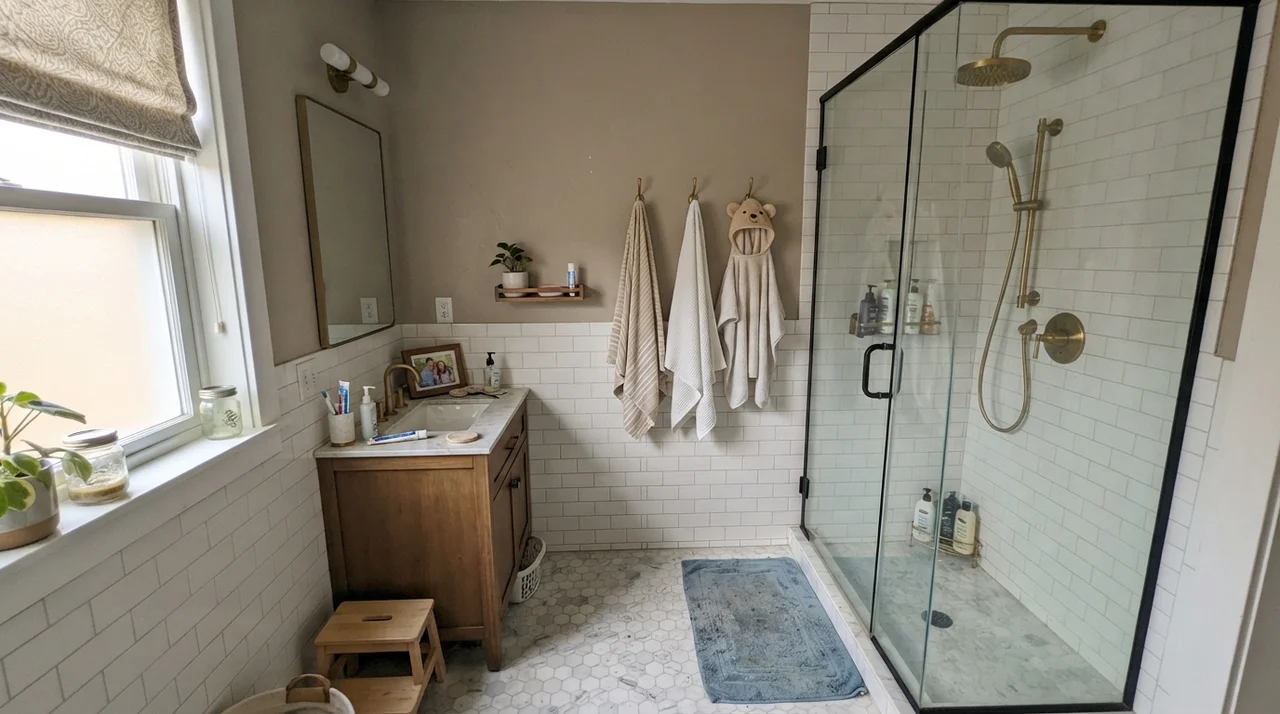
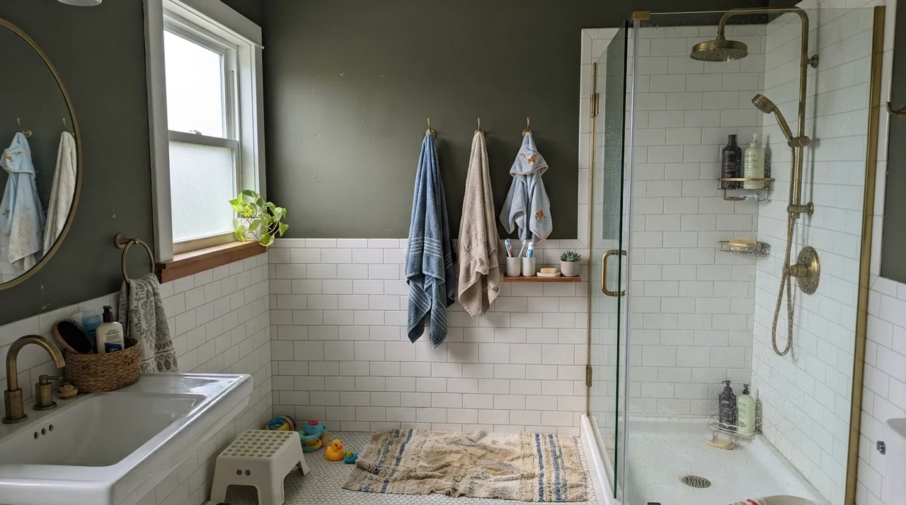
In a cottage-style bath with classic white hex tile and an oak vanity, it creates a wonderfully grounded, historic feel. But be mindful of your window orientation: an overcast morning through frosted glass will immediately draw out the stone-gray undertone.
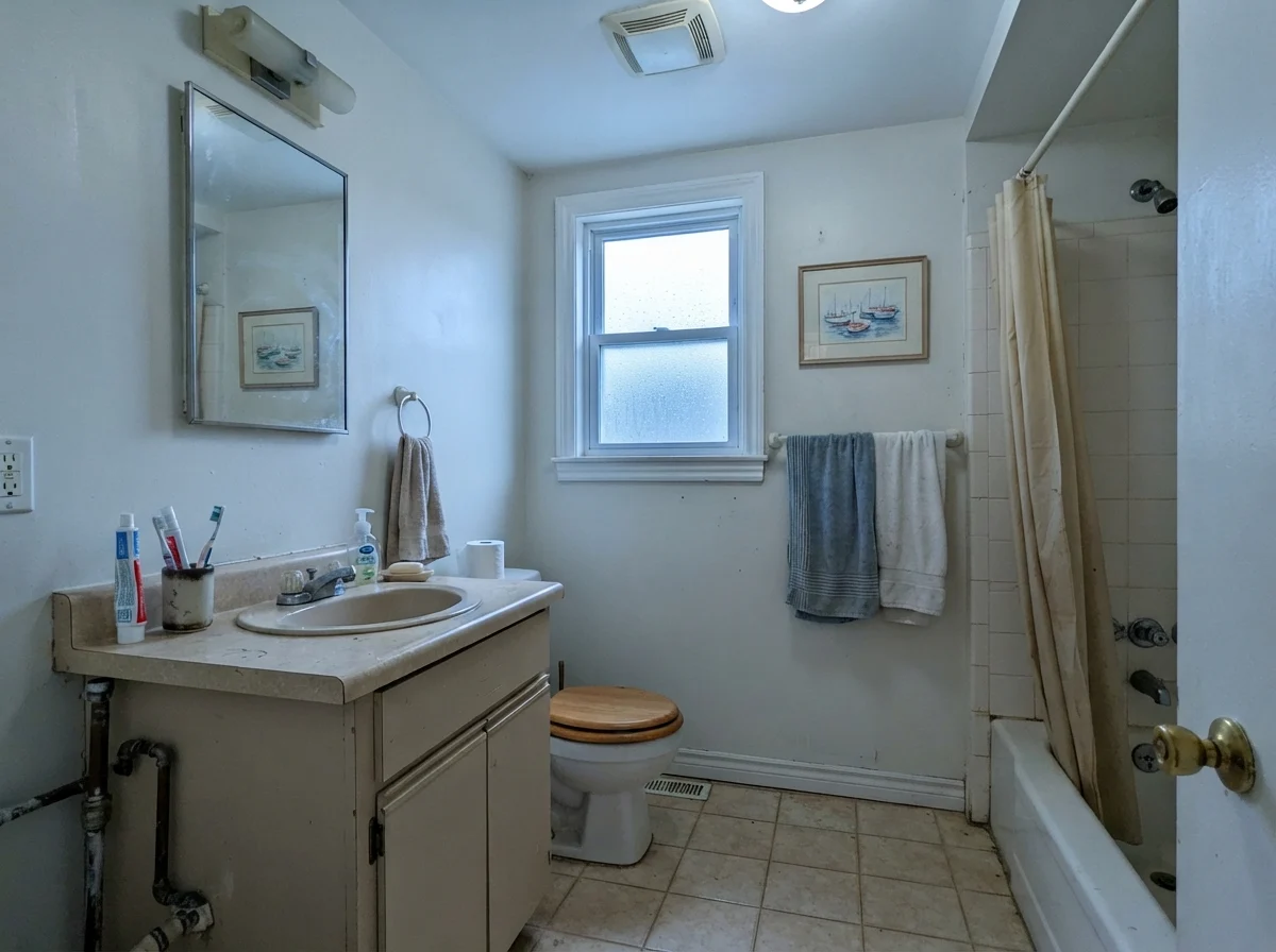
Take a hard look at that third photo above. That is the reality of low-chroma paint on an overcast day. Without direct sun to awaken the yellow component, the wall flattens into a pale putty. If your bathroom only has a small, frosted north-facing window, you need to be prepared for that quiet, cool personality three months out of the year.
Woodwork, Millwork, and the Power of the Same Color
One of my absolute favorite ways to use Seapearl—and something I did in our 1960s ranch when we refreshed the trim—is to paint the walls and the woodwork in the exact same color, simply stepping up the sheen. We used eggshell on the drywall and semi-gloss on the casing, doors, and baseboards.
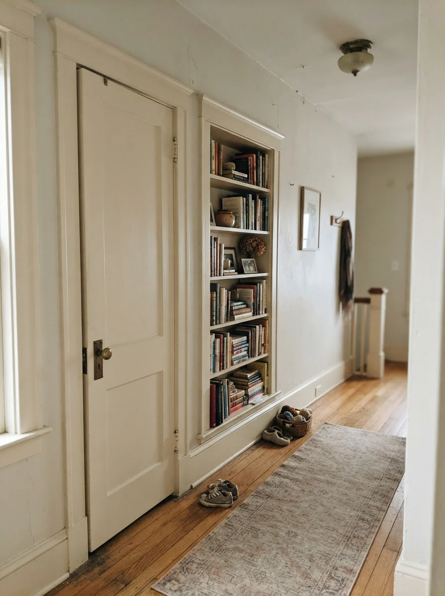
When you take a bright white trim paint and run it against an off-white wall, you create a sharp boundary line that chops up the room. But when you paint deep casings, interior doors, and built-ins in Seapearl alongside Seapearl walls, the millwork stops shouting. The shadow lines do all the talking. It looks like the woodwork has always belonged to the house, rather than being slapped on during a weekend remodel.
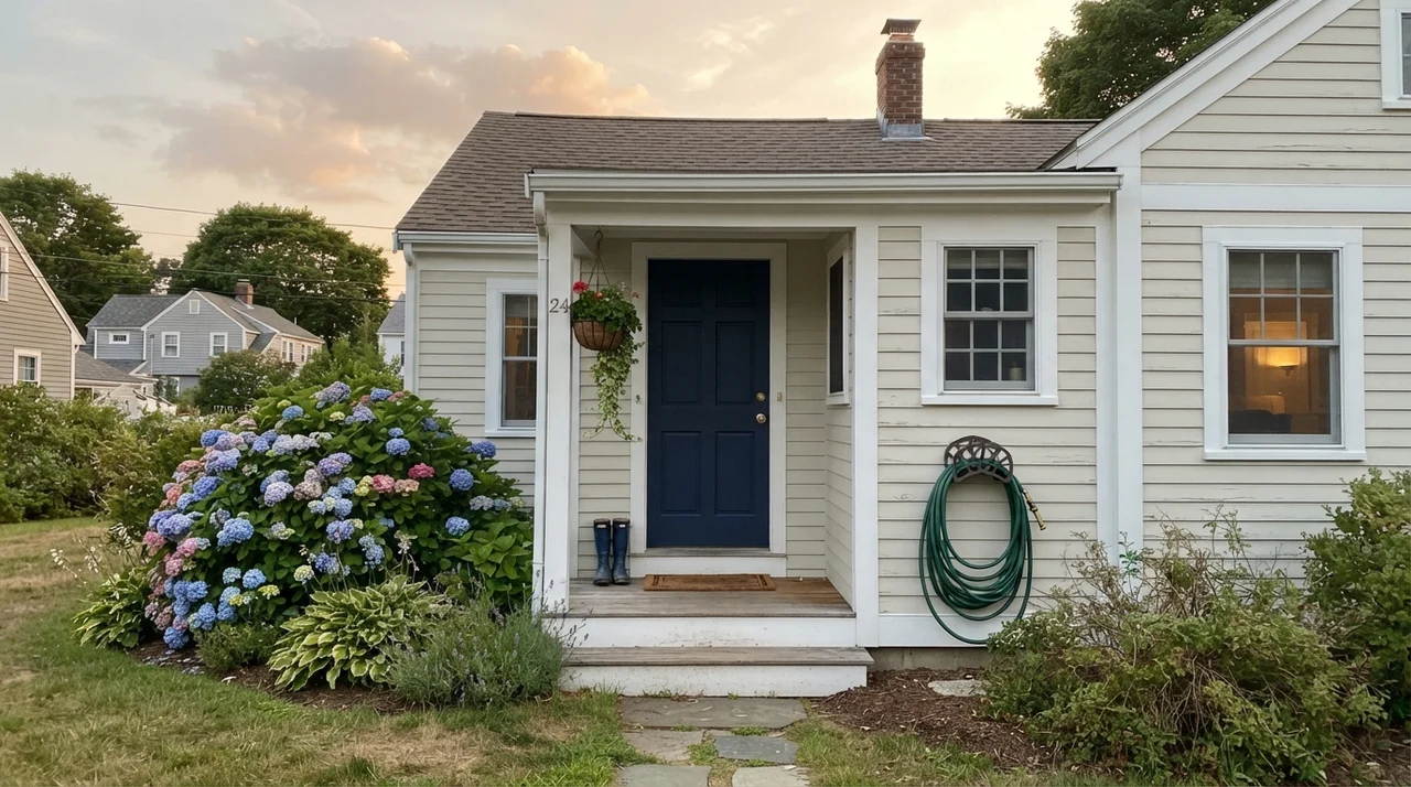
Outside, Seapearl is an absolute workhorse. In full southern sunlight, bright whites can produce an unbearable glare that hurts your eyes from the driveway. Because Seapearl sits at an LRV of 76, it softens the exterior body of the home without looking beige or dirty. Paired with dark navy or charcoal shutters (like Benjamin Moore Kendall Charcoal HC-166), it yields that tailored, timeless colonial curb appeal that buyer’s agents drool over when you put the sign in the yard.
Where Seapearl Completely Falls Apart
Almost every bad Seapearl story comes down to three predictable situations, and you can diagnose them before you ever pry the lid off the can. If your room checks any of these boxes, save yourself the frustration and pick a different swatch.
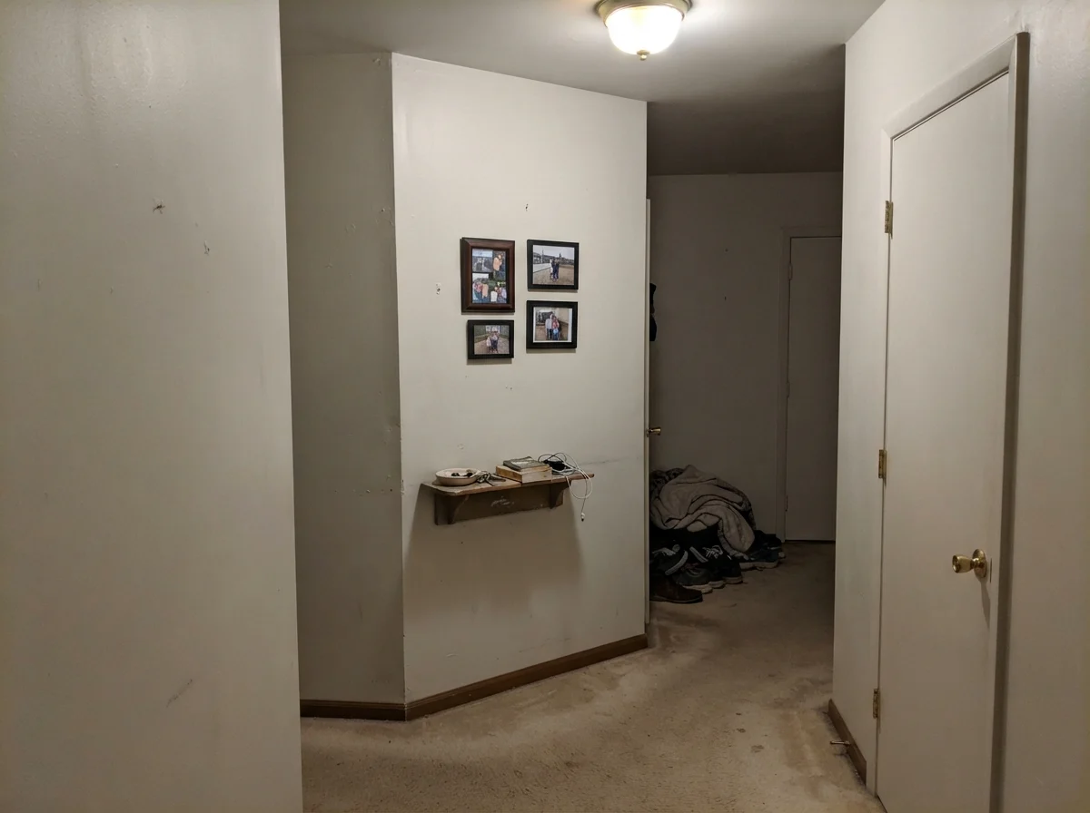
The image above is the honest truth nobody wants to post on a polished mood board. That windowless hallway corner has no natural daylight to feed on. Under a single ceiling fixture, Seapearl doesn't look creamy or heritage; it looks tired, muddy, and unfinished. If you have an enclosed stairwell or an interior hallway, do not expect Seapearl to magically create warmth out of thin air. In dark spaces like that, you are far better off leaning into a color with real saturation, like Benjamin Moore Manchester Tan (HC-81), or a creamier white with enough yellow to hold up under shadows.
The second guaranteed failure is rolling Seapearl right up against a flat, bright builder-white ceiling. When that stark, unwashed chalk-white sits overhead, its higher LRV reflects down and makes Seapearl walls look like someone smoked twenty years of cigarettes in the room. If you choose Seapearl for your walls, either take the same color onto the ceiling at 50% strength, or deliberately frame it with a crisp, intentional white trim like Benjamin Moore Chantilly Lace (OC-65) so the contrast looks calculated rather than lazy.
Living with It Long-Term: Scuffs, Washability, and Resale
Here is what thirty years of homeownership has taught me about finishes: the flat finish that looks so velvety in architectural magazines is a nightmare the second you introduce a dog, a toddler, or a vacuum cleaner cord. In our current ranch, every high-traffic wall gets painted in eggshell. It has just enough resin to be scrubbed clean without leaving that dreaded burnished shiny spot where you wiped off a smudge of dirt.
For trim and baseboards, semi-gloss is non-negotiable. Baseboards take the brunt of shoes, grocery bags, and mop buckets. In our last house, our trim held up for nearly a decade because we invested in premium semi-gloss. Seapearl actually hides routine scuff marks far better than a bright white like Chantilly Lace, because its subtle gray-buff undertone doesn't highlight everyday gray scuffs the way a pure white does.
On kitchen cabinets, insist on satin. Semi-gloss on cabinets can look cheap and plastic under overhead recessed lighting, while eggshell will absorb oils from fingers around the pull handles. Satin wipes clean easily, resists grease, and keeps that tailored furniture finish intact.
How Seapearl Compares to the Heavyweights
Before you commit to a full five-gallon bucket, you need to understand how Seapearl stacks up against the other off-whites sitting on your kitchen table right now. Even tiny shifts in LRV and tint make a massive difference once you roll out four hundred square feet of wall.
Is Benjamin Moore Seapearl the exact same color as China White?
Yes. Benjamin Moore Seapearl (961) and China White (OC-141) share the exact same formula (#E7E4D9) and an LRV of 76. They are identical paints sold under two different names and deck numbers.
What ceiling paint should I use with Seapearl walls?
Do not leave a standard stark builder-white ceiling. The high contrast will make Seapearl look tan or dirty. Either tint your ceiling paint to Seapearl at 50% strength for a seamless wrap, or use Benjamin Moore Chantilly Lace OC-65 for an intentional, crisp architectural contrast.
Can I use Seapearl for the whole house?
It is a gamble. Because Seapearl has very low chroma, it shifts dramatically depending on daylight. A southern-facing living room will look like rich warm cream, while a windowless hallway or north bedroom will turn drab stone-gray. If you want a whole-house white that behaves consistently, Benjamin Moore White Dove OC-17 is a safer buy.
What sheen should I buy for trim and doors?
Semi-gloss. It provides the necessary durability to be scrubbed clean over years of use, and the sheen contrast creates subtle visual depth if you paint your walls and trim the same color.
The Thirty-Year Perspective: Making the Final Call
When we sold our colonial, the buyer told our agent that the house felt restful the moment she walked through the front foyer. She couldn't name the paint color, and that is precisely the compliment you want. You don't want guests walking into your home and immediately thinking about a paint swatch. You want the walls to support the furniture, catch the daylight, and quietly step out of the way.
Seapearl can do that better than almost any off-white on the market, but only if you give it the conditions it demands. It is not an unfussy, roll-it-anywhere paint. It requires daylight, it demands respect for what finishes are already in the room, and it punishes you if you pair it with cheap builder-grade ceilings.
Susan's Verdict · Buy the Sample First, Then Check the Direction
Seapearl is an exceptional, tailored off-white with real body for older homes with original wood floors, generous south or west windows, and heavy millwork. It is well worth the money if you paint walls and trim the same color and let the sheens do the work. But if you have dim northern rooms, windowless hallways, or cream-glazed tile you cannot afford to rip out, skip it. Pick a steadier white like White Dove or a warmer cream like Swiss Coffee, and save yourself the repainting weekend.