Color Diary · No. 127
Worldly Gray When the Sun Leaves: A Five-Year Ledger
Sherwin-Williams' warmer answer to Agreeable Gray, reviewed honestly: the quiet green cast nobody warns you about, the rooms where it goes dingy, and what to pick instead.

Susan HartleyNovember 17, 2026 · 16 min read
Worldly Gray · Sherwin-Williams SW 7043
Hex#CEC6BBLRV57Undertonesearthy tan → soft green → muted gray
In our last house, a 1990s colonial with oversized windows and an open staircase, I spent three weeks staring at paint chips taped to the hallway drywall until the blue painter’s tape curled and fell off. Gray was everywhere that year. Not just everywhere in magazines, but across every suburban development within twenty miles. My sister had painted her entire center-hall colonial in a cool, battleship gray that looked sharp on an architectural blueprint and felt like an operating room by November. I knew I couldn’t live with that kind of chill through an Ohio winter. But the builder’s beige we had inherited was turning distinctly orange against our honey oak trim, and I wanted something that felt pulled together without making our furniture look like yard-sale castoffs.
That is how I ended up buying five gallons of Sherwin-Williams Worldly Gray (SW 7043). On the paper chip at the store counter, it looked like the most polite color in the world: a gentle, balanced greige sitting at an LRV of 57. It promised to bridge the gap for anyone who thought true gray was too cold and beige was too dated. We rolled it across our high-traffic family bathroom, down the main hallway, and eventually onto our kitchen built-ins. Five years in, having lived with it through blazing July humidity and dreary February sleet, I can tell you that Worldly Gray is not the blank slate the swatch suggests. It is a chameleon with an earthy green thread running right through its middle, and whether you love it or regret every roller stroke comes down to your daylight, your light bulbs, and what kind of flooring you lay beside it.
The Three Faces of Worldly Gray
Every neutral shifts under changing skies, but Worldly Gray moves more than most. Sherwin-Williams built this greige on an earthy foundation that pulls distinctly tan when the sun is out, shows its quiet green cast in cool northern light, and settles into a stony gray once artificial bulbs take over.
warm sun
overcast, north light
dusk, rain, cool bulbs
That soft green undertone is what prevents Worldly Gray from turning chalky or pink in bright rooms, but it can read like pale sage if your lighting drops below 3000K or faces due north.
Wheat BreadBehr · see diary
Vintage PewterBehr · see diary
Worldly GraySW 7043
Sculptor ClayBehr · see diary
AlpacaSherwin-Williams · see diary
Morning Light, Evening Lamps, and That Elusive Green Cast
The single biggest surprise for most homeowners who buy Worldly Gray is how dramatically it reacts to the time of day. Most paint companies categorize greiges as either warm or cool. Worldly Gray sits in a middle ground where its character changes entirely based on what window it faces. Its Light Reflectance Value is 57, which means it sits just slightly above the halfway mark between black and white. It has enough pigmentation to stand up to glare without washing out, but not enough self-contained brightness to glow when daylight disappears.
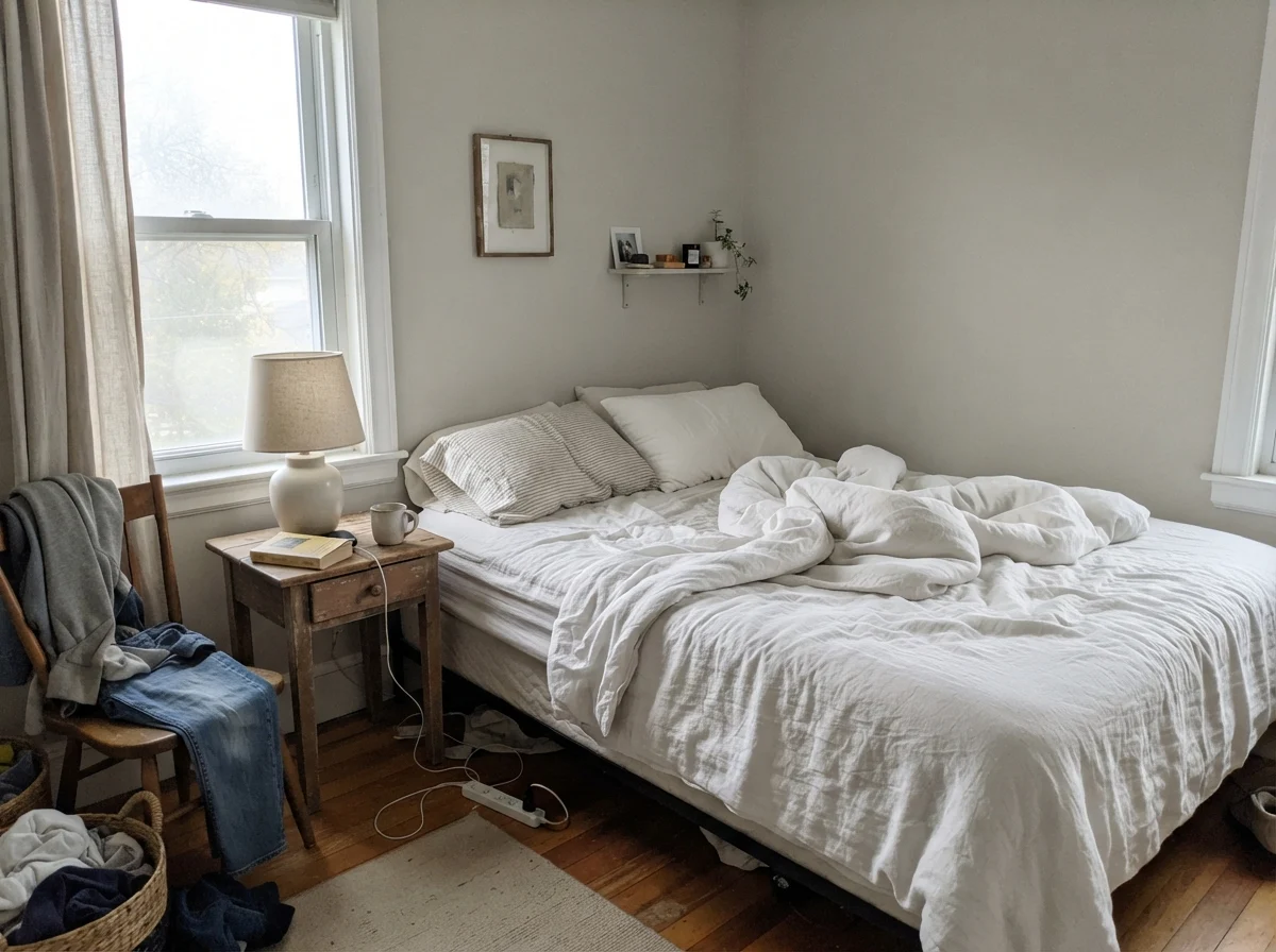
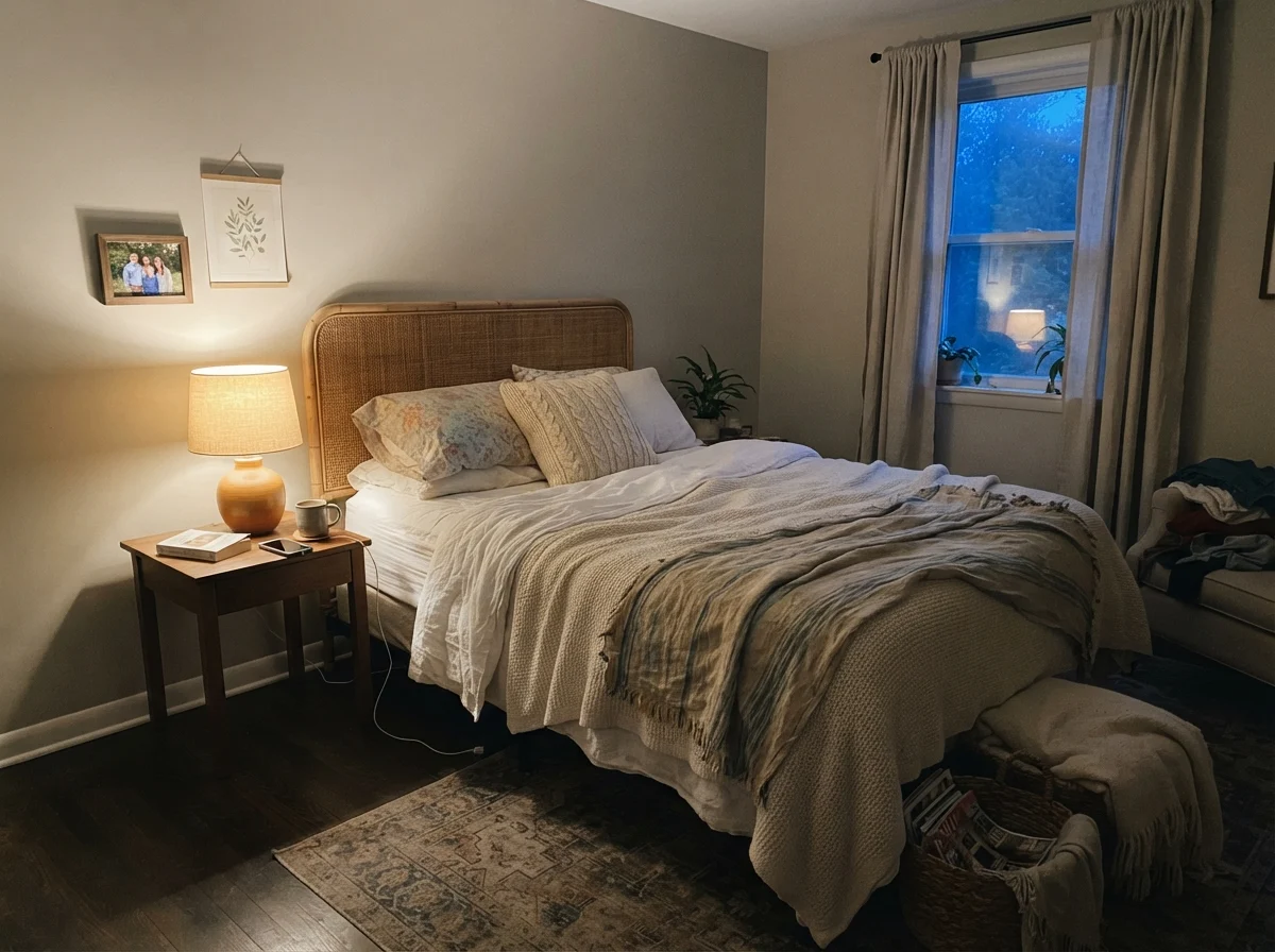
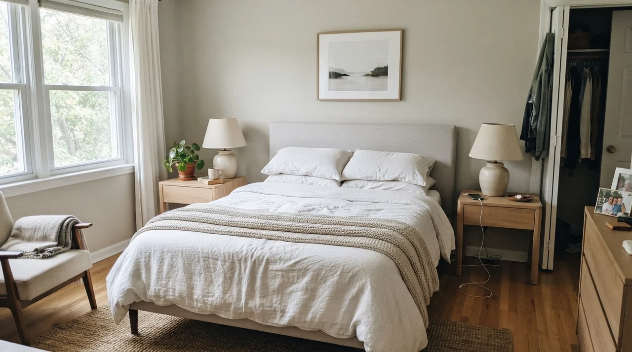
When we had it in our east-facing guest room, waking up in the morning was an exercise in pure contrast. At seven in the morning, before any lamps were flipped on, the walls felt almost pale, fragile, and a little washed out. You could see the cool morning sky reflecting off the plaster, giving the color a restrained gray posture that felt almost clinical. But by eight at night, with a single ceramic table lamp burning a warm 2700K bulb, the very same wall turned into an envelope of cozy, toasted linen. The green spine tucked itself away, the gray softened, and the room felt wrapped in warmth. If you work away from home and only see your bedroom after sundown, you will experience an entirely different paint color than someone who sits in that room at ten on a rainy Tuesday morning.
Daylight Spaces: Where Worldly Gray Earns Its Keep
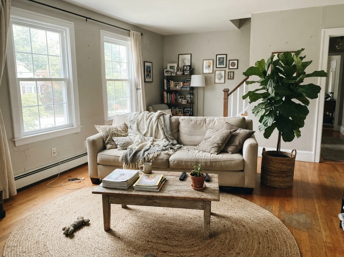
If you have generous south-facing windows or an open floor plan where natural light bounces from room to room, Worldly Gray behaves itself remarkably well. In our living spaces, it carried from the sitting area right across to the dining room without breaking stride. That subtle green undertone—which can be a nuisance in dark spaces—is actually the secret weapon in sunny rooms. A lot of popular greiges turn sickly pink or pasty white under unfiltered sunlight. Worldly Gray doesn’t do that. The green gives it an earthy, grounded depth that absorbs the glare and flatters natural materials like jute rugs, woven rattan, and oiled oak.
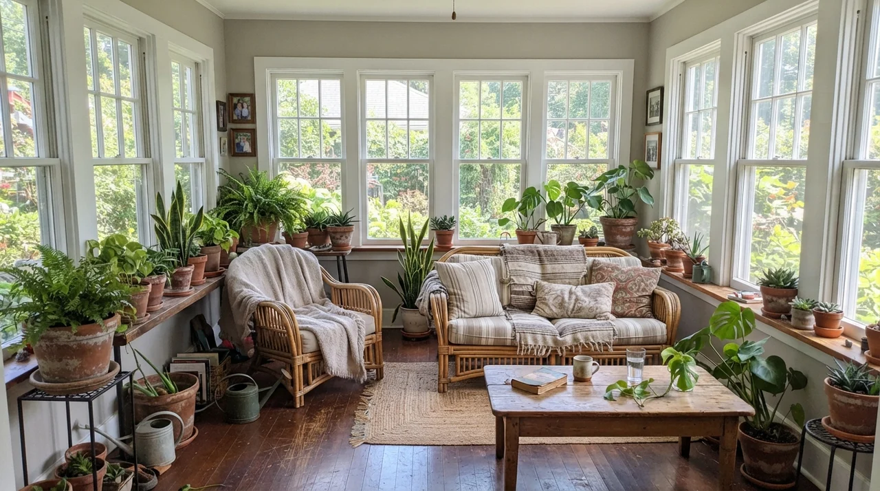
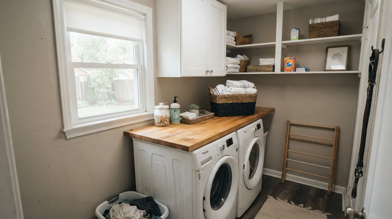
In rooms with wrap-around light, like a bright sunroom or a cheerful laundry alcove with an open window, it looks tailored and deliberate. It allows white woodwork and painted trim to stand out sharply without creating the jarring black-and-white look that cooler grays tend to produce. When paired with butcher block or potted greenery, the earthy base feels organic rather than manufactured. It is one of those colors that guests notice as being comfortable before they register the specific hue on the wall.
Cabinets, Built-ins, and Woodwork
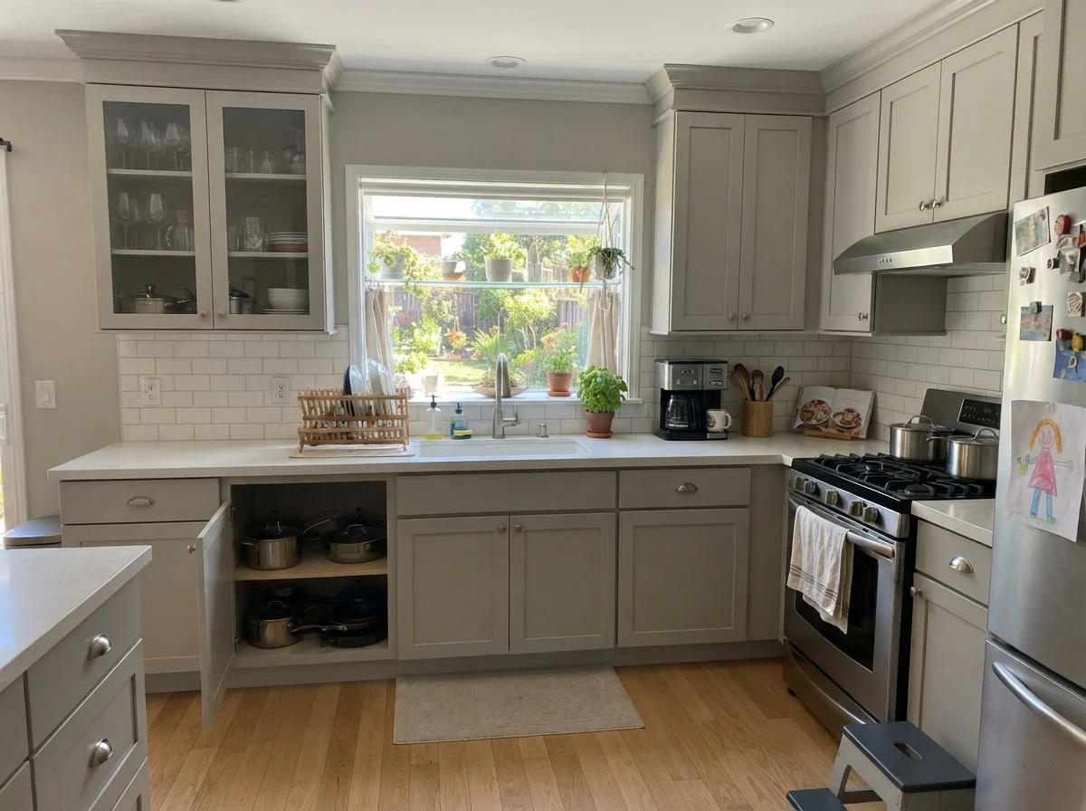
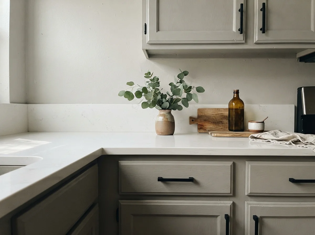
Cabinets are where homeowners frequently make expensive mistakes. When we decided to give our dated kitchen a refresh rather than ripping out sound wood boxes, we tested three candidate colors on spare cabinet doors before committing. Worldly Gray in a satin enamel finish turned out to be an exceptional choice against warm white quartz and light oak floors. It doesn’t read as a builder’s white, nor does it look like heavy, dark woodwork. Instead, it creates an intentional, soft presence that grounds the kitchen.
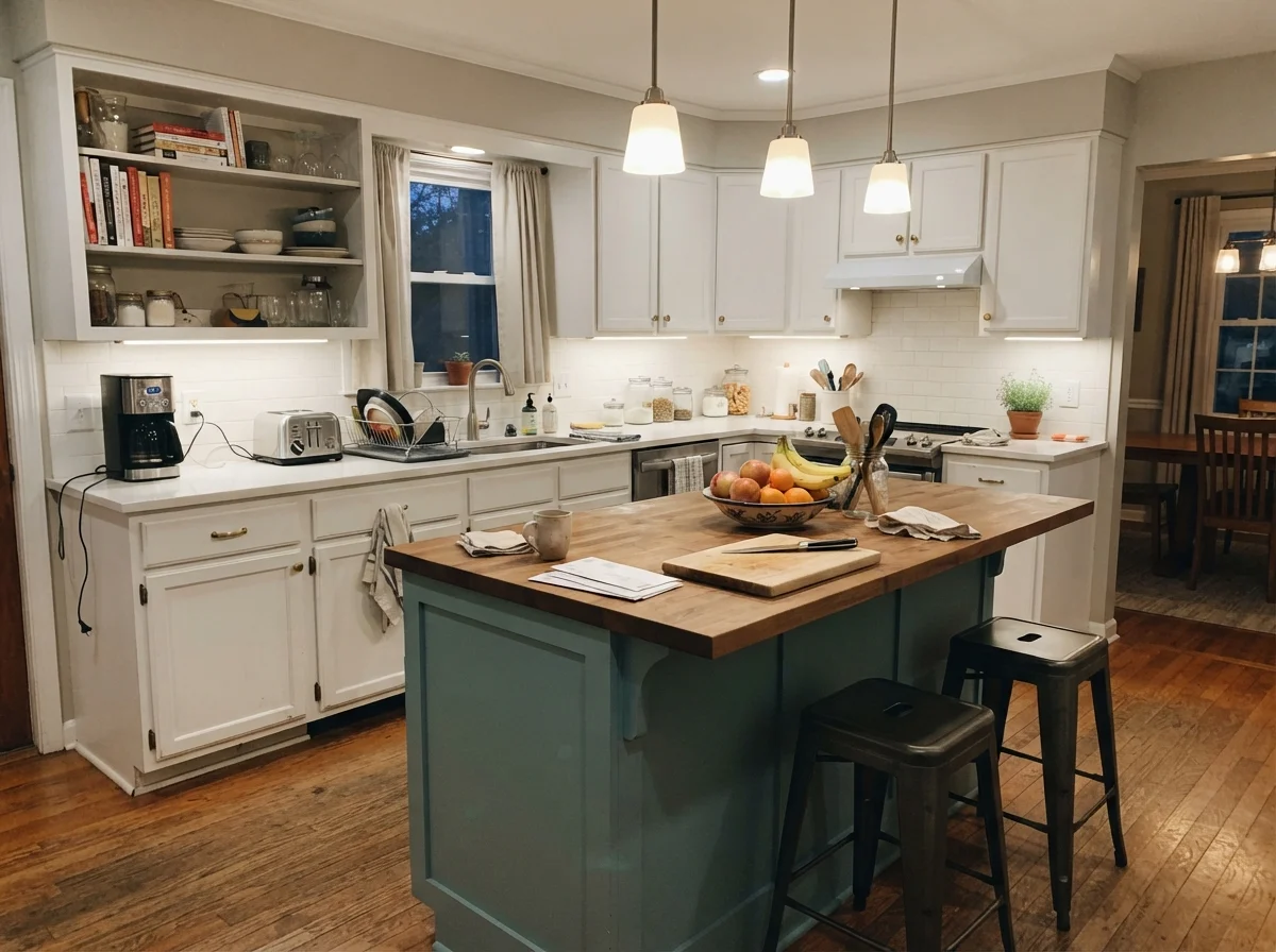
A dry aside for anyone painting cabinets: wall paint on a cabinet frame is a recipe for heartbreak. You need a dedicated, urethane-fortified cabinet enamel. But as a shade, Worldly Gray holds up to daily grease, kitchen steam, and constant handling around the drawer pulls far better than lighter whites. Even on a freestanding kitchen island surrounded by otherwise white cabinets, that slight greige depth brings just enough contrast to break up an expanse of cream walls without chopping the kitchen into disjointed zones.
Bathrooms and the Problem with Tile
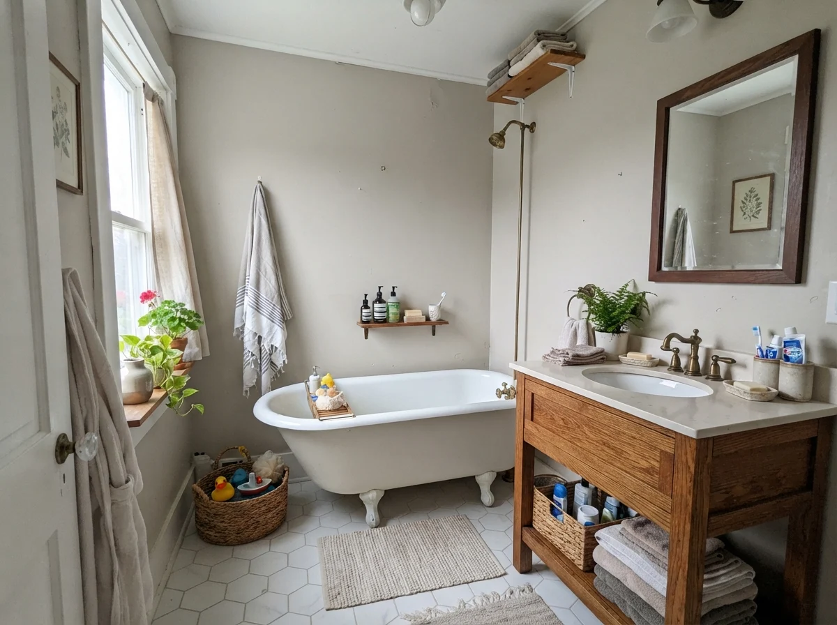
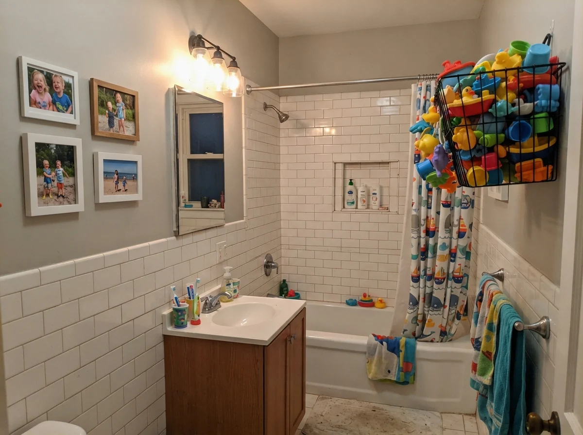
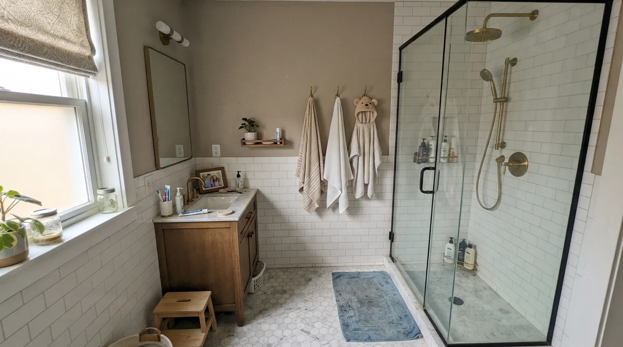
Bathrooms are high-stakes rooms for Worldly Gray, and I have seen it succeed brilliantly in one house and fail miserably in another. In our 1970s split-level, we used it in a cottage-style family bathroom with white wainscoting and a clawfoot tub. The morning light bounced off the white hex tiles, warmed up against our oak vanity, and made Worldly Gray look like a million bucks. It held its own against bright subway tile and brass plumbing fixtures without blinking.
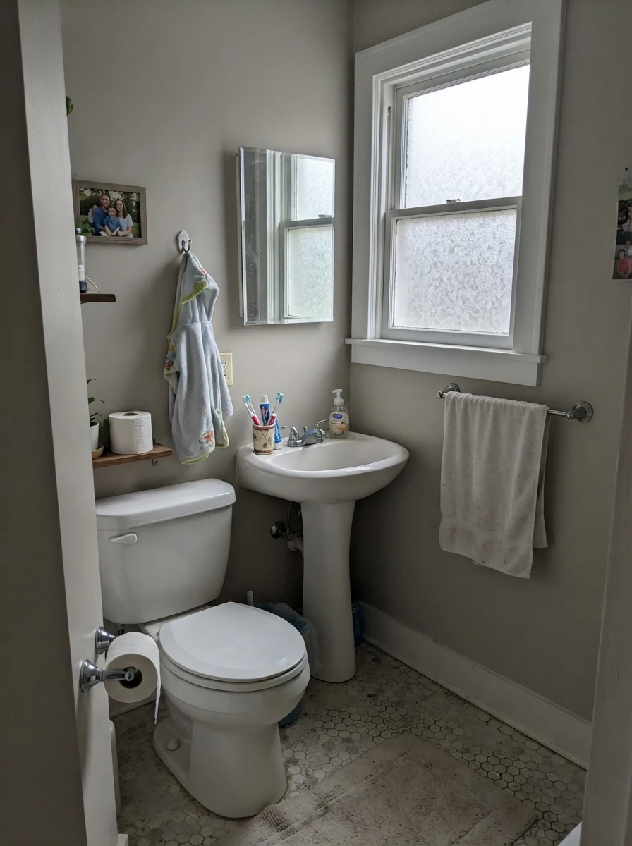
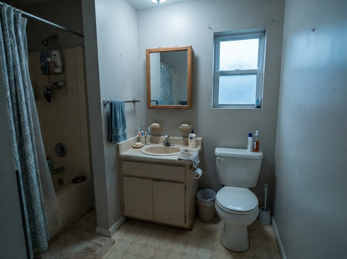
The trouble starts when your bathroom lacks direct sunlight or relies on older, cool tile. On an overcast day in a small windowed bath, Worldly Gray drops its tan disguise and leans flat, muted, and undeniably gray. Worse, if you have a north-facing frosted window and an older beige or mauve vanity, the cool blue sky will pull that underlying green into direct conflict with the pinkish tones in the porcelain. The result isn't greige; it's a dingy, tired cast that looks like wet cement. Before buying a single gallon for a bathroom, look at your tile under your everyday vanity bulbs.
Bedrooms, Nurseries, and Everyday Family Life
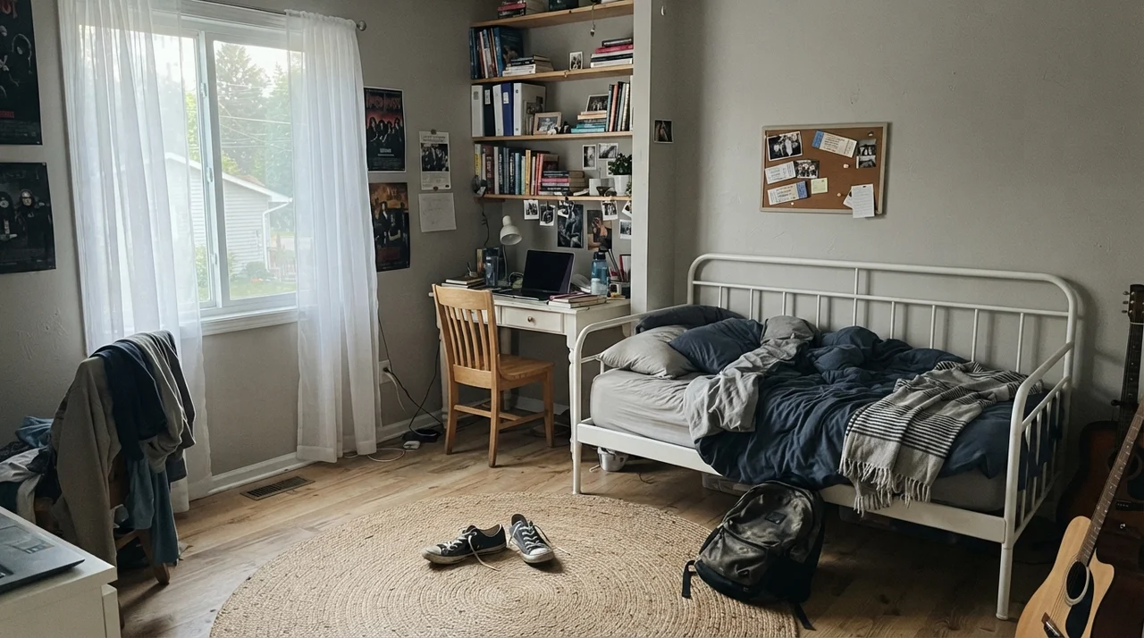
When our daughter hit high school, she insisted her room couldn’t be pastel anymore. We rolled Worldly Gray across all four walls. Her room had a large, slightly cool window, a white metal bed frame, and an avalanche of schoolbooks and sneakers on the rug. The color behaved like an unfussy workhorse. It felt mature enough for a teenager without feeling stiff, and it absorbed the chaos of corkboards and wall posters without competing for attention.
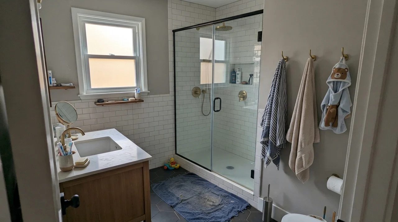
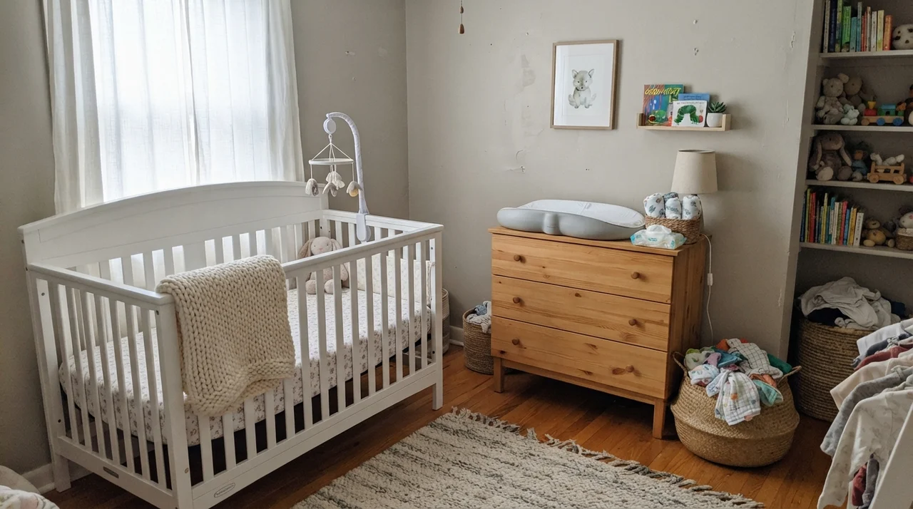
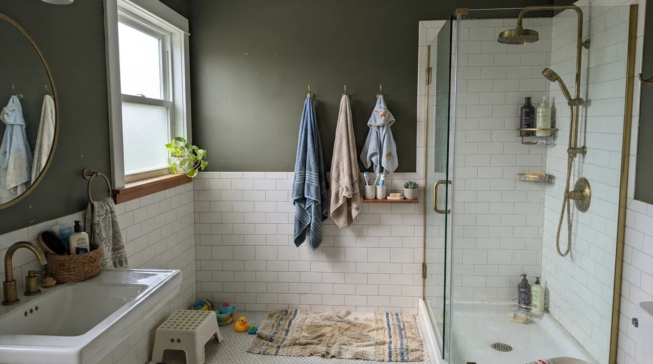
We used the same shade years earlier in a nursery room, paired with sheer curtains and a light-wood changing dresser. In diffuse daylight, Worldly Gray provides a calm, quiet perimeter. It doesn’t scream for attention, and it allows pale linens, knit blankets, and woven laundry baskets to bring texture into the space. In a dedicated kids' bath, painted over durable subway wainscot, it took the riot of colorful plastic bath toys and wet towels in stride. It is resilient, practical, and remarkably adaptable to everyday mess—provided you keep the lighting warm.
Architectural Millwork and Exterior Siding
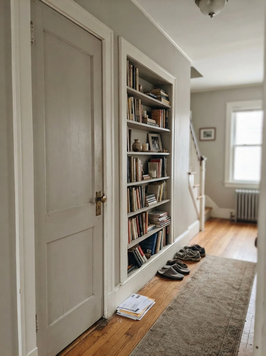
One place where Worldly Gray consistently surprises people is on interior millwork. In older houses with wide trim or built-in bookshelves, painting the doors or built-in shelving in Worldly Gray against creamy off-white walls creates a rich, collected look. It highlights historic two-panel doors and brass hardware without the harshness of a dark contrast color. It gives old woodwork substance while keeping the hallway airy.
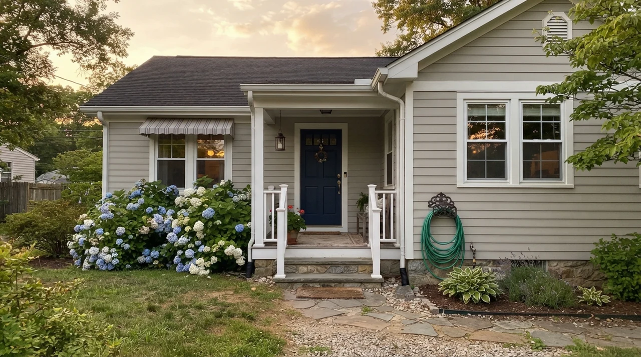
Outside the house, the sun changes the math completely. On horizontal exterior siding, direct sunlight bleaches out the undertones. The green thread evaporates, the tan softens, and you are left with a clean, handsome warm gray that looks dignified behind hydrangea bushes and white trim. When we sold our colonial, that subtle exterior warmth was the first thing buyers noticed pulling up the driveway. It looked fresh without looking trendy, and it held up against road dust and rain far better than pure white siding ever could.
Worldly Gray is not the blank slate the swatch suggests. It is an earthy chameleon, and whether you love it or regret every gallon comes down to your daylight, your light bulbs, and your floors.
The Honest Fail: Where Worldly Gray Disappoints
I promised you the unvarnished truth, and this is where homeowners get burned. The bad reviews for Worldly Gray are remarkably consistent, and they almost always come from someone who rolled it into a windowless interior hallway or a dim basement. In a dark room with a solitary overhead bulb, Worldly Gray’s LRV of 57 turns into a liability. The color cannot find any sunlight to reflect, so the warmth drains out completely. What remains is a drab, muddy putty that homeowners rightfully describe as dingy.
The second hazard is flooring with violet or mauve undertones. Because Worldly Gray carries an earthy green cast, the color wheel works against you: green sits opposite purple. If you put Worldly Gray next to a 1990s mauve carpet or violet-veined bathroom tile, the green undertone forces the wall to flash an uncomfortable violet-blue. No amount of scrubbing or extra coats will cure that clash. If your hallway is dark and windowless, or your carpet leans toward taupe-purple, walk away from this chip.
Trim Pairings: Keeping It Crisp
Choosing the right trim for Worldly Gray is simple once you understand what it needs. Because it has that subtle green-tan heart, it looks best against trim finishes that provide clear, clean contrast without competing for attention. I always advise keeping trim in a semi-gloss finish to give the woodwork an architectural kick, while keeping walls in an eggshell finish to diffuse light softly across the drywall.
Durability, Scrubbing, and the Long Game
A color can look lovely on day three, but after five years in a busy house, the real test begins. In our mudroom entryway and the kids' hallway, Worldly Gray was put through every indignity known to suburban family life: muddy dog flanks brushing the baseboards, backpacks dragged against corners, and bicycle handlebars scraping the drywall. When you live with a color long-term, you quickly discover whether scrubbing it leaves shiny spots where the pigment rubs off.
Worldly Gray held up remarkably well in our standard eggshell finish. When muddy paw prints dried on the wall, a damp microfiber rag with a drop of mild dish soap scrubbed clean without burning through the sheen or leaving a chalky ring behind. That is the beauty of an LRV in the mid-50s: it is light enough to keep a home feeling open, but pigmented enough to hide the minor scuffs that make pure white walls look dated within six months. When we sold our house, I only had to do three minor touch-ups around door casings before the open house. That resilience alone was worth the money.
What undertone does Sherwin-Williams Worldly Gray have?
Worldly Gray is a warm greige with a distinct, earthy green undertone. In south-facing daylight and warm lamplight, it reads as a gentle, warm tan-gray. Under cold north light or 4000K daylight LEDs, that green undertone becomes far more noticeable.
Is Worldly Gray too dark for a whole-house paint color?
Not if your house has normal to generous windows. With an LRV of 57, it reflects plenty of light across open floor plans. However, in windowless interior hallways or dark basements, it can look muddy and dingy without ample lamplight.
Why does my Worldly Gray look purple or violet?
This happens when Worldly Gray is placed adjacent to mauve or violet-taupe surfaces, like older 1990s carpets or certain granite slabs. Because green sits opposite purple on the color wheel, the eye exaggerates the contrast, making the wall flash an awkward violet tone.
What light bulbs work best with Worldly Gray?
Stick strictly to 2700K to 3000K warm white bulbs. Cool 4000K or 5000K 'daylight' bulbs strip out the warm tan pigments and make the subtle green cast look tired, sage-like, and sterile.
What sheens should I use for Worldly Gray?
Use eggshell for main walls to diffuse light softly and allow for easy cleaning. Use satin for kitchen cabinets and built-in shelving, semi-gloss for trim and interior doors, and flat for ceilings.
Susan's Verdict · The Grounded Greige
Worldly Gray is the color to buy when builder beige feels hopelessly dated and cool grays make your living room feel like a dentist's lobby. It bridges honey oak floors and modern furniture better than almost anything else on the rack. Just keep it out of windowless basements, banish 4000K bulbs from your fixtures, and ensure your flooring doesn't lean mauve. Give it real sunlight and warm wood, and it will reward you for years.