Color Diary · No. 129
Sherwin-Williams Ripe Olive Only Shows Its Green on Its Own Terms
The near-black olive nobody asks for by name, reviewed honestly: where the green actually shows, where it just reads as black, and what to pick instead.

Susan HartleyNovember 17, 2026 · 18 min read
Ripe Olive · Sherwin-Williams SW 6209
Hex#44483DLRV6Undertonesolive-brown → charcoal black → warm graphite
In our last house—a 1990s colonial that had more honey oak trim than any human being knew what to do with—I bought two gallons of dark paint on an impulse because I was tired of everything looking like a graham cracker. I thought I was buying an earthy, forest-floor green that would settle down the orange baseboards. What went on the wall looked like straight asphalt until eleven o'clock the next morning, when the sun finally cleared the neighbor’s garage and hit the dining room wall at a sharp angle. For about forty-five minutes, it was the exact deep olive of a Mediterranean olive jar. Then the sun moved behind our maple tree, and it went back to being charcoal black for the rest of the day.
We lived with it for seven years. I came to respect it, but only after I stopped expecting it to be something it wasn't. Sherwin-Williams Ripe Olive (SW 6209) is what happens when a deep, brownish olive gets pushed right to the edge of midnight. With a Light Reflectance Value of 6, it sits right on the boundary line the paint industry uses to classify a color as an outright black. If you open the can expecting a rich hunter green or an unmistakable sage, you are going to feel cheated. But if you walk into the hardware store wanting a black that has a heartbeat—a dark anchor that doesn't feel like cold cast iron or a wet chalkboard—it is one of the smartest formulas on the deck.
When people ask me about dark colors, I tell them the same thing I tell them about linoleum: you have to look at what it does when nobody is taking a photograph. Paint chips are tiny, flat, and usually viewed under fluorescent retail tubes or on a kitchen table in the middle of a sunny Saturday afternoon. In that bright environment, your eyes catch the brown-green undertone immediately, and you imagine an entire room wrapped in that moody mossiness. But four walls in a regular house do not live in bright noon sun all day. They live in corners, shadows, and rainy Tuesdays.
At LRV 6, Ripe Olive absorbs ninety-four percent of the light that touches it. That means the undertone isn't something that floats on the surface all day long; it is something that has to be pulled out by direct illumination. When we sold that colonial, our real estate agent walked through during an overcast 9:00 AM walk-through and wrote down 'black accent wall' on her listing sheet. I didn't bother correcting her. By noon, she called to ask if I had repainted it while she was out running errands because the sun had finally reached the glass. That two-faced quality is either a feature or a flaw, depending entirely on whether you know it’s coming.
The Three Faces of Ripe Olive
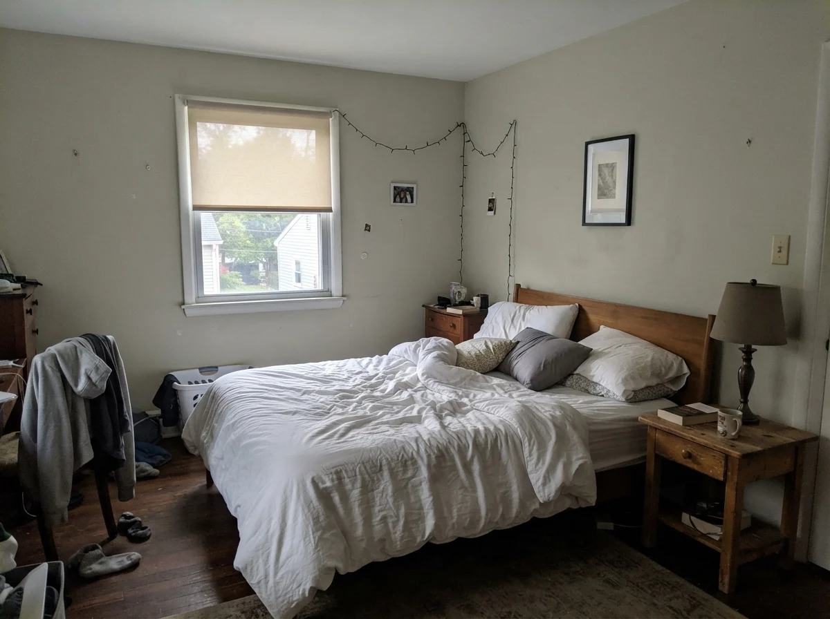
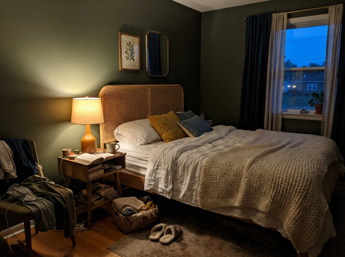
Because Ripe Olive hovers at LRV 6, it shifts dramatically between direct daylight and artificial evening lighting. It never drifts into cold navy or purple, but it will swing between warm olive and plain graphite.
warm sun
overcast, north light
dusk, rain, cool bulbs
Under bright daylight or low-angled morning sun, the olive-brown pigment wakes up. In indirect light or under 4000K LEDs, the color drops straight into charcoal black.
Laurel WoodsSherwin-Williams · see diary
Shade-GrownSherwin-Williams · see diary
Ripe OliveSW 6209
After HoursBackdrop · see diary
Deep RiverBenjamin Moore · see diary
How Daylight Flips the Switch
The single biggest mistake I see homeowners make with near-blacks is ignoring the time of day. We put a test patch on a bedroom wall, look at it when we get home from work while flipping on an overhead fixture, and think we understand it. You don't understand an LRV 6 paint until you have watched it wake up in the morning and go to sleep at night.
In cool early light, before lamps are flicked on, Ripe Olive can feel almost skeletal. Without direct rays to stimulate the green tint, the wall retreats, absorbing what little morning daylight enters the window and flattening out. But bring in a warm lamp at twilight, or let a low western sun graze the plaster, and the brown-green base suddenly catches fire around the edges.
Notice what happens in those two exposures. When the lamp goes on in the evening, the 2700K bulb hits the pigments and gives back warmth, making the wall feel protective and grounded rather than cold. In contrast, the flat gray light of a rainy dawn strips away the olive character and leaves you with an understated, quiet charcoal. If you hate charcoal, you will hate this paint on rainy mornings. If you like the grounding weight of an antique iron stove, you will love it.
At LRV 6, Ripe Olive absorbs ninety-four percent of the light that hits it. The olive isn't a billboard; it's a whisper that only comes out when the sun points straight at it.
Bathrooms and the High-Moisture Problem
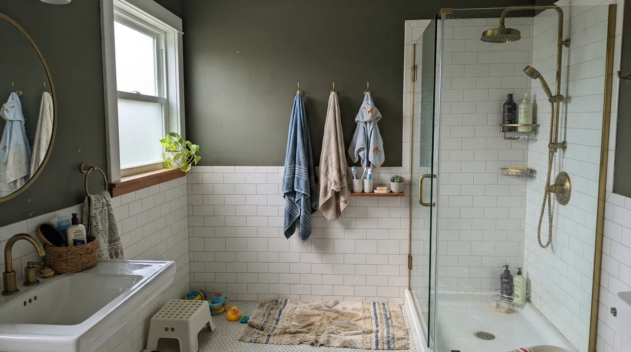
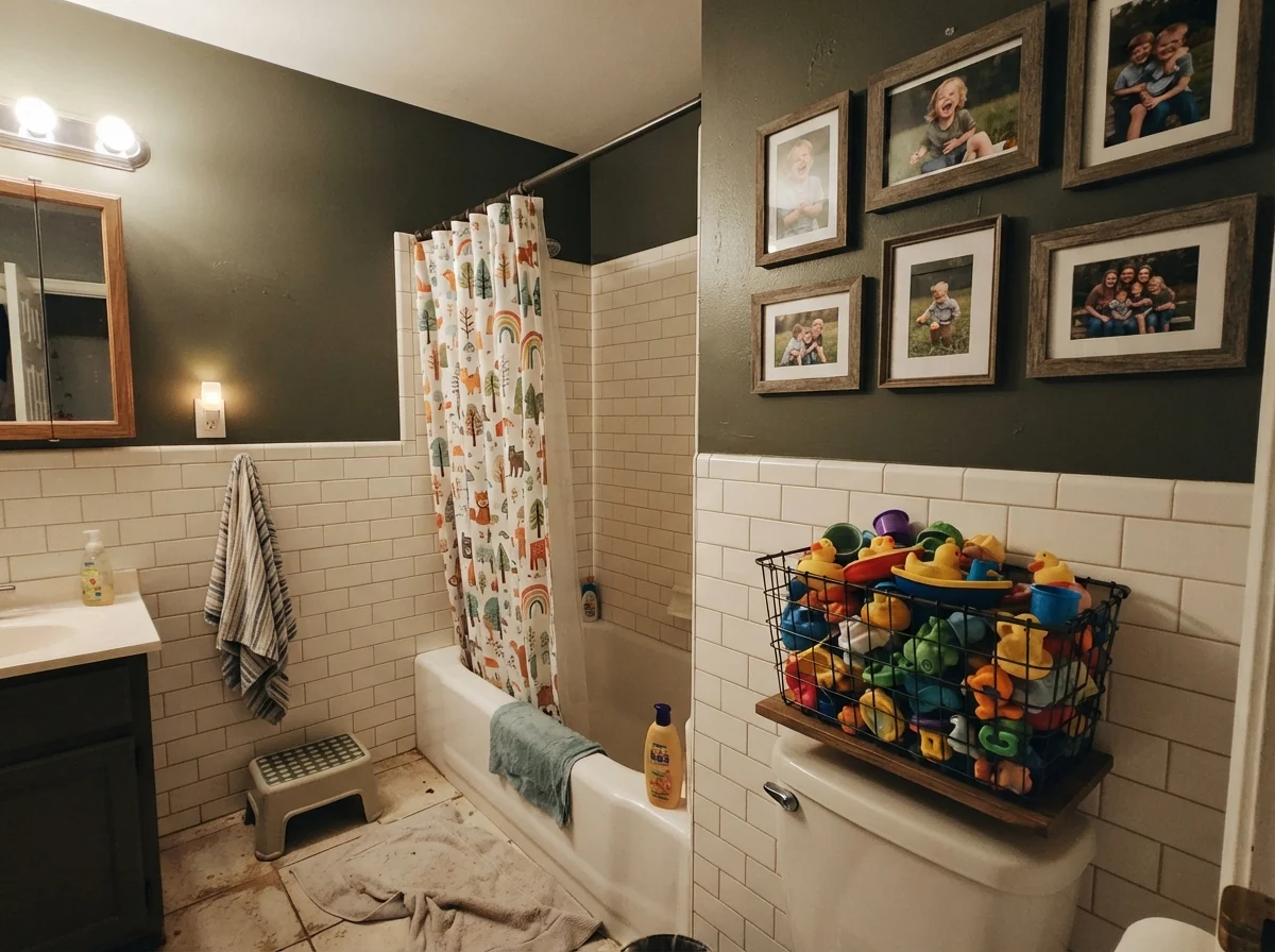
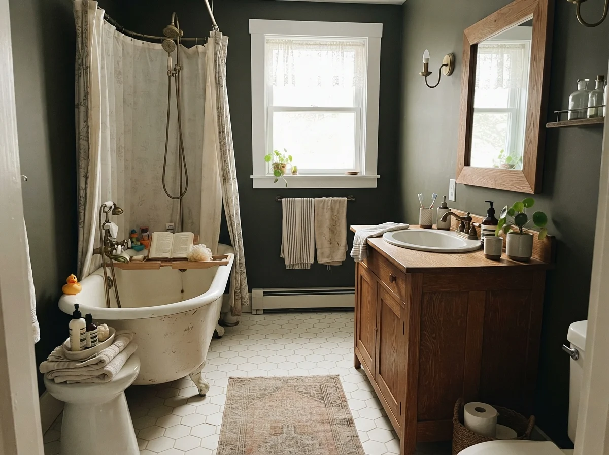
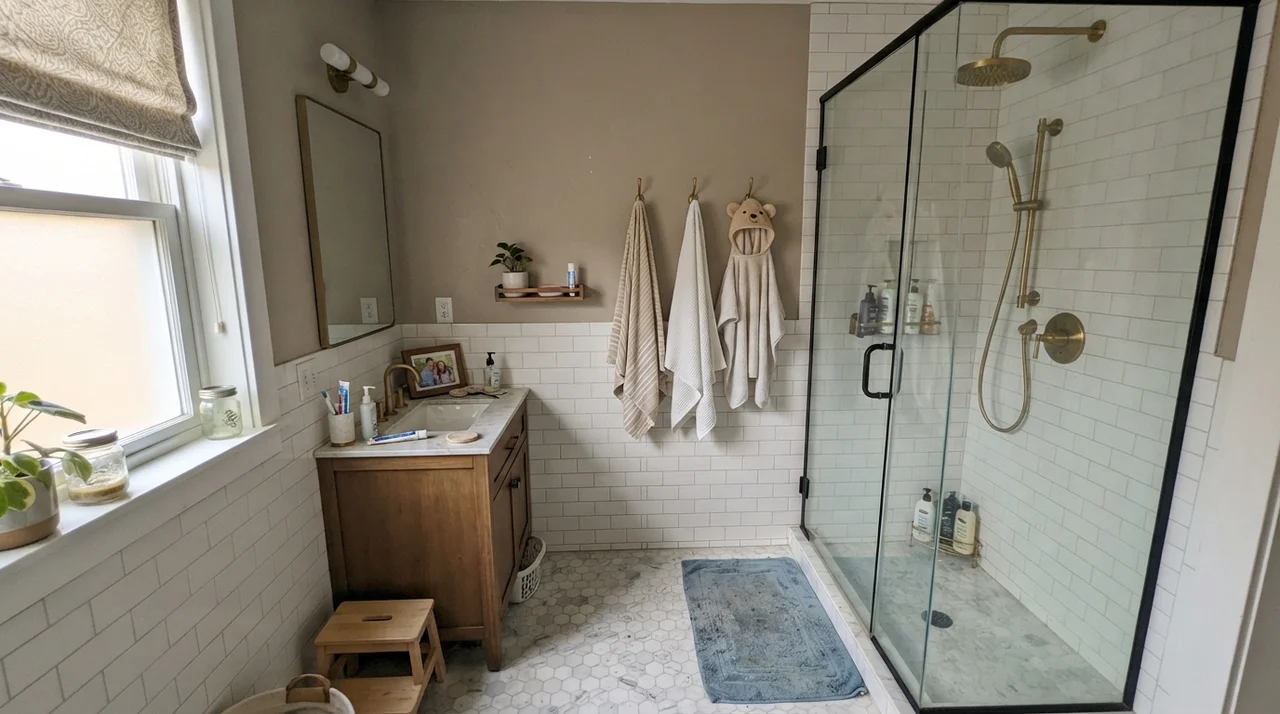
I have repainted our bathrooms more times than my husband cares to remember. Bathrooms are testing grounds: they have high humidity, harsh vanity lighting, and very little unbroken wall space. Putting an LRV 6 shade in a bathroom sounds like madness to the average homeowner, but if you have white tile wainscoting to bounce light, it is actually one of the easiest ways to give a builder-grade space some backbone.
The trick is keeping it above the chair rail or wainscot. When you run Ripe Olive floor-to-ceiling in an eight-by-five bathroom with no exterior window, you are essentially brushing your teeth inside a coal chute. But pair it with clean white subway tile, warm brass, or an oak vanity, and the color behaves like a frame around an oil painting.
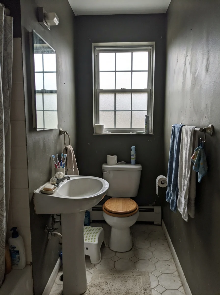
Notice that third shot under the frosted window. When an overcast sky settles over the house, the walls drop that rich earthy gleam and read like a flat, dusty slate. That is the reality of living with a near-black. If you panic the first time an overcast sky turns your bathroom walls gray, you picked the wrong can. But five years in, that quietness during bad weather is often what keeps a dark room from feeling frantic.
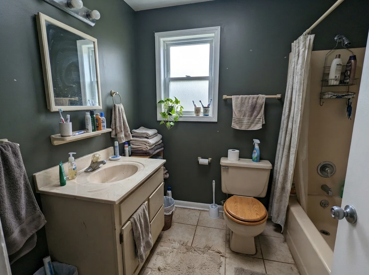
However, you have to watch out for north-facing bathrooms with small windows and dated fixtures. If the room is already saddled with an older beige vanity or yellowish lighting, cool north daylight will push Ripe Olive into a muddy, cast-iron murk that does zero favors to the room.
Kitchen Cabinets and Islands: Where It Earns Its Keep
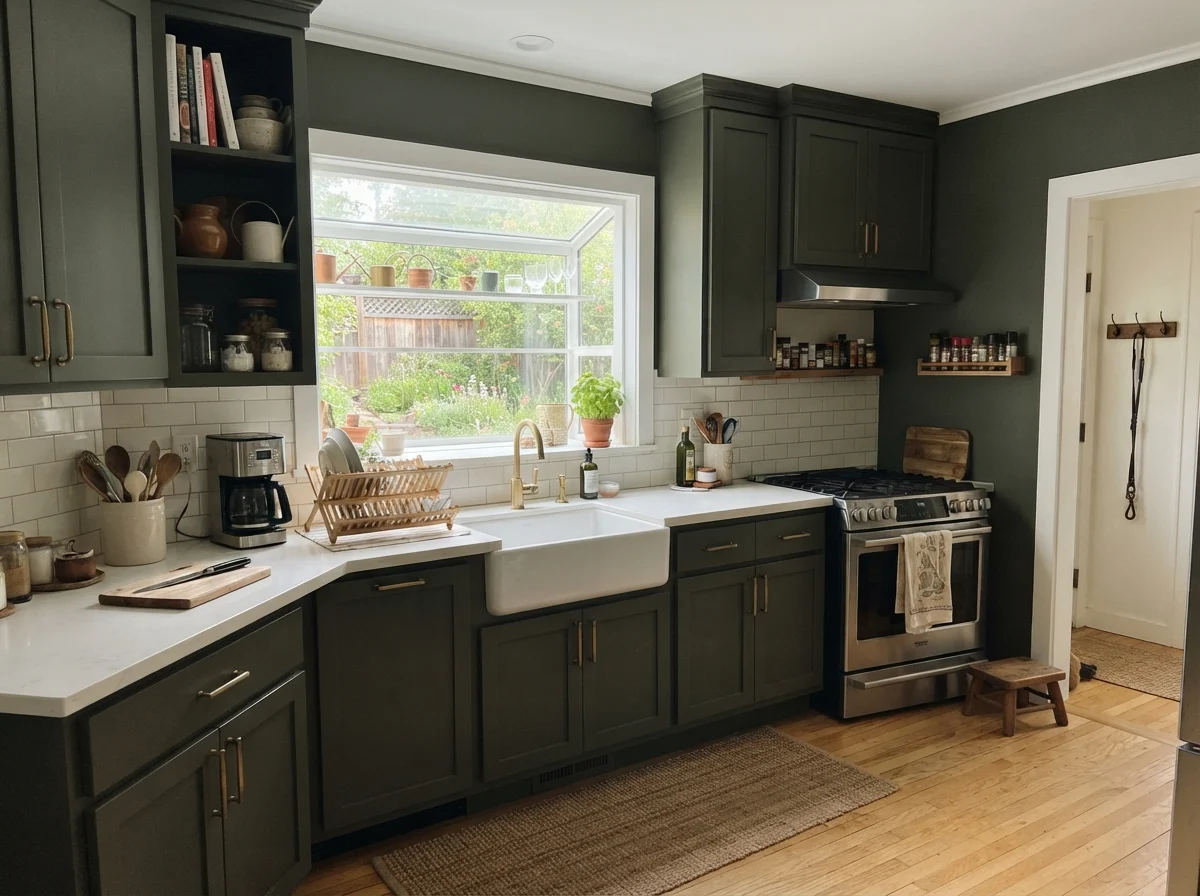
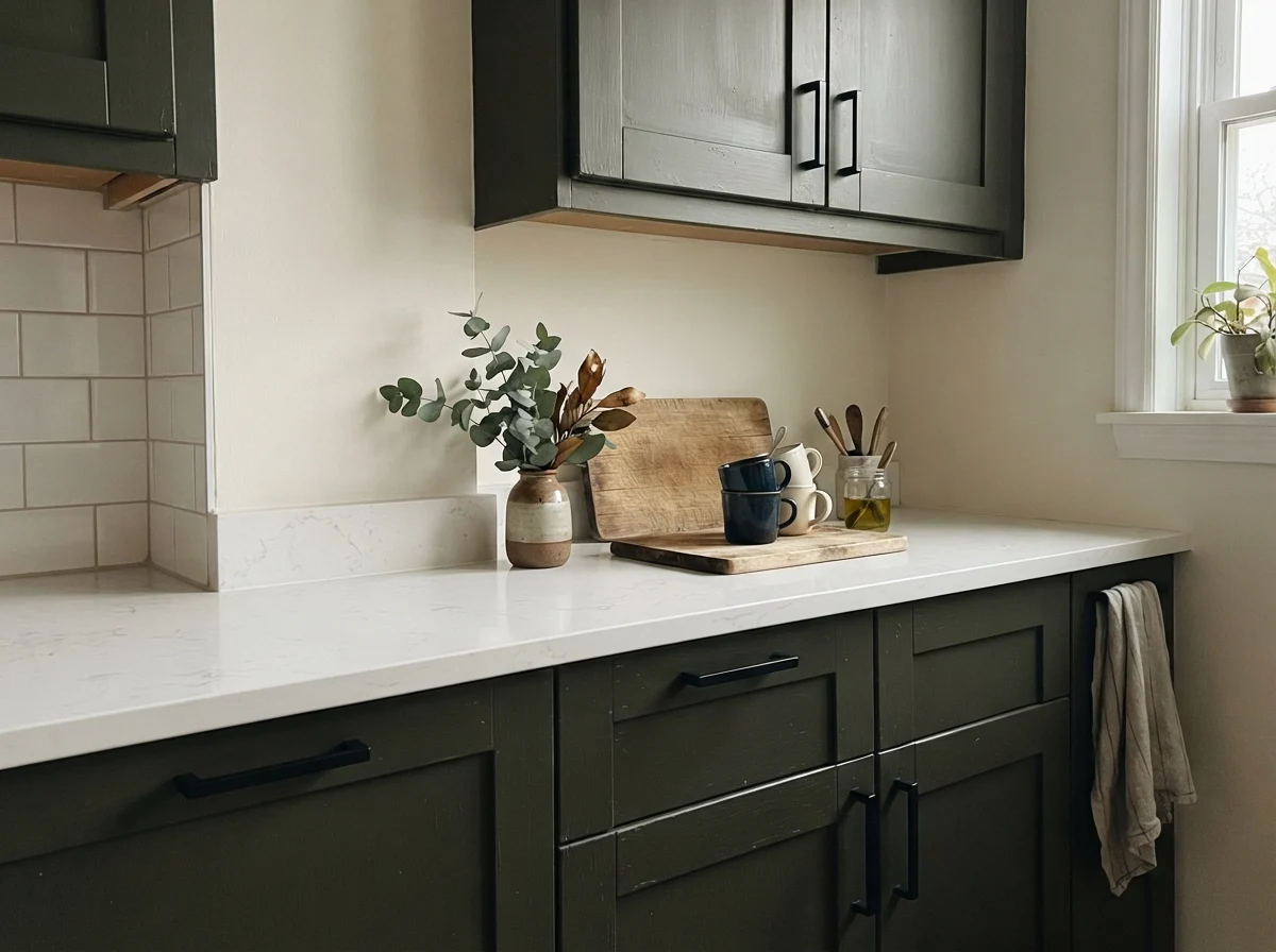
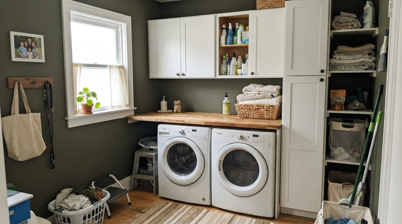
If you ask me where Ripe Olive actually justifies its existence on a paint ledger, it’s on cabinetry. In our current 1960s ranch, I painted our laundry room built-ins dark because I got tired of shoe scuffs leaving gray streaks across white semi-gloss. Dark lower cabinets do the heavy lifting in a real house where people actually cook and drop canned tomatoes.
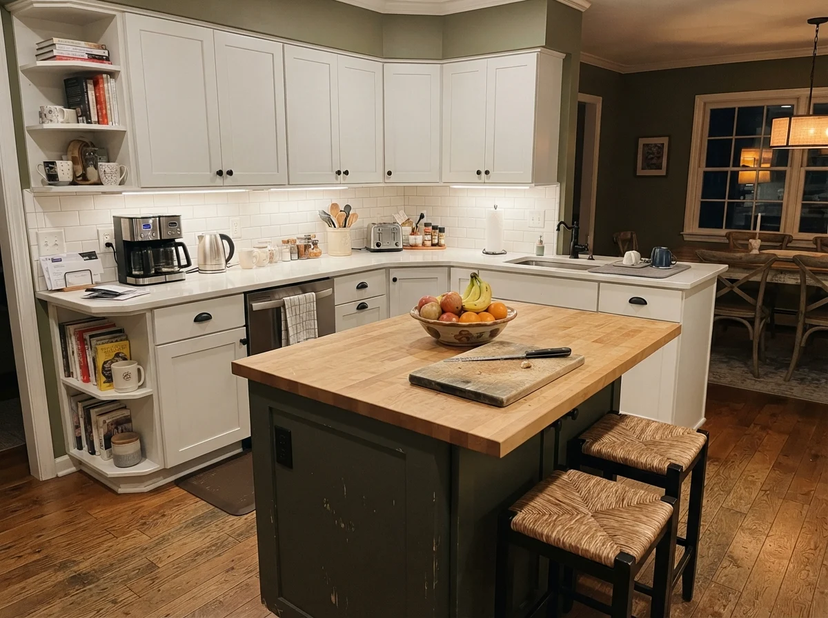
Many people run toward true jet blacks or cold iron charcoals for their islands because they saw a sleek photo online. But true black in a family kitchen can look severe, like a block of unpainted steel. Ripe Olive brings enough warmth from its olive-brown pigments that it softens against light oak flooring and warm quartz counters, avoiding that cold, showroom sterility.
A satin urethane enamel is the only finish worth the money on kitchen woodwork. Do not let an eager painter convince you that matte looks more modern on cabinet doors. Matte on a kitchen cabinet five years in looks like a chalkboard that’s been touched by greasy butter knives; satin wipes clean with a damp rag without leaving shiny burnish marks where hands repeatedly grab the edge.
If painting every upper and lower cabinet feels like too dark of a commitment, isolating it to an island is the move. It anchors the kitchen floor, hides scuff marks from kids’ sneakers kicking the counter stools, and lets the surrounding walls stay light and breezy.
Living Spaces, Sunrooms, and Natural Sunlight
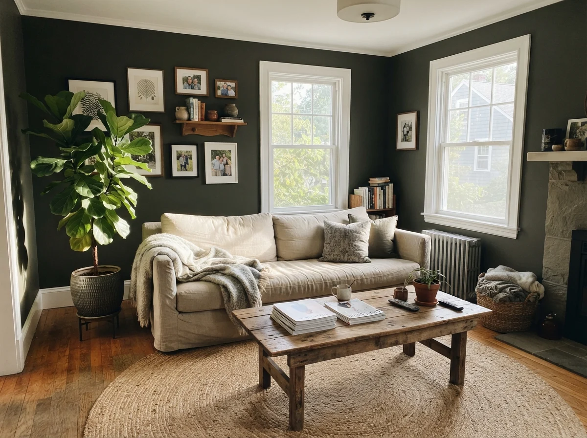
A living room or family sunroom that receives generous daylight from multiple sides is the natural environment where Ripe Olive shines. When sunlight rakes across a painted drywall surface at an angle, the pigment reflects back that organic, deep woodland warmth that makes people stop and ask for the name of the color.
I’ve seen houses where a color like this looked dated within three years because it was applied like a trendy blanket over every corner. But in a room filled with light oak, unbleached linen, and terracotta pots, it behaves like an architectural element rather than an accent wall gimmick.
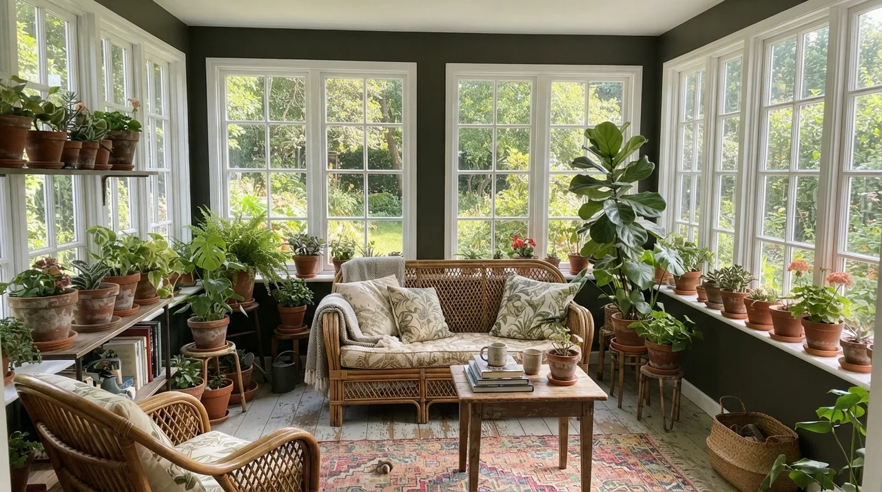
In our 1970s split-level, our sunroom was little more than a screened porch someone had enclosed with cheap aluminum frames. Painting the small sections of wall between those massive window openings in a deep dark shade was the smartest dollar we spent on that house. When you paint the trim or wall piers between outdoor glass panels dark, the eye looks straight past the framing and out into the garden. The dark paint makes the greenery outside look ten times brighter.
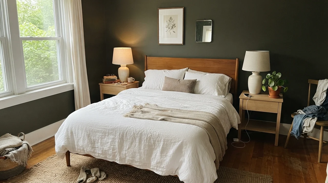
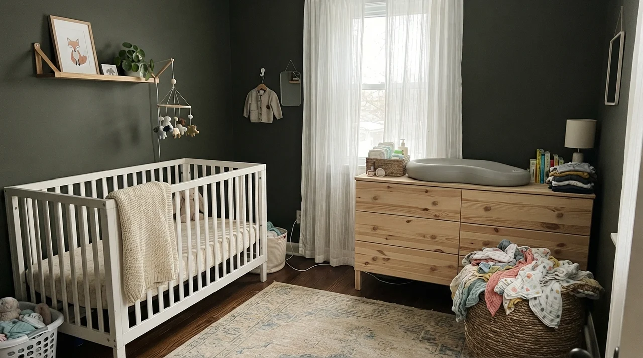
The same logic applies to main bedrooms and nurseries, though you must be disciplined about natural light. A bedroom with plenty of soft side-window daylight feels serene and grounded wrapped in Ripe Olive; a dark nursery without generous windows, however, will just feel oppressive.
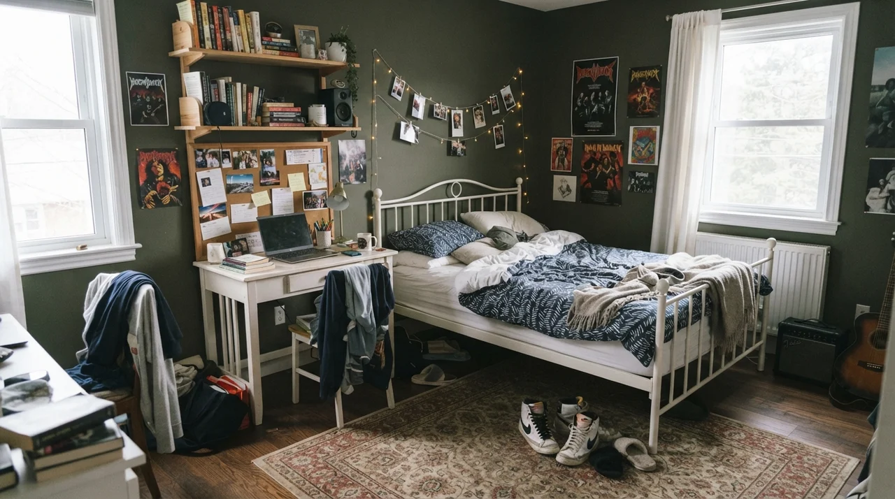
If you have teenagers who want black walls—and every teenager goes through that stage—this is the parent's compromise can. It gives them the brooding, high-contrast cave they think they want, but the olive-brown undertone keeps it from feeling like the inside of a drum case. When they head off to college and you have to convert the room into an office or guest space, you won't hate your life while repainting over it.
Notice the laundry room above. That single window makes all the difference. When you put an LRV 6 color in a narrow workroom that has real daylight and crisp white cabinetry, it looks organized, clean, and deliberate. You don't see the lint or minor scuffs as readily as you do on off-white walls, and the butcher-block counter picks up the warm earthy notes in the base.
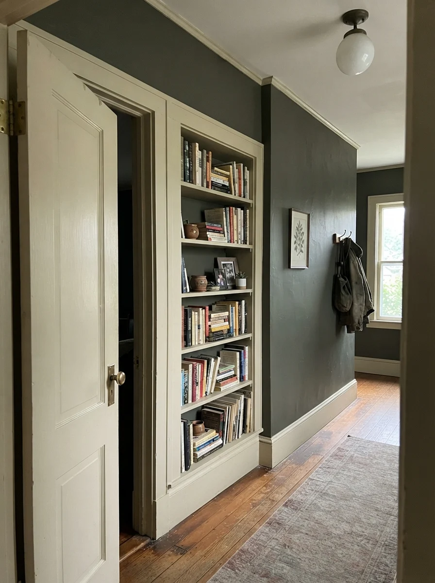
Hallways and older millwork are another place where Ripe Olive works wonders. In an older hallway with cream walls, painting an interior door and a built-in bookshelf creates immediate depth without stealing the hall's ambient bounce.
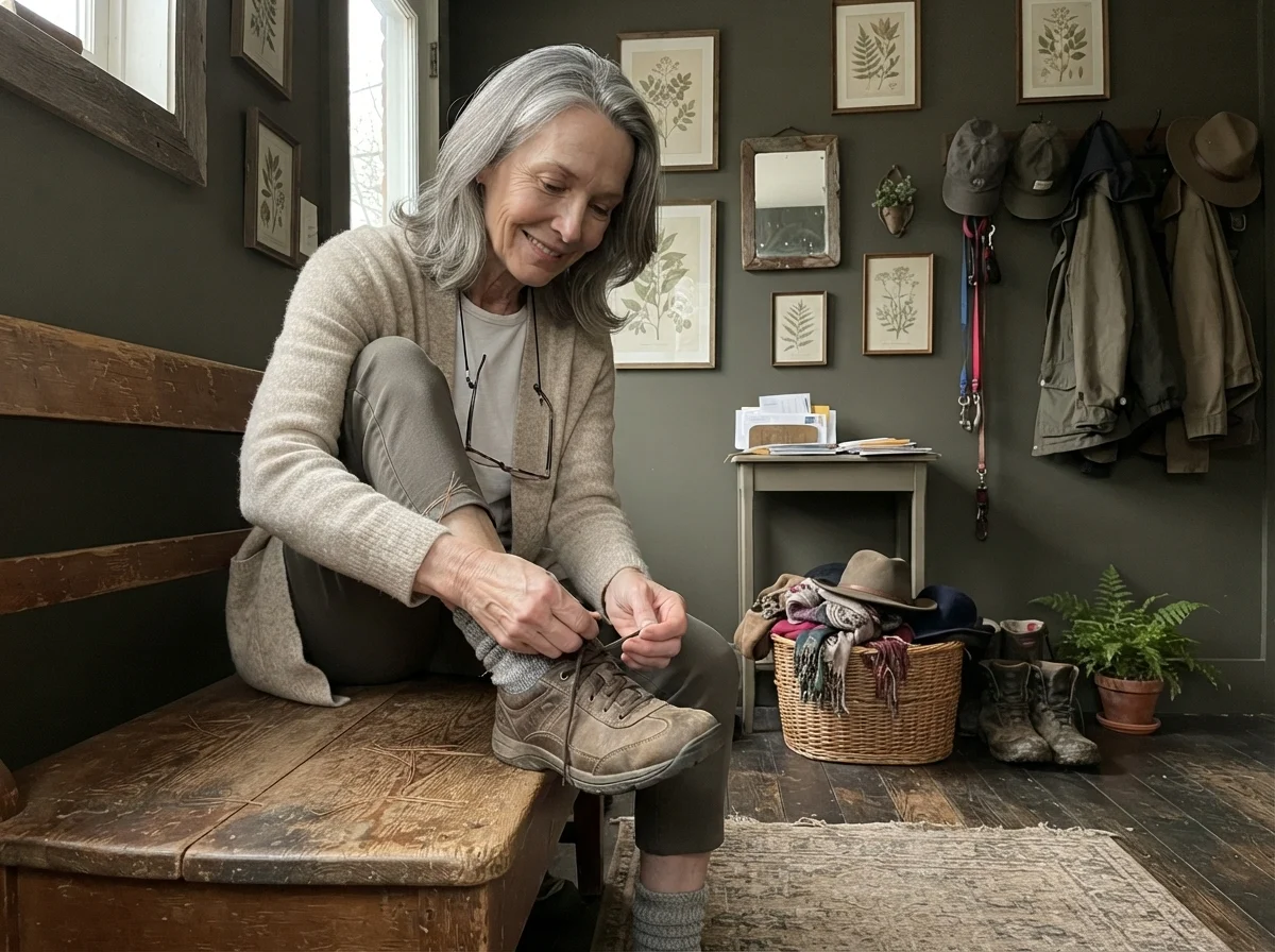
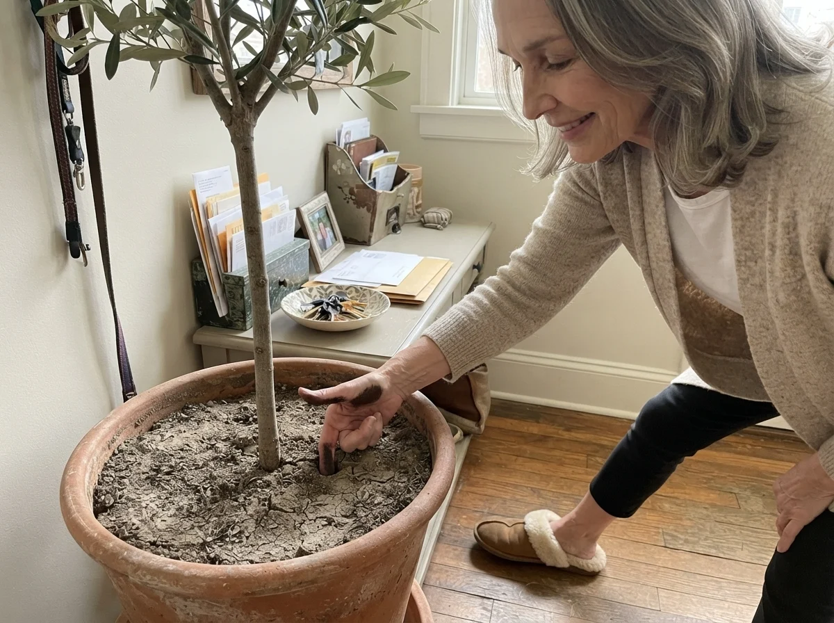
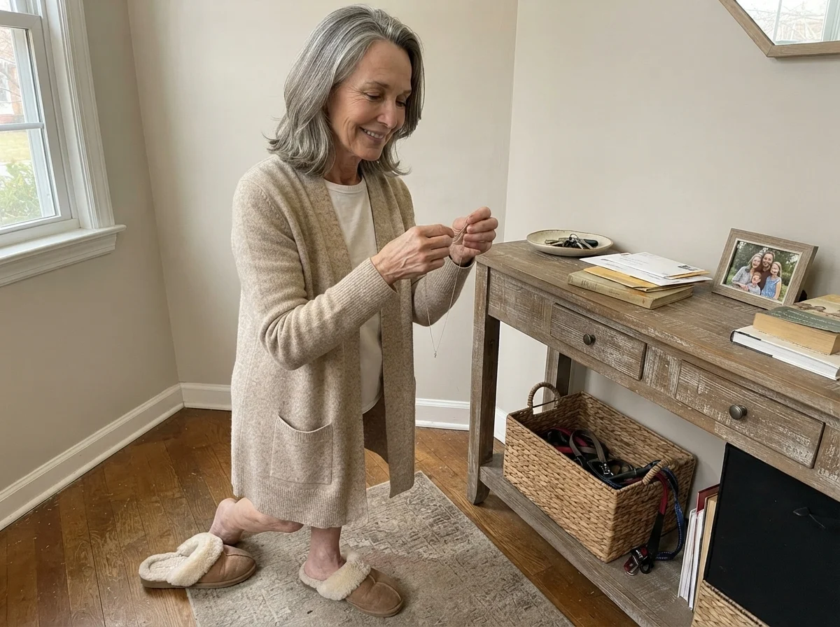
That entryway wall behind me gets hit by low afternoon light from the side sidelights. Up close, when you are unlacing your boots after an hour in the garden, you see every bit of that brown-green woodsy tint. Step back six feet down the hallway when the afternoon sun dips below the roofline, and it reads as a solid, comforting dark charcoal. That flexibility is why I’ve kept it around.
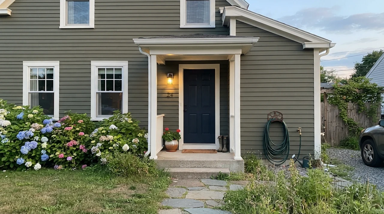
Outside on horizontal siding, that outdoor sun does what interior incandescent bulbs simply cannot do: it strips away the black veil entirely. On an exterior with white trim and landscaping, Ripe Olive reads as a tailored, rich dark olive that never turns blue or purple under scorching midday sun.
The Honest Fail: Where Ripe Olive Falls Flat on Its Face
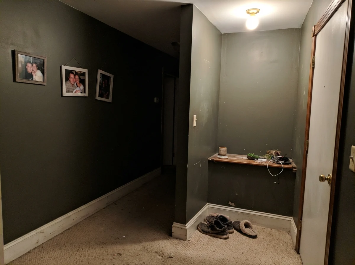
Now let's talk about the room where you should never, under any circumstances, roll this color. If you have a windowless hallway, an interior basement powder room, or a dim stair landing lit by a single builder-grade flush-mount ceiling light, stay completely away from Ripe Olive. It will not make the space feel 'moody' or 'intimate.' It will make it feel like an unfinished utility closet.
When deep base colors are starved of natural light and washed in weak, diffuse indoor bulbs, the undertones collapse. Instead of seeing that rich olive, the paint film turns into a flat, muddy, putty-like murk that makes beige carpets look dirtier and absorbs whatever wattage you’re trying to throw at it.
Look at that corner. That is what happens when you treat an LRV 6 near-black as if it were a forgiving greige. There is no magic depth there—just an uninspired muddy patch that looks like wet concrete. If your space doesn't have a window or at least two distinct light sources (like task lamps or sconces with warm bulbs), keep walking down the paint aisle.
Pairing with Materials and Architectural Styles
In thirty years of redoing houses, I’ve learned that paint is only twenty percent of the equation; the other eighty percent is whatever hard surface is touching it. Ripe Olive is not a universal background paint. It is picky about what sits next to it.
Because of that brown-green foundation, it sings next to warm natural woods—unlacquered brass, medium walnut, light natural oak, and honed butcher block. Put it next to chrome, high-gloss white laminate, or gray vinyl plank flooring, and it looks sullen and ungrounded.
The Five-Year Ledger: Durability, Flashing, and Deep Bases
Here is the truth about deep base paint that the teenager at the paint counter will never tell you: it requires twice the elbow grease to put on, and twice the care to live with. Deep base paints contain very little titanium dioxide (the white pigment that gives regular paint its hiding power). Instead, they are packed with clear base and heavy tint. That means coverage over light drywall is notoriously thin.
If you roll Ripe Olive directly over white drywall primer, expect to roll three coats, minimum. A tinted gray primer is not an upsell; it is the only way to get true coverage in two coats without driving yourself crazy. Furthermore, if you don’t maintain a wet edge and back-roll every single stroke in the same direction, you will get roller flashing—streaky, shiny patches where the sheen dries unevenly. In our colonial, I got lazy on a bedroom accent wall and ended up with flashing that bugged me until the day we packed the moving truck.
When it comes to wear and tear, high-traffic walls painted in an eggshell or matte finish are prone to burnishing. If someone drags a laundry basket along the hallway wall, it leaves a faint shiny trail that cannot be scrubbed clean without changing the sheen of the paint. On cabinetry, doors, and trim, always spend the extra ten dollars for a dedicated urethane satin enamel. It cures harder, resists fingerprint oils, and handles a damp soapy washcloth five years in without leaving a dull circle behind.
Does Sherwin-Williams Ripe Olive look green or black in a regular room?
In most average rooms without direct sun, Ripe Olive reads as a warm, softened black. The rich olive-brown undertone only steps forward clearly when exposed to direct sunlight, bright morning rays, or warm task lighting from lamps.
What sheen should I choose for Ripe Olive on kitchen cabinets?
Use a dedicated urethane satin enamel. Matte finishes on dark cabinets absorb skin oils and burnish easily, while semi-gloss can make an LRV 6 dark color look like shiny plastic. Satin provides scrubbability while maintaining a soft, tailored glow.
Do I really need a gray-tinted primer under this color?
Yes. Ripe Olive is formulated from an ultra-deep base with very little white hiding pigment. Rolling it directly over light drywall or standard white primer will require three to four coats to achieve even coverage. A medium-gray primer cuts that down to two solid coats.
Can I paint a small bedroom in Ripe Olive without it feeling like a dungeon?
Only if the bedroom receives generous daylight from large windows and you commit to using 2700K lamps in the evening. In a low-light north-facing bedroom, four walls of Ripe Olive will quickly swallow ambient light and feel cave-like.
Susan's Verdict · Worth the Money with Proper Lighting
Sherwin-Williams Ripe Olive is not a general-purpose green wall paint. If you buy it hoping for a room full of mossy woodland color, you will be disappointed six days out of seven. But if you treat it as what it truly is—a warm, textured near-black with an organic heartbeat—it is magnificent on kitchen islands, front doors, and sunlit accent walls. Use a gray primer, put it where the sun actually hits it, and let it do the heavy lifting.