Color Diary · No. 52
Behr Blank Canvas: What Five Years Over Honey Oak Taught Me
Behr's 2023 Color of the Year, reviewed honestly: the rosy flash most people miss, the trim mistake that ruins it, and what to buy instead.

Susan HartleySeptember 27, 2026 · 15 min read
Blank Canvas · Behr DC-003
Hex#F1EDE1LRV85Undertonessoft cream → peach blush → muted putty
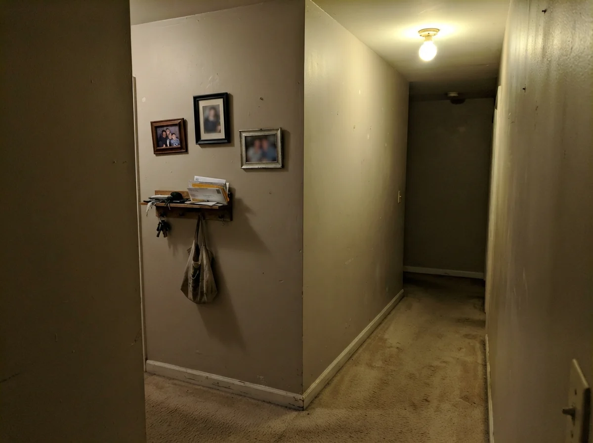
In our last house, a 1990s colonial with enough orange polyurethane to finish a bowling alley, I spent three solid months trying to find an off-white that didn't turn sickly green against the baseboards. We had inherited rooms coated in that ubiquitous cool gray that took over the country around 2012, and in north-facing bedrooms, it felt less like a serene retreat and more like living inside an unwashed wool sock. When we finally moved into our 1960s ranch, I swore I was done treating walls like cold concrete.
That is how I ended up staring at a five-gallon bucket of Behr Blank Canvas (DC-003). It had just been crowned Behr's 2023 Color of the Year, and every home magazine was promising it would bridge the gap between stark modern minimalism and warm traditional comfort. At an LRV of 85, it is distinctly high on reflectance, sitting in that sweet spot where a room feels legitimately bright without throwing harsh glare back into your eyes. But after having lived with it across multiple rooms, wiping down high-traffic corners, and watching how it behaves when the seasons roll around, I can tell you there is a lot more going on under the surface of this can than the chip suggests.
The Red-Orange Backbone Nobody Mentions
Most warm whites achieve their creaminess with yellow or yellow-green pigment. Think of the classic builder ivories that look like melted butter under an incandescent bulb. Blank Canvas takes a completely different road: its warmth is built on a red-orange tint. That subtle shift is why it reads as a gentle, powdery cream rather than custard. On walls surrounded by honey oak, natural maple, or warm stone, it creates an immediate softness that absorbs the harshness of orange-tinted wood instead of fighting it.
However, that same red-orange undertone means that under certain lighting conditions, Blank Canvas will flash a faint rosy or peachy cast. In a room flooded with strong southern afternoon sun, you will notice that warm glow blooming along the drywall. For ninety percent of homeowners, that cozy warmth is exactly why they bought it. But if you were expecting a sterile, chalky art-gallery white, that pinkish-peach warmth will take you by surprise.
Morning Shadows to Evening Lamps
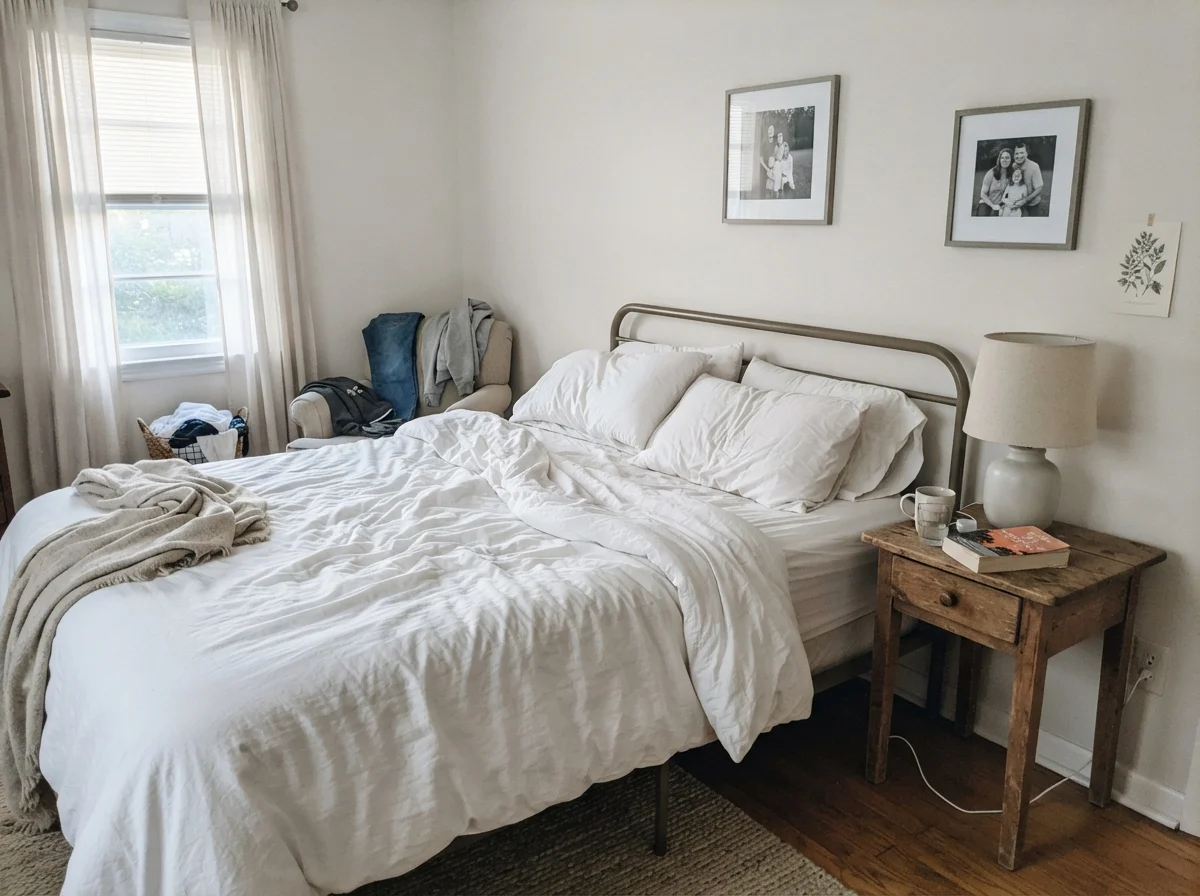
The single biggest favor you can do yourself before rolling out an entire bedroom is to observe the walls at 7:00 AM and again at 8:00 PM. Early in the morning, when cool daylight washes into the room without any lamps turned on, Blank Canvas pulls back its warmth and behaves like a quiet, clean off-white. It looks calm, slightly muted, and gives you all the benefits of an LRV 85 paint by bouncing what little natural light is available deep into the room.
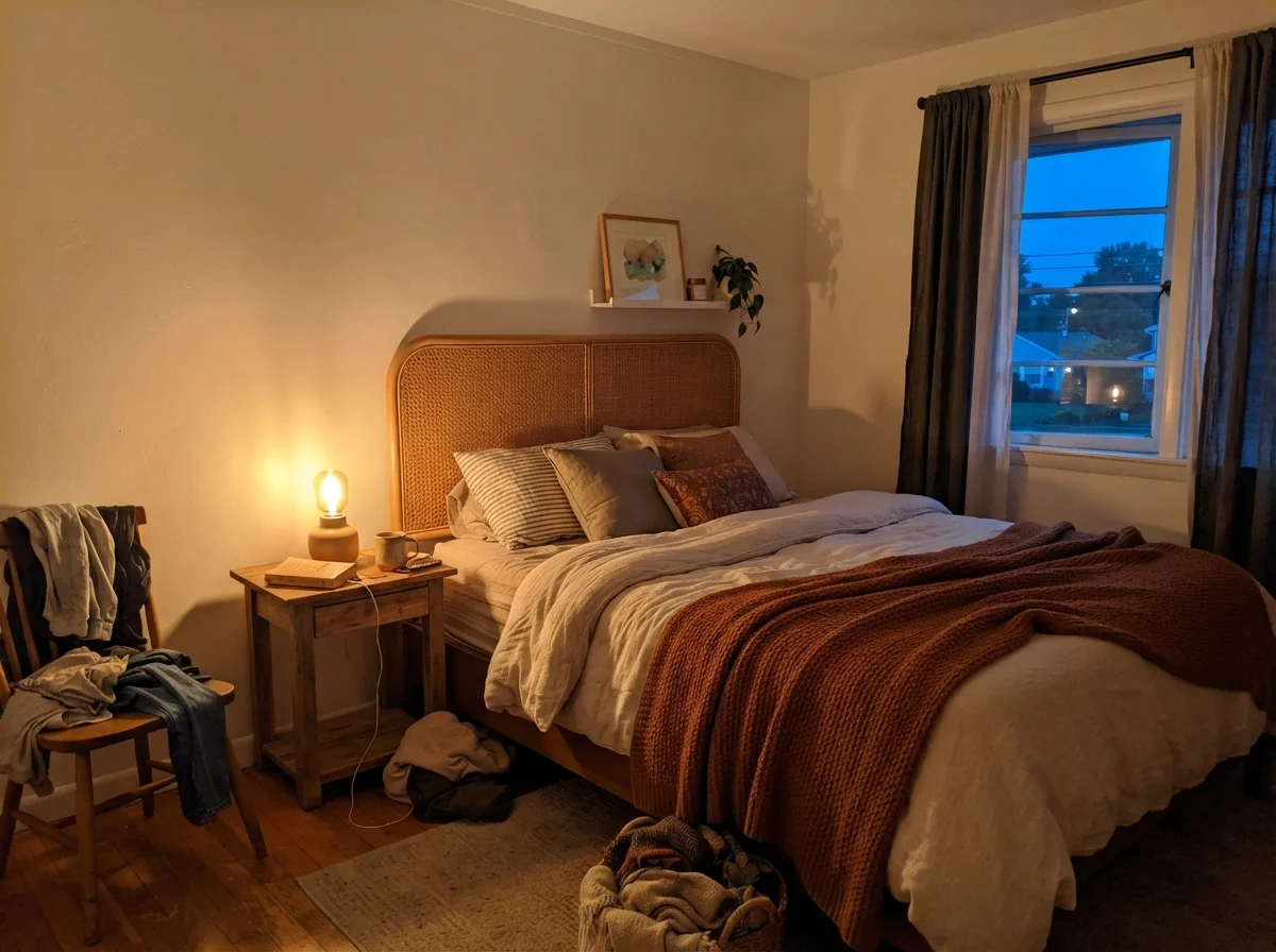
By the time dusk rolls in and you switch on your table lamps, the color transforms entirely. Under standard 2700K incandescent or warm-spectrum LED bulbs, the red-orange pigment wakes up. The room envelops you in a deep, cocooning cream that feels settled and grounded. If you use 4000K daylight bulbs, however, you will strip all the charm right out of it—the walls will look flat, clinical, and vaguely unfinished. The fix is simple: swap the bulbs, not the paint.
How Daylight Quality Shapes the Room
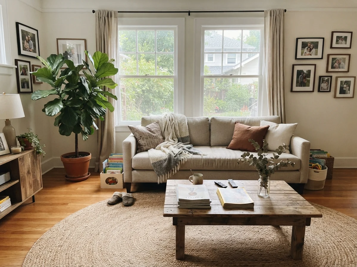
Lighting is not uniform across a house, and Blank Canvas is particularly responsive to the direction your windows face. In a south-facing living room, midday sunlight brings out its fullest, sunniest expression. The walls read as an inviting, toasted linen that makes wood furniture, jute rugs, and textured upholstery look entirely natural together. There is no cold edge to be found anywhere.
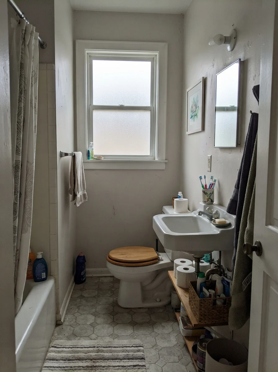
On an overcast afternoon or in a bathroom with small frosted windows, however, the color drops down a notch. When flat, gray sky light hits it, the creaminess recedes and the paint takes on a muted, quiet posture. In cool north-facing light, where cool daylight naturally neutralizes warm pigments, Blank Canvas performs its neatest trick: the blue-tinted daylight cancels out the subtle rosy undertone, leaving you with a perfectly neutral, soft cream that never looks dingy.
Bedrooms, Nurseries, and Family Spaces
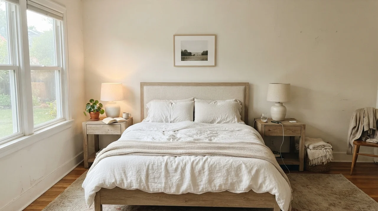
In main bedrooms, Blank Canvas creates an uncluttered, rested backdrop. When you layer it with pale oak nightstands, white linen bedding, and simple ceramic lamps, the room feels open and gentle. Because it reflects 85 percent of the light, you don't need oversized windows to keep the space from feeling cramped or cavernous. It gives you the lightness of white without the blinding glare of an untinted base.
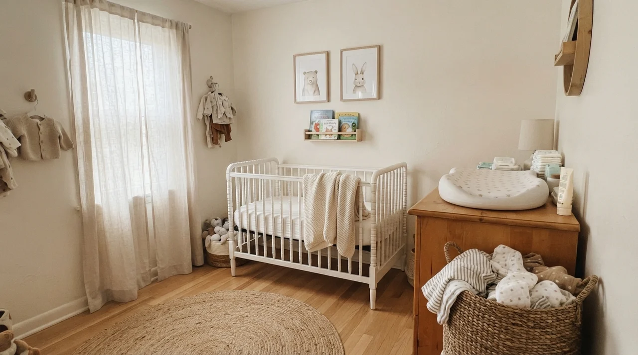
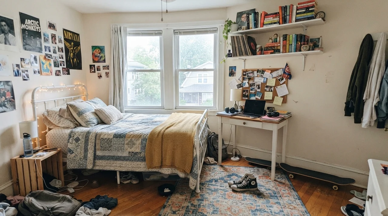
For children's rooms and nurseries, this shade solves an everyday decorating dilemma. Bright white walls can make a nursery look like a clinic, while saturated pastels are often outgrown in eighteen months. Blank Canvas supports natural wood cribs, knit blankets, and woven storage baskets without dictating the decor. As the room transitions from a nursery into a teenager's space with desks, metal bed frames, and corkboards, the wall color holds up across the years without needing a repaint every time their tastes change.
The thing nobody tells you about warm white is that it doesn't choose between yellow or pink—it chooses between looking intentional or looking like a dirty accident next to your trim.
Kitchens, Islands, and Cabinetry
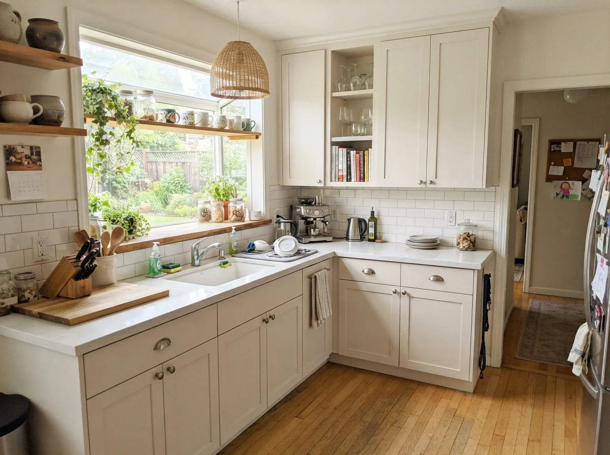
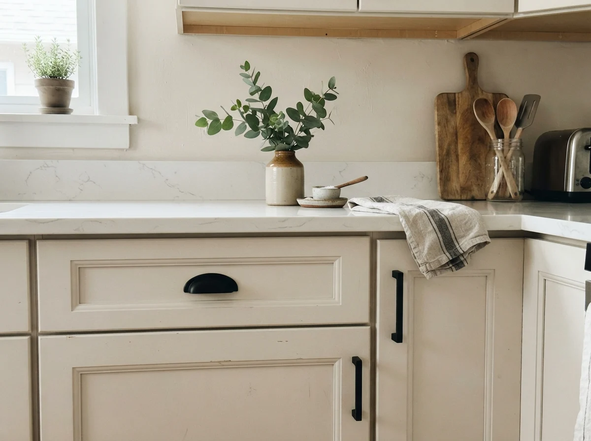
If there is one place where Blank Canvas truly earns its keep, it is on cabinetry. When people repaint dated honey oak or dark cherry cabinets, their first instinct is often to reach for pure white. The trouble is that stark white cabinets next to older warm quartz or butcher block can look cheap and jarring—almost like plastic replacements dropped into a traditional home. Blank Canvas painted on shaker cabinet doors in a satin finish reads custom, calm, and expensive.
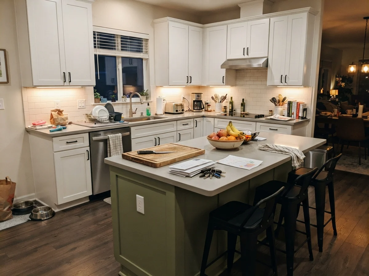
Paired with matte black or unlacquered brass hardware and light oak floors, it creates a grounded kitchen that feels like it has been there for decades. If you are nervous about painting every cabinet upper and lower, painting just the kitchen island in Blank Canvas while keeping perimeter cabinets a crisp white provides a subtle, grounded warmth that anchors the whole work area.
Sunrooms, Mudrooms, and Utility Spaces
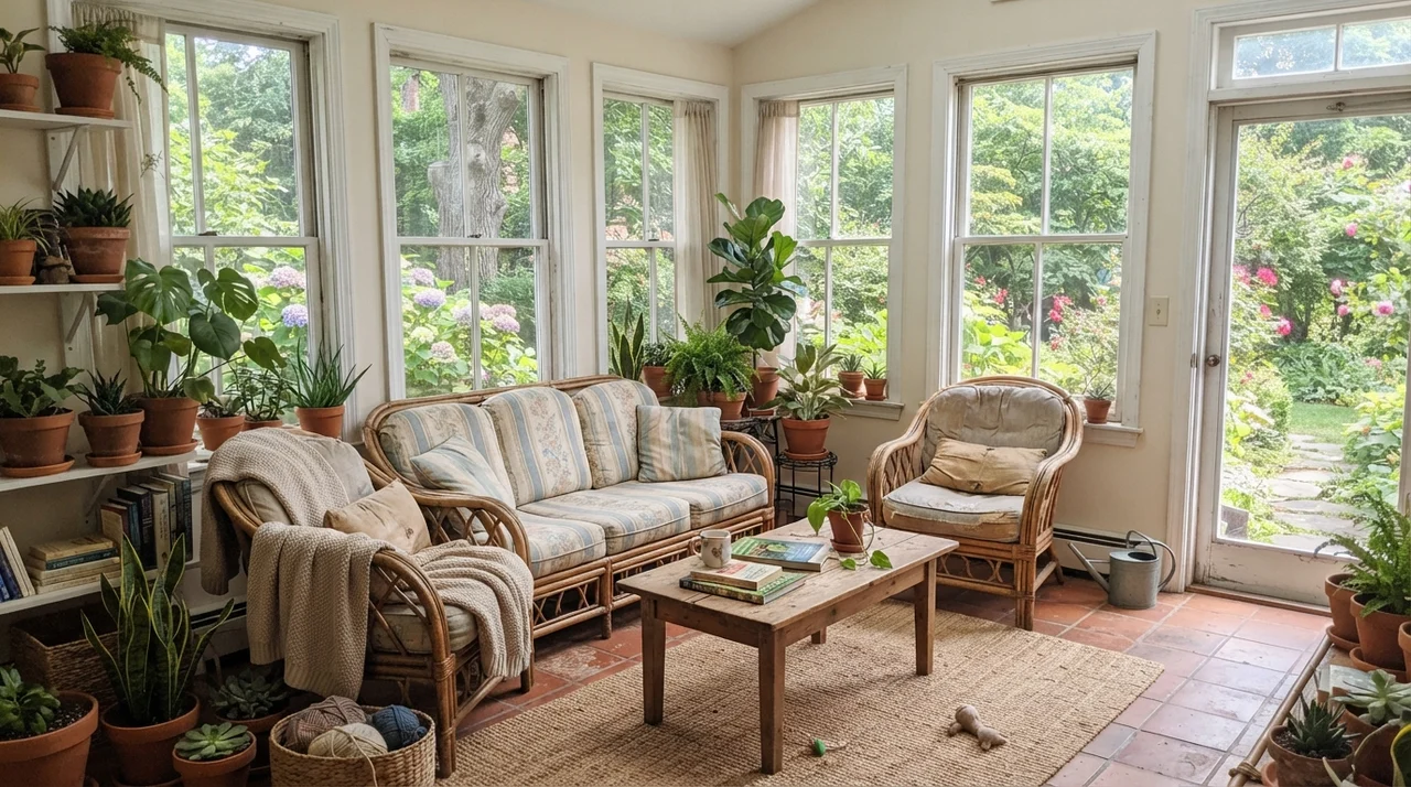
In spaces packed with natural materials—like a sunroom filled with terracotta pots, trailing plants, and rattan seating—Blank Canvas bridges the outdoor greenery and indoor comfort effortlessly. The multiple window frames break up the wall space, and the warm wall tone prevents the sunroom from feeling blinding when midday light hits every glass pane simultaneously.
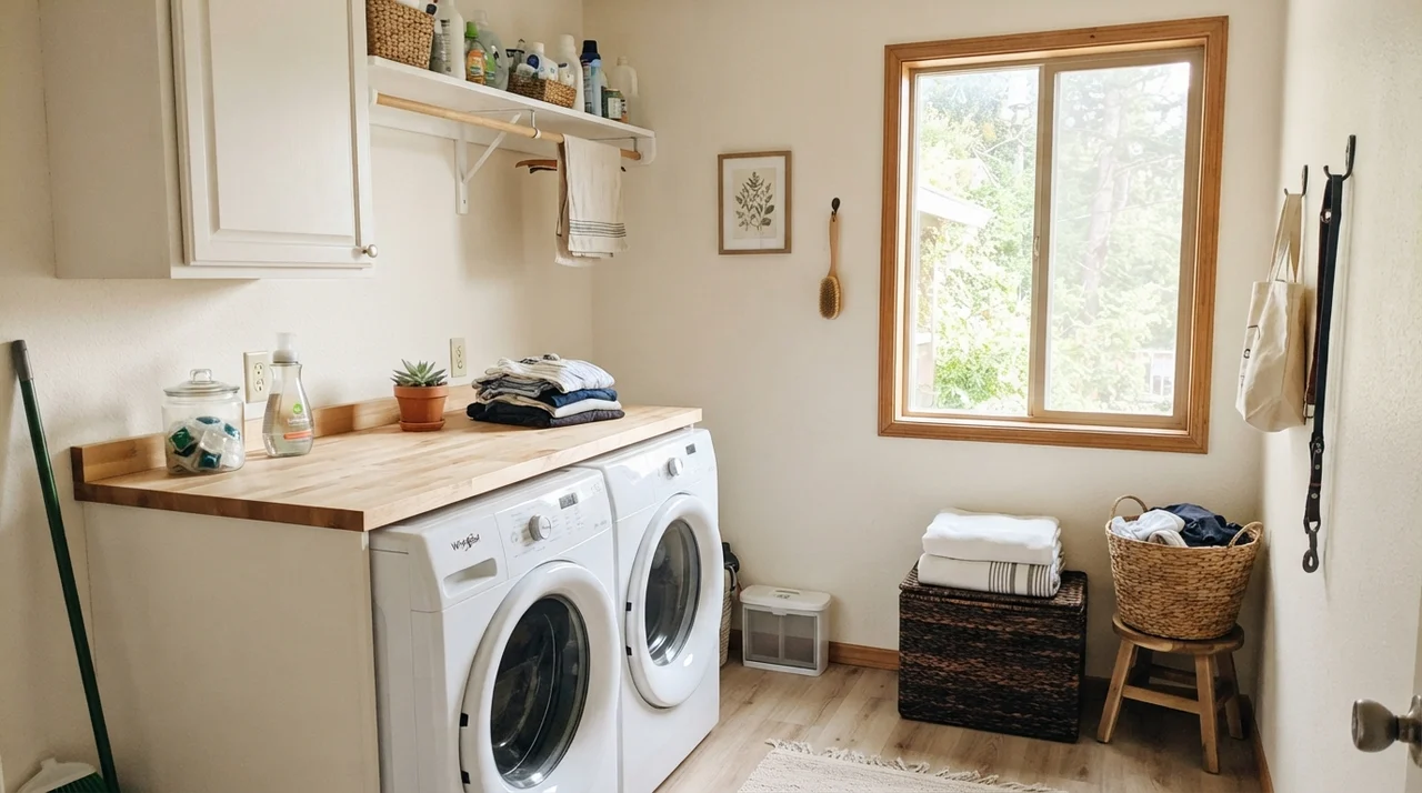
Utility rooms benefit from this high-LRV cream just as much. A small laundry room with a single window can feel cramped and dreary if painted in a muted taupe. Blank Canvas bounces light across butcher-block folding counters and white appliances, keeping the space crisp and functional without turning sterile.
Bathrooms: When It Works and When It Fails
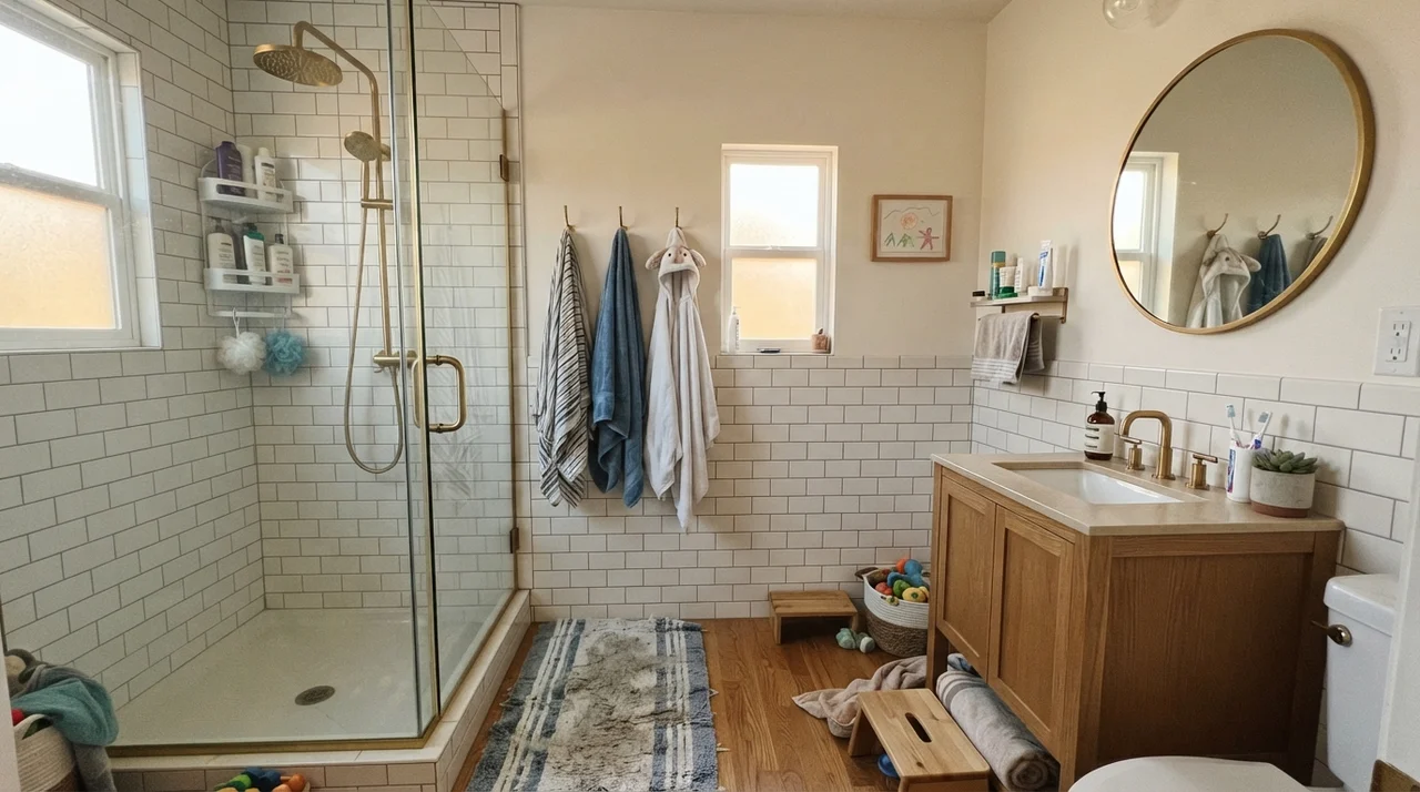
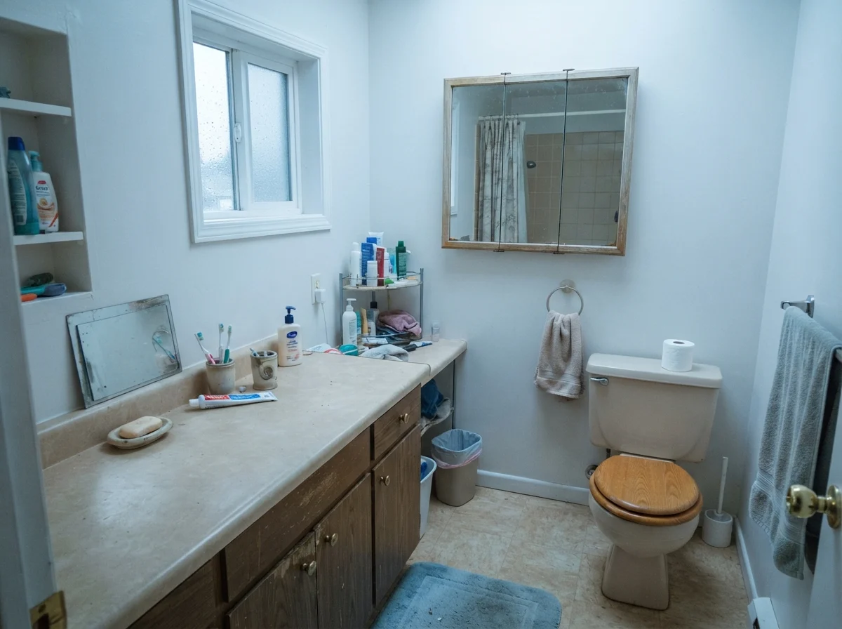
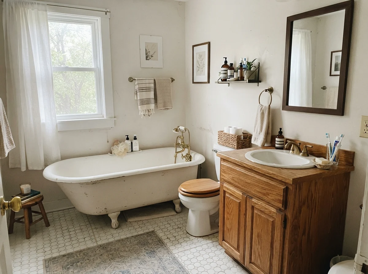
Bathrooms are high-risk territory for any warm white, and Blank Canvas is no exception. In a cottage-style bath featuring a classic clawfoot tub, warm oak vanity, and white hex tile, this color acts like a gentle embrace. It ties the warmth of the wood together with the white porcelain, giving the entire room a cohesive, lived-in patina.
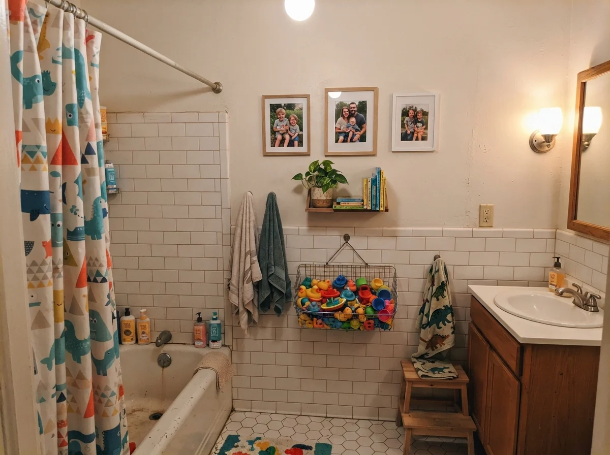
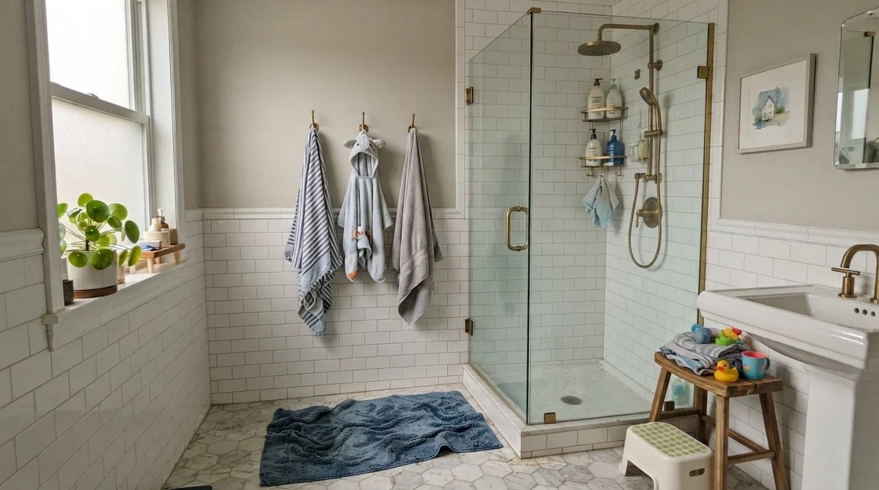
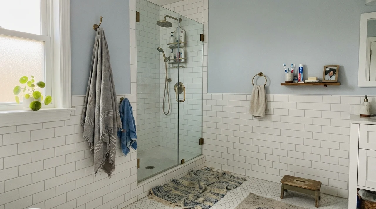
In a family bathroom where subway tile wainscoting runs halfway up the wall, it adds just enough contrast above the white tile to define the upper half of the room without screaming for attention. However, if your bathroom is finished with modern cool gray porcelain tile or blue-gray slate, walk away. That cool tile will pull hard against the red-orange pigment in Blank Canvas, making the floor look icy and the walls look strangely peachy or muddy.
The Color-Drenching Secret: Doors and Built-Ins
The single biggest mistake homeowners make with Blank Canvas is pairing it with standard, untinted bright white trim. When you put an LRV 85 cream wall right against a stark, high-gloss pure white baseboard, your brain immediately registers the difference—and the wall loses the argument. It suddenly looks like dingy white, or like a heavy tan that someone diluted improperly.
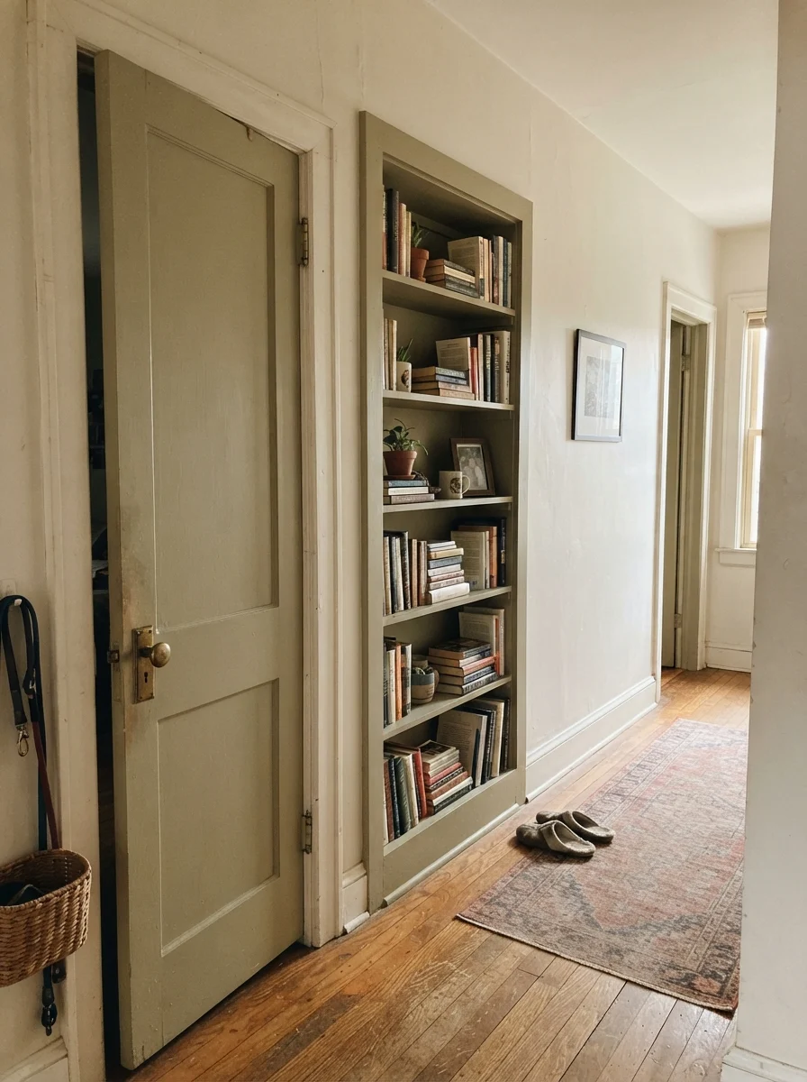
The secret to making this color look million-dollar is color-drenching. Instead of fighting with trim paint, put Blank Canvas on everything in the room: flat finish on the ceiling, eggshell on the walls, and semi-gloss on the baseboards, interior doors, and built-in bookshelves. The subtle sheen difference separates the architectural planes, and your doors and trim read as intentional, velvety cream rather than mismatched white.
Where This Color Falls Apart
Nearly every unhappy Blank Canvas review online comes down to one of three situations, and you can spot all three with a simple sample board before opening a can:
- Bright White Trim Left Unpainted: If you have builder-grade bright white trim and you do not plan on repainting miles of baseboards and crown moulding, skip this paint. The contrast will make your walls look yellowed and aged in the wrong way.
- Big Windows Looking Out on Leafy Greenery: Large picture windows framed by dense green trees bounce green-tinted daylight straight onto the opposite wall. Because Blank Canvas has red-orange warmth, that green bounce will mix with it and turn the wall a murky, slightly olive putty.
- Cool Gray Flooring: If you installed cool gray luxury vinyl plank or slate tile, the floor and wall will fight constantly. The walls will look pinkish-tan and the floor will look like cold steel.
Taking It Outside: Exterior Siding
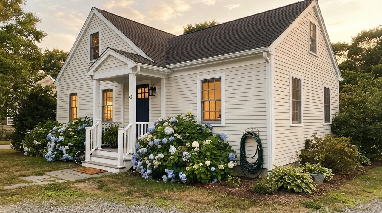
Exterior light is remarkably intense. In direct midday sun, paint colors lose anywhere from three to five steps of depth. Because of this, pure white on an exterior can cause eye-watering glare that washes out the texture of your siding. Blank Canvas on horizontal siding reads as a crisp, soft white from the curb during the day, but it retains its warmth when clouds roll in and at dusk.
To make it work on an exterior, you need real contrast. Pair it with dark accents—such as a deep navy or a charcoal like Behr Cracked Pepper (PPU18-01)—on shutters and front doors. A flat or low-lustre exterior finish on the siding will also help hide surface imperfections in older wood or fiber cement.
Living With It: Scrubbing and Long-Term Wear
Over thirty years and three houses, I have scrubbed every brand of paint imaginable. When we sold our second house, half the touch-ups I had to do were because cheap flat paint had burnished into shiny spots around light switches. Here is my practical advice for Behr finishes with Blank Canvas: do not buy their cheapest flat line. In economy flat paint, cutting in with a brush dries slightly darker than rolling the field, leaving visible framing lines along the ceiling.
For living rooms and bedrooms, buy Behr Dynasty or Marquee in eggshell. It wipes down cleanly with a damp rag without leaving polished streaks. For trim and cabinetry, semi-gloss or satin gives you the hard shell you need to survive dogs, vacuum cleaners, and kitchen grease.
How Blank Canvas Compares to Close Rivals
Choosing an off-white often comes down to splitting hairs between four or five chips at the paint desk. Here is how Blank Canvas stacks up against the other popular cans you are probably considering:
Does Behr Blank Canvas look yellow on the wall?
No. Unlike older traditional off-whites that rely on yellow oxide, Blank Canvas has a red-orange undertone. It reads as a soft, powdery cream or very pale linen rather than butter or custard.
What sheen should I choose for each surface?
Use flat on the ceiling, eggshell on living room and bedroom walls, satin or bath-rated eggshell in bathrooms, and semi-gloss on doors, baseboards, and kitchen cabinets.
Why do my Blank Canvas walls look tan next to my trim?
This happens when the trim is painted in standard untinted bright white. The sharp contrast forces your eyes to see the depth of color in Blank Canvas, making it read beige or dingy. Color-drenching the trim in the same shade solves this immediately.
Can I use Blank Canvas on an exterior?
Yes. In full sunlight it looks like a soft, clean white from the street and avoids glaring brightness. Pair it with dark shutters or a dark door in a color like Behr Cracked Pepper for proper definition.
Susan's Verdict · Worth the Money with One Rule
Blank Canvas is the warm white that successfully pulled thousands of homes out of the cold gray era. If you have honey oak floors, warm wood furniture, or rooms that feel chilly under north daylight, it delivers cozy, lived-in warmth at an accessible price. Just don't strand it against bright white trim—color-drench your woodwork or give it dark contrast, and it will serve your house beautifully for years.