Color Diary · No. 118
Checking the Floorboards Before Painting Benjamin Moore Elmira White
An obscure Historical Colors greige, reviewed honestly: the exact conditions that turn it pink, the rooms where it's genuinely calm, and the color a Houzz designer told one owner to switch to instead.

Susan HartleyNovember 11, 2026 · 16 min read
Elmira White · Benjamin Moore HC-84
Hex#DBD3C3LRV65Undertonesbeige → peach → muted gray
In our last house, a 1990s colonial with enough honey oak and red-toned floorboards to panel a ship, I learned the hardest lesson about light-reflective neutrals. You think you are buying a neutral wall color because the paper swatch looks like dry oatmeal sitting flat on your counter. Then you roll two coats across a wide hallway, step back, and realize your red flooring is bouncing noon sunlight straight upward into the pigment, turning your respectable off-white the exact shade of diluted calamine lotion. Nobody warns you about this at the paint desk.
Benjamin Moore’s Elmira White HC-84 is sitting at rank 146 in their catalog, quietly tucked away in the Historical Collection. It never got the breathless magazine spreads or the Color of the Year marketing treatment that pushed Edgecomb Gray and Pale Oak into every suburban subdivision in America. For a lot of homeowners, that obscurity sounds appealing. We get tired of seeing the same four paint names on social media. But Elmira White stays quiet for a reason: it belongs to Benjamin Moore's orange deck family, carries a Light Reflectance Value of 65, and hides a documented temper. Under the right roof, it is an exceptionally gentle, period-correct greige that feels as though it has belonged in a traditional home for eighty years. Put it over the wrong wood floor, or bump it against the wrong white trim, and you will be back at the hardware store before the primer is dry.
The Orange Deck Family and the Pink Flash
Every paint formula has an underlying home base in the deck system, and Elmira White lives in the orange family. In even, balanced daylight, that formula reads like an elegant, slightly warm greige—neither cold gray nor buttery beige. But because it sits at LRV 65, it is light enough to bounce whatever warmth enters the room, and under certain lighting or floor pairings, that orange base swings directly toward peach or pink.
warm sun
overcast, north light
dusk, rain, cool bulbs
orange → soft beige → dusty peach
Natural TanSherwin-Williams · see diary
Edgecomb GrayBenjamin Moore · see diary
Elmira WhiteHC-84
Baby FawnBenjamin Moore · see diary
Natural CreamBenjamin Moore · see diary
When people talk about paint undertones, they often treat them like spooky secrets that jump out after the paint dries. In reality, it is simple physics. At an LRV of 65, Elmira White reflects 65 percent of the light that strikes it. If the light bouncing off your floorboards has picked up the red stain of a cherry wood, a redwood finish, or an ambered red oak, that light enters the wall at a tinted angle. Because Elmira White already carries warmth from its orange deck origins, that red bounce tips the scale. The gray drops out of sight, and suddenly your beige has a flushed face.
We saw this exact problem play out in real owner forums. An owner painted an entire open-concept floor plan in Elmira White. In the rooms with pale tile, it was the calm, handsome Historical neutral they expected. But the moment the layout opened up over redwood-toned flooring, the walls read distinctly peach. A designer stepped into the thread and pointed out the culprit: reflected warmth off the floorboards. The professional recommendation was to strip Elmira White out of the red-floored rooms and switch over to Edgecomb Gray or Nature's Essentials—colors built just a breath cooler, with enough gray spine to resist that upward red bounce.
How Daylight and Light Bulbs Shift the Balance
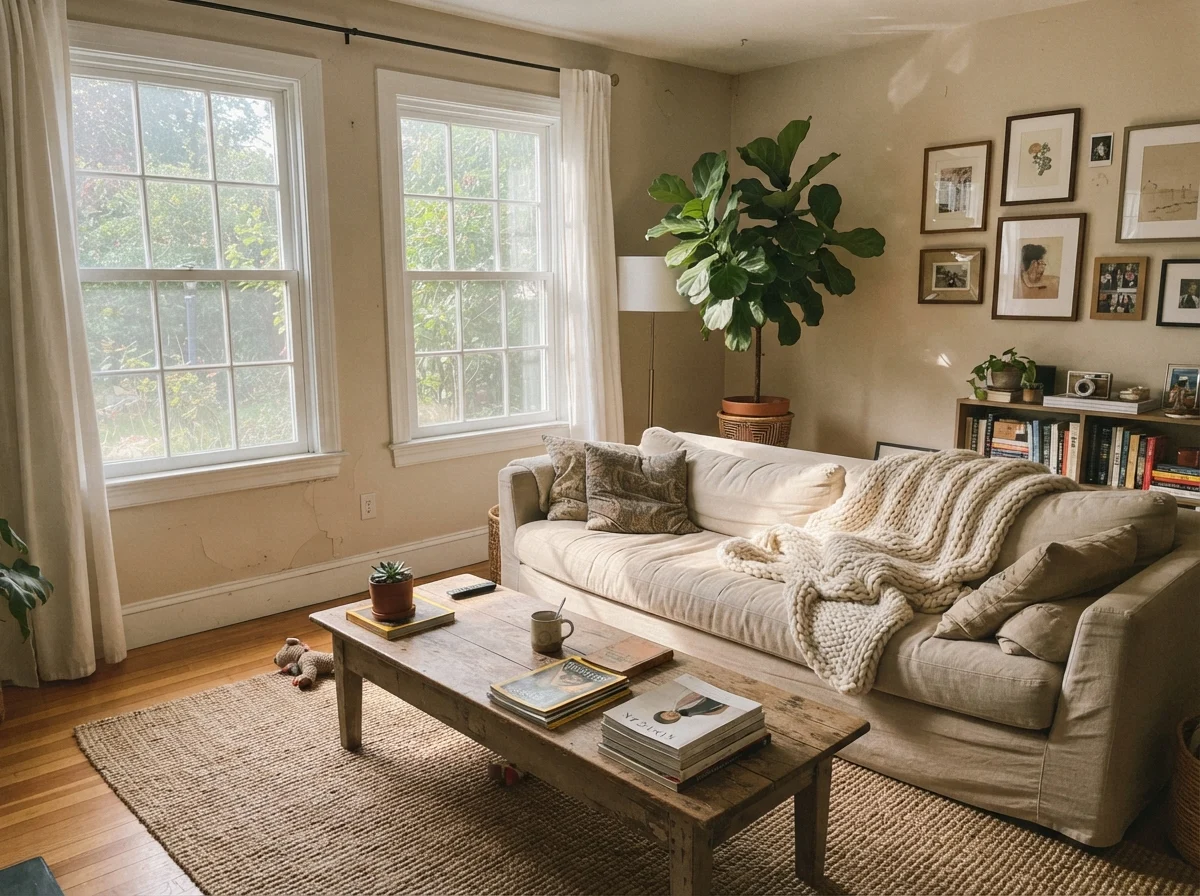
Before you commit to gallons of this shade, you need to watch it travel across twenty-four hours in the exact space you intend to paint. In clear midday daylight—away from any red patio bricks outside or warm mahogany furniture inside—Elmira White behaves like a dream. It gives you that lived-in, established look that newer, crisper builder greiges simply cannot replicate. It feels historic without feeling heavy.
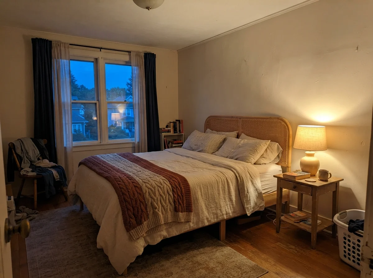
Early mornings bring out its quietest, almost stony character. If you look at it under north-facing light or an overcast sky, you will see the gray side of the formula come forward. But as the afternoon rolls around and western light starts raking across your baseboards, Elmira warms up fast. If your indoor lighting uses standard 2700K warm incandescent or LED bulbs, that evening warmth gets amplified. In our 1960s ranch, I have found that swapping warm lamps for balanced 3000K bulbs often saves a borderline paint from drifting into unwanted peach territory. With Elmira White, that bulb check isn't optional; it's basic maintenance.
Living with Elmira White Room by Room
Because Elmira White is so sensitive to the materials around it, you cannot treat it as an automatic whole-house paint. I have painted whole houses before—our first split-level got rolled in a single beige from the basement stairs to the attic hall because we were twenty-five and broke—and when a paint has undertone quirks, a whole-house job turns into a game of roulette. In one bedroom it looks like a million dollars; in the hallway next door it looks like makeup foundation gone wrong.
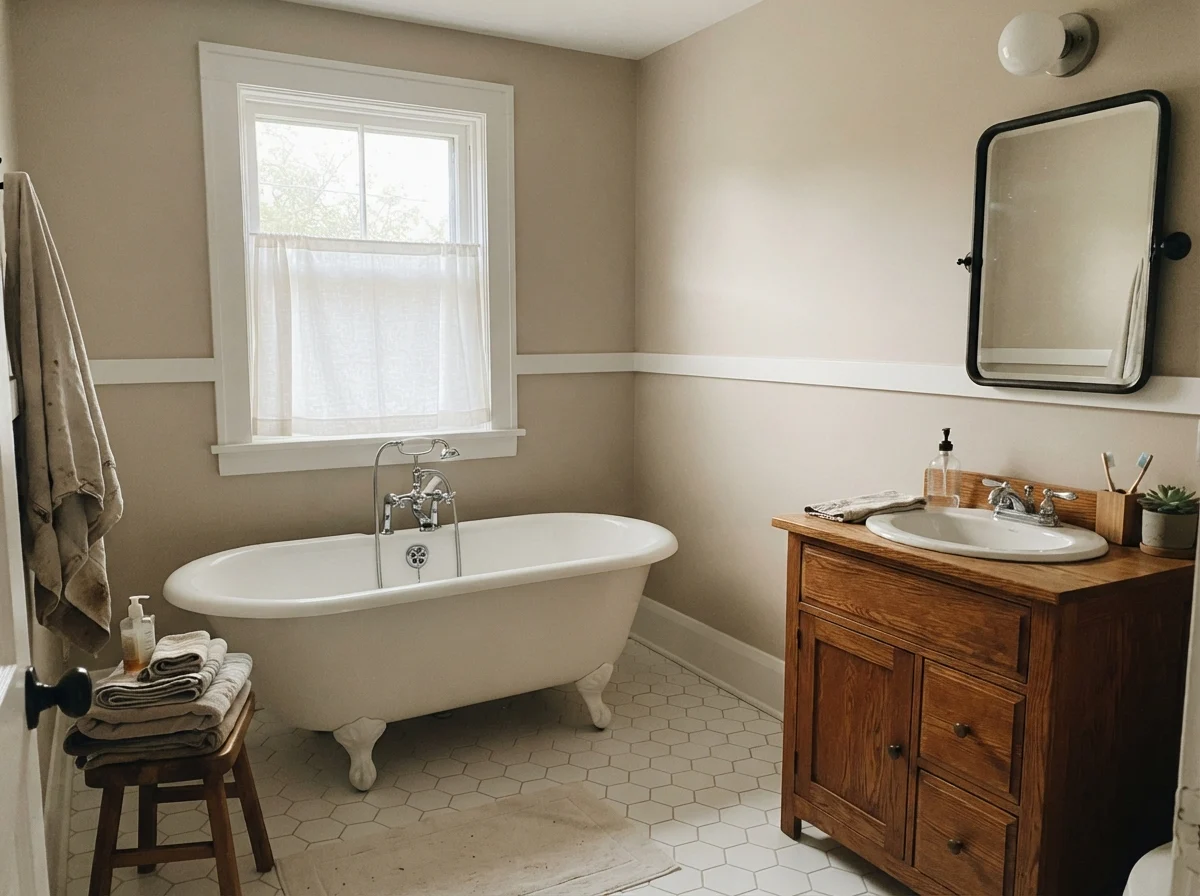
Where Elmira White truly earns its keep is in spaces with pale, low-contrast flooring: light white oak, gray-washed planks, pale slate, or classic white hex tile. Give it those cool or neutral anchors, and it behaves itself beautifully.
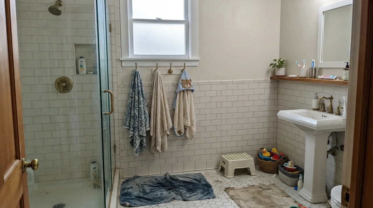
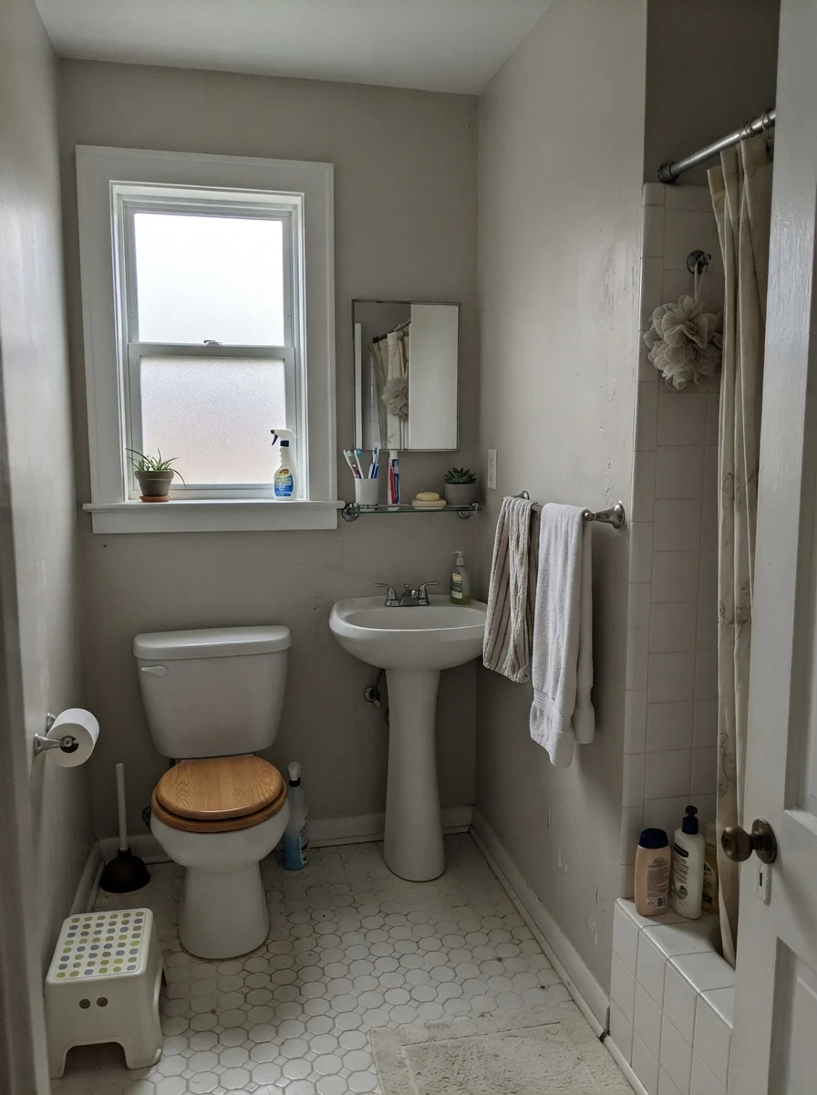
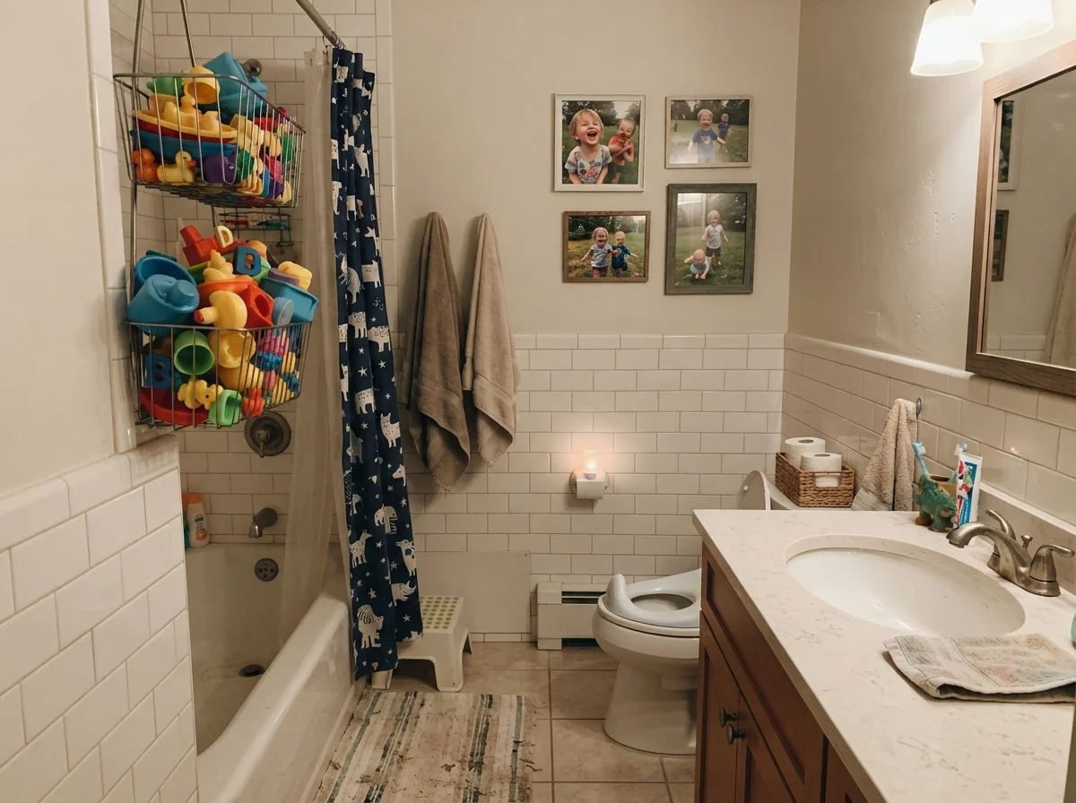
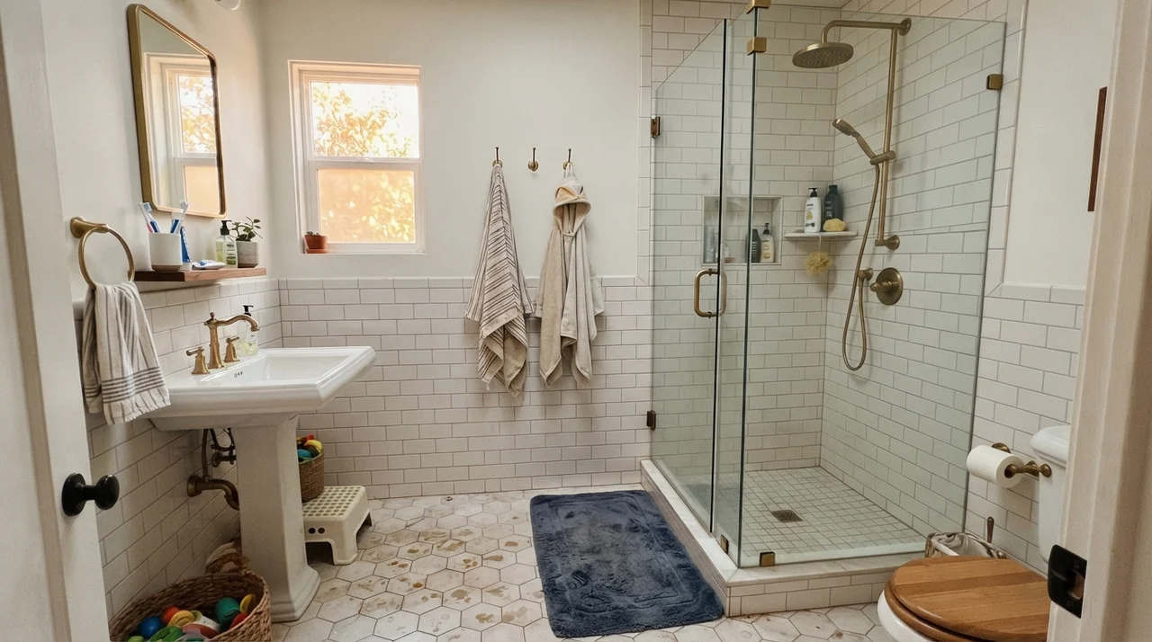
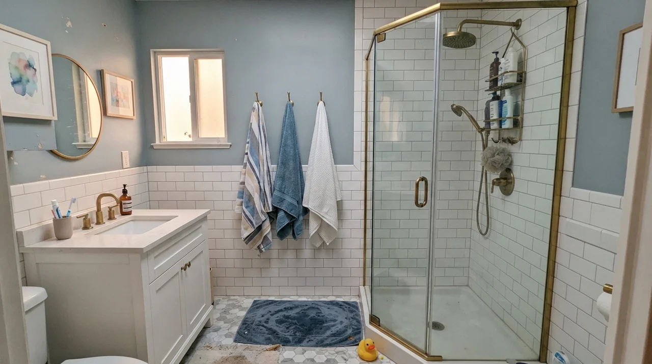
Bathrooms with traditional white tile are a natural sanctuary for this shade. Wainscoting or half-wall subway tile breaks up the vertical expanse, meaning the paint only covers the upper half of the wall where reflected floor bounce is minimal. The crisp porcelain and white ceramics give your eyes a clean baseline, allowing Elmira White to register as an intentional, warm off-white rather than an ambiguous tan.
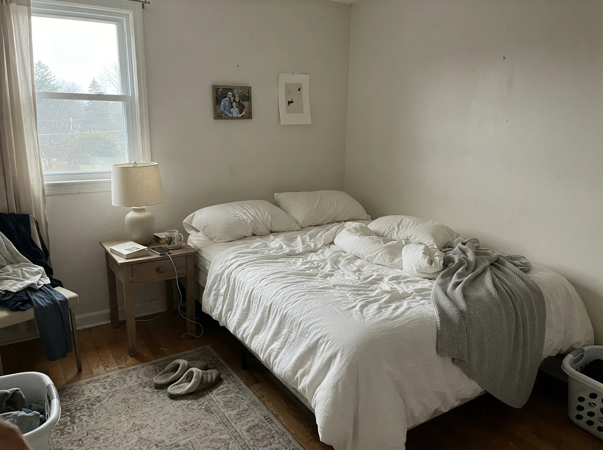
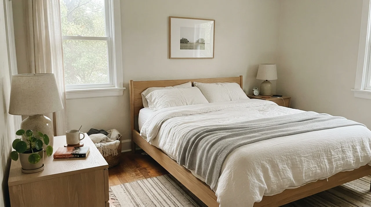
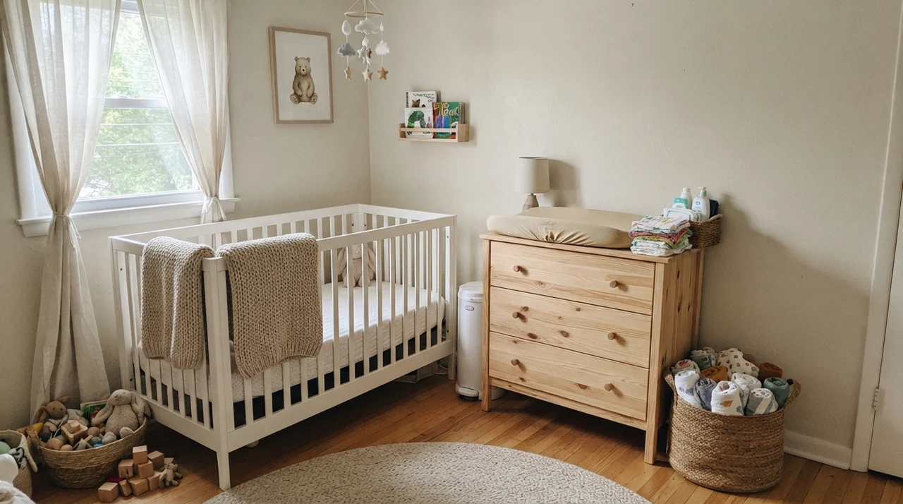
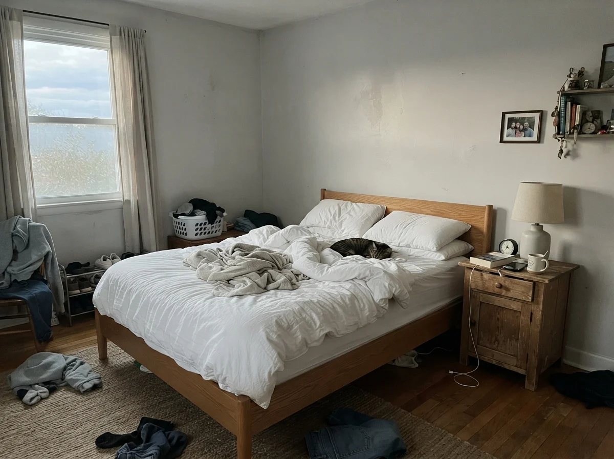
Move that same paint into a main bedroom or a nursery, however, and the flooring becomes your primary design partner. If you have pale carpets or bleached wood, the room settles into a gentle, restful sanctuary that looks wonderful under cream linens and tailored drapes. But if you have vintage red-oak parquet, you will spend your evenings looking at a wall that glows like a Georgia peach.
The Cabinet Trap: The Swiss Coffee Warning
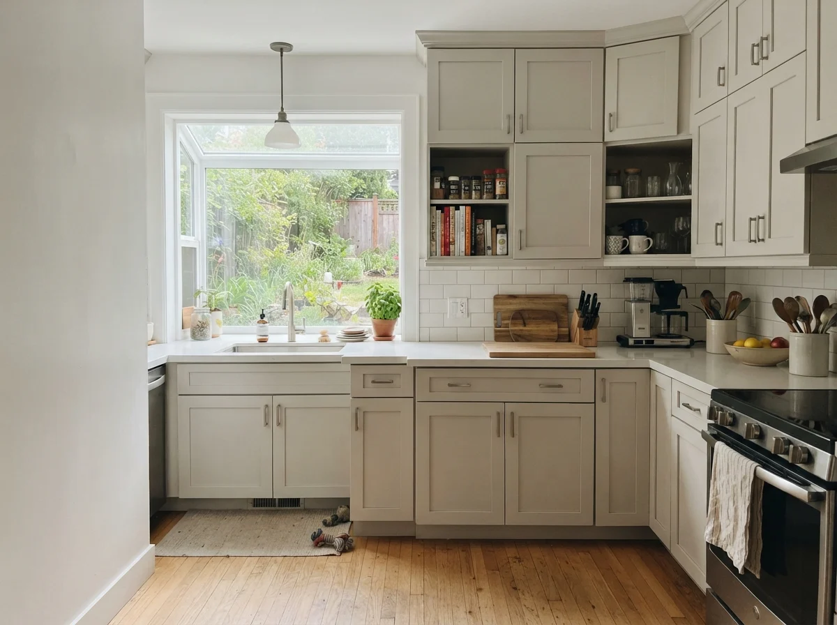
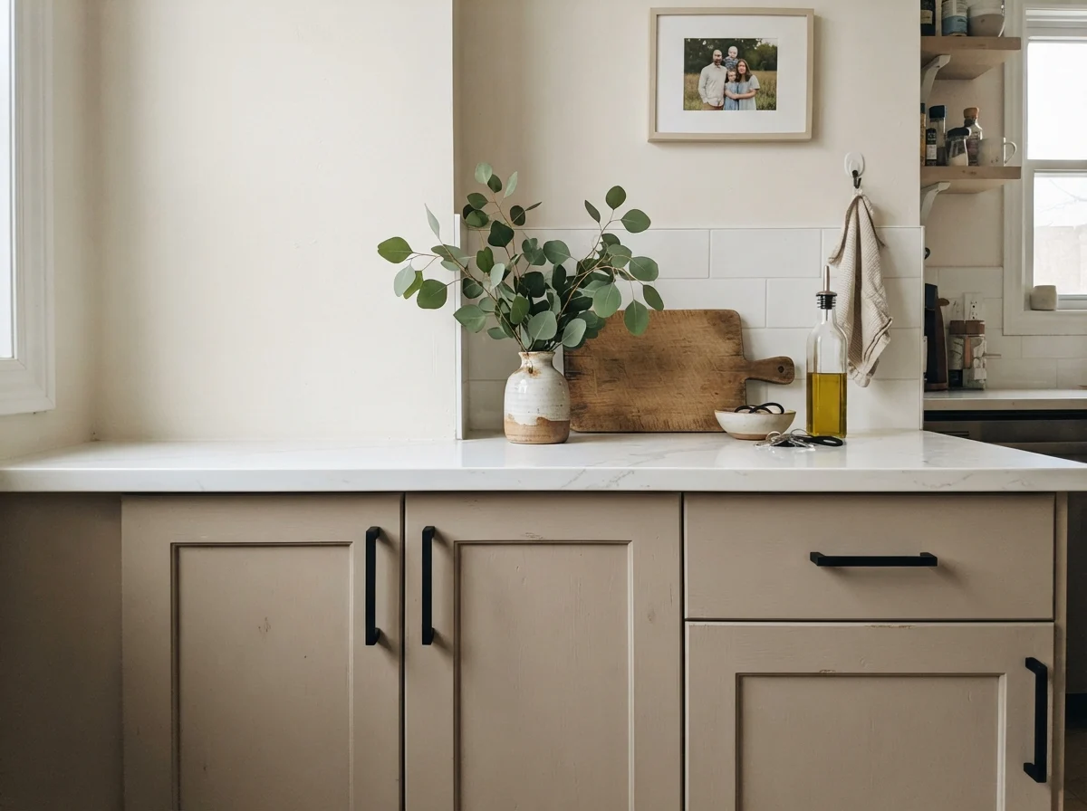
Here is where many well-intentioned homeowners hit a brick wall: the kitchen. There is a documented complaint from a homeowner who had Elmira White on their kitchen walls and loved it—until they installed brand-new cabinetry painted in Benjamin Moore’s Swiss Coffee. The homeowner reported that the moment the Swiss Coffee cabinets went up, the Elmira White walls suddenly looked dirty, intensely peachy, and entirely wrong.
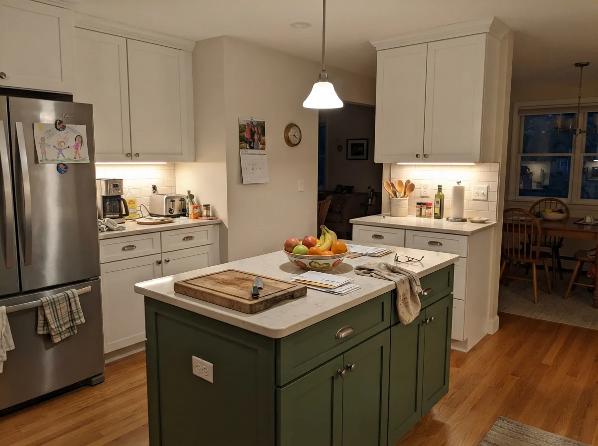
What happened there? The wall paint didn't change color overnight. What changed was the comparison point. Swiss Coffee, while nominally a warm off-white, is noticeably lighter, cleaner, and cooler in relation to Elmira White. When you put a brighter, cleaner white directly against an earthy Historical neutral like Elmira White, you strip away the neutral's subtlety. The gray elements in Elmira White retreat, and the warm orange pigment looks like a staining error. If you are going to use Elmira White in a kitchen, it belongs on the cabinetry itself paired with neutral white subway backsplashes, or on walls surrounded by trim that shares its exact warm temperature.
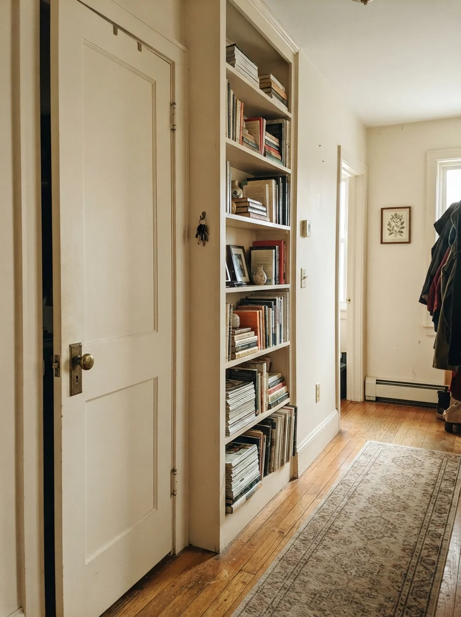
Using Elmira White directly on woodwork or a kitchen island is actually one of the safest ways to enjoy it. Built as part of the Historical Collection, its formulation was meant to mimic traditional painted joinery and millwork. On doors, islands, or built-in bookshelves, its depth feels purposeful. It reads like solid, painted wood rather than an indecisive wall color.
Woodwork, Built-Ins, and the Real Meaning of Lived-In
In our 1970s split-level, every door was hollow-core brown luan, and when we finally replaced them with two-panel pine doors in the late nineties, I spent weeks testing trims. When you paint interior doors and built-ins a soft, muted color like Elmira White while keeping the wall surrounding them a creamy neutral, you get an architectural depth that feels earned. It looks like the house has had steady, caring owners who made thoughtful choices decades ago.
A dry aside from thirty years of rolling paint: there is a specific kind of fatigue that sets in around hour six of painting built-in shelves, usually right when you realize you bought a color that changes its mind depending on whether the sun is behind a cloud. If you want a paint that requires zero thought, Elmira White is not your friend. But if you have the patience to sample it against every floor transition, it offers an understated maturity that newer mass-market greiges struggle to touch.
The Honest Fail: Dim Hallways and Muddy Corners
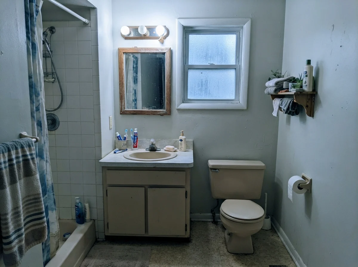
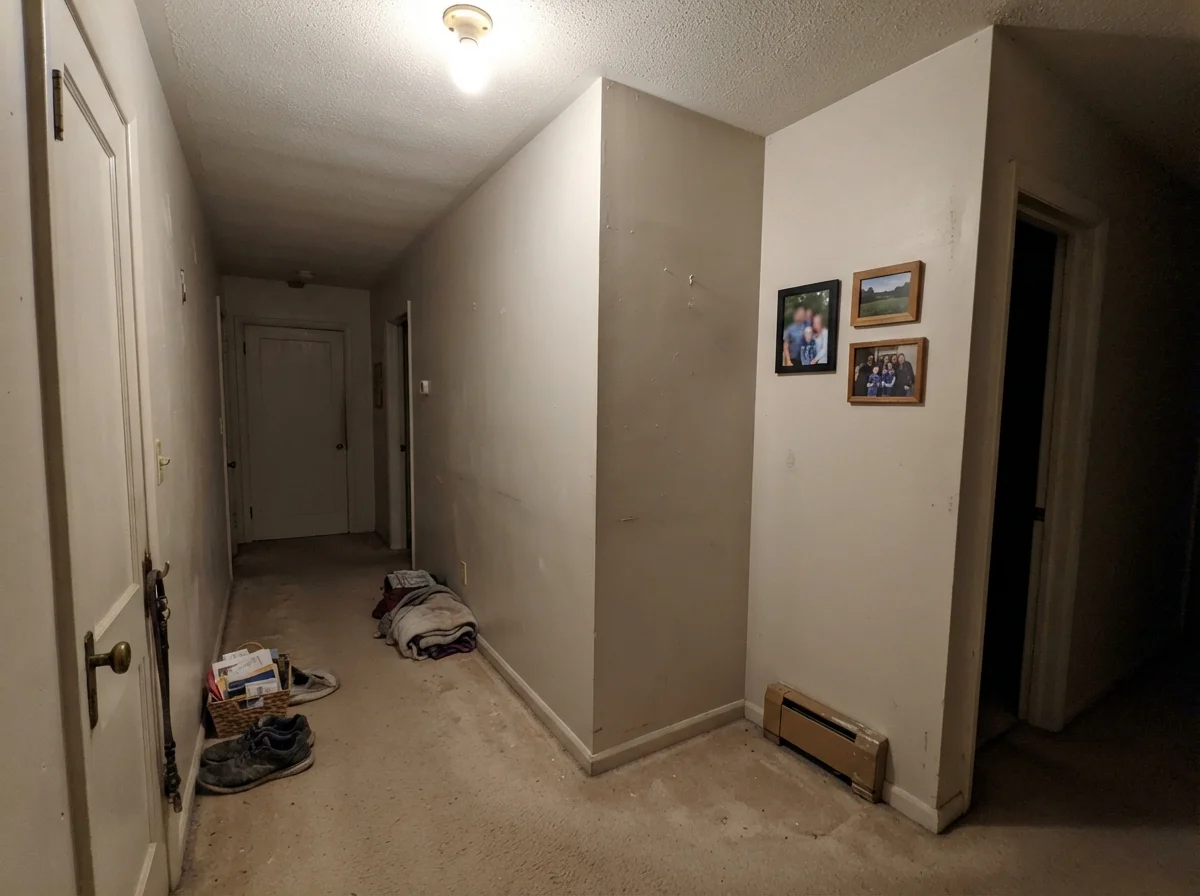
Here is what happens when you ignore lighting conditions and try to use Elmira White as a default hallway neutral. In a windowless corridor over builder-grade beige carpeting, lit only by an old overhead ceiling fixture, this paint dies. The LRV of 65 is not high enough to manufacture light where none exists. Without natural daylight to illuminate its subtle gray balance, the orange base curdles into a dreary, muddy putty tone. It looks tired. It looks like the wall hasn't been painted since 1983.
If you have an interior hall with no direct daylight, look elsewhere. A paint like this requires genuine light to breathe. Without it, you are paying premium Benjamin Moore prices for a finish that looks like drab institutional plasterboard.
Taking It Outside: Clapboard and Trim
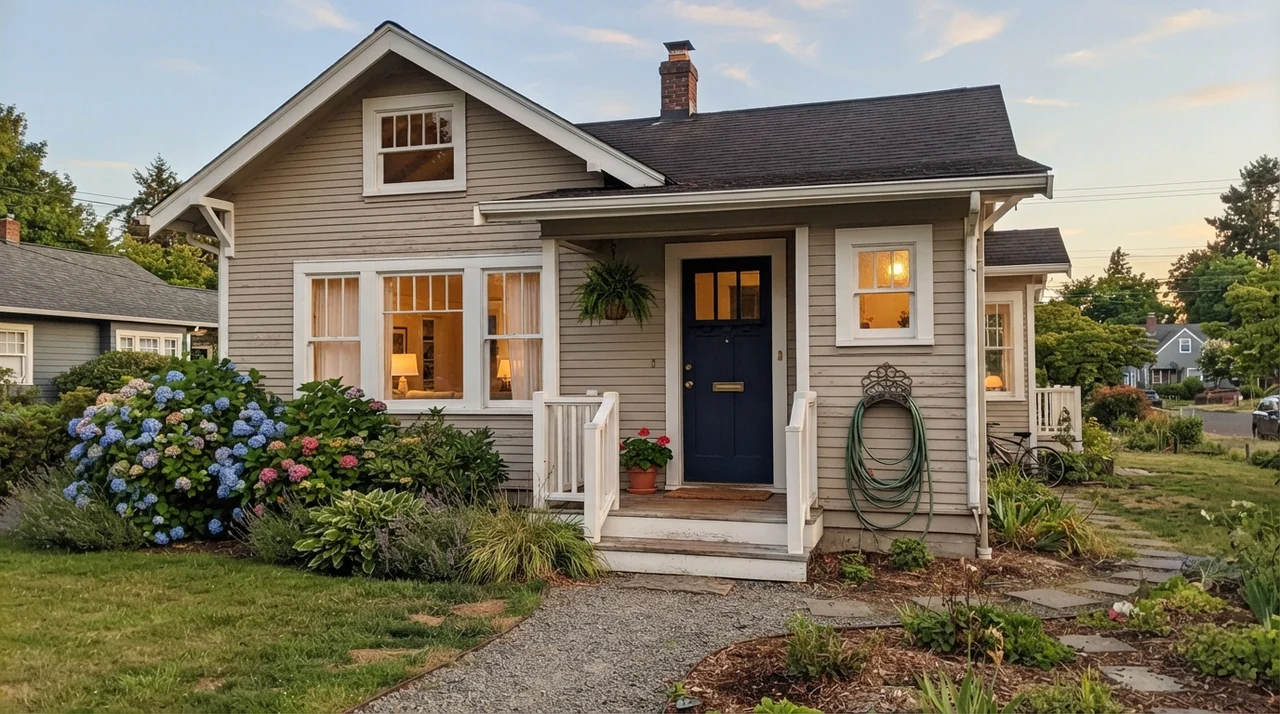
Because Elmira White comes out of the Historical Collection, homeowners frequently look at it for exterior clapboard siding. On a traditional home, rolled in a satin finish alongside crisp white trim and a deep navy front door, it gives an exterior an understated, established dignity. It looks like an authentic coastal New England home that has weathered forty Atlantic summers without chipping.
However, the exterior floor rule still applies. If you have an exterior deck stained in redwood, an unpainted red cedar shingle roof, or large red brick walkways right up against the foundation, bright afternoon sun will bounce off those surfaces and project that same peach tint onto your exterior siding. Always buy a sample quart and paint a large board to test outside at nine in the morning, two in the afternoon, and sunset before ordering five-gallon exterior buckets.
Durability, Sheens, and the Five-Year Reality
Let's talk about the reality of living with this paint five years in. In our houses, we have raised children, hosted decades of holiday family dinners, and lived through dogs that treated hallways like banked race tracks. You do not judge a paint formula by how pretty it looks while the painter is rolling it. You judge it by year four, when the hallway baseboard has been scuffed forty times and someone has splashed red pasta sauce three inches above the kitchen counter.
For interior walls, my recommendation is strictly eggshell. A flat finish in Elmira White looks soft, but the moment you try to scrub off a muddy fingerprint, you will burnish the wall and leave a shiny patch that forces you to repaint the entire section. Benjamin Moore's eggshell finish gives you just enough resin backbone to wipe it down with a damp microfiber cloth and mild soap. On trim, doors, and built-ins, spend the extra money on semi-gloss. It cures harder, resists hand oils around doorknobs, and creates the slight sheen contrast that makes a subtle greige look tailored.
When we sold our colonial, the buyer’s inspector didn't care about our paint color names. What mattered was whether the walls looked scrubbed clean and intact. Colors like Elmira White hold up well over the long haul because their muted nature hides minor surface dust far better than a brilliant, stark gallery white ever could. If you touch it up three years later, however, make sure you use paint from the original can; subtle orange-greige mixes are notoriously difficult to match across different factory tinting batches.
Why does Elmira White look pink on my walls?
Elmira White belongs to Benjamin Moore's orange deck family. When paired with red-toned flooring (like cherry, redwood, or warm red oak) or warm afternoon sun, the paint reflects those red light waves upward, pulling out an unexpected peach or pink undertone.
What trim white works best with Elmira White?
Benjamin Moore White Dove (OC-17) is an excellent match. You want a warm, softly muted white trim. Avoid cooler or cleaner whites like Swiss Coffee, which create a harsh contrast that makes Elmira White look muddy or pink.
Is Elmira White too dark for a whole house?
At an LRV of 65, it is light enough for open living spaces, but it is risky for a whole-house repaint unless your flooring and light exposures are completely consistent. Different floors and lighting conditions will make it look like several unrelated paint colors.
What sheen should I use for Elmira White on walls?
Eggshell is the right choice for living rooms, bedrooms, and hallways. It provides the scrubbability needed to clean off everyday family marks without the distracting glare of higher-gloss finishes.
Susan's Verdict · A Handsome Neutral That Demands Inspection
If I were standing in the paint aisle today with an old house, pale oak floors, and a room full of warm white trim, Benjamin Moore Elmira White HC-84 would be near the top of my list. It has a quiet, dignified historical weight that feels settled and permanent. But if my floors had red, cherry, or heavy amber stains, or if my kitchen was lined with clean, cool white cabinets, I would leave Elmira White on the shelf and buy Edgecomb Gray instead. Elmira White isn't a bad paint—it's just a paint that refuses to lie about what is sitting on your floorboards.