Color Diary · No. 117
Sherwin-Williams Debonair: Why an Unknown Blue-Gray Still Deserves a Roller
A blue-gray with almost no track record online, reviewed honestly: where it turns quietly sophisticated, the exact light where it goes flat, and what to pick instead.

Susan HartleyNovember 10, 2026 · 18 min read
Debonair · Sherwin-Williams SW 9139
Hex#90A0A6LRV34Undertonescool slate gray → dusty blue → muted teal-gray
When we moved into our 1990s colonial twenty years ago, every single room had been rolled in what the builder probably called almond. It wasn’t cream, and it certainly wasn’t white; it was the color of wet cardboard left out in a drizzle. Over the decade we lived there, I took that house apart room by room with a purdy angled sash brush and gallons of paint. One of the earliest lessons that house handed me was that mid-tone colors are the easiest to misjudge in the store and the hardest to live with when you get them wrong. A pale off-white forgives almost any bad lamp or rainy Tuesday afternoon. A deep navy makes an intentional, moody statement even when the room is dark. But a mid-tone blue-gray with an LRV around 34—right in that middle pocket where Sherwin-Williams Debonair SW 9139 lives—refuses to hide. It either works with the daylight in the room, or it sits there looking like wet cement.
Debonair is an interesting case because it has virtually no digital paper trail. If you look up popular blue-grays, you will find thousands of forum posts, kitchen renovation reels, and designer roundups analyzing every micron of tint. Debonair has almost none of that. It sits on the paint deck at number 141 in popularity, quietly tucked into the teal-blue family, overlooked by the internet crowds. But an absence of chatter doesn't mean a color is a mistake. Sometimes it just means nobody turned it into a marketing campaign. We have lived with it, tested it across different orientations, and watched what happens when real life—laundry baskets, dirty fingertips, and winter weather—collides with its dusty slate undertone.
In our last house, I made the mistake of picking a gray with a blue name, expecting a gentle slate, only to find it read like a cold sidewalk whenever clouds rolled through. Debonair doesn’t pull that stunt. Gray does most of the talking here, but there is an undeniable current of cool slate blue underneath that refuses to let the wall surrender to generic greige. When soft morning daylight strikes it above a clean run of white tile, the color opens up completely. It feels grounded, tailored, and calm. But you have to understand the undertone before you commit twenty dollars to sample pots, because that underlying teal-blue base shifts depending on what's shining on it.
The Undertone Breakdown
Debonair sits squarely at an LRV of 34, meaning it reflects roughly one-third of the light that strikes it. In direct sun, the blue wakes up and reads airy and dusty. Under north-facing sky or flat overcast, the slate gray takes command. Add cool commercial light bulbs, and it strips out the warmth entirely.
warm sun
overcast, north light
dusk, rain, cool bulbs
A true cool blue-gray that leans slate in direct daylight and pulls toward a flatter, colder cement gray when starved of warm natural light.
Teton BlueBehr · see diary
Van Courtland BlueBenjamin Moore · see diary
DebonairSW 9139
CadetSherwin-Williams · see diary
Rainy SeasonBehr · see diary
How Daylight and Lamps Change the Wall
Color swatches are flat little pieces of printed paper viewed under fluorescent hardware store tubes, which makes them terrible truth-tellers. In real rooms, a paint color is an active mirror of whatever light enters the windows and whatever bulbs you screw into your fixtures. With Debonair, that morning-to-evening swing is pronounced. If you paint a room that catches early east light, you will see a color that feels crisp, clean, and unmistakably blue. By dusk, especially if you flip on a lamp with a warm 2700K bulb, that blue settles into a rich, dusky slate that feels like a wool blanket. But if you starve it of warm light or subject it to high-kelvin utility bulbs, the charm evaporates.
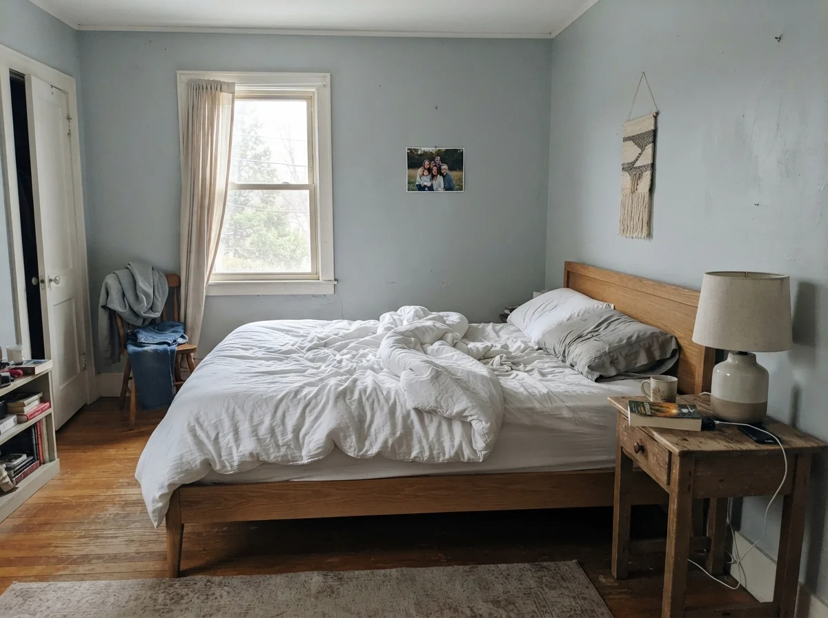
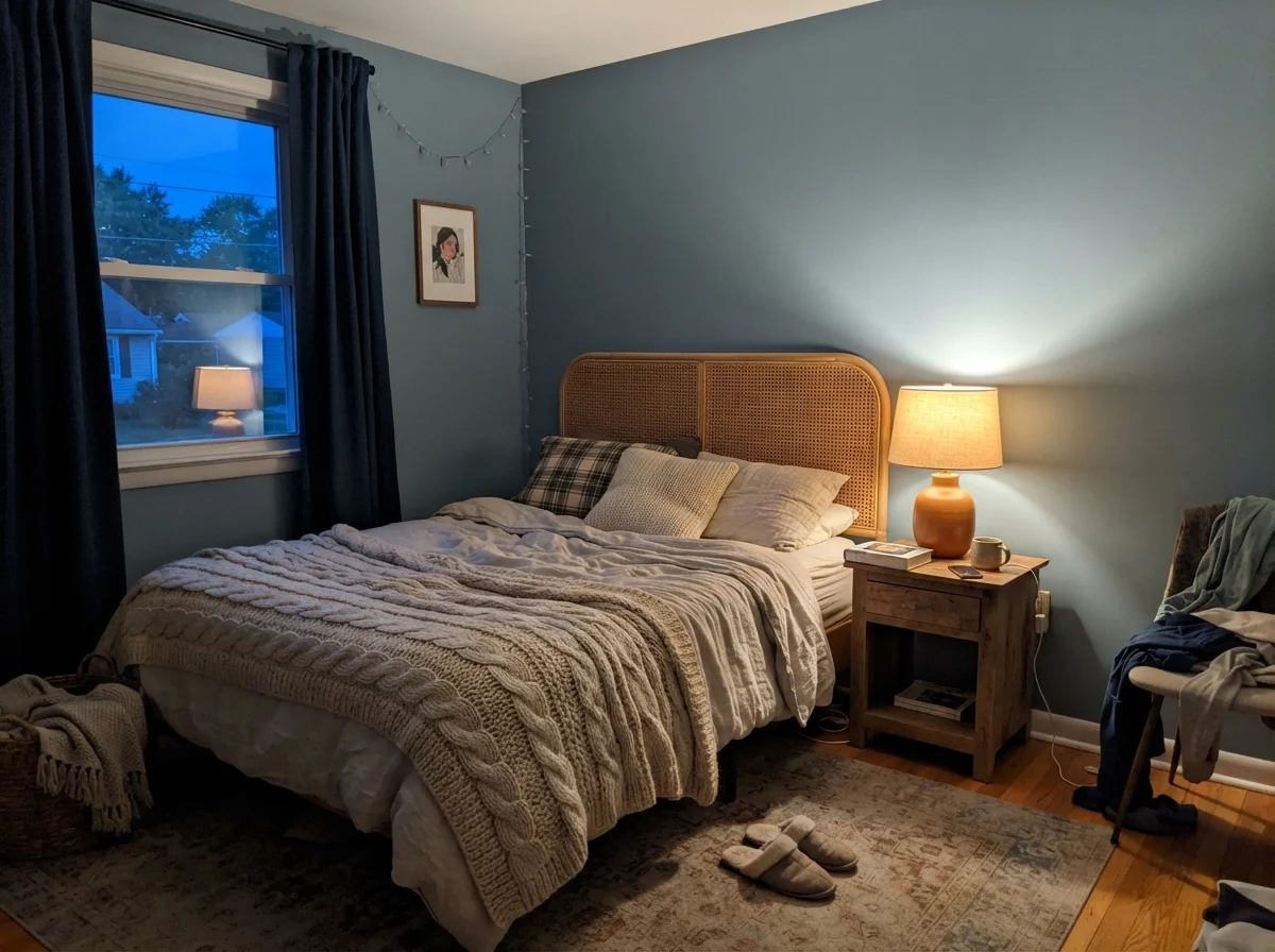
Notice the shift between those two shots. In the early morning, before the sun climbs high enough to warm the room, Debonair leans pale and almost washed out against white linen. It doesn't look bad, but it doesn't show its cards yet. Step into the same room around 8:00 PM with a soft bedside lamp burning, and suddenly the wall wraps around the room. The yellow-orange spectrum of an incandescent-equivalent bulb neutralizes the chill in the blue, turning the paint into a quiet, comforting backdrop. This is why I tell anyone asking about blue-gray: if you run 4000K daylight LEDs throughout your house, do not buy this paint. It will look like a municipal waiting room by nightfall.
That's the thing nobody tells you about color: you don't choose it for the weekend you paint it. You choose it for year four, when the light has faded it half a shade and you've scrubbed the same spot by the door handle a hundred times.
Debonair in Bathrooms: The Natural Fit
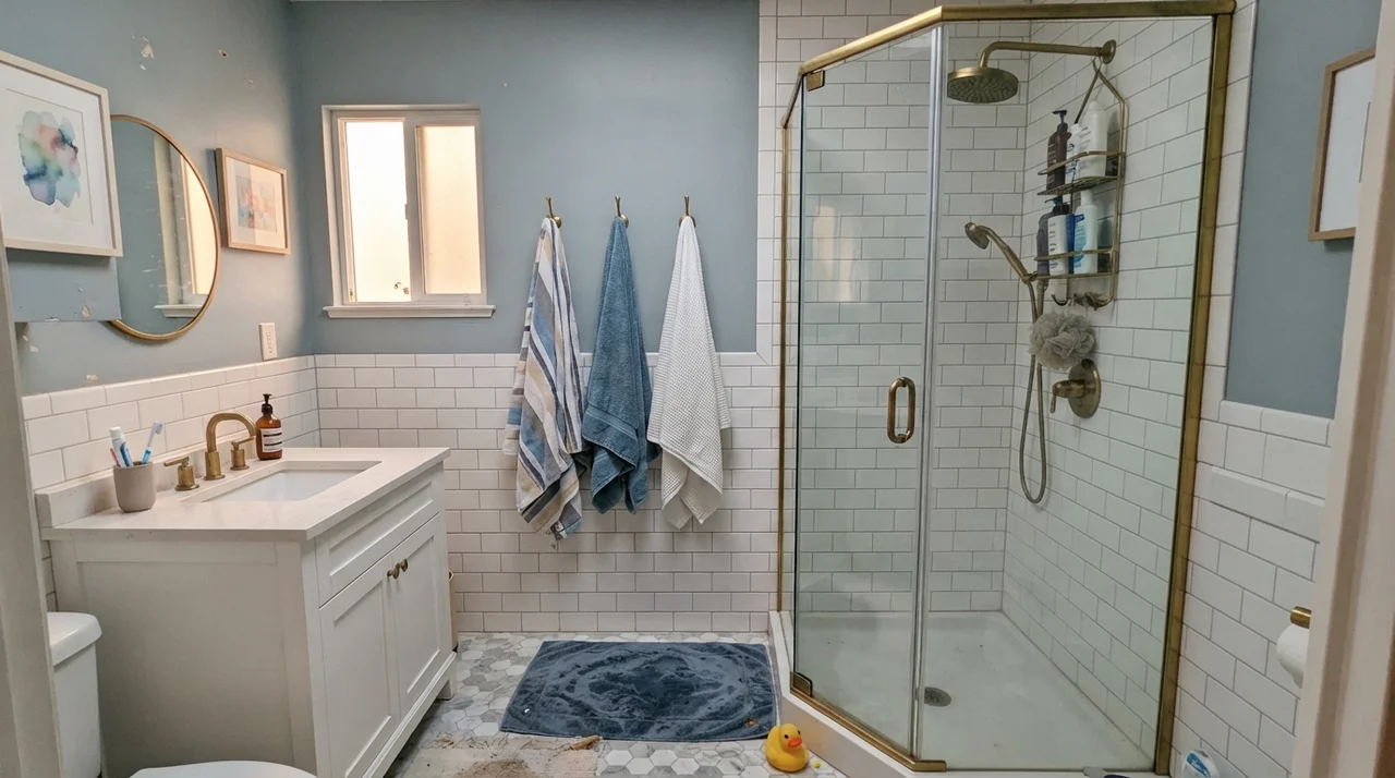
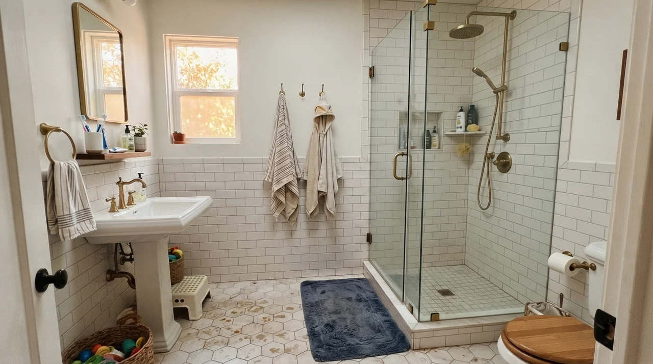
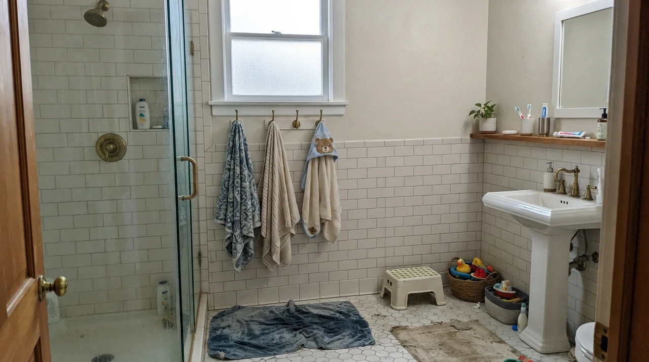
If there is one room where Debonair has consistently proven itself, it is the bathroom. Bathrooms tend to have two things working in this color’s favor: large expanses of bright white tile or porcelain to provide contrast, and high-quality task lighting. Without contrast, mid-depth colors can feel murky. Put Debonair on the top half of a wall above white subway wainscoting, however, and the slate blue looks intentional and tailored.
In a family bath that sees wet towels, steam, and children splashing, finish matters just as much as tint. On walls, I always specify eggshell. Flat paint in a bathroom is a mistake you only make once; one good splash from the tub or an attempt to wipe away toothpaste residue, and flat paint leaves a permanent burnished mark. Semi-gloss is what we use on the door trim and baseboards so they can take vacuum cleaner bumps and bleach wipes without chipping down to the primer.
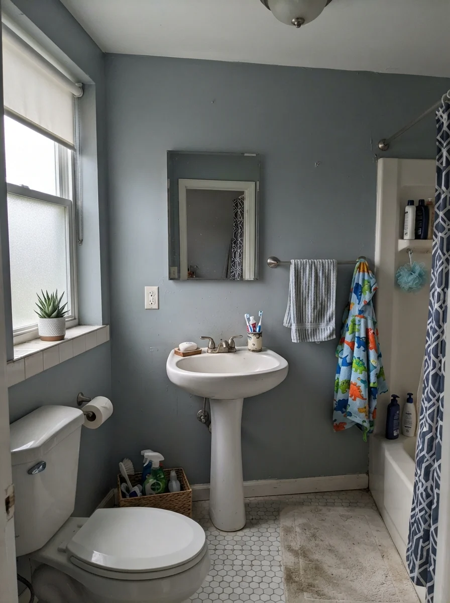
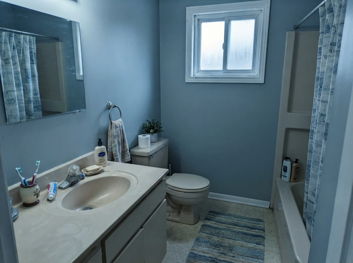
Take a hard look at the two images above. On an overcast afternoon or in a north-facing window, Debonair steps away from its cheerful coastal blue personality and pulls toward steel. In that dated bathroom with the older beige vanity, you can see how dangerous it is to put a cool blue-gray next to dirty yellow-beige finishes without a bridge. The beige makes the paint look chilly, and the paint makes the beige vanity look yellowed and tired. If your bathroom tile has pink, peach, or almond tones left over from the 1980s, Debonair will not rescue them. It will highlight every single flaw.
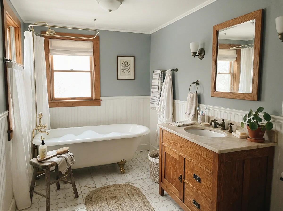
Where it shines is against crisp white fixtures and warm natural wood. Put an oak vanity or brass plumbing fixtures against this color, and the entire room balances out instantly.
In this cottage bath, you can see exactly why warm wood is Debonair's best friend. The honey tones of the oak vanity pull out the depth in the paint, while the cast-iron clawfoot tub keeps everything classic. Five years in, this is the kind of room that doesn't feel dated. It doesn't scream a specific trend cycle; it just looks clean, sturdy, and comfortable.
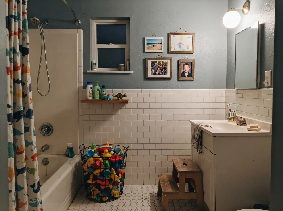
Even in a high-traffic kids' bath, where bathtime clutter and damp bath mats rule the floor, the color holds up to everyday life. Because it has an LRV of 34, it hides minor smudges and water splashes far better than an off-white, but isn't dark enough to show every trace of soap powder dust.
Bedrooms: Keeping the Calm Without the Chill
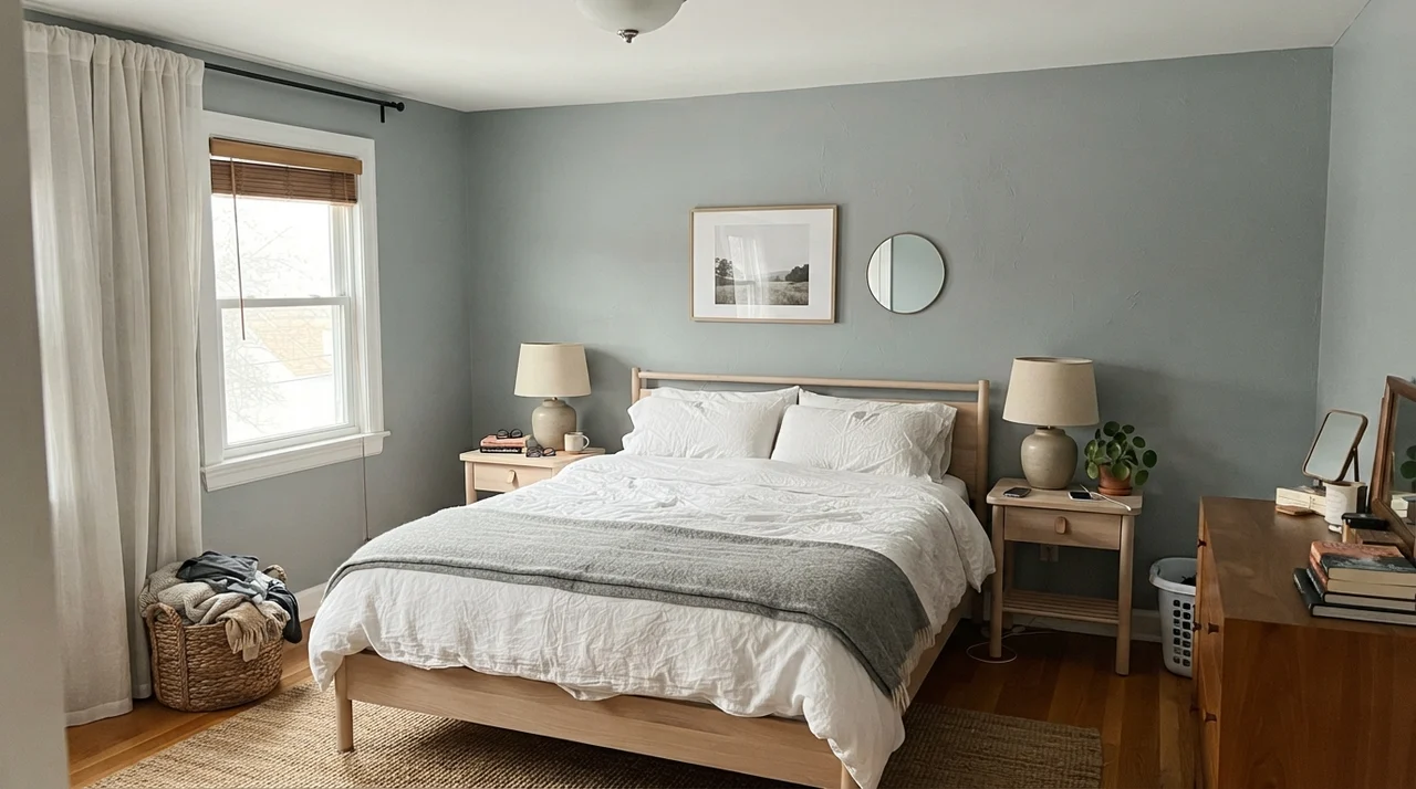
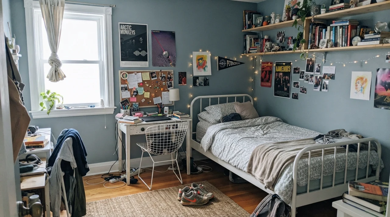
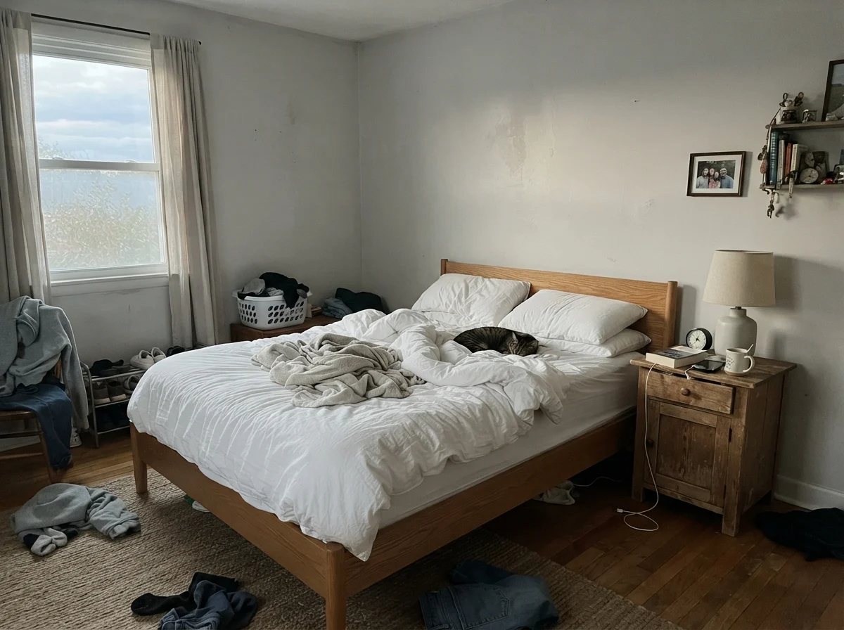
In our current 1960s ranch, our primary bedroom faces south-southeast. South light is generous and warm all day long, which means you can roll cool tones onto the wall without fear of the room feeling like an icebox. Debonair in a bedroom with steady daylight creates a restful, quiet environment that lets you sleep past sunrise without feeling buried in a dark cavern.
The secret to keeping a blue-gray bedroom from feeling sterile is your bedding and furniture textures. When you choose cool paint, your textiles have to supply the tactile warmth. White linen, washed cottons, natural cane or pale oak, and soft woven blankets keep the space approachable.
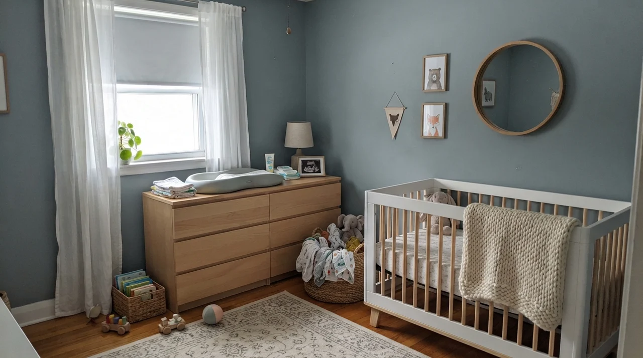
In kids' rooms and nurseries, parents often default to pastel baby blues that look sugary when wet and juvenile within three years. Debonair avoids that trap completely. Because it has a solid dose of gray pigment grounding the teal base, it transitions effortlessly from a calm nursery into a space that suits an older child or a teenager.
When our kids were growing up across our first two houses, I repainted their bedrooms three times each. Every time I bought a pale nursery pastel, it looked dated within thirty-six months. A color like Debonair has enough backbone to survive the jump from cribs to soccer cleats without requiring you to haul out the drop cloths and roller pans again when middle school hits.
Kitchens and Built-ins: The Cabinet Question
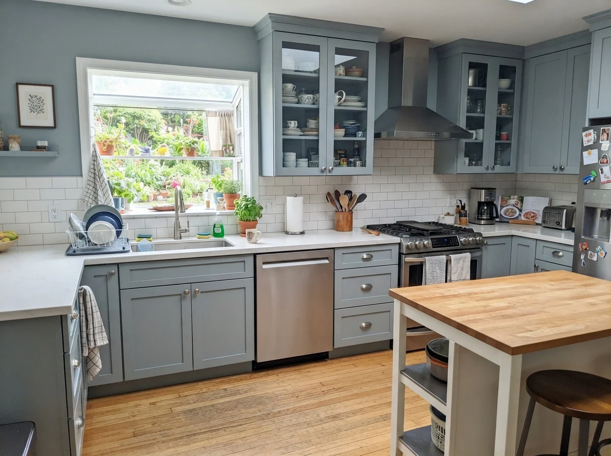
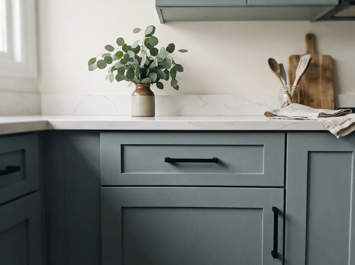
I get asked all the time whether mid-tone colors work on cabinetry. The short answer is yes, but only if you are deliberate about your finish and your surrounding materials. On kitchen cabinets, satin finish is non-negotiable. Semi-gloss on cabinet doors reflects too much light and shows every brush stroke or spray overlap, while eggshell can absorb oils from your thumbs around the cabinet pulls. Satin gives you a wipeable surface that can be scrubbed clean with warm soapy water without going shiny in the high-wear spots.
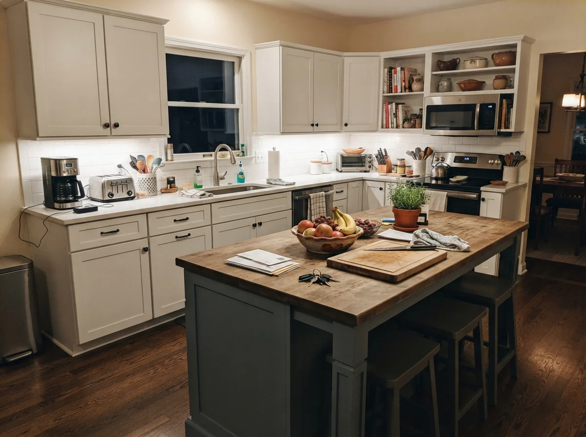
If you have an all-white kitchen that feels a little sterile, painting just the island in Debonair is a low-risk, high-reward upgrade. It anchors the center of the room without darkening the overall footprint.
Notice how well it plays with the everyday clutter in a working kitchen. White islands show scuffs from kids' sneakers kicking the back panel almost the second you sit down. Debonair takes that wear in stride. When we sold our colonial, the buyer’s home inspector remarked on how clean our painted woodwork looked—not because we didn't use the kitchen, but because a mid-tone color hides the scuffs that white screams out loud.
For a full run of cabinetry—both uppers and lowers—you need plenty of light from windows and light-colored countertops to prevent the room from feeling boxed in.
Living Rooms, Sunrooms, and Everyday Living
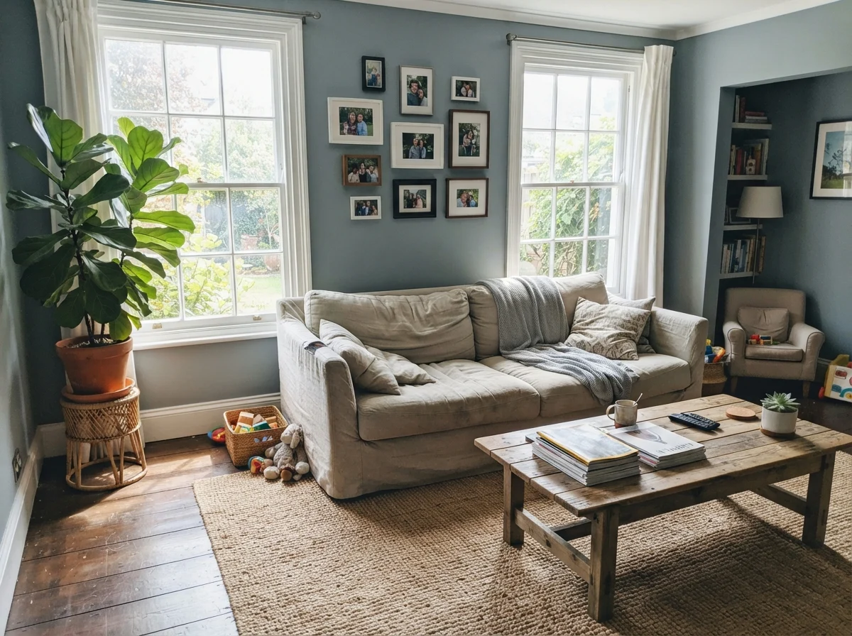
In an open living room, rolling a mid-tone color across every square foot can be a gamble unless you have the windows to support it. If your living room has two large south- or west-facing windows that pour sun across the floor, Debonair behaves like an expensive, tailored backdrop for neutral furniture. Linen couches, jute rugs, and warm oak coffee tables sing against it.
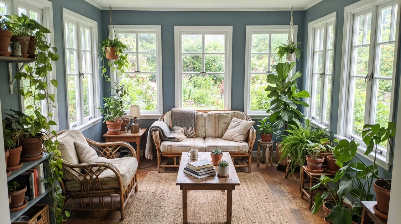
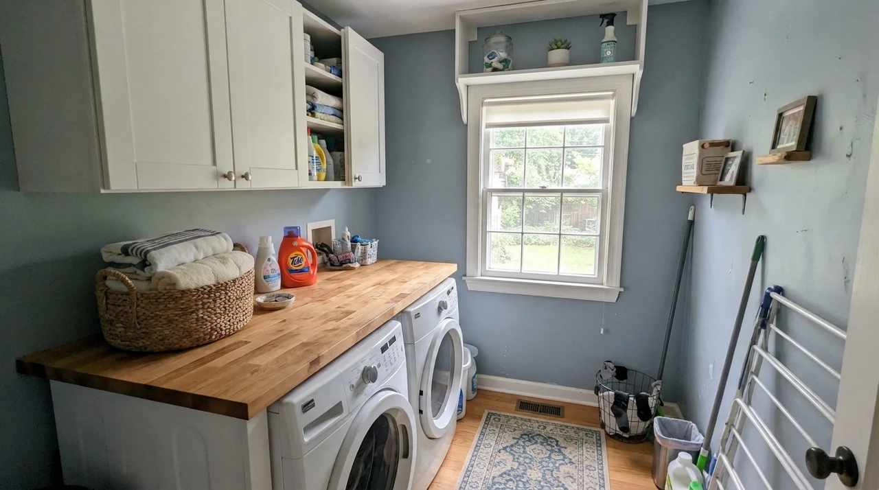
In a sunroom lined with white-trimmed windows and terracotta pots, the green-blue lean of Debonair ties directly into the garden outside. But in small utility spaces—like a tidy, bright laundry room—it also does wonderful work. It gives an otherwise utilitarian chore space a tailored, peaceful personality, turning a room you have to visit into one that feels considered.
The Honest Fail: Where Debonair Falls Flat
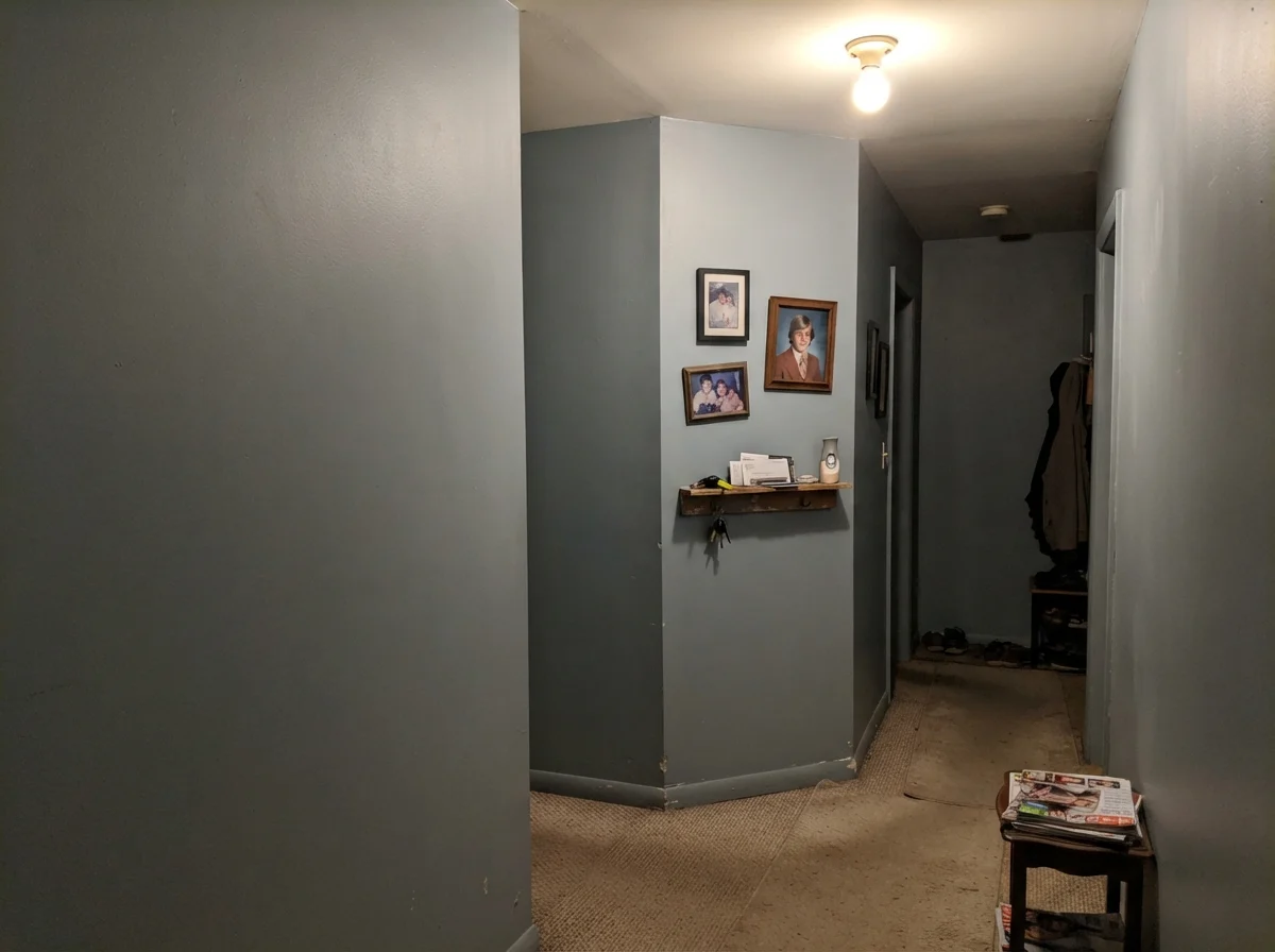
Here is the truth you won't find on a tiny store swatch: mid-tone blue-grays need light to live. If you stick Debonair into a windowless interior hallway or a dark back foyer under an old ceiling dome fixture with a dull bulb, the color completely collapses. The blue vanishes. The gray turns muddy, drab, and putty-colored, like damp clay sitting in a bucket. It doesn't look elegant or historic; it just looks neglected.
If this is the kind of hallway you are dealing with, do not paint it Debonair. A windowless hallway needs either a clean, light-reflective warm white that bounces whatever artificial light you provide, or a deliberately dark jewel box color that leans into the shadow. Putting a mid-depth slate gray here is the fastest way to make your hallway feel narrower, colder, and gloomy.
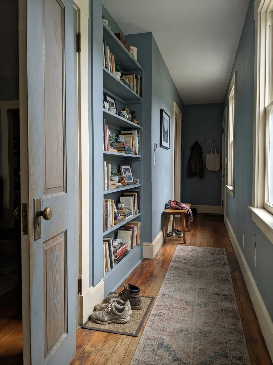
On the other hand, if you have an older house with great natural hallway light, you don't have to paint the entire wall to enjoy the color. Using Debonair on an interior panel door or a set of built-in bookshelves against warm cream walls delivers all the charm with none of the cave-like gloom.
Look at how the brass knob and the warm cream walls protect the color from going cold. The wood floor does the grounding, the cream wall reflects daylight, and the Debonair on the door supplies the character. That is how you use a color like this in older architecture.
Exterior Siding: Where the Sunlight Forgives Everything
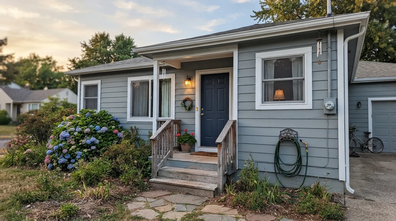
People often get terrified of using mid-tone blues on the exterior of a home, worried their house will end up looking like a nursery toy box. But exterior sunlight is brutal: direct midday sun will wash out a color by two or three full shades. A delicate pale gray will look stark white outdoors, while a mid-tone like Debonair, with its LRV of 34, finally has enough meat on its bones to hold its color without blowing out.
On horizontal siding paired with crisp white trim and a dark navy accent door, Debonair reads like an established New England coastal home. It doesn't look flashy, and it won't look dated in ten years. When you're spending thousands of dollars on exterior paint, you want a color that doesn't scream a specific decade. This one holds up.
Durability, Scrubbing, and Long-Term Realities
Here is what happens five years in: your baseboards get kicked by grocery bags, your dog shakes muddy water against the hallway wall, and someone tries to scrub a smudge off with a rough kitchen sponge. If you bought cheap builder-grade flat paint, that scrubbed spot will permanently look like a grease stain because the pigment rubbed right off on the sponge. I learned that the hard way in our split-level back in 1988, and I haven't bought cheap flat paint for high-traffic zones since.
Debonair has enough pigment depth at LRV 34 that minor dings don't flash white the way they do on near-black paints, but it's dark enough that it won't show every single grey smudge left by passing hands. We scrubbed clean our laundry walls dozens of times after muddy yard work, and with a quality eggshell enamel, the sheen holds its ground without peeling or burnishing. In moisture-heavy rooms like full baths, make sure your exhaust fan is actually sized for the square footage. Moisture trapped on mid-tone paints can leave faint surfactant leaching trails if you don't let the room breathe.
What is the LRV of Sherwin-Williams Debonair and why does it matter?
Debonair has a Light Reflectance Value (LRV) of 34. This places it in the mid-tone category. It reflects about 34% of available light, which means it has enough pigment depth to stay rich in bright sunlight, but will appear noticeably dark or flat in rooms without ample natural or warm artificial light.
What sheen should I choose for Debonair on walls versus cabinets?
For interior walls, eggshell is the ideal balance of wipeability and subtle sheen that won't look plasticky. For trim, doors, and baseboards, use semi-gloss for scrub resistance. For kitchen or bathroom cabinets, stick to a durable satin enamel to resist skin oils and daily wiping.
Will Debonair look like baby blue in a nursery or bedroom?
No. The heavy presence of slate gray in its formula prevents it from reading sweet or pastel. Even in direct morning sun, it maintains a tailored, dusty quality that reads calm and mature rather than juvenile.
What light bulbs work best in a room painted Debonair?
Always choose warm 2700K to 3000K bulbs. Warm light balances the cool slate undertone of the paint, bringing out its richness at night. Cool bulbs rated 4000K or higher will strip out the warmth and make the walls look chilly and institutional.
Susan's Verdict · Worth It Where Light Allows
Sherwin-Williams Debonair SW 9139 is a dependable, handsomely proportioned blue-gray that never needed the internet's approval to do its job. In a bright bathroom over white tile, on a hardworking kitchen island, or wrapped around a south-facing bedroom, it delivers a quiet, tailored calm that holds up year after year. Just respect the light: keep it far away from dim, windowless hallways and cold fluorescent tubes, give it a warm wood or brass anchor, and it will reward you long past the five-year mark.