Color Diary · No. 119
Behr White 52: What Thirty Years of Ceilings and Basements Taught Me
Behr's plainest white, reviewed honestly: the jobs it quietly wins, the rooms where it turns cold or green, and what to buy instead.

Susan HartleyNovember 12, 2026 · 17 min read
White · Behr 52
Hex#EBEBE6LRV83Undertonescool gray → stark white → pale leaf green
When we bought our 1970s split-level back in the nineties, the basement stairwell and the downstairs half-bath were painted a muddy, suffocating shade of harvest gold. That stairwell didn't have a window within twenty feet of it. It was narrow, dark, and smelled faintly of thirty years of damp coats and teenage traffic. I didn’t want an architectural statement down there. I didn’t want a nuanced designer cream with undertones of almond or champagne. I wanted the darkness gone, and I had exactly forty-five dollars left in that weekend’s hardware budget.
I drove down to Home Depot, walked up to the counter, and bought two gallons of Behr White—formula 52. Not Ultra Pure White, not Swiss Coffee, not a customized color swatch. Just plain White. It was the can sitting right behind the clerk's counter, mixed with the bare minimum of pigment to make it opaque. I rolled two coats onto those panelled stairwell walls, let it dry, and for the next nine years, I lived with it. That was my introduction to number 52, and thirty years later, after three houses and more repaints than my knees care to remember, I still have a gallon of it sitting on the shelf in my utility room.
That doesn’t mean it belongs in your living room. In fact, if you roll this color across a sun-drenched family room with broad windows facing an overgrown backyard lawn, you are probably going to hate it by August. Behr White 52 is not a decorating color; it is a workhorse. It doesn’t hold your hand, it doesn’t add cozy ambiance, and it has almost zero pigment to protect itself from whatever light or reflection hits the drywall. But once you understand what it can and cannot do, it becomes one of the handiest, most dependable cans you will ever carry out of a paint department.
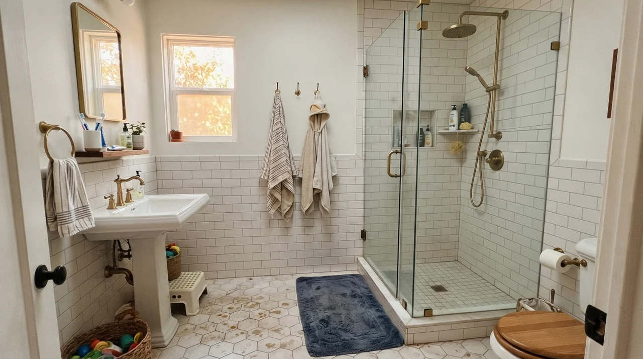
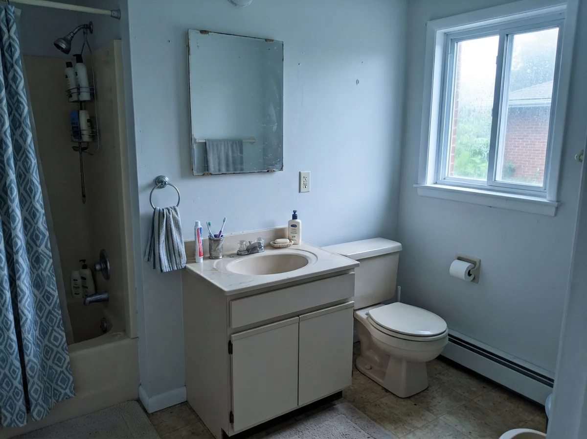
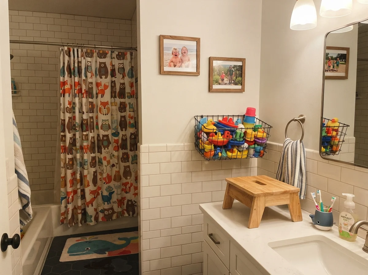
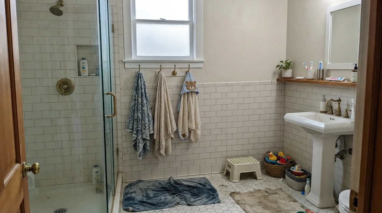
When you put Behr White 52 above a clean wainscot of classic tile, like in the family bath shown above, you see its best quality immediately: it steps back and lets clean lines do the talking. The Light Reflectance Value sits up at 83 on the official card—though in everyday use, because it lacks heavy brown or yellow tinting, it bounces back light with the brightness of an 88. That high reflectivity is a double-edged sword. If you give it good fixtures, bright porcelain, and a bit of warm metal, it reads sparkling, immaculate, and fresh. But strip those elements away, and you quickly discover how naked this paint actually is.
Most people shop for white paint looking for an emotion. They want a room to feel restful, historic, or wrapping. Behr White 52 gives you none of that. It is completely indifferent to your feelings. Its job is simply to bounce raw light back into the middle of the room. That makes it brilliant for specific utility jobs, but dangerous if you treat it like an all-over wall color without doing your homework first.
The Undertone Breakdown: A Color with Zero Defense
Because Behr White 52 has practically no heavy tint base to steady it, the wall changes its character entirely depending on the hour and the window exposure. It doesn't resist the light outside; it surrenders to it.
warm sun
overcast, north light
dusk, rain, cool bulbs
Under bright midday sun, the paint reflects garden greens; in flat northern daylight, it drops into cool office gray; under evening drizzle or cool bulbs, it takes on a chilly, cast-iron blue-gray.
Statement WhiteBehr · see diary
White SandSherwin-Williams · see diary
White52
Pure WhiteSherwin-Williams · see diary
SnowboundSherwin-Williams · see diary
How Daylight Dictates the Mood
Here is the fundamental rule about Behr White 52: whatever light enters the room is the color the wall becomes. In our last house, a 1990s colonial that had oversized windows throughout the bedrooms, I tested this on two walls in the guest wing. In the morning, when the dawn light was pale and cool, the room looked almost sterile—like a freshly opened envelope or a clean sheet of ledger paper. But come evening, with a 2700K lamp turned on beside the bed, the wall caught the glow and softened into something completely livable.
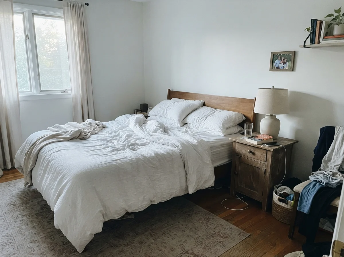
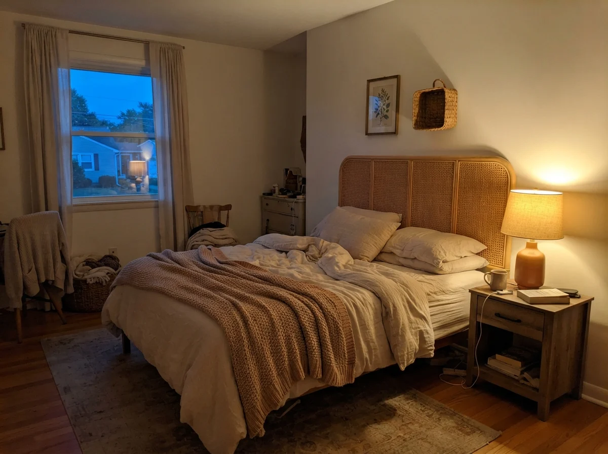
If you don't control the bulbs in the room, or if you count on this paint to create its own warmth, you will be sorely disappointed. Take a look at how drastically the same bedroom environment changes from morning to night.
Notice the difference? In the morning light, without an artificial bulb to intervene, the paint washes out to a chalky pale gray. There is no amber or biscuit undertone hiding in the formula to rescue it. In the evening, the rattan headboard and that single bedside lamp do all the heavy lifting. The paint simply reflects the warmth of the bulb. If you installed a 4000K or 5000K daylight LED in that lamp fixture, the room would immediately look like an emergency room triage bay. You have to be deliberate about the lighting hardware you bring into the space.
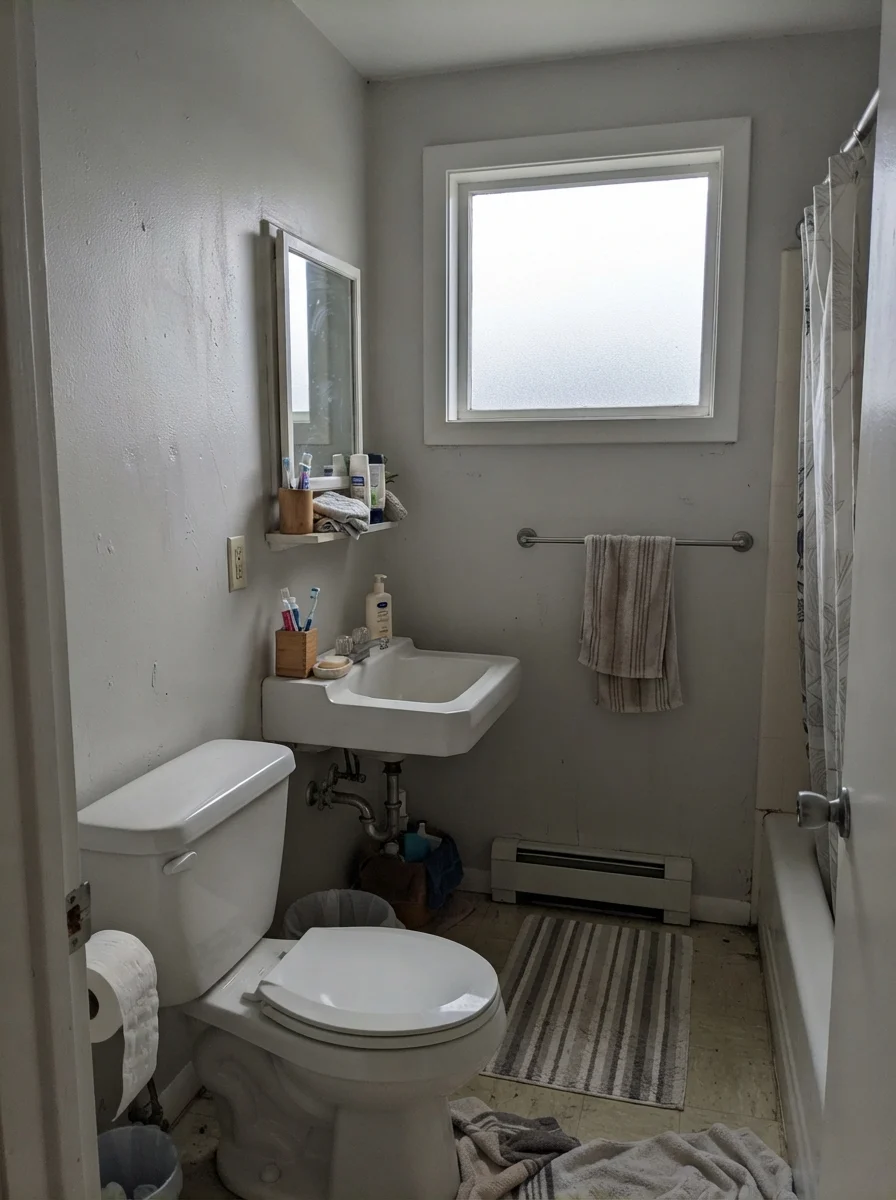
Where people get into real trouble is in secondary bathrooms and powder rooms that don't get direct southern exposure. On a gray November morning, or in a room with a small north-facing frosted window, this paint will break your heart if you were expecting a buttery cottage retreat.
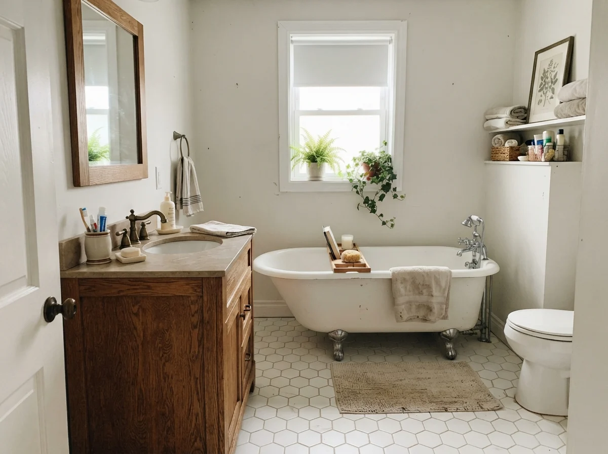
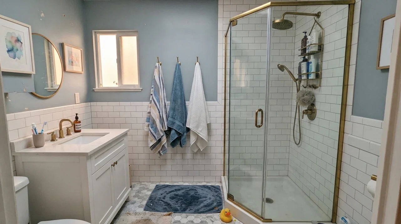
Look closely at that modest bathroom on the right. When you put a high-reflectance, pigment-sparse white like Behr 52 next to an older beige vanity or dated ceramic fixtures, the paint doesn't harmonize with them. It exposes them. It reads cold and sharp, which makes the older beige fixtures look tired and dingy by comparison. This is one of the costliest mistakes homeowners make when refreshing a dated home before listing it: they pick the brightest plain white on the shelf thinking it will make an old bathroom feel brand-new, and instead it makes the tub and vanity look like they need replacing.
When we sold the split-level, my buyer’s agent walked through our upstairs hall bath and told me point-blank to paint the vanity cabinet or change the wall color. I had used a leftover can of plain white on the walls, and the cultured marble sink suddenly looked yellowed and grimy. I ended up repainting the walls in a soft, slightly warm greige over the weekend just to calm the room down. Lesson learned.
Bedrooms and Quiet Corners: Letting Texture Do the Talking
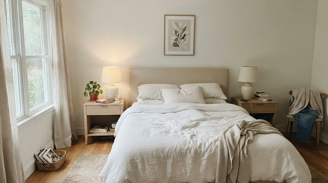
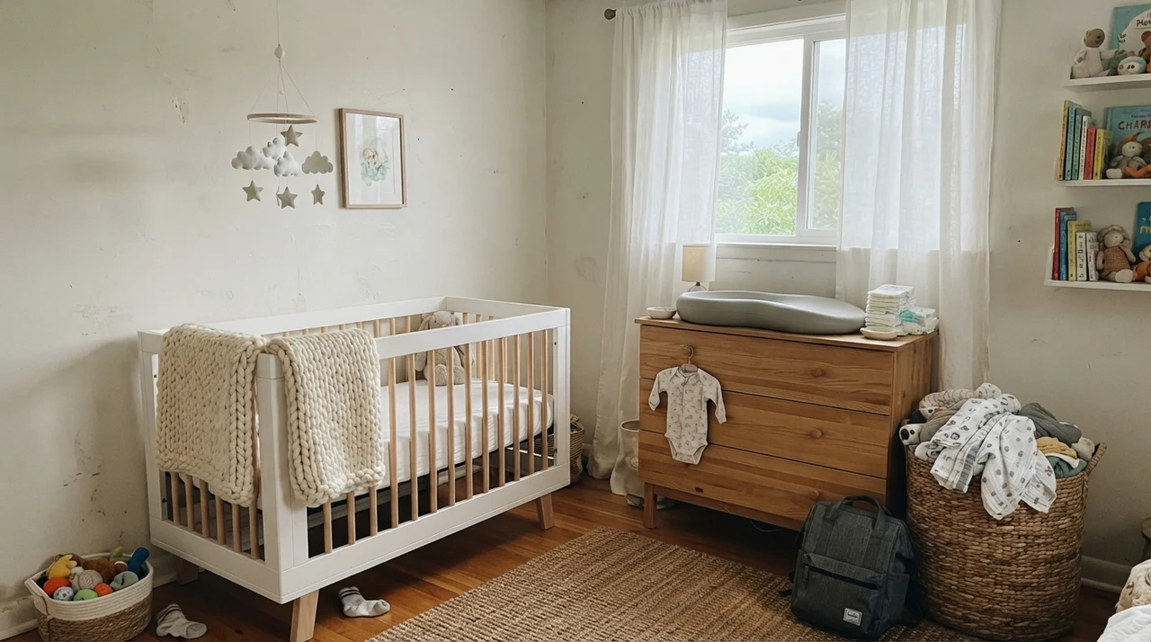
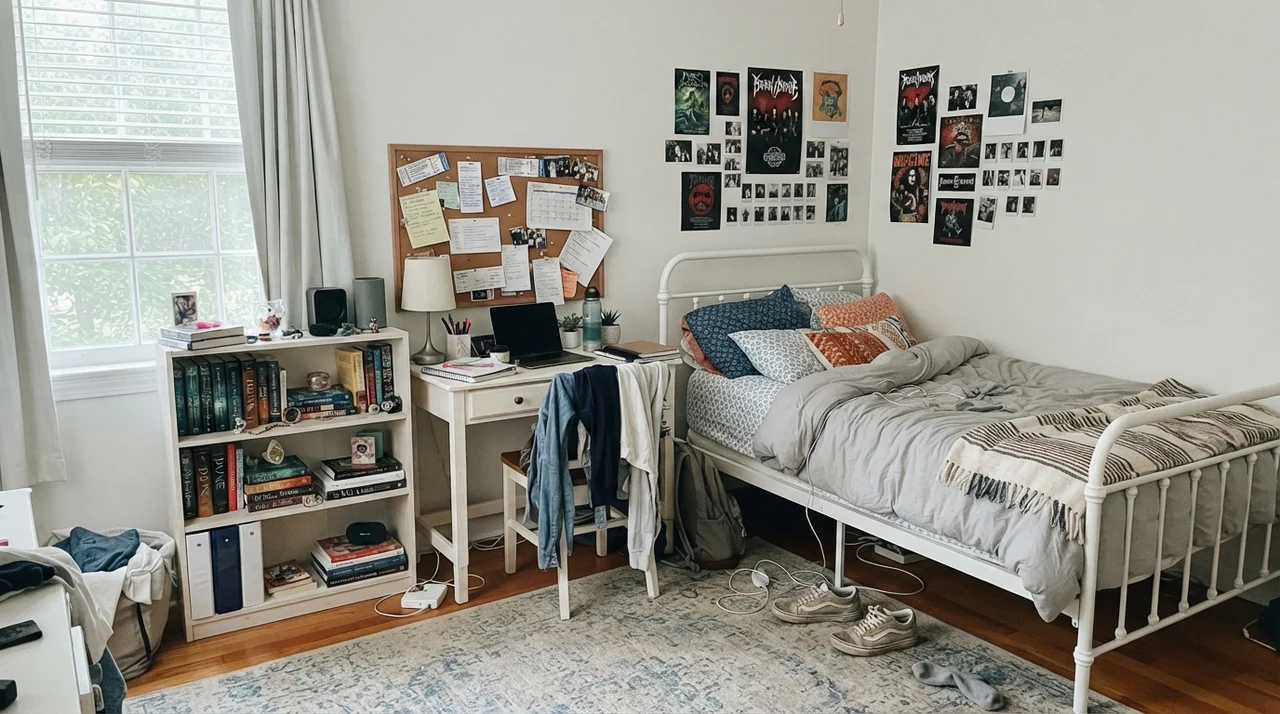
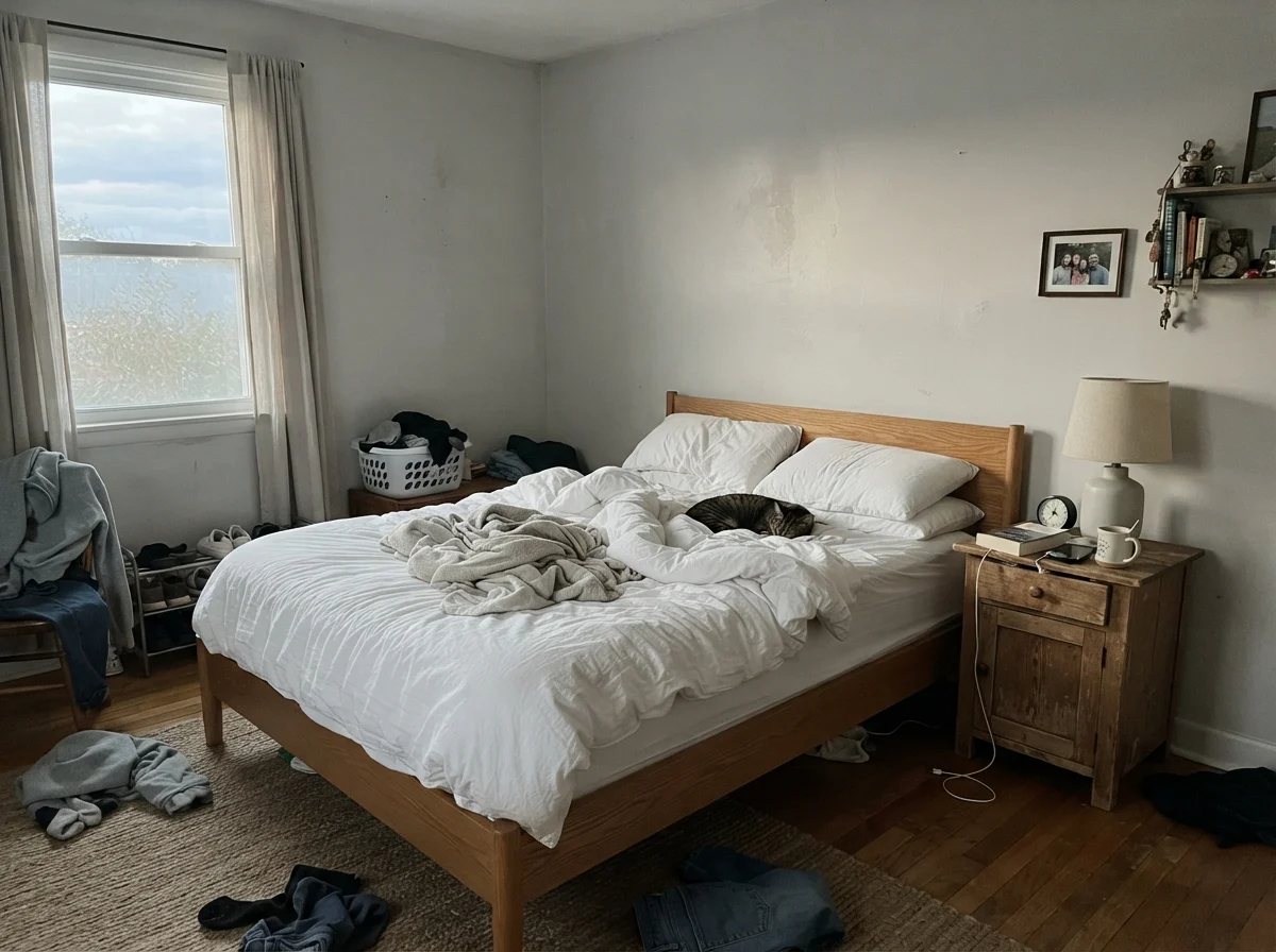
Can you use Behr White 52 in a bedroom successfully? Yes, but only if you understand that the walls cannot carry the room by themselves. If you want white walls in a main bedroom, a nursery, or a child’s room, every bit of character has to come from what you put inside the room: wood grains, knitted blankets, books, and woven textures. The paint provides a clean background canvas, nothing more.
In the main bedroom shown above, the room works because the pale oak nightstands and the natural linen bedding introduce tactile warmth. In the nursery, the light-wood dresser and muslin textures do the exact same thing. The teen room is perhaps the most realistic demonstration of all: paired with open shelves, a corkboard, and an ordinary white metal bed frame, the paint feels neat and sensible. It doesn't distract. Five years in, when the posters come down or the furniture shifts, you aren’t trapped by a wall tint that refuses to cooperate with a new duvet cover.
However, we need to address the biggest failure point of this paint: wide living spaces with expansive outdoor views.
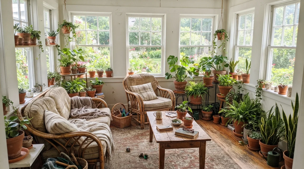
Look at what happens in that sunroom. When you place Behr White 52 right next to garden windows, it acts like a mirror. Because it has so little pigment body to anchor it, the sunlight hits the green lawn, bounces off the rhododendrons and maples outside, and shoots right onto your drywall. By two o'clock on a July afternoon, the walls will genuinely take on a pale, watery greenish tint. I’ve seen homeowners drive themselves crazy thinking their drywall contractor used bad compound or that the painter skimped on coats. The paint isn't defective; it's simply reflecting the grass outside because there is nothing in the can to fight back.
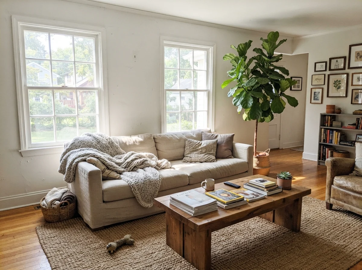
In the main living room, south-facing sun at midday can turn walls painted in this color into a glaring expanse. You find yourself squinting while reading a magazine on the couch. Unless you have a warm jute rug, heavy linen upholstery, and plenty of wood furniture to soak up the glare, Behr 52 is not worth the money for primary living rooms. You are much better off spending twenty dollars more for a gallon with a touch of creamy umber or beige pigment built in.
Behr White 52 is not a decorating color; it is a workhorse. It doesn't hold your hand, it doesn't add cozy ambiance, and it has almost zero pigment to protect itself from whatever light or reflection hits the drywall.
Cabinets, Islands, and Millwork
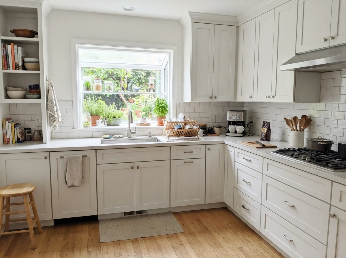
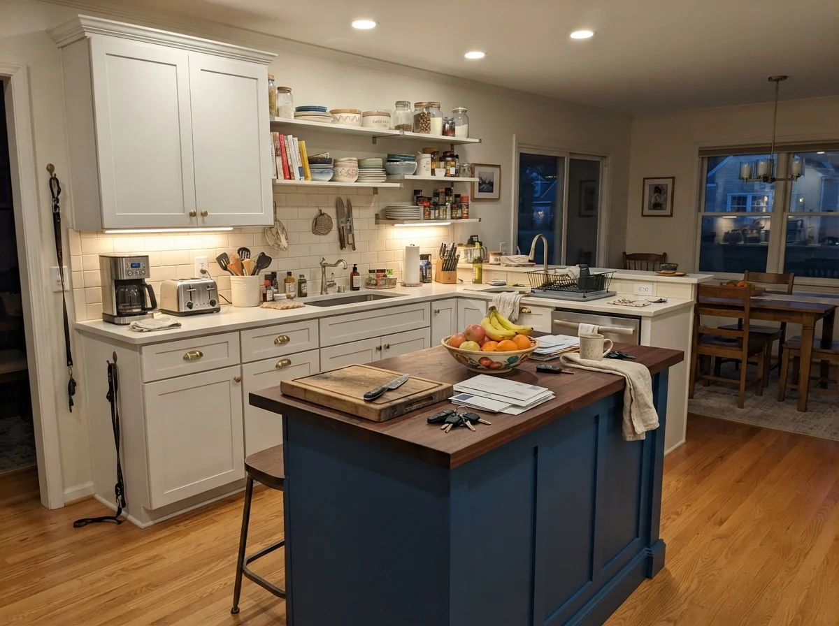
Where Behr White 52 truly earns its keep is on hard surfaces: cabinetry, trim, and doors. In a kitchen, when you paint shaker cabinets in a durable satin enamel, it delivers a sharp, clean architectural white that avoids yellowing or looking dated within a few seasons.
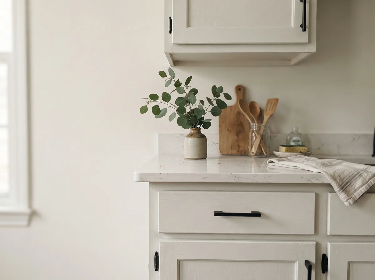
When paired with quartz counters and simple matte black hardware, as seen in the close-up, Behr 52 looks tailored and completely timeless. It doesn't pretend to be antique farmhouse milk paint, nor does it look like high-gloss commercial acrylic. It just reads as crisp, well-maintained woodwork.
In the island setup above, painting just the central workstation in this clean white against warmer cream perimeter walls keeps the kitchen anchored without feeling heavy. It cleans up nicely, wipes down after meal prep without dulling, and gives you a dependable contrast point against everyday kitchen clutter.
Utility Spaces, Bathrooms, and Architectural Details
If you ask me where this paint belongs in ninety percent of American homes, my answer is simple: ceilings, small utility bathrooms, laundry rooms, and interior doors. These are rooms where color only gets in the way. You don’t need an artistic vision when you’re folding laundry on a Tuesday night or bathing toddlers with a plastic basket of bath toys.
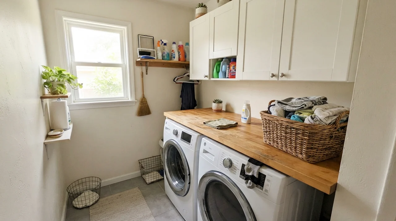
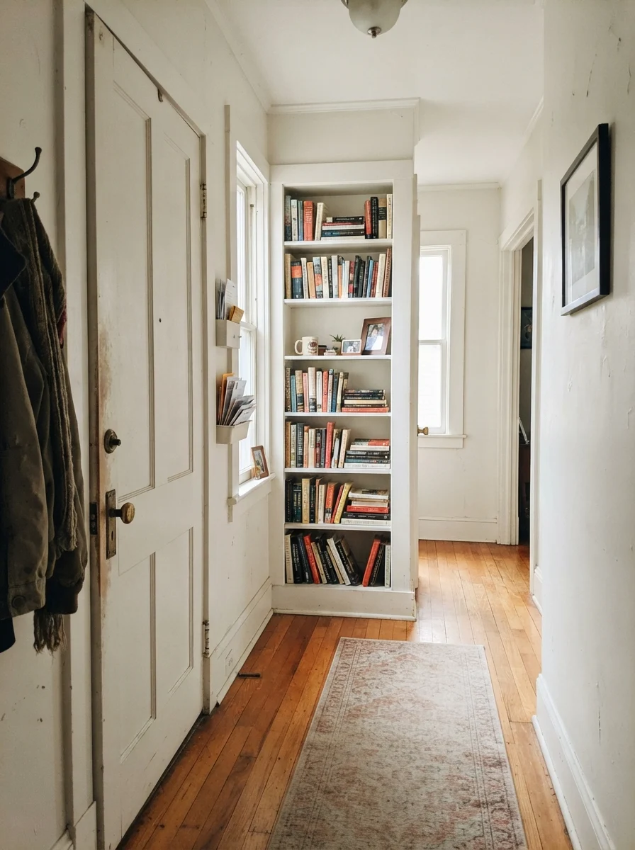
Look at that laundry room. You have white cabinets, white appliances, and a butcher-block counter over the machines. In a tight space like that, using an LRV 83 white makes the ceiling feel six inches taller and throws light directly onto the sorting counter. It feels sanitary and orderly. The same goes for the two-panel door and built-in bookshelf: putting Behr White semi-gloss on the trim against a soft cream wall provides immediate, clean definition. The brass hardware stands out beautifully.
Now, let's look at what happens when you ignore the warnings and put this paint in a space where it has no right to be.
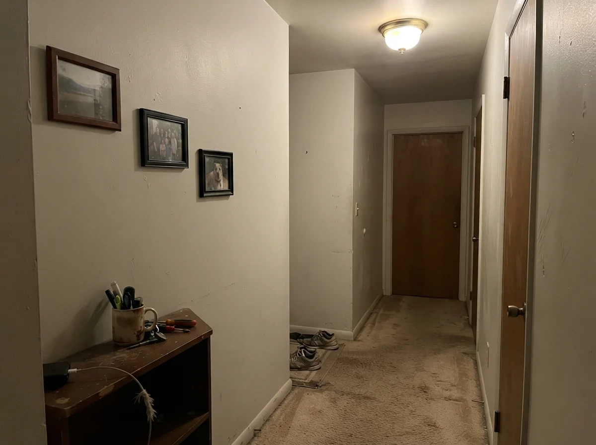
This is the honest reality that color swatches will never show you. Take a windowless corner, carpet it in builder beige, light it with a single dull ceiling bulb, and Behr White 52 turns into wet putty. It doesn't look white at all. It looks like dirty gray primer that someone forgot to finish with a topcoat. The framed photos look stranded, the beige carpet looks yellowed, and the entire corner feels depressing.
Why does this happen? Because there is no natural daylight to energize the white, and no warm pigments in the paint can to create its own light. When a paint has no pigment to hold its ground, it simply reflects the shadows. If your hallway or entry looks like this, do not buy Behr White. Buy a color that has some backbone—a gentle greige or a tinted warm ivory that knows how to exist in low light.
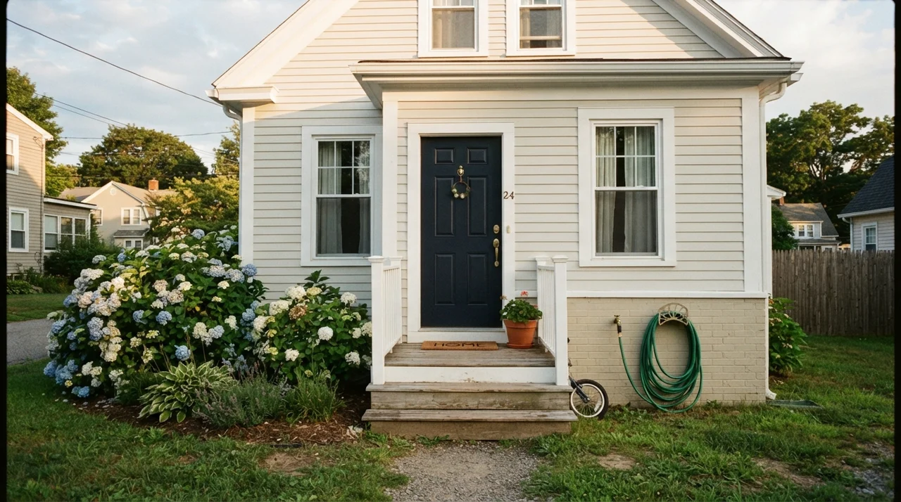
On an exterior, as you see on that horizontal siding, the midday sun washes out any subtle nuances anyway, so a straight, clean white like number 52 holds up with classic dignity. Paired with dark navy on the door and green hydrangeas out front, it looks tailored and clean from the street curb. And in my own kitchen, surrounded by wood cutting boards, stone sinks, and the daily clutter of vegetable prep, it keeps the background simple and bright.
Durability, Scrubbing, and the Touch-Up Question
Here is what five years in with Behr White 52 actually looks like. Because it is so bright, every smudge, dog nose print, and muddy boot mark by the back door is on full display. You cannot hide behind this paint. In our 1970s split-level, the hallway by the garage entry took a beating. The good news is that in an eggshell or satin finish, standard Behr scrubbed clean easily with warm water and a drop of dish soap. It holds up well against repeated washing.
The bad news? Touch-ups are an absolute nightmare. Because of the high reflectance and the minimal pigment body, any touch-up you make with a brush three years later will flash like a beacon when raking light hits the wall. You will see the exact circle of the brush stroke from down the hall. If you get a heavy ding on an open drywall expanse, don't fool yourself into thinking you can dab it with a foam brush. You will have to roll the whole wall corner to corner. On the flip side, because 52 is Behr’s stock white formula, you can drive to any Home Depot five years later, hand them the code, and walk out with an exact color match off the computer. That kind of shelf longevity is worth something when you're managing a busy household on a budget.
Can I use Behr White 52 on all the ceilings in my house?
Yes. In fact, flat Behr White 52 is one of the best plain ceiling paints you can buy at Home Depot. Because it has virtually no undertone to fight your wall colors, it reads clean and high overhead without turning blue like some dedicated ceiling whites.
What sheen should I choose for high-traffic hallway walls?
Stick to eggshell. Flat shows every fingerprint and cannot be scrubbed clean without marring, while satin will highlight every taped drywall seam and roller bump down the length of the hall.
Will Behr White 52 make my small powder room look bigger?
Only if you have bright, warm lighting. If the powder room has no window and a dim yellow bulb, 52 will drop into a shadowy, dingy gray. Use 2700K bulbs and clean white porcelain to keep it sparkling.
How does Behr White 52 handle touch-ups after a few years?
Poorly on open walls. A white this bright shows sheen flashing instantly under raking daylight. For small dings, feathering rarely works; plan on rolling the entire section from corner to baseboard.
Susan's Verdict · Buy it for the utility, not the romance
Behr White 52 is not worth the money if you expect it to magically make a dark, north-facing living room feel cozy—it will look cold, gray, and completely blank. But for ceilings in every room of the house, basement stairwells, laundry rooms, modern shaker cabinets, and clean semi-gloss trim, it is an unbeatable, budget-friendly workhorse that has earned its spot in my garage for thirty years.