Color Diary · No. 69
Behr Creamy Mushroom and the Line Between Real Taupe and Dusky Pink
Behr's most-asked-about taupe, reviewed honestly: the rooms where it looks expensive, the light that turns it pink, and what to buy instead.

Susan HartleyOctober 8, 2026 · 15 min read
Creamy Mushroom · Behr PPU5-13
Hex#CABDAFLRV52Undertonestaupe → warm red-gray → dusky rose
In our second house—a drafty 1990s colonial with honey oak floorboards everywhere you stepped—I spent four months hunting for a neutral that felt substantial. Everything the magazines recommended at the time was either a bone-white that made our trim look yellow, or a cool cement gray that fought the warm woodwork so violently the whole downstairs felt like an argument. I wanted a wall color with actual weight. Something that felt grounded the second you walked through the door.
That was my first real lesson in what happens when you cross into true taupe territory. Behr Creamy Mushroom (PPU5-13) is precisely that kind of color. At a Light Reflectance Value of 52, it sits firmly in the middle of the deck. It is not an off-white, and it is certainly not a pale whisper of greige designed to disappear behind artwork. It is a deliberate, warm, earthy taupe that makes an immediate statement: somebody chose this wall on purpose.
When you get it right, Creamy Mushroom looks remarkably expensive. It flatters natural stone, wraps around warm oak trim like it was made for it, and gives a dining room or primary bedroom a quiet, enveloping dignity. But five years in, after watching how mid-tone pigments respond to changing seasons and shifting light bulbs, I can tell you that Creamy Mushroom comes with one non-negotiable catch: its red base.
Understanding the LRV and the Underlying Red Base
To understand whether Creamy Mushroom will hold up in your house, you have to look at the numbers and the tinting formula. An LRV of 52 means this paint reflects just barely over half the light that hits it. That is heavy enough to absorb shadow, which is why it provides such cozy depth in rooms with ample daylight, but it also means it will not do any heavy lifting to brighten a dark hallway or a windowless laundry room.
More importantly, the warmth in Creamy Mushroom comes from red and brown iron oxides rather than yellow ochre. In balanced light, that red undertone is what keeps the paint from turning into dull, muddy sludge; it gives the taupe its creamy, velvety warmth. But the moment warm direct sunlight or low-kelvin incandescent bulbs hit a broad expanse of wall, that red pigment wakes up. If you are not prepared for it, a room you expected to look like weathered stone can drift straight into a dusky, pinkish-mauve.
How Daylight Dictates the Shift
Over thirty years of painting rooms across three different houses, I have learned never to trust a color swatch until I have seen it at 8:00 AM, 2:00 PM, and 9:00 PM under artificial light. Creamy Mushroom behaves differently in every compass orientation:
- North-facing rooms: Cool, indirect northern light neutralizes the red warmth. Here, the color behaves like a sophisticated, grayed taupe. As long as the window is large enough to keep the LRV 52 from feeling dingy, northern exposure shows Creamy Mushroom at its most tailored and modern.
- South-facing rooms: Midday and late-afternoon sun pours heat directly onto the wall. This is the danger zone where the red undertone gets pulled right to the front. On a large wall, it can read as a soft, fleshy rose. If you hate pink, do not put this color in a south-facing room without testing a wide swatch first.
- East and west exposures: In east-facing rooms, you get a lovely warm glow with morning coffee that settles into a neutral stone by afternoon. In west-facing rooms, it stays quiet all morning, then flares into a warm, rosy blush as the sun drops toward the horizon.
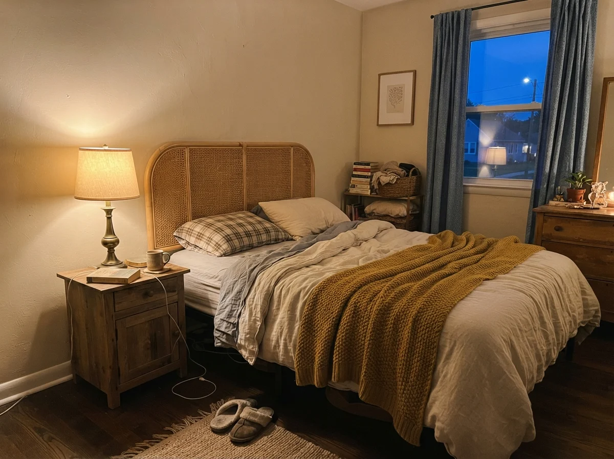
- Evening artificial light: Standard 2700K warm incandescent or LED bulbs exaggerate the rosy side of the paint. If you find your walls looking too pink after dinner, swap your bulbs to a clean 3500K; that simple change often corrects the color without requiring a single brush stroke.
Living with Creamy Mushroom in Everyday Bathrooms
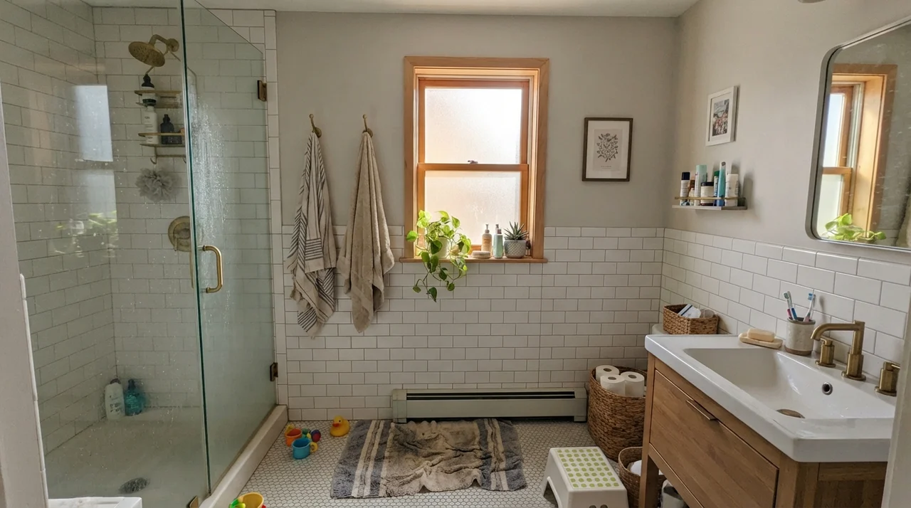
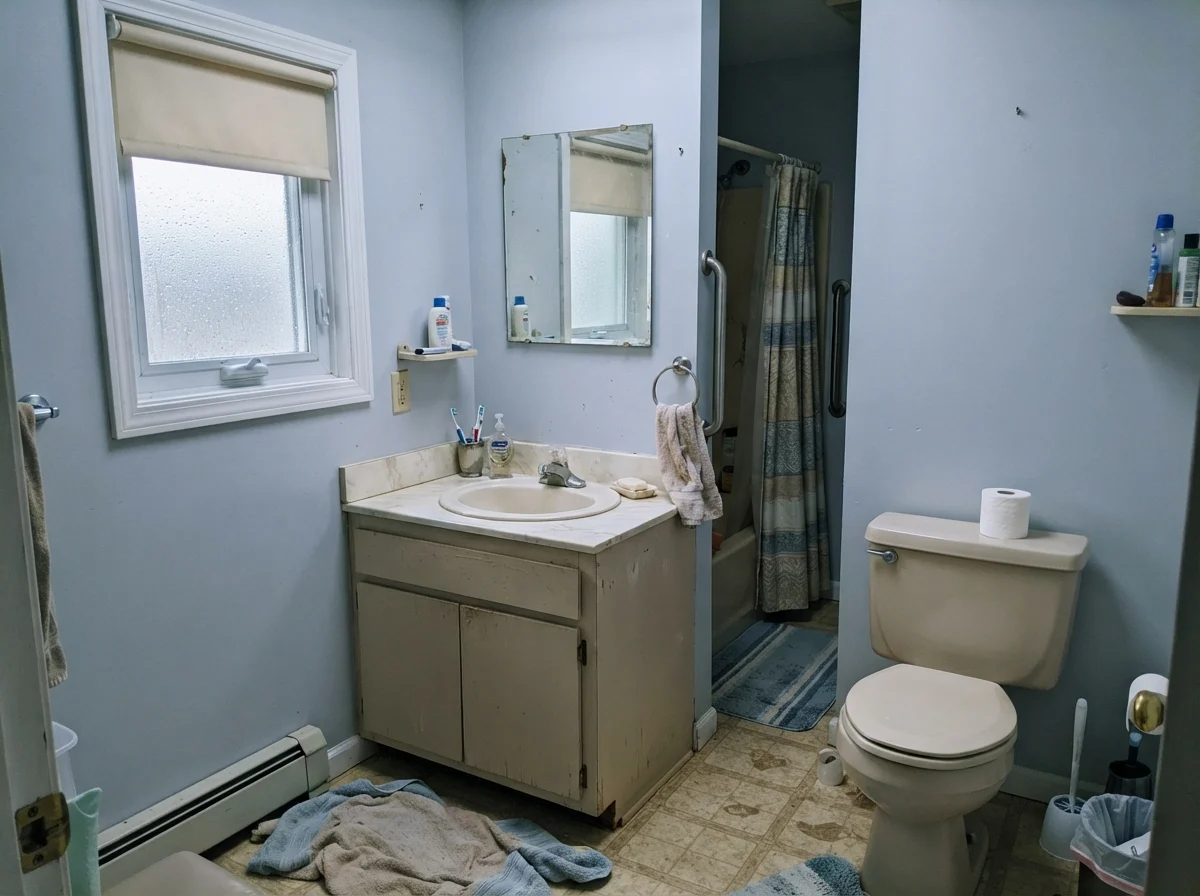
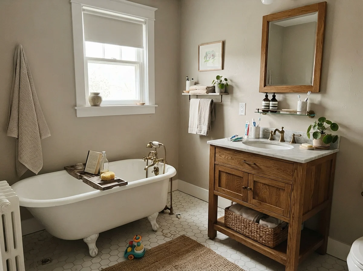
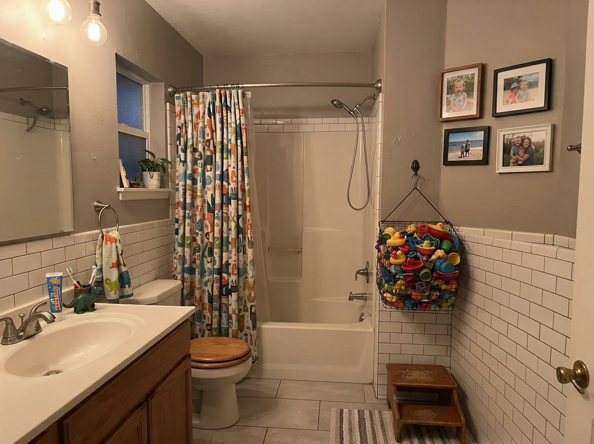
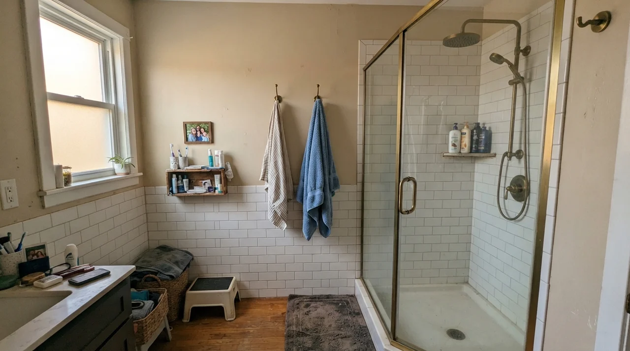
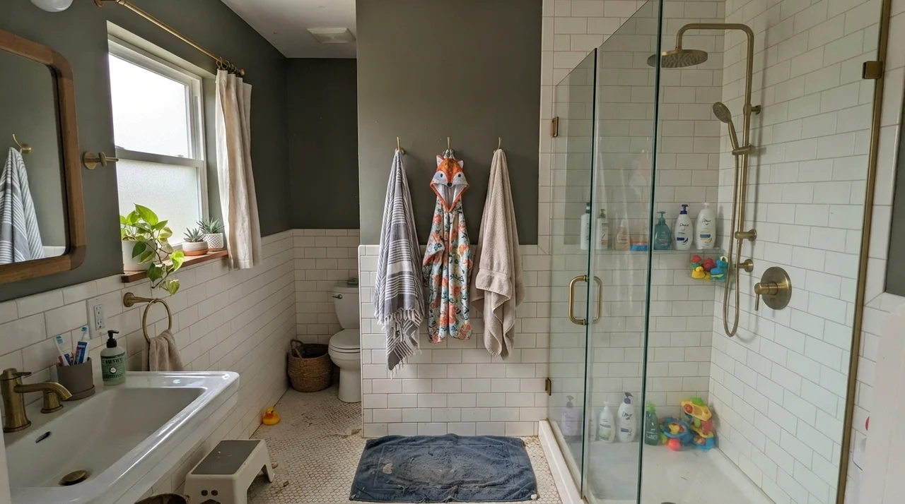
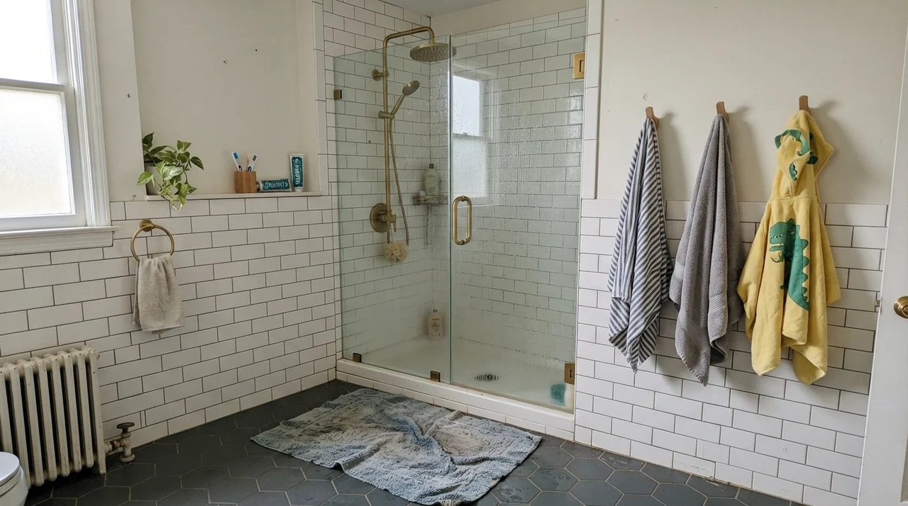
Bathrooms are notorious stress tests for mid-tone neutrals. Between bright vanity lighting, steamy showers, and hard tile surfaces, a paint color has nowhere to hide. Creamy Mushroom can be a stunning alternative to stark white in a bathroom, provided you balance it with clean white tile or warm wood fixtures.
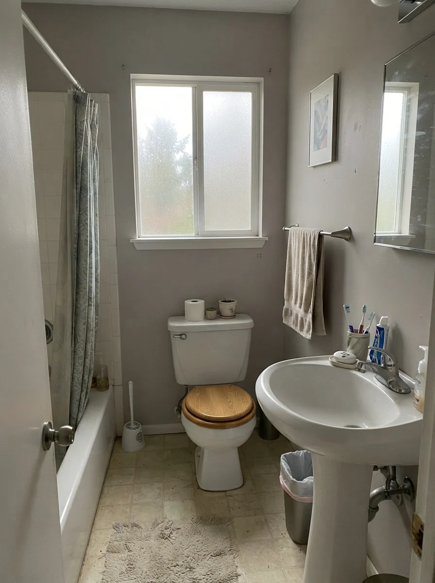
In a cottage bathroom with classic fixtures, the depth of this taupe creates a lovely historic warmth that clinical whites simply cannot deliver. However, in small, dated bathrooms with limited natural light or flat overcast skies, that same depth can lean heavy and slate-gray. It needs crisp contrasts—like bright white porcelain, subway wainscoting, or clear glass—to keep the room feeling fresh rather than tired.
Bedrooms, Nurseries, and Calm Retreats
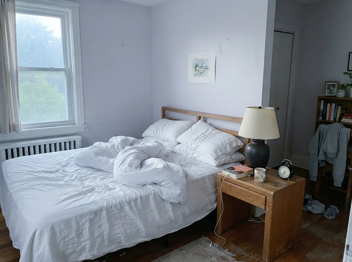
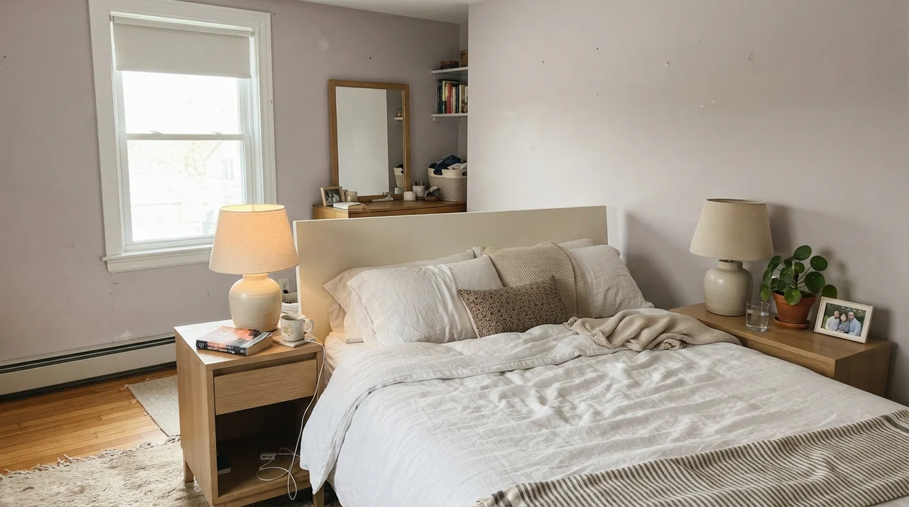
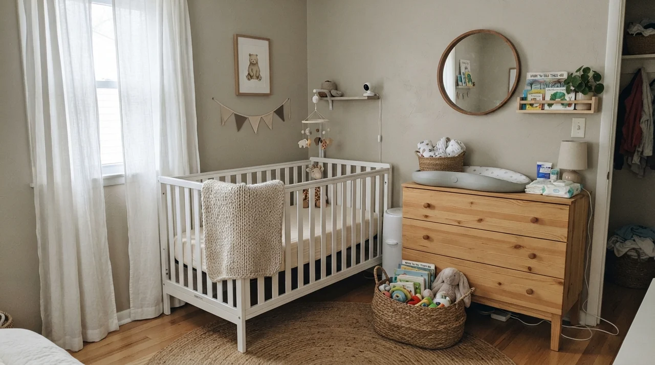
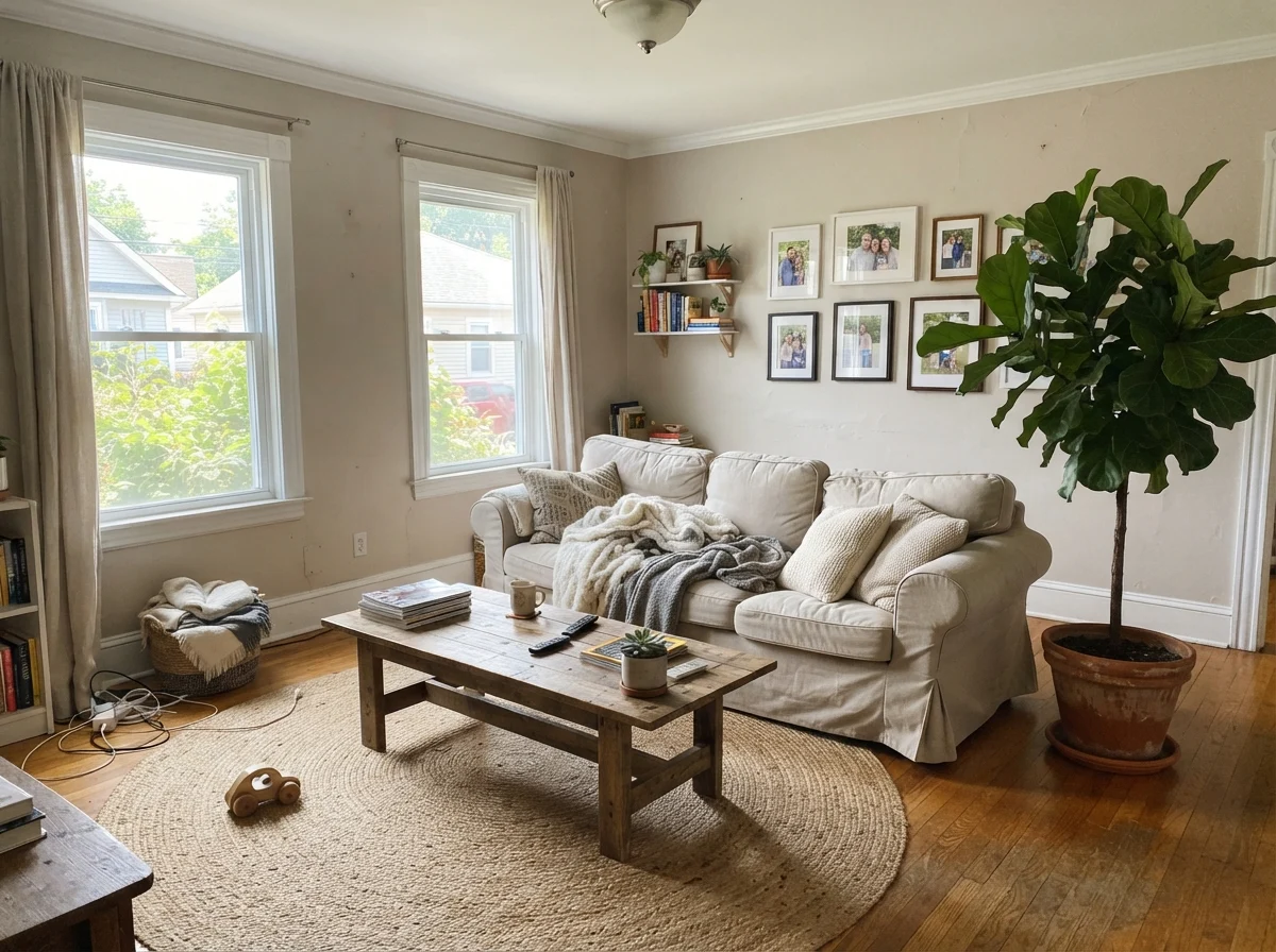
Where Creamy Mushroom truly earns its keep is in spaces designed for quiet relaxation. If you have lived with stark white or icy gray bedrooms, you know how cold they can feel in the winter months. Creamy Mushroom wraps a bedroom in visual warmth without plunging the space into darkness.
In our current 1960s ranch, I used a similar mid-tone taupe in a guest bedroom that receives generous side-window light throughout the day. It provides just enough contrast to make crisp white linen bedding and pale oak furniture pop. In children's rooms and nurseries, it serves as an enduring neutral backdrop that grows gracefully with the child, never looking dated within a couple of years the way trendy pastel shades often do.
Taupe is not an off-white pretending to be subtle. It is a commitment to depth, and it demands real daylight to back it up.
Kitchens, Woodwork, and Architectural Accents
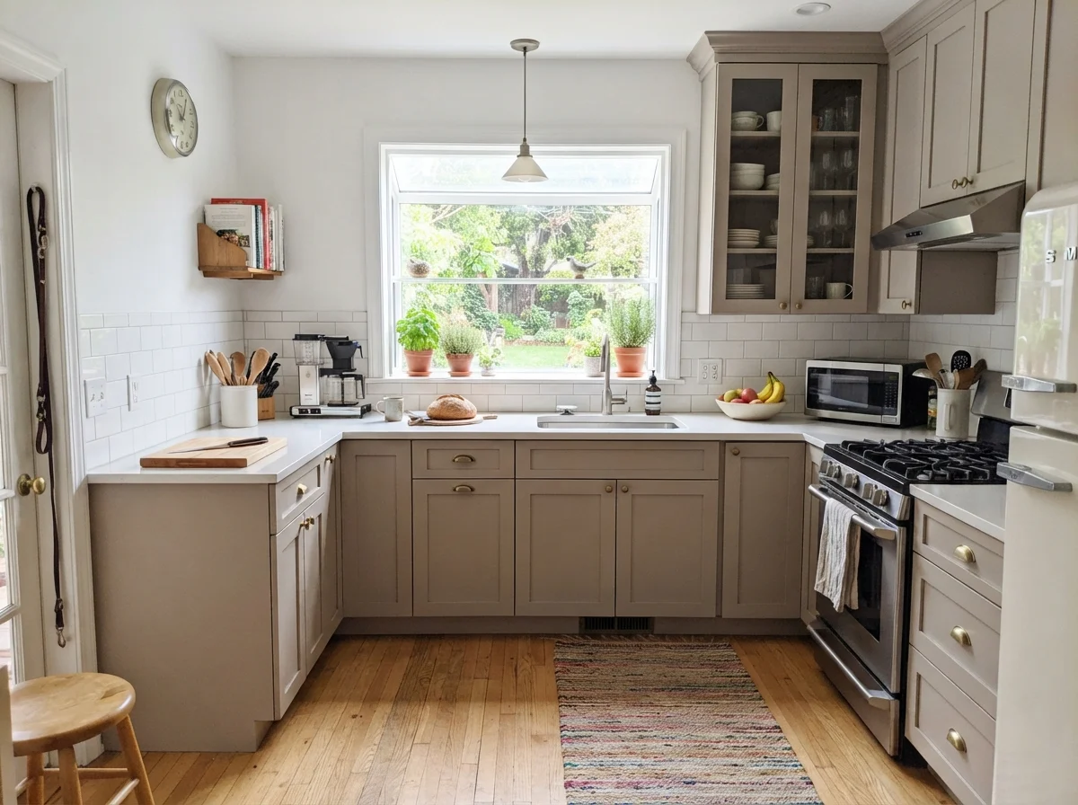
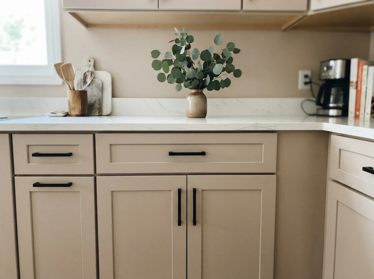
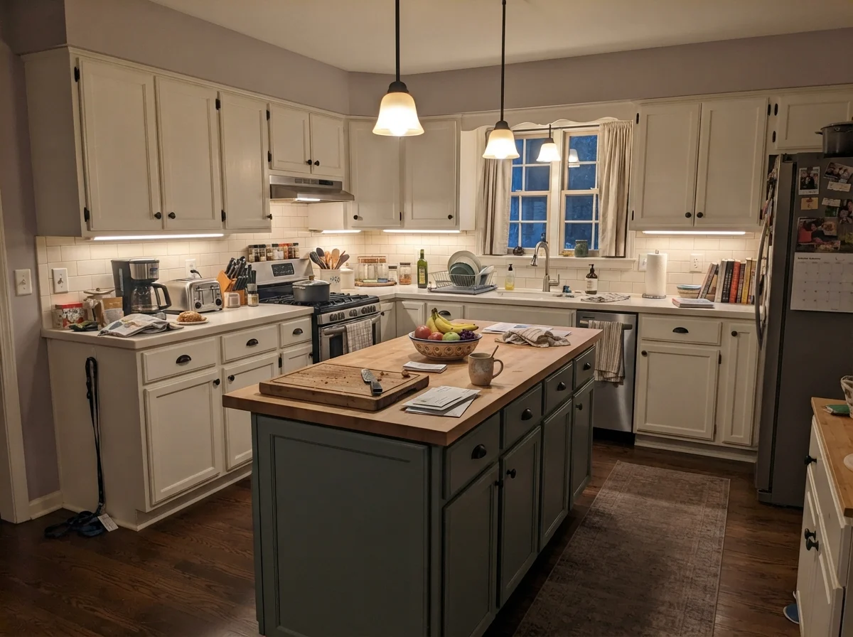
If you are tired of sterile all-white kitchens but hesitate to jump into bold jewel tones, painting cabinetry in Creamy Mushroom in a durable satin finish is one of the smartest design moves you can make. It delivers that tailored, bespoke look without feeling trendy. Because it has enough brown in its base, it pairs effortlessly with quartz counters, white subway tile backsplashes, and warm hardwood floors.
When we sold our last house, our real estate agent specifically pointed out the kitchen island accent as a major selling point. Painting just an island or a single interior door in this shade creates architectural focus without overwhelming the room. It anchors the perimeter white cabinetry and adds immediate warmth.
Large Living Areas, Sunrooms, and Utility Spaces
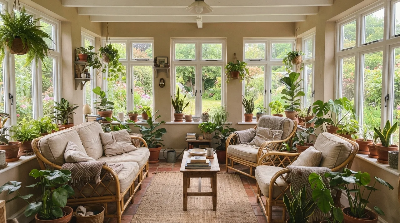
In wide-open living rooms and sunrooms with tall windows, lighter neutrals often wash out, leaving big drywall spans looking thin and unfinished. Creamy Mushroom excels here because its LRV 52 holds up against intense natural light. Direct sunlight actually flattens out the pinkness in broad open spaces, leaving behind a handsome, sandy stone color that makes natural materials—like jute rugs, leather seating, and rattan—feel right at home.
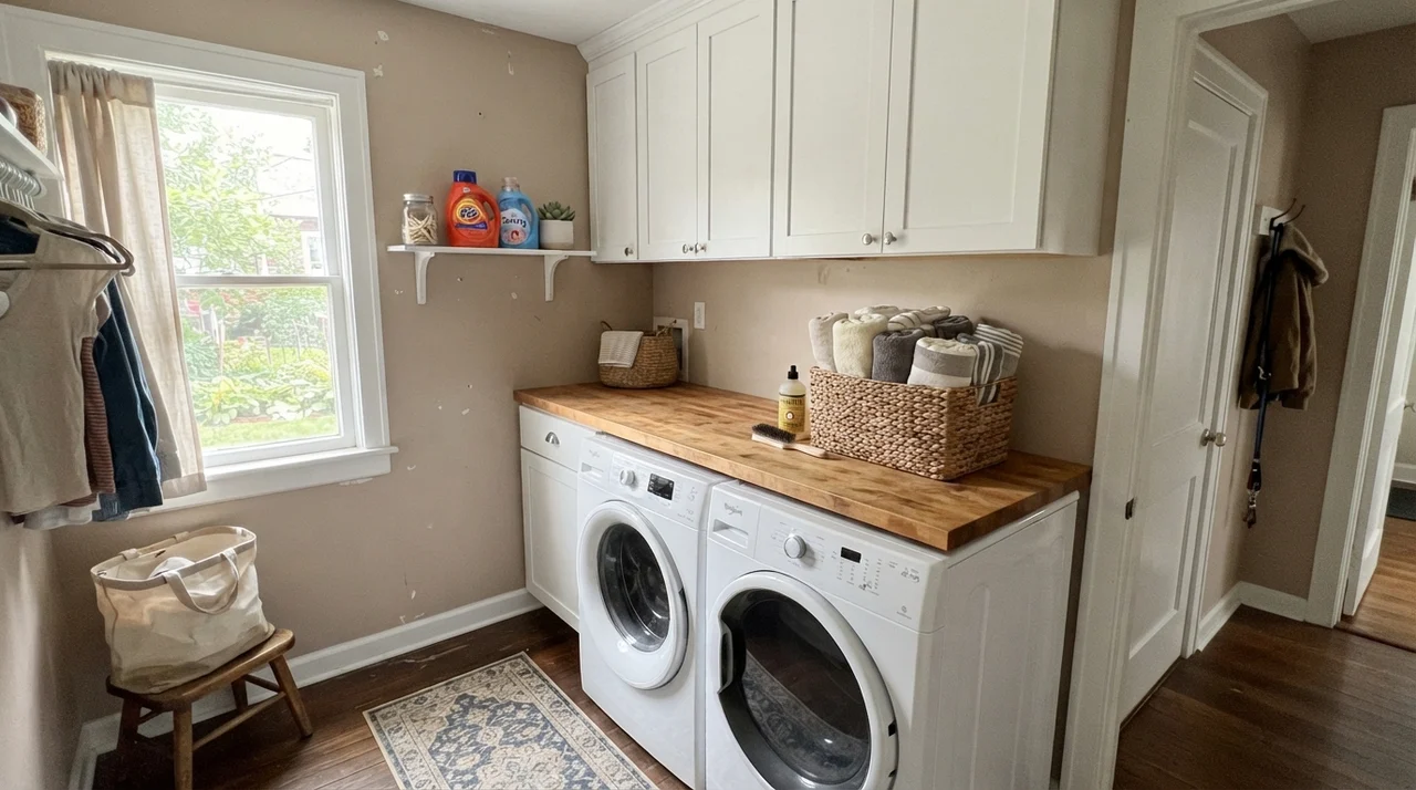
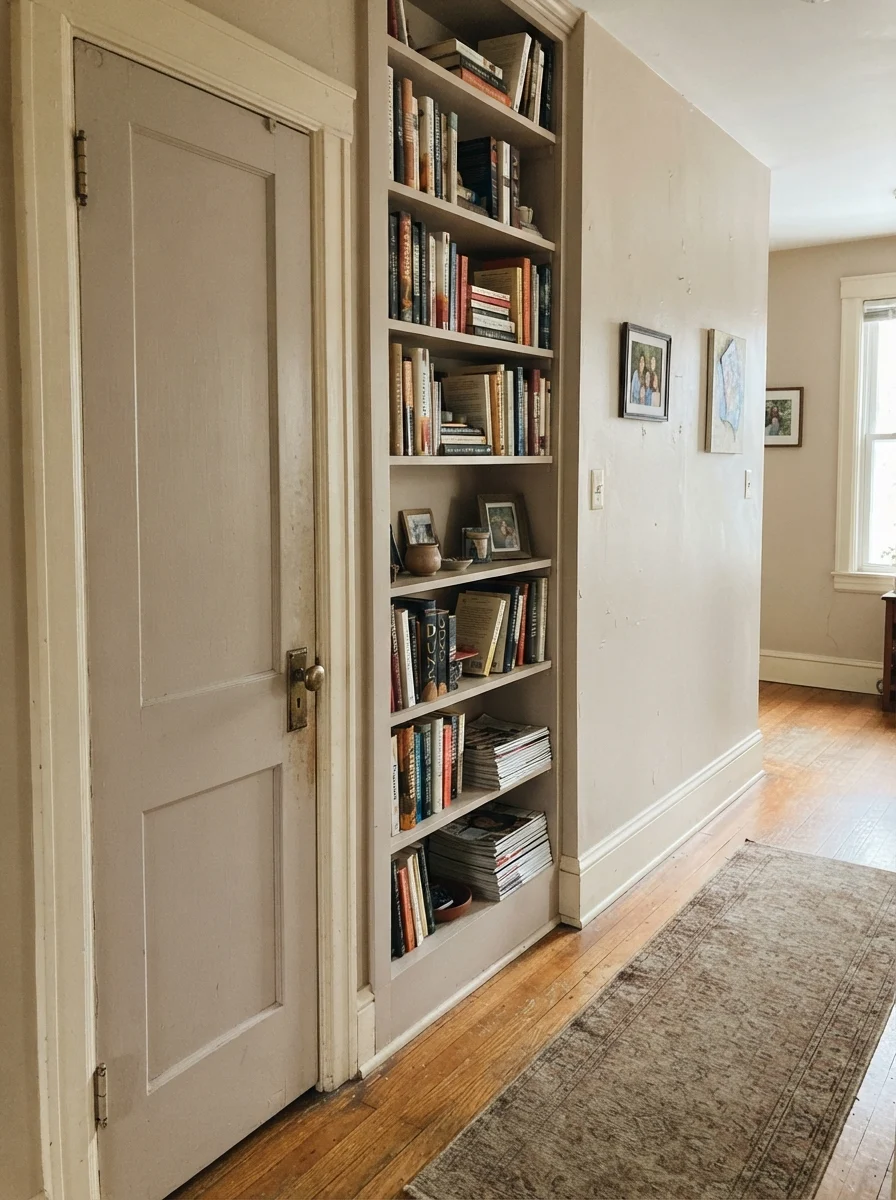
In utility areas like laundry rooms and connecting hallways, using Creamy Mushroom on walls or architectural built-ins creates continuity throughout the house. A bright laundry room with clean white appliances and butcher-block counters feels intentional and grounded when wrapped in this warm tone.
The Honest Fail: Where Creamy Mushroom Falls Apart
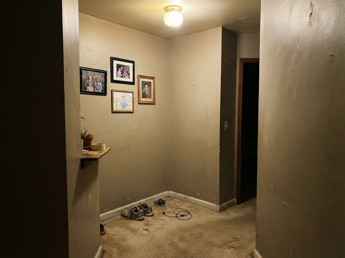
The bad stories about this color are almost always centered around the exact same mistake: putting it into a small, dim space that lacks natural daylight. When you take an LRV 52 paint that relies on warm red undertones and trap it in a windowless interior hallway or a low-ceiling basement under a single overhead bulb, the warmth suffocates. It does not look cozy; it looks like damp putty.
Similarly, if your home features cool gray luxury vinyl plank (LVP) flooring or cold blue-white trim, Creamy Mushroom will fight those cool tones relentlessly. The stark temperature clash pushes the red right out of the taupe, leaving your walls looking like dusty 1980s mauve. If your permanent finishes are cool gray, step away from this can.
Exterior Performance: Siding and Curb Appeal
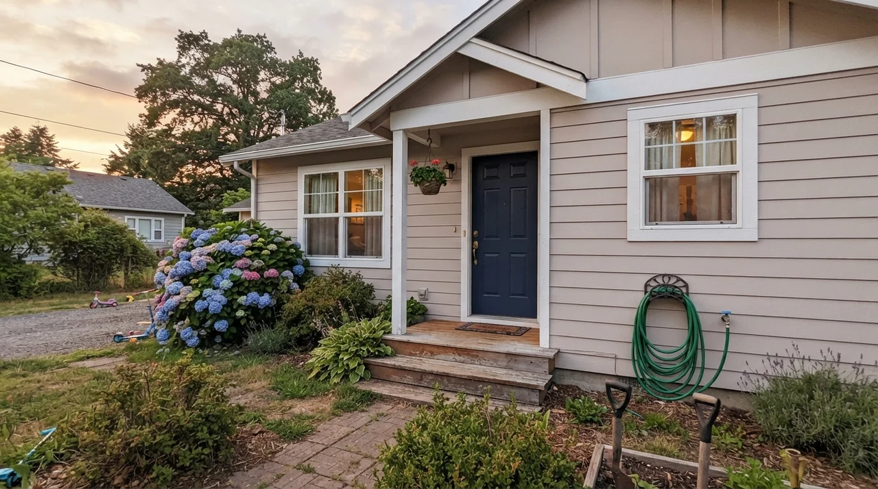
Outside the house, paint behaves very differently than it does indoors. Full outdoor sunlight washes out pigment significantly, effectively raising how light a paint appears by 10 to 15 percent. On exterior siding, Creamy Mushroom looks remarkably balanced. The harsh outdoor sun burns off the pink risk, turning the siding into a classic, stately warm stone.
When paired with crisp white exterior trim and a deep, grounding accent—like a rich navy or dark charcoal front door—it gives a traditional or split-level home timeless curb appeal that will not look dated within a few seasons.
Durability, Scrubbing, and Sheen Decisions
Let's talk about the practical reality of living with this color five years in. In high-traffic zones like hallways, entryways, and stairwells, mid-tone colors like Creamy Mushroom are wonderful for hiding superficial scuffs, shoe marks, and family handprints that make pure white walls look instantly grubby.
However, your choice of sheen is critical. Never use flat sheen Behr in a busy hallway. Flat paint in a mid-tone taupe will burnish—meaning it develops permanent shiny, polished patches—the second you scrub it clean with a damp microfiber cloth. For everyday living, follow this exact sheen formula:
- Walls: Eggshell (gives enough wipeability without creating distracting glare across wide drywall spans).
- Trim & Doors: Semi-Gloss (provides hard-wearing protection that resists chipping from vacuum cleaners).
- Cabinets & High-Traffic Trim: Satin (smooth, durable, and easily wiped down around handles).
Budget Reality: Where to Spend and Where to Save
When you are doing a whole-house repaint or updating a dated room, paint budget decisions matter. Behr's premium lines at Home Depot are genuinely worth the money for wall coverage—their hide and pigment density in mid-tones like Creamy Mushroom easily rival high-end designer brands at nearly half the cost per gallon.
However, if you are hiring a professional painting crew who exclusively sprays Benjamin Moore products, you do not need to fight them to use a big-box brand. Benjamin Moore Hampshire Taupe (990) shares the exact same color hex profile and an identical LRV (51 versus 52). You can have your painter use their preferred professional can and get the exact same look on your walls.
Why does Behr Creamy Mushroom look pink on my walls?
Creamy Mushroom is tinted with red and brown iron oxides. Strong south-facing sunlight, late afternoon western light, or warm 2700K bulbs pull that red forward. If you have cool gray floors, the contrast will make the pink even more noticeable.
What sheen should I choose for high-traffic hallways in Creamy Mushroom?
Use a satin sheen. At LRV 52, flat or matte paints will burnish and leave shiny marks when scrubbed clean. Satin gives you the durability and wipeability needed for busy corridors.
Can I use Creamy Mushroom on my kitchen cabinets?
Yes, absolutely. In a satin finish, it serves as a sophisticated, grounded alternative to white. It pairs beautifully with quartz countertops, warm oak floors, and brass hardware.
Will Creamy Mushroom make a small room look smaller?
With an LRV of 52, it reflects only half the available light. In a small room with ample window daylight, it creates a cozy, enveloping atmosphere. In a windowless or poorly lit room, however, it will feel heavy and muddy.
Susan's Verdict · Worth It for Sunlit, Wood-Filled Rooms
Creamy Mushroom is the real deal if you want authentic taupe depth that makes trim, brass, and warm hardwood floors look expensive. It is not a beginner's neutral: put it in a dark windowless hallway or pair it with cold gray tile, and it will turn muddy or pinkish-mauve within a day. But if you have good windows, warm woodwork, and the patience to test a swatch in late-afternoon sun, it delivers a rich, lived-in elegance that standard greiges can never touch.