Color Diary · No. 131
Benjamin Moore Linen White and the Stained Oak Compromise
The classic vintage-home cream, reviewed honestly: the rooms where it glows, the afternoon light that turns it butter, and what to buy instead.

Susan HartleyNovember 19, 2026 · 19 min read
Linen White · Benjamin Moore 912
Hex#F2EBDALRV81Undertonescream → warm butter → muted parchment
When we bought our 1970s split-level, every baseboard, door casing, and window frame was dark, unyielding, honey-stained oak. My first instinct back then—fresh off looking at home magazines that favored gallery-smooth renovations—was to grab a bucket of crisp, stark white paint and cover every surface in sight to make the place look modern. It took exactly three roller passes across the hallway wall to realize I had made an expensive mistake. The sharp, cool white clashed furiously with the trim, making the oak casing look like an aggressive neon pumpkin. That was my introduction to the stubborn reality of older millwork, and it was the afternoon our local hardware counter pushed a can of Benjamin Moore Linen White into my hands.
I have lived with it across multiple renovations now. In that first house, we learned that vintage woodwork does not negotiate with modern paint formulas. Linen White—carrying an LRV of 81 and the color code 912—is filed in the fan deck under whites, but let us be entirely frank: it is an old-school cream. When you roll it next to original honey-colored trim or aged plaster, it does something extraordinary that clean gallery whites simply cannot pull off. It softens the room, absorbs the heavy contrast, and makes decades-old timber look completely deliberate rather than neglected.
Yet because it sits right on the edge of the cream category, it carries a reputation that swings wildly from timeless savior to yellowed regret. People who buy it expecting an airy, modern off-white often panic the moment a sunny afternoon hits their walls. In our second house—a 1990s colonial with oversized south-facing living room windows—we watched that warmth turn into heavy diner butter by four o'clock. Understanding where this paint belongs, and where it decidedly does not, is the difference between an elegant restoration and an unexpected weekend repaint five years down the line.
The reason Linen White continues to hold rank 88 in the global deck family after all these decades is that it solves a very specific, stubborn problem. It gives north-facing, light-starved rooms a gentle, buoyant lift without relying on chalky brightness. Rooms facing north receive cool, slightly bluish daylight that saps the life right out of neutral grays and cool off-whites, leaving them feeling like damp concrete. Linen White counterbalances that cool wash effortlessly. The blue light tempers the yellow pigments, leaving behind a tranquil, velvety parchment.
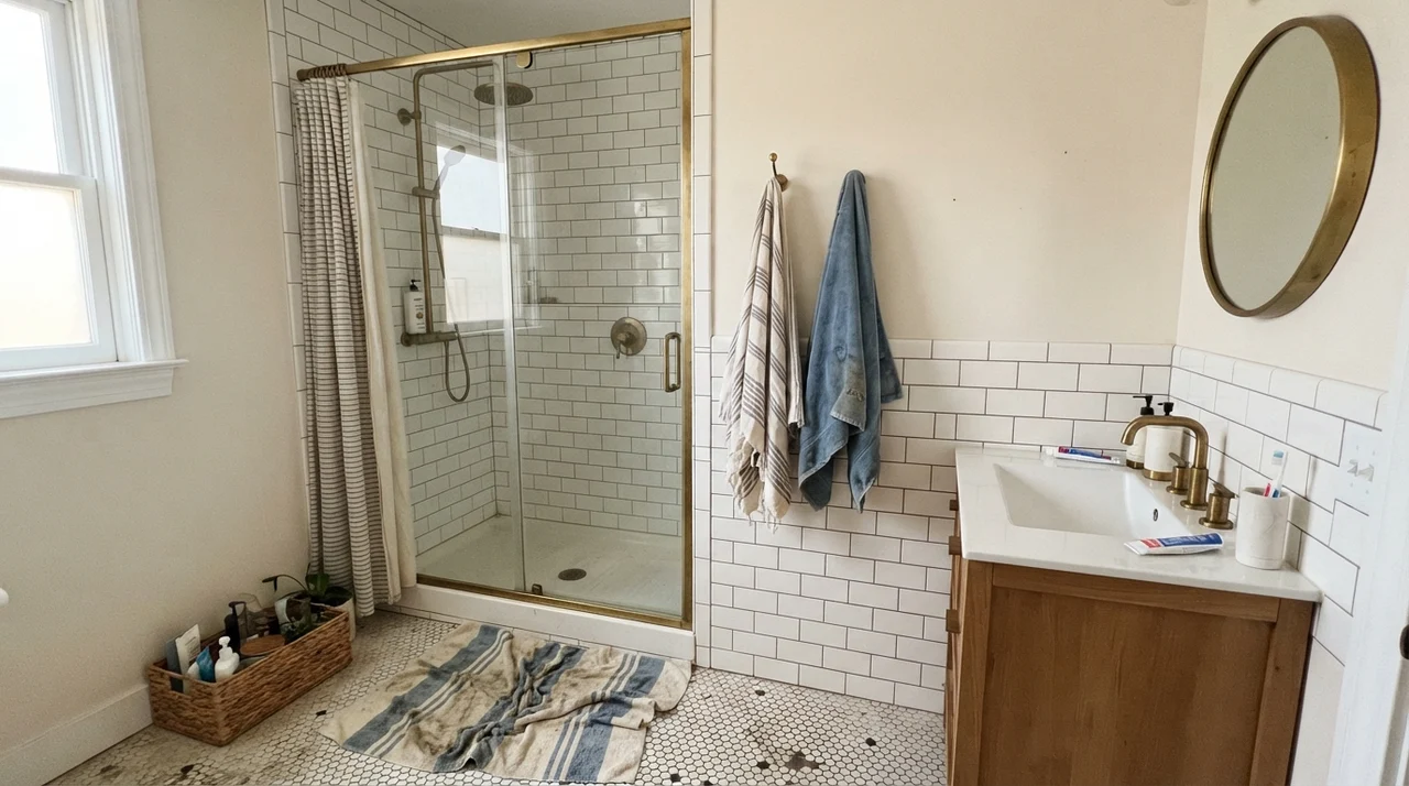
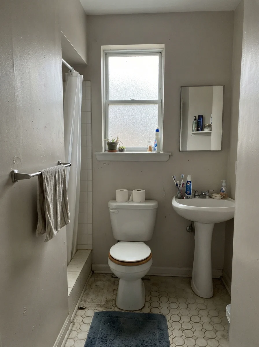
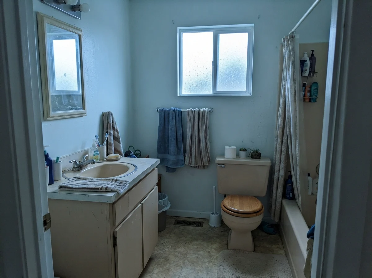
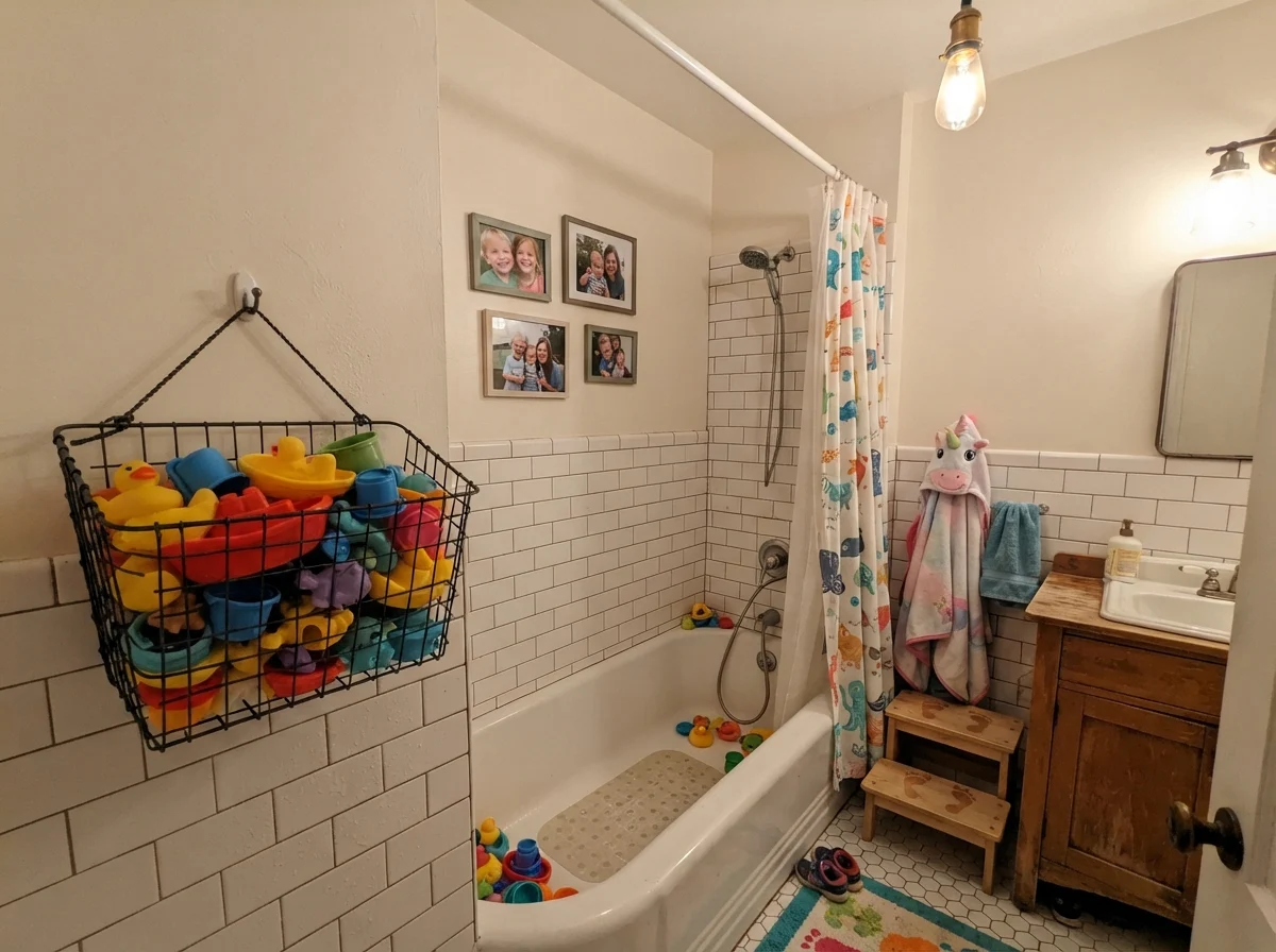
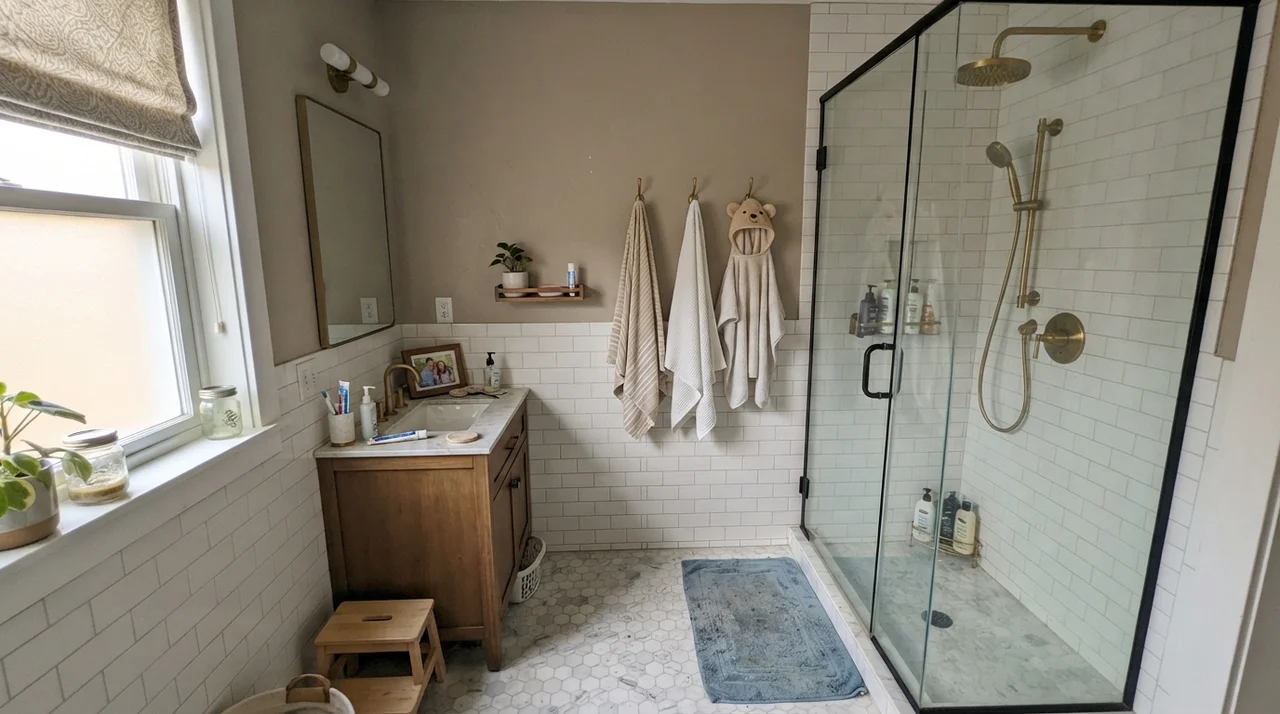
In our last house, I put this formula to work in our primary bathroom. Bathrooms are notoriously tricky because you are balancing utilitarian hard surfaces—mirrors, porcelain, chrome or brass—against vertical drywall. As shown above, running Linen White on the drywall above a classic white tile wainscot creates an inviting, settled balance, especially when warm brass fixtures pick up the undertones. But you have to be mindful: if your surrounding tiles are a frosty ice-white or cool marble, this cream will immediately look aged and separated. It demands warmth in the materials around it to make sense.
Light Shifts: From Pale Morning to Dusk Glow
Before you commit five gallons to a central living space or bedroom, you must see how Linen White behaves as the sun crosses your roofline. Because of its light reflectance value of 81, it bounces a healthy amount of illumination back into the room. But what it does with that light changes dramatically from 8:00 AM to 8:00 PM.
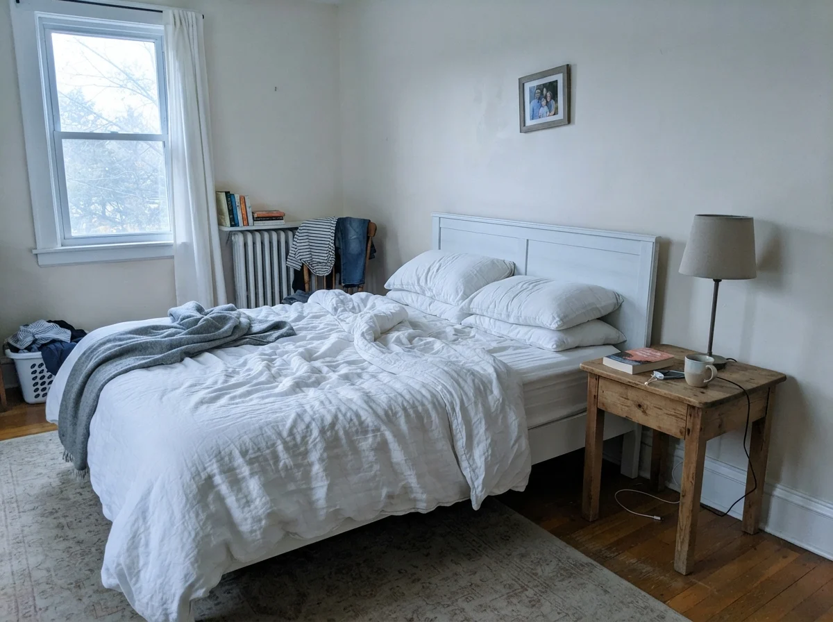
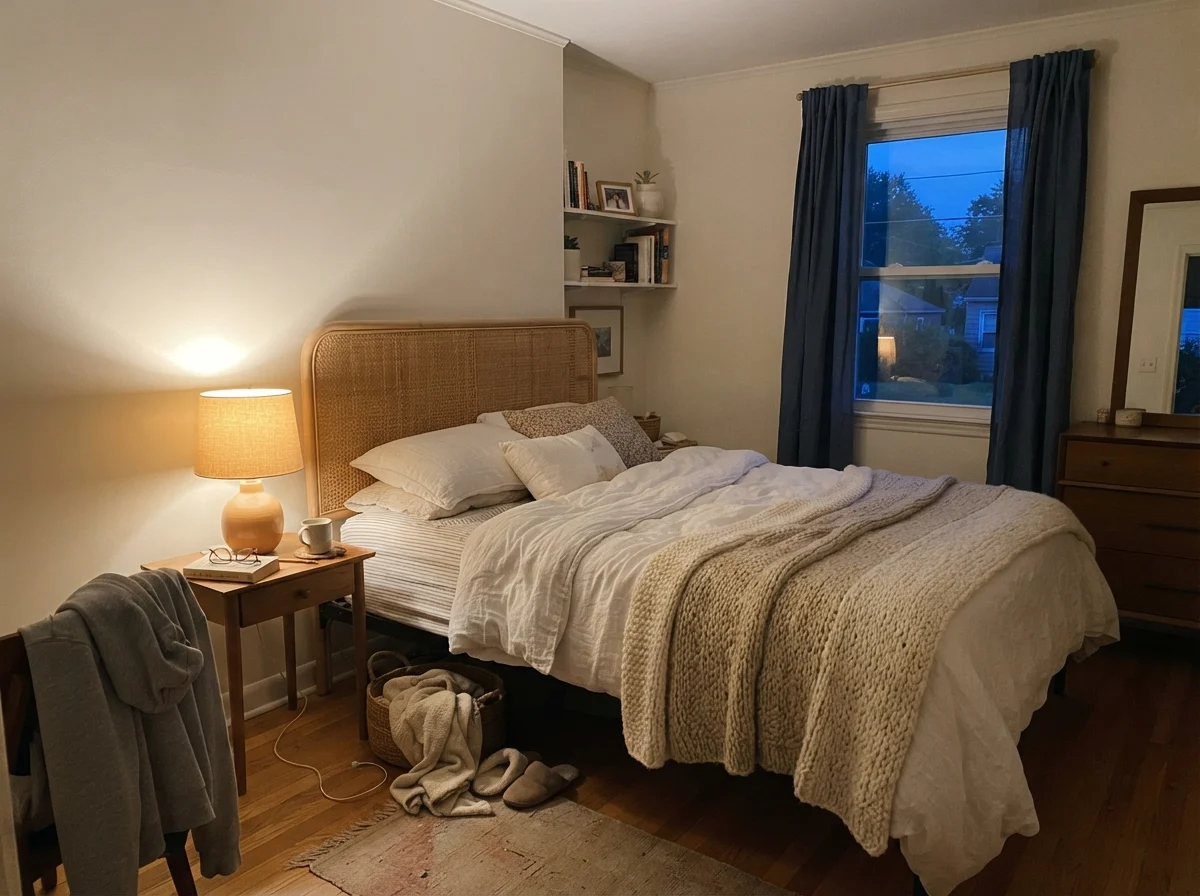
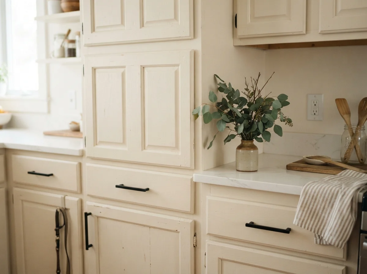
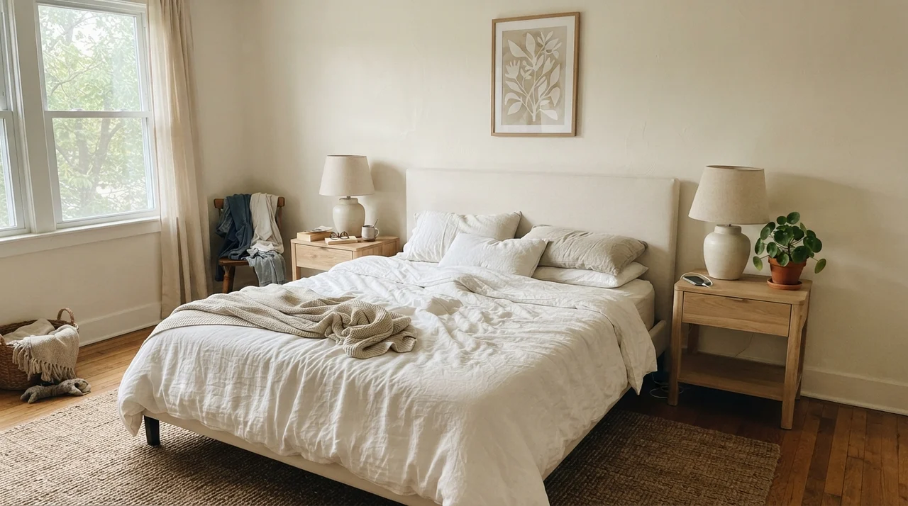
Early in the morning, especially in a bedroom with cool eastern light or filtered shadows, Linen White can appear surprisingly quiet, almost pale and washed out. There is little direct warmth in the sky yet, so the yellow base stays dormant. As the sun moves, however, the pigment awakens. By late afternoon, warm light pulls the golden tones straight to the surface. Come nightfall, under low-temperature domestic lamplight, the paint transforms into an enveloping, cozy blanket. That dual nature can be a triumph if you love a vintage ambiance, but a shock if you thought you purchased an unyielding neutral.
Notice the transformation between those two frames. In the first shot, the lack of warm artificial lighting and the flat dawn sky leave the wall looking quiet, slightly chalky, and pale. An impatient homeowner might walk in at 7:00 AM and worry the color has vanished. But step into the second room at dusk, click on a 2700K incandescent or warm LED lamp, and the paint settles into its real purpose. It cocoons the room in genuine comfort. If you use 4000K cold commercial LEDs, however, the paint turns sour and sickly. The lesson here is simple: adjust your bulbs before you blame your paint can.
Vintage Bathrooms and the Moisture Test
Bathrooms test paint harder than almost any other space in the home, particularly in older layouts where ventilation relies on a single small window or an aging ceiling fan. Moisture, heat, and harsh reflective porcelain will expose every flaw in a wall finish within twenty-four months.
We have used Linen White across three different bathroom configurations over the years, and how it holds up depends almost entirely on sheen and architecture. In a cottage bath with painted woodwork and traditional fixtures, eggshell sheen on the walls keeps moisture from penetrating while maintaining a gentle, non-reflective surface. Semi-gloss is an absolute necessity for any painted wood trim to ensure scrubbability around mirrors and sinks.
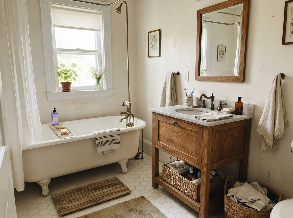
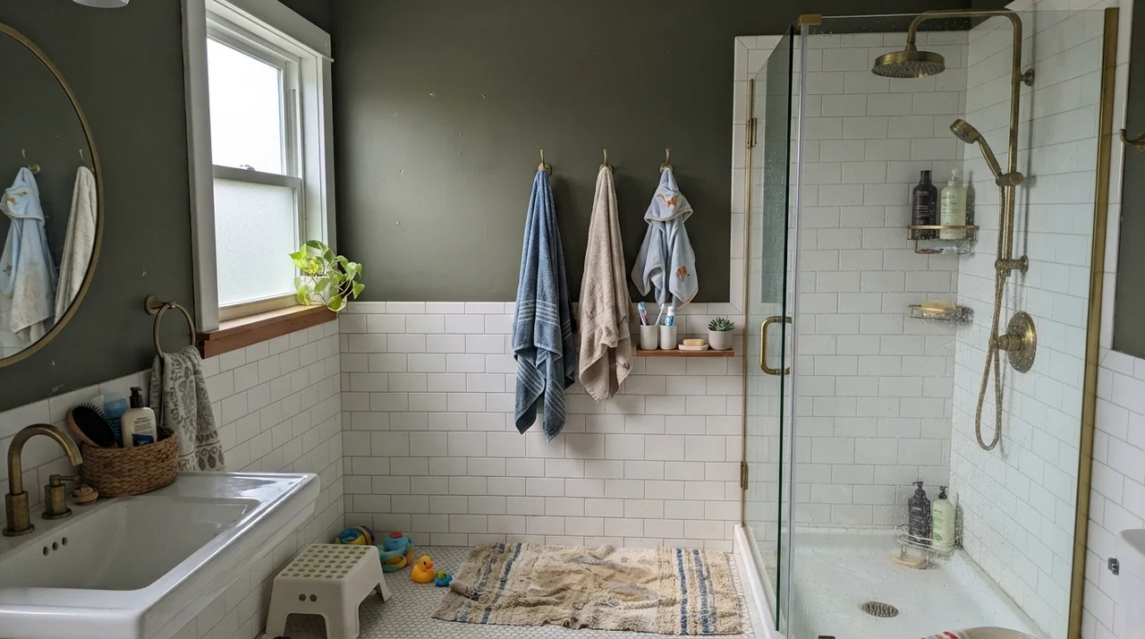
When you study the middle and right images above, you see what happens when the natural lighting falters. Overcast skies through frosted glass or a cool rainy afternoon outside a north-facing window will draw out the stony, quieter side of Linen White. It will not suddenly turn into a sparkling bright modern white; instead, it looks like antique parchment. In an older house with existing beige vanities and period plumbing, that subdued mood feels right at home. But if your goal is an energetic, high-contrast, hotel-spa aesthetic, Linen White in a dim bathroom will leave you feeling underwhelmed.
Living Rooms and Sunrooms: The Warmth Threshold
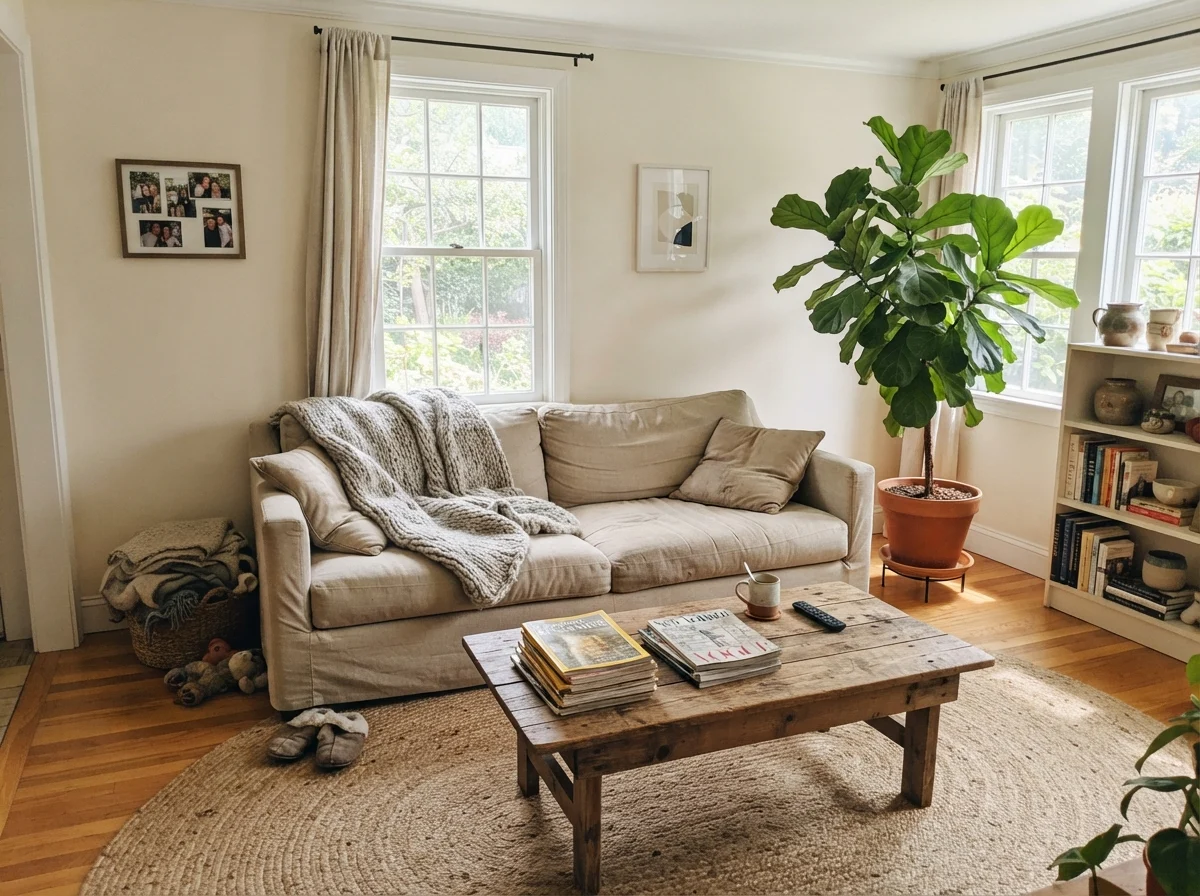
In our 1960s ranch, the main living area features original oak flooring and wide windows looking out into the yard. This is where Linen White demonstrates its greatest strength, as well as its main vulnerability. If your living space receives balanced eastern or northern daylight, the color gives the walls a grounded, gentle warmth that modern gray-tinted whites cannot duplicate. It sits behind artwork, linen fabrics, and woven jute rugs without demanding to be the center of attention.
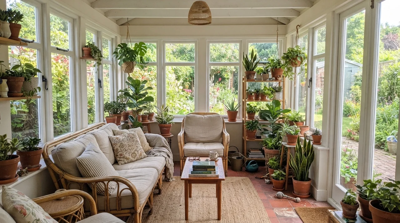
However, you have to monitor the southern and western exposures closely. Strong afternoon sunlight acts like an amplifier on the yellow pigments in formula 912. In a room wrapped in windows, such as a sunroom, the paint can tip from warm cream directly into rich butter yellow by late afternoon. Some homeowners embrace that sun-drenched, rustic cottage feel. Others feel like they accidentally walked into a stick of softened butter.
In our current living room, eggshell on the drywall has scrubbed clean time and time again after dogs and grandchildren brushed past. Because Linen White contains enough pigment to sit comfortably below stark white, it hides life's scuffs far better than a bright titanium-heavy base. A damp rag removes muddy smudges without leaving behind that telltale dull burnish mark that plagues chalky off-whites. That practical durability is why older families have stood by this formula for decades.
Kitchen Cabinets and the Ripple Effect
I have repainted kitchen cabinets in every house we have ever owned, and if there is one universal law of kitchens, it is this: your cabinet color dictates every other surface you will buy for the next fifteen years. When you choose a cream cabinet, you are making an irreversible pact with warmth.
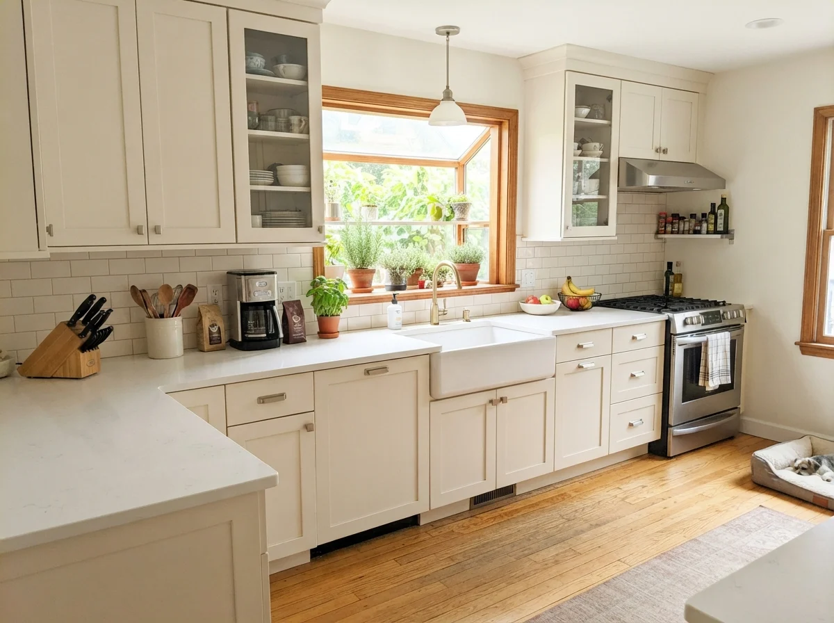
Linen White on shaker cabinetry—brushed out in a satin sheen—creates an undeniably welcoming, classic farmhouse kitchen. It flatters butcher block countertops, honey oak flooring, and aged brass pulls in a way modern cool whites could only dream of. But here is the catch that trip up so many renovators: if you install cool white quartz with bluish-gray veining, or lay down cold gray luxury vinyl planks, Linen White cabinets will instantly read dirty and out of place. It refuses to share a room with cool undertones.
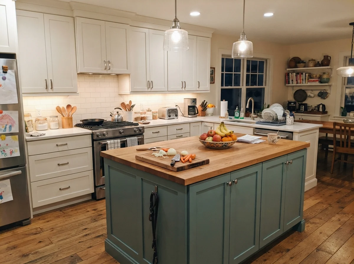
Around cabinet knobs and pull handles, hands leave oils and grease that require regular cleaning. In satin sheen, Linen White held up admirably across several seasons in our colonial kitchen. The scuffs wiped off cleanly with warm water and mild soap. But keep this in mind if you are painting only the island, as shown in the third image above: your surrounding whites must stay on the warm, gentle side. If your perimeter cabinets are a crisp, stark factory white, your Linen White island will look like it came from an entirely different house.
Bedrooms, Nurseries, and Everyday Family Life
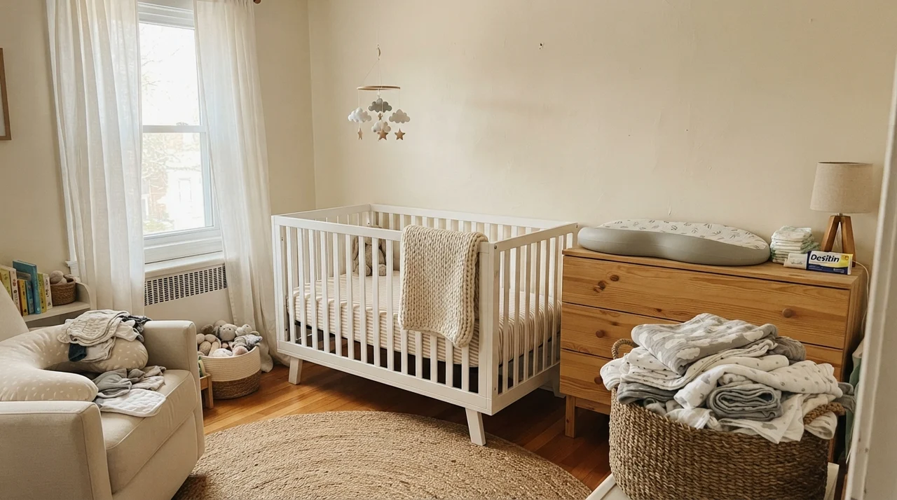
In family bedrooms and nurseries, color needs to be gentle. A bedroom should not jolt you awake with high contrast, nor should it feel cold when the winter morning light filters through the curtains. Linen White provides an exceptional foundation for spaces that change functions over the years, effortlessly bridging the transition from an infant's room to a high-schooler's sanctuary.
Because it offers an LRV of 81, it keeps smaller bedrooms from feeling boxy or dim, while softening the glare of daylight. In our home, bedrooms painted in this shade accommodated light-wood furniture, changing tables, and painted trim without ever fighting the decor. When our kids grew older and replaced cribs with desks, bookshelves, and metal bed frames, the walls did not need an immediate repaint. They quietly receded into the background, doing the unglamorous work of making the room feel inhabited and warm.
In spaces like children's bathrooms and nurseries, water splashes, fingerprints, and inevitable wall bumps are daily occurrences. Eggshell on these walls has always been my non-negotiable recommendation. Flat paint in Linen White might look velvety on a ceiling, but five years in a busy hallway or nursery will leave a flat wall covered in burnished scrub spots. With eggshell, crayon marks and scuffs from dropped plastic toys wipe away without stripping the pigment down to the drywall paper.
Architectural Millwork, Doors, and Utility Spaces
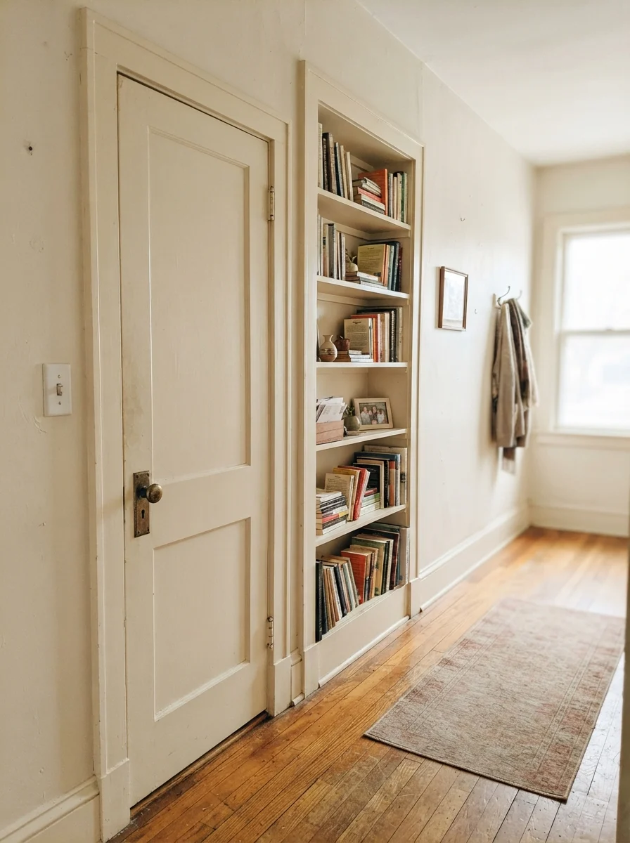
One of the quietest triumphs of Linen White is its performance on interior woodwork. In historic houses, interior doors, built-in bookshelves, and baseboards were rarely coated in stark, gleaming white. They were traditionally treated with creamy, oil-based enamels that softened the transition between stained wood floors and wallpapered or painted plaster. Linen White recreates that traditional feel better than nearly any other catalog color.
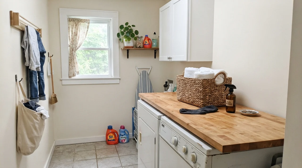
We used it on a two-panel interior passage door and a built-in bookshelf in our hallway. Next to original hardwood flooring and an antique unlacquered brass doorknob, the semi-gloss finish felt historic rather than freshly remodeled. In utility spaces like laundry rooms, running this warm cream against butcher-block countertops and plain white appliances keeps an otherwise sterile chore room feeling grounded and cheerful.
Where Linen White Fails: The Honest Assessment
Every paint has a breaking point, and Linen White is not a forgiving catch-all. Its greatest asset—its heavy, unapologetic yellow-cream base—becomes an absolute liability when placed in the wrong environment. Nearly every disappointed review of Linen White can be traced back to two specific scenarios: bad lighting and incompatible companion colors.
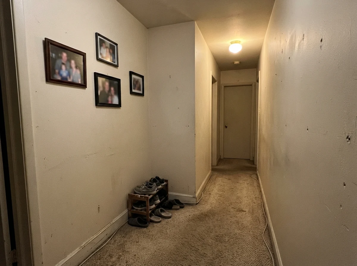
Consider an interior windowless hallway. If you roll Linen White in a tight corridor lit only by a cheap overhead builder fixture, the paint dies. Deprived of natural light, it cannot reflect balanced spectrums; instead, it collapses into a flat, muddy putty tone that looks like yellowed parchment from an attic trunk. Look at the photograph below. It is completely unglamorous, but it is the honest truth about what happens when you put a warm cream in an unlit hallway over beige carpet.
The other major failure occurs when people attempt to pair Linen White with modern, cool gray elements. If you have installed gray luxury vinyl plank flooring, gray subway tile, or cool white-and-gray marble countertops, Linen White will look like an accidental mistake. The cool gray tones force the eye to see only the sharpest yellow-green aspects of the cream. In that setting, your walls will simply look dirty, as though someone smoked cigars in the house for twenty years.
When we sold our 1990s colonial, the prospective buyers' home inspector actually asked if the living room trim had discolored from age. It hadn't; we had simply used a warm cream next to newly installed, cool-toned window replacements. That clash was not worth the money to fix at the closing table, and it taught me an unforgettable lesson about contrast.
Exterior Siding and Susan's Kitchen Table
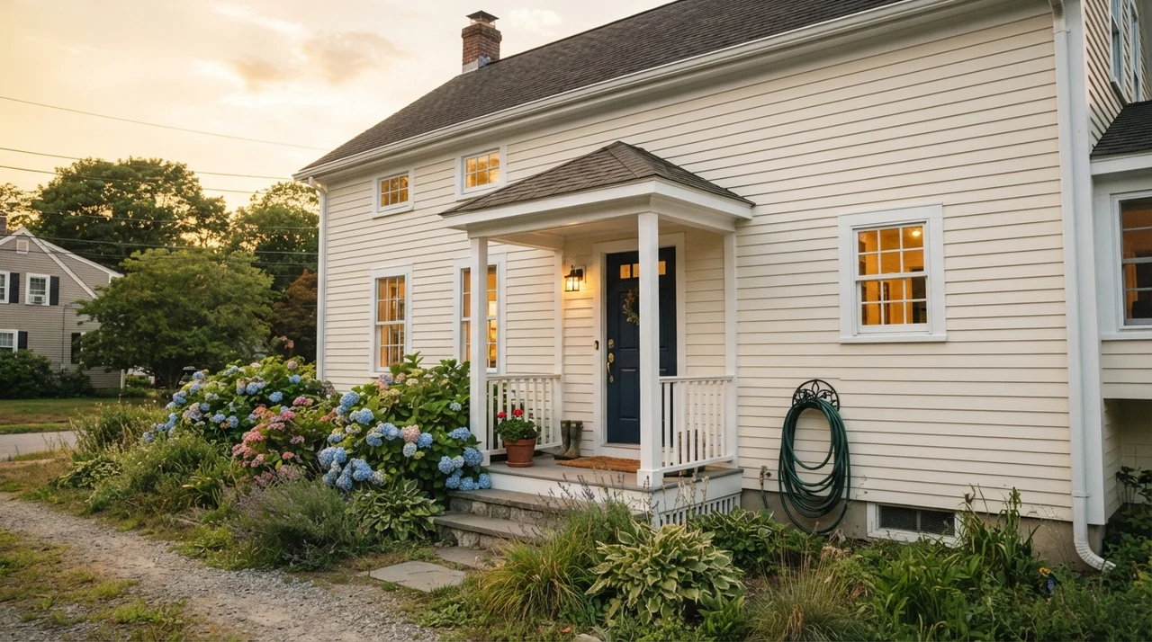
Outside the house, Linen White takes on a completely different personality. Full direct sunlight washes out subtle undertones, so exterior siding painted in Linen White does not look yellow; it looks like a soft, welcoming, historical clapboard. In early evening golden light, framed by white trim and a deep door, it exudes traditional charm that makes bright white houses look severe and uninviting.
When you take a step back and look at three decades of living with walls, you stop chasing what looks striking in a two-second photo on a screen. You start paying attention to how the paint makes your morning coffee feel, how it forgives the little dings of everyday life, and whether you will still want to sit inside that room on a rainy Tuesday in November.
Linen White is not a default neutral. It is an old-house specialist, and if you treat it with respect, it will reward you for twenty years.
Durability, Touch-Ups, and the Budget View
Let us talk practical money, because buying paint for an entire house adds up fast. Benjamin Moore Linen White in their premium interior lines is worth the money if you have original plaster or uneven drywall. The pigment density and formulation cover minor wall blemishes, settled patch lines, and old roller stipple far better than budget off-whites. Where people waste their cash is applying it over areas that never had a chance: modern open-concept spaces with cool gray tile.
Regarding finish: for walls, eggshell is the only choice that makes sense for long-term living. It holds enough resin to be scrubbed clean when dirty hands or pets leave their mark, but it does not highlight wall waves the way satin can. For trim, invest in a dedicated semi-gloss enamel. If you are doing ceilings, keep it strictly flat. Flat Linen White on an old living room ceiling is quietly brilliant; it softens the harsh line between wall and ceiling and forgives plaster repairs that standard bright ceiling white would mercilessly highlight.
One dry aside on tinting: do not attempt to color-match Linen White at a big-box store with a different brand's base can. Because Linen White sits on an intricate balance of yellow oxide and umber, a cheaper base often tips the formula into lemon territory. Furthermore, Benjamin Moore has used slightly different tint formulations across decades; cans bought years apart or at different mixing counters can show minor variations. Buy all your gallons together, box them in a large bucket, and you will save yourself a major headache.
Why does Linen White look yellow on my walls?
Because it is fundamentally a cream, not a neutral white. If your room receives strong southern or western sun, that direct warmth supercharges the yellow pigments. Additionally, placing it next to cool gray flooring or stark builder-white trim will force your eye to see only its yellow undertones.
What trim color goes best with Linen White walls?
Original stained oak and natural wood trims are its absolute best partners. If you want painted trim, keep it in the warm family. Benjamin Moore Timid White provides a subtle, harmonious contrast. Avoid stark, cold whites, which make Linen White look dirty by comparison.
Is Linen White a good color for kitchen cabinets?
Only if the rest of your kitchen materials share that warmth. It looks exceptional with butcher block, honey oak flooring, and brass hardware in satin finish. However, if your countertops are cool gray quartz or your floor is gray tile, Linen White cabinets will look out of place.
Can I use Linen White on ceilings?
Yes, in flat sheen, it is one of the best tricks for older homes. It eliminates the cold, clinical glare of standard ceiling white and forgives uneven plaster patches, while casting a gentle warmth down over the entire living space.
Susan's Verdict · An Old-House Specialist
Linen White is not the paint you buy when you want your home to look like a freshly printed real estate magazine. It will not work beside gray vinyl planks, it will not tolerate cold 4000K light bulbs, and it will punish you in a glaring, south-facing sunroom. But if you live in a house with character—with honey oak trim that you refuse to tear out, plaster walls with small imperfections, and north-facing rooms that feel cold half the year—there is no paint I trust more. We lived with it through three decades of family messes, scrubbed it clean year after year, and it never let us down. Inside its lane, it is worth every penny.